Animation &Animation Artifacts &Disney &John Canemaker &repeated posts &Tytla 20 Jul 2011 07:31 am
Tytla’s Stromboli – the First half
As stated last week, I’m recapping some of my Tytla posts from the past. This very long scene was originally in five parts. Today and tomorrow all five parts will be posted.
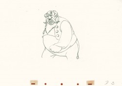
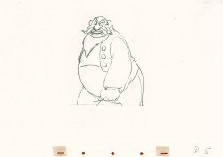
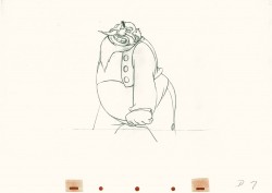
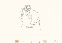
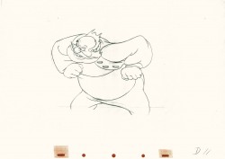
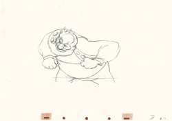
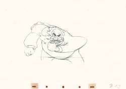
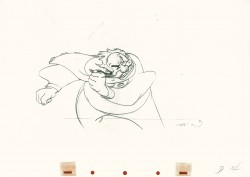
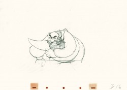
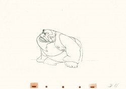
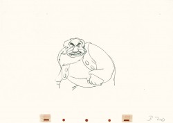
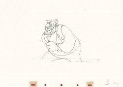
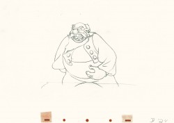
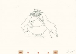
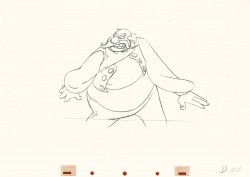
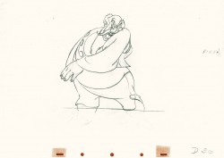
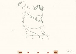
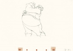
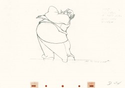
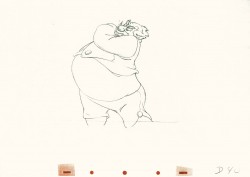
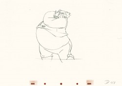
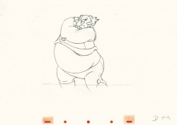
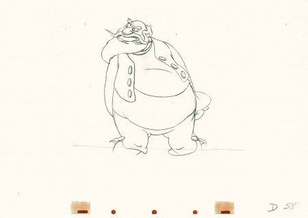
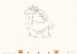
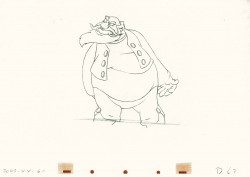
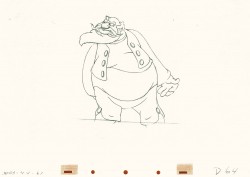
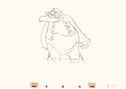
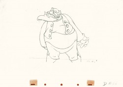
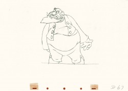
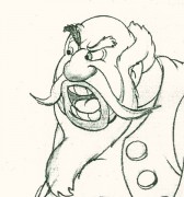 - Bill Tytla‘s work has to be studied and studied and studied for any student of animation. He was the best, and it’s pretty doubtful his work will be superceded. He brought beautiful distortion to many of the drawings he did, using it as a way to hammer home some of the emotions in the elasticity he was creating. Yet, the casual observer watching this sequence in motion doesn’t ever notice that distortion yet can feel it in the strength of the motion.
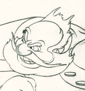
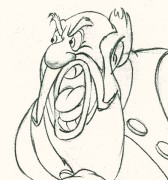
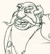
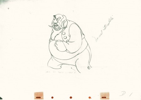
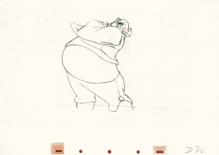
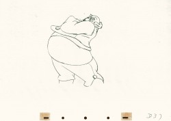
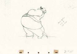
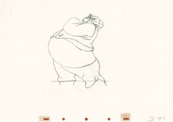
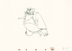
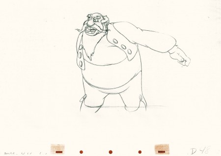
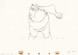
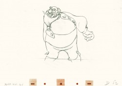
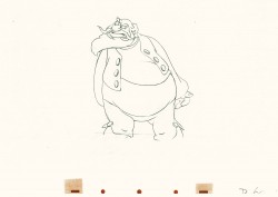
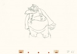
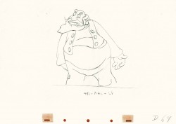
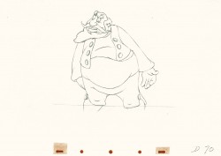
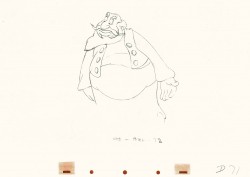
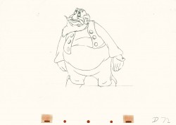
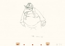
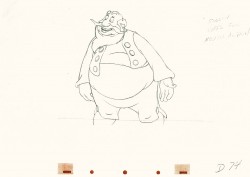
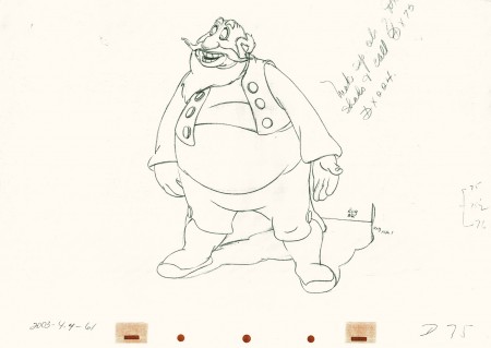
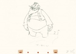
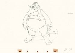
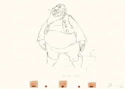
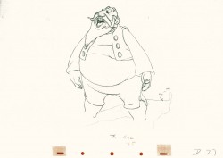
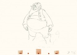
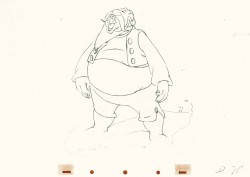
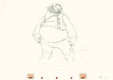
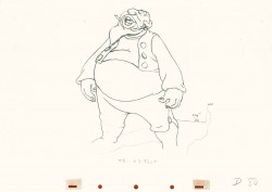
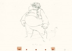
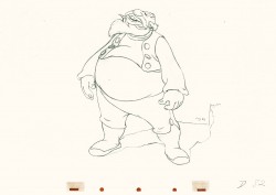
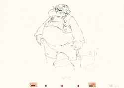
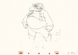
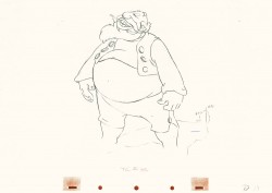
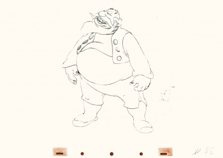
Four drawings (#1, 11, 22, & 48) that shift so enormously but call no attention to itself.
Brilliant draftsmanship and use of the forms.
Here we have the beginning: drawings 1-48. More will come in the future.
 1
1(Click any image to enlarge.)
This note arrived from Borge Ring after my first post Bill Tytla’s scene featuring Stromboli’s mood swing:
- The Arch devotees of Milt Kahl have tearfull misgivings about Wladimir Tytla’s magnificent language of distortions. ‘”Yes, he IS good. But he has made SO many ugly drawings”
Musicologists will know that Beethoven abhorred the music of Johan Sebastian Bach.
yukyuk
Børge
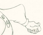
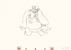
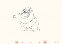
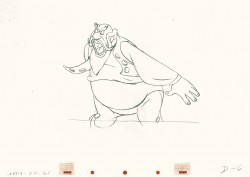
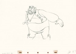
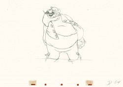
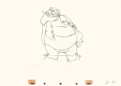
My first post spoke a bit about the distortion Tytla would use to his advantage to get an emotional gesture across. It’s part of the “animating forces instead of forms†method that Tytla used. This is found in Stromboli’s face in the first post. In this one look for this arm in drawing #50. It barely registers but gives strength to the arm move before it as his blouse follows through in extreme.
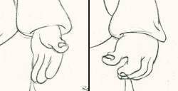 There’s also some beautiful and simple drawing throughout this piece. Stromboli is, basically, a cartoon character that caricatures reality beautifully. A predecessor to Cruella de Vil. In drawings 76 to 80 there’s a simple turn of the hand that is nicely done by some assistant. A little thing among so much bravura animation.
Many people don’t like the exaggerated motion of Stromboli. However, I think it’s perfectly right for the character. He’s Italian – prone to big movements. He’s a performer who, like many actors in real life, goes for the big gesture. In short his character is all there – garlic breath and all. It’s not cliched and it’s well felt and thought out. Think of the Devil in “Night on Bald Mountain” that would follow, then the simply wonderful and understated Dumbo who would follow that. Tytla was a versatile master.
Here’s part 2 of the scene:
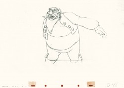 48
48 49
49(Click any image to enlarge.) The full scene with all drawings.
Click left side of the black bar to play.
Right side to watch single frame.
David Nethery had taken my drawings posted and synched them up to the sound track here.

on 20 Jul 2011 at 8:04 am 1.John Celestri said …
Michael, thank you so much for gathering together and re-posting your Tytla blogs on consecutive days. The information they contain should be required study for ALL students of animation.
on 20 Jul 2011 at 8:22 am 2.Nancy Beiman said …
There are so many people who can’t see the forest for the trees, or the animation for the drawings. Animation is not about good looking individual drawings; it’s about good looking movement. Borge Ring’s commentary is very apt–it’s possible to like different styles. For my money, Tytla could act rings around Kahl. He had incredible range, playing everything from Chernobog to baby Dumbo to the Seven Dwarfs.
on 20 Jul 2011 at 9:08 am 3.John Celestri said …
Animation drawings are created for the purpose of being projected on a screen at the rate of 24 frames per second in order to convey emotion and motion; as such they should reflect the distortion necessary to do the job. A held pose should be pleasing to look at because the audience has time to actually see it. Those who don’t understand the difference, don’t really understand animation.
on 20 Jul 2011 at 4:12 pm 4.Stephen Worth said …
I like the drawings you featured at the top where his mouth cheats forward to face the camera even as his face turns. It reminds me of vaudeville and opera singers making sure their voice projects to the audience when they turn upstage. Everyone talks about what Tytla developed at Disney, but a lot of these fourth dimensional cheats come straight out of Terry-Toons. He did some great work there too.
on 21 Jul 2011 at 4:01 pm 5.Eddie Fitzgerald said …
Not shabby, not shabby at all! My dream is that fully animated 2D animation of this sort will carve out a niche for itself and continue to innovate until 3D works better than it does now.