Bill Peckmann &Books &Comic Art &Illustration 29 Apr 2011 06:57 am
Toth’s Clint and Mac
This material was sent to me by Bill Peckmann. Here’s Bill’s note accompanying it:
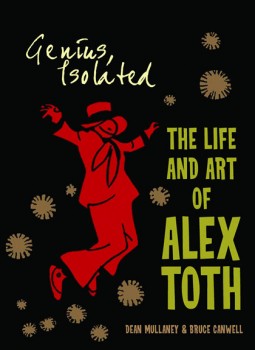 In a couple of days Dean Mullaney and and Bruce Canwell‘s Genius Isolated, a book about the work of Alex Toth, will be hitting the bookstores. This is certainly going to be a GREAT tome given the track record of dedicated work of the authors. (Early reviews bear this out.)
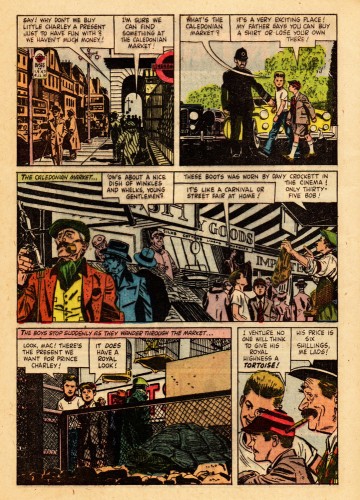
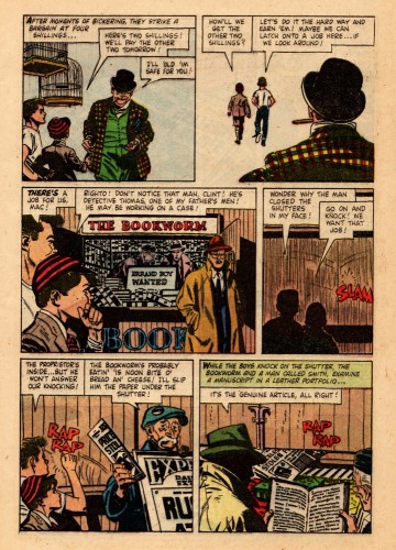
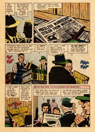
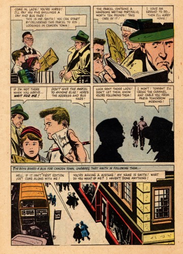
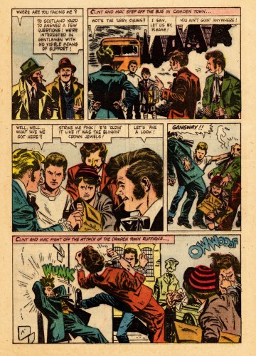
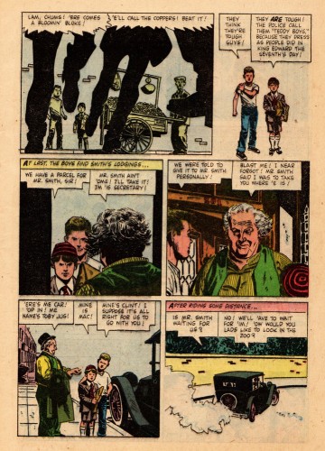
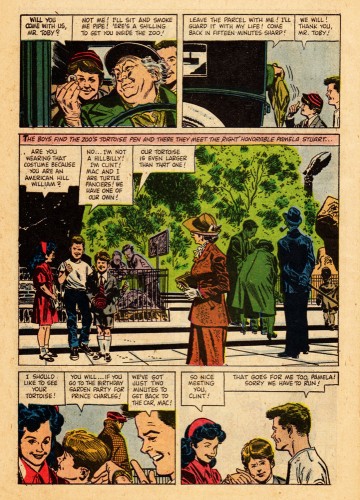
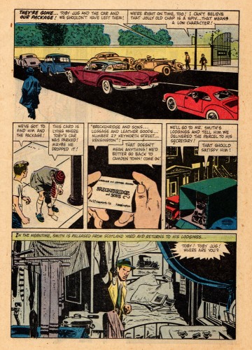
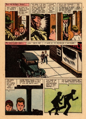
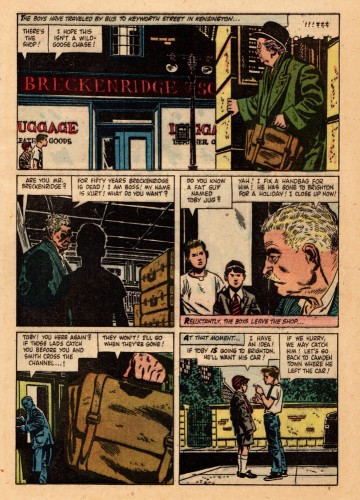
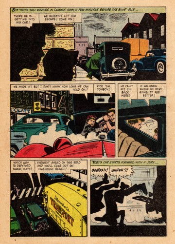
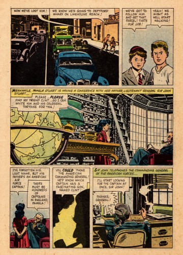
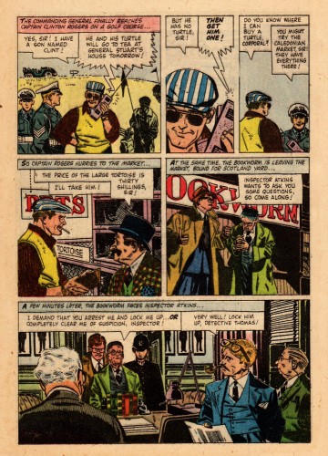
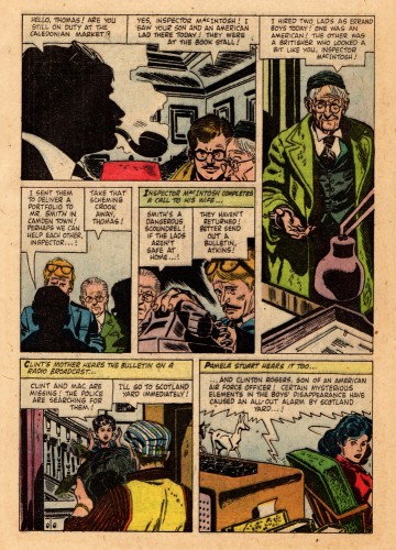
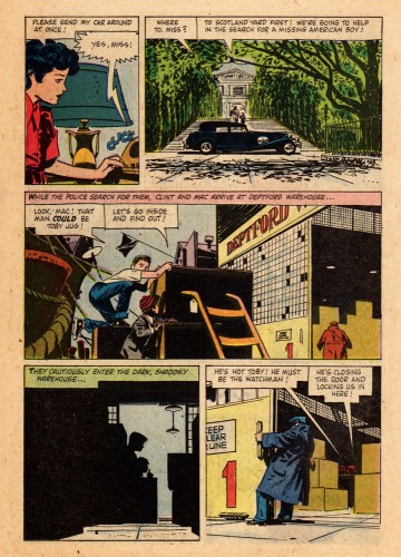
To celebrate the book here’s one of Alex’s Dell/Disney comic books. It’s the 1958 adaptation of the Disney movie Clint and Mac.
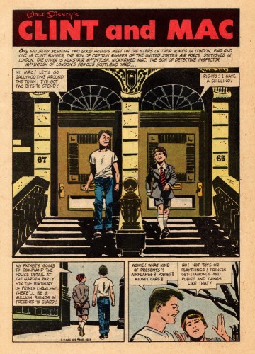
Alex was a big Robert Fawcett fan and I believe the 30 year old Toth had Fawcett on his mind when he illustrated this comic. There are so many beautifully designed panels on these pages. Sorry about the slap dash coloring of the book, but that’s the way Dell did it in those days, though the computer screen helps a lot.
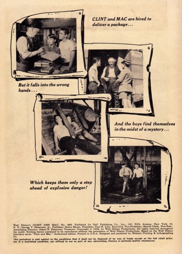
One page of this magazine appears in the book. Here, you’ll get to see and read the whole thing. This is the first half of the book
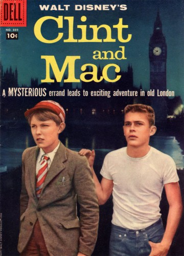
The magazine’s cover
Many thanks to Bill Peckmann for this rare piece of the Alex Toth collection.

on 29 Apr 2011 at 10:10 am 1.The Gee said …
I haven’t read anything beyond the opening narration panel to get the characters’ names but….
Is the “Mysterious Errand” that leads to “an exciting adventure in London” a quest to get Clint a jacket?
———————————————————-
Two quick and more serious things:
about Fawcett–and I think this shows up somewhat here in Toth’s work and surely elsewhere in his work to a degree:
On minor note, the examples you put up of Fawcett’s work earlier all had a certain air of tension to them. My guess is the line work just amplifies that tension. My hope is that I’m not putting on an air of pretension by pointing out something pointless.
On a more major note, those Fawcett examples almost all have a foreground element to them. This shows up every so often in the panels of this comic.
I know it is just a composition thing and sets up contrast, sets up place and allows for somethings to be emphasized as dominant, and by contrast, others to be less dominant. But, it is nice to see it. So much illustration I pay attention to can place everything * over there* and not arrange it so the viewer is “close to” the scene. I’m certainly guilty of it.
I hope that makes sense. If it doesn’t, feel free to ignore it and concentrate on the opening quip. No harm, no foul.
on 29 Apr 2011 at 10:56 am 2.Bill said …
Mr. Gee, no harm, no foul intended and absolutely none taken. Love the quip! Keep it all comin’!
on 29 Apr 2011 at 12:03 pm 3.Eric Noble said …
Excellent! The story is passable, but the artwork is incredible! I will have to find more by Toth so I can study it.
on 29 Apr 2011 at 8:27 pm 4.Mark Mayerson said …
Toth did the adaptation of Darby O’Gill and the Little People, another Disney film.
on 10 Jun 2011 at 3:48 am 5.Tim said …
It was my understanding Clint and Mac was a serial on the Mickey Mouse Club in the last season, not a movie. I’ve come across the Clint and Mac Dell comic
cover many times, but not the entire story.
on 10 Jun 2011 at 7:42 am 6.Michael said …
Tim, as it turns out, you’re right. Clint and Mac was a 15 episode serial directed by Terence Fisher and aired on the Mickey Mouse Club.