Commentary &SpornFilms 28 Apr 2011 07:28 am
Ends and Odds

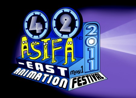
The ASIFA East Animation Festival will be held on this coming Sunday, May 1st.
Tishman Auditorium, The New School. 66 West 12th Street.
As always, admission is free. So is the party after the show.
________________________
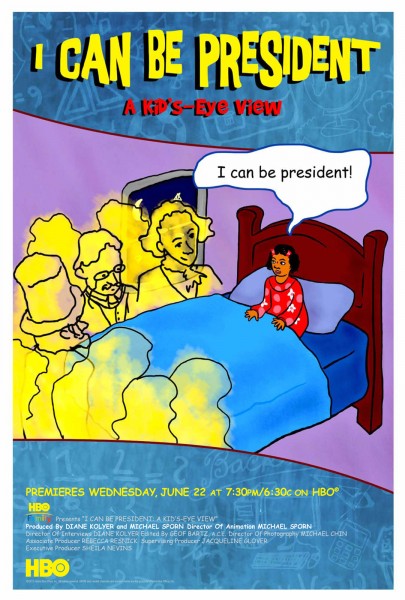
- We just received the poster for our upcoming half-hour program for HBO, I CAN BE PRESIDENT. The show will air, for the first time, on June 22nd and will be repeated ad infinitum after that. HBO is throwing a party for it on May 26th; I’ll take some pics, if anything interesting happens, and post them.
The poster is a mishmash of part of a scene from the show with other elements thrown at it. The type is less than I would have liked. I have difficulty with the mix of translucent and opaque colors (something I would never do), so I asked them to put a white border around it. The poster originally bled from the page. Hopefully, this takes a bit of the onus off it. Hey, what do I have to complain about! They made a poster!

The poster for our show, I CAN BE PRESIDENT
Key to this show was the work of animators Matt Clinton and Katrina Gregorius. They both had a big hand in making anything that is “Special” in the show Special.
- As part of the Tribeca Film Festival, Saturday at 7:00pm there will be a NYWIFT “Independent Women” screening and panel.
 The films to be screened include:
Pastorale (1950, dir. Mary Ellen Bute),
Divination (1964, dir. Storm de Hirsch),
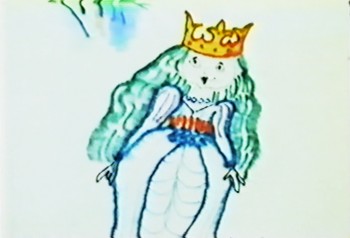
Windy Day (1967, dir. Faith Hubley),
Zenscapes (1969, dir. Marie Menken),
Anything You Want to Be (1971, dir. Liane Brandon),
Homage to Magritte (1974, dir. Anita Thacher),
1-94 (1974, dir. Bette Gordon), _________________________“Windy Day”
Coney (1975, dir. Caroline Ahlfors Mouris, Frank Mouris),
Desire Pie (1976, dir. Lisa Crafts),
Remains to be Seen (1983, dir. Jane Aaron), and
Bent Time (1984, dir. Barbara Hammer).
The panel will include: directors, Lisa Crafts, Emily Hubley, Liane Brandon, Barbara Hammer, Jane Aaron, Bette Gordon, as well as Bute films curator/collector Cecile Starr, and Tribeca’s experimental film programmer Jon Gartenberg. It will be moderated by Drake Stutesman, co-Chair of The Women’s Film Preservation Fund and editor of Framework: The Journal of Cinema and Media.
Saturday, April 30 at 7:00pm
Location: SVA Theater (SVA) 333 West 23rd Street Between 8th & 9th Avenues NYC
.

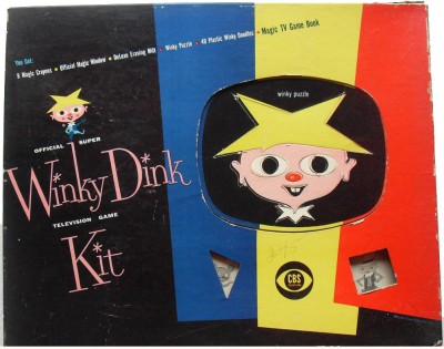
- Stephen Heller at Print Magazine reminisces about Winky Dink. Check it out.
Somewhere I have one of these original kits. The envelope it’s in is deteriorating; they used such poor quality paper to pack it in.

on 28 Apr 2011 at 6:12 pm 1.John Schnall said …
True story: I didn’t know you needed a special kit to watch Winky Dink back in the day (hey, what do you want, I was six…), so I drew with a crayon directly on our family’s tv set. Good thing we didn’t have sharpies back then…
on 29 Apr 2011 at 5:56 pm 2.Charles Brubaker said …
Comic sans!? Ugh, if there’s one font that should be banished forever it’s that one.
Still, I wish I get HBO because I’m curious about your special. Will it ever be released on the web somewhere? (HBO’s site, iTunes, whatever?)
on 29 Apr 2011 at 6:21 pm 3.Michael said …
Sorry, the show won’t be released on the web, but it will be distributed on DVD. Hopefully late this year.
on 29 Apr 2011 at 7:46 pm 4.Dave Levy said …
Congrats on the HBO special! I’ll be watching.
on 30 Apr 2011 at 1:38 am 5.The Gee said …
Comic Sans isn’t entirely bad. It has its uses. Unfortunately, many people use it in appropriately. With fonts, that happens.
I do think that it can be used with good effect.
Though, I am wondering where the poster was designed, in-studio or by a production artist at HBO? Or, was it a mixture of both? I know the illustration was most likely done in-studio, but the whole shebang?
on 03 May 2011 at 1:08 pm 6.The Gee said …
Oh, good gravy. For some reason I didn’t bother to even read the paragraph above the image of the poster.
I just replied straight to the comment about the fonts. As it goes, I prefer to have some say in promo materials. At the very least, I wish to see them before they go to press or release them.
While I’m not saying I’d do a better job on them, there have been times when I would say that.
So, I was thinking that someone at HBO made the call on the design and now I guess I know the answer, potential, future dear readers of comment threads on eclectic topics found via search engines and by clicking the link out of curiosity because one sentence piqued your curiosity enough to do so.
on 03 May 2011 at 1:19 pm 7.Michael said …
I had no idea they were going to do a poster. I sent a frame grab for the invitation carrd. Then one day I got an email and an attachment asking what I thought of the poster. They’d used the frame grab as the centerpiece and built up from there. I would have preferred using the type we use in the film for the main title. Whatever. I’ve got a poster!
on 04 May 2011 at 9:17 am 8.The Gee said …
Well, a poster for it *is* pretty cool.
Heck, the fact that any promotional materials, particularly print ones, are made is a good thing.
I’m not sure what HBO usually does for your work but if the poster is a new development, may you get another and more next time.