Animation Artifacts &Books &Disney &Illustration 12 Apr 2011 06:56 am
Goliath II
- I feel very fortunate. Jason Hand, following my posts on Bill Peet’s great book illustrations, has sent me the illustrations to the book, Goliath II. This book grew out of the Disney featurette. Peet, in his autobiography, says he pulled the story from one he had written to be made into a book. When he was in the doghouse at Disney, sentenced to working on commercials for the likes of Peter Pan Peanut Butter, he stopped Walt in the hallway and showed him the story outline. Disney put it into production immediately.
It was an important film in that it was the first to use Xerography to copy the animators’ lines onto the cels. This was an extremely important step before they moved onto 101 Dalmatians.
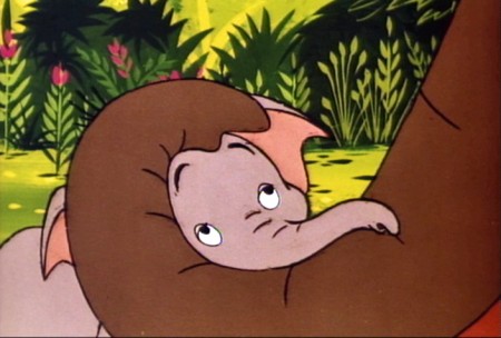
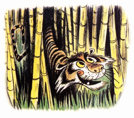
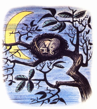
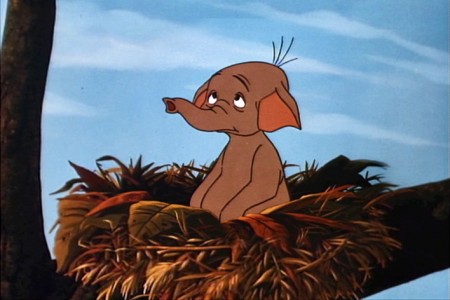
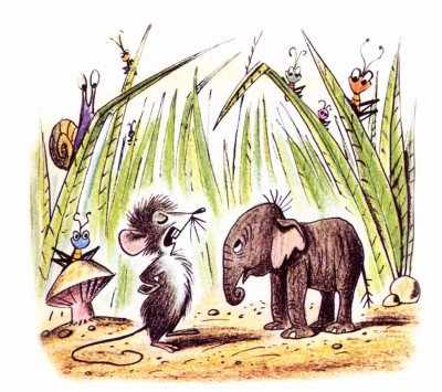
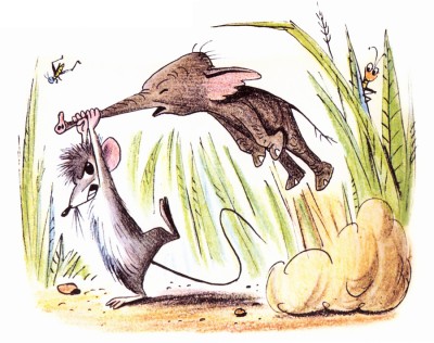
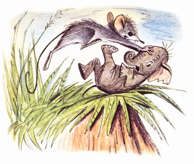
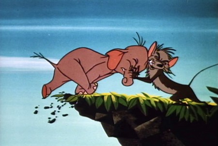
I thought this was a great invitation for me to add some frame grabs from the film which match the illustrations of the book, to see how closely the two matched. After looking at the book, one can see that the film is very two dimensional. Every action happens east – west. None of the action moves in perspective (toward or away from you). This, of course, is a product of the limited budget. The film is also all closeups. Little of the action takes place in Long Shot (the better to keep the budget down.) The film, naturally, is a disappointment when compared to Peet’s illustrations.
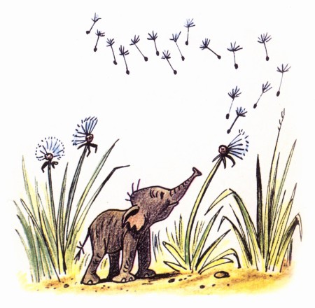
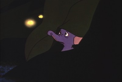
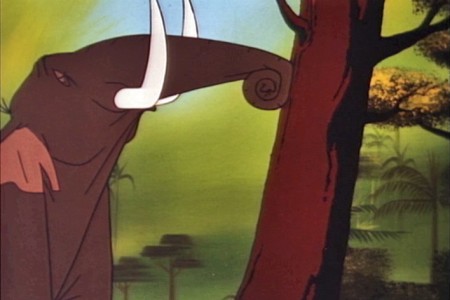
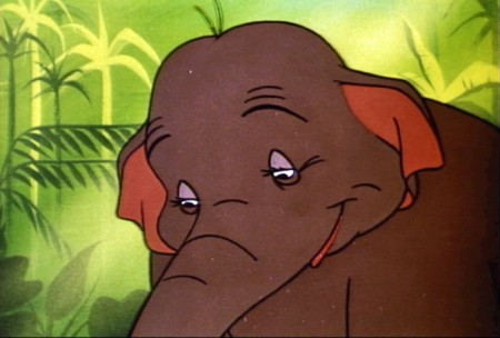
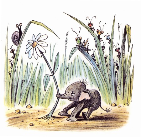
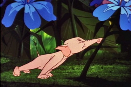
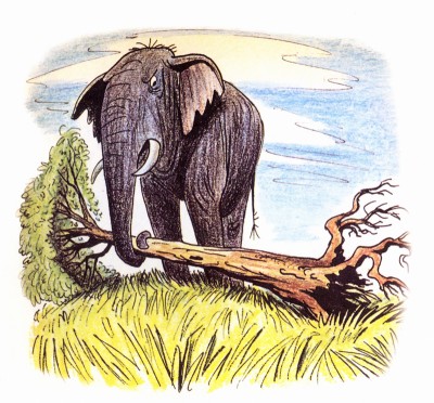
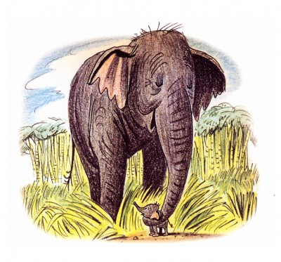
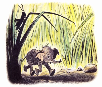
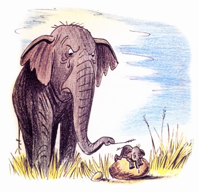
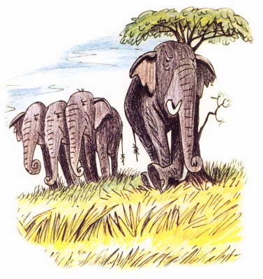
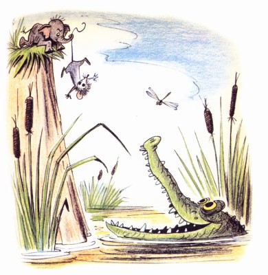
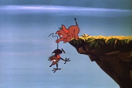
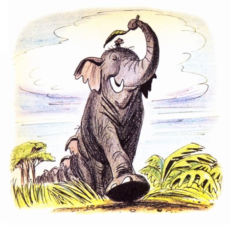
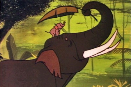
Here are the illustrations followed by the correlative frame grabs:
 1
1A delicate drawing of something that doesn’t appear in the film.
 1
1
The closest thing to floating dandelions is Goliath watching
a couple of fireflies toward the last half of the film.
 3
3
This scene isn’t played well in the film.
It’s perfectly clear in the book.
 4a
4a
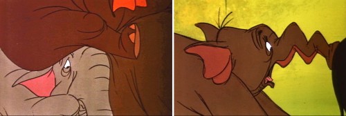
They couldn’t handle this scene in a single shot.
They broke it into two closeups. TV direction.
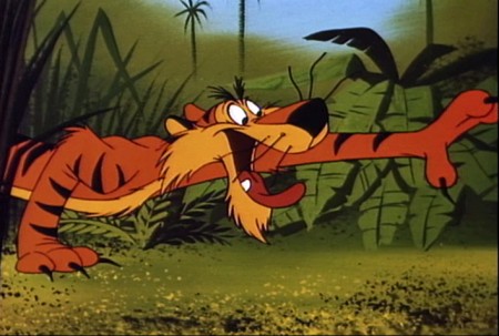 5
5
This is about as close as I can come to a match.
Peet’s drawing is so full of life.
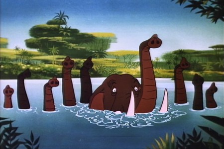 7
7
This scene actually comes later in the film.
There was no bathing scene early on.
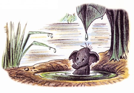 8
8
No relation to this scene is in the film.
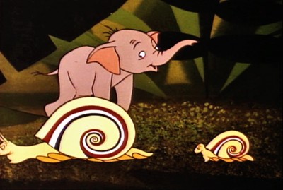 9
9
There’s no real correlative to this illustration in the film.
The closest appears toward the beginning.
 10
10
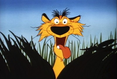
More John Lounsbery than Bill Peet.
 12
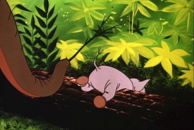
12
A very different approach in the film.
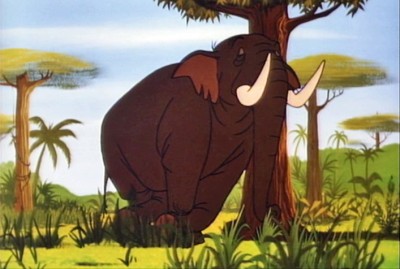
 14a
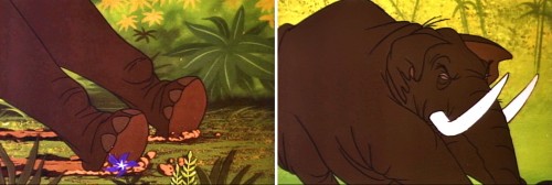
14a
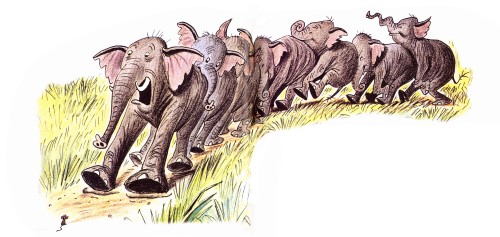
The elephant pile up illustrated by Bill Peet has to be broken
into a number of short scenes cutting back past the elephants.
 14b
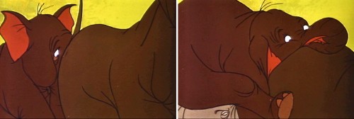
14b
This makes animation easier to do and, consequently, fewer drawings.
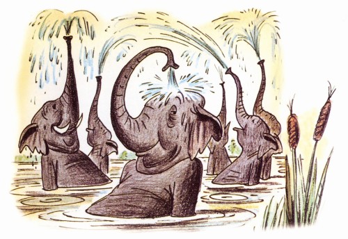
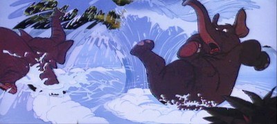 15a
15a
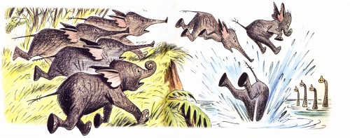
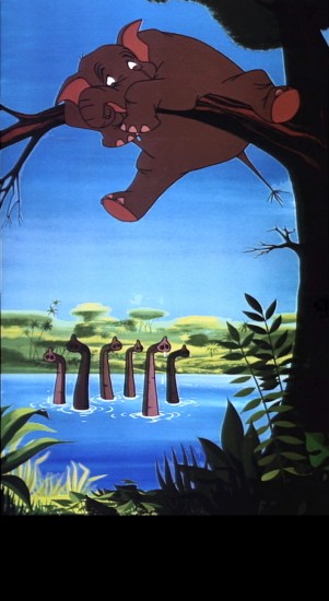
The elephants end up in water, but they jump in
one at a time. Better for the reuse of animation.
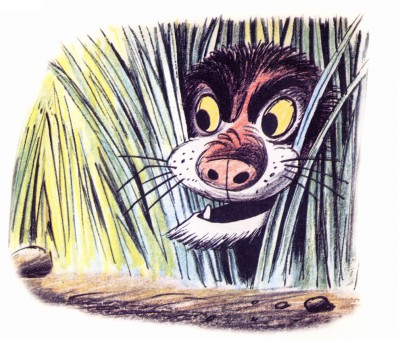
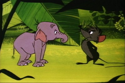 16
16
The mouse enters the story.
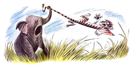
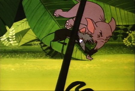 17a
17a
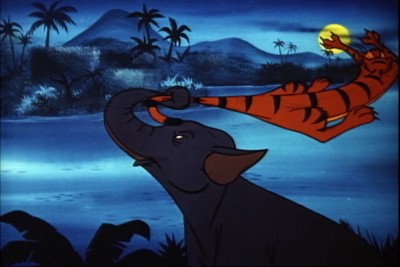
The mouse throws Goliath in a very different way.
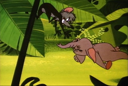 17b
17b
Unfortunately they’ve plotted the entire move
with an overlay that cuts up part of the action.

on 12 Apr 2011 at 8:54 am 1.Steven Hartley said …
The film was ok – but I just disliked the amount of reuses in there!!
on 12 Apr 2011 at 11:59 am 2.Ray Kosarin said …
A strange and tepid film–”TV direction” sums it up. Funny, and a little grim, to think that right around this time Disney was extolling (or defending) his studio’s work over the limited-TV animation of Hanna-Barbera and encouraging viewers to “watch the crashes” (not sure the precise quote) where they might appreciate the difference. But is cutting close, as they do here, to avoid animating a crash all that much better than cutting away altogether? It seems the economics of TV production were already casting a shadow over the Mouse House.
on 13 Apr 2011 at 12:57 am 3.Tom Minton said …
Amby Paliwoda was responsible for much of the elephant animation in this cartoon, which was largely re-used in “The Jungle Book” a few years later. Paliwoda also animated the none-too-dissimilar green pachyderms in Filmation’s “Journey Back to Oz” feature, the only version of them to be hand-inked.
on 13 Apr 2011 at 12:00 pm 4.Eric Noble said …
Bill Peet’s artwork is so much more appealing than the animated film. The film just looks so bland. As for the animation reuse, you can always depend on Woolie Reitherman for that. He was much better off as an animator than a director.
on 13 Apr 2011 at 2:08 pm 5.Thad said …
Christ almighty, this is a pitiful cartoon. It’s even more pitiful having just screened Dumbo in IB Technicolor. Oh how the mighty have fallen. Nice Peet drawings though.
on 13 Apr 2011 at 5:45 pm 6.Steven Hartley said …
Woolie’s directing is okay – indeed, Woolie was better off at animating, but I suppose that “was his thing”. Although, he did a good job on “101 Dalmatians” in directing Cruella chasing after the pups in her car. Excellent timing there. Although, he still had number of reuses here as well as his other films.
I suppose I don’t like when he reuses when it’s obvious reuse – like that Goliath and mother reuse from Dumbo – that’s clumsily reused. It just doesn’t work for me. Although, I suppose what annoys me about his reuses is that it causes animator’s have lower footage output.
on 10 Dec 2012 at 11:24 am 7.drew said …
very interesting!
By the way, what happens to that tiger later in the movie?