Animation &Commentary &Disney 30 Nov 2010 08:26 am
Keane Posing
- Before posting this, let me tell you that I have all the respect in the world for Glen Keane. He’s one of the finest animators out there who consistently does original animation.
 Last night I saw Tangled at a screening in 2D. I would have liked to have seen it in 3D, though EVERY review I’ve seen has put down the 3D experience saying that the glasses darken the movie to less than 60% of the brilliance on film. I doubt I’ll see it again for the 3D; if I do see it again it’ll be on DVD.
The history of the Disney studio. The film, itself, is basically a reworking of Beauty and the Beast (the magic flower, the bad male who has to be transformed into a good guy), Snow White (the wicked queen and the magic mirrors – two of them have to be broken), Cinderella (she cleans the tower for her wicked stepmother – or is this more of Snow White?), Sleeping Beauty (the horse with his own mind, the Princess awakens the sleeping Prince – or is this Snow White again?), The Little Mermaid (She looks like Ariel, the Little Mermaid with the hair that she just has to keep pushing back), Tarzan (the two lead characters skateboard over water and some paving, yet they don’t have skateboards). I could go on through some other films, but what’s the point?
Several of these female characters showed their spunk and advanced their Independence. In Tangled, Rapunzel goes after what she wants but doesn’t create her own fate, in the end. The male does. One expected it would be the wicked stepmother, but no, it’s the Prince … er Robber/Thief/Scoundrel. Inadequate. This is a film for 14 year old girls, and we see that they’ve seen it this past weekend, but they’re given the wrong version of the story.
The story in Tangled is smooth flowing, but crudely formed. It’s a mass of unbelievable material that rips apart one of the darker and great stories from the Brothers Grimm first published in 1812. The story is a nasty one which begins with a king, personally, stealing a plant from the witch’s garden to help his wife. She catches him on the spot and makes him promise his first born in payment.The king is RESPONSIBLE for his theft. Rapunzel moves to the tower and is protected from sex with her caging in the tower.
The film doesn’t use the hair very well. It is the sex that isn’t otherwise stated, and some symbolism should have entered the animation; it didn’t have to be obvious – it just had to be there. The incidental characters – all male seem to have bonded well, but we have no idea who they are or what their sexual preferences are. Again, the film seems unwilling to deal with the main subject of this great fairy tale. A stepmother trying to protect her daughter from the evils of the world. (Men!) Instead, this film is about ripping off Disney past. Yet we did see in Jeff Kurti‘s book on The Art of . . . that Rembrant was a major source of inspiration in the earlier days. Too bad too little of Rembrandt made it to the screen.
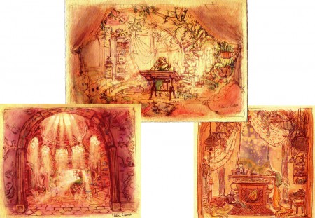
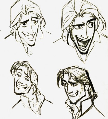
Just prior to going to this screening, I watched the first half of Tarzan on tv. Below, I’m going to post a number of drawings showing some clichéd poses by Glen Keane, but these poses don’t represent the animation he does on screen. He’s too good and sensitive an animator to show any clichés in the actual animation on screen. In fact, some of what he does is quite inspired. (Not the idea of Tarzan skateboarding through the trees without a skateboard. I expect the soles of his feet would be bloodied and damaged after trying it once, and I don’t think there’s scar tissue for it. It’s a small reality issue for me.) It’s just that these model sheet poses inspire clichés from lesser animators when they’re the poses.
Tangled is totally watchable (despite a couple of children running around the screening room, bored and loud). It’s just not good; story is everything.
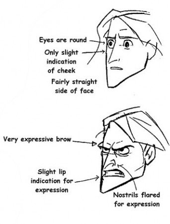
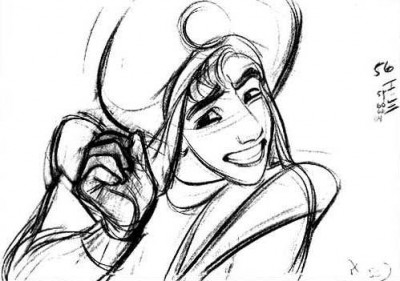
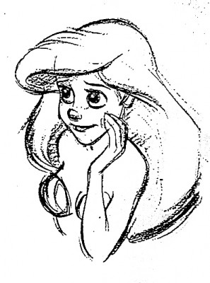
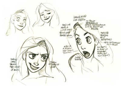
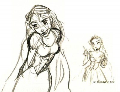
Here are a bunch of drawings I culled from Raul Andres‘ blog, The Art of Glen Keane. I have to admit my purpose isn’t to showcase the art of Mr. Keane, but to express my disappointment with what I’ve found. It first became obvious to me with many of the drawings and models of his that were printed in the book, The Art of Tangled. Many of the poses he’s done since Beauty and the Beast have gone to the clichéd pose, and it’s disconcerting to me. Characters look like each other, and their facial postitions repeat the past. It’s a laziness in the drawing.
Look and compare drawings with this small sample. It took only minutes for me to compile them, and I could easily have kept going.
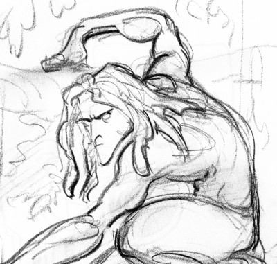
Tarzan 1
The problem, to me, is that Glen Keane has grown into this phase of reworking the same godawful poses. He has to come to grips with what he’s doing, and pay more attention it. There’s no excuse. It isn’t so obvious in his animation, just in his model sheets.
You wouldn’t be able to catch two poses from Frank Thomas, Milt Kahl or Ward Kimball that were so alike. There were no obvious clichés in their work.
Glen Keane is a remarkable artist and a brilliant animator. That is exactly why I have to take notice. There are many others aping what he’s doing in animation, and the kingdom is beset with endless clichéd poses. Let’s get it together, folks. Time to bring animation to a higher level.
Attitude has got to be a thing of the past. It’s rampant in Tangled, Toy Story 3 and to a lesser degree in Kung Fu Panda; it’s not obvious in How To Train Your Dragon. The independent films, The Illusionist and My Dog Tulip don’t settle into this type of posing. Strong, clear thinking artists dominate these two films.

on 30 Nov 2010 at 10:44 am 1.Mark said …
Thank goodness it’s not the aping, devoid of character or personality scribbles of that Andres Dejha.
on 30 Nov 2010 at 11:03 am 2.Richard O'Connor said …
It’s difficult in these days when yelling is considered debate to criticize without being construed as a “hater” or “negative nancy”. It’s too bad that any discussion which points out negatives must be continually qualified.
I think you’re right on target here and your point about the trickle down effect onto lesser artists is most important.
Good, gutsy, article.
on 30 Nov 2010 at 12:01 pm 3.Daniel Caylor said …
Ok, good point.
on 30 Nov 2010 at 12:37 pm 4.David said …
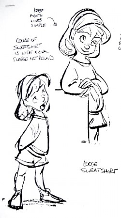
Just a small point of order: The model sheet drawings of “Jenny” are from “Oliver & Co.” , not from “The Rescuer’s Down Under”.
Glen’s rough model sheet version of Jenny is more appealing than the final character design of Jenny that was used in the film.
on 30 Nov 2010 at 1:01 pm 5.Michael said …
Thanks David, I corrected it.
on 30 Nov 2010 at 4:10 pm 6.karl said …
I agree with much Richard’s comment, the one above it however is unnecessary. The ‘scribbles’ you are referreing to are likely his ANIMATION drawings, and it is hard to call his characters “devoid of character or personality” when you watch the scene up on screen. Andreas Deja is another very accomplished artist and animator, that was one of the mindless negative comments Richard was trying to distiguish against
on 30 Nov 2010 at 4:32 pm 7.Michael said …
In fact, I very much like Andreas Deja’s animation, probably more than Glen Keane’s. Let’s just say they’re different. I don’t see clichés in his work. I scanned about and couldn’t find model sheets that were attributed to him.
on 30 Nov 2010 at 7:01 pm 8.Steph said …
I’ve noticed twice now you’ve used the term ‘attitude’ and it intrigues me. Could you explain exactly what you mean by that?
on 30 Nov 2010 at 7:09 pm 9.Michael said …
Steph: Look at almost any pose above, especially the male in Tangled. The arched eyebrow, think of the character of the Kung Fu Panda, and you will probably come up with a similar pose on his face. Glen Keane consistently turns the two feet in on females, a sure sign of vulnerability and submission. He doesn’t do this for males. Look at the many model sheets by Milt Kahl, Frank Thomas or Joe Grant. Not EVER a similar pose. This is “Attitude” not character, posing not living/breathing. We need to see more character in the characters.
Mandy Moore’s non-acting voice was perfectly animated without characterization. Fortunately, the excellent Donna Murphy was nicely animated without “Attitude”.
on 30 Nov 2010 at 7:54 pm 10.Patrick Smith said …
Good post. The only problem is that I forget what you’re talking about as I drool over his wonderful drawings. It’s kind of like talking to a girl who has a low cut top.. I just can’t concentrate when looking at such obvious beauty.
on 01 Dec 2010 at 12:12 am 11.Eric Noble said …
Very intriguing post. The whole “attitude” thing is annoying. People mistake that for character. Whenever I see that, I don’t think “smart, independent person who can take care of themselves”, but “white-bread suburbanite who wants to be cool and who’s trying to cover up their insecurities.” I knew a lot of people with those types of faces in high school.
This is definitely a result of creative inbreeding. None of the major animation companies are willing to go beyond the tried and true. I hope we can move beyond this soon. I know that we have talented artists to pull it off.
on 01 Dec 2010 at 6:54 am 12.Kellie Strøm said …
Creative inbreeding is the perfect phrase. Movies in general have been in the hands of fanboysandgirls for a couple of generations now, but obviously the problem is worse in animation where everything on screen is created from scratch and therefore so much more vulnerable to fanisms. The films of the high Hollywood period were made by people who didn’t grow up wanting to make films, who came from working in other artforms, likewise with the animation of that time, hence the richness of their influences.
on 01 Dec 2010 at 6:57 am 13.The Gee said …
Is he stuck?
I also have to agree with most of what Eric wrote. Believe me, I don’t want to but, man, it does seem like that’s the case.
As for those influenced by this trend….that’s a weird thing to understand. I find it hard to believe that people believe that those expressions and poses are enough to make interesting cartoons. But, perhaps, that’s a huge part of what they know.
I dunno.
on 01 Dec 2010 at 8:28 am 14.Attitude in Animated Characters and Where it Should Come From | The Animation Anomaly said …
[...] Yesterday, Michael Sporn posted an opinion piece that expresses his dismay at not only the repetition present in Glen Keane’s artwork but also the continued presence of attitude in them. I had to go back and read it twice just to be sure I understood. Surely attitude comes from the character themselves not the way they look, right? Eh, no. As it turns out, you can pull plenty of faces that can be read as having an attitude. [...]
on 01 Dec 2010 at 9:39 am 15.Oswald Iten said …
You’ve hit the nail on the head again! Although I still have to wait for “Tangled” (or “Rapunzel” as they still call it in Switzerland) to be released, I’ve had the very same impression of the Keane attitude poses. As much as I still marvel at Glen Keane’s animation I’ve had that unpleasant feeling that all the films after “Beauty and the Beast” that showed his stylistic influence (mainly “Tarzan”) displayed some of the most clichéd posing.
I say that as someone who has been guilty many times of trying to ape good animators’ work as sort of an exercise and frustratingly ending up with lifeless clichés.
on 01 Dec 2010 at 11:02 am 16.Tim Rauch said …
I’d go further and say Keane, while being a marvelous draftsman and technically gifted animator, has been playing his characters the same way for a long time. All the males are cocky with just enough self-deprecation to remain appealing and the females are doe-eyed innocents. Pocahontas is the one exception. She feels more like a lifeless, animatronic fem-bot. Of course, he’s not entirely to blame, a lot of the trouble would be in the material he’s given. I don’t understand how those artists haven’t gone crazy and left Disney by now.
on 01 Dec 2010 at 1:51 pm 17.Charles Kenny said …
I agree with Tim, although there is a good chance that executive meddling may be partly to blame. I can see it now:
“That looks great Glen, but y’know, The Little Mermaid looked brilliant and it made a boatload of cash, can you make Belle more like that?”
Maybe he’s comfortable where he’s at in the Disney fold, if he wasn’t, he would have up and left long ago. I don’t begrudge him for staying there and he continues to be an extremely important asset not only to them, but to the entire animation industry.
on 01 Dec 2010 at 5:17 pm 18.The Gee said …
” I don’t begrudge him for staying there and he continues to be an extremely important asset not only to them, but to the entire animation industry.”
Oh, no. It tough to say that he should have bolted long ago or mixed up his career going from studio to studio. He’s got a rarified gig going on. So, it is a drag that the features he’s worked on range from the big release features to the ones with recurring characters, like Chip and Dale.
If perhaps there was the challenge of dealing with a different studio then he’d try to approach things differently though. That said, given his time at Disney and when he broke into the industry, Disney’s studio has probably changed a lot.
Also, what Kellie wrote is also something important. The one thing the first generations of cartoonists and animators had going on is being able to work with The First Generation of Cartoonists and Animators. Since then, so much influence has come from cartoons and animation instead of other areas.
Eric used the term “suburbanite.” Yeah. That’s a detriment, in my opinion. But, it is such a common thing among artists in general that what can be said about it. It is a fact of life that a couple of generations of artists grew up in front of TVs and watched tons of video tapes/DVDs and read a lot of this and that. But, didn’t have a reason to explore museums or live life in ways that early generations lived life. So, they think the way that “attitude” or the other stuff is essential to making good things, things they love/loved.
For what it is worth, I haven’t seen most of the Disney features from the late 80s to now, definitely not the big ones Keane’s worked on. Though, I did see “Tarzan”, just not the other blockbuster ones before it or very many after it.
Enh. I could go on too long about this, pivoting from mind numbingness of Kids in School TV cartoons to cliched recurring gags to how lame so much is but there’d be little point to it. I will say something cliched: there’s a lot of sizzle, but little steak; a lot of gloss but nothing to complete that metaphor.
on 02 Dec 2010 at 12:01 am 19.Neal said …
Without a doubt, Keane is a superior actor to Deja. By a long shot. Keane may be repeating himself, but Deja just copies other peoples work from the past. Yawn.
on 02 Dec 2010 at 12:29 am 20.Eric Noble said …
“a lot of gloss but nothing to complete that metaphor.”
I think you summed it up perfectly.
on 02 Dec 2010 at 1:54 am 21.Tom said …
What about the other modern Disney animators, do you think they have the same problem?
on 02 Dec 2010 at 9:33 am 22.Michael said …
Yes, some do and some don’t. It’s gotten to be a way they’ve trained themselves, at this point. Others don’t fall into that position. Andreas Deja seems to be free of it from any of the drawings I see. The pose comes out of his acting.
on 03 Dec 2010 at 4:49 am 23.Steven Hartley said …
Glen Keane seemed to be mainly casted with human characters – but he’s a brilliant draftsman, and his animation of Ariel in the Little Mermaid had appeal!
on 06 Dec 2010 at 6:40 pm 24.daniel said …
Hey Michael,
I have seen generic reused poses by many of the artists you seem think are “free”. Andreas and Milt being the most obvious. I can do the same point by point analysis in a blog of even the great Milt Kahl, of how he reuses the same poses and even the same animation. I have looked at many of Milt’s model sheets and animation and there are Milt cliches as well as Andreas. You are splitting hairs especially to think Andreas is any more “free” then Glen.
How is Hank Ketchum any more free then Glen? or Bill Waterson? or Gary Larson? Schulz? Eric Goldberg? Tony Fucile? John K? Freddie Moore? Every artist has their own set of cliche.. and when probed the same way you have in your posts.. they would fall prey under the same criteria!
On another side note, The Illusionist has some of the most soul-less animation I’ve seen for a long time.. characterization? The illusionist is a perfect example of movement without character.. They feel more like puppets then believable characters.. Although I have my own issues with Tangled, but the animators for illusionist should take a lesson from them on “character” animation..
In my opinion, as critical as you are about Glen’s drawings, I can’t see why you are blind to the exact same qualities found in artist that you admire so much!
on 06 Dec 2010 at 7:40 pm 25.Michael said …
In this post, I am writing about a specific type of cliché that Glen uses. Milt Kahl has never once drawn anything similar. You are obviously unable to see it; it’s obvious from your response when you call some of Milt’s poses “clichéd”. More power to you, you’re welcome to say what you will, but I think you’re wrong. You put down “The Illusionist” as a way of countering my post here, but it has nothing to do with what i’ve written. (Except that no such attitudinal poses exist in that film, regardless of whether you like the animation or not.)
on 06 Dec 2010 at 8:36 pm 26.daniel said …
“Characters look like each other, and their facial postitions repeat the past. It’s a laziness in the drawing.”
Milt has never once drawn anything similiar? Are you kidding me? Wendy-Alice-Girl in Junglebook, Penny are extremely similiar in their character design! He also used the same face on the Princess in visual development work in the Black Cauldron.. Same facial construction.. same anatomy.. same expressions!
“You wouldn’t be able to catch two poses from Frank Thomas, Milt Kahl or Ward Kimball that were so alike. There were no obvious clichés in their work.”
Milt is also infamous for using formulaic head bobbles in Sword in the Stone, Jungle Book, Robin Hood..etc.. You can see Milt falls in to repetition if you compare the performance between Frank Thomas’s Madam Mim and Milt’s.. Madam Mim has very similiar head shake that harkens to Shere Kahn, Sir Ector, the King in Sleeping Beauty..etc.. This was so obvious that both Frank and Ollie have been noted on saying that about Milt as well..
If your talking about formulaic posing, if you look at any cartoonists like Hank Ketchum, Schulz, and Gary Larson and even Ronald Searle.. they have their own stock poses! stock expressions! If you study Searle’s work from the period of 1950s and 1960s he is constantly using the same poses and expressions..
Am I missing something? You are talking about using stock faces, stock expressions, and stock poses? Please enlighten me how Glen is so much more cliche then those artists I just described?
on 06 Dec 2010 at 8:42 pm 27.daniel said …
The simple fact that most of these artists draw from memory or imagination.. and is inevitable that the results will be formulaic..
“Memory drawing is a valid method, although I will neither advocate it nor analyze it in these pages. The danger of drawing by memory is that it can and does produce images which become a formula.”–Robert Fawcett
on 06 Dec 2010 at 11:27 pm 28.Michael said …
Daniel, your last comments tell me that you didn’t understand my writing. It is obviously my fault.
I am writing about SPECIFIC POSES that Glen keane and many other imitators are using. I singled out the poses for these.
All animators, writers, artists redo the same drawings and themes. It’s inevitable. Certainly, Milt Kahl, Frank Thomas and Ward Kimball reused the same poses. However, those poses did not originate in imitation of Frank Frazetta’s use of dynamic tension. That’s where this whole modern phase of posing originated. Glen Keane has taken it to a new level. I do not criticize his animation, as you might have read, but I criticize his MODEL SHEETS.
on 07 Dec 2010 at 1:32 am 29.daniel said …
Michael, you seem to be contradicting yourself..
“I am writing about SPECIFIC POSES that Glen keane and many other imitators are using. I singled out the poses for these.”
but yet you also say..
“All animators, writers, artists redo the same drawings and themes. It’s inevitable. Certainly, Milt Kahl, Frank Thomas and Ward Kimball reused the same poses.”
so the only difference between the cliche poses that Glen is doing for his model sheets and what Milt has done in his model sheets is that.. ” it did not originate in imitation of Frank Frazetta’s use of dynamic tension”? What does that mean? Frank Frazetta’s use of dynamic tension? If you know Glen personally, you would know he is the last person trying to imitate Frank Frazetta and he is constantly observing life and drawing people around him in his sketchbook.. He even had a artshow in Paris about drawing people around him..
Modern phase of posing? imitation of Frank Frazetta’s use of dynamic tension? ??? Would love it if you clarified that for me..
Glen thinks the same way he does model sheets as well as his animation.. There really is no difference.. He always aproaches his work with sincerity and a passion to fuse life into his drawings..
on 07 Dec 2010 at 9:18 am 30.Michael said …
Daniel, you didn’t understand the point of my post and you keep repeating the same points. I don’t need to continue this one-on-one conversation any longer; it serves no purpose.
on 07 Dec 2010 at 1:46 pm 31.daniel said …
Let me know which one of these is what the point of your post is..
“Characters look like each other, and their facial postitions repeat the past. It’s a laziness in the drawing.”
“The problem, to me, is that Glen Keane has grown into this phase of reworking the same godawful poses.”
“You wouldn’t be able to catch two poses from Frank Thomas, Milt Kahl or Ward Kimball that were so alike. There were no obvious clichés in their work.”
“Look at the many model sheets by Milt Kahl, Frank Thomas or Joe Grant. Not EVER a similar pose.”
What exactly is your point then if it’s not one of the above? Please enlighten me? In my opinion, the only reason why you criticize Glen is that he is currently popular and influencial now.. and there are imitators because of this.. but this is no different then any other popular artist from the past.. From Picasso to Bill Watterson.. The fact that you point out Glen “reworks” the same poses is nothing new (which you have also admitted).. and they are found in every artist..
The only thing you have said in response to that is that Glen’s work is a imitation of Frank Frazetta’s use of dynamic tension.. which seperates him from Milt Kahl and Frank Thomas.. something you have yet to clarify..
on 07 Dec 2010 at 3:38 pm 32.Norm said …
I don’t think Sporn understands the purpose of model sheets in Animation. The purpose is to give a clear view of the character so that the animator or the cg modeler/animation artist knows the character’s proportions and how they are constructed. A super unique twisted, contorted, or crushed pose will not be as informative as a more open pose.
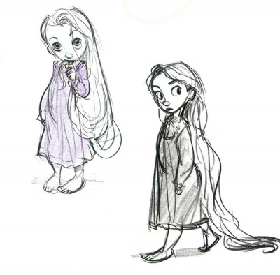
Take for example the drawing of Rapunzel with the wide eyes and open mouth, a drawing meant to show the range of how far the features on her head can stretch, which is obvious from the notes on the drawing. The drawing is probably meant less as a specific character expression but more as a technical exploration of how the character’s face works and the pliability of it.
“It’s a laziness in the drawing.”
I think this is the most offensive comment in this post. It’s obvious from all of Glen’s work that he is anything but lazy. He’s pushing himself to draw the most appealing young girl character possible within the limits of his ability. The sheer volume of work and the subtle changes within it is recognizable to any true artist with a good eye. Any artist with a good eye can see the improvement Glen has made from Ariel to Rapunzel. The Rapunzel drawings are more appealing and more confident in their shapes.
Other bad examples posted here are the Aladdin/ Flynn comparisons. The eye shapes in the Aladdin drawing are nothing like those in the Flynn drawings, and I doubt those Flynn drawings are even Glen’s. They are most likely Jin Kim’s. Even if they are Glen’s though, the eye shapes and mouth shapes are not “exactly” the same.
Similarly in the Jenny/Child Rapunzel comparison, I see no generic repeated pose comparisons between any of the drawings. The poses are no where near the same. Child Rapunzel looks much younger than Jenny. Her eyes are bigger, her head is bigger, and the proportions of the two characters are totally different. I fail to see how the poses of Child Rapunzel holding her hand near her face or stepping forward have anything in common with Jenny leaning on the surface or speaking with her hands behind her back.
These kind of differences are noticeable to any real artist with an eye and taste for subtlety.
It’s also sad to see a post like this when, regardless of how you feel about the story, the artists at Disney have actually pushed animation medium forward with the most cartoony, pushed, organic, and believable human animation ever done in the CG medium under Keane’s guidance and incredible taste. A truly remarkable accomplishment that is in no way a repeat of what has been done in the past.
on 07 Dec 2010 at 3:47 pm 33.Michael said …
“Sporn” – I – have been directing some of the greatest animators in the country, as well as training many of the current animators at their first jobs, for the past forty years. I think I know what the purpose of a model sheet is.
on 07 Dec 2010 at 5:16 pm 34.Norm said …
“- I – have been directing some of the greatest animators in the country, as well as training many of the current animators at their first jobs”
Obviously you don’t have an eye or the visual taste as an artist to see the differences in these drawings then, as the examples you chose do not illustrate your “point” very well in my opinion.
I’ve also noticed you’ve refuted none of my points.
“The problem, to me, is that Glen Keane has grown into this phase of reworking the same godawful poses.”
And how exactly do your examples illustrate this? They really don’t, and if you really had an eye for animation art you would know that. There’s no denying there are some stylistic similarities between these designs, but to say that they are cliched, godawful or whatever other insulting adjective you wish to use is simply wrong. Glen’s Child Rapunzel looks and holds her self more like a kid than the Jenny drawings do. If anything this comparison illustrates the evolution of Glen’s art and hard work, not a formulaic rehash.
“Time to bring animation to a higher level.”
For the CG medium, it has been.
on 07 Dec 2010 at 7:09 pm 35.Michael said …
Norm, your opinion vs mine, and the conversation ends that way no matter how much you feel obligated to put me down.
on 07 Dec 2010 at 7:41 pm 36.daniel said …
Michael,
I’ve done my best to make it crystal clear to address each one of your “points” yet you still haven’t refuted any of mine (or Norms’ for that matter). The most you can come up with is a convoluted answer of .. ” a imitation of Frank Frazetta’s use of dynamic tension.”
on 08 Dec 2010 at 10:31 pm 37.Norm said …
daniel,
We can’t expect an intelligent response from Mr. Sporn because he has no idea what he is talking about. Case in point from one of his responses above:
“Glen Keane consistently turns the two feet in on females, a sure sign of vulnerability and submission.” -Sporn
Only one drawing in the post above even has this attribute, which is the one of child Rapunzel bringing her hair to her mouth. Looking at the drawing in which Jenny is standing with her hands behind her back anyone can see that her feet are actually splayed more outward than turned inward. In the drawing of the child Rapunzel stepping forward her back foot is turned away from the viewer, as is evidenced by the indication of the larger mass of the heel and the compacted length of the foot receding into perspective. Again the two feet are not turned inward, they are actually turned more outward.The exact opposite of what Sporn has said. This is far from being “consistent” especially with the examples shown. If you’re going to take the effort to make a point Mr. Sporn, how about trying to choose examples that actually support it?
Take a look at the Jane drawings from Tarzan here–
http://theartofglenkeane.blogspot.com/2010/01/tarzan.html
–and see how many of the drawings have the feet “consistently” turned inward. Almost none of them do. In fact most of them are turned more outward. A more astute identification of a cliche in Glen’s work is that he turns the feet outward on women as well as men.
He also refers to feet being turned inward as “a sure sign of vulnerability and submission”. Feet being turned inward can also be a sign of shyness, trepidation, insecurity or playfulness. Yet Sporn uses hyperbole to spin it as a “sure sign” of submission to put it in a negative light.
Sporn’s lack of artistic discernment and inability to make a solid point is also clearly demonstrated by the fact that he complains of Glen “reworking the same godawful poses”, but very few full body “pose” drawings were used as examples here. They are mostly bust shots and head drawings.
Sporn’s statements like– “Milt Kahl has never once drawn anything similar.” Is utter nonsense. Little John from Robin Hood and Baloo come to mind.
Example here–
http://totallylookslike.icanhascheezburger.com/2009/05/11/baloo-totally-looks-like-little-john/
Again more hyperbole. “Never once”. Laughable.
This is sad. I really liked Mr. Sporn’s blog as a resource, and have admired many things he has had to say and the great art he has shared here, but this post and the subsequent bullcrap and nonsense spewed from Mr. Sporn’s keyboard really leaves a bad taste in my mouth. You have to feel bad for all the “greatest animators” in the country he has taught, when the man can’t even tell if a foot is turned inward or outward in a drawing.
I think we all can tell by now that the “greatest animators” statement is just more of his asinine hyperbole.
on 08 Dec 2010 at 11:28 pm 38.Norm said …
My apologies.
I misread that Mr. Sporn had claimed to have “taught” the greatest animators, I now realize he stated that he has only directed the greatest and trained many for their first jobs. I apologize for misrepresenting that statement, but I still stand by the rest of my writing when it comes to pointing out Sporn’s gross use of hyperbole to justify his misguided notions.
on 21 Jan 2011 at 4:28 am 39.cazam said …
Wow, just wow! After reading this article and all the comments I am greatly saddened.
Here, let a not so great animator remind you all of something apparently forgotten. What matters most in animation is that it captures the “Illusion of Life” with all it’s emotion and inner soul. In fact animation’s simplicity is what makes it one of the hardest arts to create.
Honestly all the animated works mentioned are fantastic and well crafted. Rupunzel included. (I call it Rupunzel because that is what it deserves and should be called.) Rupunzel was one of the best animated films I have seen in a while, and far more “Disney” than their recent films. The Model Sheets are also masterfully done and ooze with as many fresh elements as clichéd. Truthfully, I can’t think of a single model sheet that I can’t find clichéd elements…and I’ve seen many.
This reminds me of what animator Shawn Kelly said once: Animators today seem to be quite prideful and negative which cause us to overlook the elements that truly matter. (My own words, but something along those lines)
on 20 Dec 2016 at 3:54 am 40.home said …
irzadxohepgtgfrlwcjeohtndkznuidxiahhnydrmsfhlfwhxubhbwkbg
on 13 Mar 2018 at 9:57 am 41.jason hanks said …
Well,He has an oascar…What the fuck do you have???..nuff said.