Disney &Illustration &Layout & Design &Mary Blair &Models 23 Aug 2010 08:10 am
Mary Blair – 7
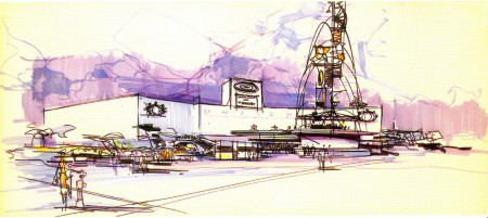
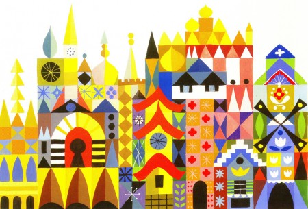
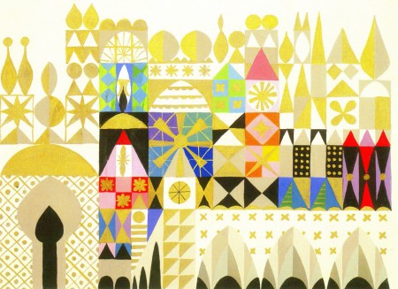
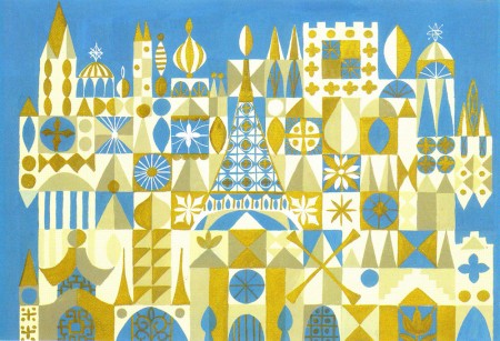
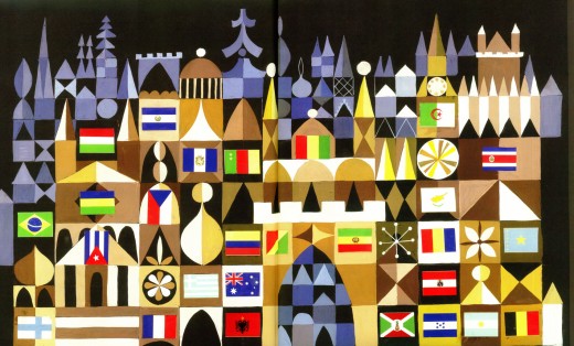
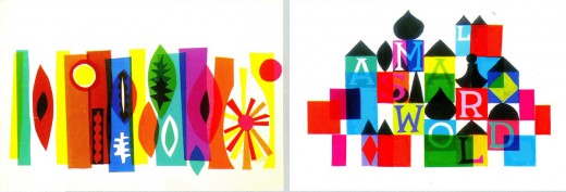
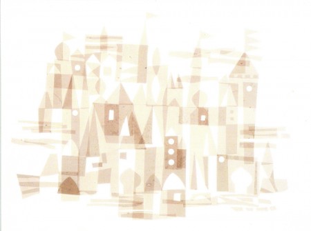
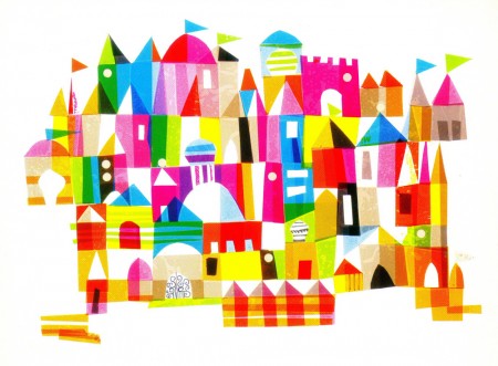
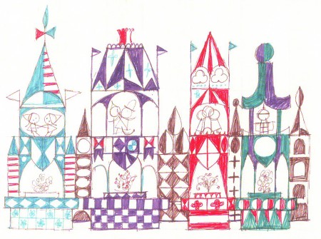
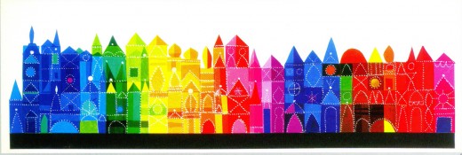
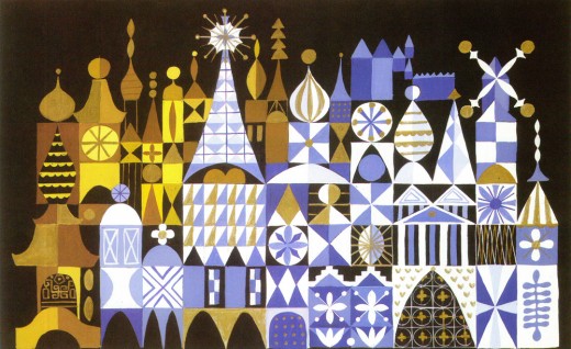
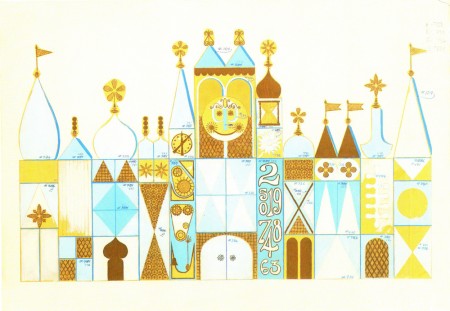
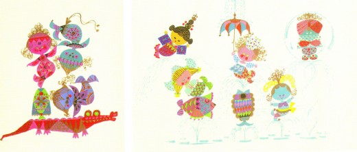
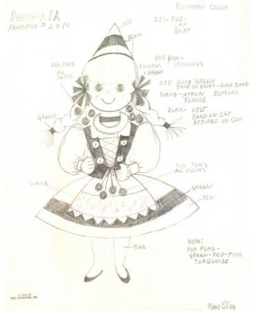
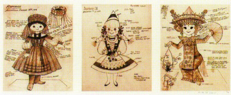
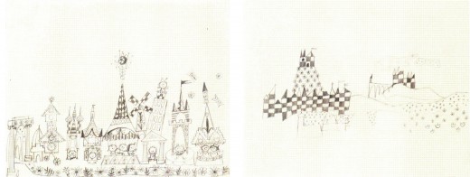
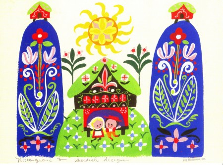
- Back to Mary Blair’s great work. We move from the film work she did for Disney to the art work she did in designing It’s A Small World for the Pepsi pavilion at the 1964 NY World’s Fair. There’s so much artwork for this that I’m going to have to break it into two posts.
Here’s my selection for the first group:
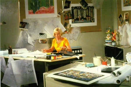 1
1The artist at work.


on 25 Aug 2010 at 6:15 pm 1.Steven Hartley said …
I love this Mary Blair artwork – these palaces are just marvellous, the colours and patterns, mostly everything!! Another artist with this brilliant style is a Swiss-artist named Paul Klee who did these style of paintings!!
Oh (I heard about the deleted comments) since my second installment of my play was updated two days ago and its the one that you described as hilarious!!
on 28 Aug 2010 at 5:35 am 2.Brian Sibley said …
Terrific stuff, Michael. Thanks for posting these. I love the way she has jigsawed together so many different architectural styles representing countries and cultures – No. 3 is especially pleasing.
on 20 Oct 2011 at 9:44 pm 3.Lisbeth Laursen said …
Really glad I found your site!
Thanks for putting together all these images!
Didn´t know Mary Blair’s brilliant artwork until today – thanks to Google.
Best regards,
Lisbeth
(Denmark)
on 18 Apr 2014 at 7:56 pm 4.Carlos Cypas said …
Awesome works. BUT,attention is needed. The Brazilian flag is upside down, maybe others too.