Animation &Frame Grabs &Layout & Design 24 Aug 2010 08:04 am
Conrad
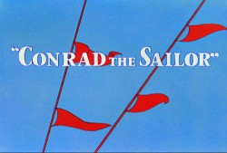 - Regulars to my blog know that I’m a big fan of the work of John McGrew. He was a designer/Layout Artist working in Chuck Jones’ crew at Warner Bros. in the late Thirties/early Forties. His work was daring beyond compare, and, I think, with support from Jones, he changed the look of modern animation backgrounds.
He designed the seminal film The Dover Boys as well as amazing pieces like Aristo-Cat, Inki and the Lion and Conrad the Sailor.
In an interview conducted by Greg Ford and RIchard Thompson, Chuck Jones was asked about McGrew’s style: 
- Q: What about John McGrew’s style and approach, as compared with Noble’s?
A: John McGrew didn’t really have a style; he was experimenting all the time. Maurice does have a style. John McGrew, you might say, was more of an intellectual. You could be intellectual, and get away with it— but if you’re solely intellectual as a director, you weren’t going to get away with it. The result was, however, that he goosed me into thinking that it might be worthwhile to try some different things with backgrounds and so forth. And later on, I would find this kind of thing very useful, in that often it would make your gag work, and sometimes you wouldn’t even know why. Like that little abstract background at the end of Duck Amuck, with the sharply angled lines going off.
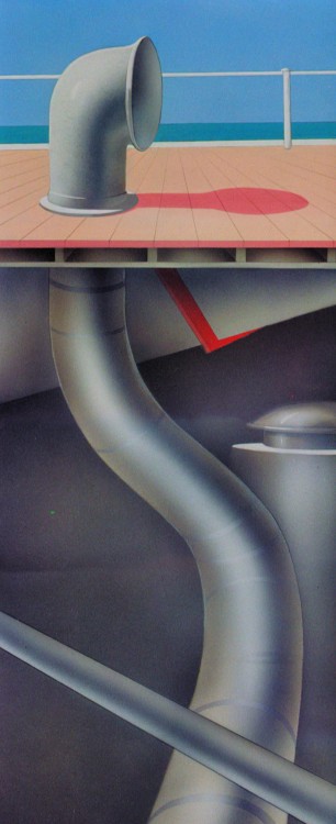
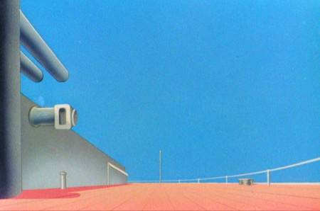
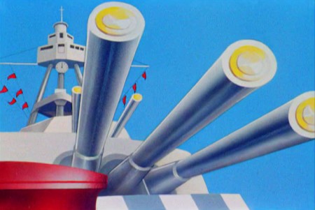
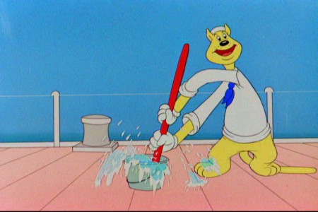
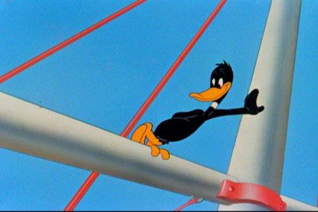
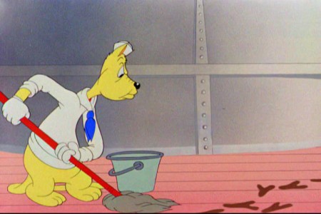
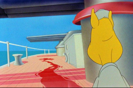
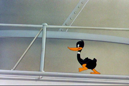
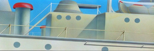
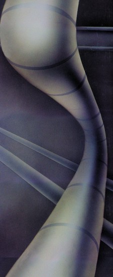
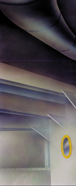
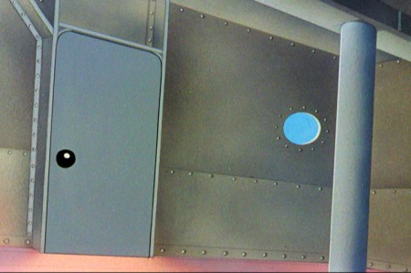
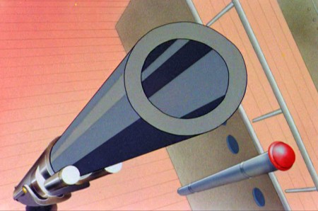
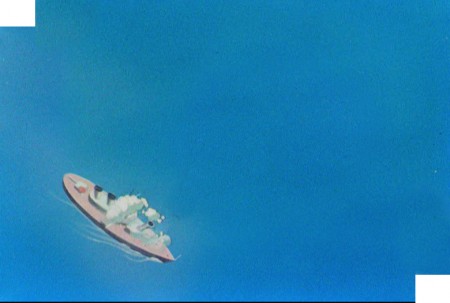
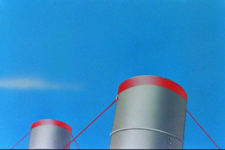
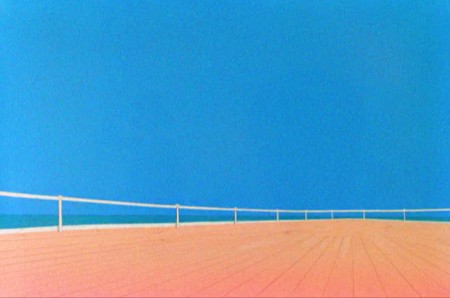
Today I’d like to feature some frame grabs from Conrad the Sailor. Where I could, I separated the characters from the backgrounds to just feature the Bgs. My guess is that the Bgs were painted by Paul Julian, but they were planned by McGrew.
The one scene I don’t illustrate is the most original in the film. Daffy is shot into the air with a bullet. (illus #18) The camera does a 360° turn to head back to the ship. The Bgs don’t hold up on their own. Lots of blue sky and wisps of cloud. It works in motion.
Of this short & McGrew, Jones says:
- . . . we used a lot of overlapping graphics on that particular cartoon so that one scene would have the same graphic shape as an earlier scene, even though it would be a different object: first we’d show a gun pointing up in the air, then in the next shot, there’d be a cloud in exactly the same shape. It gave a certain stability which we used in many of the cartoons after that. John McGrew was the artist responsible for that sort of thing. Conrad was also the one where we used the first complete 360° turn, when the characters went up through the air.
For more information read Mike Barrier’s excellent interview with John McGrew.
 1
1(Click any image to enlarge.)
The following BG pan can be seen in full to the left. I’ve broken it into three parts for a closer look.

 12a
12a .
.
———-(Continue scrolling down.)
.
.
.
.
.
.
.
.
.
.
 13
13
 15
15
A bicycle pan that keeps moving to the left.





on 24 Aug 2010 at 9:39 am 1.Michael said …
Just a short note of apology. About the last fifteen comments seem to have been accidentally eliminated due to my spam filter. Sorry.
on 24 Aug 2010 at 7:18 pm 2.Thad said …
Alberto Becattini lists Julian as Jones’s BG painter for this period so you could be right. This particular cartoon is a little plodding for my taste, but I love the sense of atmosphere these layouts give us… that Conrad and Daffy (and the captain) are all alone on board this Naval ship. After all, isn’t the conflict what matters?
on 24 Aug 2010 at 8:44 pm 3.Michael said …
I agree with you, Thad. The pacing and the construction of the film is bit slow. Jones was going through a transition during this period, and I think McGrew was the real saviour for him. The layouts were superb, and as Jones has said in interviews, McGrew taught Jones some things he’d use for the rest of his career to become the smartest of the Warners directors.
on 25 Aug 2010 at 6:08 pm 4.Steven Hartley said …
I like those Leon Schlesinger years of Looney Tunes and Merrie Melodies – they always inspired me!!
I do like Looney Tunes, I think they have great personalities in the characters – its not always slapstick in there, also dry humour