Bill Peckmann &Disney &Illustration &Models &Rowland B. Wilson 28 Jun 2010 08:09 am
Rowland Wilson at Disney -4
- With this post, I’m concluding the material loaned to me by Bill Peckmann of Rowland Wilson‘s sterling artwork for Hercules. I started this post last week, and you can go back there to see other character designs.
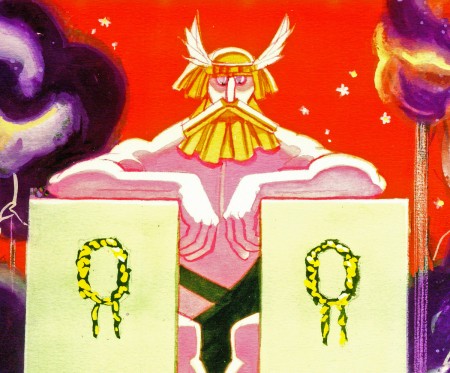
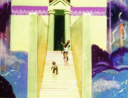
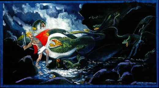
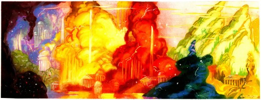
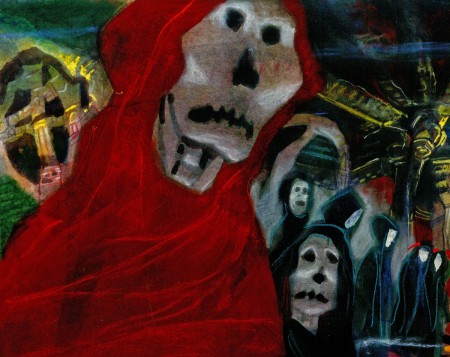
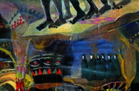
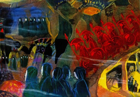
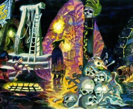
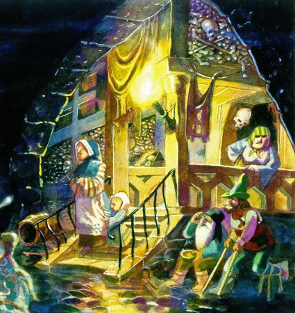
These watercolors are less character designs than they are inspirational pieces. They are inspirational. How stunning this art. I would have loved seeing something like this on the screen rather than Gerald Scarfe‘s. But that’s just me.
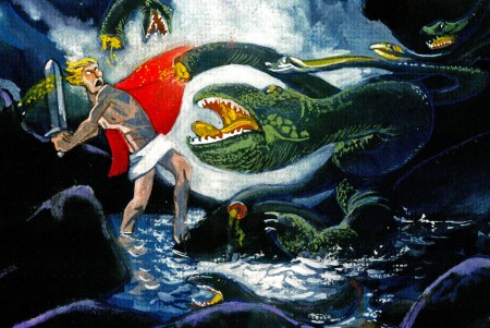
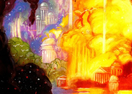
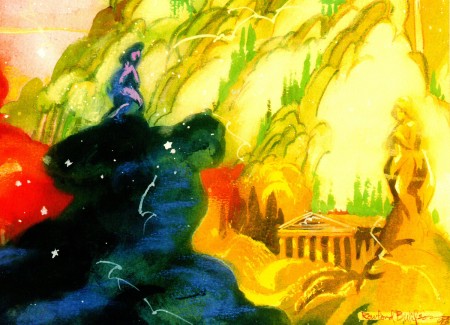
As with some of the last posts, I’m showing the larger piece (and they are large) and then going in for some tighter blowups.
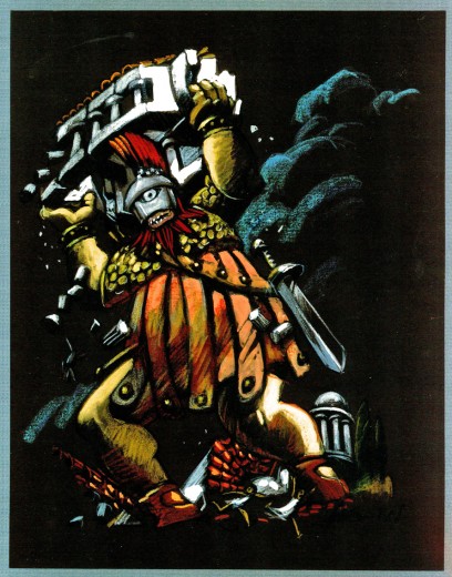 1
1(Click any image to enlarge.)
Typed beneath this image:
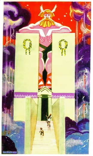
HERC AND PHIL ADDRESS ZEUS ON MT. OLYMPUS
The realm of the gods is in the sky. The landscape is made of sky imagery –
the classic buildings, the trees, the hills are the colors of rainbows, thunderheads,
lightning, rain, hail and stars. Trees have tops made of clouds and trunks of rain
or lightning. Buildings evolve out of mist as do the gods themselves.
The gods can be large or human scale as needed.
In mythology, Zeus changed himself into a swan, a bull, a cloud,
and even a shower of gold.
Everything is as changeable and colorful as a sunset.
THE HOME OF THE GODS.
A skyscape. Trees, mountains and waterfalls appear and dissolve away.
We can see shapes in the clouds – temples and statues.
Lightning flashes and stars gleam in unexpected places.
The whole skyscape is slowly drifting.
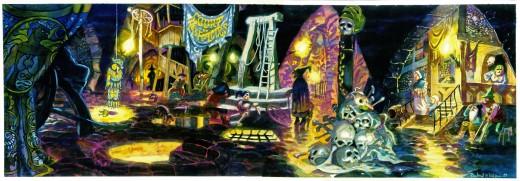 6
6
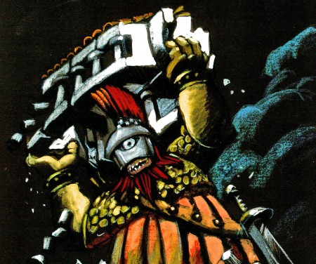
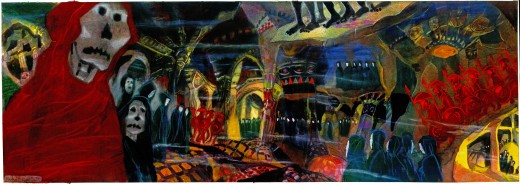
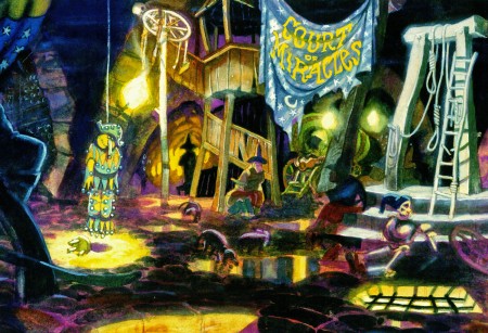
This one looks almost as though it were painted
on black velvet – appropriately enough.

on 28 Jun 2010 at 9:11 am 1.Mark Mayerson said …
Somebody needs to publish a book called The Art of Rowland B. Wilson.
on 28 Jun 2010 at 10:11 am 2.Hiro said …
Thanks for posting. One question though, are you sure these are watercolors? They look like pastels to me.
on 28 Jun 2010 at 10:26 am 3.Michael said …
1 & 5 are pastel
2 & 4 are watercolor
3 & 6 are mixed media
Michael
on 28 Jun 2010 at 10:30 am 4.Bill said …
Mark,
A super ditto and let’s keep our fingers crossed!
on 28 Jun 2010 at 1:18 pm 5.Casey said …
I love his use of color and the way he designs his characters!
on 28 Jun 2010 at 3:47 pm 6.Hiro said …
Thanks Michael!
on 28 Jun 2010 at 5:36 pm 7.Suzanne Wilson said …
Thank you Michael and Bill for a(nother) magnificent posting.
So powerful! So…….Herculean!
I will add another note on technique: sometimes Rowland used opaque watercolor (gouache), especially for accents and highlights.
I second, or should I say “third” “The Art of Rowland B. Wilson” book.
on 28 Jun 2010 at 8:14 pm 8.Eric Noble said …
“Somebody needs to publish a book called The Art of Rowland B. Wilson.”
I wholeheartedly agree. This man is too much of a talent to be left unknown. These paintings are absolutely magnificent. Thank you for sharing these with us.
on 30 Jun 2010 at 8:44 am 9.Carter said …
Number 6 and its blowups have to be for “The Hunchback of Notre Dame”, not “Hercules”. The clothing on the characters is not Greek, and, of course, there is a banner that reads “Court of Miracles”. Brilliant stuff, though!!!