Animation &Animation Artifacts &Articles on Animation &SpornFilms 09 Dec 2009 08:09 am
Interviewing Bridget
- For a short while I produced a quarterly publication, called Sporn-O-Graphics, that promoted the work and the workers at Michael Sporn Animation, Inc. It was mailed free to about 1000 people on a list we’d put together. The idea was to talk about our films and the people who had made them. There were a total of six issues of this paper. I’ve posted a couple of the issues or more interesting bits in them on this blog, (here and here) and today I’d like to post an interview that was in one of the last issues. Bridget Thorne was as important to me as anyone who’s ever worked here. Denise Gonzalez also worked for me – at the time she edited and put together Sporn-O-Graphics.
Behind the Scenes with
Bridget Thorne
Interview by Denise Gonzalez
Bridget Thorne is a background designer who has been an important part of Michael Spom Animation for more than fifteen years. In that time she has enhanced the look of MSA films with beautiful backgrounds that are, in a way, part of the characters rather than just a scenic backdrop.
 DG: How long have you been working with Michael Sporn?
BT: I first started working for Michael in 1979 on Byron Blackbear And The Scientific Method, a fifteen minute short for the Learning Corporation of America. It is actually one of my favorites. I started out as a scenic painter for plays. I worked with a designer and basically dressed the set. We’d paint the exteriors, lay in wallpaper, marbleizing floors, etc. I started at Williamstown and at Playwright’s Variety in New York, I did a lot of off Broadway and off-off Broadway.
DG: Do you see background painting as a complete picture or as a supplement to animated artwork?
BT: It’s a supplement.
 DG: How do you take that into consideration when you start the backgrounds?
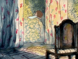
BT: Ideally, I take into consideration how the characters are designed. I like the characters to be part of the picture, not stand out like they do in Saturday morning cartoons. It all fits into a stylistic sensibility or pace more than anything else. I’m not a cartoon snob, I’m more of a two dimensional artist than a filmmaker. I design my backgrounds and line style according to the way the characters are designed. What I used to try and do was color the backgrounds, to match the colors of the characters. You work out of your home rather than at the studio. What are the benefits or drawbacks of working this way? I’ve just started doing this and yes, there are benefits. I can get into my own head, and I take off more with ideas because I’m not interrupted as much. But I like being in the studio and staying with the rest of the production as it goes along.
DG: Do you prefer working on original stories or from an existing book?
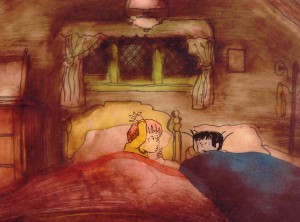 BT: It depends on the story. Let’s say IRA SLEEPS OVER, it was great working out here on that because with an existing story you have a style to imitate, and it is easy for a whole bunch of people to follow that when they’re all working in different places. So as far as production goes, that makes it easier. The great thing about original scripts is that they allow for an incredible amount of individual input. What do you take into consideration when designing the look of a film and what preparation is involved? It depends on the story. I tend to have a knee jerk reaction at first or an impulse. I have a Fine Arts background, and I tend to rely on painters. I find fine artists are more in tune stylistically with Michael’s films than the more hard-edged graphic cartoons. (Though I will look at Disney inspirational drawings.)
Then I look at the layouts and the character design, so I sort of work on intuition and impulse. Then I look at the existing elements and put those all together and come up with a design. As far as preparation goes, what I consistently do is make 5×4 sketches of design ideas. For ABEL’S ISLAND I did lots and lots of little paintings of winter and fall and spring.
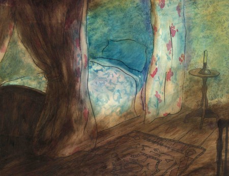
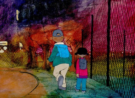
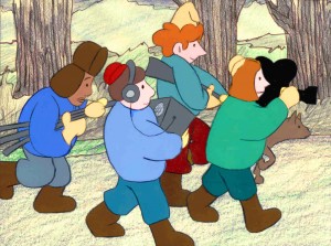
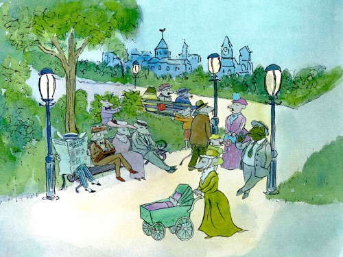
First three illustrations pictured above:
1. BYRON BLACKBEAR AND THE SCIENTIFIC METHOD.
2. A CHILD’S GARDEN OF VERSES.
3. IRA SLEEPS OVER
DG: When designing the film do you take into consideration that this will be seen by a child?
BT: I’m not a cartoony person so I don’t think about that. I tend to think more — sometimes I run into trouble this way — I think of it in a frame and ideally what I really want is a balanced look on the screen. A lot of times that’s hard because what I see in front of me is so different when it is filmed.
DG: What do you consider to be the best example of your work thus far?
BT: I guess ABEL’S ISLAND. I was able to abstract a little. I wasn’t confined to chairs and bureaus. I was able to match the mood of the movie to the backgrounds. If Abel was in trouble, I could put colors that indicated that, or I could abstract it. If something was calm I could paint it calmly. Abstraction, or looseness, is more my personal style. This is true of Michael’s style, as well.
A scene toward the end of ABEL’S ISLAND.
DG: Have you ever worked on a film you couldn’t connect with?
BT: I’d say yes. It’s a hard question to answer off the top of my head. I sort of think of movies like they were kids; they are either noisy or funny or quiet or sad. They all have their own characteristics, and it is really the process of making the movie that attracts me to animation. I tend to have different feelings about each movie. But yes, sometimes a story irritates me or something comes in and it doesn’t suit my style or what I imagined. It can be very difficult. That’s an interesting thing about animation; there is really a sense of compromise; you are compromising all the time.
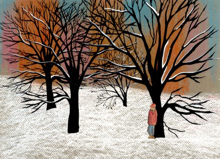
A scene of the narrator at the end of THE TALKING EGGS.
