Animation &Layout & Design 27 Jul 2009 07:26 am
Piper spot
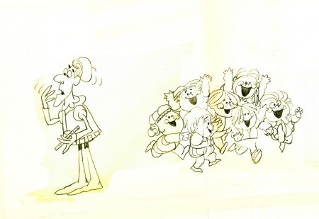
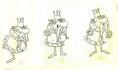
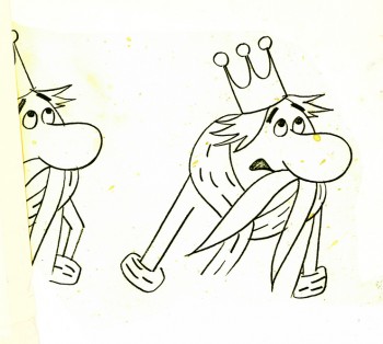
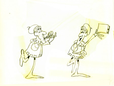
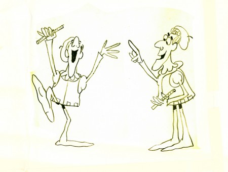
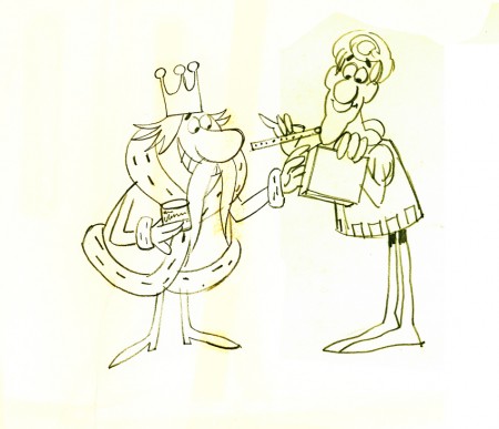
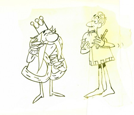
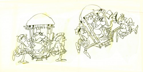
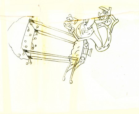
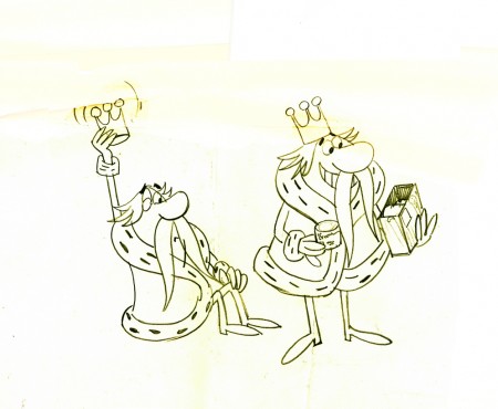
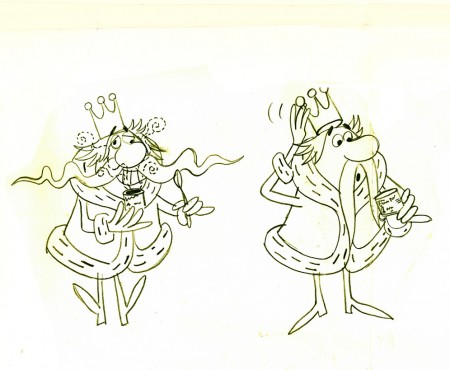
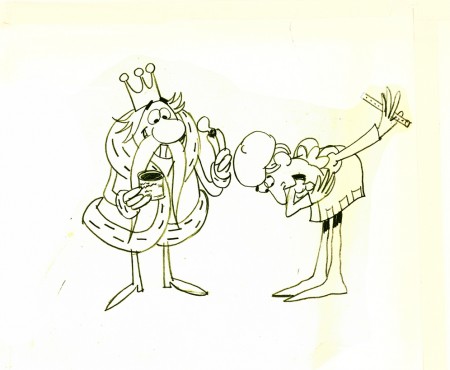
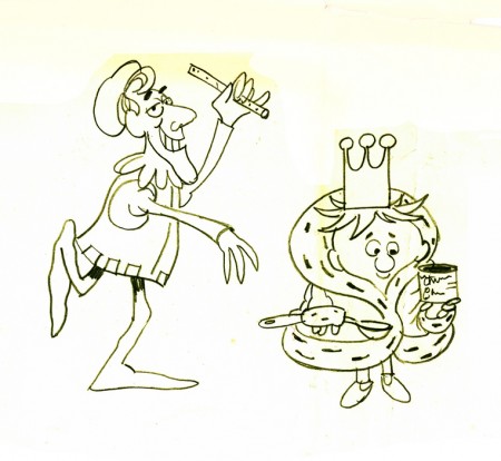
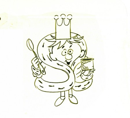
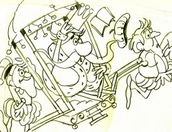 - Here’s some LO drawings for a commercial. It’s a riff on the Pied Piper. The Piper talks with a King character, who in the end gets young, after using the product.
The art was obviously taped together and kept over the desk of the animator. The LOs were cut to fit into a large square and some of the drawing was done atop the tape.
This is a standard commercial done in New York during the 60′s. It has the look of almost any studio in town. I think this one was done at Pelican. I don’t know who the animator was nor what the product was that they were selling. Still, I thought the images worth sharing. It’s not a style that I particularly love, but it was sure a mainstay around NY back then. It looks like an offshoot of the work Paul Cloker was doing for Rankin Bass at about the same time.
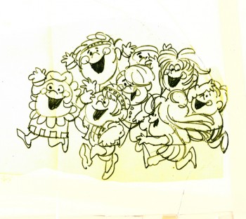
As I said, it comes in a large taped-together mass. I give you the whole sheet, and then I’ve broken the drawings apart.
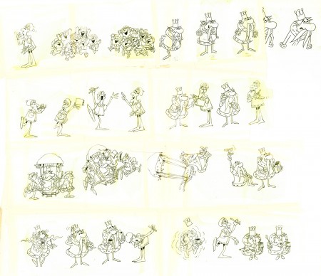
(Click any image to enlarge.)


on 27 Jul 2009 at 7:47 am 1.Pierre said …
I like the style very much, even if was your run of the mill 60′s NYC commercial.
These presentations that you post help one realize just how much work goes into even a generic 30 second commercial from this period. It may not be Bill Tytla’s Stromboli but it’s still really nicely drawn and evokes an era long gone by.
on 27 Jul 2009 at 1:17 pm 2.Tom Minton said …
Looks like a 1960′s commercial studio either interpreting Roger Bradfield or to some degree influenced by his design. You are right about this style being THE look in that decade on the East Coast.