Books &Illustration 25 Jul 2009 07:52 am
High in the Clouds – Part 2
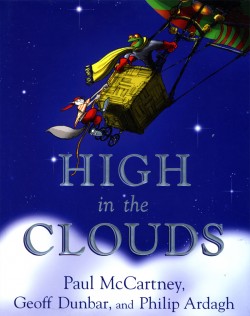 - I know, I know. I gave you the first part oh High in the Clouds weeks ago and haven’t followed up with the second part. Well, here it is.
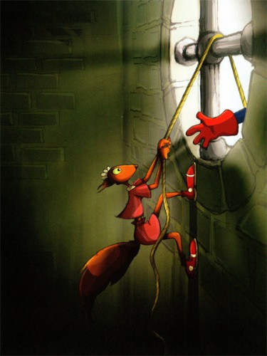
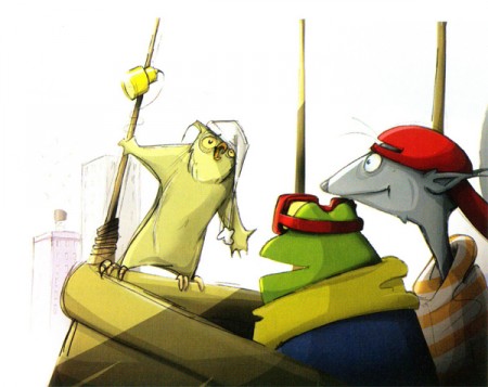
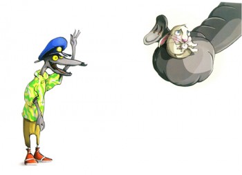
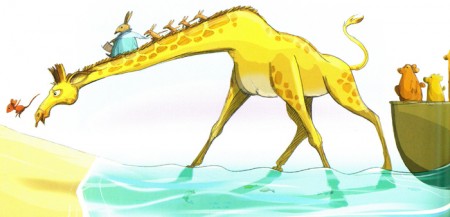
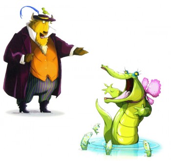
This is the storybook by Paul McCartney, Geoff Dunbar and Philip Ardagh that will be made into an animated film, directed by Rob Minkoff.
Dunbar is the animator/director who won lots of awards for some of his shorts and commercials. He’d animated a couple of McCartney songs in the past. Ardagh is a writer, and McCartney is McCartney.
Minkoff was the co-director of The Lion King, director of Stuart Little and The Haunted Mansion.
I have no real knowledge of this, but I assume it’ll be done in CG. Why else hire Minkoff when Dunbar’s already designed the hell out of the idea? Hopefully, it won’t look like all the other crap out there, but I have no confidence in anyone anymore.
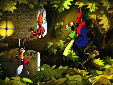
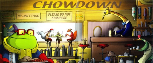
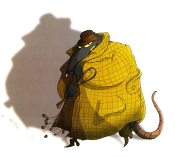
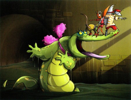
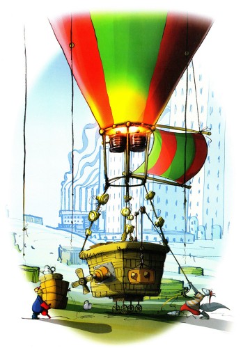
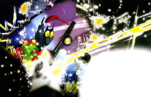
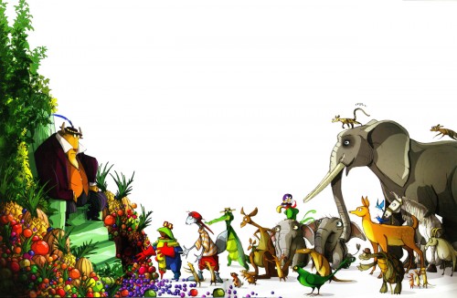
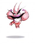
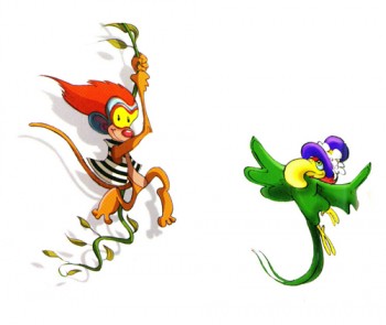
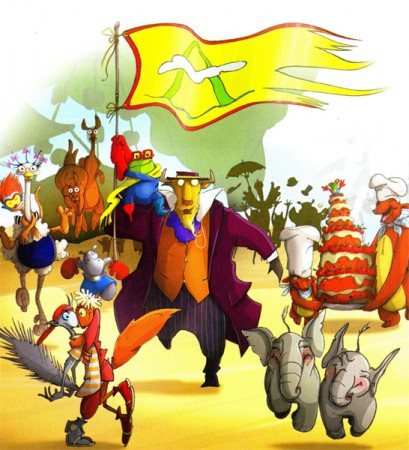
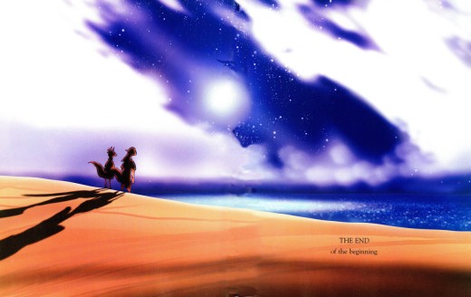
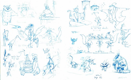
So here are the rest of the illustrations. I haven’t read the book, and am not sure I will. It looks like a reworked/printed animated program, as it is.
 22
22(Click any image to enlarge.)
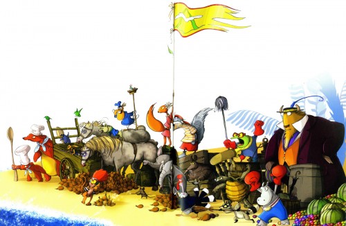
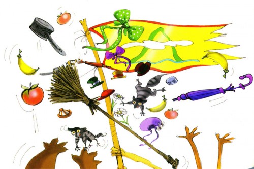
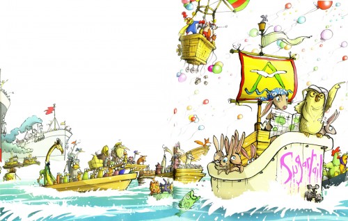
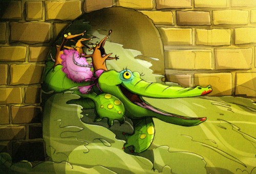


on 25 Jul 2009 at 12:19 pm 1.Paul Spector said …
Love the post– love the attitude.
on 26 Jul 2009 at 10:01 am 2.hans bacher said …
i am sure it will be a great film, such appealing characters…
on 26 Jul 2009 at 11:05 am 3.Michael said …
I have to say, Hans, that I agree with you. The characters are not ones I would enjoy animating. They remind me a bit of Paul Vester’s style back in the Sunbeam days. Tall and a bit too angular.
on 26 Jul 2009 at 1:17 pm 4.Emmett Goodman said …
This all looks great. But does anyone realize this an extension of a film McCartney and Dunbar have done in the past, with a couple of re-designed characters?
Don’t get me wrong, I’m sure this can turn more than a few heads.
on 27 Jul 2009 at 11:41 am 5.Doug said …
I very much hope it is not CG as that would be a big breath of fresh(er) air to see this hand drawn. I’m just a peasant who visits here but I really like the looks of this stuff. I’d be curious to know why it looks “like a reworked/reprinted animated program”? Too slick? Too clean?
on 27 Jul 2009 at 12:49 pm 6.Michael said …
What I was trying to say, was that it looked like a previously animated tv program that was reworked to illustrate the book.
on 29 Jul 2009 at 7:26 am 7.Thomas said …
Would love to see this with classical animation over it.
not just one wacky character that just not fits totally in.
Just toony in the movements when needed. And according to the characters!