Animation &Hubley 15 Apr 2009 07:44 am
Hub Eyes
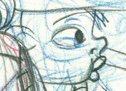 - It was 1973, and I was happily – I can’t tell you how happily – ensconced in the Hubley studio working on Letterman, a new series for an upcoming CTW show, The Electric Company.
It was my first animation job. I inked it all (directly from animator roughs), I assisted & inbetweened it all, and I animated odd scenes including all the title sequences. I was a novice, and I was doing it all. Excited and happy is all I can remember.
I was alone one morning in the small room wherein I worked. I made a habit of getting into work before anyone and leaving after everyone. I wanted to make sure I was indispensible.
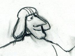 A month into the gig, and I think I’d only spoken with my hero, John, about a half dozen times. I was rushing through one of the Johnny Gent “Spellbinder” sequences. I inked all of his scenes, then inbetweened in ink the drawings. No time to work in pencil for this schedule. Johnny was completely off character, in a very old fashioned way, and I had to rework them all closer to the models – in ink. The schedule just gave me no time to be proud of what was happening. (A year or so later I apologized to Johnny for what I did to his artwork. I was so inexperienced and had such a dominant role in how the final art looked in that series.)
John Hubley ran in to give me something and made a quick comment about the character I’d been drawing. He said it was a “Paramount eye.” I looked at the drawing, then at him. Then John drew on a small piece of paper a “Disney eye,” then a “Terrytoon eye.” He laughed aloud and told me to try to square off the eyes a bit. Then he ran out.
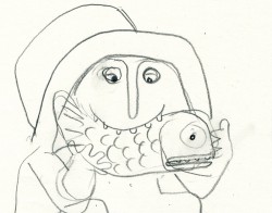 I learned a lot that day. I watched eyes that day and probably all that week. I ran Hubley films at lunchtime (I’d made it a habit to project their films in the kitchen during many of the lunch breaks. The entire group enjoyed these sessions) and watched the eyes. I talked with Tissa David about eyes in one of our evening tutorials – she was trying to teach me how to inbetween properly.
I was reminded of this moment when Chuck Rekow commented on the Moonbird Walk posted weeks ago. “The shape of the eyes on the boys is a real departure from almost anything in the cartoon world —even 50′s era. It’s closer to real life, and reminds me of the graphic style of Ben Shahn. It lends the film an aura of “seriousness”, even though it’s a cute film about two boys and an imaginary bird. Obviously, the pre-recorded sound is a major deal, but this gem is loaded with touches of inventive detail.”
How right he is, and I love being reminded of it.
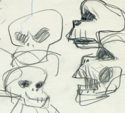 The eyes are the direct route to the soul of a person and, consequently, an animated character as well.
After working for the Hubley studio, for a short bit, I worked for Phil Kimmelman and Associates. This was a hardy commercial studio doing tight designer-based animation. Rowland Wilson was doing a lot of their design work, and the animation clean-up was tight. Animators Jack Schnerk, Sal Faillace and Dante Barbetta did a lot of the work the few months I was there. I worked primarily as an inbetweener and learned some hard and tight lessons while there.
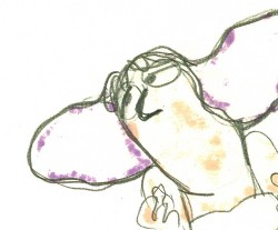 After the very loose work I’d been doing for the Hubley films, it was not only difficult for me, but good to keep me towing the proper line. I wanted to learn animation, and all of it was important.
Here, too, an empahsis was on the eyes. No Disney eyes, no Hubley eyes, either. But now I was just concerned with keeping those lines tight tight tight. No shimmer on the eyeballs. After all, I was told, people stared into the characters’ eyes, and any flaws in the animation would show up first in those eyes.
I worked for PK&A for about three or four months. I’d also worked for Tubby the Tuba at NYInstitute of Technology under Johnny Gentilella, where we got somewhat close and I was able to discuss all sorts of animation problems with him. That was the only redeeming element, everything else about the studio was wretched. My displeasure ultimately led to my leaving as soon as I could.
Eventually, I was back at the Hubley studio helping to finish up the short Cockaboody.
The tightening of my inbetweening only brought positives to what I could now do for John Hubley’s animation.
To this day, I still watch eyes closely. For some reason, the tighter the lnework, the closer I watch the assistant’s work. The looser the line, the more I watch the design. I prefer watching the design. Often it means eyes that can be easily labelled: Disney, Paramount, or Terrytoons. I suppose today, you’d say: Pixar, Dreamworks or Blue Sky. (And believe me, you can see those differences even in cg.)
The images above are from the following films:

on 15 Apr 2009 at 4:20 pm 1.Cameron said …
I just started to draw recently, and I’ve already discovered how much I love eyes. While watching Casablanca, I found myself freeze-framing to sketch certain looks in Ingrid Bergman’s eyes. I’ve also never noticed how much highlights can impact the emotional punch of a performance.
on 15 Apr 2009 at 5:42 pm 2.Ray K. said …
Remarkable post, Michael–grist for several chapters of that book on NY animation you’re not writing! Lots to think about, some great old stories, a reminder of how mavericky these films–now so comfortable in their familiarity–were, and a vivid snapshot of NY animation 30 years ago!
on 16 Apr 2009 at 10:09 am 3.Chuck R. said …
Great read, Michael, and thanks for the nod!
This post rekindled memories of my own humble beginnings as a budding artist -very exciting periods of my life. I work pretty much in isolation now, but I hope the concept of mentoring continues to thrive in other studios. I’d love to see that scrap of paper with the “Disney eye, Terrytoon eye…”
I’d also love to see a book dedicated to John Hubley’s work, or at least a good DVD compilation with lots of goodies.
on 08 Jul 2009 at 9:43 am 4.Tina D said …
Do you know a Ingrid Sporn? Supposedly your sister?
Email me, please.