Books &Commentary 17 Feb 2009 08:48 am
Amid’s Books
 – Let’s talk a bit about a new book by Amid Amidi, The Art of Pixar Short Films. There are two reasons one might want to buy this book: you’re a fan of the Pixar films, including the shorts, or you’re a fan of Amid Amidi’s animation books.
I’d like to cover my interest first; I like Amid’s work very much. This is his third book published by Chronicle books. The first The Art of Robots was a beautiful puff piece for that Blue Sky film, a bit over-filled with fine drawings and paintings and final art
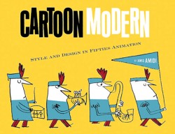
 from the industrious film. The second, Cartoon Modern, is a stunningly attractive, informative and extremely important animation book. It covered a lot of the holes left by other books – the real art that was pioneered by those who made films in the late 40s, 50s and early 60s. A thoroughly researched tome filled with beautiful reproductions, drawings and modern art as made for animation by many many studos and individuals. The book was an arduous task to pull off, and Amid made it look so simple.
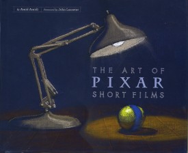 This third book, The Art of Pixar Short Films, resembles both of these past books, in some way. Amid has learned enough from the second book that his writing, his selection of artwork, his choices of design and presentation are important and make the book a beauty.
All type is gray, not black. The type for IDs of photos and artwork is handled as it would be on an architectural sketch or blueprint. Names are delineated, literally. The images are thoughtfully placed for the best composition with plenty of
 white space around them.
The artwork representing the films is well chosen; the development art is better represented than stills from the films, themselves. This is a plus; we can see the actual shorts on the dvds. For the most part, much of this art is excellent and oftentimes better than the films’ final art.
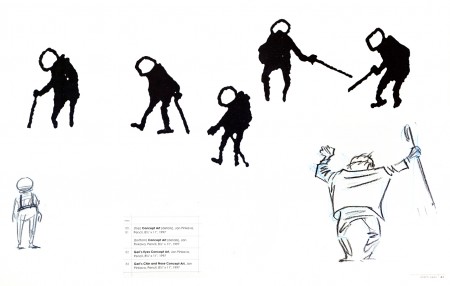
The gesture drawings done for Geri’s Game present an excitement
that seems distant from the final film, pictured below left.
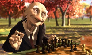 This brings me to my problem with the book, I’m not a big fan of the films. Pixar is a big studio, doing the top of the line work in cg animation. Toy Story, The Incredibles, Ratatouille can’t be beat. The shorts, especially the later ones are just not very good – in my opinion.
When a studio with the enormous abilities of Pixar chooses to do shorts, there has to be a reason. We’ve heard that the reason was to help develop talent so that future directors could stretch and grow. This is a good reason, but the shorts have to either showcase a high quality or a sense of experimentation that isn’t evident. When Disney did shorts back in the 30s so that his animators could learn and grow, the films were made to sell, but they had a level of expertise that we came to expect from Disney. Some of those Silly Symphony shorts have not been topped.
Looking at those beautiful drawings, above, for Geri’s Game, we see the potential for something alive and vibrant. The film is, for me, difficult to watch. It is the antithesis of those drawings. Perhaps they were working out some cg problem, but that’s really irrelevant to audiences.
Pixar’s current film short, Presto, isn’t represented in the book. (The 2D short, Your Friend the Rat is also not included in the book.) It aspires to outdo Tex Avery at his own game. But it doesn’t; t doesn’t come close. There’s no character animation that I can see – both characters move identically. There’s no character development that I see – both are cartoon characters with no personalities; only their motivations are different.. The timing is dreadful; the film moves too fast in its animation and in its cutting. Maybe you’d call that experimentation, but I call it bad film making. Of course, this is just my opininon. Many people love the short, and it may win the Oscar next Sunday.
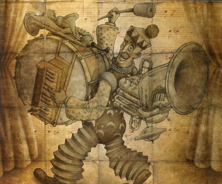
A beautiful drawing from one of the finer shorts by Pixar.
Yes, other shorts are better. One Man Band has delightful animation of the two musicians, but it also has the cloying, clichéd animation of the child which seems to come right out of the most obvious of Bluth. However, the score for this short is incredibly good.
Luxo Jr. is the finest of their shorts. It’s a beauty. Well designed with strong character animation. The fact that cg animation hadn’t been well developed at the time was irrelevant. The short did what it should have; it told a simple story, introduced a strong character and entertained audiences. It hasn’t lost that appeal, but I think Pixar may have.
I don’t have enormous hope for the cg films of Dreamworks unless some strong director can compete with Jeffrey Katzenberg’s insensitivities. I do still have hope for Pixar, and I’d like to see them do something with these short films. The Disney short, Glago’s Guest, though not perfect gave me great hope for the other Disney lot.
So, I’ve come a long way to say I prize this book for the graphics, many of the images chosen, the author, Amid Amidi’s sense of design and strong knowledge of the medium as well as an ability to articulate that information well. My only problem is the subject of the book. I’ll keep looking for everything Amid’s done, and I’ll continue to collect his books. They all have a lot to offer and fill an important part of my collection. They all are beautifully designed and every small detail is carefully watched. I’m ready to buy his next book.

on 17 Feb 2009 at 12:47 pm 1.George Griffin said …
The problem with cg is its premise of perfection. The Gerry’s Game sketches show a spontaneous empathy with the idea of awkward mobility: the body is hunched over, off balance, feet at times missing: imperfect but somehow authentic and accurate. But this spirit is very difficult to transfer to animation without drawing attention to Gerry-as-drawing, an abstraction. The hyper-realistic cg illustration of Gerry, well-larded with copious detail and gradient, and moving to naturalistic continuity and physics, is so much more reassuring and conventional. And, for many viewers, it’s entertaining.
Perhaps it’s unrealistic to expect that Pixar’s “experimentation” will ever serve any purpose other than to enhance its own premise of perfection in the service of entertainment.
on 17 Feb 2009 at 1:22 pm 2.Michael said …
And therein lies the problem of cg as these studios see it.
on 17 Feb 2009 at 2:54 pm 3.Matt said …
Gerri’s Game was an exercise in Subdivision Surface modeling. This a method of 3d modeling that has been around since Ed Catmull (pixar co-founder) developed it back in the 70s. It is a method that facilitates modeling – particularly organic surfaces such as the human face. While it had been around for decades it was too expensive (memory/processing/render-wise) to use – and is still not fully implemented. While it may look lousy today – it was probably the best looking cg character (particularly for a cartoony human) at the time. Compare it with the hard surface toys of toy story – or the hideous human characters in that movie.
on 17 Feb 2009 at 5:28 pm 4.Michael said …
Well Matt, I assume they can now do Subdivision Surface Modeling. It didn’t make a good film.
They did feathers with For the Birds and made a much better film.
What was the experiment they perfected in Boundin’? Boy, what a bad film that was.
on 17 Feb 2009 at 6:14 pm 5.Matt Jones said …
BOUNDIN’ is sheer joy-there’s nothing else like it. It came from Bud Luckey’s heart & is one of the more original of PIXAR’s shorts in my opinion.
On a side note it’s curious to me why some get so hung up on PIXAR’s so called quest for ‘realism’ in their rendering. They’ve often said they’re looking to replicate the look of stop-mo puppets (especially with the INCREDIBLES) & succeed. If anybody comments on how detailed the (real) puppets are in CORALINE or NIGHTMARE it’s usually in positive wonderment.
Strange that this has become a distracting argument against current trends in CG. WHY have them ‘photo-real’ (kind of a misnomer in itself as they’re actually striving for stylisation & exagerration)-why NOT?! Why should CG have to become abstract or more stylised in some way to gain ‘worthiness’. I think it CAN-& it WILL, it’s still evolving. (Although it’s worrying that LUXO jr. is still the benchmark 25 years later!)
on 17 Feb 2009 at 6:19 pm 6.Michael said …
Personally, I’m not looking for realistic rendering. I’d like them to create are, not imitate the look of little puppets. Real puppets can do that better than can cgi.
on 17 Feb 2009 at 6:31 pm 7.Sunny Kharbanda said …
That’s a beautiful sketch from “One Man Band”. The short had some charm to it; too bad the girl’s animation and the tacked-on ending marred the overall piece.
It seems to me that when they keep their stories simple (as in Luxo Jr., One Man Band or For the Birds), they’re able to create something richer.
It’s amazing how Luxo Jr., the “simplest” of them all, still holds up today.
on 17 Feb 2009 at 9:09 pm 8.Thad said …
These shorts from Pixar can’t touch even the most mediocre Puppetoons in terms of just plain fun.
on 18 Feb 2009 at 3:57 am 9.Jenny said …
Just out of curiosity–was it really stated somewhere that in “Incredibles” they were going for the look of stop-motion puppets? I think that must not be as you remember it, Matt. Not for that film and those characters(nor in “Ratatouille”). I’m content to be wrong, mind you, if there’s some explicit quote about it from Bird–I’d just be surprised. It doesn’t come across as that sort of intended style/feel/design.
For the record, I love stop motion animation of many flavors, it’s nothing to do with a style being good, bad or otherwise–it’s just not the look I think was striven for. Was it?
on 18 Feb 2009 at 8:49 am 10.Michael said …
Jenny, I can’t imagine that ever coming out of Brad Bird’s mouth, either. Rat puppets? I don’t think so. I just think it’s the look those in the know have settled on for cgi films. The world is at their fingertips, as far as I can see, and the invention is limited.
The recent French short Schizein tried taking it to a different place, somewhere between 2D and 3D. It thought that was a good step. Not good enough for Academy notice, mind you. Cartoon puppets are in with Oktapodi and Presto.
on 19 Feb 2009 at 3:35 pm 11.Matt Jones said …
I can’t remember where i heard it but i believe that was the reason the INCREDIBLES designs had those simplified ‘hole-less’ ears-they were simplified human designs in the manner that certain stop-mo designers approach human characters.
Jan Pinkava also wanted RATATOUILLE to have characters influenced by stop -mo especially Jiri Trinka. He’s talked of having the costumes be designed ‘little’ as if they were made from smaller scale pieces of fabric akin to stop-mo puppets. It seems this was carried over into Bird’s version.
on 20 Feb 2009 at 4:50 am 12.Sue said …
I was at a screening of “The Incredibles” that had a Q & A afterward with Brad Bird. And he actually mentioned his reason for the lack of detail in the ears. As I recall, his reason was that didn’t want extraneous detail to distract the audience from the characters. I don’t remember him mentioning anything about any influence of stop-motion on the design – only that his main concern was the audience focusing on what the characters were saying and doing, instead of hyper-realistic fine hairs on an earlobe.
Hope that sheds some light.
on 25 Feb 2009 at 2:54 pm 13.Matt said …
I’m not sure about the actual intention of the character design and implementation for the characters in the Incredibles, but my initial impression back when it came out was that it was the first big leap in human characters that have a stylized (in the traditional animation/cartoon sense) look. They don’t look stop-motion puppet to me, much more in line with 2D animation. Although, not much has changed since. The characters in Bolt and to some degree the humans in Wall-E have that same look.
I’m not sure if they are using sub-div surfaces yet for the characters or not. I work at a “rival” studio and we still do not. Still using the old nurbs patch modeling.
on 14 Jul 2009 at 12:57 pm 14.Pierre Fontaine said …
I know I’m about four months too late for this conversation but for the record, it’s stated somewhere in the “Art of the Incredibles” book that Brad Bird highly regarded how well Jack Davis’ character designs made the transition from 2D drawings into 3D stop motion puppets for all those Rankin Bass holiday specials. He wanted the same kind of approach to the character models in The Incredibles.
And yes, Geri’s Game was intended as a platform to implement sub-division surface modeling into their production pipeline. It makes sense to try something like this on a short film before trying it out on a feature film.
Essentially, sub-division surfaces is a way of modeling something using lo-res geometry which is then bumped up to a higher res during rendering time. That’s a gross over-simplification of the process but in the end, it allows faster feedback for the animation artists so that they no longer need to deal with manipulating a model with hundreds of millions of polygons in real time.
Interestingly enough, the construction of Gollum changed between The Two Towers and Return Of The King. In Return Of The King, WETA reconstructed him as a sub-division surface model, which greatly decreased the strain on their systems.
Pierre