Articles on Animation &Chuck Jones &Frame Grabs 11 Feb 2009 09:00 am
Wackiki Art
- John McGrew is a principal designer in the history of animation who quite radically changed things for us all. He led the way out of the 19th Century and, with Chuck Jones’ blessing, pulled the art of animation into the 20th. Others followed or were running alongside him, but he left the first mark.
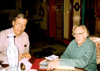 Mike Barrier interviewed McGrew in his studio in France in 1995, (photo right by Phyllis Barrier from Mike’s site) published the interview in Funnyworld Magazine and has it now posted permanently on his website. If you have any interest in design in animation, you should have already read it. I just reread it for about the 15th time, and am amazed at how much history is packed in there. Go here.
McGrew, with his work on The Dover Boys and dozens of other brilliant cartoons, took animation into abstraction and back. His work, I think, is comparable to Scott Bradley’s music at the MGM cartoons. Bradley was the very first film music (live action or animated) to incorporate Schoenberg’s 12 tone serial music. McGrew didn’t imitate Picasso or Steinberg, he created modern art in animation.
McGrew did his layouts in color showing the background artists what he wanted. He worked with strong designers, in their own right, painting backgrounds:Paul Julian, at first, and  Gene Fleury after 1941. When he left the unit, during the War, Bernyce Fleury took his place working with her husband, Gene, on Jones’ films.
Wackiki Wabbit is one of the most interesting of Chuck Jones cartoons.
Precisely because of the layouts and backgrounds. They’re done in an abstraction that almost dominates the film, but actually serves to represent a world of foliage. The style uses cutouts and a wide range of techniques. Mcgrew probably did not work on this film; it came exactly at time of  change when Bernyce Fleury entered the picture. McGrew, in the Barrier interview, says that he had never worked with her on a film. Her style seems evident throughout. Cut-outs mixed with the wallpaper-like patterns.
The film gives no credit to Layouts or Backgrounds.
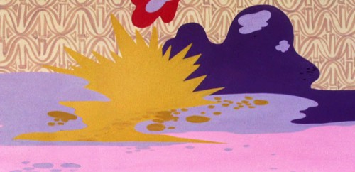
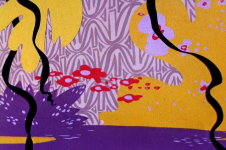
I’ve made some frame grabs of the backgrounds (eliminating most of the characters – unless they were stationary) and
___ (Click any image to enlarge.)__________am posting them below.
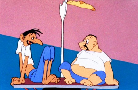
The film opens with tones of blue against a pink sky.
The two solidly drawn cartoon characters float in a sea of color.
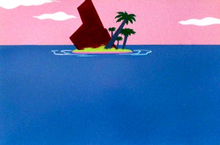
This is about as green as the Island will ever get.
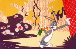
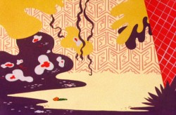
On the island, Bugs Bunny lives in a world of abstract foliage.
The colors are skewed – not verdant but warm.
Large masses of solid colors sit against brush drawn lines.
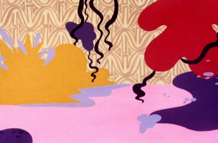
A limited number of colors allows the scenes to cut
without following through with any other consistency.
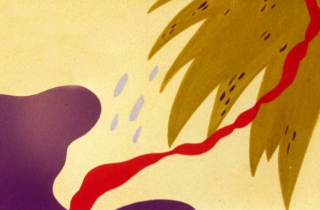
However, if you remove the characters, you’re missing the center.
As it should be.
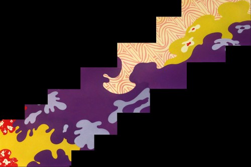
There are numerous large and fast pans,
this one a diagonal from right to left.
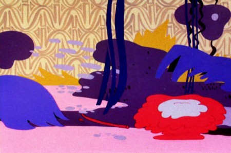
Some areas like the blue, above left, or the red, above right, animate.
The solid colors help them all to combine seamlessly.
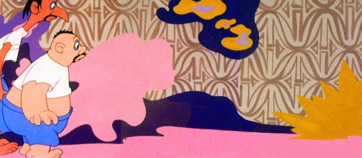
Bugs dances on the right, a pan
to the left reveals the two humans.
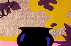

Cut from the pot to a quick pan high up in the trees.
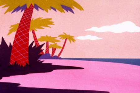
This serves as a sunset with our two humans
chasing each other into the distance and the film’s end.



on 11 Feb 2009 at 11:21 am 1.Richard O'Connor said …
As a child this film was unconfortable to me. It felt like this island was a kind of hell. Looking now, its the lack of green which creates this disturbing mood.
I wonder if the deserted men would seem less desparate if the foliage was more lush.
on 11 Feb 2009 at 5:33 pm 2.Robert Schaad said …
Hi Michael. This has always been one of my absolute favorite Bugs cartoons because of the abstracted backgrounds. There are some great fast pans as well as the visual gag of the characters reading the subtitles. Thanks for the post.
on 11 Feb 2009 at 9:21 pm 3.Bill Perkins said …
Hi Michael, Thanks again for another terrific, terrific post. I read an article Greg Duffell wrote in Amids superlative Animation Blast a few years ago. That led me to a book about McGrew called “John McGrew un genie ingenu” by Edgar Decherze that I picked up on ABEbooks. Its written in french, I now enough to muddle thru however it is a real must have if you’re interested in one of animations great artists. The chapter devoted to his time at Warner Brothers is very slight with only several pages of frame grabs but it most importantly covers his life and the breadth of artistic endeavours in many mediums. For the artwork reproductions alone it is worth trying to find a copy.
on 12 Feb 2009 at 12:33 am 4.Dave Levy said …
I really enjoy how the color helps show what a nightmare the island turns out to be for the castaways. The art is loud and obnoxious (in a good way!), and the same could be said for Bugs himself. A good example of wild art styling that IS in service of the story.
I love these such examples where classic cartoons really stretch outside the rule. It must have kept the director and their staff on their toes. After all, they were turning this gems out as product. Its only now that they are appreciated as art. In their own time, they were in the shadow of Disney.
on 12 Feb 2009 at 12:52 am 5.Michael said …
Thanks for the information, Bill. I wasn’t aware of the book and will search it out.
on 14 May 2014 at 11:39 pm 6.Glenn Yasui said …
Absolutely pent subject matter, thank you for information.