Commentary &T.Hachtman 17 Jul 2008 08:13 am
The New New Yorker

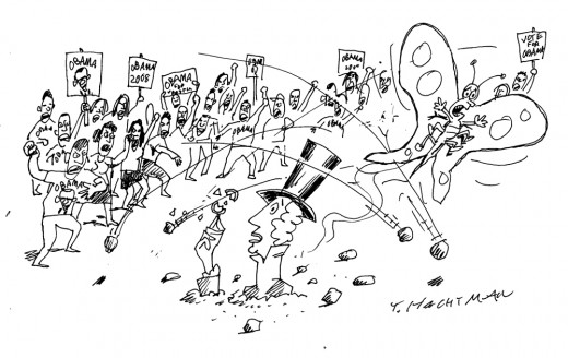
(Click if you want to enlarge any image.)A poignant cartoon by Tom Hachtman that
should be published in The New Yorker, but that
would involve good taste.
_
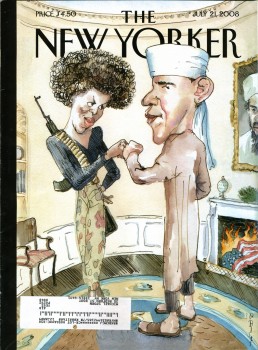
- I haven’t noticed any animation blogs that are screaming about the New Yorker cover that  made all the headlines this week.
(Pictured to the right.)
The thing had me furious when I received my subscription copy this past Monday. I’m an ardent Obama supporter, but the subject matter isn’t what had me irritated. I appreciate a vile caricature as much as the next guy. The best political cartoons are sharp, pointed and acidic. The magazine doesn’t generally post political cartoons on their cover, yet it isn’t the fact that they’ve chosen Obama as their target. I’ve gotten used to it. There aren’t too many left wing magazines posting anti-McCain cartoons, so they may as well attack their own.
What bothered me was the obvious attempt by The New Yorker to be racy, vicious and caustic for the sake of sensationalism. They wanted to sell magazines, so they thought they’d create a stir.
I’ve been a subscriber of the New Yorker for almost 40 years. I’ve read almost all of their issues in that time. This wasn’t the standard they shot for in all those years. Tina Brown came on as editor and tried to shake the magazine up to get subscriptions and ad revenue up. She was replaced by David Remnick, and he seems to want to up the ante. This issue takes the magazine out of the realm of tasteful writing and cartooning. It got vulgar for the sake of sales. This is what they did with that other Condé Nast publication, Vanity Fair. It’s a magazine I dislike enormously.
Now I have to rethink my subscription. OK, I don’t. Within the same magazine is a great article about Obama and the backroom politics that had to be scaled to make it in local Chicago politics. This is the kind of article no one else is writing. Unfortunately, the racist, scurrilous cover is the sort of thing you can find anywhere else.
The edition of the magazine, of course, has just about sold out. Here’s a NY Post article about the business side of the story.
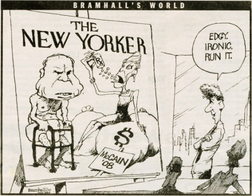
Below is a cartoon I ripped out of The Daily News by Bill Bramhall. It’s hilarious and touches on the “irony” of the situation. Since most of you probably missed it, I thought I’d showcase the cartoon.
- Jeff Scher has a wonderful new animated piece in the NY Times. Fly By Night is a film he’s made by shooting flying bugs and showing their flight paths and motions. I have to admit, I was amazed by it. Go here to watch the 1 min 34 sec film.
- I attended an Academy screening this past Tuesday night. It was the most crowded event of 2008. The place was full. Only one animation member wasn’t there, an oddity in itself. Generally three or four animation folk show up; this time there was even an animation guest, Tom Sito (currently visiting New York).
What was the film? Wall-E? Kung Fu Panda? Space Chimps?
No, it was Mamma Mia! Having seen it, I can testify that it was the most energetic film I’ve seen all year. Meryl Streep doesn’t settle down for one second. She’s all over the place. It had more action than Indiana Jones 4.
Too bad I hated it. It was nice seeing all those people show up, though.
We’ll see if The Dark Knight is as packed next Tuesday.
The Emmy nominations for animation are:
Outstanding Animated Program (for Programming Less Than One Hour)
Creature Comforts America • Don’t Choke To Death, Please
King Of The Hill • Death Picks Cotton
Robot Chicken • Robot Chicken: Star Wars
SpongeBob SquarePants • Inmates of Summer / Two Faces of Squidward
The Simpsons • Eternal Moonshine of the Simpson Mind
Outstanding Animated Program (for Programming One Hour Or More)
Blue Harvest (Family Guy) • FOX • Fuzzy Door Productions in association with Fox Television Animation Studios
Imaginationland (South Park) • Comedy Central
Justice League: The New Frontier •Warner Bros. Animation
Congrats to those nominated.


on 17 Jul 2008 at 10:28 am 1.Tim Hodge said …
I was also surprised at the cover. Yes, I appreciate irony and a stinging caricature, but the tone of this cartoon seems more to play into the mindset of short-sighted rumor mongers that plague Fox News. This illustration will be used by Obama enemies who don’t understand satire.
Sad, sad.
on 17 Jul 2008 at 11:34 am 2.Thad said …
At a political forum I occasionally post to, racists have immediately begun to use this cartoon in their signatures, as they did when this one appeared online.
I can’t decide if people who find these kind of things acceptable in a civilized society need to be ignored or just pummeled.
on 17 Jul 2008 at 11:53 am 3.Detroiter said …
I think the title of this whole discussion should be “Done In By Their Own Cleverness.” This is a jab at the whispering campaigns that have been launched against Obama during the primaries and continuing today: Barack Obama is really a Muslim (equals terrorist) and Michelle Obama is just too … too … well, you know.
What’s shown on the cover is what’s been said about them by the cultural and political troglodytes that dominate so much public discussion. Given that explanation, it is a pro-Obama statement; or maybe an anti-anti-Obama statement.
THE NEW YORKER didn’t so much violate a standard of taste as a standard of humor: If you have to explain it, it ain’t that funny.
on 17 Jul 2008 at 12:39 pm 4.Ray K said …
Yes–this cover is obnoxious, sensationalist, and stupid. “Ironic” is no substitute for smart, though right now, sadly, it all too often seems to get mistaken for it.
This cover is, of course, something of a reaction to Fox News’s outrageously quipping a few weeks back about Barack and Michelle’s fist-bumping at a rally being a “terrorist” gesture. The thing is, we need no irony or hyperbole to recognize that this remark was boneheaded; it’s so unmistakeably boneheaded as not to be worth our time. (As Hendrik Hertberg, whose New Yorker “Talk” pieces are unfailingly timely and smart, put it only a few issues ago, being angry at Fox News is of as much use as being angry at mildew.)
Irony can, of course, serve worthy ends. And in fact I quite liked the New Yorker cover a few months back (I think it may have the same illustrator), while Hillary’s campaign was running their egregious Who-Do-You-Want-Answering-the-Red-Telephone-at-3AM ads. That one showed Hillary and Barack lying together in bed, comfortable and familiar as a long-married couple, both reaching at the same moment for the ringing red telephone on the bedside table. That one worked well because it matched the absurd contest the Clinton campaign was in all seriousness trying to sell us with a fittingly absurd image on more-or-less its own terms: it invited us to see finish the argument the Clinton team was pushing on us and see its hollowness. THAT’s what irony is good for.
on 17 Jul 2008 at 4:18 pm 5.Michael said …
Thinking a bit more about this – after having watched David Remnick on charlie Rose completely confused about the ruckus – I realize what I think is the problem.
They continually call this cover “satire” but you have to satirize something concrete not abstract. The pundits continually say that Obama can’t take the joke. The problem is that it isn’t Obama who’s satirized; it’s the abstract notion of people’s perception of Obama. The whole thing is too abstract to be funny. It’s just confusing.
Remnick felt that regular readers of the magazine would go to the title of the piece inside the mag. Consequently, they would get it. If you have to read an explanation, it isn’t funny. Or good.
on 17 Jul 2008 at 7:11 pm 6.Ted Nunes said …
The attempt at satire is amazingly flat footed here. But even if it were drawn a little differently (I could imagine ways to “clarify” the gag and really make the point), the New Yorker missed the fact that the whole reason the whisper campaign has legs is that there are a lot of people who are determined to not “get the joke”. This will be just as unhelpful and distracting as the turban photo.
Satire can be as bad as sarcasm; people won’t (will refuse to) get it and think you meant it on face value.
on 17 Jul 2008 at 9:12 pm 7.Tom Minton said …
A right-wing pundit recently put forth the following suggestion as to how this sorry joke might have played as humor: the New Yorker cover image is as it appears except it’s on an easel being drawn by Newt Gingrich. Too late now.
on 18 Jul 2008 at 7:59 am 8.Michael said …
Tom, you’ll note that Bramhall uses that method. By caricaturing David Remnick approving the McCain cartoon, his political cartoon works.
on 18 Jul 2008 at 8:33 am 9.Kai said …
I’ll have to politely disagree with most of you. I’ve been a New Yorker reader for about 25 years, and I think the cover is hilarious. What is shocking to me is the reaction to it, particularly by the Obama campaign. To suggest that there are people “out there” who will not “get” the joke is to suggest that never, ever should any image be published that might possibly have several levels of meaning or might be easily misunderstood. To me, that is political correctness taken to the extreme. Harry Truman is credited with the phrase “If you can’t stand the heat, get out of the kitchen”. While Sen. Obama has gotten used to reverential treatment in the mainstream press, he should get used to somewhat warmer temperatures as election day draws nearer.
Oh, just my 2 cents. You’ll be relieved to know I can’t vote in your elections, anyway.
on 18 Jul 2008 at 9:39 am 10.Michael said …
It isn’t that I don’t or can’t get the joke, it’s that the joke is confusing. The fact that you think it’s an anti-Obama joke reveals that. The joke is supposed to be, according to the cartoonist and New Yorker editor, David Remnick, about the misunderstanding and mis labelling of Obama by the right wingers. Ironic, isn’t it?
on 18 Jul 2008 at 11:55 am 11.Kellie Strøm said …
As the magazine has made clear the intention was to make fun of the paranoid rumours about Obama, the criticism seems to indicate they overestimated their audience in this instance.
The best way for the Obama campaign to use this cartoon would have been to laugh loudly and underline the intended message.
While the majority of New Yorker covers aren’t about politics, there certainly hasn’t been a shortage of political covers. As well as the abovementioned Clinton v. Obama telephone cover, here are two Bush covers, another Bush cover, a fourth Bush cover, a fifth Bush cover, and a cover showing the fall of the Republican Party.
The difference between all of these and the Obama cover was that none of these could be read as pro Bush or pro Republican, whereas the Obama cartoon was of course intended to be supportive, but not supportive enough for everyone it seems.
There have also been numerous covers about the war in Iraq, Afghanistan, about al Qaeda, and about Iran.
on 18 Jul 2008 at 8:01 pm 12.Will Finn said …
If this was a cartoon from THE ONION, I’d have laughed my head off. Seeing it on the NEW YORKER made me utterly flummoxed. I admit I don’t see the magazine as much as I once did, (my parents were lifetime readers, so I go back 5 decades with it), but overt political satire doesn’t leap to mind when i think of their covers. Yes, I get the joke but i fear that many who don’t (and aren’t your typical NEW YORKER readers) will see it and feel it verifies the very thing it spoofs.
The NEW YORKER Bush satires are statements that obviously illustrate the artists contempt for their subject. The Obama cover is more like one of those Randy Newman songs where he adopts the point of view of the person he is ridiculing. Half the people who hear those songs don’t get the joke and many others can’t get past the incendiary language to fully appreciate his satirical point. Irony is usually lost on the stupid so it should be wielded with care.
on 19 Jul 2008 at 2:00 pm 13.Tom Minton said …
There are still irritated people under five feet tall looking for Randy Newman.
on 20 Jul 2008 at 10:58 pm 14.Will Finn said …
Tom Minton, allow me to use the LOL initials for the first time!