Animation &Disney &Frame Grabs 02 Jul 2008 07:45 am
Dark Shadows
- An interesting aspect of Disney’s Alice In Wonderland, deserves some attention, and I don’t think I’ve ever seen anyone write about it.
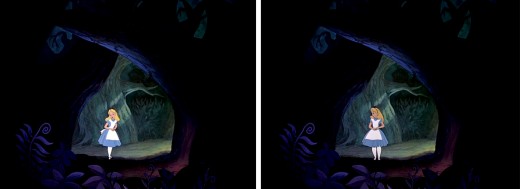
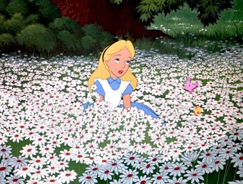 Once Alice is in Wonderland, she immediately comes upon the woods, and from there she steps in and out of the woods to meet up with new crazies and her peculiar adventures. The effects department was used to signal this move in and out of the dark world of wonderland. She constantly steps in and out of shadows.
This, as anyone who did animation in the pre-computer age, knows that it was a complication to add shadows. Not only the shadows under the characters but the shadows over and around the characters. It meant filming the scenes twice, just for the shadows. Since the camera, during the filming of Alice, was not computerized this double shooting had to be done by hand VERY CAREFULLY. Every frame had to exactly match.
Hence, this was an important part of the design. The directors and Disney took these shadows seriously; after all they cost twice as much – just to photograph. Never mind animating them, coloring them or planning them.
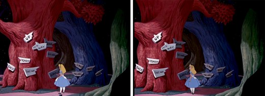
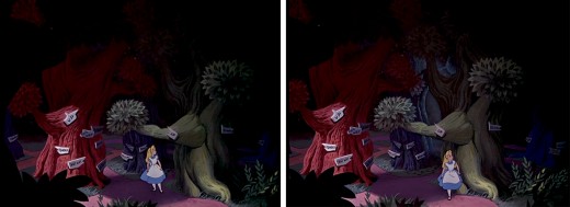
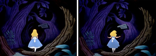
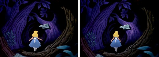
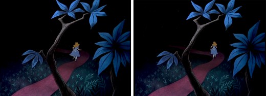
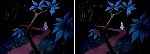
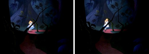
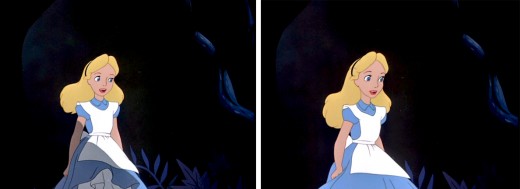
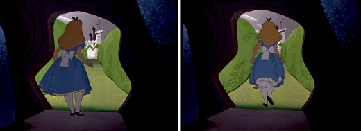
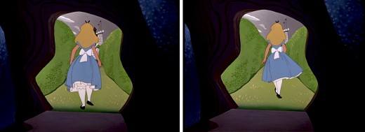
I’ve put together a number of frame grabs which illustrate the move into or out of shadows, and I’d like to share them.
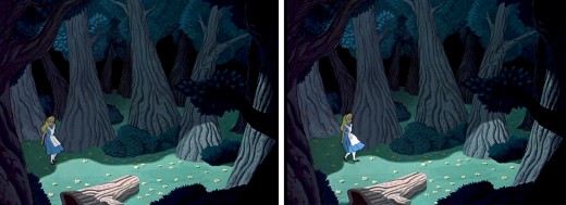
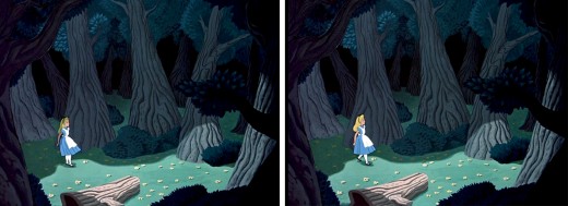
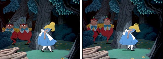
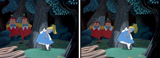
Here, Alice steps out of a shadow for the first time, and meets up with
Tweedle Dee and Tweedle Dum. They’re partially covered, themselves, by shadow.
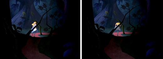
This variant of the shadow is a hard line of darkness that moves over her.
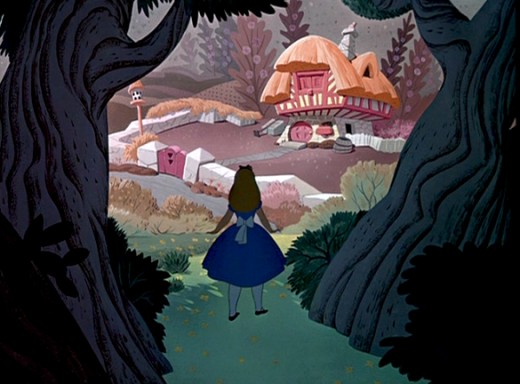
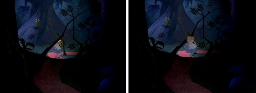
Soon, Alice moves toward the Duchess’ house. We cut from her
standing dark in shadow, to her walking in a brighter light.
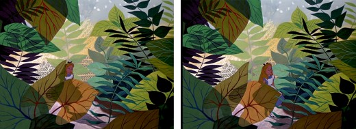
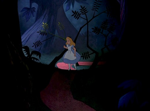
As she moves toward the Caterpillar, Alice is covered with shrubbery and shadow.
She is next seen struggling through the foliage to talk to the Caterpillar, in full light.
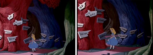
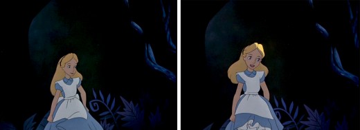
This variant of the shadow is a total shift in color as her entire body moves into darkness.
It was done by dissolving one Alice into another – meaning the cels were painted twice.
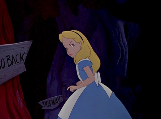
In the woods, Alice walks into and out of and into shadows.
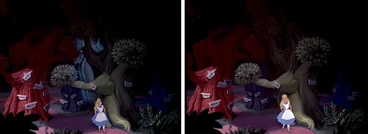
She slowly moves toward the Cheshire Cat who directs her to the tea party.
As she does she moves from shadow and cuts into light as she appears at the gate.
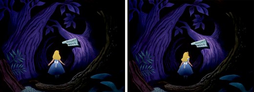
This is a particularly nice effect wherein the entire area gets spotlighted -
led by the character. The area outside of the spot darkens slowly and beautifully.
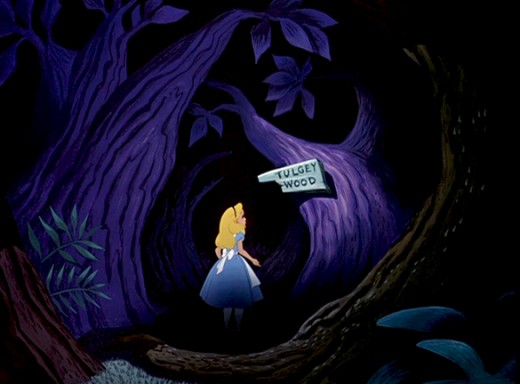
Once leaving the tea party, she wanders around the Tulgey Wood trying to find any direction. Shadows aplenty as she moves endlessly through the woods.
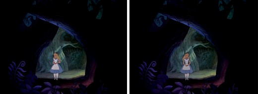
Alice moves into and out of shadow via dissolves.
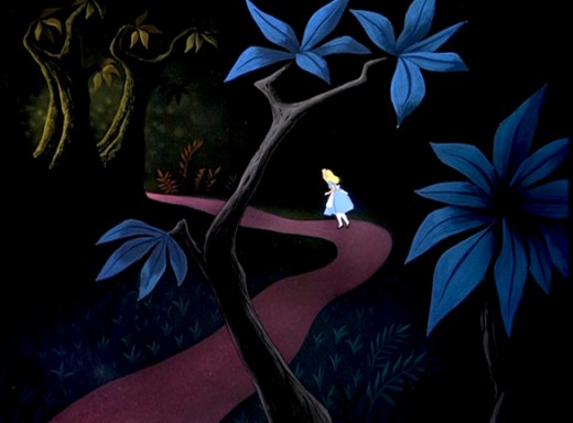
Alice passes by many crazy characters, going in and out of darkness.
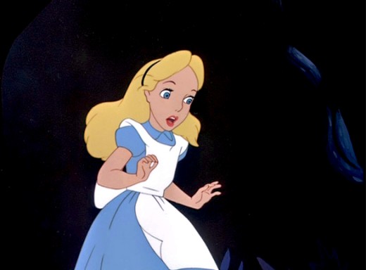
Just prior to meeting up with the Cheshire Cat, and has an extended conversation
which just about ends her stay in the woods.
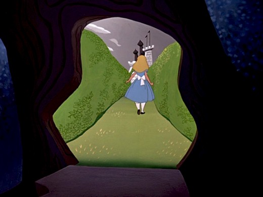
Finally, Alice steps into the Cheshire Cat’s tree and
into the light of the maze of cards to meet the Red Queen.

on 02 Jul 2008 at 8:49 am 1.Tim Rauch said …
What an insanely beautiful film! Thanks for posting.
on 02 Jul 2008 at 11:41 am 2.Bill Robinson said …
This is something I always noticed on a subconscious level, but it’s really interesting to see all the sequences put next to each other like this. A lot of effort for the effect, but definitely worth it – it really cements Alice in her environment and makes Wonderland feel slightly more dangerous.
on 02 Jul 2008 at 12:23 pm 3.Eddie Fitzgerald said …
Well done!!!!! This is my favorite Disney film and the backgrounds you posted are among my favorite backgrounds. I only realized when I read your article that the moving in and out of shadow was so important to the feel of the film. I hope this insight finds its way into a book somehow.
on 02 Jul 2008 at 1:24 pm 4.Tom Minton said …
When one considers what a task it was to shoot in sequential three strip Tech, adding such shadows was a precision special effect indeed. One thing that real Technicolor yielded was a very rich black, which Mary Blair’s designs often required to really come off. I suppose today’s digital technique brings us closer to the three strip look than anything else, but the results aren’t quite the same.
on 02 Jul 2008 at 2:00 pm 5.Mike Rauch said …
Awesome topic Michael! Thanks for posting this. Really beautiful. Truly something to study.
on 02 Jul 2008 at 2:01 pm 6.Emmett Goodman said …
I never noticed this aspect before. Probably because I’ve gotten so used to seeing shadows in most Disney films. But the shadows do seem to play a role in the visual of this film. I know the Cheshire Cat’s appearances needed shadows to allow the character to slip in and out. And the same thing with Tweedle Dee and Tweedle Dum.
on 02 Jul 2008 at 9:59 pm 7.David Nethery said …
What a great lesson. Michael, you should charge tuition on this blog.
Another great post . Thank you for putting in the time to do the screen grabs and to explain in detail what we’re seeing , i.e. the amount of work that goes into these scenes; they are so masterfully accomplished that it is easy to overlook these subtle effects when watching the film.
on 03 Jul 2008 at 9:51 am 8.Galen Fott said …
Just want to add to the kudos on this fantastic post. It’s far too easy (for me at least) to watch the films without realizing the enormous care and artistry that went into them. It’s easy to take something like “shadows” for granted. Thanks for your care and artistry in making this post!
on 03 Jul 2008 at 9:42 pm 9.JOHN GRANT said …
The shadows are also wonderful as it is like a
theatre with the action on a stage with spot-lighting..also,correction Michael-that was the
WHITE RABBITS house-the Duccess is NOT IN THE Disney film..Also,the same shadowing worked well in the 1958 vesion of the DISNEYLAND ALICE RIDE-remember the Lighting in this attraction -each scene ended in a dark shadow..the Upside down room and Tulgey wood areas-very theatrical,thanks to CLAUDE COATS,who also was an ALICE background artist for thefilm!!
on 03 Jul 2008 at 11:32 pm 10.Michael said …
Of course, you’re right about the Rabbit’s House. I should have remembered.
on 20 Oct 2008 at 4:56 pm 11.Antonia said …
Wow! I have goosebumps! You have placed your finger on something that I had registered at a subconscious level but had had such difficulty in expressing for so long! I was trying to explain today why AiW had stuck in my mind and was talking about it the other way round, i.e. that it wasn’t the shadows but the spotlighting – i just couldn’t explain it! So thank you.
You don’t happen to know of a method that can record a three-dimensional zoom movement into a static 2D state? (does that make sense?) I want to draw a journey that you can somehow travel through without going anyway.
on 29 Mar 2009 at 8:14 am 12.Sakura Amatsuka said …
This happens to be my very favourite Disney flick, mainly because of the cute look of Alice herself. I love 2D animation (because of the drawings and I love doing that type of art) and I think it is such a greatly animated film. I also think it sucks that Disney are now doing another adaptation of the book it’s based on (also a favourite) but it’s going to be a dark, gothic, live-action take on the book since Tim Burton happens to be directing it. It’s a shame Disney aren’t usually like this anymore. I also think it sucks what Hollywood are nowadays doing: they’re redoing great movies from the past more than original stuff. I’ve heard Child’s Play, A Nightmare on Elm Street and Footloose are all going to be remade. I have heard Disney will be going back to this stuff for their next animated release coming this year called the Princess and the Frog. That’s all I have to say.
on 02 May 2009 at 2:37 am 13.Ross Care said …
This is one of the aspects of ALICE I have always loved and it’s wonderful to see it so well illustrated and documented here.
Has anyone mentioned the rounded, glowing quality of the Cheshire Cat in certain of his scenes? He literally glows against those ominously dark backgrounds. I always assumed this was air brushing, but who knows.
I might also add the the chiaroscuro nature of much of ALICE made it ideal for development as one of the early “dark rides” in Disneyland.
The combination of sculptured figures and black light efx literally puts you “in the film….” especially in the Tulgy Wood section in the middle of the ride.
(I assume everyone is aware Disney lifted Tulgy Wood from THROUGH THE LOOKING GLASS’s famous poem, “Jabberwocky,” one of the darkest things in the original Carroll works?)
ALICE is absolutely my favorite D-land attraction. And as far as I know it can only be experienced in California’s Disneyland.
This is the closest any Disney park attraction comes to putting you into an artistically authentic 3-dimensional ride-through experience of a Disney animated classic, especially in the opening Garden of Live Flowers “set” in which the huge figures of the flowers tower over the riders who are made to feel like tiny Alice.
Thanks for this wonderful addition to your always amazing site, Mike.
Ross
on 02 May 2009 at 2:41 am 14.Ross Care said …
BTW in the third set of illustrations it’s the White Rabbit’s thatch roofed house that Alice sees from the shadows of the woods.
on 08 Jun 2009 at 10:57 pm 15.Gilbert dela cruz said …
i like the way you made it , nice work ,hope you can do also the other disney movies too.
on 05 Mar 2010 at 5:12 pm 16.Steven Hartley said …
Its all been very interesting, Alice in Wonderland may not be one of Disney’s greatest storytelling, but the art work and animation is wonderful.