Commentary &Theater 23 Feb 2008 09:19 am
Sunday
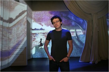 – As mentioned yesterday, last Wednesday, I saw the Roundabout Theater Company‘s production of Stephen Sondheim‘s glorious show, Sunday In The Park With George.
The reviews were universally glowing calling it everything from “Art” to a “Masterpiece.” In one sense, I’m glad of it, but in another I find this completely dispiriting.
_________________________________Sam Buntrock, the director, on the set.
The show is a restaging of ___________________
Sondheim’s musical, with book by James Lapine, of the magnificent production that premiered in 1985 and won the Pulitzer Prize.
The musical’s first half tells the story of Georges Seurat’s creation of the painting A Sunday Afternoon on the Island of La Grande Jatte. Georges is addicted to his painting and
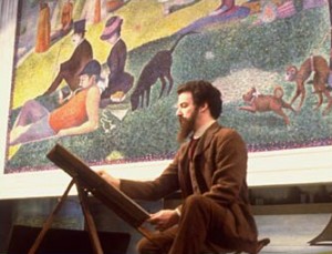 ignores his mistress, “Dot,” who moves away from him, to America, with her newly born child, Marie. George’s obsession with art, and this painting in particular, claims his life. He dies at age 31.
The second half of the show finds the elderly Marie at the Chicago Art Institute, where the painting is being celebrated on its 100th anniversary. Marie’s grandson, George, is an artist who is premiering his 7th Chromalume in celebration of his Great Grandfather’s work. After Marie dies, _____Mandy patinkin, the original Georges
he makes a pilgrimage to Paris to visit
the island of la Grand Jatte. He finds artistic inspiration from the ghost of “Dot,” his Great Grandmother.
In short the show is about Art, with a capital “A”.
In its original incarnation, I got it. I saw the show three times on Broadway back then, and I cried fiercely through the performances of Mandy Patinkin and Bernadette Peters.
The show felt perfect, and I was not only moved emotionally but artistically as well. (Actually the third time found Robert Westenberg in the role of Georges.) The show and its soundtrack was and has remained a great source of inspiration for me.
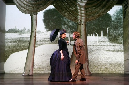
Animation works behind the actors as well as on top of these cut out trees.
The trees throw no shadow, and the animation on them doesn’t overlap
onto the background.
The current production has been imported from England where it was enormously successful. Apparently, judging by the reviews, it will be here as well.
The director is an ex animator who has moved into theatrical direction; this being his first real show. And it’s a big one. His conceit was to use animation for the painting and its creation as well as in other small sections.
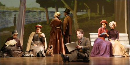
This works wonderfully, at times, and horribly at other times. At the very beginning, Georges wallks out to a large, bare room painted white (though the lighting makes it look like a soft gray.) With Georges’ first big gesture a line draws completely across the entire set. Then it animates, on vocal cue, to a blurring of the chalk line. From this the chalk drawing of the painting fills the stage across the forced perspective of the room with its four doors. At this early point in the show, I thought that this might be interesting.
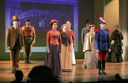 Every so often, on cue to the songs, a character drawn on the background animates. There’s a slight move and then a freeze … then another move … then a freeze. The movement generally is very lifelike, so one assumes it was motion capture and flattened to look like a chalk drawing or painted image. At one point, a soldier looks horribly done. It almost feels like a very early cgi character – plastic and hollow.
This became a problem for me. I began to look for the movement on the background and felt completely distracted from the show. A boat moves on the background. A man leans against a tree. A dog takes three steps and freezes. People wipe on or fade in and/or off. My eyes were often diverted. If wanted to watch the show – the actors and the complex story – I was distracted by irrelevant animation.
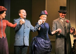 I was mostly impressed with the cast. Jenna Russell as “Dot” and “Marie” was excellent and seemed, at times, to be channeling Bernadette Peters from the original. Daniel Evans didn’t channel Mandy Patinkin, and I had more difficulty with him as “Georges” and found him more appropriate as “George.” I did have a problem with his being bald in the second half. At first I didn’t recognize this as the same actor, and I liked that. However, when he meets up with the ghost of “Dot” in Paris, I wondered how she so easily recognized him without the hair and beard. He no longer looked like her lover, Georges.
I was particularly bothered by the critical scene of Georges Seurat in his studio where he’s obsessed with “painting the hat.” He starts with a canvas (yes, it’s supposed to be a painting but the characters on it are animated, moving), but then he moves to a pad on which I guess he’s drawing the hat. All this movement keeps the eye moving and occupied, but it plays against the scene and its emotion. In the original, he stays at that canvas painting the hat and painting the hat and painting the hat. He only moves away from it to argue with “Dot.” This director isn’t clear in what he’s trying to say. I know he’s trying to “paint the hat” because the lyrics tell us that, but we don’t experience the difficulty of getting that “hat” just right. I understood it because I know the show, but I wonder what someone new to the musical would have gotten.
The projections are stunning in that they don’t seem to be on top of the actors, so I wasn’t sure how they were projected. There were no shadows of the actors thrown on the walls. Surely it couldn’t be rear-screen projection since you can see the walls, and when a door opens the projection moves with the door. Presumably it was multiple projection moving over so large a screen of a set. I didn’t notice any keystoning.
The primary animation stays on the back wall and is deceptive in giving you a false sense of perspective. At one point, when it represents the painting exhibited on the museum’s back wall, the painting and the wall move back in perspective as the room extends enormously. The extension, of course, is just an animated image, but it looks real as the actual room despite moving back. You can’t feel where the set and the movie separate, although you’re watching that rectangular screen of a wall.
These technically magnificent projections were designed and executed by by Timothy Bird and the Knifedge Creative Network.
I started off by saying, I’m glad it’ll be successful. It means that the technical achievement, which is a large leap and done extraordinarily well, would be utilized in other shows. However, I find it dispiriting in that it’s all too distracting. Essentially what’s happening is that a movie on the set is overwhelming the theatrical events in front of the screen. I came to the theater, not a movie. The animation should be absolutely and completely subservient to the show and not get in the way. I found it more moving in the original to view a flat, cut-out soldier than to see the gimmicky animation in this version. Yes, the painting and the corridor moves into the distance, but it’s immediately followed by another copy of the painting dropping close up to us. Why did it move away except, of course, for an effect? That’s the problem with this show, the effect is too big. When Georges is painting a painting, why are the characters he’s painting moving – however slightly? It’s a painting and the movement doesn’t mean anything to what’s going on. It’s just annoying.
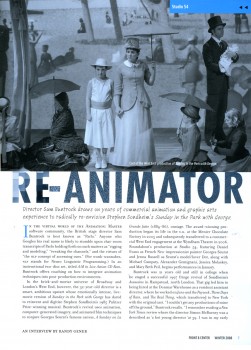
I wish Sam Buntrock would have limited what he was animating. Less is more in my book. One wonders what a more established directed would have asked for. An interview with this animator-turned-director appeared in the Roundabout’s membership magazine, Front & Center. I haven’t found this on line, so I post jpegs of it below.
The NYPost offers a video clip from the show giving a brief idea of the animation here. It also gives a clip of the song where Georges is drawing the “hat” when he should be painting the hat.
 1
1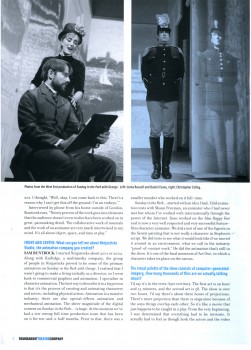 2
2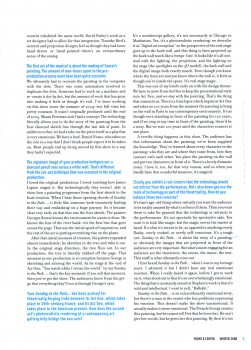 3
3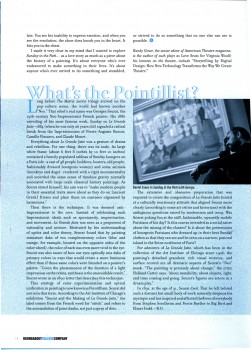 4
4
on 23 Feb 2008 at 12:38 pm 1.Galen Fott said …
Michael –
Thanks for this post, and for posting the interview too. You certainly are pretty much the lone negative voice I’ve found regarding this production! I saw the original too, and am hoping to see this one before it closes. How much do you think your perspective as an animator changed your perceptions of this production?
on 23 Feb 2008 at 2:14 pm 2.Michael said …
My companion was at least as angry as I when we left. We both had significant problems with Daniel Evans, but that doesn’t seem to be anybody else’s problem. I wanted to focus completely on the leads but found that there was too much going on – busy ness – to keep me “entertained.” The orchestra, as you probably know, is also not an orchestra but a five piece group. It didn’t bother me as much as it did Heidi.
The rest of the audience didn’t seem to have problelms, but there was no standing ovation at the end – which is too often obligatory on B’way.
I’m sure I’m just a curmudgeon and you’ll probably love it.
on 24 Feb 2008 at 9:14 pm 3.Tim Rauch said …
Thanks for posting the article, Michael, but I also wanted to say, if it’s of any use to anyone, you can read the interview at:
http://www.roundabouttheatre.org/fc/winter08/sunday.htm