Animation &Tissa David &walk cycle 12 Dec 2007 08:37 am
Tissa Elephant
- Before I get into the post for today, I wanted to call attention to a brand new site dedicated to Richard Williams‘ film The Cobbler and the Thief.
The site, called The Thief, is a collaboration of four artists who worked on the film, but they’re encouraging conversation from others who were involved. It looks to be a promising site.

Thanks to Matt Jones for directing me to it. (By the way, check out Matt’s site if you aren’t familiar with it.)
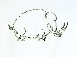
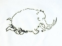
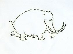
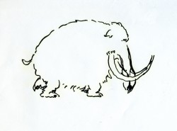
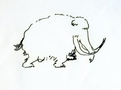
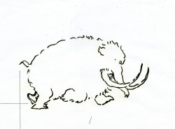
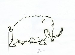
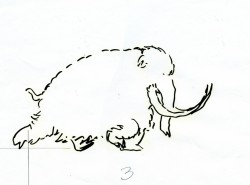
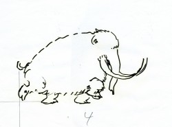
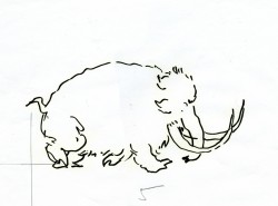
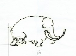
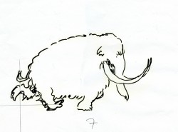
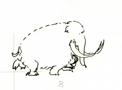
- Here are the drawings for a walk cycle Tissa David animated for an elephant walking in a well-played Perrier commercial from the 80′s. It was a spot done for the Ink Tank in R.O. Blechman ‘s style. These are rough drawings.
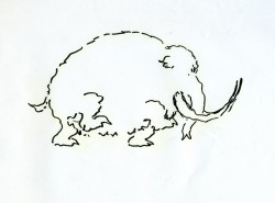
Tissa did two versions of the walk in ruff. I’m posting both here so you can see the difference she got in the walks. The second one, which is the final, is subtlety. It’s a quieter walk and is more apporpriate to the tone of the spot. (That’s back when animation didn’t have to jump from pose to pose and could actually move properly.) I’ve added a QT version of each of the walks to view the movement.
The first RUFF version follows:
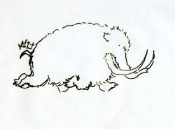 1
1 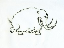 2
2
Click on the drawings to enlarge.
The version used for the final follows.
You’ll note the crosses on each drawing. One might assume this is for re-registering the drawings, but that’s not the case. (You’d need at least three crosses for a fair registration.)
Tissa usually draws a horizon line for each foot of the walker. In the case of these drawings, she drew only the line for the back two legs.
When teaching people how to draw a walk, she starts by drawing two parallel lines and informing you that each line is for one of the feet of the character. The two feet (four in an animal) should NOT be on the same line. It helps to give a slight feeling of depth to the body.
I can’t tell you how many walks I’ve seen lately that don’t even follow this simple and basic rule.
If you go here, you’ll see another spot Tissa and Blechman did for Perrier from the same campaign.

on 12 Dec 2007 at 9:32 am 1.Ray Kosarin said …
Beautiful stuff, Michael, but that’s Tissa in a nutshell. (I can’t overstate how huge a role her teaching played in my learning to animate properly, and when I’m doing my best work, on some level I hear her voice in my head keeping me in line!) What strikes me about this elephant (mammoth? big tusks) walk, besides its charm, is the beautiful solidity and weight of the animal underneath the lightness and wiggliness of Blechman’s line quality. Though Blechman’s designs in the hands of a less conscientious animator can swim inside the lines, Tissa’s work has both the discipline and the assurance to make them solid, elegant, and light.