Daily post 13 Nov 2013 01:00 am
Good Will and Great Cartoons
Yesterday’s blog post was something I needed to write for myself.
Animation, as far as I can see hasn’t been going as well as I’d like. The good films have been few and far between.
During my career, I’ve been asked to be involved in a number of fine films. However, it’s the luck of the draw to be involved in good movies, also the power of your own abilities. I can’t tell you how many films, bad films, that have requested my help and participation. Also good films. They’ve been few and farther between, but they’ve been there.
The moment Weston Woods asked me to work on The Man Who Walked Between the Towers I knew this was a good one. It took me about five seconds to read the script and know it was great, and I knew I was working on a winner. There are other films that had the opposite reaction for me, and I was correct there as well.
Yesterday I wrote about a film I was asked to participate in. I knew the very second I saw the project that it would make a great film. None of the story stuff I wrote about – 60,000 flyer pilots (just a metaphor) coming to the rescue – was actually in the film. But the result is the same. The film is a feel good moment, and I know it will make a very good film. Even, god help me, if I’m not allowed to be part of it. It’s a good movie with a good story line. I just hope I am part of it, because I like it enormously.
-
My point, here, is this. Please allow me the use of Miyazaki for my example. The man is a good = no, take that back, a great filmmaker. He not only knows a good film, but he knows how to make them better. The films ha makes become automatically better. He has something to say; he finds curious and complicated ways of telling those stories, and when he is part of a project he gets the most of the story.
He knew he had to make it a children’s film with the simplest of story directions. He had to reach the largest possible audience and be direct. He was, and the film he made was an unmitigated success.
With The Wind Rises he has made an adult film it’s the only way he could tell this tale. He also complicates the structure of the story, and despite the fact that he will not get the largest possible audience, he wants to be sure every aspect of the complicated story is told. This he does. He ignores a large section of the audience for the sake of making a richer story.
His work on the two films, in my mind, can only be seen as the work of a genius. His story is as full as it can ever become, yet he disappoints a small part of the audience searching for the obvious. I can only credit the man, the artist. I also take away very deep lessons about his artistry and what he wanted to do with it. I’ve seen Ponyo half a dozen times with full joy. With The Wind Rises, occurring post Tsunami and post nuclear meltdown, I am sure he has plenty to tell me, and I will see it again and again until I’ve gotten all of its pleasure.
Most prominently I believe he wants to be heard about man’s inhumanity to man. Despite all the natural disaster and chaos in our lives, he uses a man intent on carrying out the best war to get the full tale told. His method is enough to make me tear up, his story goes even deeper.
-
So back to that film that I praised last night. The one that asked me participate in telling a sad and deep story. I am beside myself with joy at having been asked. I hope I remain connected with it. I am honored at having been asked. If I am allowed to continue with it, I will do my very best. If I am not allowed to continue through to the end,I’ll watch and have my opinion, and that’s one opinion I’ll keep to myself.
It’s been a few days since I posted some artwork. Here are some piece I repost which were taken from the collection of Vincent Cafarelli. I’m curently sitting in his desk at Buzzco, so I’d like to see more of the great art that passd his way during the heyday of the commercial in NYC.
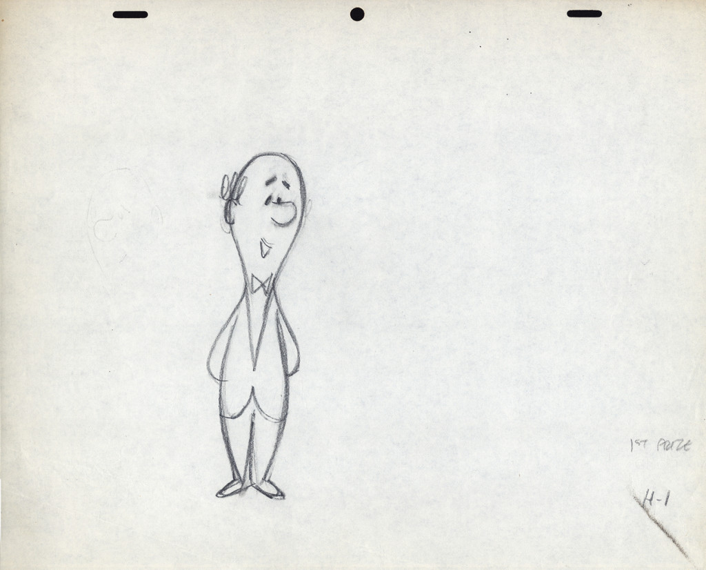
Among Vince Cafarelli‘s remaining artifacts there are lots of bits and pieces from several Piels Bros. commercial spots. I decided to put some of it together – even though they’re not really connected – into this one post.
There are animation drawings I’ll try to post in other pieces.
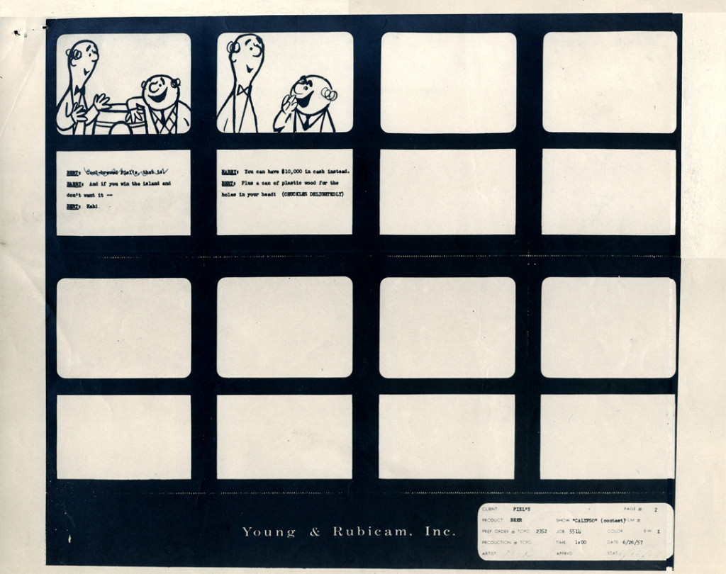
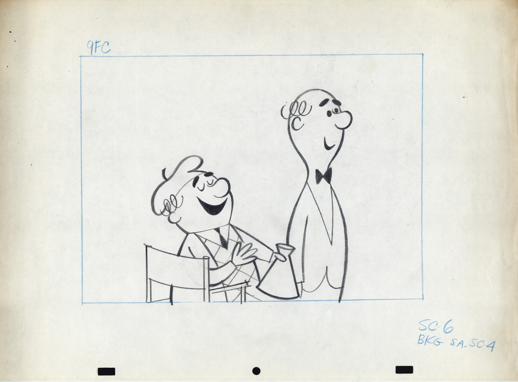
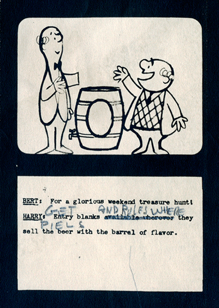
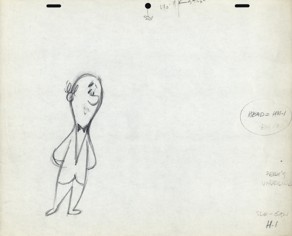
Here, we have a storyboard for a spot; I believe this is an abbreviated spot promoting some contest Piels beer was running. I think this is from a shortened version of a one minute spot since there are animation drawings which are obviously from the same setup, but they’re not part of this storyboard. (There’s an unveiling of the barrel, which is upside down.)
Since the boards are dated 1957, and given the use of signal corps pegs, I believe these were done for UPA.
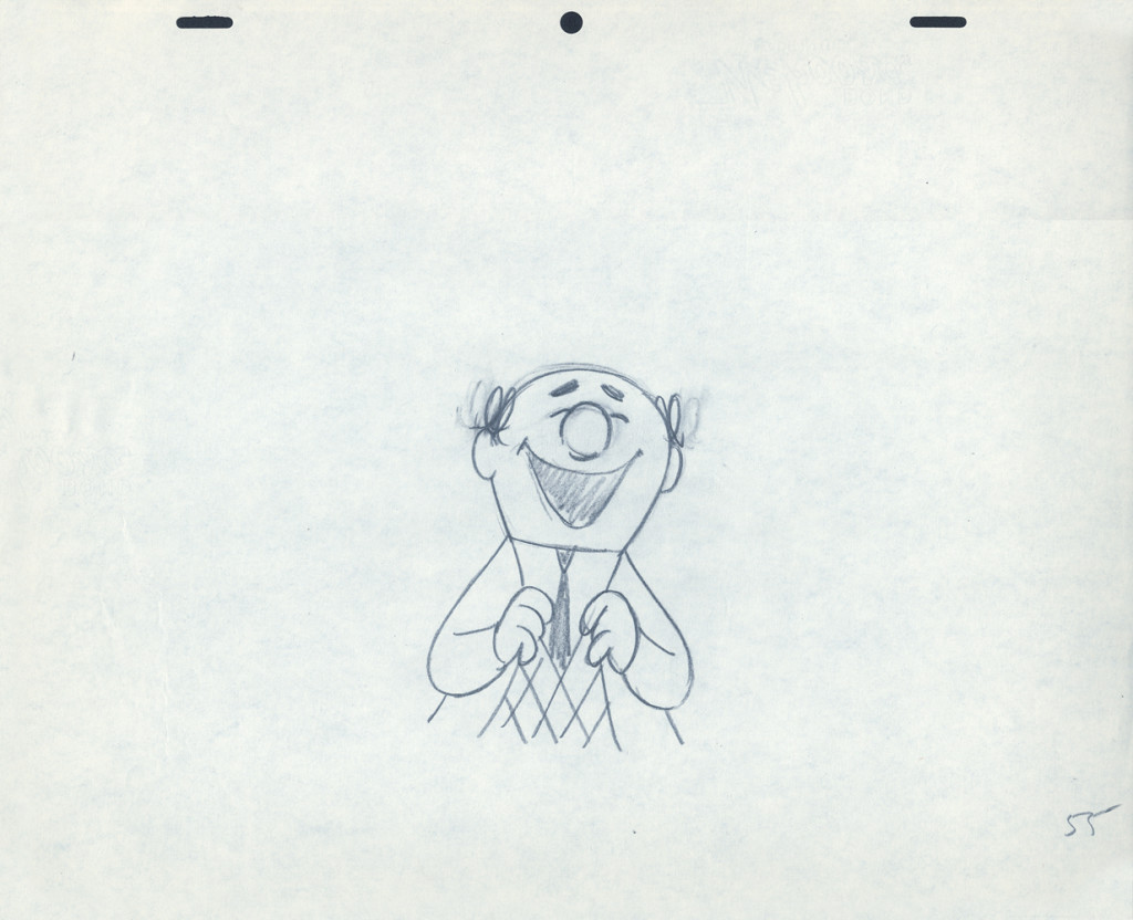
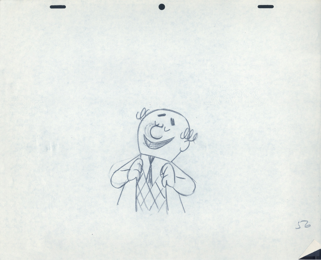
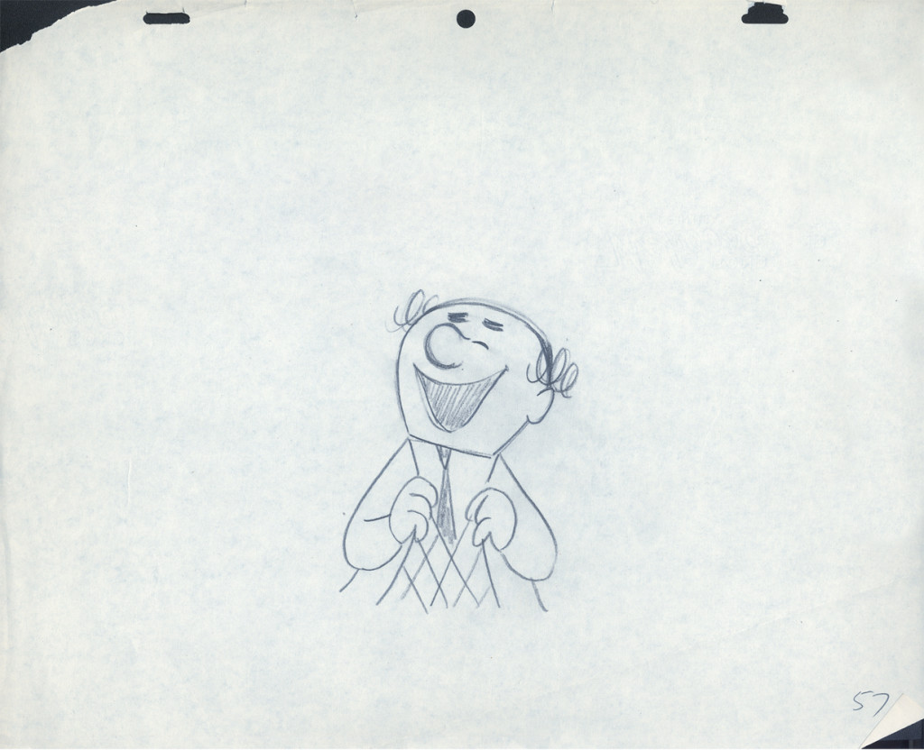
Regardless, the drawings are excellent. I presume they’re hand outs to Lu Guarnier, animating, and Vince Cafarelli, assisting.
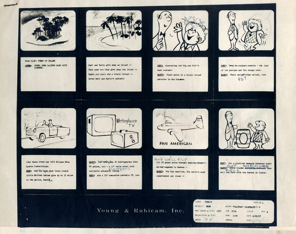 1
1
The following are three drawings from the opening scene of this storyboard. Others from this scene weren’t saved.
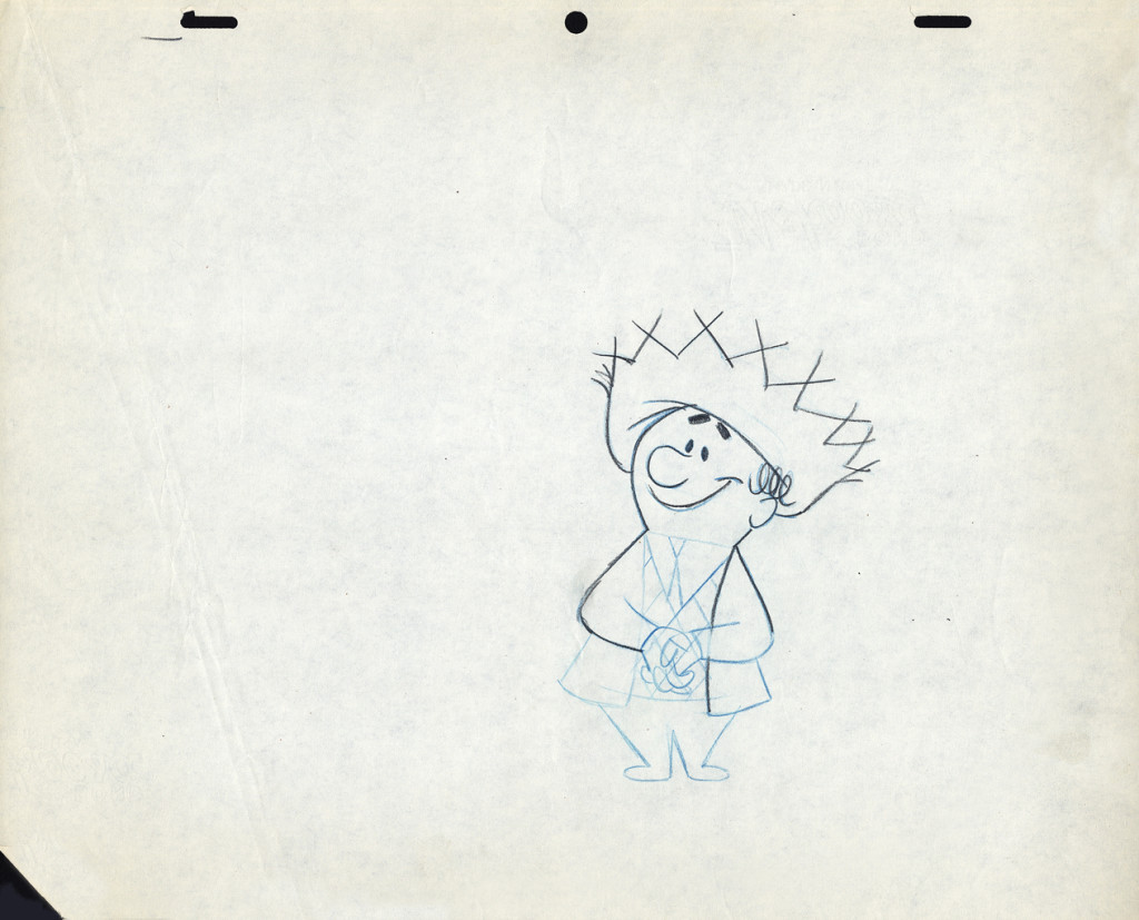 1
1Here’s Bert.
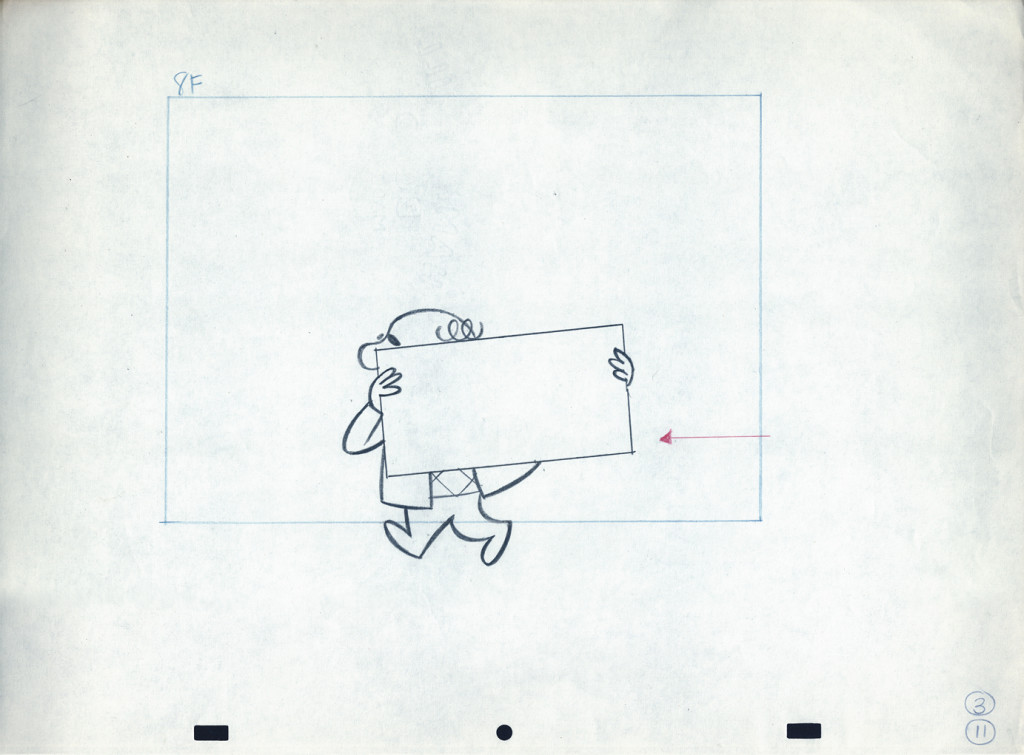
Let’s follow that with layout drawings from two different spots. The first doesn’t really offer much, but the quality of the clean-ups and the drawing is first rate. I’m pleased to post it:
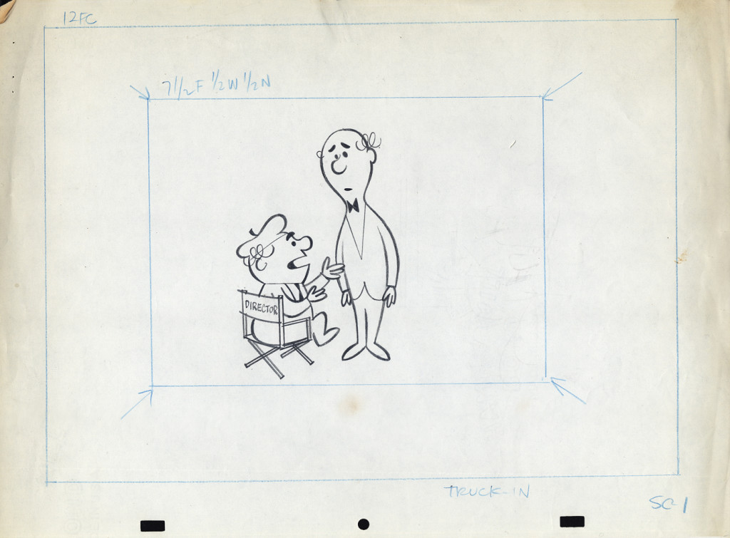 1a
1a
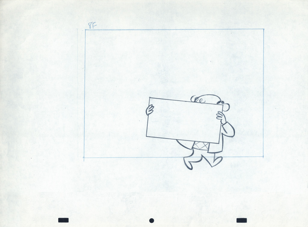
Here are layout drawings for the second of the two spots I have in hand. I presume this is also a spot promoting that contest.
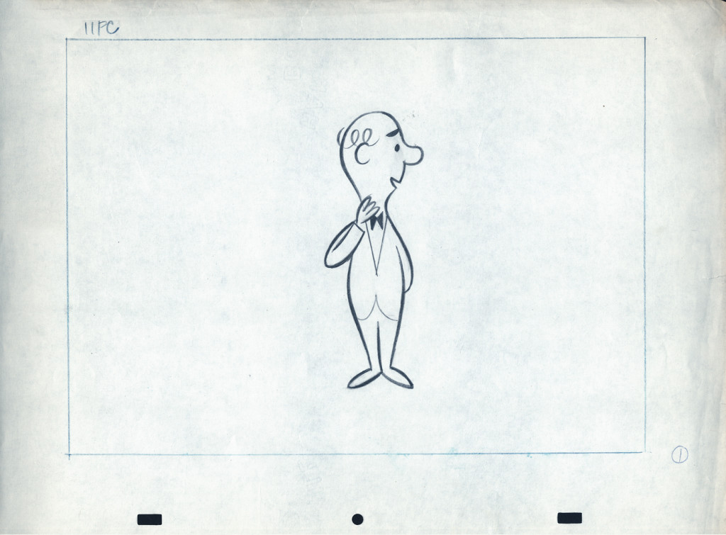 1
1
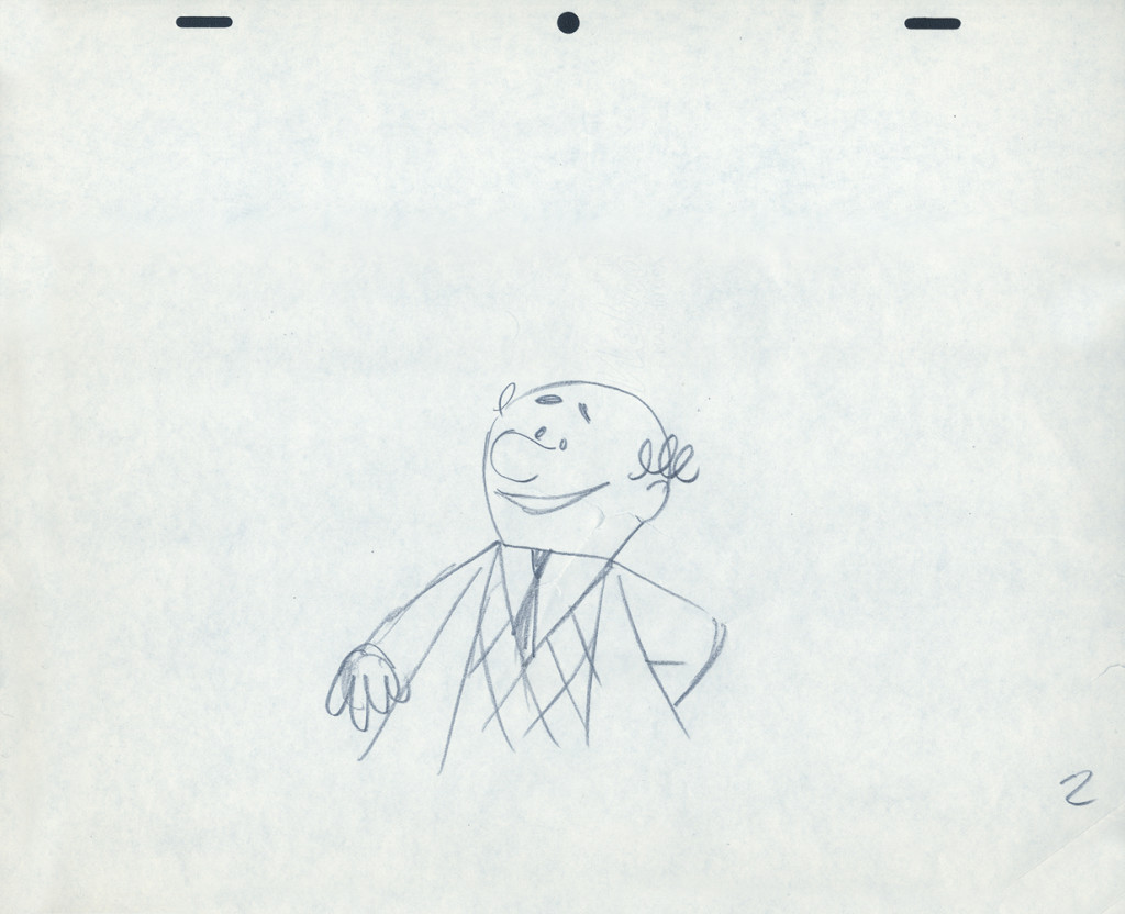
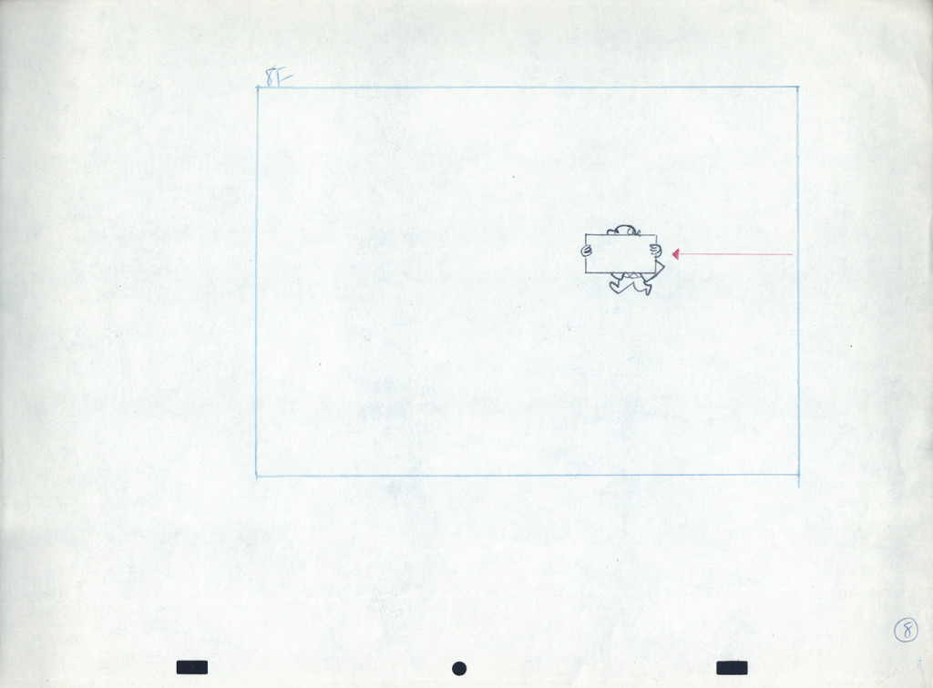
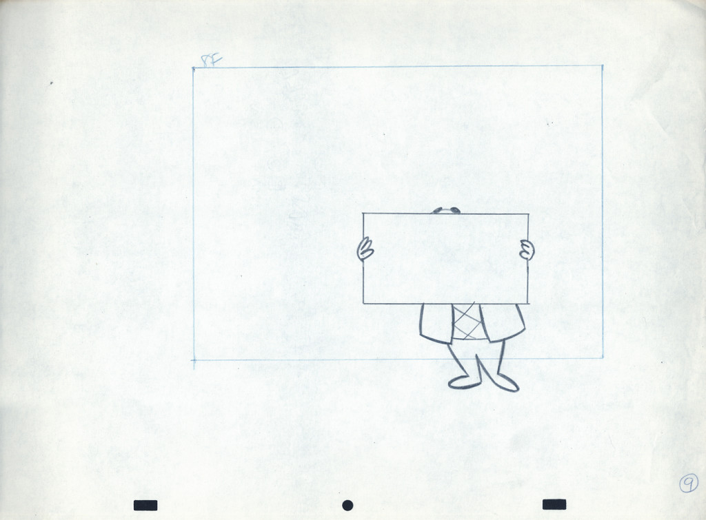
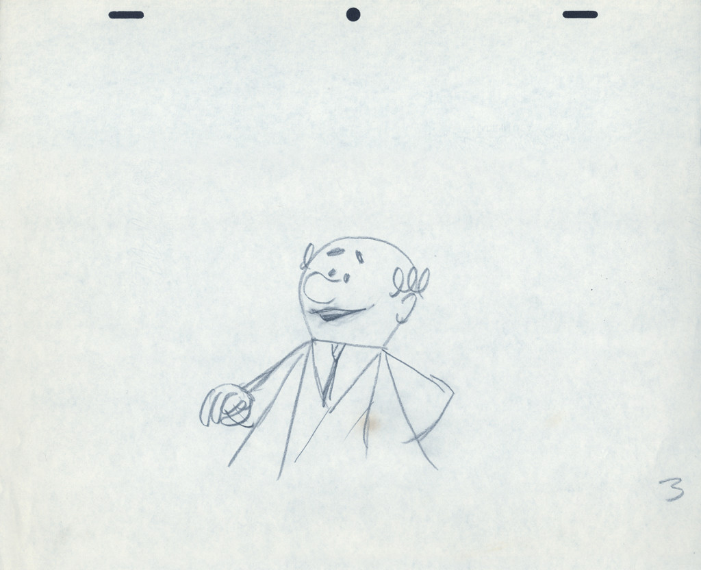
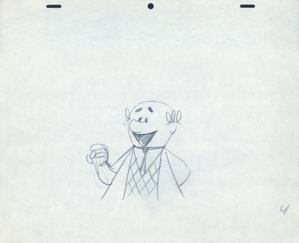
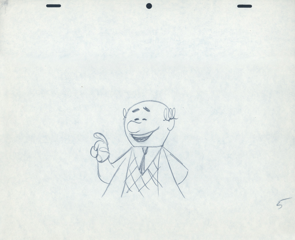
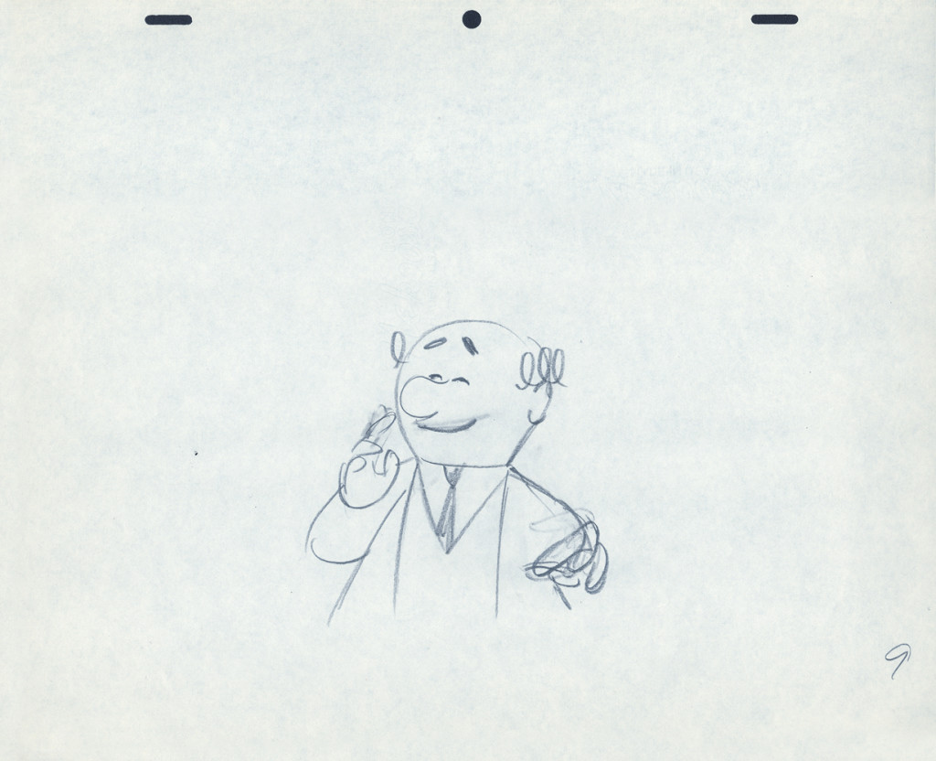
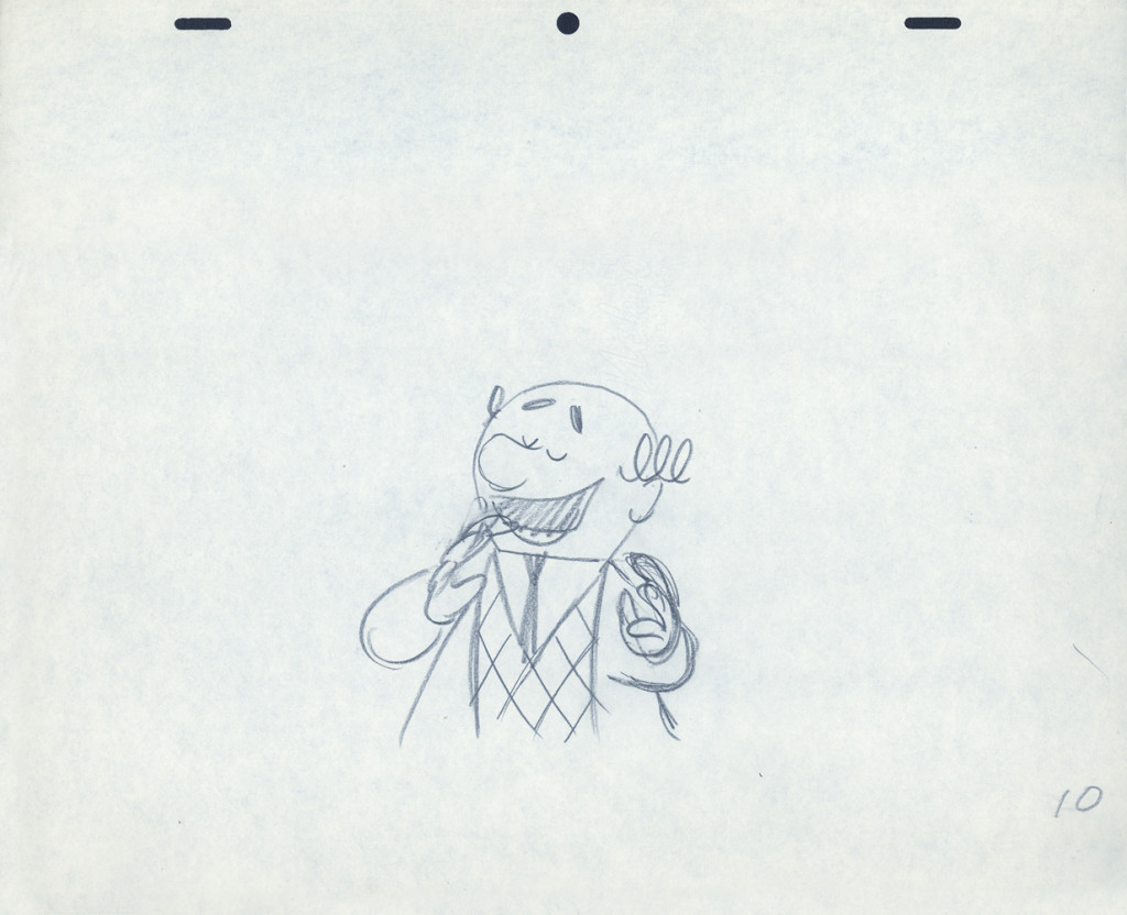
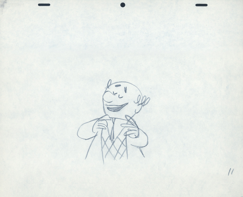
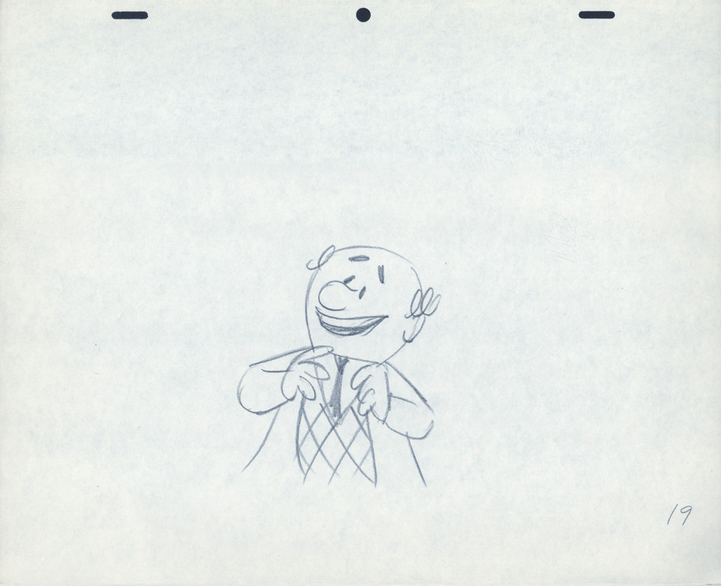
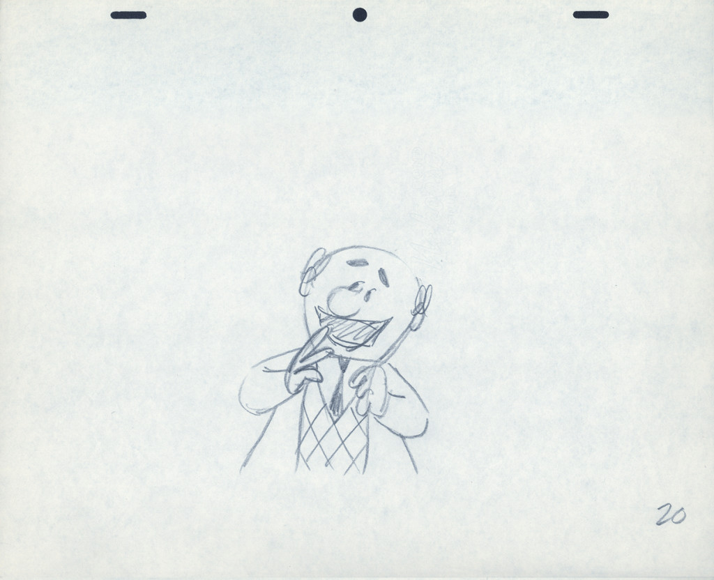
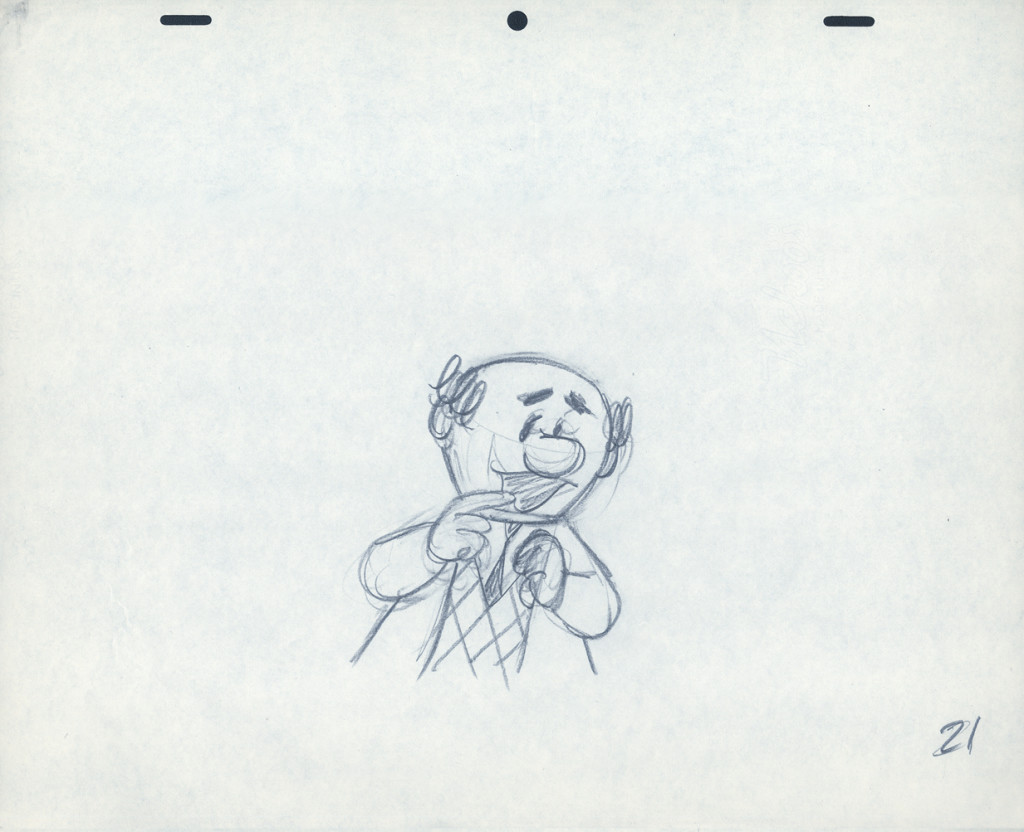
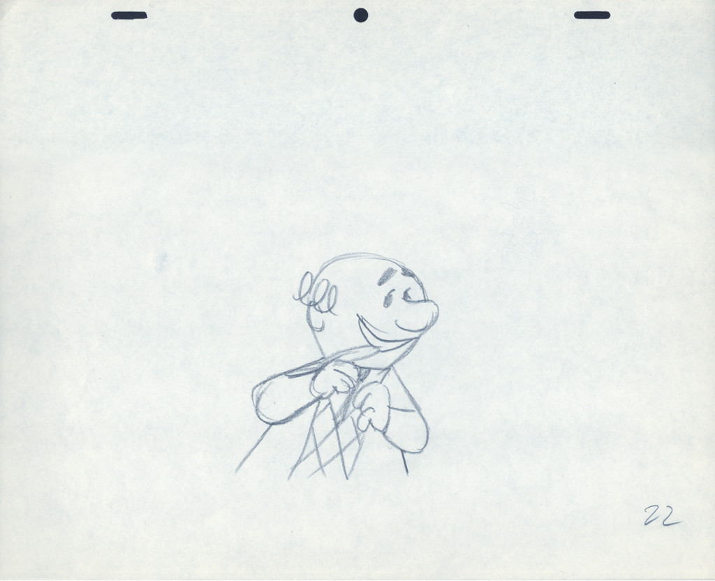
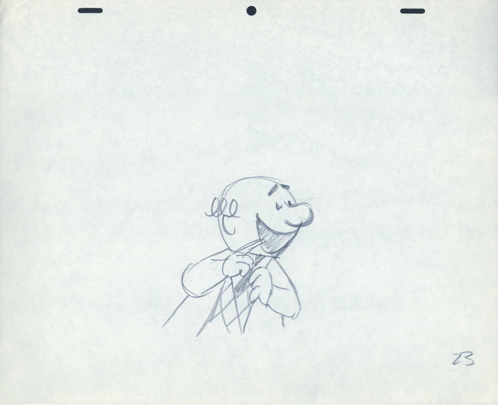
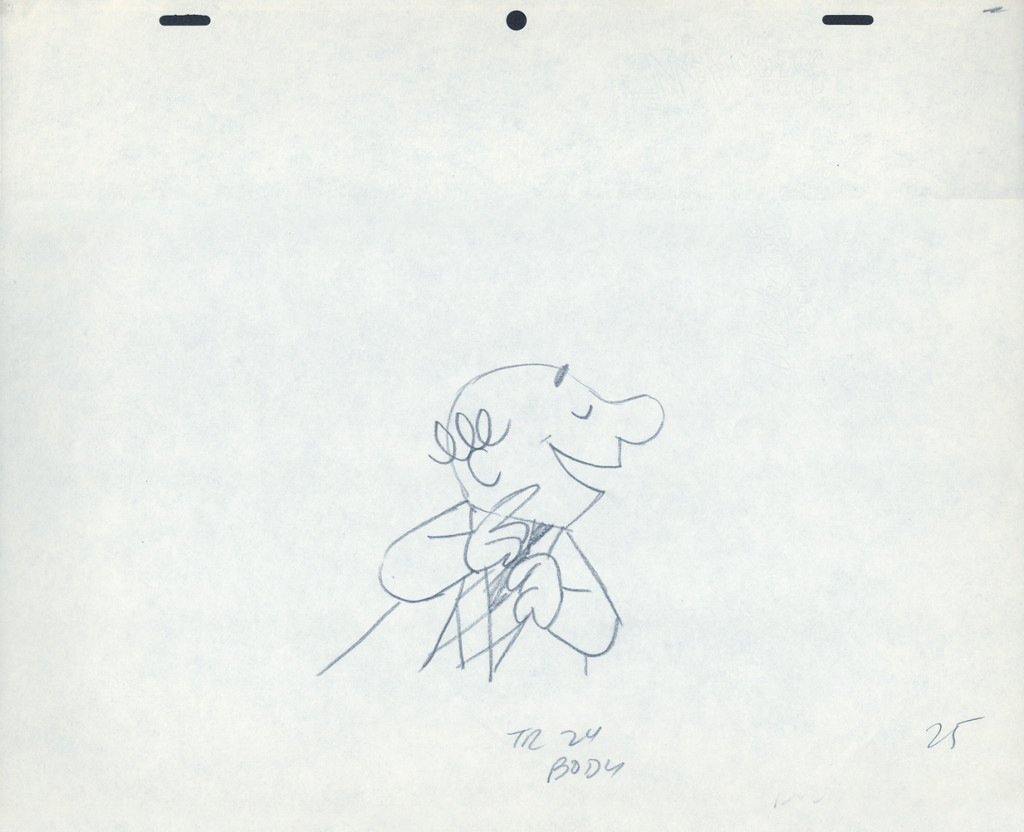
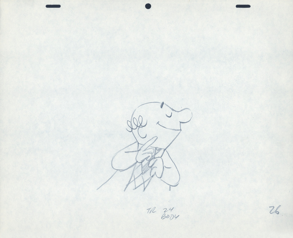
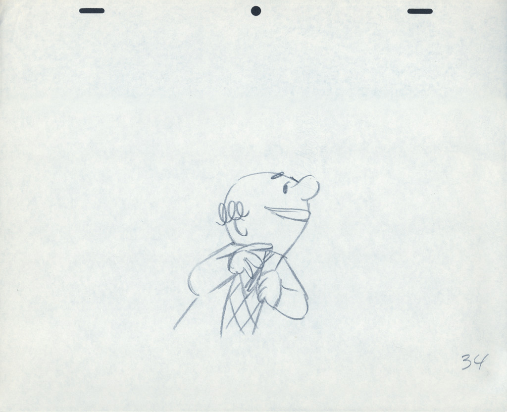
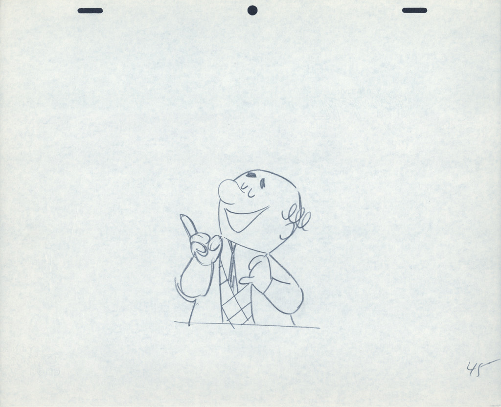
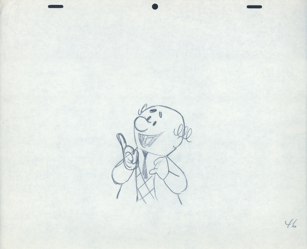
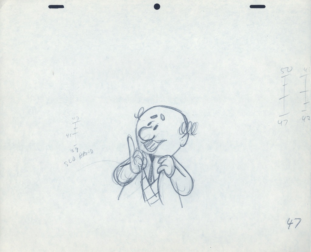
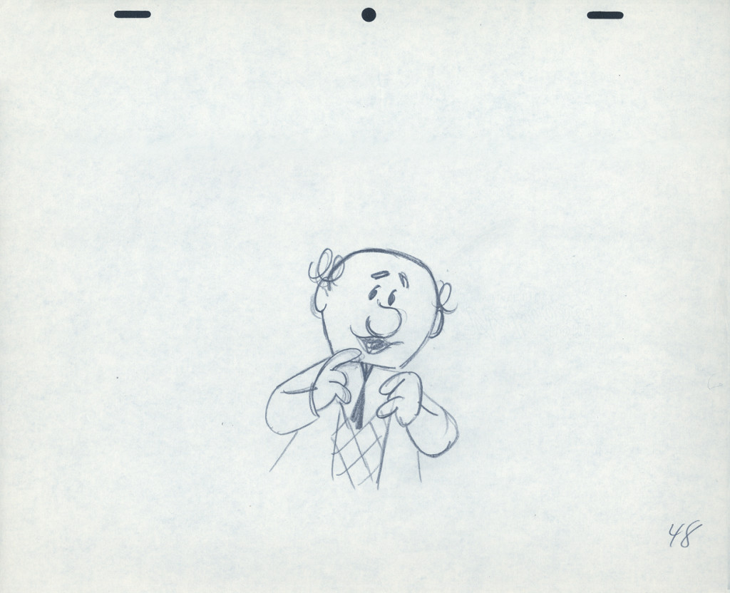
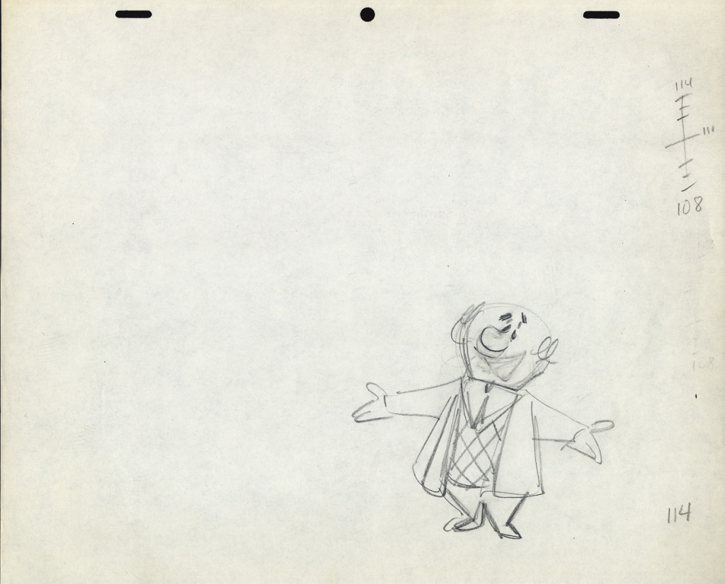
- Here’s one of the scenes saved by Vince Cafarelli from a commercial he did while at Goulding-Elliott-Graham. The commercial was animated by Lu Guarnier, and Vinny was the assistant on it. Hence, he saved the rough drawings (instead of Bert Piels. (Sorry I don’t know what he’s saying, though I’m looking for the storyboard.)
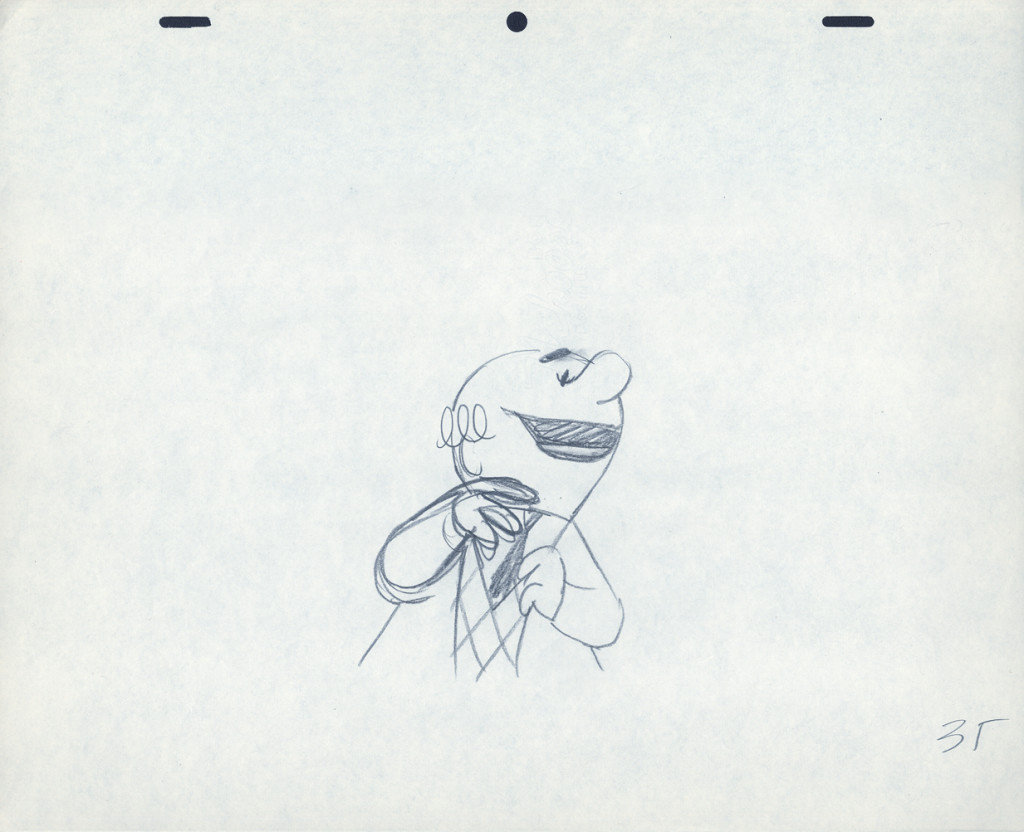
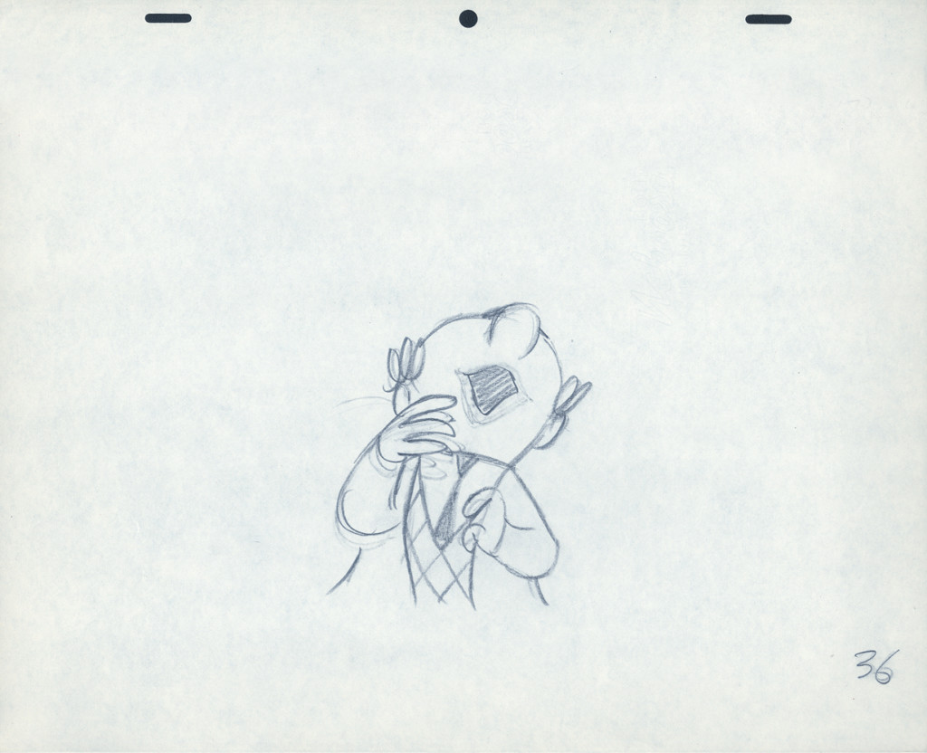
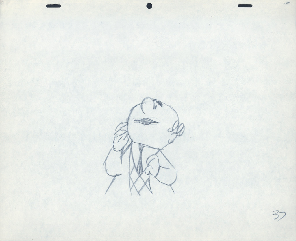
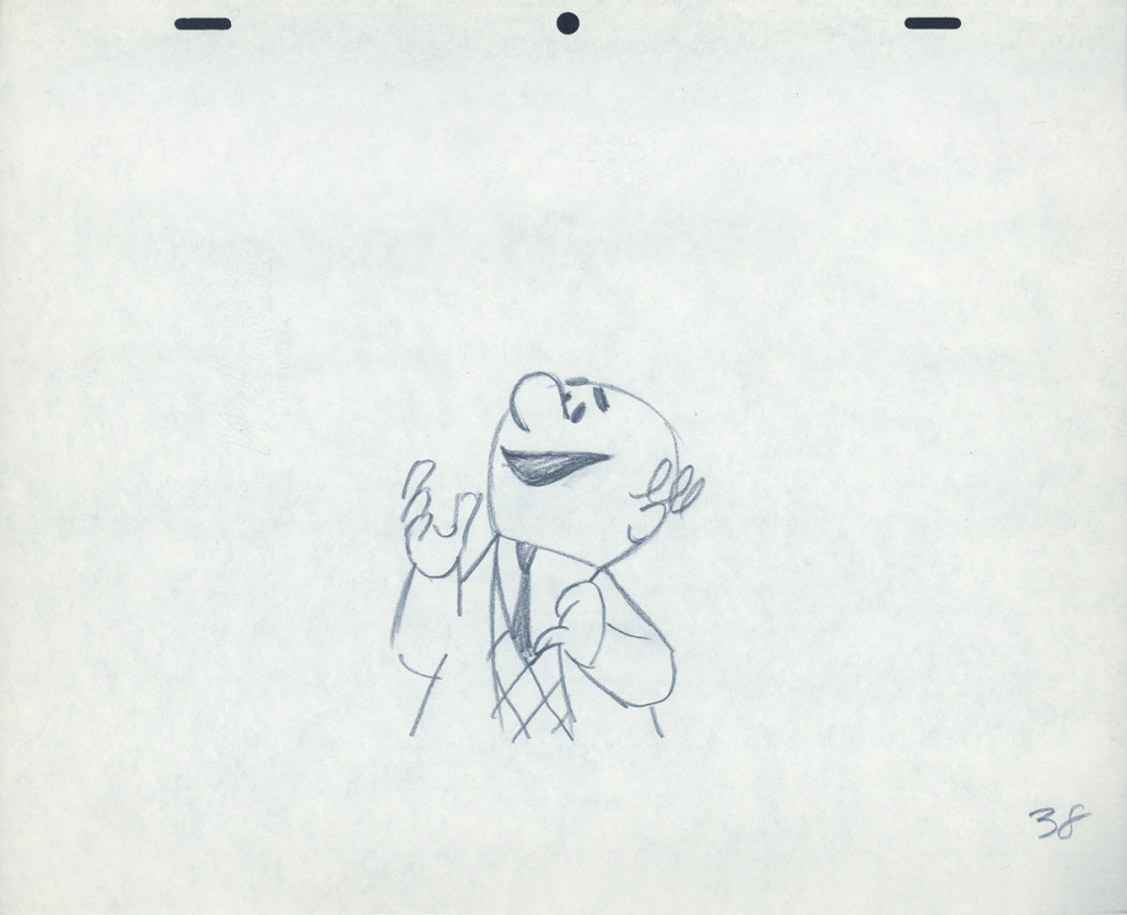
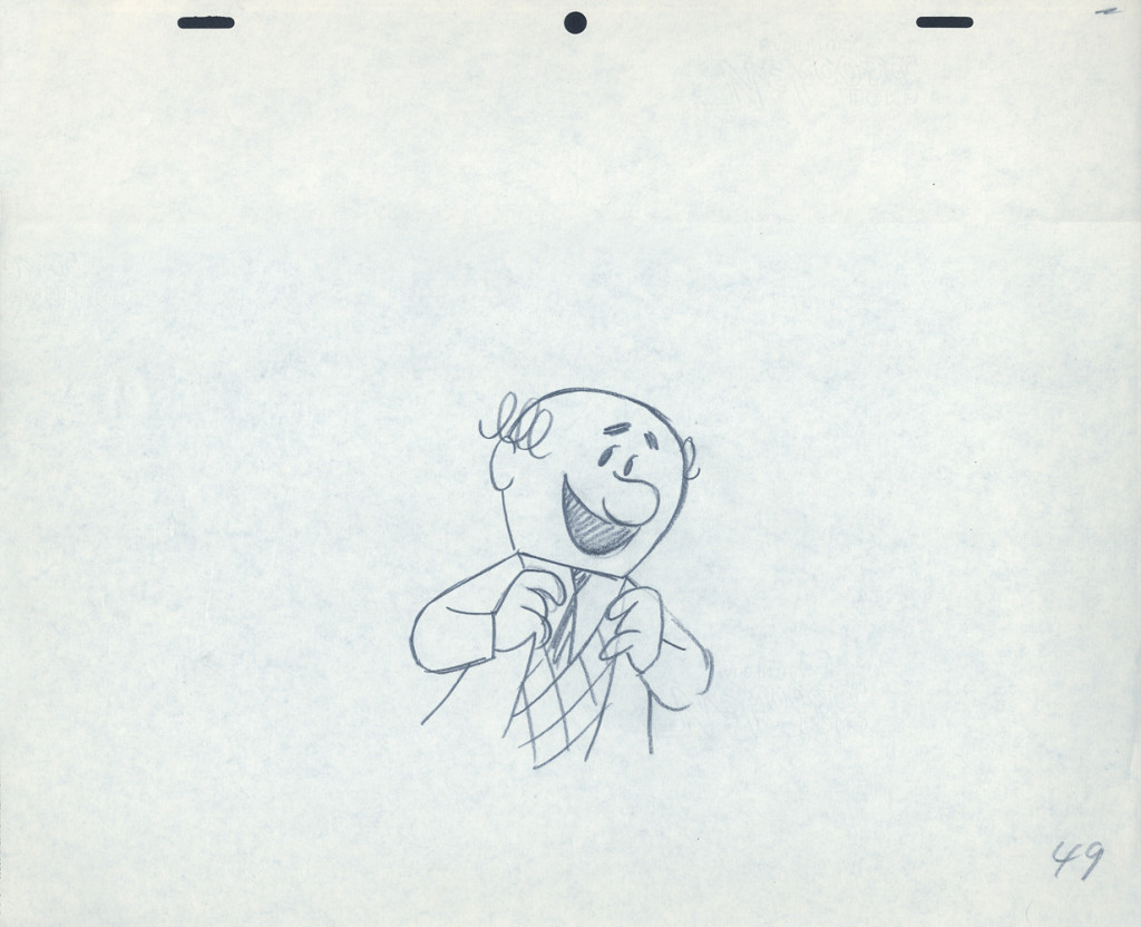
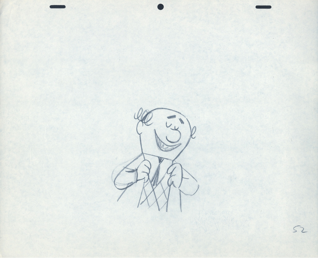
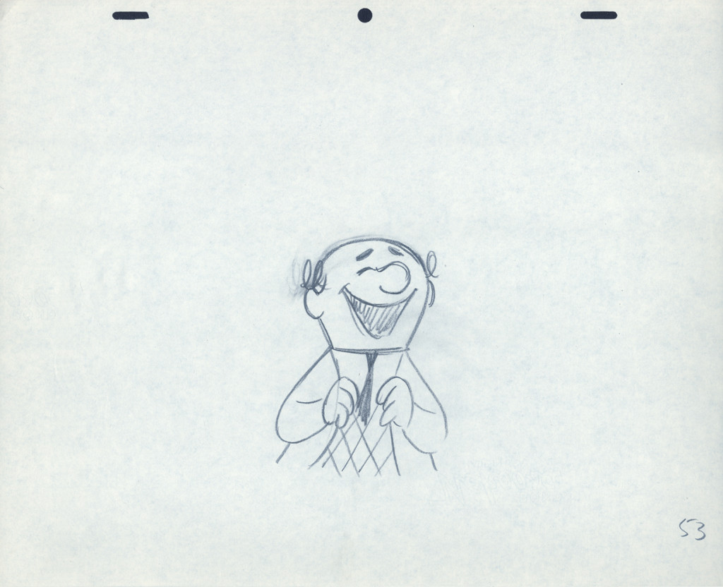
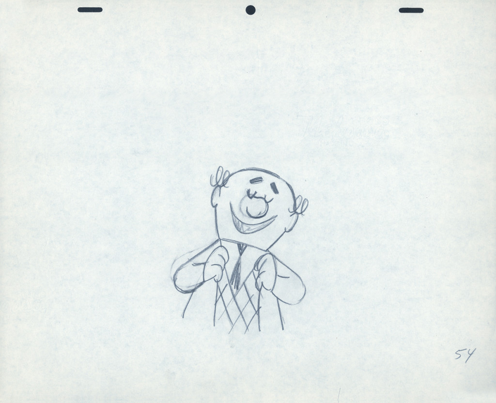
So, here are Lu’s rough drawings in this CU
 2
2
The following QT movie was made by exposing all drawings on twos
except for the extreme positions that were missing inbetweens.
For those, I dissolved from one extreme to the next.
It drove me crazy that Lu Guarnier always animated on top pegs.
Next week with the last of these three posts on this Piels Bros commercial, I’ll talk about Lu’s animation and some of my pet peeves.
Here’s the last of the three posts I’ve been able to cull from the drawings left behind in Vince Cafarelli‘s things. The 60 second spot was animated by Lu Guarnier and clean-up and assisting was by Vinnie.
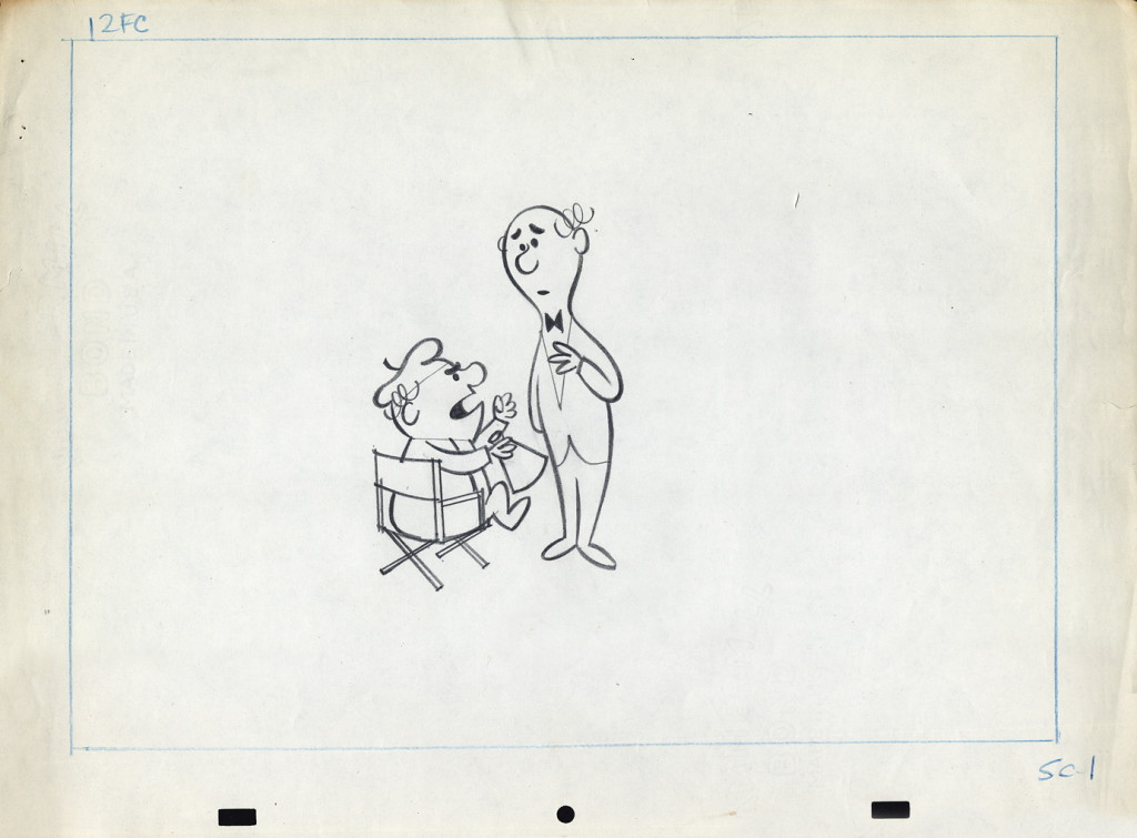
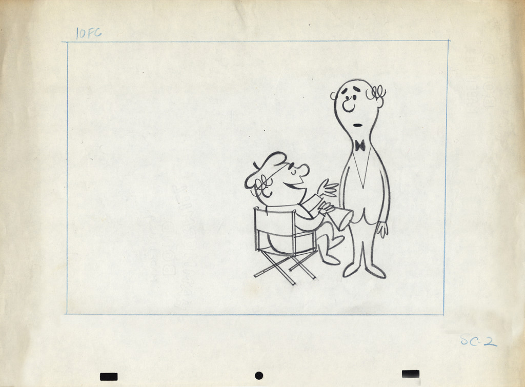
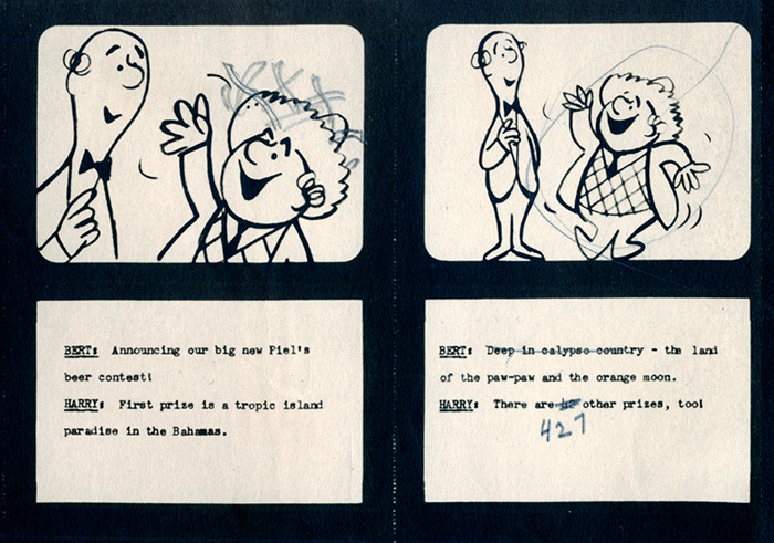
Within this post there are drawings from two separate scenes. If you look at the storyboard (I’d posted the entire board in another post, but I’ve pulled the particular frames from the board to show again here), you can see what it is the characters are saying. I don’t have all the drawings for these two scenes; just those I’ve posted.
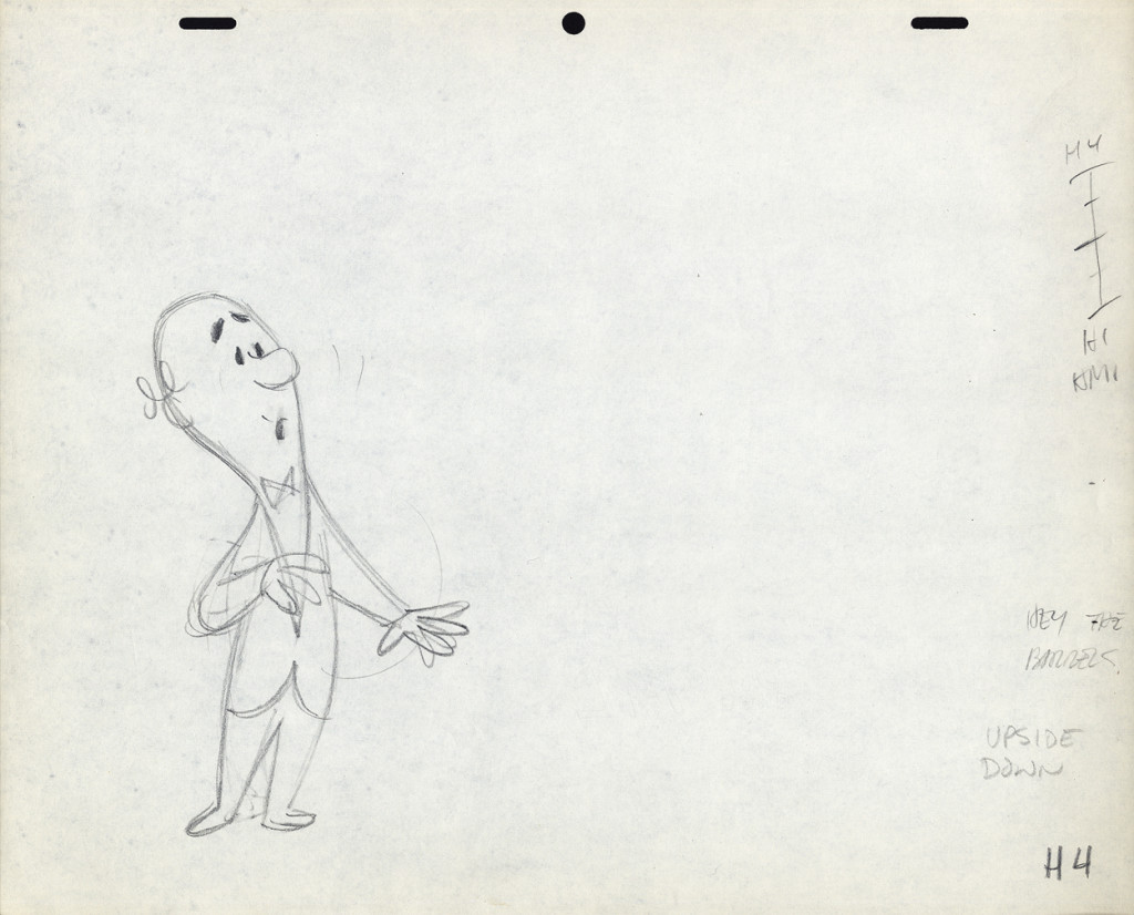
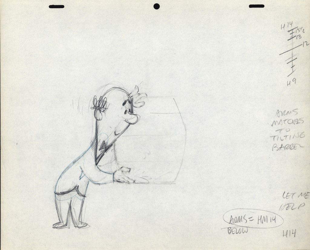
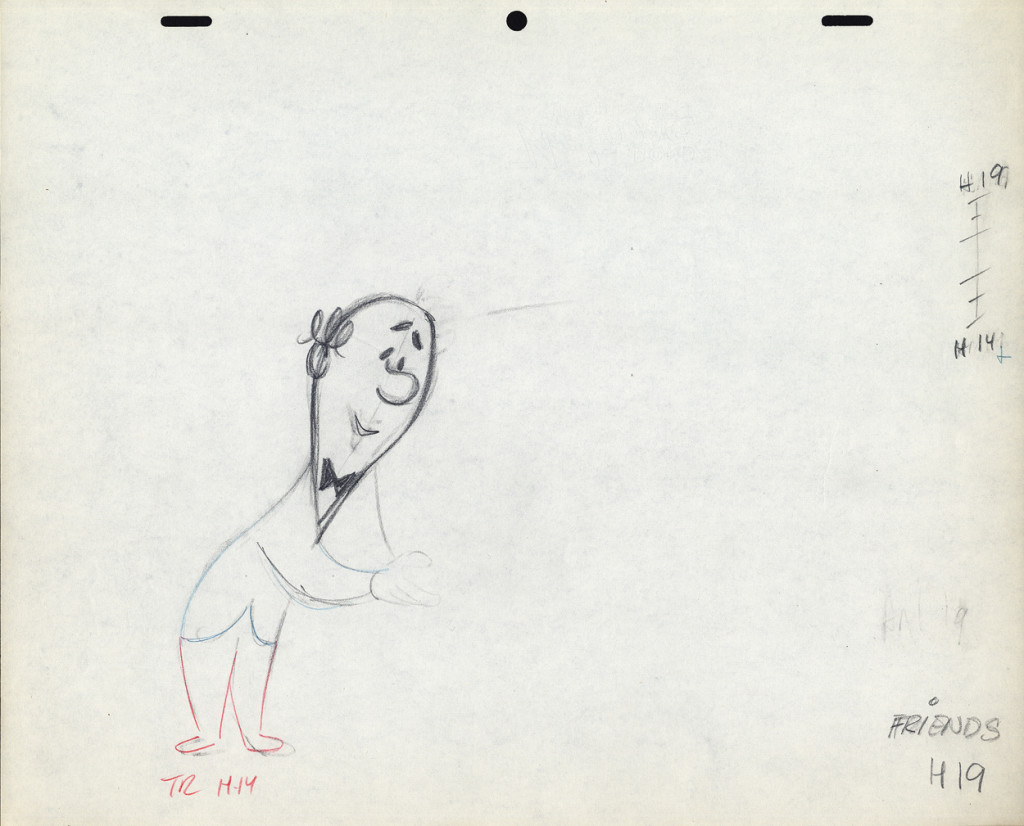
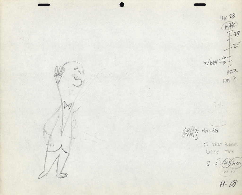
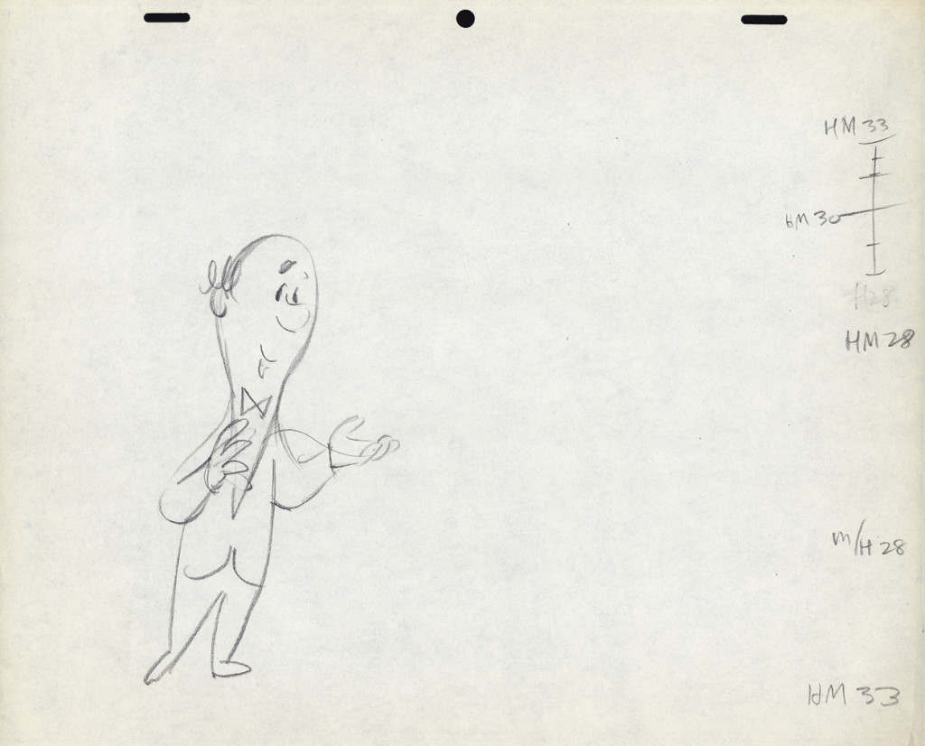
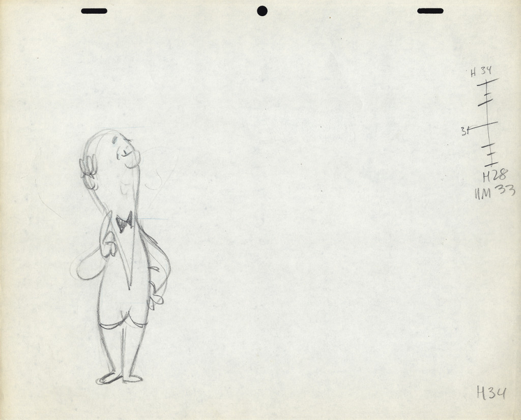
I’m also going to use these drawings of Lu’s to write about his style of animation. I was taught from the start that this was completely done in an incorrect way. I don’t mean to say something negative about a good animator, but it is a lesson that should be learned for those who are going through the journeyman system of animation.
 Right from the get-go I had some difficulty assisting Lu’s scenes. He started in the old days (early-mid Thirties) at Warner Bros, in Clampett’s unit, and moved from there to the Signal Corps (Army); then to New York working at a few studios before landing at UPA’s commercial studio. After that, he free lanced most of his career, as had so many of the other New York animators. They’d work for six months to a year at one studio then would move on to another.
I suspect the problems in Lu’s animation all generated from the training he’d gotten at WB. Lu worked in a very rough style. No problem there. An animator should work rough. These drawings posted aren’t particularly rough, but in his later years (when I knew him) there was hardly a line you could aim for in doing the clean-up. His style was done in small sketchy dashes that molded the character. Rarely was it on model, and always it was done with a dark, soft leaded pencil. There were others who worked rougher, Jack Schnerk was one, but Lu’s drawing was usually harder to clean up.
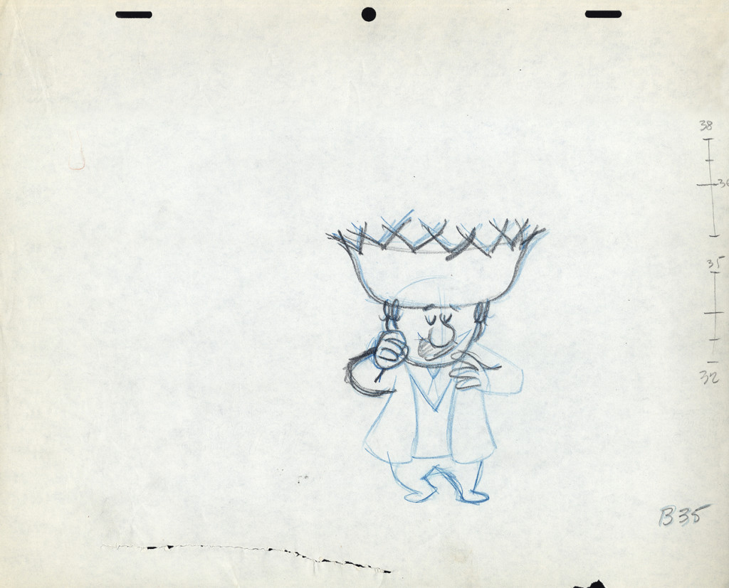
There was a rule that came out of the Disney studio, and, as both an animator and an assistant, I’ve followed it closely. When doing the breakdown charts (those ladders to the right of the drawing) all inbetween positions had to be exactly half way between drawing “A” and drawing “B”. If the animation called for it to be 1/4 of the way, you’d indicate that half-way mark then indicate your 1/4. If a drawing had to be closer or farther away – say 1/3 or 1/5th of the way – the animator should do it himself. This, as I learned it, was the law of the land. However, Lu would rarely adhere to it, and an assistant’s work became more complicated. The work was too easily hurt by a not-great inbetweener. I’ll point out an example of Lu’s breaking this rule as we come to it).
 B35
B35
These ladders are done correctly, per the Disney system.
#34 is half way between #32 & #35;
#33 is half way between #32 & #34.
#36 is half way between #35 & #38;
#37 (the 1/4 mark) is half way between #36 & #38.
However, Grim Natwick told me
- demanded of me –
that all ladders should appear on the lower numbered drawing.
The ladder here should be on drawing #32 for all art
going into the upcoming extreme, #38.
Lu never followed this rule, which means the
assistant generally had to search for the chart.
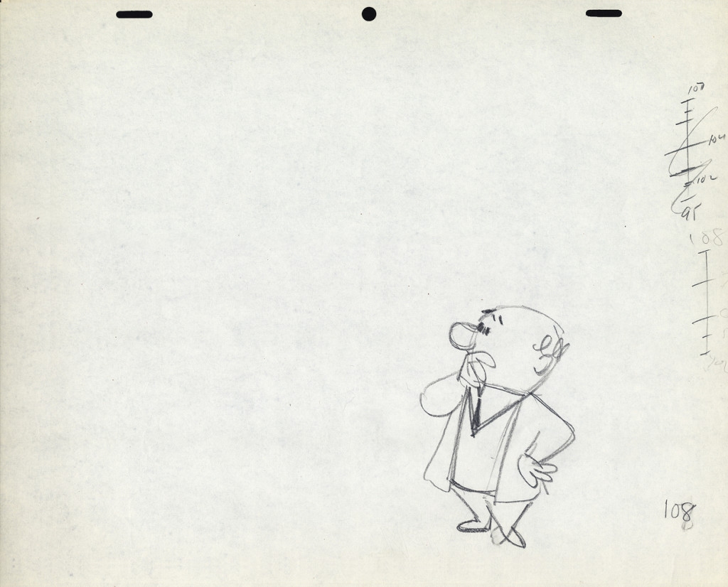
The Second scene
 B108
B108
This ladder is typical of Lu’s animation.
It would seem that #106 is 1/3 of the way between #108
and #105 is half way between #106 and #109.
and it also looks like #107 is 2/3 of the way between #108 and #109.
Because the numbers come on the last of the extremes, here,
more confusion is allowed to settle in.
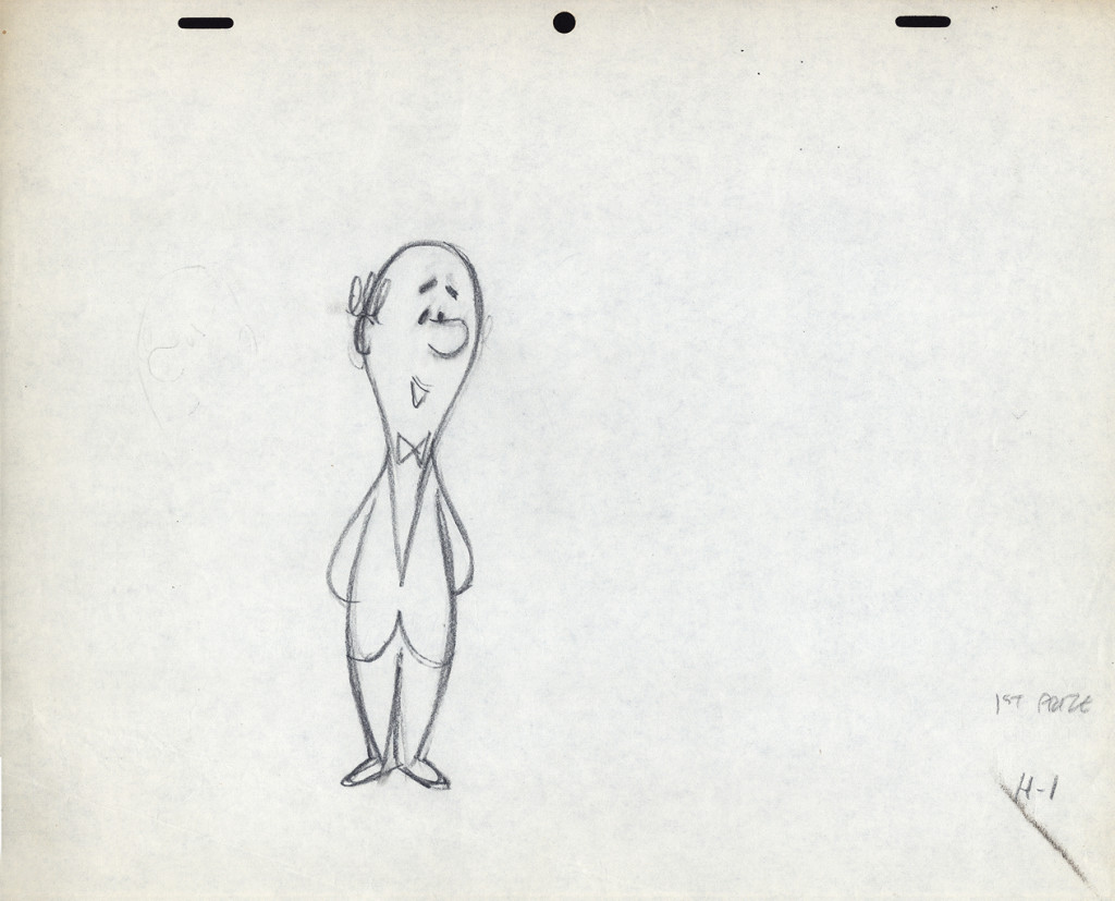
 H9
H9
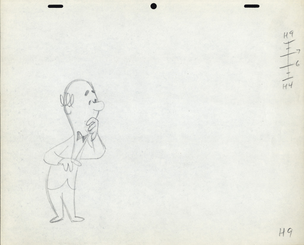
Again, the ladder appears on the later extreme. The assistant
shouldn’t have to go looking for it. The ladder should be on
the first drawing involved in the breakdown.
Again, the breakdown drawings are on 1/3′s, and
the inbetweens are 1/2′s of that. It makes it harder on the
people following up on the clean-up & inbetweens.
I don’t know if this style of Lu’s was a product of where he learned to animate or not. Jack Schnerk, a comparable animator – whose work I loved (even though he had a rougher, harder to clean up drawing style) – always broke his timing in halves and halves again. There were times when his animation went to one’s and he did most of all the drawings. I assumed he had an unusual timing, and he didn’t want to burden the Assistant with his schema. He also always carried the breakdown charts on the earlier numbered drawing – per Grim Natwick’s comment. In some way I felt that Lu was rushed to get on with the scene, and whatever method he used would be to get him there more quickly. (It was the assisting that was slowed down.) This may have been a product of his attempts to devise some type of improvisation in the animation. Lu’s work, on screen, was usually excellent, so he didn’t much hurt anything in his method.
It might also have been his method of trying to put SNAP into the animation. This was a WB trait from the mid-late Thirties. It was certainly in Lu’s animation. No doubt a hold-over from Clampett’s early days of directing.
The final thing to note is that Lu usually worked on Top Pegs. Animating on Top Pegs makes it impossible to “roll” the drawings and check on the movement of more than 3 drawings. You can only “flip” the three, checking the one inbetween, but it didn’t give you a good indication of the flow of the animation. This is obviously necessary in animating on paper. It also made it difficult for the cameraman as well as those following behind the animator. If there were a held overlay, this would have to be on bottom pegs since the animation is on top pegs. That requires extra movement of the expensive cameraman to change all the animation cels after lifting the bottom pegged overlay. It also risks the possible jiggling of the overlay as it’s continually moved for the animating cels.


on 13 Nov 2013 at 4:21 pm 1.Mark Sonntag said …
I know how you feel Michael, I’ve always felt that we’ve been, or should I say Hollywood has been making the same film for 50 years or more. I’ve been watching a lot of Miyazaki lately, because his work reminds of the early Disney features where you can feel Walt’s presence in every frame. His work IS him.
I draw great inspiration from that, especially as I move forward with my short (been re-boarding a little). If you haven’t read it I recommend reading Starting Point 1979-1996.
on 23 Jan 2014 at 12:16 pm 2.Kevin Hogan said …
A great final full posting by Michael. I will dearly miss him.
on 24 Nov 2014 at 2:59 pm 3.Kathy said …
I feel sad about michael’s passing, i wish i had knowing him before, he seemed like an amazing person, he may rest in peace.