Commentary 18 Oct 2007 08:02 am
Persepolis Thoughts
 - Persepolis was very much the film I expected to see. The story was more sophisticated than can usually be found in animated features, and the artwork was more daring. It didn’t look or feel like any other film I’d seen. However, this also created problems that I expected, albeit none that really undermined the positives to be found in the film.
Marjane Satrapi and Vincent Paronnaud have crafted a thinking and thoughtful film about some very real problems in the world. In its finest moments, it speaks volumes about the problems of independent-minded women and is particularly interesting for this reason.
It doesn’t follow the Hollywood formula with heightened climaxes and overmodulated set pieces. There aren’t many phony emotions on display, and I can’t tell you how enjoyable that was for a change. Live action and animated films, these days, bring nothing less than the predictable, so it was nice to see something quieter and more valuable.
The film, of course, is an adaptation of Marjane Satrapi’s graphic novel. (Since it’s very much the real-life story of Ms. Satrapi one wonders if it should be called a “novel.”) The story takes its cues from this novel, and in the big picture it is an enormous task to have pulled off. As we follow young Marjane growing up and her relationships with her parents and grandmother, we also see the political changes in Tehran, Iran as that country twists and turns politically.
The adaptation from graphic novel to screen created the biggest complaint I had with the film. Like all graphic novels, the story develops in chapters, and the film closely follows suit. Each chapter has its own climax, and I’m not sure many are significantly larger than the other. Hence, there is a sameness that comes across as we move through the film. The art style also heightens this constancy to the point where it gets a bit tiring. One truly welcomes the few scenes done in muted colors whenever they slip into the story.
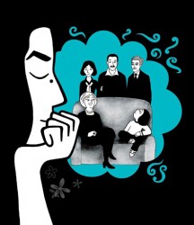
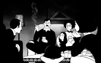
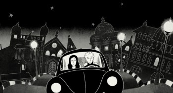
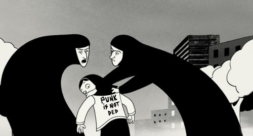
 The art style faithfully adapts the art in the book, though it’s obvious that some of the illustration has gotten significantly more sophisticated enroute the big screen. There is often a level of transparent textured whites overlaying the characters giving it some real depth. Images in mirrors, for example, are depicted via this texture. Smoke and haze are also designed using these whites.
Some of the backgrounds are lovely in their own simplicity with textured off-whites over gray buildings. It takes on a look all its own; at times I felt a hint of some of Hubley’s more impressionist work. None of this seems to come across in the graphic novel nor in the film stills I’ve seen. These small sparks of strong graphic art were welcome in the otherwise stark black and whites. It’s amazing how far they were able to push this style. However, the art style doesn’t do much to allay the problem I had with the story; there’s an overall sameness to the style – however beautifully controlled it is.
The screening I saw was of a film in French with English subtitles. Matthew Clinton, a leading animator in my studio saw the film with me. He commented afterward that he had problems enjoying the graphics because he had to continuously read the subtitles. He felt the graphic style of the subtitles was jarring with the hard-lined style of the animated film. I, on the other hand, wondered if this made the film’s visual style richer because my brain had to take in two visual elements at the same time. Of course, I’ll see the dubbed version when it’s released and will let you know if it changed for me.
 The film is a film; it’s not a cartoon. (Although there are a few annoying cartoon moments that pop up from time to time as they try to exaggerate the character, Marjane’s, emotions for comic effect.) The voices were excellent, particularly Danielle Darrieux as the grandmother and Catherine Daneuve as the mother. Of course, with those two actresses one would hardly expect less.
The animation moves quite fluidly, though I never quite felt that there was real personality in the movement. (That, however, is a complaint I have with even the highest budgeted film these days.) Vincent Parronaud was more the director of the animation than Marjane Satrapi, and Marc Jousset was the Art Designer. Christian Desmares was the Animation Director. There were twenty animators who drew the film in France. All of them should be proud of their accomplishment. The film was done for about 6 million Euros ($8.5 million).
This film takes animation in a direction it should be headed. It doesn’t try to revisit the mold that Disney developed nor does it try to cash in on cheap theatrics. It’s the best animated film I’ve seen in some time, and I hope it does well at the box office. Perhaps, then, there will be another film by this group.


on 18 Oct 2007 at 1:45 pm 1.David Nethery said …
Thanks for the thoughtful review. I am very eager to see this film.
I’m encouraged to see these types of hand-drawn films being made . This is the sort of film we hand-drawn holdouts should be making , both in terms of the personal, mature stories and the moderate budgets (I think the only way to get a film like this made is to not let it turn into a behemoth mainstream studio production costing $75 million or more … that sort of major budget comes with major strings attached , too.)
I remember thinking the same thing when I saw Triplets of Belleville. “See , it is possible to make an animated feature that is relatively inexpensive , but it doesn’t look threadbare cheap and it’s not based on a toy or some other pre-sold consumer item.”
It’s interesting to see so much 2D animation continue to come out of France (I guess they didn’t get the memo a few years ago the “2D is dead”) Les Armateurs production company in France put together the financing and organized multiple studios to work on The Triplets of Belleville and are currently also involved with the feature Brendan and the Secret of Kells , which is being co-produced by studios in Ireland, Belgium, Hungary, and Brazil. It’s an interesting production model, (gives me a headache to think about coordinating a feature across all those different languages and time zones) but it seems to be working for them.
on 18 Oct 2007 at 9:00 pm 2.Dagan said …
So glad I stopped by and read your review of the film… I am really looking forward to seeing it!
It certainly does look (and sound) unique and refreshing. By the way, great write-up on ‘Raggedy Ann and Andy,’ too… I haven’t seen the film since I was around 7 years old, and I’d love to feast my eyes on it again! (GOTTA love an animated film so rich with NYC animation history!)
Thanks again for your great writings here on the blog.