Daily post 05 Nov 2013 04:16 am
More Sketchbook Material
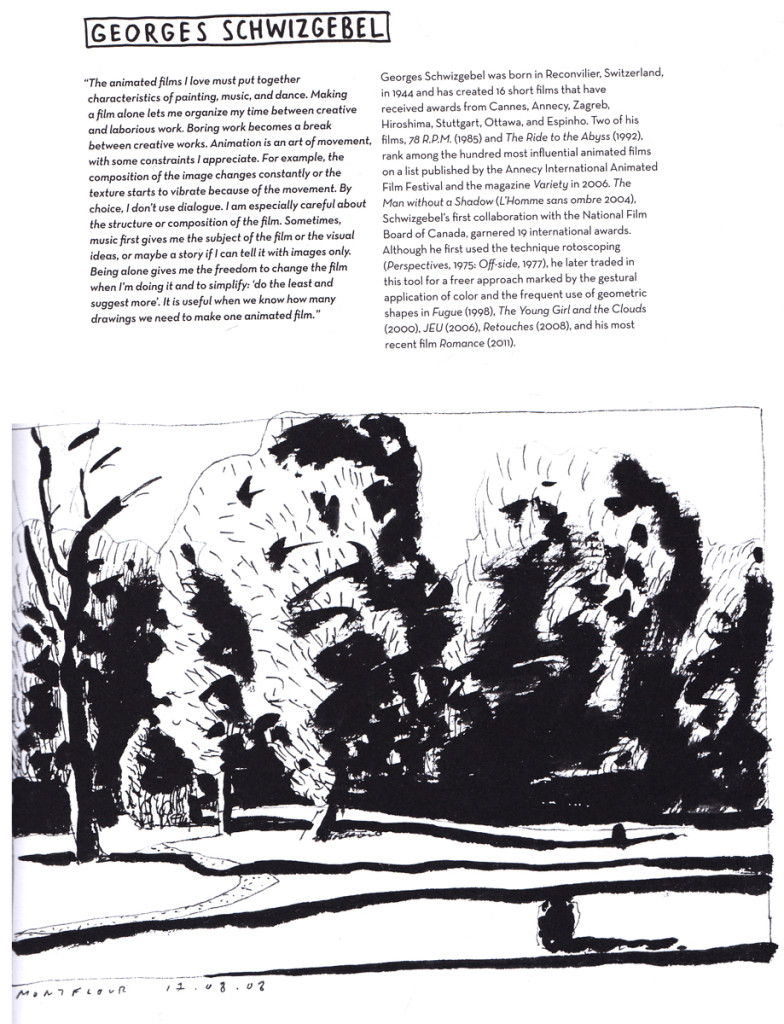
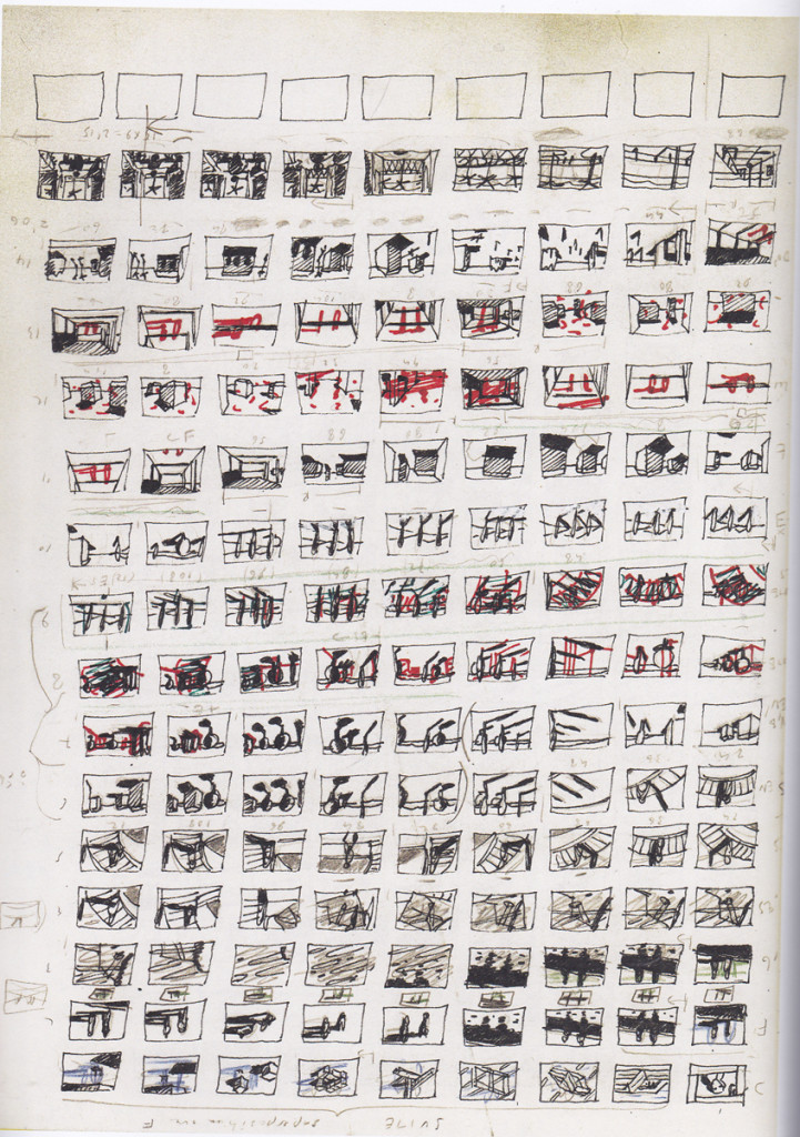
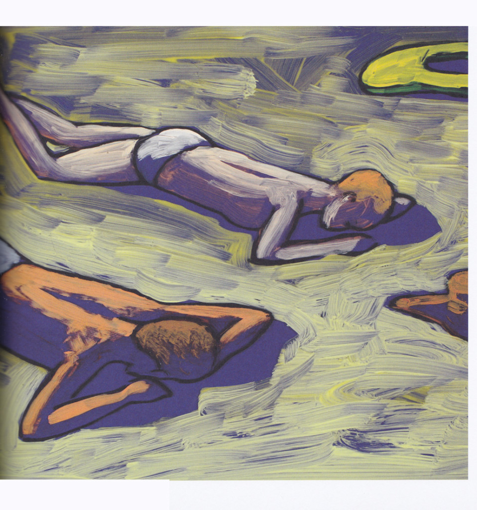
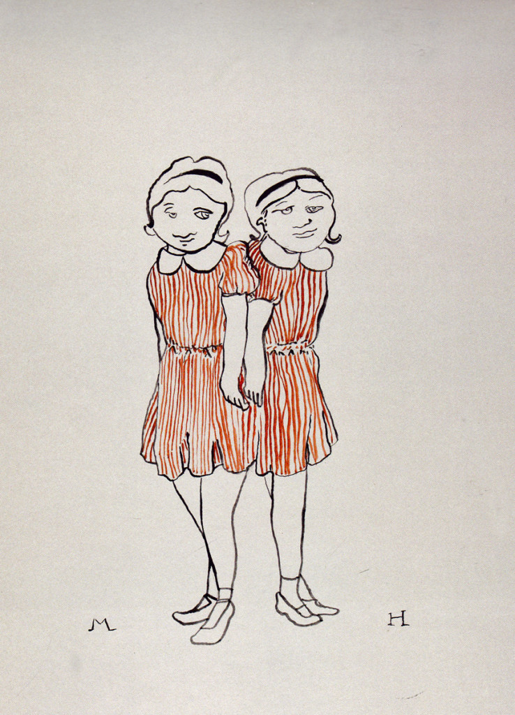
It was more than a week ago that I posted some very nice inspirational and preproduction drawings printed in the wonderful Chronicle book, Animation Sketchbooks, edited by Laura Heid, who is not only an artist but an animator as well.
LÄ“t’s take a look at a few more. Shall we?
 1
1
 3
3

on 05 Nov 2013 at 1:29 pm 1.the Gee said …
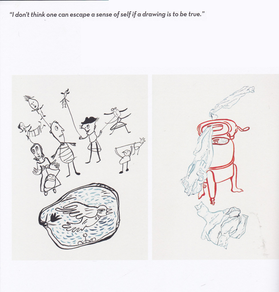
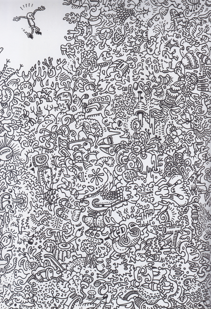
That last one, Number 16, is a gentle reminder that very elaborate cartoon drawings were made in the 1970s.
I’m almost certain this memory is accurate. There was a product of some sort which involved provided line art that was to be colored with provided stick markers. If I’m right then perhaps the idea was like coloring pages for older kids and adults. The end result being psychedelic poster art?
If the line thickness of that chaotic crowd were thinnerit would totally come across as perhaps being art on the sidewalk. Instead because it and the figure are the same thickness, whatever the heck that is is on the same plane as the figure. I mention this because I could see messing around with that and changing the image digitally, by adding color and painting it.
on 05 Nov 2013 at 1:44 pm 2.the Gee said …
Oh. My mistake. It wasn’t until I looked though the rest and read the cutlines that I figured out all are recent works by contemporary artists, including the last one.
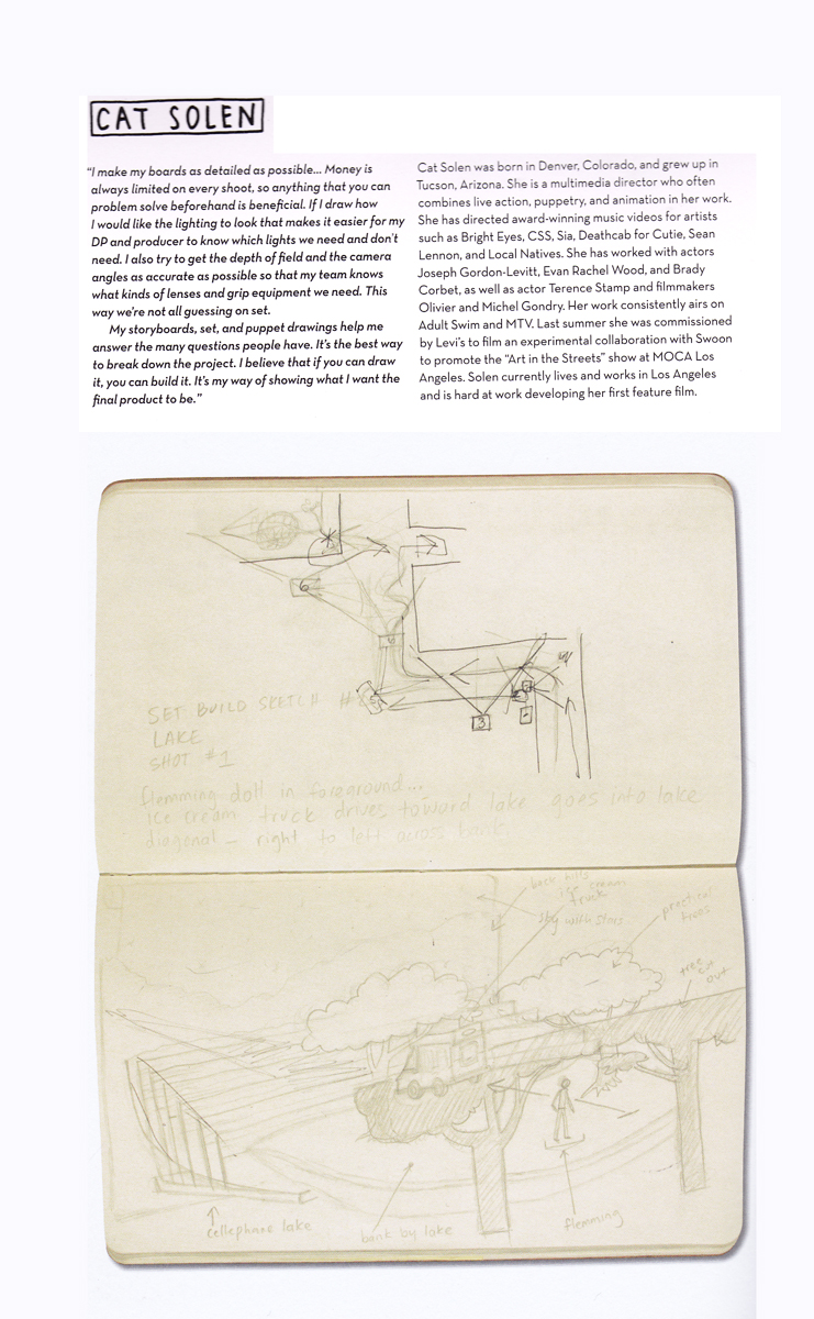
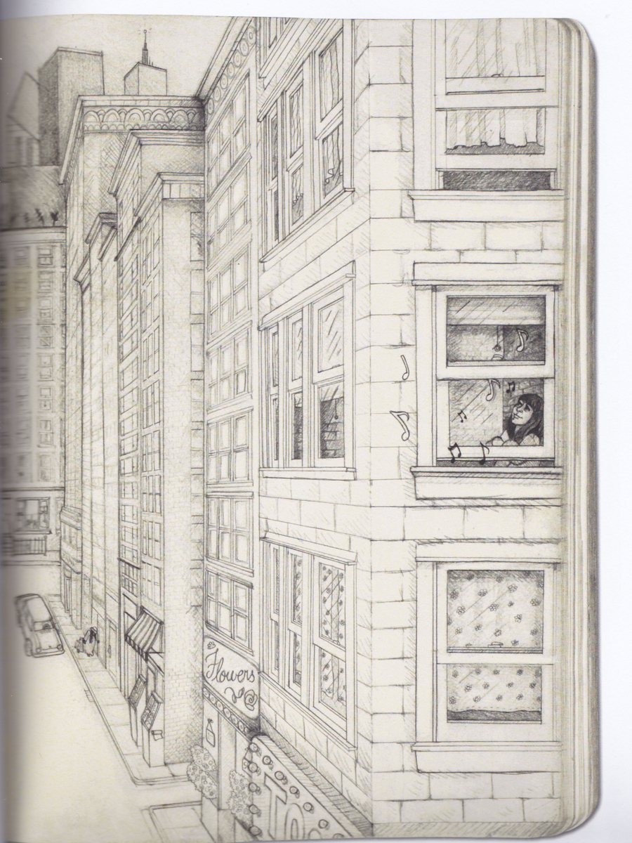
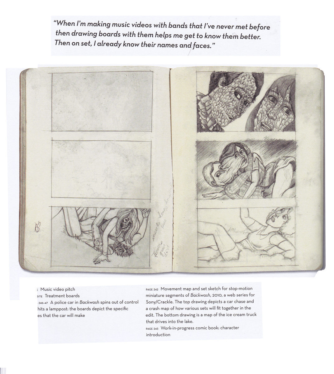
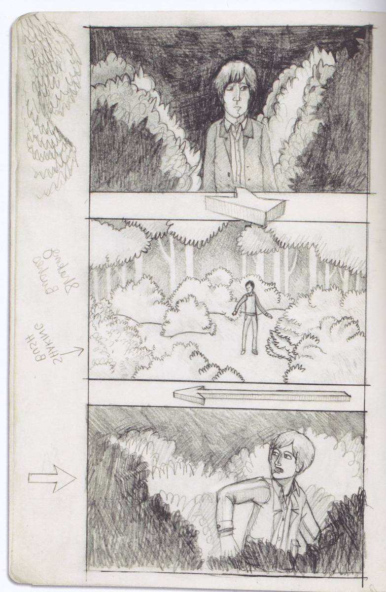
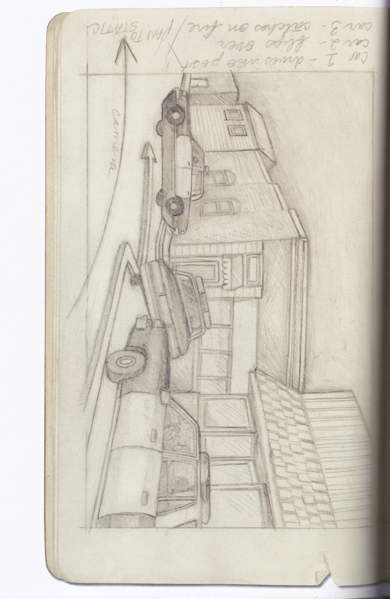
What surprises me about all of it is how heavy-handed the overall art is. That’s not meant to point out a bad thing. I know this is all just excerpts but you know how some artists sketches made while visiting some place are looser and still capture the place and what was happening in a moment. In some of these, like the ones with cars, it is just kind of forced information and the drawing is polished to a point but it still overly detailed in distracting ways. Since these might be for storyboards or concept pieces, it is shocking to see how some of them are drawn.
For instance numbers 10 and 13 (somehow 11 and 12 don’t exist!) are really over drawn for what it is worth. Perhaps the artist was thinking a lot? I could see that.
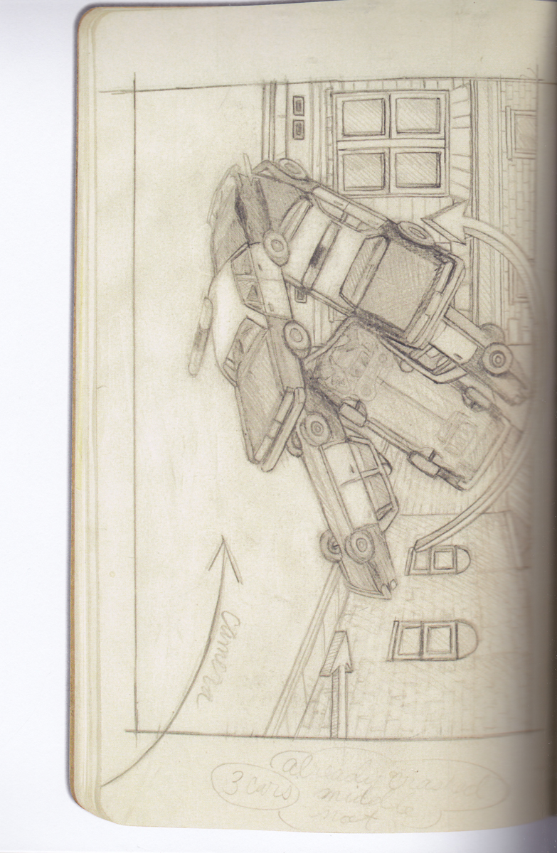
But, for 14 and 15, did the background need to be drawn so detailed for both of them? Perhaps if the artist were more comfortable with drawing cars and established place in number 14, then both drawings would not look so over wrought.
Again, this isn’t a bad thing. It works for what it is worth. If it was for planning, brainstorming or communicating then most likely all of this worked well. But, for something that could almost also be finished art it is kind of disappointing. For something that is meant to be sketchbook stuff, it is a bit too much and makes me wonder if the artist likes drawing or is some other visual method preferred (like painting/camera work).
on 05 Nov 2013 at 1:51 pm 3.the Gee said …
Ugh. I got it.
In the cop car pile up. I expect to see more damage and for each car to look that much different because of the type of damage shown.
In one, the lights have popped off the top, but, I expect to see smashed parts, cracked glass, for each car to look different not only because of perspective but because they are piling up. I’m not sure if the arrows used in both drawings would be entirely needed but even those have unneeded detail, like the next step is render these arrows on a computer.
I don’t mean to make too much of this. I may be. But, it is reminding me of odder storyboard art I’ve seen. Stuff that doesn’t say enough, for live action, and which probably should have been done by someone else. Or just not considered art to be published.
Now, I realize this might “sound†harsh. I don’t mean for it. They are probably all great artists. I’m just over-reacting to the art shown. It’s more me than the art.