Commentary &Layout & Design 13 Oct 2013 08:17 am
Just Give Me A Good Drawing
I want to write a couple of pieces about design and stylization in animation. This will start us off.
As animation left the Thirties, proudly moving into the Forties there was a lot to be proud of. In a short period, the animators had moved from stick figures to rubber hoses to fully rounded individuals acting through their pieces. The animation had gotten a bit sentimental (as were many live action pictures of the day), but they handled their tasks well.
The acting had grown full throated and offered more than just the surface performances.
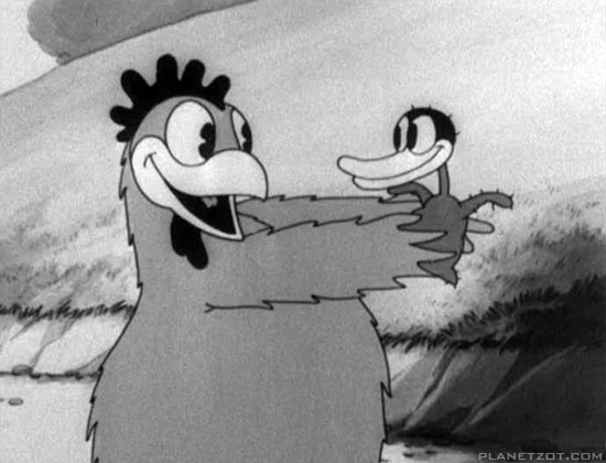
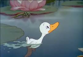
The early version of Disney’s Ugly Duckling and the Later one.
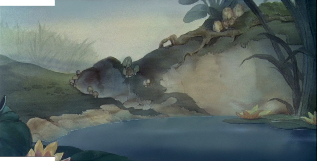
Hans Bacher’s beautiful reconstruction of the BG from the latter film.
Looking at a film like The Old Mill we see rich scenics animated, a film that played against The characterizations of the The Ugly Duckling or Ferdinand the Bull. Warner Bros were starting to slip into their Looney Tunes period as their characters grew smart and zany. This movement was led by Bob Clampett with Tex Avery showing him how to deal out wild paced timing and surrealistic movement to play for any joke they could get. Disney was straight as an arrow but went for the beauty thing and achieved it as peers competed with each other in the varied studios.
Even Terrytoons were stealing Hollywood’s gags and pulling them off in a somewhat retro manner.
After the Disney strike and the entrance into WWII design and stylization started to grow up. They saw what the Russians had been doing in their attempts to animated the state-run propaganda, ad the art left some inspired, though it was obvious that the animation was living up to their designs.
Some of the animators on the sidelines pushed themselves into the forefront of graphic evolution in animation. Leading the pack in America were the free lanced group working for UPA and the military. The use of strong graphics allowed the animators to get awa with a bit less animation while keeping the films strong. People like Hilberman and Zach Schwartz may have been on the wrong side of Disney’s politics, but they pulled out the stops with their pen and inks.
Films like Hell Bent for Election or A Few Quick Facts About Fear gave the artists the right to move daringly forward with their very strong artwork.
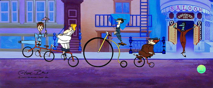
These led Chuck Jones to follow his designers like John McGrew to change the face of the animation. With The Dover Boys of Piemento University all of animation took notice and immediately tried to replicate the work going more and more daring with each film.
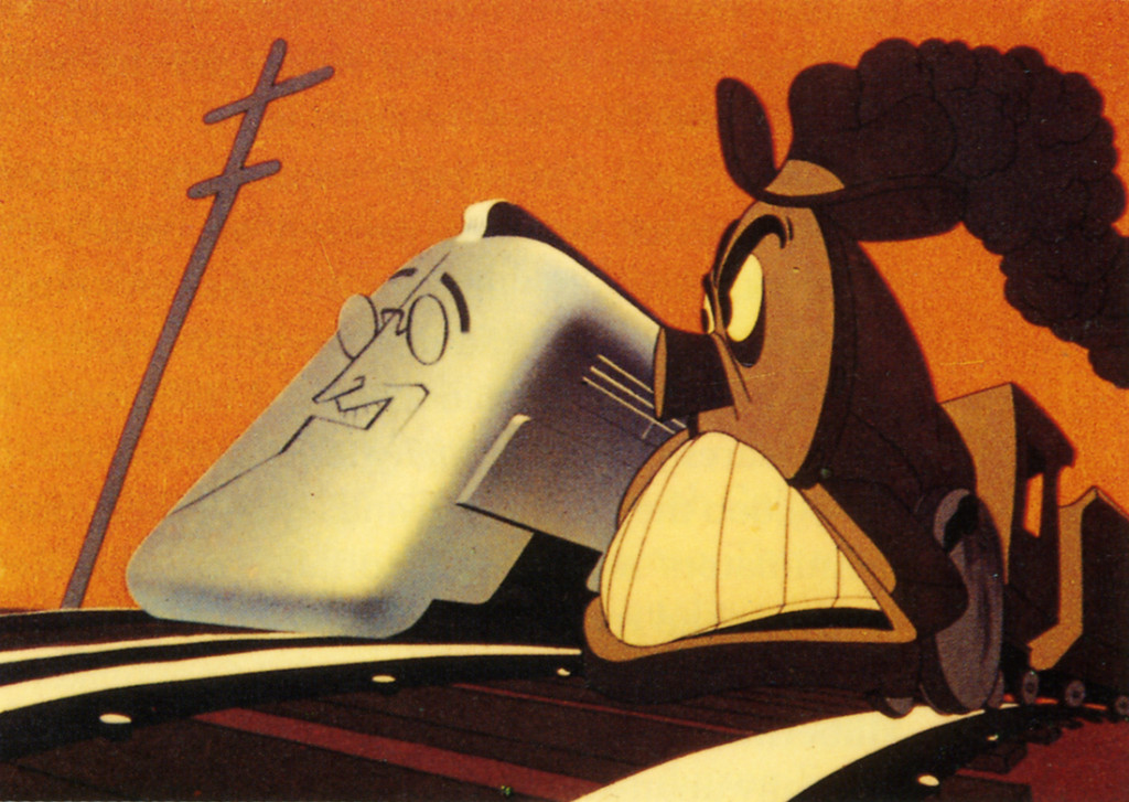
Hell Bent for Election
Immediately after the War, these new graphics returned with the troops as Disney made strong colored works dominated by the likes of Mary Blair and the story structure of Bill Peet. Warner Bros., mostly under the guidance of Chuck Jones brought their abstract art to the BGs with similarly strong painters like Paul Julian leading the way. Under John Hubley at UPA he had not only designed and painted films but also co directed the Oscar nominee The Tell Tale Heart.
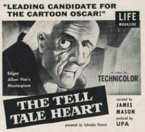
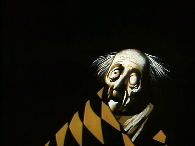
Poster and art for The Tell Tale Heart by Paul Julian at UPA.
Animation went such a distance in a short period of time. From the ball of uncontrolled mass called Oswald the Rabbit, to a rubber hose Mickey & Minnie Mouse to well defined circular characters. It led to more and more sophistication in the scripts and stories with the graphics trying to keep up.
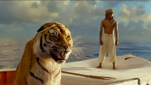
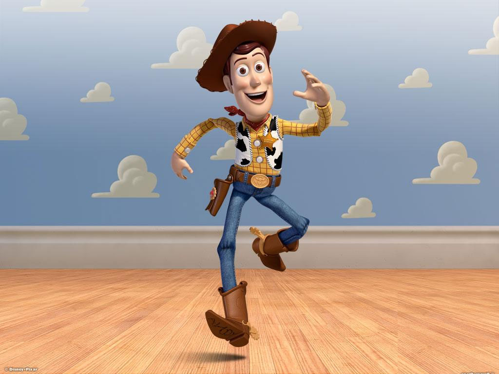 This all ended in 1995 as Toy Story burst onto the screen. The cgi graphics took time to grow up to the sophistication we have today with the likes of Brave or Despicable Me. Seeing the incomparable work in the 2012 Oscar winner, the even more precocious The Life of Pi, gives us pause for thought. We have no idea where animation is going, but for the moment it is definitely not graphically forward. It is difficult to sit by and watch when I have only my meager tools to work with – a pad and pencil. But I continue forward and hope what I do will be accepted.
Give me a good drawing. That’s all I ask.
