Animation Artifacts &Books &Disney &Models 25 Sep 2007 08:08 am
Pastoral Pics
![]() – The Pastoral sequence from Fantasia is definitely not a favorite of mine. I have a lot of problems with it that it’s best not to start a critique. However, these days – there being so much bad art-in-animation – it’s like saying it’s my least favorite Rembrandt.
– The Pastoral sequence from Fantasia is definitely not a favorite of mine. I have a lot of problems with it that it’s best not to start a critique. However, these days – there being so much bad art-in-animation – it’s like saying it’s my least favorite Rembrandt.
Just the same, I’ll still say the sensibility offers everything I dislike about Disney.
In the past couple of weeks, I’ve been posting artwork from the Deems Taylor book, Fantasia. This is pretty much a storybook for all the sequences from Fantasia. It was published in 1940 by Simon & Schuster.
Here are the illustrations for the sequence featuring the Pastoral by Beethoven.
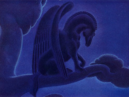
This is probably my favorite drawing in the sequence. There’s a lot of power in it.
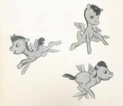
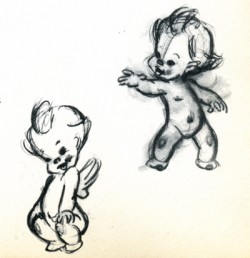
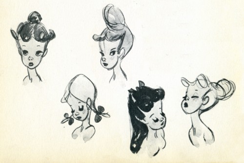
There’s not much to say about drawings like these. They’re very skillful but very sweet.
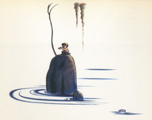
I like this image. There’s a lot of atmosphere in it, and it seems to fit well into the book’s design overall.
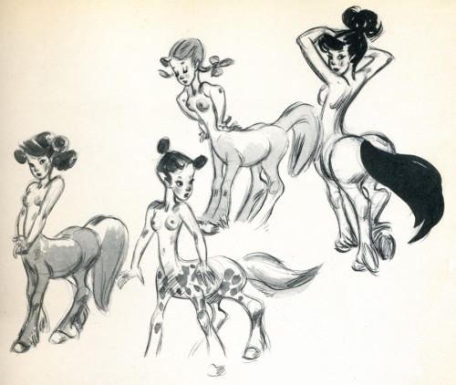
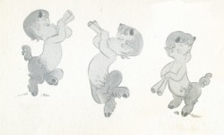
I’m not convinced that these drawings are by Fred Moore, though they’re obviously trying
to emulate what Moore has done.
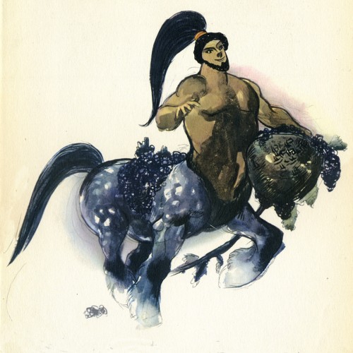
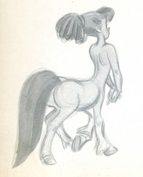
I don’t know how this image made the book. I suppose they needed one of these centaur types. Surely, there must have been a better drawing done for the sequence.
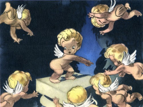
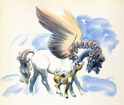
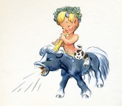
Another drawing of these very cute characters, but I think this one is really
well done, trading in a lot of the cuteness for artistry.
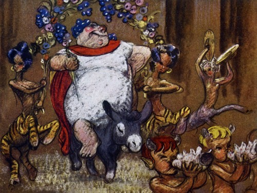
__Bacchus. Ward Kimball animated a lot of this character and did a good job of it.
__I think it’s probably the best animation in the sequence.
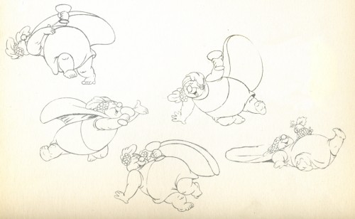
__These look like Kimball’s drawings from the sequence.
__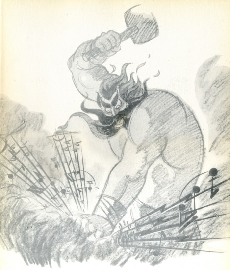
_____Thor. I’m glad the final didn’t look like this.
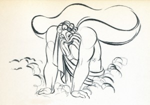
__The animation drawing of Zeus is attractive. The character was nicely done.
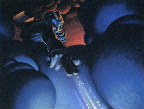
This color sketch of Zeus is quite different though it gives a good sense of what they were looking for in the sequence.
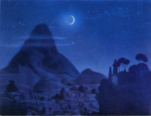
__This image appears in quite a few places representing the sequence.
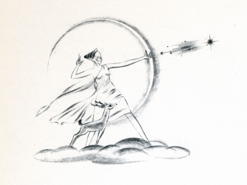
__This, I think, is a nice, rough drawing.

on 25 Sep 2007 at 11:45 am 1.Paul Trotter said …
I think we need to look beyond the animators as possible sources of this art. Some of it may be concept art from the story men or layout artists. One likely source of some of this art would be the Art Director for this sequence, Lance Nolley.
on 25 Sep 2007 at 1:54 pm 2.Eddie Fitzgerald said …
I probably like this sequence more than you do.
Some of the scenes are just too cute but then again, a lot of the cuteness is built into the music. We’re seeing the sentimental side of Beethoven and I find the man interesting in all his moods.
on 25 Sep 2007 at 5:43 pm 3.Paul Trotter said …
Some of the “cuteness” appears to come from the concept art of Albert Hurter http://www.animationarchive.org/2006/09/media-two-disney-concept-artists.html
Note:”Originally, Pierne’s “Cydalise” was to have been the musical choice for the Greek mythology setting, but Walt Disney decided it wasn’t expressive enough for the story, so Ludwig van Beethoven’s “Pastoral Symphony” was chosen instead.”(IMDb)
on 25 Sep 2007 at 6:17 pm 4.Michael said …
If you look again at the model sheet drawn by Al Hurter, you’ll see that he was incapable of drawing the vulgar cuteness that ended up in this film. There cute, and there’s cute. I think many of the animators brought their own poor taste to some of this artwork. It needed a better, stronger designer to make it work.