Animation &Articles on Animation &Hubley 30 Aug 2007 07:49 am
Littlejohn & Tyer
- Bill Littlejohn is an animation “God” who doesn’t get the attention he deserves. Let me call your attention to an excellent and extensive interview Tom Sito conducted with Bill which is posted on AWN.
 Bill was one of the first animators whose work I could identify opn screen. I studied the Hubley films in my early years, and I watched The Hole and Of Stars and Men every chance I could in the days before vhs tapes when you had to go to a theater to see these films.
Bill’s work on Of Stars and Men has completely entered my vocabulary of great animation. The walk cycles for the many animals are just so magestic and regal that I watch them over and over.
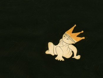
That film employed the Hubley technique in which the animation drawings were painted black (using oil paint so that the paper wouldn’t buckle) all about the exterior of the character and were then double-exposed over the backgrounds. A lot of hit and miss was part of the process as characters had to avoid each other or create a multiple exposure; you could see through each of the levels. With each run through the camera, the density of the image kept thinning out, as well. It’s amazing how stunning this film is given the inherent problems in the technique. And it was made for a budget of $90,000 – a feature film!
I have a lot of Bill’s animation drawings I saved while working at Hubley’s. I’ll try to scan some soon.
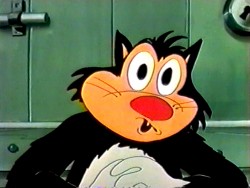
 - There’s an enormous Jim Tyer post which celebrated his brithday back in February. there’s not much new information here, just a lot – and I mean lots – of links to videos and other writings. If you’ve a mania for Jim Tyer, this is the first stop.
There are quite a few sites which break down Tyer films in a frame by frame analysis. His animation is good for this; the distortions are so entertaining. However, I sometimes wish there were more of a critical analysis by someone who is truly knowledgeable about animation. It’d be fun to see an informative comparison between some of Rod Scribner and Jim Tyer, but truly discuss their work in relation to animation technique. Less show-and-tell and more commentary with illustrations supporting the thesis. Maybe someday when I’m in a ponderous state, I’ll offer my thoughts. However, until then, it’s still fun to look at the wacky drawings.
A couple of these sites are:
Animation I.D. Tyer-How Does It Work
Classic Cartoons “How To Relax”
Classic Cartoons “Foiling the Fox”
Inspiration GrabBag More Jim Tyer

on 30 Aug 2007 at 12:53 pm 1.Eddie Fitzgerald said …
Wow! Two of my favorite people in one blog! Bill Littlejohn certainly is an under-rated artist. I remember seeing his “Tiger Paw” commercial on TV for the first time and being blown away by it. The story, art direction, direction and all the technical jobs on that commercial were executed flawlessly. I hope it won a million awards.
Jimmy Tyre scenes are in desperate need of analysis and I hope you’ll be able to do that some day. You’ll have your work cut out for you because you’ll have to articulate thoughts never before committed to paper. Even more than other animators, Tyre’s work seems to be visceral and impulsive.
on 30 Aug 2007 at 8:43 pm 2.David said …
Bill Littlejohn is a wonderful animator and I’m glad to see this interview which recognizes his achievements and points them out for the younger generation that may not be familiar with his work.
However, I think there’s a factual error in one of the interviewer’s questions on page 3 of the interview :
“TS: You animated on most of Hubley’s award-winning shorts — The Hole, Cockaboody and The Adventures of an *. ”
http://mag.awn.com/index.php?ltype=article&article_no=3383&page=3
But is that right ? I thought Tissa David animated all of “Cockaboody” .
(this is in no way to take away from Bill Littlejohn’s remarkable career achievements, but accuracy is important in listing credits)
on 30 Aug 2007 at 8:58 pm 3.David said …
“That film employed the Hubley technique in which the animation drawings were painted black (using oil paint so that the paper wouldn’t buckle) all about the exterior of the character and were then double-exposed over the backgrounds.”
Interesting. I did not know that was the technique used… it’s an interesting technique and produces a very unique look. They used this on Moonbird, too , I would guess ?
(and “The Hat” also I suppose)
on 30 Aug 2007 at 9:54 pm 4.Thad Komorowski said …
Thanks for the link. Like the title of my post, how does Tyer’s animation work? It’d be interesting to read what you think.
on 31 Aug 2007 at 2:14 am 5.Michael said …
Yes, David, Moonbird and The Hole were also done with this blackening/double exposure technique. Only in these films they used a watercolor based paint to blacken the white of the paper. You can see what one of the Moonbird “cels” look like here.
There are times in Moonbird where only parts of the animation were painted black and a circular matte was used over the drawings. These circles appear as halos in the film as well.
You’re right that Tissa David animated the entire film Cockaboody.
on 31 Aug 2007 at 12:52 pm 6.Tom Minton said …
In the recent Walter Lantz Woody DVD release, there’s one short dealing with gas rationing animated entirely by Bob Bentley that, in certain scenes, almost prefigures some of the things Tyer would do about a decade later. Bentley was a skilled, experienced animator but not all that much has been written about him. Could Tyer have taken a cue from what Bentley was hinting at and run with it? Or could Tyer have possibly been an uncredited animator on that cartoon? Tyer did spend a little time in southern California, according to the late Paul Fennell, who recalled talking to him at a bar near MGM on one occasion. This is probably a question for Mark Kausler.
on 31 Aug 2007 at 1:48 pm 7.Thad Komorowski said …
Tom,
“Ration Bored” wasn’t entirely animated by Bentley, as it was improbable to the Lantz studio’s system. The end scene with Woody getting a ‘hoarder”s angel wings was most certainly animated by Hawkins.
Bentley was a very funny (in a good way) according to others, and I do think that that scene with the tire is his in that cartoon.
on 31 Aug 2007 at 1:49 pm 8.Thad Komorowski said …
Bad grammar in that post– Should have said “it was improbable to how the Lantz studio’s system worked”.
on 31 Aug 2007 at 3:17 pm 9.Dave Levy said …
I’ve been watching the new Woody Woodpecker DVD set and I’m amazed at how much distortion is used in the character animation. Body parts and limbs enlarge and shrink from moment to moment in a way that reminds me of Tyer too. This is what has been lost most of all in the flash age. In flash it’s like you are animating with a rigid model sheet instead of drawing what the emotional truth of each moment tells you to draw.
on 31 Aug 2007 at 4:35 pm 10.David Nethery said …
“This is what has been lost most of all in the Flash age. In Flash it’s like you are animating with a rigid model sheet instead of drawing what the emotional truth of each moment tells you to draw.”
Amen, brother ! You put your finger on it precisely .
Some people do manage to get lively looking work done in Flash, but it’s mostly from animating and inbetweening frame-by-frame in a “traditional” manner, with the Flash software utilized as a paperless animation/ink & paint system rather than using Flash symbol animation and the dreaded motion ‘tweening shortcuts , which usually results in that rigid, mechanical look.
on 31 Aug 2007 at 4:57 pm 11.Michael said …
Has anyone seen ANY real animation in Flash? Or is it all just movement (usually fast to hide the flaws).
on 31 Aug 2007 at 6:36 pm 12.David said …
I’ve seen good , full animation done in Flash , but as I said it’s usually when Flash is simply used as a paperless animation/ink & paint system , but the animation is drawn in a traditional manner frame-by-frame . The thing is , in my opinion there are better software packages for doing that sort of thing : TVPaint (aka “Mirage”), or if vector art is desired then ToonBoom . PAP (Plastic Animation Paper) is also a pretty good program, though I’ve only played around with it a bit.
Here’s a film by Anik Rosenblum that was drawn in Flash using a Wacom tablet :
The Autumnal Walk
There are other good things out there being done in Flash , but to me a lot of work done in Flash does still have that mechanical “rigid model sheet” look … but of course Flash isn’t to blame for that any more than traditional cel animation technique is to blame for Filmation’s or H&B’s mechanical, rigid-model sheet look of the 60′s and 70′s . I’d say that Flash production has in many ways upped the quality level quite a bit for limited television series animation. Maybe not in terms of entertainment value, but in terms of the overall technical quality of the product (no more sliding cel edges, color pop-offs, out of alignment drawings because the xerox machine had a bad day, and that sort of thing).