Photos 05 Aug 2007 07:57 am
Banner Photo Sunday
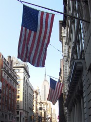 – Back around July 4th, I posted a lot of American flags that could be seen all around town. At that time, I pointed out that there was a bit of a change floating all about us. Back in the 70′s-80′s, a lot of the bronze signs that posted the names of stores and building inhabitants were being stolen right off the buildings and sold for the value of the bronze.
Instead of replacing these heavy metal signs, the storekeepers found cloth banners which could easily and more cheaply advertise their names while at the same time offer brighter colors and bigger lettering. In short, they made for perfect floating ads.
We’ve grown accustomed to these many flags floating all over our landscape, and in NYC they’ve become almost invisible to us. Blocks of color and writing floating everywhere over our heads but just within our lines of sight.
So, just to make my point, here we have some obvious banners that I tread past daily. I hope some of the pictures are, at least, interesting.
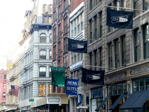
You can see that these banners have just about taken over advertising and display for many store outlets. They’re flying everywhere about Manhattan.”
 _
_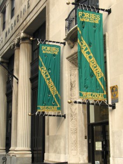
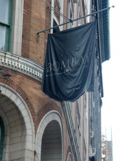
Everything from Bombay Stores to Forbes Magazine use these banners. Forbes, I might add, also has bronze lettering on their door.
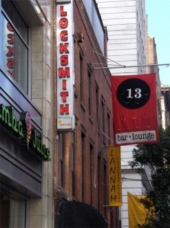 _
_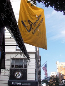
There are times when electric lights sit right alongside these banners, lighting them up at night.
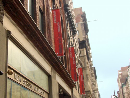
Parsons (above) and the New School (below left) use similar multiple banners across the street from each other.
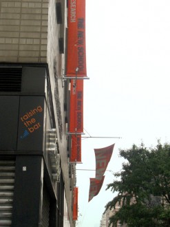 _
_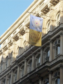
The Yoga banner (on the right) is just about worn out and can barely be read from the other side of the street.
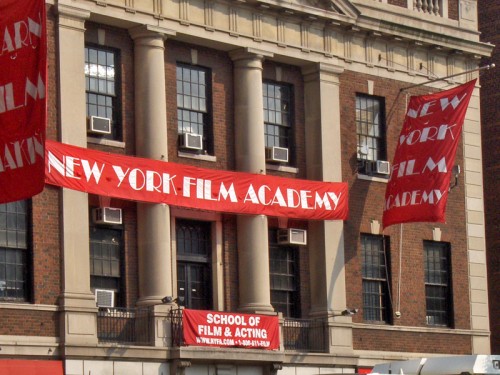
The NY Film Academy just about overdoes it with their multiple banners. This fine old building almost loses all of its dignity in being overdraped like this.
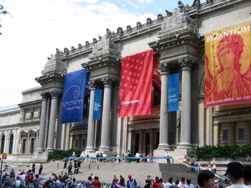
The banners of the Metropolitan Museum of Art have almost become famous; they’ve appeared in so many movies.
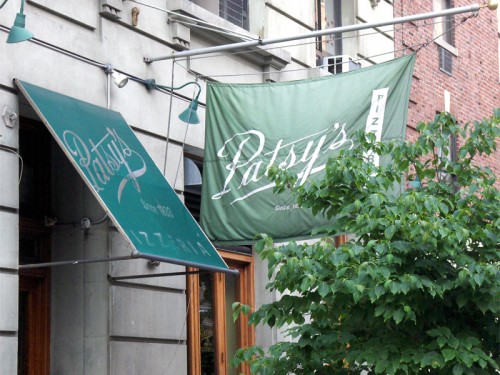
However, I like the way Patsy’s uses the awning and the banner (almost hidden behind the bush) to call some quiet attention to itself.

on 05 Aug 2007 at 4:20 pm 1.Eddie Fitzgerald said …
Nice essay on banners! I like the way loose cloth works with architecture. You see it in awnings and draperies too, and in table clothes, quilts and furniture covers.
In old Russia they even cut lace patterns into the wooden trim on buildings. It’s odd that people seem to have a need for colored cloth. Even concrete buildings seem incomplete if they don’t have banners.
BTW, the Steve Martin interview with Roz Chast was fun!