Monthly ArchiveMay 2013
Bill Peckmann &Books &Rowland B. Wilson 31 May 2013 05:28 am
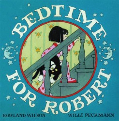
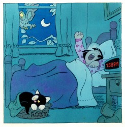
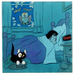
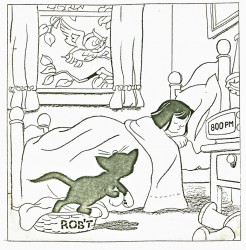
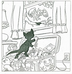
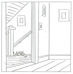
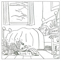
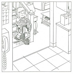
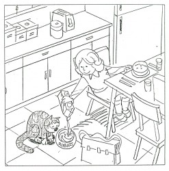
Bedtime for Robert
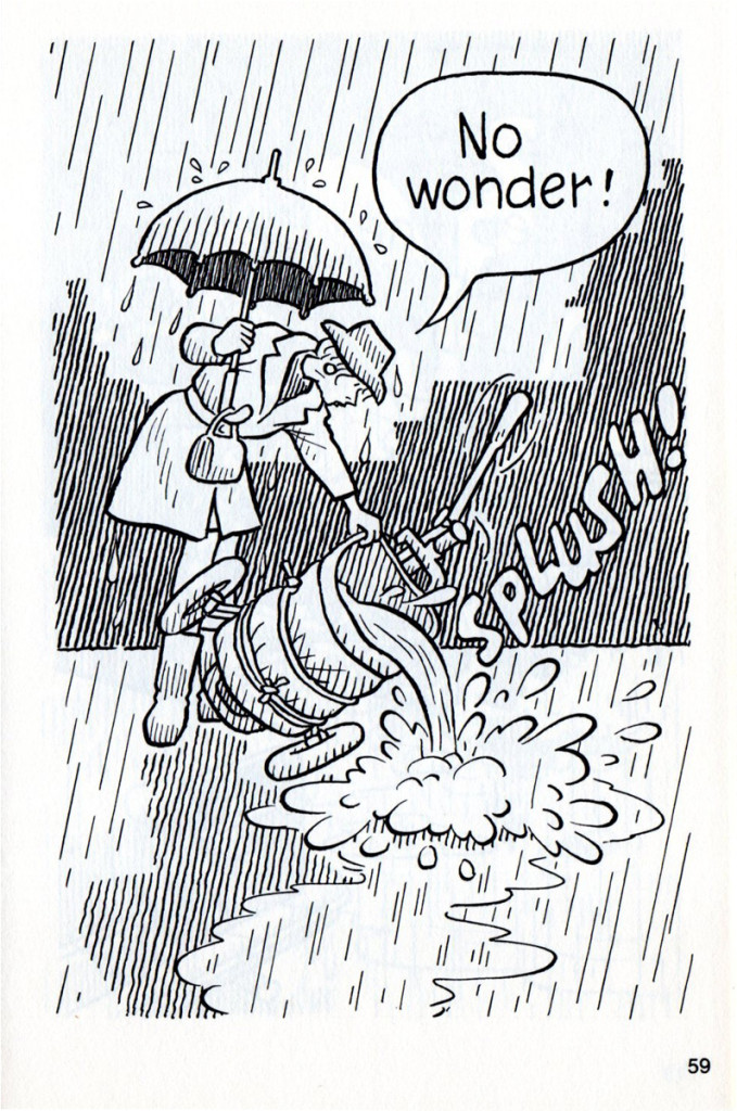
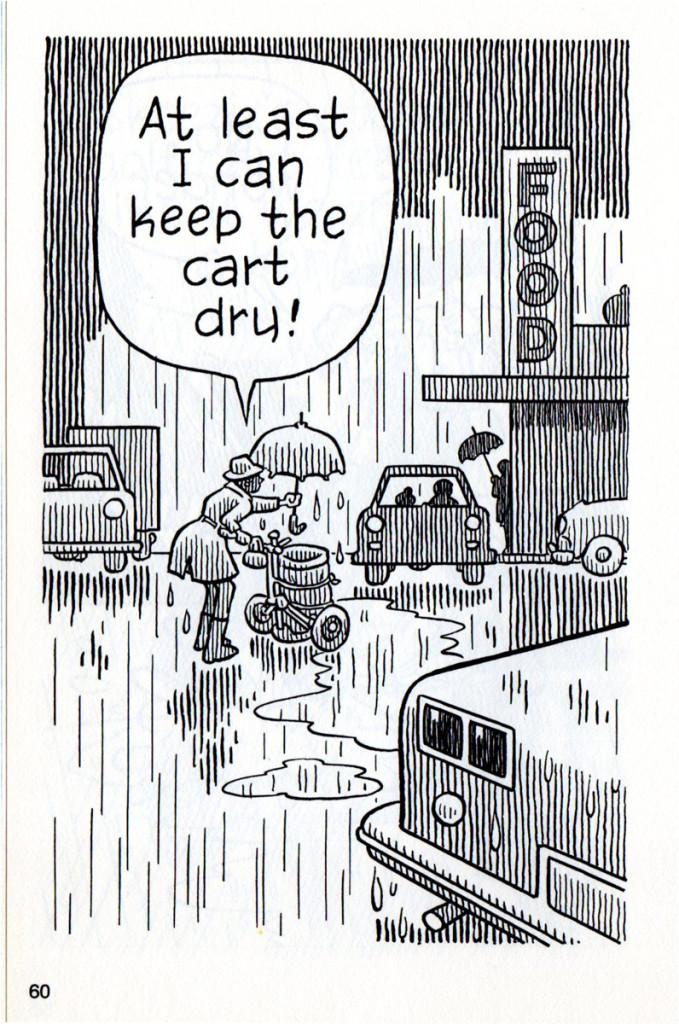
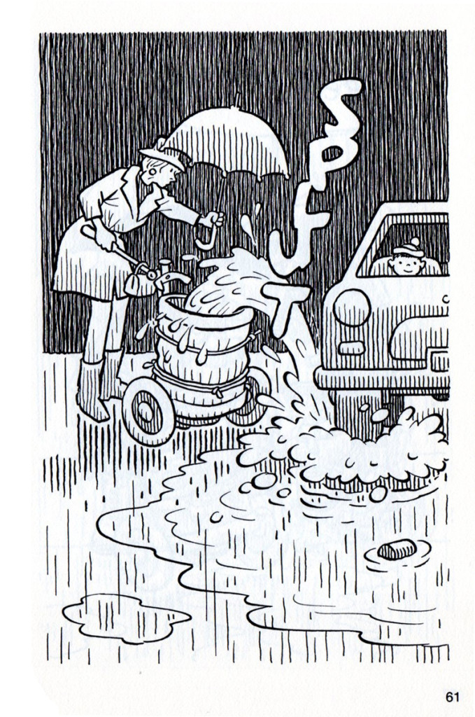
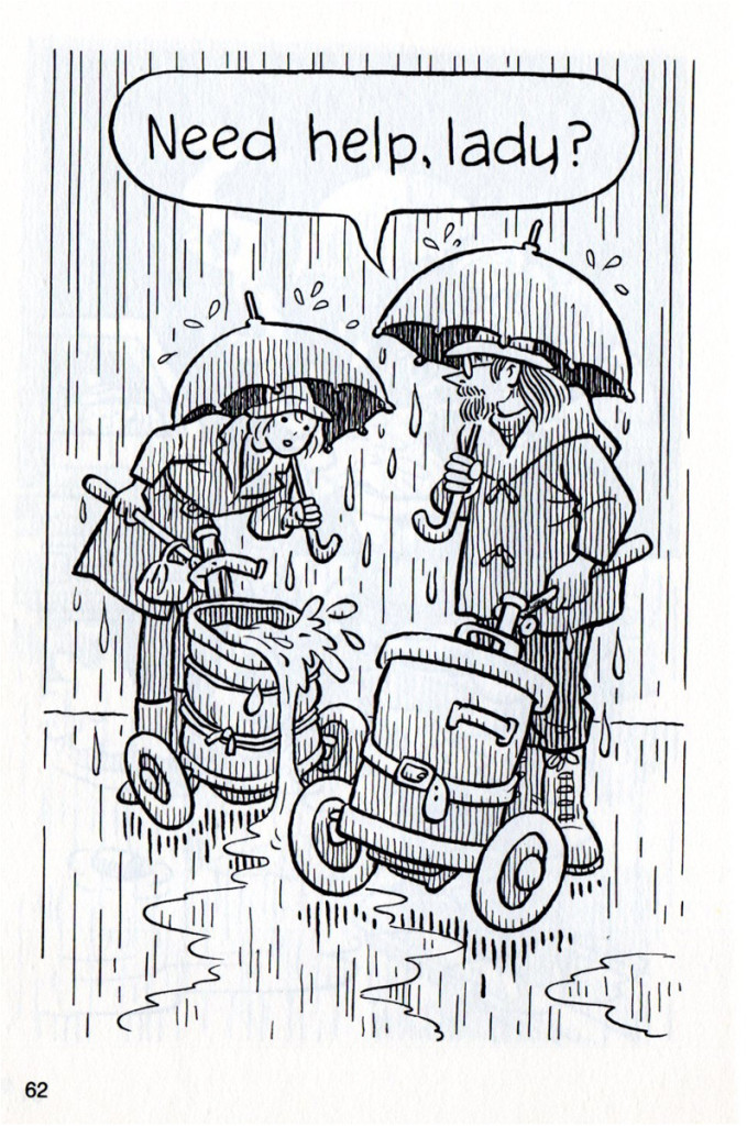
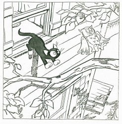
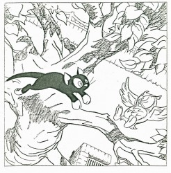
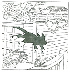
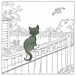
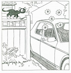
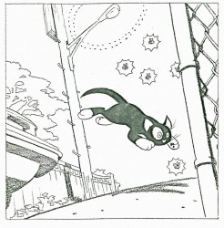
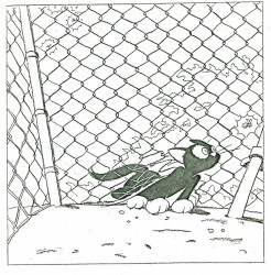
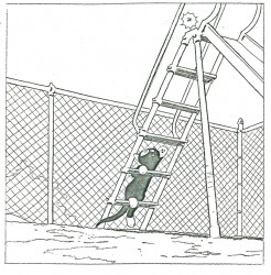
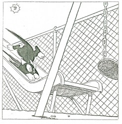
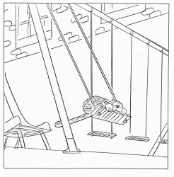
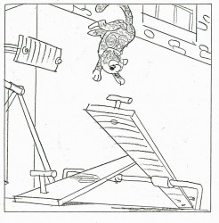
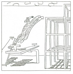
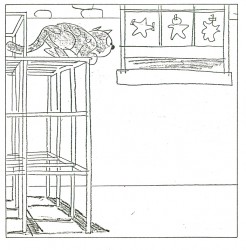
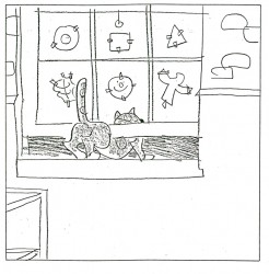
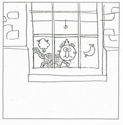
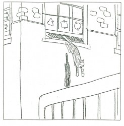
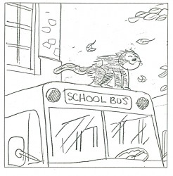
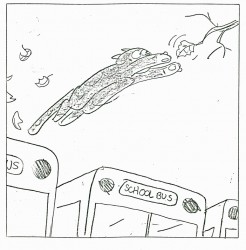
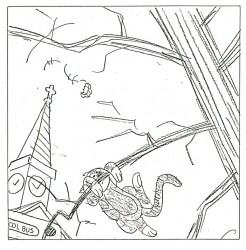
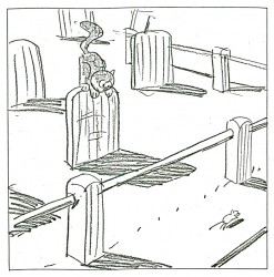
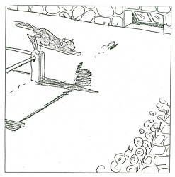
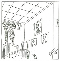
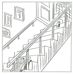
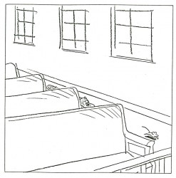
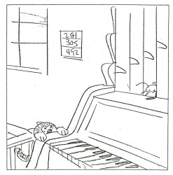
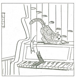
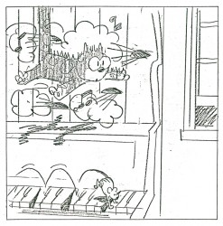
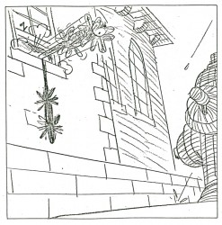
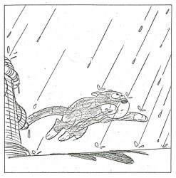
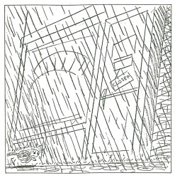
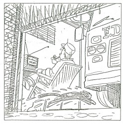
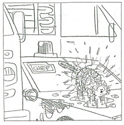
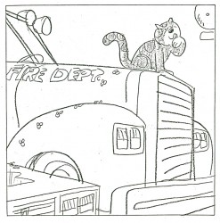
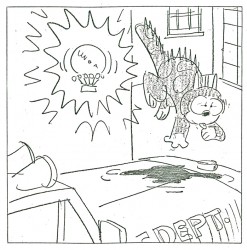
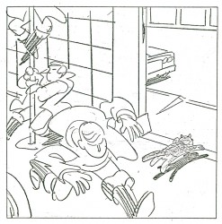
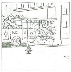
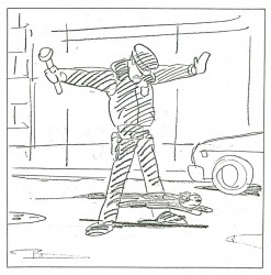
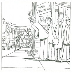
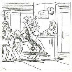
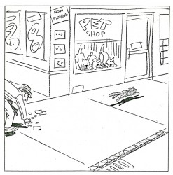
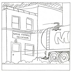
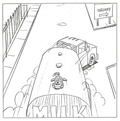
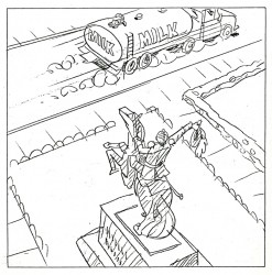
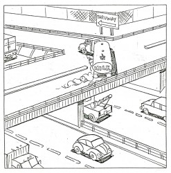
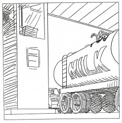
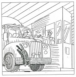
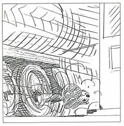
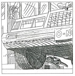
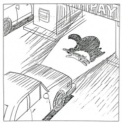
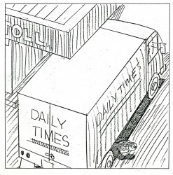
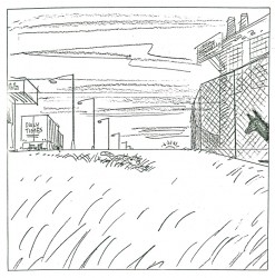
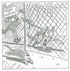
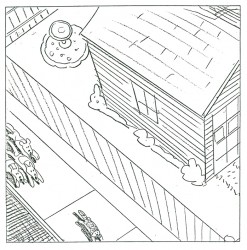
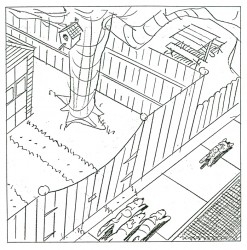
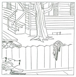
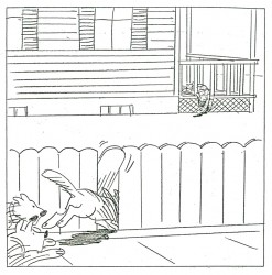
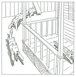
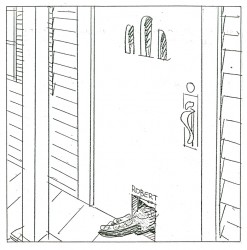
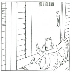
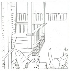
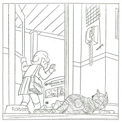
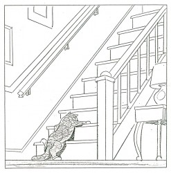
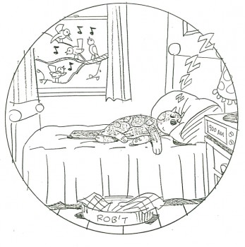
- Bill Peckmann collaborated with Rowland Wilson, back in the early ’80s, on a charming little book for children that never found a publisher and, consequently, never was completed. Bill had a bound copy of the book – in a mockup form – and sent it to me. I, naturally, would like to share it.
First, here’s the note on the inner sleeve of the cover:
- ABOUT BEDTIME FOR ROBERT, A WORDLESS BOOK
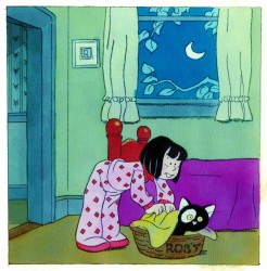
Bedtime for Robert is intended to bring to small children an early experience of the special personal relationship one has to a book; the availability and flexibility that a book enjoys over a fixed-time medium such as television.
Being wordless, the book needs no translation. The child has access to it at any time without relying on adults. This early exposure to the physical reality of books will, we believe, enhance the experience of reading later on.
The story combines the pull of a narrative with information that appeals to a child’s curiosity: in this case what goes on at night in the adult world. Although the child must go to bed (reluctantly), Robert the cat’s curiosity leads him into this forbidden adult world. Robert is all cat with cat qualities, not a little person in a cat suit as most cartoon cats are. The child can project his own emotions into the character.
The authors are booklovers with extensive experience in both print and film. We have both won Emrnys and other awards for our animation designs for educational TV.
We believe this is the first book to utilize the principles of film continuity in a printed form. This continuity is vital to the understanding of a narrative without the aid of words.
The use of film pacing supports the unfolding of adventure and humor in a wordless story.
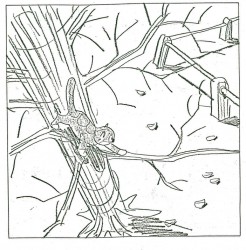
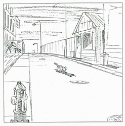
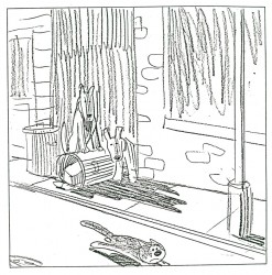
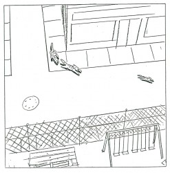
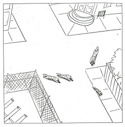
The book is planned to be in color. The pages up to 17 are in finished linework and the rest is in rough layout form.
Robert is conceived as a series. The character and structure would remain constant. The variables would be in the cat’s adventures in various places, seasons, times of the day, and occupations.
Please contact either of us at the addresses below. This is a simultaneous submission.
Yours truly,
Rowland Wilson
Willi Peckmann
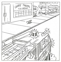
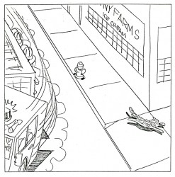
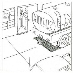
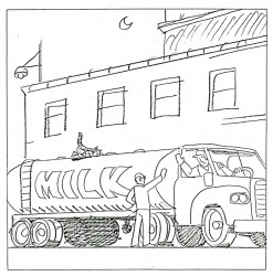
You’ll see immediately how original this book is:
 3
3(Click any image to enlarge.)
 28
28 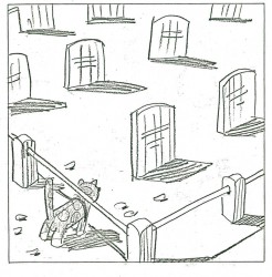 29
29
And just to put everything in proper perspective, here’s a letter they received from Houghton Mifflin rejecting the book. He was Rowland B. Wilson, for god’s sake!
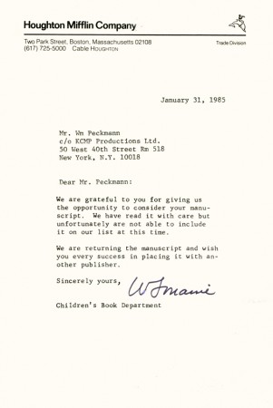
Bill Peckmann added this background info: “The rejection slip from
Houghton Mifflen really hurt the most because our thinking at the time
was that since they were publishing Bill Peet’s books (my all time
favorites), we thought they would understand the concept of “Robert”
better than anyone else. Go figure”
Books &Commentary 30 May 2013 04:36 am
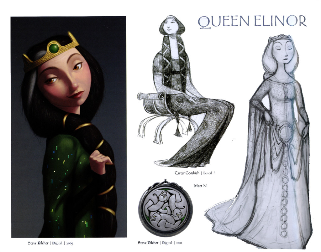
Art of Brave
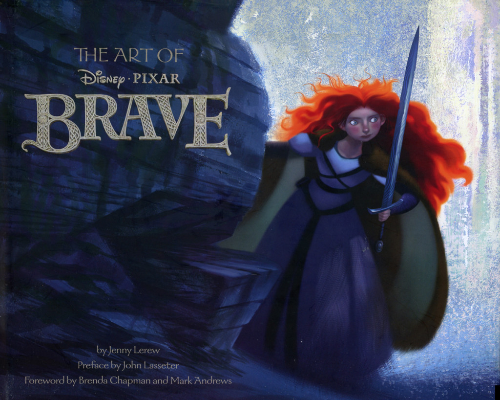 I didn’t get to review an animation book last year and have sorely wanted to. The publisher was going to send a copy, then they couldn’t, then it was too late, and then, lo an behold, I received a copy of Art of Brave by Jenny Lerew. Chronicle books has long been a favored publisher of mine – at least of art books, particularly animation art books. Their attention to detail is usually great and meticulous. That’s definitely true of this volume.
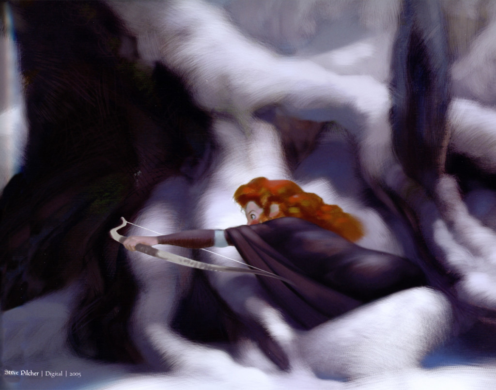
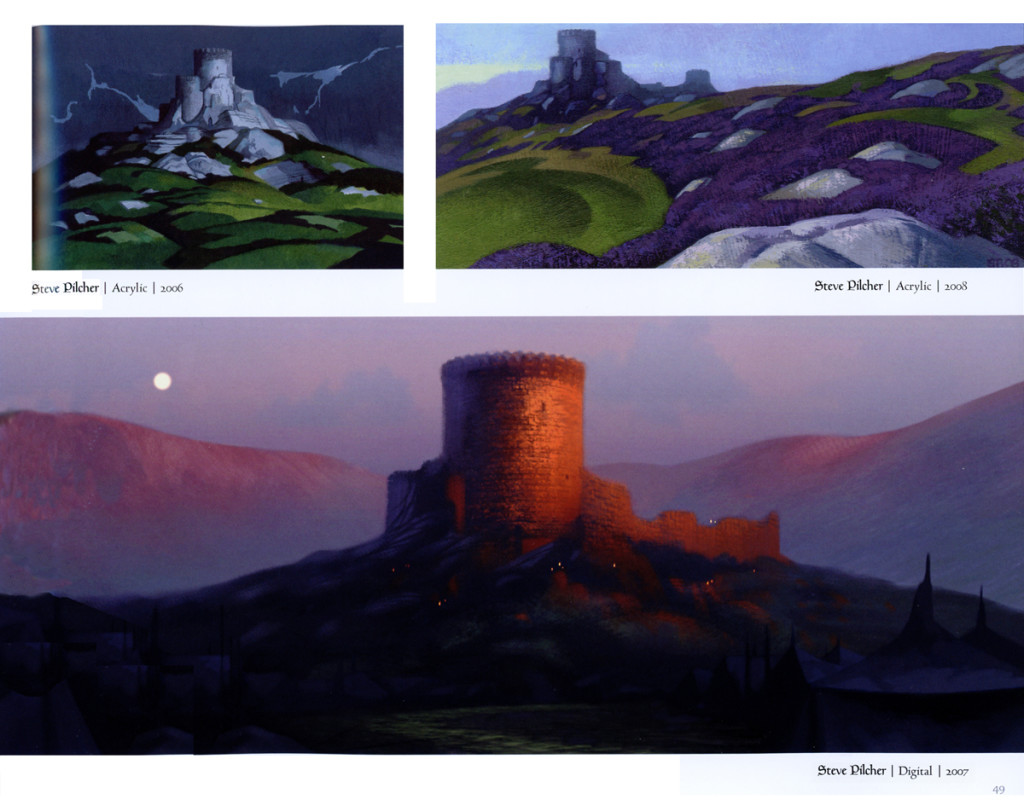
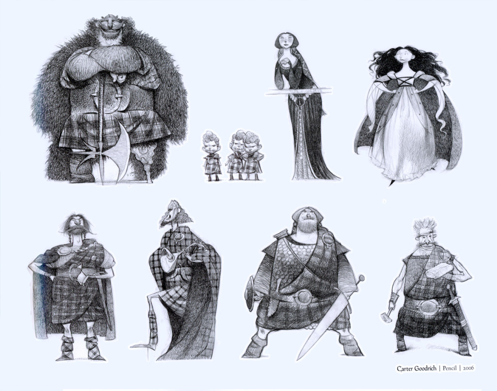
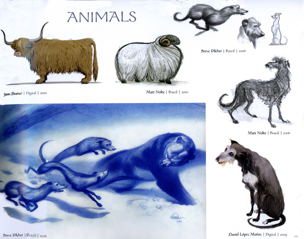
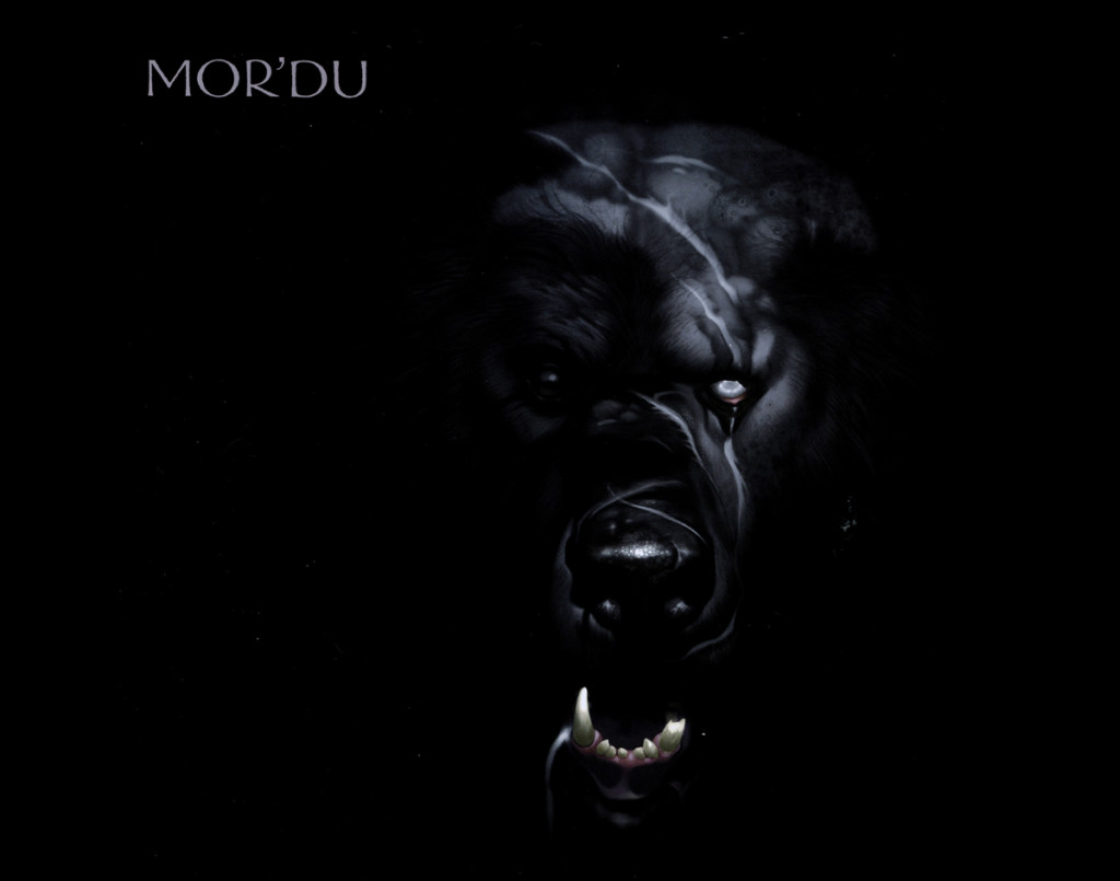
I’m delighted to finally have a copy for my library, The book is a beauty. The Production Designer, Steve Pilcher has an enormous volume of art here and all of it’s incredible. Whether pen and ink, chalk, acrylic or digital his artwork is jaw-droppingly beautiful, and the bulk of the work seems to be his. Others such as Noah Klocck for his digital renderings, Mike Mignola and his great ink & paint character sketches, or Matt Nolte’s pencil sketches, Mark Andrews’ sketchbook drawings or Nelson Read’s castle details; they’re all terrific artwork. Cassandra Smolcie gives complex Celtic Graphics, and, of course, Tony Fucile offers beautiful character drawings. The Art backing up Brave is overwhelming. How could they NOT make such a beautiful film?
Jenny Lerew, the book’s author, comes in quietly and before we know it we’re reading about the film’s beginnings and its make up. We get a good picture of Brenda Chapman who originated the film almost fully formed, and, because of the steady writing of Jenny Lerew we can easily see how the film grew. Unlike many other books of this sort Jenny doesn’t shout out her writing, but she just goes about the business and articulately explains the production for us. We see past the initial pitch meetings right to the green light.
 1
1
The heavy duty politics that must have accompanied this movie – Brenda Chapman having been replaced midstream as director – isn’t even discussed (or maybe I missed it). What is detailed is the development of the film, particularly its story, and even more pointedly the “Art”.
We do learn that the imagery goes from almost 100% snowbound settings to a wider variation. This is most definitely one of Mark Andrews‘ directions in taking the reigns. And with that knowledge I can’t but help wonder whether it was a good change.
I might have enjoyed seeing the book go a bit more into the cgi realm. We have all these glorious hand-painted images, but when does it get interpreted into the digital? Not even much discussion of the true heart of this film’s story – the hair. Merida’s beautifully flowing mane of curls. It’s a wonder of computer animation that they pulled it off. Ang Lee had Richard Parker, Brave had that red hair! Both won Oscars for their achievements.
As a gossip-hound I would have liked seeing some of the dirt to know what happened, but the plan and the method is to just tell about the art of Brave. In her closing acknowledgement, Jenny Lerew says she went directly to Brenda Chapman to ask what she wanted seen in the book. Chapman said that “. . . what mattered most to her was that the book would shine a light on the artists, the crew who had worked so hard and for so long and achieved such beautiful results.” This is definitely the book Lerew has written.
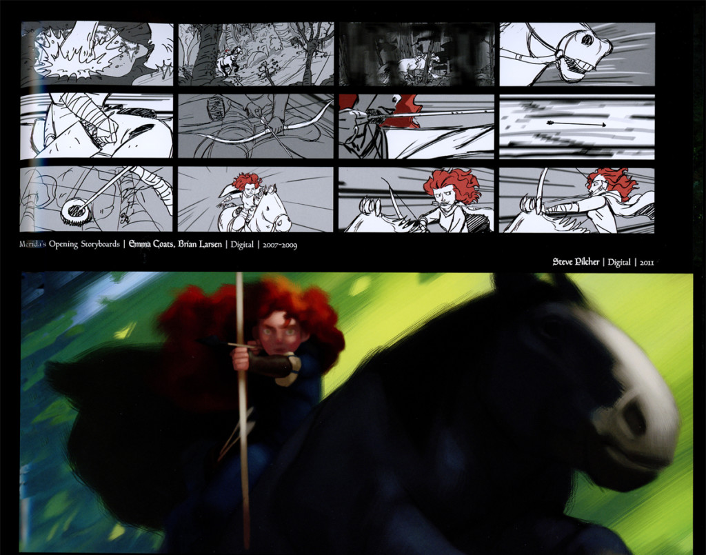
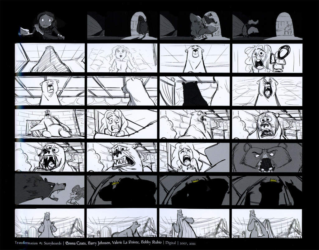
Storyboards
 7
7
It’s only natural that a good number of illustrations display
the storyboard. Jenny Lerew, the book’s author, is
a talented storyboard artist.
The stunning artwork and the confident writing of Jenny Lerew make this, for me, a valuable book that I’m glad to have as part of my animation library.
.
Art Art &Books &Theater 29 May 2013 07:12 am
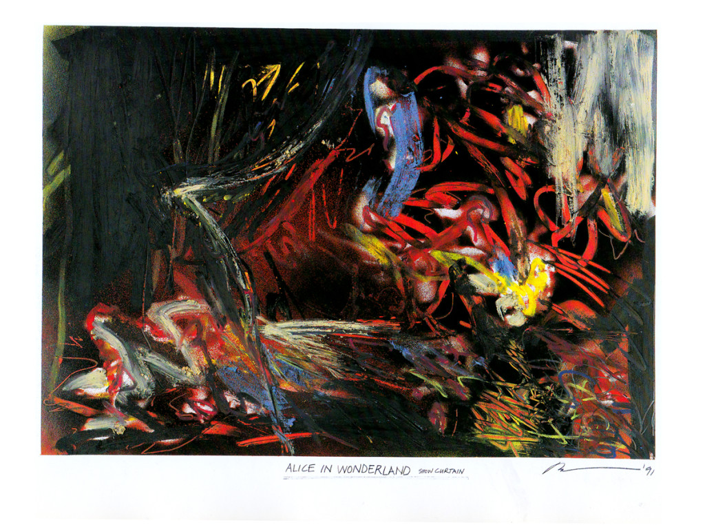
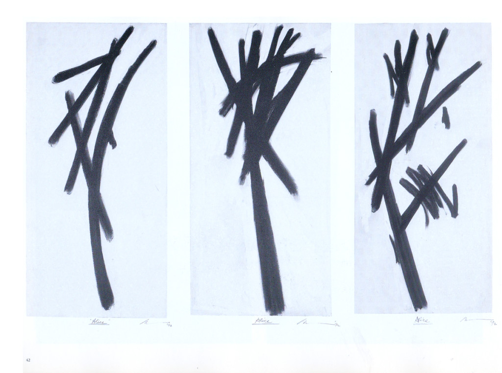
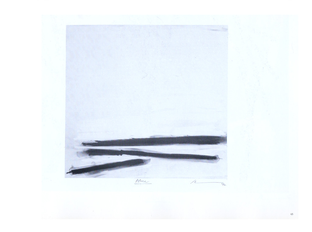
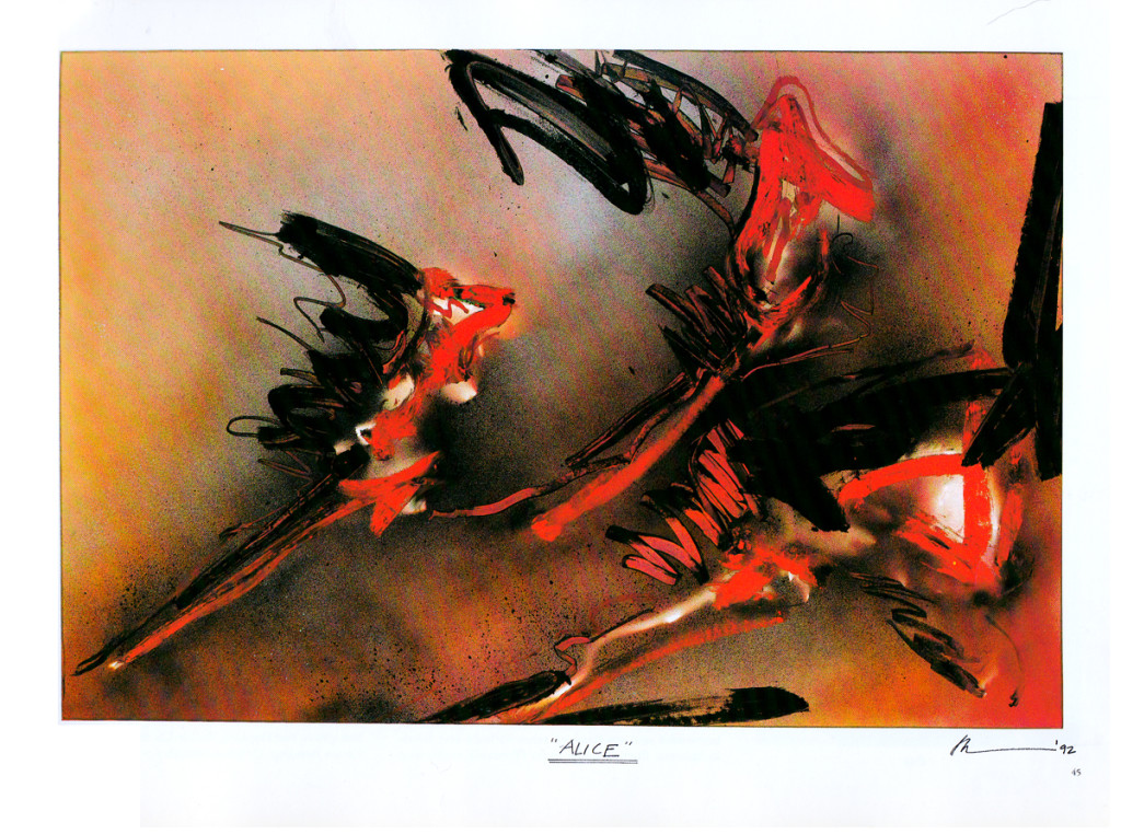
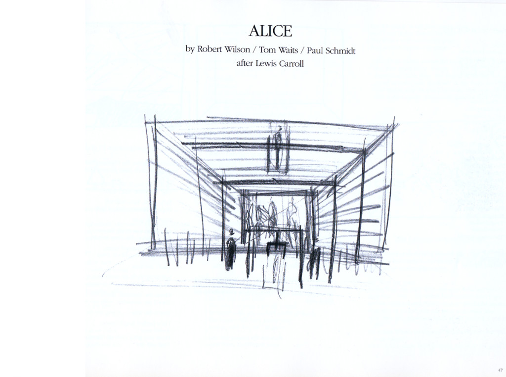
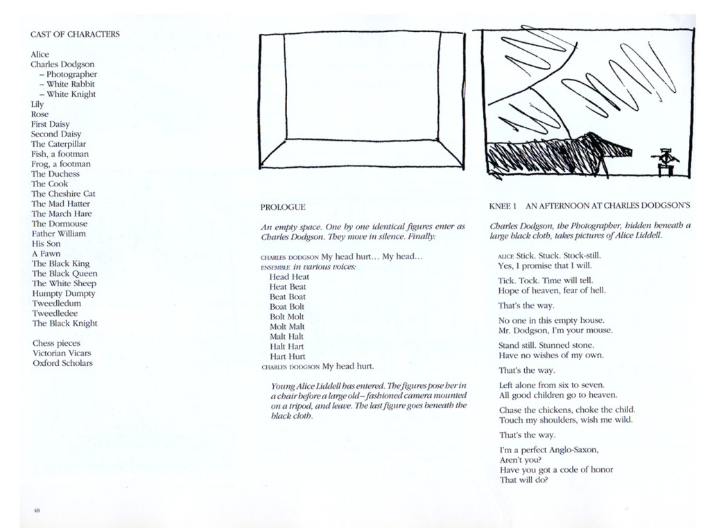
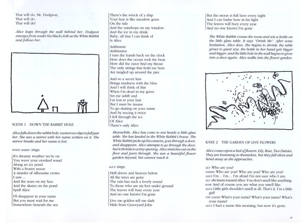
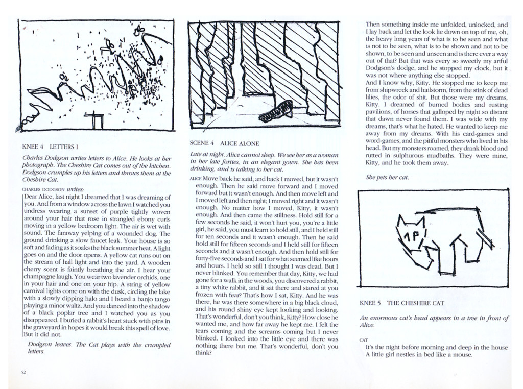
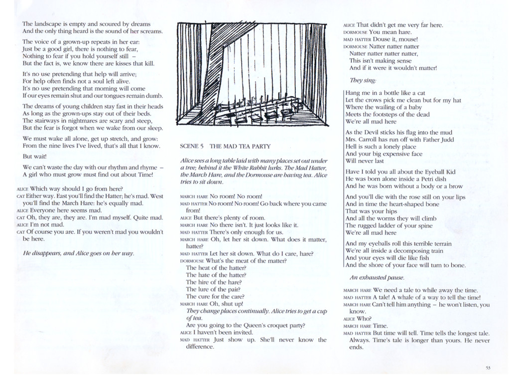
Robert Wilson’s Alice
I love Robert Wilson‘s work. He’s an artist who creates theater and theatrical events. His opera, Einstein on the Beach, composed by Phillip Glass, made the reputations for both of them. Wilson has worked with many of the key avant garde composers, everyone from David Byrne to Tom Waits. He’s done many pieces with Phillip Glass.
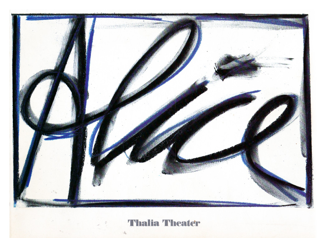
His work, Alice, premiered in 1992 at the Thalia Theater in Germany. The song score was written by Tom Waits and is an original. The story combines the story of Alice Liddell with Carroll’s invention.
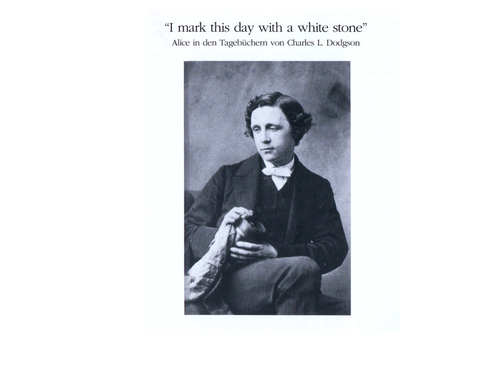
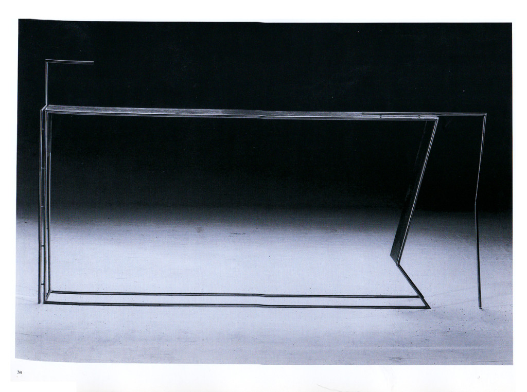
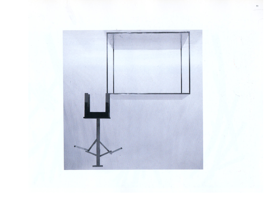
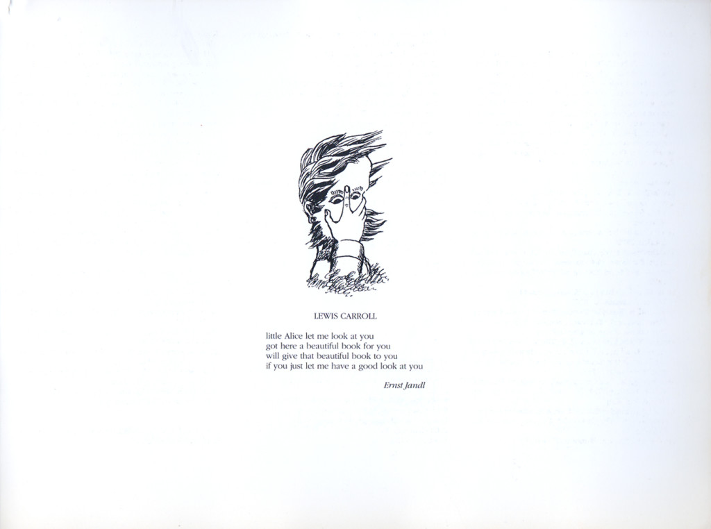
I saw the show in 1993 when it played at the Brooklyn Academy of Music and was completely taken by it. This souvenir book was sold at BAM. The first half focuses on Alice Liddell’s life as well as Carroll’s writing. This part of the book is in German and is illustrated with a lot of drawings done by Carroll,
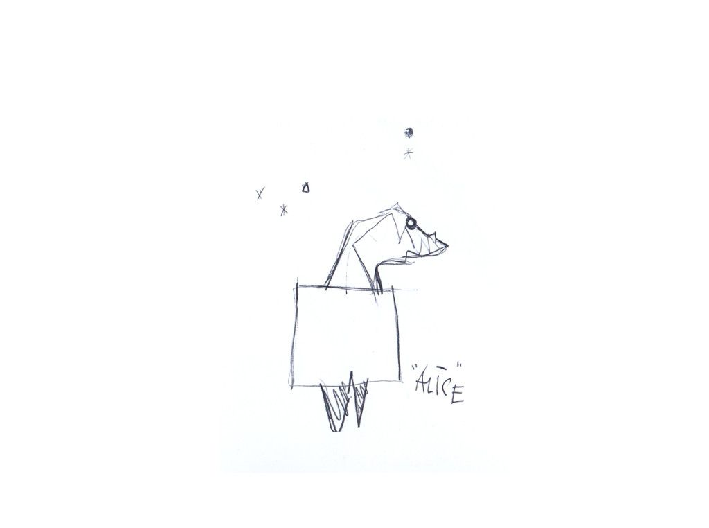
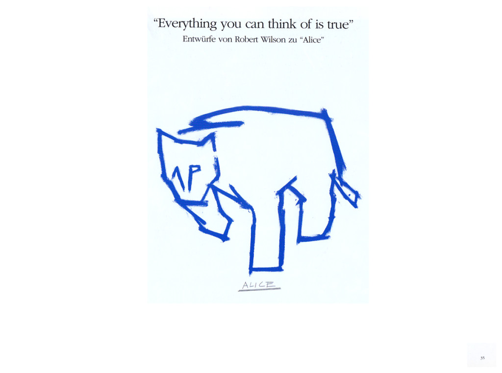
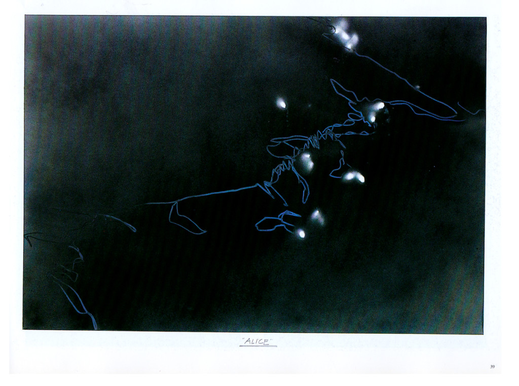
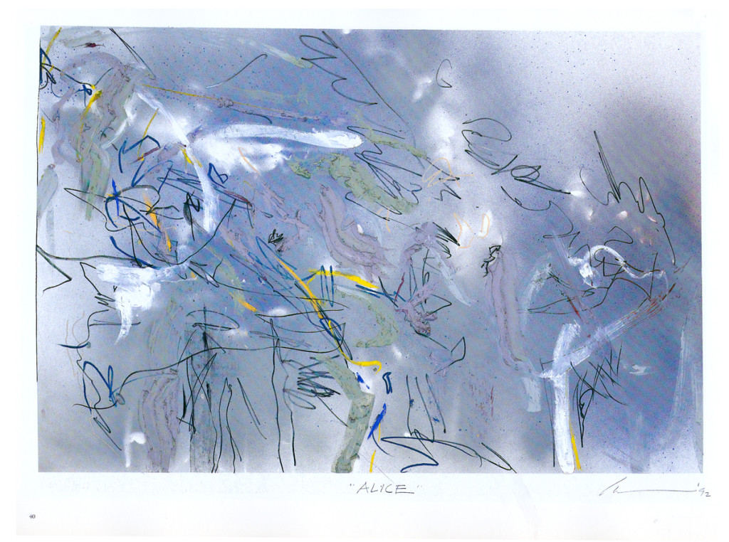
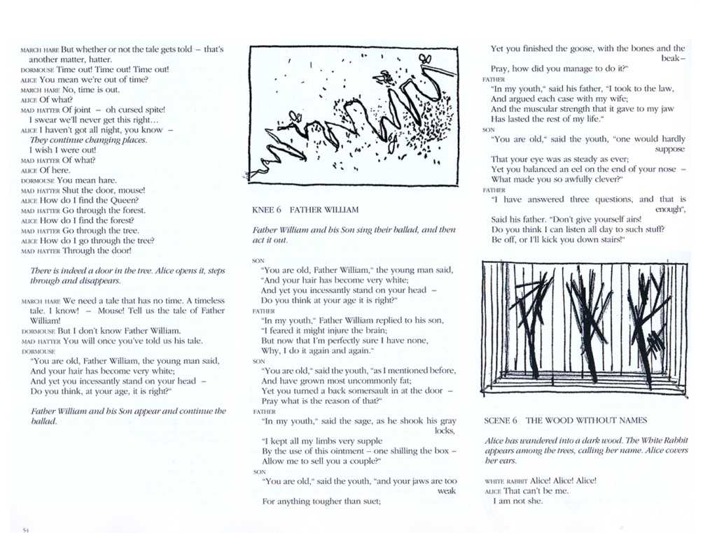
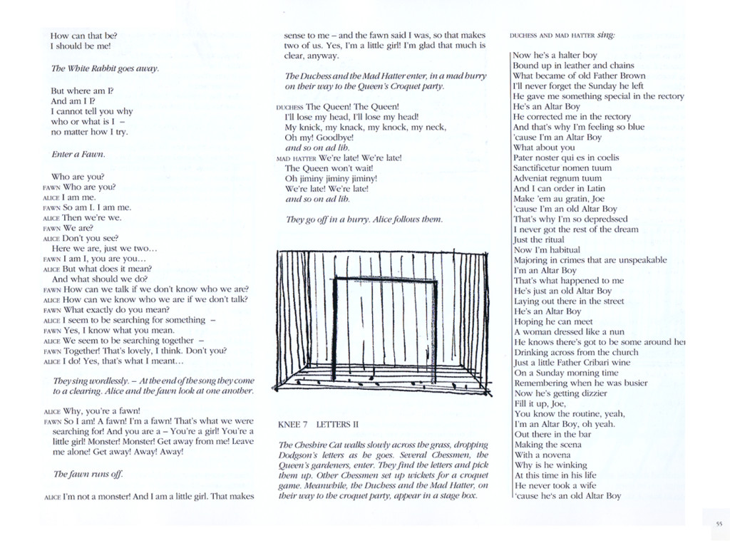
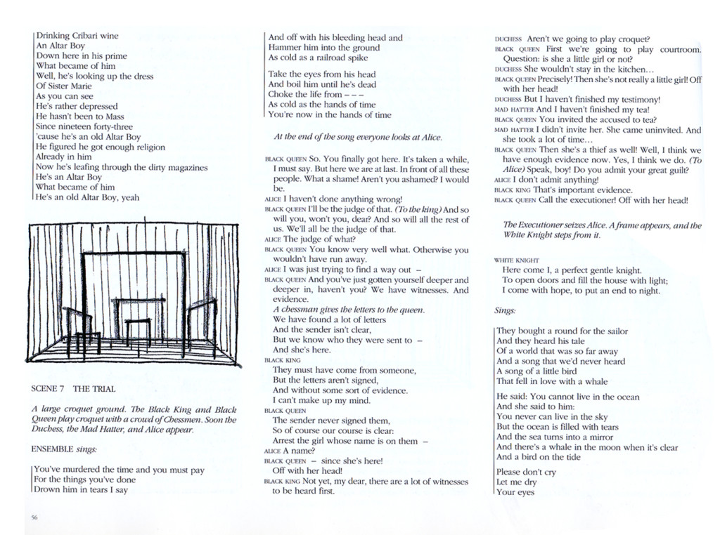
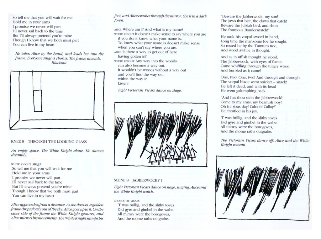
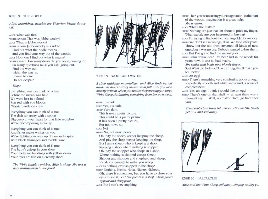
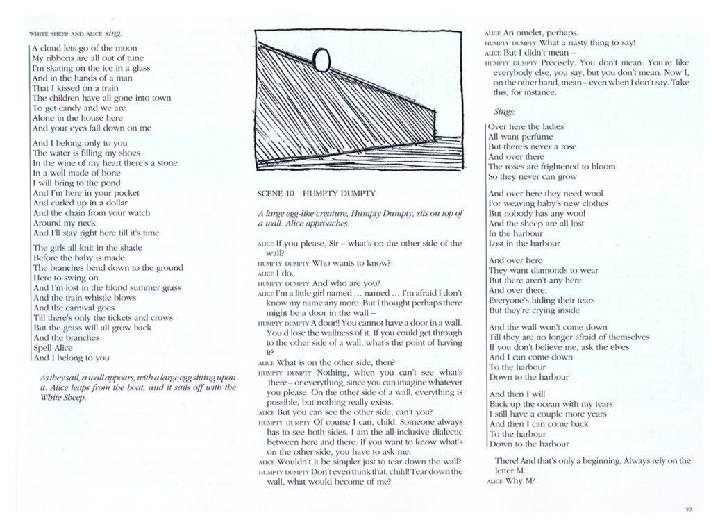
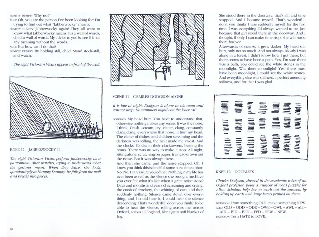
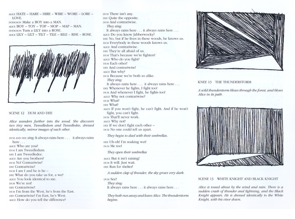
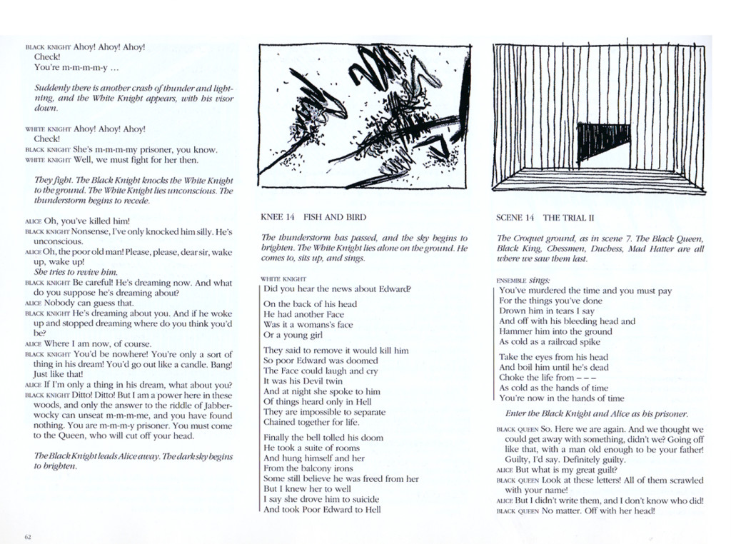
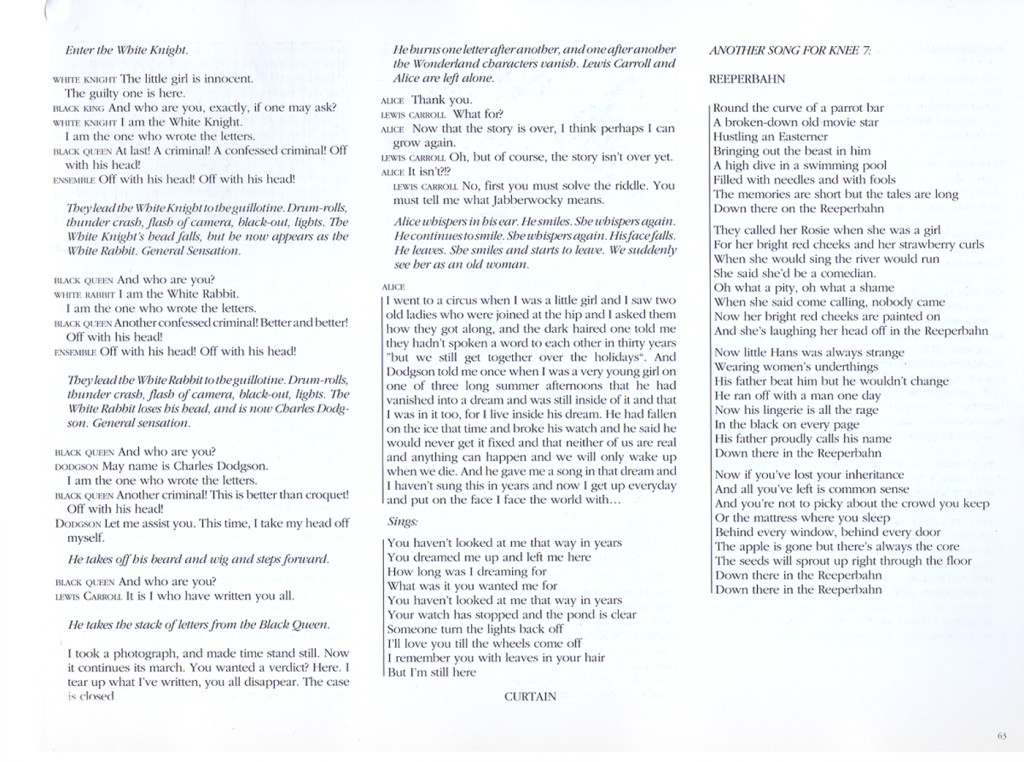
The second half begins with paintings and sculpture that Carroll did, inspired by the work. Then you get a copy of the play illustrated with quick sketches by Wilson.
Here are those two sections. (Click any image you want to enlarge to read.)
 1
1
Animation &Disney &Frame Grabs &repeated posts 28 May 2013 05:38 am
Whoopee
 - Before there was video tape (which means before there were dvds), there was only 16mm film that you could project in your own home. I had (and still have) a nice collection of decaying movies and used to show these often. One of the regulars to show and watch and laugh at was the great Mickey short, The Whoopee Party. Everyone loved this short, no matter how many times we watched it. It’s a great film!
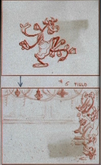
This encouraged me to watch it again on the B&W Mickey dvd I have. So I couldn’t help but jump for joy over the story sketches they include in the extras. Why not post them? So here they are – sketches from the limited storyboard they produced. I’ve also interspersed frame grabs from the film so you can compare images.
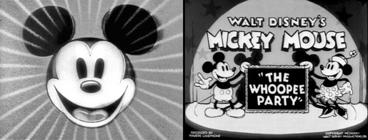
________________________(Click any image to enlarge.)

____________(Click any image to enlarge.)
 13
13
Books 27 May 2013 05:14 am
Tekenfilm
 - Marten Toonder lived through much of the history of Dutch animation. (Like many other throughout Europe he gained the moniker of the “Walt Disney of Holland.”)
He was born in 1912 and died July, 2005. In 1940, with puppet animator, Joop Geesink, he formed the Geesink-Toonder Studio. The break-up of the two led to his forming the Toonder Studio in 1942.
He left this studio, as tituilar head, to get back to illustration in 1965, and ultimately retired in 1977.
Toonder is probably best remembered for his several successful comic strips. You can visit a sample of these here or here.
He made animated shorts of his comic strip, Tom Puss, which you can see on YouTube.
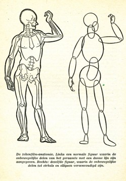
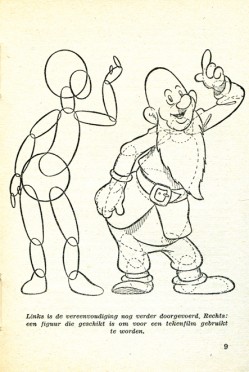
I make Toonder the subject of this post because I have an early book about animation which he wrote. Called Tekenfilm, it seems to have been written in 1946; at least that’s the only date I can find in the smallish publication.
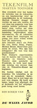
It’s in Dutch, so I’m not able to read the book. However, I thought I’d post a couple of pages of the book . I haven’t been able to find any reference to the publication to date. ___________________The book’s flyleaf – in Dutch
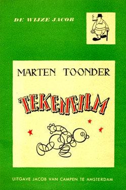
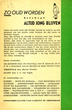
The book’s Front cover & Back cover
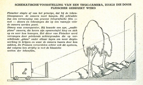
Here the Fleischer studio gets credit for the Multiplane Camera.
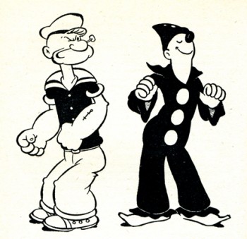
I like the way Popeye is drawn. Koko looks more on model.
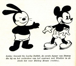
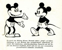
A wierd looking Oswald leads to Mickeys.
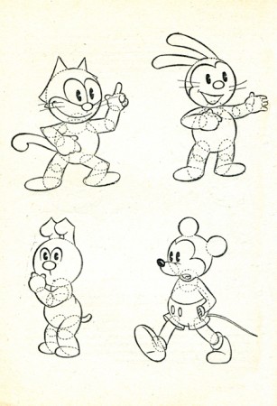
How to try to draw some characters.
Where’s Bugs?
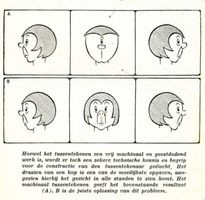
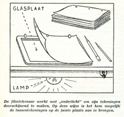
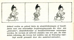
Here’s a lesson you still don’t see in many animation books.
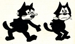
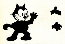
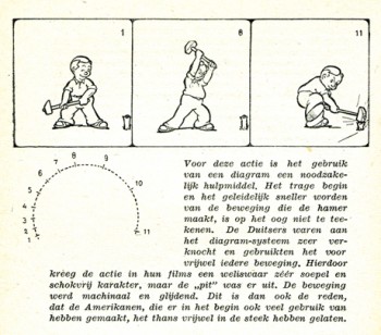
How not to draw the mechanical inbetween.
His solution isn’t the best.
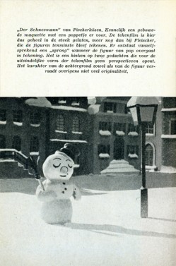
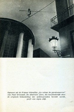
Ending with two European cartoons of merit from 1944:
The Snowman in July by Hans Fischer-Kösen
and Voleur de Paratonnerres by Paul Grimault
Photos &Steve Fisher 26 May 2013 04:40 am
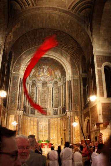
St. Bart’s
Steve Fisher explores three churches and a synagogue. We get to view the results with him. Steve writes the rest of this post:
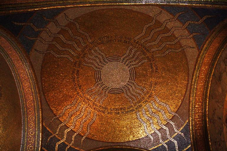
- As part of the New York Landmarks Conservancy’s “Sacred Sites†weekend, celebrating landmark religious structures, I visited St Bartholomew’s Church on Park Avenue and 51st street. While I had seen the imposing building many times over the years, I’d never been inside. Its Byzantine design is unlike any church interior I’ve ever seen.
 1
1
- I also visited St Matthias Church in Ridgewood, Queens as part of the New York Landmarks Conservancy’s “Sacred Sites†weekend. The weather was not conducive to traipsing around outside, and it was not especially impressive anyway. But then the surprise came when I entered the building. Wow! Yet another discovery that had been virtually in my backyard without my ever knowing it existed.
 1
1
- Behind the St Matthews Church in Woodhaven, Queens is a landmarked cemetery, the Wyckoff-Snediker Family Cemetery. The church is currently being renovated. The cemetery is overgrown and neglected and not likely to be cleaned up before the renovation is completed.

- I also had a chance to visit the Tifereth Israel Synagogue in Corona, Queens [the oldest in the borough]. I went today since I was certain someone would be there for sabbath services, and I could find out when I might return to photograph it, not wanting to interfere with the service. The congregants were very welcoming and even allowed me to take some photos from the balcony while the service was in progress. While the exterior of the building has been completely renovated, the interior is in much need of attention. I guess they are awaiting funding to tackle the inside.
 1
1
Commentary 25 May 2013 05:36 am
Epic May Days
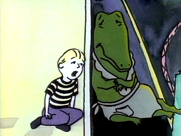
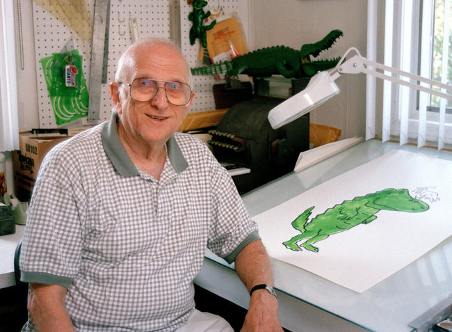 Bernard Waber was an author/illustrator I worked with twice animating his two most popular books for HBO. He was an enormously sweet fellow who enjoyed coming to my studio to see his projects in production. He wanted little to no involvement in that actual production but we tried to involve him just as well.
Mr. Waber died last Thursday at the age of 91.
The favorite story I tell about him is that HBO had little party for him on the celebration of the completion of Lyle Lyle Crocodile. It was a pleasant party with several of the animation voices present. There were half children and half adult, and there was a guy dressed like Lyle who wandered about the party.
At one point a large cake shaped like Lyle the Crocodile was brought out and Mr. Waber was handed a knife to cut the cake. Staring at his cartoon creation he couldn’t cut the cake, so he handed the knife to the guy in the Lyle suit to lit him do the duty. With that, the Lyle impersonator cut off the head of the Lyle cake and began to dole out pieces.
It was an interesting moment few people took notice of.
Mr. Waber was a delightful person, and his art was truly fund to draw. I miss now knowing that he’s no longer around. It’d take the fun out of animating any of his other, many books.
Epic of Course
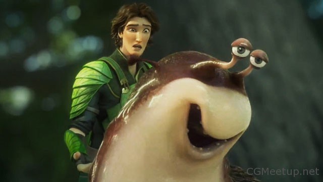
The MP Academy hosted a screening of Blue Sky’s film, Epic. Director, Chris Wedge attended the screening for a Q&A afterward. (Unfortunately, the batteries in my camera went sour and I wasn’t able to get a photo.) Last weekend, Candy Kugel got the Academy to offer seats to anyone who’d seen it on my blog. However, the day before the screening, we were told that only guests of members would be allowed to attend. Sure enough come showtime, they allowed all the young people who’d shown up to see the film. Good thing too since there was a poor turnout from Academy members. However, with the ASIFA members anxious to see the show rhere was a decent sized crowd.
It was a rather generic Q&A, but it went well and quickly. Chris Wedge is a very amicable guy and made a positive out of the program. The film itself is an attractive and very quick paced action-adventure film. It should do pretty well especially with music celebrities like Beyoncé (who isn’t ready to become an actor just yet.) I have to say that I’m a fan of Blue Sky’s work. There’s always a real attempt to do something more than give something generic; they really want to make something rich. And, maybe because they’re so far from the people in LA, they do things that are totally original and theirs. All those Ice Age films are good examples, but add Rio or the Horton movie, you get a good idea of what I’m talking about.
Now with Epic, they’re doing a giant of a movie that takes place in Wiliam Joyce’s world of little people. Fighting fairies that go to war on the backs of hummingbirds. It’s original, to say the least.
Unfortunately,it can’t take the backbone of Myazaki’s Princess Mononoke where the majesty of the forest is shown amidst all the battles. Yes, the forest and the woodland creatures are both beautiful and endangereed, but we have to see and understand this as part of the life and and death of battle, It isn’t enough to be part of ecosystem (albeit one we don’t know about), but it would be more courageous to show HOW they fit into that system and why they are so important – as are those endless battles. And the excellent art direction.
Another Epic – one from 1995
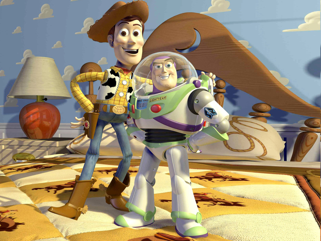
This article by Barbara Robertson in CGW Magazine August 1995, is an excellent report about the ways and means of making the first cgi animated feature, Toy Story. Ms. Robertson writes about the programs used, the methods of lighting and even their casting of the cartoon characters. (Rather than casting each character–that is, assigning a character to an animator–they tended to assign all the characters in a sequence to an animator. The “dailies” kept everybody aware of what everyone else was doing.)
Essentially, in the big picture, not much changed. As a matter the most important part hasn’t changed since the days of Snow White. stories and scripts are still told in the same way. If they aren’t good there’s trouble, no matter how may dwarfs,dolls in the playroom, or leaf men bustling about on hummingbird backs.
Toy Story
Epic off Course
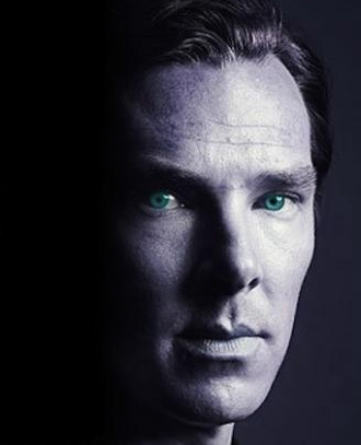 The only other film I’d seen this week was the worst film of the year. Even worse than the pretentiousness of Prometheus. Riddley Scott might have to work harder if he wants to make a more stupid film than Star Trek Into Darkness. The dialogue is certainly the worst written drivel I can remember hearing packed all into one film. As a matter of fact, I’m not sure one can even say the dialogue was written; it just pours out of the mouths of the mediocre actors. Only Benedict Cumberbatch and his fine talent is able to pull some sense out of the words he’s forced to say. All the other actors seem designed to read such lines. With Simon Pegg reaching a new low as he tries to act as though he’s been cast as a Scrooge McDuck imitation. His lines certainly don’t sound as though they’re coming from a human. The man has talent, but the director, JJ.Abrams, works hard to get poor performances out of most of the cast. Spare yourself and stay away (unless, of course, you are an indiscriminating 14 year old boy.) Other than Cumberbatch, the only other person worth watching was Michael Giacchino whose score is sometimes very good. He does “Mickey Mouse” his music a bit too often for my taste, but he also does what few others do on this film. He gives it strength!
Spoiled alert!!! There are two shots – cu aways – that you should look for. They come at some intenee moment in the fim (joke: there are no intense moments just loud and louder. With lots of quick cuts to lots of miscellaneous people.
 One quick cut goes to a blonde female; she must be J.J. Abrams’ girlfriend, because she has no other role in the movie. (Well, she does have another quick cutaway later.) Her starched blonde/white hair is short, and she looks a bit like my drawing on the right. At least her hair looks like that. Her second quick cutaway shows her turning some switch beneath her, but she barely has time for that. Maybe she’s in the film for those who will stop the vid when they buy it. Whaever, just another bit of absurdity in a moronic film that’s making a lot of money.
Not Quite the Epic
The excellent site, The Thief posts a new update on Richard Williams and what he’s been up to. The report on an article that appeared in The Guardian about Dick. The article goes into depth about Dick’s history and his story of failing to make The Thief and the Cobbler as he would have wanted it.
Today he is doing another long film but refuses to reveal what it is about. He feels that revealing too much will eventually help him to end in failure, so better to reveal it as i goes. Rather than trying for a feature film, he’s trying for a long film divided into chapters. As he finishes a chapter, he could reveal that, without worrying that the rest may never come.
- “We had so much publicity about The Thief and then it went wrong” – but says it is being made in chapters – “so if I do drop dead we will still have something” – and that a six minute prologue, which will be a short film in its own right, will soon be ready. “What I’m interested in is that nobody has been able to handle realism. It’s just been embarrassing. So I’m doing graphic realism, these things are obviously drawings, but it will go into adult territory and will combine different styles. I want something that will be grim, but also funny and salacious and sexy.”
Bill Peckmann &Books &Comic Art &Illustration 24 May 2013 05:54 am
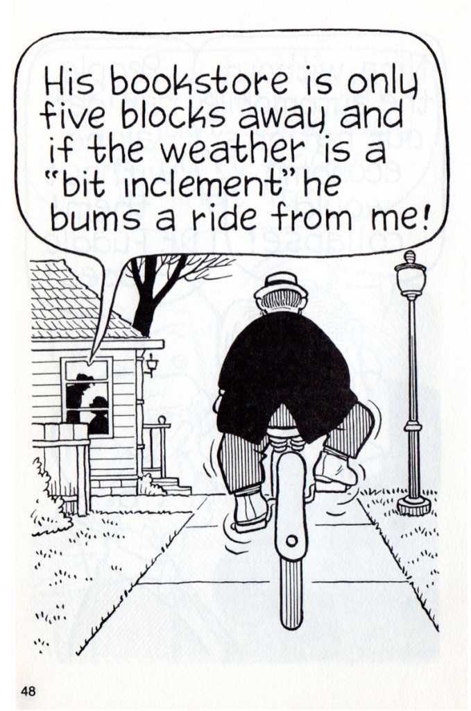
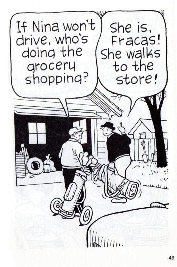
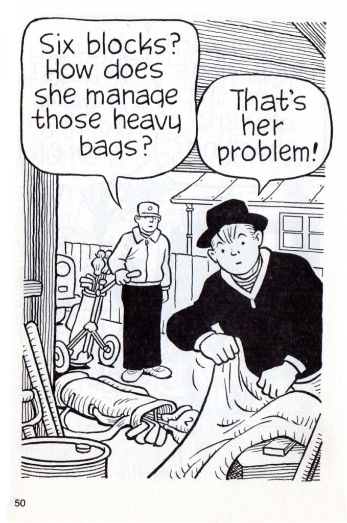
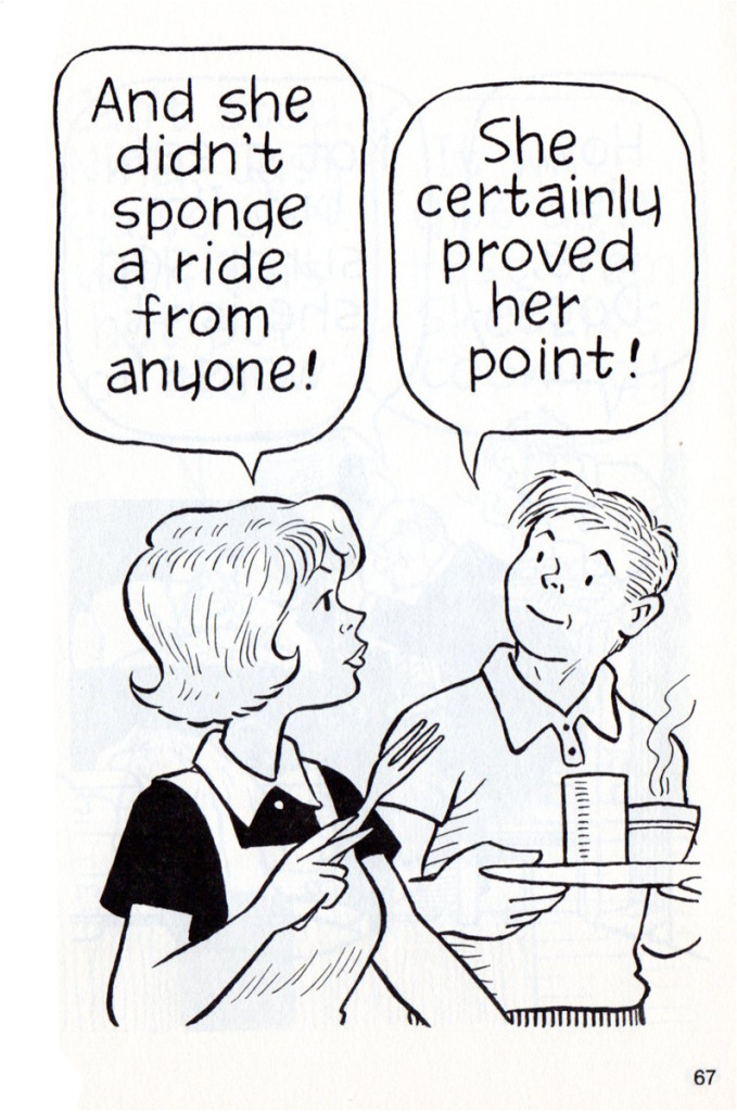
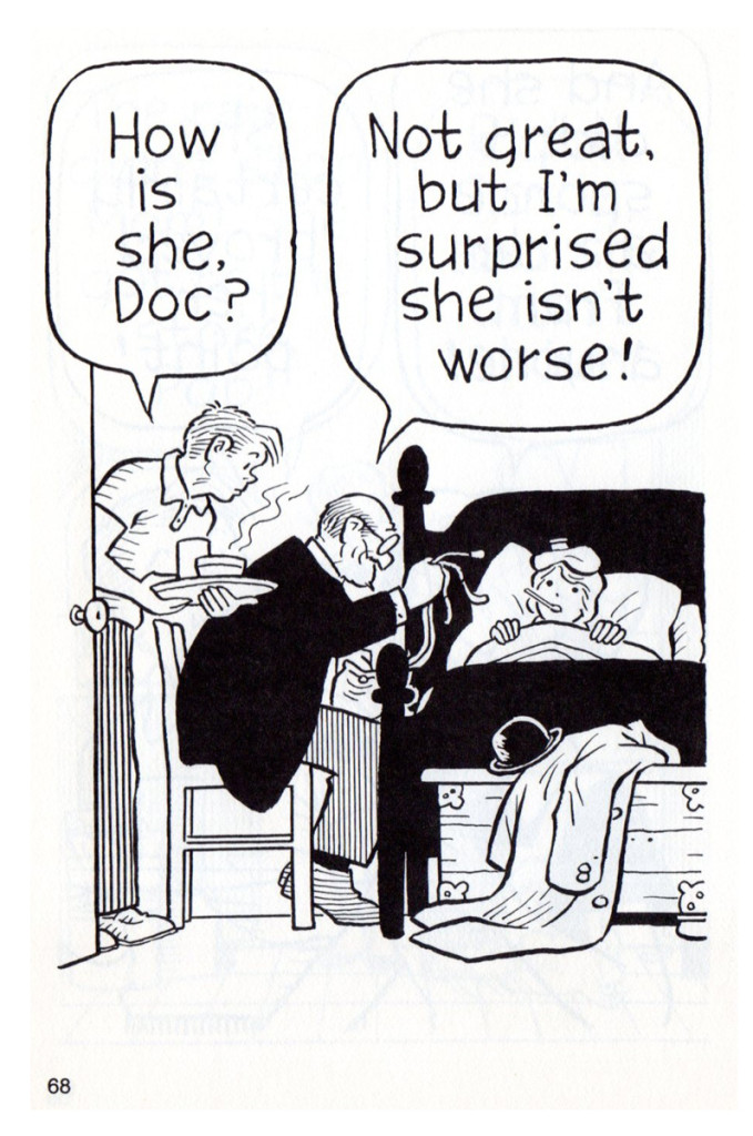
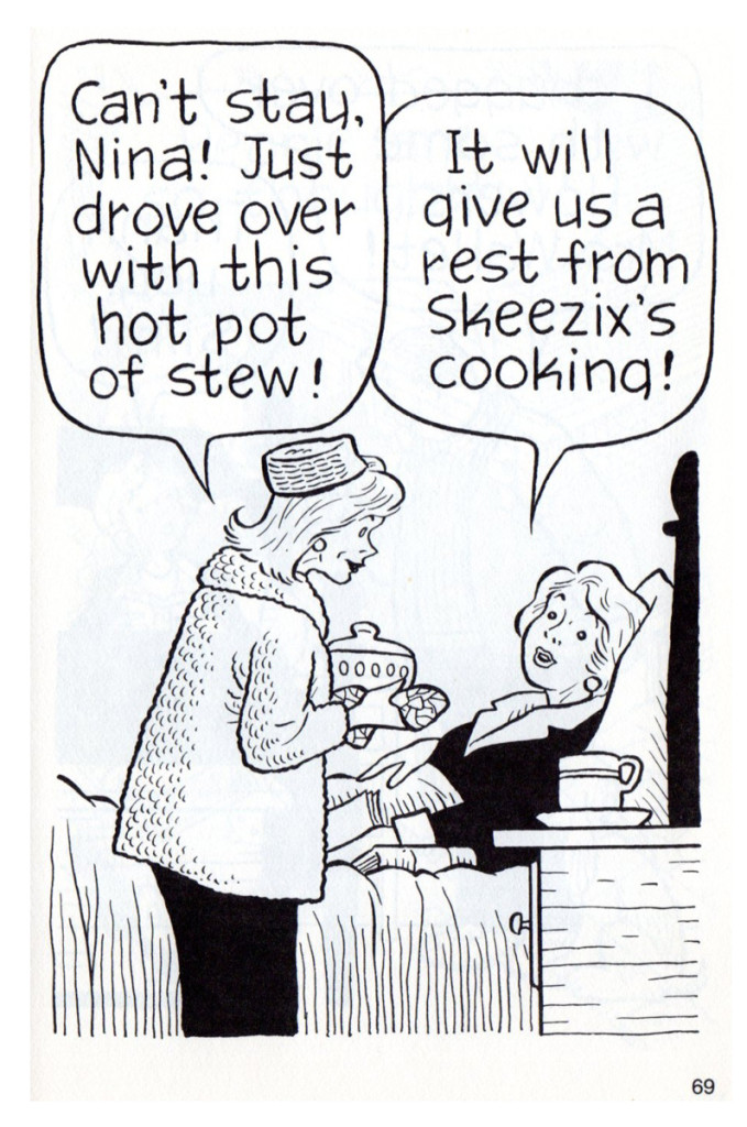
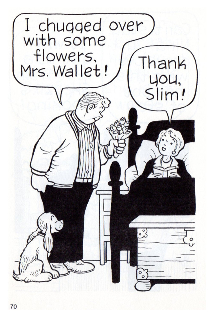
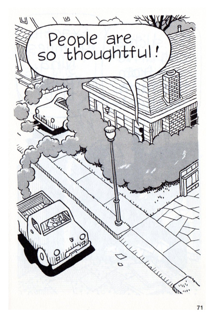
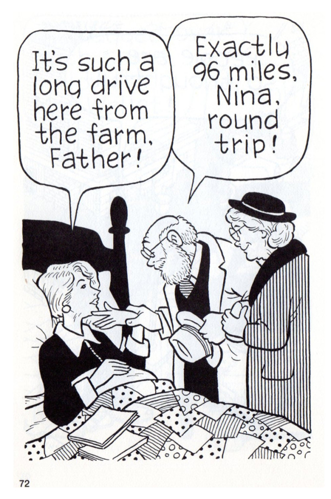
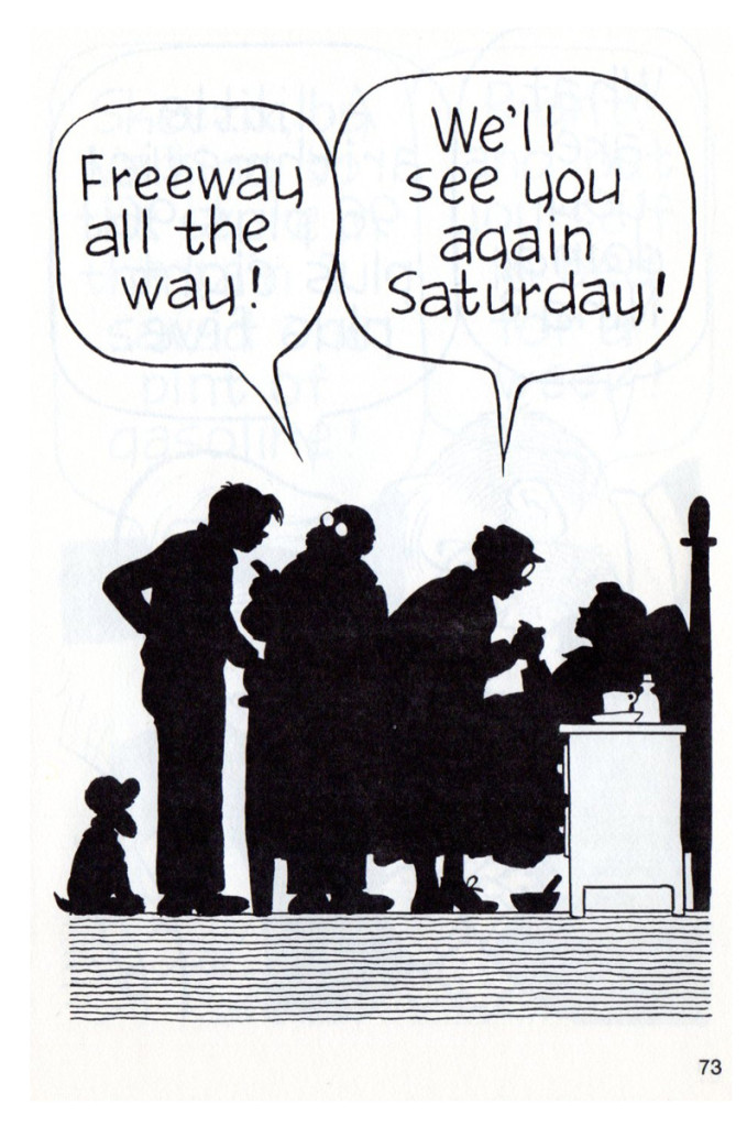
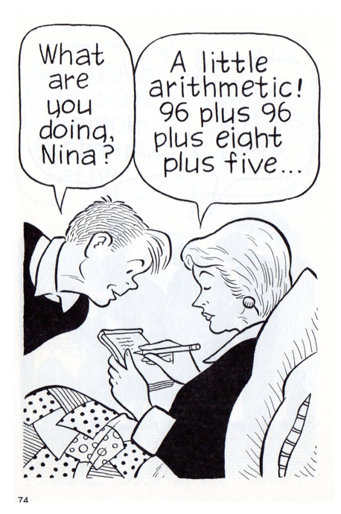
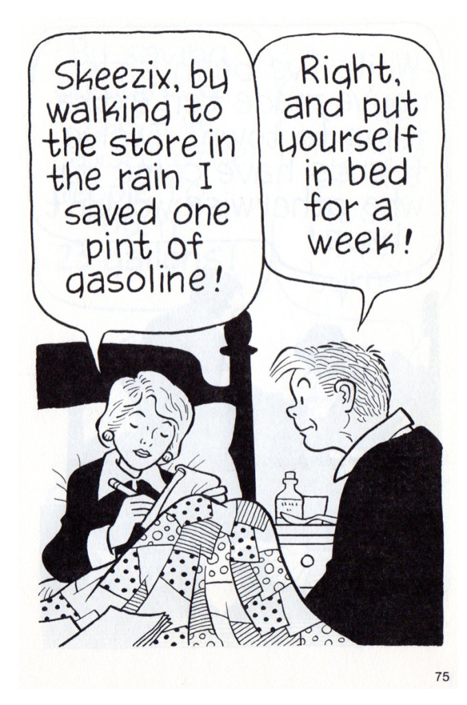
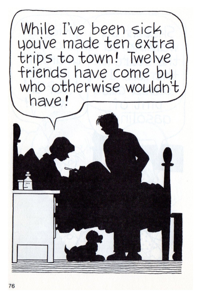
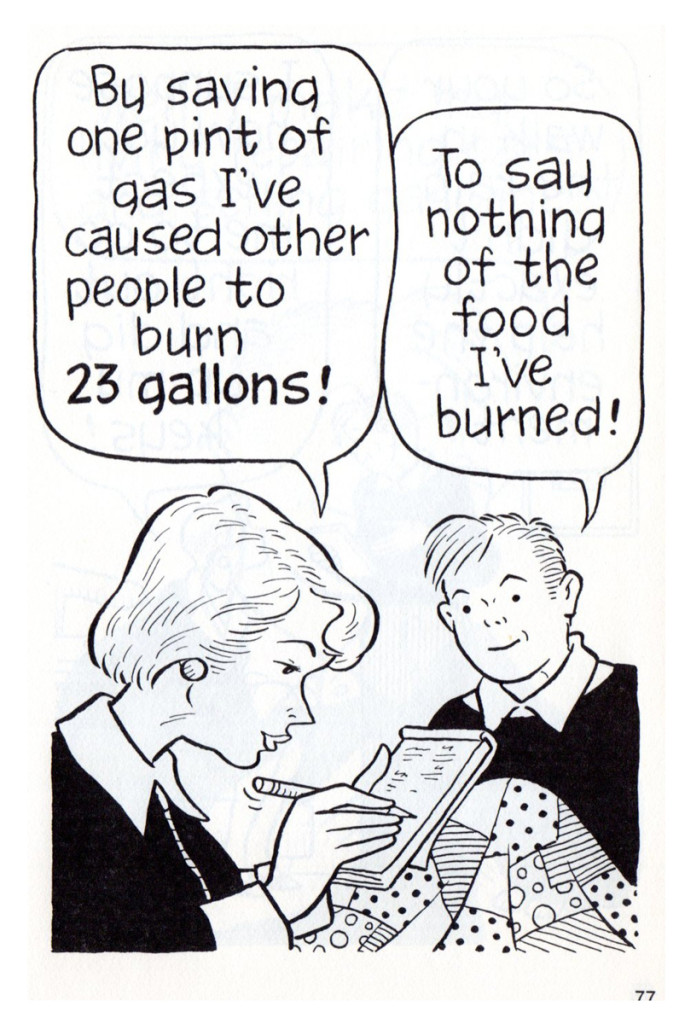
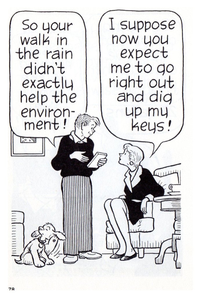
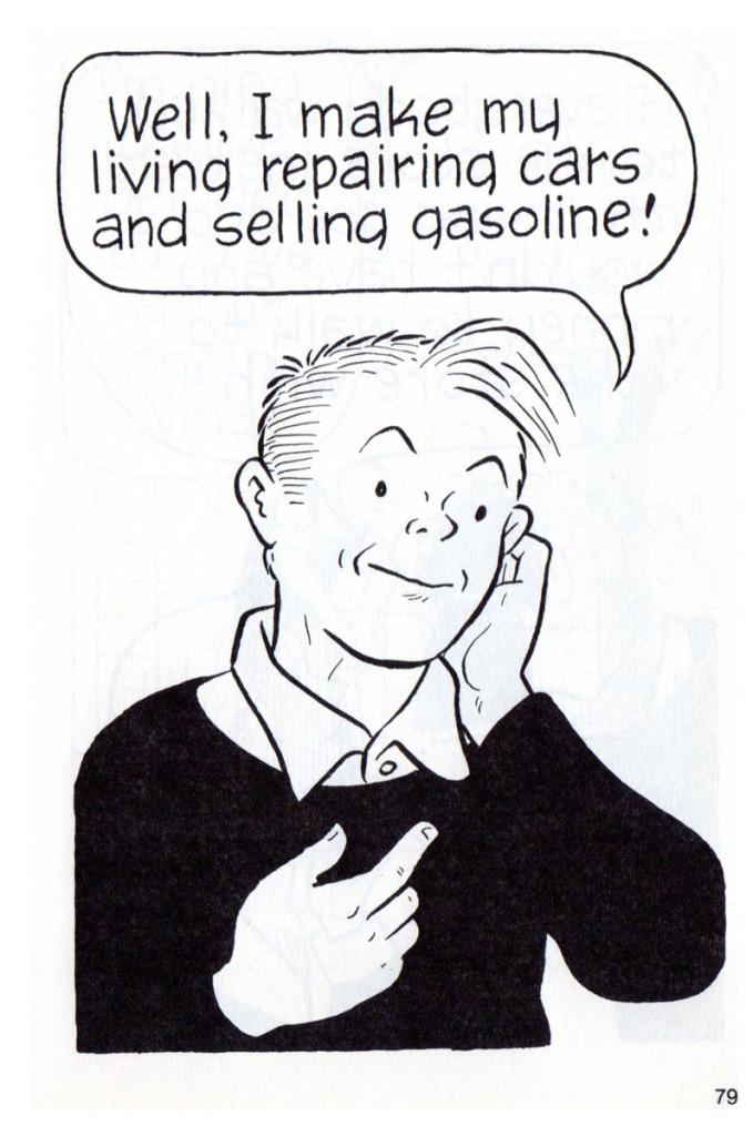
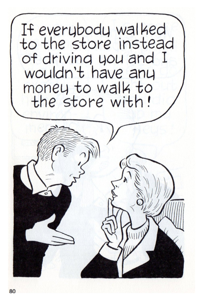
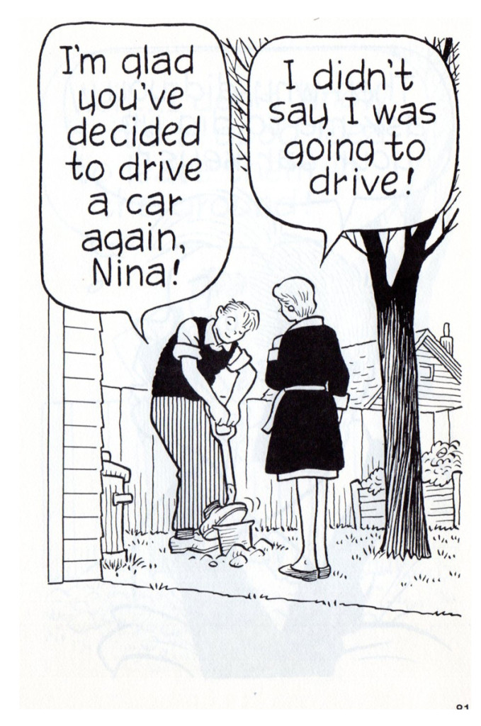
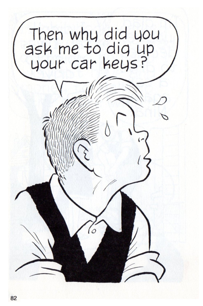
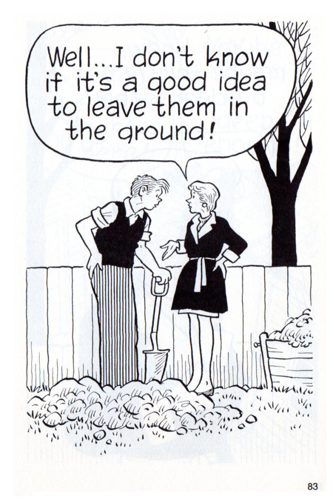
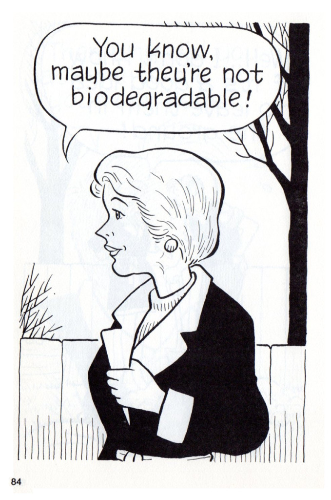
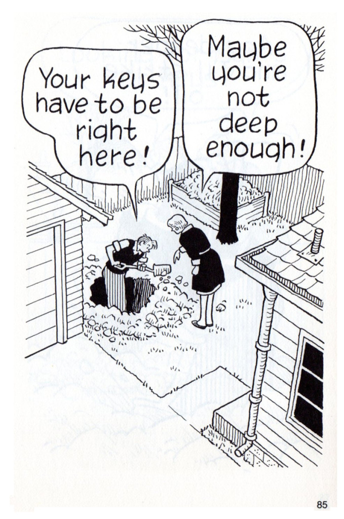
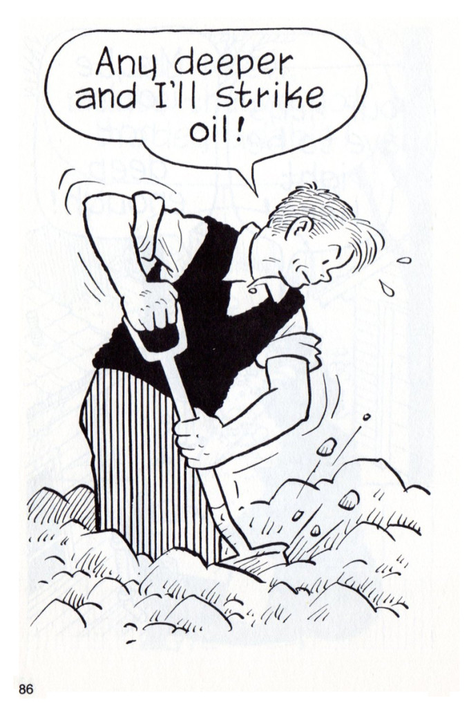
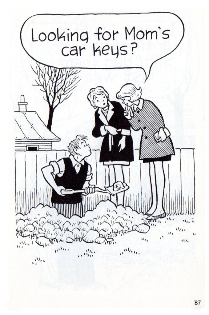
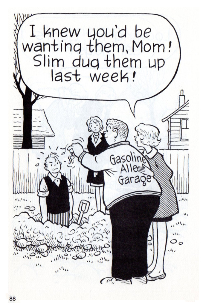
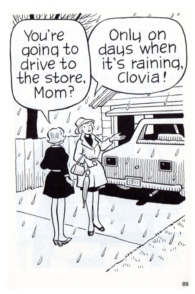
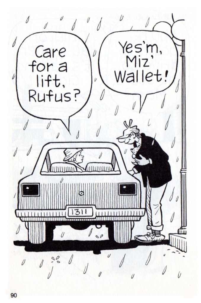
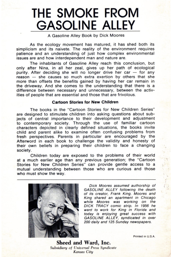
The SmokefromGasoline Alley – pt.2
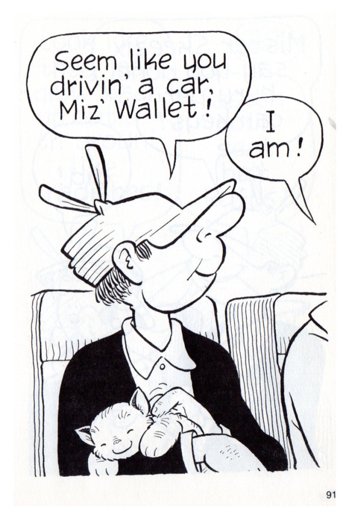
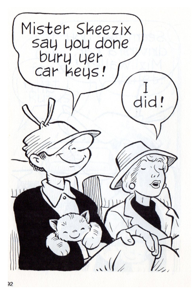
This is the second part of the book for youngsters written and illustrated by Dick Moores from his comic strip, Gasoline Alley. Moores took over the strip when Frank King, the originator, retired. I’ve written frequently that i love this edition of the strip. Dick Moores’ open, rounded line work is just beautiful to me, and I like his compositions as well.
It’s interesting in this book how he keeps to closeups of the characters leaving a lot of white space to work against his linar shading. Only rarely do we get a longer, establishing shot of the scenes. It’s quite effective in its own way and, at the same time, gives it a variance to the strip done for syndication.
Many thanks to Bill Peckmann for scanning and forwarding the book to us for posting. I love it.
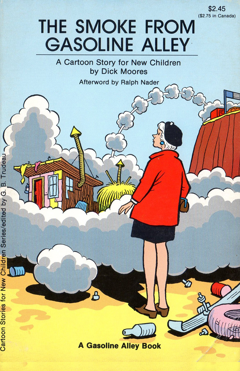
Book Cover
Bill Peckmann &Books &Comic Art &Disney 23 May 2013 06:36 am
Junior Woodchucks
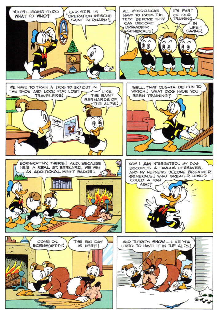
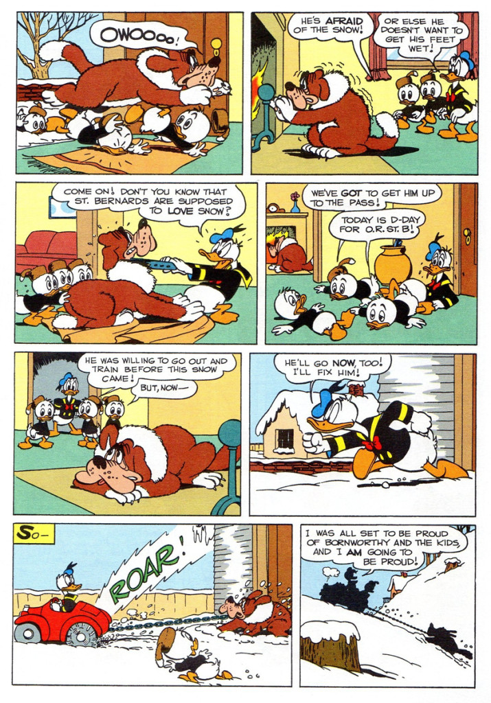
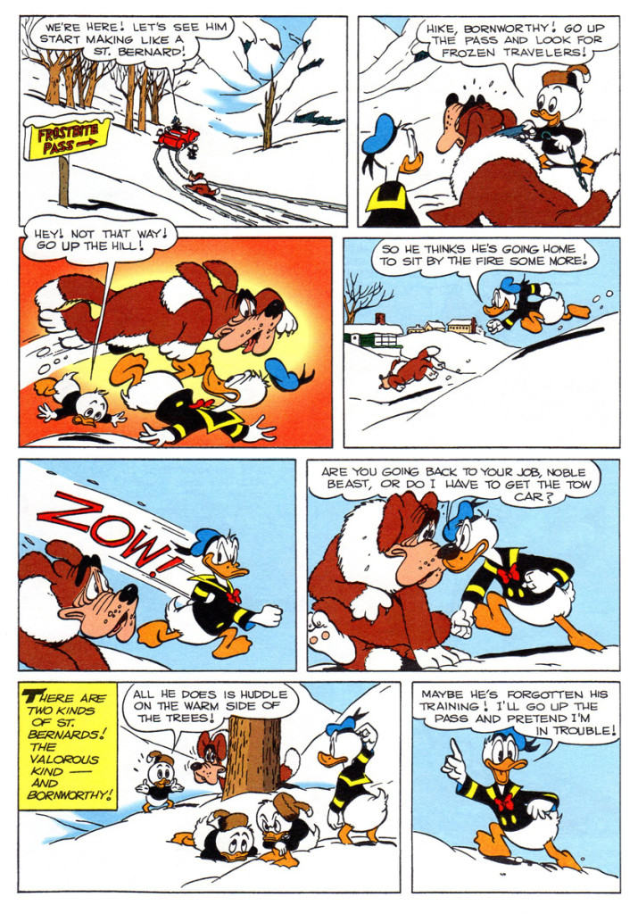
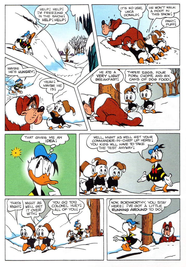
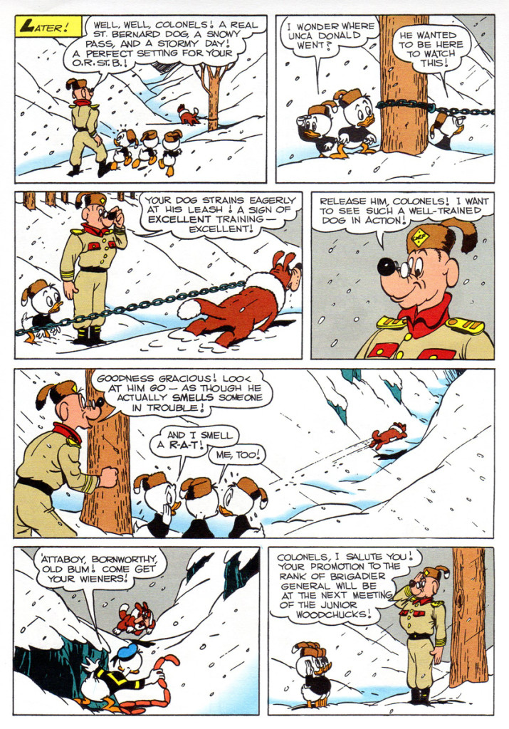
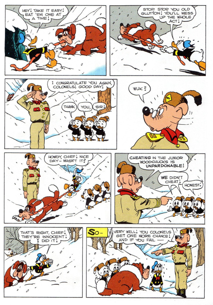
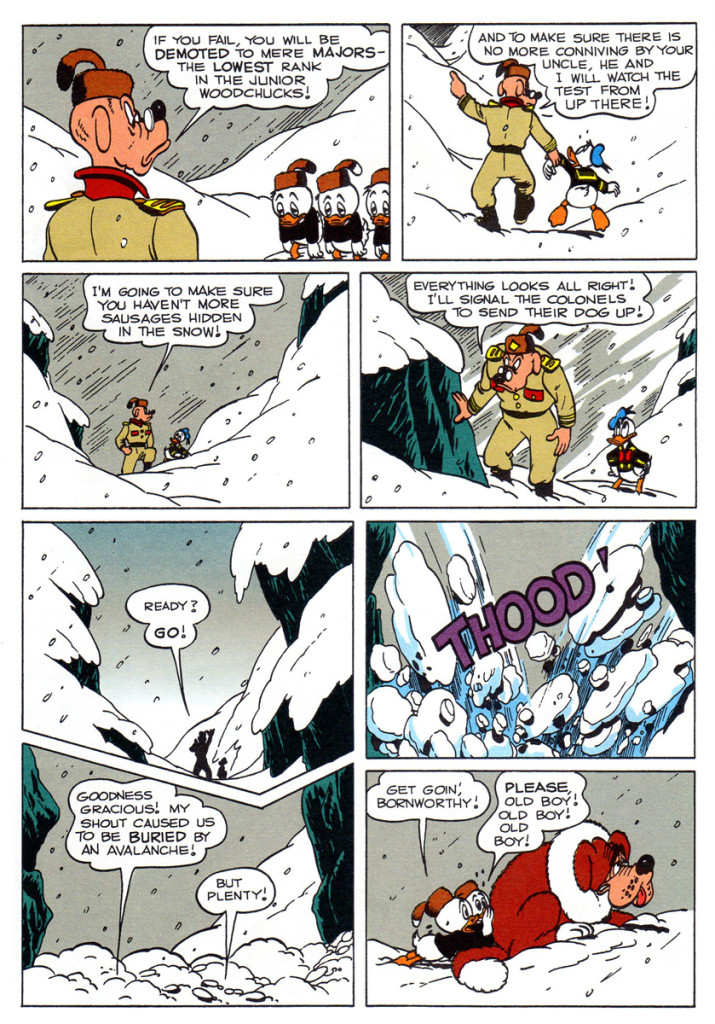
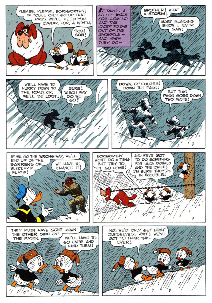
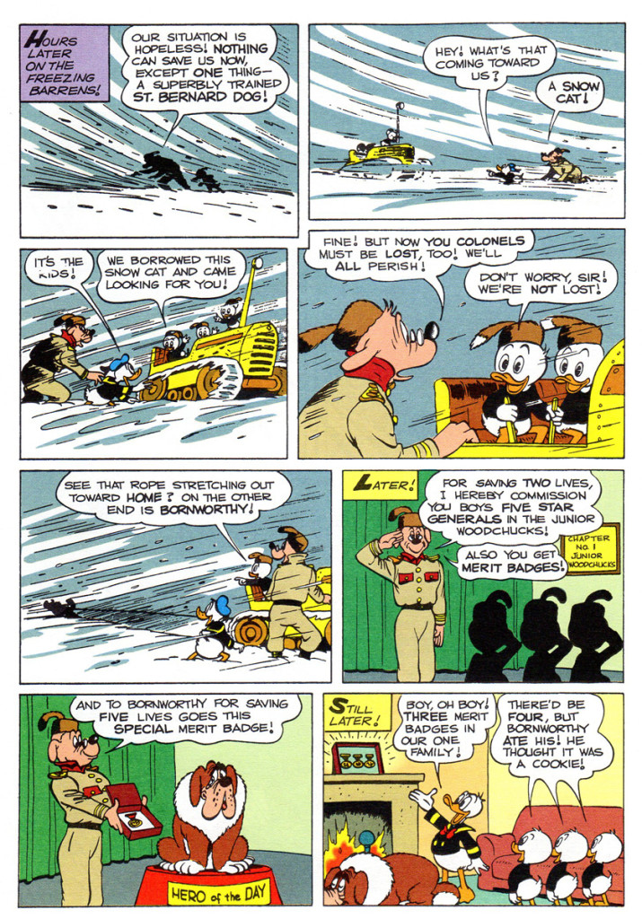
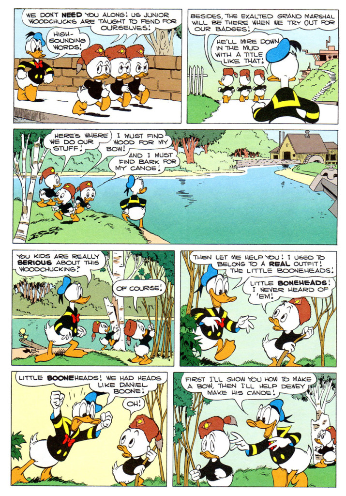
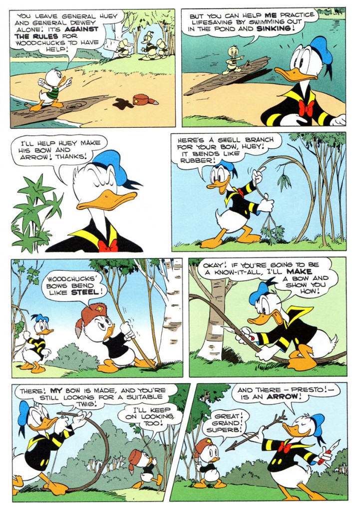
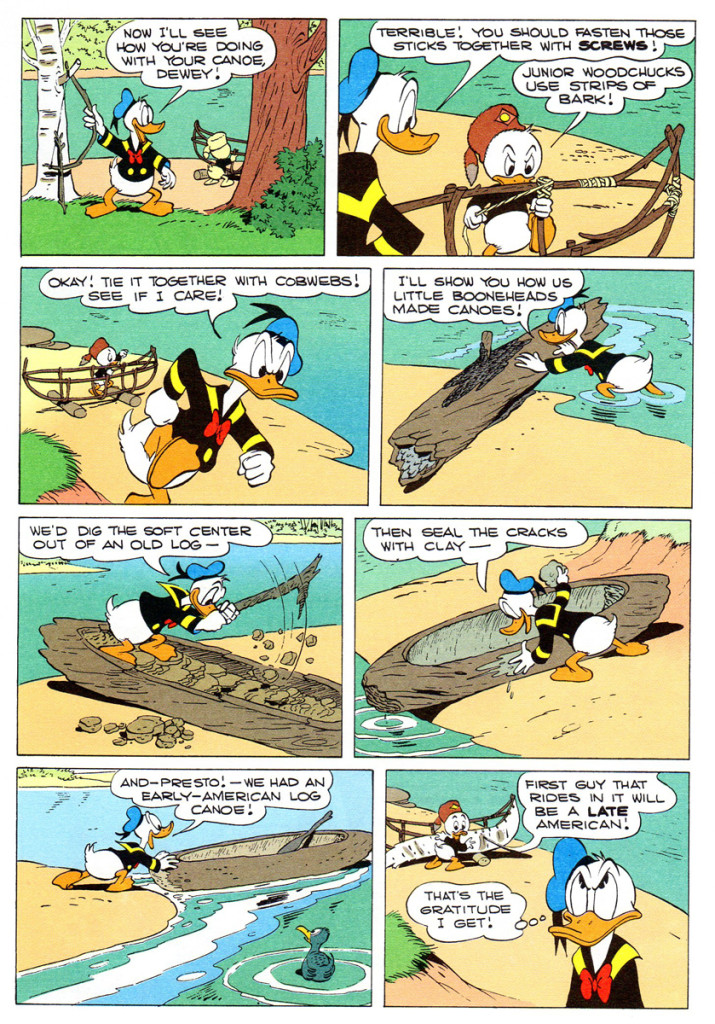
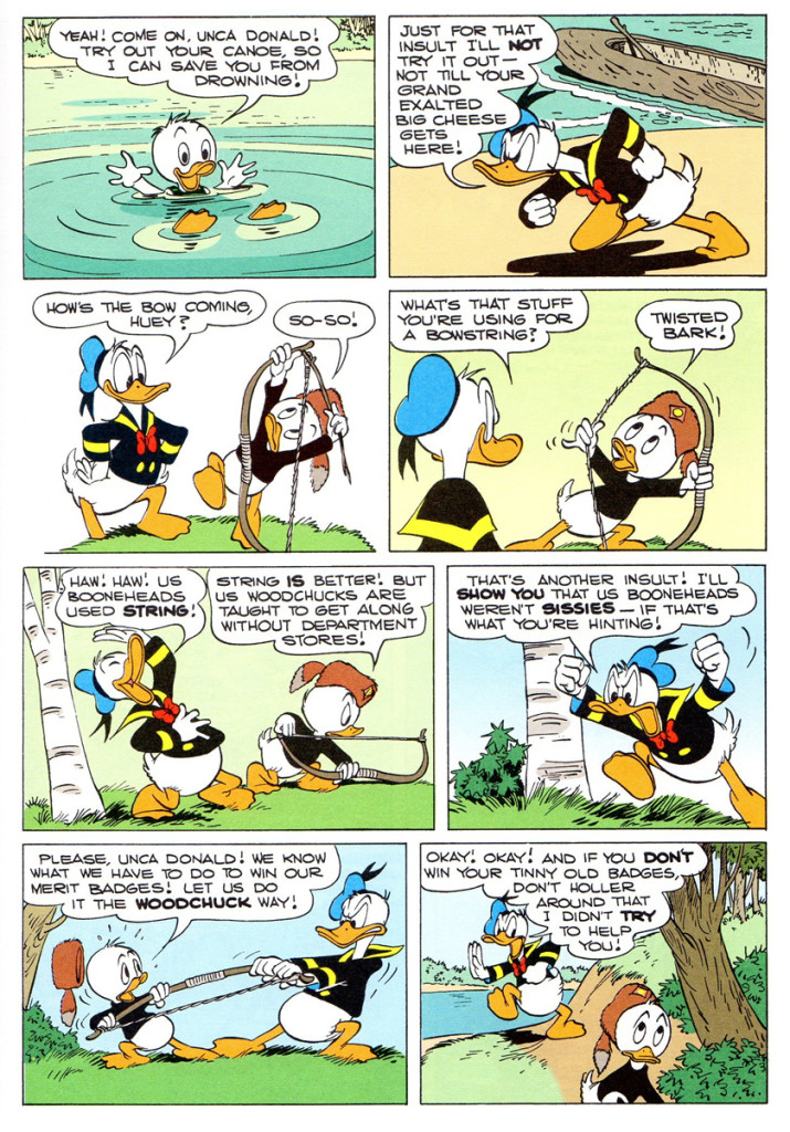
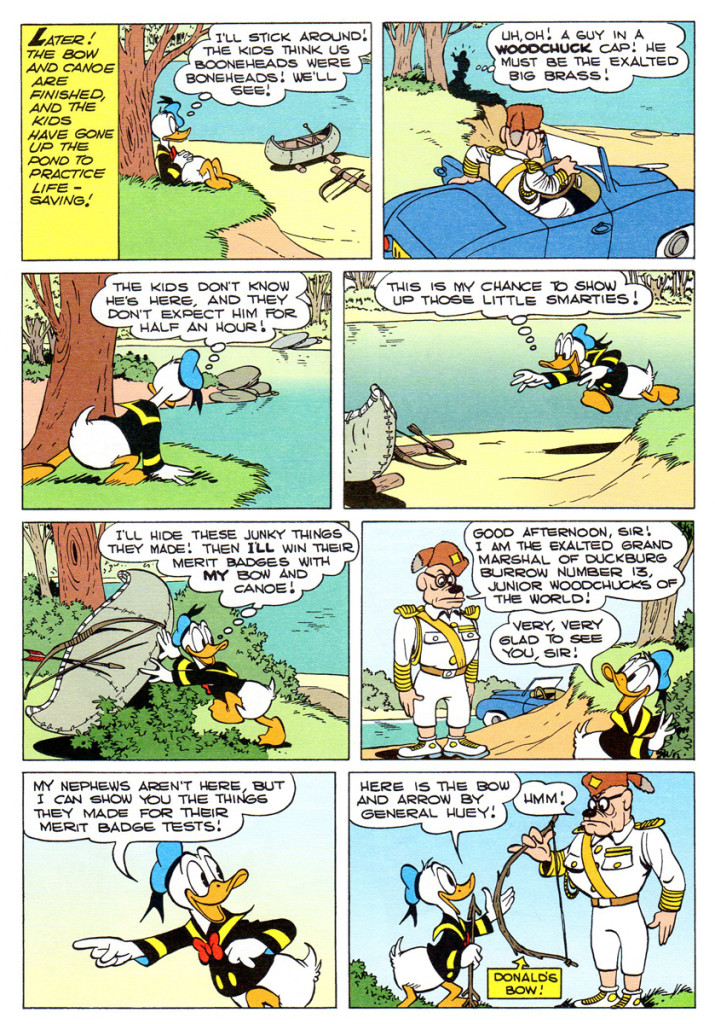
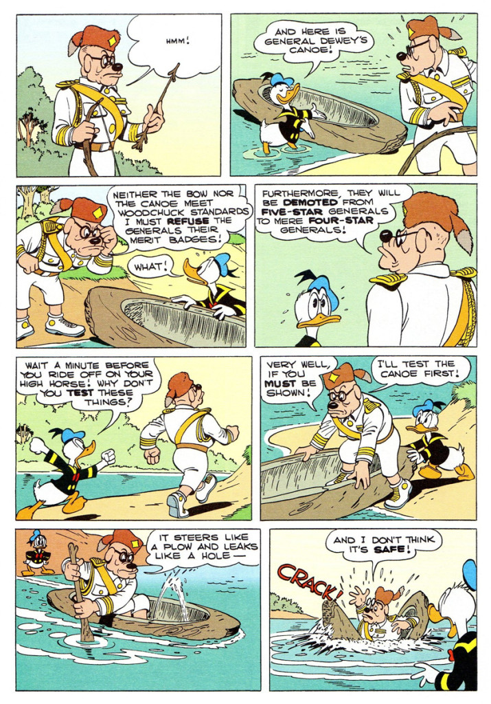
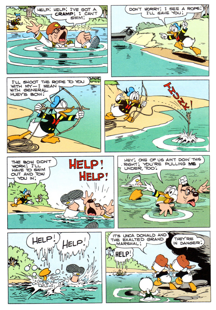
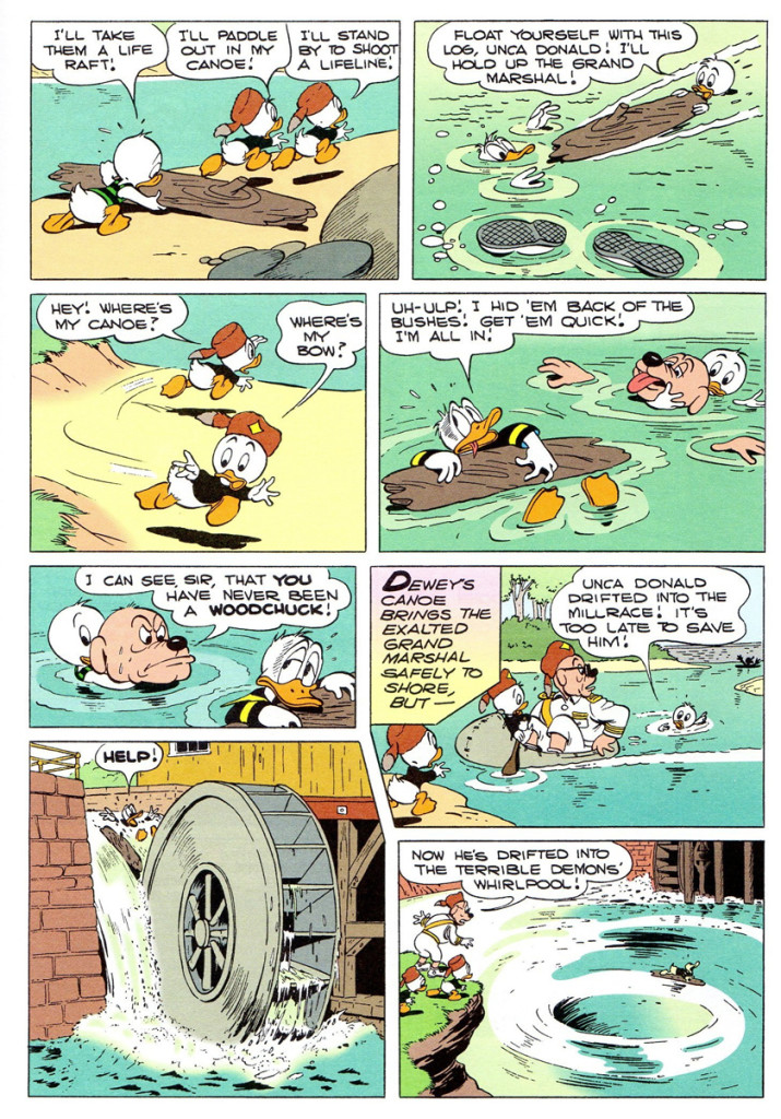
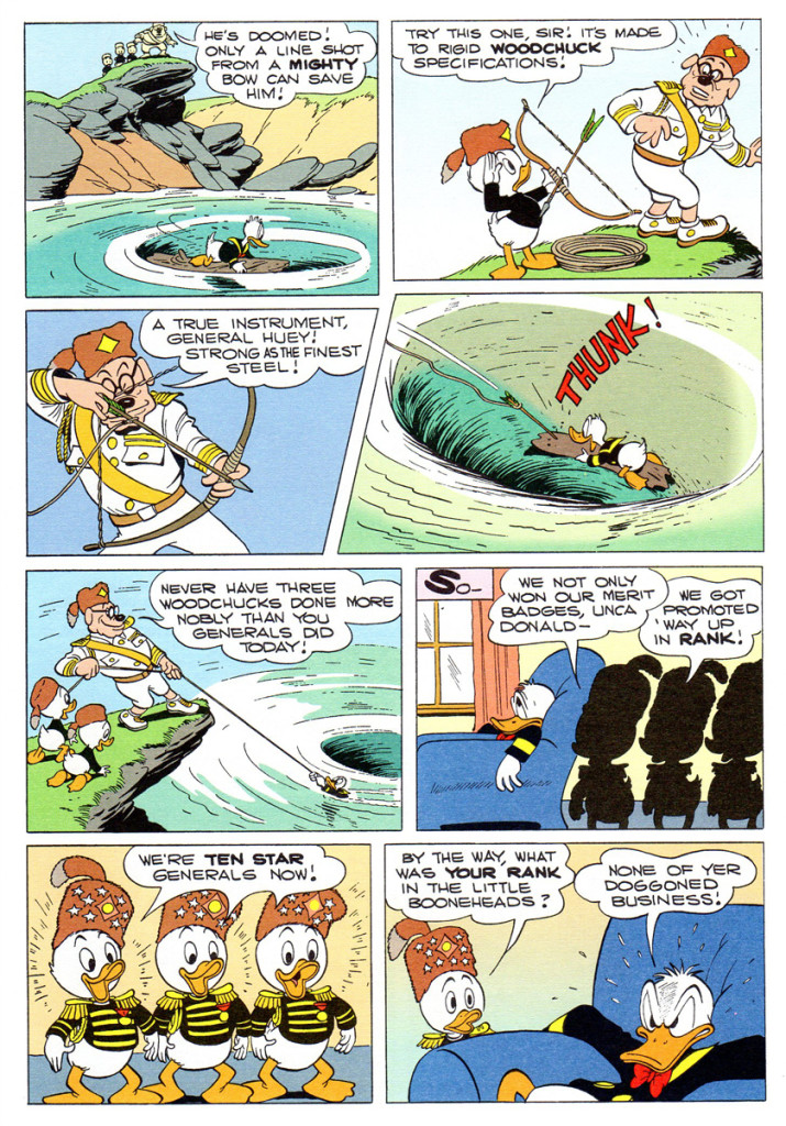
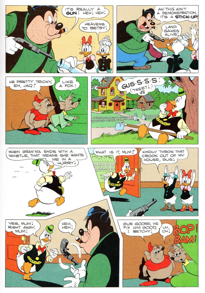
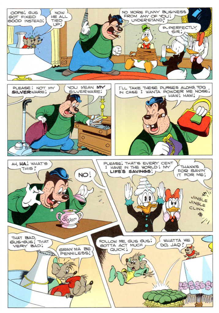
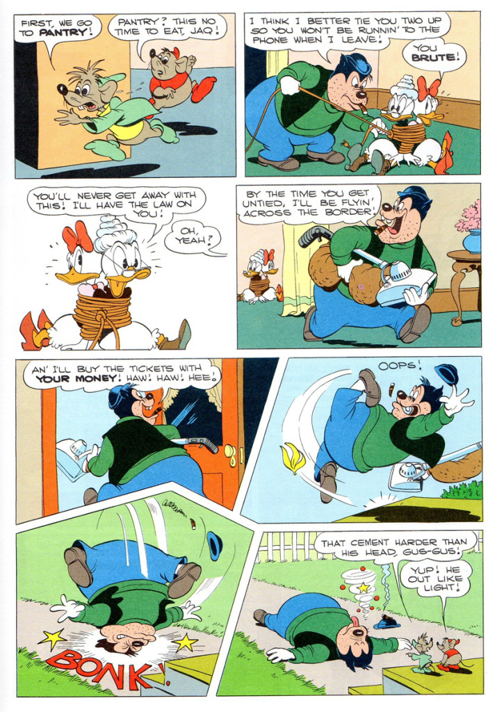
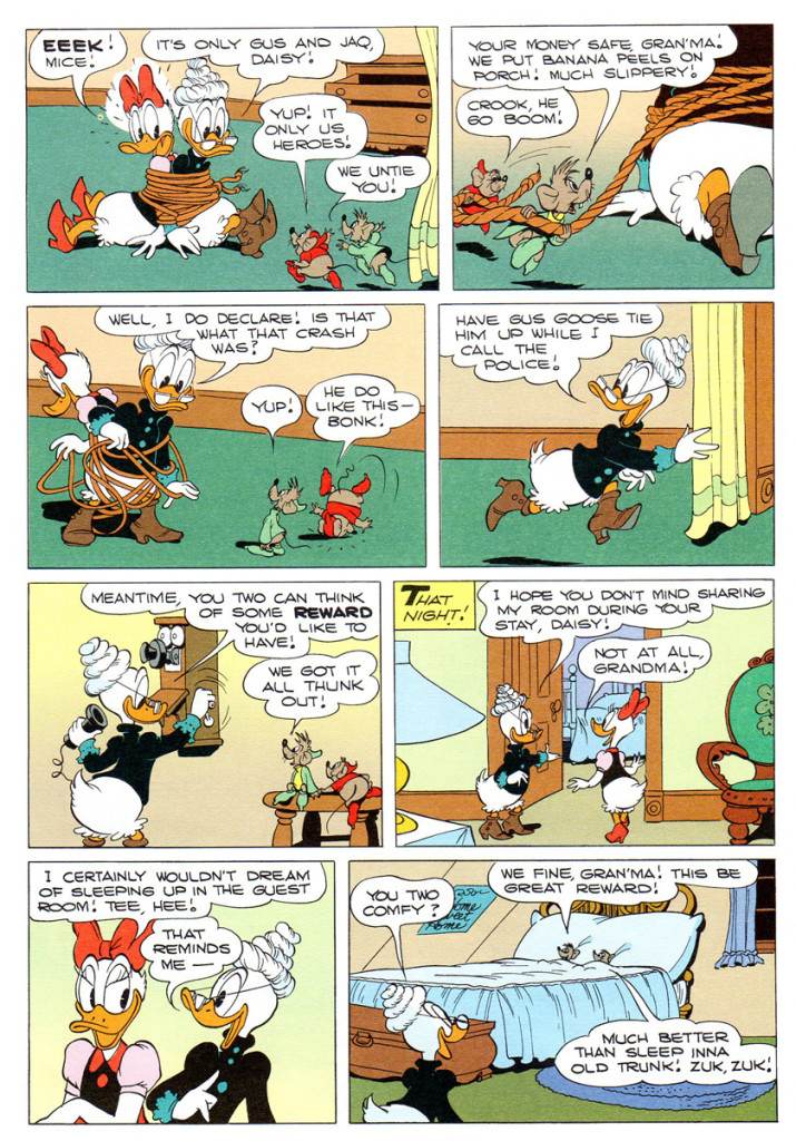
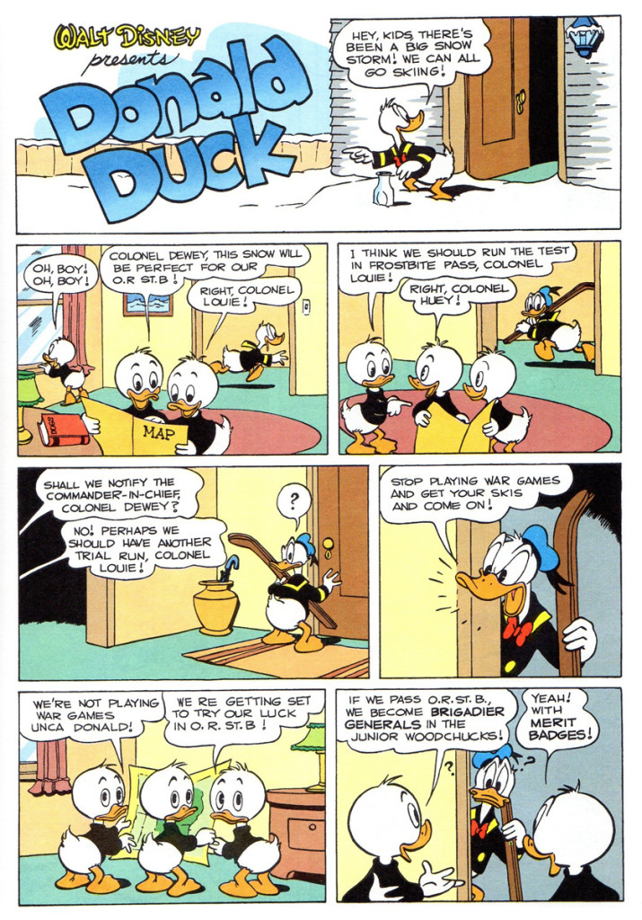
Bill Peckmann forwarded this wonderful package of comic stories. They’re three Junior Woodchuck stories by Carl Barks; classic ones, at that. It’s always great fun to revisit the Donald stories by Barks, so without any more wasted time, here we go to Bill:
- In 1951, Donald Duck comic book artist Carl Barks had stepped up to the next level of his extraordinary creative powers. Lucky for us little ankle biters then, that was the year he introduced Duckburg’s memorable kid’s organization, the “Junior Woodchucks”. (Boy, did we all long to join up also!)
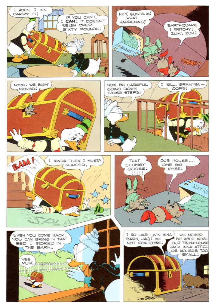
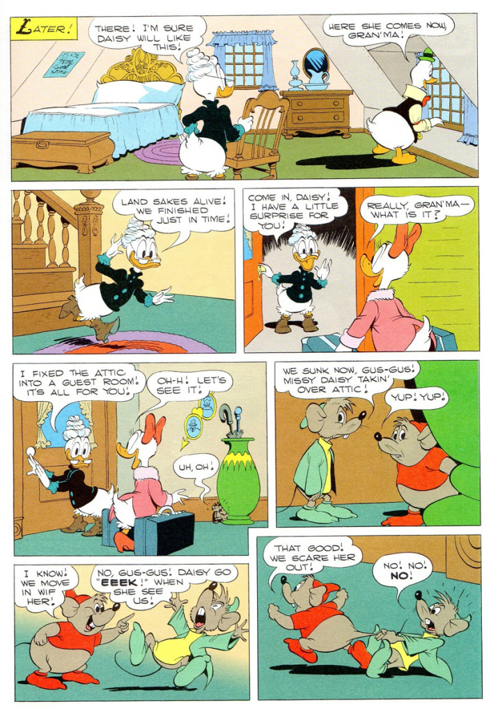
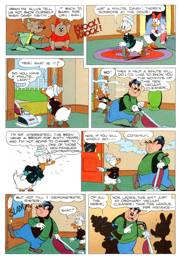
Here from that year are two of the first JW stories. It only went uphill from there, the JW’s eventually got their own comic book.These couple of stories are reprinted and re colored from Gladstone Publishing.
 1
1
The first “Junior Woodchucks” story appeared in “Walt Disney’s Comics and Stories” #125, Feb. 1951. This second story is from “WDC&S” #132, Sept. 1951.
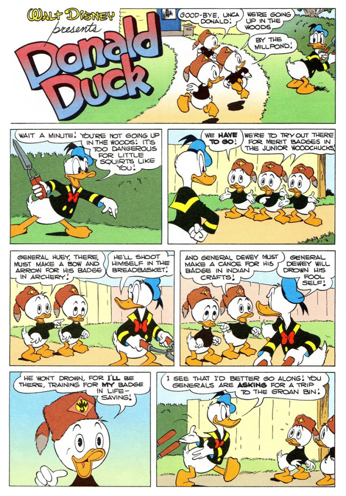 11
11
“Walt Disney Comics & Stories” #132 gave us little squirts an extra bonus; not only did it contain a Donald Duck story by the “good guy artist”, there was also a second story in that issue illustrated by his deft hand! Even though the “Grandma Duck” story wasn’t written by Barks, it still has the master’s touch in all of those beautifully rendered panels.
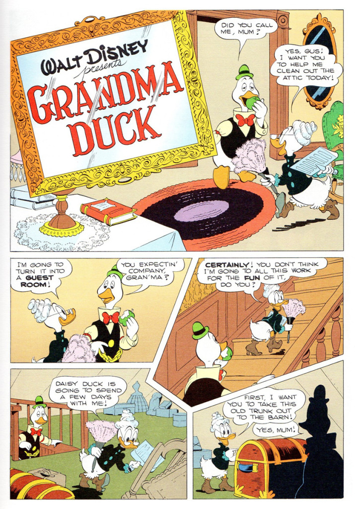 21
21
Articles on Animation &Commentary &commercial animation &Disney 22 May 2013 04:35 am
Press
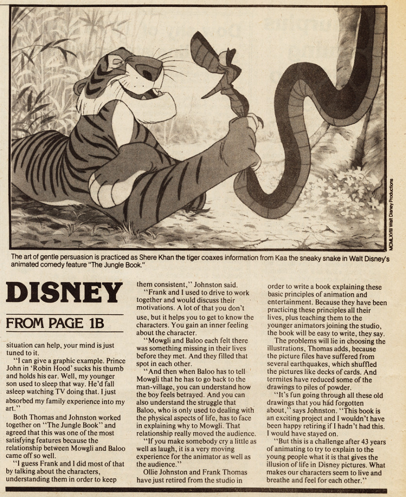
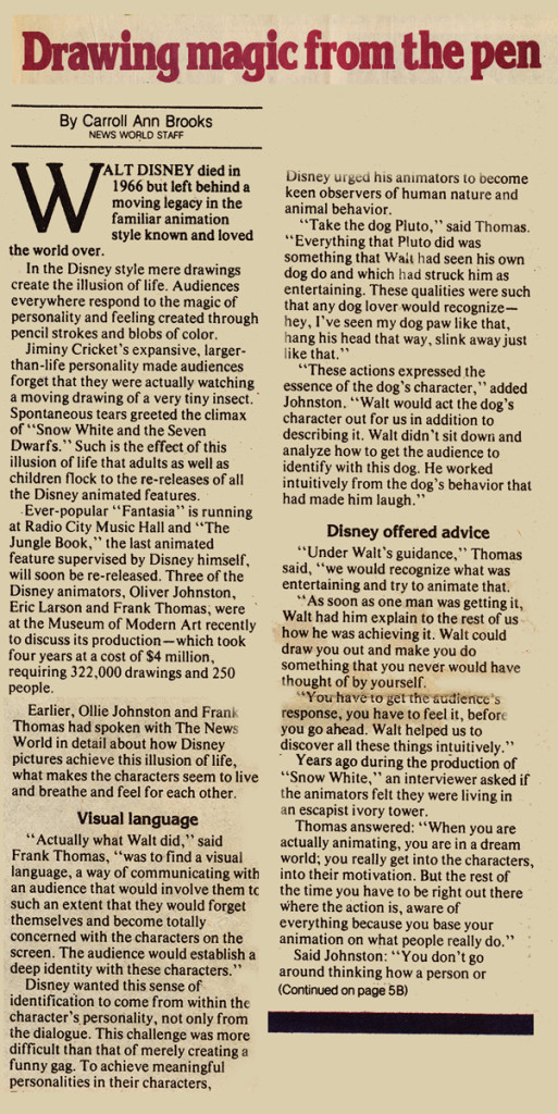
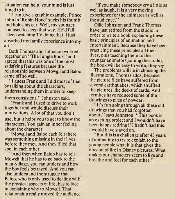
Among the remains of the material saved by Vince Cafarelli, there was this newspapaer, The News World, dated Tues. May 23, 1978. On the same page, there were two articles about animation.
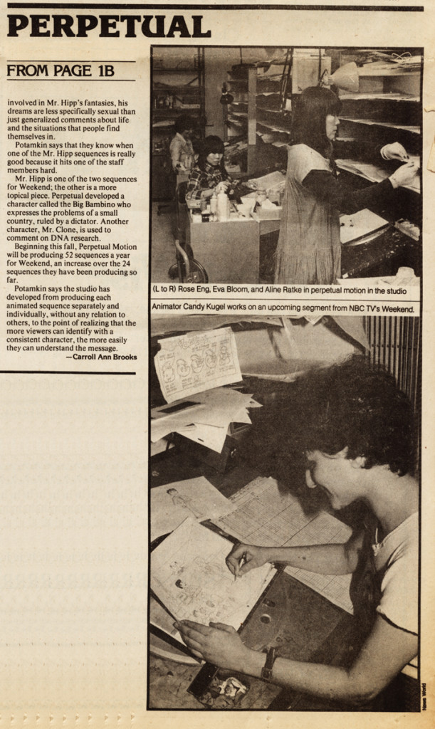
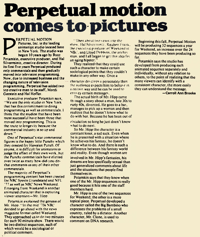
Once was a piece about Disney’s Jungle Book, which was just about to be released. The second was an article about Perpetual Motion Pictures. This, of course, was the company where Vinnie and Candy worked with Buzz Potamkin producing and Hal Silvermintz designing.
Below, I post first the two parts of the Disney article (I’ve also singled out just the type in case you want to read at a larger scale.)Then I follow with the two parts of the Perpetual Motion article.
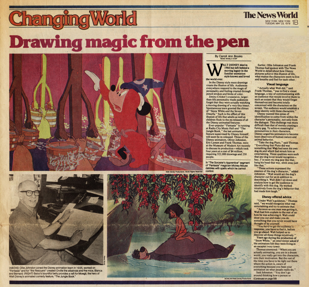
The Disney article (part 1)
The following is the article about Perpetual Motion Pictures:
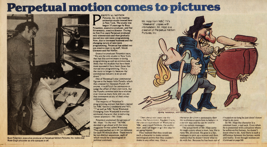
Perpetual article (Part 1)






 1
1

 2
2
 3
3
 4
4
 5
5

 6
6
 7
7
 8
8 9
9
 10
10
 11
11
 12
12

 14
14
 15
15
 16
16
 17
17

