Monthly ArchiveJanuary 2013
Disney &Frame Grabs 31 Jan 2013 06:35 am
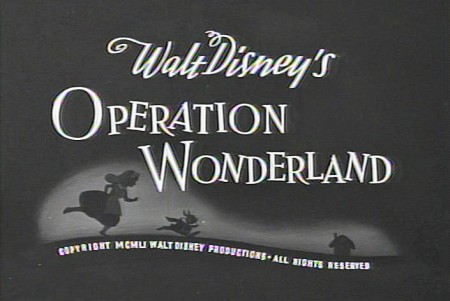
Operation Wonderland Redux
- On the DVD of Alice in Wonderland, there’s an extra little short that supposedly gives you a tour of the studio and a lesson in how animated films are made. (Do you think we’ll ever see one about Dreamworks or Pixar? I’d like to get a video tour of either studio.)
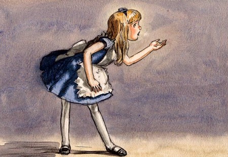
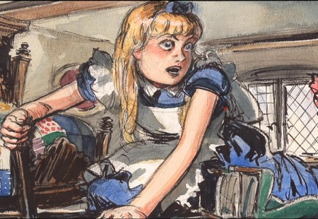
Since I’ve been focussing on Alice’s Milt Kahl scenes, I thought it’d be interesting, as an accompaniment, to post some frame grabs from this theatrical short that was done to promote Alice.
 1
1(Click any image to enlarge.)
 2
2
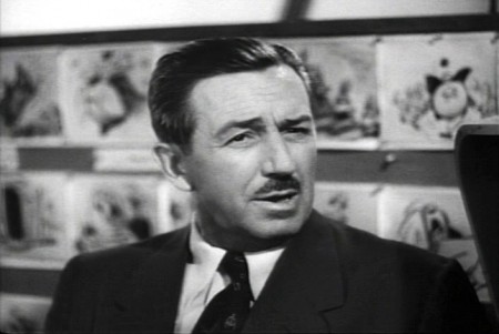
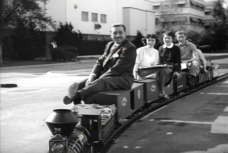
Of course, the film has to start with Walt
riding a toy train around the studio.
 3
3
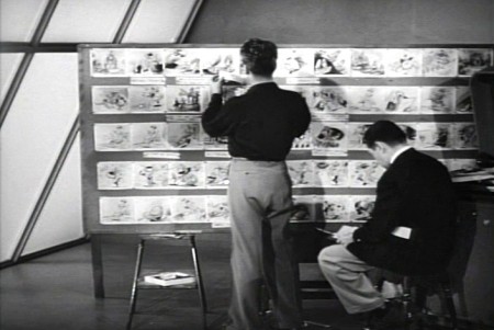
Two storyboard guys sitting in the middle of the studio.
 4
4
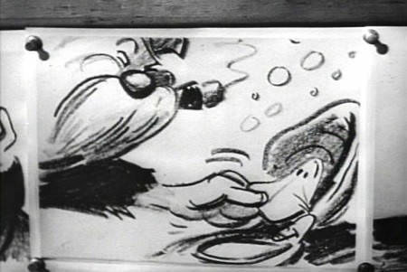
Storyboard: the walrus grabs a clam.
 5
5
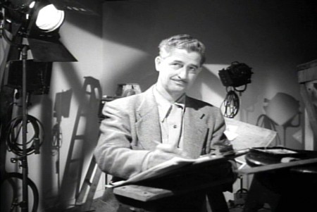
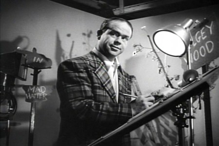
Ward Kimball in a funny jacket.
 6-7
6-7
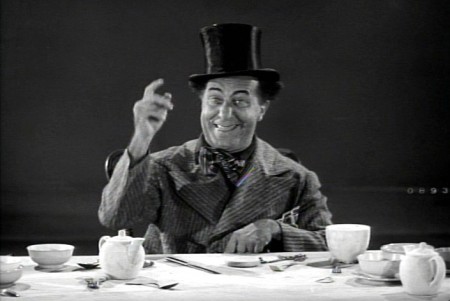
The actor posing as the Walrus for the camera.
 9-10
9-10
The Walrus & Carpenter sequence.
 12
12
Walt and Winston Hibler. Hibler eventually narrated
most of the Disneyland shows and True-Life adventures.
 14
14
Flowers from storyboard to final film.
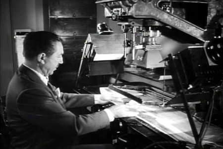 15
15
Walt gives a demo of the animation camera and
seems to be wrinkling the cels as he does this.
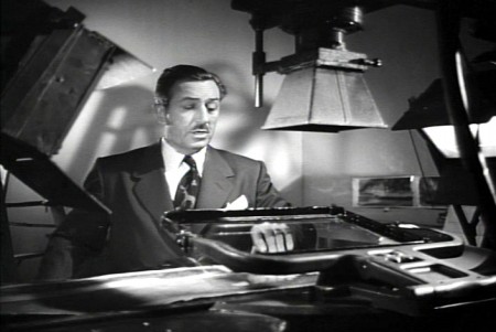 16
16
Walt operating an animation camera. Ludicrous.
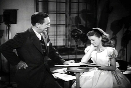 17
17
Walt and Kathryn Beaumont (who’s
supposed to be doing schoolwork.)
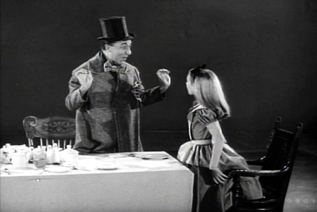 18
18
Kathryn Beaumont and Ed Wynn.
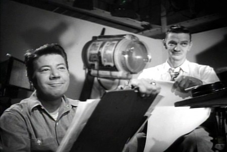 20
20
John Lounsbery on the right. The other animator looks to be
Fred Moore. Older and heavier than we’ve seen him in the past.
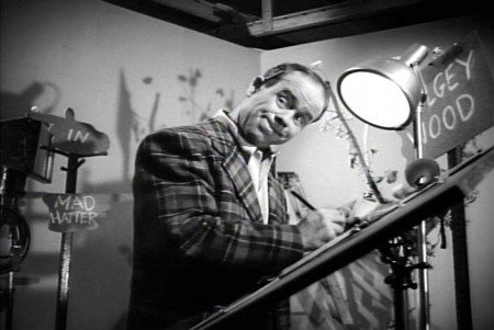 22
22
More of wacky Ward Kimball pretending to draw.
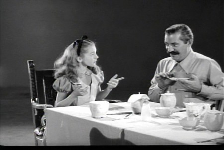 23
23
Kathryn Beaumont and Jerry Colonna.
 25
25
Jerry Colonna leads us into pencil test of the scene.
 27
27
This scene was animated by Ward kimball & Cliff Nordberg.
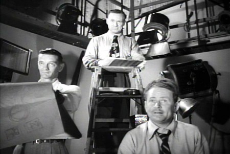 46
46
John Lounsbery is on the left.
I’m not sure who the other two are.
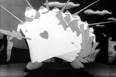 47
47
The cards in action in the film.
 49
49
One of the highlights of the film is this dancer doing
march steps for the cards – to be studied.
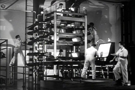 50
50
The multiplane camera in operation.
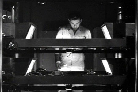 51
51
The cameraman at the top always looks a bit devilish.
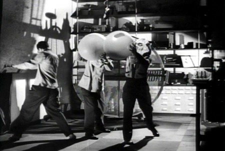 52
52
No “how animation is made” film would be complete
without the sound effects guys making a racket.
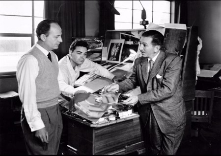 54
54
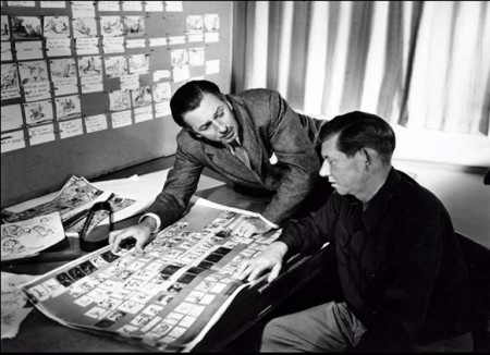
Walt going over some artwork with
John Hench (L) and Claude Coats (center)
Thanks to Hans Bacher and Gunnar Andreassen for identifying them.
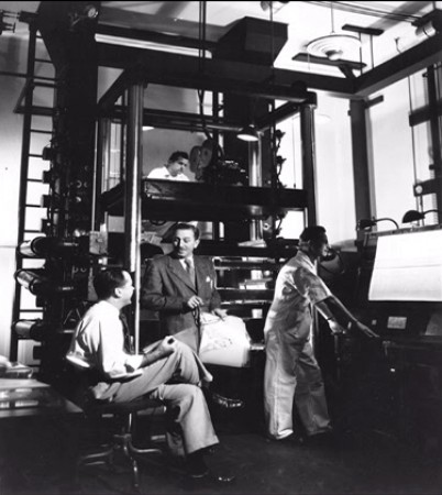 55
55
Before riding his toy train into the sunset, Walt sits
in front of his real toy, the multiplane camera.
If anyone can identify any of those I couldn’t, or if you think I’ve mistakenly identified anyone, please leave a comment.
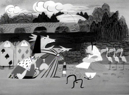
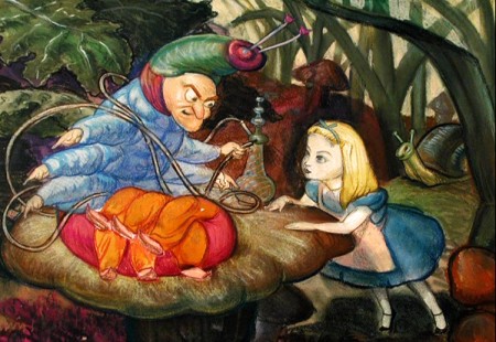
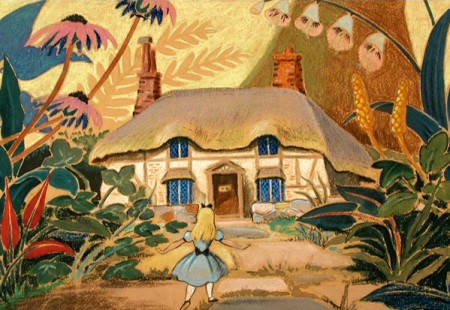
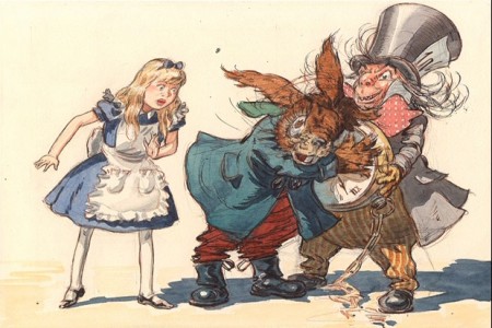
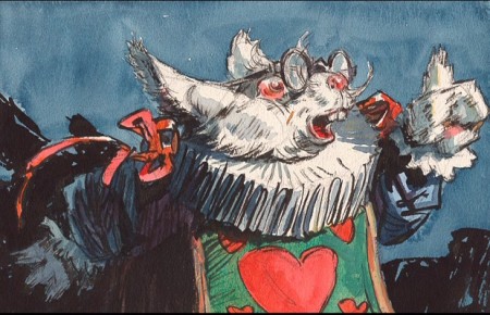
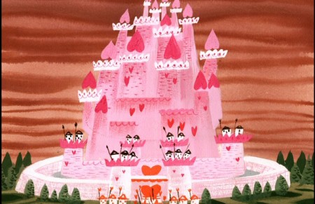
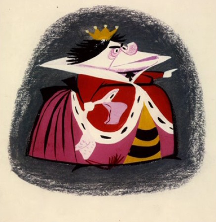
There’s an art gallery of images, many of which are by Mary Blair (and I’ve already posted her pictures a while back.) I’ll finish this post with some more of the images on the dvd.
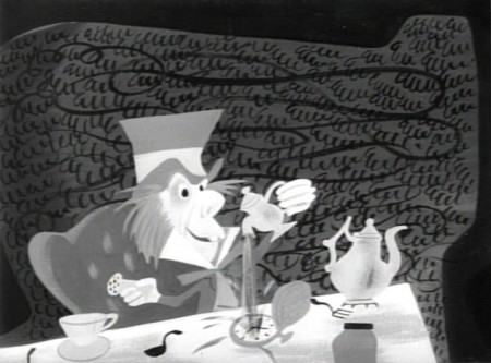 1
1Mary Blair in B&W.
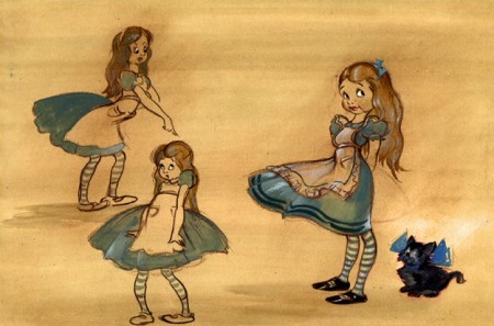 4
4
Thiis looks like it comes from HOPPITY GOES TO TOWN.
To see more Mary Blair designs for Alice go here.
Animation &Animation Artifacts &Bill Peckmann &commercial animation &Illustration &Models &Story & Storyboards 30 Jan 2013 08:26 am
More Misc Commercial Art
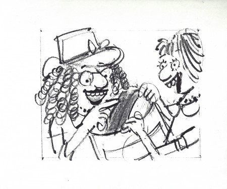
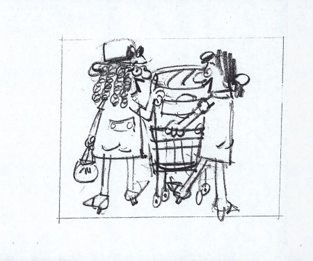
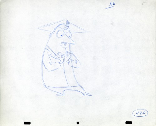
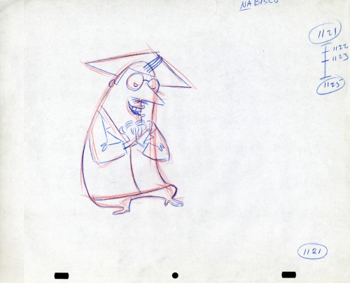
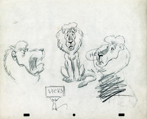
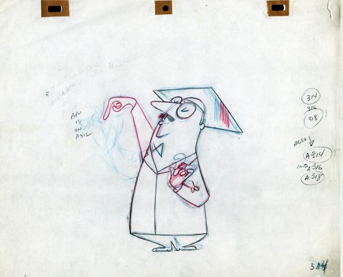
- Still left in the Vince Cafarelli collection of drawings from commercials he did, most probably, at Goulding-Elliott-Graham (for the moa part) are the drawings below. We know through some small bits and pieces of information what a couple of the sponsors were. (The wording of dialogue the professor speaks that the sponsor is Nabisco Shredded Wheat; the lion and the mouse ad is obviously for Vicks – drops or vap-o-rub.) However, too many other bits leave us empty handed. I can recognize cartoonist, Lou Myers‘ work anywhere, but no clue what they’re for. Candy Kugel and I were also able to delineate Lu Guarnier‘s drawing style (Vinnie was his assistant for years), and I know Jack Schnerk‘s great work. I recognize the brilliant and great hand of George Cannata from similar work that Bill Peckmann had recognized (see here) in a past post. So it is great to learn as much as we can, even though there’s a lot of guesswork in it.
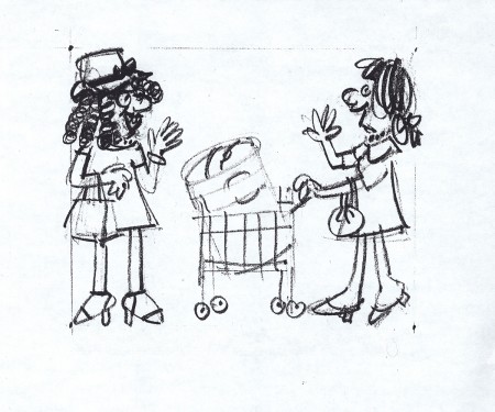
The following are three storyboard drawings by cartoonist Lou Myers for some spot:
 1
1
The following drawings are for Nabisco Shredded Wheat. They’re animation drawings/ruffs by Lu Guarnier. The delicate pencil lines of these years turned into dark rougher ones in his later years. The timing charts were always the same right out early wB years. You’ll notice a lot of quarters and thirds in the breakdowns. This is something you’d never see from Disney. There, everything is broken into halves and halves again and again.
 1A
1A
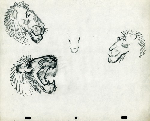
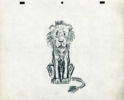
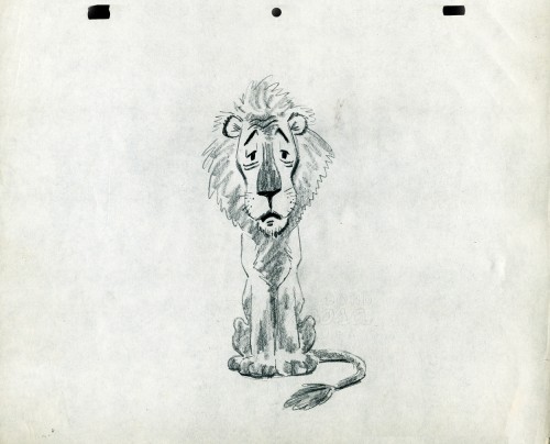
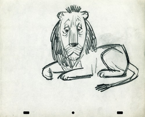
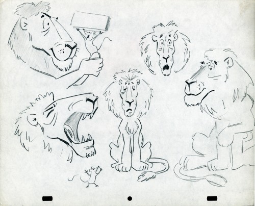
- The following lion is designed and animated for a Vick’s commercial. (Note the second model sheet.) There were quite a few commercials during the period that reworked this great Aesop tale for the sponsor’s use. The lion obviously has a cold. Rather than pulling out the thorn, the mouse introduces him to Vicks’ cough drops and the lion feels a whole lot better.
What has been left behind of this ad includes a couple of model sheets of the lion as well as a couple of animation drawings. I don’t know who the designer is, but the animation drawings are most definitely the work of Jack Schnerk. I suspect all the drawings here are by Jack. He probably kept reworking the model sheet until he got the character in his hand. I can remember him lecturing me on the quality of my drawings. Unless my drawings became roughs, rather than tight clean ups, he was convinced I couldn’t get good animation in my pencil. Jack’s work was rough. and it became much more rough than this, certainly by the time I knew him and was assisting him. He also had a peculiar style of roughness; very choppy angular lines chiseling out the fine drawings. You can get a good example of that with drawing labeled “2D”.
The last four drawings are all animation drawings. “2D” is a rough, “2E” is a clean-up by Jack. The last drawing is a beauty and probably the final look he hit upon.
 2A
2A
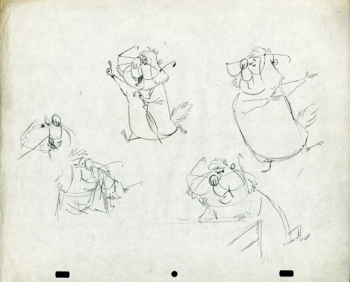
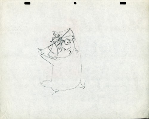
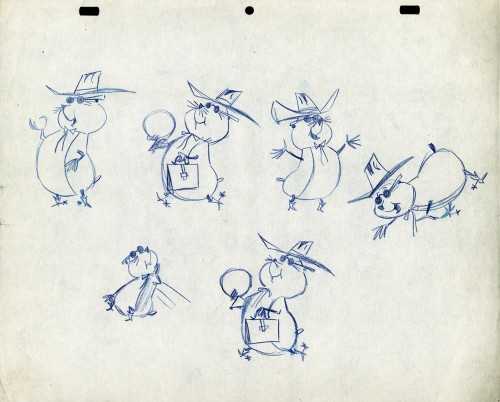
Here we have some drawings by a designer. I suspect that it’s the work of George Cannata. I did a couple of posts on a designer at Robert Lawrence Studio a few weeks back. Bill Peckmann identified the primary designer whose work screamed out to me. Since then, I’d recognize that line anywhere, and it’s most definitely below.
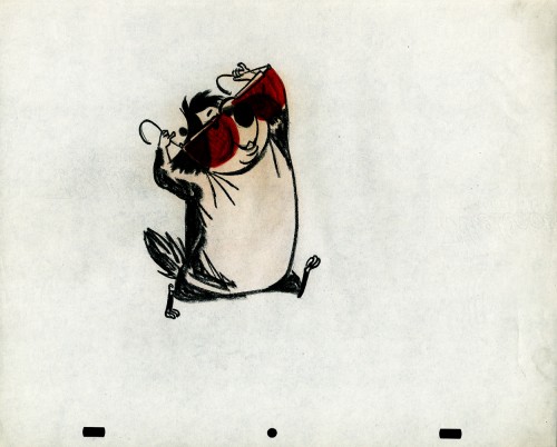
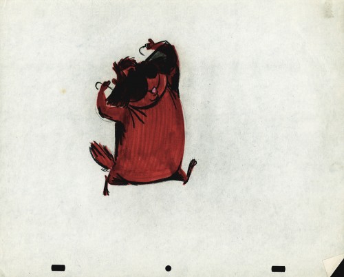
The Groundhog below is obviously a character with a southern drawl. The first step was to try the obvious making him a cowboy (“3A”). But that soon changed. and the character got plenty more sophisticated (“3B & C”). After that the line got juicy and the color got bold. There’s really so much to a character like this who just about animates himself.
 3A
3A
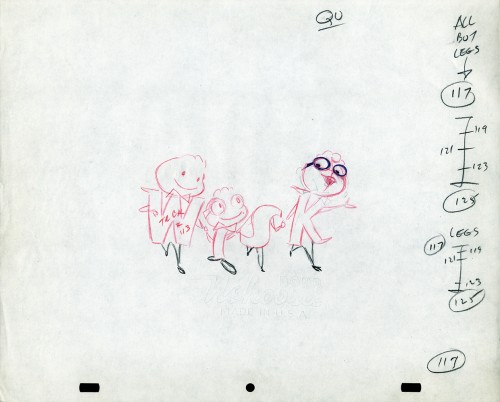
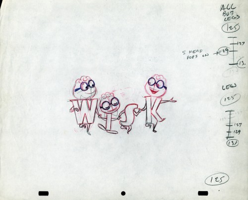
The following five drawings are for a WISK commercial. There are two model drawings and three animation ruffs. The primary model indicates that the spot is done for Screen Gems which was a viable studio in the early 60s and 70s. However, I don’t know who the animator was. Neither Lu Guarnier nor Jack Schnerk fill the bill.I know that Irv Dressler was at Screen gems for many years, but am not sure about this time especially since IMDB has him free lancing for King Features and other entertainment studios. The drawswing style of these animation drawings is right out of the Paramount/Terrytoons mold. Many animators’ work looked like these. People such as Johnny Gentilella, Marty Taras et alworked in a very similar style, though these are a little harder lines than either of those two.
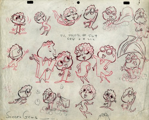 A
AThis is the primary model for the entire family. It’s a
beautiful drawing, and the characters have a lot of play
in them despite being connected so obviously.
Just look at the father’s hair. Beautifully done
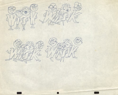 B
B
Here’s a secondary model. I suspect this is the animator
tracing off the characters and seeing what he can do with them.
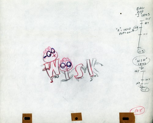 C
C
Animation drawing #105. Those breakdown charts are something.
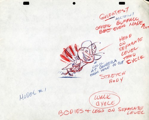
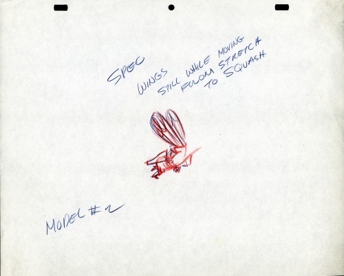
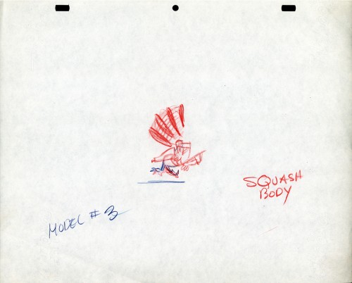
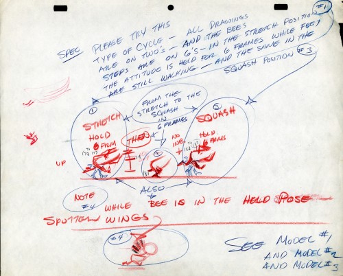
The Buffalo Bee for Honey Nut Oats is also a model sheet from Screen Gems. With it come an animation model sheet for the walk cycle of the character. These drawings look like Lu Guarnier’s to me, but there’s no official way I could confirm that, of course.
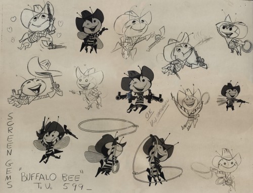
Model sheet
Daily post 29 Jan 2013 07:23 am
Lucid Intervals
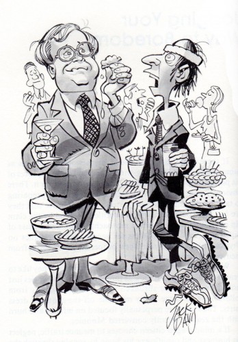
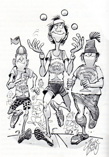
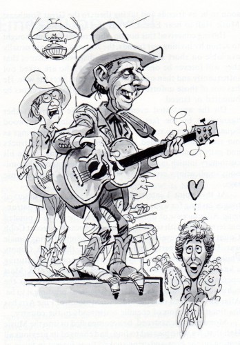
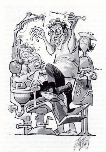
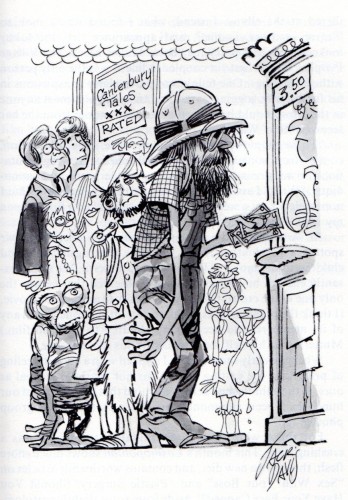
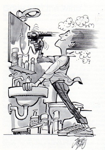
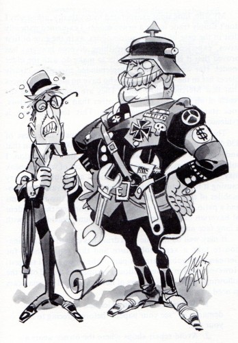
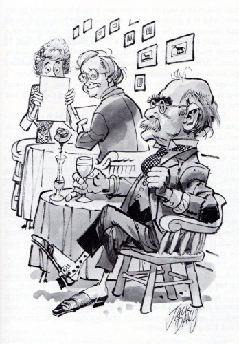
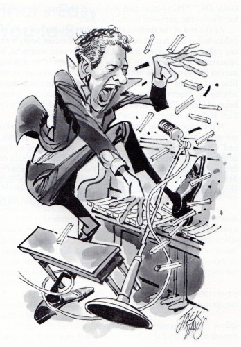
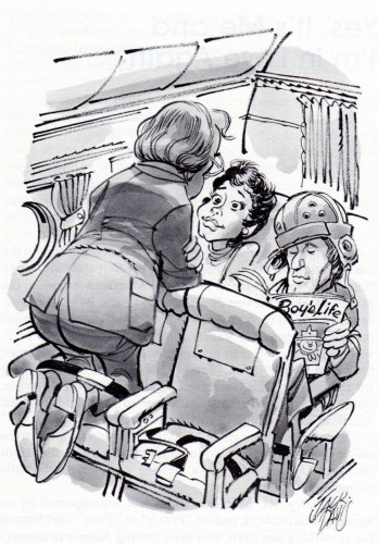
- Bill Peckmann sent me a number of pieces by Jack Davis. This post is composed of cartoons from the book he illustrated, Lucid Intervals.
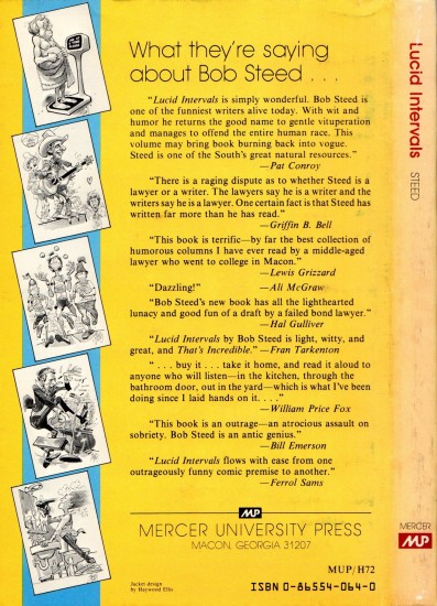
- In 1983 Jack illustrated a book titled “Lucid Intervals” by the author Robert L. Steed, a fellow Georgian. Because of collector/historian/publisher Manuel Auad, who fortunately for us also happens to be a big time, long time Davis fan, we get to see the fruition of Jack’s endeavor. Thank you Manuel! (We can only hope that one day publisher Mr. Auad will turn his sights on Jack and get the same results he got by zeroing in on illustrators Robert Fawcett and Albert Dorne!)
Here’s the cover.
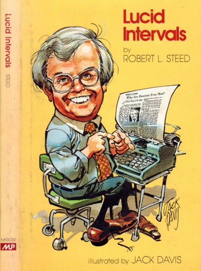
Front cover
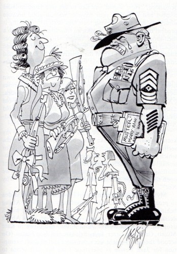
“The Female of the Species Caught in the Draft”
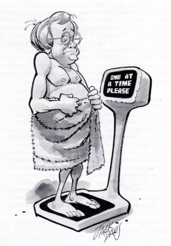
“Obese Abuse (or, Fat People need Love Too)”
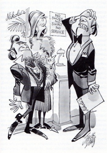
“Fit to Be Tied at Nikolai’s Roof”
(Bill’s note: One of the ruddy, bloomin’ best caricatures of Rudyard Kipling!)
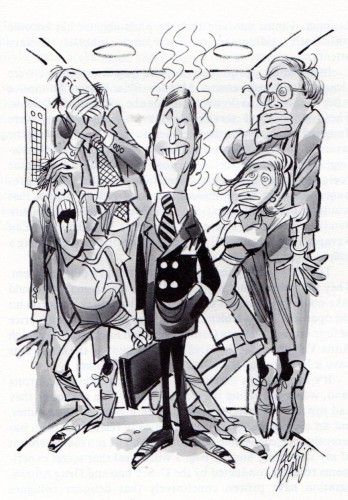
“I’m O.K., You’re O.K., But He Smells Funny”
(Another great caricature, this time Jerry Lee lewis!)
Frame Grabs &Layout & Design &Title sequences 28 Jan 2013 06:18 am
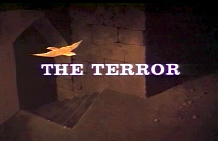
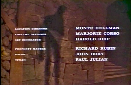
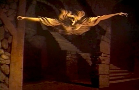
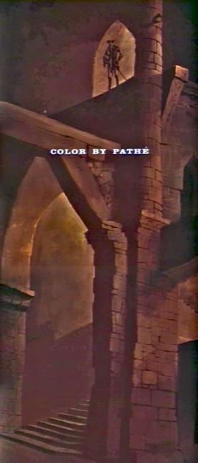
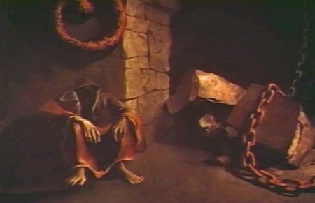
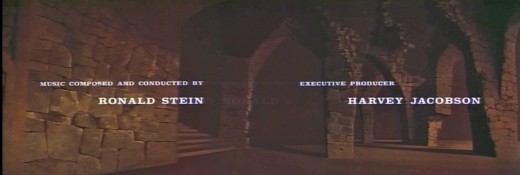
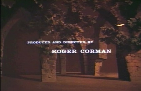
Paul Julian’s The Terror titles – redux
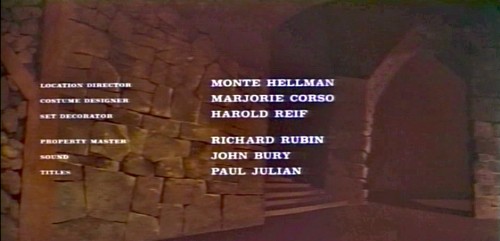
After posting the book, Piccoli, a week or so ago, I’ve grown more interest in Paul Julian‘s work. He’s known predominantly for the Bgs he did at Warner Bros and the art direction he did on The Tell Tale Heart. However, there’s more film work he did independently.
The Hangman was a short film he did with co-director Les Goldman. Maurice Ogden’s poem is read by Herschel Bernardi in a very earnest tone. The artwork by Julian absolutely saves this film which was nomainted for the Oscar.
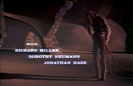
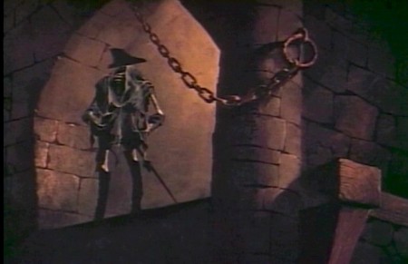
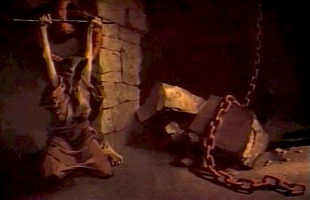
Roger Corman also used Paul Julian for a number of opening title sequences for the low budget films he did in the 60s. I’m going to try pulling some frame grabs from a number of these title sequences so that I can place some focus on Julian’s work in these forgotten films.
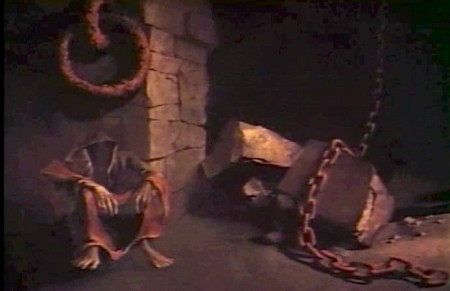
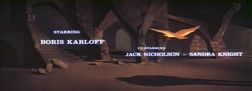
I start here with The Terror a film Starring Boris Karloff and Jack Nicholson. Julian uses a couple of pieces of artwork that he works over the course of the sequence with lots of lateral camera moves. Quite expressive work, though certainly not on a par with Tell Tale Heart.
 1
1(Click any image to enlarge.)
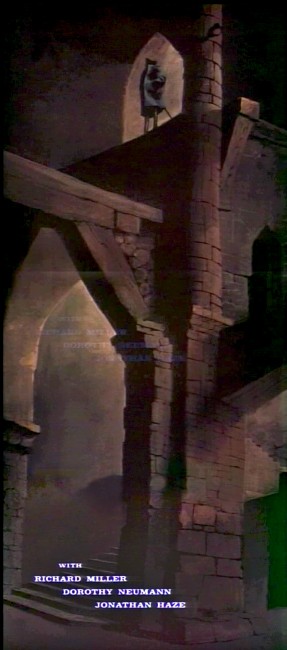 6
6
Starts at the bottom and pans up.
You can watch a grayed-out version of this video on YouTube. The credits come on about a minute into it.
Daily post &Photos &Steve Fisher 27 Jan 2013 08:01 am
West Side Story
Animation &Books &Commentary 26 Jan 2013 08:53 am
George and Friends w/Books
- I admit it; I am getting older, and I have completely different thoughts on what animation is than most people half my age. I have no intention of apologizing for that, because that’s what I believe and cherish and enjoy.
 This past week there was a program of animated work by George Griffin. He ran the show in achronological order starting with the most recent material and ending with the oldest. That show was animation. Everything in every frame (though there are no more frames) or bit of particle of George’s work and being is animation. He not only loves animation, but he is animation. It was a wonderful show to attend.
George enjoys showing the hardware and the techniques, the guts of the animated creature and the sprockets of the projector, if in fact there is a projector. His first “films” were bits and pieces live and animated. His very first piece was a filmic trick that Méliès and Blackton probably did in their first movies. George took the crumpled piece of paper in his hands and unfolded it to a crisp, new sheet of clean paper – he played the film backwards, of course, and with that, he started the show.
 All of the films shown utilized such tricks and bits, punching and stabbing with animated games, study and punctuation. Even taking his film, Flying Fur, in which he originally took a great Scott Bradley score for an MGM cartoon and put his own visual accompaniment. Not leaving well enough alone he remade his own film with Flying Fur Fragments. This has George, himself, go into his basement and rummage through odds and ends and artwork from the original short and we see these pieces come to life in his hand with a reconstructed, rehashed version of the great Bradley score. Skips and hops, walks and chases are pulled from the original to accent the accents in the music . It’s just pure joy in early 21st Century seeing what feels like be bop animation to a wildly modern musical score written in 1944.
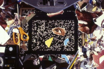 Speaking of be bop, George did just that when he animated a short homage to Charlie Parker in the film, Ko Ko. Taking a piece of music performed by ther great Parker in 1945, George visualizes every note and muscle of that great piece of music. The animator has found the heart of the music and given us all the fun in it with his very singular view of that score. This film’s a treat that can be watched over and over.
George shared a commercial he did in the style of Keith Haring, and though the animator apologized for the “bad animation” in the film, I didn’t see a bad bit in it. As a matter of fact I’ve seen about a half dozen Harings animated, and I can’t think of a better match for that graffiti artist than George and his own style.
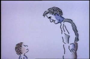 The one film that was very representational was a film he did with his daughter, Nora. It’s a very sweet movie called A Little Routine. It’s a wonderful little piece that illustrates the daily routine with the father putting the daughter to bed. George uses lots of imagery in a semi-abstract way as something so simple as escorting his daughter from the bathroom to the bedroom involves trekking over countryside terrain bringing the little girl to the safe part of the woods where she will have no worries or fears. When she wakes in the night desperate for a glass of water, we hear daad shouting miles away that he’ll bring the water and we see him making that routine trip to the bedroom to protect his little girl. It all happens in a flash, of course, something that can be done so easily in animation. The film seemed to touch many in the audience that wanted the more representational world for the break of it, and they didn’t seem in any way disappointed when we were back to sterner stuff.
George Griffin understands animation; it’s in his lifeblood and he offers it to us an any way he can: flipbooks, mutoscope, dgital refilming of 16mm, movie files or purly digital sections. He feels that there is no need for the apparatus as long as we want to get out the animated bits.
The evening was an inspiration. Thank you, George.
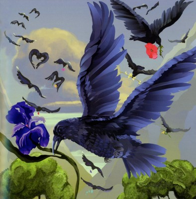
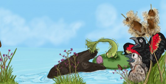
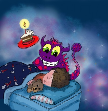
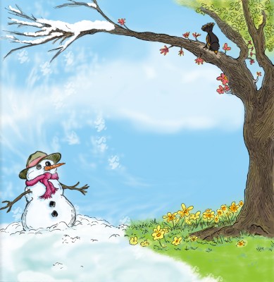
- Some friends and past employee/friends have been busy writing and illustrating children’s books. I thought I’d show off three of them and write a few words about them. (If you can’t promote your friends’ work, who can you promote?)
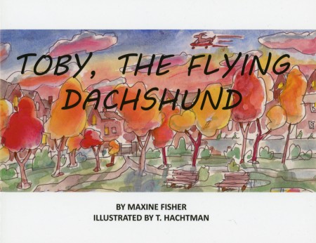
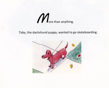
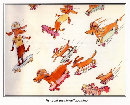
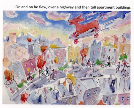
Three long-time very close friends have joined together to do a children’s book. Maxine Fisher has written most of my scripts (including POE) and she and Tom Hachtman put together a book about a dachshund. Max loves her pet, of course, and has now immortalized her in this book. Tom did the illustrations and Max’s brother, Steve (who does all those brilliant Sunday photos for me) put the book together and they self published on Lulu. That means you can buy it directly from Lulu, and I think it’s worth it. They’re still looking into Amazon, so maybe soon.
But I thought I’d post a few of the pics from the book and let you see how great it turned out. Tom wrote that he was finishing the last illustration as his yard (and eentually house) was being flooded by Hurricane Sandy.
Go to Lulu to find out more about the book.
___________________________
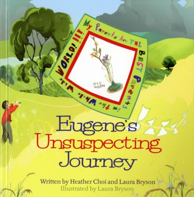
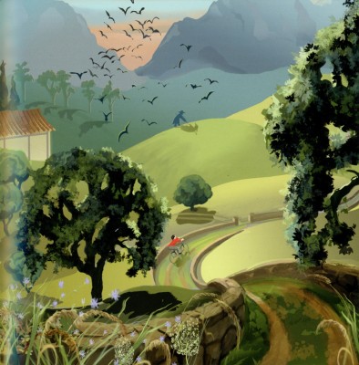
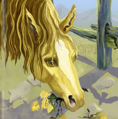
- Laura Bryson worked with me for years doing backgrounds for a number of the half hour shows (like The Red Shoes and The Marzipan Pig). Now she’s out freelancing and painting and has recently turned out her second children’s book which she co-authored and illustrated.
The book uses the Chinese Zodiac within the theme of the book offering Laura plenty of opportunity to paint nature and animals. The color palette is quite controlled as is the quiet story. The book can be found on Bestboypublishing.com.
Here are a few other samples from the book:
 1
1
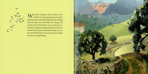
Illustrations on every other page give plenty of opportunity
of using flat colors to set up the next page.
 3
3
And, of course, Laura who loves her horses
makes sure to include one to illustrate.
___________________________
- Finally, we have Stephen Maquignon. Steve’s illustrated many books since he left animation, and each one gets more sophisticated than the last. I asked him to send me some art from a couple of books he wanted to highlight, and he did. I’ve chosen the following pieces from both books.
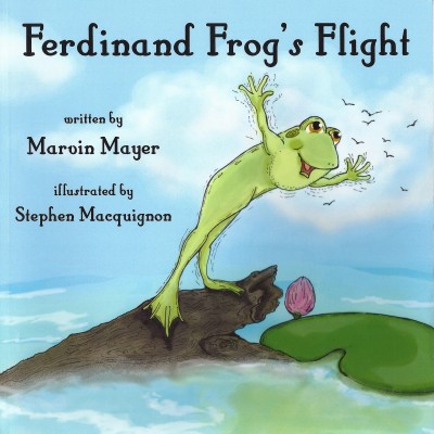 1
1
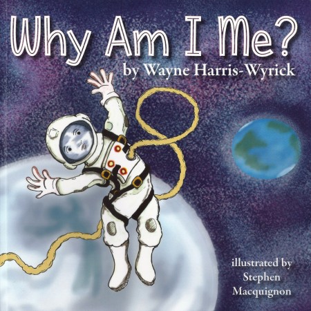 3
3
This second book, Why Am I Me? seems very clever. Steve wrote the following about the book:
When I read this one I could not see one main character in it, a big question, and
I thought it deserved many voices so each time the question why am i me pops up
I put in a different kid in a different situation.
Kind like the ride at Disney world “It’s a small world after all”
Stephen has a number of sites on which you can see more of his artwork and order copies of his books if you’d like to:
This is a link to his bio page on amazon it shows all the books he illustrated.
likewise Barnes & Noble
This is his primary personal site as a Children’s Book Illustrator
Bill Peckmann &Books &Disney &Illustration 25 Jan 2013 11:07 am
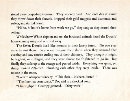
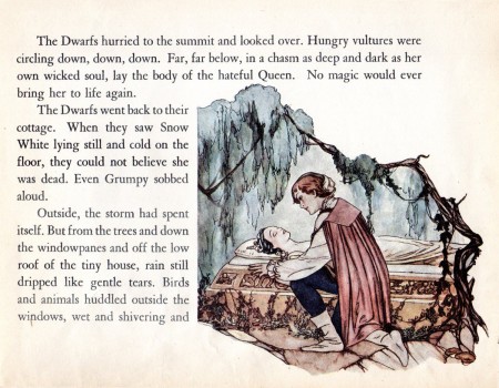
Snow White Book
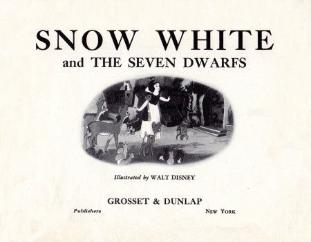
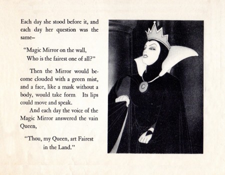
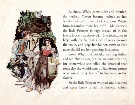
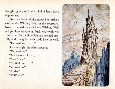
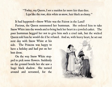
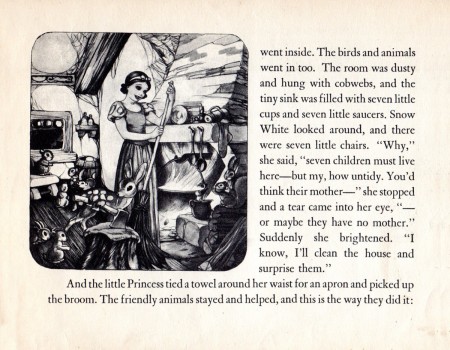
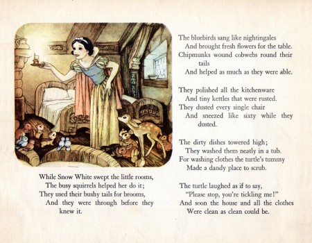
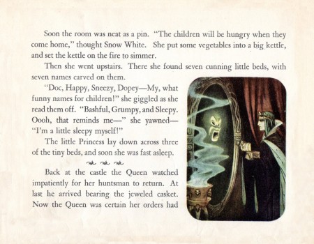
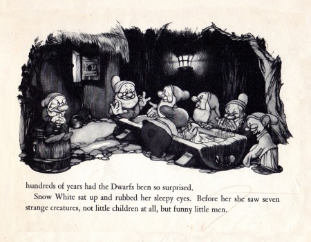
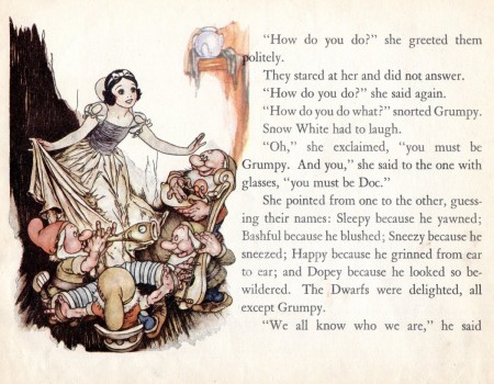
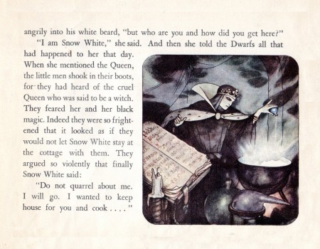
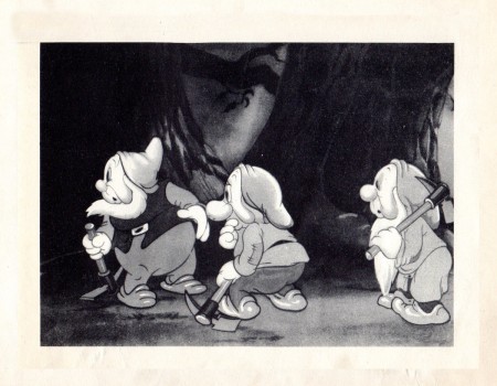
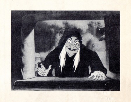
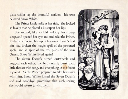
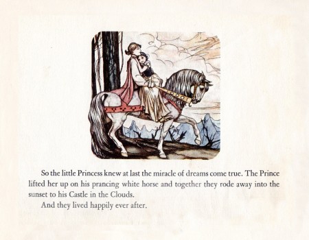
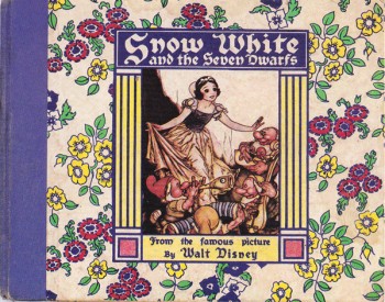 - I’m reading J.B. Kaufman’s two Snow White books, both at the same time, and I’m taking my time about it. Bill Peckmann aroused my interest with a couple of Snow White oddities. Featured in Kaufman’s The Fairest One of All is a the Whitman children’s book that was released with the initial release of the movie in 1937. (See the cover to the right.)
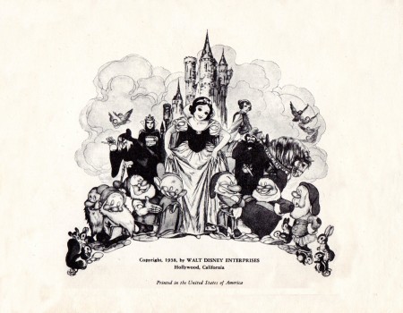
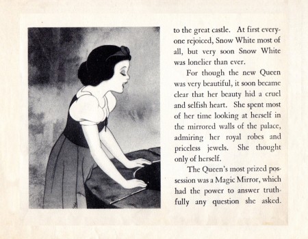
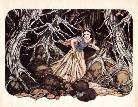
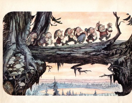
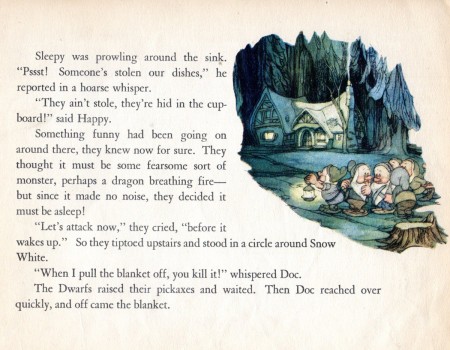
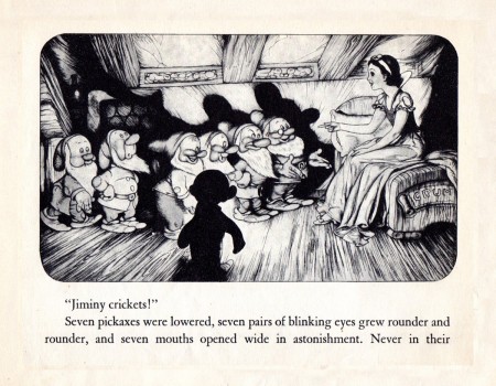
Bill sent me the cover of his copy of the book, bought at a local street fair. His version was the rerelease of the book by Grosset and Dunlap done in 1938. And it’s a beauty. The book contains some B&W screen images from the movie,, but more than half of it is made up of illutrations by Gustaf Tenggren, the studio artist/designer so responsible for some of the film’s look. He joined the studio in 1936 and had involvement in finishing the movie and giving it the Old World look that it has. Ferdinand Horvath and Albert Hurter were already at the studio when he joined and had equally strong contribution in the design. Tenggren was principal in the publicity materials done for the movie. Here’s the copy of bill’s book, complete with damaged cover:
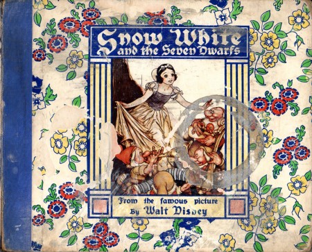
This is the dameaged cover of Bill’s book.
Bill Peckmann &Comic Art &commercial animation &Story & Storyboards &Toth storyboard 24 Jan 2013 07:10 am
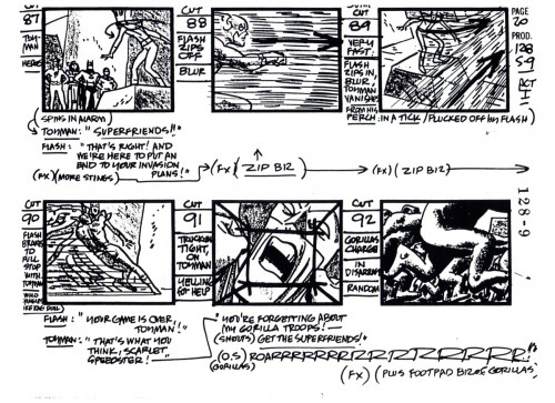
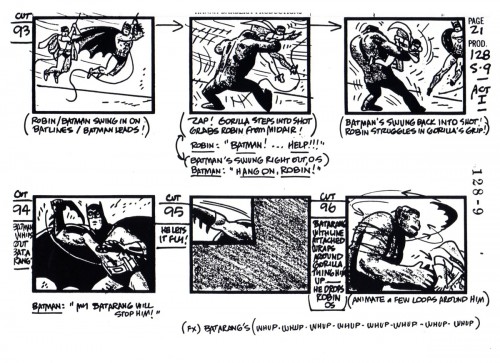
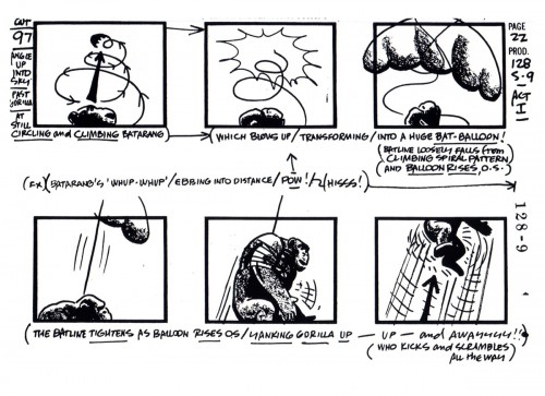
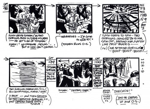
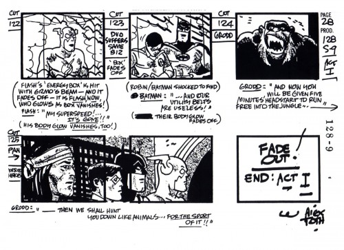
Toth’s SuperFriends Storyboard
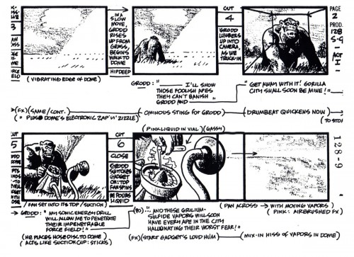
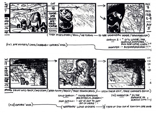
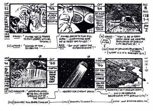
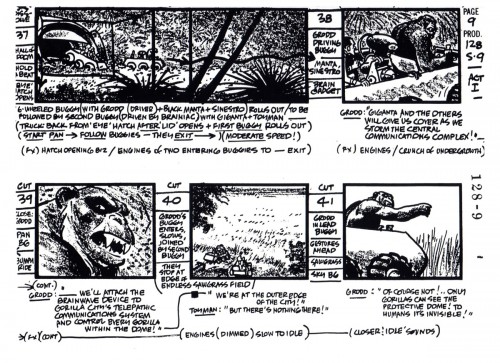
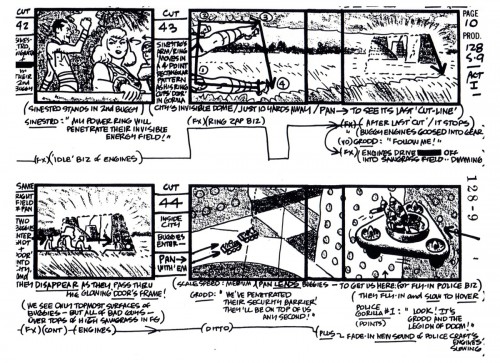
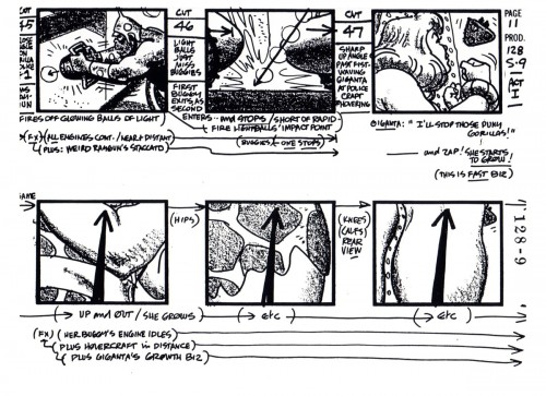
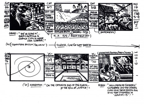
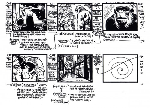
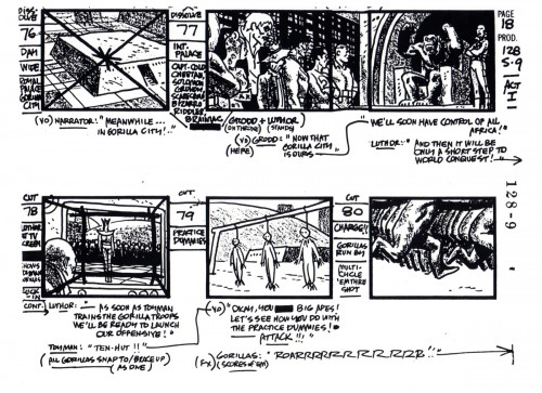
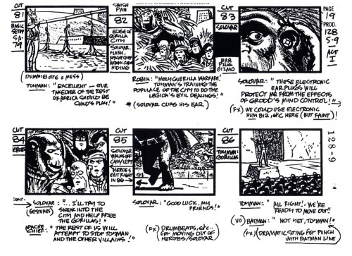
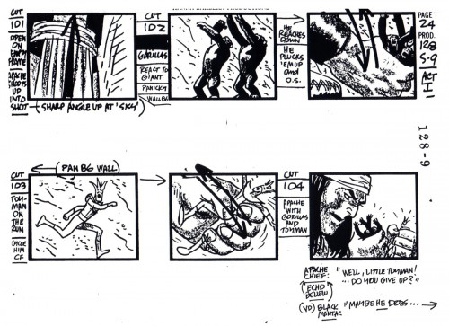
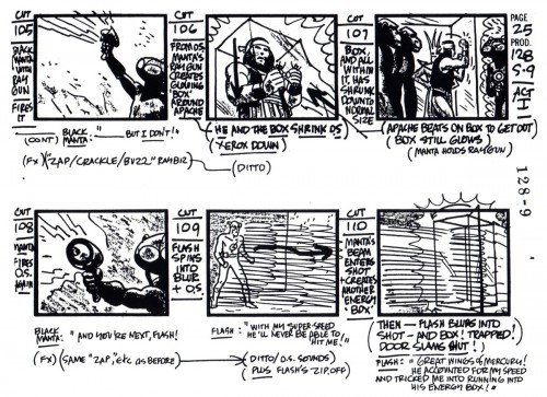
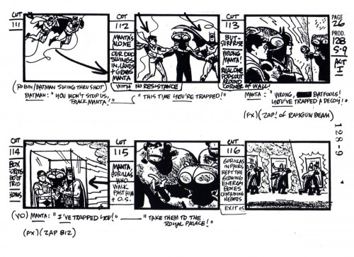
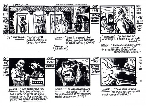
- Alex Toth did storyboards, too. Here’s one he did for Hanna-Barbera, and it shows the visceral strength of the “SuperFriends” project. More than the original comic book and greater than the final outcome. It’s a class act, and great thanks to Bill Peckmann and Manual Auad who brought it to him. To Bill:
- Many thanks to illustration art publisher, historian, fan extraordinaire, Manuel Auad, we are able to post 28 pages of a Hanna-Barbera “Super Friends” storyboard done by Alex Toth.
Even though the pages are Copies of Copies, they are nice clean copies that haven’t been covered with down-the-line production notes yet.
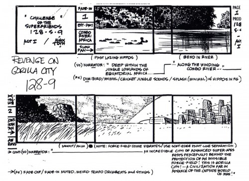 1
1
Here’s another board he did which we posted a while back.
Daily post &Top Cel 23 Jan 2013 08:56 am
Top Cel – 2
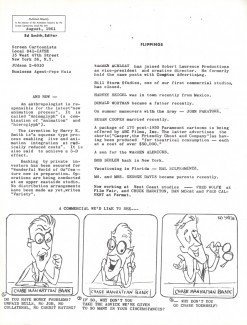
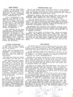
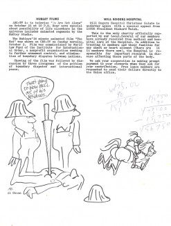
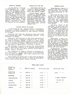
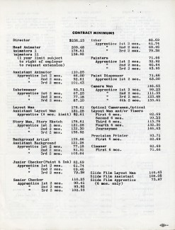
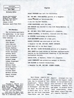
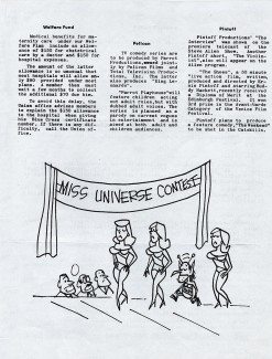
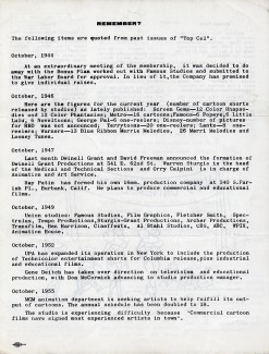
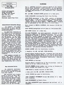
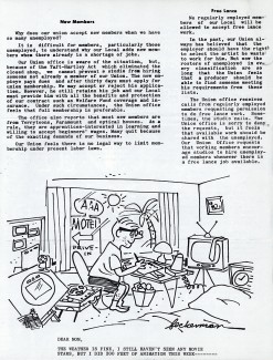
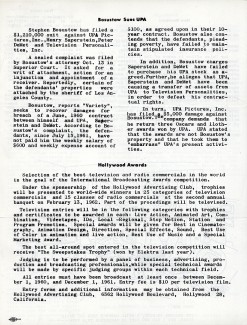
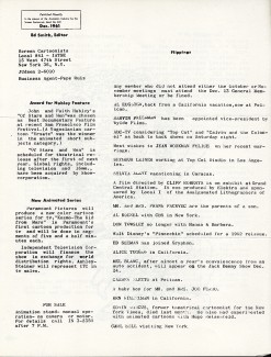
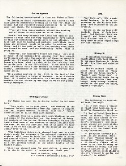
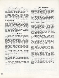
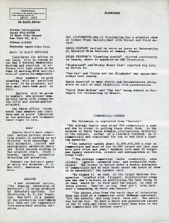
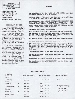
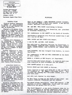
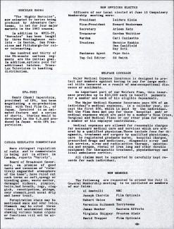
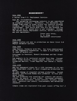
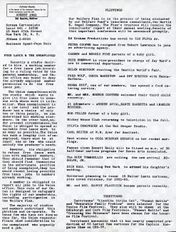
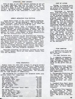
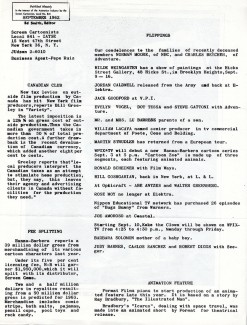
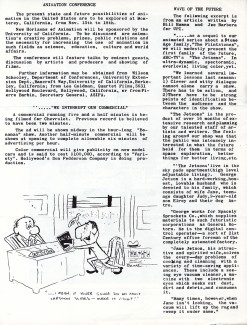
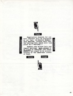
- It’s 1961-1962, and we return to Vinnie Caffarelli‘s collection of Top Cel, the u-nion’s monthly newsletter. As I wrote last week, the interest in this period of the publication is that the editor, animator Ed Smith, brought a lot of great graphics to the publication, and they really stood out. These were collector’s items for a lot of the membership, and I’m glad Vinnie had saved these so that I can share them with you. I have a collection of them that dates back a bit earlier, but all those have been in storage for some time and I can’t easily get to them.
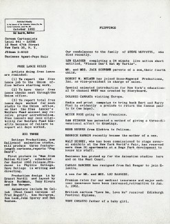
We have in this group something that seems to have been fairly regular, the wraparound cover. The first and last pages of the newsletter unfold to be one long drawing. I’ve attached both pages and turn them on their side so they can be properly seen.
A lot ow work went into putting these newsletters together, so kudos to Ed Smith for having done such a great job.
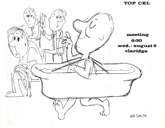
August 1961 – drawing by Ed Smith
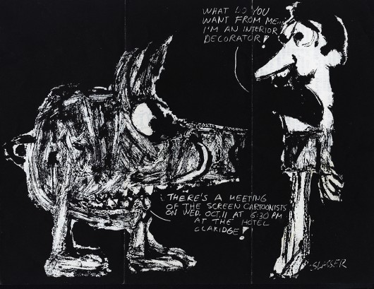
October 1961 – drawing by Len Glasser
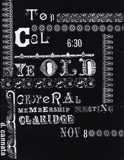 3a
3a
Novemeber 1961 – drawing by Dolores Cannata
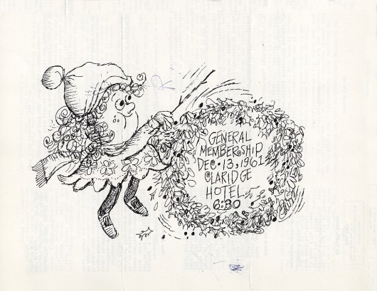
December 1961 – drawing unsigned (?)
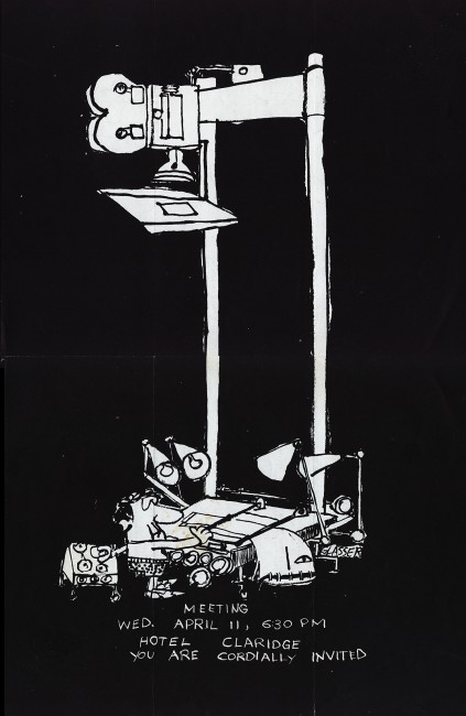 5a-d
5a-d
April 1962 – drawing by Len Glasser
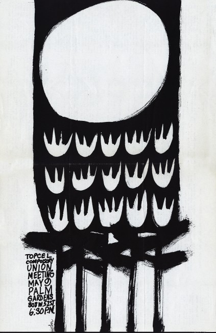 6a-d
6a-d
June 1962, drawing by Karl Fischer
 7a-d
7a-d
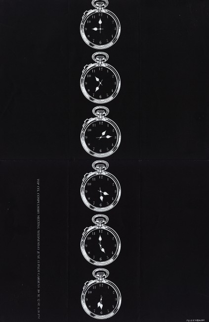
May 1962, drawing by Bill Feigenbaum
 8a
8a
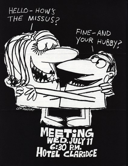
July 1962, drawing by Len Glasser
 9a-d
9a-d
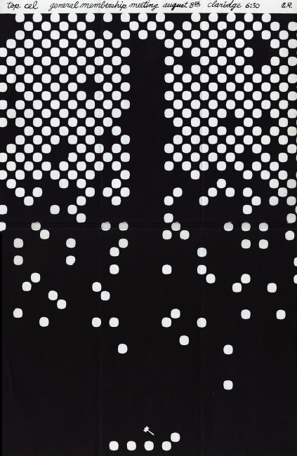
August 1962, drawing by C. R. (?) possibly Cliff Roberts
 10a
10a
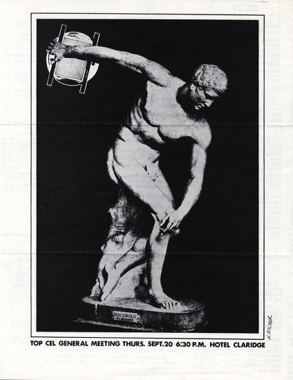
September 1962, drawing by Karl Fischer
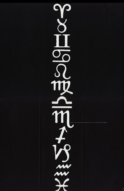 11a-d
11a-d
October 1962, drawing unsigned (?)
I wish these great drawings were better labeled.
Commentary &Disney 22 Jan 2013 08:28 am
Rambling on some Disney Features
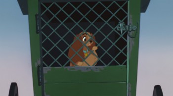 - A stash of Disney animated features were on television this Sunday. Hercules, Lady and the Tramp, Alice in Wonderland, Aladdin, Cinderella, and The Lion King all followed each other immediately, one on top of the other. Actually some of them even overlapped each other. The credits for Hercules (miniscule and too tiny to read) played on the left half of the screen while the opening credits for Lady and the Tramp played on the right half of the screen. They were going to milk every ounce of Disney Family viewing they could for the money.
I was pretty sick on Sunday, the flu has struck our little home hard, and I’m not yet down for the count but feel pretty close. So I could see how much of this 2D mania I could stomach – flu and all. I didn’t come in to it until the very end of Hercules, which is probably the one film I would have liked seeing again, but virtually missed.
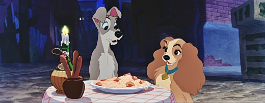
Some quick notes: It was nice to see Lady and the Tramp letterboxed for Cinemascope. The opening is still as tender as ever, and the Siamese cats are beautifully layed out for scope. The layout, backgrounds and animation – particularly the effects animation of the chase for Tramp in the dog pound wagon is exceptional. I think it’s probably one of the best sequences in the film. “Bella Notte,” of course, works well, but except for the sentimental emotion the sequence was never one of my favorites. There isn’t much for the dogs to do while the singing continues. They do pull a lot out of the spaghetti, but for much of it, the dogs just sit there, or in closer shots chew their food.
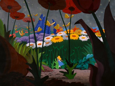 Alice seemed loud and aggressive though some of the coloring seemed inspired, and it’s amazing to see how much of Mary Blair is still in there in some parts – particularly the end of the caterpillar sequence. I found the Cheshire Cat a blessing in the wilderness. A lot is done with little subject matter, and it’s all in the excellent animation, of course. It’s obvious that Alice is a tough character to animate, but she’s done brilliantly. Essentially, she’s the “straight man” for everyone else in the film. She just sits there while the other characters bounce their schtick off of her. As I noted in a past post I am intrigued by the use of shadows in the transitional parts of the film. It works stunningly well , and this device virtually holds a lot of the film together in some odd quiet little way. I’d be curious to see more of this done with other films. You need a director with a big vision watching out for the film as a whole. I’m not crazy about a lot of the wild animation of the many zany characters that seem more cartoon to me than do they feel like Lewis Carrol creatures. There’s an interesting little scene where Alice sits down to cry in the woods. At first, she’s alone, then like Snow White in a similar situation feels sorry for herself and lets go. Little woodland creatures, deer and squirrels and rabbits and birds surround Snow White. Alice greets the odd little cartoon characters which feel as though they’d escaped from Clampett’s Porky in Wackyland. The woodland characters in Snow White serve the purpose of moving the heroine forward in the story to the dwarfs’ cottage. The zanies in Alice just disappear before she stops crying. Essentially, they’re pointless little creatures that offer nothing to the film. Fortunately the Cheshire Cat returns at this point. He fades in just as all the others have faded off.
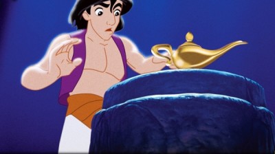 Aladdin has always bothered me. It feels more like a Warner Bros film than a Disney feature. The wild animation and even the style of the animation gives me good reason to feel this way. However, I think I came to terms with that in watching it again (maybe my 12th time?) mixed in with these other movies. The film is what it is and does it well. Eric Goldberg’s genie is a classic combination with the Robin Williams voice over, and Eric gets full use of that voice and the business happening on screen. The material presented has dated some, though not as bad as I expected. How lone before kids don’t know who people like Ed Sullivan are? Though I suppose this is similar to the personalities left over from the celebrity cartoons of the 30′s & 40′s. Mother Goose Goes Hollywood needs a program of its own to tell us who half of those caricatures represent. And they are great pieces of art that Joe Grant did for them. The villain in Aladdin tries hard but he’s not menacing just threatening. There was never anything that I worried about with him, and this feeling goes back to my very first viewing of the film. I do like the tiger in the film, Jasminda’s pet. That cat makes up for the ineffectual father. His character is not anything I can really associate with.
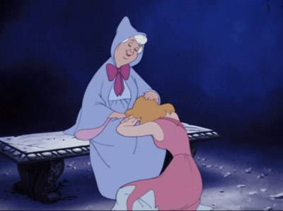 Cinderella is a very interesting film. I go into it thinking I hate it and get completely tied up with the extraordinary pacing of the film. Every scene is so exact and tight. They really knew what they were doing. I’m not the biggest fan of the human animation, but at the same time I’m in awe of it. It isn’t really rotoscoping, but it’s so beautifully pulled off the live action they shot, that it feels completely fresh. The cartoon animals play off the humans as the dwarfs did in Snow White. They look as they they come from different films and the style of animation is so different. The set pieces are exquisite. That entire piece with Cinderella locked in her room, the animals fighting to release her all those stairs away and the final reveal of her own glass slipper. It’s so beautifully melodramatic and so perfectly executed. Yes, this is an odd film for me to watch.
I didn’t make it to The Lion King. I’ve seen that about half a dozen times in the last few months so preferred watching my soap opera – Downton Abbey.
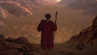
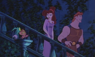 Watching these films back to back to back like this sort of lessens them but at the same time one is overwhelmed by the amazing craftsmanship held so high for so long. For years I felt the modern films, Aladdin, Beauty and the Beast, Hercules were lesser efforts compared to what the “masters” did. But now I’m sure they’re every bit as good as some of the later classics. No, I don’t think Snow White, Pinocchio, Fantasia, Dumbo and Bambi can be beaten today, but the new films are definitely equal to Lady and the Tramp, Cinderella, Alice In Wonderland and anything later than that. (I actually think Sleeping Beauty is in a class of its own and haven’t seen the equal to that from the more recent people. Actually, I take that back. I think Prince of Egypt is right up there. That’s a magnificent film, and it’s one I’d like to discuss more in depth sometime soon.)
 Oh, of course, this is all my own opinionated nonsense. Someone else would have a completely different list. I’m, obviously, leaving cg films out of this discussion. To be honest, I can’t even find a story there that I think measures up to most of the Disney classics. I’m also not thinking much about non-Disney works, but there’s an obvious reason for that. However, some of those Dreamworks 2D films are exceptional and deserve a lot of attention. Attention they haven’t received. Spirit has stunning animation, as do a number of others. They really need a bit of time.
I had some bigger thoughts brought on by watching them all, but I’ve gone on too long already. So I’ll let this rambling post fizzle out. Hope you don’t mind, but I’m getting to enjoy writing these diatribes.
