Monthly ArchiveOctober 2012
Animation Artifacts &commercial animation &Layout & Design &Models 31 Oct 2012 09:27 am
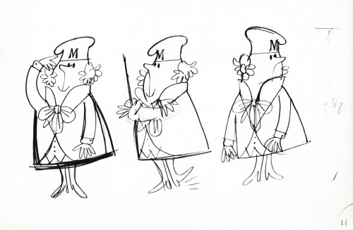
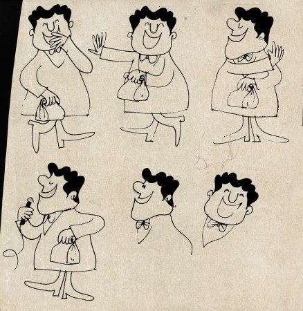
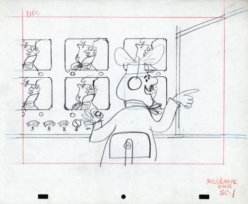
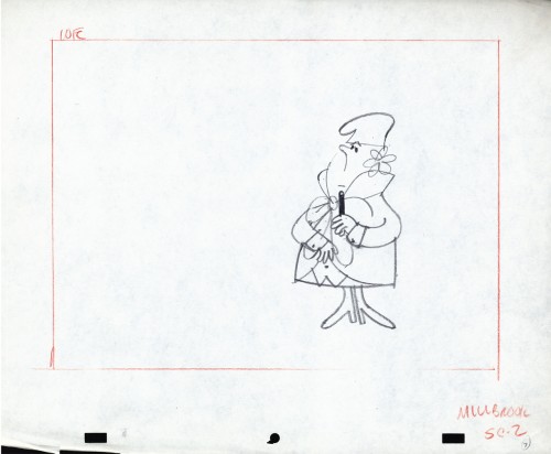
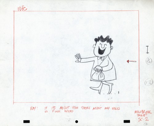
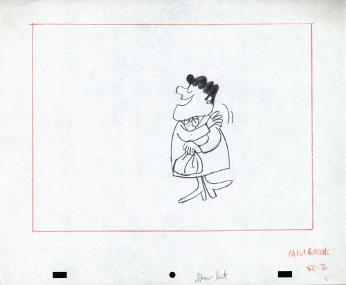
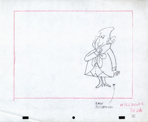
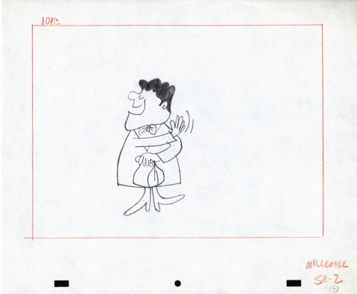
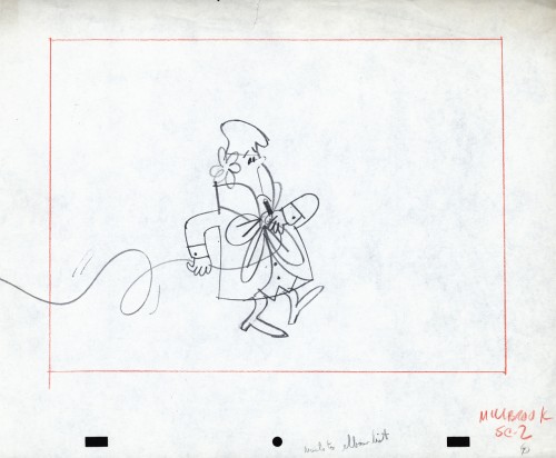
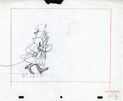
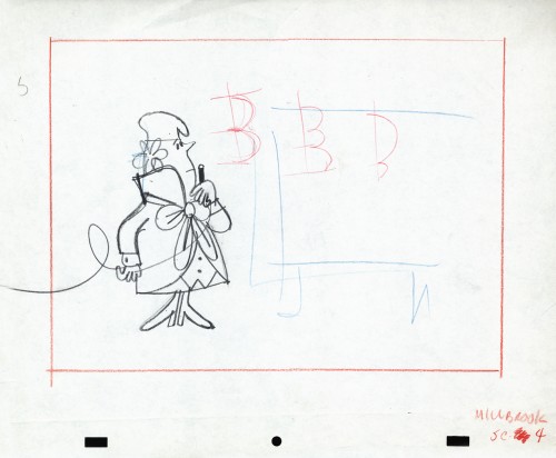
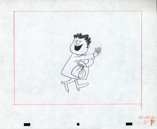
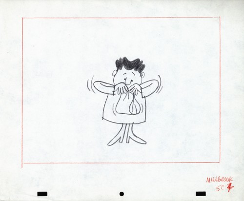
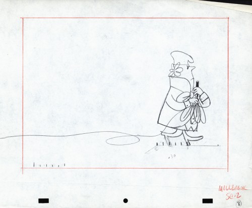
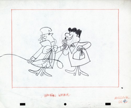
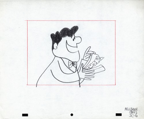
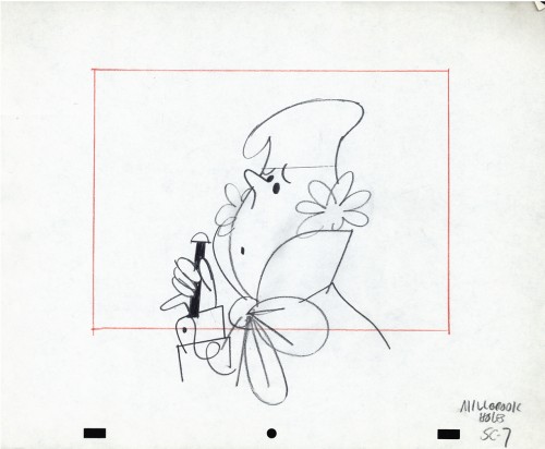
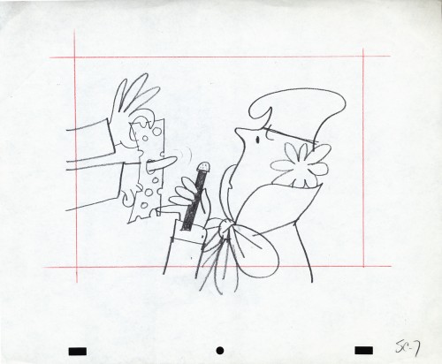
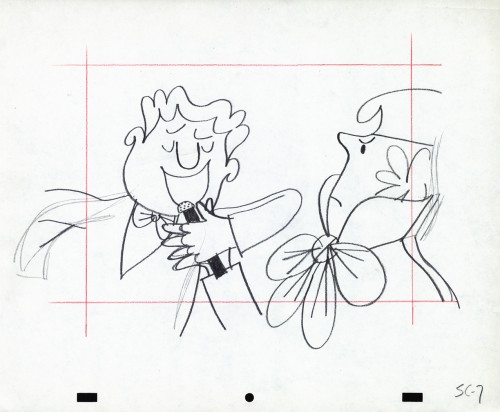
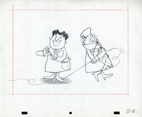
Vince Cafarelli’s Millbrook Bread – 3
- As I’ve shown in a couple of past posts, Millbrook Bread was a profitable series for the young animation studio, Goulding-Elliott-Graham. See posts 1 and 2.
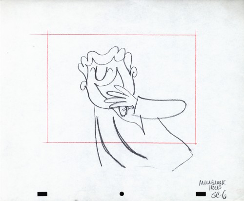
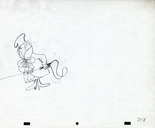
Vince Cafarelli collected a lot of drawings from various commercials that he worked on over the years, and there’s an abundance of art from this small studio. All of it good to great. Unfortunately, very little of this art is well labelled, and a lot of the ordering of the artwork is pure conjecture to get it to fall into place. I’ve grown quite attached to some of the material from this series and its characters. The design, to me, is just very attractive. Consequently I can’t hesitate to add more to view. Here’s models and art from two more spots.
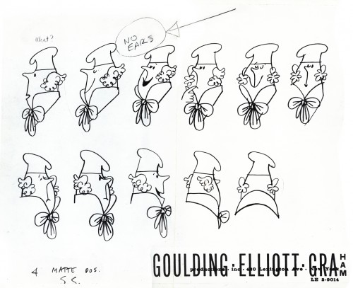
“Minny” the Baker Model 1
Commentary 30 Oct 2012 12:16 pm
Oscar Shorts
The following is a list of films that were screened as competing for the Oscar in the animated shorts category. The first half of the films were shown on Saturday, the second half on a Sunday. 6 1/2 hrs each day. Only for the hard of hearts who can make it. It’s like attending an animation festival compressed into two days. They treat us in a grand way in New York. Patrick Harrison and John Fahr really have it down and are wonderfully organized.
A quick scan (and I do mean quick) and I selected some the films that were more interesting to me than others. Of course, it’s hard to remember the films by title. When you see so many films in the dark, you have a hard time even remembering the titles, never mind trying to remember the films. Some stood out more quickly than others. None of the filmmakers’ names are on any of the material handed out to us, just the title, film times and film formats.
1. Dell’ Ammazzare Il Maiale – 6mins
2. Here and the Great Elsewhere 14mins
3. Amazonia 5mins
4. Being Bradford Dillman 10 mins
5. Belly 7 mins
6. Body Memory (Keha Ma’I LI) 10 mins
7. Cadaver 7 mins
 8. Combustible 13 mins
9. Dripped 8 mins
10. The Eagleman Stag
___9 mins
11. The Fall of the House
___of Usher 17 mins
12. Fear of Flying 9 mins
13. Fresh Guacamole
___2 mins
14. The Game 5 mins
15. The Gruffalo’s Child 26 mins_________________Combustible by Katsuhiro Otomo
16. Head Over Heels 10 mins
17. House of Monsters 7 mins
18. I Hate You Red Light 8 mins
19. I Saw Mice Burying a Cat 6 mins
20. Junkyard 18 mins
21. Kubla Khan 4 mins
22. La Detente 9 mins
23. Lost and Found 4 mins
24. The Making of Longbird 15 mins
25. The Missing Key 30 mins
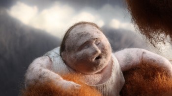 26. Oh Willy… 17 mins
27. Pepe & Lucas 7 mins
28. The Pub 8 mins
29. Reflexion 4 mins
30. Slow Derek 8 mins
31. The Story of Pines
___16 mins
32. Tram 7 mins
33. The Wind Girl (La Nina de Viento) 14 mins
34. Wolf Dog Tales
___7 mins
35. Zeinek Gehiago Iraun
___12 mins ___________________Oh Willy by Emma De Swaef & Marc James Roels
36. 7596 Frames 5 mins
37. The Hybrid U-nion 5 mins
38. The Maker 6 mins
39. Paperman 7 mins
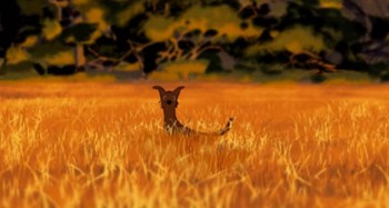 40. Adam and Dog
___16 mins
41. Chase 13 mins
42. Kara 7 mins
43. Pasteurized 8 mins
44. Sammy 10 mins
45. Shift 5 mins
46. The Tale of a String
___ 8 mins
47. Wiggle Room 8 mins
48. It’s Such a Beautiful
___Day 23 mins
49. Overcast 9 mins _______________________Adam and Dog by Minkyu Lee
50. Traces 7 mins
51. Bydlo 9 mins
52. Kali the Little Vampire 9 mins
53. The Last Bus (Posledny Autobus) 15 mins
55. Edmond Was a Donkey 15 mins
56. Daffy’s Rhapsody 4 mins
57. Maggie Simpson in “The Longest Daycare” 5 mins
I don’t really have much information about the films or the film makers. However if you go to google and type in the title something should come up which will give you a lot of back information about the films and their creators. Worth the effort. For example type in “Oh Willy” and you get a whole series of photos and information about the puppet shoot etc.
Bill Benzon on Tissa’s Memorial
On his blog, New Savannah, Bill Benzon has written an excellent piece entitled What I Learned from Tissa David. The piece speaks about an animator’s style and how seeing a compressed number of films with the voice of the animator so obviously front and center helps allow us to recognize that voice. This, I have to say, is made easier by someone like Tissa who speaks so articulately through the visual emotions her characters display on screen.
Tissa gave every director a gift: deep and rich characters that spoke through their body language even more clearly than they could through verbalizing. Perhaps because Tissa had a bit of a problem with her speech (once a Hungarian, always a Hungarian) she was able to give her characters more communicative skills with their movements than they had with their language. This was something of a treat for me. In the final project she was doing for me, Tissa was working with highly articulate characters in POE, and adding the body language was giving the characters an amazing richness that is hard to express. Edgar Allan Poe was developing as an introverted character who lashed out and railed wen he spoke. All those words were spoken through a violent frustration that the character would have preferred not to vocalize. He always had to go in before he could lash out.
Art Art &Books &Commentary &Illustration 29 Oct 2012 06:21 am
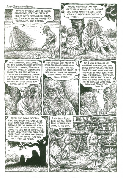
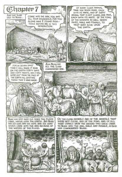
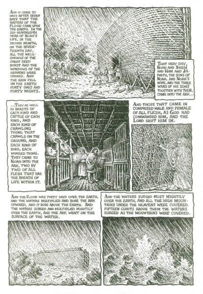
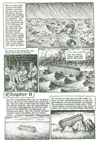
Crumb’s Mighty Genesis
- Tsunami’s in Hawaii and Northern california, Hurricanes in New York and the Northeast. Floods everywhere. I see only one responsible thing to post at this point. Mitt denies the science of globl warming. Obama doesn’t fein stupidity but hasn’t done anything abot it. Not that his moronic Congress would allow him to take even a baby step.
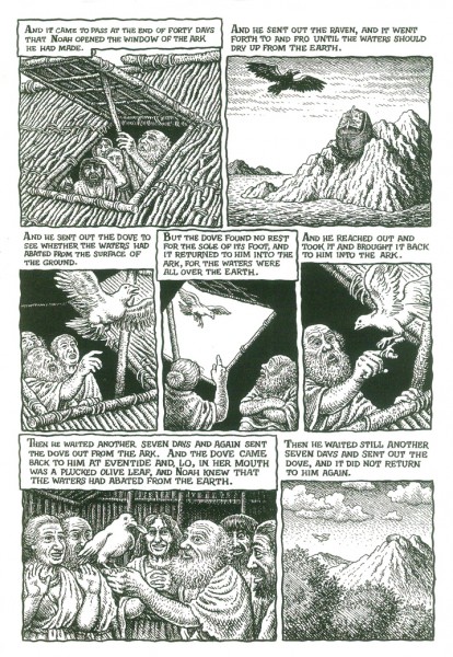
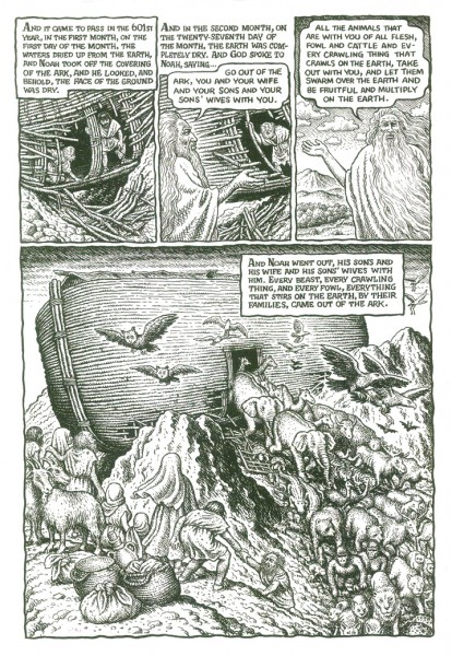
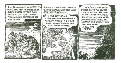
In 2009 a book came out containing the appropriate chapter and artwork and response to our current dilemma.
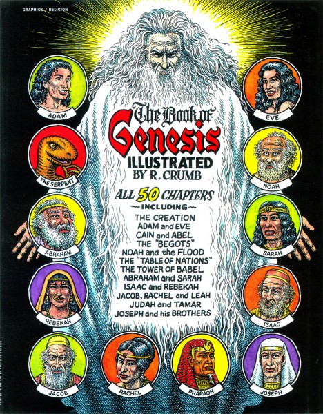
Robert Crumb‘s Complete Book of Genesis.
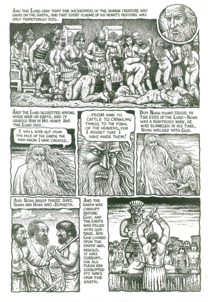
His fantastic illustrations pull you into the book, and his condensation of the stories of the Old Testament couldn’t be better. If you don’t know about this Crumb book (and it’s hard to imagine that you don’t) you should get to a library or Amazon and buy a copy. It’s a grand work of Art, in my opinion.
Noah’s Ark, illustrated here in fewer than seven pages, gives a good sampling of what Mr. Crumb is doing with the work and deals with our modern problems.
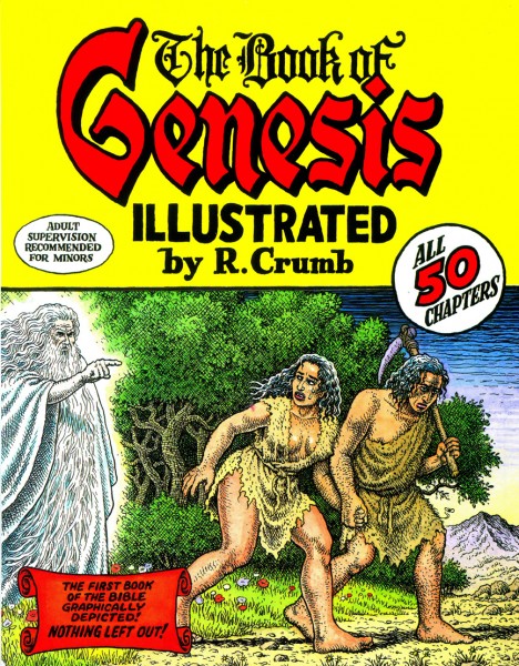
The Front Dustcover of the book
Bill Peckmann 28 Oct 2012 04:35 am
Romney’s TV Guide
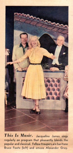
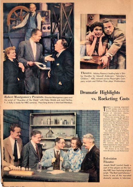
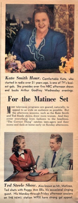
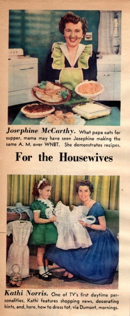
Bill Peckmann surprised me with a bit of trivia. It really has nothing to do with trivia but will call home to many New York born Baby Boomers. Here’s Bill:
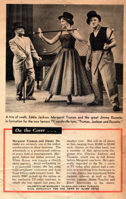
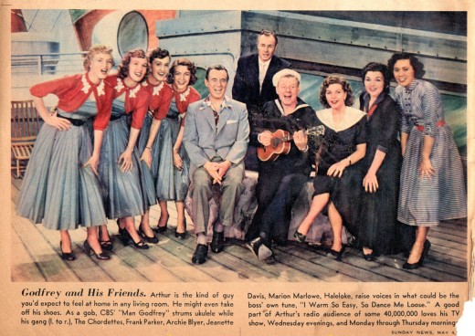
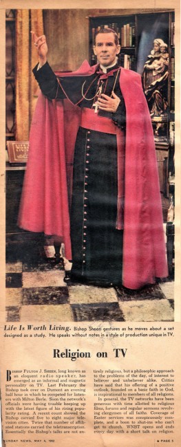
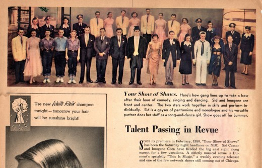
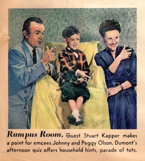
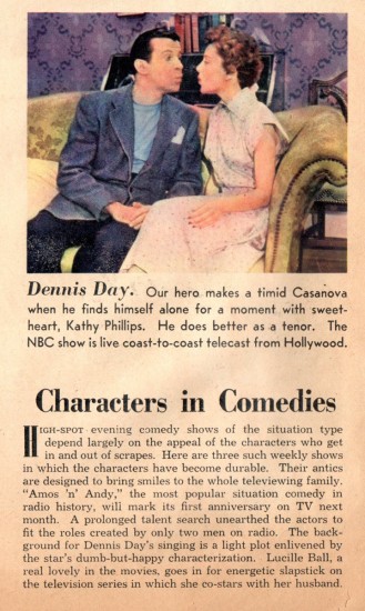
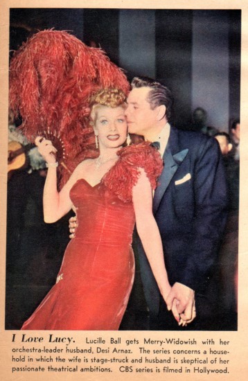
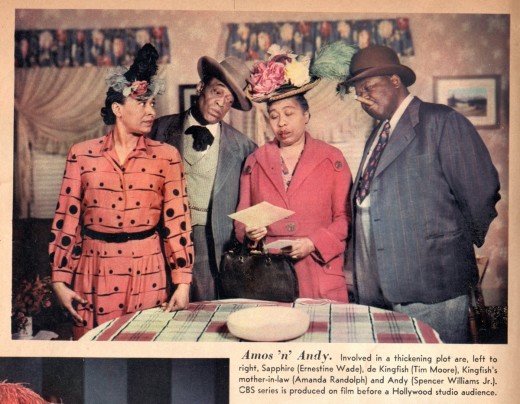
- As a kid, the word “rotogravure” from the lyrics of the song “Easter Parade” always stuck in my head because I never knew what it meant. Only years later did I learn it was a printing process, but I believe in those days of “Easter Parade” it was the nickname for the color supplements of the Sunday newspapers that flooded the newsstands at the time. In those days of black and white newspapers and black and white TV, color Sunday comics and supplements were big doings! Especially as a young TV addict, if that Sunday magazine had color photos of your favorite TV (black and white) characters!
Here are the first few pages of the Daily News’ 1952 Sunday supplement. It’s about time I got it to the scanner, it’s crumbling in my hands as I put it on the platinum! Only 60 years after the fact!
Time to step into the Time Machine…
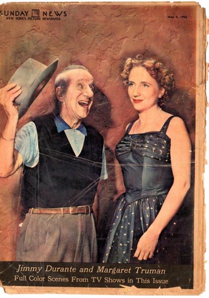
The cover
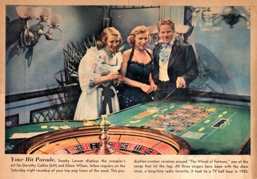 2
2
Photos are in the order as they appear in the newspaper.
The only thing missing are the numerous ads.
Commentary 27 Oct 2012 05:51 am
Next . . .
Today and tomorrow, Academy members in New York are converging to watch fifty some odd short films to make the first cut list of animated short films. Since the shorts range from five to 30 minutes, this means there are many hours of movies to watch. They’ve split it up into two days’ worth of screening. Half today and half tomorrow. By 7pm tonight my eyes should be bloodshot.
- This past week was a busy one packed to the gills. I finally had to back out of a couple of things, or I woulda gone crazy. Let’s go back to last Monday and start there:
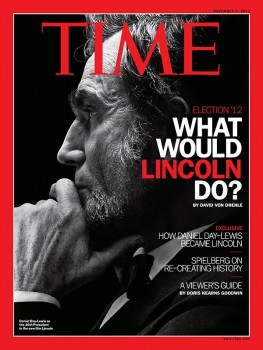 - Last Monday there was a screening of Lincoln. That’s a film I’m curious to see. The book by Doris Kearns Goodwin is great. Steven Spielberg is not much of a draw for me. I’m not his biggest fan, though there were a couple of odd little films he did that I liked, particularly Catch Me If You Can. More recent films by him have been horrible. Tin Tin was completely bad. Spielberg seemed not to know what he was doing (if, in fact, he did control that thing.) War Horse made me want to run out and rent Black Beauty so I could see a good version of this film. It was beautifully shot but the film was completely misguided.
No Spielberg is not the reason I want to see the film. It’s the book and the script by Tony Kushner; he’s something of a genius. His play, Angels in America got better with his screenplay of the same thing. His play Homebody/Kabul is a work of brilliance, and the version I saw starred Linda Emond, who had the stage to herself for the first half hour. And I think that was the best half hour I’ve ever seen in theater and the best acting.
So Tony Kushner and Doris Kearns Goodwin are reasons I want to see Lincoln, not Spielberg. Oh, and Daniel Day Lewis looks and sounds G R E A T. Tommie Lee Jones is also getting the good reviews for the film. I want to see it. But not last Monday. Besides I wanted to see the debate and somewhat glad I did. Nice to see Romney in a flop sweat.
 - On Tuesday I had the Memorial for Tissa, and there was too much to do. It seemed effortless, I’m sure, but it took a lot of planning and I have to thank my Heidi for being on my back about that. It was not as easy as one might have thought, and I still hadn’t written my speech.
Finally, the event came. I’d had great help from Paul Carrillo and Rick Broas in editing the footage. It had to look simple and effortless. I copied off a couple hundred copies of the program and had folded all of them myself. I met John Canemaker at the screening room early Tuesday, and with the help of the Academy’s John Fahr we went through a quick rundown of the program. Since I was going to moderate it, I had to figure out what was going to be said on the fly. That rehearsal really helped, and it gave the projectionist a chance to see the eight times he had to stop and restart the video. The DVD looked horribly compressed on my computer, but it looked wonderful on the big screen. (Though Raggedy Ann suffered a bit. Too bad they haven’t released that film on DVD.) The Academy has a great projection system there; the sound was amazing.
It all came off well and a bunch of us went out to an upper east side pizza joint where they gave us a table for 12 to buy some drinks. That was fun, too. I’ve posted a review with a lot of photos from the event here. I’ll post the speeches next week that were given on Tissa’s behalf.
- On Wednesday Ron Diamond presented his Show of Shows program. This is an accumulation of a lot of short films Ron has seen at Festivals and is now distributing. The program is usually good, albeit long, and the animation community shows up for it. Consequently, I generally like going to it, and I reserved a couple of spaces right away. It usually gets packed quickly. However, this year, there was heavy going all week with screenings etc., and since many of the films to be screened at Ron’s show are part of the Academy screenings this coming weekend, I had to back out of it, and I did. I must say, it was a good decision considering I’ve had some back problems lately. It ain’t easy sitting in movie seats, and that’s all I’m doing this week.
 On Thursday I saw Cloud Atlas. The film was like the end credit music. It was sort of minimalist. It kept playing in cycles a bit like Phillip Glass, but not as sophisticated. The non-theme kept feeling as though it were going to burst into a strong and hummable tune, but it never did. Just circular, musical motions. That was the movie. You kept thinking it was going to burst into a strong story that you could care about, but it didn’t. It had a hundred stories with two hundred characters all played by the same people. Tom Hanks is six characters, Halle Berry plays five or six. Everybody is busy. Hugh Grant plays five characters and I think two were women. I nodded off a couple of times, but i don’t think I missed anything.
This was more of a video game than a movie. You kept going back and forth to different levels. If the characters got in a bad enough jam we’d cut away to another level. The only problem was that the viewer isn’t controlling the level shifts. No surprise that the directors did The Matrix. This is the film for those with Attention Deficit Disorder.
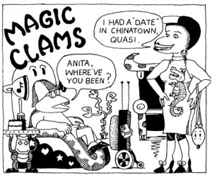 On Friday the Museum of Modern Art celebrated the work of Sally Cruikshank. There was a screening followed by a dinner at the Italian restaurant to the rear of the museum, Il Gattopardo.
I was there when Sally Cruikshank‘s Quasi at the Quackadero burst onto the scene in 1975, and I watched closely as her career developed. There were a number of short films featuring the characers from Quasi. She had moved to San Francisco and worked closely with Kim Deitch. He, for a while, was her boyfriend and would assist her and paint cels etc. in the making of the films. Sally was making a feature of Quasi – it was that big a success. It never quite happened, so I assume she never raised the money. There were a couple of trailers made which were shown, as films in their own right.
Quasi has a curious story and introduces characters galore, one more funny than the other. Actually, there’s no real story other than that Quasi and Anita go to a club and meet up with a world of wild. Her style has been often compared to that of the early Fleischer films like Bimbo’s Initiation or an early Van Buren short like In a Cartoon Studio. In that her
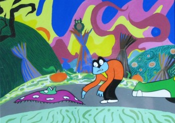 work has a odd drawing style with all the characters completely malleable, almost as though they had no bones, and an innocence in the movement, I have to agree. The Fleischer work always seemed open to the animators’ adding to the curious layouts peculiar motions. The characters often move a long way out of whatever way they’re going to get back to the completion point, and it’s all about the funny. She truly understood the Fleischer house style and did it well in her own drawing style. They’re very peculiar films.
Sally also did the high-budget job of titles for the movie, Ruthless People as well as the animated sequence for the Twilight Zone feature film directed by Joe Dante. The big budget bought a very smooth and rich style which goes like a bandit. However, my favorite of her films was Face Like a Frog. This is like her hallucinogenic style on speed. Everything is moving all the time, and there’s just so much life in it.
Because the films came in so many different formats, the projectionist must have had a hell of a time keeping the evening flowing. However, it seemed not to be a problem. The show felt like one of those many screenings we used to attend in the 70s. Lots of black in between films and a feeling that you weren’t quite sure what was going to come next.
Sally has basically left animation. After trying hard to work in Flash for a couple of years, she decided that it was too difficult for what she wanted.There were a couple of shorts in this process, and they seemed to be fighting a constraint that the earlier films didn’t have. She has turned to watercolor painting. Her films seem like they’ve gone through the Fleischer/Van Buren mode but using a filter of something more modern. A similar but very different effect comes through the work of Kim Deitch. They both obviously influenced each other and are both remarkably original in their art. I’d like to see what Sally’s watercolors look like.
I hadn’t met Sally prior to last night, so I was glad to have been invited by the Museum’s Josh Siegel. He did a great job of organizing the event. J. Hoberman, was a longtime head critic for NY’s Village Voice and was only recently downsized by that paper. It completely tore apart the Voice’s film section. Hoberman moderated the program asking questions and taking a few from the audience. He was well-informed about Sally’s career and it was obvious that he truly enjoyed the films. I’ve been a real fan of his writing and criticism, so I was pleased to have had the chance to talk with him. (He did review one of my films, the music video Caverns – scroll down when you get there. He didn’t like the film very much and felt I’d stolen a technique of split screen from another music video director. In poiint of fact, I didn’t; I just wanted to play with split screens.)
Il Gattopardo is a pleasant place; the museum usually takes us to a table in the rear. Often, if it’s a large group, there will be a very long table, and we’ll talk with those closest to us. The long tables make it difficult to chat with those some six table-lengths away. Last night, it was a small group at an over-sized round table. Sally and her husband, J. Hoberman (who moderated the event) with his wife and daughter, Josh Siegel, John Canemaker and Joe Kennedy and me. (Heidi works Friday nights and couldn’t attend.) The meal was good, the chat was pleasant, and the evening was a success.
The film program will be repeated at MoMA on Monday at 4pm for those who’d like to see it.
There’s a good interview with Sally here.
Backto the start. Today and tomorrow there will be 13 hours of cartoons to sort through. Lots of complaints, but I kind of like the whole thing. Maybe I’ll write about it for tomorrow’s splog post.
Ed Sorel – Enigma
- Mark Mayerson directed me to this excellent article in The Comics Journal that speaks about Ed Sorel, the great illustrator whose art has graced many magazines including a number of issues the New Yorker. The article was written by R.O. Blechman and naturally has the wit and poetry of the great writer that Bob Blechman is. This is quite a piece, despite its brevity, and I urge you to take a look.
Bill Peckmann &Comic Art &Disney 26 Oct 2012 05:53 am
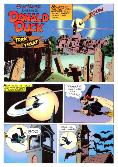
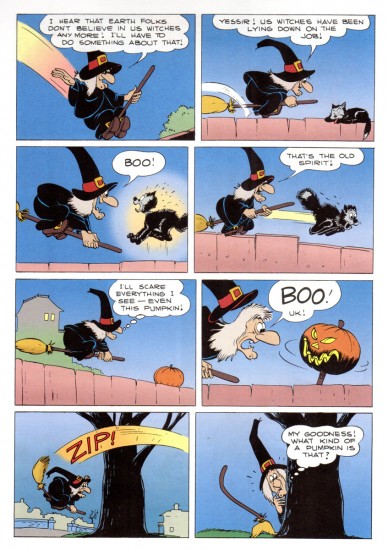
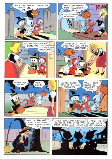
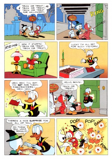
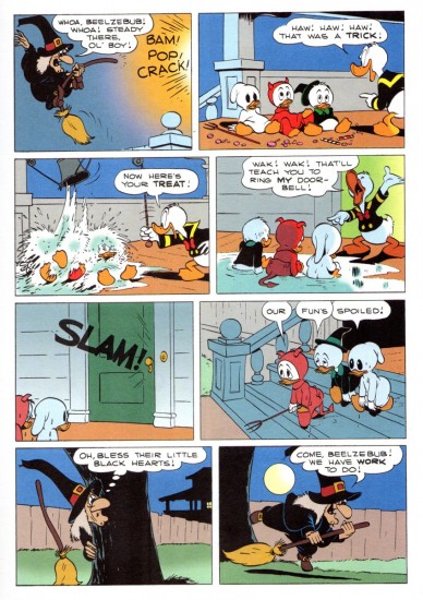
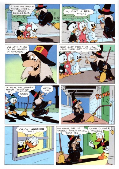
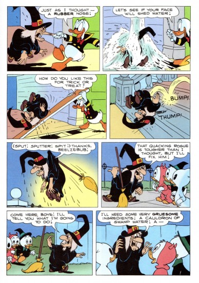
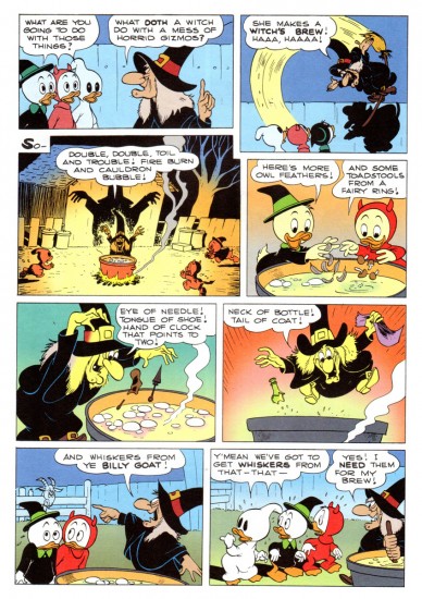
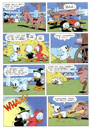
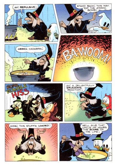
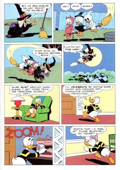
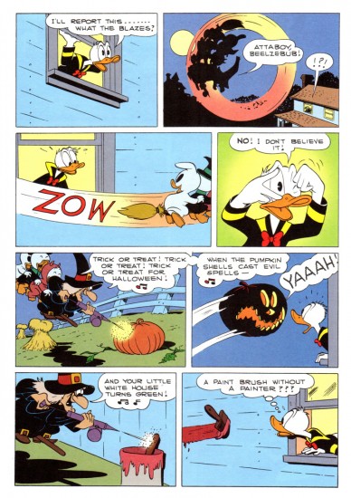
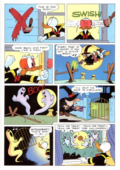
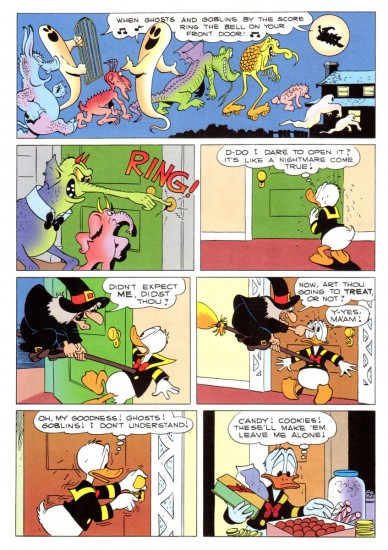
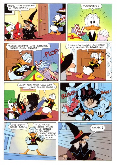
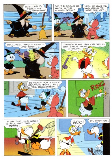
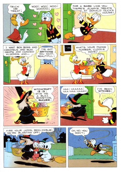
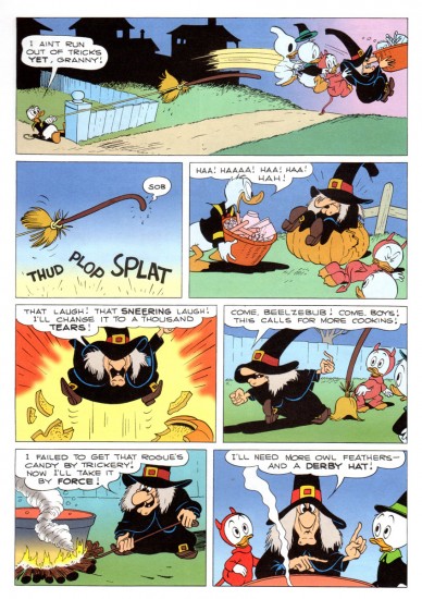
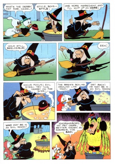
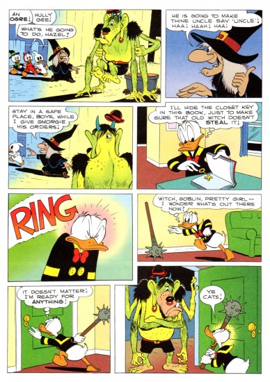
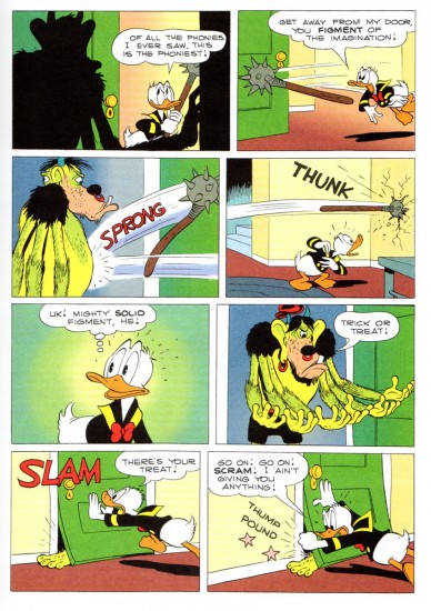
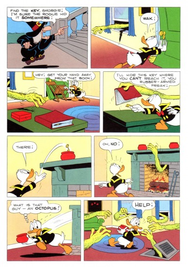
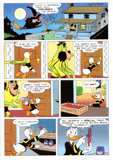
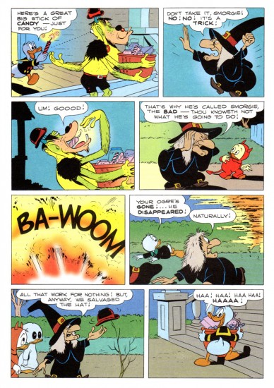
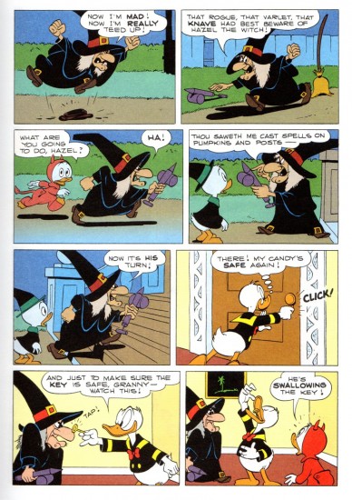
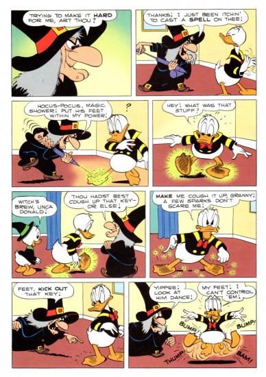
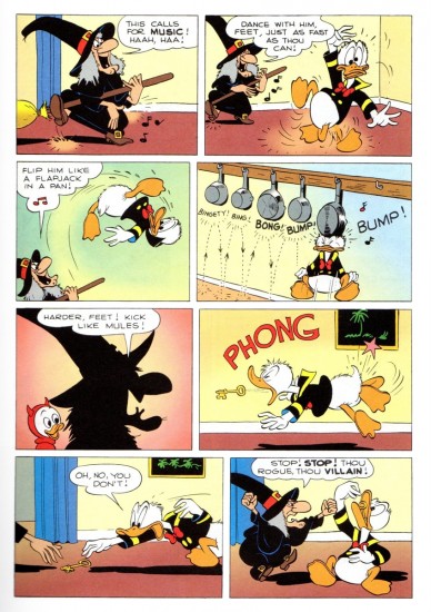
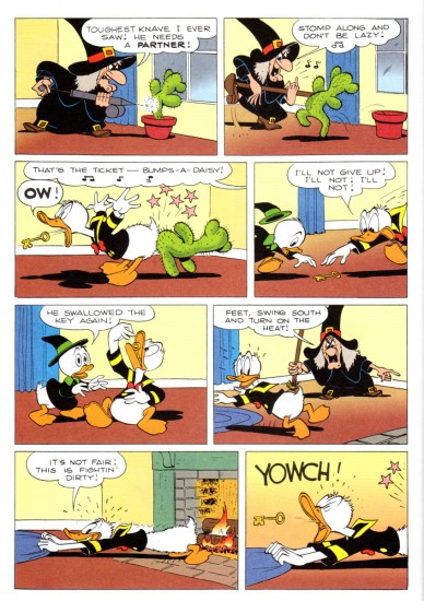
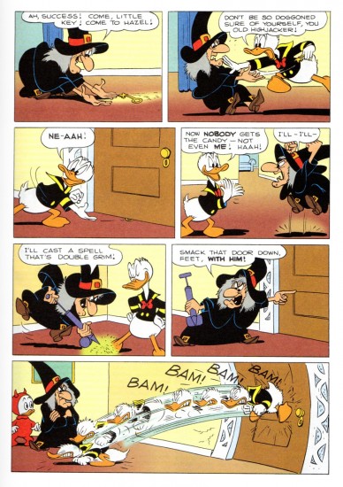
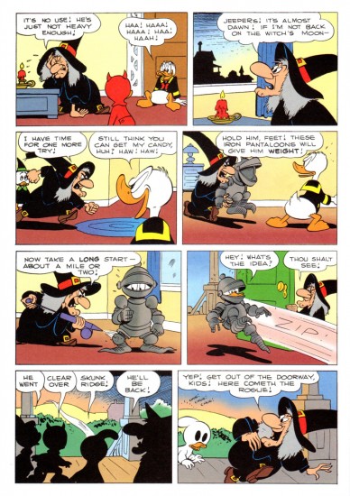
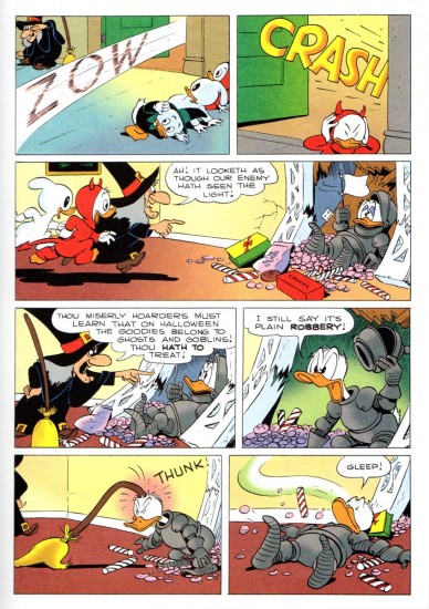
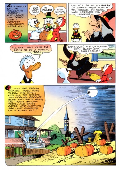
Trick or Treat à la Barks
Note: This is a long post. I was going to post it the day before Halloween, but I thought I’d give you something to do – revisit this classic comic – over the weekend. Happy Halloween.
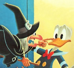 - I remember as a kid seeing the annual Halloween show on the Wonderful World of Color. Featured was the Donald cartoon wherein Hazel the Witch was introduced, Trick or Treat. Carl Barks went wild with this character and the premise, and it was a treat every year to get the new Donald story featuring the great character. (All that was missing was June Foray’s great voice. But I could play that in my head when I read the comic book. t was her first voice for Disney and her big break into animation voices. She started with a homerun; a classic the first time out of the box.)
Bill Peckmann has forwarded scans of the following story. Here’s his introductory words to the piece.
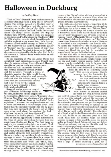
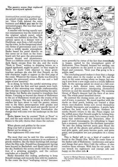
- In 1952 Carl Barks did a ‘Donald Duck’ comic book titled ‘Trick or Treat‘. It was a rare instance where a Barks story had its origins in a Disney Duck short. (Geoff Blum‘s excellent essay/history of the story at the end post will explain how the ‘Trick or Treat’ book came about.)
Here, with no tricks and all treats is Carl being at the top of his game, this is the cover of the original 1952 Dell comic book.
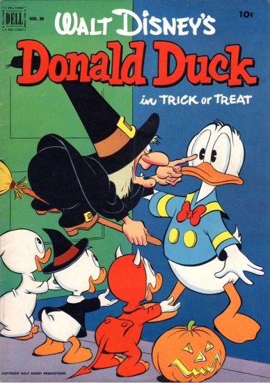
Comic book cover
Here’s the article by Geof Blum writing about the genesis of this comic book story adapted from the animated short.
There’s a good post about the color of this strip for the Gladstone publishing version of Trick or Treat. Posted are a number of color guides for that version.
Finally, here’s Carl Barks’ oil painting based on the artwork for his classic comic book.
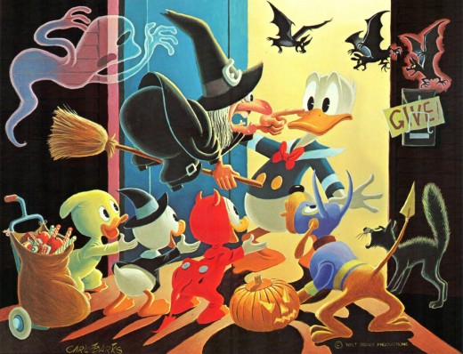
To be honest, I think this is the best of this series of oil paintings that Barks has done. It doesn’t feel like something overworked and trying too hard. It just captures the spirit of the original magazine as well as the spirit of the animated short from which it was adapted. Not only a Barks gem, but a Disney gem as well.
Commentary &Photos &Tissa David 25 Oct 2012 05:52 am
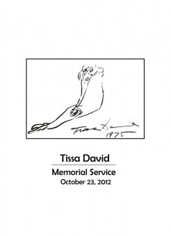
Tuesday’s Tissa Memorial – 1
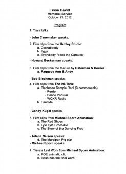
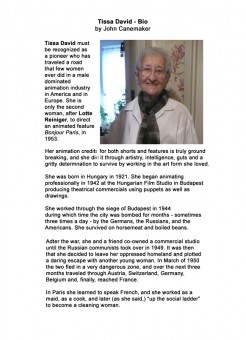
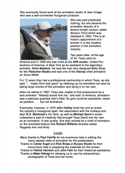
- Tuesday night, we had a memorial service for Tissa David who passed away in August. I organized this event with a lot of help from John Canemaker and Buzzco’s Candy Kugel and Rick Broas, who did a lot of work in prepping the material for the final edit which ws done by Paul Carrillo. Patrick Harrison and John Fahr of the MP Academy helped us secure the theater for the evening. Finally, Mate Hidvegi allowed us to use a number of his great photos of Tissa and he apartment. I have to loudly thank all of them.
There were five speakers other than me. John Canemaker, Howard Beckerman, R.O. Blechman, Candy Kugel, Arlane Nelson with my closing comments. In between the speakers there was footage from many of the films Tissa animated. I’d like to offer a couple of posts of material from this service. Today, I’m including the program that was handed out to those who attended. I’ll follow with the text of some of those speakers. I’d hoped to put together a podcast of the comments, recorded. However that didn’t work out.
So I’ll simply post the text.
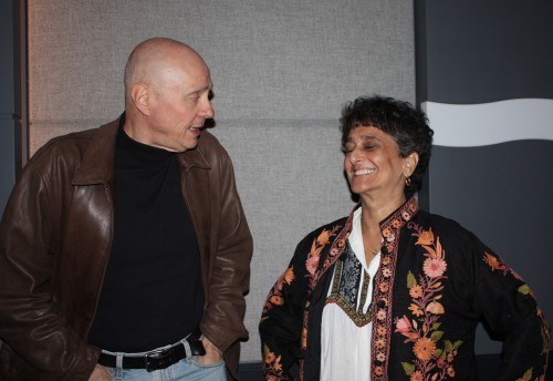
Laura Bryson and her husband Dave took photos.
Many thanks to them for letting us use her snaps for this post
 1
1
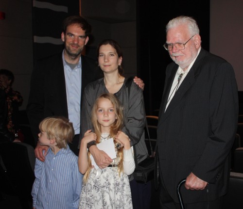
Tissa’s neice, Arlane Nelson with husband, Duane, and family.
Arlane spoke for the family at the memorial. Her talk was
my favorite, personal and funny and a whole other side of Tissa.
 2
2
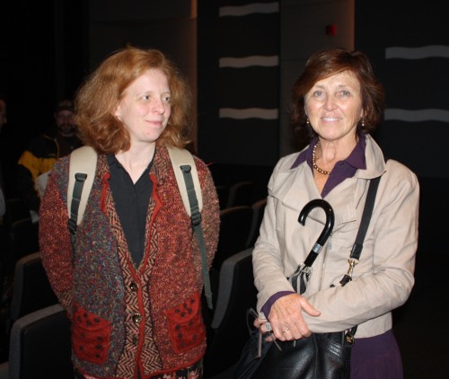
Marilyn David (R), Tissa’s cousin
 3
3
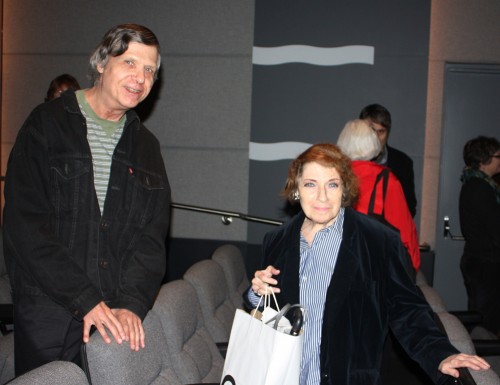
Ruth Mane and friend. Ruth was one of Tissa’s
closer friends. They were often movie buddies.
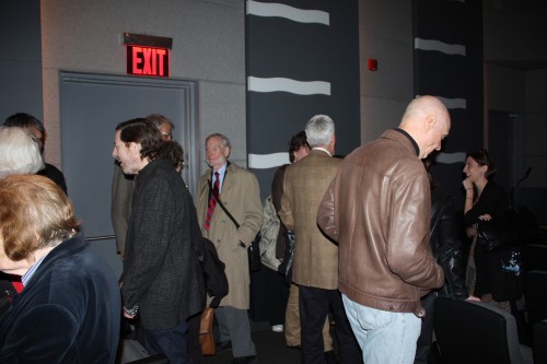 4
4
(LtoR starting with me) Howard Beckerman (in raincoat), Richard O’Connor (half hidden by)
John Canemaker (back to us), Joe Kennedy, and Liesje Kraai
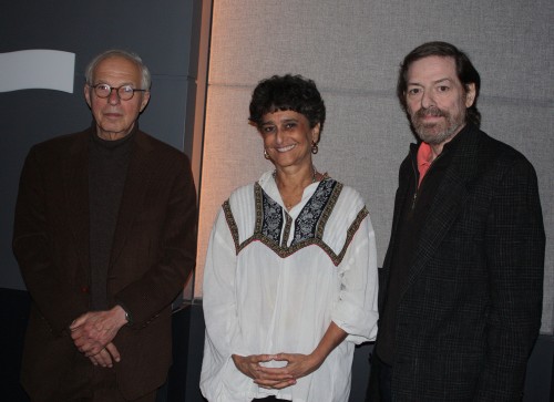 5
5
R.O.Blechman, Candy Kugel, Me
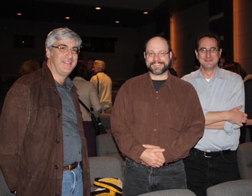 7
7
David Wachtenheim, Dean Lennart, and Ray Kosarin
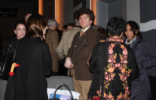 8
8
(LtoR)Heidi Stallings, Liesje Kraai (back to us)
Richard O’Connor, Candy Kugel (back to us), and Kaukab Basheer
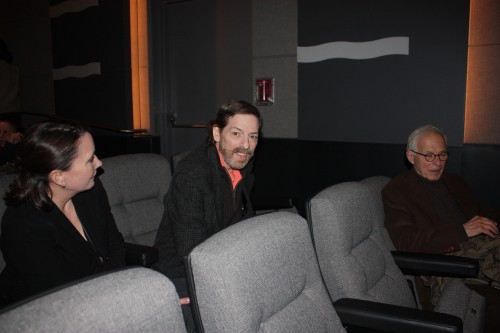 9
9
Heidi Stallings, Me, and R.O.Blechman
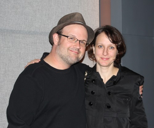 10
10
Jason McDonald and Maria Scavullo
 11
11
Ray Kosarin, Laura Bryson, and Stephen MacQuignon
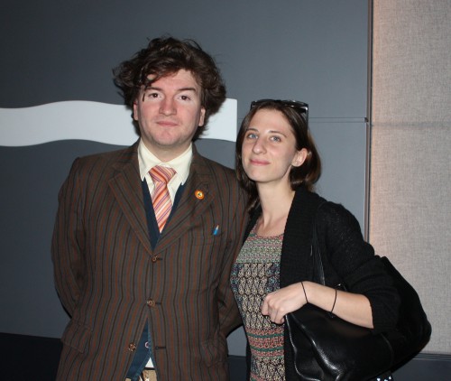 12
12
Richard O’Connor and Liesje Kraai
 13
13
(LtoR) John Schnall, Steve Dovas, Masako Kanayama,
Stephen MacQuignon, Bridget Thorne, and Robert Marianetti
Some who attended include: Bill Plympton, Bill Benzon, Tony Eastman, Bridget Thorne, George Griffin, Daniel Esterman, J.J. Sedelmaier, Laura & Dave Bryson, Janet Benn, Ray Kosarin, John Schnall, Jason McDonald, Stephen MacQuignon, Rick Broas, Masako Kanayama, Ruth Mane, Steve Dovas, Matt Holt, Richard O’Connor, Liesje Kraai, Dean Lennert, Dave Wachtenheim, Robert Marianetti, and just too many others to remember. It was a great turnout.
Again, many thanks to those I asked to speak. The variety of the talk made for a great conversation. As soon as and if I get their permissions, I’ll post the transcripts of what they had to say.
Animation Artifacts &commercial animation &Story & Storyboards 24 Oct 2012 06:13 am
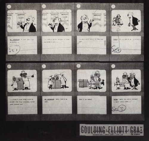
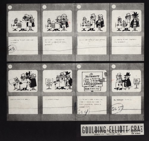
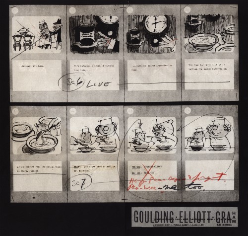
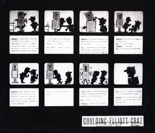
Goulding/Elliott/Graham Storyboards
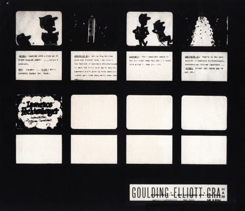
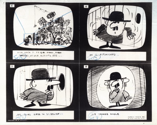
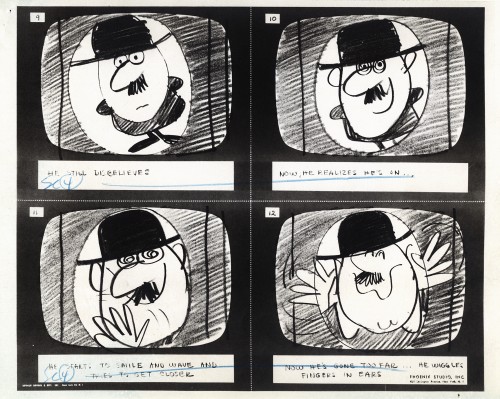
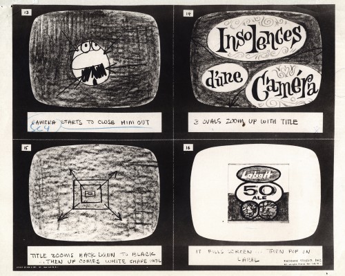
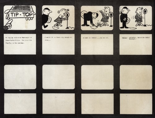
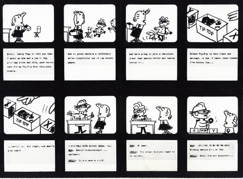
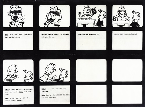
- Goulding, Elliott, Graham was a company made up of comedians, Ray Goulding and Bob Elliott (“Bob & Ray”) and designer/director, Ed Graham. After the Piels Bros beer account did so well, Bob and Ray realized that they should have a larger piece of the pie, so they set up their own studio to produce commercials that featured their voices and their writing talents. This was an instant success which soon dissipated until the studio closed only two years later.
But they had a nice run. Vincent Cafarelli, obviously, had a good time at the studio (he’d left assisting at UPA to work there). In his collection of animation artifacts, there’s a folder of storyboards for commercials they’d made. I’ve put together a number of these boards and will show them here. I do notice that the writing is interesting (compared to any commercial on the air today) and the design is often exceptional. I hope you agree.
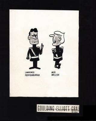
A model of the two characters in this spot.
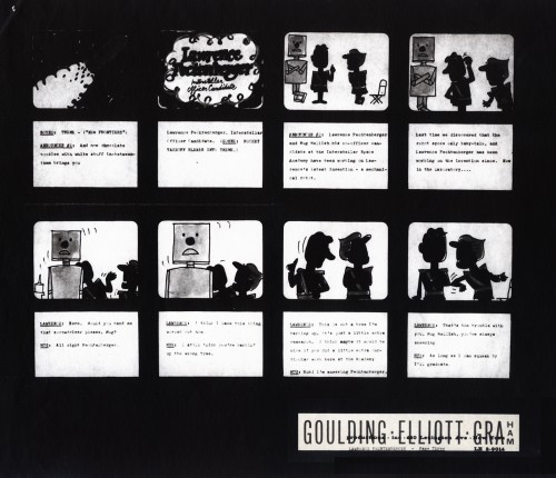 1
1
I can only assume this is an ad for some kind of
“Oreo”- like cookie. The sell is so soft that I can’t
even figure out the client. Doesn’t sound successful.
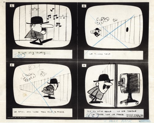 1
1
There’s no doubt that Len Glasser designed this.
It looks just like a character he later did for Ernie Pintoff.
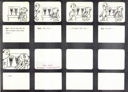
The only spot for Piels, in the collection, is obviously
this short ID – probably 10 secs. long.
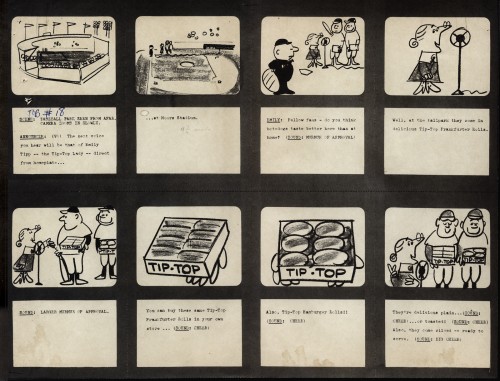 1
1
We’ve seen a number of these Tip-Top Bread spots.
They were certainly a primary client for the company.
These boards were in with the Goulding-Elliott-Graham material,
actually was done at Gifford Studios (Lou Gifford & Paul Kim).
Vince has a lot of these folders in his collection improperly labeled.
Commentary &Daily post 23 Oct 2012 06:32 am
Inspired Perspiration
 Before getting into it, let me remind those living in NYC, there will be a memorial service for Tissa David who passed away last month. Tissa was something of an original, a female animator who could draw with the best of them. She animated plenty of footage for the Hubleys, Dick Williams, R.O. Blechman and my studio, Michael Sporn Animation. Clips will be shown from many of her films, and five speakers will talk about Ms. David.
It starts at 7pm at the
Academy Theater at the Lighthouse,
111 East 59th St, lower level.
There’s no charge.
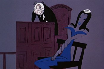 -I was thinking about Rooty Toot Toot the other day. Actually, I wasn’t, I was thinking about some of the ugly designs that came out of other lesser UPA films. Some, like Rooty Toot Toot, were those of animation’s greatest design ever done. The bad ones had characters borrowed out of 19th century illustration, and they didn’t blend in with the 20th century art that others were designing for the very same films.
I think of characters in several of the Art Babbitt directed films at the studio. They just didn’t work. Brilliant backgrounds of Paul Julian just didn’t have the support from the unattractive characters. The characters just didn’t approach the same level of design; in fact, they fought the Bgs which tried very hard to work. Actually, Babbitt’s films don’t seem to fit into the canon of work that came from the studio at the very time they were being developed.
A quick mental jump, and I was thinking about John Hubley and the characters in Rooty Toot Toot. They’re definitely the outgrowth of some modern approach to character design in illustration. Ben Shahn had his influence there, as did Thomas Hart Benton and Saul Steinberg.
Hubley was a working artist. He spent time looking at, working with and studying other artists religiously. He never lost his curiosity when I knew him and applied it to his art. When he did the 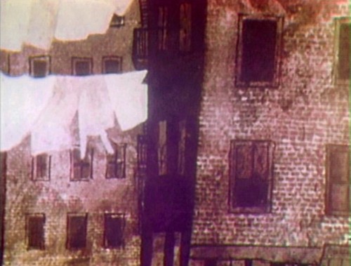 Letterman gig for The Electric Company, he pulled out Paul Klee and studied all those Klee’s with cross-hatching and mottled watercolor. Then he turned to George Herriman and Krazy Kat. During Carousel there were plenty of artists to study and John did. He wasn’t looking to steal from the greats; he just wanted to understand how another artist had solved a similar problem. This was second nature to Hubley. Gregorio Prestopino‘s design for Harlem Wednesday.
,
In the fifties and early sixties, John was taken with the work of Gregorio Prestopino , and brought him into the mix. A 10 min short film evolved, Harlem Wednesday (1957). At UPA, the younger Hubley sparkled with intelligence and purpose in his design, and he acted as a force at UPA when things got big.
Hubley loved many other artists. Who knows what the reference was for Rooty Toot Toot, but we know that there was a group of artists that got Hubley rowling, and the end result was rich.
At the Disney studio a different sort of reference was pulled out for study. Disney brought illustration designers like Frederick Horvath and Albert Hurter to the studio. Dsney reached deeply into the European fairy tale illustrators. If he had been able to bring Edmund Dulac or Arthur Rackham into the studio, he would have. As it is, he brought the best he could find.
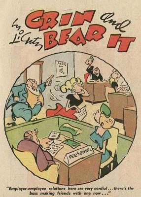 Heinrich Kley and Wilhelm M. Busch. 19th century artists whose principal focus is on the body and physical gesture, this is the strength of animators. Anyone can appreciate their strong work, but animators are particularly attuned to such reference material. Many other animators look toward other cartoonists. Rod Scribner was in love with George Lichty‘s comic strip “Grin and Bear It.” He studied Lichty, religiously, for inspiration, and the result was that great style.
Both types of reference are important. As long as it gets the mind to the next step. Art means you’re trying to continue making art; cartoon references means you’re trying to make a cartoon. Is it necessarily true that if you’re referencing “Art” you’re going to end up with “Art” and if you reference cartoons it means your end work will not be “Art”? No, the answer is no. Who knows what kind of reference Jim Tyer was going for, but some of the animation he did takes animation to another level, one that only Tyer can reach with his uniquely individual style.
Actually, let’s move down another generation. All the Don Bluth films analyzed, studied and reworked the Disney classics while those animation workers told themselves they were in homage of the Disney classics. When the end result becomes a Thumbelina or Gnome in Central Park, you’re not going to find much “Art” in the film. But then Disney animation took it lower.
Is it live or is it Memorex? Or maybe Romnesia?
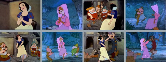
Woolie Reitherman‘s reuse of so many scenes from the Disney classics makes us wonder if there was still talent in the studio. Where was Ken Anderson, Milt Kahl, Frank Thomas and Ollie Johnston when Woolie was trashing Disney? Why didn’t those bosses speak out against it? Sure, they wanted to cut costs, but did they have to take that route? How many
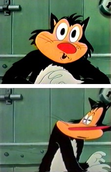 times do we have to see Snow White dancing with the dwarves – I mean Maid Marian dancing with small animals – to realize that we’re looking at bad animation reuse. It’s not an homage, it’s just cheap. But then Woolie Reitherman was chockablock with cheap ideas as a director. That disco sequence in The Aristocats couldn’t have felt any more bankrupt, just when Disney animation needed to be at the top of its game, Woolie brought it to its lowest point.
Taking inspiration from animators or animation classics doesn’t necessarily pull you to the bottom of the junk heap. Bakshi pushed John Kricflusi into the genius of Jim Tyer‘s scenes, and a new style emerged. Granted it isn’t always art but it is original. John K has spawned a whole new world of wildness among many of the younger people. I’m not sure that’s good, but I am sure that some of the work he, personally, has been doing is rich and inspired.
Woolie Reitherman was just looking for a way out of a tight budget; John K uses his tight budget as a way of taking Jim Tyer to another level.
Animation &Commentary &Models &Story & Storyboards &Tissa David 22 Oct 2012 05:19 am
The Marzipan Pig Extras
When we completed The Marzipan Pig, the author of the origianl book, Russell Hoban, came to NY from his home in London. He had originally come from Philadelphia to be an art director at an agency in NYC. He eventually moved to England where he became one of our most famous children’s book authors. We arranged a theatrical screening for him of The Marzipan Pig after which Tissa David, he and I went to lunch. In his very dry way, he told me that he was pleased with the film. As I do with all authors, I asked for criticism not compliments, and he told me there was only one complaint. We didn’t get the bridge quite right at the end of the film. Of course he was right, and it’s hard for me to watch those final scenes, now, without thinking about that damned bridge. But he did say he loved the movie, so I held onto that memory as well.
I’ve read every book of Hoban’s I could, including at least 60 of the children’s books and all of his adult novels. In film, I know only of the work we’ve done and The Mouse and His Child. Unfortunately, that feature film stopped midway through the book’s story. It’s a brilliant book and what they did of the story carries whatever is happening on the screen.
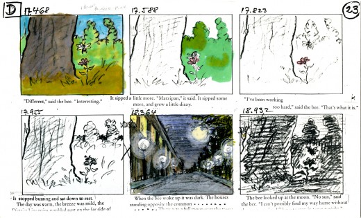
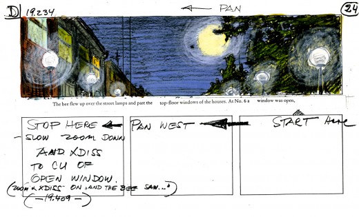
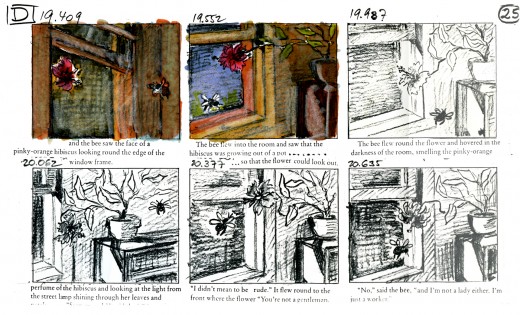
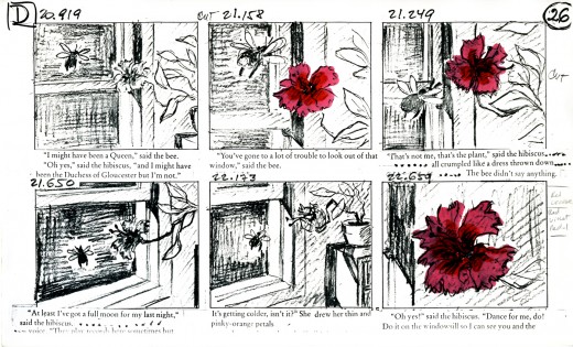
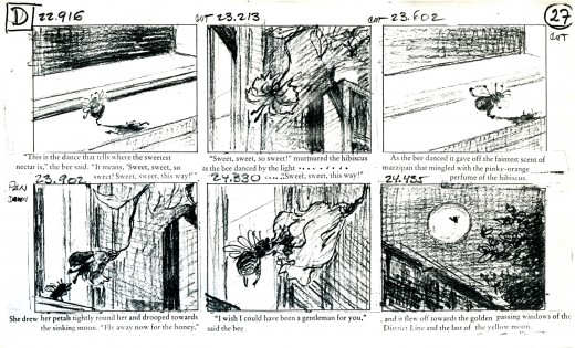
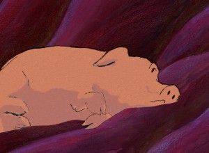 For The Marzipan Pig DVD we included a copy of a section of the animatic. This includes the actual film superimposed over the stills so you can make a comparison as the film runs. Film in film. I like this format; you can really take in the animation and layout of the piece when both are on the split screen.
I thought I’d post here some of the storyboards and the animatic for that section. Of course, this is in a low res version; more can be discovered in the dvd version.
Tissa David did the storyboard and animated the entire film by herself. This film is a beauty, if I do say so myself. It’s a truly adult film, though it was sold as a family film. It deals with love in all its forms, albeit, obviously, through metaphor. It was adapted from a brilliant children’s book; one of Russell Hoban‘s finest.
Quentin Blake illustrated the original book, and we didn’t purchase the illustrations. Hoban told us that it wasn’t how he’d imagined the pig to look, so he drew it for us. He was once an art director in an ad agency, so he was able to draw. This is the pig we used.
Hoban had hated what was done with his book, The Mouse and His Child, so demanded that all the spoken dialogue in the film be found among his words. We wrote a script; Maxine Fisher went to London to work with him in revising it. Finally, when it came to recording the actor Tim Curry, I threw out the script and had him read the book – with the exception of one line. It was a good decision, and it made for a great performance from a great actor.
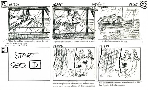
_____________(Click any image to enlarge.)
You’ll notice that some changes were made
in scenes and scene cuts as the animation progressed.
This is typical.
Here are two films we did for a home video of children’s poems. The first is a poem by Russell Hoban. The animation is by Mark Mayerson, and the design is by Jason McDonald. The music is by Caleb Sampson. I think all of these artists did brilliant work, but then Hoban’s thoughts and words always pull out the best.
Russell Hoban’s The Tin Frog
This second poem of Hoban’s also brought out the best in the artists, Jason McDonald who designed and storyboarded the whole piece. The excellent animation was by Sue Perrotto..
Russell Hoban’s Jigsaw Puzzle
Click left side of the black bar to play.
Right side to watch single frame.
