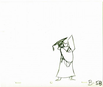
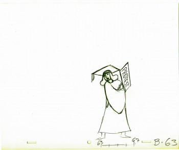
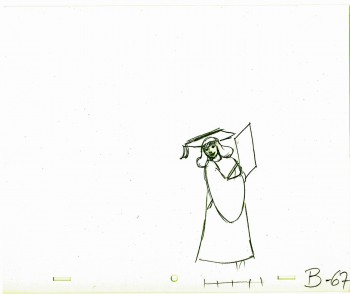
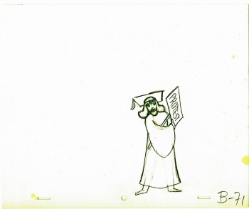
Monthly ArchiveSeptember 2012
Bill Peckmann &Commentary &Daily post &Rowland B. Wilson 21 Sep 2012 05:19 am
RBW at Auction and otherwise
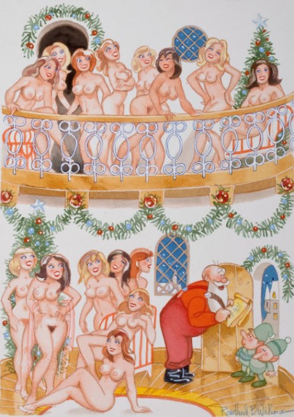
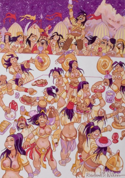
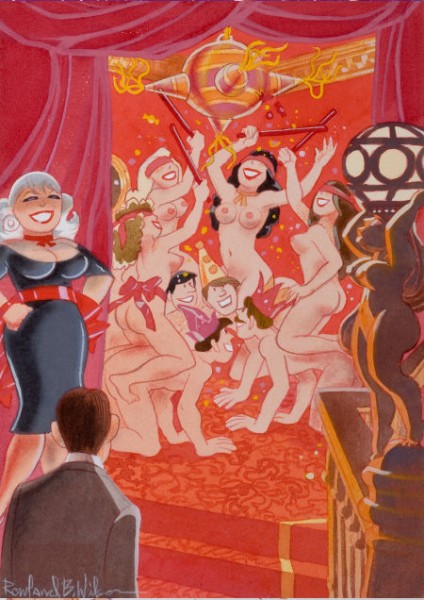
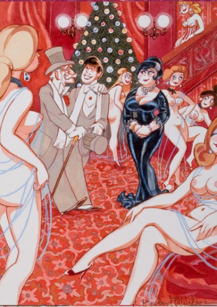
- If you’ve ever wanted to own a Rowland B. Wilson cartoon, now’s your chance. A number of Playboy cartoons by Wilson are up for auction via Heritage Auctions. The auction will end on Oct. 13th, and you can make a bid now, if you like. I’ve posted the cartoons available below with some of the descriptive material from the auction house. Good luck.
 1
1“This Year I’m Putting in a Provision For Good Big Boys Too!”
Playboy page cartoon illustration, January 2002
 2
2
“A Toast to the New Year!
May It Be Another Prosperous One For Atilla and All Us Huns!”
Playboy cartoon illustration, January 2003
 3
3
“We’ve Added a New Kink to the Piñata Tradition!
Playboy cartoon illustration
 4
4
“At Long Last, Grandfather, You’ve Taken Me to See the Nutcracker”
Playboy cartoon illustration, January 2000
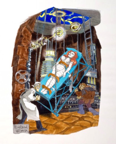 5
5
“If I Can Bring This Lovely Creature to Life,
She Will Bring Me Everlasting Immorality!”
Playboy cartoon illustration, November 1981
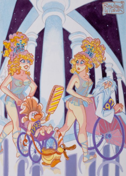 6
6
“I Have a Feeling ’93 is Going to Be a Very Weird Year”
Playboy cartoon illustration, circa 1993
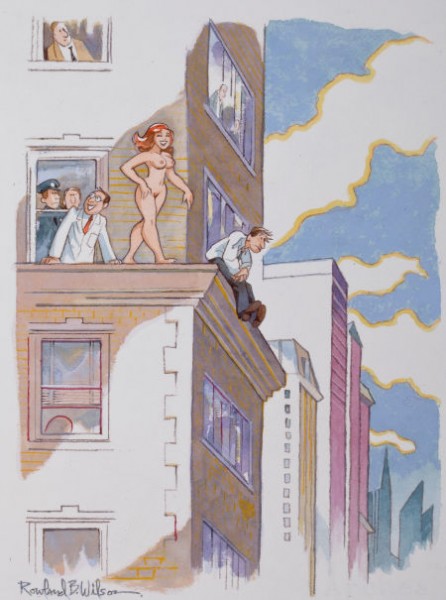 7
7
“Miss Perkins Has a Perfect Record in Dealing with Potential Suicides”
Playboy cartoon illustration, May 2003
______________________
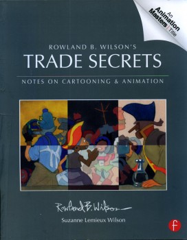 And as long as we’re talking about Rowland Wilson, I can’t pass up the chance to tell you, yet again, how great Trade Secrets is. Subtitled, “Notes on Cartooning and Animation,” the book is so much more than that. It’s a lifetime’s worth of invaluable notes, advice and commentary about illustration, cartooning and (most importantly to me) animation. I’ve read large chunks of this book over and over again. It all seems so basic and simple, when you’re deep into it, but the book is thick with brilliant comments about the art of drawing and painting. You’ve got to get your hands on it just to see how rich the material is. Once you do, though, you’re going to want to own it. I feel not only indebted to Rowland for the material but to Suzanne Lemmieux Wilson for having finished the book and making sure it looks as perfect as it does. It’s a treasure.
To give another view of some other advertising work done by Rowland Wilson, Bill Peckmann forwarded these pieces. Here’s Bill:
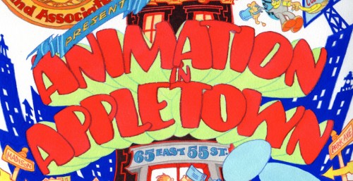
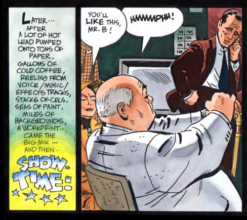
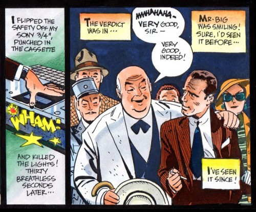
- I thought maybe you would enjoy seeing the original art of two Phil Kimelman & Ass. house ads. The first one is all Rowland Wilson, both concept and finished art, the second one is a collaboration of Rowlie and Alex Toth.
We’ll start with the printed ad as it appeared in Millimeter magazine in 1979, and then do close ups of the original art.
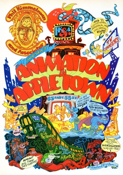
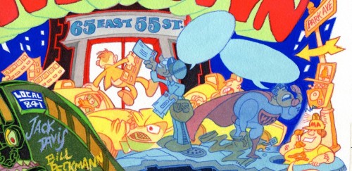
The full sized ad
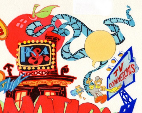
No lettering in the word balloons, that was done on a separate over lay.
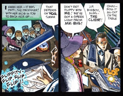
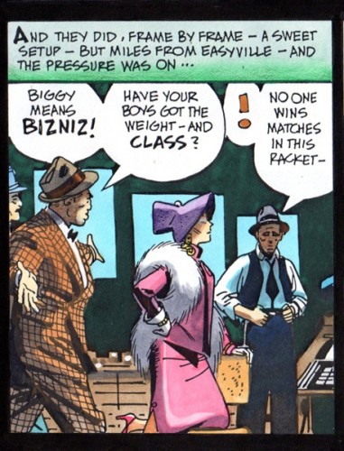
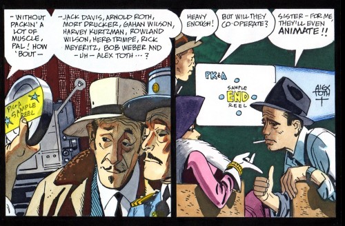
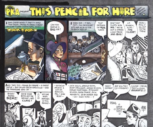
The second PK&A house ad was written by Rowland Wilson, Alex Toth did the finished black and white art and then Rowland colored it with his water colors.
Here’s the black and white.
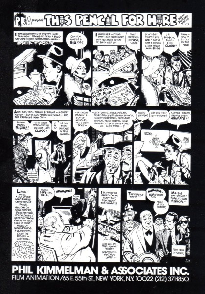
We took Alex’s original art, xeroxed that on to kid finished
Bristol board, the paper Rowland always worked on.
Here is an unfinished, experimental start by Rowland.
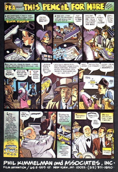
The only time the ad ever ran in color was here
in the 1982 International Film Guide paperback.
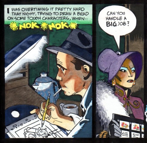
Hopefully all will enjoy these panels in their large format
and be able to see how each one works by itself
in the drawing and the coloring.
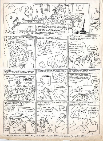
Here is a small footnote to the history of the ‘Pencil for Hire’ ad.
It’s my rough that started the ball rolling. I was hoping to entice
Alex into doing a take off on a Milton Caniff type Sunday comics
page for our house ad. Fortunately, Rowland was looking over
my shoulder and thought it was time for a rewrite!
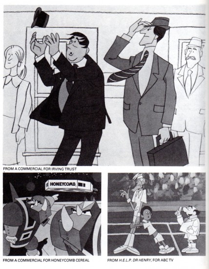
The 1982 Film Guide also contained this page, the “Irving Trust” commercial
and the “Dr. Henry” series were designed by Rowland, the “Honeycomb” spot by me.
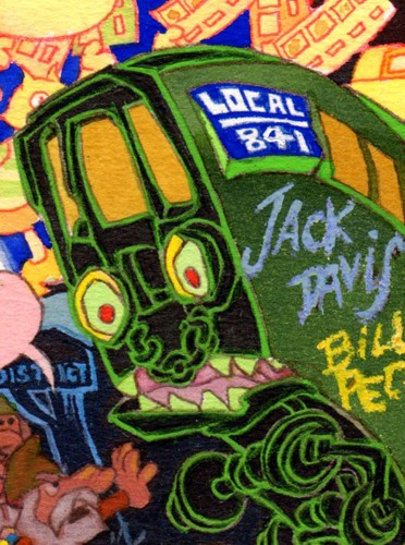
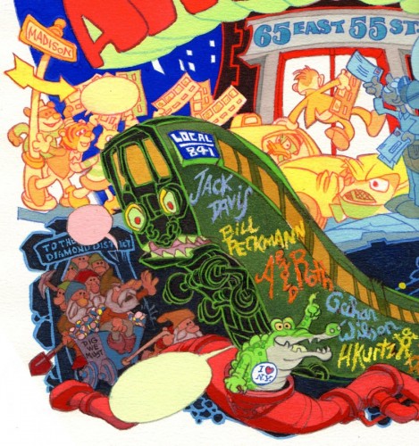
PS: I wanted to end on this button. For all of us who
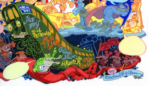
still remember “Local 841″ and green subway cars!
Bill Peckmann &Comic Art &Illustration 20 Sep 2012 05:24 am
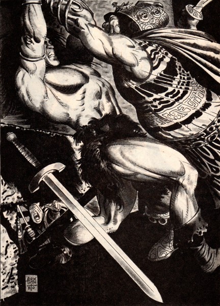
Conan from Toth – 2
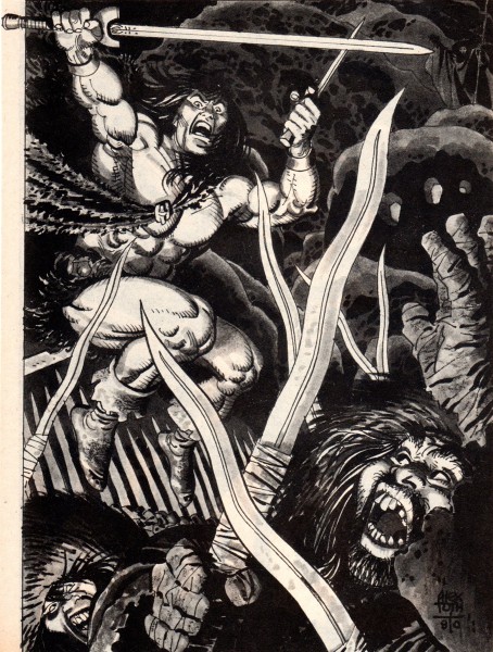
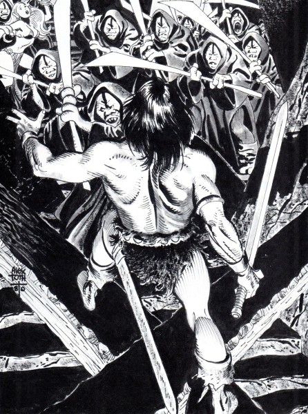
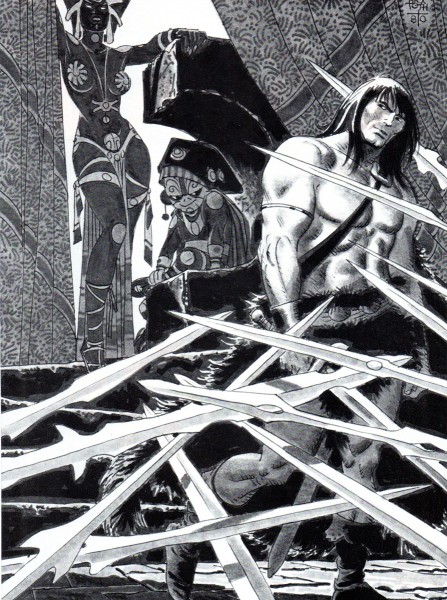
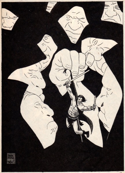
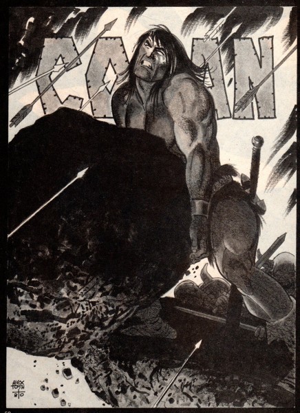
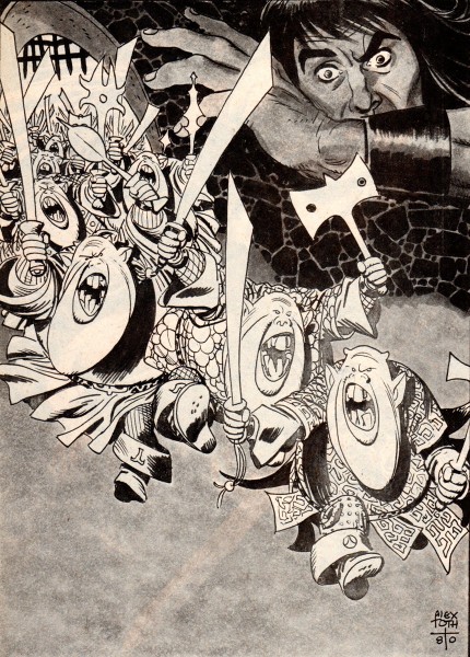
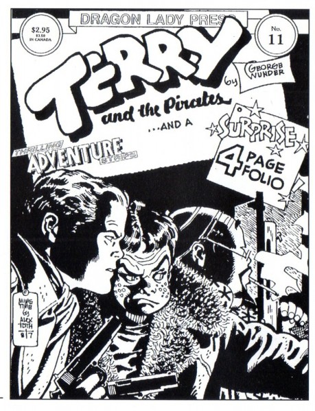
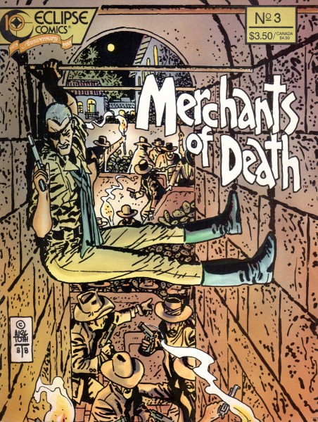
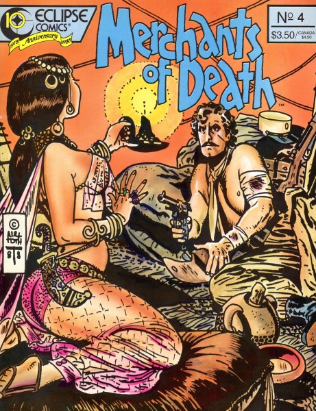
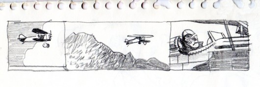
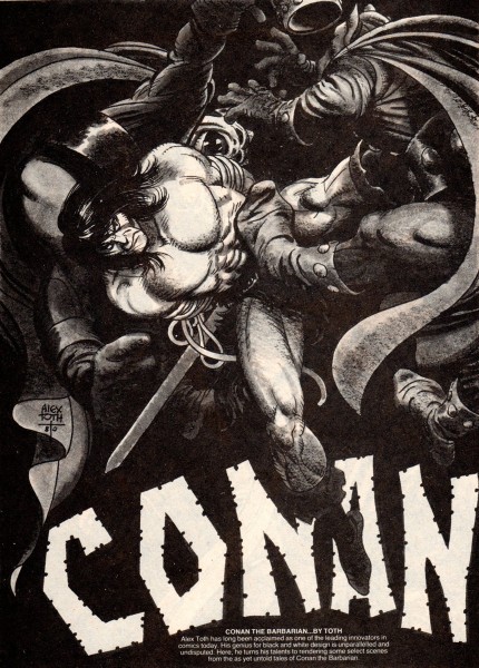
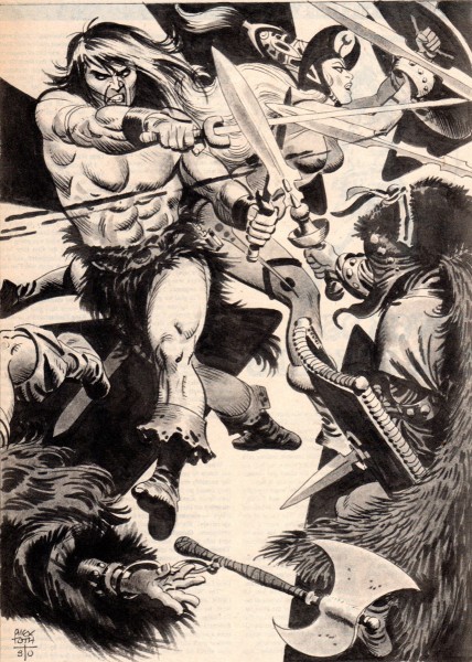
- Bill Peckmann offers a bevy of beautiful Alex Toth illustrations for Conan the Barbarian. Here are Bill’s comments for these incredibly fine illustrations:
-
I haven’t seen many of these Toth illustrations on the Net, and I thought maybe the Toth fans out there might enjoy these.
Here is Alex Toth in the early 1980′s taking a stab at the Sword and Sorcery genre and doing a ripping job of it. These are single page illustrations from Marvel’s black and white magazine, “The Savage Sword of Conan“. Alex is at the top of his game; design and drawing leave nothing to be desired. the assignment held his interest long enough so we came away the winners with these nine examples.
 1
1
 9
9
That was the last of Alex’s Conan. He did a total of
10 illustrations for Marvel’s Conan, so we have all but one.
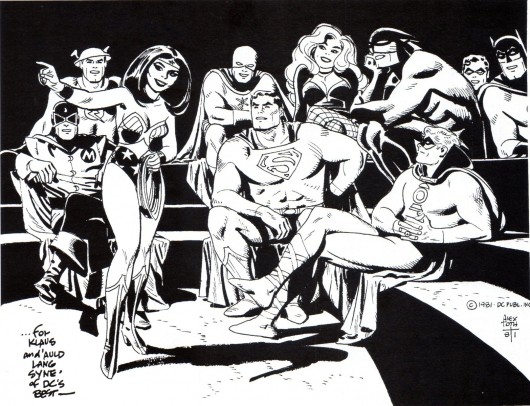
Here is a 1981 drawing of super heroes that Alex dedicated to Klaus Strzyz,
a fan, a friend and interviewer of Alex’s. The drawing was then made into a
handsome cover on Roy Thomas’ “Alter Ego’s” fanzine tribute to Toth in 2006.
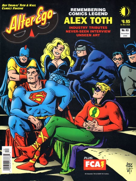
This is the final cover for Roy Thomas’ 2006 “Alter Ego’s” tribute to Toth.
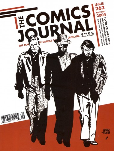
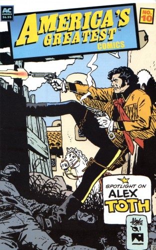
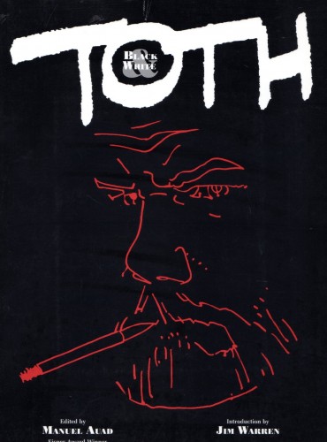
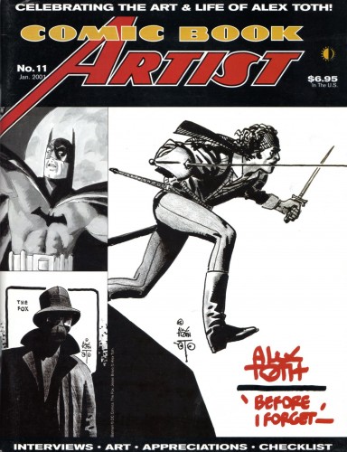
These are the covers of books and magazines that have collected the words and work of Alex. Hopefully for new fans they still might be available somewhere on the net or in used bookstores.
 1
1
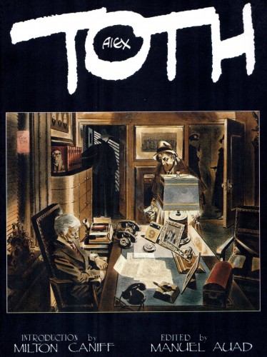
The next two excellent books were authored and published by Toth fan and friend Manuel Auad. (Manuel was also responsible for the great, recent Robert Fawcett book and the forthcoming (October) book on illustrator Albert Dorne. The illustrator who still remains Jack Davis’ biggest idol!)
 4
4
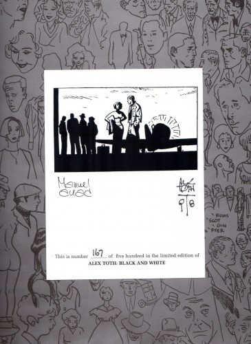
Tipped in autographs for “Alex Toth: Black & White”.
 6
6
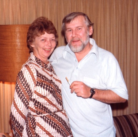
Alex and his wife/best friend Guyla in their Hollywood home in 1979.
They met at Hanna-Barbera and the rest is history.
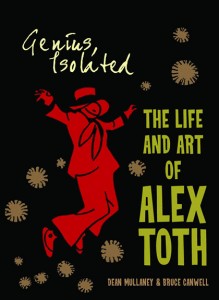
Their marriage will be brought to life in the upcoming book “Alex Toth, Illustrated“,
second in the trilogy of Alex’s work, by Dean Mullaney and Bruce Canwell.
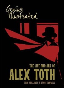
Vol 1 & 2 by Dean Mullaney and Bruce Canwell.
Now available on Amazon.
Many thanks to Bill Peckmann for all the scanning as well as the loan of the artwork.
Animation Artifacts &commercial animation &Layout & Design 19 Sep 2012 05:22 am
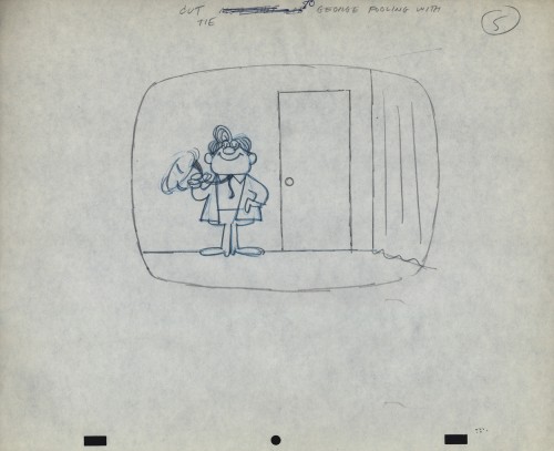
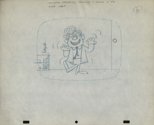
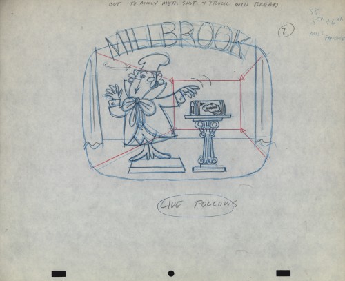
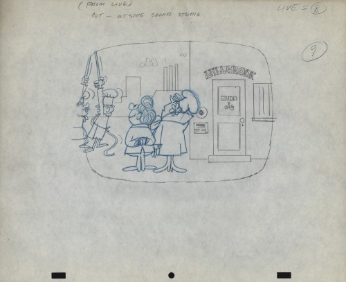
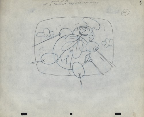
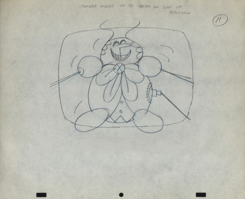
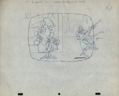
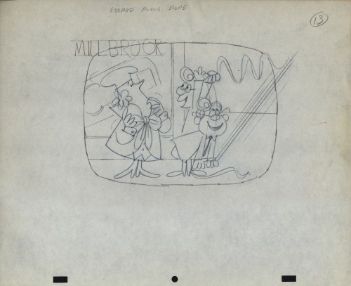
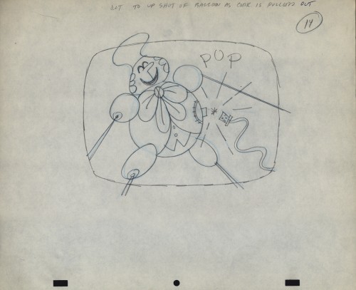
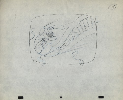
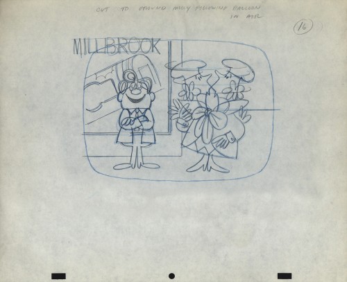
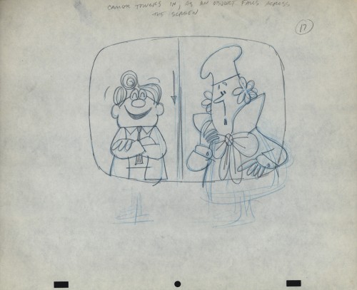
Vince Cafarelli’s Millbrook Bread – 1
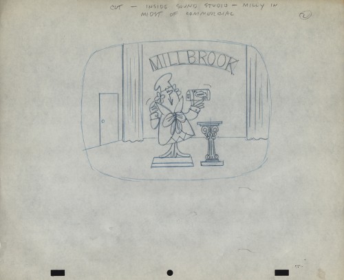
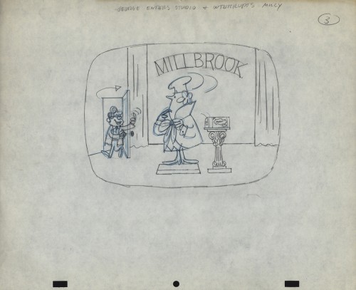
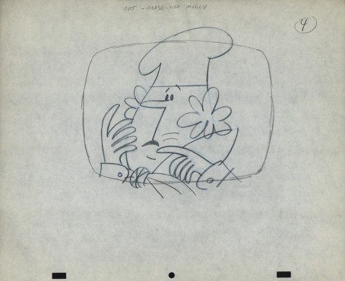
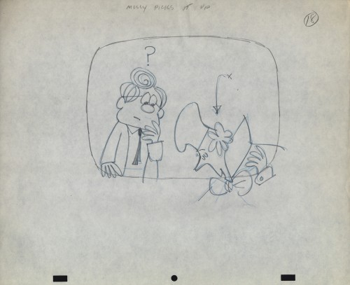
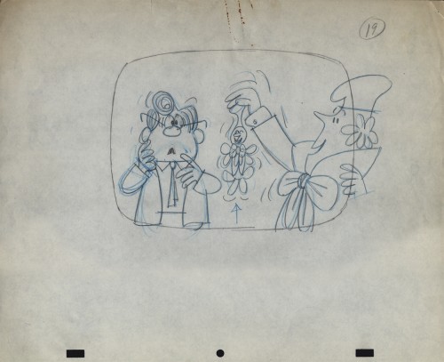
- When Bob Elliott and Ray Goulding (of Bob & Ray fame) found a chance, they scooped up the Piels Brothers account from UPA and, with Ed Graham, they opened their own animation studio to do the Piels commercials. The blend didn’t last long, and they soon went out of business. Vince Cafarelli worked at Goulding-Elliott-Graham Prods. for a while and several Millbrook Bread commercials were produced, featuring “Milly” the baker.
I remember these commercials from my childhood well. I loved the very graphic style of the spots. I remember seeing how the character turned his head (see number 16, below) and was taken by the movement. I think I was probably 11-12 years old at the time. The video records the date as 1963, but I’m sure they’re wrong – 1959, maybe?
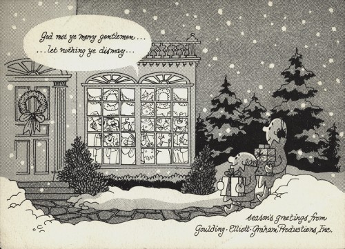
I previously posted this Christmas card from Goulding-Elliott-Graham Prods., Inc. If you click on the card and look in the window of the house, you’ll see “Minny” the Millbrook baker (centered) within, singing Christmas Carols.
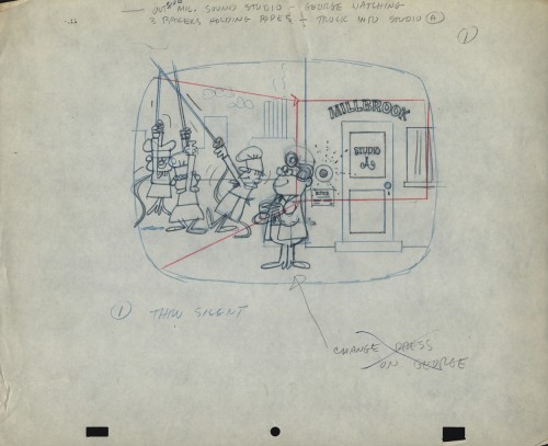
Michael Smollin takes credit for directing the commercials, but I’m not sure he worked for Elliott-Gould-Graham. I thought that Ed Graham had directed all spots in house. Smollin may have designed the characters. We’re assuming that Vinnie drew these images. The writing is his. It’s doubtful he would have been directing at this point, so he probably drew the Layout drawings.
In Vinnie’s collection of art, the layouts for two of these spots were found. I’ll post these from the first spot this week and the second spot will come next Wednesday.
 1
________________________________
1
________________________________We don’t have a copy of this spot that we could post. However, to give you an idea of how the voices sounded, here’s a vradio spot done for Millbrook Briead by Bob and Ray.
Bill Peckmann &Comic Art &Illustration 18 Sep 2012 05:41 am
Conan from Toth – 1
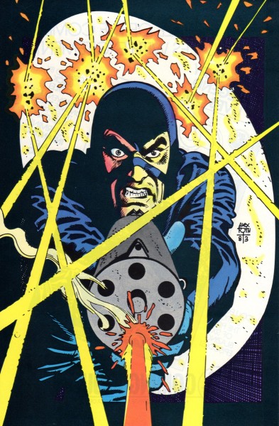
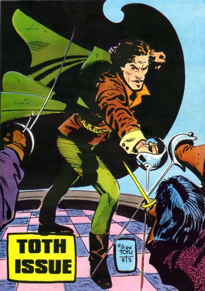
- Bill Peckmann sent me a stash of nine extraordinarily fine illustrations by Alex Toth done for the magazine, The Savage Sword of Conan.
To fill up the post, Bill sent a number of magazine covers (front and back). However, I thought the Conan drawngs so excellent, that I’ve chosen to have them stand alone. So, I’m using these pieces – great as they are (they certainly stand alone as a post) – as a teaser for Thursday’s images of Conan. Trust me, come back if you’re a fan of Alex Toth’s work.
For part 1, Bill wrote:
- Here’s a potpourri of front and back covers that Alex did in the 1980′s.
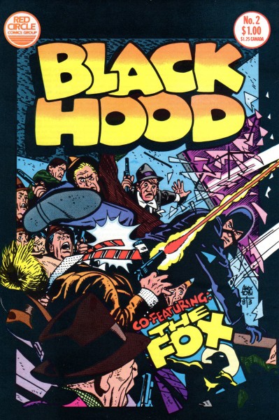 1
1
Animation &Animation Artifacts &SpornFilms &Tissa David 17 Sep 2012 06:20 am
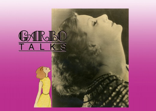
Garbo Talks thru Tissa’s Animation
The initial rough/cut screening for Garbo Talks was a bit peculiar. I sat down and a woman sat next to me; I sort of recognized her. We said hello when she sat down. Somewhere midway during the film I realized who the woman was – Betty Comden, that half of the Comden & Green writing team. I realized she was playing the part of the older Greta Garbo in the film, without receiving credit. It was brilliant casting, but you could say that about all of Sidney Lumet’s movies.
When I left the screening room there was a tense meeting going on with four people. I caught Sidney’s eye and waved goodbye. Going down in the elevator Burtt Harris, the producer, rushed in as the doors were closing. He asked what I thought of the film. Before I answered he said it wasn’t working, and Elliott Kastner and MGM weren’t very happy. A rough conversation in an elevator.
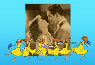
The next day, Sidney asked what I thought of the film, I said that I felt we didn’t know enough of the back story of the Ann Bancroft character in the film. I suggested that I try to offer this in the opening credit sequence. Sidney loved the idea. He just made me promise that it wouldn’t feel like the credits to “I Love Lucy” or “I Dream of Jeannie.”
During the mix, we were talking about the music for Garbo Talks when we slipped off into discussing the music for some of Sidney’s other films. I told him that the music by Richard Rodney Bennet for Murder on the Orient Express was one of the most brilliant film scores ever done. Sidney hesitated in responding finally saying he didn’t get it at first, and it took a while for him to appreciate the music for that film. Sidney wasn’t always perfect in selecting a composer for his films, although I do think that Johnny Mandel was a great choice for him on Deathtrap and The Verdict (or any film, actually).
Bob James had scored Garbo Talks. (He is an eminent jazz pianist, whose most famous piece is probably the theme to the tv show, Taxi.) Bob and I had to work together very closely. He wrote the score to the animatic I’d given him and would build the rest of the film’s score from that. He hit many of the actions in that opening title, and Tissa David‘s animation hit them all. There was a very tight sync between music and title animation.
The preview screening was held on Long Island. I drove there and met the group of Sidney, editors and MGM execs, including Elliott Kastner. He was the leading producer on the film. They weren’t happy at the end of the screening, and I was sure my titles were going to go. It took a week to hear that the titles were staying, but the score by Bob James was dropped. The composer took the hit, unfairly. A new score was being written by Cy Coleman. All that tight sync work!
Coleman wrote a lovely melody for the film, but just swept across the animation not hitting any points in particular. It’s taken me a long time, but I’ve come to like the music he wrote. Tissa wouldn’t watch the piece again with the new music.
In the film, the character played by Ann Bancroft has had a life that, in some small way, was shaped by Greta Garbo’s feature films. This is a small bit of backstory in the live action film, until the end.
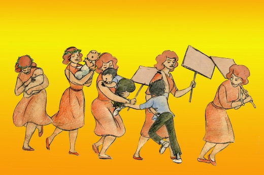
For the credits, I chose to develop this aspect of her story, and Sidney agreed on the approach. We told her life in a caricature of Ann Bancroft‘s character, growing up. The sequence ends with her at her current age, an elderly woman, and the live action begins. Hence, we were giving the life story of the film’s lead character before the film started.
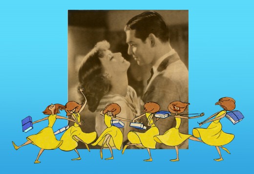
The idea was to use the device that had been developed for TV in the 50′s & 60′s of the caricatured characters whisking through the sitcom titles. (See Bewitched or The Carol Burnett Show.) However, it was our intent to treat it in a serious way.
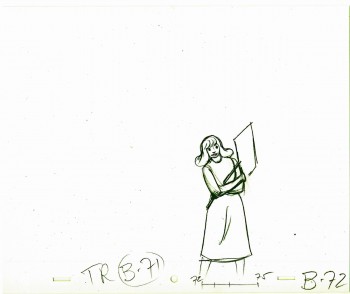
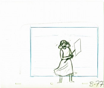
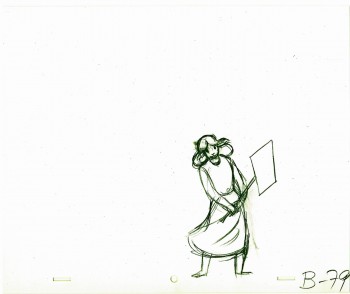
Tissa David did a stunning, tour de force of a brilliant piece of animation. It was a dance that the character went through, and the credits played off the animation, which played off stills of Greta Garbo’s films.
There was a small crew on the piece, which ran about 2 ½ minutes. Tissa animated, I did whatever clean up was left. Robert Marianetti single-handedly colored everything; Janet Benn and Christine O’Neill did additional I&P. Gary Becker filmed it, and Edith Hustead edited.
.
.
Tissa had about two weeks to animate about 2½ mins. of animation. I begged her to leave inbetweens for me, which she did, though only on close positions. I inked on paper, and Robert Marianetti colored directly from these rough-ish drawings. It was done with prismacolor pencils on paper. The paper drawings were then cut out and pasted to cels.
.
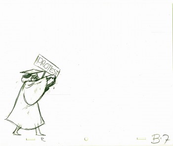 7
7
(Click any image to enlarge.)
Below is a rough PT of the piece with its staccato rhythm since it’s missing inbetweens.
Garbo Talks ruff PT On twos at 24FPS
Click left side of the black bar to play.
Right side to watch single frame.
The entire title sequence.
Thanks to Roger79 for uploading it.
Thanks to Stephen MacQuignon for finding it.
Photos &Steve Fisher 16 Sep 2012 05:56 am
wALL sTREET
- My friend Steve Fisher sent a host of photos of the Wall Street area on the very day that stocks went booming past their highest mark since 2008′s catastrophic crash. That same night I saw Arbitrage, a Richard Gere movie about a crooked hedge fund operator. These pictures seemed destined to end up on today’s photo gallery.
The pics come from many parts of the historic area like the Bank of New York Building or Trinity Church or Tiffany & Co. Lots of beautiful, old buildings displaying lots of majestic architecture and hiding questionable actions. Thanks to Steve for these photos:
 1
1
Commentary 15 Sep 2012 05:45 am
Commentarium
This was a really busy week as far as seeing movies went. The first three were Special Oscar preview screenings.
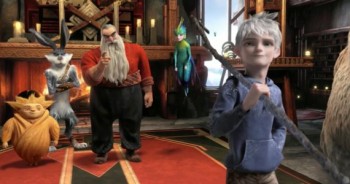 - Sunday night there was a screening of Dreamworks’ Rise of the Guardians. This was a rough cut; it had a lot of unfinished scenes. many were missisng proper lighting, the score was a temp track (a 101 strings big budget adventure-music type played LOUD and LOUTISH.) When I learned that the brilliant Alexandre Desplat was doing the music, I realized that I’d only seen 2/3 of the film. Desplat might actually be able to save this loud, annoying and tedious film. By the way, someone tell them that people don’t smile that much – visually, I mean – actually, aurally too (whenever there’s a hole in the track, they stab it with someone laughing), and females can do something other than pose cute. There isn’t one real female character in this film.
I met the director, Peter Ramsey, Jeff Katzenberg,the brilliant writer, David Lindsay-Abaire, who was wasted on this one. I met the producer, Christina Steinberg, and William Joyce, who fathered the whole thing. The film reminded me a lot of the Shrek films, stylistically, I mean. It wasn’t pretty.
Jude Law is brilliant and Alec Baldwin can do anything – including a Russian Santa Claus. Who knows maybe when they add the real and final score, when they finish coloring the scenes and when they put it all together properly it’ll be great. I seriously doubt that’ll happen, and it’ll be hard to sit through again. I do want to hear the new score, though. I like that composer and want to see how he scores this mess of a movie.
Monday night there was a screening of On the Road, the filmed version of the Jack Kerouac book. Directed by Walter Salles who did Motorcycle Diaries, this film doesn’t have the same drive as his last. The poster is a closeup of Viggo Mortenson, who in his two minutes in the film, brings it to life for a short bit. There are a lot of stars who make short appearances. I wish the lead actor had been someone with more screen presence. There weren’t too many people on the screen that you really cared about, and that certainly included Kristin Stewart who can’t act very well.
The tiny Disney theater was packed with celebrities (I sat next to Dianne Wiest) who all made it to the afterparty at Le Cirque. That was fun.
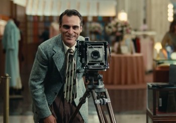 Tuesday brought The Master in 70mm to the Ziegfield Theater – one of NY’s largest and best. Lots of stars in the theater. I sat next to David Straithairn.
This was THE film of the year, so far. Joaquin Phooenix has a damn good chance of winning an Oscar. He was great. The film was eccentric and felt slow even though I never felt the need to check out my watch. Why don’t we get films like this in animation? Johnny Greenwood‘s (Radiohead) score is out of this world. The first really big film of the year. Although the film is about vague and elusive ideas, so much is left for the viewer to determine, the film has stuck in my head for the past five days replaying many of the scenes. I look forward to seeing it again at the Academy screening on Sept. 24th.
The film got an excellent review from AO Scott at the NYTimes.
Also excellent notices from the NYPost and the Daily News. But the best review I’ve read was Karina Longworth‘s review in The Village Voice. She responded to some of my thoughts on the film. An excellent piece of criticism.
Thursday I saw Arbitrage. Richard Gere, Susan Sarandon, and Tim Roth in a film about a corrupt hedge fund manager who accidentally kills his French paramour in a car crash. Can he get out of the financial predicament he’s in to save the company? Can he hide his involvement in his girlfriend’s death? A pot boiler that kept me interested, though the film is really about nothing. Richard Gere was good but no competition for Joaquin Phoenix or Phillip Seymour Hoffman in The Master.
Friday night I saw a new play that starred Jake Gyllenhaal and BrÃan F. O’Byrne. Called If There Is I Haven’t Found It Yet, (what a bad, unmemorable title) there were excellent performances from all four actors, but the play was a ghost of a show. Something about bullying an overweight high school girl in England. Mix that with something about global warming and have a set with a glass tank of water in the front of the stage. The furniture which is piled in a junk heap center stage is there for the actors to pick and choose the pieces they want to do the scenes with. Then they throw it into the tank of water at the end of the scene All scenes end with this violent action. When the girl tries to kill herself in the bathtub, water overflows leaving, on purpose, at least a couple of inches of water on the set. The actors play the last ten minutes ankle deep in water. (At one point, I actually wondered if the tank were going to overflow and water would come into the audience. I was sitting in the fifth row.) I think this is supposed to be a metaphor of some kind for the mess global warming is doing to the world which is a metaphor for the mess the world is making of families.
The play was not good. The actors were. They all play with Brit accents and all do well at it. I thought of waiting for Jake Gyllenhaal at the end of the show to say hi after Man Who Walked Between the Towers. However, there must have been a hundred people crowding the front of the theater to get a look at the star. I got outta there.
This afternoon, Saturday, I’m going to see Francine at MoMA. Melissa Leo‘s new film is being released by MoMA for the first week. The reviews haven’t been good.
- There’s a wonderful and extensive interview with Richard Williams on the blog One Huge Eye. The interview was conducted by Alex Amelines, the creÂator of oneÂhugeÂeye. He’s also the founder and direcÂtor at the LonÂdon based StuÂdio Tinto. Other interviews on the site include those with: David Sproxton, Eric Walls, Jeff Pratt and Nick Cross. (It’s obviously a Brit site.)
Inking for the Best of ‘em
- John Kricfalusi has a tutorial, on his site, in how to properly ink his style. This, in many ways, is a lesson in how to ink (period). There are minor things that you would not do for every style — such as inking the entire externalline of the character in a heavier weight. This is purely a style preference. However, control of the thick and thin line as well as control of details is astute. Inking is such an enormous part of the animation process that it’s amazing to see how few pay proper attention to it. There have been many a film that have been badly hurt because of poor inking. I’ve seen beautiful inking on many a Peanuts special, but I’d also seen one that had a very poor, wavering inking rendering that episode almost unwatchable – for me. (The general public probably didn’t notice it.) If those lines are not right, it can damage the animation and takes the heart out of controlled assisting.
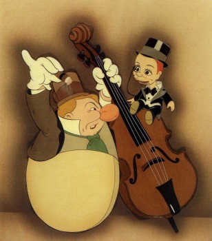 Yet, the opposite is true as well. An exhibit at the NY Public Library at 42nd Street in 1998 was one of the best I’ve ever seen. It was a program of “Celebrity Caricature” mostly from the 20′s & 30′s. In among the magazine art was a small section on animated caricature. Drawings by Tee Hee and Joe Grant were on display with a couple of cel set-ups. The ink lines were stunning. They were drawn with delicate thick and thin lines done with crow-quill in multiple colors. Just as the models would be marked up for the different cel colors, it had markings for the ink line colors, as well. The Charlie McCarthy & W.C. Fields in the image to the right represents some of the beautiful caricatures from “Mother Goose Goes Hollywood”.
Terrytoons New Camera
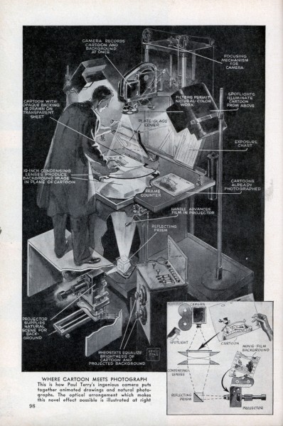
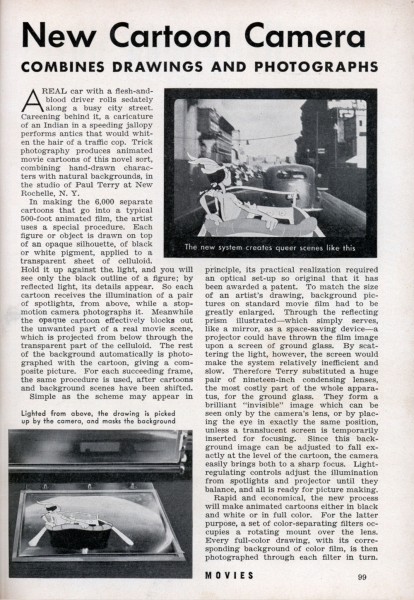
After a piece about inking, how could we avoid an article about a brand new animation camera. The Terry cartoons introduced a new camera in 1939 which allowed them to film live action, projected one frame at a time, from beneath the platen. Thus you could easily combine live action and animation at the camera phase, thus avoiding any opticals.
Here’s an article from Modern Mechanix.
 1
1
Dumbo’s Done
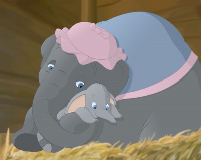
William Benzon has completed his lengthy article about Dumbo on his site, the New Savannah. He’s put all of these posts together into one big read. You can read it in PDF format by going here. Quite a work of scholarship by Mr.Benzon.
Bill Peckmann &Books &Illustration 14 Sep 2012 05:47 am
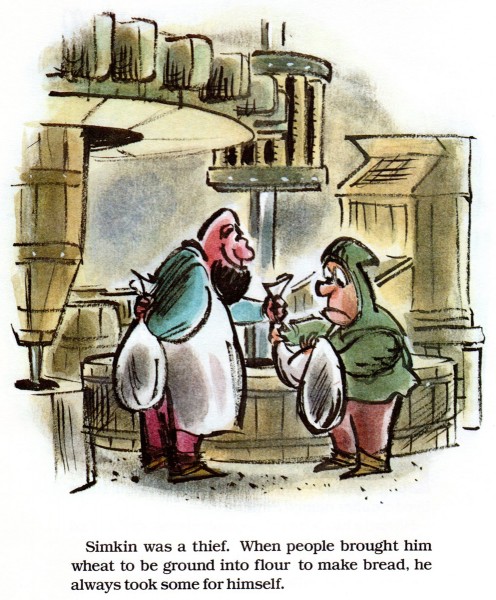
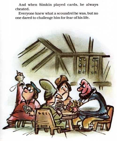
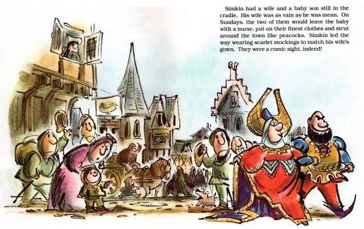
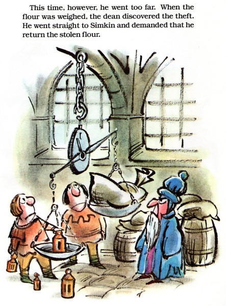
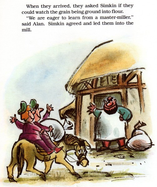
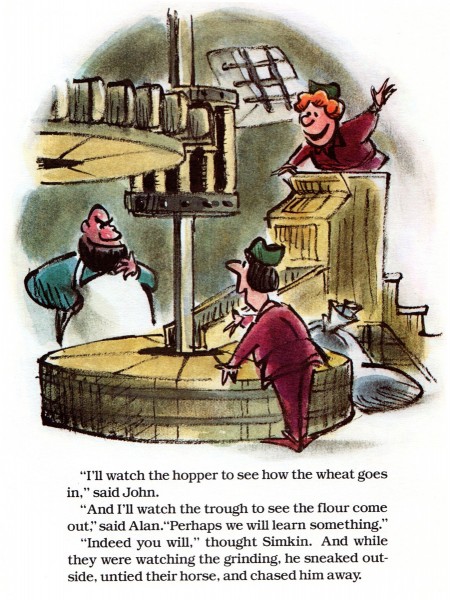
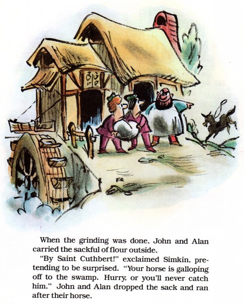
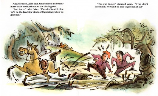
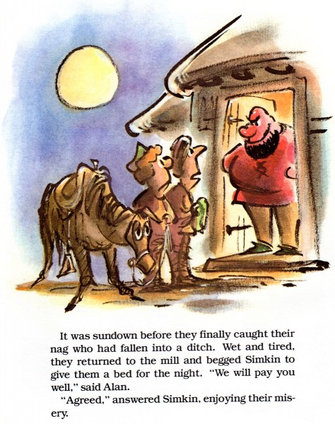
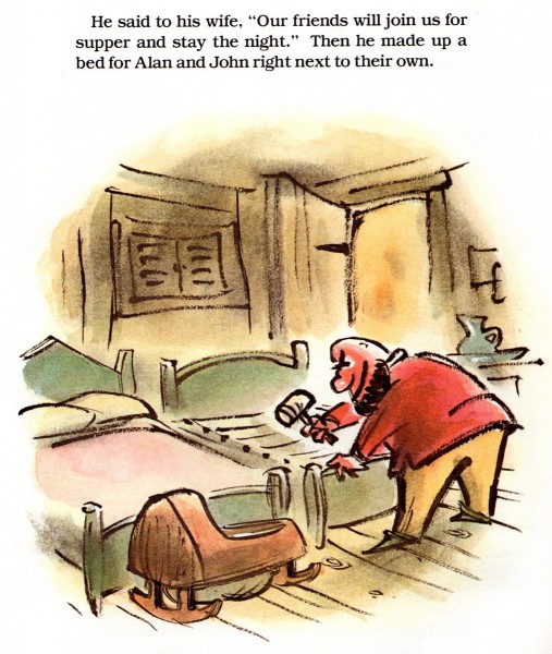
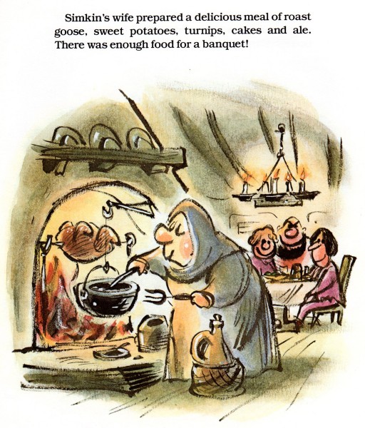
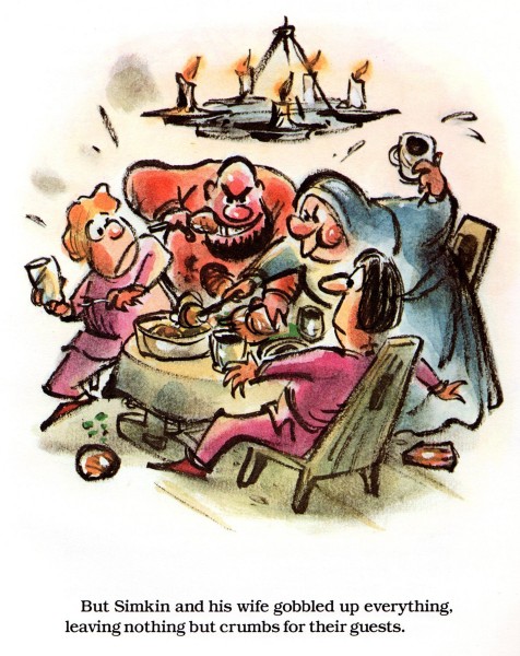
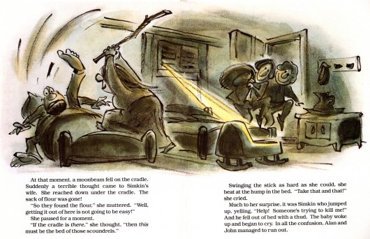
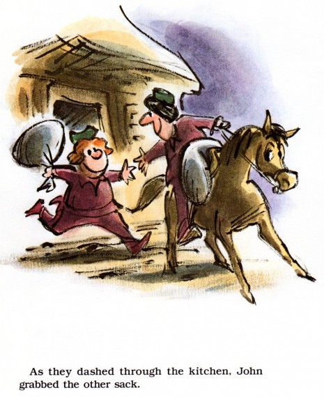
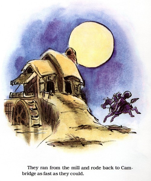
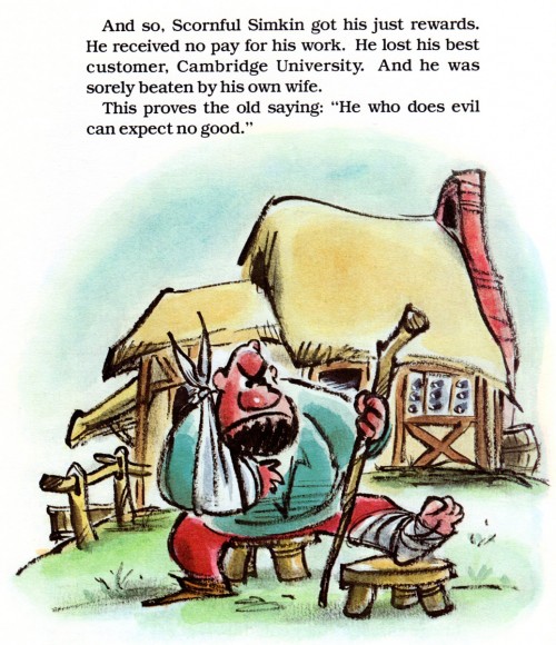
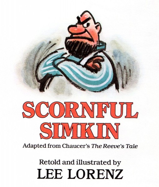
Lee Lorenz’ Scornful Simkin
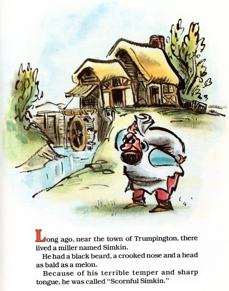
Lee Lorenz, of course, is a brilliant cartoonist. However, we don’t often see examples of his great children’s books. Bill Peckmann sent me the following scans. He wrote:
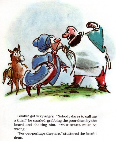
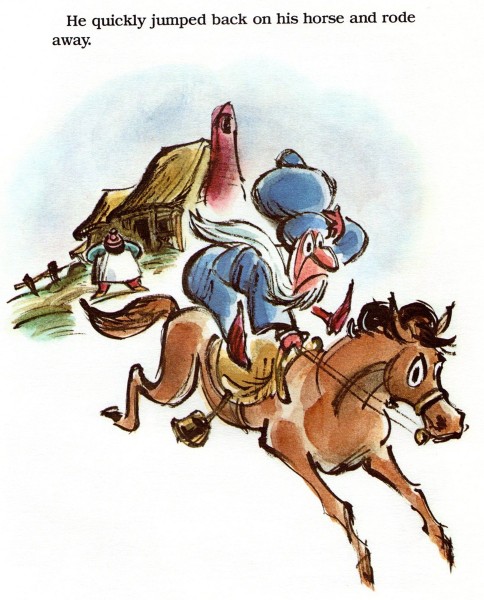
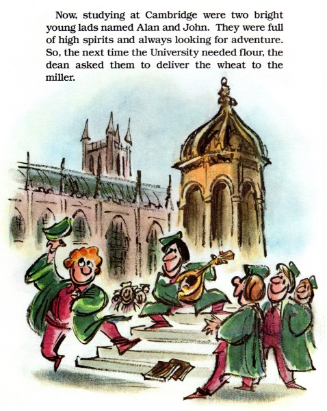
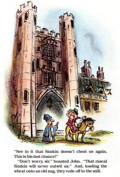
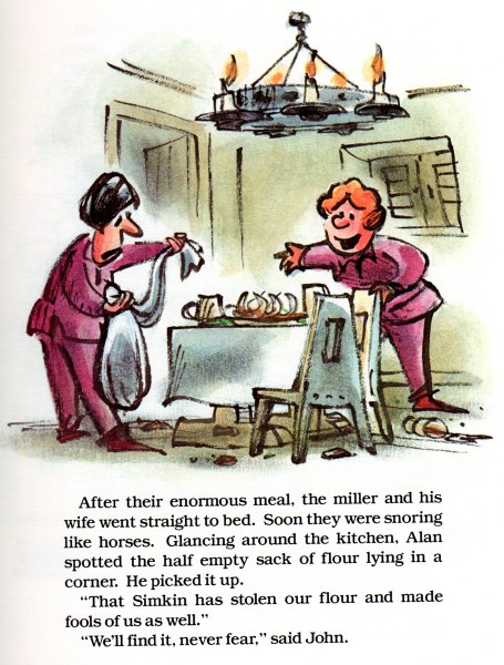
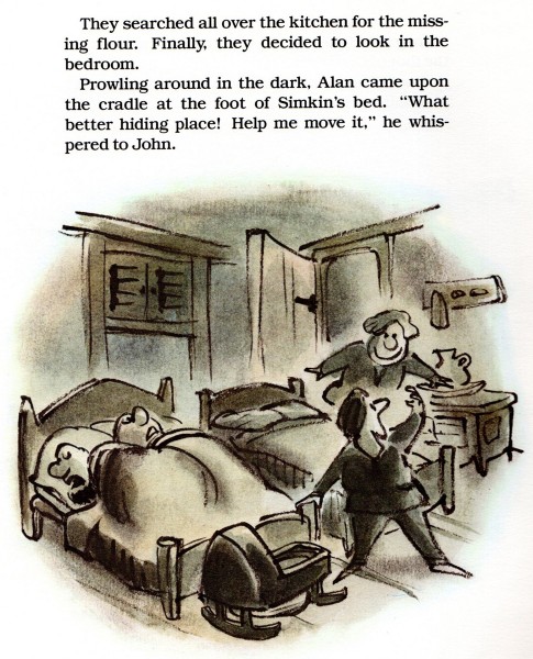
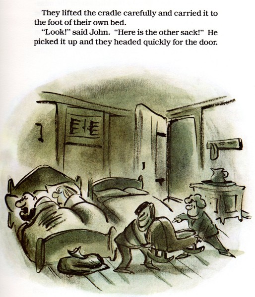
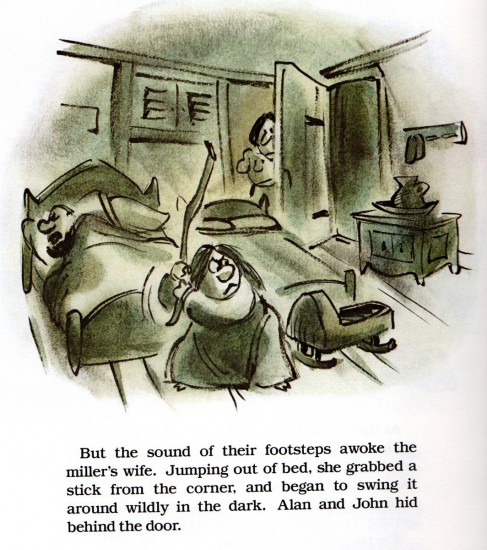
- We know good fortune is smiling down upon us when a great, noted gag cartoonist/artist gets the gig of illustrating a children’s book. So it was in 1980 when Prentice-Hall published Lee Lorenz‘s book, Scornful Simkin. It’s an illustrated retelling of Chaucer’s The Reeve’s Tale. That story is about Scornful Simkin, the terrible tempered miller who after grinding other people’s grain would always keep a little for himself.
The art in the book has the same feel and flair as storyboards from the Golden Age of Disney.
 1
1
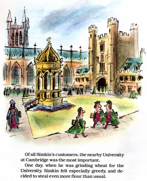 6
6
Like good wine, these pages only get better with age!
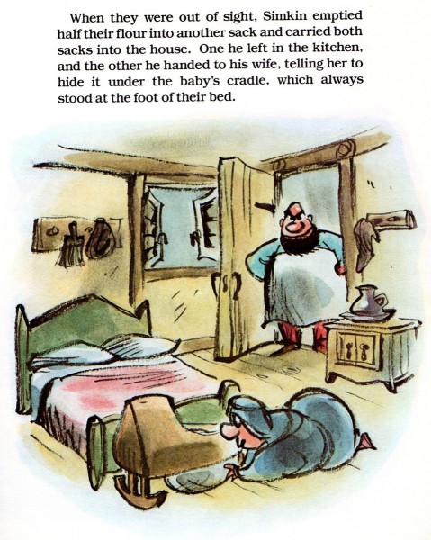 15
15
Standing O’ for Mr. Lorenz, classic Disney meets classic Masterpiece Theater!
Action Analysis &Animation &Animation Artifacts &Disney &Tytla 13 Sep 2012 05:48 am
Tytla’s Terry-Disney Style
- Bill Tytla is probably the finest animator who has graced the history of the medium. He was a brilliant actor who dominates most of the classic early films of Disney work. Snow White, Pinocchio, Dumbo, and Fantasia are all appreciably greater films because of his work. In studying this master’s work frame by frame you can see a real elasticity to the character, one that is not apparent in the motion of those same characters. There’s true emotion in the acting of these characters, and it’s apparent that he uses that elasticity to get the performances he seeks.
There’s something else there: Tytla’s roots were in Terrytoons: I have no doubt you can take the guy out of Terrytoons, but it seems you can’t take the Terrytoons out of the guy.
Let’s look at some of the drawings from some of the scenes I posted here in the past.
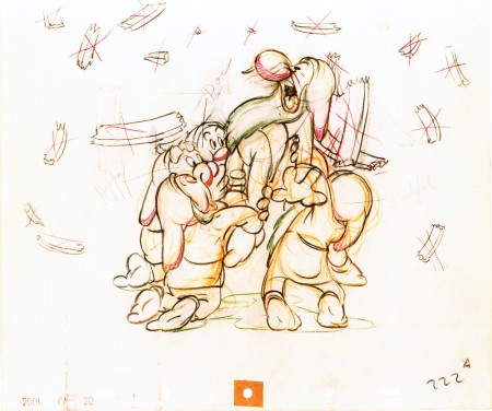
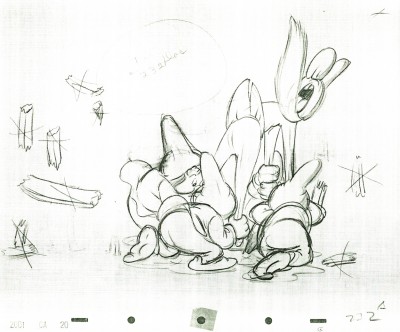
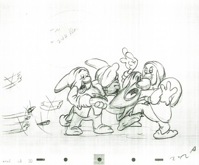
Where better to start than with those gorgeous dwarfs from Snow White. Here’s a scene I posted where all seven are animated on the same level as they carry Grumpy to the wash basin. If he won’t clean himself, then the other six will do the job for him. Take a look at some of the distorted characters in this scene, then run the QT movie. Look for the distortion in the motion.
As for the drawing, like all other Tytla’s scenes it’s beautiful. But tell me you can’t find the Terrytoons hidden behind that beautiful Connie Rasinski-like line.
Flipping over to Stromboli, from Pinocchio, we find animation almost as broad as many Terrytoons, the difference is that Tytla’s drawing that roundness and those enormous gestures on purpose. He knows what he’s doing and is looking to capture the broad immigrant gestures of those Southern European countries. Stromboli goes in and out of distorted drawings, as I made clear in a past post.
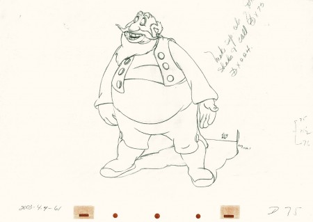 75
75
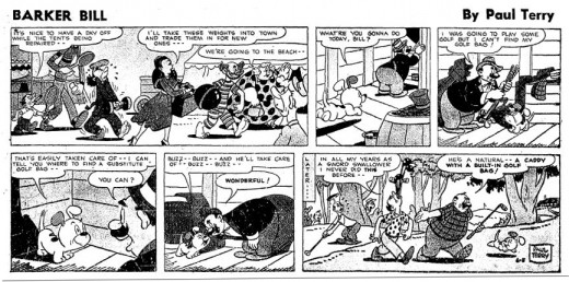
A strip by “Paul Terry”as starring his 1930s character, Barker Bill.
Borrowed from Mark Kausler’s blog It’s the Cat.
The Laughing Gauchito was a short that was, no doubt, going to be part of The Three Caballeros. Tytla, Frank Thomas and Ollie Johnston had all animated for the short before Disney, himself, cancelled the production.
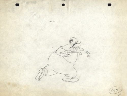
Here are three drawings from the film, and they are all beautiful extremes from the scene. (Tytla marked his extremes with an “A” to the right of the number, or at other times with an “X” in the upper right.) The beautiful roundness does not come at the expense of his drawings. Below the Laughing Gauchito we see a cartoon drawing by Carlo Vinci from a 1930′s Terrytoons short.
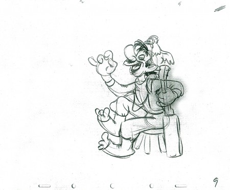 9
9
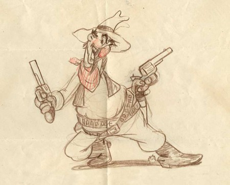
A Terrytoons drawing by Terry artist Carlo Vinci from a mid ’30s short.
borrowed from Animation Resources
Here’s a scene Bill Tytla did for a Harman-Ising cartoon. He was the supervising animator, and the lack of Disney becomes evident in the drawings. The animation is closer to a Terry short than what he did at Disney’s. The movement feels muddy in that actual cartoon. I’m sure it was his own animation trying to blend with the style of Harman’s work.
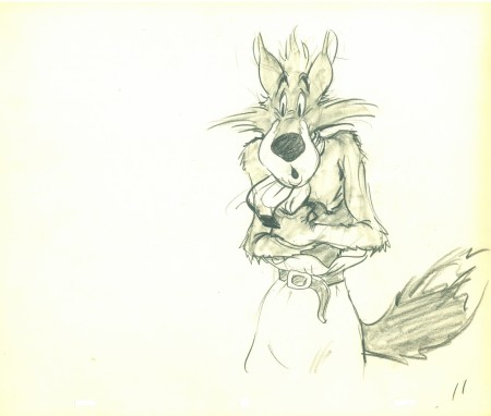 11
11
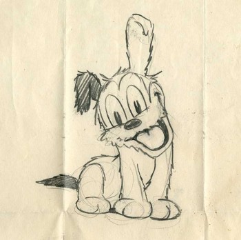
Another beautiful Carlo Vinci drawing from a 30′s Terry short.
borrowed from Animation Resources
And here’s a drawing out of a Little Lulu cartoon. I’s not a film directed by Tytla, and is not a good drawing. But Tytla’s influence on all the Lulu shorts at Paramount at the time can’t be denied. It certainly looks more Terrytoon than Paramount. This is not even a good Terry drawing – though its for a Paramount cartoon.
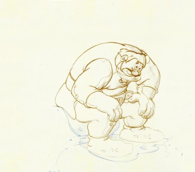
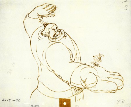
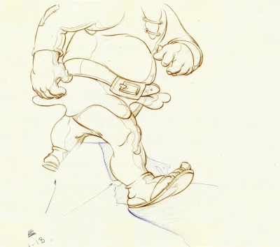
Back at Disney, Tytla animated Willie the Giant from the Mickey short, The Brave Little Tailor. This character, like Stromboli, owes a lot to Terrytoons. I felt this when I first saw the short as a child, and I still think it true. The same, I think, is also true of the same Giant character when he appears in Mickey and the Beanstalk, which Tytla obviously didn’t animate but would have handled if he’d stayed at the studio.
 3
3
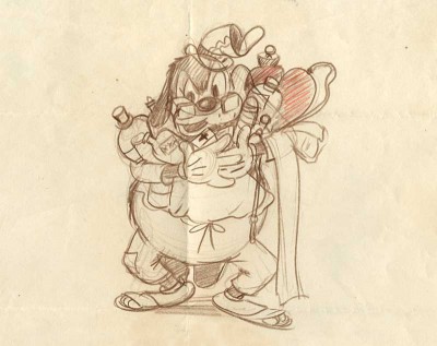
Another Carlo Vinci sketch.
borrowed from Animation Resources
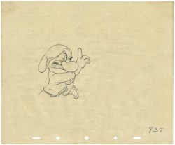
This following, last drawing is a Tytla drawing I own. I know Tytla did it. He gave it to Grim Natwick who gave it to Tissa David who gave it to me. It’s a gem.
Animation &Animation Artifacts &commercial animation &Models &Story & Storyboards 12 Sep 2012 07:00 am
Sleeper – Vince Cafarelli collection
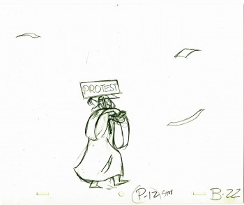
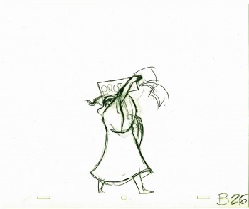
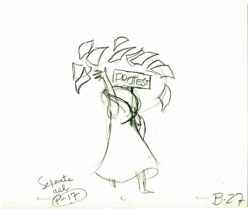
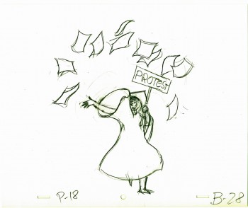
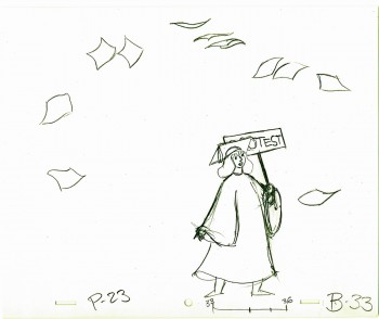
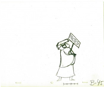
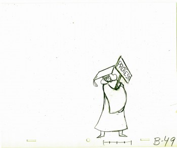
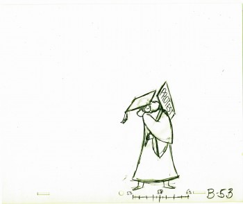
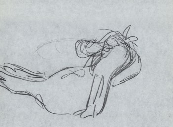
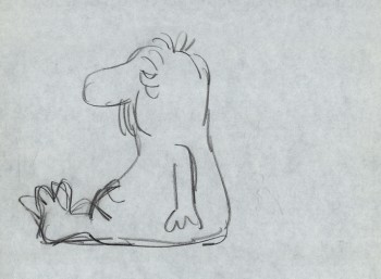
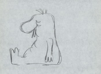
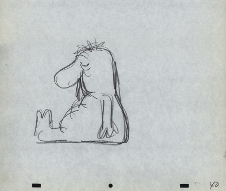
- Today I stumbled upon an odd spot in the collection of artwork saved by Vince Cafarelli. This is the storyboard and rough animation for a piece that Vince animated to a storyboard by Hal Silvermintz. The two worked on this when they were employed at Stars & Stripes Productions Forever, Inc.. It was something that the two were obviously doing for themselves – (an Independent film?). In any case it never seemed to have gone farther than this animation. . . at least, not in this form.
“Weekend” was a weekly news show that included a short animated piece. Perpetual Motion Studio did these weekly animation pieces for the NBC show airing on late night Saturday night. (This was before Saturday Night Live aired.) The budget was almost nil, so the material had to be not too expensive and the work had to be fun.
During the run of this series of shorts, Hal Silvermintz pulled out the storyboard, and it moved ahead in a new version. Candy Kugel animated the “Weekend” version and finished it for Ink & Pt. The final color spot aired in 1973-74.
Here’s the storyboard and a model sheet:
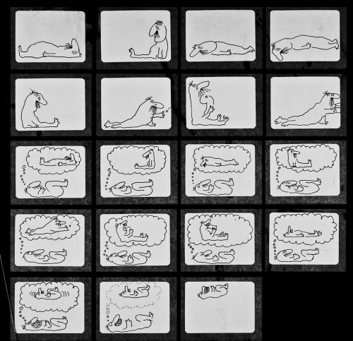
The original storyboard.
Here are drawings from about half of the first scene. For four key positions, I’m posting the entire page, pegs and all. For the remainder of the drawings, I just have the character for you.
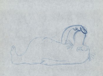
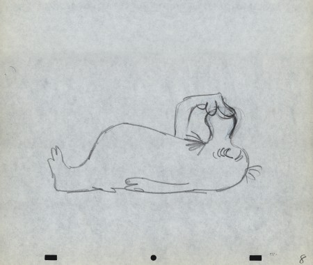
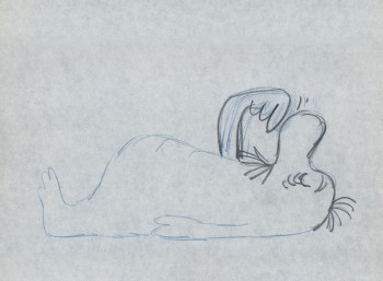
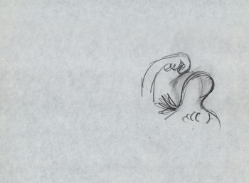
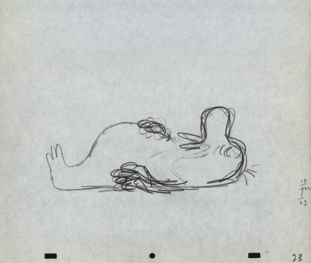
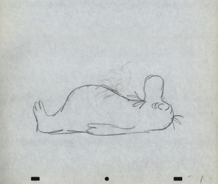 1
1
Here’s a QT movie of the drawings posted above.
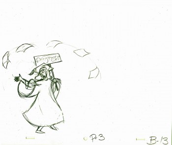
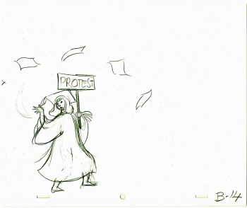
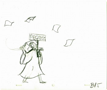
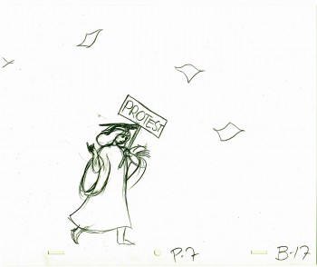
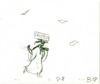
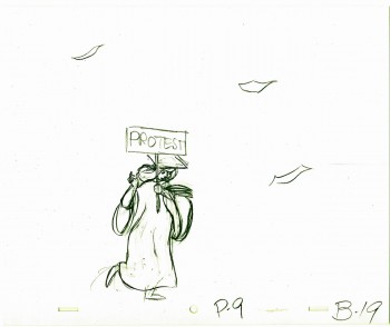
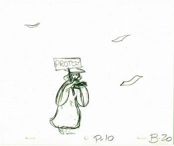
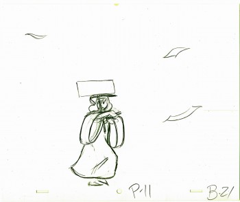
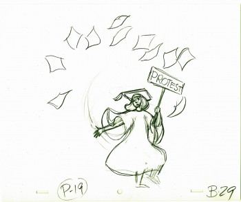
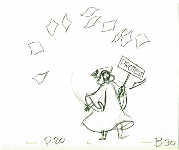
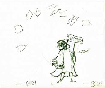
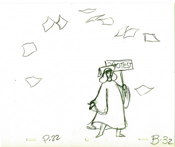
There were no X-sheets to offer timings, so I had to
guess at the timings that might have been used.
