Monthly ArchiveSeptember 2012
Disney 30 Sep 2012 10:48 pm
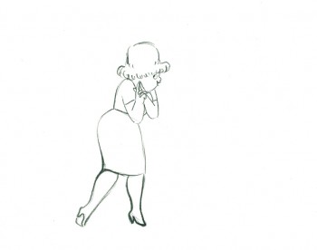
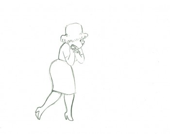
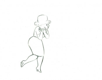
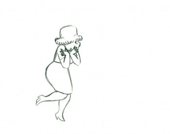
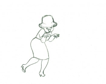
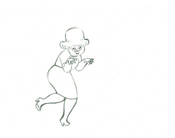
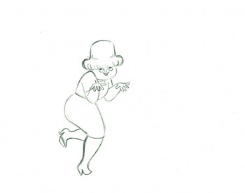
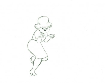
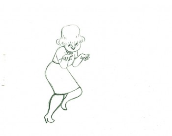
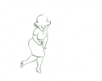
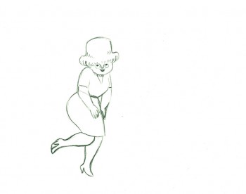
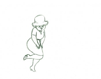
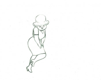
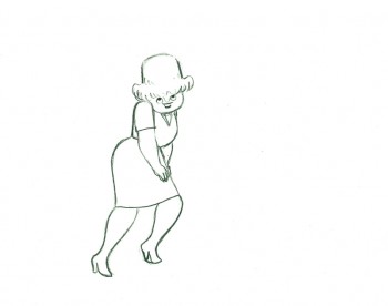
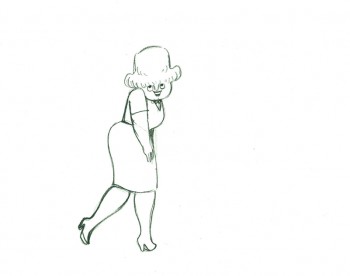
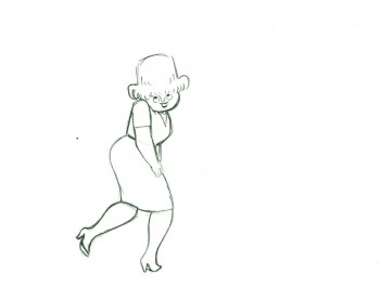
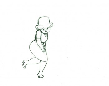
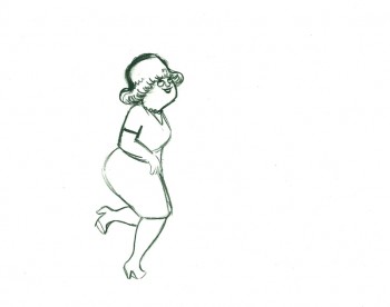
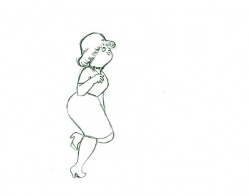
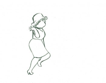
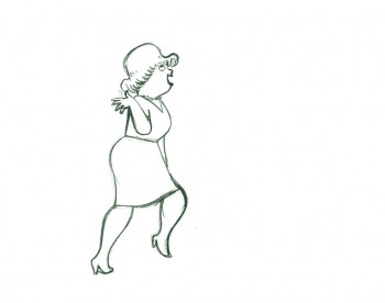
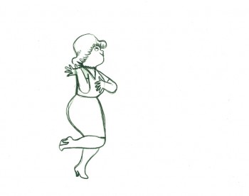
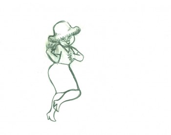
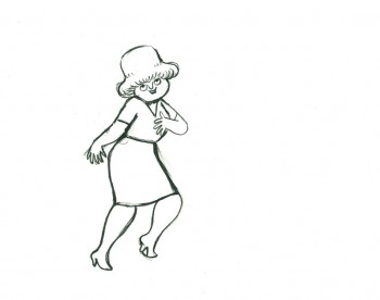
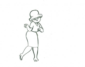
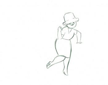
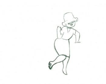
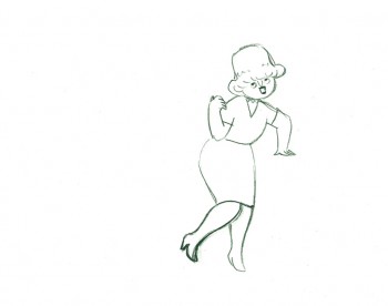
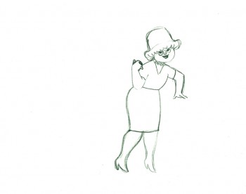
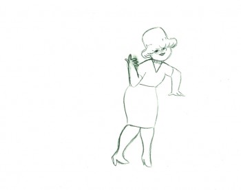
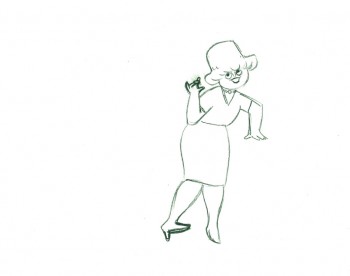
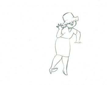
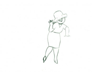
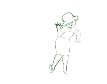
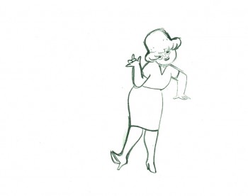
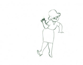
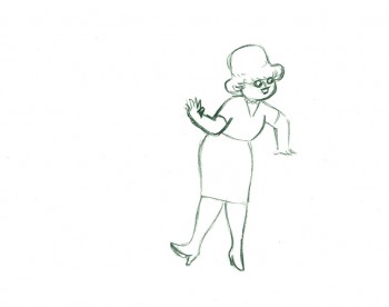
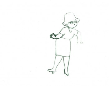
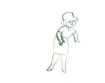
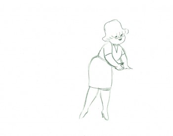
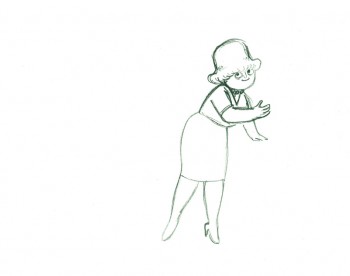
Jeanette Thomas
John Canemaker sent me some information, worth getting out there
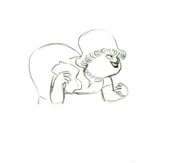
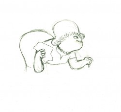
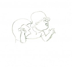
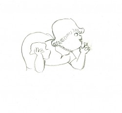
- Jeanette Thomas, the wife of Frank Thomas, passed away in California on Saturday evening, September 29. The couple were married for 58 years and the parents of four children. Mrs. Thomas, the former Jeanette Armentrout of Greeley, Colorado, appears in two films directed by her son Theodore Thomas, Frank and Ollie (1995) and Walt & El Grupo (2008).
Excerpted from Walt Disney’s Nine Old Men and the Art of Animation (Disney Editions, 2001):
- Just before the war, at a party thrown by his brother Larry on the Stanford campus, [Frank] Thomas met a young woman named Jeanette Armentrout. Tall and elegant, with beautiful, intelligent blue eyes, Ms. Armentrout was visiting from Greeley, Colorado, taking summer classes at Stanford. She and Frank later went on a picnic, but, said Jeanette recently, “before I could get very interested, school was out for the summer and I returned to Colorado.†She held a teaching certificate and began teaching at Colorado State. Strong and independent, Jeanette was always grateful for the “experience in earning my own living.â€
In 1945, after the war, she took a job teaching in a high school in Redwood City, California, near Palo Alto. “She started writing to me at that point,†said Thomas, who was smitten after their initial meeting and had “written letters to her all along.†Now that Ms. Armentrout was suddenly “in the back yard†(that is, in California) their letters became mutually more specific. “It took me three and a half years, and a war, and teaching, to realize that he was pretty special,†said Jeanette.
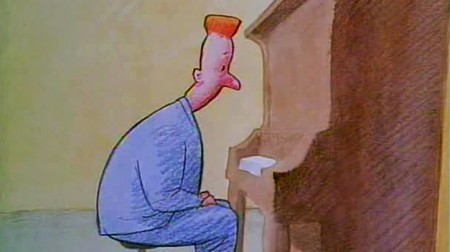
She invited him to visit her in Redwood City; he sent her a musical piece he wrote titled “Concerto by Me.†When he played it for friends, they said it sounded like a proposal. “I said it’s okay with me if she takes it like that,†said Thomas. “Oooooh!’†said the friends. “Good things happened pretty fast after that,†he recalled. On a three-day pass, master sergeant Thomas stretched the fifty-mile limit allowed soldiers to 200 miles to see Jeanette. “So we proposed to each other and decided what we were going to do.†Thomas was discharged from the service on January 23, 1946 and the couple were married in Colorado on February 16.
. . . Jeanette Thomas recognized how “terrifically stimulating and restoring†the [Firehouse Five Plus Two] band was for her husband. “He loves an audience,†she said. “He’s a ham, that’s why he’s a good animator.†She saw his professional piano playing as “an ego booster†that gave him a release from “the frustration that he had to keep bottled up during the week.†He did not bring home the stresses of the studio; at dinner each evening with his family, his constant sense of humor came to the fore putting a funny spin on the day’s events. In general, according to his wife, Thomas is “one of the least mercurial artists that I’ve ever known.â€
Photos &Steve Fisher 30 Sep 2012 06:16 am
Lower Manhattan
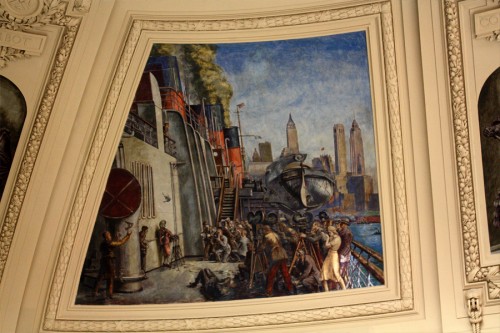
- I rather enjoyed the pictures of the Wall Street area that were posted two weeks ago. Steve Fisher has sent me some more of them, and I can’t resist. I post them here with the courtesy of Steve who snapped them.
 1
1Bowling Green
 10
10
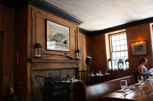
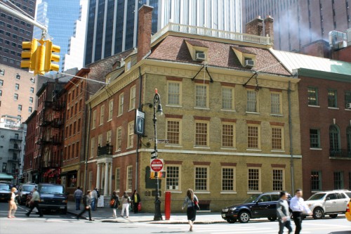
Fraunces Tavern – America’s oldest operating restaurant.
George used to eat here.
.
Generally, every week Steve also sends me about a dozen photos of birds.
I usually have no interest in these so you can imagine all the pictures you haven’t seen.
However, there were two pics he sent me this week that just took my breath so I have to post them and a couple of others that belong together.
.

Bluejays
Books &Daily post 29 Sep 2012 06:55 am
Egos, Books, and Michel Ocelot
There’s been a relatively short conversation going on at the comment section of my blog for an older piece I’d repeated this past week. The discussion has been about Eyvind Earle. The first few visitors who commented all wanted to express their dislike of this film (particularly the story) and Eyvind Earle’s design work, in particular. “Scott’s” dislike of Mr. Earle’s work extends to his personal attitude while working on the film. He, according to “Scott”, was thick headed and wouldn’t listen to any requested changes to his designs, allowing his ego to take charge of the work. (I’m not sure that I see that on the screen, nor did I really feel that when I met the man when I got to spend an afternoon with him as I accompanied Mike Barrier on an interview. I admit it is possible though.)
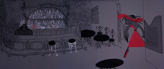
In fact, I think the ego is essential in breaking new waves and advancing the art form. Adam Abraham in his book When Magoo Flew writes about the ego of John Hubley in running his productions at UPA. If he wanted a specific blue, that’s all that he would settle for. The report is that he was oppressively insistent on it being his way only. I worked for Hubley for years and never got to see that side of the man. Oh, there was a well deserved and big ego there, but it never got in the way of the art being created.
Rooty Toot Toot
We’ve seen Bill Peet complain about Bill Tytla‘s use of his (Peet’s) drawings while working on Dumbo. According to what I’ve read, Peet complains that Tytla took full credit for the sequence of baby Dumbo running in and around his mother’s legs, when Peet felt it was his scene, his key drawings that made the scene the perfect piece that it was.
Chuck Jones, while working briefly for Disney (on Sleeping Beauty), told Walt that he had to leave the studio. When Disney asked what job Jones really wanted at the studio, Jones said, “Yours.” He felt that only Disney’s job was suitable for him. Talk about ego. The ego was even larger than that when you realize that it was Jones, hmself, that told me that story – however real it actuall was. The egos of Jones and Clampett and even Freleng vie over who created what character.
Egos are necessary in an industry of craftspeople and artisans, especially when an artist is trying to get something brilliant out of them. Thomas, Johnston, and even Kahl were brilliant actors with amazing abilities of draftsmanship. But the film, the bigger picture, needed a direction which Earle gave it. Just look at the wretched Reitherman films to see what Thomas, Johnston and Kahl turned out without the strong, smart director who was also an artist. Tytla took animation to another level, he was truly an artist, himself, but look at the miserable little films he directed when he left Disney’s studio. Even the support system of that studio wouldn’t have helped Leprechauns Gold or Snap Happy. (Mind you, I love Snap Happy, but it has no relation to art.)
Here’s a small piece David Parfitt wrote:
- Tytla was a tough guy who used abusive language and irritated his fellow animators. Ken Anderson (Disney Legend for Animation and Imagineering) went to Walt Disney to express frustration at the way Tytla treated his coworkers. Walt Disney replied, “What do you think of Chernabog, the God of evil, in ‘Fantasia’? What do you think of Stromboli in ‘Pinocchio’?†Anderson (the art director for both films) replied, “They are some of the most powerful and vicious villains we’ve ever done.†Walt Disney looked at Anderson and said, “Where do you think all that anger comes from?†Vladimir Tytla was a maverick who needed to release anger and energy to manifest some of the most powerful imagery ever produced by the Disney Studios. A maverick is difficult for a company to grapple with because of their abrasiveness and the way they go against the way things typically run. Yet out of the agitation and irritation often comes a new direction that could secure a company’s future.
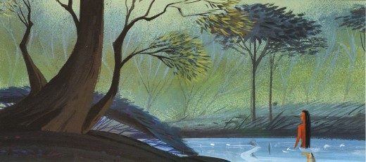
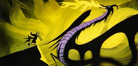
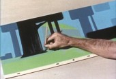
Sleeping Beauty changed the Disney studio forever. The animators and artists there, with the exception of Ward Kimball and a few others, fought against the use of 20th century graphics in their films, yet UPA’s influence slowly crept into the mix. Finally when Walt Disney, himself, chose Eyvind Earle and put full support behind him to design this film as he saw fit. The animators all fought Earle and continued to bad mouth him to the end of their days. Yet Earle’s style, as well as Tom Oreb‘s great character designs for that film, are frequently copied by the new generations of artists. The backgrounds and some of the character design are stolen directly from Sleeping Beauty. Even though the SB art is a play on 15th Century manuscripts and art, it was used for the Pocahontas forests.
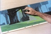
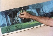
Painting Sleeping Beauty
Nothing at Disney, with the possible exception of Bedknobs and Broomsticks went back to the past to illustrate their films henceforth. Until, of course, today’s new artists in animation who just steal from other past films. Bluth‘s Small One or is virtually without style. Tim Burton is possibly the only exception I can see of this current view of the state of animation. The regurgitated past of other artists who deservedly had egos aglow. We go on. Perhaps someone like Genndy Tartakovsky will bring some of the panasche he brought to Samurai Jack.
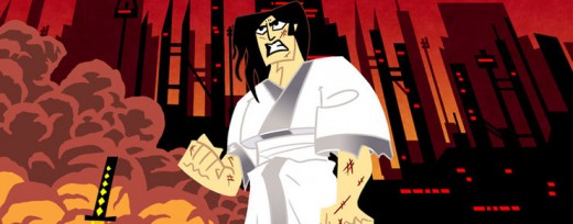
Samurai Jack
By the way, there’s a good interview with Tartakovsky on this week’s on-line version of the Village Voice.
Books
.
- There are a couple of books I’d like to write about.
.
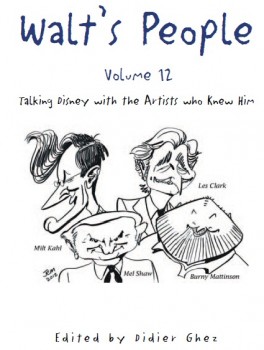
- Let me mention Didier Ghez‘ latest volume of his interview series, Walt’s People.
Just released is Walt’s People – Vol. 12. Just the idea of 12 volumes of any book in print, is quite extraordinary, and amazing feat for Didier Ghez to pull off.
I own about a half dozen of this series and have read all of them at least twice. Most of the interviews are exceptional, some are smart, and the rest are just very good. In all there are those interviews that give us some real insight into the process and history of the making of animated films by the professionals who did it. Les Clark, Larry Clemmons, Charlie Downs, Al Eugster, Sammy Fain, Milt Kahl, Burny Mattinson, Paul Murry, and Mel Shaw are among the many who are interviewed in depth for this new volume. Some of our greatest historians (Robin Allan, Michael Barrier, Albert Becattini, John Canemaker, John Culhane, Pete Docter, Chris Finch, J.B. Kaufman, Jim Korkis, Dave Smith, and Charles Solomon among others) conduct the interviews.
It’s just another great volume in the series. You should own them all; I should own them all, to be honest, and I will.
Ganesha’s Sweet Tooth
- As previously reviewed on this blog, Sanjay Patel will see his first children’s book, Ganesha’s Sweet Tooth released this week by Chronicle Books. I have a sore spot for Mr. Patel’s work. He’s an artist who works by day at Pixar and is an artist, with his own very defined style, working extensively after hours.
I’ve reviewed many of his books and have a real fondness for The Ramayana. Were I you, looking to explore this artist’s work, I’d buy Ganesha’s Sweet Tooth. Once you have it and want more – you will – go for The Ramayana. It’s a brilliant masterwork.
Snow White x 2
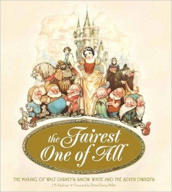
- Unless you’ve been hiding under a rock, if you’re an animation fan, you know that the brilliant historian, J.B. Kaufman, has not one but TWO books on Snow White about to appear on the market.
The Fairest One of All: The Making of Walt Disney’s Snow White and the Seven Dwarfs and
Snow White and the Seven Dwarfs: The Art and Creation of Walt Disney’s Classic Animated Film
are the two titles by Kaufman that focus in great depth on that film and its development. This is to celebrate the 75th anniversary of the feature, and will coincide with a display that will appear soon at the Walt Disney Family Museum in San Francisco.
Both books come from the Walt Disney Family Foundation in conjunction with the Walt Disney Family Museum. I’ve seen the Art of Creation book, and was completely taken with it. I will most definitely own both books. The film means much to me, and I want to own anything Kaufman writes. It’s a no-brainer – double my pleasure.
By the way, part of the reason I’m looking forward to reading these two books is to compare it with Michael Barrier‘s amazing writing on this period at Disney’s studio. In Hollywood Cartoons, there’s a large part of the book dedicated to the development andcreation of this particular film. Then in The Animated Man: A Life of Walt Disney Barrier tells the same information but from a different perspective entirely. This biography of Disney is wholly involved with Walt Disney, the man and artist. It’s a unique turn that we only see in the poorly written Diane Disney Miller book, The Story of Walt Disney. As Walt’s young daughter she could see the story no other way than from his perspective. While waiting for the Kaufman books to come out, read either of Barrier’s books for the best, to date, version of the Snow White story. It’s strong writing.
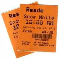 It’s appropriate that I was invited to a 10am screening of Snow White at Lincoln Center this morning. It’s part of the NY Film Festival’s 50th anniversary celebration. Eric Goldberg introduced the film with a brief and smart little talk about the animation. Talking about The Old Mill as a test run for the Multiplane Camera, talking about the Three Little Pigs first offering characters that looked alike but had characterization defined by their animation (as did the dwarfs), talking about The Goddess of Spring being an enormous failure for Ham Luske who succeeded animating Snow White. It was nice to say hello to Eric prior to the film. We haven’t seen each other in about five years. It was nice also to see the film projected. I saw the movie on tv/dvd only a couple of weeks ago, but it’s a very different experience on the big screen. The digital transfer was glorious, merciless and disastrous. The ink lines were so sharp that you could actually feel how deeply the crow quills cut into the cels. However there were many points where individual frames had slight digital distortion to hurt the ink lines, and the magic mirror actually had the detritus of digital compression across the center of the mirror. Someone should have been there to supervise the transfer.
Paperman played prior to Snow White. It was animated cgi, then flattened and lines were added atop the flattened drawings. I can’t for the life of me understand why it wasn’t just animated by hand. It would have cut the cost in half and had more life to it. Sorry, I don’t think it worth the Oscar. Though you never know it may be the best film, this year.
Tales of the Night
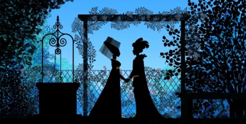
- Michel Ocelot has received another excellent review from the NYTimes. Tales of the Nightis reviewed by Andy Webster in the Times, and is Ocelot’s latest feature length animated film – his first in 3D – and the reviews are sensational. It’s screening as part of the Children’s International Film Festival and plays at New York’s IFC Theater through next Tuesday. This is a silhouette film in brilliant color.
His films are beautiful and deserve to be seen in a theater. I’d heartily recommend getting to the theater if you have the chance. Hopefully the distributor will submit this one for Oscar consideration. Though the look is 2D, the graphics are done via cgi as was the case with his past films, including Azur & Asmar, Kirikou et les betes sauvages, Princes and Princesses, and Kirikou and the Sorceress.
Some amazing animation is coming out of France these days.
More Reviews
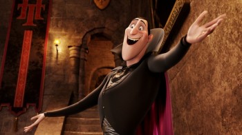 Now to the bigger release for the smaller film department:
Adam Sandler‘s second animated feature, Hotel Transylvania, opened to mostly poor reviews by 2nd string reviewers.
NYTimes sent Neil Genzlinger to give his negative review. The most positive line is: “The movie loses its originality as it rolls toward its predictable conclusion, but it’s still lovely to look at.”
Someone named Sara Stewart reviews the film for the NYPost and gives it a middling 2½ stars. “Director Genndy Tartakovsky (“The Powerpuff Girls,†“Samurai Jackâ€) is a natural fit for this kid-and-parent-friendly flick. The animator’s wit and attention to detail enliven a collection of well-known ghosts and ghouls. (Though Tartakovsky’s more traditional TV-cartoon style is still superior, as evidenced by his playful closing credits.)”
Joe Neumaier, the 2nd rate first stringer of the NYDaily news gave it a mostly positive 3 star review. “This being a Sandler movie, the humor skews toward the infantile (fart jokes, peeing baby werewolves). But the sleek visuals are rich and glossy, placing the characters, who look like Halloween door decorations, in baroque hallways or secret passageways.”
I enjoy the reviews in The Onion, and their review for this film by Tasha Robinson doesn’t disappoint. A C+: “Tartakovsky gets a long way on wild design and visually daring sequences. His work has always been adventurous, experimental, and conceptually creative, and he hasn’t lost any of his energy or capacity for staging a memorable setpiece.”
Whatever happened to the feature length version of Samurai Jack that J.J. Abrams was going to produce wth Tartakovsky directing?
Bill Peckmann &Story & Storyboards 28 Sep 2012 05:54 am
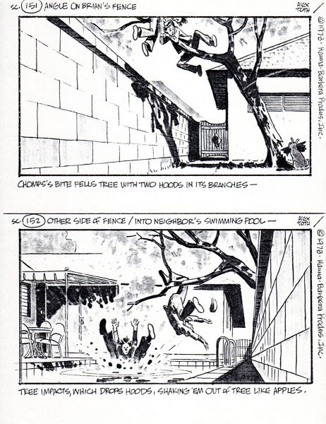
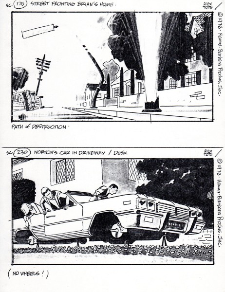
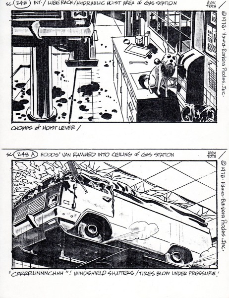
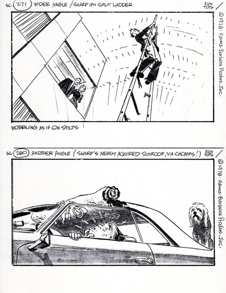
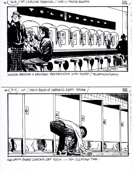
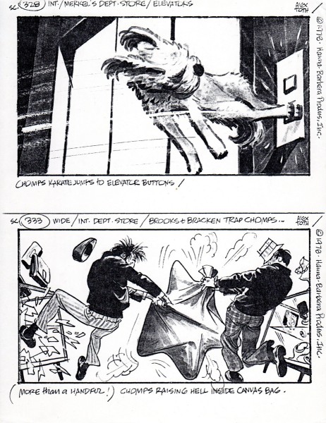
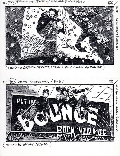
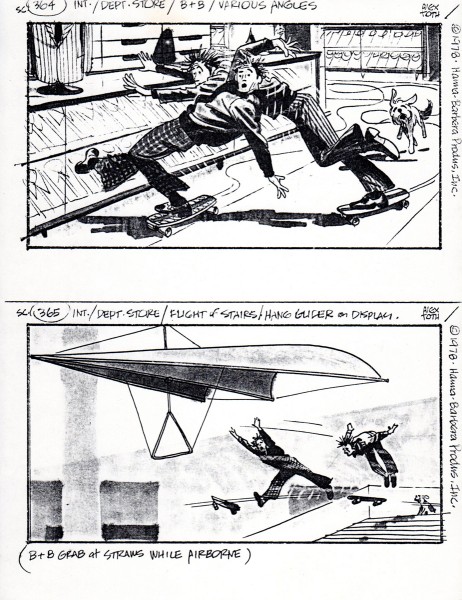
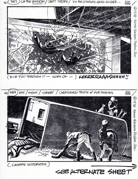
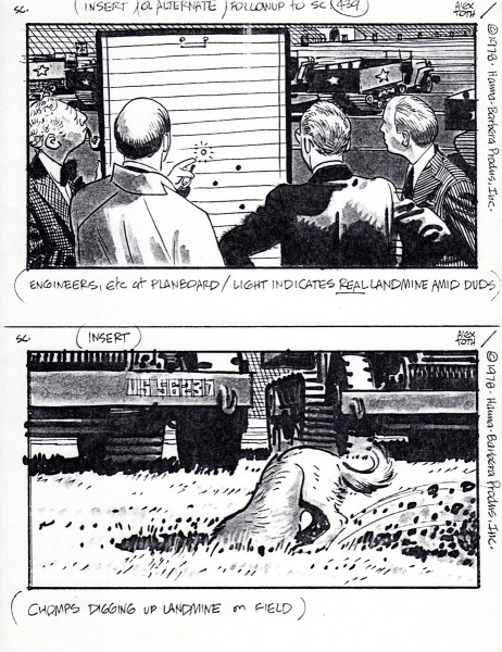
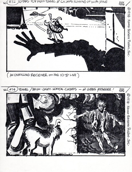
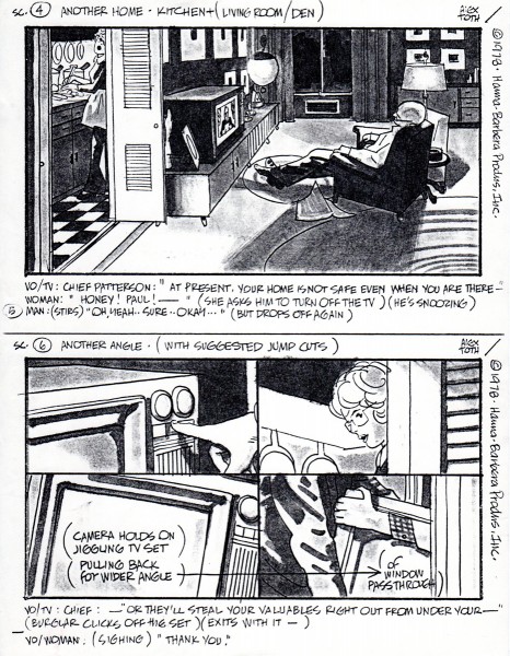
Toth H&B storyboard
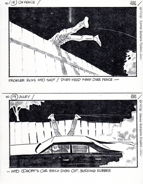
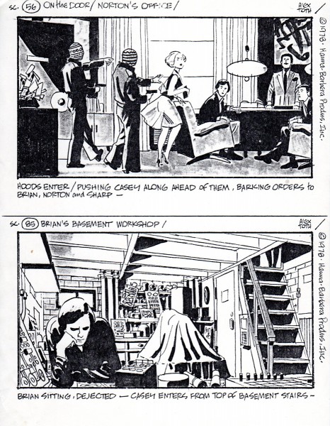
Alex Toth worked at Hanna Barbera in their story department. Bill Peckmann told me he had some boards from Toth’s stay there, and I asked him to send them on. The board presented here is far from complete. It’s missing many pages and whole segments. But the images, as might be expected are terrific. So look for the drawing and forget the storytelling.
Here are some comments from Bill:
- I’ve come across some Toth storyboards (copies) from his Hanna-Barbera days. One incomplete set is really neat. This is a live action board that Alex did for Hanna-Barbera in 1978. Unfortunately all we have are these Xeroxed 28 random panels from the original board. (I wonder if that still exists anywhere?) At least it gives us a rare peek at how Alex handled a live action film assignment instead of his H-B Saturday morning cartoon fare. With this sparse sampling of pages, the continuity will not make much sense but the individual panels are a pleasure to look at.
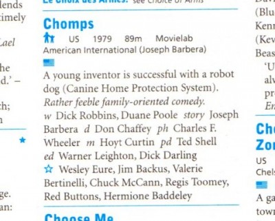
The title of movie that Alex did this live action storyboard for, it’s a 1979 film called “C.H.O.M.P.S.”
Here is it’s listing in HALLIWELL’S FILM GUIDE.
.
And here is the board:
 1
1
Action Analysis &Animation &Animation Artifacts &Tissa David 27 Sep 2012 06:57 am
Tissa’s Class
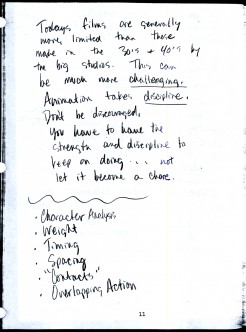
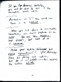
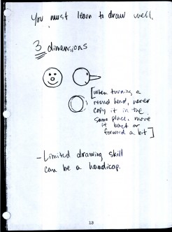
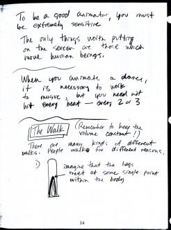
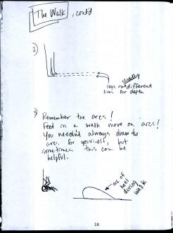
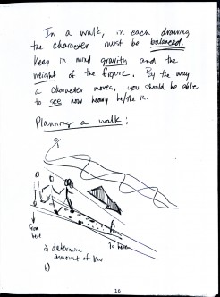
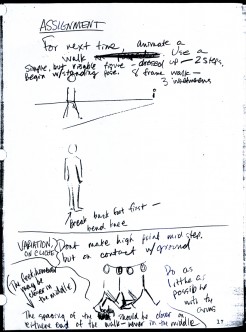
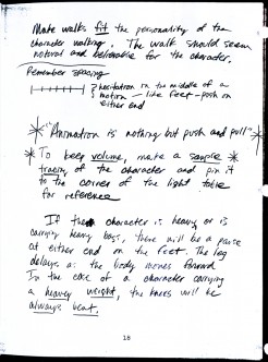
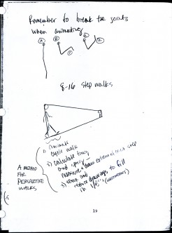
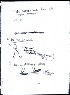
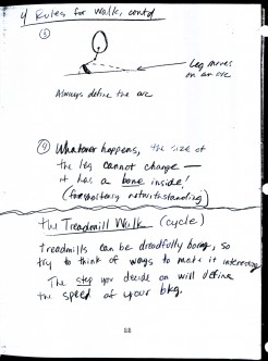
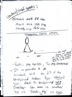
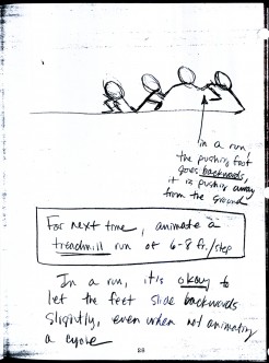
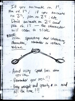
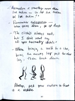
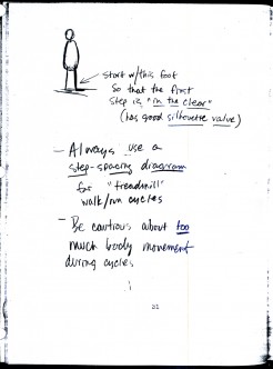
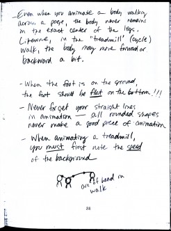
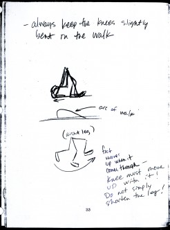
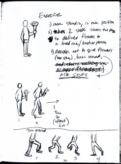
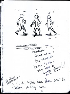
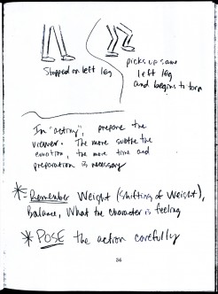
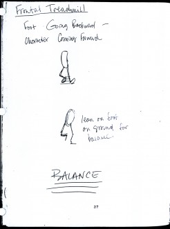
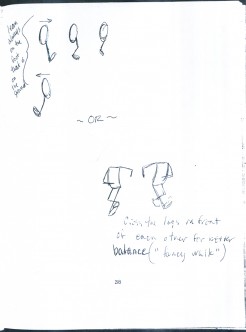
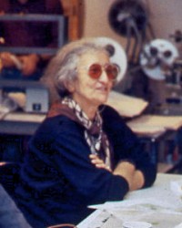 – There was a time in New York when Tissa David taught a class in animation for free, open to anyone who wanted to attend. This was sponsored by R.O. Blechman out of his studio, the Ink Tank. It was held after hours, so that those who worked in the business could attend.
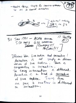
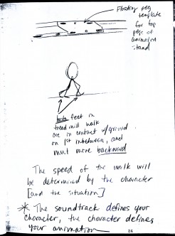
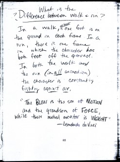
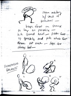
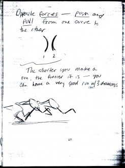
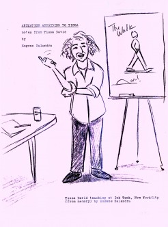
There were several sets of notes I’ve seen taken from Tissa’s talks, kind of a poor man’s version of Dick Williams‘ famous Art Babbit notes. A copy of Dick’s notes circulated within the business and quite a few people studied from them. Recently, John Canemaker loaned me a copy of Eugene Salandra‘s notes from Tissa’s class. Eugene had graduated from John’s class at NYU and had become a professional in New York, before he moved to California to work for Disney. As a professional, he was able to cut to the quick to synthesize Tissa’s basic lessons. I was impressed, and I contacted Eugene to see if he minded my posting some of the pages. He was supportive of the idea and hoped that he would help get the information out to others.
So, here I’m posting the first batch of these notes, which I think are very readable. (You’ll have to click on any of the images to enlarge so that you can read them.) If the reaction is good, I’ll offer more. This group is predominantly about walk and run cycles. But if you look close enough, you’ll see that they cover a lot more.
 1
1 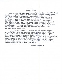 2
2
Animation &Animation Artifacts &commercial animation &Layout & Design 26 Sep 2012 05:15 am
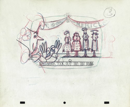
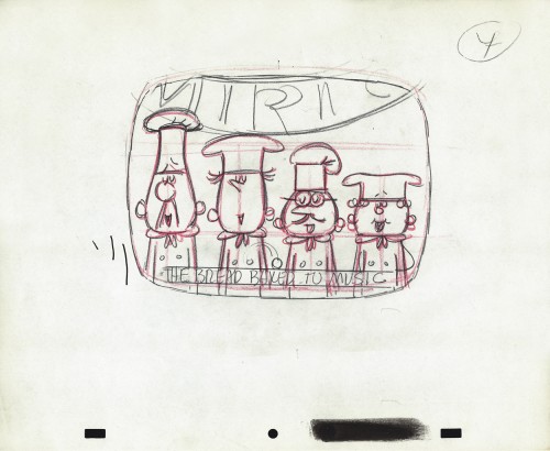
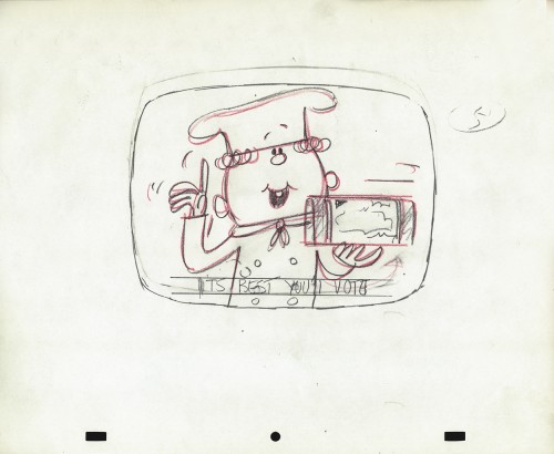
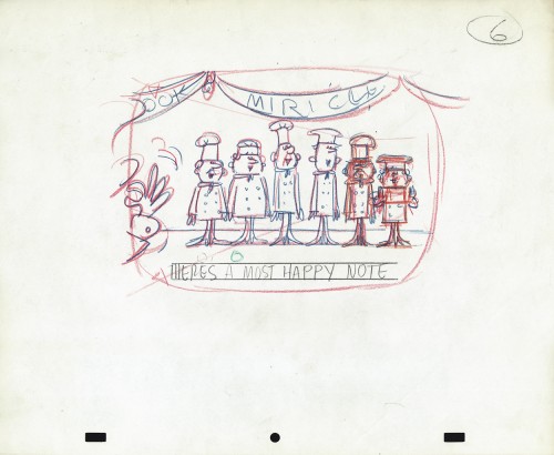
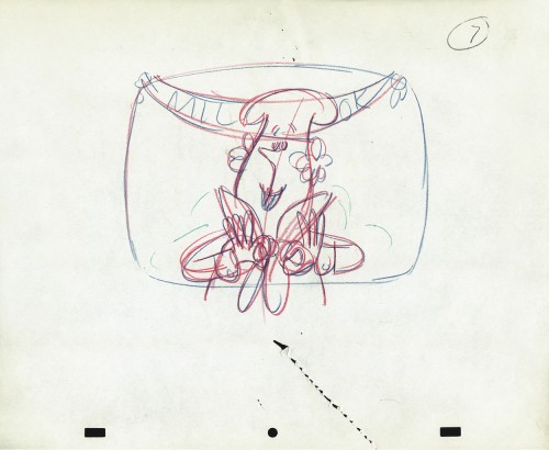
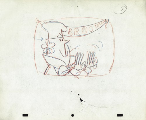
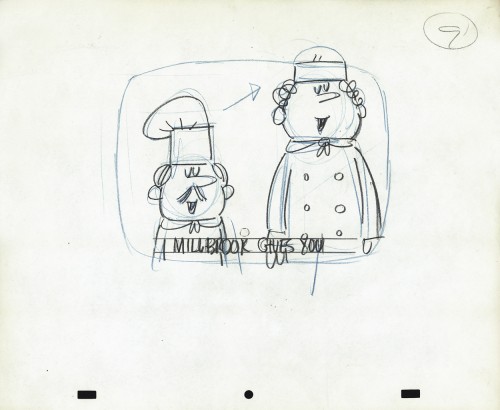
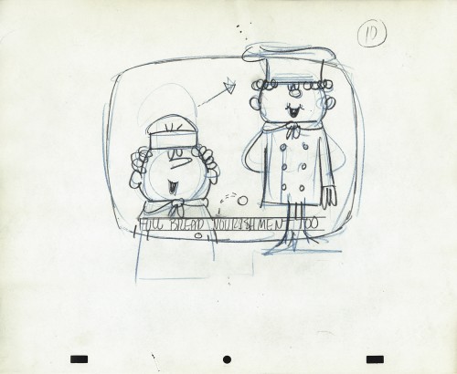
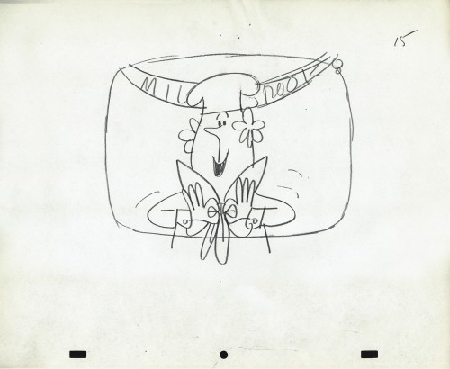
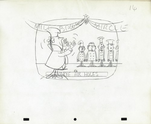
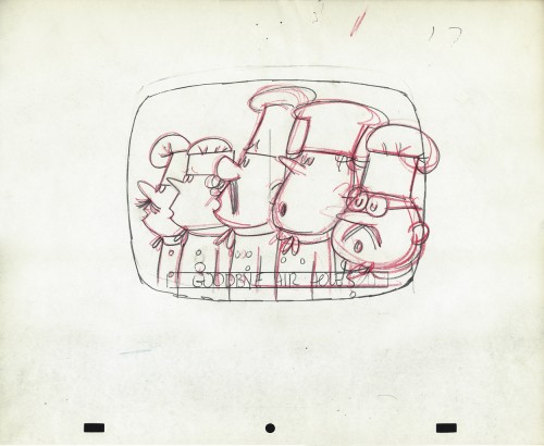
Vince Cafarelli’s Millbrook Bread – 2
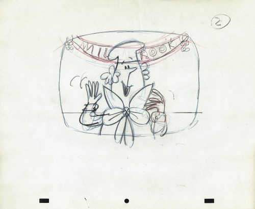
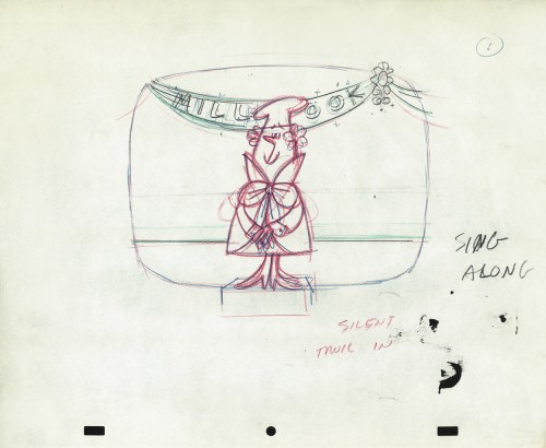
- Last week we saw the first of these two spots Vince Cafarelli did while working for Goulding-Elliot-Graham Prods., Inc. Millbrook Bread was the client and the Piels Bros. voices, Bob Elliott & Ray Goulding, owned the studio with Ed Graham. They also did the voices for these bread spots. This particular one must have been pretty big; the video survived these many years later, and I’ve attached it to the end of this post.
But first, here are the Layout drawings which I believe were done by Vinnie Cafarelli.
 1
1
commercial animation &Disney &Illustration &Independent Animation 25 Sep 2012 05:29 am
Eyvind Earle – recap
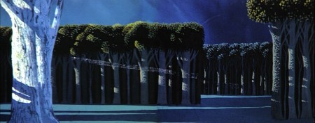
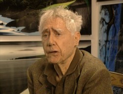 – Let’s talk a little about Eyvind Earle. This is the artist who rose to fame when he was selected by Walt Disney to set the style for the long-in-production feature, Sleeping Beauty. The animators disliked his art direction and openly protested it. Walt remained true in his stance and supported Earle to the end; though it could be said that Walt was more involved in Disneyland’s construction and gave too little attention to the in-fighting at the animation studio.
I remember Frank Thomas, specifically, stating that he had done everything possible to supercede Earle’s style after he, Thomas, had animated the Merryweather scene as she creates Aurora’s dress and cake in honor of her birthday. He felt that the black bodice that Earle had designed took all the lightness out of his character’s delicate dance.
(Click on any image to enlarge.)_________________________________
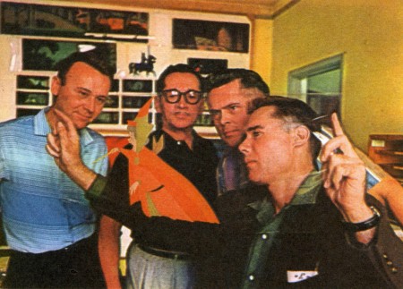
L to R: Al Dempster, Dick Anthony, Ralph Hulett and Eyvind Earle
Thomas publicly attacked Earle at the Lincoln Center celebration of Disney animation back in 1973. I’d already read something similar, and heard it privately. None of the others on stage at Lincoln Center – Woolie Reitherman, Ken Anderson or Ollie Johnston – countered in support of Earle.
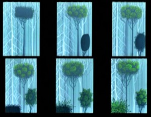 Sleeping Beauty was such a drastic change in look from the other Disney features, that I think it took deep hold in the minds of a lot of Baby Boomers growing up around this feature. Earle became a strong target of interest, and I think his reputation has grown annually.
I have to admit it was odd seeing the backgrounds of Pocohontas trying to emulate Earle’s Sleeping Beauty style, but in some ways it seemed fitting. The studio had been ripping off the films of the past for so long that it was only appropriate that they’d focus on someone who was such a dynamic force.
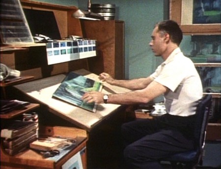
For a short period after he was released by Disney, in the post-Sleeping Beauty layoffs, he worked with John Sutherland Productions where he designed the short, Rhapsody of Steel. Then he formed his own studio, Eyvind Earle Productions, Inc. He did an animated trailer for the film, West Side Story, under the supervision of Saul Bass. He did an animated title for the Kraft Suspense Theater, and he did a Christmas Special for Tennessee Ernie Ford.
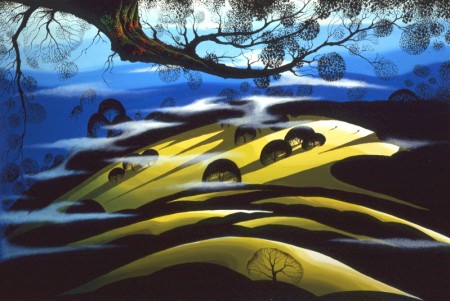
Ultimately, Earle made a success of his own art after leaving animation. He’s been represented by a number of very large galleries and has sold a lot of popular art in a style all his own. Here are a couple of examples found on line:

I’m not always a big fan of the color schemes in his graphics, though he always makes them work, but I have to give credit to Earle for his originality and the dynamic approach in his art.
His autobiography, Horizon Bound on a Bicycle, is a must for all real fans.
This is his animation resume:
- 1951 Started with the Walt Disney Studios as background painter on: FOR WHOM THE
__ BULLS TOIL, MELODY, and the Academy Award winner for “Best Short of the Year”
__TOOT, WHISTLE, PLUNK and BOOM which also received a Cannes Film Festival Award.
__Production Designer, Color Stylist and Background Painter for the DIsney animated __classic SLEEPING BEAUTY, as well as, PIGS IS PIGS, GRAND CANYONSCOPE,
__PAUL BUNYAN, LADY AND THE TRAMP, LONDON BRIDGE, and WORKING FOR PEANUTS.
__He designed 5 murals for Disneyland.
1958 Joined John Sutherland Motion Picture Company in Los Angeles.
1960-1966 Created 24 sheet poster for Hamm’s Beer.
__Started motion picture animation company, Eyvind Earle Productions, Inc.
__Created animated commercials for Chevrolet Motors, Chrysler Corporation, Marlboro
__igarettes, Motorola Television and the Kellogg Cereal Company.
__Created animated trailer for WEST SIDE STORY for United Artists.
1961 Created animated television special THE STORY OF CHRISTMAS starring
__Tennessee Ernie Ford and the Roger Wagner Choral.
1962 Created animated television special THE EASTER SPECIAL.
__Created title for the KRAFT SUSPENSE THEATER.
__Created the logo trademark trailer for Universal Pictures.
__Produced and created the theatrical short DEATH AND SUNRISE
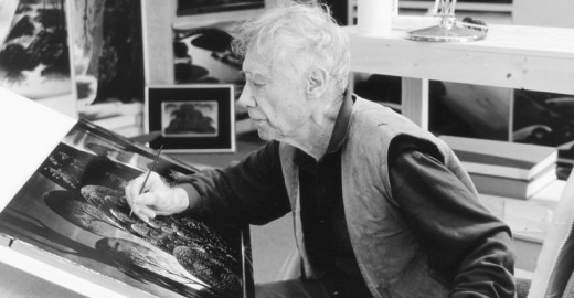
You’ll find a lot of merchandise including all the books listed here, on the Eyvind Earle website.
Action Analysis &Animation &Animation Artifacts &Hubley &Independent Animation &Tissa David 24 Sep 2012 05:41 am
Viva à la Tissa
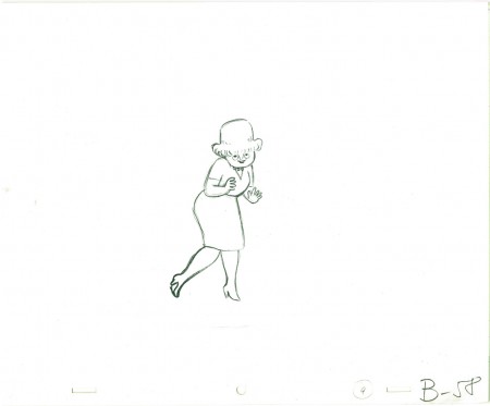
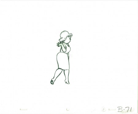
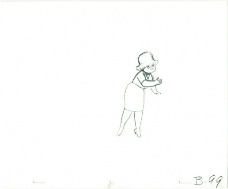
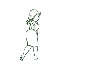
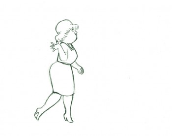
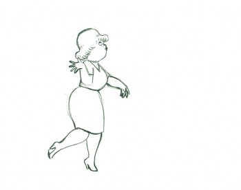
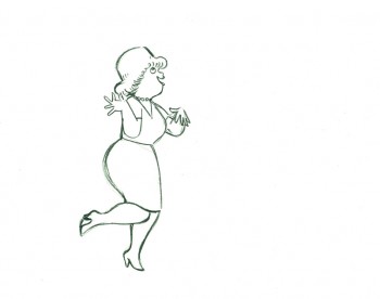
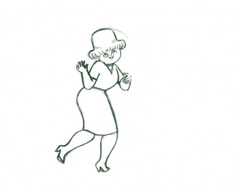
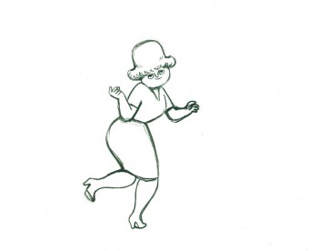
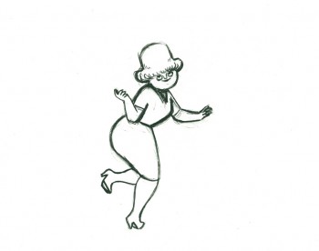
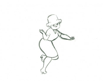
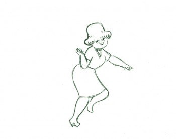
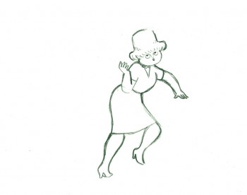
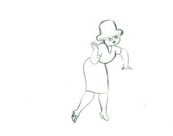
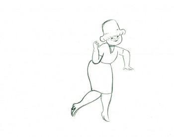
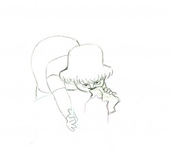
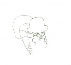
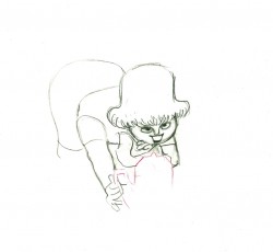
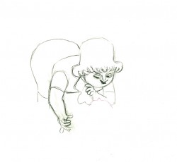
- Tissa David animated a VIVA paper towel spot for John Hubley. Here’s a scene wherein the lead, a woman, walks through (Bg pans behind her at .25 per drawing) toward the kitchen, where she stops.
Instead of giving you the entire page of animation paper, I’ve trimmed it down to just include the character and her walk. Here are four examples of what the entire drawing looks like, untrimmed.
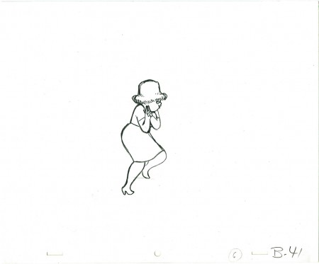 B41
B41
And here are all the drawings for the scene cropped:
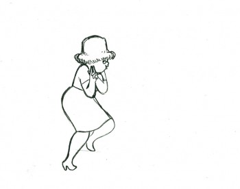 41
41
________________________
.
The following is a QT of the entire scene with all the drawings included.
Since I didn’t have exposure sheets, I put everything on two’s straight ahead.
- Here’s what looks like a simple move done by Tissa David when she animated this Viva, paper towel commercial.
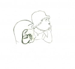
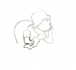
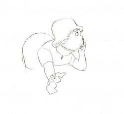
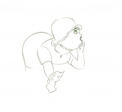
The character’s move in this scene is a complicated one done simply. She has been bent over, cleaning with her paper towel, and she moves up. You can follow the overlapping action as her eyes pull her up, head turn, and body follows.
The stripes will come and go. Tissa depends on someone else to concentrate on this material when she’s working on a commercial.
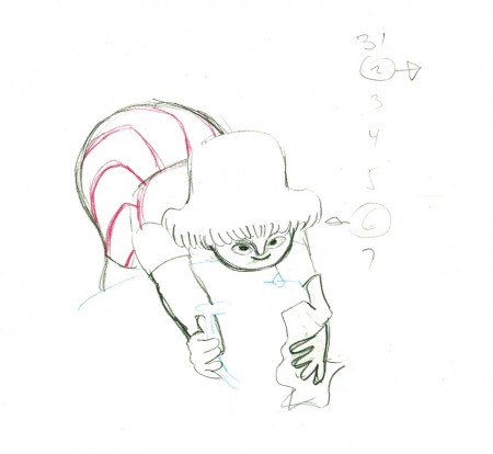 e37
e37(Click any image to enlarge.)
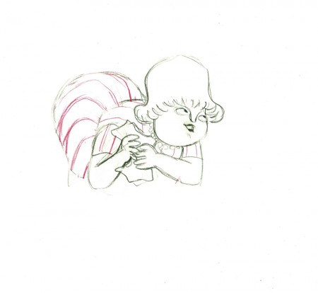 e44
e44
Her eyes point in the direction she wants to go,
and the rest of the scene moves her up and into profile.
This key move is hidden under the exchange of the
paper towel from one hand to the other.
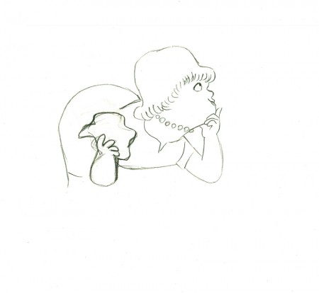 e51
e51
She stops to think (accenting her monologue.)
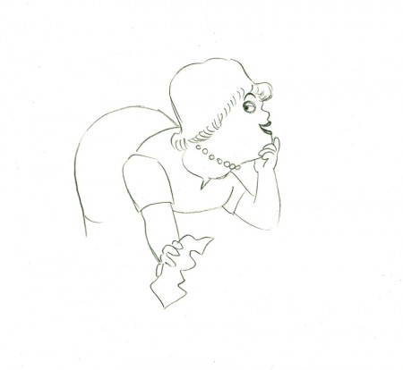 e58
e58
And she slyly looks back to camera to respond with her thought.
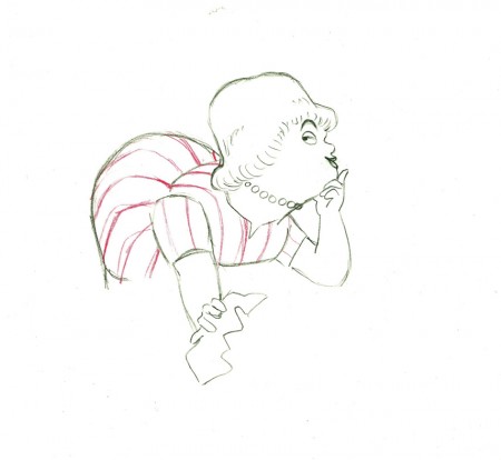 e59
e59
She continues, all through this move, talking.
She’s pitching the product.
Here’s a QT of the piece:
Cleaning for VivaClick left side of the black bar to play.
Right side to watch single frame.
Bill Peckmann &Photos &Steve Fisher 23 Sep 2012 05:26 am
Gaudi Gaudi Gaudi
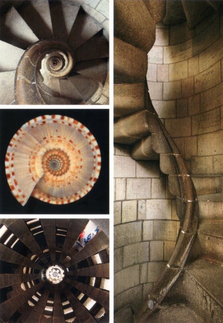
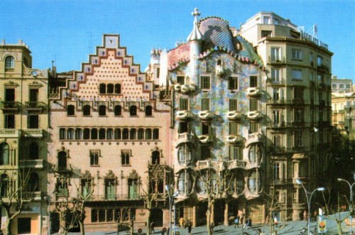
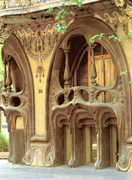
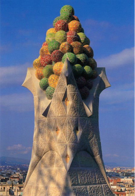
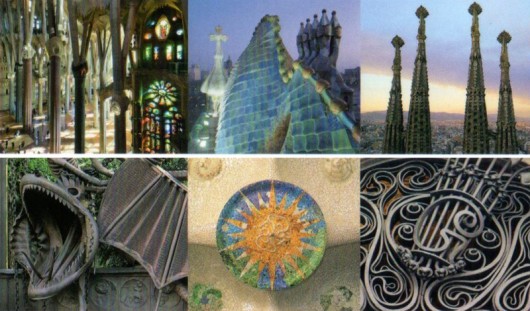
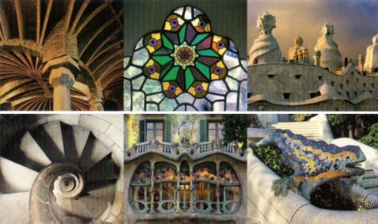
- Yesterday, Bill Peckmann sent me a few scans with this note:
- My stepdaughter Bethany just came back from her trip to Spain and brought back these very pretty gaudy postcards. Gaudy as in the Antoni Gaudi, famous Spanish architect. He would have had fun at Epcot and the Disney parks!
Here are the scans sent:
 1
________________
1
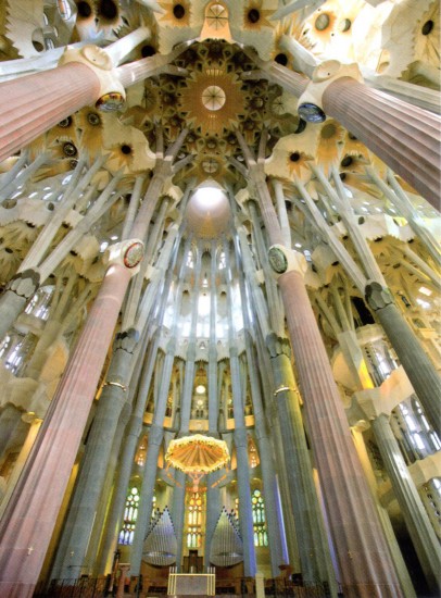
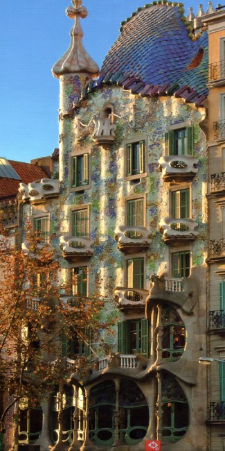
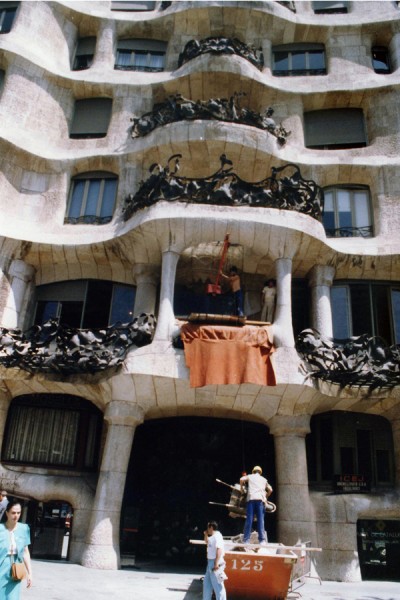
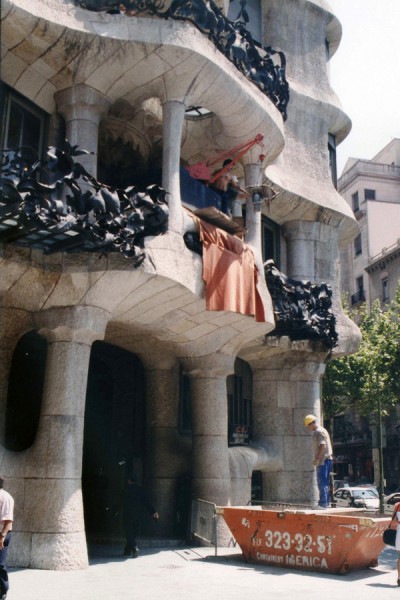
________________These pictures reminded me that my friend, Steve Fisher, who is an architect, went to Spain to photograph the Gaudi buildings. I asked him to send me any pictures he could get together quickly. Of course, he’d shot them before there were digital cameras, so he had to scan the stills he had on hand.
Take a look:
The first three are pictures of Gaudi’s Casa Milá [1905-10]
The next two are of Casa Battlό [1905-07]
The last three photos are of his most iconic work,
the Church of the Sagrada Familia [1903-26].
It was not finished in Gaudi’s lifetime [he died in 1926],
but since his death, others have continued to work on it
based on interpretations of his ideas. They’re still working on it.
Commentary 22 Sep 2012 06:53 am
Criticeria
- It appears that a number of animated features will be opening shortly. There’s a screening in NY this morning of Hotel Transylvania. It’s at the Museum of the Moving Image in Queens. That’s a long enough trip to keep me from going. I’ll see it another time; the ad keeps me uninterested. It opens next friday, Sept 28th.
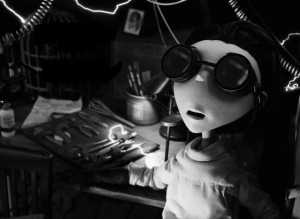 The Academy will screen Tim Burton’s Frankenweenie on October 11th, a week after it opens in theaters. I’ll see it there, in comfortable surroundings.
There’s an article about Tim Burton in today’s NYTimes.
Wreck It Ralph opens November 5th. Can’t wait.
There’s no real incentive for me to see any of these films except that they’ll all be entered into the Oscar race, and to vote I’ll have to see them all. The more I can see now, the fewer I’ll have to see in that crushing two weeks at the end of the year. That’s when all of the entered films have to be viewed. It’ll be something like 16 films in two weeks to absorb. Talk about impaired judgment.
The contenders for animation short will be screened n NY on Saturday, Oct. 27th. That’ll start at 10am and probably go straight through to about 6 or 7pm. Your eyes are melting by the time you get out of there, with maybe one or, at the most, two good films in the bunch.
I still look forward to it all.
My World and Welcome To It
 - Meanwhile, Heidi, my wife, says my world is all about politics and movies. She’s wrong; baseball is high in there as well. This time of the year, particularly an election year like this, I only want to watch talking heads on TV (and The Good Wife and Treme and Boardwalk Empire.)
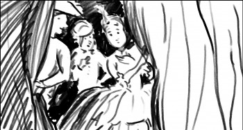
Actually, I don’t think about much of this. I do think about POE and the scenes I’ve been anmating over and over and over. The style is a bit funky and I keep reworking it. I have four scenes done, and I keep expecting more of myself, so I keep redoing them. If I’d been doing it on cel with an animation camera, the first version would have been the final. But using a computer means I can rework the damn thing a hundred times or more. It’s fun though. I want to have the thing down pat before I really get into it. Once the real “Go” is there it means Go.
By the way, the title, My World and Welcome To It, of course, comes from that great series from 1969 which starred William Windom as a James Thurber-like cartoonist whose animated imaginings filled the screen throughout the show. I was in Alaska in the Navy when it aired in the lower 49. I might have been able to see Russia from my house, but the TV didn’t run this series. My sister talked about it in her letters and I did a lot of catching up when I got home.
I was reminded of the show recently when Windom died in early August. I was a fan of his before that series, and I became more of a fan after the series.
Robert Dranko was the animation art director and producer for the series and
Bob Richardson was the animation director.
Ottawa
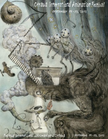
 - The Ottawa International Animation Festival began this past Wednesday. I’ve always felt close to this Fest. Having gone to the first half dozen versions of this event, where I learned so much about International film and the job of selling movies, that it naturally formed a soft spot for me. With sadness and regret, I couldn’t make it up to attend in person. However, I do keep my eyes open to see what’s happening there and what I’m missing. Richard O’Connor, through his site, Ace and Son, has always been a source of information that’s been invaluable to me. This year Richard helped open the first program by presenting a reel of short clips and an articulate eulogy for Tissa David. On his report of the first day of the Fest, he posts a video clip showing his comments during that program. You can check in daily for his comments.
Memorial
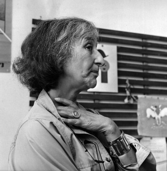
- Meanwhile the NY memorial for Tissa David is coming along nicely. It will definitely take place at 7pm on October 23rd at the MP Academy screening room at the Lighthouse at 111 East 59th Street. The theater is downstairs. It may be crowded and first come first seated.
There will be five speakers and lots of film clips.
I intend to screen at least one or two complete films, but time may nix that plan.
The films to be screened come from four studios:
- . the Hubley studio – EGGS, COCKABOODY, EVERYBODY RIDES THE CAROUSEL and possibly a commercial or three
. the Ink Tank/R.O.Blechman – THE SOLDIER’S TALE, CANDIDE promotional film, a commercial or two
. Raggedy Ann and Andy – “Candy Hearts and Paper Flowers” sequence
. and my studio – THE RED SHOES, THE DANCING FROG and THE MARZIPAN PIG (of course).
There’s also a nice surprise which will start the evening and the program.
It should be excellent.
Let’s Celebrate The Tune
- There was an article about Bill Plympton in last week’s The Onion. No it wasn’t a joke, it was a fine article in the AV Club section of the paper. This is a good article by Tasha Robinson and is worth the read. It basically celebrates the one-man-feature idea of The Tune done in 1997. He was a pioneer, I have to hand it to him. Worth the read.
