Monthly ArchiveMay 2012
Books &Disney &Illustration 31 May 2012 06:14 am
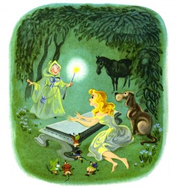
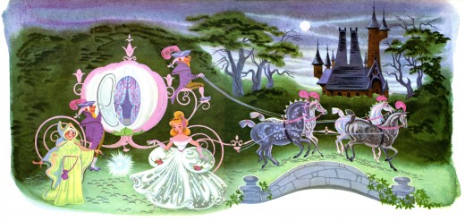
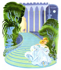
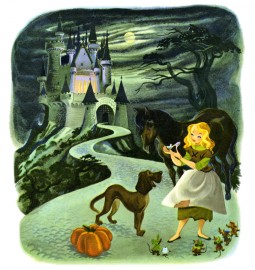
Retta Scott’s Cinderella
– Retta Scott‘s name was always an intriguing one for me.
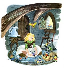
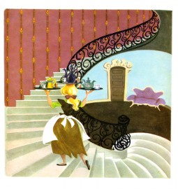
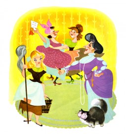
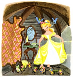
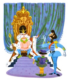
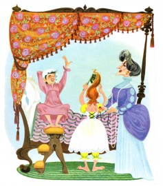
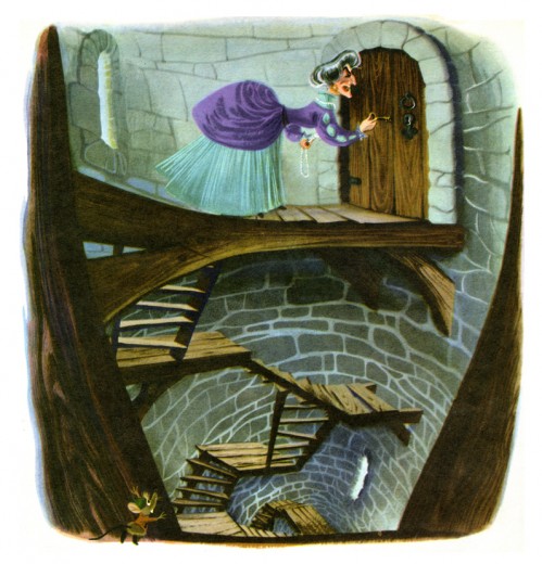
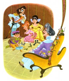
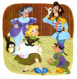
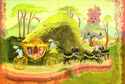
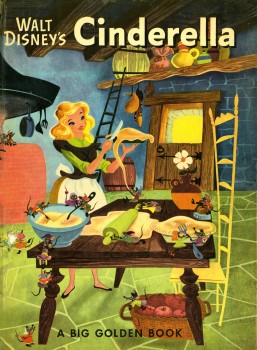
 She was an animator on Bambi, Dumbo and Plague Dogs. She was layed off at Disney’s when they hit a slump in 1941 but came back to do a number of Golden Books for Disney. The most famous of her books was her version of Cinderella, one which was so successful that it remains in print today as a Little Golden Book.
When asked why females weren’t animators at the studio, the Nine Old Men who traveled the circuit, back in the 1970′s, often mentioned her. They usually also said that she was one of the most forceful artists at the studio, but her timing always needed some help (meaning from a man.)
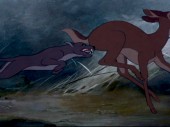
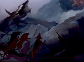
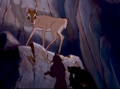
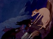
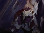
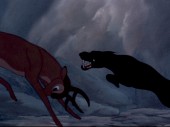
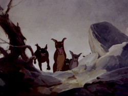
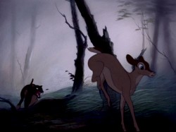 Ms. Scott was known predominantly for her animation in Bambi. Specifically, she’s credited with the sequence where the hunter’s dogs chase Faline to the cliff wall, and Bambi is forced to fight them off.
The scene is beautifully staged and, indeed, is forceful in its violent, yet smooth, movement. I was a young student of animation, at the time, so this sequence has always had a long and lasting impression on me.
.
,
I’m curious to know how Western Publishing proceeded with the illustrated Disney books. Apparently a large number of Disney artists contributed to the books – at least in the 40′s & 50′s. Bill Justice, Dick Kelsey, Mary Blair, et al. Then, of course, there are the Golden Books that didn’t have a Disney connection by Disney artists. The Poky Little Puppy by Gustaf Tenggren is, of course, the most famous of these.
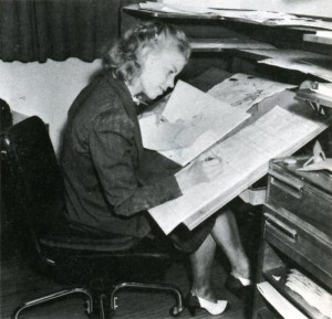
(Retta Scott working on Pastoral seq. from Fantasia. From The Art of Walt Disney by Finch.)
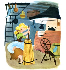
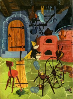
Here are some of her illustrations for Cinderella published in 1950 to tie in with the Disney film. Oddly, the illustrations don’t completely look like the film’s characters. The cat and mice are close, but Cinderella, herself, is very different, less realistic. She looks more like a Mary Blair creation. When I was young, I was convinced that these were preproduction illustrations done for the film. If only.
Fleischer &Models 30 May 2012 06:05 am
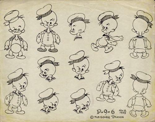
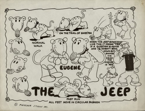
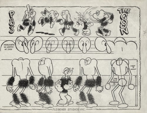
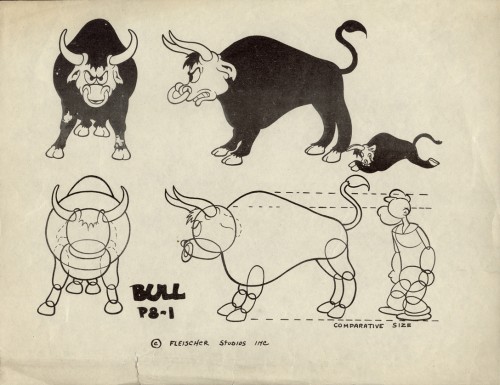
Fleischer Model Sheets – Popeye and Betty
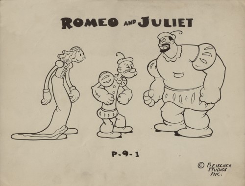
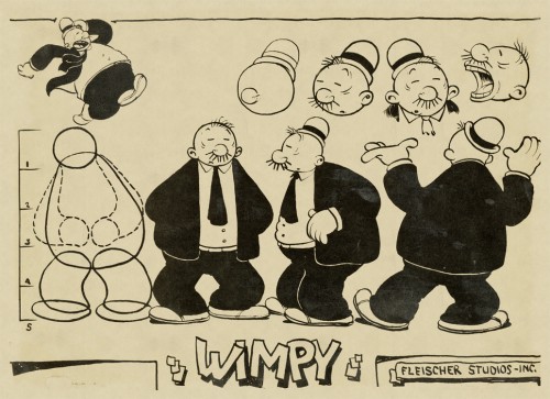
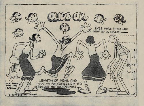
- In Vince Cafarelli‘s collection of model sheets, there are a number from Popeye cartoons of the Fleischer era. These, for the most part, seem to be designed for the one-off cartoons. These are the more eccentric model sheets, and it’s no wonder that they don’t go into a lot of detail They didn’t expect to need them again once the individual shorts were finished.
As such, there are very few images of Popeye here, except where he’s wearing an unusual outfit – as in the third model, Romeo & Juliet.
 1
1Olive Oyl
 2
2
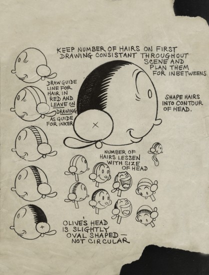
An assistant’s guide to Olive’s head
 9
9
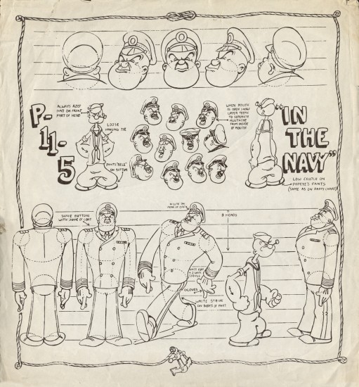
A new uniform for Popeye and
an early non-Fleischer film.
(As Thad Komorowski writes below, this model sheet
is from THE MIGHTY NAVY, a Fleischer film. I was wrong.)
And to add to the models here are two from the late Betty Boop.
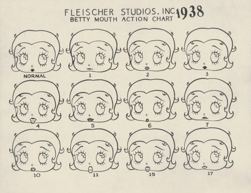
This first shows the normal Betty Boop mouth actions for a
simple bit of dialogue. Expect this to be on the test tomorrow.
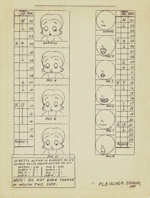
And here’s a Betty mouth chart for the improvised dialogue.
Interesting that they had that all worked out.
They obviously animated in sections where they’d ask
the actors to provide the gags. With Popeye,
they’d just keep the mouths shut.
Bill Peckmann &Books &Illustration 29 May 2012 06:28 am
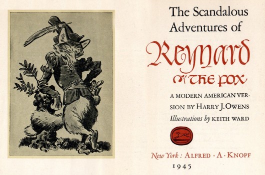
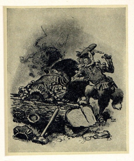
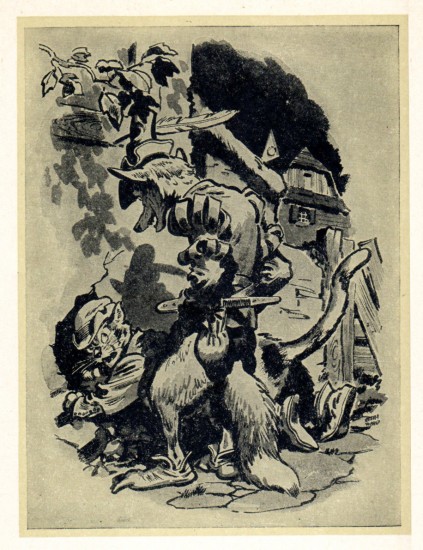
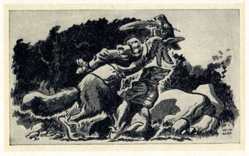
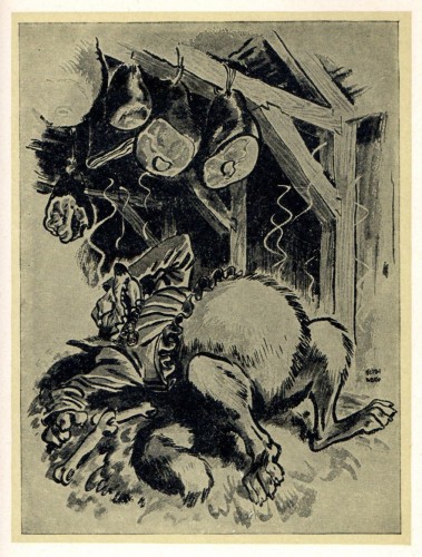
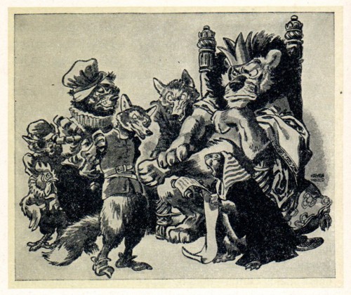
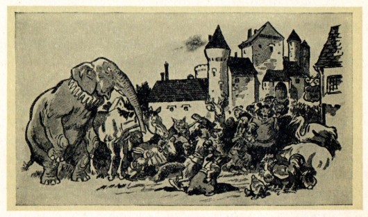
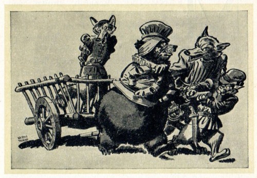
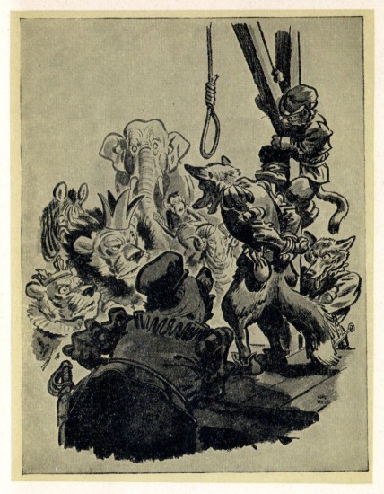
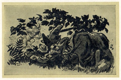
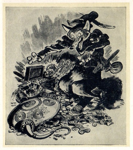
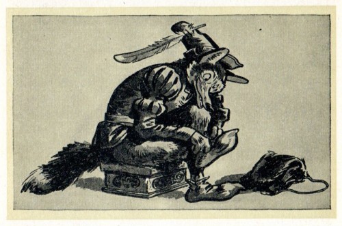
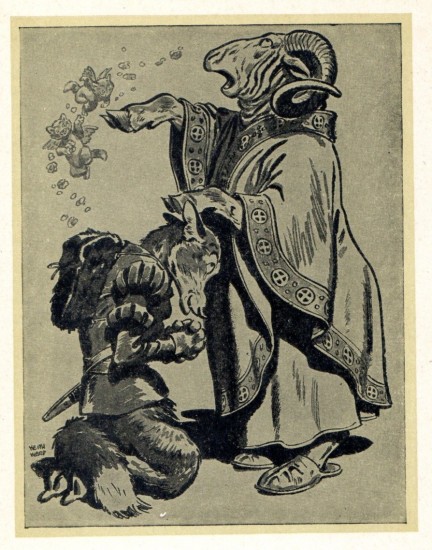
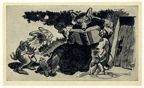
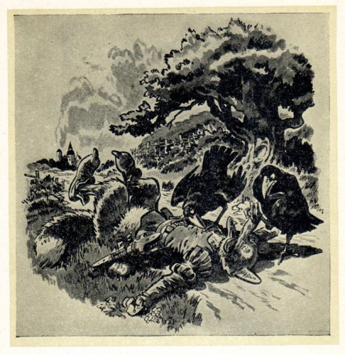
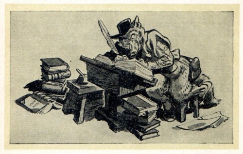
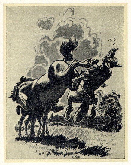
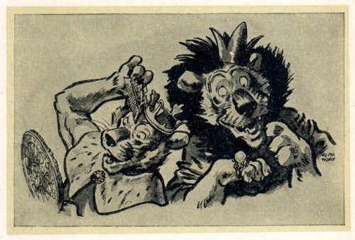
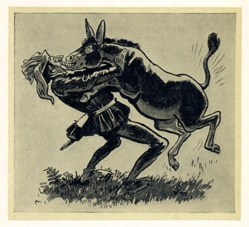
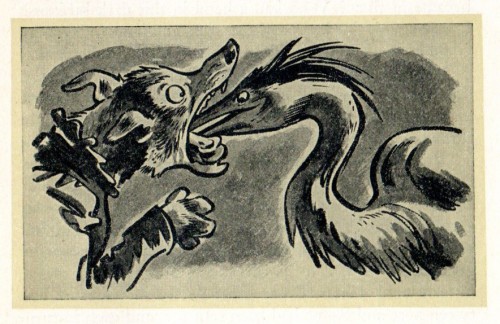
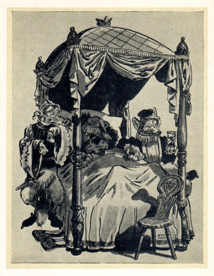
Reynard the Fox
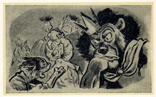
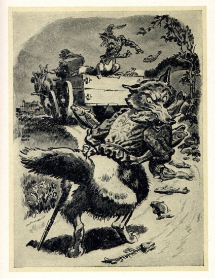
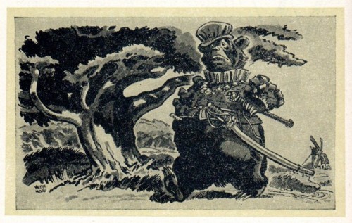
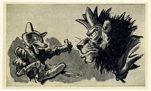
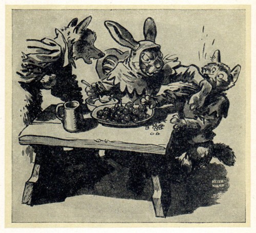
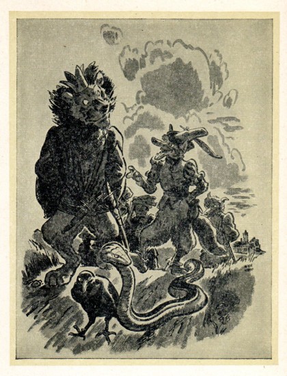
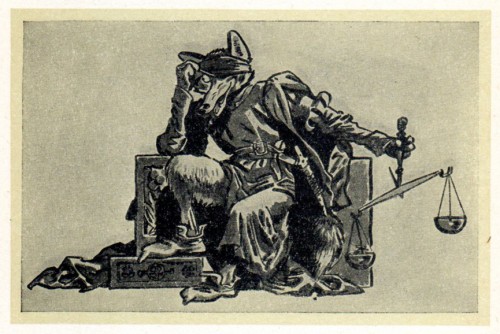
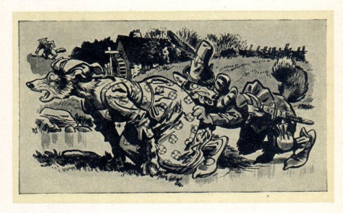
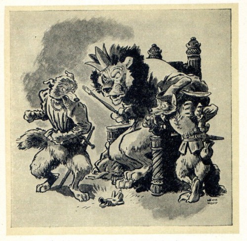
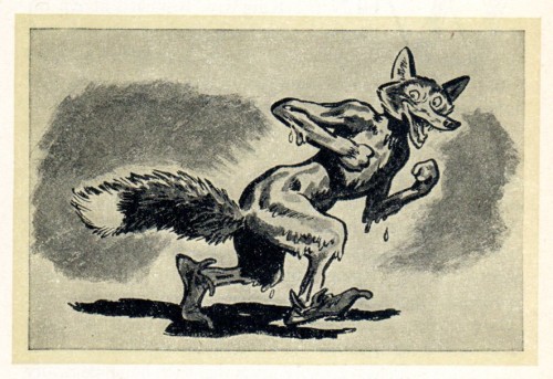
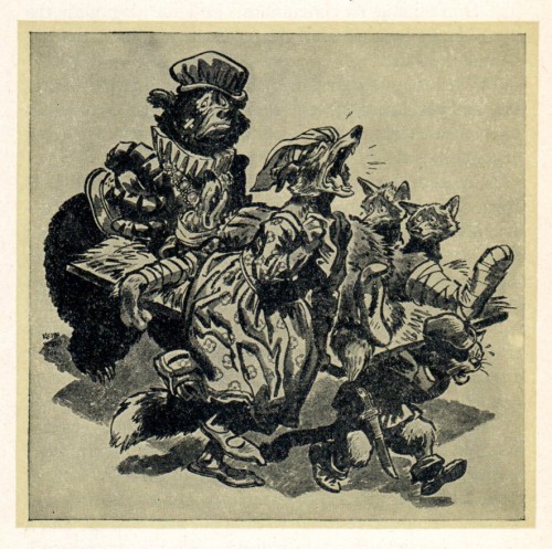
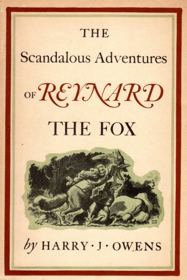
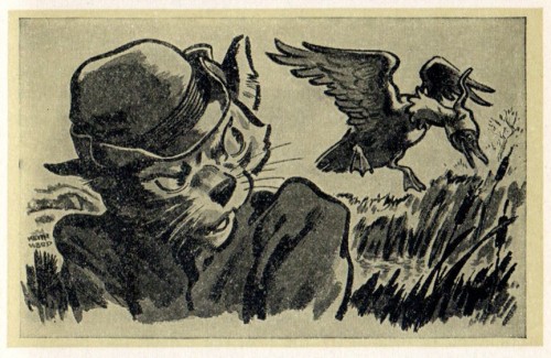
 - Here are illustrations by Keith Ward from the book, Reynard the Fox, which was published in 1945.They are outstanding illustrations from an artist whose every work seems to be outstanding. These were sent to me by Bill Peckmann, and this is what he wrote to accompany the scans:
- Here are Keith Ward’s illustrations from ‘Reynard the Fox’. And beauties they are, all
35 of them! For me, being very partial to the Caniff/Sickles school of cartoon/illustration, these fall right into that wonderful 1940′s category and it makes me wonder if Milt or Noel could have been as facile with animals as Keith Ward was.
A couple of side bonuses, and they are this, the drawings have the same realistic cartoon playfulness that illustrators Jack Davis and Wally Tripp infuse in their art and you’ll get to see foxy Reynard’s influence and inspiration that found its way into Disney’s ‘Robin Hood’ feature. (Turn to Will Finn‘s July 22, 2007, excellent “expose” blog for that story!)
 1
1
 7
7
This, to me, is a GREAT illustration. Brilliant work in a book.
Marc Davis spent a lot of emotional weight developing the story for a feature to be called Chanticleer and the Fox (Andreas Deja has a wonderful posting on his site about this film.) This film combined the stories of Chanticeler the Rooster (Chaucer) and Reynard the Fox (Rostand). Disney opted to bypass this film to make the story that was developed by Bill Peet, Sword in the Stone.
Thanks again to Denis Wheary for lending us his Keith Ward book!
And thanks to Bill Peckmann for scanning and sending and getting the copy from Dennis.
Animation Artifacts &Frame Grabs &Hubley &UPA 28 May 2012 06:21 am
The Four Poster
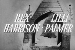
- One of the real neglects in animation history is the availability of The Four Poster in VHS, DVD or any other format. For some reason, this title has eluded marketers who’d want to cash in on the name of Rex Harrison or his wife, Lilli Palmer. Where’s TCM when you need them.
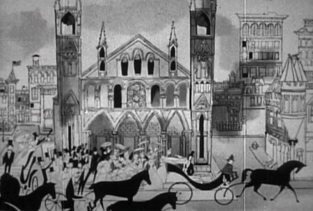
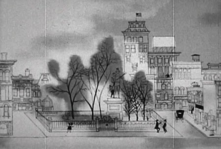
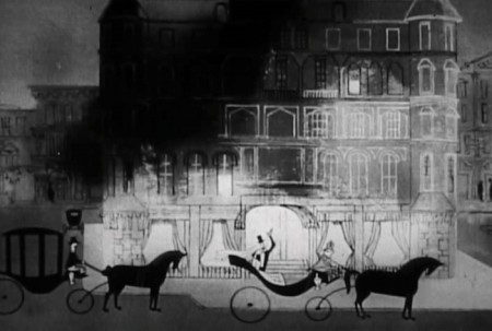
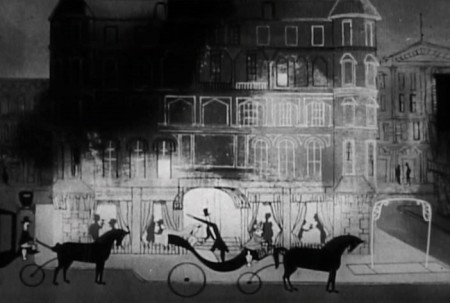
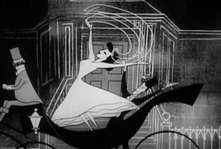
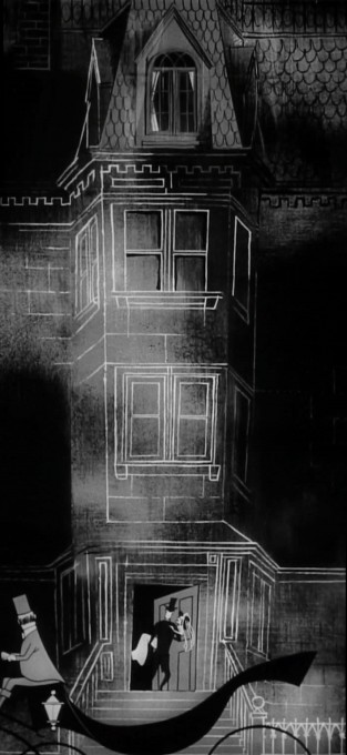
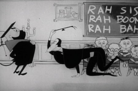
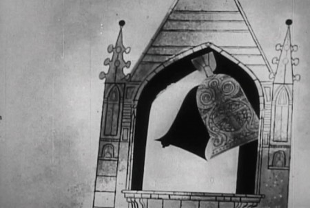
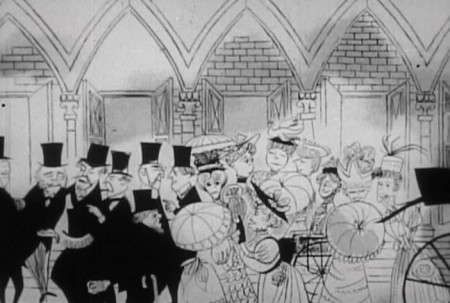
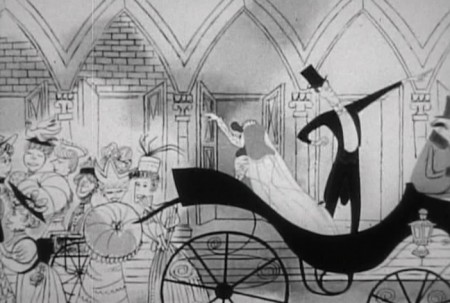
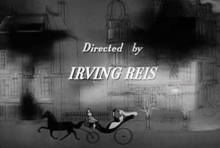
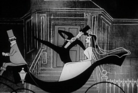
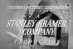 This film was a Stanley Kramer production directed by Irving Reis in 1952 of a play by Jan de Hartog. It tells the life story of a marriage between the husband and his wife. In fact, the film is so insular that it never leaves the bedroom, and it revolves around the “four poster” bed in that room. For the film, they chose to open it up by leaving the bedroom via animated inserts done by John Hubley at UPA. There are some 20 minutes of the film done by Hubley/UPA, and it’s extraordinarily progressive animation for the time.
 I own a good 16mm copy of the whole film, and cut the animation segments separate from the feature, I allowed a friend to make a video copy but was very disappointed with the results – out of focus and almost unwatchable. In the past couple of weeks, another friend led me to a second DVD copy which is also out of focus but not as bad as the first.
I’ve wanted to focus on this film for some time, hence I decided not to wait any longer and am sharing frame grabs with you of this muddy, soft focus version. You can still get the idea. If another, better copy turns up in the future, I’ll rework these images and repost it.
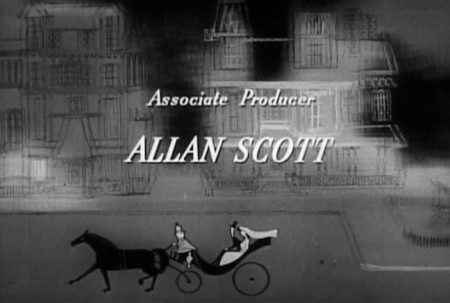
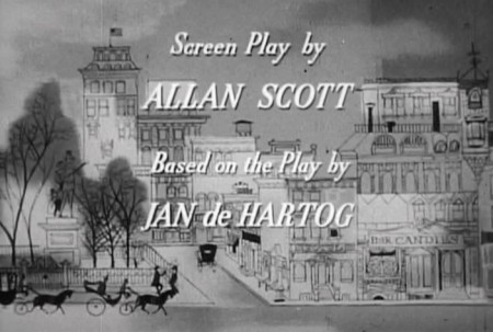
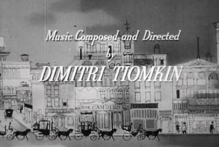
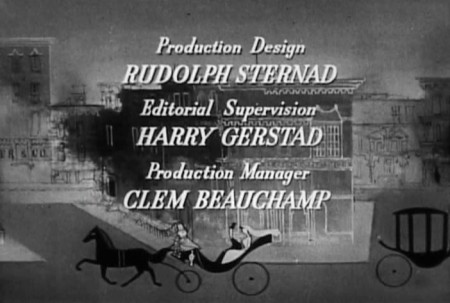
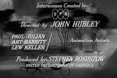
Here are bits from the opening credits. Lots of traveling right and then left and then right again.
 3
3The film does get very claustrophobic staying in the one bedroom set
for the entire film, with just the two characters, husband & wife, to talk
us through most of the movie. It’s exhausting.
This makes the animation more welcome than it would ordinarily be.
You’re dying for any excuse to change scenery and move the story forward.
 4
4
On top of this, the live action is very theatrical
whereas the animation is full of life and quite lyrical.
 5
5
The animation does reveal a good part of the story from the
birth of their boy to his death in WWI on the front lines.
(Hubley designs one of his greatest sequences for this one.)
 8
8
Supposedly, the film was sent to Yugoslavia for a run.
Some of the people in Zagreb were able to kidnap the film
and hold onto it for a number of additional weeks. They
studied it closely and copied it.
 9
9
When they were finished the print was returned to
the States, and they started up Zagreb animation with their
new-found knowledge and inspiration. A bit more than inspired,
shall we say. How very 21st Century of them
 12
12
In his book, When Magoo Flew, Adam Abraham doesn’t give a lot of
space to the work on this feature. However, every small comment
seems valuable since so little has been written about this film.
 13
13
Abraham says that Hubley and crew went onto this directly after
finishing Rooty Toot Toot. They were broken into small groups
with each group doing one of the interecenes in the feature.
 15
15
Paul Julian oversaw the stylistic representation of the War
and Art Babbitt animated the sequence showing the effect
of the war on the soldiers coming home.
 16
16
In total, it’s an enormous accomplishment.
____________________
.
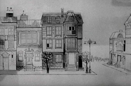
The first animated intersection shows the Rex Harrison character going off to work as a teacher in a boys’ school.
 1
1
 2
2
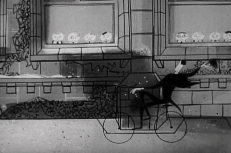
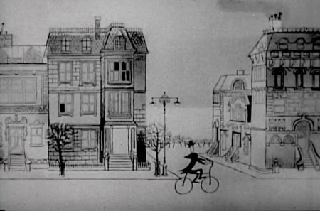
Out of the home, Rex Harrison’s character
comes cycling on his way . . .

. . . to school. Like many other sequences in this animation,
he rides a long pan to the school where he enters on bike.

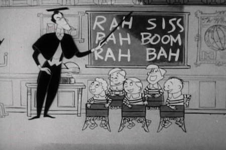
Inside the school, we echo the first scene with another pan.
This time we pan from class to class ending with . . .
 5
5
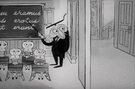
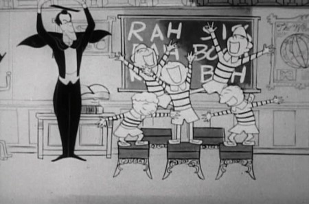
. . . Rex Harrison’s very unethical class, where the kids are having fun.
 8
8
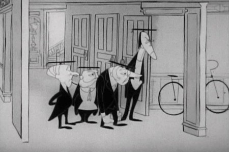
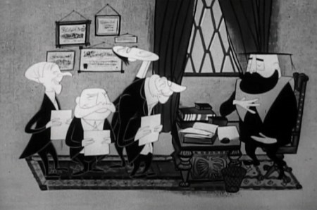
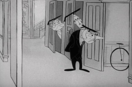
The raucus noise of his class is disturbing other teachers.
They don’t like the students having fun.
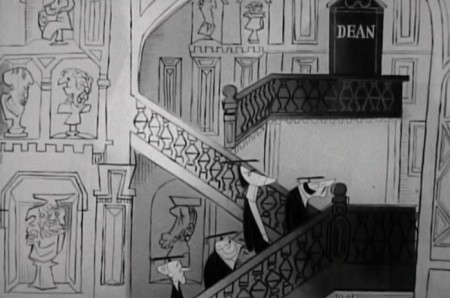
 11
11
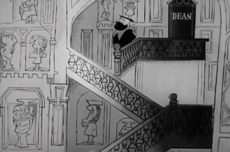
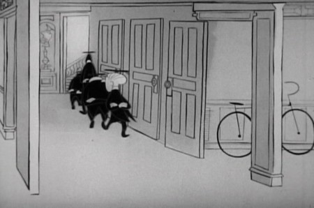
Off to the Dean’s office to complain.
 16
16
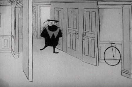
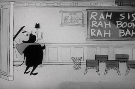
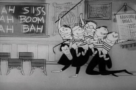
The Dean breaks in to something too much fun.
 17
17
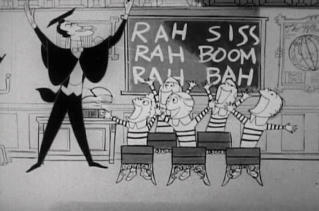
Even with the soft focus, you can see
that the character design is great.
 20
20
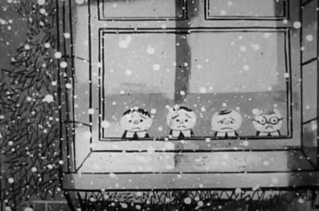
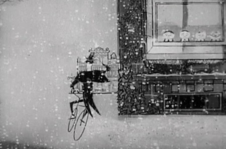
He goes off into the sunset of a
snow fall.
Back to live action
Photos &Steve Fisher 27 May 2012 05:36 am
Robins
cheep cheep cheep, talk a lot, pick a little more
Pick a little, talk a little, pick a little, talk a little,
cheep cheep cheep, talk a lot, pick a little more
Pick a little, talk a little, pick a little, talk a little.
Heidi’s currently directing THE MUSIC MAN for a local theater group. This song has been
playing on a loop in the recent background. It somehow seemed appropriate for this post.
It’s really not, but so what; I like it.
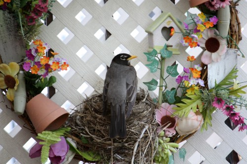
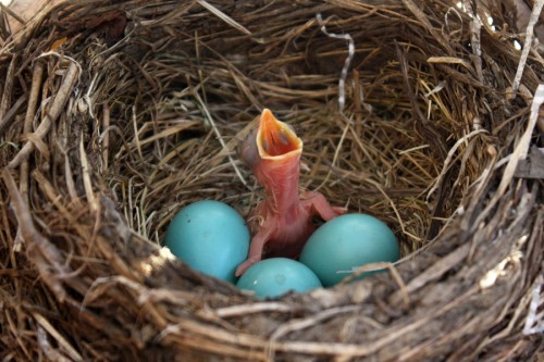
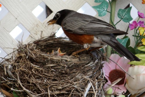
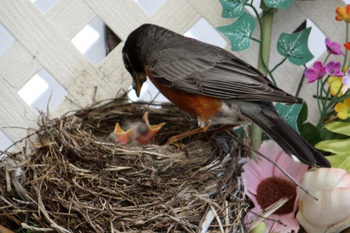
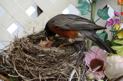
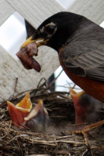
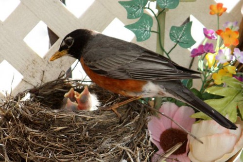
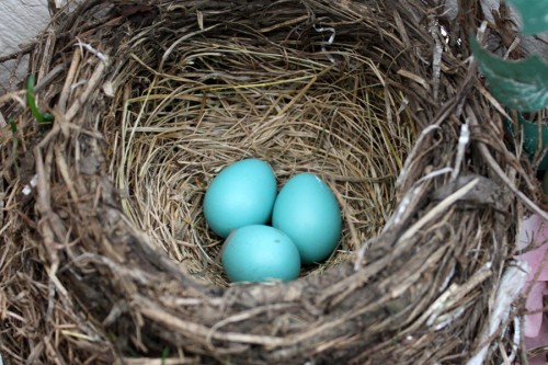
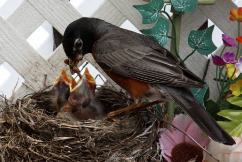
- Steve Fisher has been posting some amazing photos of activity in his backyard in Maspeth, Queens, NY. It’s obviously Spring:
 1
1
 5
5
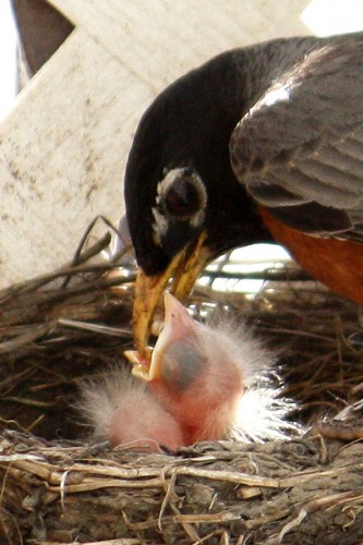
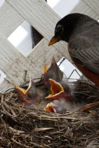
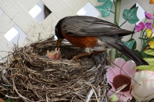
Today, May 22, I see that all four eggs have hatched and the chicks are getting fuzzy…
 11
11
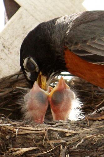
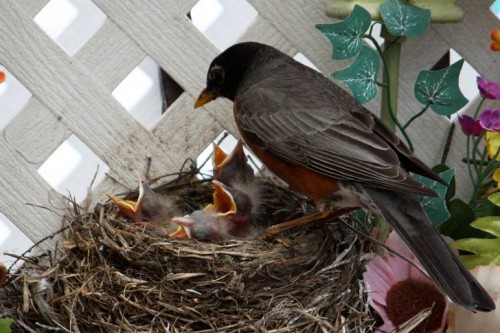
In all the shots with the mother robin, it’s the telephoto lens
that lets me get in so tight – I am safely 20 feet away from her.
It’s only when she leaves the nest to gather meals for the kids or
to take in a movie that I can peer right into the nest with a normal lens
within inches of the chicks and I have a look-out
in case the mother comes home early.
 16
16
First time all four chicks are up at the same time. All they do is eat, sleep and grow.
Commentary 26 May 2012 05:05 am
Stuff
 - Finally, the Indiegogo campaign is complete, and it was a total success.
Thank you all. The amount shown on PayPal doesn’t reach the $13,000 goal requested, just $12,225. But several people had difficulty with PayPal and asked to just send me the money directly. With that additional $1450, we’ve definitely reached and passed the goal, and I couldn’t be happier. $13,675.
I’d like to thank those people who opened up their blogs to make mention of the campaign. Michael Barrier and Mark Mayerson had a direct effect on the moneys contributed. I can track several thousand dollars directly to their promotions. I’d like to thank them for the unbridled support they both gave. The same is true of several others, most notably Bill Benzon and Steve MacQuignon. There were certainly others I wasn’t aware of, and I’d like to thank those people as well. Including all those who listed it on Facebook. Every mention helped. Hillary was right; it does take a village. Thank you enormously for the reinforcement.
I’ve been working on the storyboard for the sequence I plan to animate and have been moving much-too-slowly. I’ve been reworking every drawing endlessly, and will have to get to just roughing them out. As we all know, the finish of the storyboard drawings is basically irrelevant to the completed movie. Getting the emotion and the power of the sequence across is much more vital. That’ll be happening, and the project will be moving forward immediately.
We have been negotiating with a cable TV company about selling the US rights to the film, and I expect to have a deal in the next couple of weeks. This will give us the traction to raise the rest of the funds for the feature. We have a sales agent in England who will sell the film (with the help of the trailer I’m making, thanks to your support) outside of the U.S. to complete the budget.
I’m at the starting line just waiting for that gun to go off, and I definitely heard a pop!
A Cat In Paris
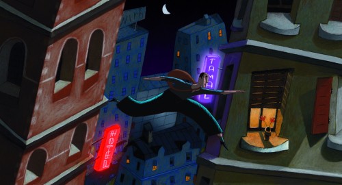
- A Cat in Paris is opening in NYC for all you who missed it in its recent run for the Oscar. It’s an exceptionally good animated feature distributed by GKids. Directed by Jean-Loup Felicioli and Alain Gagnol it tells the story of a pet cat that leads a double life. By day he lives with Zoe, whose mother is a detective in the Parisian police force. But at night he sneaks about the rooftops of Paris working with Nico – a cat burglar, whose fluid movements are poetry in motion – as he evades captors and goes from rooftop to rooftop across the Parisian skyline.
It’s a delightful film with few words of dialogue and a beautiful sense of style.
Fri Jun 1 ANGELIKA FILM CENTER
10:55 12:25 1:55 3:25 4:55 6:25
Sat Jun 2 ANGELIKA FILM CENTER
10:55 12:25 1:55 3:25 4:55 6:25
Sun Jun 3 ANGELIKA FILM CENTER
10:55 12:25 1:55 3:25 4:55 6:25
Buy tickets in advance here.
Fantastic Mr. Anderson
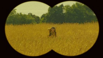 - It wasn’t too long ago that I was raving over Wes Anderson‘s adaptation of The Fantastic Mr. Fox, Raold Dahl‘s novel, made into film using animated puppets. I saw Anderson’s most recent film, Moonrise Kingdom this week. To my taste, it’s a wonderful film, despite the fact that it’s not animated. Like all of his films, it’s so obvious that Mr. Anderson made it. The compositions are offset, the search for a real live father is always part of the story, and the set design is particular; it could only be he who directed the movie. I also find that I tend to smile throughout his films. That’s certainly true of this movie. It went on a bit long for me, but that’s ok. I’ll still go to see it again.
Alexandre Desplat is definitely writing the best scores for films these days, though Tom Newman is no slouch either.
Bklyn Film Festival
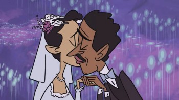
- While many animators will be in Annecy at the opening of June, there’s an alternative for those of us stuck in New York. The Brooklyn International Film Festival will run from Friday June 1st through Sunday June 10th. Their program includes many animated short films. I suggest you go to their site to look for more information about any of these films as well as screening times. These are the titles and list of directors that will be screened:
2012 ANIMATION FILM LINEUP
 ALWAYS A FAMILY Dir: The Rauch Brothers, United States, 4 min, 2011
ANIMEDITATION Dir: Jonathan Rosen, United States, 3 min, 2011
BOOBATARY Dir: Leah Shore, United States, 2 min, 2010
BOX, THE Dir: Dadomani Studio, Italy, 3 min, 2012
CITY OF GOOD PEOPLE Dir: Hur Bum-wook, Korea, 16 min, 2011
COUNTDOWN Dir: Celine Desrumaux, England, 4 min, 2011
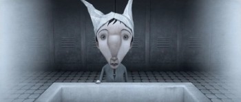 EDMOND WAS A DONKEY Dir: Franck Dion, France, 15 min, 2012
GALLERY Dir: Robert Proch, Poland, 5 min, 2010
GOLDEN EARS Dir: Jonathan Rosen, United States, 5 min, 2011
HUNTER, THE Dir: Marieka Walsh, Australia, 7 min, 2011
INNER CITY Dir: Alain Fournier, Canada, 9 min, 2011
KING CREOSOTE & JON HOPKINS – BUBBLE Dir: Elliot Dear, England, 5 min, 2011
LADDER, THE Dir: Emily Wormley, United States, 4 min, 2011
LAST BELLE, THE Dir: Neil Boyle, England, 19 min, 2011
LIGHT THAT DIED IN MY ARMS, THE Dir: Alan Foreman, United States, 2 min, 2012
MAKING OF LONGBIRD, THE Dir: Will Anderson, Scotland, 15 min, 2011
 OLD MAN Dir: Leah Shore, United States, 6 min, 2012
OLD MAN AND THE OLD WOMAN, THE Dir: Basia Goszczynska, United States, 8 min, 2011
SID THE KILLER Dir: Harry Teitelman, United States, 5 min, 2011
STOPOVER Dir: Neil Stubbings, Switzerland, 4 min, 2011
TULIPOMANIA: RUMBLE THUD Dir: Cheryl Gelover & Tom Murray, United States, 3 min, 2011
WE, THE MASSES Dir: Eoghan Kidney, Ireland, 14 min, 2011
WHO LASTS LONGER Dir: Gregorio Muro, Spain, 12 min, 2011
WOLF DOG TALES Dir: Bernadine Santistevan, United States, 6 min, 2012
Arjun – The Warrior Prince
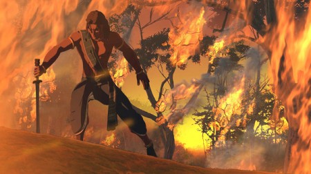
- Yesterday an Indian animated feature opened in NYC. It was reviewed in the NYTimes by Rachel Saltz in a relatively short review.
An Animated Mahabharata, it opened in New York, Los Angeles, San Francisco, Chicago, Dallas and Houston. Who knows how long it will play. The stills for the film are certainly provocative.
For now it’s at: AMC Loews Village 7
(I found it a bit difficult to actually find out where it’s playing.)
10:45am, 1:00pm, 3:30pm, 5:45pm, 8:05pm, 10:30pm
This film is from the studio, UTV, an Indian communications conglomerate, that was taken over by Disney; they are billed as a “Co-presenter.”
According to the NYPost, “. . . the title character vaguely resembles Disney’s Tarzan, but nobody is going to mistake the less-than-state-of-the-art, computer-game-style 2-D animation for the work of” . . . Disney, much less its Pixar subsidiary.
Traditional Animation
- James Nethery posted a longish interview with me on his site, Traditional Animation. You might want to take some time floating around the site while you’re there; you’ll find a lot of very entertaining material there (despite the interview. I can get chatty at times!)
I’ve added this site to my blogroll.
Bill Peckmann &Books &Illustration 25 May 2012 07:03 am
Keith Ward Sampler – II
- Bill Peckmann has plugged me into some artwork and illustration by the very talented artist, Keith Ward. I’ve already featured a number of his pieces on several different posts. Last week, I featured a sampler of his illustration work. Here, I’d like to continue that.
Today we feature three separate books by Mr. Ward. These were sent to me by Bill, and from here on, I’ll let Bill do the tellng:
- It’s with many thanks again to collector/fan Denis Wheary, that we are able to sample more of illustrator Keith Ward’s early children’s book art. This time around we get to see how Mr.Ward handled ‘black and white’ and three color illustration back then.
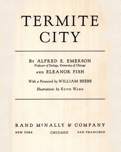
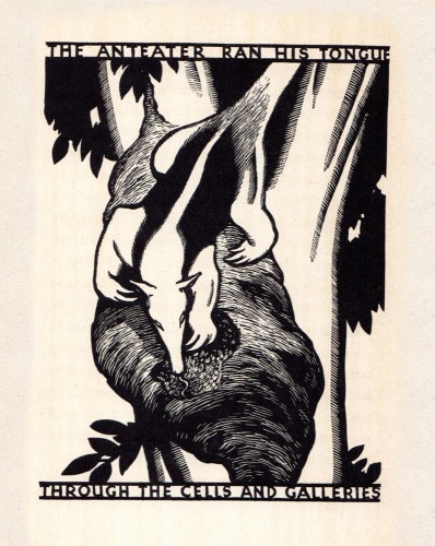
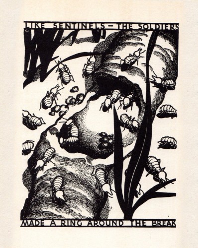
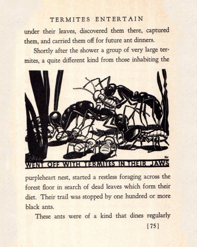
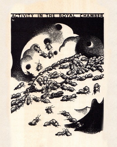
- Because of his very beautiful color art for books and magazines (his covers for ‘Child Life’ magazine are outstanding!) in the 1930′s, these first excerpts might not even look like the hand of KW. They are taken from a non fiction, ‘National Geographic’ type book titled ‘Termite City’, published in 1937. The ‘serious’ subject matter drawings are very successfully designed and executed in scratchboard.
 1
1
 5
5
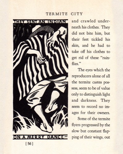
Ah, finally a humorous subject matter and
Keith Ward does what he does best!
 8
8
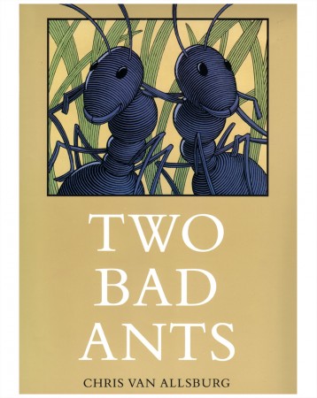
Side note: After seeing the previous drawing, I thought of
Chris Van Allsburg’s beautifully rendered 1988 book,
‘Two Bad Ants’. Was there any inspiration there from
‘Termite City’, hmmm?
 9
9
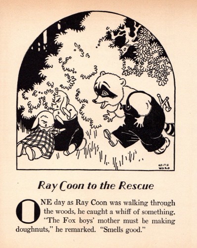
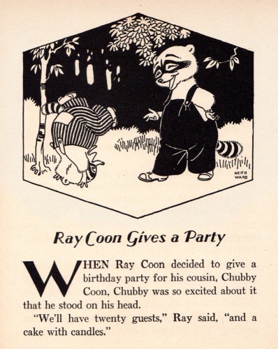
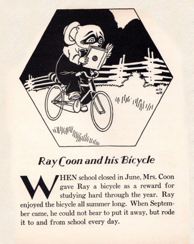
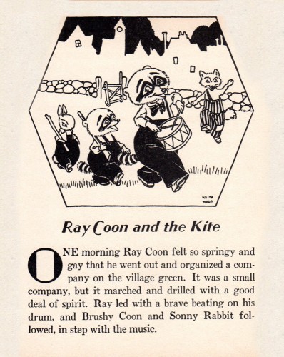
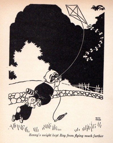
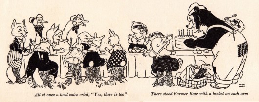
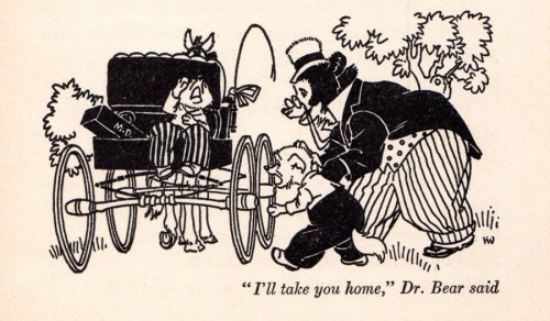
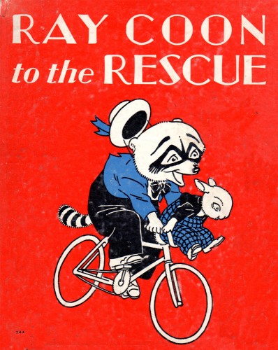
Here are a few pages from Keith Ward’s ‘Ray Racoon to the Rescue’,
all black and white art and published in 1938.
 18
18
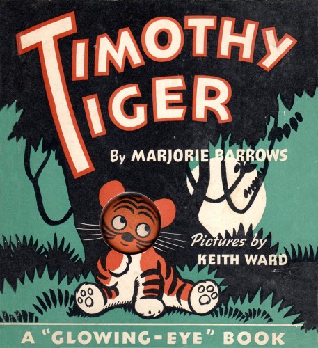
Front cover.
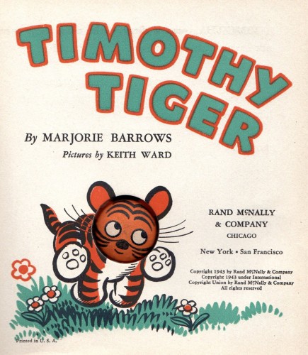
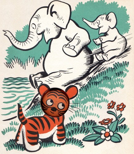
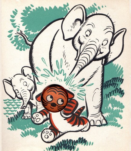
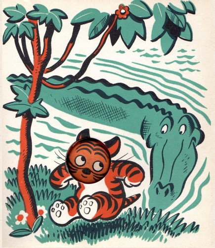
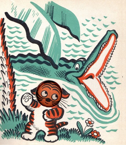
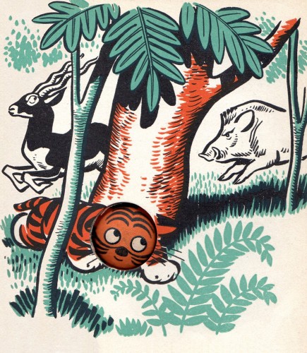
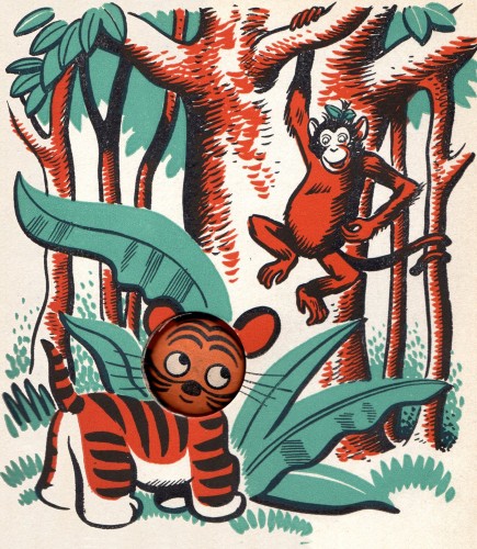
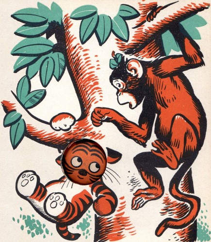
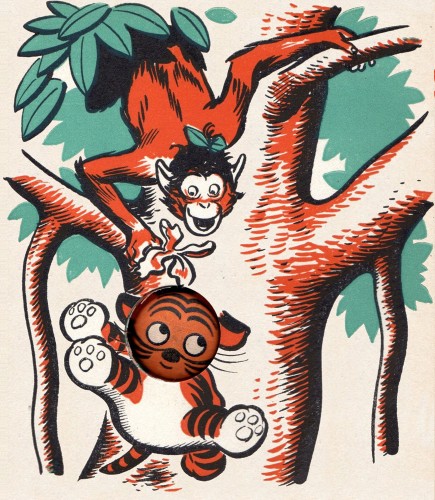
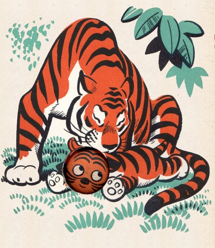
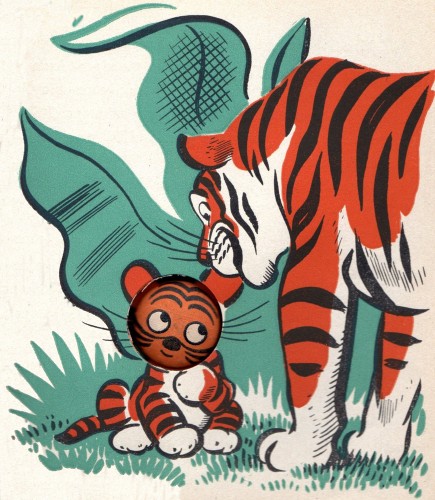
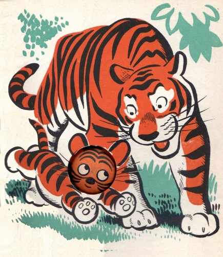
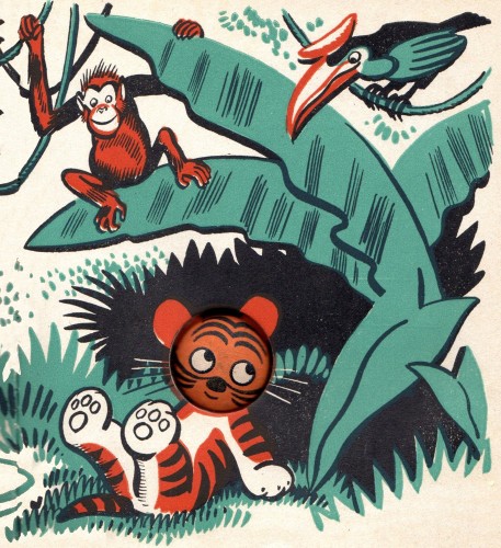
Published in 1943, here are some pages from KW’s three color book
and they show how to handle a ‘gimmick’ die-cut problem very successfully.
The last few pages of tiger art are beautiful.
Here is the end cover with an end note.
Thanks to Denis, I’ve become reacquainted with a book,
which it turns out, might be my first remembered book from childhood.
It was the ‘glow in the dark eyes’ that hooked me then, but now I’m
very grateful to rectify that by being able to understand the terrific art.
Disney &Fleischer &Illustration &repeated posts 24 May 2012 05:16 am
Sheet Music Graphics – repost
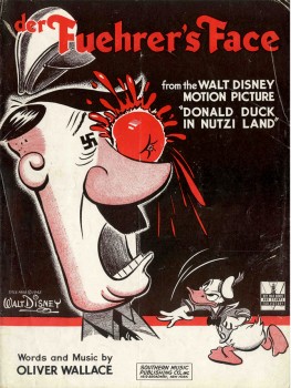 – I’ve long been a fan of old sheet music and have a tiny collection of songs from animated pictures.
This is a song by Oliver Wallace in the Donald Duck cartoon, Der Fuerher’s Face. The sheet music is a bit rare in that it has the original title of the Donald film, Donald Duck In Nutzi Land.
They soon changed the title on the sheet music, especially after the music became a #1 hit in a version by Spike Jones & His City Slickers.
You can see the film on the Walt Disney Treasure DVD – On The Front Lines: Disney Goes To War.
The film deservedly won the Oscar for Best Short Subject in 1942. Its opposition were all propaganda war films.
.

.
- Here’s part of the back page, for those who want to see the Disney logo for sheet music back then.
Sheet music in the 30s, 40s and 50s was Big Business. There were no DVDs,videos or LP records. No walkman, I Tunes or cel phones. Selling sheet music for all those kids learning to play an instrument was the natural tie-in to the film, and gave the Nation another inroad to marketing the film.
If the audience hummed the song, more tickets could be sold to the film.
.
The graphics for the music to Song of The South wasn’t quite as dynamic as the one on the cover of Der Fuehrer’s Face.
This cover tries to capture the lyrical, romantic feel of the film. Here surrounding the live-action plantation, with all the different song titles available from the film in the sky, is a border consisting of the animated characters from the film. The colors are limited to the green-etched homestead and the brown-linear characters.
The back cover of the sheet music contains a shot of the live-action characters, James Baskett, Bobby Driscoll, and Luana Patten. All are colored in the same brown ink as the cover’s line art.
That year “Zip-A-Dee-Doo-Dah“, also from this film, won the Oscar, while the film’s music, itself, was nominated for Best Scoring of a Musical Picture.
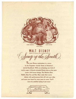 This film made quite an impression on me when I was a kid. And this song was one of the two I played over and over from the record. I also loved “Laughing Place”.
It’s something of a shame that the film has been kept out of circulation in the US. I can’t imagine that the film affected me as a child in any negative way. Uncle Remus was clearly the hero of the film and the only truly positive adult character in the film.
The last time I saw the film projected was back in the 70′s when Disney set themselves up at Lincoln Center to show a complete retrospective of ALL their films. At the library auditorium behind Lincoln Center there were a number of seminars in which Frank Thomas, Ollie Johnston, Ken Andersen and Woolie Reitherman talked about their work.
I remember Frank Thomas talking about this feature, saying that Disney only did the best for the film hiring the greatest cinematographer, Gregg Toland, to shoot it. He’d shot everything from Citizen Kane to The Grapes of Wrath. (Both are unbelievably stunning works of cinematographic art.) What Thomas didn’t say, or didn’t realize, however, was that this was Toland’s first COLOR feature. And it showed. Garish, cartoon colors flooded the screen, with actors wearing much too much makeup. A big step for Toland but not the best photography.
Still, I remember those colors vividly, and I would love to see it again – on screen. A dvd would probably do.
– I have a non-Disney cover. It’s the 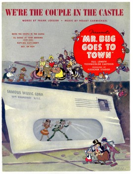 sheet music for the 2nd feature film from the Fleischer’s, Mr. Bug Goes To Town.
This was a feature that really got me going when I was young. I think it was the first original story done in animation; not an adapted fairy tale or novel. The story still works for me, though it comes off as a bit episodic. (Actually, I think most animated features are too episodic.) They’ve created a complete world for these insects, and it works.
Technically the film is a bit limited. The opening title shot is a stunning shot panning down the Empire State Building and across NYC ending on the vacant lot where the bugs live. The animation is adequate for the period; it has a charm that I find delightful and sometimes exciting. The voices are good, and the music is excellent.
This was the hit song, written by the brilliant Hoagy Carmichael (who wrote Stardust, Heart and Soul, and Skylark) and the just-as-brilliant Frank Loesser (who wrote Guys and Dolls, Hans Christian Andersen, and How To Succeed In Business). The score for the film was co-written by Leigh Harline (who scored Pinocchio, a lot of Disney shorts, and The 7 Faces of Dr. Lao, among others).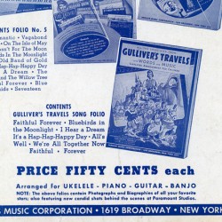
As we can see, most sheet music was printed with one or two colors) red for Der Fuehrer’s Face, brown & green for Song of the South) as opposed to full color. However, this Fleischer song has a full color cover (although they use one color on the rear cover). It shows that Paramount felt they had a hit song here, and they did have a modest hit. Glenn Miller’s recording of it didn’t hurt.
The rear cover is little more than an ad for other Paramount songs. However, in among the group is Gulliver’s Travels. I’m posting just this small section of the back cover, printed in blue.
.
.
Animation Artifacts &Fleischer &Story & Storyboards 23 May 2012 05:32 am
Popeye Storyboard – part 3
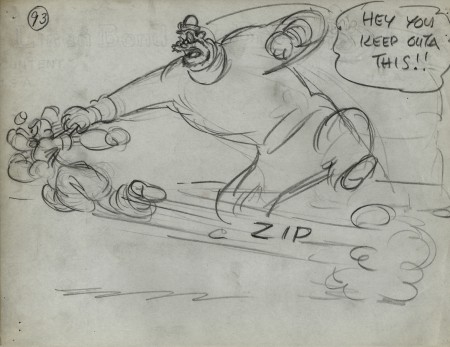
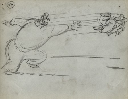
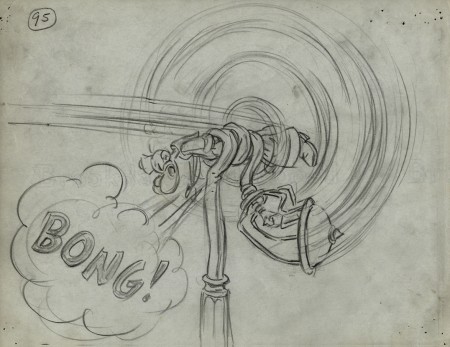
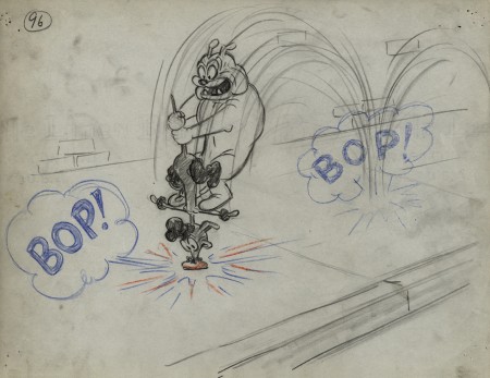
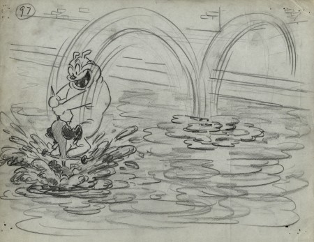
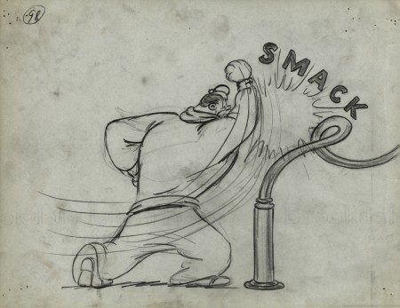
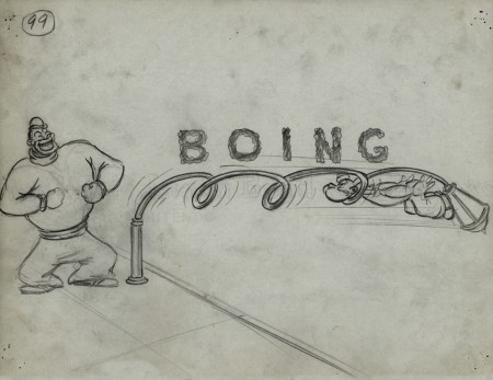
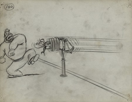
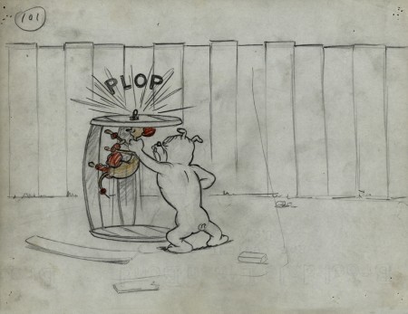
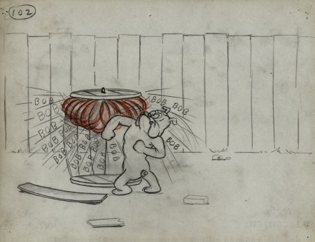
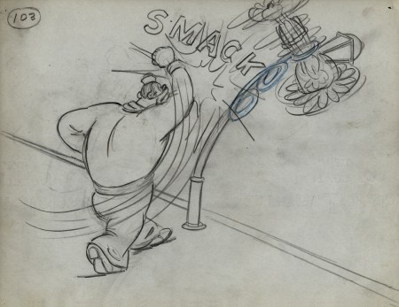
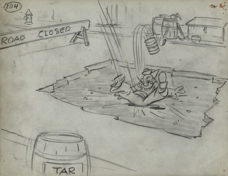
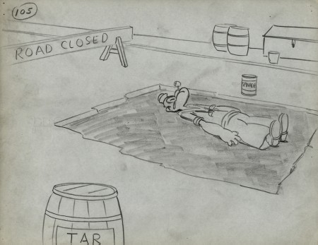
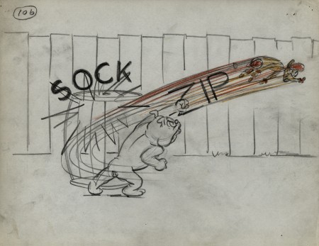
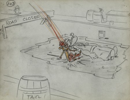
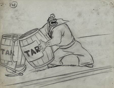
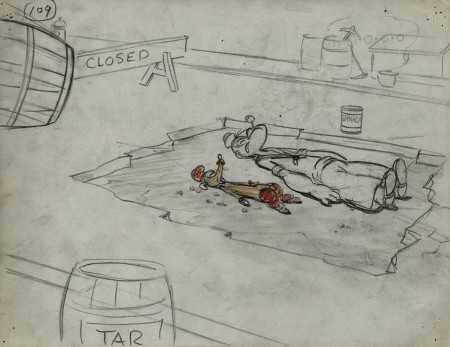
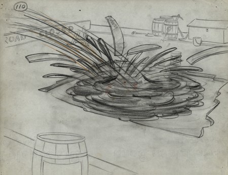
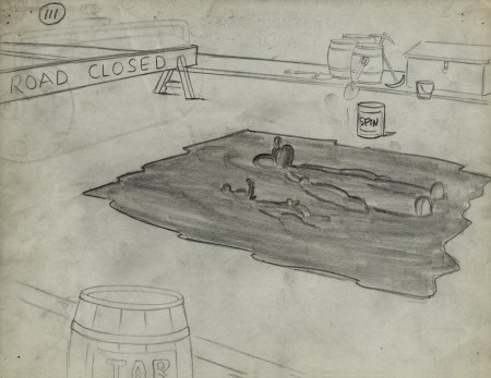
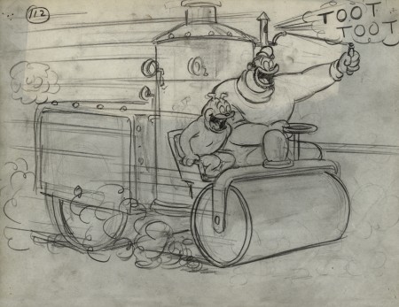
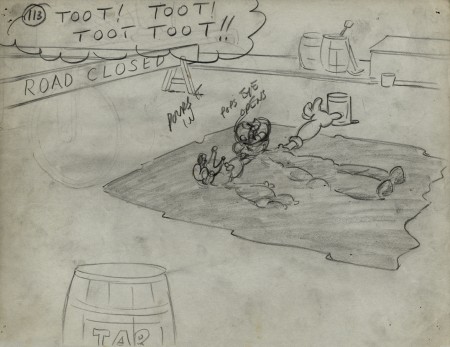
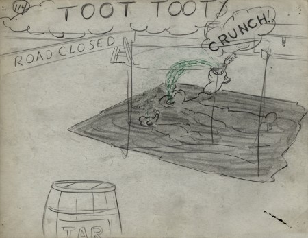
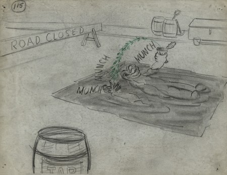
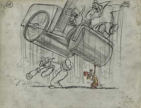
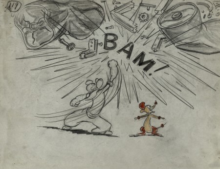
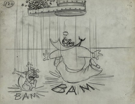
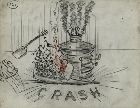
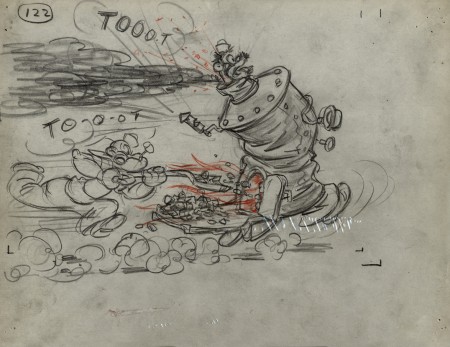
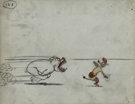
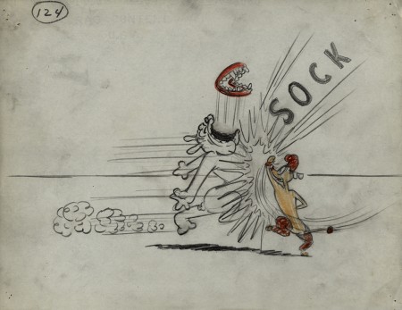
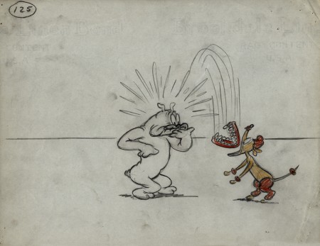
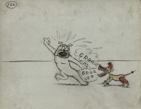
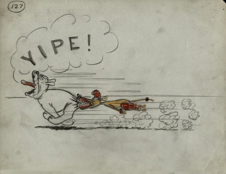
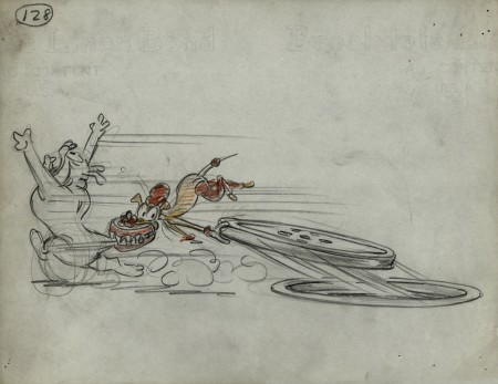
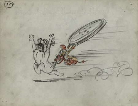
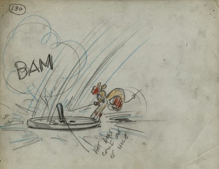
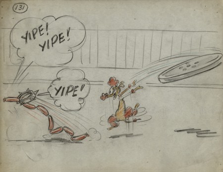
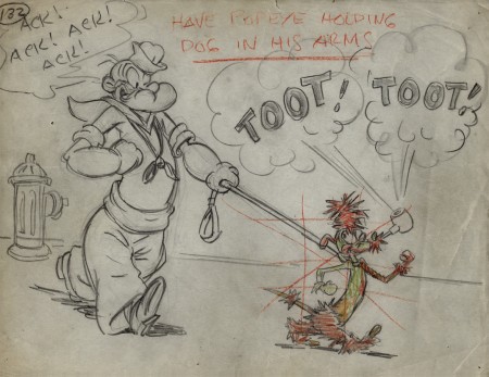
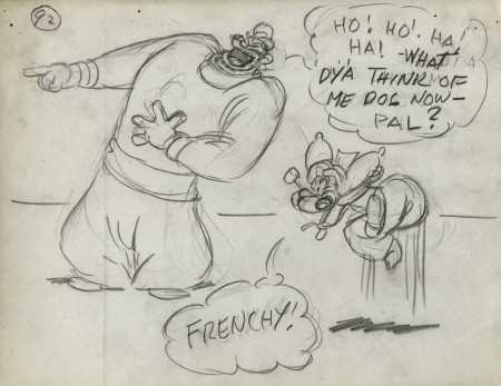
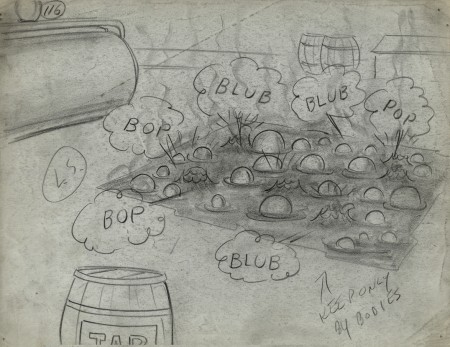
- We’ve come to the third and final part of the storyboard for the 1949 Paramount Popeye cartoon, “Barking Dogs Don’t Fite.” These storyboard drawings come from the late Vincent Cafarelli‘s collection of artwork he’d saved from the divers studios in which he worked.
The storyboard was done by Jack Mercer and Carl Meyer. Their drawing styles are both expressive and markedly different. I suspect that one drew the human characters and the other the animals. The drawings of Bluto are just out of this world, ripped right out of the early 20th century comic book pages. I also suspect these were done by Jack Mercer, but I have nothing but a hunch to give me that guess. I believe he was working at the studio longer and might have had more of the early Fleischer grit in his drawings as opposed to the cartoon slickness that would’ve come from later employees’ work. Each drawing is done on inexpensive 8½ x 11 paper. As usual with these continuing posts, we pick up with the last drawing from last week’s entry.
 92
92
 116
116
Note that drawing #117 is missing.
.
___________________________
Here’s the full short as seen on YouTube.
I wish the look was a bit closer to the board, however
some of the layouts in the final film are significant
improvements over the planning in the storyboard.
.
Animation &Animation Artifacts &Frame Grabs &UPA 22 May 2012 06:55 am
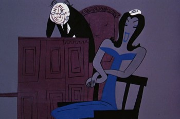
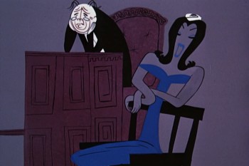
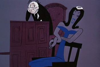
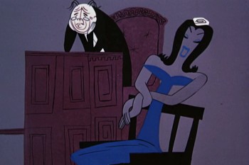
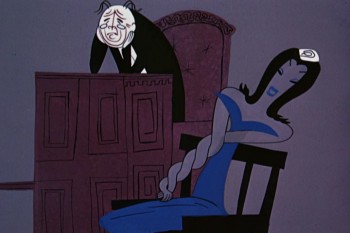
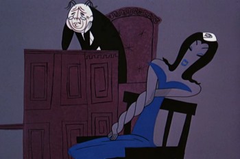
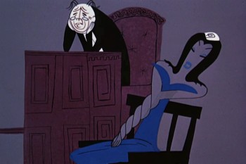
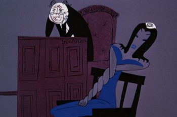
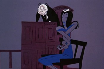
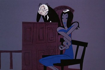
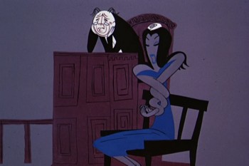
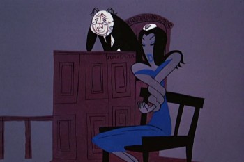
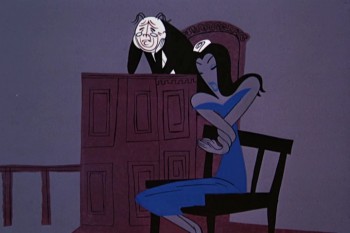
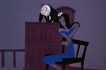
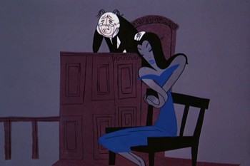
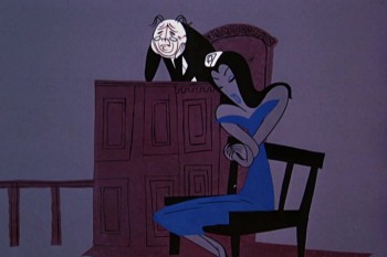
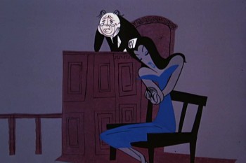
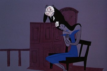
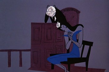
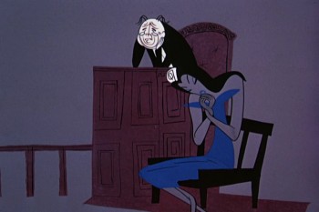
Nelly Bly’s Twisted Arms
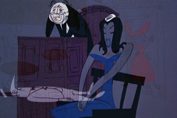
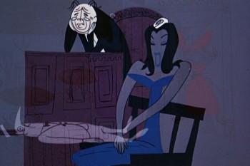
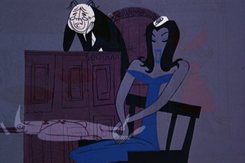
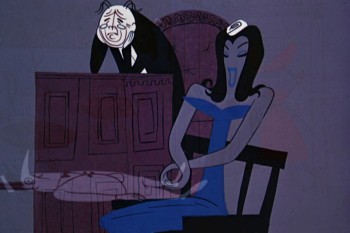
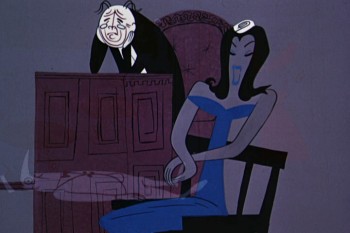
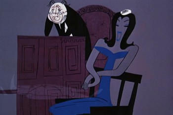
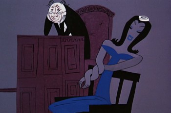
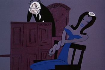
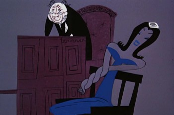
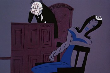
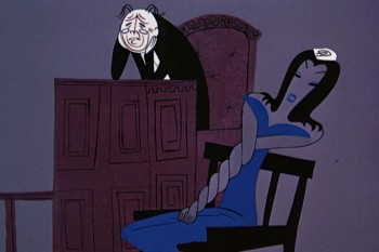
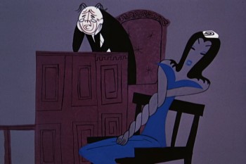
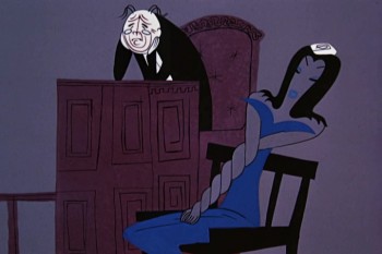
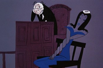
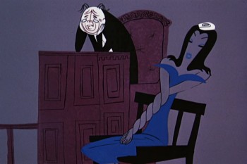
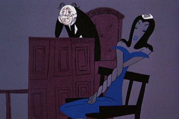
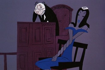
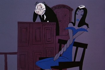
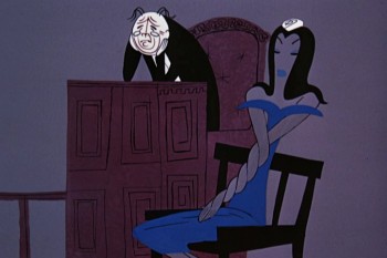
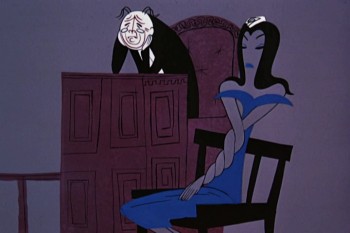
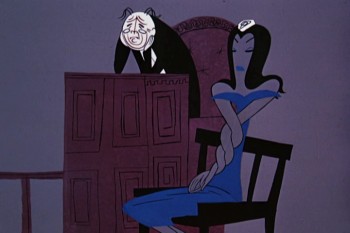
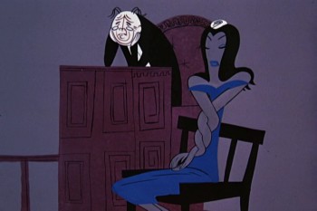
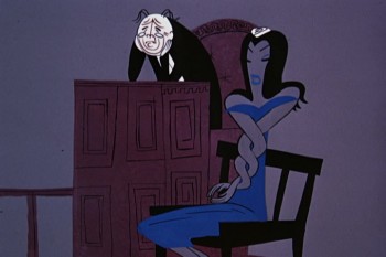
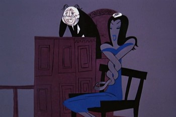
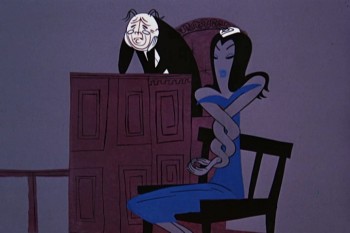
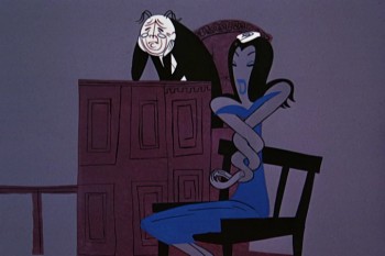
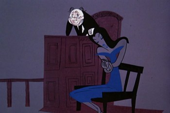
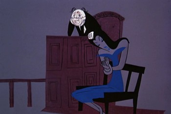
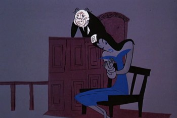
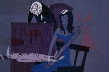
This is one of my favorite scenes of all time. Nelly Bly is on the witness stand, and she’s constantly straightening herself out as she gets deeper and deeper into her side of the story. Grim Natwick’s animation is perfect, and John Hubley’s direction and design is even better. The judge, behind her, couldn’t be better positioned.
This is a great cartoon, possibly UPA’s best. It lost the Oscar to The Two Mousketeers, a Tom and Jerry cartoon, and not even a particularly good Tom and Jerry cartoon. It would take another ten years before AMPAS ruled that you had to see the short films to be able to vote on them.
I tried to include this scene with its soundtrack, but it took longer than I could afford to give it.
 01
01
______________________
The bump in the middle is a hold wherein there’s a
camera move. I replaced it with a short dissolve.
