Monthly ArchiveMarch 2012
Bill Peckmann &Disney &Rowland B. Wilson 12 Mar 2012 05:38 am
Rowland B. Wilson’s Hunchback – another look
- When you post every day, there are gems that just don’t get long enough exposure. Bill Peckmann, at one time, had sent some preliminary artwork that Rowland B. WIlson did for a number of Disney and Bluth features. The wealth of material was enormous and it went too quickly into the past.
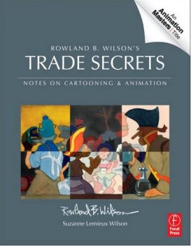 Given the new book coming onto the market, Rowland B. Wilson’s Trade Secrets: Notes for Cartooning and Animation, I thought it appropriate to take a fresh look at some of his brilliant art for the animated film.
This is a book that was put together by Suzanne Lemieux Wilson, and it looks to be as much about animation as about cartooning. Certainly, I think it appropriate to bring back some of this great pictorial material. NOW.
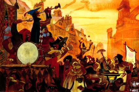
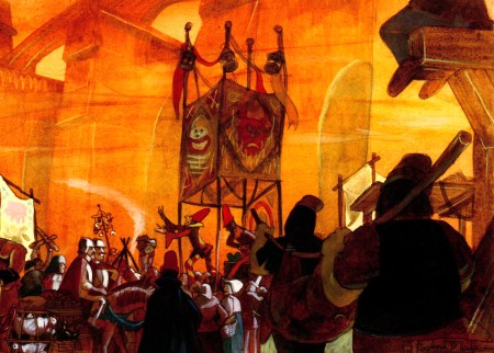
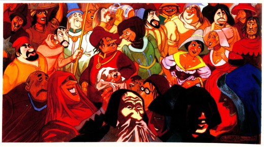
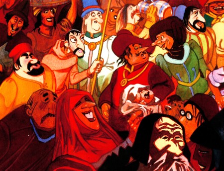
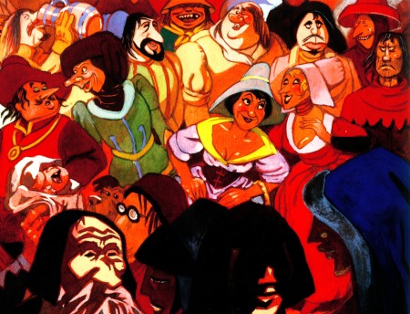
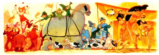
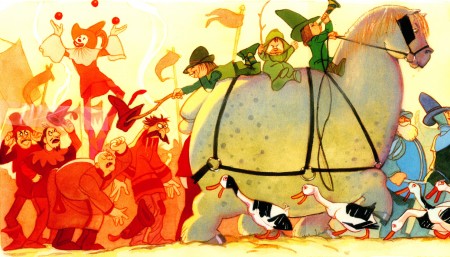
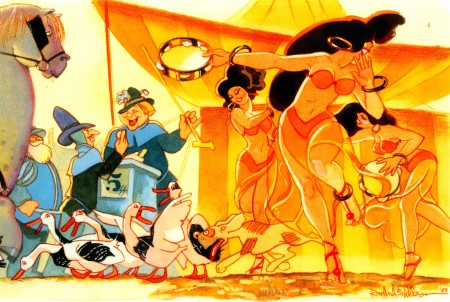
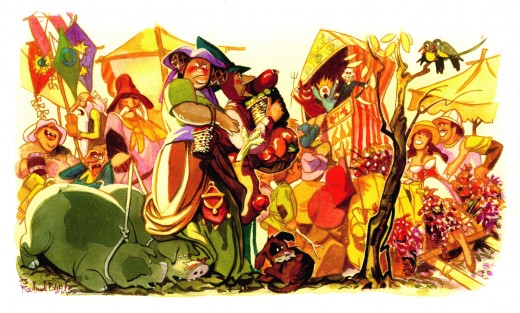
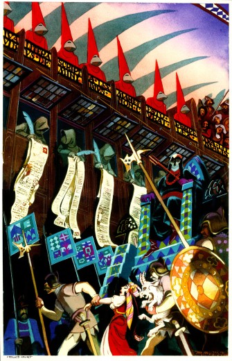
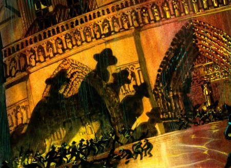
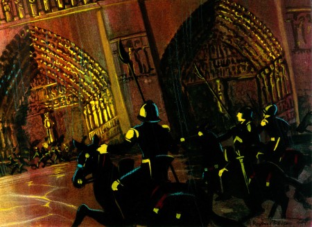
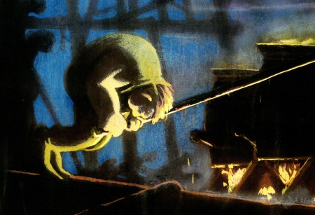
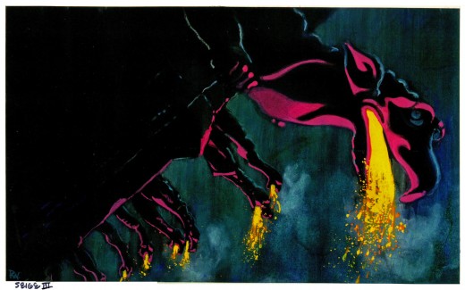
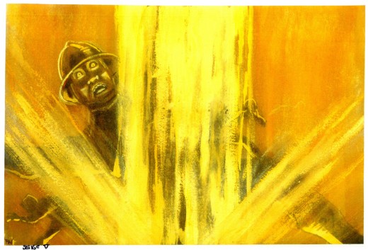
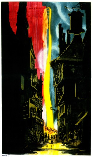
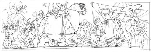
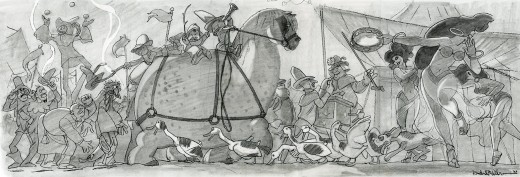
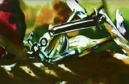
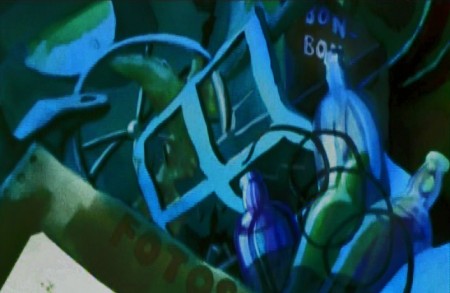
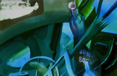
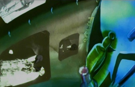
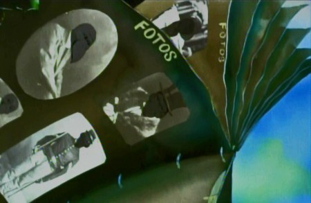
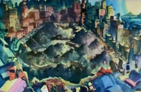
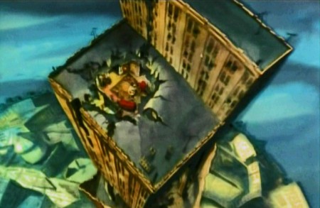
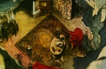
Here is the incredible cache of photostats that Bill Peckmann had sent me showing some watercolor paintings Rowland B. Wilson did while working for Disney. There are two groups of paintings: one for The Hunchback of Notre Dame, one for Hercules. These are the Hunchback images; Hercules will come next week.
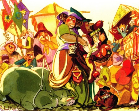
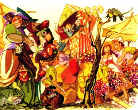
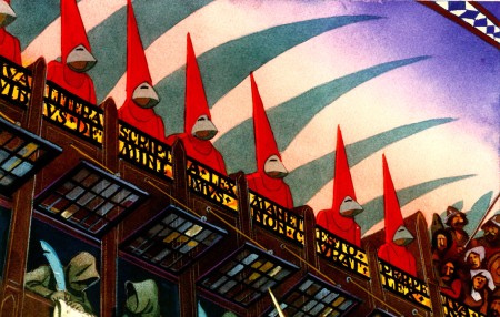
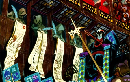
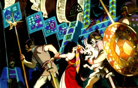
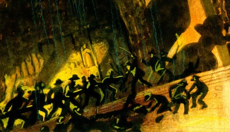
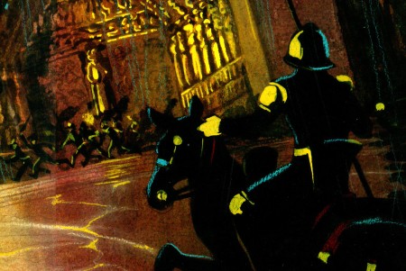
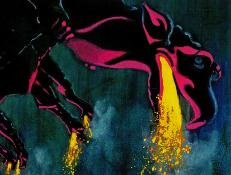
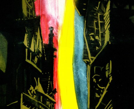
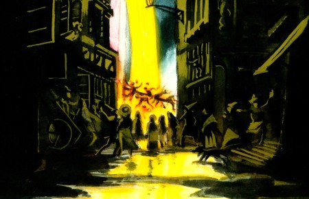
These were all inspirational sketches, and they’re all extremely long. Consequently, I’m posting them in batches. The first comes from Hunchback, and I’ll post the full sized image, then break each down into a couple of parts so that you can appreciate the incredible detail Rowland did in these things.
I hope you enjoy them.
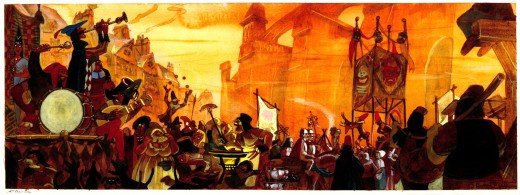 1
1(Click any image to enlarge.)
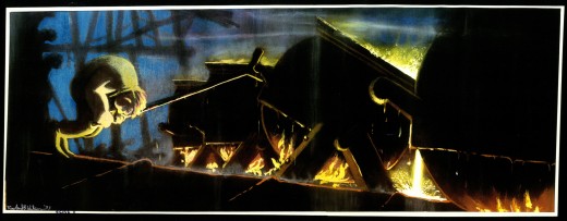
The following group of images is labelled, “The Siege” and concerns itself with the climax of the film where the people storm Notre Dame Cathedral and Quasimodo pours oil on them. These pictures are so beautiful (and large) that I can’t help but split them up so you can see some of the closeup detail.
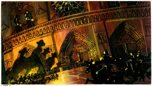 11
11(Click any image to enlarge.
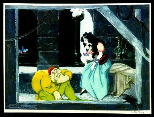 12
12
Now this is a Hunchback I could love.
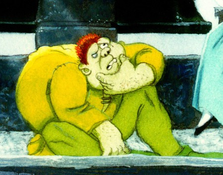 12a
12a
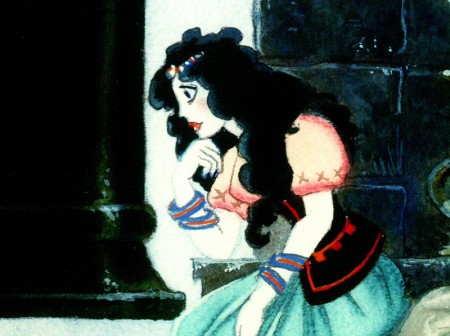
These two character designs look like they were influenced
by Richard Williams’ “Cobbler & the Thief.” Since Rowland worked
with Dick in London, it’s possible.
 12b
12b
Errol Le Cain by way of Rowland B. Wilson. Beautiful.
 13
13
At first I wasn’t sure which end was up on this image.
It might be correctly viewed counter-clockwise.
However, the label in the lower left should be the lower left.
Here are a couple of additions, a few sketches contributed by Suzanne Wilson.
Many thanks to Bill Peckmann for the generous loan of this material.
Independent Animation 11 Mar 2012 05:50 am
Kickstarting the Can
- I have to say I like the name Kickstarter. There were a number of programs, and I chose to go with that one trying to get some life in POE. The others allowed you to fail in reaching the total goal and enable you to collect what had been pledged. Something about Kickstarter made it all more reliable and above board to me.
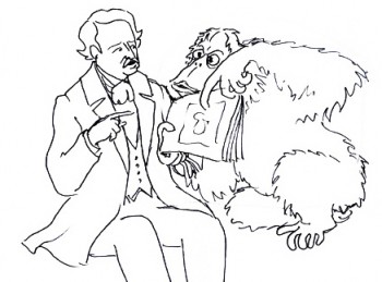 POE was a film that I pushed to start almost five years ago. Now it’s in the loghy period and really needs that “Kickstart”.
So let me tell you what’s happened so far with only a couple of days since it all started.
First and foremost there was an overwhelming show of support from so many people. Even if I don’t reach the goal, I’m so pleased to have seen the results that have already come. In just four days, we’ve reached a quarter of the total moneys requested. I’m a bit of realist, so I have no grand expectations of getting there. Yet I’m ready for whatever comes.
I’ve also been trying to contact any possible backer who expressed interest to see if they’d be interested in putting in some high numbers for this campaign. I haven’t had a “no” yet, but the money’s still not there. There’s still a week or so to go on it.
Originally, POE, once the script and boards were done, went looking for money.
There was one principal guy we were trying for, and he came back with an offer. Unfortunately, the offer was relatively low (which wasn’t the problem for me), but they ended up wanting to own everything. Not a good idea. If I was going to bust my butt doing the work and assembling something I was proud of, I wanted to share in any tiny profits such a film could generate.
A Rue Morgue Courtyard
Well, we went for bank financing so that we would control the final product to the best of our ability. And the money was coming – it was coming.
But then do you remember “Too big to fail”?
AIG.
They were the ones giving us the money and they failed.
The money disappeared; the company that was supporting POE put the project in “Turnaround,” and it’s taken us years to get it back to where we are.
I suggested to my producer, last week that we go back to the original guy who was interested in the project and had offered too little. Many his position is changed. That very same guy is now willing to talk about co-production deals. They wouldn’t own it all , and we’d have a chance to raise more money for a theatrical run prior to the US TV airing. Maybe.
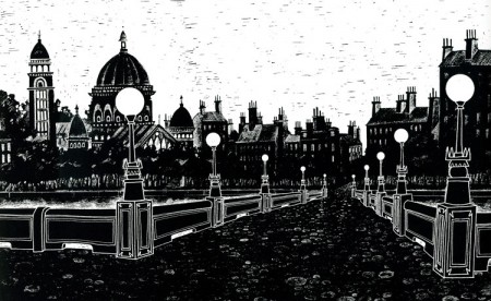
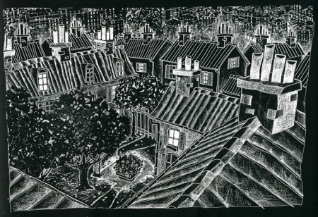
A bit of Paris n 1840
This Kickstarter push on my part has regenerated some interest, and I’m counting on using all the marbles to get it going. If I have to see it a bit more limited than I planned, I don’t care. I want a movie, and I know how to do stylized, limited animation. POE is going to get done come hell or high water.
Besides, I have too great a project to do for the second feature. Once POE‘s underway, the second script will be started. The rights shouldn’t be too expensive, and I’m going to give animation a grown up push while I can.
You can see more POE material from the pre-production at our website for POE, Poestory.net. That’s been up for quite a while and could use a good overhaul. It’ll get one soon.
Commentary 10 Mar 2012 06:26 am
Hrrumph
And talking about Animated Features, did I mention our Kickstarter Campaign to get POE in motion? Well, not today, yet. I promised to get it into the next couple of week’s posts the way Gail Collins is name dropping Mitt Romney‘s tying his dog to the roof of his car and driving to Canada.
Many thanks if you’ve been able to contribute anything. Many thanks for just paying attention. As I said, if you can get the word out to friends and friends of friends, maybe it’ll work. I’m a hoping.
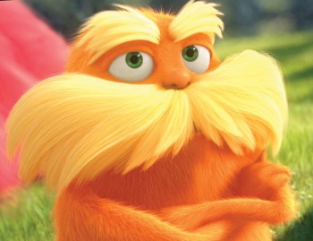 - I saw THE LORAX. What can I say? It’s the biggest piece of crap this side of 2012. This is further proof to me that CGI is not animation but bad puppetry done with machines. At least that’s what it felt like. The characters just kept moving – pop, move – pop, move – pop, move – until they stopped in any given scene. Those movements were all tied to some of the worst VO shouting, screaming, racket I’ve heard in a while. It’s like they kept trying to wake me up, but they had a mini story that spoke about nothing. Only an idiot like Lou Dobbs could attack this as “Liberal.”
I’m not sure the performances always felt bad, but the manipulation, choices, cutting of those tracks and combined with the gloopy colors and continual, non-centered movement. ECH! I was shouted down for what felt like two hours – I know, it was actually only 86 minutes, but that’s a big chunk of my life that’s gone, and it felt like two hours. (Actually there were a couople of dance moves the Ed Helms character had that were clean, but that’s about all that I saw.)
This was the #1 film in the country last week. No doubt this is the same country that is buying into the robocall Republicans accusing women of everything under the sun and trying to set the clock back to 1962. I’ve got to clear my palette. We’ll see if this miniscule but LOUD film can beat out the legions backing John Carter.
- I keep going back to ARRIETTY, but I have to say I think back on that as a style that didn’t quite work for me. It felt a bit pinched. I’d have preferred a looser design more like Spirited Away or Ponyo, Very Anime in many ways.
However, the character animation, I think, is some of the best we’ve seen from Ghibli. On all of the principal characters (with the exception of the annoying mother character), I found the motion of the characters really trying hard to be part of character development. I think specifically of a number of scenes.
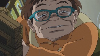 There’s a small scene where Haru (the Carol Burnett dubbed character – and I was surprised at how great a job Ms. Burnett did) stands over a small table. She is going through a simple, and basic action, but she loses her balance for a millemeter of a second and recovers. This is not something done by the books. It’s purely a motion that is put into the context of the scene she’s in, and it gives some credence to the odd character. I wish I had a dvd of the film, so I could show off some frame grabs detailing what I’ve seen.
Eventually.
There, I feel better. I can block out that American Crap, now.
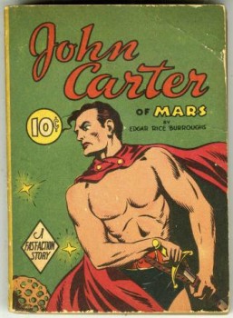 A.O.Scott kinda half liked it in his NYTimes review:
- Directed by the Pixar fixture Andrew Stanton (“Finding Nemo,†“Wall-Eâ€) and based on a 1912 magazine serial by Edgar Rice Burroughs, it is a potpourri of arcane and familiar genres. “Mash-up†doesn’t begin to capture this hectic hybrid; it’s more like a paintball fight.
- “John Carter†tries to evoke, to reanimate, a fondly recalled universe of B-movies, pulp novels and boys’ adventure magazines. But it pursues this modest goal according to blockbuster logic, which buries the easy, scrappy pleasures of the old stuff in expensive excess. A bad movie should not look this good.
Lou Leminick of the NYPost wrote in his ONE STAR review:
- Interminably long, dull and incomprehensible, “John Carter’’ evokes pretty much every sci-fi classic from the past 50 years without having any real personality of its own.
You could say much the same about the title character, as uncharismatically played by the unfortunately named Taylor Kitsch of TV’s “Friday Night Lights.’’ Even in 3-D, he’s barely one-dimensional
and
Joe Neumaier of the Daily News wrote:
- ‘John Carter’: Silly sci-fi fantasy isn’t out of this world, but it can be playful and down-to-Earth.
- There’s little here that hasn’t been seen before, which to some people is sorta the point. Stanton, a co-founder of Pixar and director of the unassailable “Wall-E,†lets “John Carter†wear its heart on its loincloth, and he never lets the often clunky-looking effects — essentially they’re “Dune†done well — overwhelm the humans.
Those humans, though, do feel like they were cast from the backlot of a miniseries set in Rome. The aptly named Kitsch is never dull and lunkheaded like similar movie warriors Sam Worthington and Jason Momoa, but neither does his sinewy grunge look mix with the late-19th-century earthly story or the sandy alien landscapes.
I have a screening I can attend of the film this coming Tuesday. After I do, I’ll let you know what I think (not that my opinion on this kinda stuff really matters.)
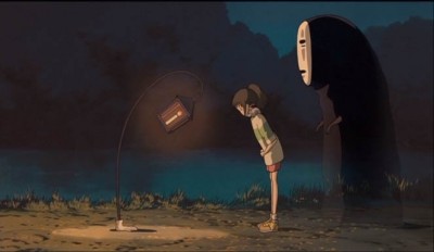 I actually have been so deeply into Spirited Away that I was going to write at length about that film. I can’t tell you how much time I’ve spent with the movie. It just keeps getting deeper for me. The animation is all serviceable and some of it is excellent; I see Ghibli really going through animation changes on this film and upcoming ones. We seem to have nothing comparable happening in the US just now, everything’s gotten so tiny here. The Brits are still doing some wonderful work, and the French have some remarkable animation. I keep watching.
Anyway, I haven’t really spilt my mouth with the Spirited Away in me. Miyazaki is just a force for me to watch. I’ve gone back to see some of his earlier features, and watch how they’ve reinforced and helped realize future works. Something like Kiki’s Delivery Service is a bit flat for me, but the story’s character development is the center of the film for Miyazaki, so I understand its place in his history.
I’ve got to watch Totoro again. It’s such a simple, lovely film. Maybe later today. I remember, years ago, someone introducing himself to me at an Ottawa Animation Festival and giving me a copy of the DVD telling me it was his favorite film, and he wanted to share it with me. It wasn’t a copied DVD; it was an unopened, store-bought copy.
That film was an enlightening discovery. (Unfortunately, I don’t know who that who gave me the DVD. Please to reveal yourself if you read this. I’m enormously grateful.)
That is a gem of a movie. There’s the inspiration.
 - Jenny Lerew, on her blog, The Blackwing Diaries, has an excellent post about character and story. She has been a principal in many a theatrical film’s story development, and she knows what she’s talking about. It’s a good read, and I encourage you to take a look.
This post actually adds to one she reworked in the past week. It’s a look into some of the later Disney features (pre Beauty & the Beast) where character took precedent over story. (Jungle Book, anyone?). If you have interest in story development, in this day of bad story writing, you should read both.
Bill Peckmann &Books &Comic Art &Illustration &Rowland B. Wilson 09 Mar 2012 07:36 am
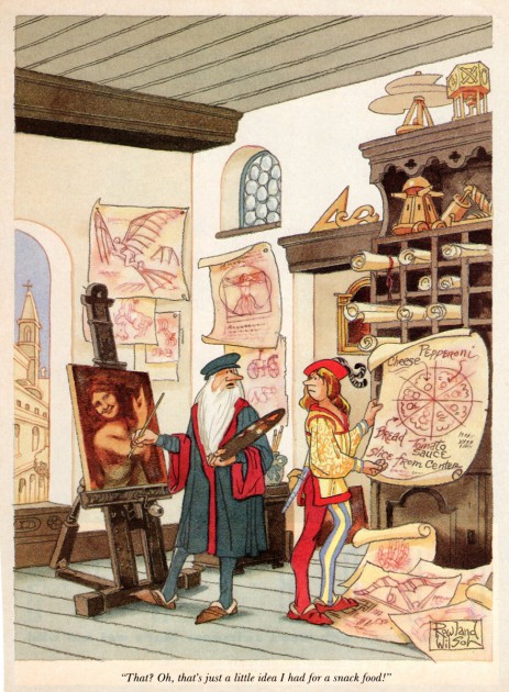
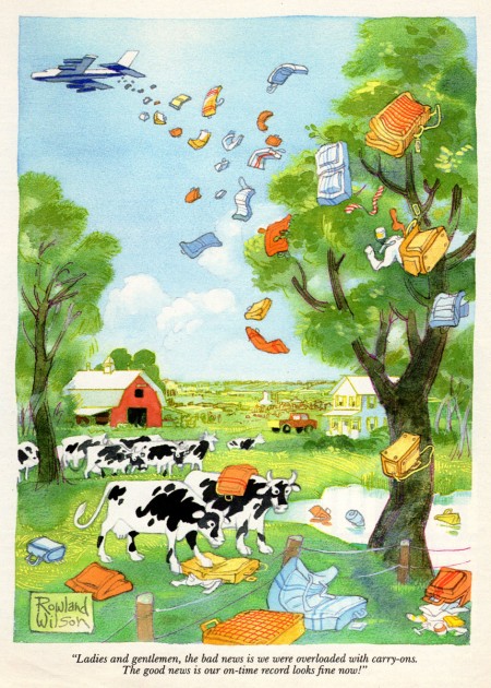
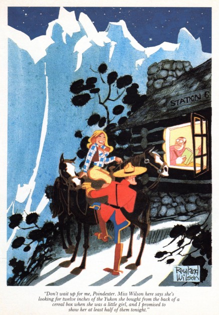
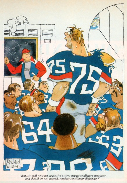
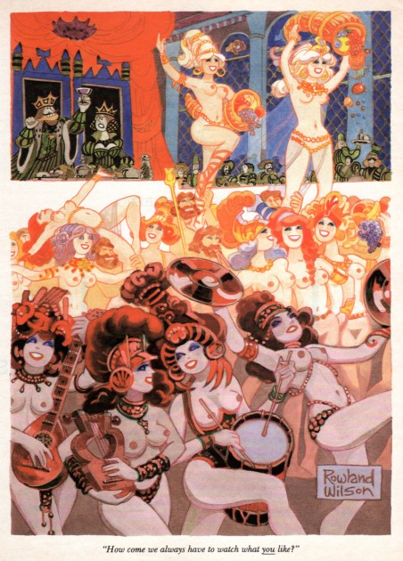
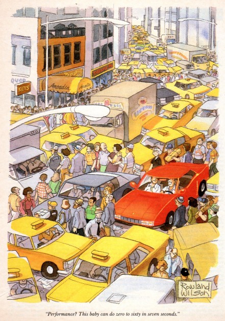
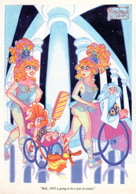
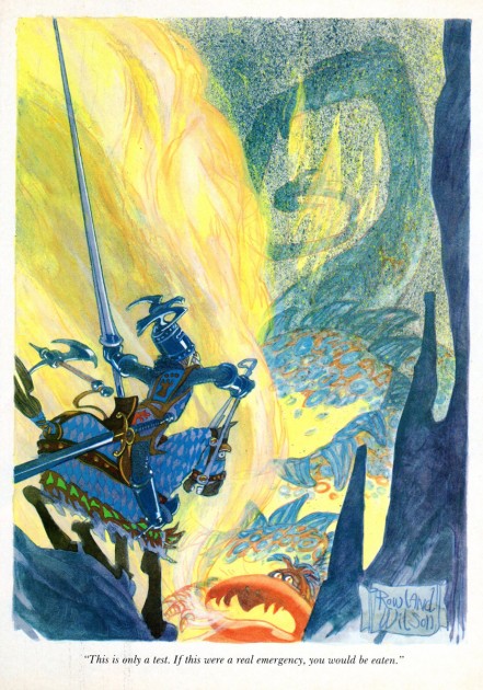
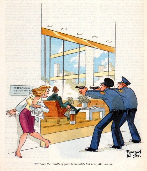
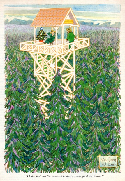
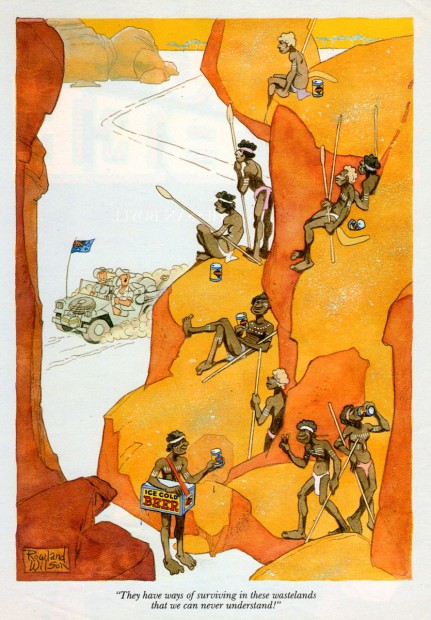
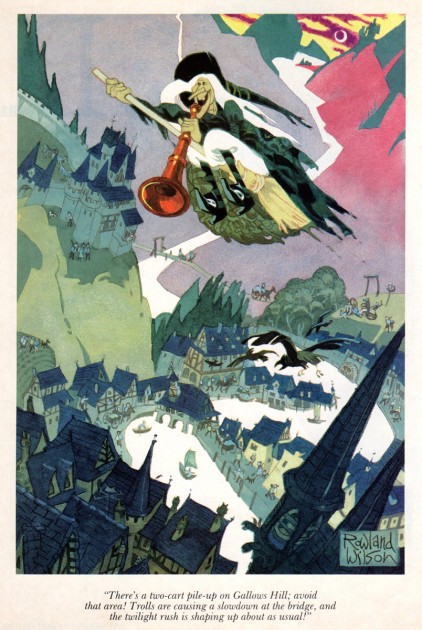
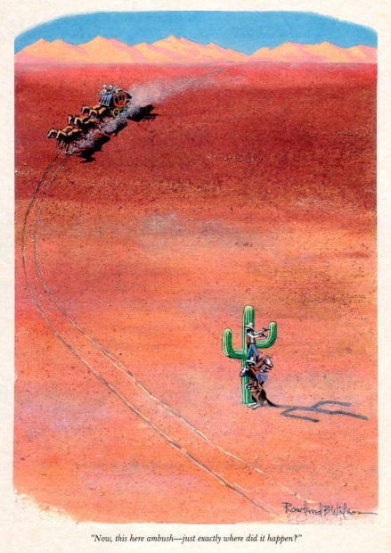
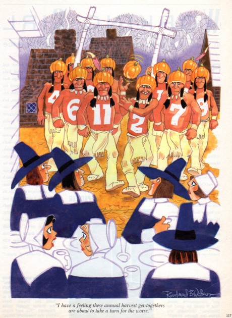
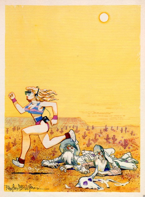
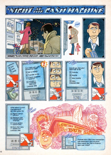
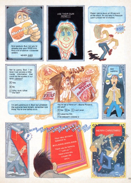
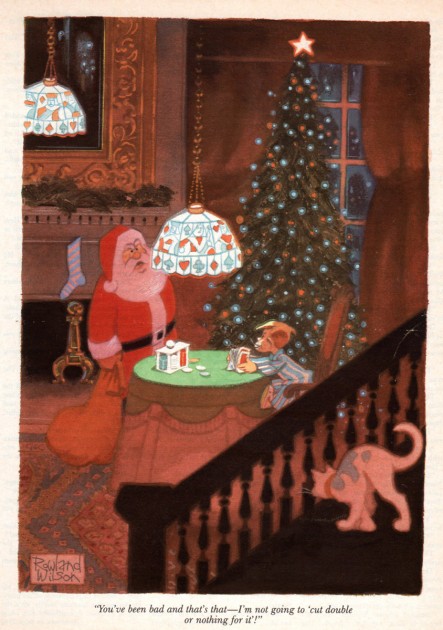
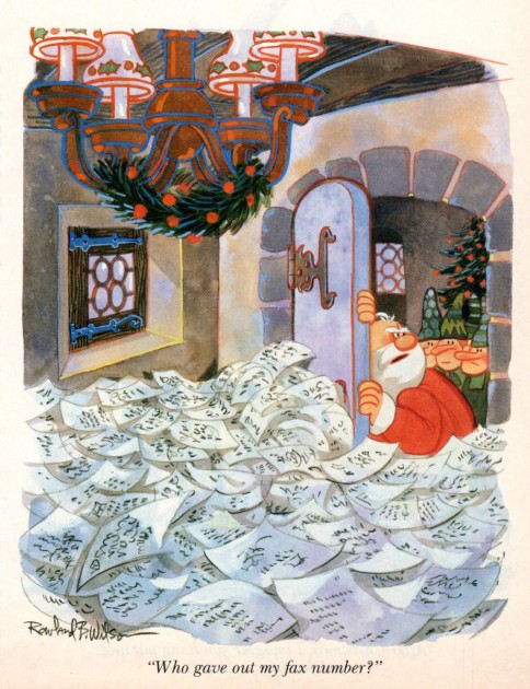
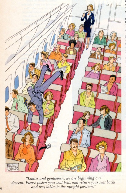
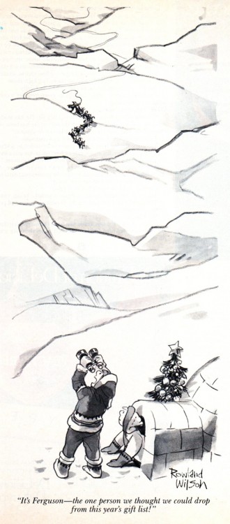
Rowland B. Wilson Playboys
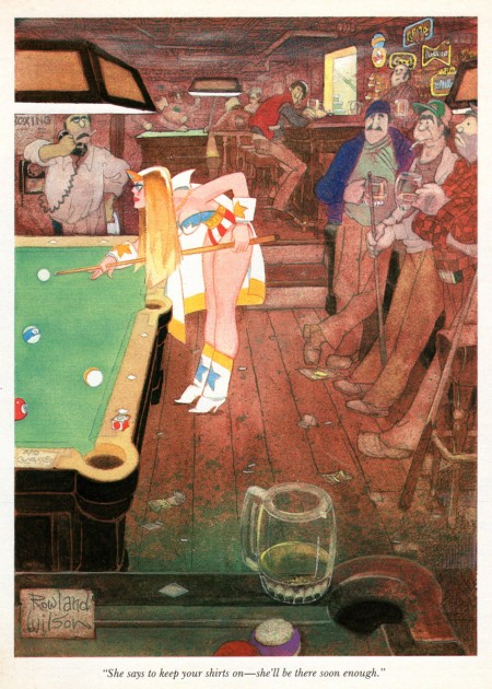
- Bill lPeckmann has sent a stash of beautiful cartoons by Rowland B. Wilson from the pages of Playboy Magazine.
 Before getting into this artwork, let me point to a brand new book on the market. Rowland B. Wilson’s Trade Secrets: Notes for Cartooning and Animation. This is a book that was put together by Suzanne Lemieux Wilson, and it looks to be as much about animation as about cartooning.
The book is available for pre-order from Amazon, and you should line up for a copy. You’ll remember that I posted lot of Mr. Wilson’s Disney and Bluth art for the animation art direction he did. I expect to repost a lot of that material again soon, perhaps when this book gets closer to hitting the market for real.
But, now we’re talking about Playboy. They did well by their artists and cartoonists; the printing was always first class and the amount of exposure was high. Rowland’s cartoons always jumped out at me as among the more sophisticated ideas, and the artwork was always top notch. I think you’ll enjoy these, and thank Bill for sharing his collection, yet again.
 1
1
You might check out some of these spot cartoons posted by Leif Peng.
Animation &Frame Grabs &Independent Animation &SpornFilms 08 Mar 2012 05:48 am
Fritz BGs & Set Pieces
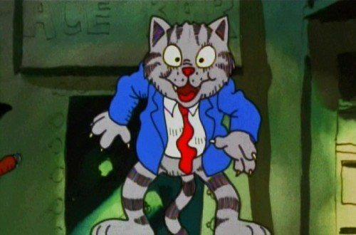
- For some reason I was inspired to watch some of Bakshi‘s Fritz the Cat, this past week. I remember posting in the past on a couple of the sequences.
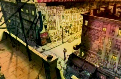 There was one on Johnny Vita‘s dynamic BGs at the time. They were a bit revolutionary for what they were. Johnny had gone through Greenwich Village with Bakshi photographing the environs. He then did a line drawing over the photos and painted the art under the lines, using Luma dyes. Bright shiny colors that he sometimes was able to mute. (It’s hard to tell the real colors from the DVD which all look like mud. I enhanced everything in photoshop to try to get colors that I remembered from 1972.) These were almost ragged versions of what Ken Andersen had done on 101 Dalmatians, but they were done on the fly. No time or money. Here’s that original post.
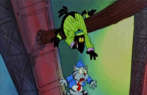
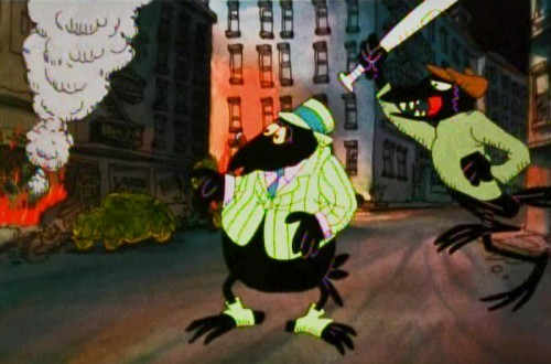
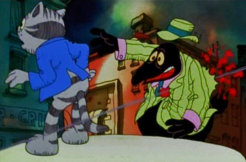
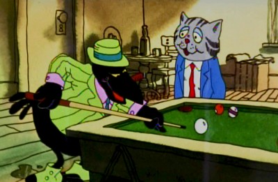 Then I did one on a scene in a bar where Fritz meets Duke, the crow, who will not only save his life but will take a bullet at Fritz’ sheer stupidity. Here are some drawings from Marty Taras of that scene.
Then, I also did a post on some storyboard drawings of the bathtub orgy at the film’s beginning. You can find those drawings here.
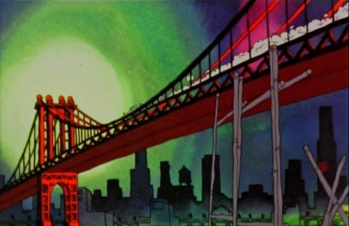
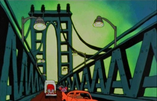
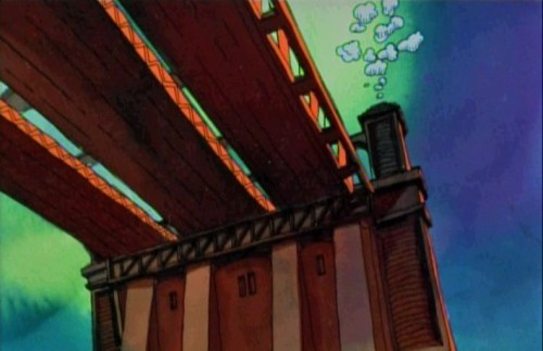
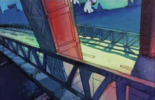
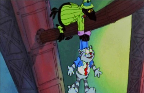
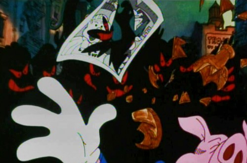
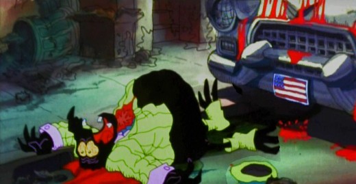
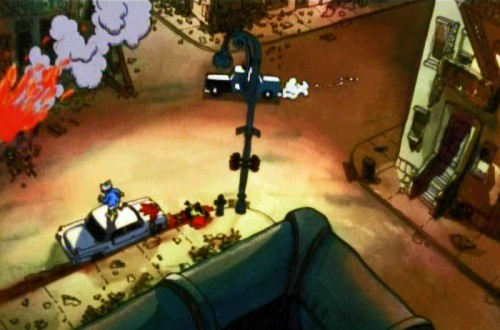
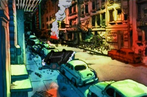
Here’s another set piece, a series of pans. I’ve hooked a couple of the pans together, but have kept many as single frame elements to be better seen. A whole melange of styles mixed in here, and no doubt Bakshi had seen what Hubley was doing to pan through screen time.

Opening part of a multiple exposure pan.
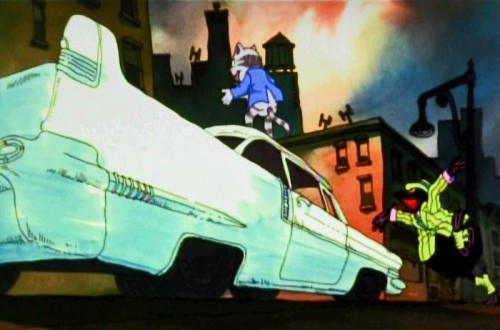
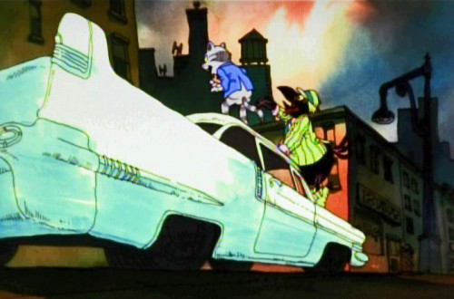
Then there’s the flight over the Brooklyn Bridge where Fritz crashes the car and the Duke saves Fritz’ life.
 1
1
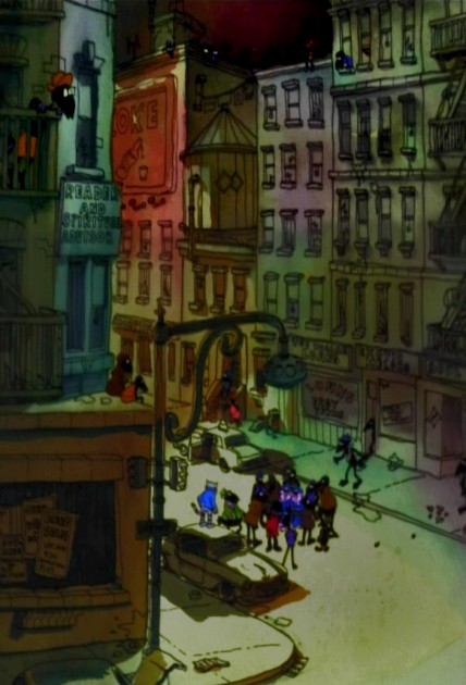
And finally, we have the best set piece of the movie. The climax that falls in the middle of the film, and the rest of the film can’t get over it.
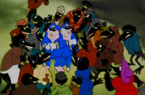
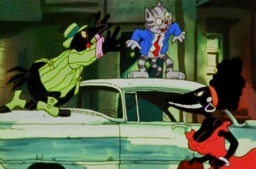
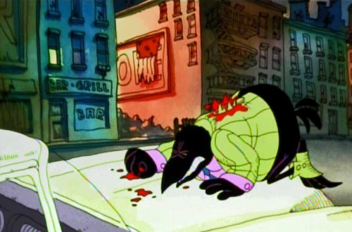
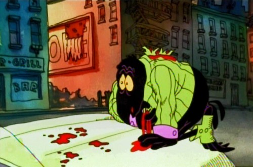
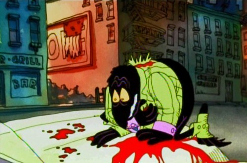
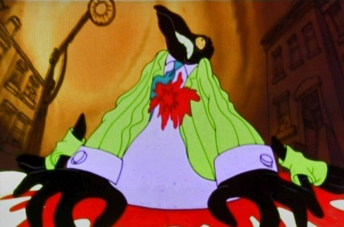
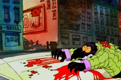
Minor mayhem breaks out in Harlem, Duke gets killed, accidentally, and a riot breaks out. It’s all Fritz’ fault, of course, and he naturally runs from the scene at the end of the sequence.
Cosmo Anzilotti, the AD told me that this was Jim Tyer‘s scene. It doesn’t quite look like his work – rock steady and beautiful. I can and do believe that it is his work. Some great great poses.
Supposedly, Tyer hated working on the film. He was a die-hard Catholic who hated the cursed animation being done. Bakshi loved Tyer, as well he should have.
 1
1
 2
2
The cops are pushed into a corner.
 4
4
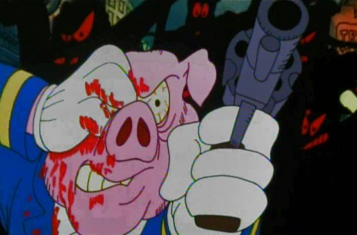
. . . who pulls out a gun and fires.
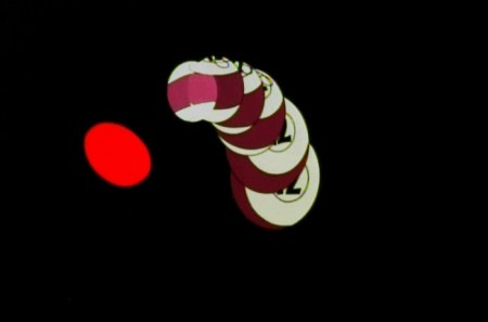
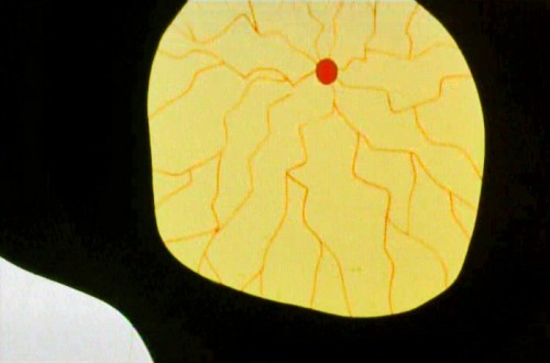
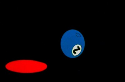 15
15
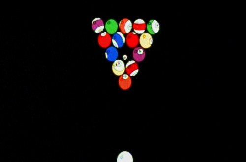
The metaphor of pool balls sinking into their holes
represents Duke’s last breaths on earth.
The most important piece of writing on Fritz the Cat is an older piece done by Mike Barrier and readily available on his site. Read it if you have any interest in the film. Part 1 – Part 2 – Part 3 -Part 4 – Part 5
- Ah you didn’t think I’d forget the HARD SELL, did you? Unfortunately, I can’t. I am trying to get my little epic into the production hard line.
POE is a telling of Edgar Allan Poe’s short life story, and we’ve done a lot of art and preparation. Now we want a couple of minutes of good final product to show how great it’ll be.
Kickstart POE is the project in the works, and I need your help. Please take a look at the page, give any small support you can, even if it’s just to tell your friends about it.
Many thanks.
Animation &Independent Animation &SpornFilms 07 Mar 2012 12:15 am
Kickstarting Poe
Many of you know that I have been working hard developing an animated feature built to tell the biography of Edgar Allan Poe. Lots of artwork has been drawn, storyboards developed and shot as animatics, voices recorded, test animation done.

Well it can’t be held down anymore. The art is literally bursting out of the box ready to go forward, and I’ve made the decision to use a Kickstarter Campaign to raise a small and reasonable amount of money to complete a few minutes of Final animation.
We want that opening two minute teaser done, wherein young Edgar is dragged from theater to theater by his squabbling actor parents as they perform up and down the 1820s East Coast. They fight, perform, separate and ultimately Poe’s mother dies as the three year old sits watching the last theater, in Richmond, VA., burn to the ground, leaving him an orphan at the film’s start.
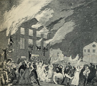
The Burning of the Theater in Richmond, VA.
This was the theater in which Elizabeth Arnold Poe,
mother of Edgar Allan Poe, was acting shortly
before her death in December 1811.
Then we have over 20 minutes of animatic that Master Aimator, TIssa David (age 91) has produced for us. We want to turn a couple of these sequences into the final animated version, rather than loose animatic.
In short we want the film moving forward, and this seems the most honest way of progressing.
I hope we will get support of the industry and our friends and those out there who will see a good investment.
We’re offering many perks from Posters, to DVDs to T-Shirts to actually getting your caricature in our animated feature. It’s all in good fun, and it’s a strong attempt to get a movie started.
Please take the time to check out the Kickstarter page, and if you can contribute anything, thank you. If not, tell your friends. It’s the friends and the friends of friends who will help us move forward.
And.please forgive me, I’m going to be raising this post until we finish up the campaign. I’m desperate to get POE in motion. Pure hard sell to come.
Bill Peckmann &Books &Illustration 06 Mar 2012 06:07 am
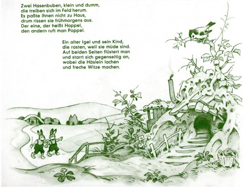
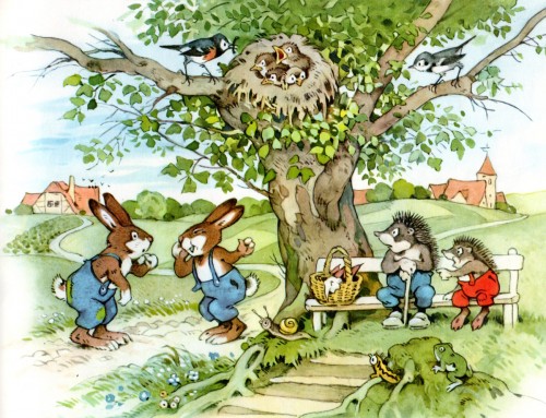
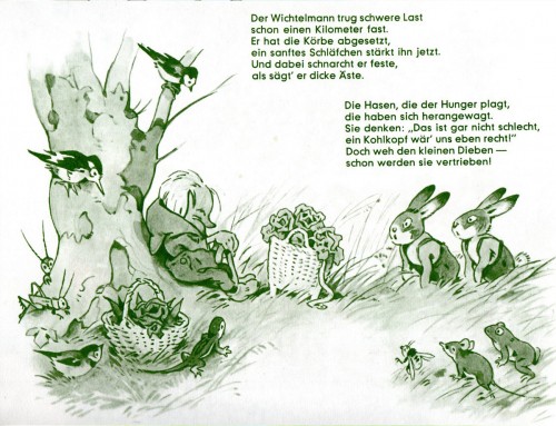
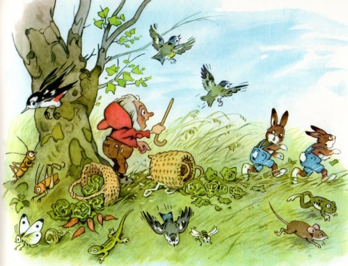
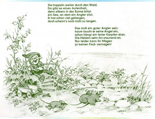
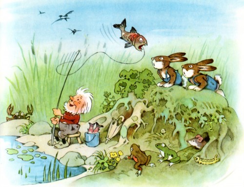
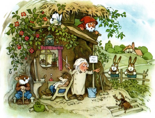
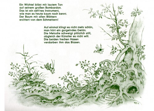
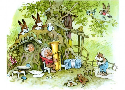
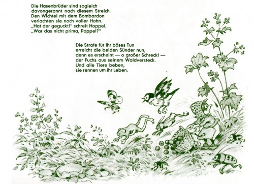
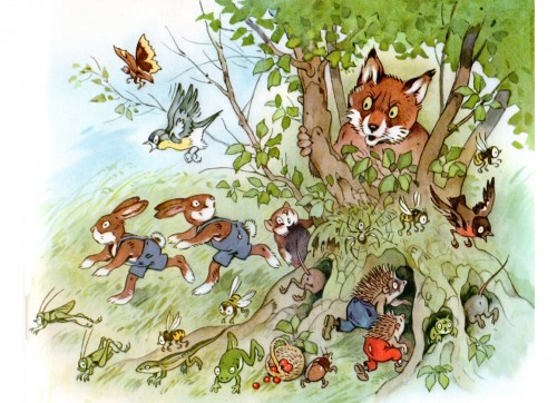
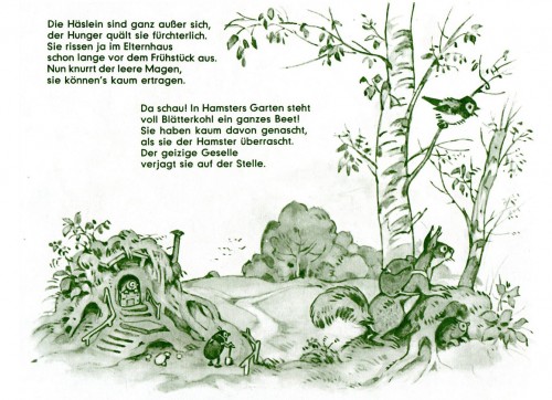
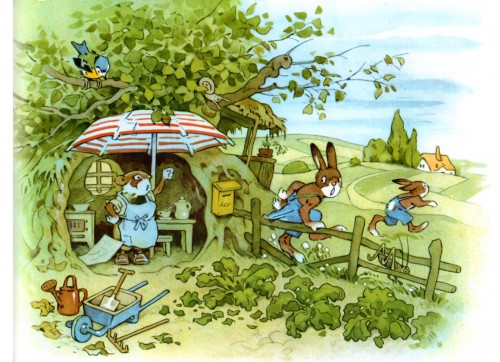
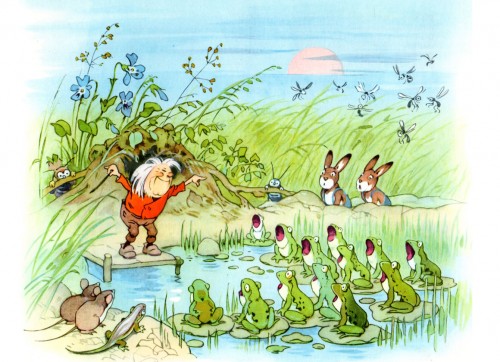
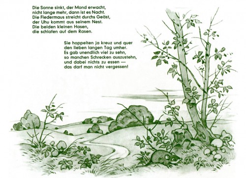
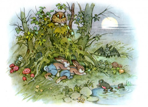
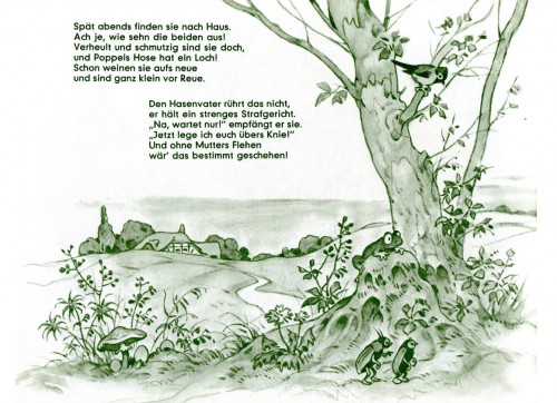
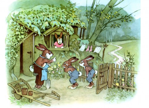
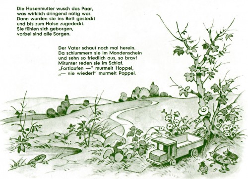
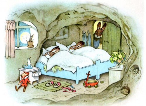
Baumgarten’s Hoppel Und Poppel
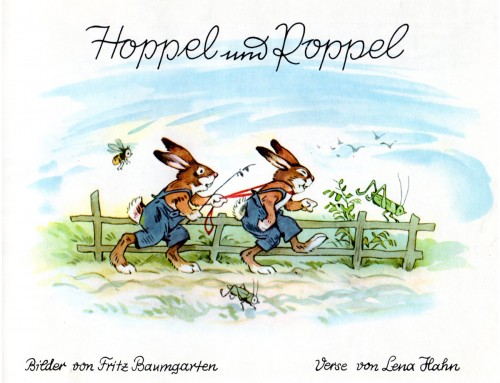
- Fritz Baumgarten was a brilliant illustrator who drew many fantasy worlds in books populated with forest animals, elves, fairies, and birds. His style reminds me a bit of an illustrated version of early MGM Harman-Ising cartoons. There’s a charming innocence in his approach, and I have to say I love all of the books of his I’ve seen. It’s fortunate for me, because Bill Peckmann has a collection of them and delights me by sending scans.
Here is Hoppel und Poppel from Baumgarten, which unfortunately is not translated. But we’re here to look at the Baumgarten pictures, not read the Lena Hahn verse. So, I hope you enjoy.
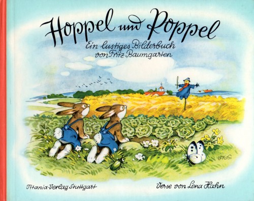
The book’s cover
Animation &Animation Artifacts &Art Art &commercial animation &Independent Animation &SpornFilms 05 Mar 2012 06:22 am
Steig Alka Seltzer Drawings
 I thought today I’d post anew some layout drawings done by William Steig for an Alka Seltzer commercial produced in the early 60′s.
Obviously, for the purpose of viewing, I’ve reconfigured the poses so that several of them are on each set-up. There are actually 15 drawings to the commercial, all on separate sheets of rice paper.
 The commercial was done by Elektra Studios. Steig worked with a bamboo reed cut to form a point. He dipped that in ink and drew. The paper is particularly thick and is designed to absorb the ink. They’re punched with Oxberry peg holes top and bottom. I have one of the bamboo “pens” he used to draw these layouts. The final commercial was basically an ink line drawing against a white field.
 I’ve been a big fan of Steig‘s since my earliest days when I first discovered him in the New Yorker Magazine. By the time I’d made it to college, I’d already seen two art exhibits of his artwork.
 By the time I saw my third exhibit of his work, I was able to barely afford one of the New Yorker drawings. It’s done on rice paper with the same type of “pen”. Years later, when I told Steig that I’d bought it, he said that it was the only drawing to have sold at that exhibit.
It was real luck for me to have been able to adapt a couple of his children’s books to animation. I not only got to meet him and his wife, Jeanne, but worked with his flutist son, Jeremy, on a number of projects.
I’m rather partial to Abel’s Island as a film. There were only about two dozen B&W pen and ink illustrations in the book, so we had to do quite a bit of designing in the style of Steig Bridget Thorne, who art directed the film, did some of her finest work ever on the backgrounds – beautiful pieces that I still treasure. I think this is one of Steig‘s best books, and I think we more than did it justice. Too bad negative feelings developed toward the end of that film as Jeremy sought some kind of financial greed, and I had to move on past him to protect the film, itself. - I still wonder what Shrek might have looked like if they’d followed Steig‘s book illustrations.

The original one minute spot.
These are some of the layout drawings done by William Steig for an Alka Seltzer commercial produced in the early 60′s.
The commercial was done by Elektra Studios. Steig worked with a bamboo reed cut to form a point. He dipped that in ink and drew. The paper is particularly thick and is designed to absorb the ink. They’re punched with Oxberry peg holes top and bottom. I have one of the “pens” he used to draw these layouts. The final comercial was basically an ink line drawing against a white field.
I’ve been a big fan of Steig‘s since my earliest days when I first discovered him in the New Yorker Magazine. By the time I’d made it to college, I’d already seen two art exhibits of his artwork.
By the time I saw my third exhibit of his work, I was able to barely afford one of the New Yorker drawings. It’s done on rice paper with the same type of “pen”. Years later, when I told Steig that I’d bought it, he said that it was the only drawing to have sold at that exhibit.
It was real luck for me to have been able to adapt a couple of his children’s books to animation. I not only got to meet him and his wife, Jeanne, but worked with his flutist son, Jeremy, on a number of projects.
Bridget Thorne, who art directed the film, did some of her finest work ever on the backgrounds – beautiful pieces that I still treasure. I think this is one of Steig‘s best books, and I think we did it justice. 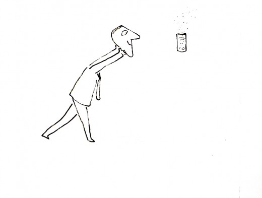
I’m rather partial to Abel’s Island as a film. There were only about two dozen B&W pen and ink illustrations in the book, so we had to do quite a bit of designing in the style of Steig
Animation Artifacts &commercial animation &Richard Williams 04 Mar 2012 08:24 am
Williams/Frazetta/Bakshi – Recap
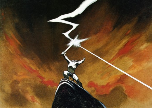
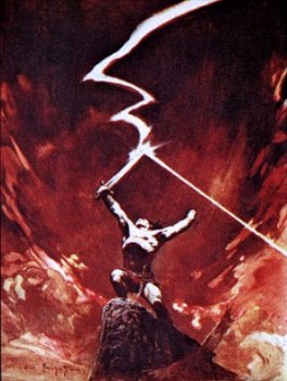 – Having given images of both Dick Williams‘ work and Bakshi‘s, I thought it’d be a good time to post the cel below. It reminds us of what an extremely talented animator and draftsman Richard Williams was – and still is.
This is a cel from his commercial for Jovan done in Frank Frazetta‘s style.
Of course, Williams captures the illustrator’s work better than Bakshi did in Fire and Ice (although to be fair Bakshi had an enormously lower per second budget.) There’s a gallery of some art from Bakshi‘s film here, and there’s a trailer for it on YouTube.
Dick Williams‘ beautiful commercial ran briefly in 1978.
An image scanned from the cover of Funnyworld #19 runs beneath the cel to give an indication of what it looked like in the final. It appears to be a cel from the __________Frazetta’s original.
same scene – a bit closer on the character.
The cel was given to me by Dick. (I also have another which matches the other Funnyworld illustration from this spot.)
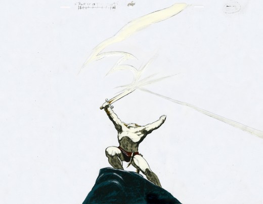
(Click on any image to enlarge.)
Dick animated the spot directly on cel with his Mars Omnichrome pencil (no longer available, of course.) There were six weeks for the entire production. Illustrator Rebecca Mills painted the backgrounds in oil. I remember Dick telling me how brilliant her work was while this commercial was in production.
_________________
- Lets go even beyond Frazetta and Bakshi with the Richard Williams‘ studio in the heyday when he was about to prove himself with The Cobbler and the Thief. Let me share another image with you.
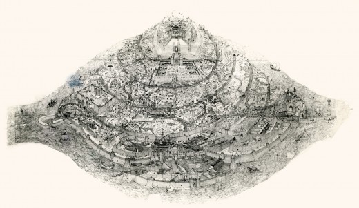
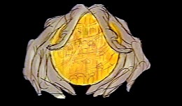
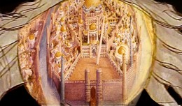
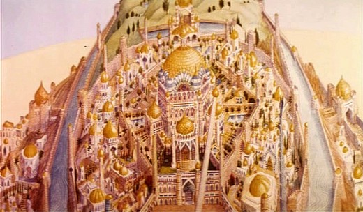
When Raggedy Ann & Andy was winding down, Richard Williams asked me, over dinner, whether I would be interested in working in London on his feature, The Cobbler and the Thief. He had in mind one sequence which he said would be all mine. This was the film’s opening – a slow truck into the island where all the action of the film would take place.
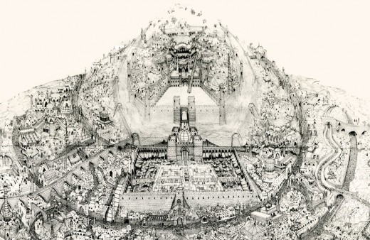
This was a photostat of this island. The original drawing, Dick had said, was enormous. It was composed of many smaller segments that were pinned together on a wall in his studio. If you look closely you can see those dividers in this photostat. To give a better indication of the detail in this drawing, I’m posting, below, a second image of a small portion of it.
The idea of it exhilarated me. I believe he said that Roy Naisbitt was involved with it, and that was something to get me going. I’d read about many of Dick’s staff and had already placed them on pedestals – including Roy’s work. I would not only get to meet them but work with them as well.
I decided not to take the job. I thought it would be better to remain friends with Dick than to continue working with him. That decision is something I don’t regret. It would have been fun to have been involved with that film, but so much has happened in my life by staying put, that I have no regrets.
The storyboard for the original cut of Dick’s film included these panels which led into the image of the animated city. A still of the city remained in the Miramax/Fred Calvert version, but that’s all.
Commentary &Independent Animation 03 Mar 2012 06:11 am
More Crits, Quips and Cracks
- Last week I wrote about my reading Andrew Osmond‘s BFI monograph for the film Spirited Away. I quite enjoyed the short book and immediately read through it twice. Of course, I also enjoy Miyazaki’s film Spirited Away, so I had a lot to visit in the read.
In the rear of the book, there are notes and references for further reading. One of these was a commentary article by Michael Barrier which is still posted on his site, about Monsters Inc. and Pixar’s animation as well as mention of a couple of Miyazaki films, Princess Mononkone and Spirited Away.
My first thought on going back and rereading Mike’s article was in how much the comment and material holds up over the years. There’s some very specific arguments being made about the animation of all the films mentioned, and I can’t take issue with much of what he has to say.
I’d like to quote a few paragraphs from this article:
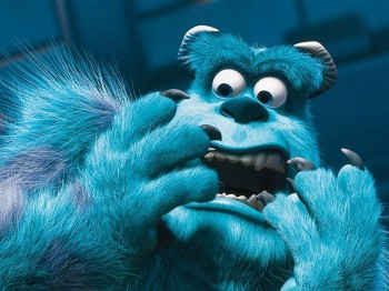 Computer animation’s technology has from all appearances advanced at an even faster rate than the techniques of the Disney animators in the thirties. It’s becoming clear, though, that, in contrast to what happened seventy years ago, there’s no necessary connection between mastering the technology and putting more convincing characters on the screen. When a character is covered with millions of precisely rendered hairs, and his on-screen environment is richly three-dimensional, it’s reasonable to expect him to move with a real creature’s subtlety. Sulley does not pass that test. He is less persuasive than many drawn characters whose caricatured movements are simpler and more direct. It is Sulley’s voice (by John Goodman) that brings him to life, far more than the animation; in that respect, the Pixar characters are indistinguishable from Homer Simpson or, for that matter, Huckleberry Hound.
 And about Spirited Away:
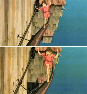 Stylization, the ready answer, or excuse, for Japanese animators’ cavalier handling of their characters, doesn’t really serve in Miyazaki’s case, because he is so good at atmospherics—his settings seem real even when the characters don’t. To the extent that Chihiro, Miyazaki’s ten-year-old protagonist, wins our sympathy, it’s not because the animation brings her to life (except perhaps in fleeting moments when she slips into the paralysis of fear), it’s because Miyazaki places her in an environment as persuasively weird as those in the most obvious of his sources, Lewis Carroll’s Alice in Wonderland and Through the Looking Glass. But how much more powerful the film would be—how much more involving—if Chihiro had been animated so that she were wholly present on the screen . . .
Mike is definitely right. The animation of the early, pre-Brad Bird Pixar films is not quite sophisticated enough to take control of the well performed celebrity voices that dominate the characters. (Bird, I think, was able to coax bits of fine original animation out of the animators and the complex system of cgi animation.) Likewise, through Spirited Away, I see a simplicity in the animation of the characters. However, it is with this film that I believe some real animation starts to enter the Miyazaki films. The scene where Chihiro crosses a treacherous metal pipe outside the bath house. The character makes a strong change in personality with this animation, and it has to be taken note that this is not in the voice over but in the artwork. Miyazaki made the choice to change the personality here against the arguments of his animation director, and we can see that the character development has clearly stepped into the studio’s animation, no matter how slowly. From this point forward, Chahiro has a marked change in her character.
Yes, as Mike suggests, the atmospherics have strongly supported the obvious animation, up to this point, but I believe something stronger is entering the films.
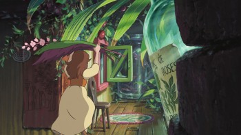 This to me is quite clear in seeing The Secret World of Arrietty. Things have taken an enormous leap, and some of the animation is very personable, completely without artifice and wholly based on human action and interaction. Certainly, it still has many wooden scenes, but there is enough original work in there, that I have to have enormous pleasure in witnessing real 2D animation making its presence felt. This non-generic animation is hard to find in western work, and that’s almost inexplicable to me.
Mike Barrier in his commentary article on Disney’s Tangled has different thoughts about cgi animation. I have to say I don’t quite agree with him on this film, but I understand what he has to say.
- Where CGI is concerned, it seems to me that a complete naturalness in the characters’ movements, like that in parts of Tangled, does not limit the animators to a deadening literalness. Instead, it creates the potential for more subtle and expressive animation of a distinctly non-literal kind, just as the Disney animators’ growing mastery of hand-drawn animation in the 1930s meant that cartoon characters like the Seven Dwarfs could be more insistently present on the screen than characters that were drawn with superficially greater realism.
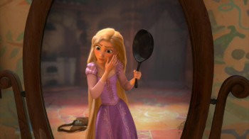 Where Mike sees glimmers of a reality in the animation, I see it all ripped away by generic popping movements, oftentimes covered with blurred motions. What you get are the slow moving gestures immediately followed by popping cartoon-like actions. This goes for both Rapunzel and her Prince. The end result is that their motions, to me, are identical, and there is no personality shining through beyond the voice acting (which I don’t think is great. Mandy Moore couldn’t be more generic.) The realistic movements, to me, are with the witch/stepmother. Here, Donna Murphy‘s voice over has a lot to do with the character, but I don’t discount what the character, herself, is doing in the animation.
In short, I have to say that there’s a veritable treasure trove of material on Mike Barrier‘s site. Dig in and take a look at some of these articles. His is a singular, articulate voice, and there’re books worth of ideas and living commentary on this site. And it’s all for free. but then if you really love animation, you already know this.
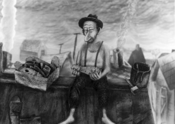 - I’m pleased to see that Ian Lumsden has returned to posting more videos on his blog, The Animation Blog. Ian’s taste is quite fine, and the work posted is always of a generally high caliber. Recently he posted Eugene Federenko and Rose Newlove‘s beauty of a film, The Village Idiots. Federenko is an artist of the most devoted kind, and to watch his films is always my pleasure. Believe me, I’ve seen many of them MANY times, and the welcome doesn’t wear thin for me.
Such films as Mr. Federenko’s makes me long for the National Film Board of even fifteen years ago when capital was a little more available, and the beautiful films
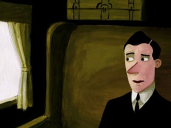 were plentiful. (I’m grateful for any short they’re still making and I wait for them at Festivals and Academy runoffs. This year’s Wild Life by Wendy Tilby and Amanda Forbis and Dimanche by Patrick Doyon were both superb gems, and those filmmakers deserved the high praise they received in being nominated for the Oscar. I’d hoped for Wild Life to win, but am pleased they got as far as they did. It’s story is the best of those that were in the running.)
- The Oscars came and went, and neither of my animation choices won, though I’m not ocmpletely dissatisfied with Rango‘s win. At least it was the more eccentric of the cgi films.
As for The Fantastic Flying Books of Mr. Morris Lessmore, I find the film completely opaque. It’s obviously and attractive and seems to think it’s about something, but I’ll be damned if I can understand it. Except that the guy likes books and doles them out from his ersatz library in the middle of nowhereland. Oh yes, he’s lonely. All he has is a Humpty Dumpty animated illustration book to keep him in good company.
This is one of those design-y stories where everything is built around conceit, and the audience is fed schmaltz about nothing. It’s a poor meal to swallow.
A film like Wild Life is about many things and told its story beautifully, graphically and was well animated.
Just the same, congratulations to William Joyce and Brandon Oldenburg
I’m pleased that they’re onto other projects at Moonbot Studio.
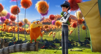 - Of the local critics, AO Scott of the NYTimes was particularly harsh on THE LORAX
- Don’t be fooled. Despite its soft environmentalist message “The Lorax†is an example of what it pretends to oppose. Its relationship to Dr. Seuss’s book is precisely that of the synthetic trees that line the streets of Thneedville to the organic Truffulas they have displaced. The movie is a noisy, useless piece of junk, reverse-engineered into something resembling popular art in accordance with the reigning imperatives of marketing and brand extension.
and then later in the review . . .
- In the film as in the book, the Once-ler ravages the landscape and destroys the Truffula trees to manufacture thneeds, knitted garments that have multiple uses but no real utility. Demand for them is insatiable for a while, and then, once the trees are gone, the thneeds are forgotten, partly because nobody really needed them in the first place. There is an obvious metaphor here, but the movie is blind to it, and to everything else that is interesting or true in the story it tries to tell.
It sounds like the trailer I saw for the film, as I waited patiently through many animated junk trailers, on the way to see The Secret World of Arrietty in a theater. The film screens for Academy members on this upcoming Thursday. Maybe I’ll muster the courage to sit through it.
But then, Eliabeth Weitzman in the NYDaily News seemed to enjoy the film calling it, “A Tree-mendous Animated Movie.”
- While softening Geisel’s darker themes, they still meld a valuable message into catchy songs, bright images (nicely done in 3D) and funny characters.
- Even adults are likely to walk out wondering how our own society has strayed so far from any sensible path … before hopping into their Lorax-approved Mazda and heading to IHOP for some Truffula Chip pancakes.
And, finally, the NYPost‘s Kyle Smith is merciless:
- I am the critic, I speak to displease:
“The Lorax†is awful, like chronic disease.
There’s no fun in “The Lorax,†no joy in its theme;
It’s as boring as sales tax.
I’m ready to ream.


 2
2 3
3
 7
7 9
9 12
12 13
13 15
15 17
17 24
24 27
27