Monthly ArchiveMarch 2012
Commentary 31 Mar 2012 07:42 am
Some things
- It was a kick to do the Kickstarter campaign trying to raise some funds for POE. No luck in the end (I obviously set my aims too high), but plenty of eye opening support from everyone in the animation community. It certainly was encouraging and more than a little heartwarming.
From the center of my being, let me say a loud Thank You to all out there; I am blessed. And you people are all wonderful.
I’m not sure if and how I’d do it again (though a lot of people are encouraging me to start again immediately); it’s a bit stressful in the end. Certainly, I’d work with one of the non-Kickstarter programs where the goal wouldn’t force the cut off. Just the same, it all took a bit of a toll. However, before the week is out I’ll get into it.
Again, many thanks.
- Now another piece of news. I’m not going out of business.
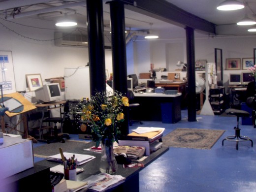
I am closing the doors on my studio space, but we’re just downsizing. The projects I’ve been doing have shown me that I don’t need quite as much space to work since what I have been doing is to work on my own or in collaboration with Matt Clinton, who is in Michigan. I have work coming up, but I’ll be doing it alone. I don’t need 5000 extra feet of space and five desks and computers.
After thirty two years, I’m going to go a bit more virtual. I’ll have the computer out of the home, and I’ll take Candy Kugel‘s incredibly generous offer to do some of the work out of her space, Buzzco. It’ll be fun to be around a good friend during the weekdays, and I’ll continue the way most of the world seems to be operating.
Of course, when the funding for POEor something large does come through, I’ll rebuild and open new doors. That actually may be sooner rather than later, but for now, my studio’s address will be my home address.
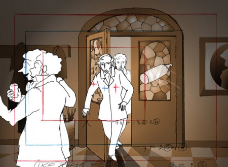
- There’s an interesting, and very independent feature film about to open at the Tribeca Film Festival. Chris Sullivan is an animator workig out of Chicago who is completely independent, and has been working on his film for years. Consuming Spirits is truly multi-media. It jumps from 2D cel animation, to cut-out animation, to clay animation. It breathlessy gliedes from one form to another in a seamless way. The film deserves to be seen on the big screen, and I encourage you to catch it during the Tribeca Fest. I’ve seen about a half hour of the film and look forward to seeing it all together and complete.
1st Screening: Monday, 4/23, 6pm. Clearview Chelsea Cinemas.
2nd Screening: Tuesday, 4/24, 4pm. AMC Loews Village 7.
3rd Screening: Wednesday, 4/25, 7pm. Clearview Chelsea Cinemas.
From the Tribeca program:
- Nearly 15 years in the making, Chris Sullivan’s Consuming Spirits is a meticulously constructed tour de force of experimental animation. Shooting frame by frame in 16mm, Sullivan seamlessly blends together a range of techniques into a distinct, signature visual style. In the process, he constructs a hypnotic, layered narrative, a suspenseful gothic tale that tracks the intertwined lives of three kindred spirits working at a local newspaper in a Midwestern rust belt town.
I’ll give more of a reminder when the time gets closer.
UPA
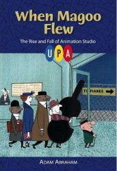
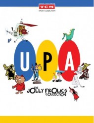
- I had intended to write extensively about UPA. The new book, When Magoo Flew by Adam Abraham and the accompanying DVDs, the Jolly Frolics, from TCM. These are just the most brilliant thing to happen to animation history this year. I’m slowly savoring the material and haven’t quite finished it. When I do I’ll write a full review.
However, I can guarantee you that my reviews for both are positive, and if I were you, I’d buy either and both right away.
Bill Peckmann &Books &Illustration 30 Mar 2012 08:07 am
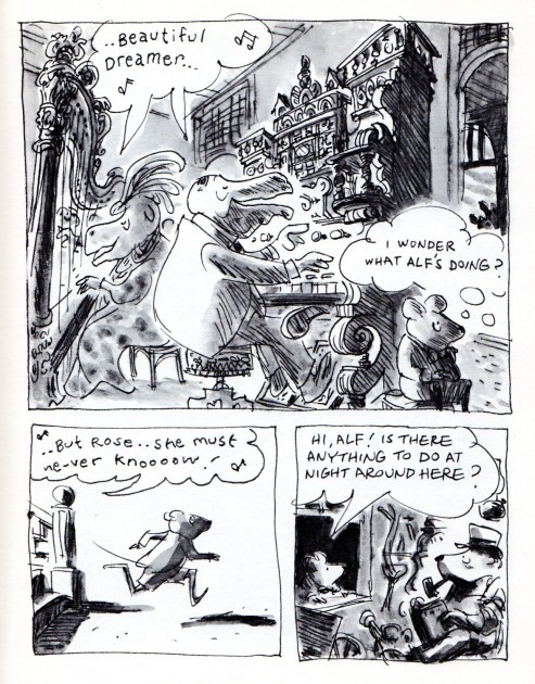
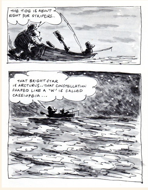
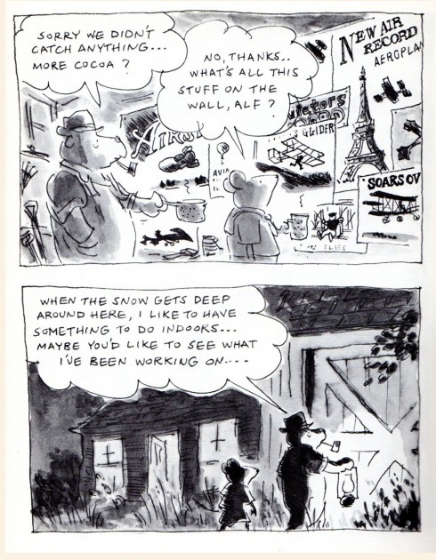
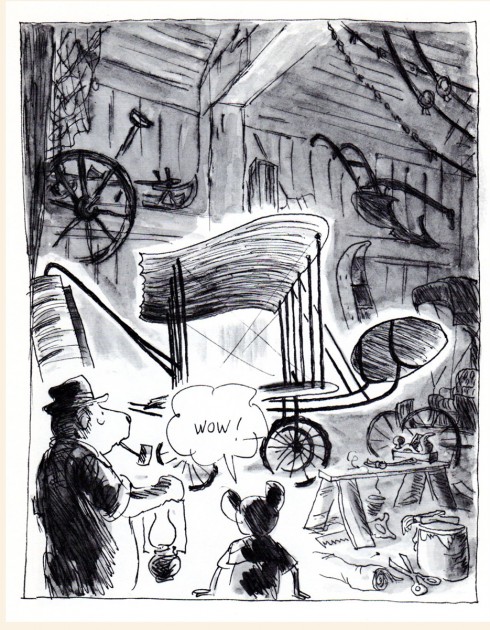
Stevenson’s Sea View Hotel – pt 2
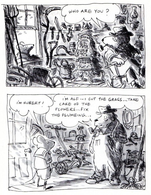
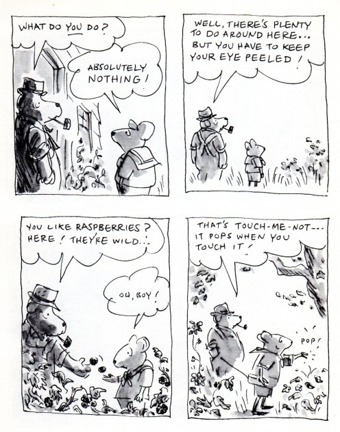
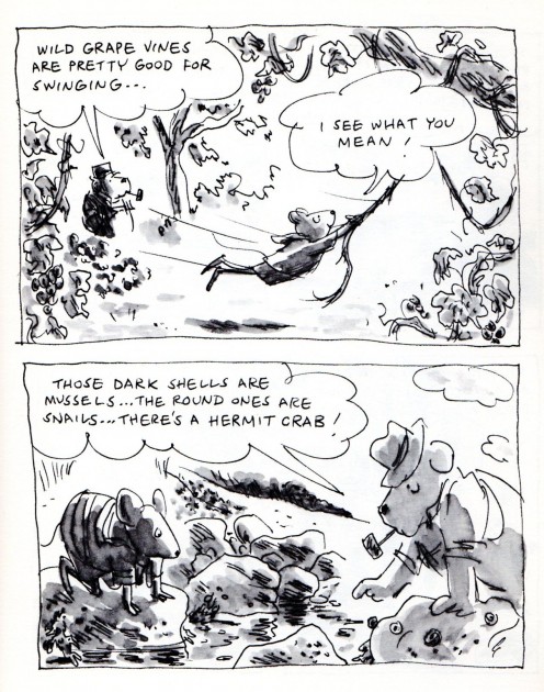
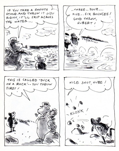
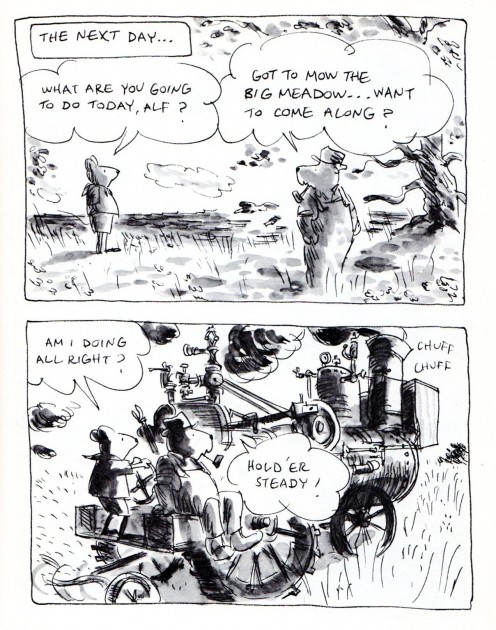
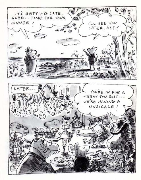
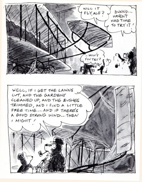
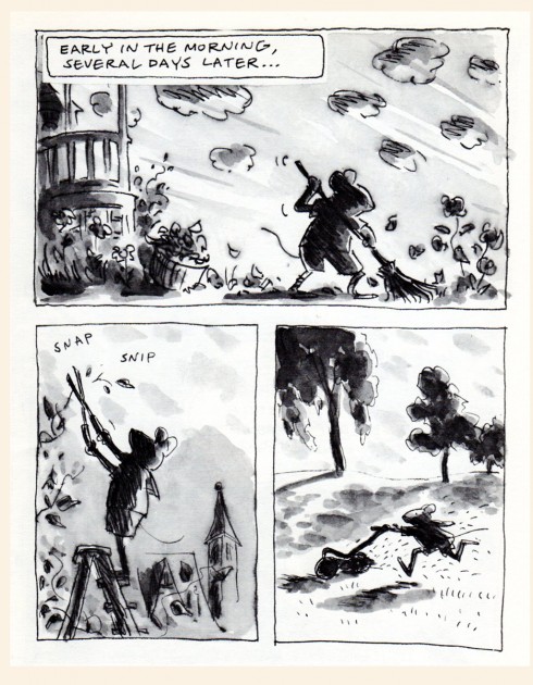
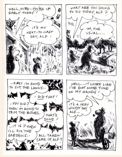
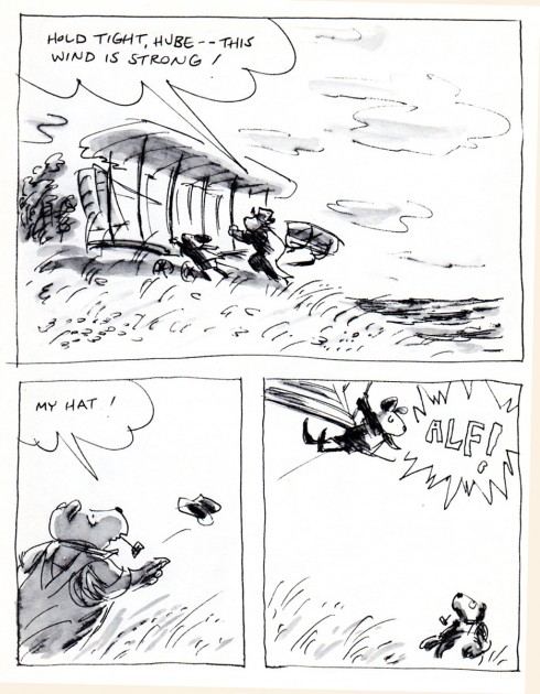
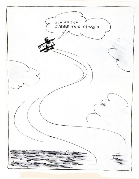
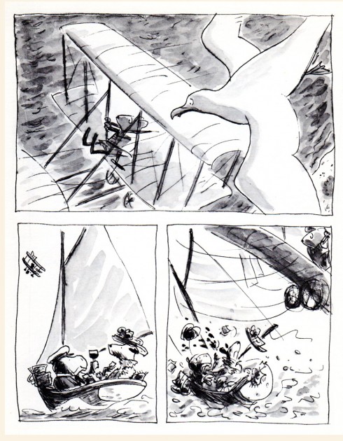
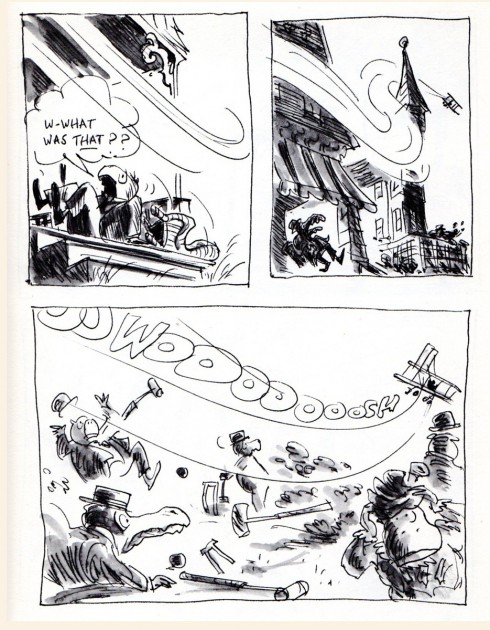
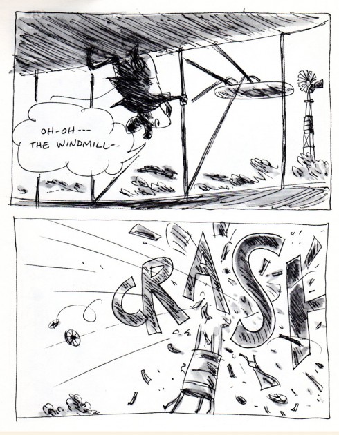
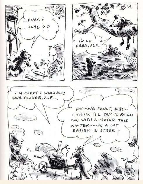
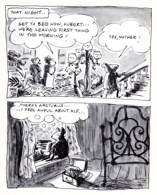
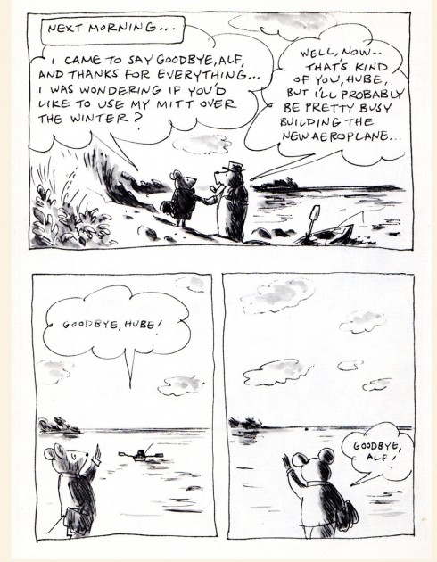
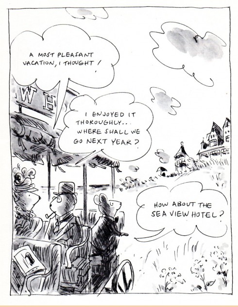
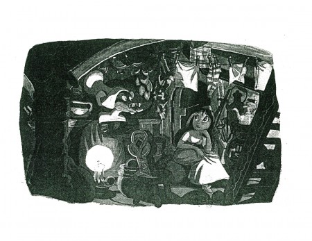
- James Stevenson‘s book, The Sea View Hotel, is a beauty. The illustrations are all B&W washed pen and ink, yet it feels like it was done in color. I thank Bill Peckmann for sending it to me, and here’s the second half of it. Go here to see the first half.
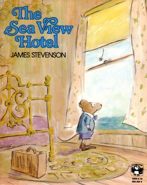
Cover
Animation &Animation Artifacts &Disney 29 Mar 2012 06:49 am
Mickey Turns in Water
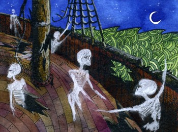
- Before we get into today’s posts, I have to remind you again
that today’s the last days of our
Anything you can offer to the POE Project would be appreciated.
Thanks for your support.
________________________
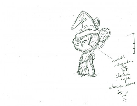
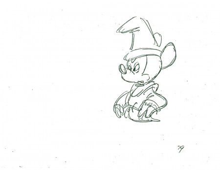
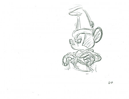
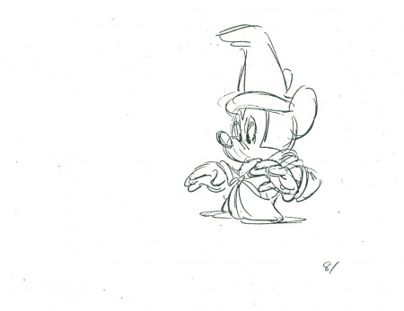
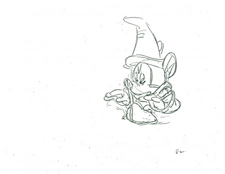
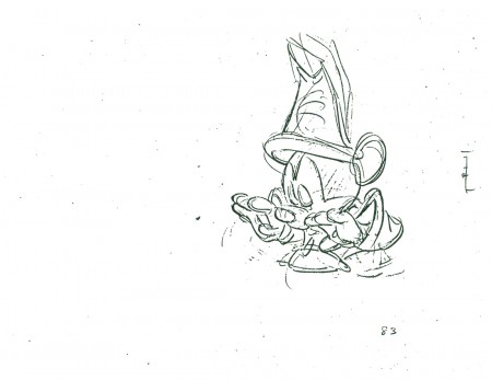
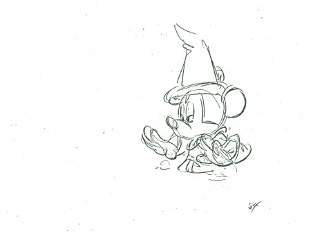
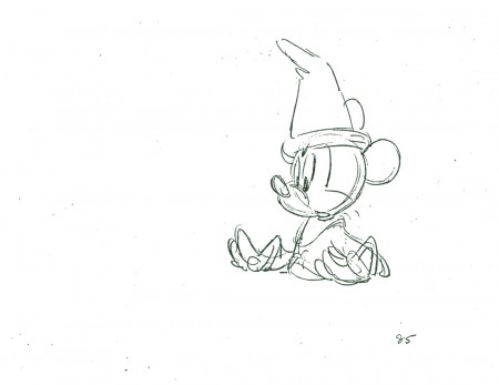
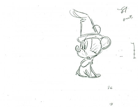
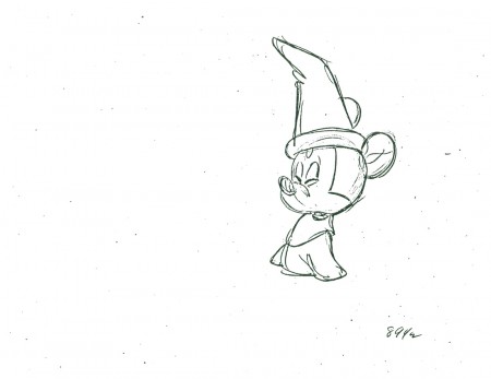
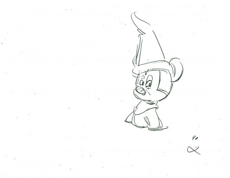
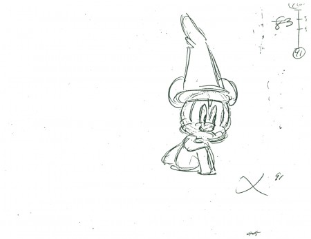
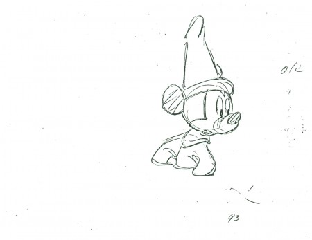
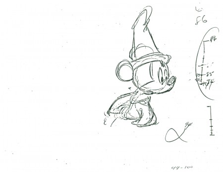
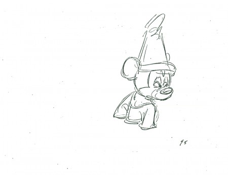
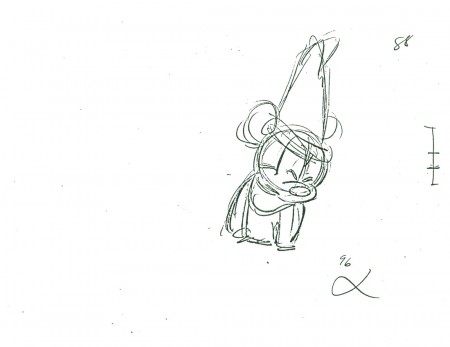
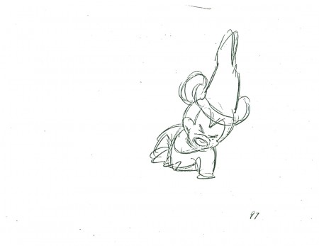
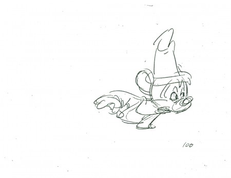
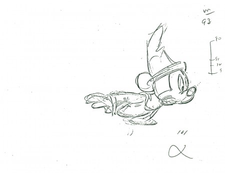
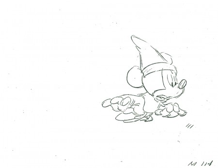
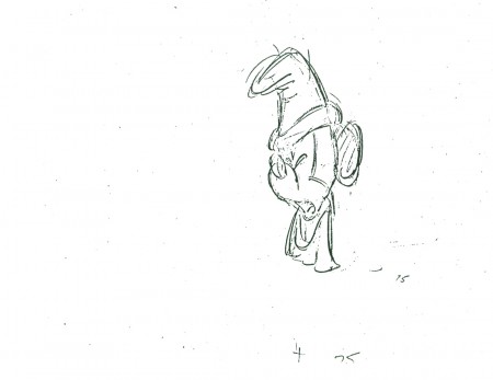
- Here’s another Preston Blair scene of Mickey, half under water, turning with some surprise. Of course, the scene is part of The Sorcerer’s Apprentice from Fantasia.
 75
75
______________________
The following QT includes all the drawings posted above.
The registration is a bit loose. Sorry but, these are obviously
copies of copies and there’s plenty of shrinkage and distortion.
Bill Peckmann &Books &Illustration 28 Mar 2012 07:21 am
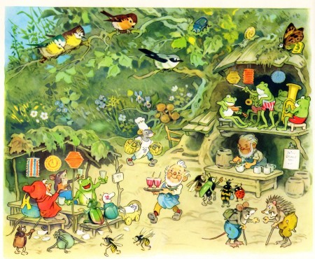
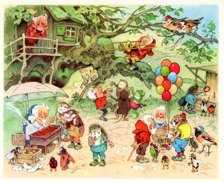
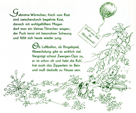
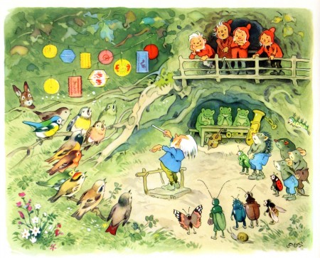
Sommerfest im Märchenwald
- Before we get into today’s posts, I have to remind you again
that we’re in the last days of our
Kickstarter Campaign.
Thanks for your support.
________________________
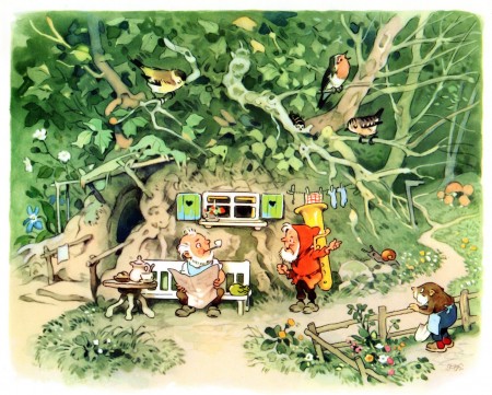
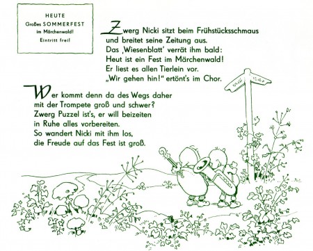
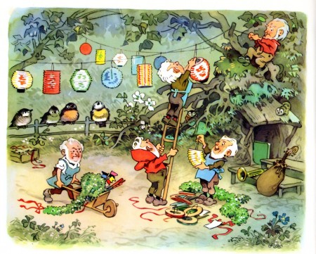
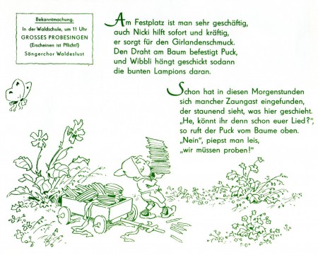
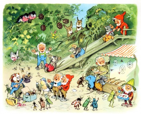
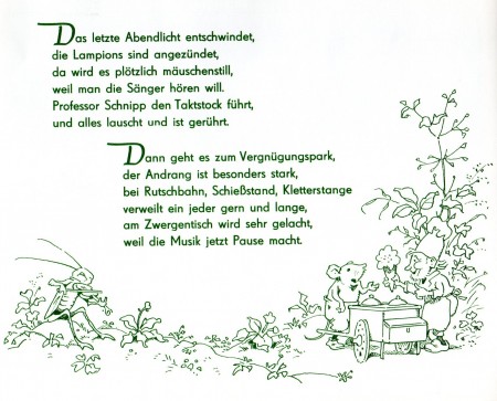
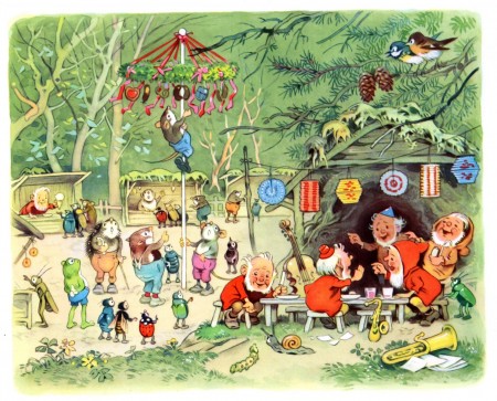
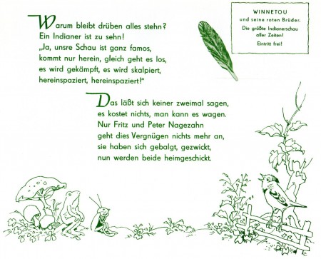
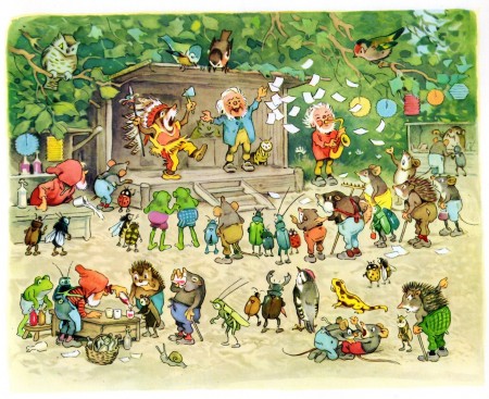
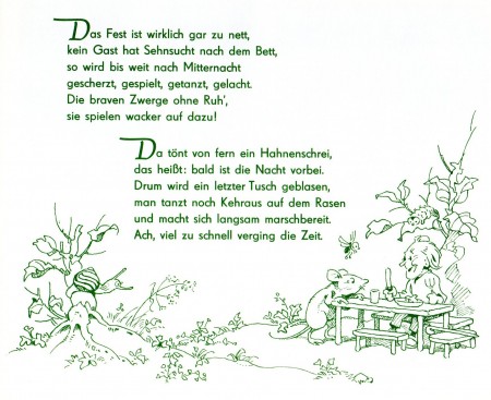
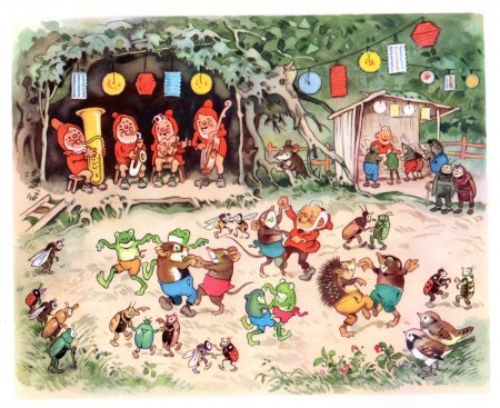
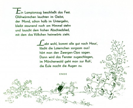
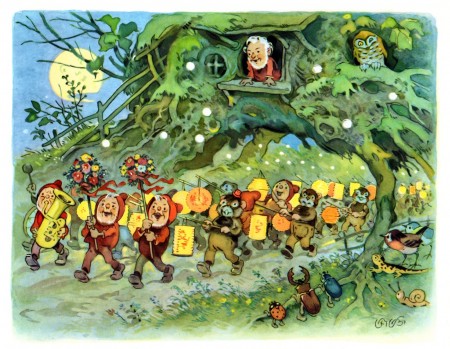
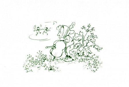
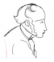
I’m sure the weather inspired Bill Peckmann to send the delightful, German book, Sommerfest im Märchenwald by the great illustrator, Fritz Baumgarten. The book’s a gem, and I hope you enjoy it.

The cover
Bill Peckmann &commercial animation &Independent Animation &Layout & Design 27 Mar 2012 07:10 am
Thumbelina Photos
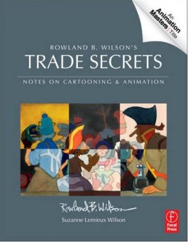 - There’s a wonderful new book on the market, and I want to keep it in your attention. So I’m trying to give as much attention to the great work of Rowland B. Wilson.
Rowland B. Wilson’s Trade Secrets: Notes for Cartooning and Animation seems to offer quite a bit of attention to Mr. wilson’s animatoin art as it does his brilliant illustration and cartooning.
Keep it in mind.
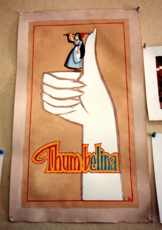
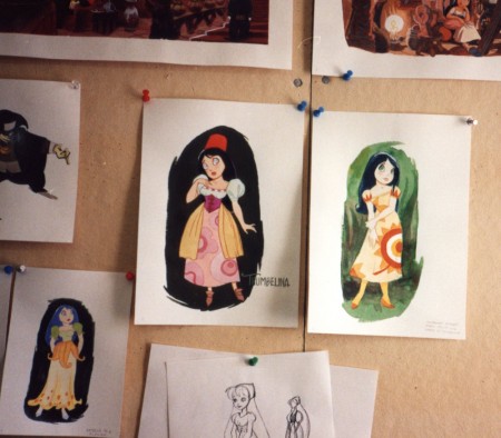
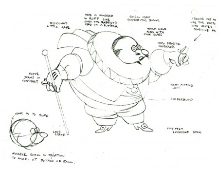
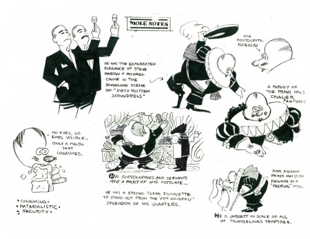
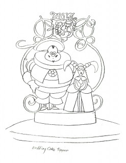
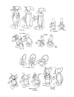
- Yesterday, we saw a lot of B&W models by Rowland B. Wilson done for Don Bluth‘s feature, Thumbelina. Today, I have a cache of photos taken by animation producer, Phil Kimmelman, when he visited Rowland in Ireland. Many of the models overlap, except that these are in color.
These all come by way of Bill Peckmann‘s great collection, thank you very much.
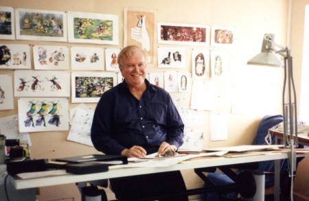 1
1Rowland at his desk.
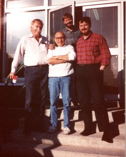 18
18
Rowland (L), Phil Kimmelman (Ctr)
Bill Frake (R), unknown in rear
Animation Artifacts &Bill Peckmann &Illustration &Layout & Design &Models &repeated posts &Rowland B. Wilson 26 Mar 2012 07:23 am
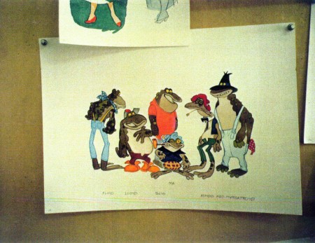
Thumbelina from Rowland B. Wilson
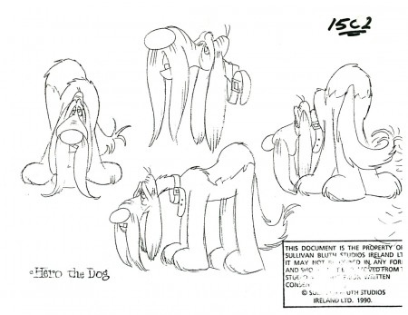
 - Thanks to Bill Peckmann‘s extraordinary collection of design material, I have access to quite a few model sheets by Rowland B. Wilson.
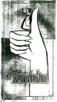
His models for Don Bluth‘s feature, Thumbelina, fill a binder. I’m gong to have to break it up into two posts.
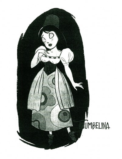
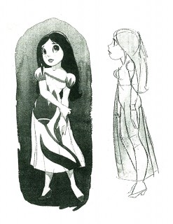
Here, I’ll reproduce the article Rowland had written for the in-house organ “Studio News.” This follows with models for some of the lead character models.
These models were done in pencil and ink, sometimes in color. Unfortunately, all of these are 8½ x 11 xerox copies. Blacks wash out and washes blacken. Regardless, they all come across fine enough to get the idea.
Any feature takes a lot of work. You can understand that just in the large number of model sheets that grace the production. When you have a talented artist such as Rowland Wilson doing that modelling for you, your art is off to a good start.
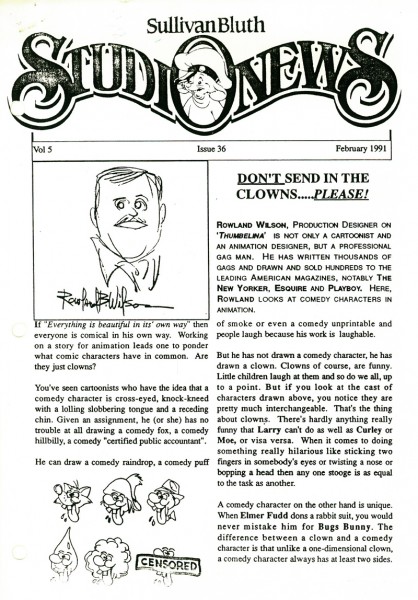 1
1(Click any image to enlarge.)
 1
1
Here we have the model that Rowland drew for Thumbelina.
This is definitely not the rotoscoped princess that we saw in the film.
 2
2 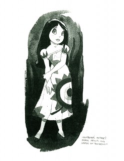 3
3
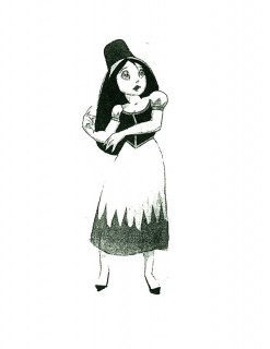
Here we have a lot of different costumes Thumbelina
will wear as she travels on her expeditions.
 4
4 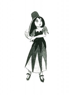 5
5
An original idea – a character who wears
more than one costume in a film!
This film is far from the best of Don Bluth, but it goes to show how much solid work is done for any feature film. There’s also quite a bit to be learned from any feature. Many of these models didn’t end up in the film (take a look at Thumbelina herself in yesterday’s post) but the drive was a forward one.
Off to the modelshow:
 1
1
(Click any image to enlarge.)
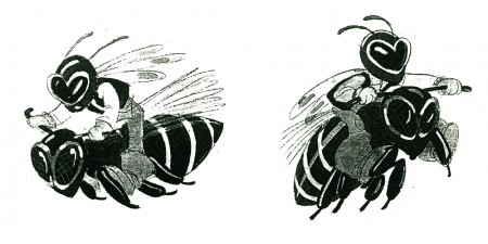 3
3
Another color one copied in B&W
 30
30
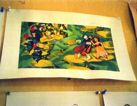
Finally, here are two color photos Rowland took of his presentation art.
Photos &Steve Fisher 25 Mar 2012 07:12 am
Good Weather
continues to roll as the last of our days move on. It’s feeling like a long, slow, uphill battle at this point, and we’re taking all measures we have to contact everyone we know. Many thanks to all of you who have been so supportive. It’s so appreciated.
Take a look at our POE site: Poestory.net.
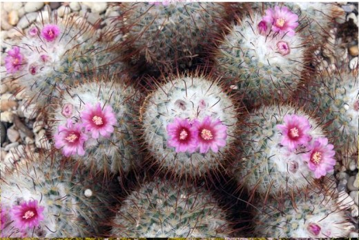
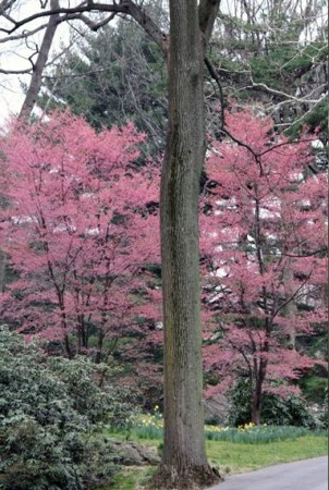
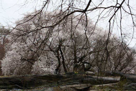
- New York’s had some unusually kind weaher lately. Lots of flora seem to be growing and maturing unnaturally early. With all this, obviously on his mind, Steve Fisher makes a photo trip to the New York Botanical Garden in the Bronx. Here are a few of his photos.

Commentary 24 Mar 2012 06:31 am
Back to Kickstarting
There’s been an enormous rush this past week to kick start my
Kickstarter Campaign into greater activity,
and there have been an enormously generous number of contributions
that I find both inspirational and wonderful.
It’s not quite what I expected from the experience
However, we’re still a mile away from the goal, and I’ve been
burning the midnight oil trying to come up with something to help
get me to the goal. It hasn’t happened yet, but I haven’t given up.
Meanwhile, I’d like to make sure you know that the official POE website is
poestory.net.
This poor blog make take some heat, so I apologize. Thanks.
____________________,
J.J.Sedelmaier, via Salon.com offers a beautifully scanned copy of Albert Hurter’s book, He Drew As He Pleased. I’d posted it in many parts, but it’s all together here in oneclean click..
Daily post 23 Mar 2012 11:00 am
Alice’s Shadows – Re-post
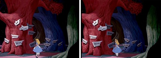
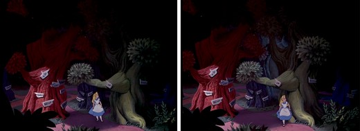
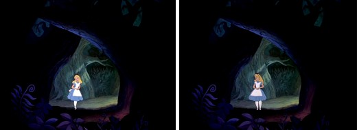
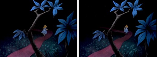
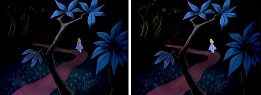
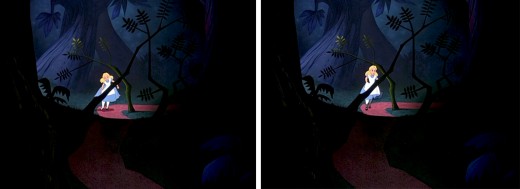
- An interesting aspect of Disney’s Alice In Wonderland, deserves some attention, and I don’t think I’ve ever seen anyone write about it.
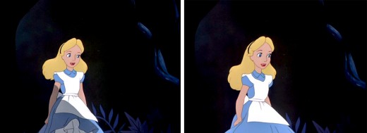
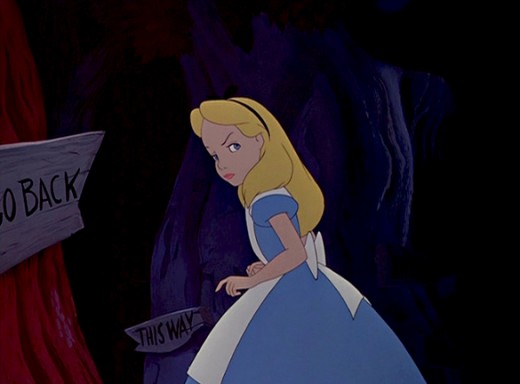
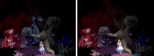
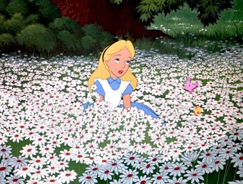 Once Alice is in Wonderland, she immediately comes upon the woods, and from there she steps in and out of the woods to meet up with new crazies and her peculiar adventures. The effects department was used to signal this move in and out of the dark world of wonderland. She constantly steps in and out of shadows.
This, as anyone who did animation in the pre-computer age, knows that it was a complication to add shadows. Not only the shadows under the characters but the shadows over and around the characters. It meant filming the scenes twice, just for the shadows. Since the camera, during the filming of Alice, was not computerized this double shooting had to be done by hand VERY CAREFULLY. Every frame had to exactly match.
Hence, this was an important part of the design. The directors and Disney took these shadows seriously; after all they cost twice as much – just to photograph. Never mind animating them, coloring them or planning them.
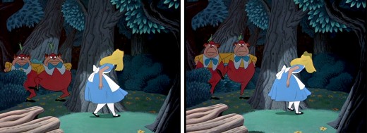
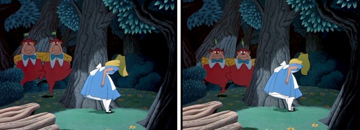
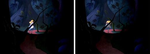
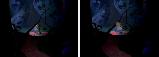
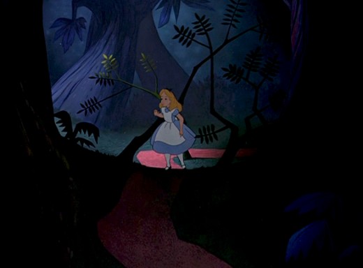
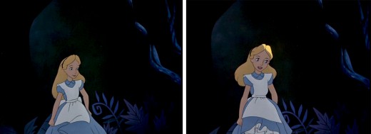
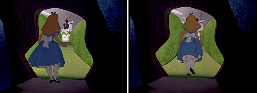
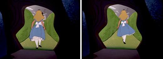
I’ve put together a number of frame grabs which illustrate the move into or out of shadows, and I’d like to share them.
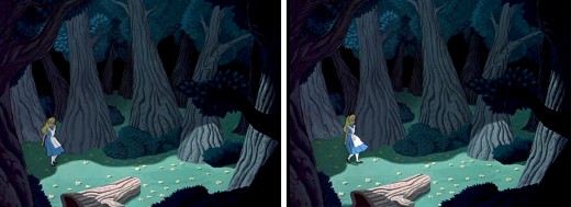
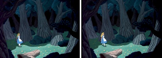
Here, Alice steps out of a shadow for the first time, and meets up with
Tweedle Dee and Tweedle Dum. They’re partially covered, themselves, by shadow.
This variant of the shadow is a hard line of darkness that moves over her.
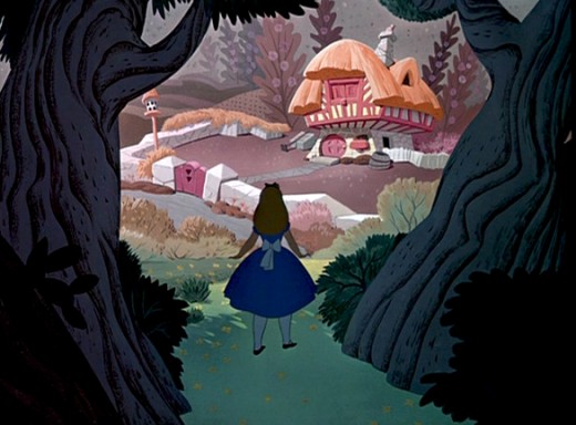
Soon, Alice moves toward the Duchess’ house. We cut from her
standing dark in shadow, to her walking in a brighter light.
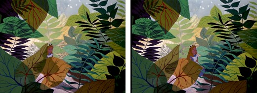
As she moves toward the Caterpillar, Alice is covered with shrubbery and shadow.
She is next seen struggling through the foliage to talk to the Caterpillar, in full light.
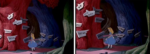
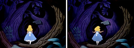
This variant of the shadow is a total shift in color as her entire body moves into darkness.
It was done by dissolving one Alice into another – meaning the cels were painted twice.
In the woods, Alice walks into and out of and into shadows.
She slowly moves toward the Cheshire Cat who directs her to the tea party.
As she does she moves from shadow and cuts into light as she appears at the gate.
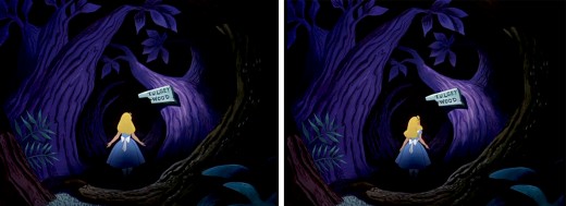
This is a particularly nice effect wherein the entire area gets spotlighted -
led by the character. The area outside of the spot darkens slowly and beautifully.
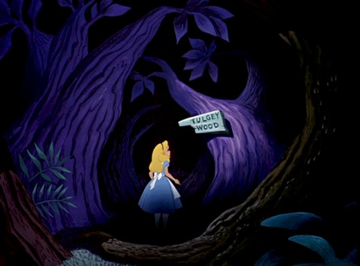
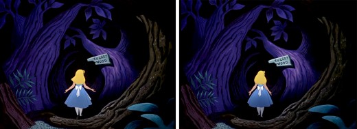
Once leaving the tea party, she wanders around the Tulgey Wood trying to find any direction. Shadows aplenty as she moves endlessly through the woods.
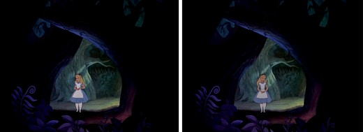
Alice moves into and out of shadow via dissolves.
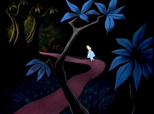
Alice passes by many crazy characters, going in and out of darkness.
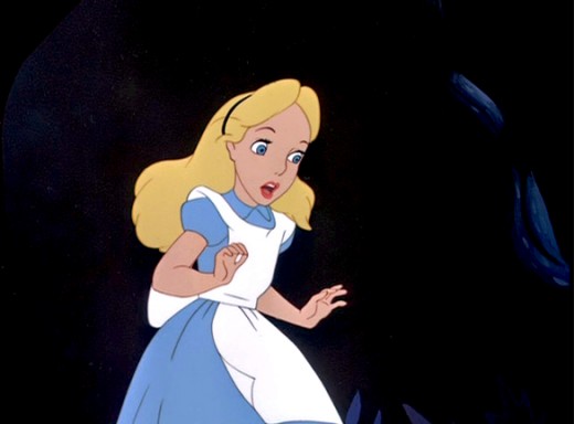
Just prior to meeting up with the Cheshire Cat, and has an extended conversation
which just about ends her stay in the woods.
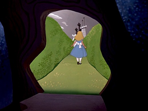
Finally, Alice steps into the Cheshire Cat’s tree and
into the light of the maze of cards to meet the Red Queen.
Animation &Articles on Animation &Bill Peckmann &Books &UPA 22 Mar 2012 08:29 am
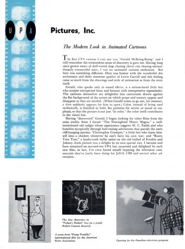
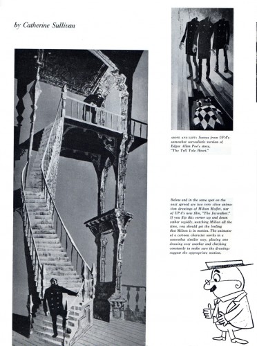
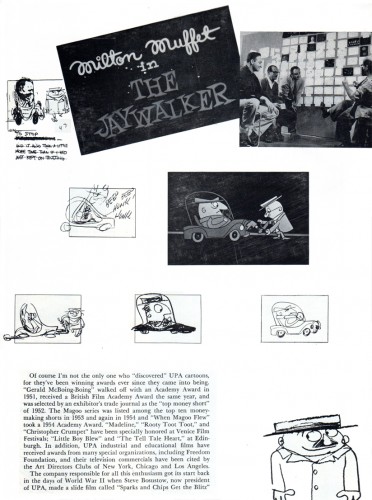
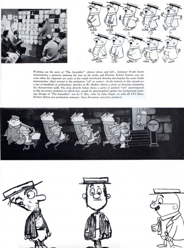
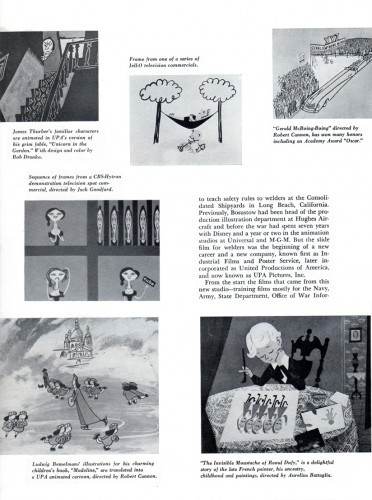
UPA brochure
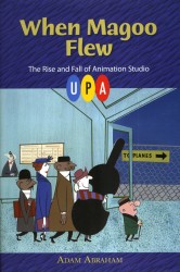
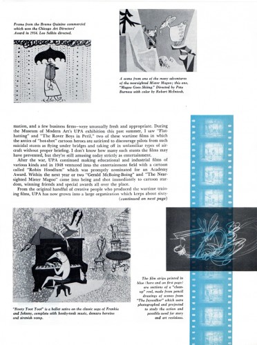
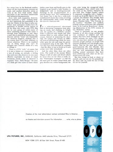
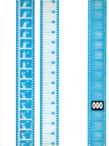
- Given the current release of the Jolly Frolics DVD that has just been released via TCM, and given the release of the new book by UPA book When Magoo Flew, by Adam Abraham, I thought this a good time to repost this brochure which seems to tie into the exhibit at the MoMA.
- Bill Peckmann sent me this brochure back in 2011. I’d not seen it before he’d sent it, so became a bit of a treasure to me, a big fan of UPA.
Here’s Bill’s note:
- This is a studio brochure/mailer* reprinted from American Artist Magazine Nov. 1955. I remember reading the article in high school, it had a huge impact. I remembered it for many years after because of the scarcity of animation articles at that time. And, because it appeared in an “art” magazine, it seemed to make “cartooning” legit.
Did Disney art ever appear in an “art” magazine around this time?
*This brochure was given to me by Ruth Mane (UPA Alumni) many, years ago.
 1
1(Click any image to enlarge.)
There’s no doubt this article followed up on the Museum of Modern Art‘s 1955 show of UPA art. Amid Amidi posted an extraordinary piece about this show on his Cartoon Modern site. By the way, this is an exquisite site. It’s just a shame that Amid let it lay after his promotion for his book Cartoon Modern. Take some time and browse around that site when you have some time.
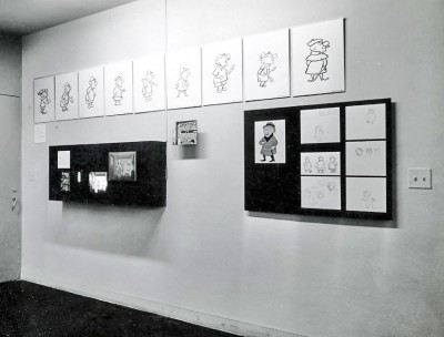
A snap of one of the walls at the 1955 MoMA UPA Exhibit.
(from Amid Amidi’s site, Cartoon Modern.)
