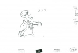
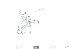
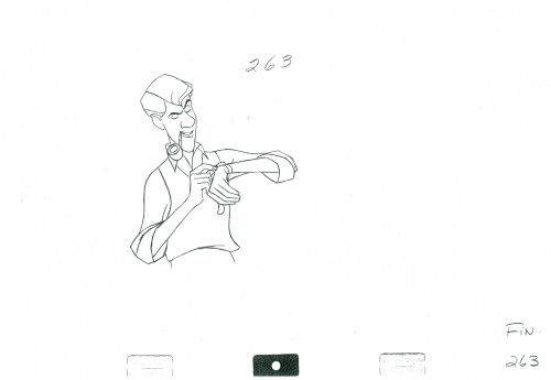
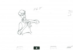
Monthly ArchiveFebruary 2012
Bill Peckmann &Comic Art &Illustration &Rowland B. Wilson 09 Feb 2012 06:13 am
RBW – TVGuide
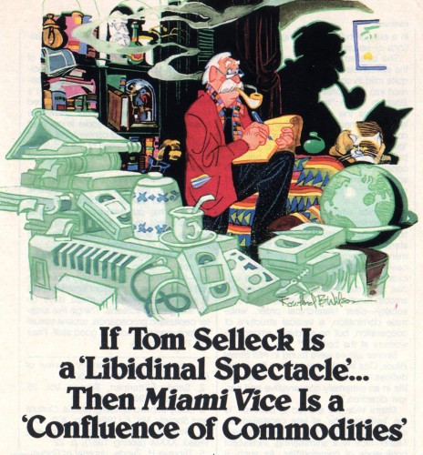
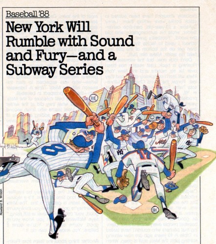
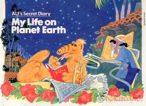
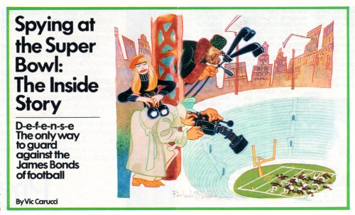
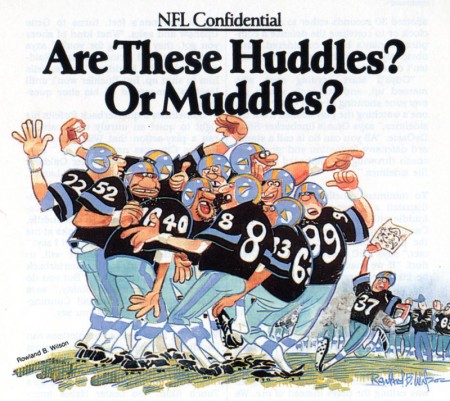
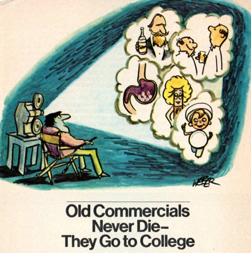
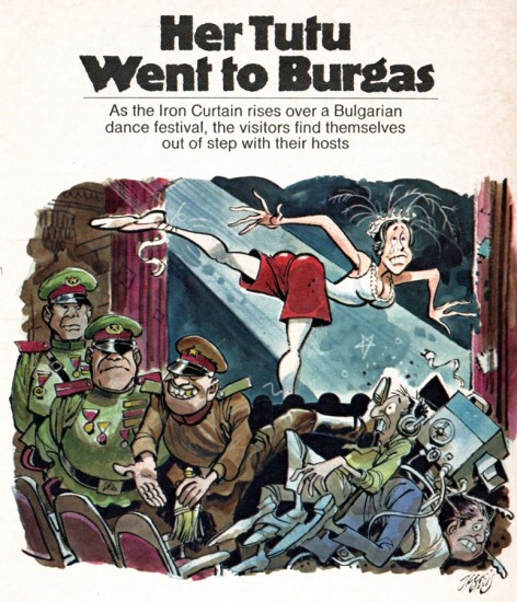
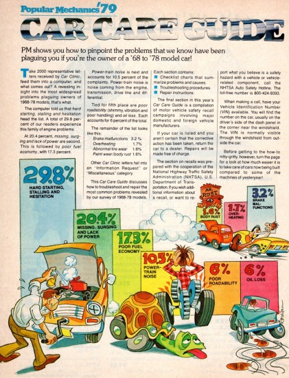
Bill Peckmann continues to open up his collection of Rowland Wilson artwork. These are illustrations he did for a couple of magazines, predominantly, TV Guide. Bill’s comments follow with the images.
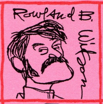 1
1This is a self caricature, circa 1970.
 2
2
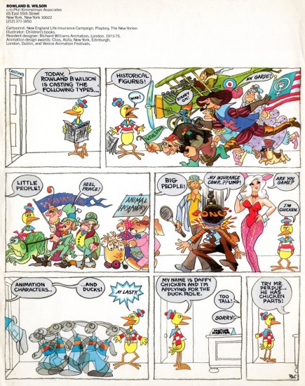
When Rowland came back to NYC after his stint at Richard Williams in
1975, he did this mailer when he was at Phil Kimmelman & Associates.
 3
3
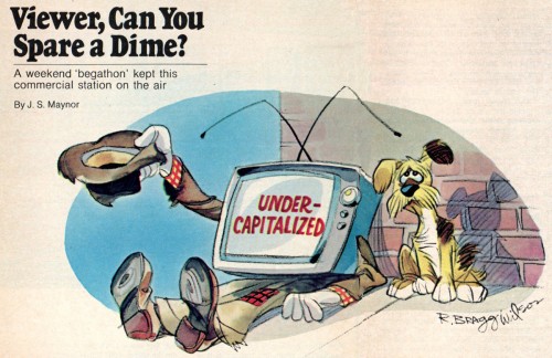
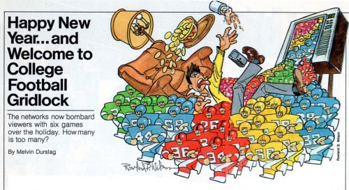
Here are the first of the TV Guide spreads
 4
4
Sadly, I should have craved/saved a lot more of Rowland’s TV Guide illustrations
than I did but alas, when you’re young and stupid you just assumed there would
always be a TV Guide and there would always be a RBW illustration in it.
A slight break in the RBW action to give then TV Guide art director, Jerry Allen,
kudos for using the great illustration and great cartoon talent that he did.
(Applause, applause!)
Here are a few of them.
 10
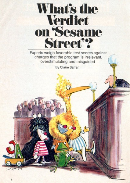
10First Charles Saxon. (After seeing this illo, you have to
wonder what a Sesame Street book would have looked like if Saxon had
illustrated it. The characters wouldn’t have been 100% on model, but that
book would have been one of the most beautiful on the bookstore shelves!)
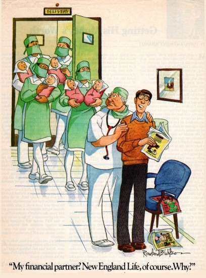
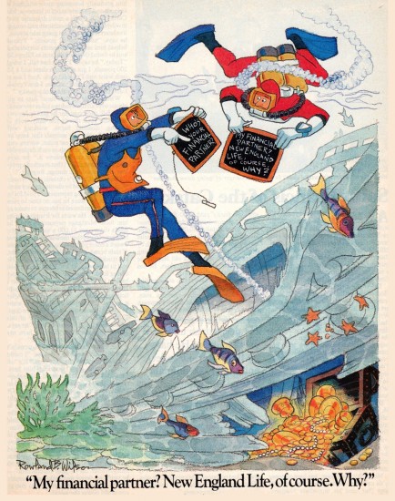
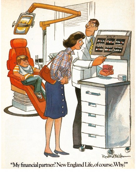
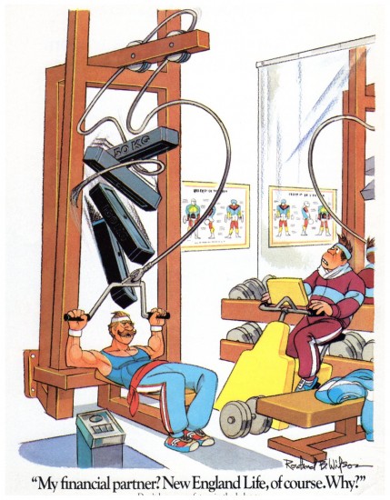
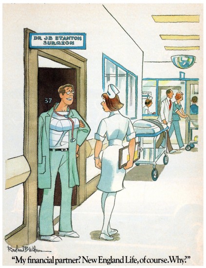
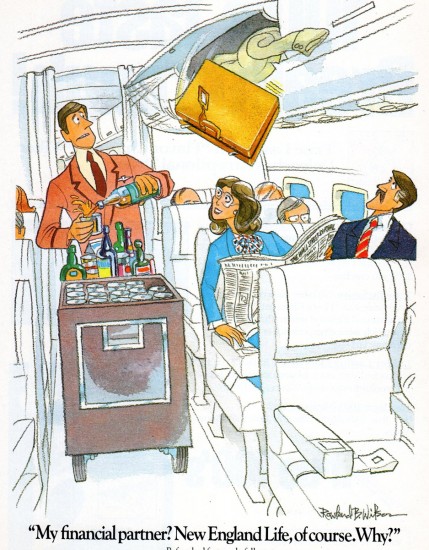
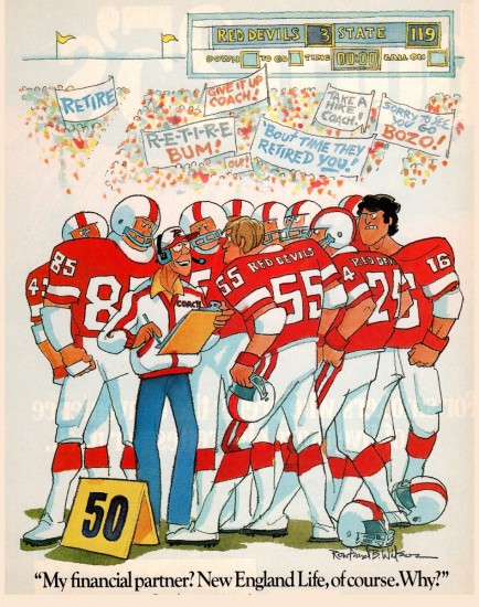
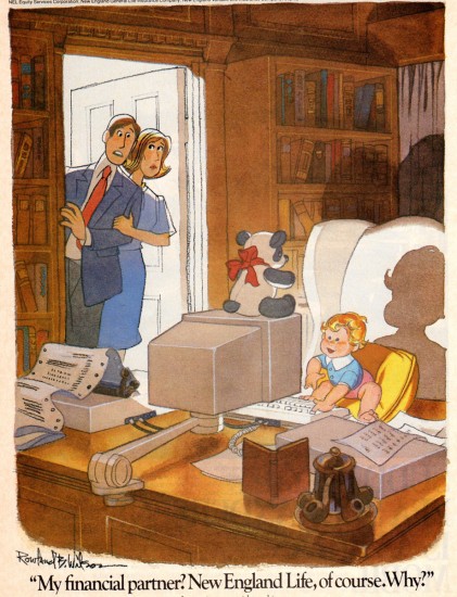
The following are 8 of Rowland’s illustrations for the second New England Life campaign.
 13
13
This is for those of us old enough to remember -
Unfortunately with their second ad campaign New England Life switched from
selling life insurance to pushing financial planning and the gags lost a lot their edge.
Combine that with stifling “hands on” art direction they also lost a lot of Rowland’s
design sense. RBW didn’t have an easy time of it but he persevered.
 20
20
Even though Rowland did this New England Life illustration long before
he worked at Disney, I always felt it had a Disney charm about it, and
it was around this time that he was setting his sights to get a gig at
the mouse factory. It just didn’t happen right away.
.
Tomorrow, a number of rough sketches for TV Guide spot illustrations.
.
Many thanks to Bill Peckmann.
Animation &Animation Artifacts &Disney 08 Feb 2012 07:24 am
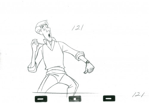
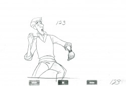
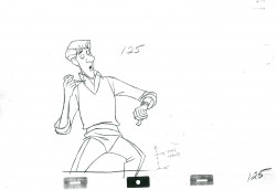
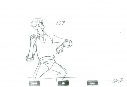
Roger – Scene 45 – part 3
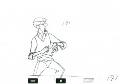
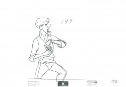
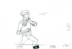
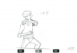
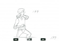
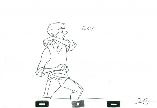
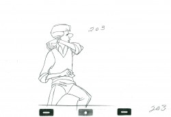
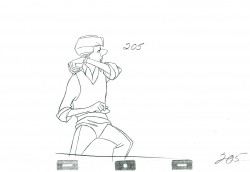
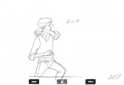
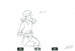
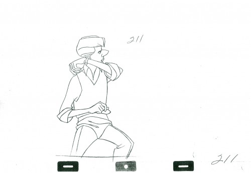
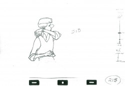
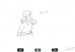
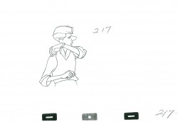
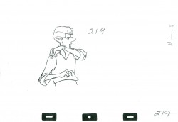
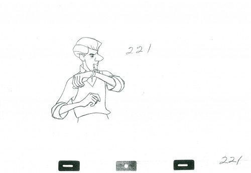
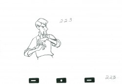
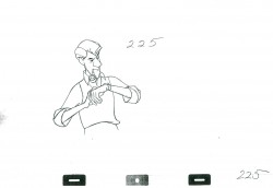
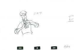
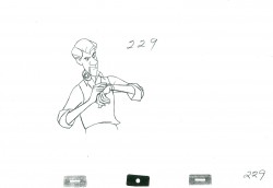
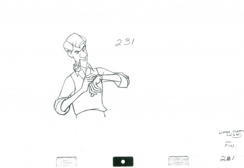
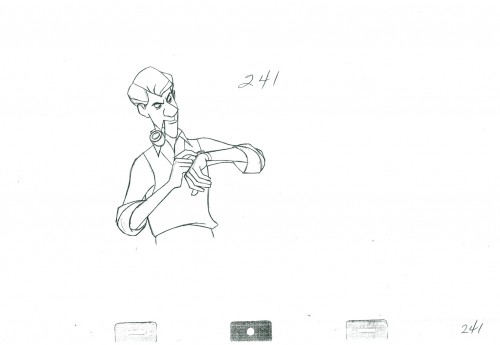
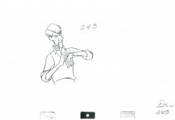
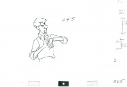
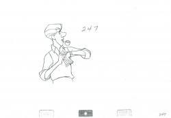
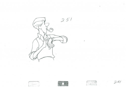
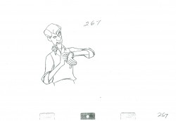
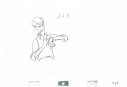
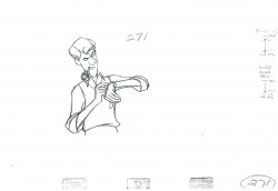
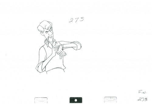
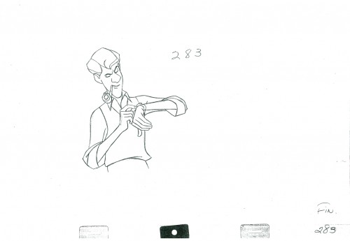
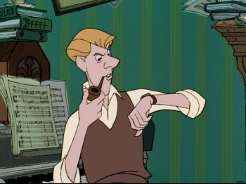
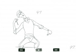
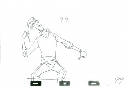
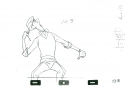
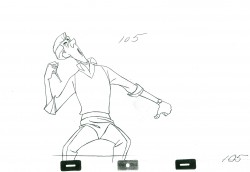
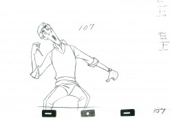
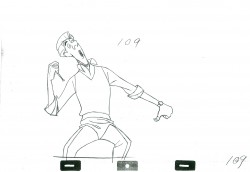
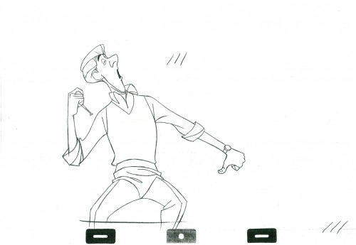
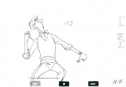
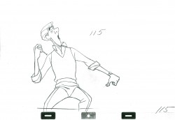
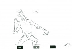
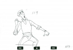
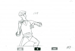
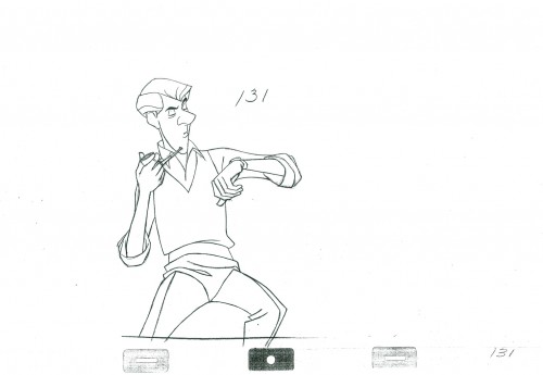
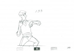
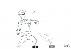
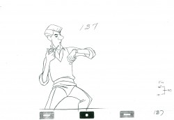
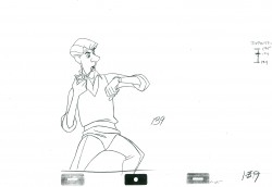
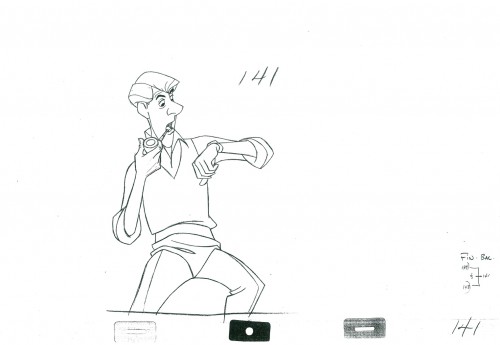
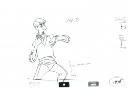
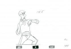
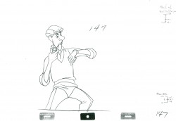
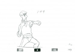
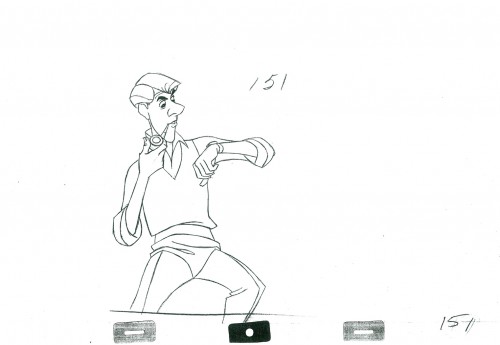
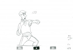
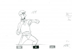
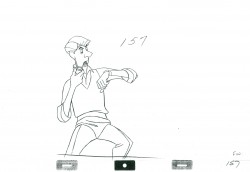
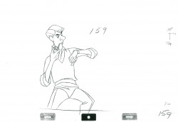
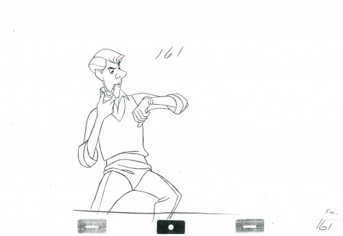
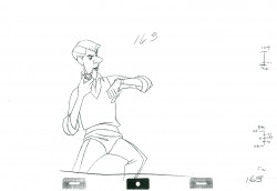
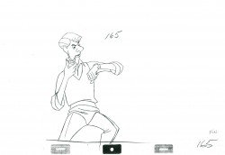
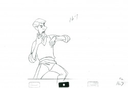
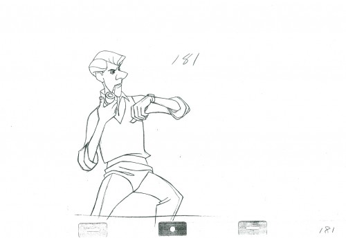
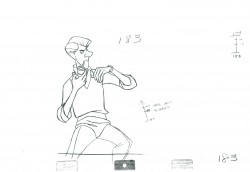
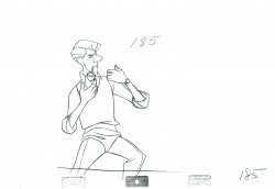
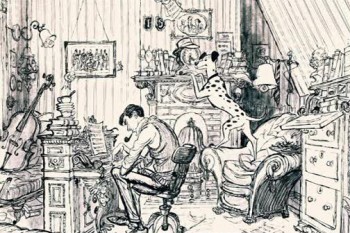 - Here is the final part of Scene 45 from 101 Dalmatians as animated by Milt Kahl. When this scene was loaned to me, it took less than a mezzo second for me to recognize it. I love it and have studied it frame-by-frame off the video (first a VHS then the DVD) many times. It’s a seminal scene for me. Just gorgeous.
I’ve always loved the first fifteen to twenty minutes of Disney features (at least up
 through Sword in the Stone.) Their intelligent introductions of principal characters usually comes in those first few minutes, and it’s always done with class. I think of Pinocchio, Gepetto, and Jiminy Cricket or Dumbo’s birth or Lady as a puppy or Bambi’s birth and discovering the world of the forest or Peter and Tink meeting the Darling children and “Off to Neverland.” These moments are thrilling to me, and usually the rest of the film doesn’t hold up to this.
101 Dalmatians doesn’t fail to deliver in this respect. Exposition and introduction are done so beautifully.
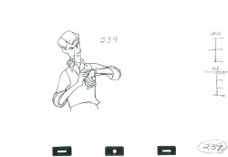
The animation is, for the most part, on twos. There are a couple of ones at the very end ot the scene as Roger shakes his wrist. If you want to visit the first two parts go here for Part 1 or here for Part 2.
We start today with the last drawing from the second post.
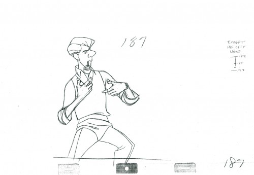 187
187
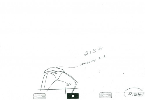 213H
213H
The legs move to their own level at this point.
A drawing is skipped here (to be inbetweened.)
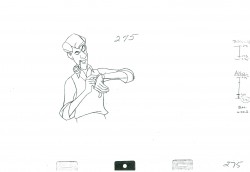
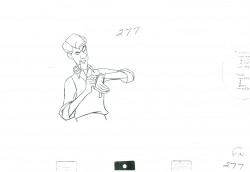
A drawing is skipped, needs inbetweening.
______________________
The following QT includes the entire sequence
which includes all drawings posted.
The registration is a bit loose. Sorry but, these are copies of
copies and there’s plenty of shrinkage.
If you click on the right side of the lower bar
you can watch it one frame at a time.
.
For more on 101 Dalmatians check out the animator drafts on Hans Perk‘s great and resourceful site, A Film LA. Hans has also posted Bill Peet‘s story treatment for the film several years ago. See it here.
For a look at the art direction of the film including some beautiful reconstructions of the BGs as well as some of the BG layouts go to Hans Bacher‘s great site One1More2Time3.
Andreas Deja has one of the more extraordinary blogs to visit. He just posted some beautiful drawings by some of the key animators on 101 Dalmatians as they set about to find the characters. See them here as well as a comparison of Milt Kahl‘s characters against Bill Peet‘s version. here
For those who own Fraser MacLean‘s excellent book, Setting the Scene, you’ll know that on pages 182-188 there’s an extensive discussion of this opening sequence from the film with plenty of beautiful images of the set.
Articles on Animation &Independent Animation &Tytla 07 Feb 2012 06:28 am
Trnka in Graphis, 1947
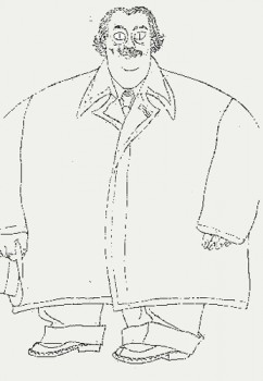 - Last week I linked to a post that Gene Deitch offered covering the Centennial of Jiřà Trnka‘s birth.
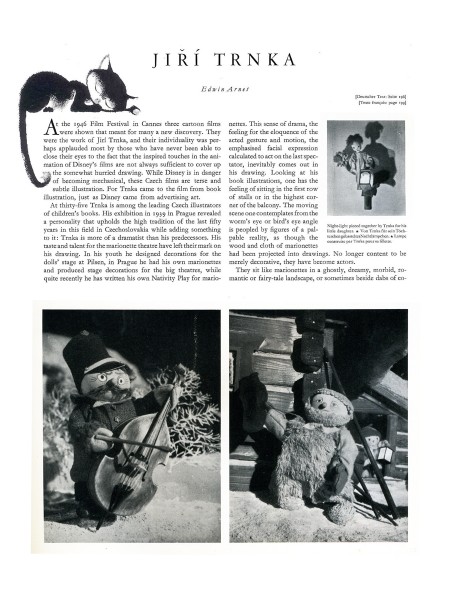
That got me to look back on some of the material I have featuring this exceptional artist. One of my favorite pieces appears in Graphis Magazine published in their 1947 edition. I’d posted this article in 2008 and am offering it again. I’d cut a few pages, which I’ve restored, and have also done a better scan of the pages.
It must be remembered that this article was published before any of the great Trnka films: The Hand, Archangel Gabriel and Mother Goose, or Midsummer’s Night Dream. Much of the piece is about his illustration work.
Regardless, it’s amazing how many beautiful images appear in his earlier films featured in this article.
(Note: Graphis is printed in three languages; all of the English is included.)
 1
1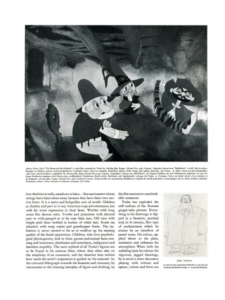 2
2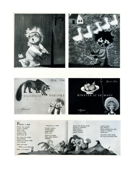 3
3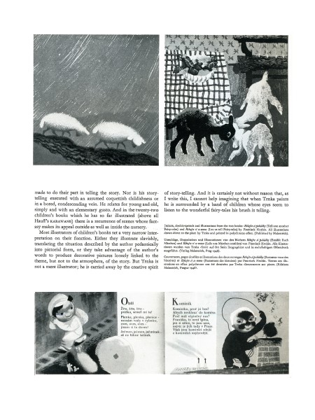 4
4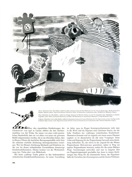 5
5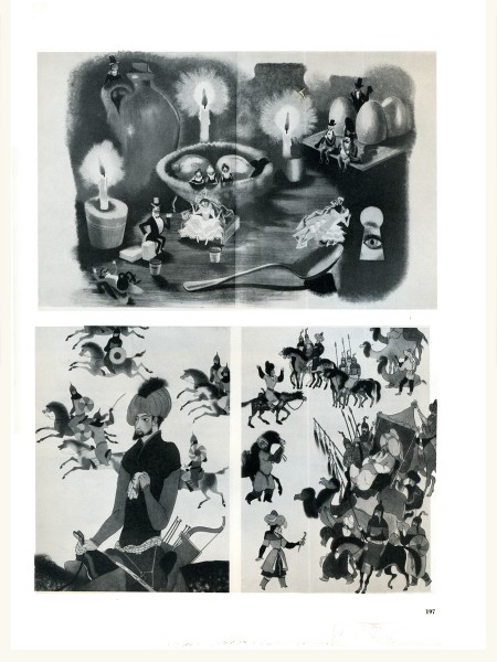 6
6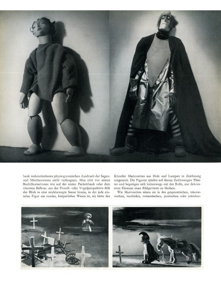 7
7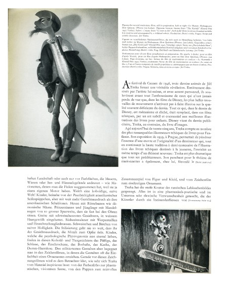 8
8
Animation &Commentary &commercial animation &Independent Animation &repeated posts 06 Feb 2012 06:49 am
John Wilson – part 5
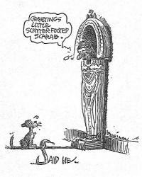
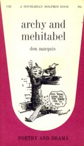 - Don Marquis‘ book, Archy and Mehitabel, garnered fame quickly and not least because of the extraordinary illustrations of George Herriman, the creator of Krazy Kat.
The first book was published in 1927 and others followed in 1933 and 1935. It wasn’t until the third book that Herriman took over the characters created by Marquis in his book of short stories, developed mostly, in poetry. An on-again off-again love affair, the story had two principal characters: a cat, Mehitabel, and Archy, cockroach. (You can read these poems on line here.)
In 1953, writer Joe Darion along with composer George Kleinsinger (the creator of Tubby the Tuba) wrote a musical theater piece. Tenor Jonathan Anderson played Archy and soprano Mignon Dunn was Mehitabel. At about the same time a recording of the showtunes was recorded with Carol Channing as Mehitabel and Eddie Bracken as Archy. The record was a success.
With the help of the young writer, Mel Brooks, they were able to get their show to Broadway in 1957, but it was now named Shinbone Alley. After 49 performances, the show closed, but the original cast album was recorded that same year. The songs stayed in the permanent repetoire of Carol Channing and Eartha Kitt.
 In 1971, John Wilson directed an animated feature starring the voices of Channing and Brackett and using the songs from the musical. The love affair between Archy and Mehitabel was penned by Archy, the cockroach; his poems tell their story.
The film suffers from its music. The songs are simple and sound as if they’re written for children, but the lyrics pull from the poems which are definitely designed for adults. It gets a bit confusing, as a result, and is a bit picaresque; the poems are short and illustrating them in animation would take more adaptation than seen here.
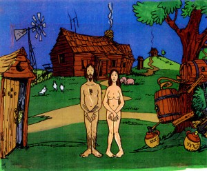 John Wilson had developed his studio, Fine Arts Films, on the back of the weekly, animated, music videos he did for The Sonny and Cher Show, an enormous hit in the early 70s.
These music videos were loose designs animated quickly and lively around the songs Sonny & Cher would schedule each week. There would always be one or two of these pieces, and they were highlights in the weekly one-hour musical/variety program.
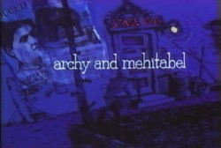 The graphics of Shinbone Alley aren’t too far from these Sonny & Cher videos. Loose design and animation with a design style not too far from the Fred Wolf’s made-for-ABC feature, The Point. This was the first feature made for television and featured the songs and story of Harry Nilsson, although Shinbone Alley featured a wilder color pallette.
Jules Engel, Corny Cole and Sam Cornell all worked in design on the film. The long list of  animators included Barrie Nelson, John Sparey, Spencer Peel, Eddie Rehberg and Jim Hiltz. Mark Kausler was an assistant on the show.
The film wasn’t an enormous success, but that was probably explained much by the limited distribution and the poor marketing of the film. I saw the film when it came out; I was living in Washington DC at the time (in the Navy). I was very disappointed. The animation is very limited and the style was a real let-down having known the George Herriman illustrations from the Don Marquis book. We’d already seen those limited animation Krazy Kat cartoons from King Features, so I knew the style could be done adequately – even on a budget. The style in this film just seemed a little too Hollywood cute, at the time, and it felt dated when it came out. I don’t feel too differently about it watching the VHS copy I own.

the film’s poster
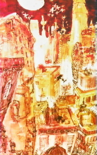
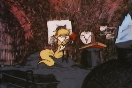
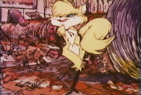
Here are some frame grabs from the first 1/4 of the film:
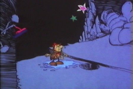
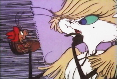
We’re introduced to Archy right off the bat as he
flies out of the river onto the dock. He realizes that he,
the poet, tried to kill himself and was sent back as a cockroach.
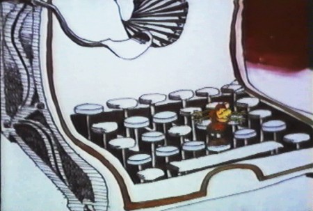
He soon finds a typewriter and goes straight back to work.
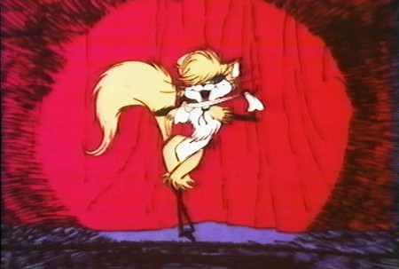
Mehitabel is a performer – with Carol Channing’s voice.
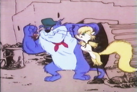
She has another boyfriend, voiced by Alan Reed,
who is also the voice of Fred Flintstone.
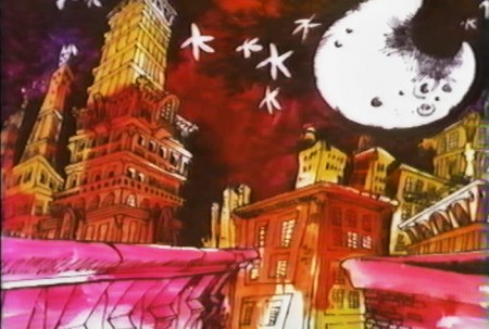
A song video takes us outside.
Part of this post was originally on this Blog in February 2010.
Photos &repeated posts 05 Feb 2012 04:43 am
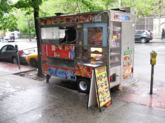
Foodcarts – Recap
Here’s a favorite post from 2009. A repost, if you will. All of these food carts are still in the same places, and the piece could have been photographed yesterday.
- Paddy Doyle’s novel, “The Van,” made me realize that we had a lot in common with our British and Irish friends. The travelling food sellers are a common dressing though the cuisine sold, I’m sure, is different.
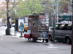 A major part of the look and feel of New York is in the food carts that are standing everywhere. In the past, my childhood, the carts were basically hot dog vendors. Then they added the salted pretzel, and things started to develop.
With the new immigrant class in the city, lots of new foods entered the picture, and in fact, I believe, they’ve taken over. Today it’s almost impossible to find a hot dog vendor. I’ve searched for one in the last week and was coming up empty-handed until I saw one late last night. A vendor was wheeling his cart home after what was, obviously, a long and tiring day. Unfortunately, I didn’t have my camera.
They still sell the hot dog and the pretzel, but you can add “Halal” foods to that menu. Shish-ke-bob, sausages, and so much more have been added.

This is what carts look like today. They come in larger sizes and smaller
sizes. They sell everything from shish-ke-bob to hot dogs to pretzels.
Their prices are usually a good deal, if you trust the sanitation.

Many of these carts sell sandwiches, bagels and breakfast pastries in
the morning. Sandwiches in the afternoon. They usually are established
locations and the same people occupy a space for many years.
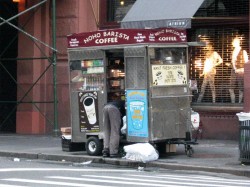

Here’s that very same cart as the vendor sets up in the morning –
I shot this at 6am. This same cart has been here for at least 12 years.

In the wee hours of the morning, carts are delivered to the requisite areas.
Oftentimes, if the cart is small, you’ll see the vendor pushing it himself.
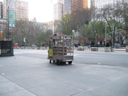
This one is setting up early morning across from
Madison Square Park on 23rd Street and Broadway.

Stocking the shelves with pastries, preparing coffee and icing juices.
Getting ready for the morning rush about to start.
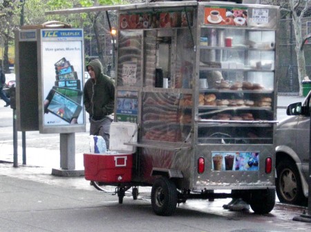
Another similar cart, in the Village, all ready for the crowds. This one has an
overhang, to protect patrons from the rain, and a external cooler with drinks.

This guy is parked outside the IFC center downtown.
As you can see his menu is quite varied and ethnic.
Quite tempting.

You can also find fruit vendors around town. The prices of various fruits is about
half what the local supermarkets charge, and the quality is generally good.
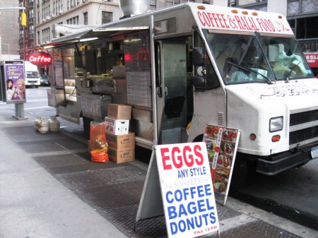
Here’s a virtual travelling store. This truck is set up daily on 28th Street
off Madison Avenue to serve breakfast. They’ll cook the eggs for you.
Later in the day they move around the corner to Madison off 28th St. to serve dinner.
They’re open all night with lines of taxi drivers waiting to buy food from them.
I have to admit, I’m always tempted but haven’t tried it yet. After all,
can all those taxi drivers be wrong? The vendor must be doing
something right.

I also caught this truck downtown and wondered if they were
establishing a spot on Bleecker Street. But they never set up.
On the move.
Commentary 04 Feb 2012 07:04 am
Oddities and Endities
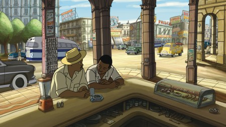
- Thanks to its Oscar nomination, Chico & Rita, the 2D Spanish, animated feature film will play in New York & Los Angeles. The distributor, G Kids, will bring the film to the Angelika Film Center starting Friday, February 10th for a week.
Directors Fernando Trueba & Javier Mariscal will be doing Q&A’s following the 7:40 PM shows Sat & Sun, Feb 11-12.
Angelika Film Center (18 W. Houston Street, 212-995-2570)
Friday, February 10, daily at 11:00, 1:10, 3:20, 5:30, and 7:40.
Screenings in Los Angeles will be Mon, Feb 6 at 2 PM (Linwood Dunn Theater), and Mon, Feb 13 at 9:20 PM (Samuel Goldwyn Theater). These are designated as Official Academy Screenings.
Annies Live
- The Annie Awards will take place tonight, Saturday, in Los Angeles starting at 7pm (Pacific Time) which is 10pm (Eastern). The awards will be available on line via streaming through a number of different sites. These include: Animation Guild site, Hans Perk’s A Film LA, Tee Bosustow’s Animazing site, and of course Cartoon Brew. If one has problems, go to the next.
- The brilliant abstract animator, Paul Glabicki, is going to have an exhibition of his art March 15 to April 14th. I’d encourage you all to see this show; his work is always smart, exciting and worth the little effort it would take. He’s also an East coast animator and deserves our support. Here is the press release for the exhibition:
ORDER
- We are pleased to announce Paul Glabicki’s second solo exhibition at the Kim Foster Gallery. His new ORDER series explores expressions of “order†as image, concept, construct, and language – and the organization and potential ambiguity of information, communication, and language within complex and concurrent data systems.
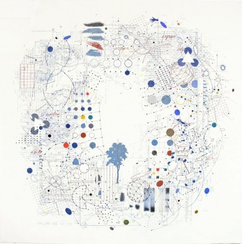 Each drawing begins with an Internet search of the word “order.†Hundreds of images, interpretations, demonstrations, and associations are generated by each search, arranged in a hierarchy of relevance determined by the search engine. Each search becomes increasingly customized to the searcher, often branching off into intricate or obscure expressions of the word, its multiple meanings, or practice (specific arrangement, sequence, command, rank, importance, by discipline.) Each drawing is a selection and orchestration of these hierarchies of order systems and applications, filtered through the artist’s response to the information collected in each search.
The process engages the artist’s own creative compulsion to organize and compose images. The first element of each drawing is deliberately placed at random, initiating a process of response, modification, and overlay. New imagery/data is added in a sequential chain, and in response to the placement of each previous element. Each drawing is rotated as new imagery and information is considered and assigned to the developing space; with its final viewing orientation established as the accumulated imagery satisfies the artist’s own personal impulse to impose “order†and closure – but only momentarily, until the process is carried on to the next piece.
Each drawing is a result of a chain of events, choices, and decisions generated by the initial, specific, finite fragment of data. The process plays with notions of causality, the desire/impulse to find, recognize or impose organization, response to (and interpretations of) vast sources of available data, and the complex interactions of image, language, communication and meaning in the representation of information.
- The work of Paul Glabicki continues to be involved with time and sequence, and an obsessive process of evolving images and complex compositions generated by an intimate examination of a finite word or found object.
All of the imagery in his work is drawn by hand (Graphite Pencil, Prismacolor Pencil, Ink, and Acrylic on Paper.)
- Paul Glabicki is best known for his experimental film animations that have appeared at major film festivals, as well as national and international museum exhibitions. His animation work in film has been carefully crafted by means of thousands of hand-drawn images on paper – each drawing representing both a frame of film and a unique complete work on paper. His film works have been widely screened at such prestigious sites as the New York Film Festival at Lincoln Center, the Cannes Film Festival, the Museum of Modern Art and Whitney Museum of Art in New York (Whitney Biennial), and the Venice Biennale. He has received numerous awards, grants, and fellowships, including a Guggenheim Fellowship, grants from the National Endowment for the Arts, the American Film Institute, and several grants from the Pennsylvania Council on the Arts.
KIM FOSTER GALLERY
529 West 20th New York, NY 10011 212-229-0044
www.kimfostergallery.com
info@kimfostergallery.com
- Paul Glabicki
ORDER
March 15 – April 14, 2012
( Tuesday – Saturday, 11 am to 6 pm)
Reception: Thursday, March 15, 6 to 8 pm
Just prior to the opening, I’ll remind you of the dates.
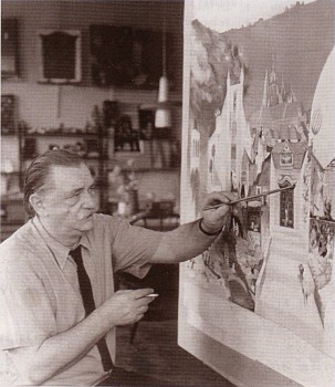 - Gene Deitch has hit another home run on his blog this week. He posts a piece about the great puppet animator and artist, Jiřà Trnka. Deitch tells intimate stories that make me feel closer to the man, Trnka, than I’ve gotten from many other books about the master’s work. (Just look at the image to the left from Deitch’s site. We see not only that Trnka was left handed, but that he couldn’t stop smoking even in the middle of painting during a photo shoot!) We learn about an aborted collaboration between Deitch and Trnka and several of the drawings Trnka did are posted on the site.
Deitch also gives us a good report with photos on the recent memorial in Prague celebrating the 100th anniversary of Trnka’s birth. This is a fabulous read.
Of course, there are many other articles equally as good on this site. Another recent post is on the artist, Jiřà BrdeÄka. He was just as great a force, in many ways, as was Trnka. This is a wonderful site and should be regularly followed.
Robot Puppet Porn
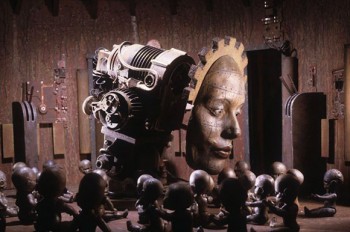 - Michael Sullivan is a New York animator/effects wizard/actor/artist who gets little attention.
He’s amassed years worth of puppets, dolls and small artifacts which he develops into his characters for the eccentric films he produces. Currently, he’s been making a film about robots – actually, a pornographic film about robots. This has been chronicled into a short film documentary that ran at the recently completed Sundance Film Festival. Titled, The Meaning of Robots, the doc is by filmmaker, Matt Lenski. There’s a trailer for the doc here and articles about the film here and here.
Watch part of Michael Sullivan’s work here.
Thanks to Tom Hachtman for the good word..
- Finally, the news that Don Cornelius had died this week, as a result of suicide, made me want to take another look at the opening title animation to Soul Train. There are no good quality copies on YouTube, but I found this small sampling of the show and felt that something was better than nothing. The titles were produced by Jim Simon with his company, Wantu Animation. I think I remember Dan Haskett telling me that he had done some animation on it. He did do a lot of work for Jim Simon, so it’s likely. Regardless, the titles are worth a nod. I haven’t seen any other animation site point it out.
Jim Simon/Wantu Animation for Don Cornelius Productions
Bill Peckmann &Illustration 03 Feb 2012 07:27 am
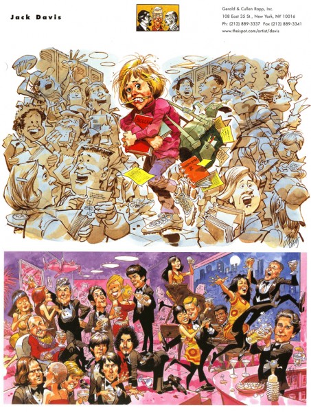
The Artist’s Rep
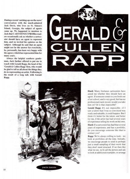
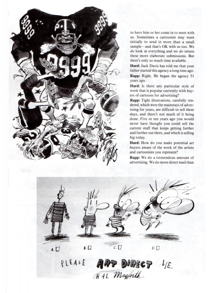
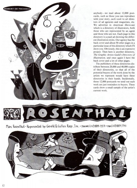
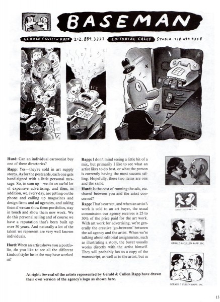
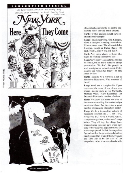
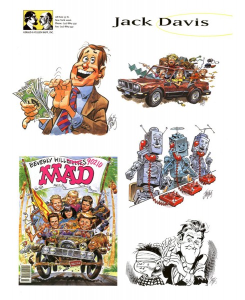
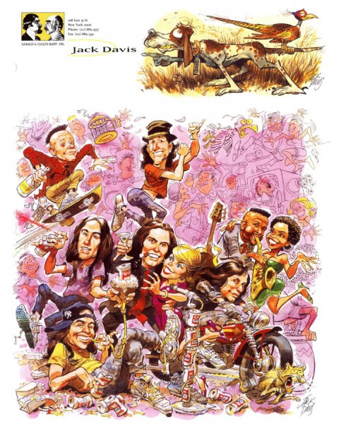
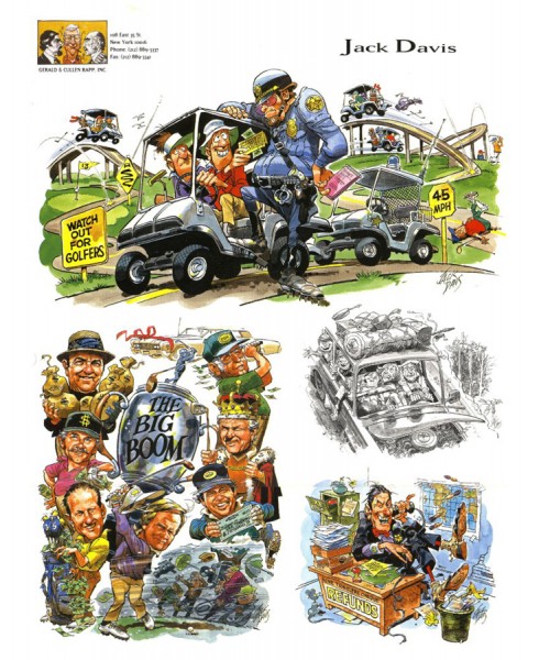
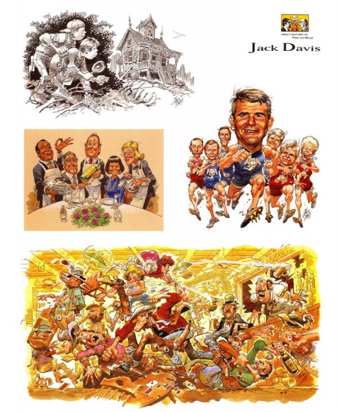
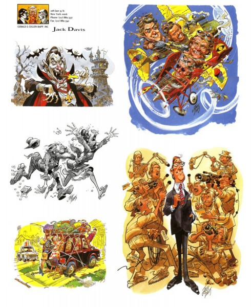
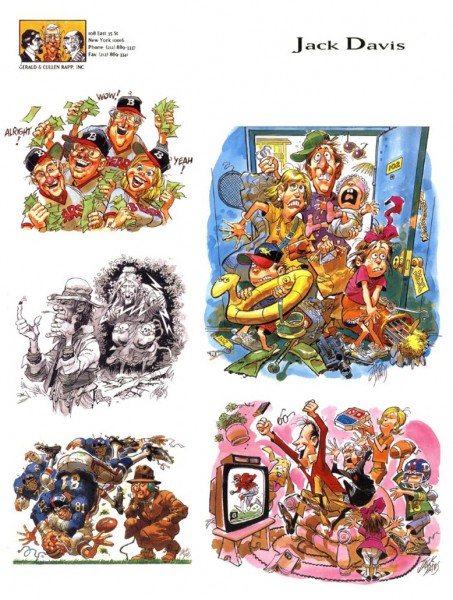
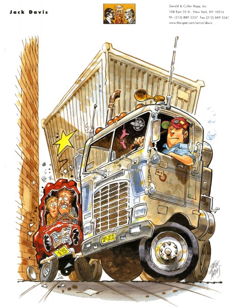
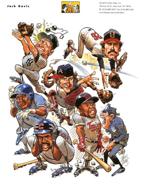
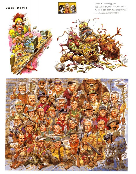
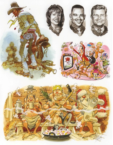
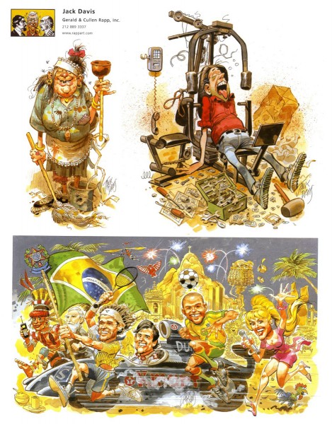
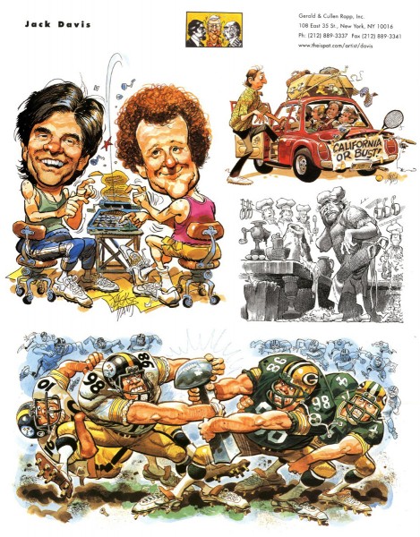
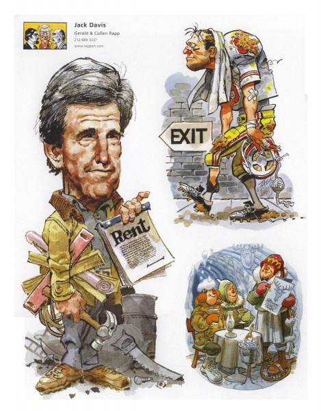
Gerald & Cullen Rapp were artists reps for a number of important cartoonists. Bill Peckmann sent me this excellent article from CARTOONIST PROfiles which details their work and some of their clients. Jack Davis is probably their biggest artist, and we follow the article with plenty of Jack’s work.
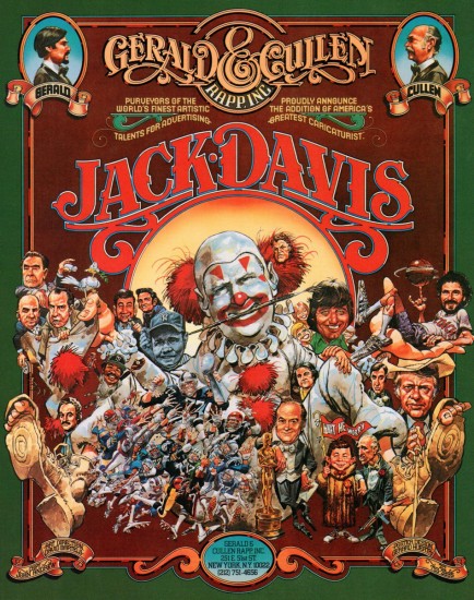
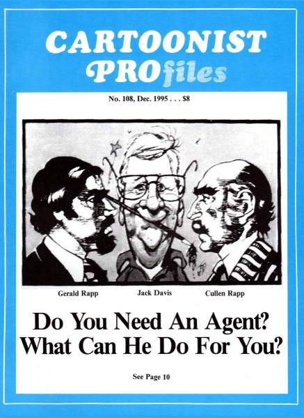
CARTOONIST PROfiles cover article about Gerald & Cullen Rapp
The following are printed cards highlighting the work of
Jack Davis.
Many thanks again to Bill Peckmann.
Bill Peckmann &Books &Comic Art &Daily post 02 Feb 2012 06:32 am
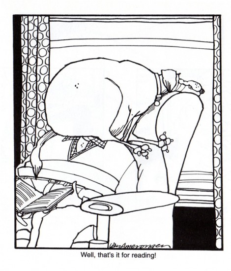
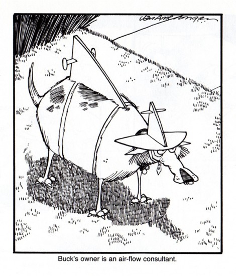
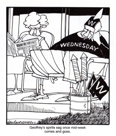
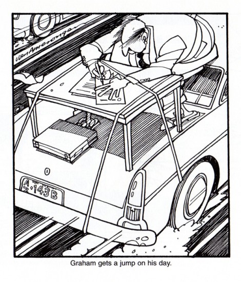
Jerry Van Amerongen
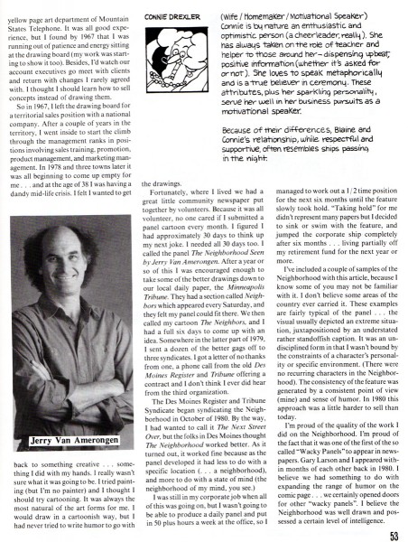
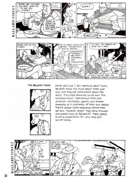
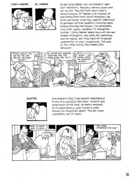
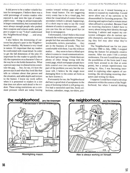
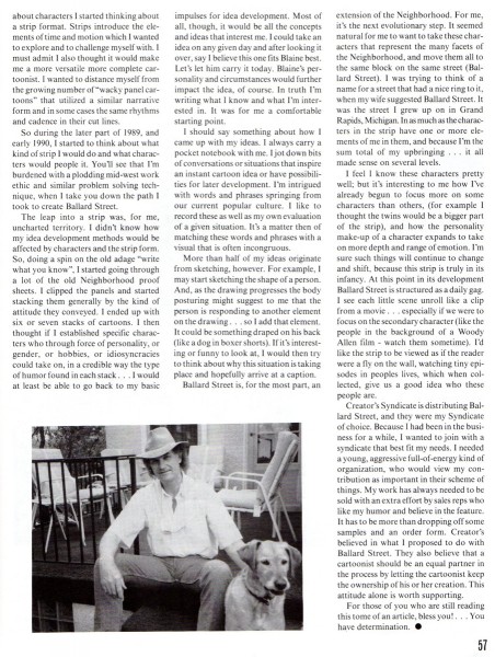
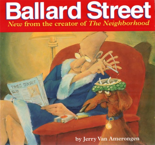
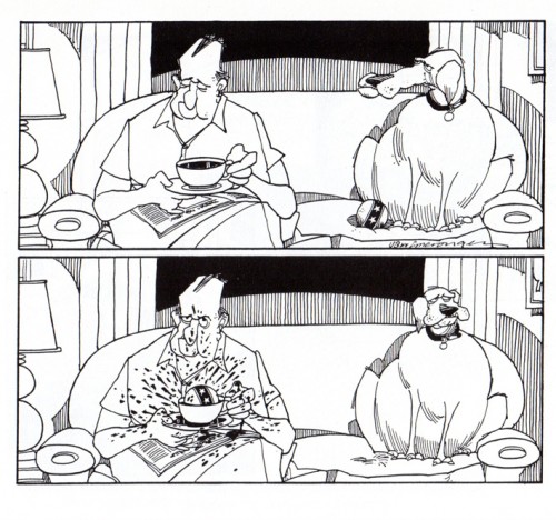
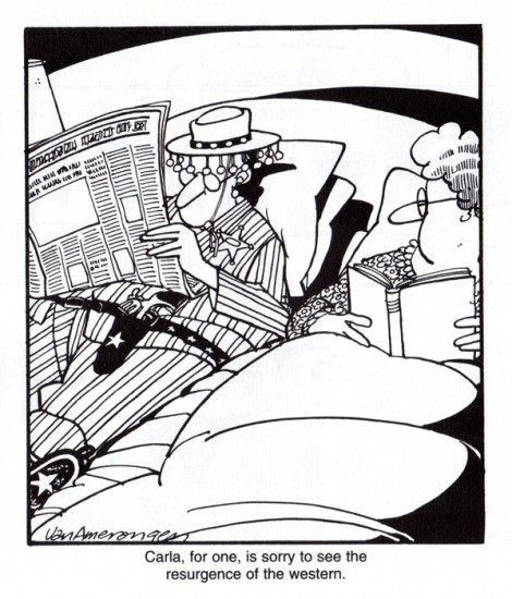
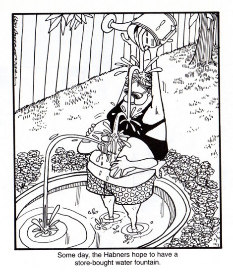
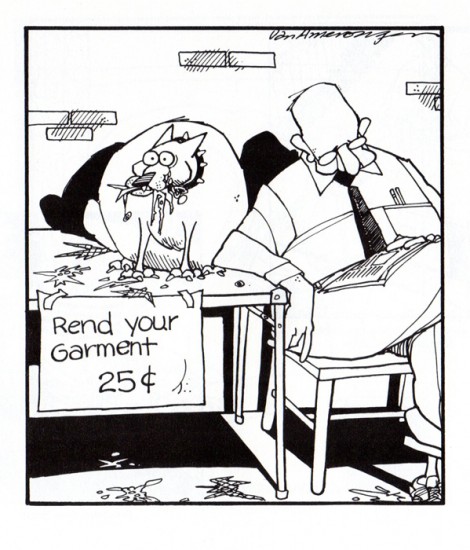
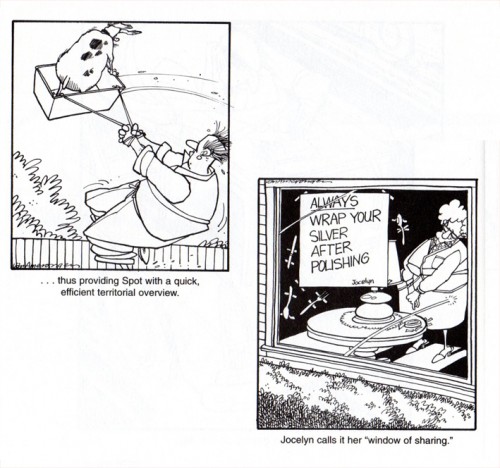
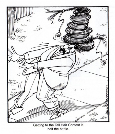
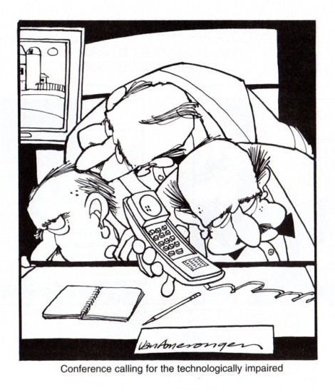
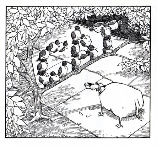
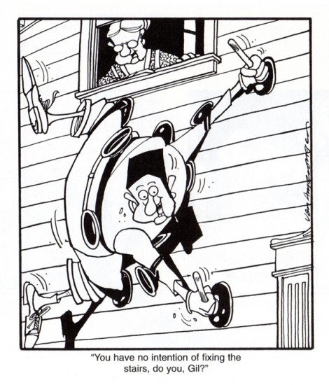
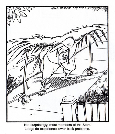
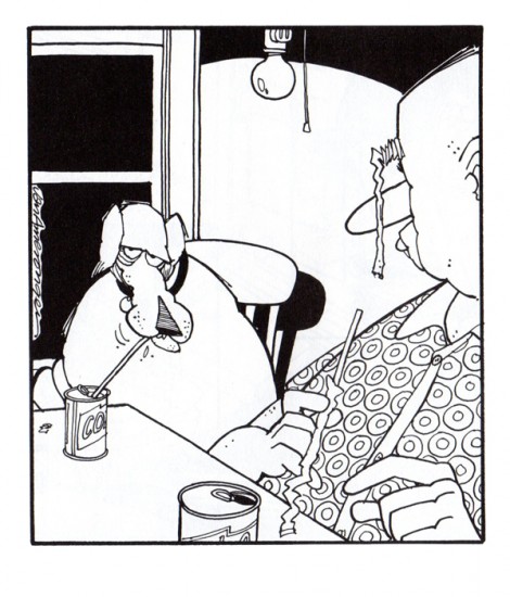
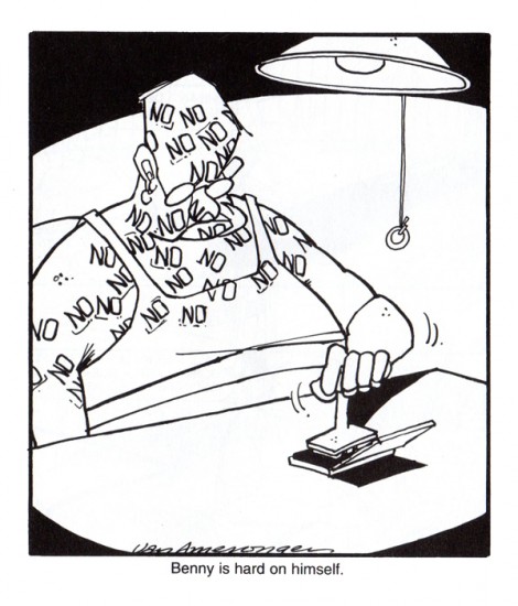
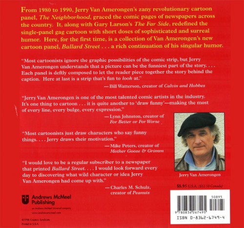
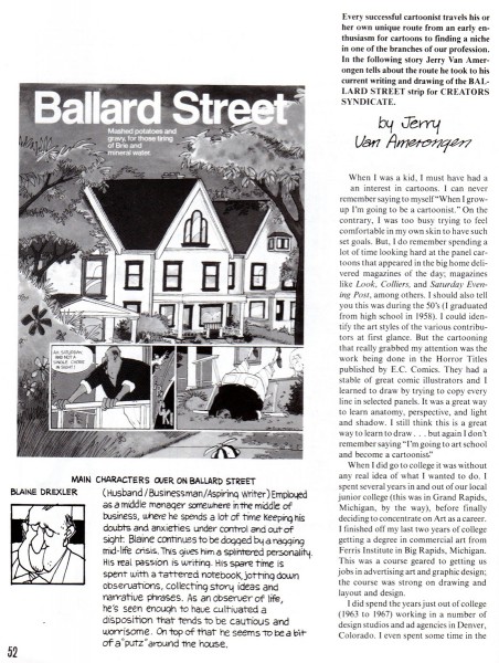
- Jerry Van Amerongen is a cartoonist whose work seems to be unfamiliar to many people. However, those who do know his work search out his cartoons. Bill Peckmann sent me this CARTOONIST PROfiles article about him and followed it with select cartoons from the pages of his book, Ballard Street. Bill wrote:
- Because of not having access to a newspaper that ran Jerry’s “Ballard Street” comic strip, this great talent flew under my radar for way too long of a time. Fortunately a good friend of mine sent me this book/collection a while back and I’ve been a fan ever since.
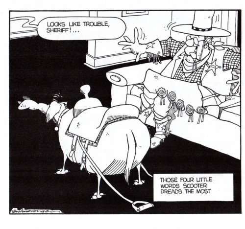
Here’s a sampling of the way that Amerongen can freeze hilarious moments in time as only he can.
 1
1
Animation &Animation Artifacts &Disney &Layout & Design 01 Feb 2012 07:47 am
Roger – Scene 45 -part 2
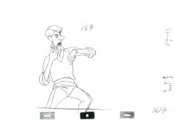
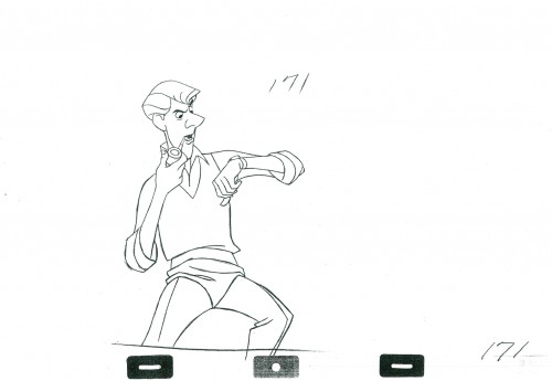
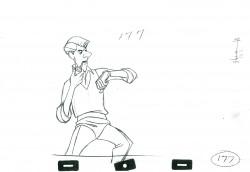
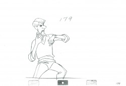
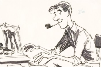 - Here is the second part of this scene from 101 Dalmatians. Roger is at the piano; Pongo has moved the mantle clock ahead by a ½ hour. Roger turns, yawns and checks his watch against the clock.
Milt Kahl animated Roger. Bill Peet did the storyboard drawing to the right. (In fact, he did the entire storyboard by himself.) This is the first of four scenes, I’ll post here – Sequence 1 Scene 45. The animation is, for the most part, on twos. There are a couple of ones at the very end ot the scene as Roger shakes his wrist. (Much of the rest of that will come with the conclusion, next week.
We start today with the last drawing from the first post.
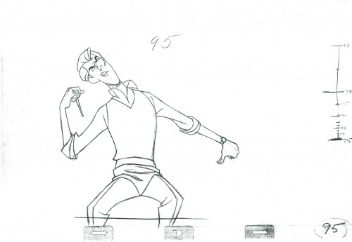 95
95
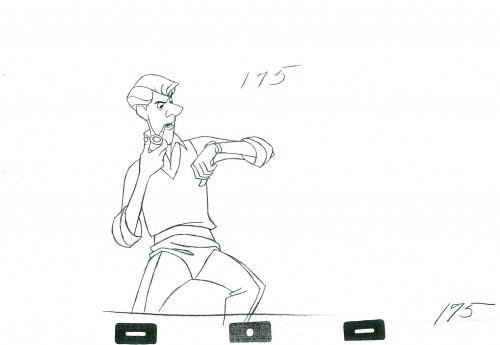 175
175
An inbetween is missing from this part.
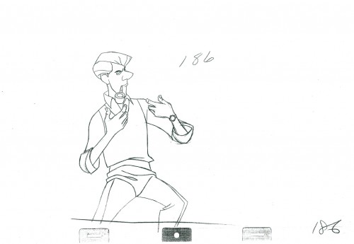 186
186
The goes on ones for a few frames as Roger shakes his wrist.
______________________
The following QT incorporates all the drawings from
this post and those in Part 1 as well.
All posts will be combined in the final piece.
All drawings were exposed on twos unless indicated otherwise.
The registration is a bit loose. Sorry but, these are copies ofcopies and there’s plenty of shrinkage.
Completion of the scene will come next week.
.
For more on 101 Dalmatians check out the animator drafts on Hans Perk‘s great and resourceful site, A Film LA. Hans has also posted Bill Peet‘s story treatment for the film several years ago. See it here.
For a look at the art direction of the film including some beautiful reconstructions of the BGs as well as some of the BG layouts go to Hans Bacher‘s great site One1More2Time3.
Andreas Deja has one of the more extraordinary blogs to visit. He just posted some beautiful drawings by some of the key animators on 101 Dalmatians as they set about to find the characters. See them here as well as a comparison of Milt Kahl‘s characters against Bill Peet‘s version. here
For those who own Fraser MacLean‘s excellent book, Setting the Scene, you’ll know that on pages 182-188 there’s an extensive discussion of this opening sequence from the film with plenty of beautiful images of the set.
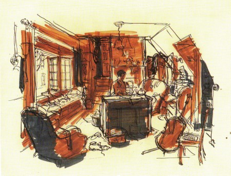
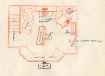
Ken Anderson’s sketch of the room.
