Monthly ArchiveFebruary 2012
Animation &Animation Artifacts &Disney 29 Feb 2012 07:33 am
Mickey Flutters Fingers
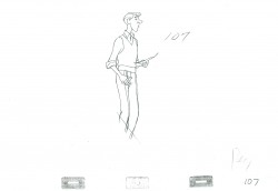
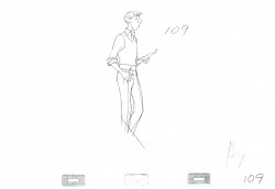
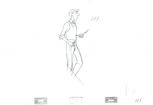
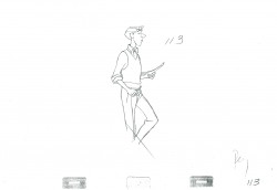
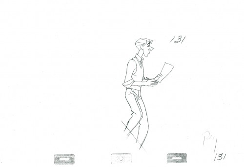
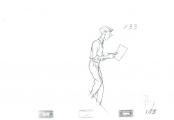
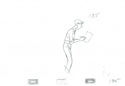
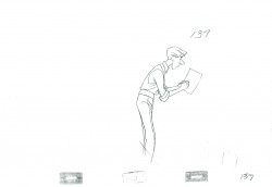
- It’s animation drawing Wednesday, and I have a few more scenes by Milt Kahl of Roger from 101 Dalmatians. However, I want to take a short break from those scenes which are large and difficult to scan in.
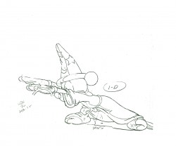
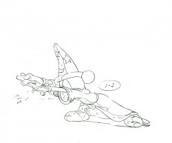
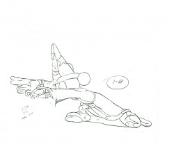
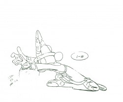
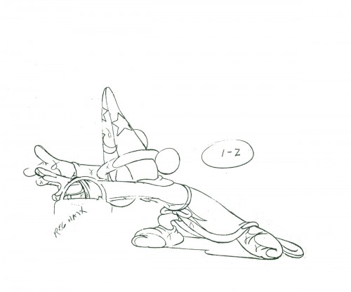
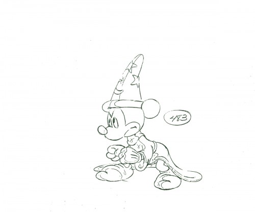
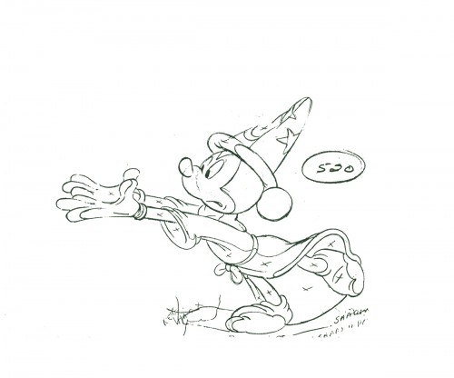
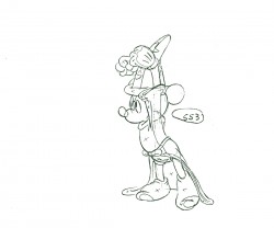
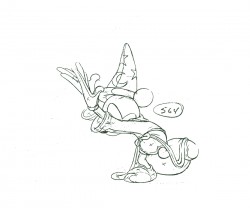
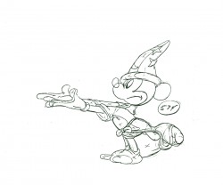
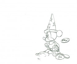
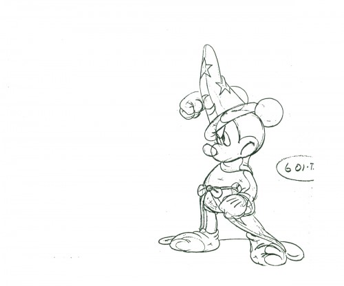
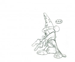
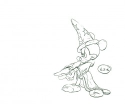
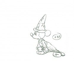
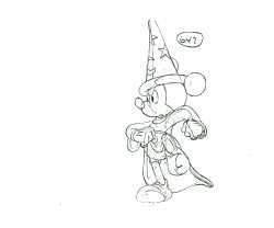
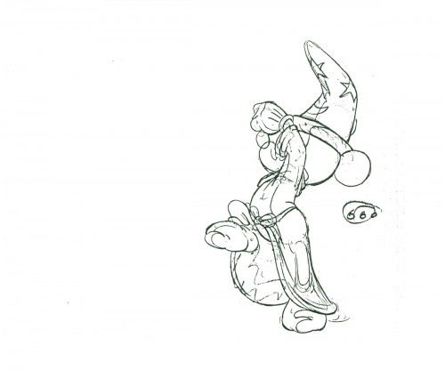
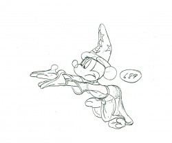
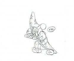
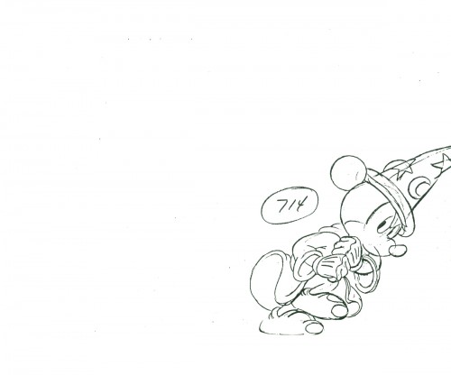
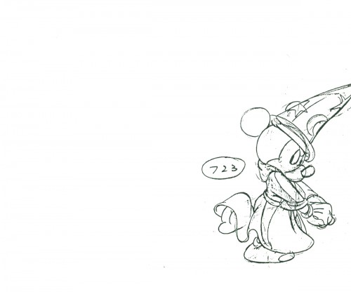
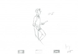
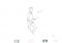
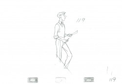
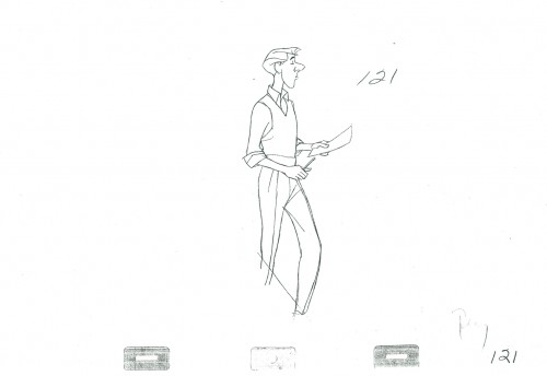
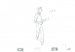
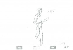
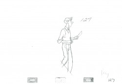
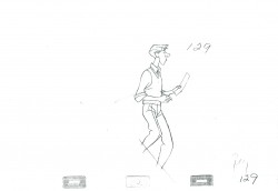
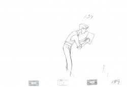
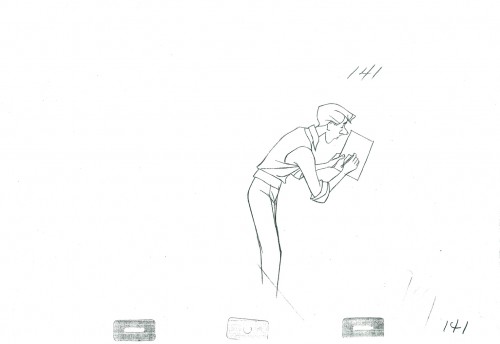
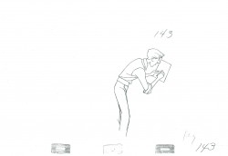
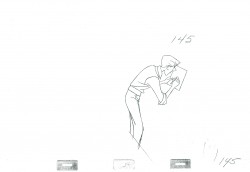
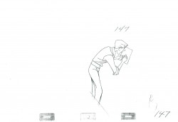
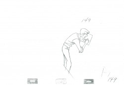
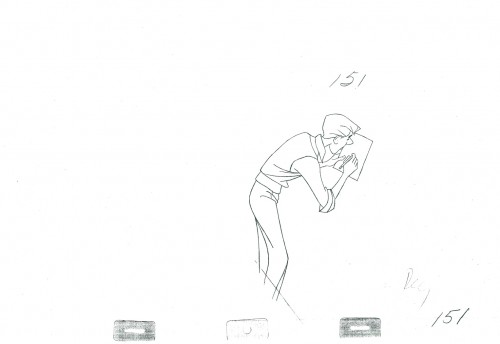
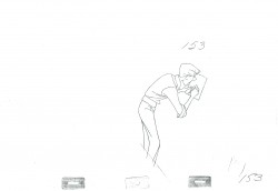
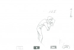
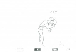
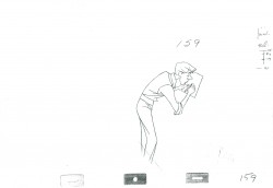
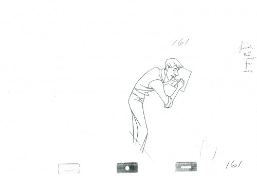
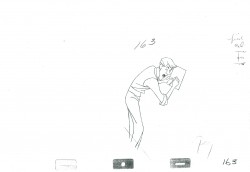
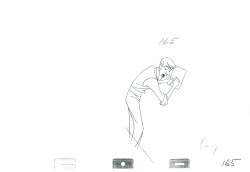
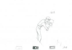
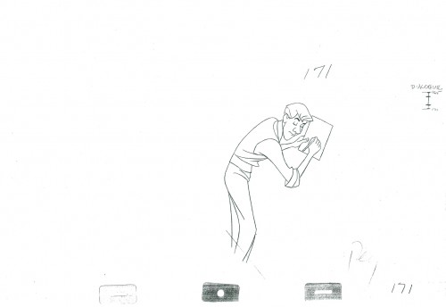
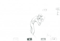
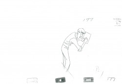
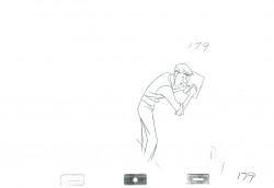
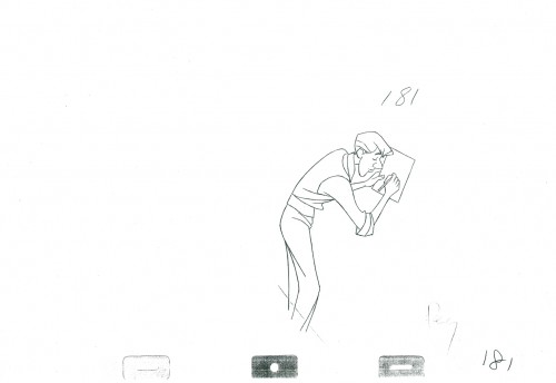
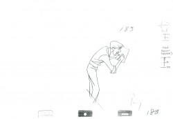
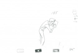
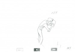
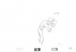
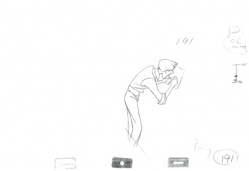
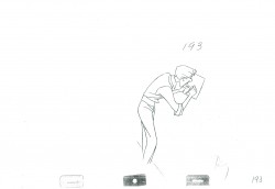
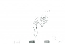
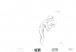
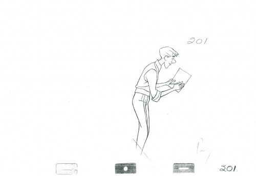
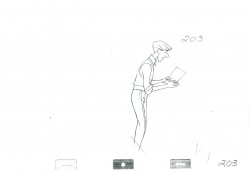
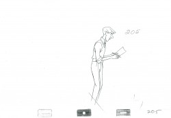
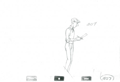
I have a number of scenes of Mickey from The Sorcerer’s Apprentice. They all came with nothing. No exposure sheets, no registration marks or pegs, no anything, So, basically, I’m just showing off some drawings, trying to register them as best I can and then giving a guess of an exposure to hint at their motion. But I think there’s something to be gained, or I wouldn’t be doing it.
Since there’s no indication of a repeated step from Mickey, and knowing it’s in the scene, I doubled it in the QT movie to see how it works. It’s all fun and variations for me here.
This is Seq 7 Scene 4 animated by Les Clark. Mickey is instructing the newly livened broom to march step and follow him.
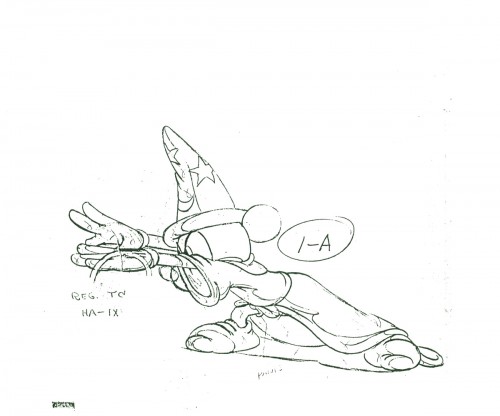 1A
1A
______________________
The following QT includes all the drawings posted above.
The registration is a bit loose. Sorry but, these are obviously
copies of copies and there’s plenty of shrinkage and distortion.
Action Analysis &Animation &Animation Artifacts &Disney 28 Feb 2012 06:09 am
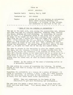
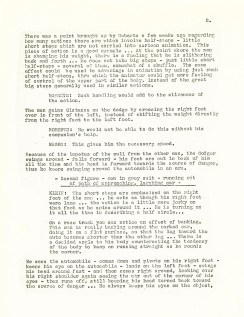
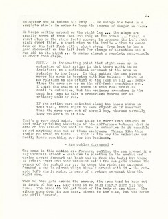
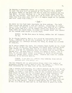
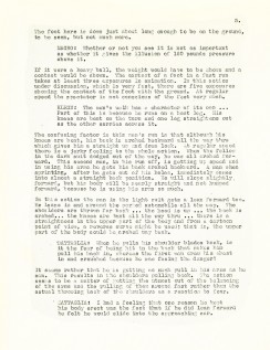
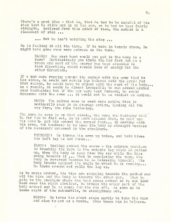
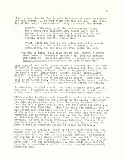
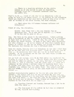
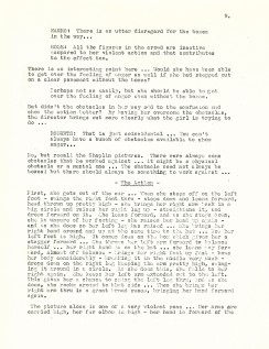
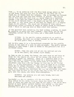
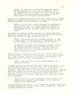
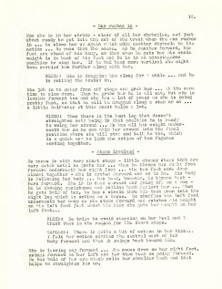
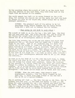
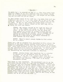
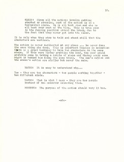
Action Analysis – May 3, 1937
- For a while I was posting the Action Analysis Notes from the Disney Studio’s after/hours classes back in 1937. For some reason I was distracted from that mission and stopped with the April of ’37 notes. Well, I’m back with more and will continue with what notes I have.
The following lecture took place on May 3, 1937.
It’s an analysis of a film clip starring Patsy Kelly as she angrily strides over obstacles and is finally stopped by a man and calmed down.
The participants of the class include: Joe Magro, Bill Shull, Jacques Roberts, Izzie Klein, Aurelius Battaglia, David Rose, Ken Petersen, and Robert Carlson.
Cover page
.
- You’ll find past posted notes here if you’re looking for them, but you’ll also have to scroll through some animation art to get to them.
Animation &Disney &Frame Grabs 27 Feb 2012 08:22 am
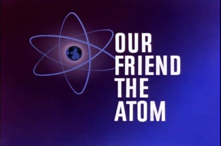
Our Friend the Atom
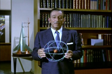
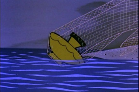
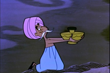
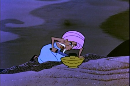
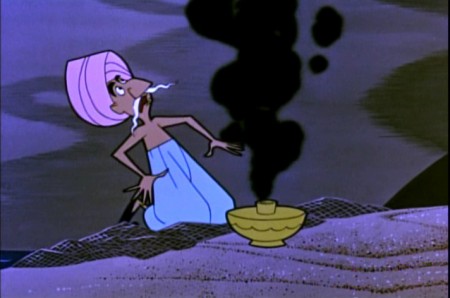
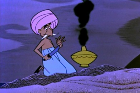
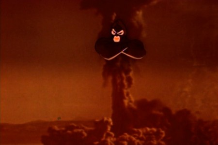
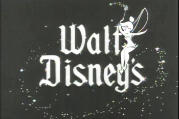 - When Disney released 20,000 Leagues Under the Sea, there was a curious and opportune time for some cross promotion with Disney doing a “Tomorrowland” show for his Disneyland program. Our Friend the Atom talks about atomic energy driving the Nautilus submarine in the Jules Verne film that Disney was pushing. (Of course, Verne wrote of an “electric ship,” but Disney in the mid-fifties had to be thinking nuclear.)
 Ham Luske directed the
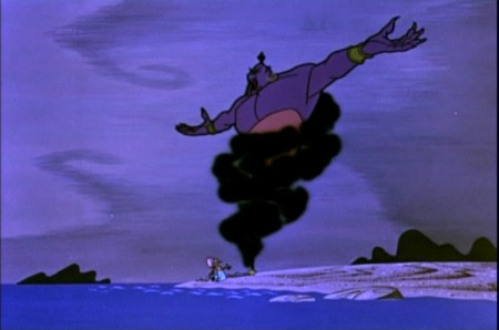
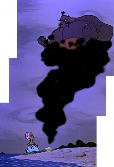
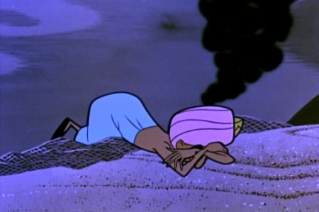
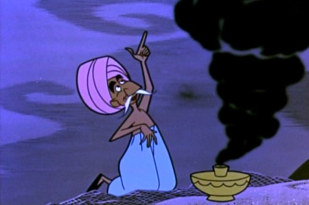
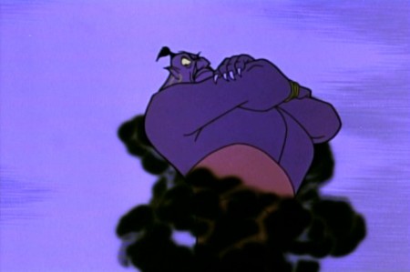
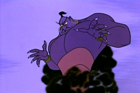
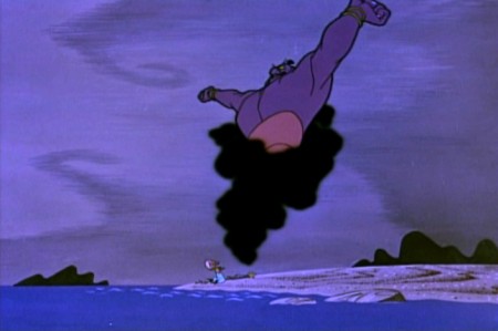
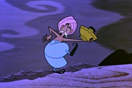
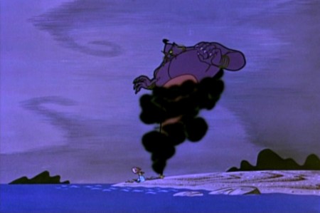
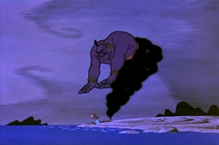
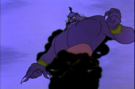
show, and I have to say some of the animation is spectacular. I really love the look of this stuff. I feel like the representation of the Genie is magnificent. There’s a feeling that they capture which really invokes the Arabian Nights figure that I read. (I was a bit turned off by the WB feel of the Robin Williams Genie in Aladdin, though I am in awe with what Eric Goldberg did with it. I guess I’m too much of a purist with some of these folk/fairy tales.)
I had always given Ward Kimball credit for the show until looking at it again. Whereas all the shows Kimball did had a light approach toward the science, trying to make it as much fun as possible, Our Friend the Atom is dead serious with very little humor underneath it. Somehow, I loved this show more and was very impressed with the strength of that Genie.
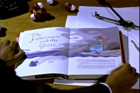
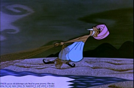
I’ve taken some frame grabs of the first segment to give an idea of it. The show is available in one of those Walt Disney Treasures – Tomorrow Land: Disney in Space and Beyond
 1
1
 4
4
Note how they keep the type in the book illustration as they did
in the Winnie the Pooh adaptations which were done years later.
 6
6
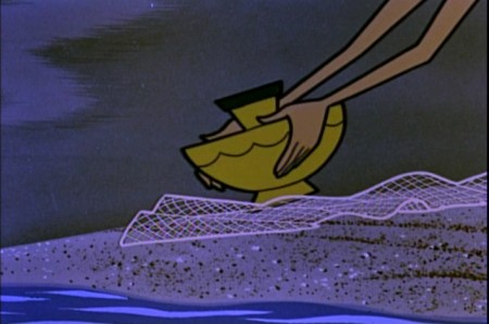
Just pure fine visual storytelling in this section.
It really is very well done in its conservative editing.
 11
11
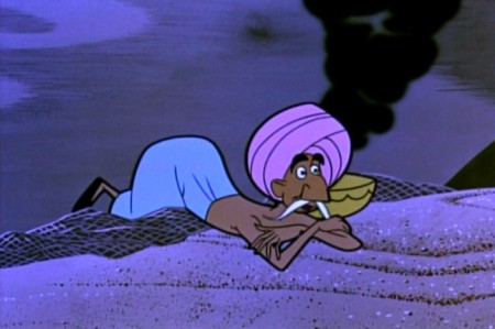
The Genie is going to take advantage of the fisherman
who has released the demon into the world.
 16
16
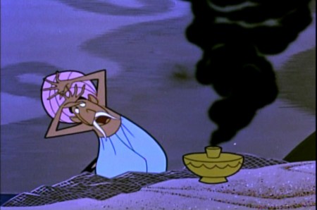
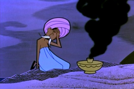
But the fisherman gets an idea.
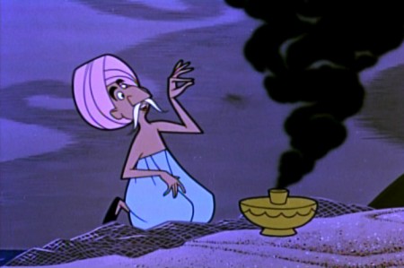 19
19
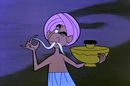
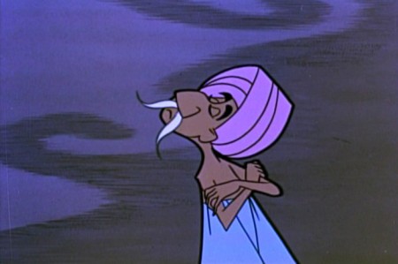
He says he doesn’t believe that the Genie
could not have fit into so tiny a lamp.
 21
21
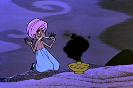
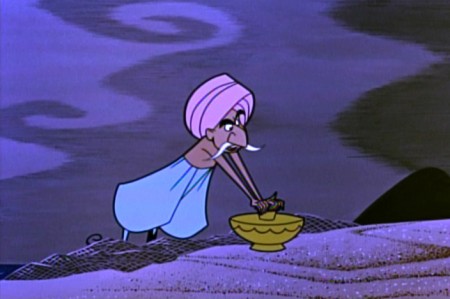
He challenges the Genie to prove that he can fit into the lamp.
 23
23
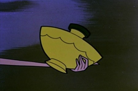
The Genie goes back in . . .
 24
24
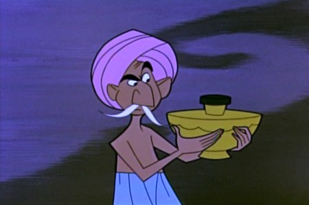
. . . the fisherman stops him in there.
 27
27
The Genie makes a magnificent deal
if the fisherman will let him out again.
.
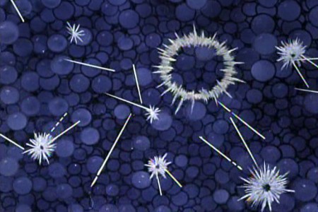
The program then goes into the history of the discovery of radiation and the atom and control of atomic energy.
.
 32
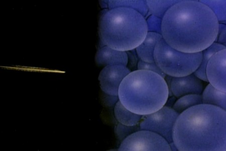
32We pick things up with the splitting of the atom.
 34
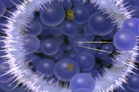
34
A chain reaction gets things going.
Daily post 26 Feb 2012 06:23 am
Studio Studio Photo Sunday – recap
I can’t resist re-posting this one from 2007. It was the same time of year; it just hasn’t snowed at all this year.
- This Sunday’s photo features the only pictures I have of my very first studio. If you remember, from past writngs, originally I set up in an apartment leased by Richard Williams. I took care of his apartment while he was out of town (most of the time), and we did Woman of the Year out of that space. (You can see photos of that space here.) Once it became clear that I needed my own space, I found one in a building at One West 30th Street.
It was an historic building and a very interesting site. Every floor was decorated differently, and except for the second floor it was completely housing. The second floor had about half dozen office spaces. Two of them were Persian rug dealers with whom we spent time drinking a lot of Turkish coffee. (This area of NY features quite a few rug sellers.)
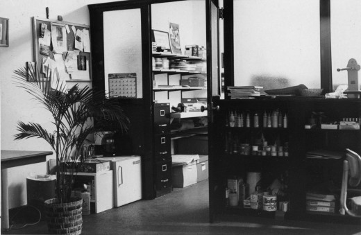
My office looked like something out of Sam Spade. All these steel and glass partitions broke the space up into two parts. In the photo above, I’m standing in the larger space (maybe 20 foot squared) which leads into the back area, my space. This was possibly 10×20. I loved it.
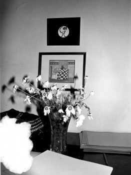
The B&W photo above left is the only other picture I have from that space. The framed cels are from Woman of the Year; it sits above the end title image from Morris’ Disappearing Bag. Both of these were done in 1981-82. Hence this photo dates back to 1982. The color image above was taken this morning from the vantage of our current studio’s front door. The flowers are on the front desk.
Last week we saw a day of heavy snow/rain/sleet which left the City covered with 3-4 inches of iced snow. A week later it still covers most of the town. Garbage is piling up a bit more than usual and construction has slowed down – just a bit.
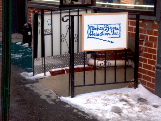
This is the front of my building. A gypsy fortune teller sits just atop the entrace to my space – down a dozen steps. There’s a knitting shop (red for Valentine’s Day) next door. They have a cafe wherein many women seem to gather to knit. (I’ve only been in the store once, but it’s usually filled into the late hours.)
This is the actual entrace down some icy steps.
Once you go down these steps you have to walk down an icy, outdoor corridor. On the left you can see this corridor from the street side. On the right it’s from the studio side.
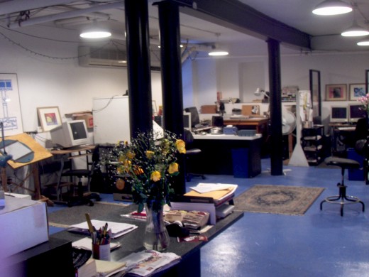
Finally. from the front door of this studio you see this space. (I’m literally standing in the doorway.) This room has four stations equipped with drawing tables and computers as well as two other computer setups. Paul Carrillo, my editor, works all the way in the back right. Matt Clinton, our principal animator on staff, works to the back left. Christine O’Neill, my assistant, sits behind the flowers, up-front.
My room is in another room to the right.
Commentary 25 Feb 2012 07:25 am
Cracks, Quips and Crits
- Today in Hollywood, the Animation Guild, ASIFA-Hollywood and Women In Animation will present “An Afternoon of Remembrance,” a celebration of some of those from our animation community who died in the past year. Among those scheduled to be remembered include a number of East Coast artists as well as several Independent animators.
Karen Aqua, Jordan Belson, Robert Breer, Vincent Cafarelli, Don Christiansen, Cornelius “Corny†Cole, Del Connell, Ray Dieter, Norm Gottfredson, Bill Justice, Earl Kress, Dorse Lanpher, Dwayne McDuffie, Dan Mills, Barney Posner, Hal Silvermintz, Paul Somner and others will be brought to a small communal closure.
I couldn’t praise the three organizations any more for doing such important work for the community. It’s a very sad event, but one that is an absolute necessity given the rising ages of many of our forbears. I only wish that I were in Hollywood to be able to attend such an event and to honor some of those veterans that came before us.
The Afternoon of Remembrance is free of charge and is open to all.
No RSVPs necessary.
Food and refreshments, 12 noon, Memoriams, 1 pm.
The Hollywood Heritage Museum (Lasky-DeMille Barn)
2100 N. Highland Ave. (across from Hollywood Bowl) in Hollywood, California.
The brilliantly talented Jeff Scher has posted a new advert he’s done for the latest Ann Arbor FIlm Festival. The ad, itself, should win the film festival’s top prize, if you ask me. Once again, Scher works with the very talented composer, Shay Lynch, who’s take a rock turn for the music to the spot. Hi energy for 30 secs. Worth watching a number of times.
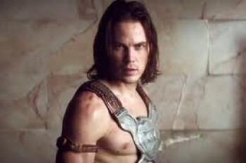 – There’s a lot of dirt being thrown about the Disney studio of late and the source of it all seems to be pointed at Andrew Stanton‘s live action film debut. John Carter of Earth, is the source of all the trouble. An article in The Beast reveals a lot when it talks about Disney Chairman Rich Ross‘ job being in trouble for the ever expanding $250 million budget.
- John Carter is . . . the kind of cautionary tale that keeps studio chiefs popping Ambien at night: a vanity project with sky-high expectations and a humongous budget* that now seems destined to land with a massive thud at the box office—unless it can somehow rake in more than $400 million to break even. In other words, it’s the kind of movie that causes heads to roll.
Stanton has denied that the budget had reached a quarter of a million dollars, but Disney seems to be stating that that’s the case. Everyone at Disney points to the film as a failure and they’re all expecting to see heads roll. Let’s hope there will be room for Stanton to get back into animation. I’m sure Pixar will be looking to do another Finding Nemo eventually.
Nothing in the trailers I’ve seen has made me excited about seeing this film, and of course I’m not being fair. However, the multiple computerized crowd scenes just reminds me of schlocky The Mummy Returns kind of thing, but this film doesn’t even have a Brendan Fraser at the center of the movie. Even that wouldn’t be enough for me to tolerate one of these overblown Hollywood epics that are never very epic – just loud. But, as I say, I might be wrong and will reserve my last judgment until I see it. I’m just not looking forward to it.
I still would have liked to have seen what Bob Clampett
would have done with this way back when.
Oh well, dreams of a rarebit fiend.
____________________
Executive Shuffle
- After Rango reaped a giddy success for Paramount Pictures, the movie company decided to set up their own Animation division. They put executive, David Swainton, in charge and they were off to the movies. Or so one would have presumed. Now Variety reports that Swainton, just four months into the job, has quit his post “for personal reasons/” Although Paramount had wanted to turn out one film a year beginning in 2014. As Variety writes:
- “At the time, the news was seen in part as a negotiating tactic with DWA, whose distribution deal with Paramount was set to expire at the end of 2012. Both parties asserted that the division would have no affect on negotiations — which weren’t even supposed to begin until early 2012. But sources outside the studio saw the initiative as leverage that Paramount could bring to the table.
“Though no film has yet been slated for release, studio has said several viable projects are in the works, including an adaptation of the graphic novel “New Kid.”
Paramount Motion Picture Group prexy Adam Goodman will take charge of the animation development team.
Fleischer Multiplane
- Looking back to Paramount Pictures animation division in 1938, Nicholas John
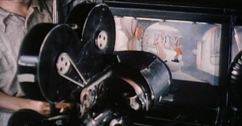 Pozega posts on his blog, Classic Cartoon Reviews, a number of screen grabs showing Max Fleischer and his 3-D setback animation camera.
The images are sharp, informative, and worth a look. Mr. Pozega pulled them from a “Popular Science” reel on the DVD “Popeye the Sailor: 1938-1940″. If you continue to scroll down on his blog there are also other newsprint images of the camera.
Spirited Away : BFI Monograph
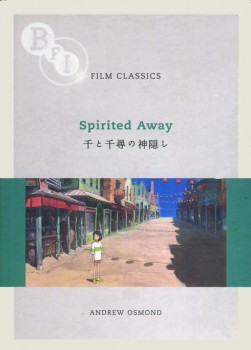 - After seeing The Secret World of Arrietty, I really got into the Miyazaki mode and have dug into a DVD set I own of his features up to including Spirited Away. They’re all in Japanese with English and/or Chinese subtitles, so there’s some purity in the viewing.
However, I’ve also been reading a wonderful monograph written by Andrew Osmond in 2008, Film Classics: Spirited Away. I raced through this book and have gone back to the front and am reading it again. It’s a very open-minded reading of the film taking in many of the negative critiques that came with the film and addressing some of them quite well. I’ve gotten quite a bit out of the book and wish Mr. Osmond had done similar works for other Miyazaki films. I’ll have to reread his 100 Animated Feature Films again. I wasn’t very positive about the book when I originally commented on it, in that I didn’t quite understand the reasoning behind the selection of titles chosen for that book. However, Mr. Osmond writes with such strength and self-confidence that he covers a lot of good territory. I’ll have to see if I think differently this time out.
I do recommend the BFI monograph, Film Classics: Spirited Away, though. It can be picked up a Amazon, of course.
A Beauty Awakens
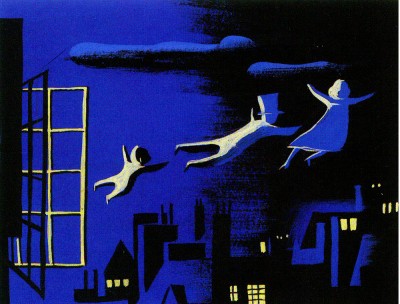
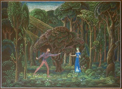
Hans Perk on his excellent site, A Film LA, has shown us another side to the development of Disney’s feature, Sleeping Beauty. For the most part, we’re accustomed to the noble and stylized images from the hand of Eyvind Earle, the stylist who ultimately dominated that feature and made it the film we all know and cherish. However, Hans features some preliminary art by Danish illustrator, Kay Nielsen. Nielsen died in 1957 during the production of the feature.
To date only the one illustration he’d done, which appeared in John Canemaker‘s book, Before the Animation Begins, had come to light. Now Hans introduces us to more of this art which has recently come to light.
This website is one of my favorites. A great resource if there was one.
Animation &Commentary 24 Feb 2012 07:51 am
Pops and Smears
- In reviewing The Secret World of Arrietty, the brilliant new Ghibli film, I wrote about the fluidity of their animation and its basis in a real rather, than a cartoon world. Unfortunately, most of the animation done in features coming from the Western world (specifically the US world) is done in a cartoon way using pops and smears. This affect creates cartoon characters and clichéd ones at that. It’s not a type of animation I love for feature films.
Of course, if you’re designing an Aladdin, where the Robins Williams/Eric Goldberg Genie is a hyper cartoon character, that’s the only way to go – stylized cartoon. That was its natural design. But for 101 Dalmatians/Peter Pan/Beauty and the Beast – no. That’s not what you should be doing. However, it seems to be the only way to go in the films coming out of Hollywood.
I thought, over the course of a couple of posts, I’d give a couple of good examples of these pops and smears I’ve been bothered with in the recent past. Let’s start with “smears” 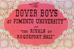 something I find particularly egregious in animation pretending to create a “real” world.
To show what I’m talking about, here’s an example from the first real – and I might say brilliant – use of this technique.
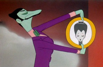
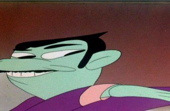
Animator, Bobe Cannon, together with director, Chuck Jones, came up with the technique for the outstanding Dover Boys film.
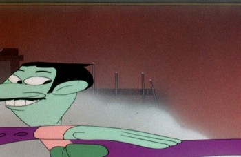
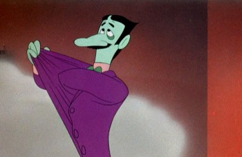
Here’s our villain, the main target of the smeared frames:
 1
1It’s the villain that moves in exaggerated smears.
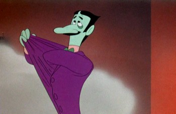 2
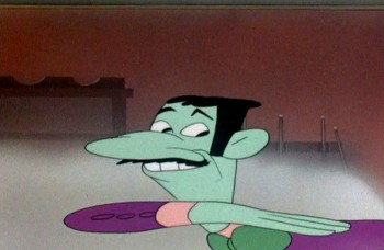
2
He moves slowly at start and stop of moves.
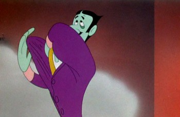 3
3
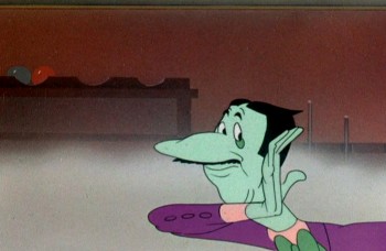
But moves wildly in between phrases of dialogue.
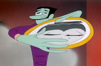 4
4
The middle poses couldn’t be wilder or faster.
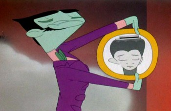 5
5
And comes to quick halting stops with small patches of dialogue.
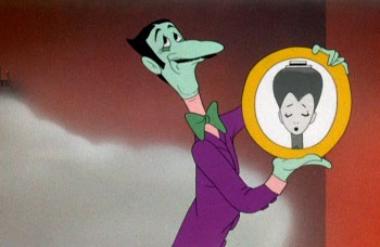 7
7
Then, if anything, we’re going wilder.
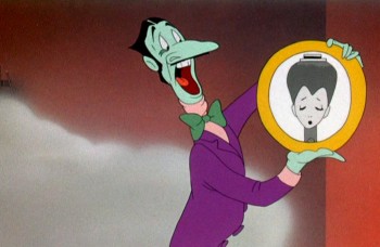 8
8
Slowly out of quiet hard pose . . .
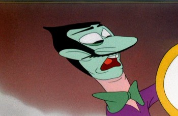 9
9
WILD as Jones backs the animation move with a tighter cut . . .
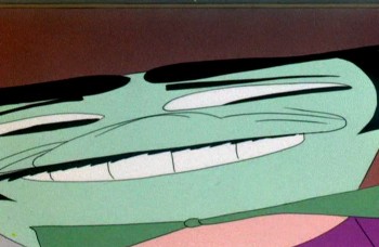 10
10
. . . and a wild camera move.
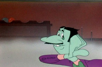 14
14
Come down to another solid, hard pose and move dialogue.
Here’s a later sequence as the villain kidnaps our heroine.
All cartoon, all comedy, all arch, all on purpose.

He moves wildly via smears inbetween phrases of dialogue.

Line of dialogue – move – dialogue – move.

Every action comes off the exaggerated speech by the arch ( and I do mean arch) villain.
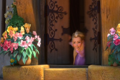
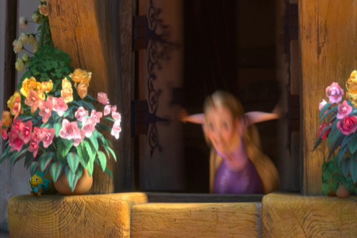
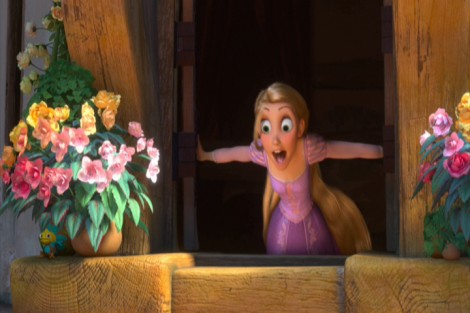
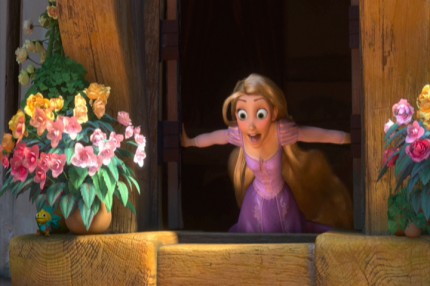
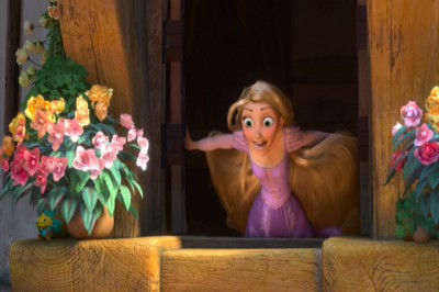
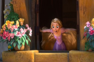
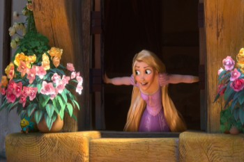
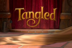 Tangled is a tangled version of the brilliant fairy tale, Rapunzel. The makers have completely distorted the tale to a mish-mash point where it makes no sense, but that’s irrelevant to this post. What is relevant is that they continually rob the characters of a reality by pushing, rubbing and smearing them throughout.
The first example of this technique shows up as Rapunzel opens her window. Technically, you start slow, you compress the middle to one or two images, and you slow out over a long beat. The inbetween chart would look something like this:

Here’s Rapunzel opening her window:
It’s not really a human motion; it’s a cartoon motion. But it’s subtle enough this first time, that we can get away with it. Let’s just call it fast. However, too often the animation falls into this mode, and by midway through the film, there are no real characters left; just cartoon characters.
I take that back. Mother Goethels is always true to a human animation style. She is a real character, and Donna Murphy’s performance grounds it behind the fine animation by Jamaal Bradley, Nik Ranieri and others.
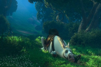
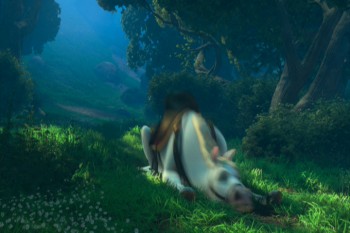
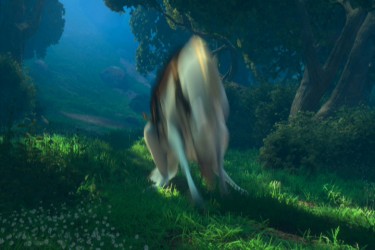
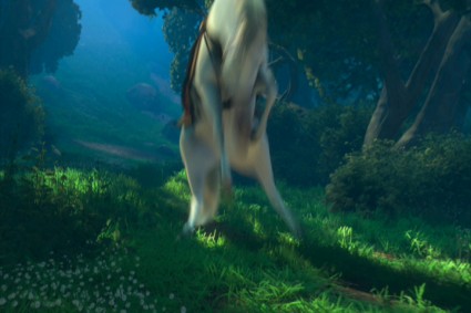
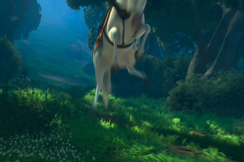
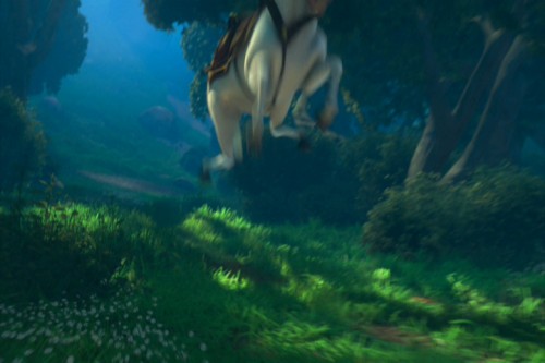
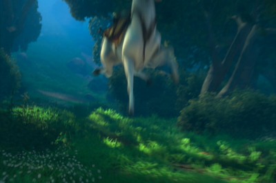
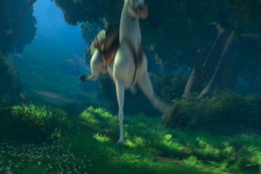
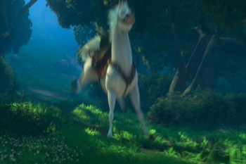
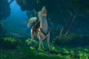
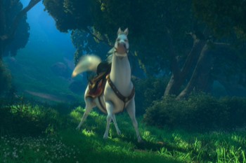
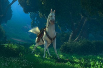
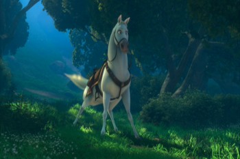
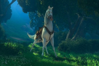
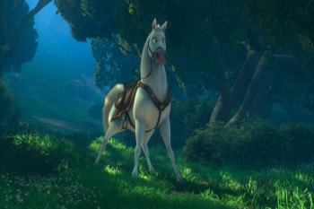
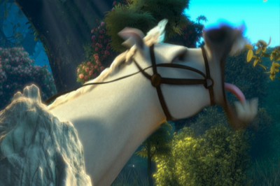
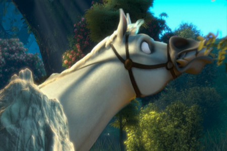
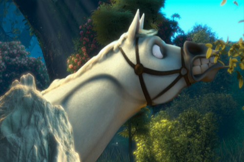
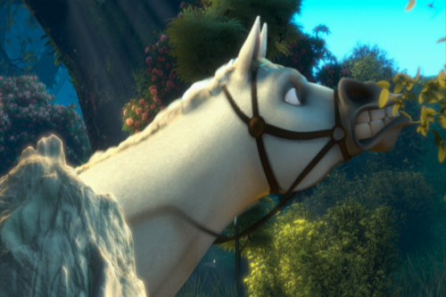
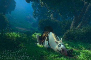
The most egregious in using these smears is the horse character, but if it were only that one, it would work. The horse is a stand-alone. It’s personality IS a cartoon. The horse, after all, isn’t a horse in this film. It’s shaped like another Disney horse, but it moves more like a dog. And it’s ALL pops and smears.
Look at these frames of it getting up from the ground, lickety-split:
 1
1
The move above is funny, not based in reality. What we have is a cartoon horse. This is not the horse Prince Phillip rides in Sleeping Beauty. It’s not even a good caricature of it.
The unfortunate part is that what Bobe Cannon did in the Dover Boys can’t easily be done in cgi. The Dover Bioys employed the brilliant cartooning of Cannon; cgi is really just a playing with computerized puppetry. You can stretch and squash somewhat, but distorting as desired isn’t always possible. So they stretch and squash and do very fast motions and hide it all under a veneer of out-of-focus. It ends up looking like just fast motion and not a true distortion – as they probably desired. The best you can hope for is image #3 just above. Now compare that to image #10 in the Dover Boys group. Not quite the same are they.
God forbid someone in cgi wants to do what Jim Tyer did. It’s impossible.
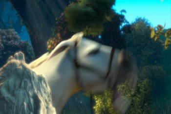
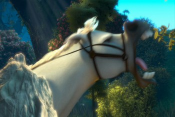
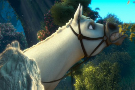
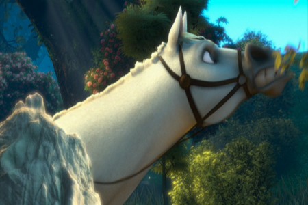
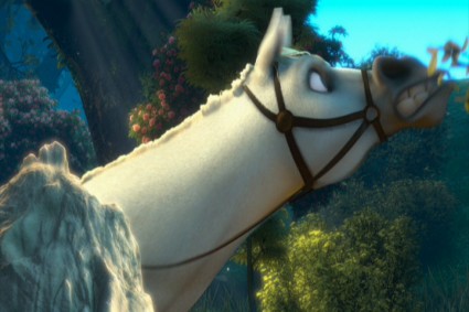
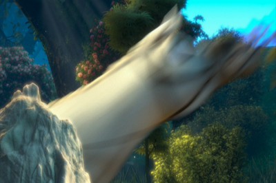
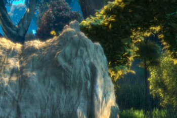
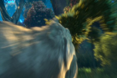
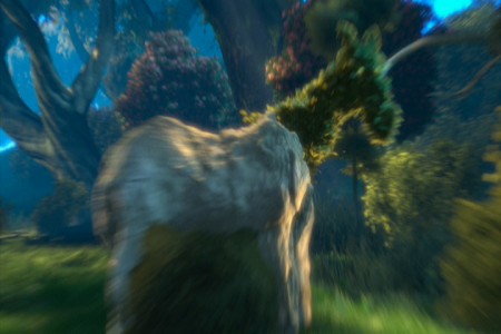
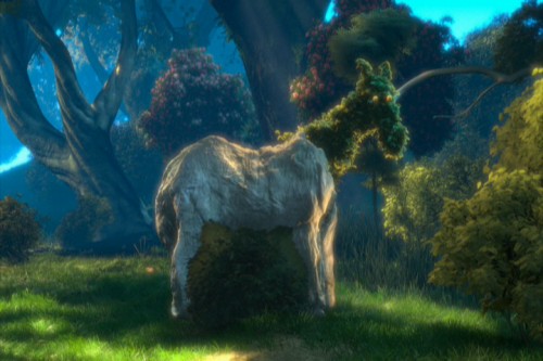
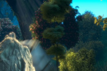
Here’s one last horse. We start rock steady – then zip, blur, stream. Ease in and race back out – zip, blur, stream. To be honest, I’m not sure what’s even happening in this scene (the horse is somehow changing into rock and vegetation?), but I let it go past as cartoon.
 1
1
To sum up what I’m trying to say. Animated features have sunk their heads into the ground. Everything has become arch and stupid. We’re not trying to develop characters but, instead, trying to do some wild movement. Movement that has nothing to do with character development. That’s a problem, if you ask me.
If you want to imitate Tex Avery or Bob Clampett, fine. If you want a seriously developed non-cartoon character, then stay away from pops and smears. It works for Aladdin, but it also limits feature films. I think Tangled is a good example of that. Outside of a few characters, I see little believable animation there. It’s all just tricks and stunts that pulls away from true, honest animation. It’s a comment on a character rather than a development of the character.
Of course, that’s my opinion. It’s so obvious to me when you see a Ghibli product like The Secret World of Arrietty or anything Mayazaki does. Their animation grows more and more subtle while Hollywood moves in the opposite direction – gags and clichéd actions. I don’t understand why Disney product approves of this. Thank god for animators like Andreas Deja who refuses to go this route, and is in absolute control of the characters he animates. There are others like him, and I applaud those artists. I wish they were all of that shape and belief.
Bill Peckmann &Illustration &Rowland B. Wilson 23 Feb 2012 07:30 am
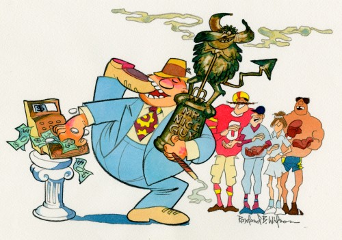
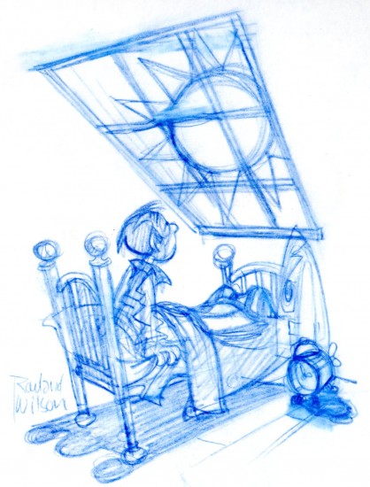
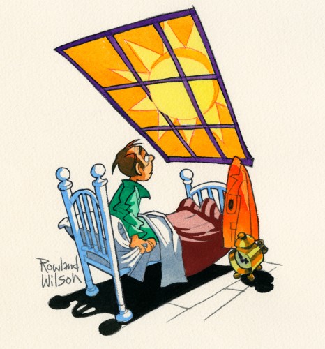
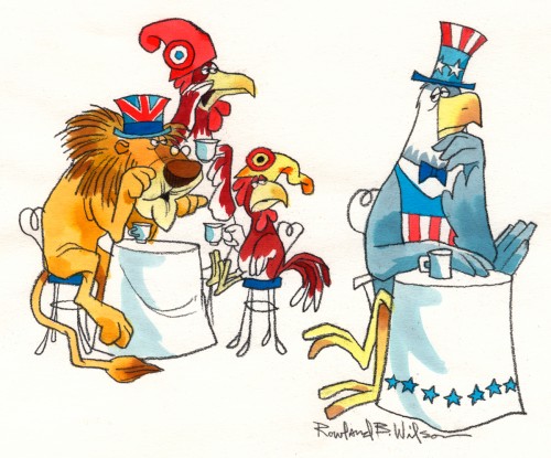
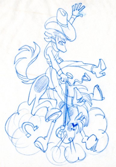
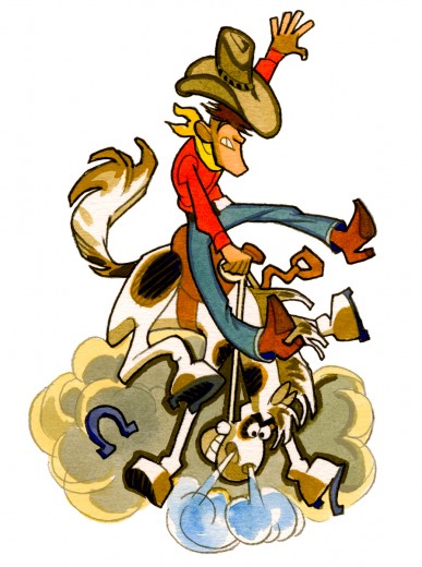
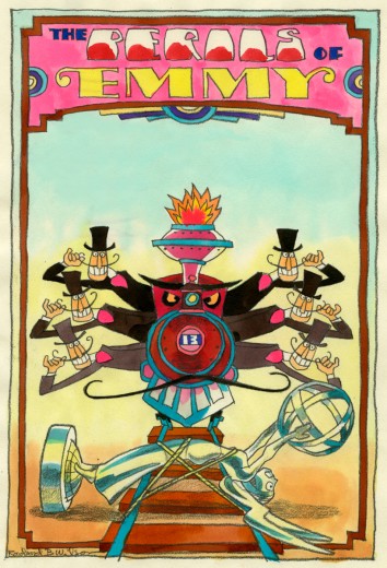
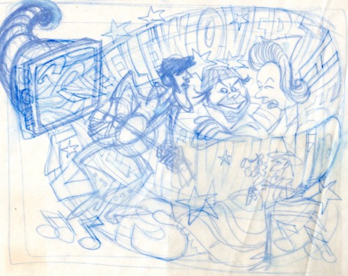
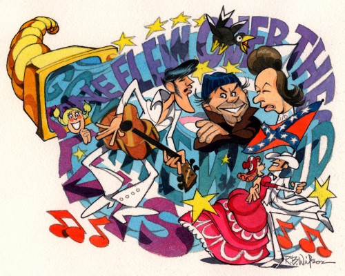
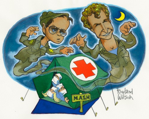
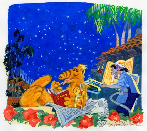
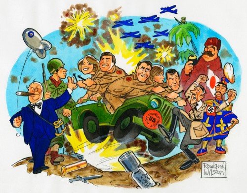
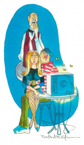
Rowland B. Wilson TVGuide originals – 2
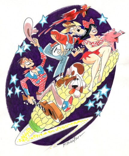
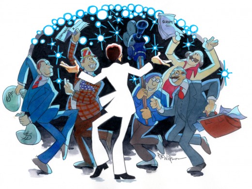
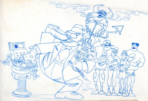
- Picking up right where we left off last week, here are Rowland B. Wilson‘s TV Guide illustrations. In many cases it’s the rough drawings followed by scans of the color original artwork. The roughs came from Bill Peckmann‘s wonderful collection, the colored originals came from Suzanne Wilson. I couldn’t be more grateful to both of them and thank them profusely. (See part 1.)
 15a
15a
Animation &Animation Artifacts &Disney 22 Feb 2012 07:19 am
Roger’s Song – Part 2
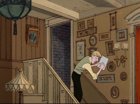
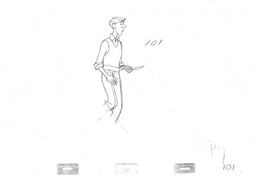
- Here I complete Seq. 02 Sc. 15, animated by Milt Kahl for 101 Dalmatians. This is the song Roger has just completed and playfully sings as Cruella de Vil exits. I have several more scenes from this sequence and will probably continue on with them next week.
They’ve all been animated, for the most part, on twos by Kahl, and it shows that not every drawing has to be on ones, which is the current fashion. Kahl knew what he was doing mechanically.
We start with the last drawing from Part 1.
 101
101
______________________
The following QT includes all the drawings from the scene.
Including Part 1.
The registration is a bit loose. Sorry but, these are copies of
copies and there’s plenty of shrinkage.
If you click on the right side of the lower bar
you can watch it one frame at a time.
You can find the drafts for this film on Hans Perk‘s invaluable site, A Film LA. You’ll find this particular scene on page 30.
Mark Mayerson has also devised a helpful mosaic for this film and written some extraordinary commentary about the scenes. You’ll find this mosaic page here.
Bill Peckmann &Books &Illustration 21 Feb 2012 06:45 am
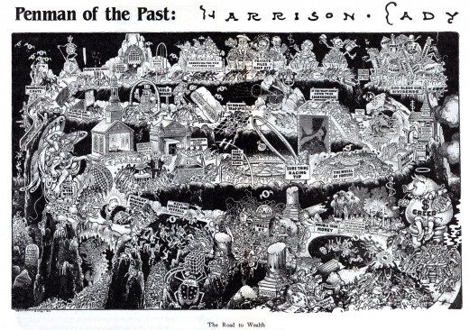
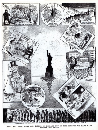
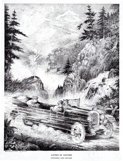
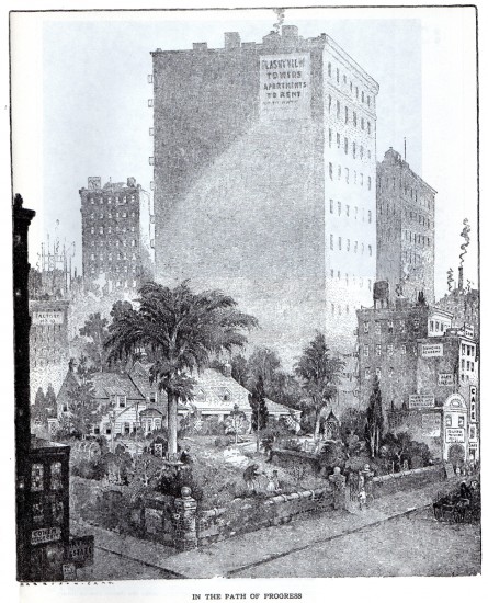
Harrison Cady
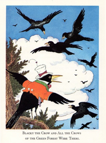
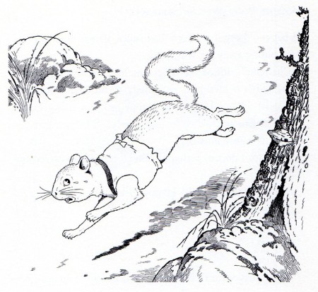
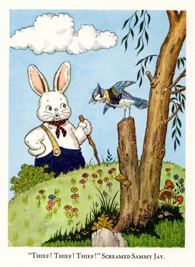
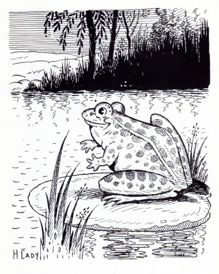
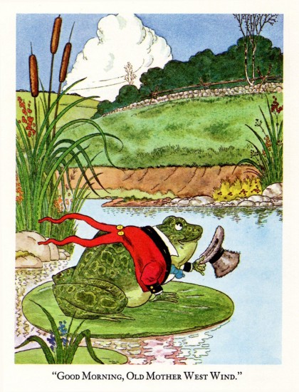
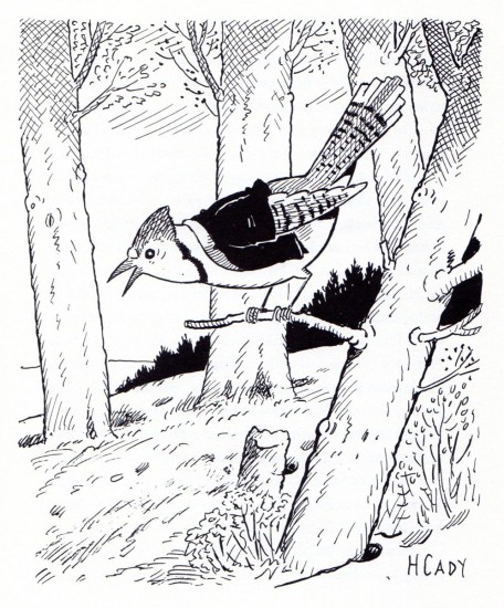
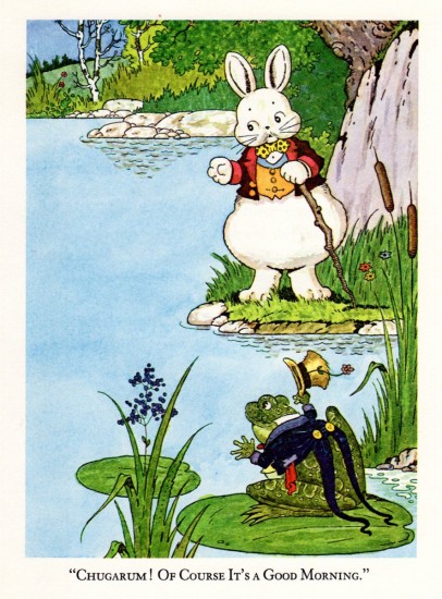
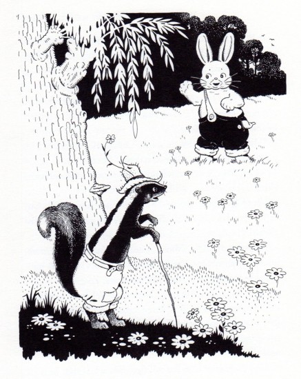
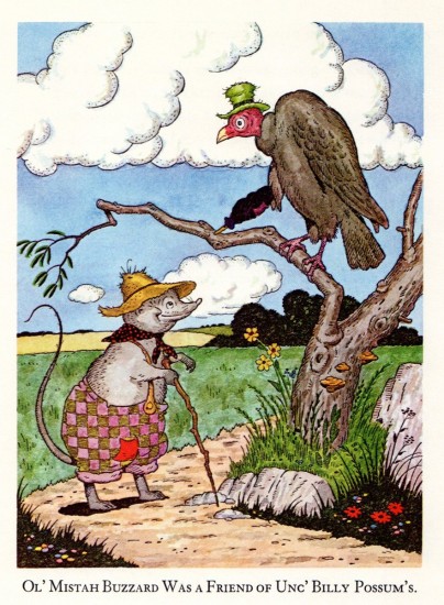
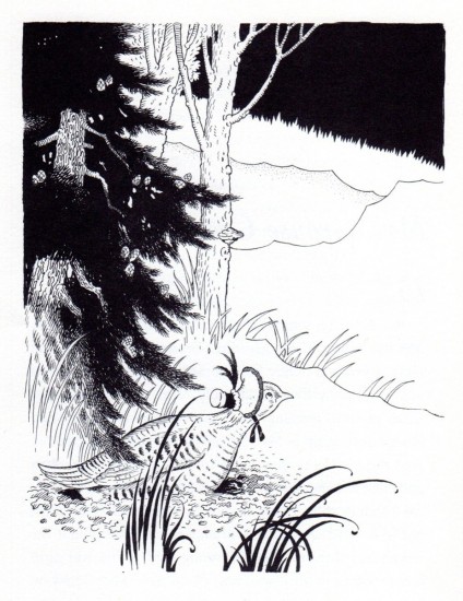
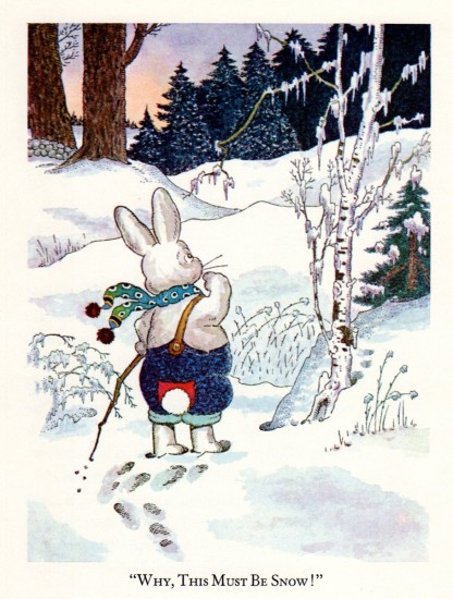
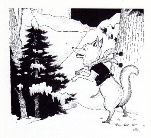
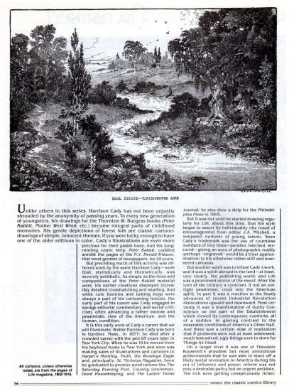
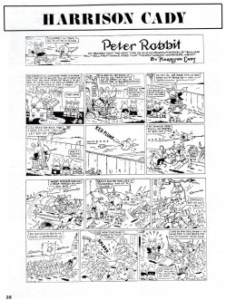
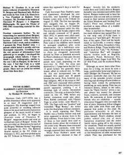
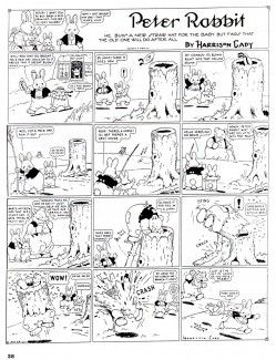
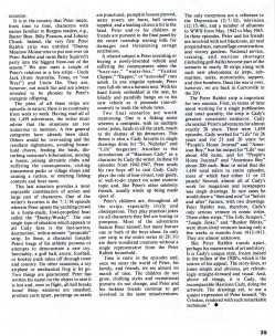
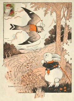 - W. Harrison Cady was a well-known illustrator for over 70 years. He illustrated for The Saturday Evening Post, Ladie’s Home Journal, Good Housekeeping, St. Nicholas Magazine and the Herald Tribune Syndicate. Cady was born in Gardner, Massachusetts and best known for his works in Bedtime Stories, a daily-newspaper created by book and magazine writer Thornton W. Burgess. Burgess conceived the character of Peter Rabbit (not to be confused with Beatrix Potters creation of the same name), and each of these Bedtime Stories was illustrated with a drawing by Cady, who had illustrated some of Burgess magazine stories as early as 1911.
Bill Peckmann has generously sent me an article on Cady and the illustrations from one of his books,
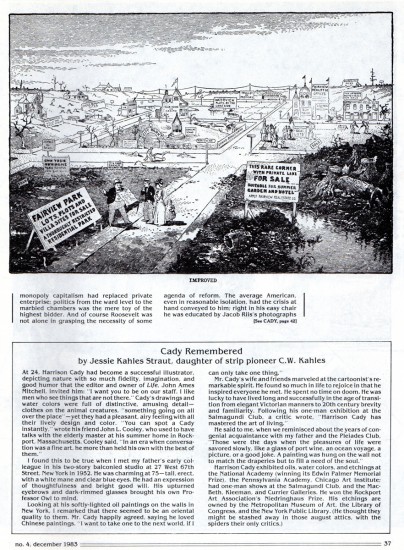
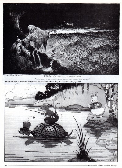
- When I first came across Fritz Baumgarten, years ago, the first thing I thought was, that I was looking at the German Harrison Cady. Unfortunately, I only have this one book of Cady’s, it’s a reprint, but I also have a Cady article that appeared in Nemo magazine, together they’ll make a neat post.
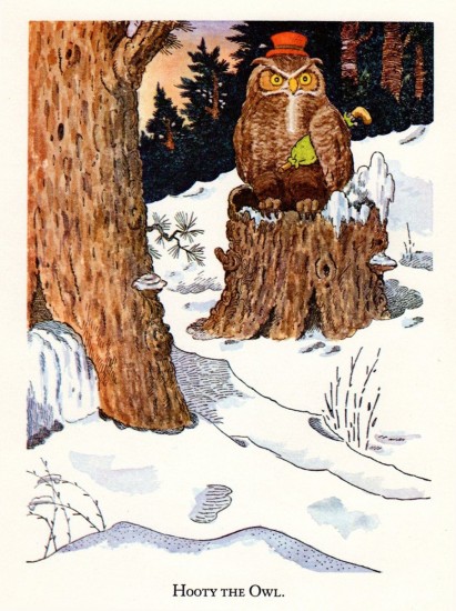
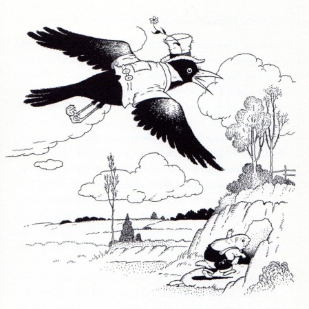
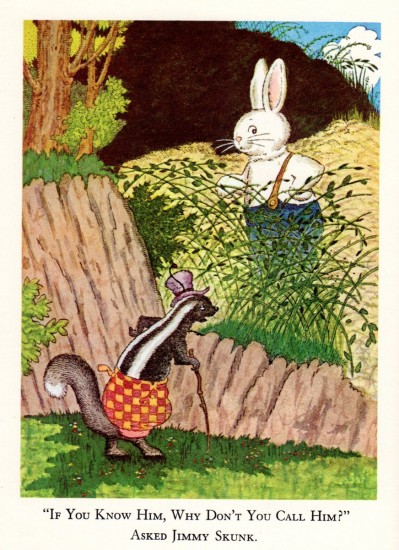
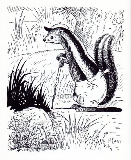
Here are Harrison Cady’s illustrations from “Mother West Wind’s Neighbor’s”. There are eight color plates and the equal number of black and whites.
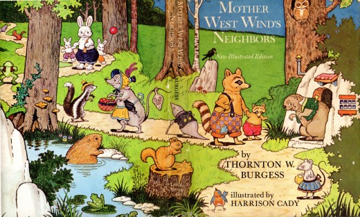
The book’s cover. .
What follows is an eight page Cady article by Richard Marshall;
it’s from Richard’s magazine, Nemo, No. 4, Dec. 1983.
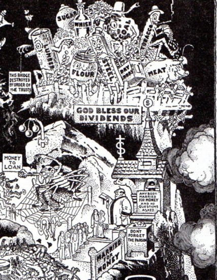
A blow-up of one corner of the illustration to show the detailing.
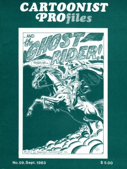
Finally, here is a CARTOONIST PROfiles article about Cady.
commercial animation &SpornFilms &T.Hachtman 20 Feb 2012 07:17 am
Happy President’s Day
- Since it’s President’s Day, I thought I’d give you a small bit of the show I did this past year for HBO, I Can Be President.
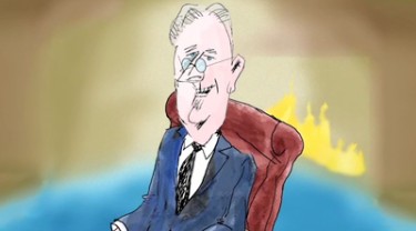 Actually, this is a rough animatic for a sequence that was cut out of the show. Had it been approved, we would have animated it and properly finished it. We did about ten segments like this when we were forming the material, and it turns out we were taking the show in a direction that was not desired.
Sheila Nevins, HBO’s VP of programming wanted the show to not focus on the past (rightfully so as it turns out), and we had to dump any but a small part of the history of the Presidents. This show had a long history which took quite some time to get through the production. It was also done for a very low budget, but turned out quite well. Special thanks go to Matthew Clinton and Katrina Gregorius for their tireless and charming work.
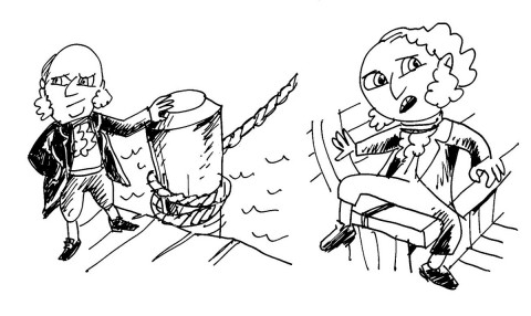
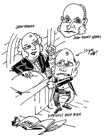
We had sequences on John Adams and his son John Quincy Adams making a disastrous sea trip to Paris; there was another section on the animals kept by various Presidents at the White House (J.Q. Adams, himself, had a pet alligator at the headquarters. Coolidge had dozens of dogs, cats, birds, a wallaby, a baby hippo, a donkey and many other animals. He basically made a zoo of the White House.)
The sequence below shows a couple of actual stories about Franklin Delanor Roosevelt in a time before he caught polio and was crippled by the disease. He came from a wealthy family, and had more access to the world than your average would-be-President.
The bad temporary Voice Over is mine, the cheapest actor I could find. The plan was to replace mine with a celebrity voice.
Animatic version of sequence cut out of I CAN BE PRESIDENT.
The DVD, when it comes out, will have a whole slew of these eliminated animation pieces.
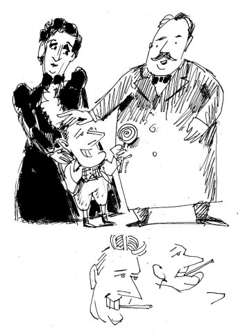
The gifted cartoonist, Tom Hachtman, did a number of caricatures of the Presidents for these sequences. It would have been nice to have used the material he delivered, but such is this type of production.
 1
1
Here are Tom’s sketches of FDR for the animatic.
 2
2
FDR narrates it as if it were a “Fireside Chat”.
 3
3
These drawings were for the animatic on John Adams and son, John Quicy Adams,
crossing the Atlantic to go to France – where they stayed for more than a year.
 4
4
It was a tough voyage. Storms, invading British ships and seasickness.
The show will air numerous times in March:
-
Sun March 4, 06:00 AM – HBO – EAST
Sun March 4, 09:00 AM – HBO – WEST
Mon March 12, 06:00 AM – HBO – EAST
Mon March 12, 09:00 AM HBO – WEST
Sat March 24, 06:05 AM HBO – EAST
Sat March 24, 09:05 AM HBO – WEST
Fri March 30, 06:45 AM HBO – EAST
Fri March 30, 09:45 AM HBO – WEST
