Monthly ArchiveDecember 2011
Commentary 31 Dec 2011 05:49 am
More Linkage, a Quiet Week & Animating
Two weeks ago I listed some links I visit weekly, if not daily. There are more that I’d like to add to that list. I don’t think less of any of these links, it’s just that I didn’t want that last post to be too long. The following are not personal art blogs; they update their material frequently, and it’s usually informative on some level.
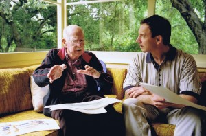 Andreas Deja‘s site, Deja View, has one of the most valuable animation links on the internet. He posts only impeccably beautiful Disney art from his collection. The images are always iconic and beautiful, and I find myself coming back to revisit the same posts over and over again. If you don’t know this site, go now and make up for lost time.
 - Hans Bacher‘s site, One1more2time3′s Weblog, is just about the most attractive site out there. Hans was an art director for Disney having great influence on a number of important animated features including Mulan and Beauty and the Beast. Not only does Hans share artwork from those films, but he offers images from many other influential studios and artists such as Richard Williams, Heinz Edelmann, and Zagreb Film. There are reconstructed backgrounds culled from frame grabs as well as Hans’ own beautiful art. I love this site.
- Gene Deitch tells stories. He’s a master who has walked through some of the most important history of animation. His site, Gene Deitch Credits, gives a personal view of many key people not usually discussed in animation history books. Jim Tyer, Phil Scheib, Duane Crowther, Jam Handy, Bob Kurtz and Eli Bauer share space with John Hubley, Jules Feiffer and Ralph Bakshi. It’s a principal stop for any animation addict.
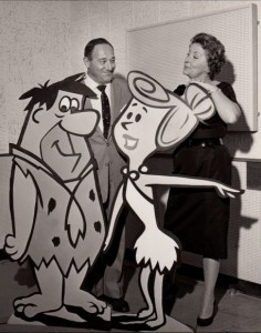 If you’re a fan of Hanna-Barbera‘s early work, Yowp! is the site for you. The shared material, here, is endlessly revealing: layouts, animation, music cues, newspaper clippings. It goes on and features something new just about every day. I love this site since finding only a few months ago. After all, I was really coming into my own at about the time H&B broke through with Huckleberry Hound and the Flintstones. Their work had a major influence on me. This site helps fill a missing need within me – all that great Ed Benedict design, all that beautiful brushwork inking.
- Animondays is David Levy‘s blog originally built for ASIFA East when David was their President. He continues on the site with fine interviews of people like Linda Simensky, PES and Rob Renzetti. He also writes fine essays which usually offer a levelheaded view of the business of animation. As its title suggests, the blog changes every Monday morning, so it’s worth the visit once a week.
- Mark Sonntag always has great and rare material on his blog, Tagtoonz. The material usually pertains to early Disney, and, as a result, it’s usually a lot of fun. Comic strips, posters and photos are always originals and just about impossible to see elsewhere.
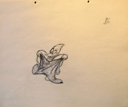 What About Thad? from Thad Komorowski changes infrequently, but the material presented is usually top notch. Posts of hard-to-see movies or comic strips are certainly well worth the visit, but he also gives strong analysis of some of the less noticed animators (such as Alex Lovy). I can’t tell you how often I’ve returned back just to revisit his posting of Lovy’s drawings from Ace In the Hole. The material is often esoteric, but the information is important.
There are also a few sites I enjoy visiting for their frame grabs or mosaics (many built on Hans Perk‘s drafts found at A Film LA.) Among these my favorites are:
-
Kevin Langley‘s Cartoons, Model Sheets and Stuff,
Sanek‘s More Mosaics and Stuff, and
Stephen Hartley‘s Likely Looney, Mostly Merrie and, his less frequently updated, Blabbing on Arts and Culture.
Finally, the last site usually has little to do with animation even though it’s written by one of our key animation people. And it’s as eccentric as you might expect.
- Tom Sito‘s site, Tom’s Blog, is a daily history lesson in the making. Tom gives an account of things that have happened in history on the day you’re checking in. What happened at Wounded Knee? The Howdy Doody Show premiered. When was Emperor Quang Tung of Vietnam crowned? I love such information. I can store it or forget it, but I enjoy reading it. Updates come every day with a quiz to start you off.
It’s always quiet this week between Christmas and New Year’s. I’ve been waiting for some word from several clients, and I can’t even reach them this week. As expected, I might add. Hopefully, the holidays won’t extend too far into 2012.
Movies have also been quiet. I did get to a screening of Bridesmaids on Wednesday.  The film was better than I expected. I’ve never been very hot on Kristen Wiig. I thought her writing was fine, but the performance was a little bit shy and reserved. This is her usual; she never goes that extra beat needed for the type characters she plays. It becomes obvious the second Melissa McCarthy steps on screen. She steals the movie easily acting very natural in overdrive-mode. I laughed aloud with almost every scene she has on screen (except the last with a joke I don’t think worked for her character.) I’ll be interested to see if McCarthy gets an Oscar nod for Best Supporting Actress. The Actor/voters usually are reserved with nominations to comedians. It was a good movie, not a great one.
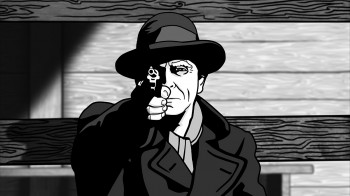 Next week there are four animated features to view:
on Tuesday: ALOIS NEBEL and ALVIN & THE CHIPMUNKS : CHIPWRECKED
on Thursday: CHICO & RITA and CARS 2
ALOIS NEBEL looks to be MoCap with flat 2D-like animation.
ALVIN got good reviews and looks as horrible as I’d expect.
CHICO & RITA looks rotoscoped and interesting.
CARS 2 I’ve already seen and hated. It’s a bad movie.
Also on Wednesday they’re screening: W.E. and SHERLOCK HOLMES: A GAME OF SHADOWS.
W.E. is the Madonna-directed film about Edward VIII and Wallis Simpson.
SHERLOCK HOLMES 2 looks even worse than the first one. A violent, loud race to the end credits.
Last night, Heidi and I went to see the play THE ROAD TO MECCA starring Rosemary Harris, Carla Gugino and Jim Dale. The tickets were gratis since Heidi works for the Roundabout Theater Company. I love Carla Gugino and Jim Dale’s work, so was pleased to see them in the show. Rosemary Harris was also impeccable. It was a great show, and the actors have only been doing it for two weeks. Wait till it opens! Beautiful set, great lighting and fabulous acting in a classic play. What more could you want.
Having rushed out the animated Christmas Card over the course of a weekend, I couldn’t help but wonder why I wasn’t doing more of that same thing. Making short animated bits – that could maybe be tied together – over the rest of the year. It was a lot of fun doing it, and couldn’t possibly be a waste of time doing more. The only problem is, naturally, writing them so that they wouldn’t be a total waste of time. Who wants to see more bad animation out there? It’s something I have to think about, really. It was a lot of fun doing the one short; it cost me nothing more than my time and energy.
I think of this often when I visit Yoni Goodman‘s site. He does a lot of short animation exercises and posts them frequently. His work is exceptional, too. Take a look at the recent anti-cholera film he did; it’s a really fine piece of work, but those tests are what really get my blood roiling.
Bill Peckmann &Comic Art &Illustration 30 Dec 2011 07:04 am
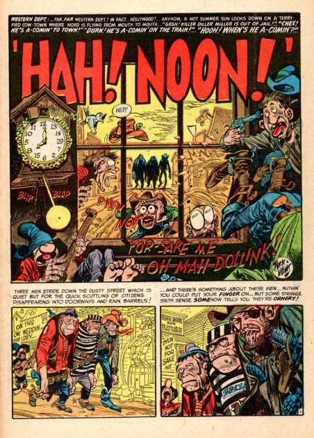
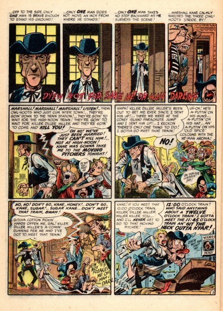
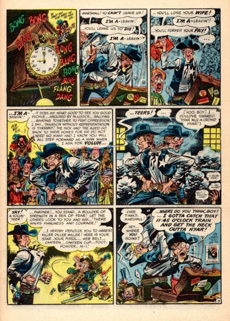
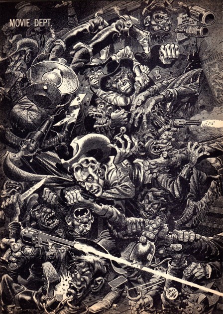
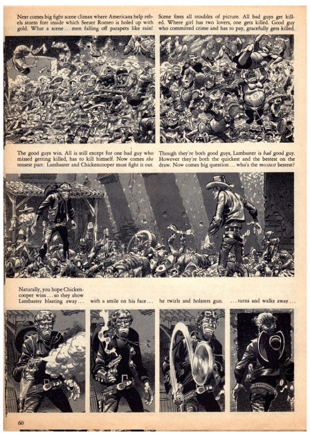
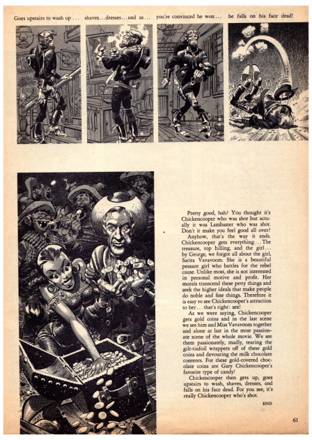
Kurtzman & Davis – Movie Spoofs
Bill Peckmann offers another collaboration between the two great cartoonist/illustrators, Jack Davis and Harvey Kurtzman. Over to Bill:
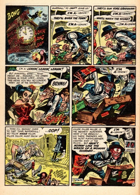
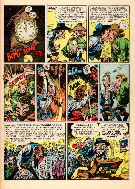
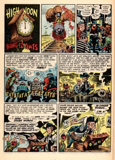
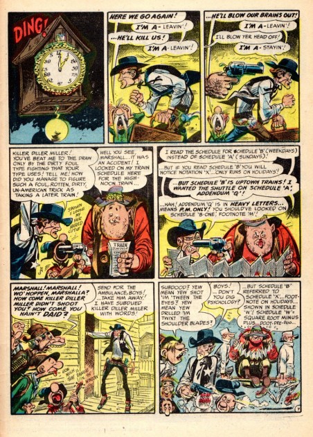
- “Gary Cooper”, an affectionate handle that was given to Jack Davis by his fellow EC Comics staffers back in the early 1950′s. The nickname fit well not only because of good looking Jack’s lean and lanky frame but also because of his impeccable easy going, gentlemanly manners. I’d take it one step further and say that just like Mr. Cooper who gave credence to any genre role he played in the movies (contemporary, sports, westerns etc.), so did Jack by excelling in any genre (crime, horror, humor, war) he drew in comic books!
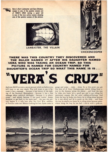
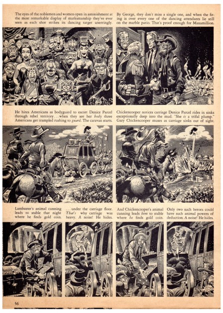
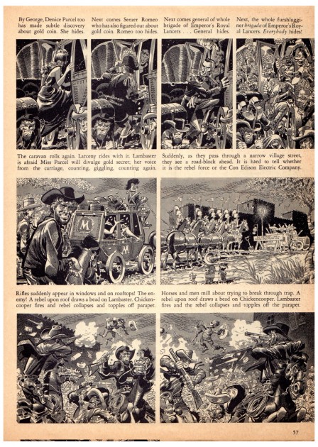
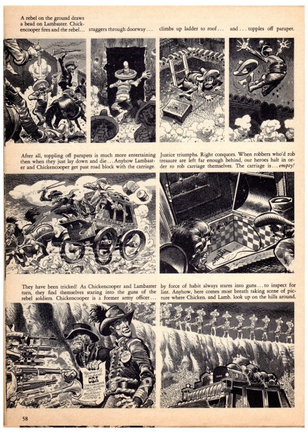
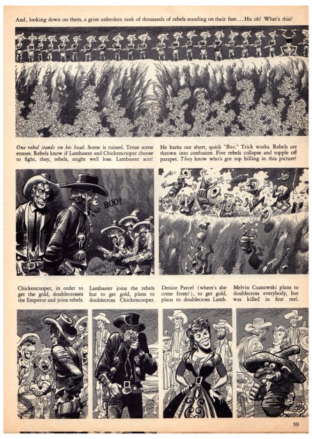
What better way to bring the two together than in Harvey Kurtzman‘s spoofs of two very popular western movies of their day. “High Noon” and “Vera Cruz”.
So, with the help of Mr. Kurtzman, Mr. Davis and Mr. Chickencooper, here is “Hah! Noon!” from MAD comic book No. 9, 1954.
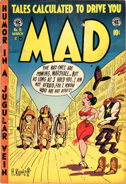
The cover
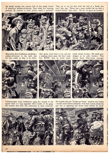
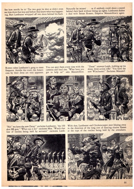
Here is “Vera’s Cruz” from the first MAD magazine, No.24, 1955. Both Harvey and Jack are in tip top form, (as always) in this, their first western movie spoof in the new black and white magazine format. (Funny,”Hah! Noon!” was the first caricatured movie send up that Kurtzman and Davis did together a year earlier in the comic book MAD.) In this new magazine format, our favorite funnymen duo were able to do a 10 pager compared to the usual 7 and 8 page stories they did in the comic book format, how they must have relished that!
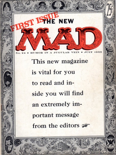
The cover
Many thanks, again, to Bill Peckmann for sharing his great collection with us.
Commentary &Illustration &Independent Animation &repeated posts &SpornFilms 29 Dec 2011 06:49 am
Blank Maps – repeat
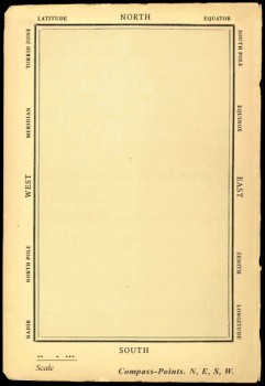 - One of my favorites of my films is The Hunting of the Snark. I adapted this from Lewis Carroll’s poem. It was an enigma to the audience when it was first published – Carroll refused to explain its meaning, and it’s an enigma now.
I remember screening it with an audience of fifth graders – about 200 of them along with a number of their parents. The program, in Chicago, was part of a retrospective of some of the children’s films I’d done at the time. I made the decision to show the Snark, even though I wasn’t sure the audience would sit still for it.
The response was amazing. The adults, during the Q&A period, had a lot of questions. The kids had no problems. When, finally, one parent asked me what it was supposed to mean, I decided to turn it around. I asked if one of the kids could answer the question. A lot of kids raised their hands, and the first one gave me the appropriate answer.
A bunch of guys go hunting for a monster________This is how the map was illustrated by
that’ll make them disappear, and one of_________the original illustrator, Henry Holiday.
them catches it. For all intent and purposes
that IS what it’s about.
I love showing this film as part of my programs. It’s easy for me to discuss, and I’m proud of it. I don’t think most animators like it, but that doesn’t bother me.
During the story there’s one key part that all illustrators love to illustrate.
But we’ve got our brave Captain to thank:
(So the crew would protest) “that he’s bought us the best–
A perfect and absolute blank!”
_
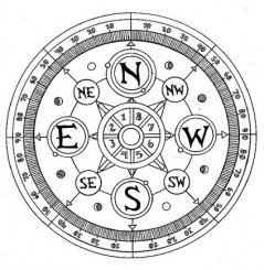
A blank page! What could be easier to illustrate? A couple of illustrators have cheated such as this map found on line:

Figure One: Bellman’s Blank Ocean Chart
Barry Smith at the University of Buffalo dept of Philosophy uses this map – a blank slate – to treat it as a map of heaven. Carroll was an Evangelical minister, but I’m confident this is not what he had in mind when he conjured up the lines in the poem.
____________________________________________
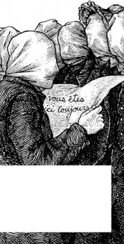 Mehendra Singh has a website which is slowly illustrating the entire poem. His illustration for this passage appears to the right. This is part of his comment accompanying the illustration.
- Yet another shameless Magritte pastiche, and not the last one to grace these pages, I’ll wager. Shameless — the 10th Muse of Protosurrealism!
Even more shameless — this insistence that the crew of the HMS Snark use the French language for navigational purposes when it is clearly evident to anyone who has ever been lost at sea that English is the natural language of confusion. This is easily verified. Stand on a streetcorner in any francophone city and ask a stranger: where am I? If necessary, pull at shirtsleeves and wave your arms, speak very slowly while pronouncing every phoneme at the utmost decibel level.
Singh has a curious and interesting site in its own right.
Let me encourage you to check it out for all the original illustration on it.
____________________________________________
_
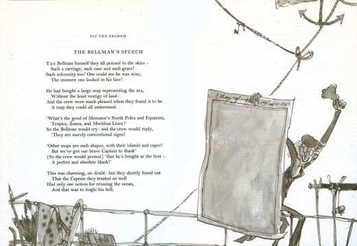
This is how Quentin Blake chose to illustrate it in his version. Since he obviously was nervous about just showing the blank map, he illustrated the Bellman holding it.
______________
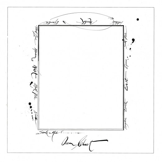
This is Ralph Steadman’s version. He went for the gold and just showed the map.
Yet, it’s still, obviously, a Steadman.
______________
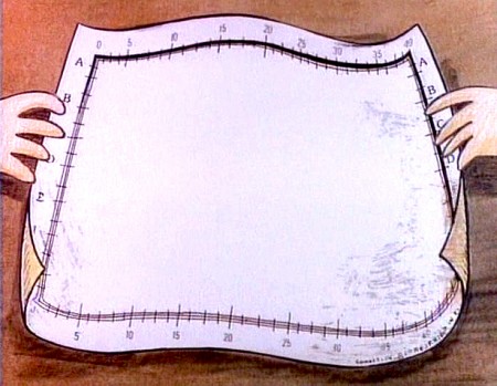
This is how I chose to depict it in my film. Showing hands and table behind it,
gave me the opportunity of trucking in to white to transition to the next scene –
an image of the sea, itself.
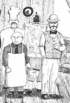
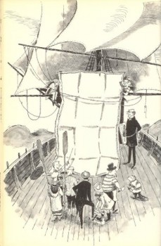
Doug H. in Australia responded to the material, above, with an e-mail full of other wonderful illustrations of the same part of the poem. I’d like to post some of these illustrations with many thanks to Doug. With respect to all of the illustrators, about half of whom
are unfamiliar names to me. They merit a good look.
___ Just scroll down. Click any image to enlarge a bit.)
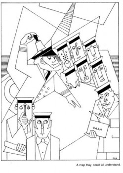 1
1 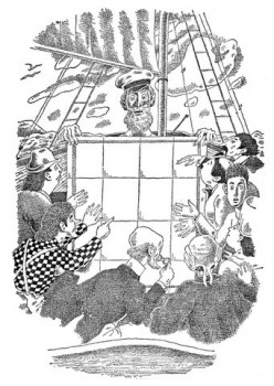 2
2
______1. Frank Hinder (1989)_______________________2. Harold Jones (1975)
______
__ 3.__
3.__ 4.
4.
______3. Michael Capozzola (2005)_________________4. Kelly Oechsli (1966)
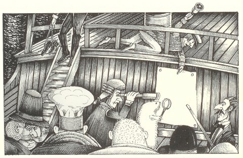 5.
5.5. John Lord (2006)
______
______
6._________________________________7.
______
______6. Max Ernst ((1950) _______________________7. Jonathan Dixon (1992)
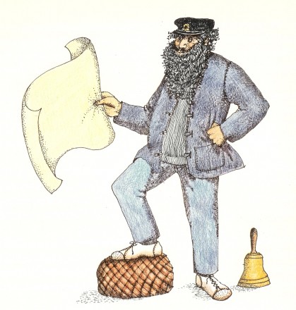 8.
8.8. Helen Oxenbury (1970)
Animation &Animation Artifacts &Disney 28 Dec 2011 05:55 am
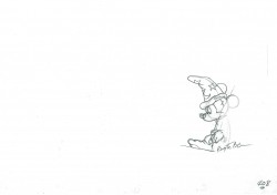
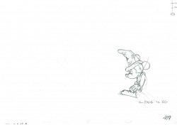
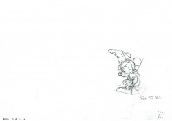
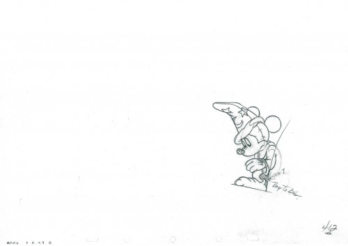
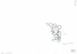
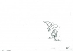
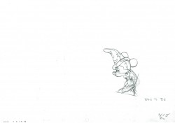
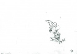
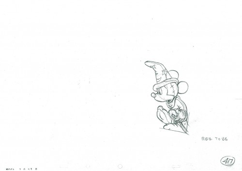
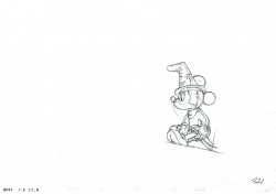
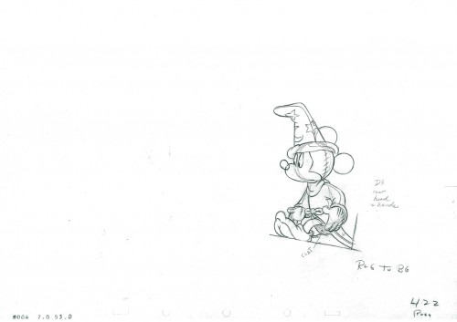
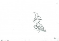
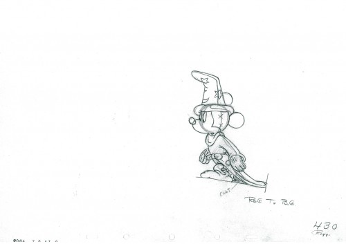
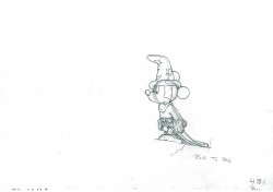
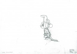
Mickey and the Brooms – part 5
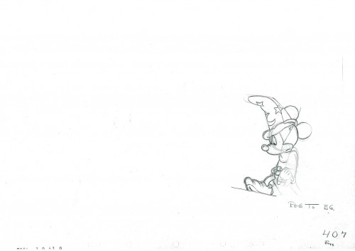
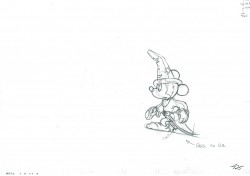
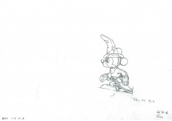
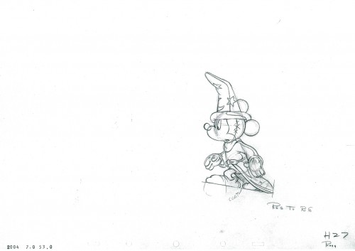
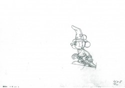
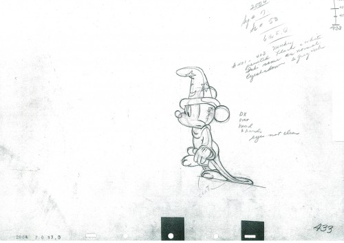
- Here’s the final bit of character animation as Mickey comes out of the room having hacked the broom to splinters. He combines with some of the shadows that were posted last week.
All that’s left of the scene for me to post is the set of exposure sheets as well as some samples of the rendering for the airbrushing. Believe it or not, that’s my favorite part of the whole thing. Next week.
The scene was animated by Riley Thompson with Harvey Toombs assisting. The sequence director was James Algar.
 ____________________________
The following QT incorporates all the drawings from this post
and the two earlier shadow posts.
All posts will be combined in the final piece.
All drawings were exposed per the Exposure Sheets.
this scene comes in at 5’30″
Bill Peckmann &Books &Illustration 27 Dec 2011 06:35 am
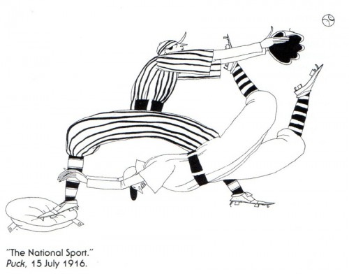
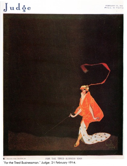
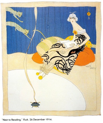
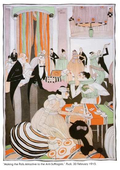
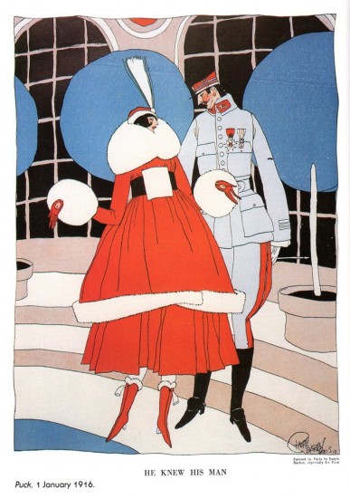
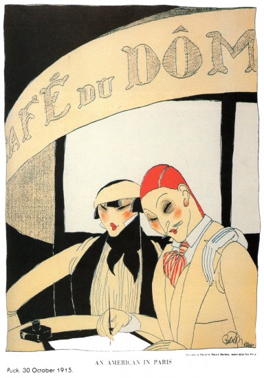
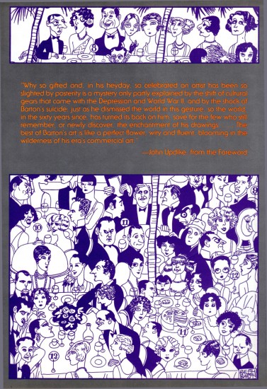
Ralph Barton
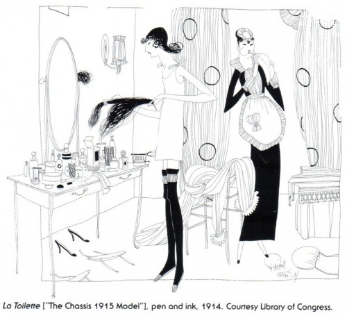
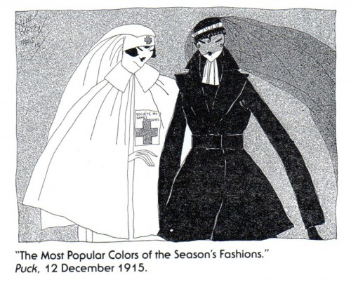
- Last week, Bill Peckmann sent me scans from a book about artist, Ralph Barton by Bruce Kellner. I’d like to share some of that book with you. I don’t know much about Mr. Barton or his work, but some of his images are arresting. Here’s what Bill wrote:
- After looking at all of those perusable pages of Disney and EC comic books, I thought that maybe you’d like a change of pace and look at something else, namely the work of artist/caricaturist Ralph Barton.
This intro should have been written by Rowland Wilson, because Rowland was a huge fan of Barton’s and was kind enough to give me this book.
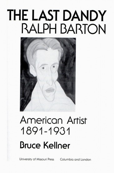
The title of the book is “The Last Dandy, Ralph Barton, American Artist, 1891-1931” by Bruce Keller, published 1991. It’s a very thorough biography of Ralph Barton, with terrific illustrations that show what a great artist he was in the 1920′s. During that time he appeared in The New Yorker, Vanity Fair, Harper’s Bazaar and Photoplay magazines.
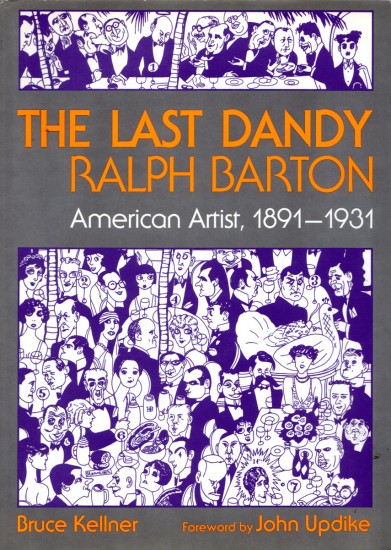
the book’s front cover
Daily post &Frame Grabs &repeated posts 26 Dec 2011 06:37 am
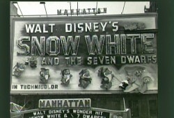
Making Snow White
- On the Snow White dvd, there’s a documentary about the history and making of the film. Some of the images on the disc are just too precious for me to allow them to slip by without my singling them out and writing about them.
.
Here are frame grabs from this documentary.
.
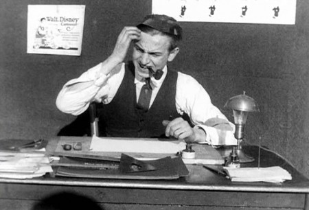
Walt is presented as a bumpkin in the early days.
I suppose he was directing if not filming this material,
so that’s the image he sought to create as well.
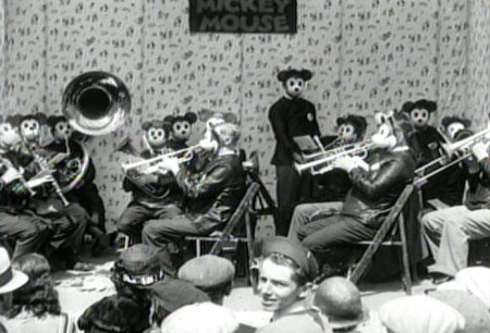
This has got to be one of the wackiest pictures in their archives.
The popularity of Mickey Mouse in the early 30′s.
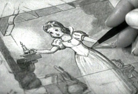
Snow White brings a change to the studio,
which you can well understand.
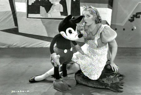
Though there’s still the problem about what to do with Mickey.
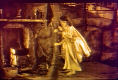
Disney was supposedly inspired by a silent filmed version
of Snow White he saw in his younger days.
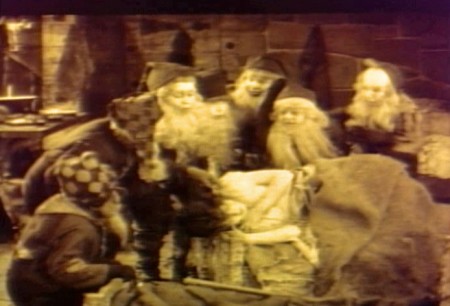
One wonders if there was also an eerie creepiness to the performance
that Walt gave to all of his animators one night as he acted out the film.
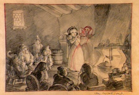
I’m curious about the pose of Snow White with her head back
and her hands behind the head.
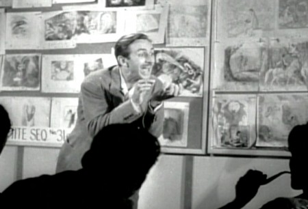
Here, Walt tries to get his animators to bite into an invisible apple -
the future of animation – as they thoughtfully smoke their pipes.
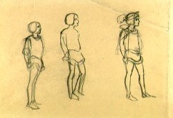
The bed building and the soup eating scenes weren’t the only ones that were
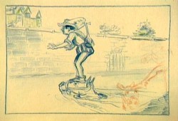
excised from the finished film. It seems the prince, initially had a larger role.
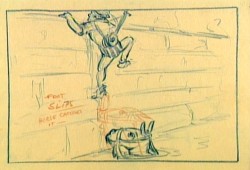
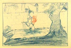
The path into the castle was a bit more difficult. First you had to
get past the moat with the help of your horse. Here the prince looks
a bit like Robert Benchley.
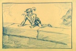
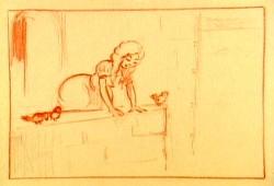
“Romeo, Romeo, Wherefore art thou, Romeo?”
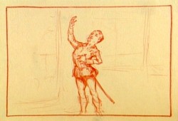
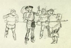
Getting caught. Obviously, the Queen and Snow White didn’t live in that
castle by themselves. There were henchmen we didn’t know about.
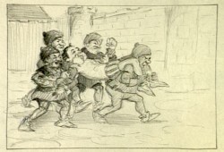
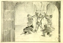
This almost looks like an early version of the seven dwarfs
carried the prince to prison.
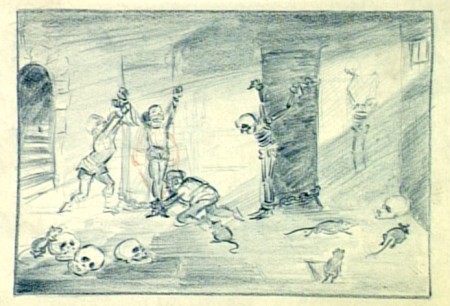
They had big rats in that prison. Scary.
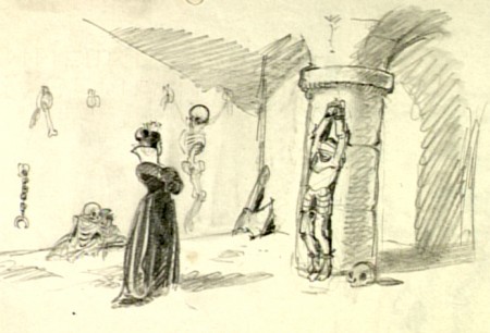
This is an obvious precursor of Malificent going to visit Prince Phillip some
20 years later in Sleeping Beauty. Both wicked Queens got more attractive.
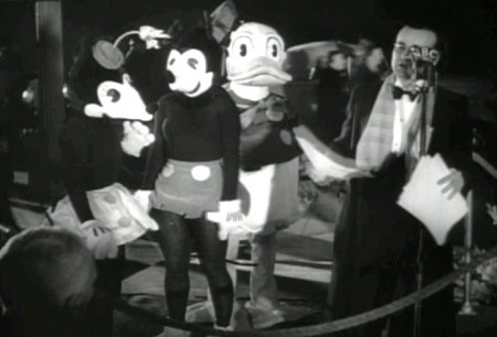
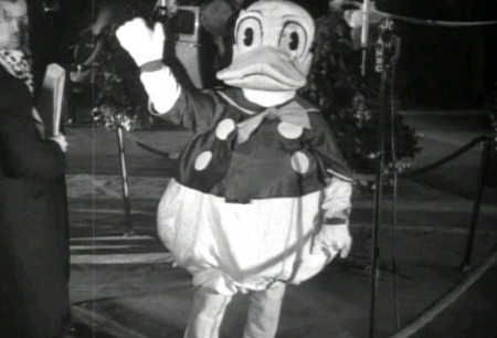
Lots of stars showed up to the grand premiere.
These actors in costume were there, too.
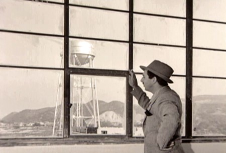
In all seriousness, the film was a masterpiece. I’m still studying it some
74 years later. Walt had reason to be proud and happy. He also had enough
money to move onto other challenging films, and he took the challenge as
opposed to making Snow White 2 or 3 (as they probably would do today.)
Daily post &Photos 25 Dec 2011 06:49 am
Merry Christmas
- Walking to the studio this morning (Robbie has to be fed before I can start my Christmas)
I passed through my favorite park, Madison Square Park. There was my Christmas tree.
 1
1Coming up on the entrance at 26th Street, you can see the tree.
 2
2
It sits in the empty reflecting pool. In past years,
they’ve had smaller trees surrounding it. I guess
the recession has hit the Christmas decorations.
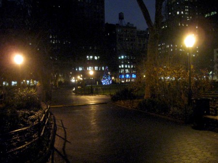 3
3
Walking beyond the tree on the way downtown to 23rd Street.
 4
4
Just before exiting the park at 23rd Street, you can still see the tree.
 5
5
20 minutes later, heading into NYU’s Washington Square Park,
the sunlight’s beginning to rise and the colors are more alive.
 6
6
From the other side of the arch, you can see that the back of
the tree is not decorated. More recession or just lazy?
Have a Merry Christmas everyone.
Commentary 24 Dec 2011 06:32 am
This past week
A number of movies premiered this past week and I got to see a lot of them. So let me give you brief comments about what I did see. But first a film I saw a few weeks back opened on Tuesday this week and didn’t get the rave reviews that were expected. Tintin shows up at the Rotten Tomatoes tomatometer with a 76% from critic notices. The papers in NY weren’t kind. However, Manohla Dargis in the NYTimes saw the exact film I did, and I’d like to share the last three paragraphs from her review, summing it up:
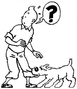 Drawn in a simple, elegant style known as clear line, Hergé’s Tintin has a spherical head, a stub nose and black ovals for eyes. His half-circle brows sit on his face like accent marks and, with his red-smudged cheeks and beads of sweat that invariably pop off his head, give Tintin surprising expressivity.
 - The simplicity is as crucial to the comic’s power as is Hergé’s ability to turn a recognizable world into bold lines and blots of color. It’s a face that looks like a mask, one readers can slip on as they rush through the story or leisurely turn the page. And it’s a face that, along with Tintin’s asexuality and lack of a family, makes him into a marvelous blank, an avatar for armchair adventurers.
- Like the screen Tintin, the movie proves less than inviting because it’s been so wildly overworked: there is hardly a moment of downtime, a chance to catch your breath or contemplate the tension between the animated Expressionism and the photo-realist flourishes. Relax, you think, as Tintin and the story rush off again, as if Mr. Spielberg were afraid of losing us with European-style longueurs. Bore us? He’s Steven Spielberg! This lack of modulation grows tedious, which is too bad because, as always with him, there are interludes of cinematic delight, when his visual imagination (like the transition in which Tintin and Haddock seem to appear in a puddle someone steps in) and his Spielbergian playfulness get the better of his insistence on bludgeoning us with technique.
Graphically, it isn’t the MoCap that bothers me so much as the unattractive half-drawn, half-photorealist style. Are they not able to flatten out the art, using the MoCap, to simulate the actual look of the comic strip? I don’t know, but I’d be curious to know. The problem in this film is the story: rush, rush, rush, scream, make a lot of noise and end it. That’s not a movie. It’s the Mummy formula – or for that matter Sherlock Holmes. Cheap and uninventive.
Now to the films I saw this week:
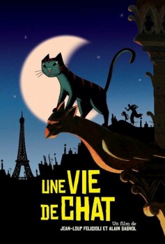 Two more of the animated features list passed on by.
1. A Cat in Paris. This film was great. Beautiful to see such excellent graphic design done so well. The story was exceptional and the film, in French, was one of the better animated features I’ve seen this year. The animation wasn’t always the best character animation, but no film these days offers that. It was always fluid and well drawn.
- 2. Hoodwinked Too. Trash. I couldn’t get out of it fast enough. The non-stop violence was supposed to be funny, and it was just pathetic. I stayed to the exact half-point and left, disgusted. The worst animated feature seen thus far.
- 3. The Girl with the Dragon Tattoo. This was a nasty crime film based on the novel of the same name. David Fincher (Zodiac, Se7en) is up to his usual smutty stuff. As a director, he’s good enough to keep you watching, but cheap enough to make you want to leave. The film plays like a film defending the rights of women, but it felt awfully misogynist to me. The acting by Rooney Mara is worth the ride.
- 4. We Bought a Zoo. A sweet, light entertainment with the heart of a RomCom and completely dependent on Matt Damon to bring most of the personality to the film with his performance. He does. The other performers, including Scarlett Johansson, help. The film would have been better with a bit more darkness in it. The music was good, and the film would have worked as well on DVD.
- 5. A Separation. This was the best movie this week. An Iranian film about a failing marriage involving an Alzheimer father, a really poor caretaker whose daughter and husband don’t help the situation, a daughter caught up in the middle of the parents’ squabble, and the morality behind a situation that arises involving the civil courts. Ultimately, it all boils down to a father/husband whose arrogant stubborn way stops him from telling his wife that he loves her and would like her not to abandon him and their daughter. It’s a real story, told matter-of-factly with a lot of heart but no melodrama.
- 6. Extremely Loud and Incredibly Close. This was a heart-breaking film about a teenager whose father dies in the 9/11 World Trade Center disaster. The very smart boy finds a key with the word “Black” on its envelope, and he decides to search all the families in NY with the surname “Black”. He feels this will unlock the key to understanding why his father died and will, at the least, extend the father’s life for however long the search will take. The boy has Asperger’s syndrome, so he has a method. The film is a bit too manipulative for my taste, but the actors are all brilliant (particularly Max Von Sydow who doesn’t talk in the film). It should definitely be seen, but prepare for a few tears along the way.
No more movies until after Christmas.
- Network Awesome is an amazing site that offers more and more films (including very many animated films) for viewing. Most are from the archives of YouTube, but Network Awesome has collected them and intelligently written about them. (Included in the site is a magazine.) The Films of Michael Sporn has just turned up on the site, and you may want to check it out for a collected number of shorts that have been present on YouTube but not very public.
- Congratulations to Bill Plympton and Sandrine Flament. They were married yesterday. It’s big news because Bill has a reputation for being NY animation’s inveterate bachelor. I hope they have a long, happy marriage.
There were a lot of links that didn’t make it to my blog last week. I do intend to continue that, probably next Saturday. I have more I want to pass on detailing my weekly travels around the internet. Sorry I couldn’t get them all into the one post.
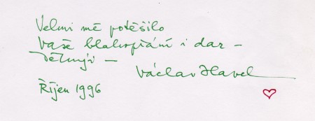
- Yesterday, Václav Havel was buried. Gene Deitch sent an email about the funeral. It hasn’t yet gone up on his site, so let me post the email:
- Today was the state funeral for Václav Havel. During these days of mourning, six black horses drew the same coffin-bearing carriage through the streets of Prague, that 74 years ago carried the body of Czechoslovakia’s first president, Tomáš Garrigue Masaryk.
- Václav Havel was surely the only person in history who, within just a couple of years, was the president of three separate nations, each with its separate constitution, currency and postage stamps!
- Havel was the last president of the Czechoslovak Socialist Republic, the only president of the short-lived Czech & Slovak Federative Republic, and the first president of the present Czech Republic!
- Watching it all, Zdenka and I were transported back 22 years when we stood in the throngs, jingling our keys as he spoke to us all, proclaiming the end of the long dark night of Soviet imposed dictatorship.
- Today, most of the world‘s leaders are here to pay homage to the man who was the symbol of the end of the long dark night of the totalitarian régime in this country, when the “Velvet Revolution“ concept of 1989 was spreading throughout the countries of central and eastern Europe.
- Now we can expect that soon the Prague Airport at RuzynÄ› will be renamed “The Vacláv Havel International Airport,†and that almost every town in the Czech Republic, and perhaps many throughout the world, will have streets, squares, libraries, cultural centers, universities, named for him, and surely statues and postage stamps of him will proliferate! He will be long be remembered as writer, dramatist, dreamer, activist, and ultimately three times president, who restored the good name and worldwide prestige of this little country.
- I’m attaching here one of our treasures, a signed note of thanks to Zdenka, for the original piece of Japanese calligraphy which we brought from San Francisco and which Zdenka and I sent to him. Havel typically signed his name with a green pen, adding a little red heart, that became his symbol.
______________________
- Tom Hachtman sent me a bunch of tries at his Christmas Card featuring Gertrude, Alice and Pabs. I was going to select one and feature itl then I was going to aim for a couple of them. I’ve decided, finally, to post them all. Here they are:
Nativity Eight | Nativity Eleven
Nativity Fifteen Nativity Five
Nativity Four | Nativity Fourteen
Nativity Nine | Nativity Seven
Nativity Thirteen | Nativity Three
- This is the first year I’ve done an animated card. I admit to not liking the medium. There’s something about a mailed hard copy of a Christmas Card that’s nice, but seeing Richard O’Connor‘s Ace and Son animated card convinced me to try my hand at it. The art and animation took me a couple of days to do it (by myself), and it’s more a compromise than a great piece. But I’m not embarrassed by it. At least it’s different. I sent it out to a lot of friends but have decided to embed it here in case you haven’t seen it (or among the few who were unable to get the link to work).
Bill Peckmann &Comic Art &Disney 23 Dec 2011 06:57 am
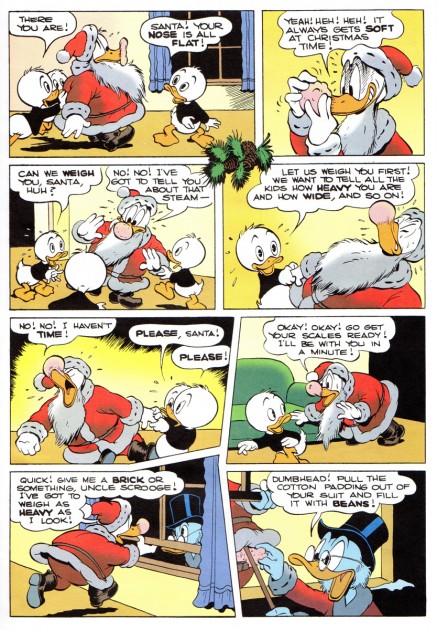
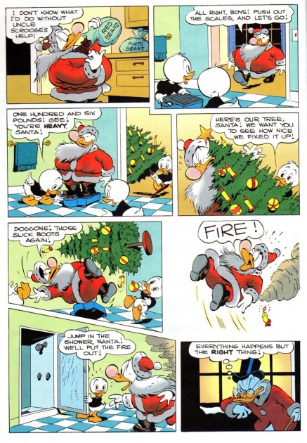
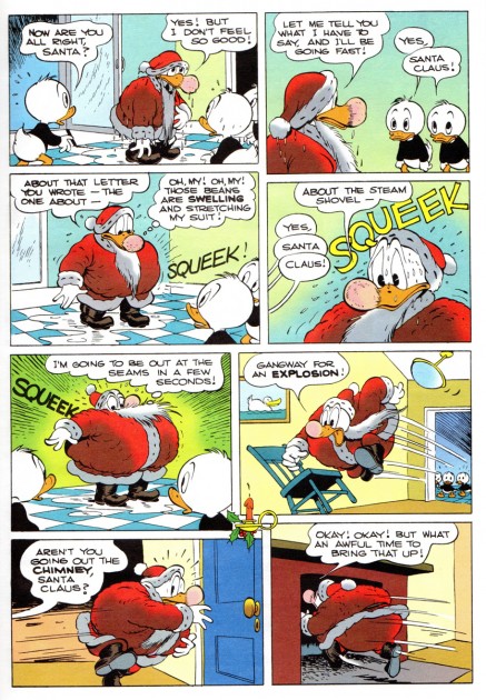
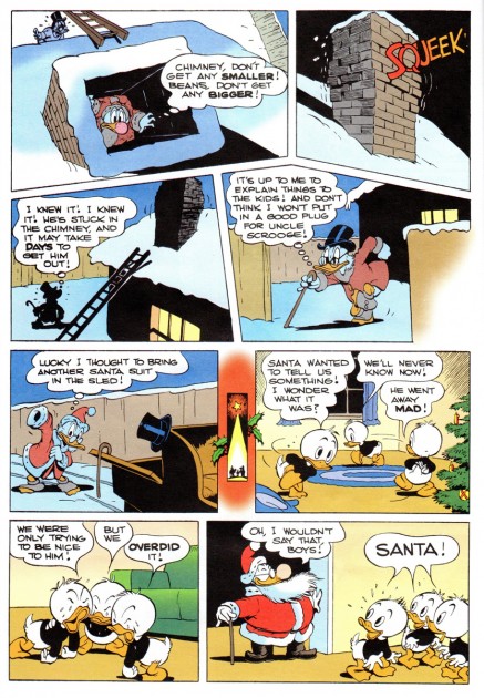
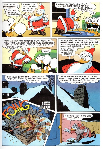
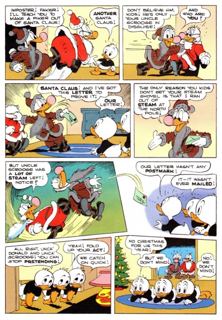
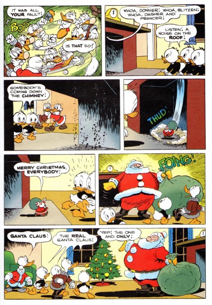
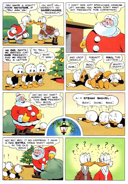
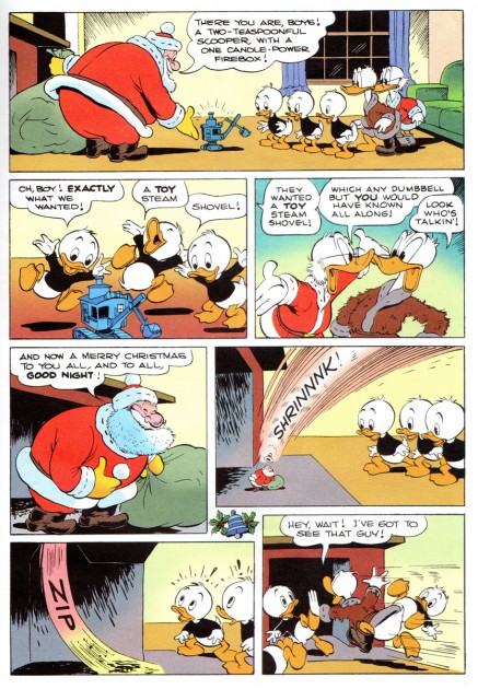
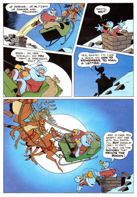
A Sumptuous Barksian Christmas Feast – part 2
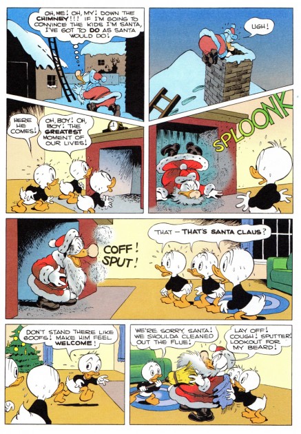
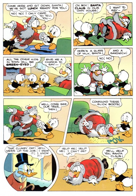
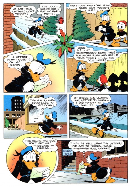
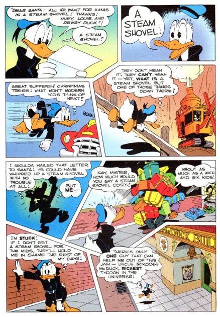
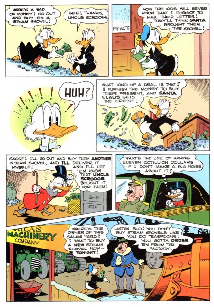
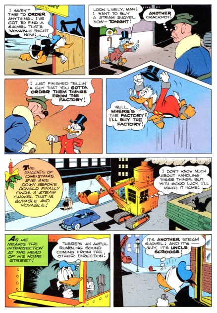
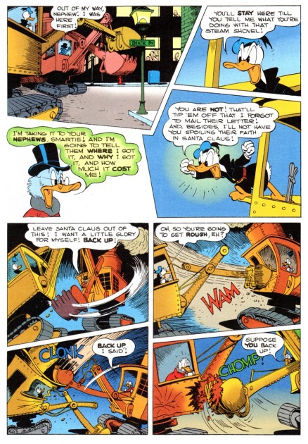
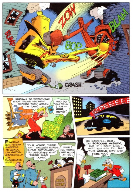
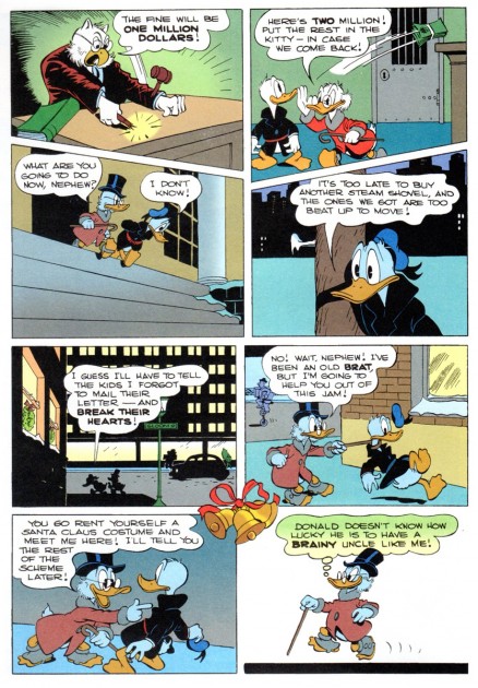
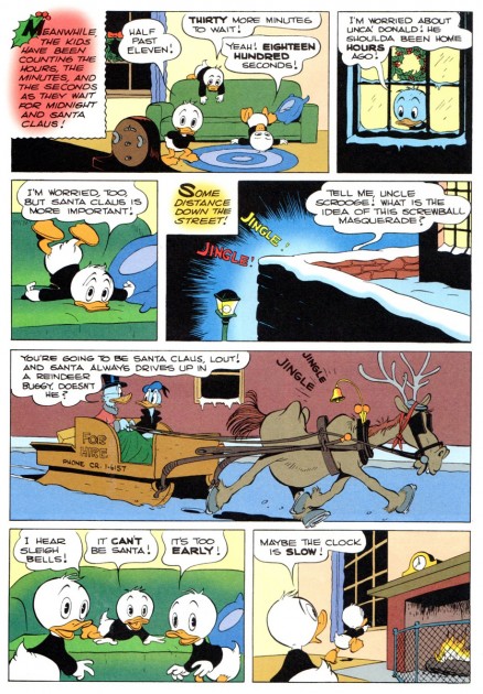
- It’s Christmastime. The perfect time to fall under the spell of Carl Barks for a few moments. Here’s the second and final installment of the piece started yesterday, “A Letter to Santa”, published in 1949 as the comic book titled, A Christmas Parade. This comes courtesy of Bill Peckmann who scanned the cover from the original magazine, but the story was taken from the reprinted and recolored version. Many th\anks to Bill for sharing this treat.
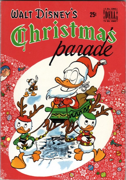
The cover, pencilled by Walt Kelly.
Merry Christmas
Bill Peckmann &Comic Art 22 Dec 2011 06:26 am
A Sumptuous Barksian Christmas Feast – part 1
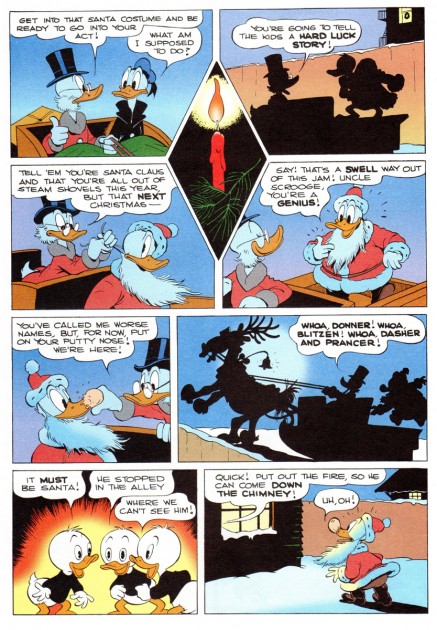
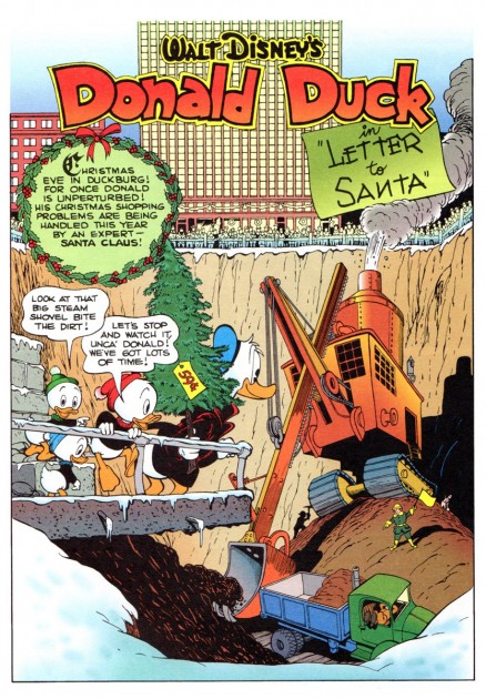
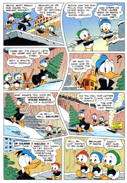
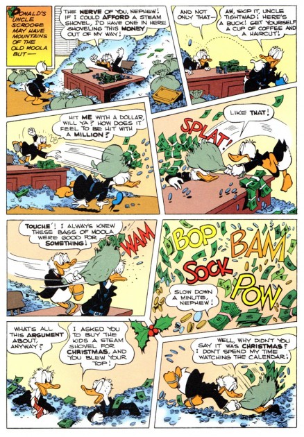
Bill Peckmann offered a holiday treat. A Carl Barks, Donald Duck story. It’s a bit on the long side, so I have to break it into two posts; I’ll complete the piece tomorrow. It’s a cliff hanger. Meanwhile, many thanks to Bill who writes:
- Here’s the cover of original comic book, “Walt Disney’s Christmas Parade” No. 1. It came out in 1949, it was one of the first 25 cent Disney comic books that I can remember. The price really put a dent in a kid’s pocket from that era, but at over 100 pages it was worth every cent!
The biggest gift in the first issue of “Christmas Parade” was of course Carl Barks’ 24 page Donald Duck “in Letter to Santa” story. There’s nothing more natural than having Scrooge McDuck in a Christmas story and fortunately nothing more natural than Carl being at the top of his game in 1949. It’s one of the best of the best!
(Note, I’m not scanning the story from the original comic book, I just didn’t have the heart to break the square binding of the old comic book. The scanning will be of a Gladstone Publishing reprint. Purists and anti-gradationists will probably be unhappy with that but it still is a handsome job when seen on the computer screen and Carl’s line work sings.
Second note, there’s also some Jesse Marsh art in the issue. He illustrated the text of “So Dear To My Heart”. Seven illo’s. I’ll see if I’ll be able to scan those without damaging the book.)

The cover is listed as being penciled by Walt Kelly.
 5
5
This is one of the very early appearances of
Uncle Scrooge McDuck in a Barks story, so he
isn’t quite the character yet that we came to know and love.
