Monthly ArchiveOctober 2011
Frame Grabs &Independent Animation 31 Oct 2011 06:59 am
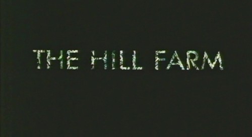
The Hill Farm – 1
- The Hill Farm is one of my favorite films. It was a school project for Mark Baker who burst on the animation scene with this first film. It ended up being the first of three Oscar nominations he’d receive. His second (The Village) and third (Jolly Roger) shorts were also nominated.
He has since formed his own commercial animation studio with Neville Astley, and they were ultimately joined by Phil Davies to form Astley, Baker, Davies. They are jointly responsible for three television series: Peppa Pig, The Big Knights and Ben and Holly’s Little Kingdom.
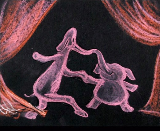
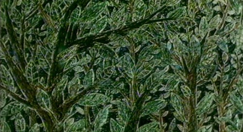
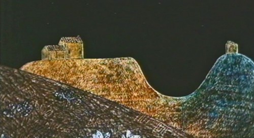
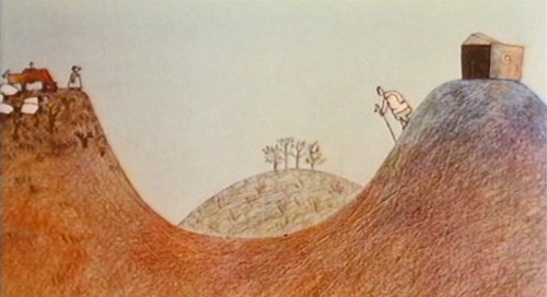
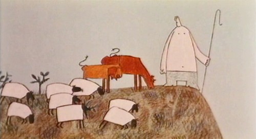
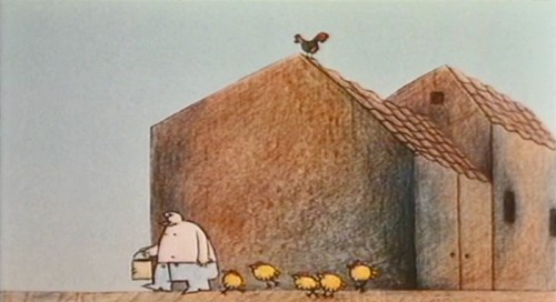
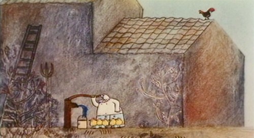
The story of The Hill Farm takes place over three days and shows how the same landscape affects three different sets of people: farmers, campers and hunters. The graphics are beautifully designed and are obviously inspired by a period of Paul Klee’s art. Julian Nott’s score this film, and for all of Baker’s shorts, is just excellent; it couldn’t be better.
The DVD for The Hill Farm can be bought from AWN; it’s packaged with “Gopher Broke” and Plympton’s “Fan and the Flower”.
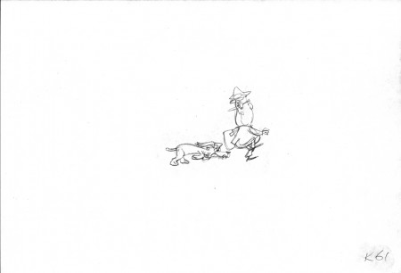
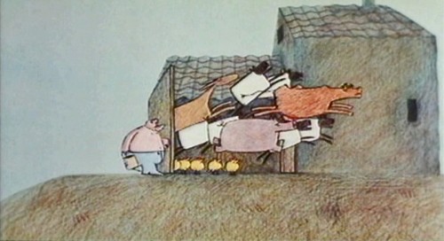
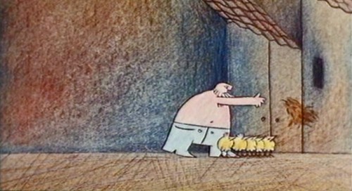
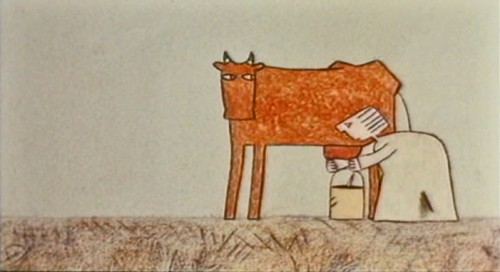
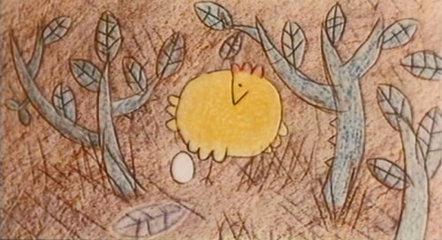
Here are frame grabs from the first half of the film.
The Farmers:
 1
1.
 2
2.
 3
3The film shows a remarkable sense of professionalism
and knowledge given that it was a student film.
.
 4
4.
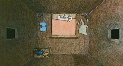 5
5.
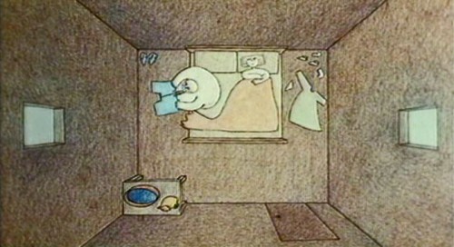 6
6Time was taken to develop each character in the film.
.
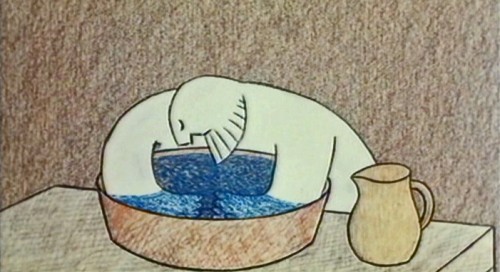 7
7.
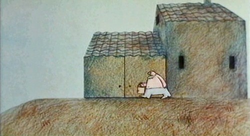 8
8.
 9
9.
 10
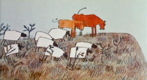
10The animals also take on a character.
.
 11
11.
 12
12.
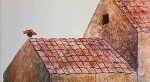 13
13.
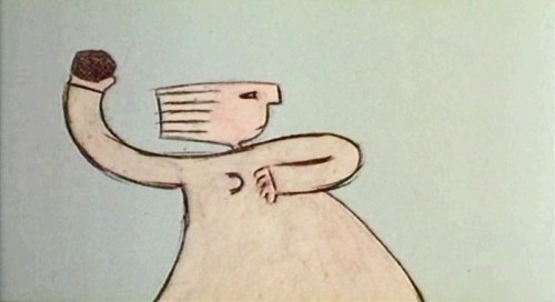 14
14.
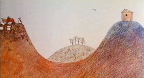 15
15Mom wakes up Junior – or is it a farm hand?
.
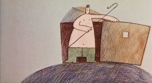 16
16.
 17
17.
 18
18.
 19
19.
 20
20.
 21
21.
 22
22.
 23
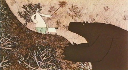
23Junior seems to have some recurring relationship with the bear
who has threatened to eat the sheep.
.
 24
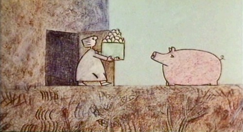
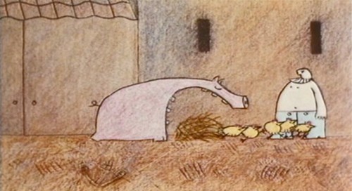
24The pig has his character . . .
.
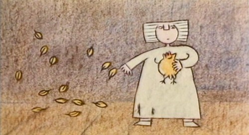 25
25. . . while the funny and cute chickens are obviously meant for killing.
This gives meaning to all the animals on the farm – as is natural.
.
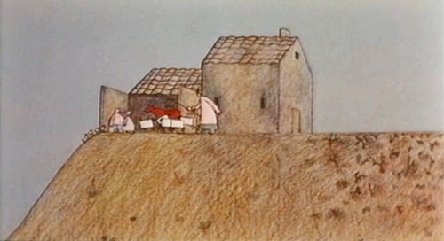 26
26And they are the prime concern of the farmer.
.
 27
27.
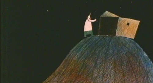 28
28.
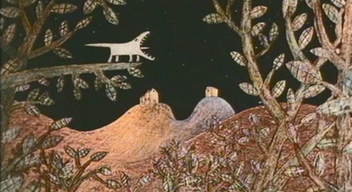 29
29We are reminded that there are also animals in the wild
other than the threatening bear.
.
Here is a contrasty version on YouTube with some distortion in parts. Part1, Part 2
Daily post &Photos &Steve Fisher 30 Oct 2011 07:13 am
Chrysler Building
- My friend, Steve Fisher, went to the celebration for the Statue of Liberty’s 125th anniversary. Here are a couple of photos he took:

.

.

.
.
- A view from the other side of the bridge.
.
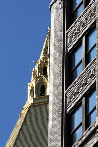
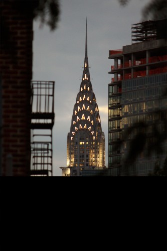
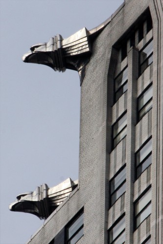
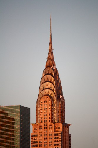
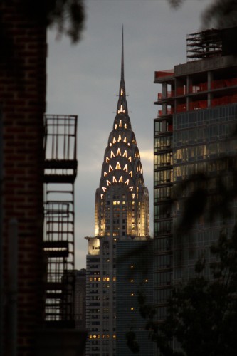
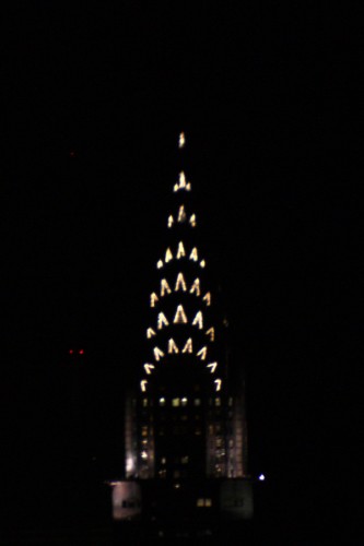
The Chrylser Building is probably my favorite building. I find it extraordinarily attractive. I was even able to endure The Bonfire of the Vanities for the wonderful shots of the gargoyles within the film. There have been some great pictures made of this outstanding bit of architecture. Steve Fisher has a collection of pictures he’s taken of the building from Queens. I asked him to send me an assortment of these pictures and I’m happy to post them today. These are they:
.
 1
1.
 2
2.
 3
3.
 4
4.
 5
5.
 6
6.
 7
7.
 8
8Golden gargoyles
.
 9
9.
 10
10.
 11
11.
 12
12You couldn’t get a better shot.
.
 13
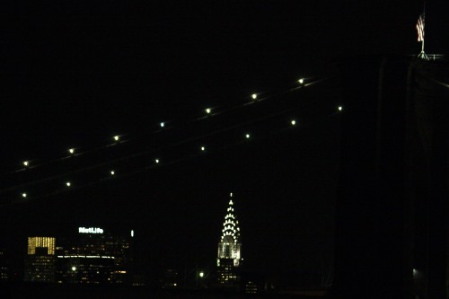
13And here’s one from Brooklyn:
Commentary &Errol Le Cain 29 Oct 2011 05:19 am
Rumblings
- I’ve been an ardent admirer and promoter of Errol Le Cain‘s work. I’ve followed him since the early 60s when I first saw a documentary on Richard Williams who’d assigned Le Cain a film, The Sailor and the Devil. I’d also featured many of his illustrated books on my blog. In doing such, I’ve received a number of comments from people over the year. This week I received one that I’d like to share with you:
- Dear Michael
The Eurasian Association in Singapore is exploring the possibility of setting up a permanent exhibition of the works of Errol Le Cain with a thorough biography from the early days of his childhood. ELC was both a Eurasian and brought up in Singapore. I actually have Errol Le Cain’s early life up to 1956 well covered. Will
be making for interesting reading when done, with some good photos too. It is his life and working life in England from1956 till 1989 that has patches and is missing many details.
I am writing to ask your help to please publish on your website our appeal for facts about his life and work and for scans at 300dpi of any unpublished illustrations or artwork by Errol Le Cain.
I have the blessings of his widow Lili Le Cain to do this, and there are still people alive who remember him and his family in Singapore; and many who collaborated with him during his most fruitful time in England. But the time to gather facts is quickly passing. At last I’m getting the replies that make research so satisfying. Inter alia, I found out that ELC’s father had been incarcerated by the invading Japanese in the notorious Changi Prison and was lucky to have escaped with his life.
Here is a little gem: when Errol sat for his Cambridge leaving exam, he finished his art paper in 20 minutes instead of the 3 hours allotted, so the invigilators (who were from another school) reported the matter which had to be investigated for cheating! Of course he was fully exonerated and his mark was an A1.
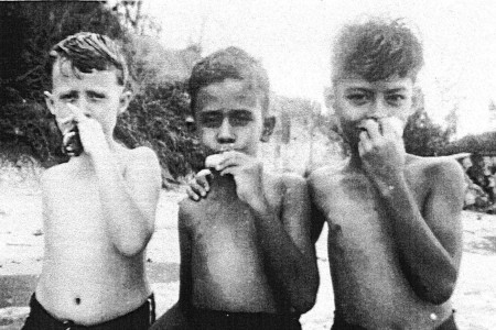
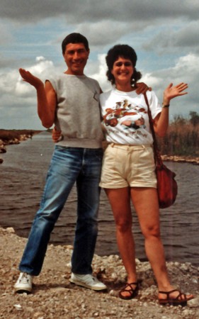
Attached is a very early photo of Errol Le Cain
in happy times with friends by the sea.
Please assist me to gather everything we can of the life and art of Errol Le Cain which should be available to the world, and not just a privileged few.
If anyone has any information about Errol Le Cain’s early life in Singapore, please don’t hesitate to write about it.
.

- Slingshot TV is a new website designed to show off new independent animated films, cartoons and art. The hope to fund, produce and distribute original work and publish articles and information to help independent artists “work better and smarter in the digital age.”
Currently, they have three shorts by Danny Dresden up and running. They’ve just begun.
If you want to contact them about a project you’re working on, or have a general inquiry please email them at slingshot.tv@gmail.com.
.
- On Thursday, Dec. 1st there will be an Evening with Paul & Sandra Fierlinger
at the Kelen Auditorium,
66 Fifth Avenue at 13th Street in NY.
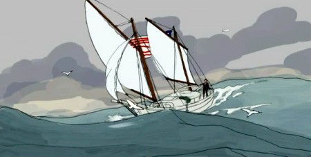
The program will consist of a screening and discussion of their documentary animation films and a discussion of the plans they have for the online distribution of their new feature film project, Slocum at Sea with Himself.
I’ve seen about ten minutes of this film and can attest that it is some of their finest work. You’ll want to see it, and I’ll remind you of this as the date gets closer. You should mark it off on your calendar as an important event.
This program is presented by the Illustration Program at Parsons, the New School for Design.
.
.
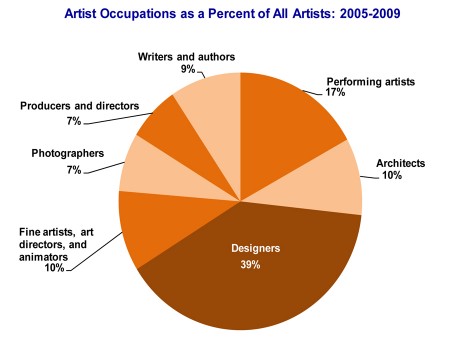
- The National Edowment for the Arts has done some research on the Arts professions, and the information is available on line. Some of the information you can see includes:
-
* There are 2.1 million artists in the United States. They make up 1.4 percent of the total workforce, and 6.9 percent of the professional workforce (artists are classified as “professional workers”).
* More than one-third of artists in the survey (39 percent, or 829,000 workers) are designers (such as graphic, commercial, and industrial designers, fashion designers, floral designers, interior designers, merchandise displayers, and set and exhibit designers.)
* Performing artists make up the next largest category (17 percent). In addition, each of the following occupations make up 10 percent of all artists: fine artists, art directors, and animators; writers and authors; and architects.
* Between 2000 and 2009, the artist labor force increased by 5 percent while the civilian labor force grew by nearly 8 percent.
It’s quite an extensive survey available here.
.
.

Finally, I have to say that I really enjoy Signe Baumane‘s blog, Rocks in My Pocket. It’s supposed to be built around the animated feature Signe’s creating with its 2D animation moving in front of the 3D sets she is constructing. However, it is really about the everyday life in the world of an artist trying to create a new world. As such we get plenty of the current day problems, but we also get stories of the past life (which obviously affects the current). It’s always a great read – as opposed to many of the self-important blogs I trudge through. The stories are always well written, and the imagery is just a delight.
Bill Peckmann &Comic Art &Illustration 28 Oct 2011 05:47 am
Harvey and Jack – Part 4
- The series we’ve been posting of the collabortion between Harvey Kurtzman and Jack Davis seems to be a popular item. This gives us lots of encouragement to go on with it. Hence, here’s part 4. These were scanned and sent to me for posting by the brilliant Bill Peckmann. From here on I turn it all over to Bill:
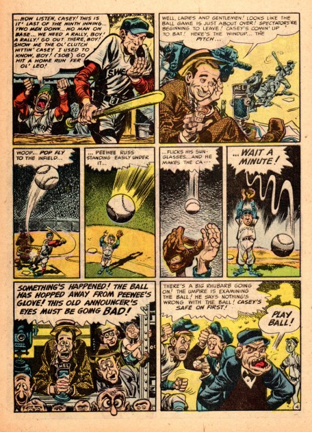
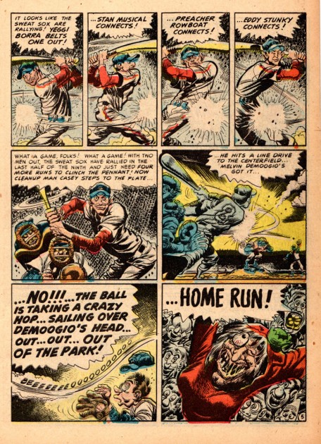
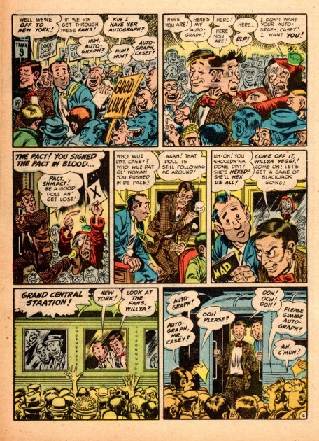
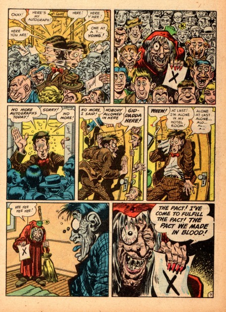
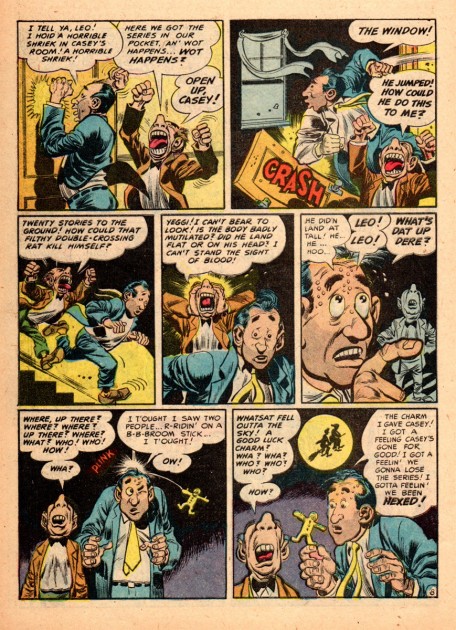
- This extended part 4 of Harvey and Jack is a big shout out thank you to Tom Hatchman. After his kind kudos to Kurtzman and Davis, (and it also being the end of the baseball season with the World Series), what better way than to try to add to that list of “firsts” of that dynamic duo than with Jack’s first cover for MAD Comics. It’s a dandy! (It’s #2, Dec.-Jan. 1953, and was his only cover for the “comic book” line/title.)
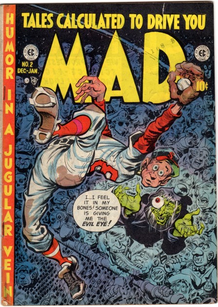 1
1The cover story by Harvey and Jack is one of their best.
It’s worth studying because of Harvey’s layouts with their
exceptional continuity and his gorgeous page and panel designs.
The man always had a camera cranking in his head, unbelievable.
.
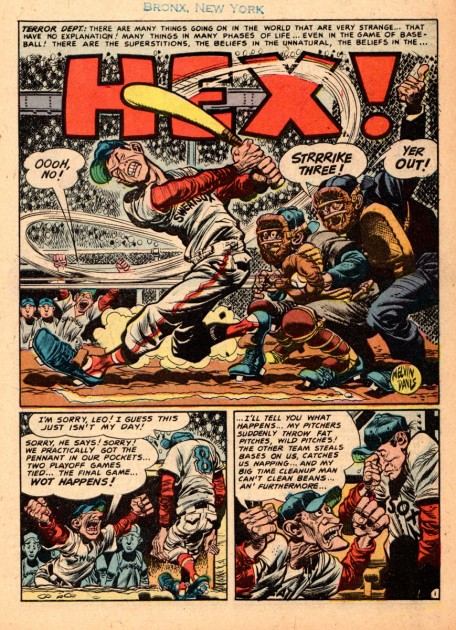 2
2This is also one of the first baseball/sports stories that Jack
did for the comics. His drawings are just exploding with life,
their wonderful dimensional quality and his great dexterity of
where to put that black ink with that super brush of his.
This story also put him on that long road of becoming one of
the best “sports” cartoonists in the business!
.
 3
3.
 4
4.
 5
5.
 6
6.
 7
7.
 8
8.
 9
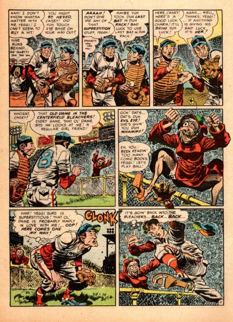
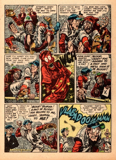
9Again, also what makes this story so pleasurable is
the terrific coloring by a young Marie Severin.
She was the colorist for the whole EC Comics line up,
no small feat, she always made the EC line stand out
from the rest of the comics on the rack. They absolutely
grabbed you first because of the covers she colored!
.
 10
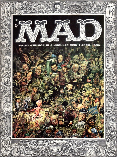
10This is Jack’s first cover for MAD Magazine, # 27, April 1956.
(A little over three years since he did his first MAD Comic Book cover.)
.
 11
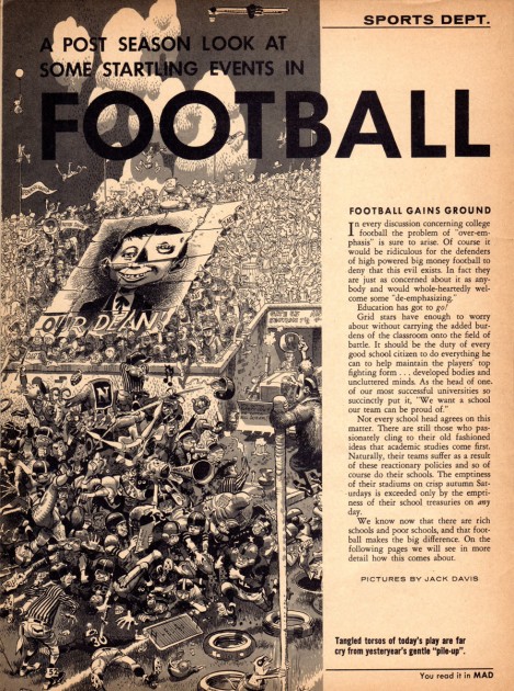
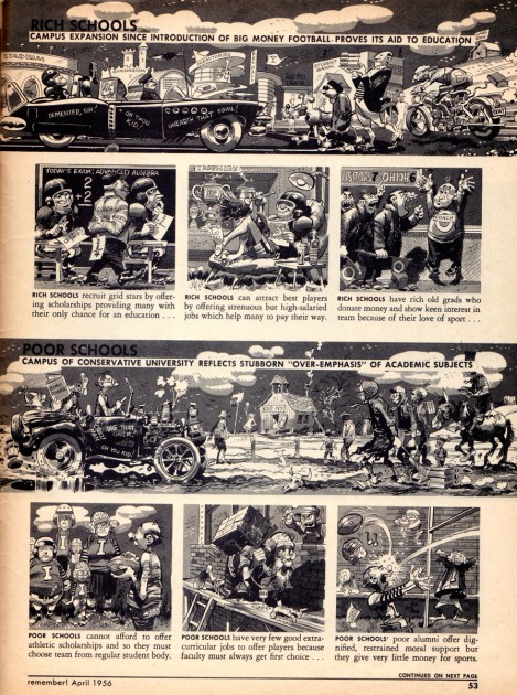
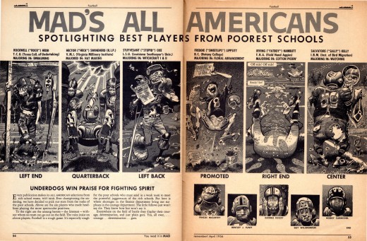
11Inside MAD # 27 we find two features by Harvey and Jack.
In “Football” jack pulls out all of the stops with his great eye
for caricaturing details like the football uniforms.
.
 12
12.
.
 15
15.
 16
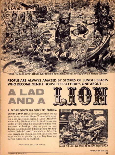
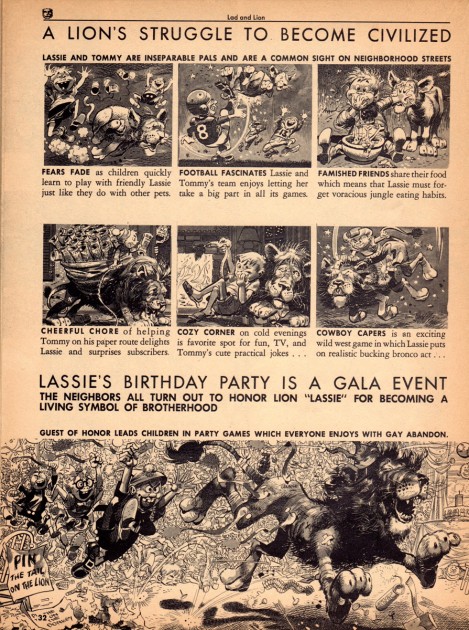
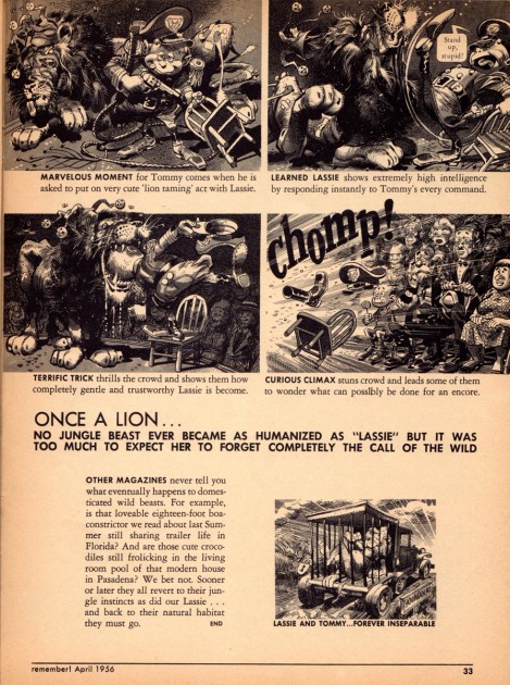
16This is the second feature of the magazine and
Jack is becoming quite the master of two tones
of gray Craft Tint, Ã la Roy Crane.
.
 17
17.
 18
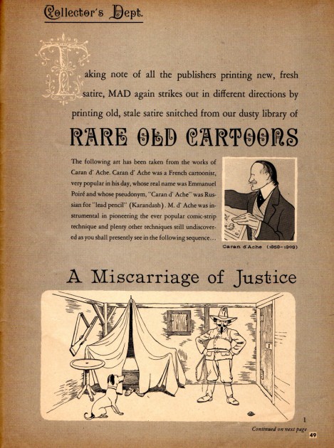
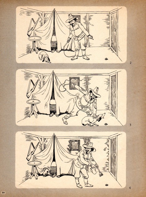
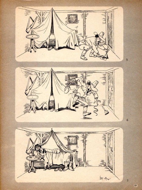
18This third feature of MAD # 27 is neither Harvey nor Jack but it’s
definitely worth sneaking in here. As a kid, I’ll always remember
and love Harvey for showing us great cartoons that were done
before he was doing great cartoons, way before! What dusty bins
and archives he went through, I have no idea, but the ones he
selected held up the some odd 50 years after they were originally
printed, and by George, they still hold up the some 50 years after that!
.
 19
19To any dog owner, the dog poses in here are top notch!
.
 20
.
20
.
Books &Commentary &Disney 27 Oct 2011 06:18 am
Walt in Wonderland – overdue review
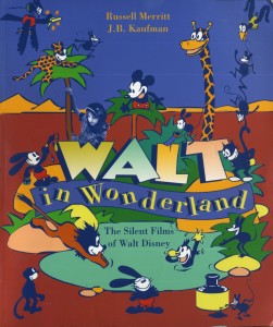 - The book I reread this week was Russell Merritt and J.B.Kaufman‘s Walt in Wonderland. Actually, this was the third time I’d read the book, and I’ve also visited it another half dozen times just for the illustrations. Needless to say, I think this book is a treasure.
In the past three weeks, I’ve read three versions of the same material in different forms. Timothy S. Susanin’s Walt Before Mickey: Disney’s Early Years, 1919-1928 led me to reread Donald Crafton ‘s Before Mickey and that led me to reread today’s book. They all come with different pleasures. Though the material was the same, in no way did I feel as though it was repetitious. All three writers have different approaches, and all three kept it lively for me.
Crafton’s Before Mickey tells the story most expeditiously. There’s a lot in this book, and the Walt Disney story is just a part of it. Susanin’s Walt Before Mickey reveals a very large gathering of data, much of which is really unnecessary to the story, but just the same was a delight to me. Merritt & Kaufman’s Walt in Wonderland expands on Crafton and holds back on extraneous material. However the book is overrun with enormously valuable visuals. Scripts, story pages, animation drawings, posters and pictures fill the space around the story of Walt Disney’s rise from nowhere through the creation of Mickey Mouse.
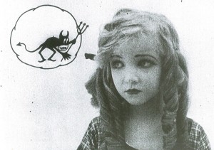
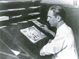 The authors take the time to reveal some of their methods of evaluating the material. For example, not all of the silent films exist today, so they create a complete filmography from archival texts they found. Copyright forms required synopses of the stories as well as credits for the films. This enables the authors to detail the material for us when they weren’t able to actually see the films. Prior to this book, we knew that Virginia Davis, Dawn O’Day and Margie Gay all played Alice in the Alice Comedies. However, Kaufman and Merritt were also able to identify a fourth Alice as Lois Hardwick, and they also calculate why the change. This is scholarship, well done.
Though I’ve read this book several times already, I still call this series “Alice in Cartoonland.” In fact, many people do, yet the authors point out that it was never the title of the films. They were simply called the “Alice Comedies.”
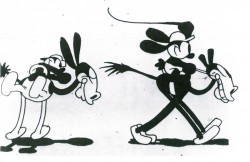
I was not much of a fan of this animation series; actually, I was not a big fan of the Disney silent films. They pale in comparison to the Felix cartoons of the same period – in fact, almost everything does (of course with the exception of the McCay films.) The Disney silent films have a lot of energy, but a farmyard sense of humor that never seemed very funny to me.
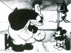
 I’ve sat through numerous theatrical screenings of silent shorts (and fallen asleep in many of them). One, however, stands out memorably. There was a MoMA show which was a compilation of shorts from different studios. An organ soundtrack was attached to many of the shorts, but several were truly silent. (It’s interesting to attend an audience who doesn’t know if talking is allowed when the film is dead silent.) The program soon grew tiresome and dragged on. The last film screened was Disney’s “Steamboat Willie,” the first successful animated short with synchronized sound. Let me tell you, it was made perfectly clear how monumental this film was, and why it was so successful. That sound track was a godsend after 90 minutes of silent dross.
 There is one telling sentence at the beginning of this book. “. . . the first striking fact about Disney’s 1920s films is that they take no particular direction: they don’t evolve, they accumulate.” The authors point out that knowing the films of the 30s Disney, one would expect that the work in the 20s would, likewise, be a developing road-map to the future; constant growth in the animation and production techniques. Yet, it isn’t until Mickey that we start seeing enormous growth. “Plane Crazy,” the first Mickey (still a silent film), is when we get the first truck in (Iwerks came up with this effect, created by placing books under the zooming background as it got closer to the lens of the stationary camera.) Perhaps it took the trauma of creating that first Mickey Mouse cartoon for Disney and crew to wake up to innovation. And perhaps realizing how powerful that innovation was to the animated film – the success of the first sound film, then the first color film – that Disney realized the importance of constant change and growth.
Whatever the reason, things changed with the coming of sound.
 Walt in Wonderland is a key book that synthesizes this entire period in the evolution of Disney animation. It’s a little-known beginning, and the book not only details the making of all the films but gives a clear and good summary of the series that were done. You see the long shot as well as the close up, and you have no doubt as to the true history of the material.
The authors obviously did enormous research, yet the look of the book, filled with new and different visuals, is anything but scholarly. As a matter of fact, there are times when the images almost create a distraction from the writing. A tough problem for an animation book to have.
All I can say is that if you have any interest in the early Disney, the young and vibrant Disney, I’d suggest you get a copy of this book. It’s a gem.
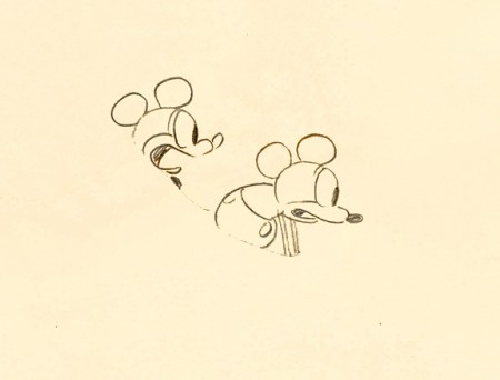
Here’s a drawing I have from Plane Crazy.
Click the image to see the whole drawing.
Animation &Animation Artifacts &commercial animation 26 Oct 2011 05:58 am
Lu Guarnier’s Alphabits
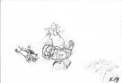
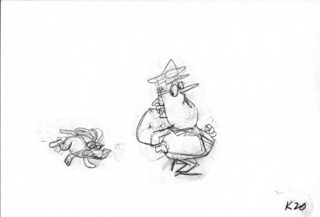
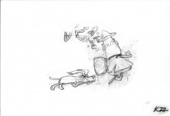
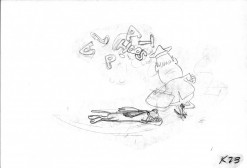
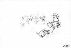
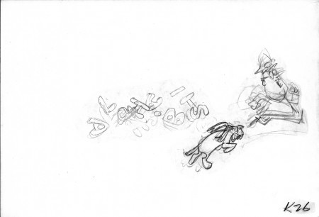
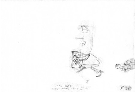
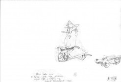
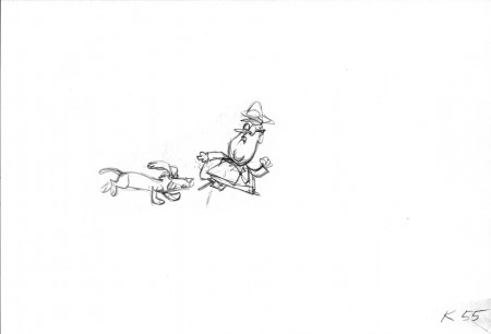
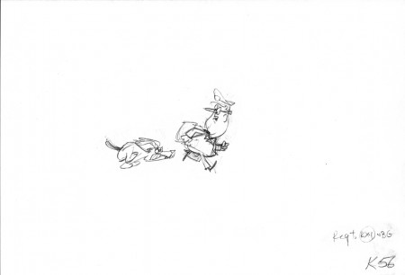
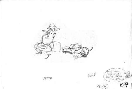
- Vinnie Cafarelli of Buzzco gave me these drawings by Lu Guarnier from an animated Alpha-bits commercial that Lu animated. Vince said that Lu gave him that scene to clean up and inbetween late one Friday afternoon and needed it for Monday. The spot features a caricature of comedian, Jack E. Leonard, who did the voice, and some of the actions were part of Leonard’s shtick in his comedy routine. They ran a number of these ads in the ’60s with the same two characters.
Lu always worked on the rough side, but his animation was usually dependably good. He started with Warner Bros in the 30s as an inbetweener, then assistant to Bob Clampett. After the Signal Corps, where he was stationed in NY at the Astoria Studios, he moved permanently to NY and became a solid part of the commercial scene. He was a mainstay at the UPA studio in NY, the only one to have a cubicle with a window. As a result, there were many in-house gags done about him. In the past, I’ve drawings from his work on Sendak‘s Really Rosie.
When I knew him, Lu made his living as a freelance animator with no permanent roots at any one studio. He would go from job to job, and many of them were from studios in LA. He had his contacts well honed. This was what most animators in NY did back then. Lu did quite a bit of work at the Hubley Studio, while I was there, and I assisted most all of his scenes during that period (1972-1977.)
This scene was scanned by Rick Broas at Buzzco. Unfortunately, the pegs were dropped so that the drawings could be scanned in registration. Many thanks to Candy Kugel for shepherding the art and scans to me and to Vinnie Cafarelli for the gift. Lu Guarnier worked on top pegs most of the time. Here he used Oxberry pegs. This is the scene from his Alpha-bits job:
 9
9
__________________________
The following QT utilizes all the drawings displayed above.
On ones, except where there’s a missing drawing -
this is made up by adding one frame to the preceding drawing.
__________________________
You can see another spot with these same characters
in the following commercial for Alpha-bits.
Art Art &Bill Peckmann 25 Oct 2011 05:52 am
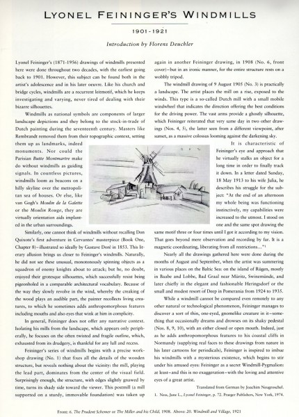
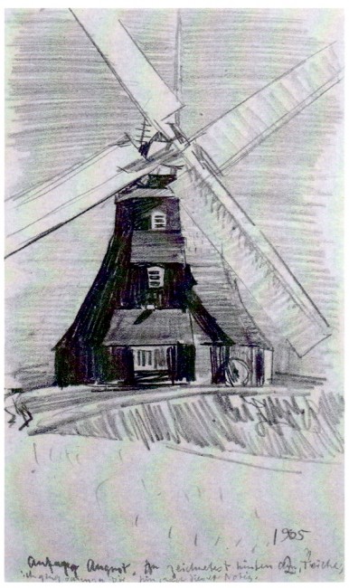
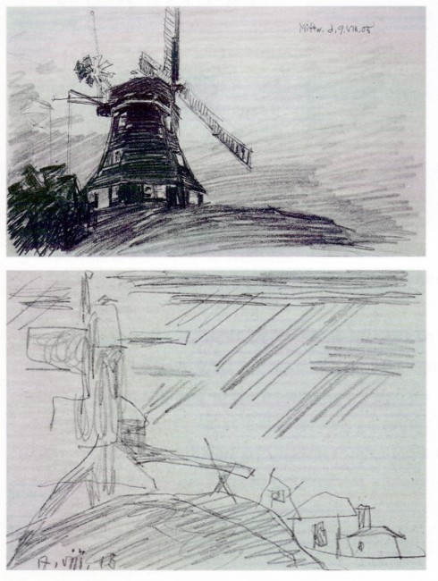
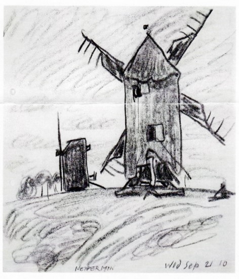
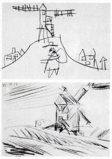
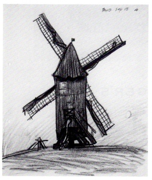
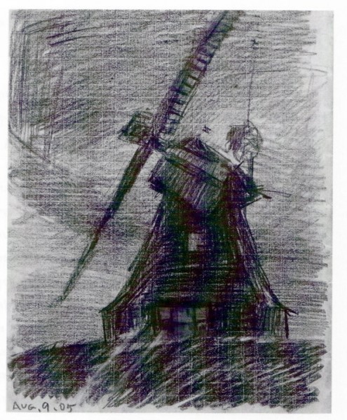
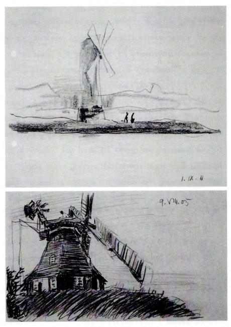
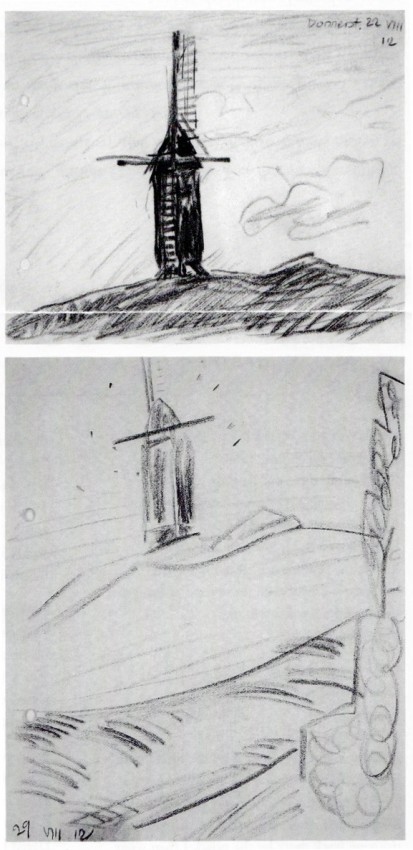
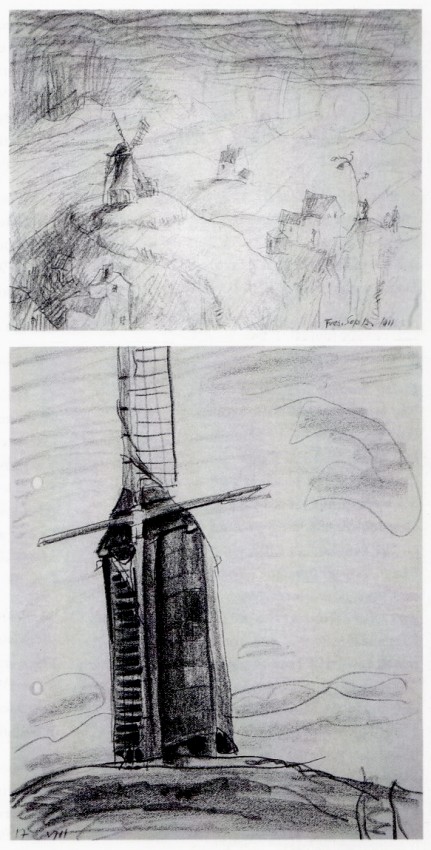
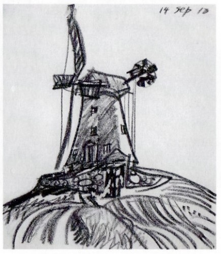
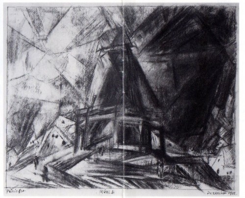
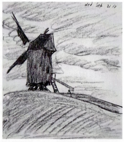
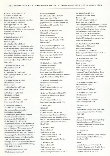
Feininger’s Windmills
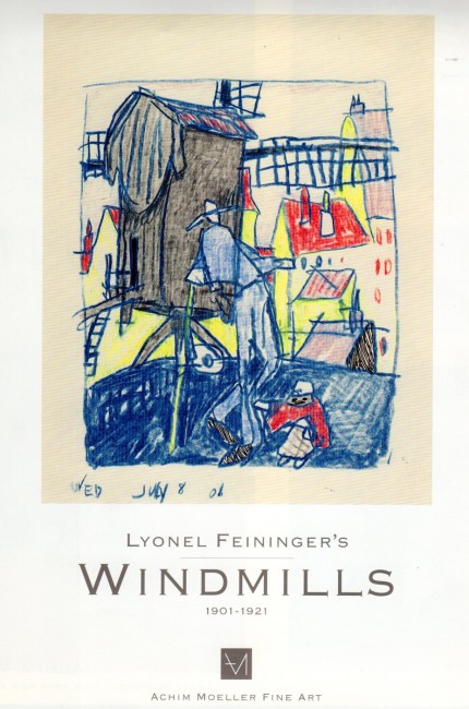
- Bill Peckmann sent some beautiful artwork by Lyonel Feininger. They’re scans of a show’s catalogue; the featured art was a series of windmills drawn by the artist. They’re beautiful. I love showing off his work while the Whitney Museum features a show of his paintings. I haven’t been up there as yet, but I intend to go soon.
Here are the images:
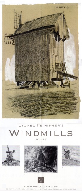
The poster for the show
Animation Artifacts &John Canemaker &repeated posts 24 Oct 2011 06:51 am
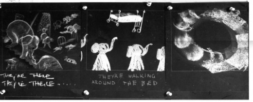
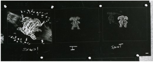
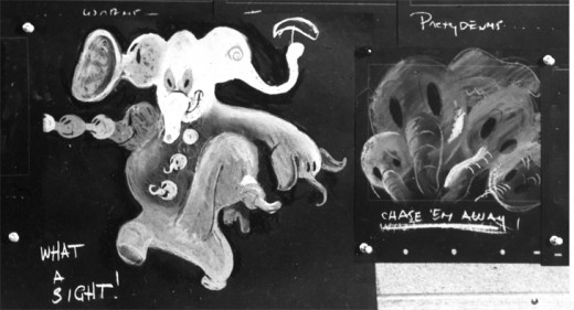
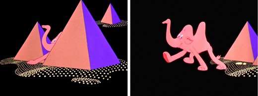
Pink Elephant Recap
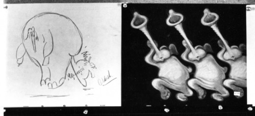
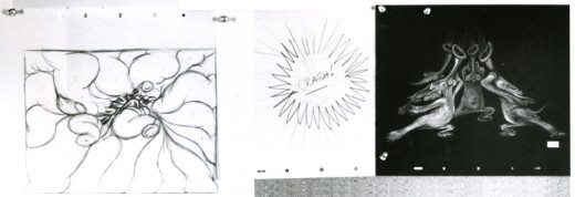
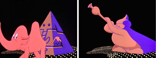
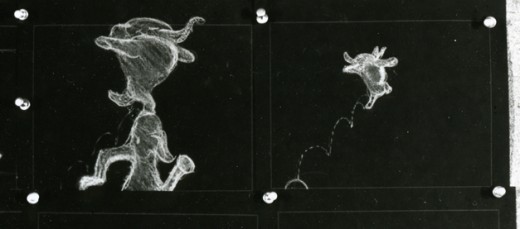
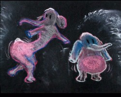
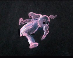
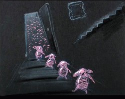
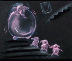
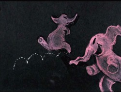
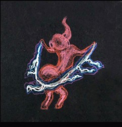
- Recently, I saw a small part of Aladdin on television. A large part of the Genie’s song reminded me of Pink Elephants from Dumbo. I thought, then, that I should post anew the models/sketches and drawings from that sequence. It originally was broken in two parts when it saw daylight here in 2007. I’ve combined the two posts into one.
Once again, thanks to John Canemaker, I have several photo images to display. Some frame grabs accompany the piece.
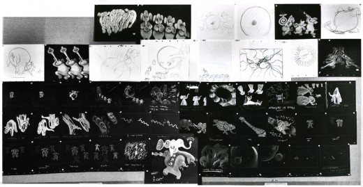
These are rather small images, so by cutting up the large boards and reassembling them I can post them at a higher resolution, making them better seen when clicking each image.
I’ve interspersed some frame grabs from the sequence to give an idea of the coloring.
The following images were in the gallery part of the dvd. These are the color versions of some of the images above.
Photos &Steve Fisher 23 Oct 2011 07:45 am
Architectonic Photo Sunday
- Steven Fisher sent me an assortment of photos that I found beautiful. He’s an architect, and his interest in architecture is obvious in many of these images. My interest in the beauty of my City is the reason I have to post them. Steve has a fresh look in the photos, and he’s totally in sync with the way I feel.
The first is an image of a chateau in France. It leads into a lot of similar shots of rooftops in Manhattan.
 1
1chateau at Chambord
Commentary 22 Oct 2011 06:55 am
Hal Silvermintz Remembered
- As I posted yesterday, Hal Silvermintz died this past week. I didn’t know him well, but I knew his work. Everyone in NY animation did back then. Conseqeuntly, I asked for some help in writing about him. Here’s a bio/obituary that was written and compiled by Mitchell Silvermintz, Vincent Cafarelli and Candy Kugel:
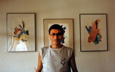
- Hal SIlvermintz was an artist. He was a serious painter. And had an original sense of graphic design.
.
Hal was born October 4, 1930 and grew up in Brownsville, Brooklyn.
He graduated from the High School of Art & Design in Manhattan and
enlisted in the Army because he said army food was better than his mother’s cooking!
He was stationed at Fort Bliss in El Paso, Texas. While there Hal painted the murals in the lunchroom and other places at Fort Bliss and painted signs
He went to the Cooper U-nion School of Modern Design in 1955 and studied fine arts. He graduated June 8, 1960. He won the Cooper U-nion Painting Award while he was there.
Hal was a member of the Brata Gallery, part of the movement that was known as the 10th Street Galleries. The 10th Street Galleries were an avant-garde alternative to the Madison Avenue and 57th Street galleries that were both conservative and highly selective.
From the early 1950s through the mid 1960s many galleries began as an outgrowth of the artist community and many of the artists who showed in these galleries, referred to as the 10th Street Co-ops or the 10th Street Scene, have since become well known. The galleries on 10th Street played a significant part in the growth of American art and were a direct predecessor to the Soho gallery scene, and the more recent Chelsea galleries.
In 1953 he married his wife, Sheila and had 3 children. He started working in television—first for DePicto Films and then for Wylde Films. There he met Vincent Cafarelli who brought him into the New York animation scene and to Stars and Stripes Productions Forever. Stars and Stripes was the psychedelic, most groovy, hip studio at the time! Headed by Len Glasser, he and Hal soon developed compatible styles and sensibilities. They worked on Rex Root Beer, Sparkletts, and other campaigns. They often used their own voices as sound tracks. He was there for a couple of years and met a young film editor, Buzz Potamkin and the two of them left and founded Perpetual Motion Pictures in 1968.
Hal was the designer and director of animated TV commercials at Perpetual Motion Pictures. His innovative sense of style and reference to fine arts was evident in his work. Perpetual won numerous Clio awards for their campaigns for DuPont, 3M, Bell Telephone, Western Electric and the Wall Street Journal. He also directed spots for Aziza, Burger King, Soft ‘n Dri and Diaperene. Perpetual also produced 5 Berenstain Bears holiday specials and Strawberry Shortcake in Big Apple City. But Hal’s sensibility was most obvious in the “Mr. Hipp†series, featured on NBC’s “Weekend†show.
Hal was a member of the Director’s Guild of America and the Screen Cartoonists’ Guild for many years. The business agent of the Screen Cartoonists’ Guild, with the blessing of the u-nion membership, sent Hal as a delegate to the ASIFA animation festival in Annecy, France in 1965.
Hal was featured on the cover of Art Direction Magazine, where they wrote:
“Cover artist Hal Silvermintz has been creating award-winning animation for two decades and, unlike many other designer/directors, he has not built his reputation on any single, specific style. Rather, Silvermintz has worked toward creating animation appropriate to its eventual function, which, of necessity requires many styles – some innovative, others tried and true. Of our cover, he said ‘I tried to get a feeling of motion or animation in the flat art… I took a whack at making the page move.’ And if he can do that on unmoving page, think of the magic he can create on film”
In 1982 Hal and Buzz parted ways. Hal Silvermintz teamed up with Hal Hoffer to become Perpetual Animation, where he continued to work until he retired in 1986, first to Texas and then to Miami. He continued to paint and was represented by a gallery in South Beach. In 1991 Hal designed “Fast Food Matador,†for Buzzco Associates. It won numerous awards and was displayed at the Museum of Modern Art in New York. It is part of MOMA’s film archive.
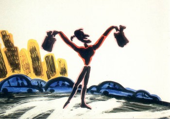
Fast Food matador
If you have any memories or thoughts about Hal, please don’t hesitate to leave them in the Comments section. Thanks, M.S.
Here are a couple of Mr. Hipp pieces that aired on NBC.
Many thanks to Candy Kugel for spearheading this piece.
.
