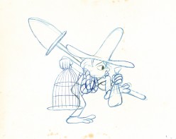
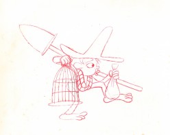
Monthly ArchiveSeptember 2011
Bill Peckmann &Comic Art &Disney 30 Sep 2011 06:50 am
Jesse Marsh comic art
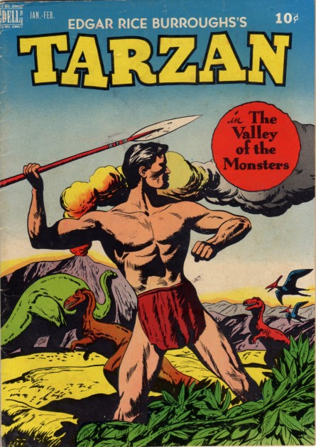
Jesse Marsh was a comic artist who, principally, is known for his work on ‘Tarzan’, the comic series published by Dell. He was a self-taught artist who started working for the Disney studio in 1939. He worked on Fantasia and Pinocchio in the story department. He served in the Army as a radar specialist and was wounded with a mortar shell. After the War and a long recuperation, he returned to Disney but also worked freelance at Western Publishing. He left Disney in 1947 to work at Western, where he took charge of the TARZAN series of comic books.
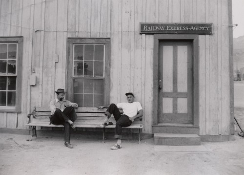
Jesse Marsh (L) and Tom Oreb (R) in the early 1940s
borrowed from Dan Nadel, posted Monday, March 29, 2010
.
Bill Peckmann sent some scans of various art by Jesse Marsh and I’m pleased to post them here. Many thanks to Bill. He writes:
-
“Before gaining success as DELL Comics’ TARZAN artist in the late 40′s and 50′s, Jesse Marsh, early in his career, worked for Disney in animation. The following material is some rarely published from that time period, They are taken from Charles Solomon’s 1995 book, The Disney That Never Was.”
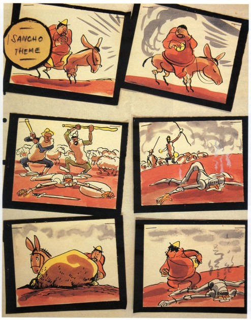
The following is the accompanying article by Solomon about Marsh’s artwork:
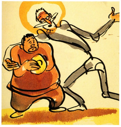
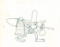
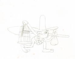
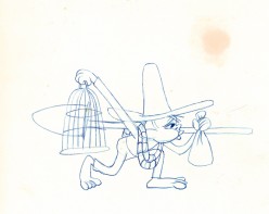
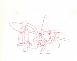
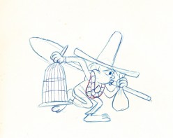
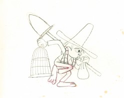
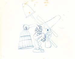
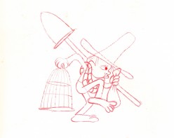
- In 1946, a second crew, under Jesse Marsh, returned to “Don Quixote.” This version would have been set to an adaptation of Richard Strauss’s tone poem Don Quixote: Fantastic Variations on a Theme of Knightly Character far Large Qrchestra, op. 35. Marsh prepared hundreds of neat pen-and-ink and watercolor cartoons, noting the musical themes that would accompany the action. He did enough rough storyboards for an entire film, beginning with a shot of the book resting on a table I flanked by suits of armor, and concluding with a sort of apotheosis: After Don Quixote’s death, he, Dulcinea, and Sancho Panza would ride through the clouds to a glittering castle beneath a rainbow. Like the earlier version, this incarnation of “Don Quixote” was apparently shelved before story meetings were held or dialogue prepared.
.
Preproduction work began for the third time in April 1951. This crew used an even simpler style that reflects the influence of such New Yorker cartoonists as Sol Steinberg and Otto Soglow; The rounded characters consist of little more than a few ink lines with monochromatic highlights in dull green or tan. Work on the film must have ended soon after it began, as only a few dozen drawings were completed.
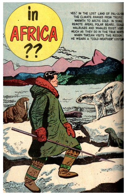
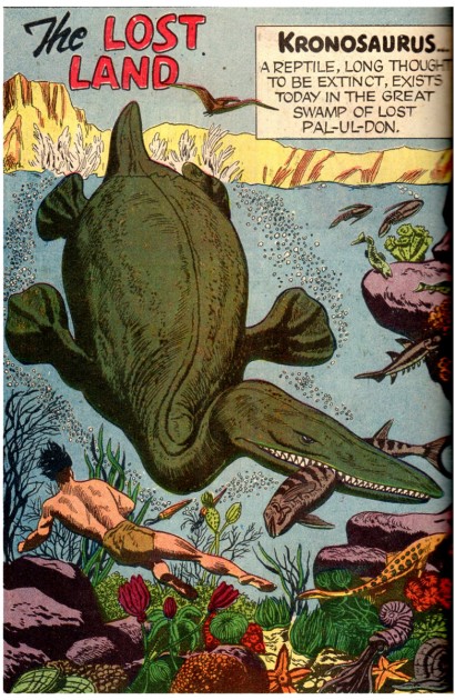
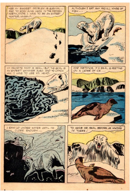
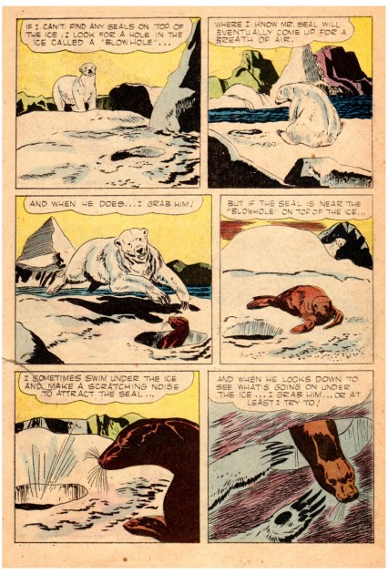
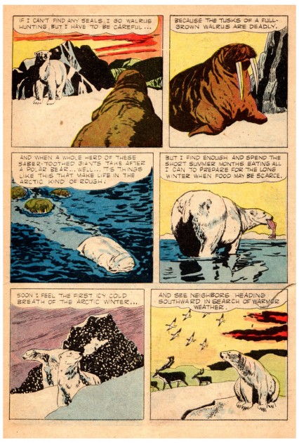
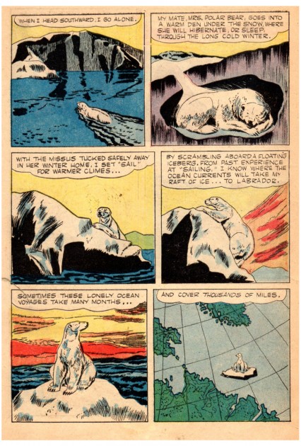
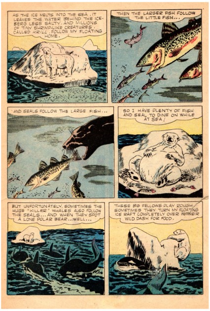
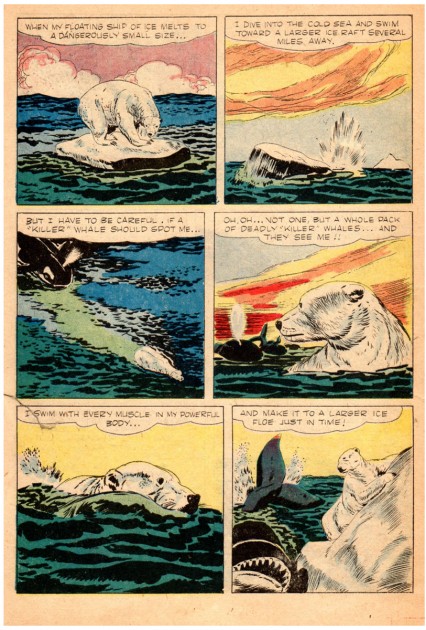
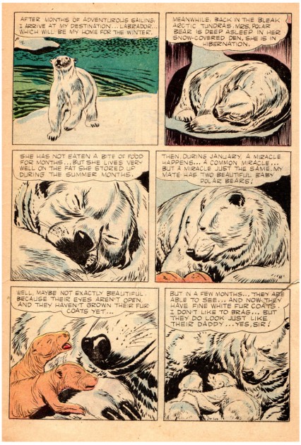
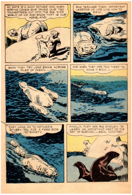
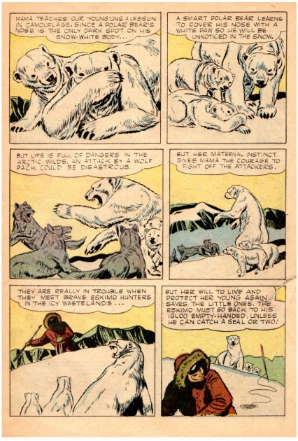
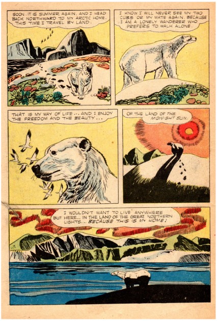
The following is from the Disney True-Life Adventure comic book, 1957.
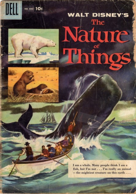
Jesse did not do the cover of this 1957 comic,
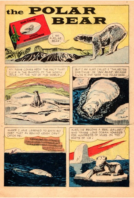
but he did do all of the 3 inside stories.
 10
10
This is the first of the three stories in this book.
 11
11
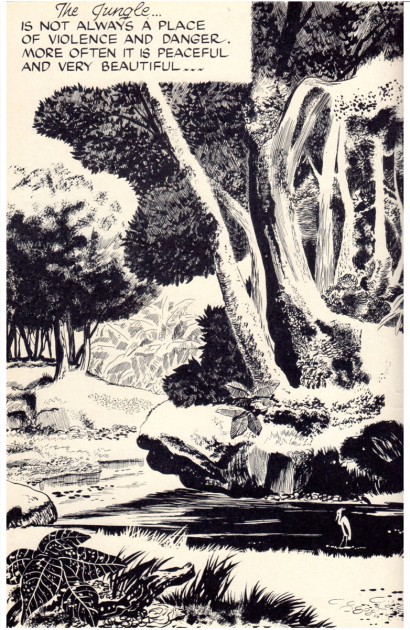
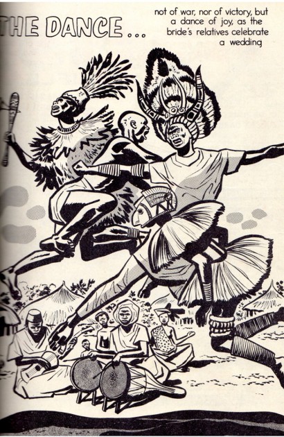
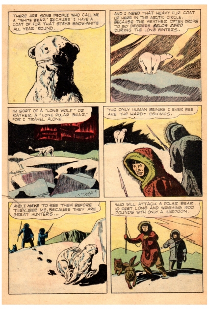
Combine Marsh’s “non slick” style with his beautiful panel and
page layout designs, and you got some impressive results.
A site called The Jesse Marsh Site offers the complete Dell TARZAN no. 1, from January 1948. This was actually the third TARZAN that Dell published.
Bill Peckmann &Comic Art &Illustration 29 Sep 2011 07:24 am
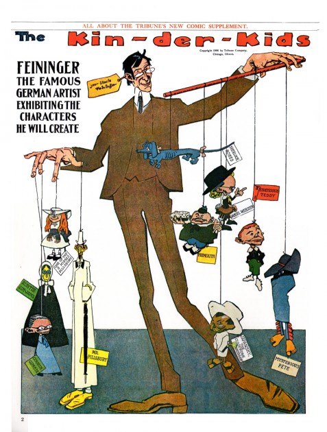
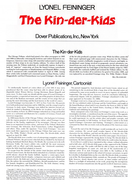
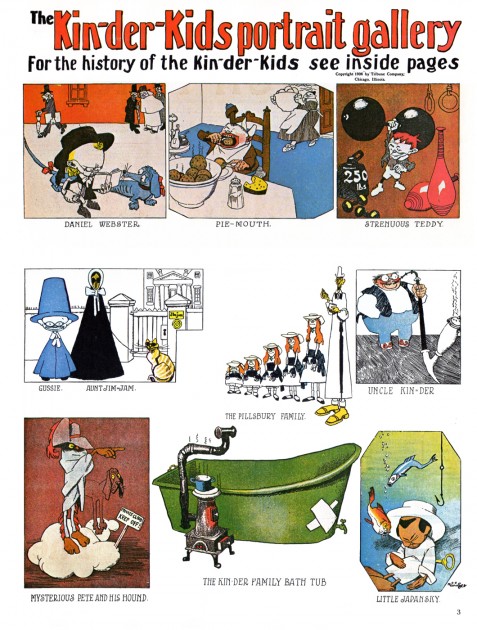
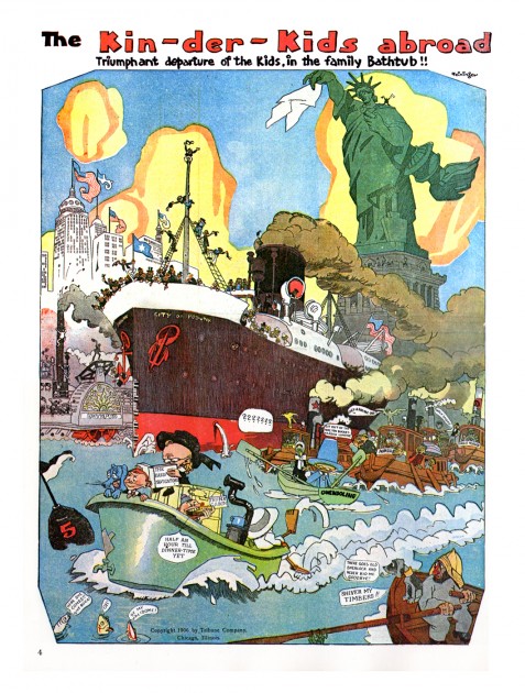
Kin-Der-Kids 2
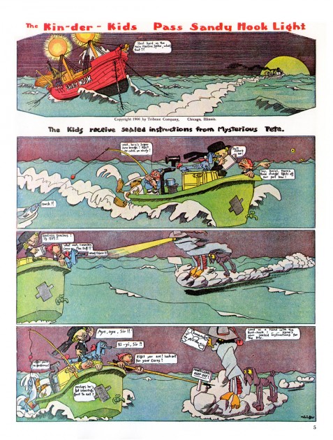
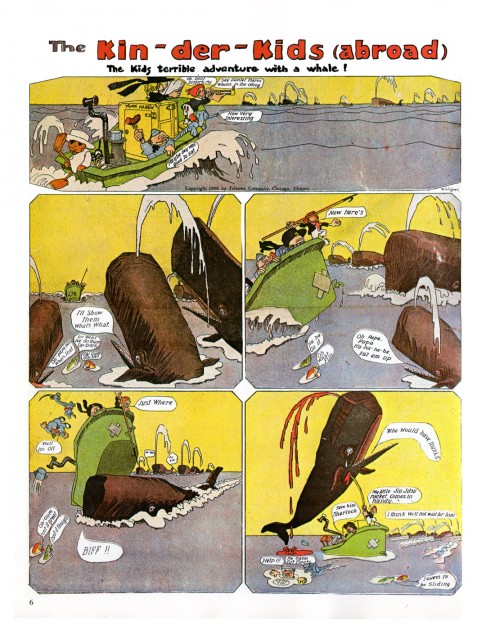
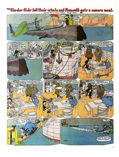
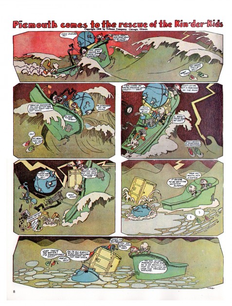
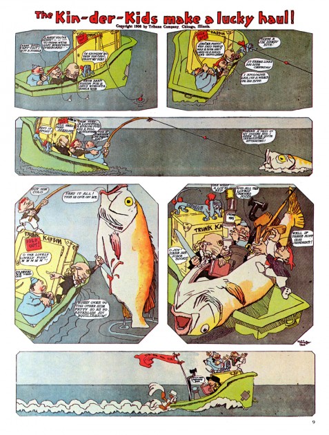
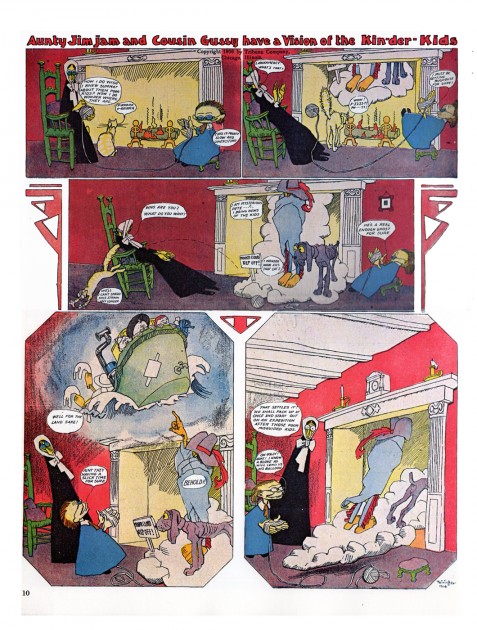
- The Whitney Museum is currently hosting a show of artwork by Lionel Feininger. To have some connection with the show, I thought it’d be a good time to post some more of the Kin-Der-Kids comic strip that he’d done in 1906. Bill Peckmann had sent more pages. I hope you enjoy this artist’s work; it was a daring comic strip for the time.
You can see my past posts on Feininger’s comic strip work at: Kin-Der-Kids, Wee Willie Winkie
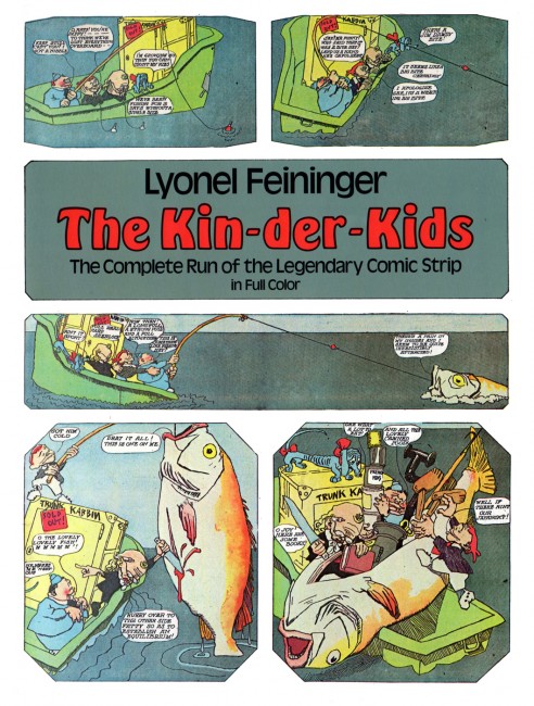
The Dover book cover
Books &Daily post &Hubley 28 Sep 2011 07:33 am
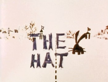
The Hat – even Bigger
As I wrote on Monday, with the AMPAS show about Hubley animation coming this Oct 10th, I intend to put a lot of focus on the work of John & Faith. This piece about THE HAT was originally posted in March, 2011. I’ve added to it.
- The interview Mike Barrier conducted with John Hubley has me thinking about Hubley and my years back there and then. You might say, I’m in a Hubley frame of mind these past few days, so I’m into reminiscing. I posted part of this back in March, 2008; here, I’ve extended the article a bit.
 New York’s local PBS station, WNDT – that’s what it was called in the old days – used to have a talk show hosted by film critic, Stanley Kaufman.
(It turns out that this show was produced by the late Edith Zornow, who I once considered my guardian angel at CTW.)
This talk show was quite interesting to me, a young art student. I remember one show featured Elmer Bernstein talking about music for film. He gave as his example the score for The Magnificent Seven. He demonstrated that the primary purpose of the score, he felt, was to keep the action moving, make the audience feel that things were driving forward relentlessly. I still think of that show whenver I see a rerun of the film on tv.
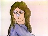
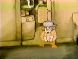
The surprise and exciting program for me came when John and Faith Hubley turned up on the show to demonstrate how animation was done. They were using as an example a film they had currently in production, The Hat. This film was about the silliness of border lines. One of two guards, protecting their individual borders, loses his hat on the other side of the line. Of course, all he needs do is to step over and pick up the hat, but he can’t. The other guard won’t allow him to cross the border illegally – even to pick up his hat.
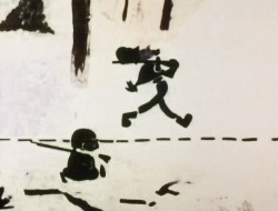
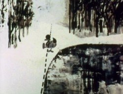
The voices were improvised by Dudley Moore and Dizzy Gillespie (much as the earlier Hubley film, The Hole, had been done.) The two actor/musicians also improvised a brilliant jazz score.
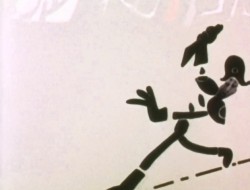
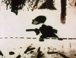
John’s design was quite original. The characters were a mass of shapes that were held to-gether by negative space on the white on white backgrounds.
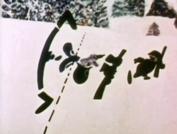 The animation of the two soldiers was beautifully done by Shamus Culhane, Bill Littlejohn, Gary Mooney and “the Tower 12 Group“.
Culhane animated on a number of Hubley films during this period, most notably Eggs and a couple of commercials.
Bill Littlejohn animated on many of the Hubley films from Of Stars and Men up to Faith’s last film.
Gary Mooney animated on The Hole and Of Stars and Men. He was an Asst. Animator at Disney, animated for Hubley then moved on to some of the Jay Ward shows before moving to Canada where he continues to animate.
Tower 12 was the company formed by Les Goldman and Chuck Jones at MGM. Apparently they were between jobs when Hubley was finishing this film, and Chuck offered help.
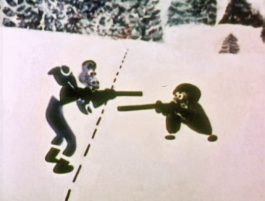
Of course, the colors of the film as represented by the dvd are pathetically poor.
It’s hard to even imagine what the actual film looks like, and it’d be great to see
a new transfer of all the Hubley films.
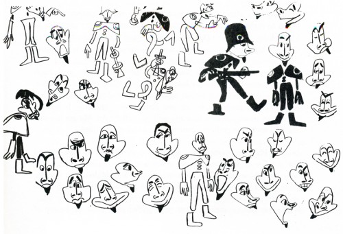
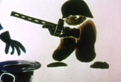 The design style of the film was an original one for 1963. It’s one that would often be copied by other animators afterwards. The characters were searated at their joints. No reel ankles, just open space. They were also broken at the wrists and belts. The taller man seems to have a collection of ribs and shoulders for his torso. Like the dotted line they walked but could not cross, these people were also a gathering of parts.
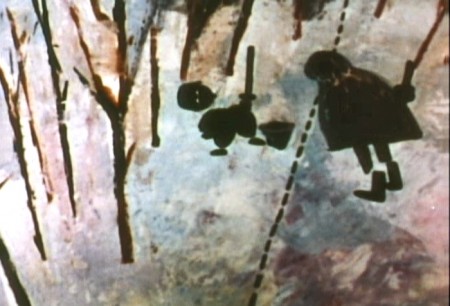
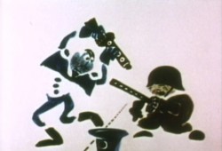 This was one step removed from the earlier film, The Hole, which had just won the Oscar and went on to enormous success for the Hubleys. That film used what they called the “resistance” technique. They first colored the characters with a clear crayon. Ten painted watercolors on top of that. The crayon would resist the watercolor and a splotchy painterly style developed. The Hat literally broke those splotches into parts of the characters and put some of the control in the animators’ hands.
.
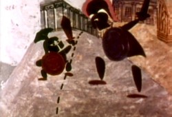 The film was obviously political. Anti-nuclear politics played strongly in the story. This was a step just beyond The Hole. In that film, two sewer workers converse on what violent things might be happening above ground. The film ends with an accident, or possibly a nuclear crash.
In The Hat, the two partisan soldiers discuss a history of man’s aggression all within their reach. At one point, it would seem, each of
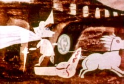 them is ready to press the red button calling for nuclear assistance – or, at the very least, a buildup of military force.
While walking up and down that line, they comment on how we reached the point of no return. All the while, bugs and small animals cross the line, indeed, walk on or over the “hat” lying on the ground.
The backgrounds for this history of War grow more violent, more expressionist. John’s painterly style comes to the fore, and the brush strokes take on a force we haven’t seen to this point.
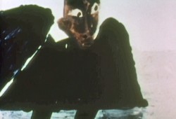
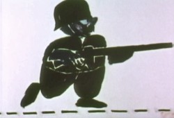
When we return to the two leads, we find that they’ve changed. They’re darker, and they both have lines scratched into the paint of their bodies. Not as much emphasis is placed on their disjointed body parts.
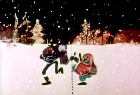
We leave them as we found them, walking that line. At this point, both of their hats lay on the ground and they’re deep into conversation. They don’t seem to notice anymore.
It has started to snow.
.
.
Shamus Culhane wrote about The Hat in his autobiography, Talking Animals and Other People. Here’s some of what he wrote:
- In 1964 the Hubleys wrote a short subject called The Hat. It was subsidized by an international peace organization. The picture featured two sentries marching on opposite sides of a boundary line. A clash occurs when one soldier’s hat accidentally rolls into enemy territory, and the other soldier refuses to return it until he has checked on the necessary protocol. During the ensuing discussion the two men become friendly, and the film ends on an optimistic note.
Although there were other characters and animals in the picture, the two soldiers accounted for about 80 percent of the footage. When Hubley asked me if I could do all of the animation of the sentries myself, I jumped at the chance. The last time I had drawn full animation, other than one-minute spots, was about twenty years before, when I worked with Chuck Jones at Warners.
The Hubleys were exciting to work with because they had a strong sense of adventure in their filmmaking. John was never tied down to techniques that he was already familiar with. Each picture was a new experience, because the appearance of the film was always dictated by the content. The Hat was no exception.
The design of the two sentries presented some odd problems in animation, in that the action was going to be normal, but the arms and legs were not attached to the bodies. Although we had detailed model sheets of each soldier, Hub’s layouts paid scant heed to his original designs. As the picture progressed his drawings of one of the soldiers became more and more Christ-like.
While I animated the picture at home, Hubley and I worked very closely together. Whenever I had a few scenes finished, we would have a conference on this work and the following scenes. Hubley was a very enthusiastic director. He would pick up the newly animated shots with obvious excitement, flip the drawings, and burst out laughing. His pleasure was so infectious that I would laugh, too. We shared a feeling of joy in the whole process or filmmaking.
The animation of The Hat took many months. During that time, with my usual curiosity about the working methods of great artists I have worked with, I studied Hubley’s approach whenever I could. In the first place he worked in a room that was crammed with the largest collection of art books I have ever seen in private hands. The subjects ranged from prehistoric cave paintings to Picasso, Klee, Chagall, and other modern artists. There were books on the art of every culture imaginable, Aztec, Mayan, Chinese, Persian, Greek, etcetera.
At the beginning of a picture Hubley would pore over a random selection of art books. Seemingly they had no relationship to each other, but he was using them to inspire his own sense of design. However, the final appearance of a Hubley film was never blatantly derivative. In The Hat, for example, I have the feeling that he was influenced (if that is the right term) by Chinese scroll painting, but that is just my own intuition.
Since Hubley was going to paint his own backgrounds, the layouts were usually little more than a vague series of scrawls with little or no detail, unless the background and the animation were going to be closely related.
Unlike Disney Studio, where the dialogue is broken down for the animator in meticulous detail, Faith gave me a very loose track analysis. Neither Faith nor John seemed to be concerned with precise synchronization of the mouth action and the dialogue track.
John’s instructions for the movement of the characters were also very loosely indicated on the exposure sheets. It seemed to be his feeling that the pace of the animation should be the shared responsibility of both the director and the animator.
The Hubley children had to be the luckiest kids in New York City. Not only were they encouraged to draw, write, and paint, but in their Riverside Drive apartment the Hubleys had built a small stage, so it must have been easy for the family to create the sound tracks for such imaginative films as Moonbird, Windy Day, and Cockaboody.
Like John Cassavetes, the Hubleys believed in the value of ad-libbing sound tracks, so a good deal of the children’s dialogue in these pictures was completely spontaneous material.
Whatever his formal education had been, Hubley was a very well-informed person, with a sophisticated view of life. One Saturday morning I dropped in to find John working alone, and in a very depressed mood. It happened that I was on the down side myself that morning. After we had talked over the work in the new scenes, our conversation drifted off into a very open discussion about the problem of being an alienated personality. We exchanged anecdotes about incidents that had happened to us because of alienation.
Somehow our talking acted as a catharsis, and we both found our moods lightened. We ended up laughing, and agreed that being alienated in our kind of society had more merit than most people realized. It was a very stimulating discussion.
Comic Art &Illustration 27 Sep 2011 07:09 am
The Gumps – recap
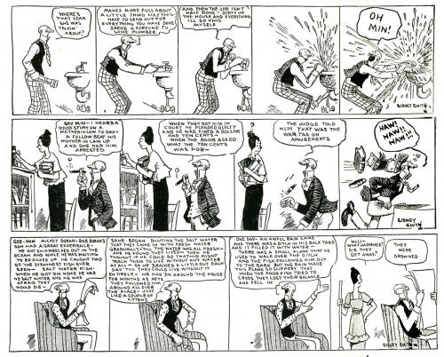
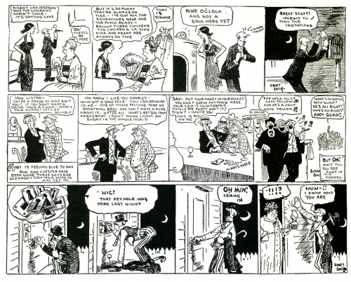
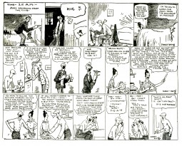
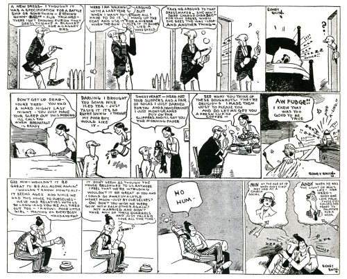
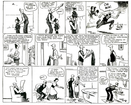
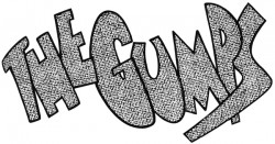 - The Gumps was the first comic strip to tell a running story. Like a serial the strip continued on a daily basis from 1917 through 1957. The story was particularly compelling; readers grew addicted to it, like a soap opera. In 1923, the Board of Trade in Minneapolis suspended operations so that the brokers could get the afternoon paper to find out whether the Gumps’ billionaire Uncle Bim had been trapped in marriage. When Mary Gold died in 1929, it was the first time a cartoon character died in a strip, and the Chicago Tribune was swamped with mail and phone calls with people threatening to cancel their subscriptions to the paper if she wasn’t brought back.
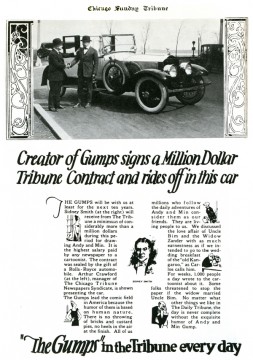 An Editor of the Chicago Tribune, Joseph Patterson, came up with the idea of having a strip that reflected the stories of “real” people. He didn’t want a daily gag with this strip and hired Sidney Smith to develop such a strip. Patterson came up with the title, “The Gumps” and brought some story ideas to Smith to develop.
It was the first strip to make its creator, Sidney Smith, a millionaire. It was that popular, and they promoted the contract. He drew the strip until his death in 1935. Smith had just signed a new three year contract and went out to celebrate. He died in a car crash.
The strip went on to a couple of assistants who worked with Smith, Stanley Link and Blair Walliser. However, for reasons hard to understand now, it was Gus Edson, a staff artist for the New York News, who continued the strip into the 50′s. (Edson was later one of the creators of the strip, Dondi, also created with an appealing, continuous story.)
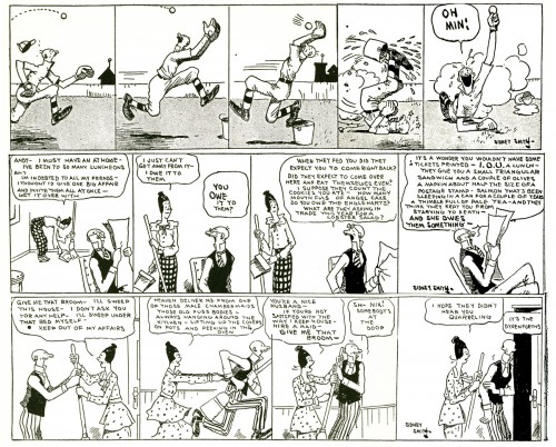
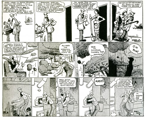
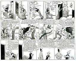
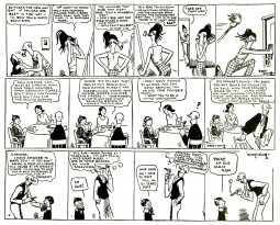
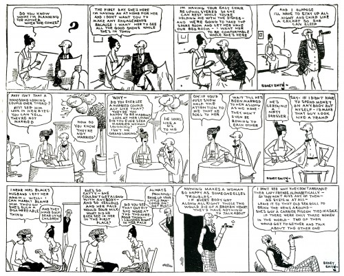
The story being everything, I thought I’d introduce the strip here with a number of panels to give you a taste, and then I’ll follow with more chunks of the story. Believe me it’s a compelling story, well told, and even the drawing style becomes pleasant as you get into it. So here are the first strips.
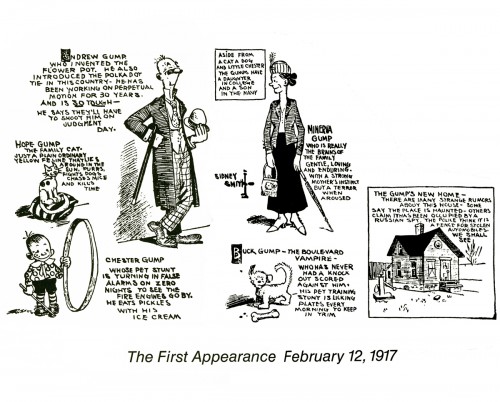
{Click any image to enlarge to be able to read it.)
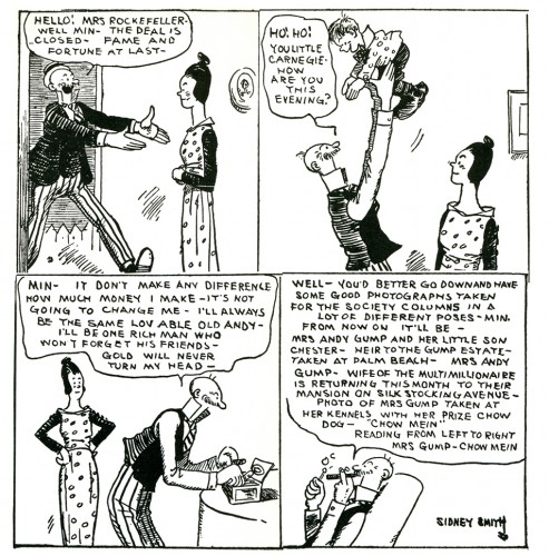
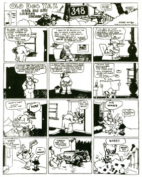 Comic strips were more of an art form back then, when The Gumps was enormously popular. First off, they were large enough to be able to read them. Because there was no television and newspapers were vitally important to people’s lives, comic strips took on another role that has been eliminated today.
Comics had a large enough popularity that they were able to grab a regular and large readership. This allowed them to be daring enough to try to grab a larger audience through whatever means necessary.
The Gumps was clever in many ways and provided the goods with an exceptional story line that had a very large audience.
Animation Artifacts &Disney &Story & Storyboards 26 Sep 2011 06:47 am
Cockaboody Board – recap
- On October 10th the Motion Picture Academy will present a program of films by John & Faith Hubley. John Canemaker and Emily Hubley have assembled the program and although it is composed mostly of films by John (I’m not sure he would have been happy about that), there will be a lot of his early films like Flathatting (for the Navy) and The Magic Fluke and Rooty Toot Toot (for UPA.) There will also be recently restored prints of Adventures of an * and Tender Game as well as the late film, Voyage To Next. The show will have plenty of surprises of very rarely seen and hard-to-find material.
To reserve a seat go to Oscars.org. Academy members – $3.00. General Public – $5.00. or you can pay by mail with a form you’d get on line. Don’t wait; it’s probably sold out by now.
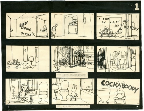
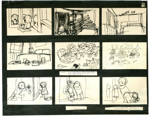
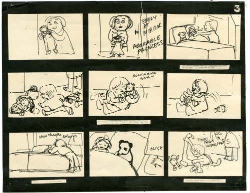
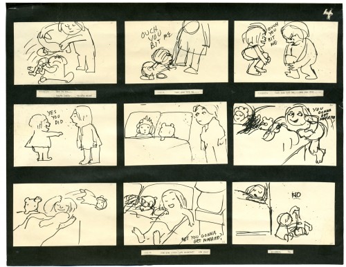
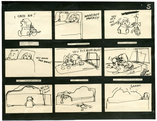
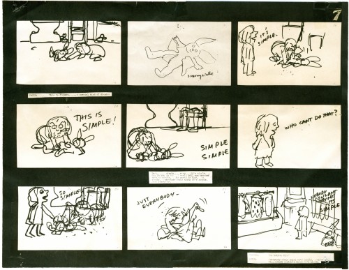
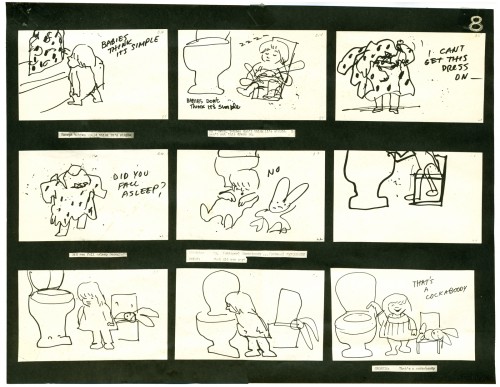
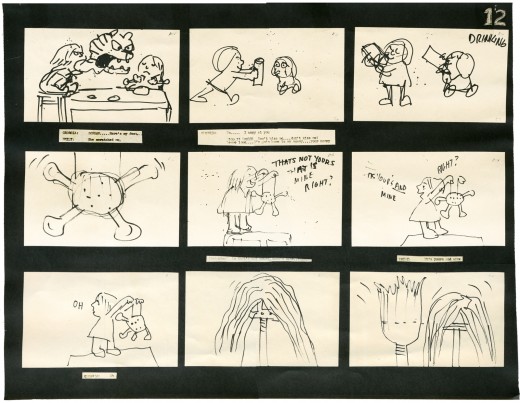
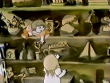
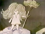
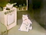
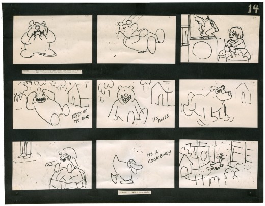
I will be posting as much of the Hubley art as I can in celebration of this show. To start with here’s the storyboard for Cockaboody.
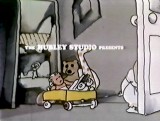
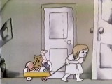
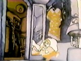
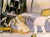
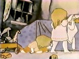
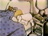
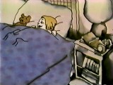
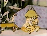
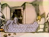
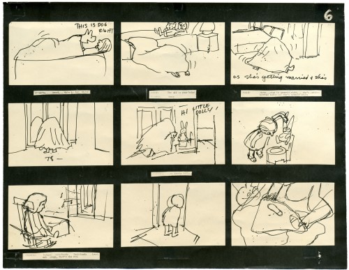
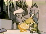
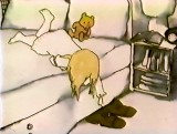
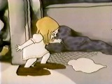
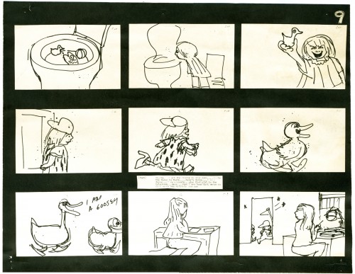
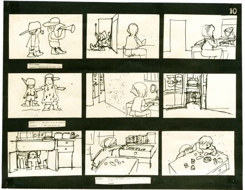
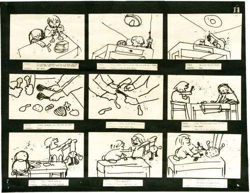
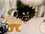
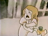
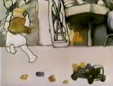
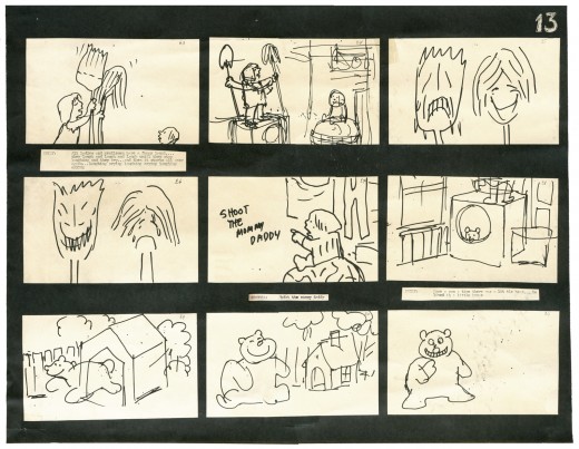
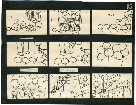
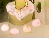
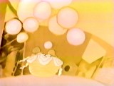
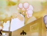
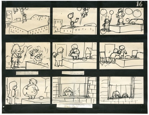
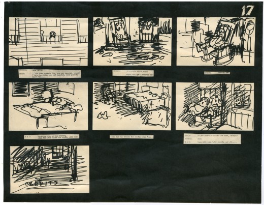
 – I have a photostat copy of the storyboard to John and Faith Hubley‘s short film, Cockaboody. So I thought I’d post it to give a good demo of a storyboard from a master. The board was done in 1973.
I had worked at Hubley’s for four months on Letterman and was layed off when that work ran out. They started preliminary work on Cockaboody while I was working on the feature Tubby The Tuba.
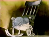
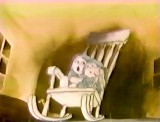
I left that project in time to get back to see the final scenes of Cockaboody colored, and I did a little animation of a rocking chair, with the two girls cradling it, at the film’s end. I didn’t do enough work on the film to receive credit, but I can still see my pencil lines on those two girls at the end of the film.
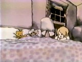
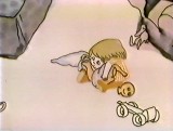
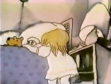
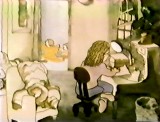
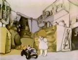
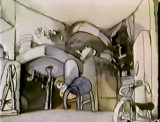
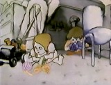
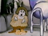
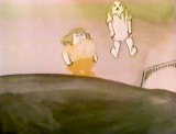
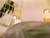
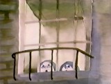
The film tells the story of two girls playing in a room next door to their babysitter. They laugh they cry they laugh they cry.
The audio track was improvised by Emily and Georgia Hubley in a recording studio years before they started the film. From the edited tracks a story was culled, and a storyboard formed. John did all of the drawings in storyboarding it.
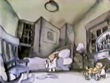
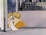
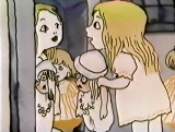
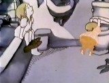
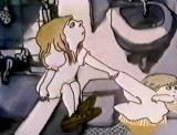
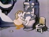
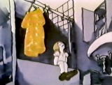
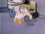
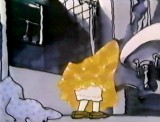
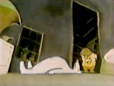
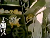
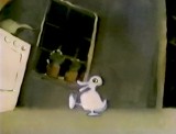
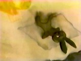
There are 17 pages of board in all. I’ve inserted frame grabs so you can see how the final turned out. Tissa David animated the entire film.
The storyboard, with all of the drawings done by John, was developed in conjunction with the Hubley’s class at Yale. The students actively discussed the board and offered their participation in the growth of the film’s origin. A documentary was also produced showing the production of the animated short.
You’ll notice that the action in the film varies from the setups in the storyboard. This undoubted had to do with Tissa’s involvement. She would often rework things with John and alter the filmmaking. John, and most of the directors Tissa works with, was open to this. She has a masterful sense of camera placement and uses it throughout this film.
The film was an outgrowth of an early recording John and Faith made of their two daughters, Emily and Georgia. While teaching at Yale the Hubleys worked with the students in their class to help develop this storyboard. One of the students, Kate Wodell, came to work in the studio and was a mainstay there for many years and continued for a while helping Faith on many of her shorts after John died.
__
__
 _
_ _
_
__
__
__
 _
_ _
_
_
__
__
 _
_ _
_
__
__
__
 _
_ _
_
__
__
__
 _
_ _
_
__
__
__
 _
_ _
_
Photos 25 Sep 2011 07:30 am
Signage Sunday Photo – recap
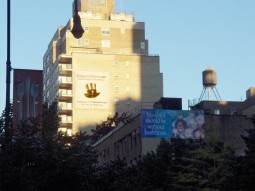
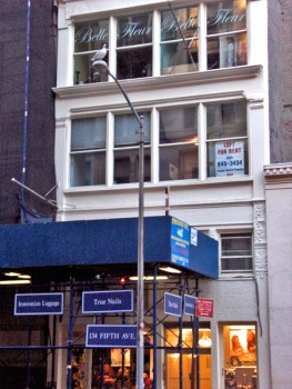 – Naturally, in a place like NY there’s an awful lot of signage about. The image to the left gives a good idea of the typical everywhere in this city. There are signs on the temporary construction, signs on the building, signs on the windows. Signs are everywhere and have become the ordinary part of the landscape. In fact, they’ve become part of the building, itself.
The signs that interest me usually are the ones that are actually painted on the buildings, themselves. I have to admit I’ve always been curious about these, and I’ve wondered how they actually do them.
Unlike the usual poster that’s printed onto strips that are pasted together on the billboard, these posters are actually painted in place on the brick walls. How, exactly, are these done? Realistic looking images are painted there. Paint by numbers? Perhaps I’ll do a little research and try to find out.
 __
__
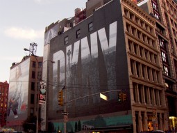
Of course, the City provides many blank canvases (open building walls) where ads can be placed. Several can be seen looking down any street. It’s actually not much different from the construction site image at the top of this post. A space is a space, and that space can be rented out. (The image on the right is a closeup of the one of the several signs on the left.)
 __
__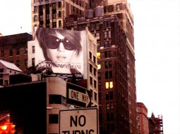
The fashion industry seems to have their own wealth of ads on buildings. These are photographically realistic, yet they’ve obviously been painted there somehow.
You can see the bricks under the coating of paint.
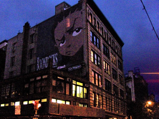
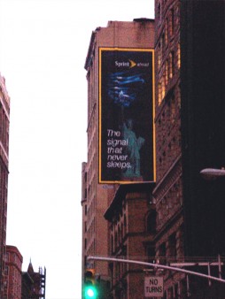
This Cartoon Network ad for “Boondocks” is painted right over a number of windows.
(You can see the lit window shining through it.) How do these folk see out? I assume
it must be some kind of special paint.
 __
__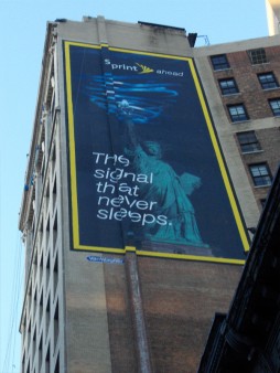
This ad for Sprint presents a new problem. When you look at the sign straight on, it looks fine. However, if you move a bit, you’ll see that the building/wall on which it’s painted has a shift in it. The sign had to have been designed to take in this change in level of the canvas. An interesting problem. (If you look closely at the Boondocks sign, you can see the same problem existed there.)

Here we have a melange of signage, not all of which are painted on walls. Does the skull represent a building under reconstruction?
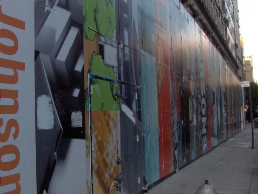
Of course, any construction site offers plenty of blank canvas.

Naturally, I couldn’t pass up this image. The tiny Commerce Bank on the corner is overwhelmed by the Chase Bank next door and on the second floor. However Commerce seems to have painted its own add on the Chase construction-site doorway.

Finally, an image sent me by Steve Fisher, shows an odd and
funny juxtaposition of signs. It would make me a bit
nervous to have my pet cared for by this veterinarian.
Commentary 24 Sep 2011 07:45 am
ChatAbout Bits
- The Ottawa Animation Festival has been ongoing for the past couple of days. We have a film in the program and would have really enjoyed being part of it. However, funds are tight, and I had to pass on it this year. It’s something I’m a bit sad about, but whatcha gonna do!
Richard O’Connor at his studio blog Ace and Son, is giving a daily diary of the Festival.
Here’s day 1, day 2, you can scroll up from there for the rest.
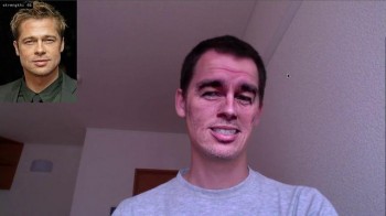 - Cartoon Brew featured a couple of videos this week that really had me thinking. Using some kind of computer animation, a couple of people replaced their faces (partially) with some celebrity parts. It was especially freaky to see some of the results. Surprisingly two of them went for a couple of the same celebrated faces: Castro, Paris Hilton, Mao, Brad Pitt et. al. The first video is more interesting than the second. The third vid shows moving facial expressions on various cartoon masks.
.
This all makes me glad that I’m in the twilight of my career. I think animation will incorporate all this motion capture stuff and will mutate into some kind of sad computation. I don’t see this stuff as animation but as Effx, and I think the industry has just gone off the tracks and walked away from any kind of real animation.
.
One commenter suggested that the early Disney stuff will someday look like garbage in comparison to what’s being done. Considering how many young people attack Snow White today, I’d have to say I agree with whoever wrote that. It’s inevitable that the people growing up with this computer nonsense will want more of that. No one will have to draw Daffy Duck in the future; just get some second rate actor to rant and put it into Daffy’s 0101010101 algorithm, and no one will ever have to draw animation again.
.
Given all the recent reading I’ve been doing about the silent Disney films, or Shamus Culhane’s bio or early Russian animation, I’ve been even more inspired to draw these days. I can imagine how frustrated I’d be with cgi if that’s what I did for a living. Given what I do work on it takes even more imagination to say I’m doing it for a living.
.
.
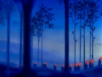
- Bill Benzon is back to his analyzation of Disney’s Fantasia as he comments in depth on the Ave Maria segment of the film. This is on his blog, The New Savannah. If you haven’t read his other pieces on Fantasia, you should check out the past posts.
.
.
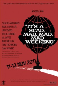
- Sergio Aragones, Jack Davis, Paul Coker Jr., Al Jaffee and other MAD Magazine artists will gather in a weekend long celebraion of their work at MAD. The upcoming event of the National Cartoonist’s Society event in Savannah Georgia will have special rates for members at the Courtyard Savannah Marriott Hotel.
Rooms start at $119 and are available from 11-10-2011 through 11-14-2011.
You must reserve by 10-27-2011 to take advantage of this special rate.
.
Bill Peckmann &Comic Art &Illustration 23 Sep 2011 07:09 am
Kurtzman Covers
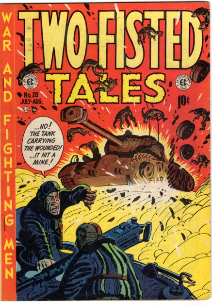
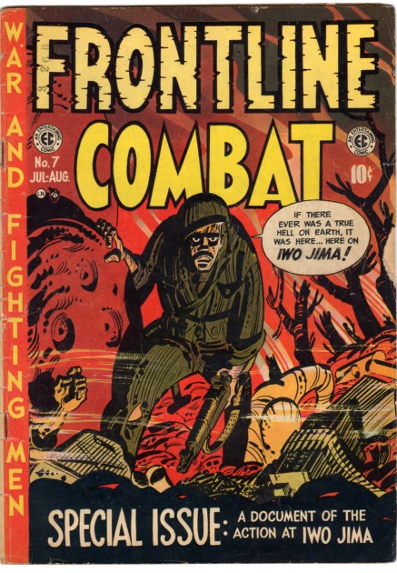
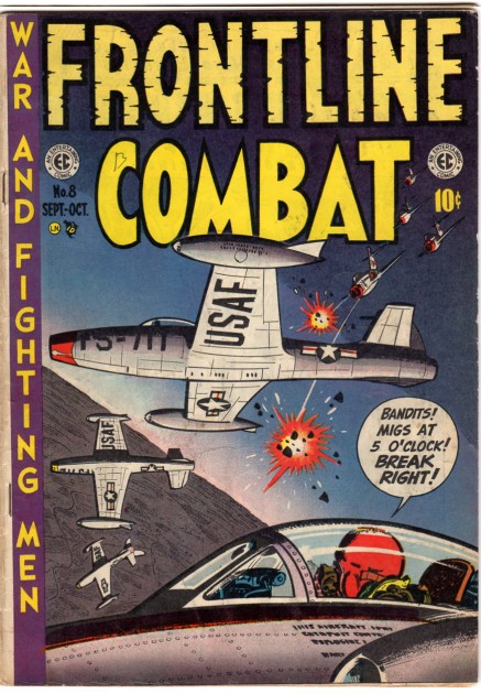
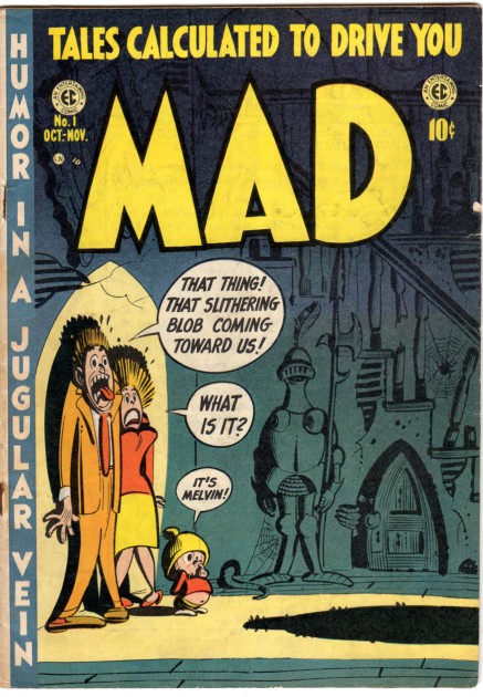
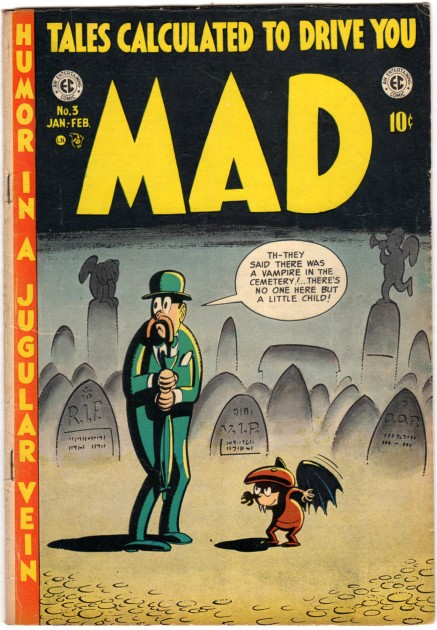
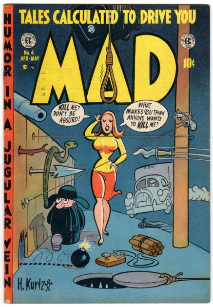
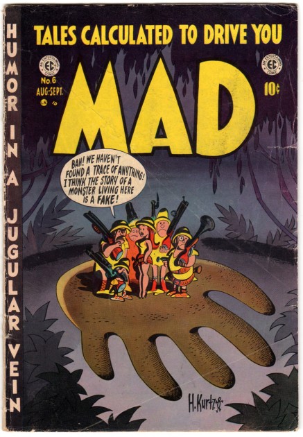
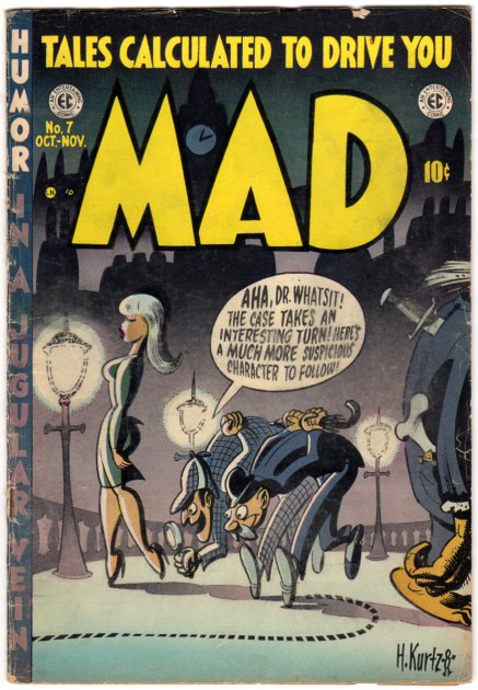
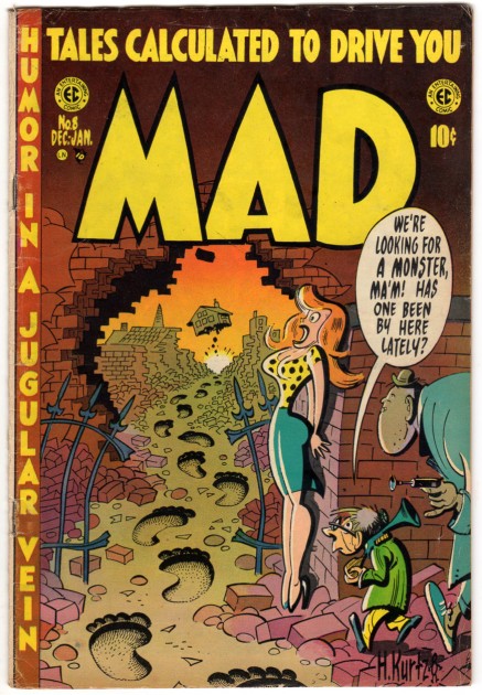
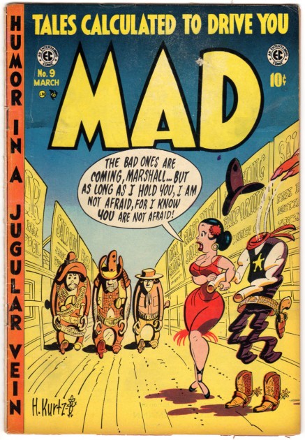
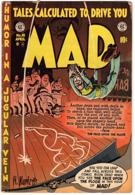
- Another coup sent my way by Bill Peckmann. Here we have a stash of early comic covers from the brilliant artist, Harvey Kurtzman. So sit back and enjoy the trip as you scroll down. Many thanks to Bill for sharing his never-ending archives. Here’s what Mr. Peckmann has to say about the covers (all comments beneath the Covers are also his):
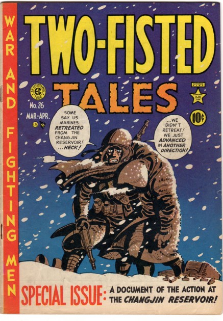
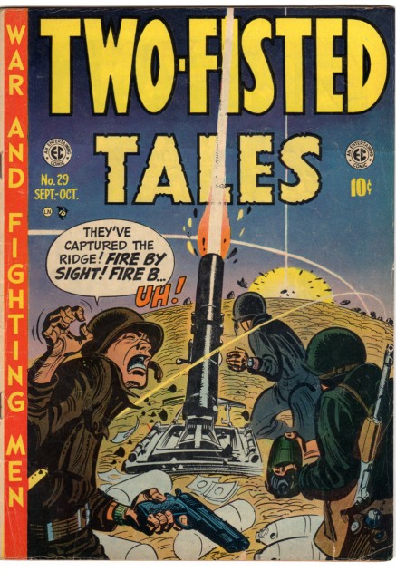
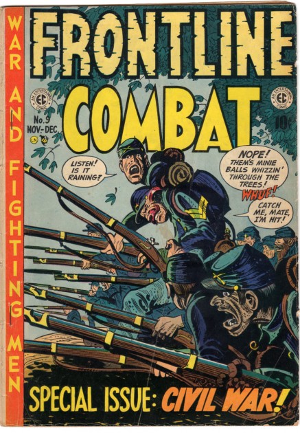
- Forward Harch! With the last half of Harvey Kurtzman’s covers. Again they are in the order they were published. There willll be a segue between the war titles and MAD to give your readers a sense of where Harvey was coming from when he started MAD comics. It’s amazing how the wonderful coloring of the covers just holds up so well after all these years! The first TWO-FISTED TALES cover is so visceral in a non action way, you can just feel the bone numbing cold of those minus degrees in North Korea.
 1
1
 5
5
Harvey’s last TWO-FISTED cover.
 8
8
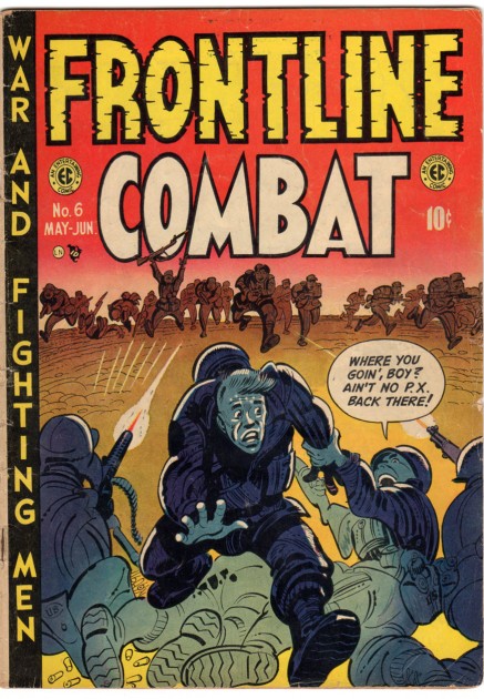
His last FRONTLINE cover. After this, his crew of Jack Davis,
Severin & Elder and Wally Wood took over cover duties.
 16
16
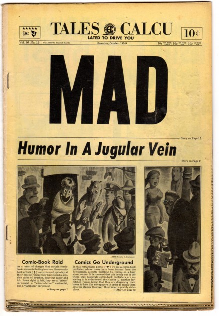
You had to live in NYC to really appreciate this cover,
it’s a perfect spoof of the then NEW YORK DAILY NEWS,
lay out, right down to the type faces, everything!
 17
17
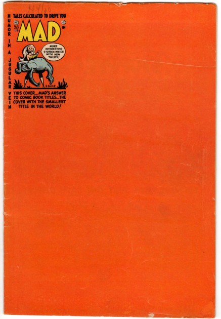
A cute, clever idea, but as a kid, I felt we were being ripped off,
we wanted a full blown HK cover!
 18
18
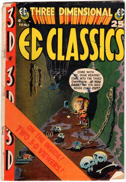
Even EC Comics got swept up in the 3-D fad,
they did 2 books, how they got Harvey to this cover
I’ll never know, maybe because there’s one MAD story in it.
Bill Peckmann &Illustration 22 Sep 2011 07:01 am
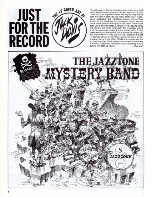
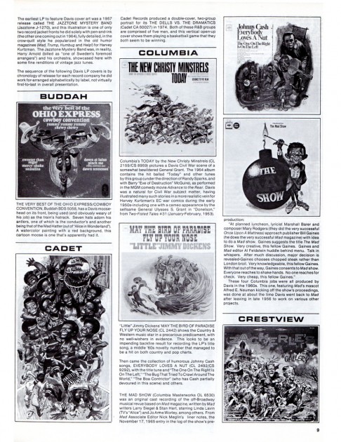
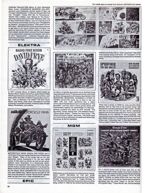
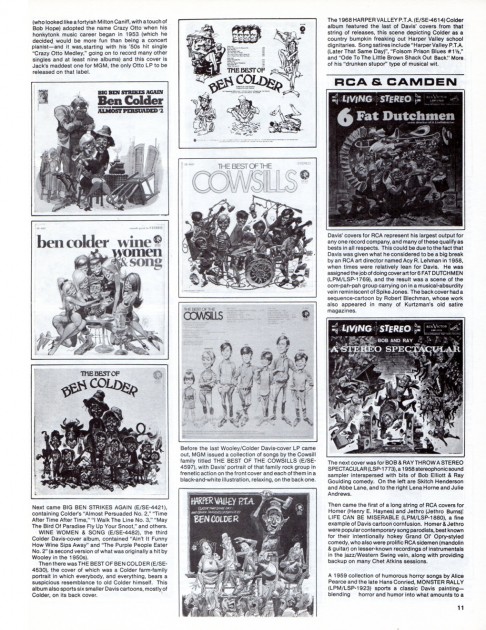
Jack Davis’ Fanfare Magazine
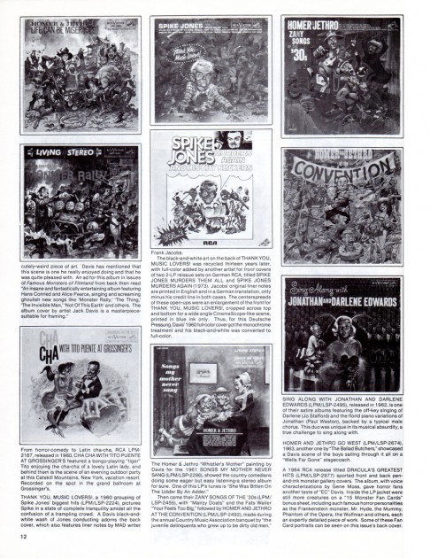
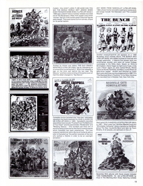
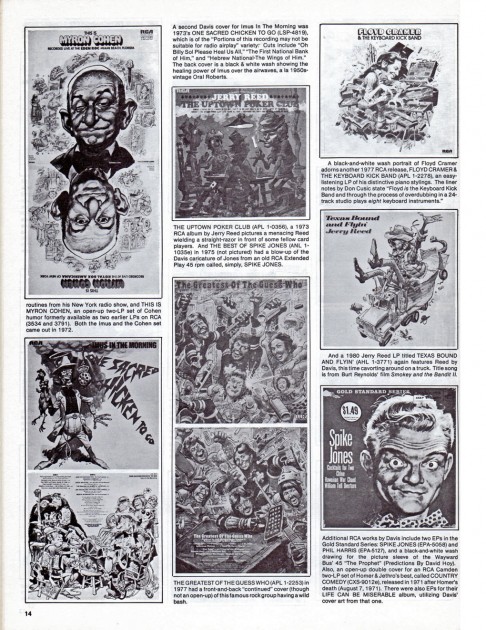
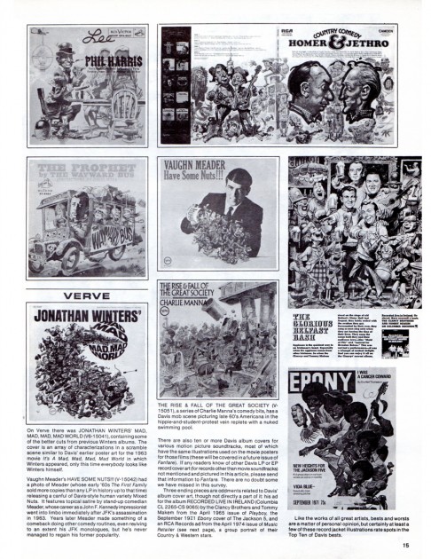
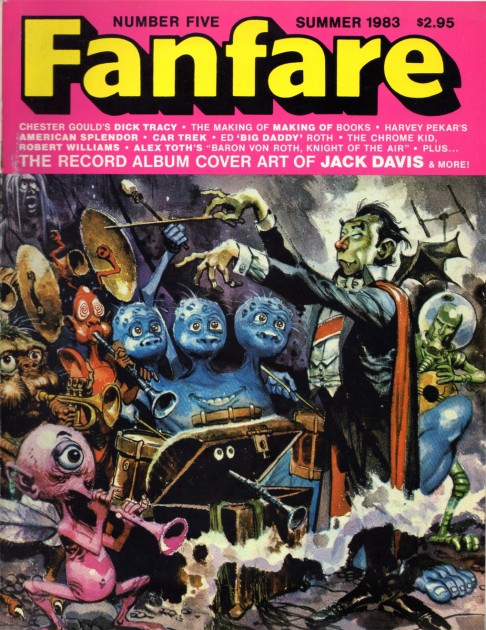
- Bill Peckmann sent me the following article about Jack Davis from Fanfare Magazine of Summer 1983. The article chronicles the record cover art of Jack Davis up to that year. As Bill wrote me, the B&W illustrations have a lot to be desired, however the material is so valuable that I’ve chosen to post it just the same. We have what we can get. There’s a lot of information in the writing, and the images are not ideal but certainly liveable; after all, it is Jack Davis. I hope you agree.
 1
1Front cover
Many thanks to Bill Peckmann for scanning and sending and sharing.
Animation &Animation Artifacts &Hubley &Independent Animation 21 Sep 2011 06:48 am
Marky’s walk – recap
After posting a large piece about Moonbird last Monday, I felt inclined to recap this Bobe Cannon walk from the film. I love it. Originally posted March, 2009
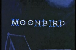 - If I had to choose who was my favorite animator, I’d have a tough time. Equal credit would probably have to go to three different people: Bobe Cannon, Tissa David and Bill Tytla. Ed Smith and Jim Tyer would fall just a smidgen below these three, for me. But there are none like them all, as far as I’m concerned.
I’ve posted a lot of drawings from Tissa and Bill Tytla, but have very few drawings by Bobe Cannon (nor have I seen many published anywhere.)
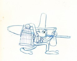
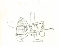
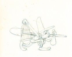
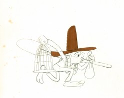
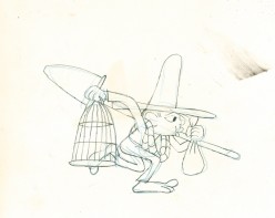
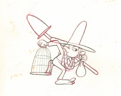
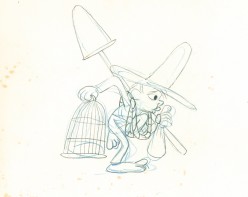
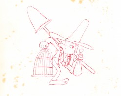
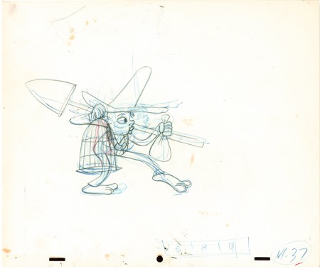
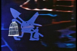 Here is a walk cycle from the beginning of Hubley’s monumental short, Moonbird. The odd numbers are extremes by Cannon, and the inbetweens (even numbers) were done by Ed Smith. Three different sized papers were used for this, and you can view them full sized if you click the thumbnails.
You’ll notice there’s paint all over the drawings. The ink & paint involved tracing the drawing, then using oil paints to cover all of the clear area in black. Some of that paint seeped onto the originals. In one drawing even to coloring the hat accidentally.
 37
37(Click any image to enlarge.) “Marky” walk cycle from Moonbird
On twos at 24FPS
Click left side of the black bar to play.
Right side to watch single frame.
There’s a lot more to this scene including several variants on the walk.
At some future time, I’ll add the other drawings to show off the entire scene.
