Monthly ArchiveAugust 2011
Photos 21 Aug 2011 07:11 am
Noah
- The past week has brought torrential rains to New York. A week ago, last Saturday night, some 11 inches of rain fell on Manhattan within about 6 hours. At 3:30 am Sunday, I decided to go to my studio to see what the damage would be. I’d had major floods in the studio, and have sandbags permanently greeting guests at the front door. Usually, the sandbags work to keep the water out. However, the pounding rain let me know that things had gotten serious. I wasn’t as much concerned for the studio as I was for the cat within the studio, Robbie. He’d never seen floods within his home before.
Sure enough there were four inches of water troughout the space, when I got there. I propped open the door and went to work. There’s a subpump within the studio that never seems to kick in on its own. I jiggled it until it started, and it took up a lot of the water and spat it outside to the drain. Within two hours, the water was down to a mopping chore. I decided to lie down for an hour or so; the cat was hiding in a high space, and wouldn’t come out after initially greeting me with lots of purring. In two hours, I began the big mop and finished that another two hours later. Chore complete.
To get rid of the moldy smell within the studio, I mopped again two days later using bleach within the washing water. It did the trick. I’m sorry I didn’t take some pictures. Seeing the cat food floating would have made a good photo.
You can understand why Heidi continually calls me Noah. A drop of rain falls, and I worry about the possiblity of flooding within the studio. Fortunately, I think the space well worth the problems.
Here are some shots Steve Fisher took of a tennis court in Queens.
 1
1It looks pretty in the photograph.
 2
2
But it’d be annoying if you wanted to play tennis.
Aside from the flooding coming in the front door, we’ve also had some coming in the back door through the bathroom. It’s not as pervasive, but it’s been MUCH more frequent these days. However, some arduous work by a plumber found the pipe line with a lining of grease about two inches thick, not letting the water move through it. Someone in the building’s been dumping grease in their toilet, and it’s been building. They finally cleaned that out and everything seems to be fine now.
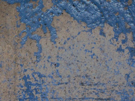
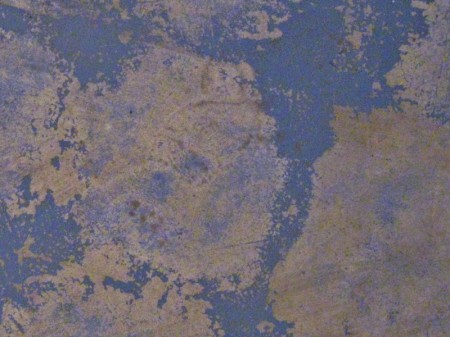
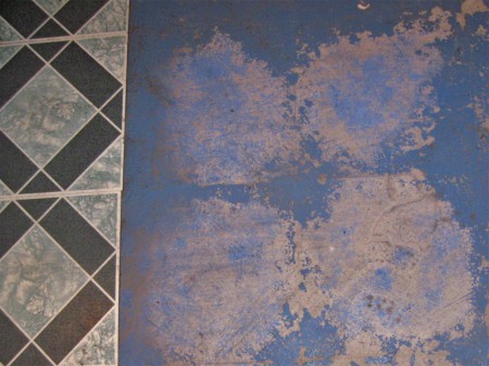
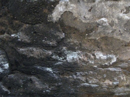
The tiling in the bathroom has plucked up from the floor, and the builiding management is going to lay some marble tiles for me. So it’s an upgrade. However, the uplifted tiles have left an interesting pattern on the floor in the bathroom. I did take some pictures of that.
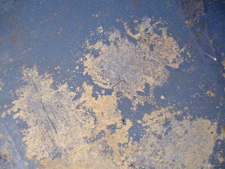 1
1
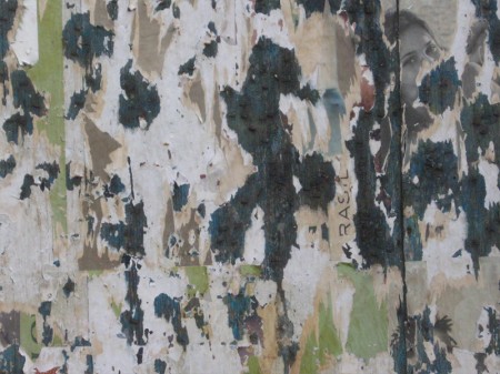
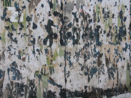
These abstractions led me to look outdoors, and voila I found a nearby billboard about to be replaced.
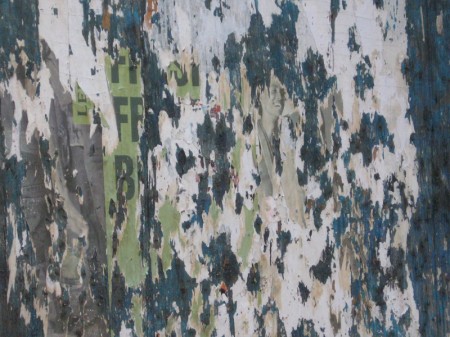 1
1
Meanwhile, just outside my front door, the sandbags remain and the bricks are ever deteriorating.
 5
5The sandbags, made to step over.
 6
6
The plaster fades away revealing the disintegrating brickwork.
Enough said. I just hope the rain coming tonight won’t compare to last weekend’s deluge. There seems to be proof positive of Global Warming everywhere we look, but the Republilcans and the Tea Party refute science. We’re in a sad state.
Commentary &repeated posts 20 Aug 2011 07:11 am
Iwerks Recap
This is a piece I originally wrote in October 2006 for this blog. I wanted to reprise it given the amount of attention I’d given Iwerks lately re Tim Susanin‘s book, Walt Before Mickey, and the Iwerks multiplane camera.
- From my earliest days, as soon as I’d learned who he was, I was a fan of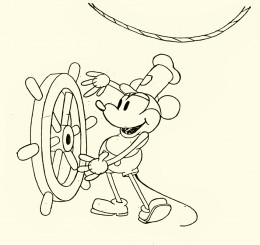 Ub Iwerks.
I began to wonder if it was just the publicity and myth of Iwerks which had followed with him all these years. We read about all those 1930′s East coast animators moving to the West, not to work for Disney but to seek out Iwerks – it was well known that he was the “true artist” behind those Disney shorts.
With Bob Thomas’ 1958 book, The Art of Animation, I read, for the first time, about Iwerks and his importance. Only recently did I begin to wonder how responsible Iwerks actually was to Disney’s success. Was this just that myth being carried over the years? Or was he brilliant?
 A quick look at the animation done at the time and we see some basics not yet developed.
There weren’t many stories written before Disney, so animators divided up their pictures. For example: They’d decide to do a film where Mutt & Jeff would go to Hawaii. One animator would start on the beach and end with them on surfboards. The animator would make it up as he went along until he turned out the required footage – maybe 2 minutes of work. The next animator would pick up Mutt & Jeff on surfboards and take them to being washed up on the beach, etc.
 Obviously, the lead animator doled out rudimentary plot points, but a lot was left to the individual animator. Look at the book, Walt In Wonderland by Russell Merritt & J.B. Kaufman to see how Disney started developing stories during this period.
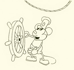
The same was true for animation techniques and methods. Animation burst out of its seams with the creation of Mickey Mouse. Disney had initiated a lot of ground work, but the medium really started growing with the enormous success of Steamboat Willie. Iwerks led the way, not only by the amount of work he did but the quality.
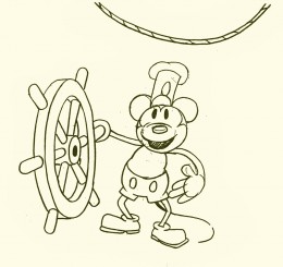
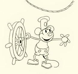 Take a look at these five Iwerks drawings from that short.
One of the first lessons an inbetweener learns is that a face turn shouldn’t have a direct middle in it. The middle drawing (#3 here) shouldn’t be straight on; it should favor, slightly, one side or the other.
Despite the simple drawings of Mickey, Ub Iwerks seemed to understand this instinctively. He didn’t really get lessons from anyone. As a matter of fact, he was creating the rules. This comes close to being straight on, but the mouth gives it away. The face is facing screen left.
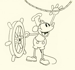 Another simple inbetween lesson is to offset the inbetween (usually an animator or good assistant will set this up for the inbetweener.)
Here Mickey is standing upright on #1 and he’s upright on #5. Drawing #3 has him with knees bent, beating in tempo to the sound. Even though this is from the first sound cartoon, done in 1928, the offset rule is in effect.
I think it’s pretty clear that some sophistication has entered the animation that Iwerks was drawing. This same sophistication isn’t in other animator’s work.
(Click any image to enlarge.)
Add to this the fact that Iwerks was probably the fastest producing animator, and you probably have good reason for knowing he was the genius behind Disney.
This, of course, didn’t remain that way. After Iwerks left, leaving behind enough animators trained by him, their work developed exponentially. Better artists were entering the studio and bringing their talents to the work, and they started making a serious attempt to improve the work.
Iwerks stopped animating and stopped trying to improve the character animation. Instead, he tried to improve the camera – actually developing the mulitplane camera in his own studio. Animation, under Iwerks, didn’t develop.
The book by Leslie Iwerks & John Kenworthy, The Hand Behind The Mouse, gives some solid information that wasn’t previously published and puts a lot of material into perspective.
Now we have Walt Before Mickey: Disney’s Early Years 1919-1928. by Tim Susanin. This is a thoroughly researched and reliably accurate book which gives a good account of Iwerks’ contribution up to and including Plane Crazy.
Bill Peckmann &Comic Art &Disney 19 Aug 2011 06:45 am
Walt Kelly’s Walt Disney Comics
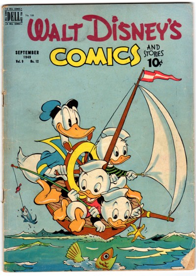
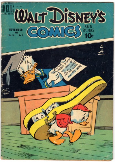
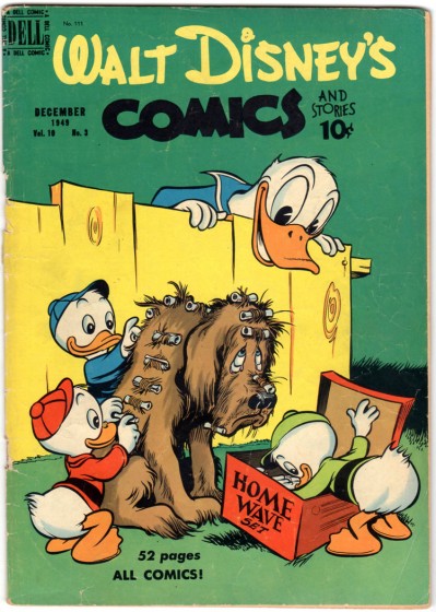
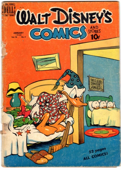
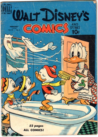
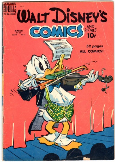
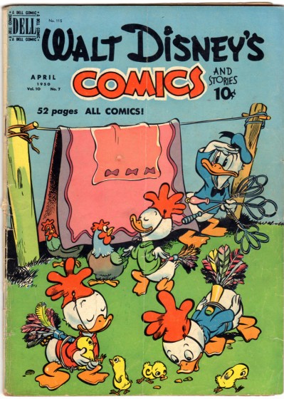
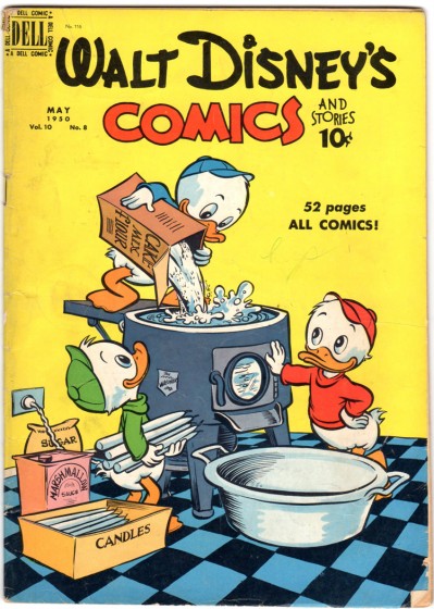
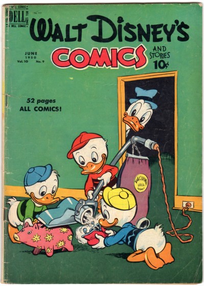
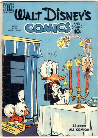
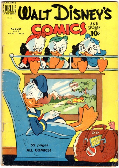
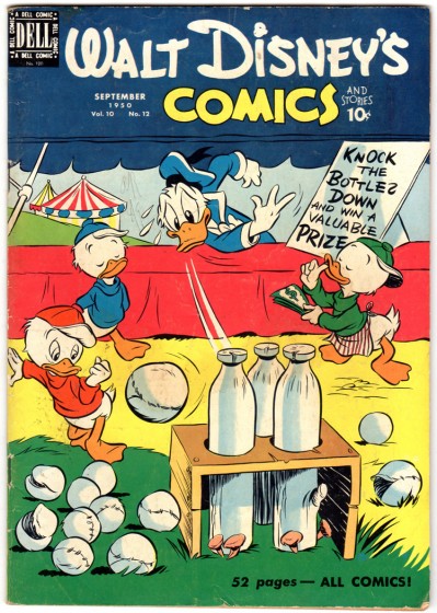
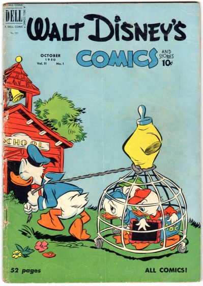
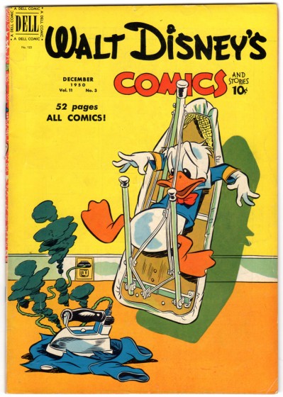
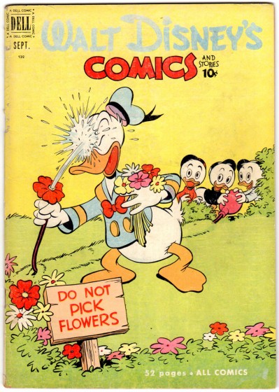
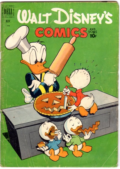
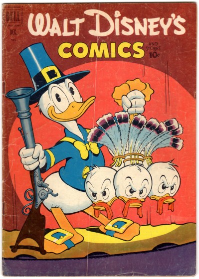
- Following up yesterday’s post of Walt Kelly’s Animal Comics, we have more of his covers for Walt Disney’s Comics and Stories. Not all of these were done by Kelly, but most are. These came fresh off of Bill Peckmann‘s hot scanner, and I thank him for sharing his amazing archive with us.
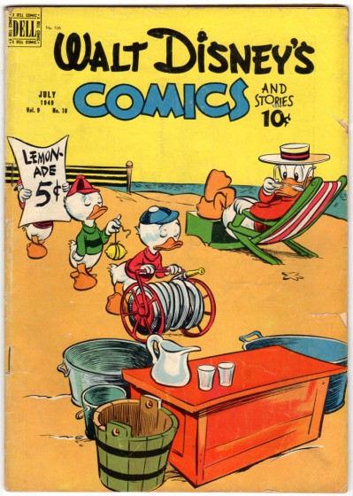 1
1by Walt Kelly
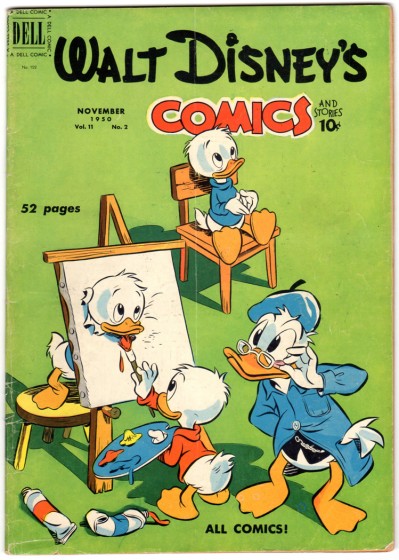 15
15
Pencils: Walt Kelly, Inking: Carl Buettner(?)
Bill Peckmann &Comic Art &Illustration 18 Aug 2011 06:47 am
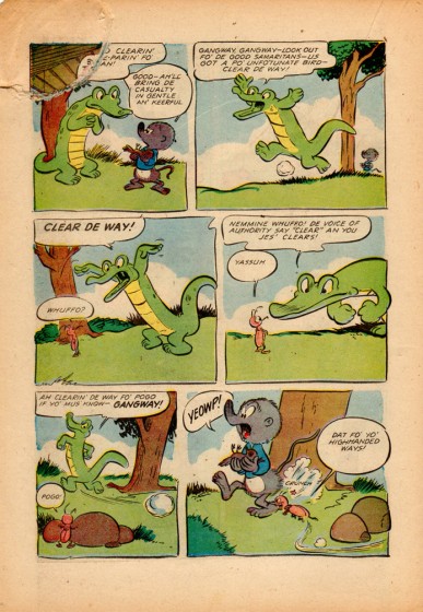
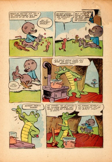
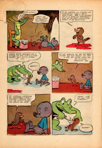
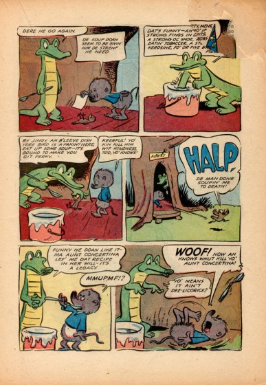
Animal Comics & Pogo
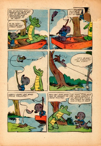
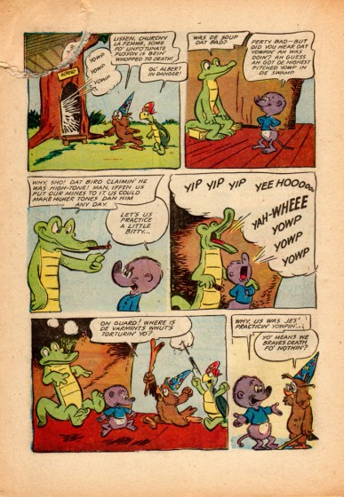
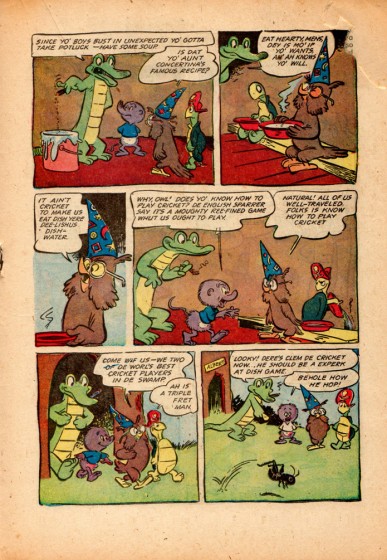
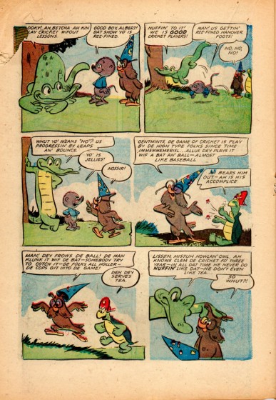
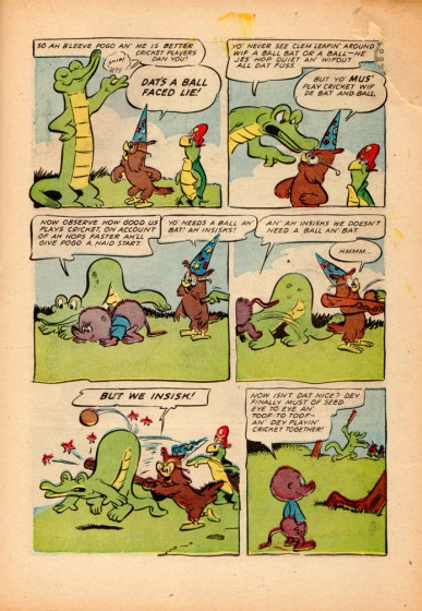
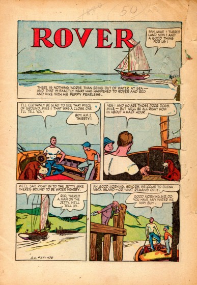
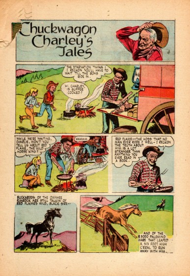
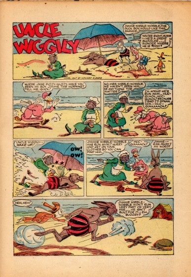
- Bill Peckmann sent scans of an incredible comic. It’s an early issue of Animal Comics (June/July 1947) with Walt Kelly‘s Pogo making an early appearance. The bulk of the magazine is the Pogo story, however there are a couple of other short pieces. We have doubt that Kelly did these other strips, (Jigger, Chuck Wagon Charley, Uncle Wiggily, and Rover), so if anyone out there knows, please drop a comment. Other than that, all I can say is enjoy and thank you Mr. Peckmann.
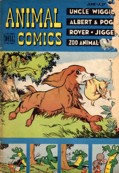
comic cover
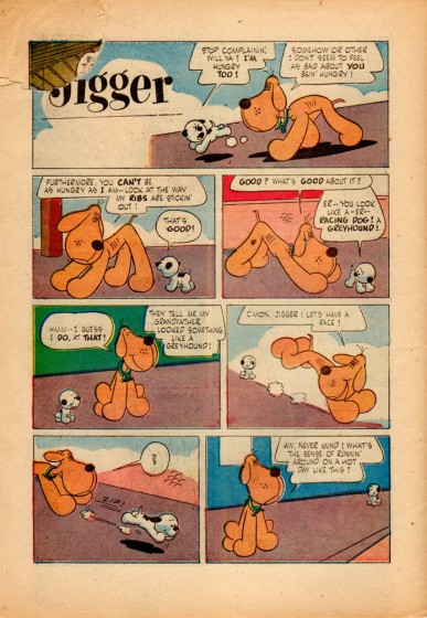 14
14
Jigger was done by the great John Stanley
of “Little Lulu” fame.
Animation &Animation Artifacts &Disney &repeated posts 17 Aug 2011 06:38 am
Dumbo’s Bath – recap
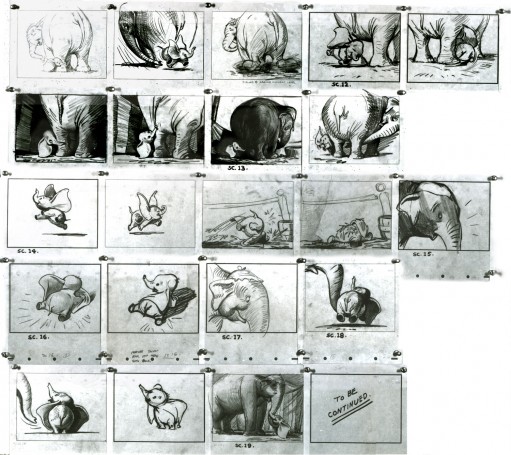
Continuing the celebration of Bill Tytla’s magnificent artrwork, I’m reposting this piece on Dumbo’s bath.
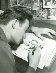 - Thanks to a loan from John Canemaker, I can continue posting some of the brilliant storyboard work of Bill Peet. The guy was a masterful artist. Every panel gives so much inspiration and information to the animators, directors and artists who’ll follow up on his work.
This is the sequence from Dumbo wherein baby Dumbo plays around the feet of his mother. Brilliantly animated by Bill Tytla, this sequence is one of the greatest ever animated. No rotoscoping, no MoCap. Just brilliant artists collaborating with perfect timing, perfect structure, perfect everything. Tytla said he watched his young son at home to learn how to animate Dumbo. Bill Peet told Mike Barrier that he was a big fan of circuses, so he was delighted to be working on this piece. Both used their excitement and enthusiasm to bring something brilliant to the screen, and it stands as a masterpiece of the medium.
Of this sequence and Tytla’s animation, Mike Barrier says in Hollywood Cartoons, “What might otherwise be mere cuteness acquires poignance because it is always shaded by a parent’s knowledge of pain and risk. If Dumbo “acted” more, he would almost certainly be a less successful character—’cuter,’ probably, in the cookie-cutter manner of so many other animated characters, but far more superficial.”
I had to take the one very long photstat and reconfigure it in photoshop so that you could enlarge these frames to see them well. I tried to keep the feel of these drawings pinned to that board in tact.
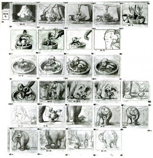
(Click any image to enlarge.)
Here are frame grabs from the very same sequence of the film showing how closely the cuts were followed. Even in stills the sequence is stunning.

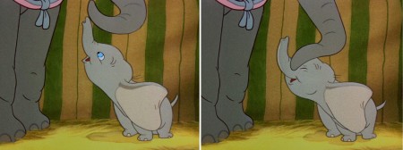
(Click any image to enlarge.)
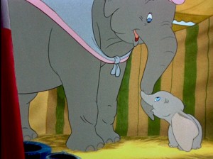 .
.This film is a gem.
The dvd also has one of my favorite commentary tracks throughout.
John Canemaker, by himself, talking about the film. It’s great!
From Hans Perk’s A Film LA:
Seq. 06.0 “Menagerie – Mrs. Jumbo Goes Berserk”
Directed by Wilfred Jackson, assistant director Jacques [Roberts?], layout Terrell Stapp.
Dumbo being washed by Mrs. Jumbo, animated by Bill Tytla, with effects by Art Palmer, Cornett Wood and Sandy Strother.
Independent Animation 16 Aug 2011 07:37 am
Joanna Priestley
Joanna Priestley is one of the most consistent of the Independent animator/filmmakers. Her work has gotten stronger as she goes on, and the number of films seems to grow more and greater with every year. Starting with THE RUBBER STAMP FILM in 1983, she hit the ground running. Her film VOICES (1985) won International acclaim and made her something of a star on the Festival circuit. To date she’s made some 24 animated shorts.

VOICES (1985)
This interview excited me and made me want to work. Her investment in animation should be an inspiration to anyone wanting to make a career of it, and I hope young animators will take note of the direction she followed. She always seems to have fun in the films she made, which all seem to successfully hide hard work of filmmaking. Her love of the work is obvious.
- Q. Can you tell us what brought you to animation.
A. When I was seven years old, my parents gave me a tiny zoetrope on a beige, plastic turntable for Christmas. I loved that toy! I read mountains of comic books and watched Warner Brothers cartoons on television every day. In high school, I saw several films by Norman McLaren from our city library and fell in love with his personal style and his experimentation with various media and animation techniques.
But I think the main factor was seeing La Jettée by Chris Marker at U.C. Berkeley. After I saw it in class, the professor let me borrow the projector and the16mm print, so I could look at it over and over. La Jettée led me to producing multi-image shows and that led to animation.
Q. What was your initial training?
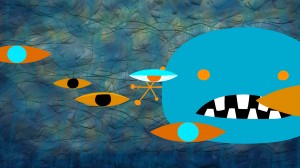 A. After living in Paris, I moved to central Oregon and settled in Sisters, a tiny, lovely cowboy town. In Paris I went to the Cinématheque Française everyday, so I was horrified that there were no movie theaters near Sisters, in an area half the size of Nova Scotia. Martha Kelley and I started Strictly Cinema and showed 16mm movies at the local high schools. Then we put on film ______________EYELINER (2011)
festivals and I was able to see lots
of independent animation. At one point, I went to Safeway and bought a pack of index card and started experimenting.
That led to a job at the Northwest Film Center (in Portland, Oregon) where I took an animation class from Roger Kukes. My index card experiments resolved into The Rubber Stamp Film, which led to the Experimental Animation MFA program at Cal Arts.
Q. Who and/or what films were early influences?
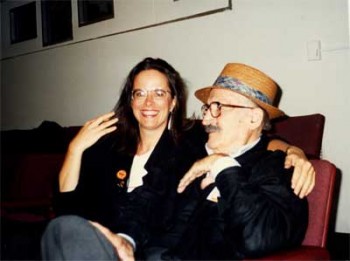 A. I am very lucky and have had wonderful mentors. That’s why I run an internship program. My teacher at Cal Arts, Jules Engel, was a brilliant abstract artist. He was always pushing the envelope into unknown territory and I got to know the Head of the Cal Arts Film School, Ed Emshwiller, who was an inspiring, lovely man and extraordinary artist who experimented in a variety of media. ______________________________Joanna and Jules Engel
Faith Hubley was a tremendous influence. When she married John Hubley, they agreed to make an independent film every year, and they did. When her husband died, Faith continued to make a film every year for the rest of her life. I find that truly amazing. I attempt to make a film every two to three years and when I get discouraged, I think about Faith and John.
Other influences: Andrei Tarkovsky (especially Stalker), Werner Herzog, Hidao Miyazaki and Chris Marker. Remains to be Seen and Traveling Light by Jane Aaron, The Man who Planted Trees by Frederic Back, Lineage and Viewmaster by George Griffin and Blade Runner.
Blab! Magazine was a huge influence (especially work by Tom Biskup, Esther Pearl Watson, Gary Baseman, the Clayton Brothers, Ryan Heshka and Mats!?) as were the Pictoplasma books, Linda Barry’s What It Is and The Woman’s Encyclopedia of Myths and Secrets by Barbara G. Walker.
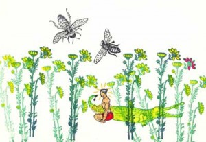 Q. You started with films that animated non-traditional media. THE RUBBER STAMP FILM, as its title indicates, uses rubber stamps to create the art, and THE DANCING BULRUSHES utilizes back-lit sand animation. What drew you to these forms as opposed to the traditional drawing?
A. I was deeply influenced by Norman McLaren’s deep exploration of multiple techniques. At the very beginning of my career, ___________THE RUBBER STAMP FILM (1983)
I began experimenting with new techniques,
new subject matter, new color palettes and new genres with each film. I want to learn as much as possible with each new project and it is very important to me that my work evolves and pushes into unknown territory. With each film, I challenge myself to learn something new. That’s what keeps it interesting.
Q. You tried your hand at computer animation working on some hi-tech computers at CalArts making JADE LEAF (1985) and TIMES SQUARE (1986) on this system. Did you find the computer all that you’d hoped for back in those early days?
A. I had no hopes or dreams about computer animation because it was such a complete novelty. Only a handful of people had access to the big, beige Cubicomp that Cal arts bought. We turned it on and there was a blank screen. We had to find a programmer to make it possible to create and save the digital animation we made with the keyboard. He also set up a program that would shoot single frames on a 16mm Bolex set in front of the Cubicomp’s monitor.
That is how I made two computer films at Cal Arts, Jade Leaf (1985) and Times Square (1986) co-directed with Jules Engel. Collaborating with Jules was so much fun. We were always trying something new and every day that we worked together he would say to me: “Honey!! How can we do this differently?!†Jules always said he made another film from the footage that we shot, but I’ve never seen it.
Q. You went completely in the opposite direction with CANDYJAM (1988) with the very low tech object animation of candy. It must have felt very different working on this film?
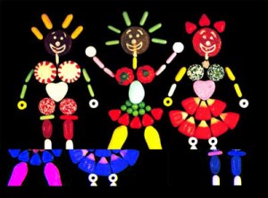 A. Candyjam was born when Joan Gratz and I met for the first time at the Hiroshima Animation Festival in 1985 and traveled together afterwards. I was collecting gorgeous Japanese candies with delicate spirals, autumn leaves, dots and colored grids. Joan and I talked about animating with candy and we thought “Wouldn’t it be amazing to ask different people from all around the world to do something with the candy from their area?â€
_____________________________________________CANDYJAM (1988)
So we asked filmmakers from several
countries if they might be interested in contributing sequences and were stunned when everyone we asked said yes (David Anderson, Karen Aqua, Craig Bartlett, Elizabeth Buttler, Paul Driessen, Tom Gasek, Christine Panushka and Marv Newland).
That’s one of the amazing things about the international animation community. People will share their talents and their time and they are willing to work together. Candyjam was a joy to make and also a bit of a nightmare because it mixed multiple techniques and two formats (35mm and 16mm).
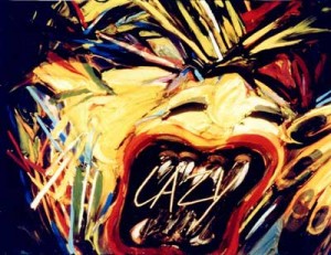
Q. SHE-BOP (1988) is a stunningly beautiful film combining 3D puppets with drawn animation. It mixes mythology with cartoon on its way to telling this story of controlling your own destiny. Again it’s very different from CANDYJAM and a strong, stylized design. Any comments?
A. She-Bop (1988) is based on a wonderful poem by Carolyn Myers about the Great Goddess. I heard her perform it at a women’s gathering in the Oregon forest. I decided to experiment with puppet animation, even thought it was a bit intimidating to have the best puppet animators in the world a few blocks away at the Vinton Studio. I made a simple puppet with copper plates and lead wire and a set made with foam core board and duct tape. All of my films use very simple, inexpensive materials. Jazz composer Dave Storrs did a lovely soundtrack.
Q. PRO AND CON (1993) combines drawing and clay painting. It’s a teaming between you and Joan Gratz. She obviously did the clay painting to work off your drawings. The film investigates life within a prison, featuring monologues by two people within that prison: an inmate and a corrections officer. You used drawings by the inmates and object animation of some of the weapons and crafts from that same prison. It’s a daring and informative film. How did it come about and what more can you tell us about it?
 A. Pro and Con came about when Joan Gratz and I applied for a Percent for Art funding that accompanied the construction of a new prison. We sent out several hundred questionnaires to inmates in Oregon and Joan selected a response which became the basis for her half of the film, which she animated with clay painting.
We also toured many prisons, where we met a very interesting African American corrections officer. I based my half of the film on interviews with her. In the McLaren _____________PRO & CON (1993)
tradition, I used a variety of techniques,
including object animation, puppets, drawings on paper and cel animation. I selected media, like animating freshly ground hamburger, that could be seen as a metaphor for incarceration. The hamburger was a pain to animate because it gradually turned brown and stinky over the course of the two day shoot.
I contacted the teacher of the art class at Oregon State Penitentiary and he asked his students to draw these wonderful self-portraits for the film. I also animated with contraband weapons and crafts that were confiscated from inmates.
Q. You worked on some of the earliest computer animation done at Cal Arts, working with older systems and programs. Obviously, you’ve adapted to the digital world in drawing your films. What programs do you like working?
A. I started working with Flash in 2002 and fell in love with it. Thank you, Macromedia! I find it easy to navigate and I never forget how it works. I also use Photoshop. I spent four months doing After Effects tutorials and trying to create work with it. Sadly, after a hiatus of six months, I’d forgotten everything.
Q. You originally used multi-media in making the films. Cutouts, cels, 3D puppets, even candy were all used to do your animation. Do you miss these different forms in making the more digital films?
A. I miss the elegant wheels and knobs and the clickety clack of my beautiful cameras. I still have a 16mm Bolex that I found under a table at a flea market. It came with several lenses, fabulous little metal accessories and a leather case. I also have a beautiful, stout, white, 35mm Mitchell camera. But it was expensive and exhausting to send cans of film by Greyhound bus to the lab in Seattle and then wait for weeks for them to process the film and send it back. They would always bump my little jobs for bigger commercial work.
I miss working with watercolor and felt pens on paper and I miss moving around and using more muscles than just my right hand, wrist and arm. But the immediacy and ease of use of Flash makes up for all of that!
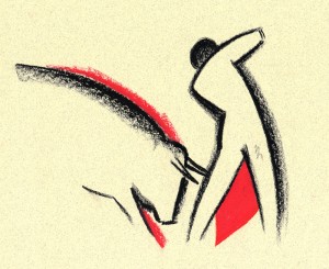 Q. In ANDALUZ you teamed with Karen Aqua in making this valentine to Andalucia. The film was done on paper in 2004, which means it was more traditional in style. This is rather late for a hand-made film. Was this intentional? How did the teaming of you and Karen come about and how did you break the workload?
A. Andaluz began when filmmaker Karen Aqua, her composer/musician husband Ken Fields and I were all chosen to be artists-in-residence at the Fundaçion Valparaiso in the village of Mojacar _________ANDALUZ (2004)
in southern Spain. To honor that synchronicity, the three of us collaborated on a film.
We began with a ritual and decided to do a film about the area. That gave us license to hike around outside and draw the architecture, animals and plants, study the sky, go swimming and study the water. We sat side by side and did about 1200 drawings together, sometimes drawing on each other’s drawings. After the residency, the three of us traveled together and lugged those drawings everywhere. We didn’t want to take a chance on losing them.
Karen was in Boston and I was in Portland, Oregon and we found that shipping drawings back and forth made us both nervous. So we had two additional residencies, at the Millay Colony and the MacDowell Colony where we finished the artwork together. Then we turned Andaluz over to Ken Field who produced amazing music with Juanito Pascual and Lance Limbocker who did the sound design.
Andaluz took about four years to make. During the process, Karen was diagnosed with cancer and underwent chemo several times, so there were a lot of challenges to face. Karen died on May 30, 2011 and I miss her terribly. She was a wonderful woman and a brilliant filmmaker/artist. I feel so lucky to have had this collaboration with her and Ken Field.
Q. OUT OF SHAPE uses iconic graphic imagery that playfully moves about the screen. You’ve moved to complete abstraction, yet you give it such a personal lively, light sense of humor. The abstraction gains a personality and becomes funny. You seem to do this so naturally.
A. Thank you. I made Out of Shape (http://www.youtube.com/user/JoannaPriestley) in two months. I was lucky to have a friend, Marc Rose, who had the time to do the soundtrack. I had just spent two years completing another soundtrack and was demoralized with how long the process took, although I love how it turned out. To refresh my enthusiasm, I made Out of Shape very quickly and joyfully and immediately posted it on YouTube.
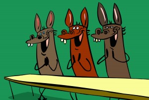 Q. In some ways MISSED ACHES seems a bit different from your other films. It’s a play on wordplay, but you treat it almost like a Warner Bros cartoon with bright, bubbly, cartoon music. In some ways it feels more like a Chuck Jones cartoon. It’s the obvious way to do the adapted story, but I wonder how you felt about it while doing it?
A. Missed Aches is based on a poem by Taylor Mali who led teams ______________MISSED ACHES (2009)
to four championships in the National
Poetry Slam. He was absolutely wonderful to work with. His words are so inspiring that the images just seemed to fall into place. I think it also helped to work at the onset with a friend who is a great storyboard artist (Dan Schaeffer). The challenge for me was to make a funny film with character animation. I am not funny. My husband, director Paul Harrod, is hilarious. Humor is extremely important to me and I think it’s the best way to cope with life.
I had a group of collaborators who made the process a great joy. I worked with a former student, Don Flores, a great character designer and animator, and with the famous Canadian sound designer, Normand Roger, Pierre Yves Drapeau and Denis Chartrand, who made the soundtrack. Major treat! While making Missed Aches, I saw Brian Kinkley’s graduation announcement on Facebook. He did this extraordinary animation of text, which is now constantly imitated. His text animation became the perfect background for the film.

Q. Anything you want to add?
A. I love what I do. I love coming to work everyday. I try to stay open, curious, follow my intuition and always try new things.
Commentary 15 Aug 2011 06:54 am
Iwerks Multiplane
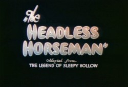
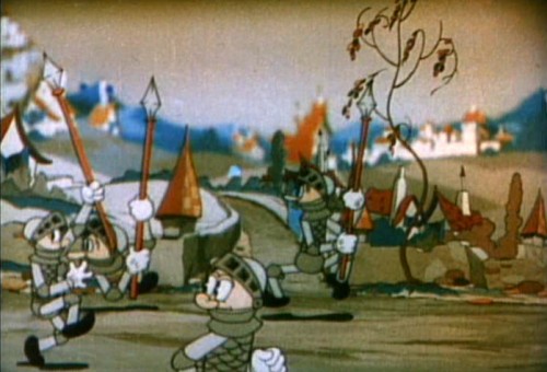
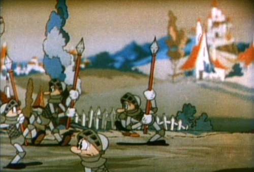
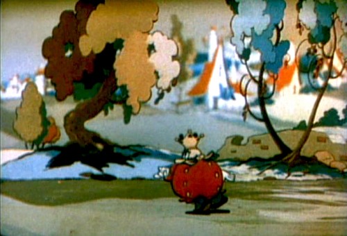
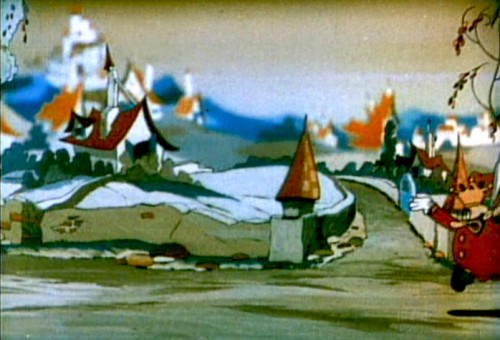
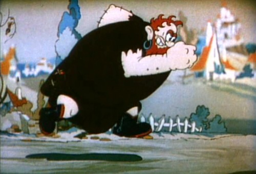
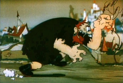
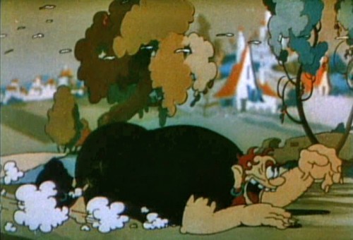
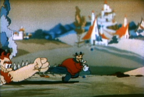
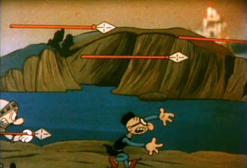
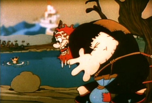
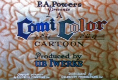
- Continuing back in time looking at the multiplane camera, you have to finally reach Ub Iwerks at his studio. It’s probable that Iwerks was the first real inventor of the idea. His studio put it into use far earlier than either Disney and Fleischer. It was most probably more limited than the other two, but the germ was there. On film, the new tool appeared in 1934. At different times, both Grim Natwick and Shamus Culhane talk about Ub working furiously in the basement on a multiplane camera built out of auto parts. The camera was a horizontal multiplane camera with the cels standing up, shot against levels of depth. Looking at the existing films it’s hard to find many uses of it. I came up with two Comicolor Films – two fairy tales, that Iwerks produced.
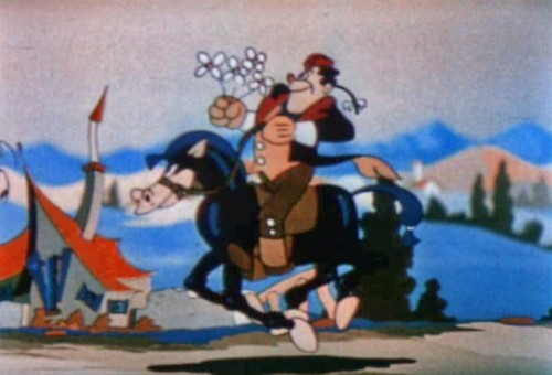
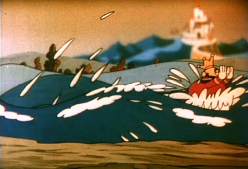
The first is The Headless Horseman (1934), and the camera is used in a very limited way, here. In fact, the scene could have been done with multiple levels panning at different speeds. This is used only in panning scenes. I’ve taken one of these repeated scenes and illustrate with that.
 1
1
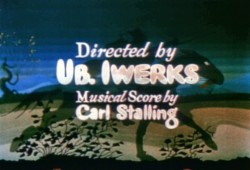
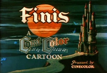
It took them a while to settle on one opening title for this series of tales.
 4
4
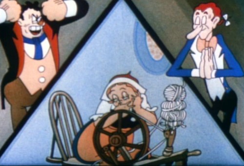
The three principal characters are introduced via
a multiple exposure three-way split screen.
 5
5
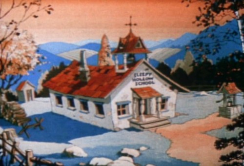
Which leads us into a flat BG of the schoolhouse.
Considering there’s a truck in, one would have thought
that the multiplane could have been used for good effect.
 6
6
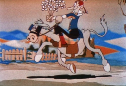
Most of its use was for these panning scenes with multiple levels
that aren’t even taking advantage of the soft focus possibilities.
 10
10
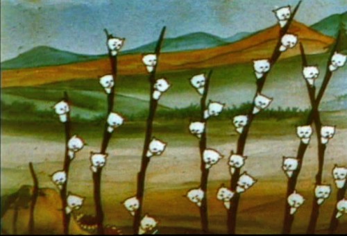
This scene has nothing to do with the multiplane camera,
I just like it.
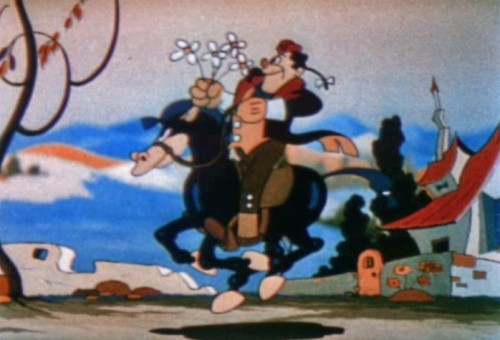
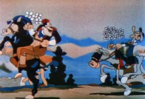
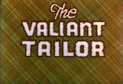
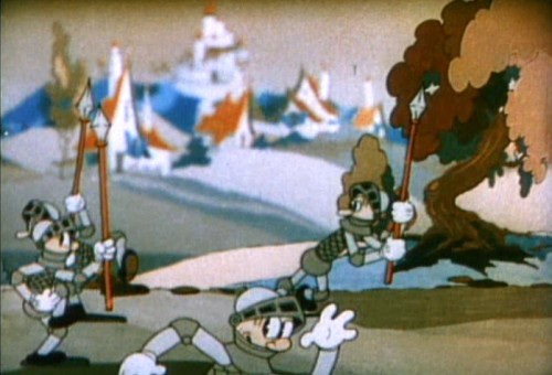
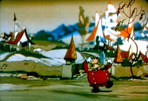
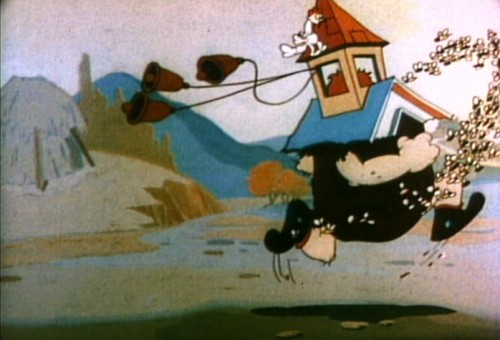
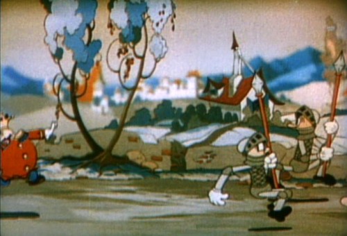
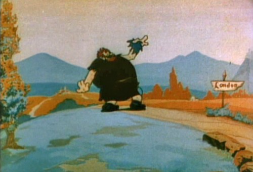
The Valiant Tailor (1934) is much more energetic. Again, the camera is used only for panning, no camera moves in or out. The BGs are broken into multiple levels and the focus is very soft in the distant background (never in the foreground.) The levels move at different speeds and oftentimes look like they’re bicycle pans in that some parts of the levels repeat in the moves. (I can’t think of any other studio that did that.) In different scenes, it also looks as though some of the back levels have been moved closer, to a more foreground position. The shadows animate over the surface of the ground they touch.
 1
1
This is the only film that uses this criss-crossed BG.
 7
7
The sharp focus of the foreground level against the soft BG
is the feature of this scene. It plays so well in motion.
 15
15
We cut to this flat scene . . .
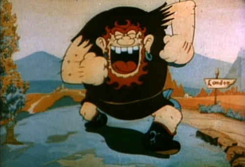 16
16
. . . but it’s very dynamic.
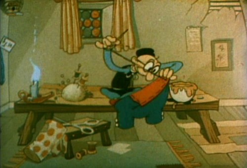 17
17
The tailor is flat in this first scene, but
the scene seems to be purposefully dim.
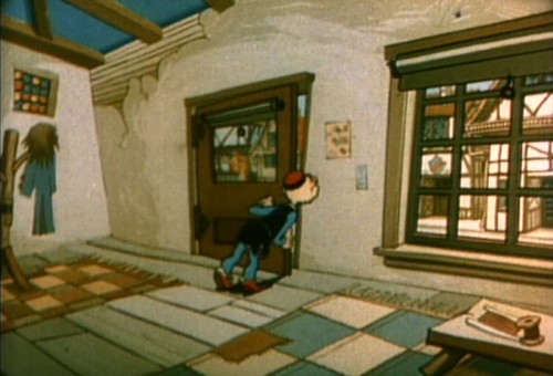 18
18
When he goes to the door, the bright, sharp focus outdoors
tells us this was shot on the multiplane.
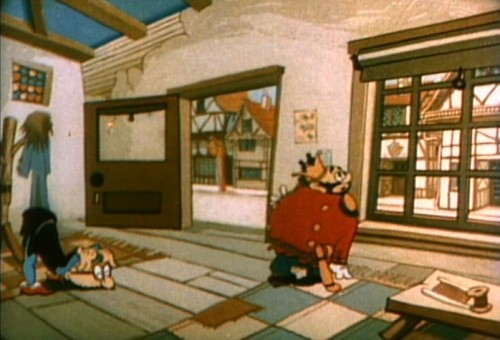 19
19
This exposure really shows how it should’ve been exposed throughout.
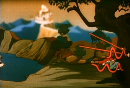 21
21
Again, it’s the sharp focus against the soft that makes this effective.
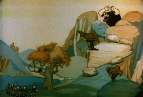 22
22
A flat scene cut into two using multiplane.
Animation &Commentary &Independent Animation 14 Aug 2011 03:08 am
Robert Breer (1926-2011)
- This note came from George Griiffin today:
- Some of you may already know Bob died yesterday. The beautiful film by his youngest daughter Sally, posted on Vimeo, made it clear but I don’t know if there has been an official announcement yet.
Unfortunately, I did not receive a link to the video
but Janet Benn located it. Thanks, Janet – M.S.
He had an enormous influence on 2 generations of animation artists, constantly pushing and pulling his practice with wit and ingenuity. It was a privilege to have known him, and to have learned so much from him. A huge force in our field has left.
There is this excellent bio on AWN.
See some of his films Here.
The only obituary I’ve found thus far is an Italian one, in Italian. Here. It says that he died peacefully on August 12th.
Commentary 13 Aug 2011 06:48 am
Rambling Bits
- This past week things kept moving. It started with the news that Standard and (very) Poors had lowered the credit rating of the US, and the stock market rolled up/down/up/down ending UP. It’s frightened quite a few people waiting for the “double dip Recession”. Did John Boehner & Eric Cantor think they would have any other result than this with the past month’s game playing in Congress? Or maybe that was what they wanted, so they could blame the President for it. A made-up crisis has put the US on the brink of a real crisis, and, by nature, the Global Economy as well.
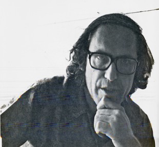 Then came the more personal news that Corny Cole had died. That was something of a shocker and a very sad one at that. Corny seemed to inspire many in animation today. As one of the heads of CalArts animation program, he’s affected many of the students lives as he inspired many of them on or into the business.
There are quite a few blog notes out there. My three favorites are
- – the odd interview posted on Mike Barrier‘s website, MichaelBarrier.com. Corny talks about his days working in Chuck Jones’ unit at Warner Bros., his ________Corny in 1976 on RAGGEDY ANN
days at UPA on Gay Purr-ee and his work
for Richard Williams on The Cobbler & the Thief. There’s a slight paranoia there, and Corny seems to think that others are out to beat him. I’m not sure, from what he says, that that was really an accurate reading. But what do I know?
- On The Animation Guild Blog Dave Brain offers his memories of Corny.
- on Cartoon Brew, Amid Amidi collects a lot of blog posts and points to many of them.
I remember Luis Bunuel‘s introduction to his great autobiography. He was aware that his death would come within another year or two, and he said that he didn’t mind dying if only he could come back once a year to read some of the newspapers because he was addicted to the news and would want to know what happened in the soap opera of life. This hit very close to home. I love the politics of the world (not so much lately now that it’s all good vs evil/black vs white) and would want to continue knowing what’s going on. When I see the culmination of one political event mesh with a friend’s passing, I always wonder about this Bunuel thought. I know, I’m nuts.
 - Speaking of Michael Barrier and his site. Every time he publishes a new interview a lot of attention is garnered. What seems to be forgotten is that Mike has recorded MANY interviews and he has many in the archive of his site. Right up there at the top, on his banner, it says interviews.
There you can find quite a few that were originally published in Funnyworld Magazine: Hugh Harman, James Bodrero, Frank Tashlin, John McGrew, Art Babbitt, Dave Hand and many other key personnel from the Golden Age of animation.
They’re all there – for free. You just have to read them.
It’s an amazing resource; take advantage. (I must have read the Dave Hand and John McGrew interviews at least four times, each. I’ve memorized the Hubley interview.)
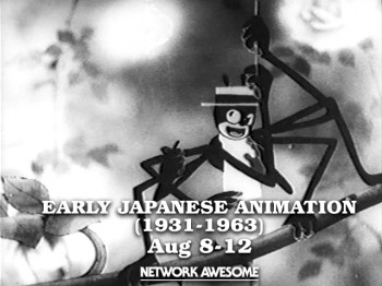 - Another very interesting site came to my attention early this week. Network Awesome features a lot of archival videos. Jason Forrest founded the site in January 2011. With it he says he’d like to: “spotlight the best from the past to create something new for the future. In a sense it’s TV about TV but our wider intent is to show something about culture as a whole. This can manifest itself in a kids cartoon from 1973, an interview from 1948 or a movie from 1993.”
You can find anything from an early Astro Boy adventure to The Grave of the Fireflies. This past week they’ve had something of a festival for very early Japanese animation, hosted by Cory Gross. All of these films are extraordinary and certainly worth viewing. Many of them seem to use an early version of the multiplane camera in shooting. The animation style starts looking like a Fleischer clone, and eventually goes more toward Disney.
Here’s what they programmed this past week:
- 1. Fox and Racoon-Dog Playing Pranks on Each Other (1933)
2. Kenzo Masaoka’s Spider and Tulip (1943)
3. Momotaro’s Divine Sea Warriors (1945)
4. Koneko No Rakugaki (1957)
They also have an on-line magazine which gives detailed information about each film on the site. Here’s a sample of the page for Spider and Tulip. It tells who Kenzo Masaoka was and what his role in the history of Japanese animation was. The film was animated during the height of WWII, so the implications are obvious. Yet compare it to what Disney was doing at the time; it’s an amazing piece.
- I also reviewed Timothy Susanin’s book, Mickey Before Mickey: Disney’s Early Years 1919-1928. I hardly believed that my review would lead to a conversation via email with Mr. Susanin. I have to say that it was a treat. The book made a strong impression on me.
Lately, I’d been reading a lot of interviews with people around the Disney studio in the 20′s, 30′s and early 40′s. Didier Ghez’ spectacular series of books: Walt’s People Vols 1-11. I only have three, but it gives me plenty to look forward to. Working with Walt and Working With Disney, both by Don Peri. These two are juicy books and have some excellent interviews within. Consequently, reading Mr. Susanin’s book came at exactly the right time for me. While reading that I pulled the two Barrier books off the shelf: The Animated Man and Hollywood Cartoons as well as the Kaufman and Merritt book, Walt in Wonderland. I’d already read each of these three several times, but it was fun rereading them while seeing how much Mr. Susanin added to the picture (and it often was a lot.) For some reason, this offends a number of reviewers, such as Charles Solomon in the LA Times. I don’t quite know why. Perhaps, he just wants to get the Cliff Notes in history books. I want all the meat and bones and gristle. Perhaps, Mr. Susanin wrote his book specifically for me. It certainly got me charged.
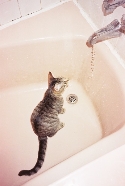
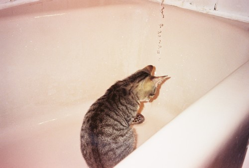
Alex, one of our cats, has always had a fascination with water.
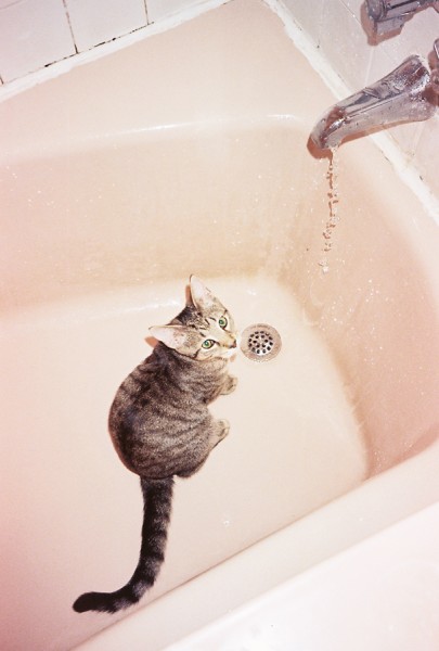
He’s now fully grown and sits in the bathtub under the dripping water.
He comes out with a soaking wet head and
likes to hit you in the face with it.
Animation &Animation Artifacts 12 Aug 2011 07:10 am
Corny’s Cartoon
Since Corny Cole died on Monday, there have been quite a few comments on various blogs. To me, the most valuable of those I’d seen was the one posted late yesterday by Michael Barrier. It is an interview done with Milton Gray and Corny in 1991. They talk primarily about the days Corny worked under Chuck Jones at Warner Bros. and the days working at UPA on Gay Purr-ee, under the recommendation of Jones. Amid Amidi also posted a fine memorial to Corny on Cartoon Brew this morning.
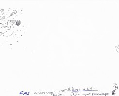
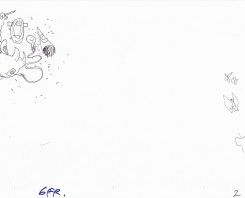
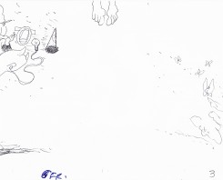
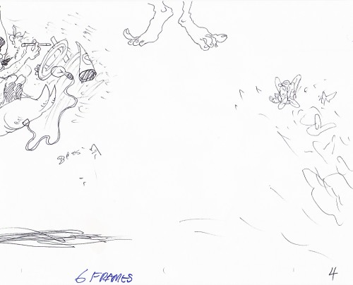
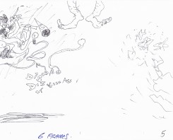
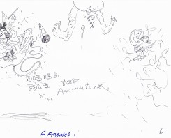
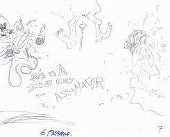
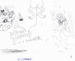
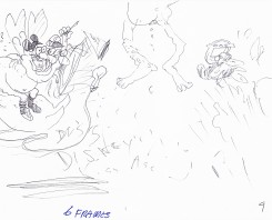
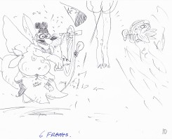
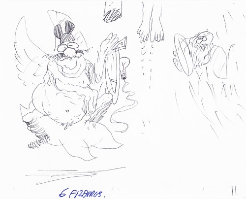
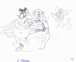
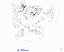
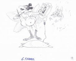
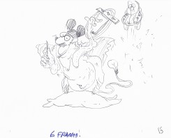
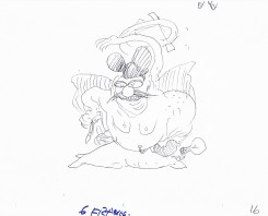
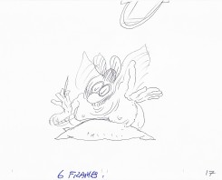
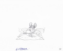
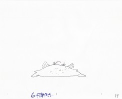
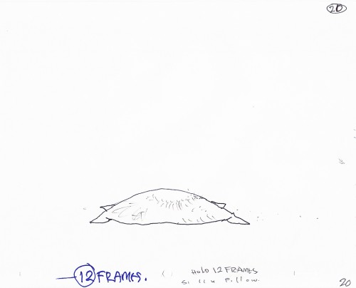
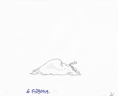
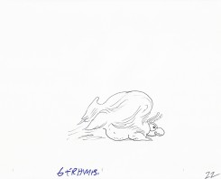
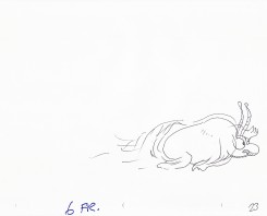
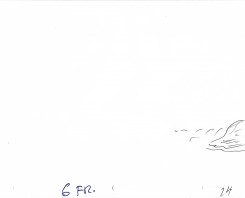
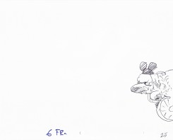
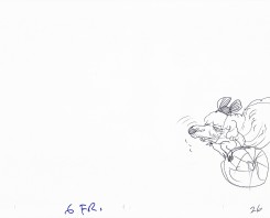
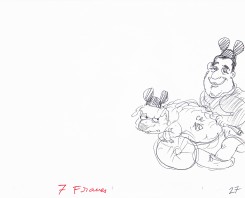
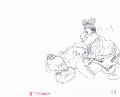
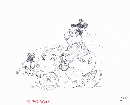
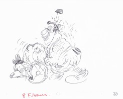
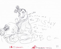
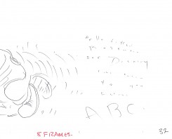
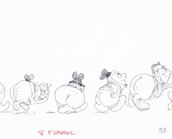
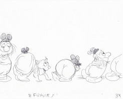
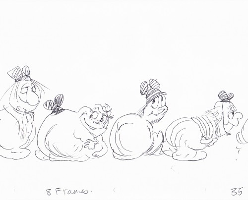
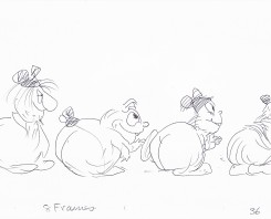
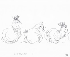
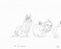
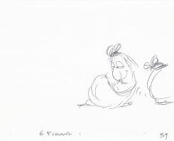
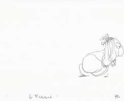
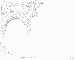
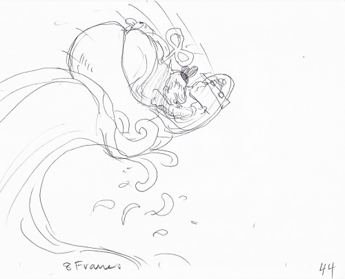
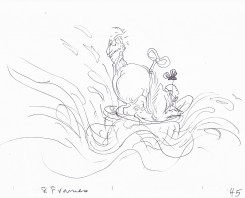
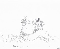
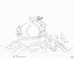
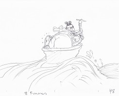
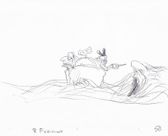
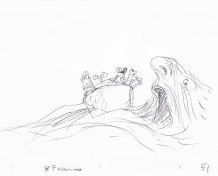
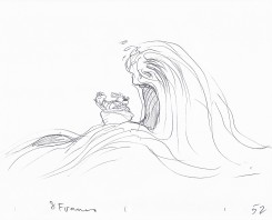
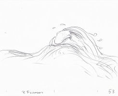
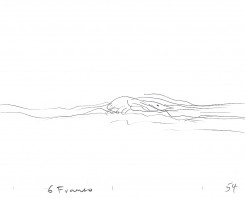
I have a few scenes done by Corny Cole from Raggedy Ann and Andy, and I hope to post some of his art. However, animator, Matthew Clinton sent me the following scene and offered it for posting. Matt had a close relationship with Corny and I thought the scene somehow special. Somehow, to me, it captures the essence of Corny’s animation, so I thought it appropriate to post this week. Here’s the comment Matt sent along with the artwork:
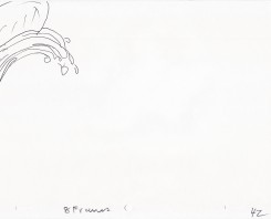
- Corny Cole gave this scene to me as a gift when I graduated. I’m guessing that it was something he worked on in his “Animation as Art” class while the students were busy drawing one day. Maybe it was for a demonstration. I included scans of all the drawings.
Corny talks, in the Barrier interview, of animating just by flipping without a bottom light. It’s easy to imagine him sitting in the front of the classroom flipping away with this artwork on his lap. It’s obviously stream of conscience. There are elements of some of Corny’s last big jobs in there: the taffy pit from Raggedy Ann and the clockwork mouse (a Disney/Mickey bastardization) from The Mouse & His Child, both features designed by Corny.
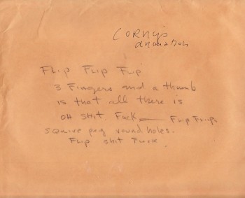
Cover sheet
. . . . . . . . . . . . . . . . . . . . . . . . . . . . .
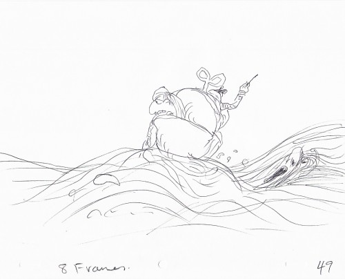 49
49
The clockwork mouse about to be swallowed by the Taffy Pit.
.
This is a QT of Corny’s piece. Since most drawings were exposed on 6′s,
I put one frame dissolves between each to soften the extremes.


