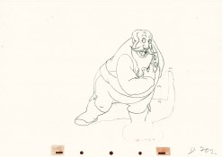
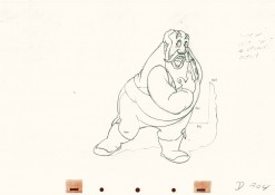
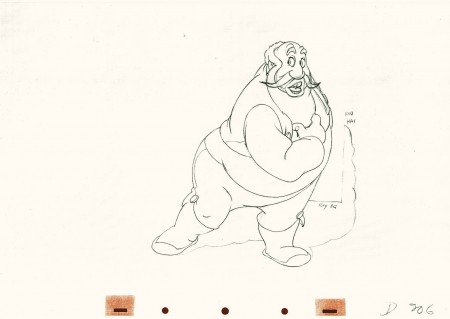
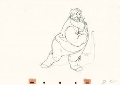
Monthly ArchiveJuly 2011
Animation &Animation Artifacts &Disney &John Canemaker &Tytla 21 Jul 2011 06:30 am
Tytla’s Stromboli – the Second half
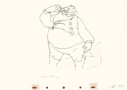
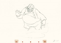
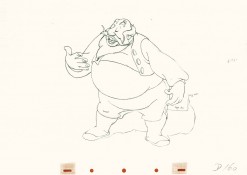
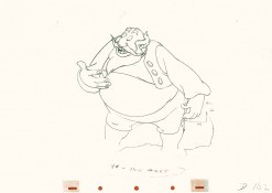
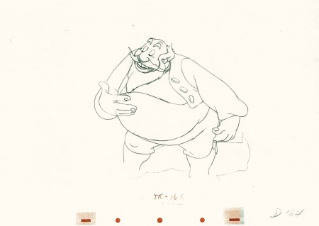
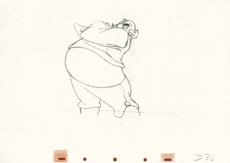
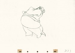
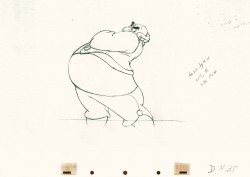
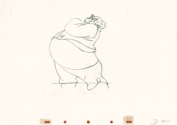
This is a continuation of yeserday’s recap post. Tytla was a genius and this scene is proof. Originally in five parts, here are the final three.
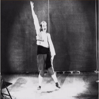
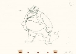
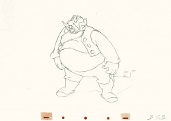
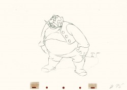
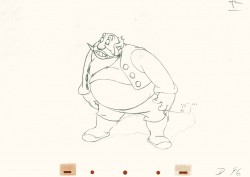
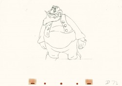
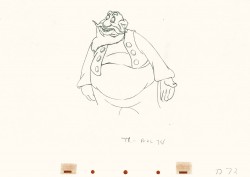
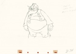
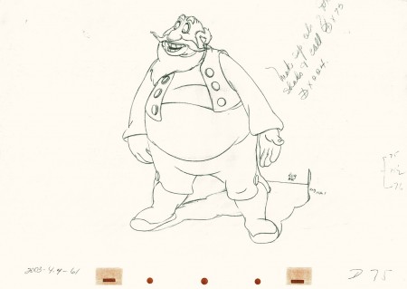
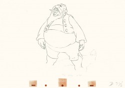
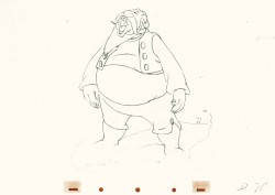
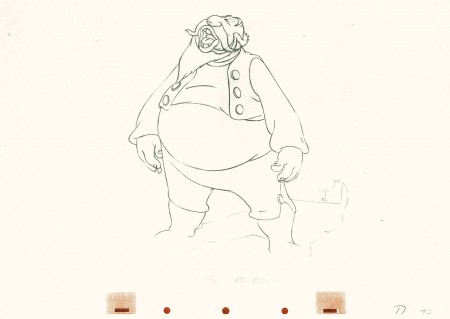
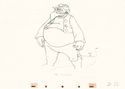
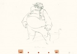
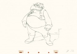
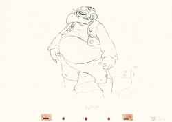
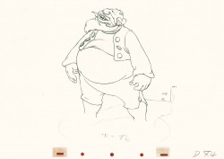
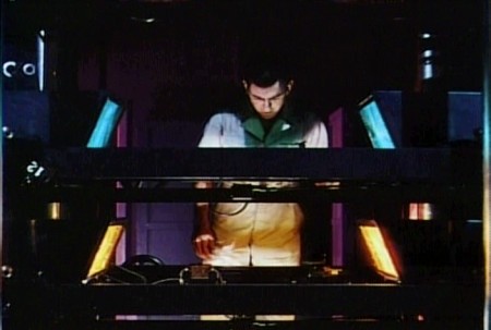
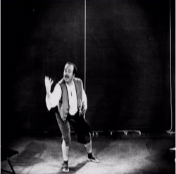
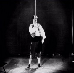
Nancy Beiman brought to my attention that T.Hee did some live action reference for Tytla as Stromboli. Here are some stills I located:
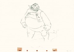
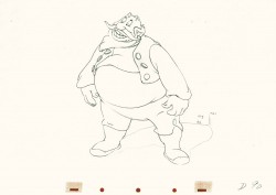
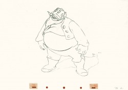
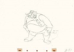
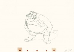
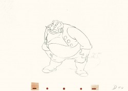
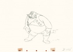
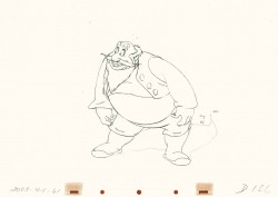
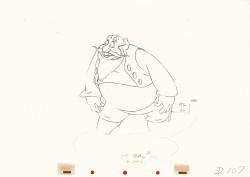
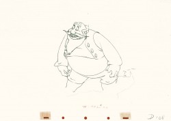
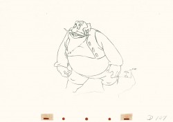
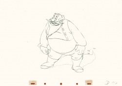
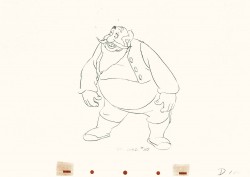
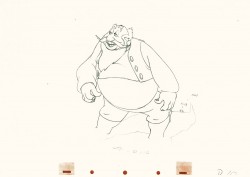
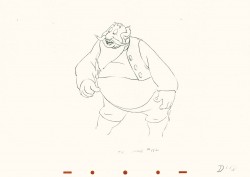
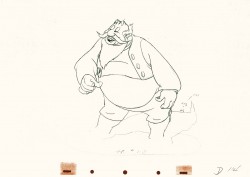
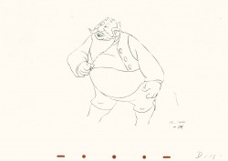
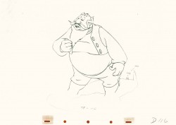
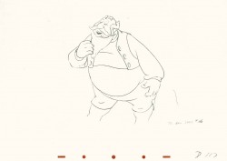
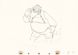
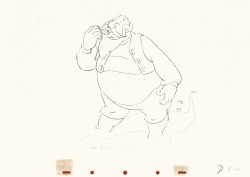
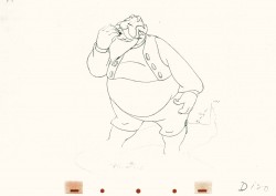
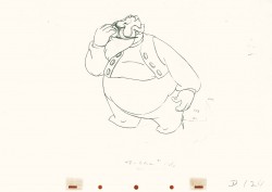
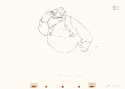
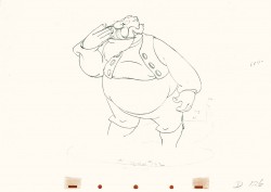
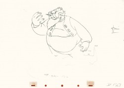
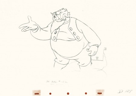
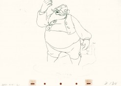
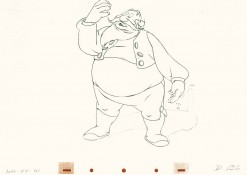
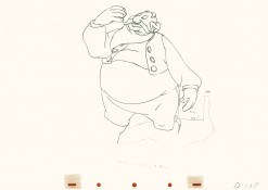
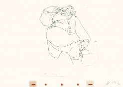
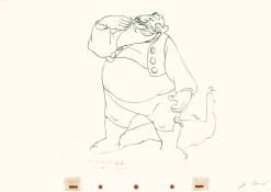
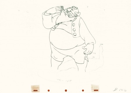
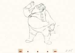
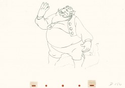
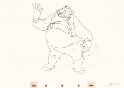
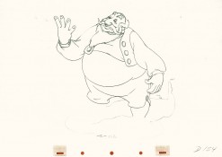
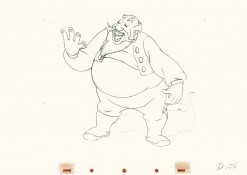
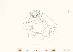
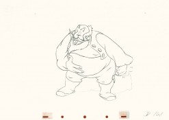
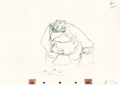
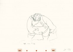
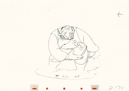
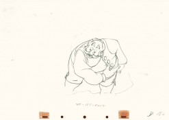
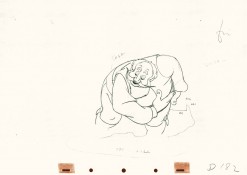
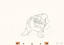
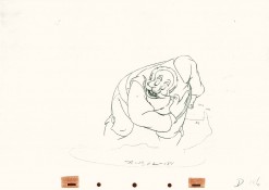
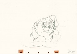
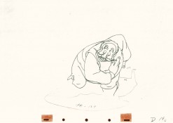
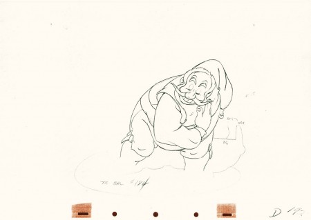
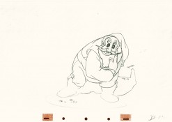
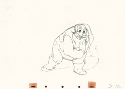
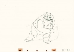
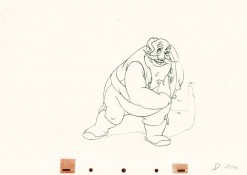
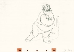
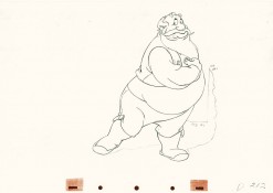
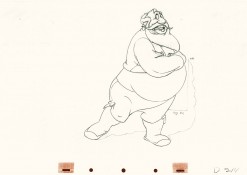
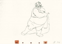
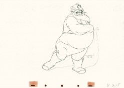
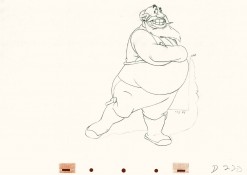
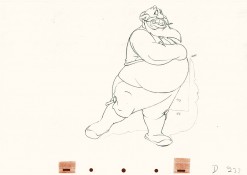
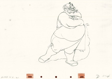
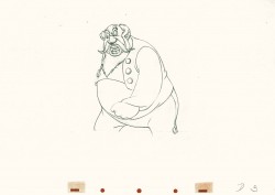
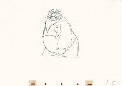
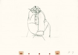
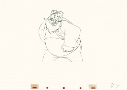
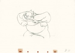
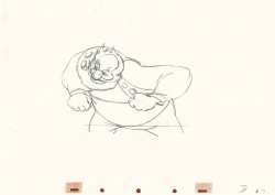
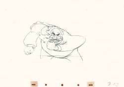
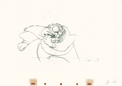
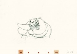
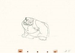
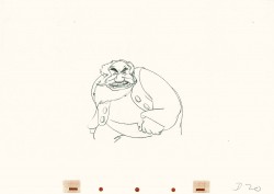
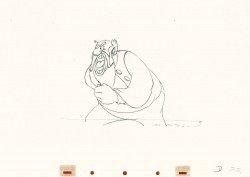
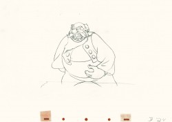
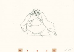
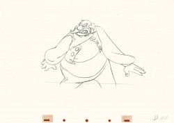
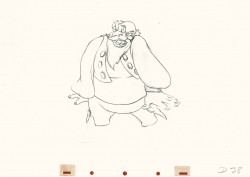
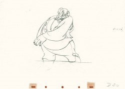
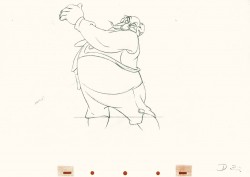
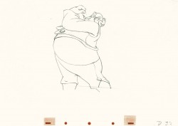
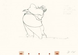
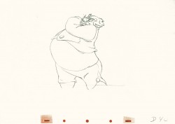
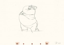
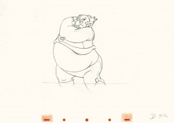
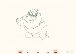
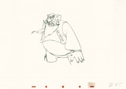
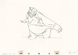
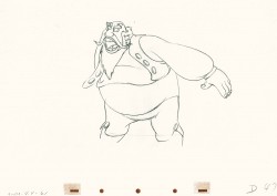
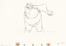
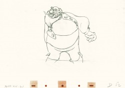
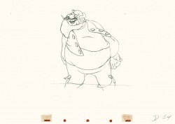
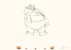
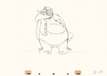
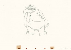
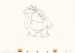
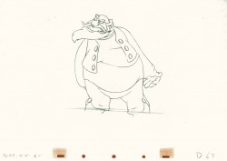
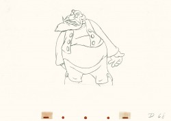
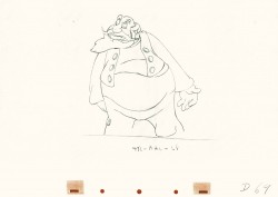
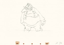
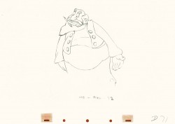
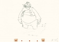
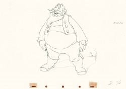
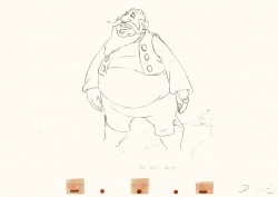
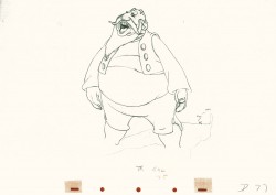
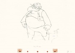
- This is part 3 of this large scene by Bill Tytla of Stromboli. The scene started in Part 1 with thoroughly frenetic anger from Stromboli. In Part 2 he tries to catch himself and get a grip on his emotions. Here in Part 3 he moves slowly and takes a 180° turn from where he started. The line against the curve. All this while playing out the lines from the scene. The drawing is stunning, the motion is brilliant, and the acting is the best animation has to offer. Those hands are just great; look at 126.
I pick up with the last drawing from Part 2.
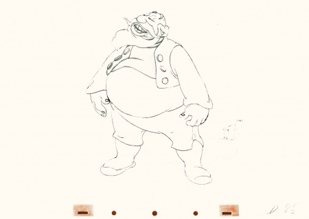 86
86(Click any image to enlarge.)
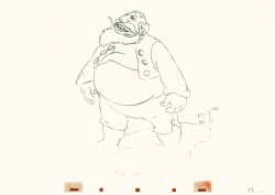 87
87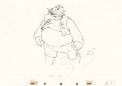 88
88
Tytla made sure he firmly planted Stromboli’s feet (in part 2)
before he attempted this firm bow.
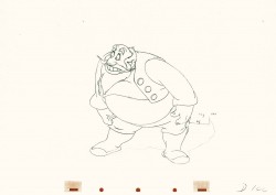
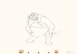 101
101
He’s made a solid line of the back, the strength of this move,
by using the left arm held firmly in place.
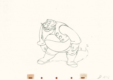 102
102
This is the bottom of the bow, now he goes back up.
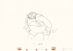
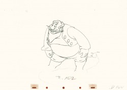 104
104
All of the shapes change naturally in the bow, though it looks
as if it remains a solid. No noticeable change. Solid weight.
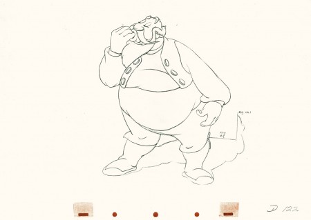 122
122
Watch the timing on the hand from here to #128
as Stromboli blows a kiss.
Many an animator today would pop it and call it animation.
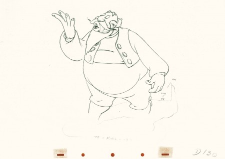 130
130
(Click any image to enlarge.)
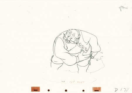 178
178
(Click any image to enlarge.)
Here’s the final QT of it all together:
Stromboli
Click left side of the black bar to play.
Right side to watch single frame.
David Nethery had taken my drawings posted and synched them up to the sound track here.
Animation &Animation Artifacts &Disney &John Canemaker &repeated posts &Tytla 20 Jul 2011 07:31 am
Tytla’s Stromboli – the First half
As stated last week, I’m recapping some of my Tytla posts from the past. This very long scene was originally in five parts. Today and tomorrow all five parts will be posted.
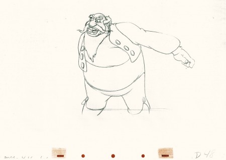
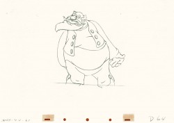
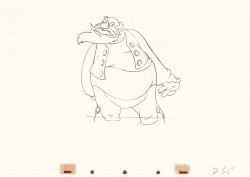
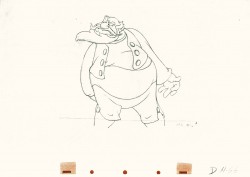
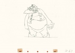
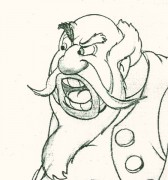 - Bill Tytla‘s work has to be studied and studied and studied for any student of animation. He was the best, and it’s pretty doubtful his work will be superceded. He brought beautiful distortion to many of the drawings he did, using it as a way to hammer home some of the emotions in the elasticity he was creating. Yet, the casual observer watching this sequence in motion doesn’t ever notice that distortion yet can feel it in the strength of the motion.
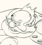
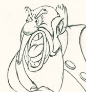
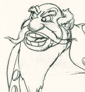
Four drawings (#1, 11, 22, & 48) that shift so enormously but call no attention to itself.
Brilliant draftsmanship and use of the forms.
Here we have the beginning: drawings 1-48. More will come in the future.
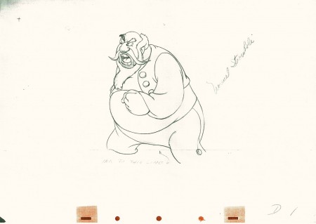 1
1(Click any image to enlarge.)
This note arrived from Borge Ring after my first post Bill Tytla’s scene featuring Stromboli’s mood swing:
- The Arch devotees of Milt Kahl have tearfull misgivings about Wladimir Tytla’s magnificent language of distortions. ‘”Yes, he IS good. But he has made SO many ugly drawings”
Musicologists will know that Beethoven abhorred the music of Johan Sebastian Bach.
yukyuk
Børge
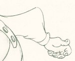
My first post spoke a bit about the distortion Tytla would use to his advantage to get an emotional gesture across. It’s part of the “animating forces instead of forms†method that Tytla used. This is found in Stromboli’s face in the first post. In this one look for this arm in drawing #50. It barely registers but gives strength to the arm move before it as his blouse follows through in extreme.
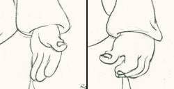 There’s also some beautiful and simple drawing throughout this piece. Stromboli is, basically, a cartoon character that caricatures reality beautifully. A predecessor to Cruella de Vil. In drawings 76 to 80 there’s a simple turn of the hand that is nicely done by some assistant. A little thing among so much bravura animation.
Many people don’t like the exaggerated motion of Stromboli. However, I think it’s perfectly right for the character. He’s Italian – prone to big movements. He’s a performer who, like many actors in real life, goes for the big gesture. In short his character is all there – garlic breath and all. It’s not cliched and it’s well felt and thought out. Think of the Devil in “Night on Bald Mountain” that would follow, then the simply wonderful and understated Dumbo who would follow that. Tytla was a versatile master.
Here’s part 2 of the scene:
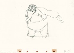 48
48 49
49(Click any image to enlarge.) The full scene with all drawings.
Click left side of the black bar to play.
Right side to watch single frame.
David Nethery had taken my drawings posted and synched them up to the sound track here.
Action Analysis &Animation Artifacts &Disney 19 Jul 2011 07:00 am
Action Analysis – April 5, 1937
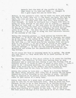
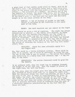
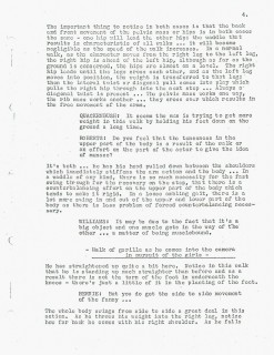
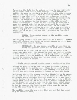
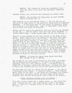
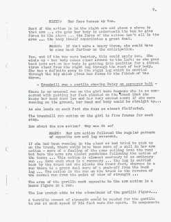
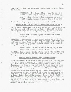
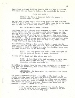
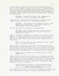
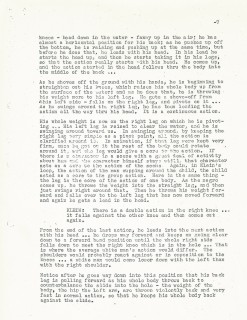
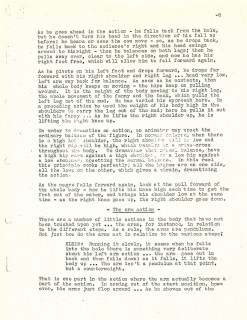
- We’re taking a step back before we go forward. Last week I posted the April 12th, 1937 edition of the Action Analysis notes from the Disney studio’s after hours class. I had to skip the April 5th notes because all I really had was the cover page. The actual notes weren’t included. Mike Barrier to the rescue. He sent me the correct notes for April 5th, and I’m now able to post them here.
Don Graham conducts the session which includes some footage from “Bum Voyage” starring Thelma Todd and Patsy Kelly. This is a 1934 feature from MGM and Hal Roach Studio. A madcap sequence which shows Thelma being chased by Patsy in a Gorilla outfit. Unfortunately, Netflix doesn’t seem to have this film, nor has TCM issued a dvd, as yet.
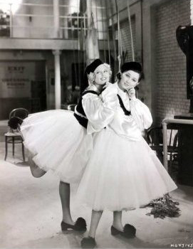
Mark Sonntag directed me to this great still
from “Bum Voyage” for sale on ebay.
Those who participate in the lecture include: Izzy Klein, Bernie Wolf, Joe Magro, Roy Williams, Eddie Strickland, Stan Quackenbush, Jacques Roberts, Chuck Couch and Jack Hannah.

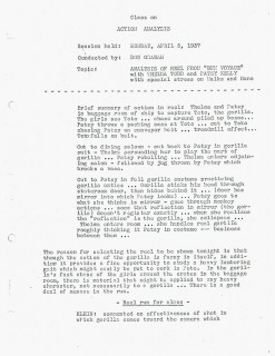 1
1
Disney &Frame Grabs 18 Jul 2011 07:12 am
Snow White Multiplane – 2
- Once Snow Whtie enters the dwarfs’ home, the multiplane camera virtually gets into limited use. There are almost no interior multiplane shots in the film, and few exteriors in the second half of the movie. I have collected a few, and I’ll post them here. Like the first half of the movie, the multiplane shots do not call attention to themselves. They’re in no way obvious, but they do help set a texture and a mood throughout the film.
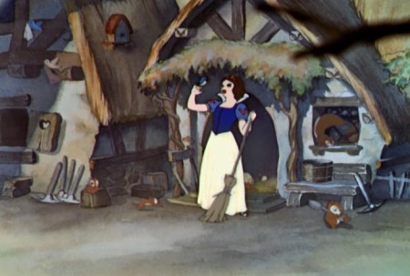 1a
1aThe first scene to use the multiplane after “Whistle While You Work,”
comes at the end of the sequence when the camera pulls out from the
cottage and Snow White has finished her work.
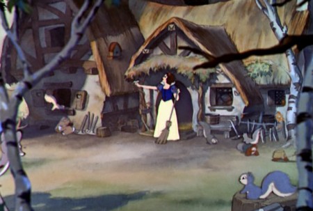 1b
1b
As we pull out, overlays, slightly out of focus, come into the picture . .
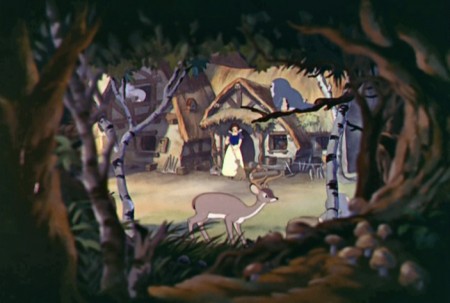 1c
1c
. . . until the camera comes to a stop.
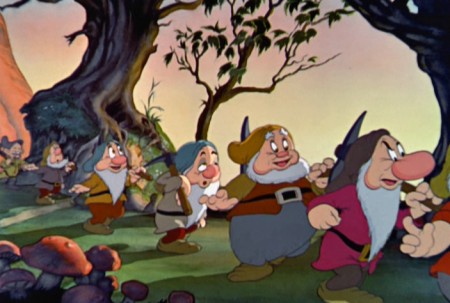 2a
2a
We see the next use of the camera when the dwarfs
go home from the mine.
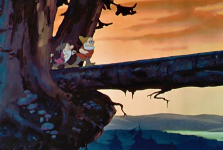 3a
3a
It’s the famous scene where all seven dwarfs
march across the tree-bridge.
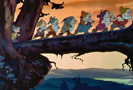 3b
3b
The sky is separated from the foreground elements . . .
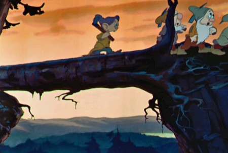 3c
3c
. . . as the camera moves in a bit.
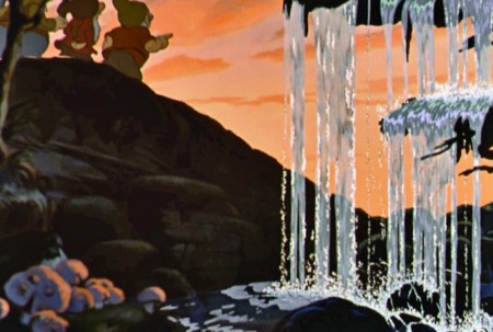 4a
4a
Likewise the following scene where the dwarfs
move home behingd the water fall.
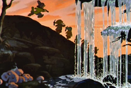 4b
4b
There’s a arge separation between background and foreground.
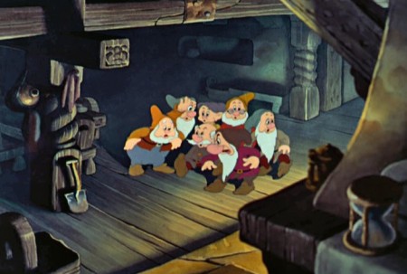 5a
5a
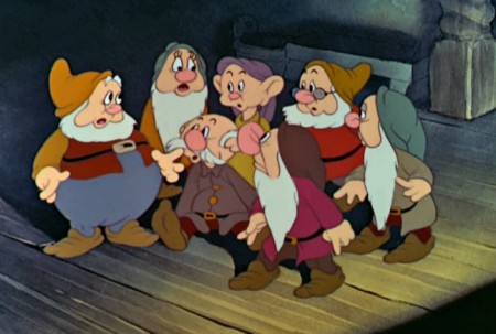
There is an interior shot where the dwarfs search for Snow White.
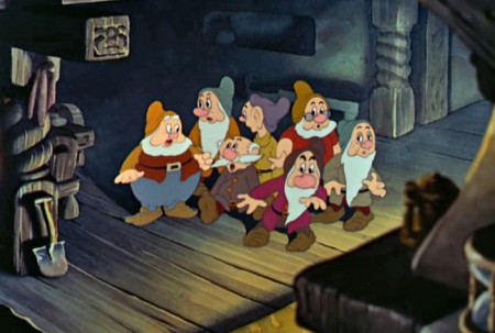 5b
5b
The camera trucks in to the dwarfs
while foreground objects go out of focus.
 5c
5c
Not all of the dwarf drawings are beautiful.
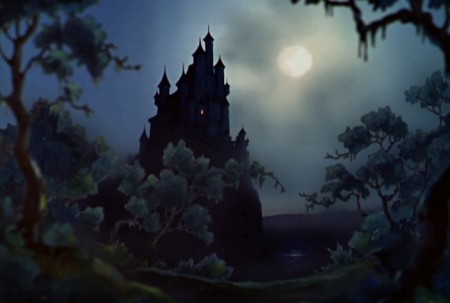 6a
6a
The truck in to the castle is stunningly beautiful.
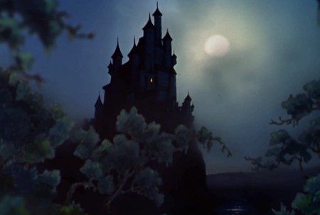 6b
6b
Traditionally, the moon stays its size
while other things move to the camera.
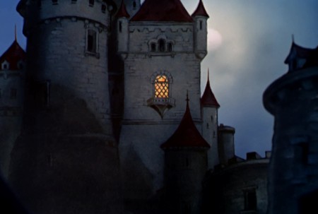 7a
7a
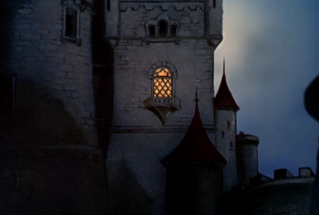
Dissolve to a closer shot of the castle and the moon . . .
 7b
7b
. . . the camera continues to move in.
 8a
8a
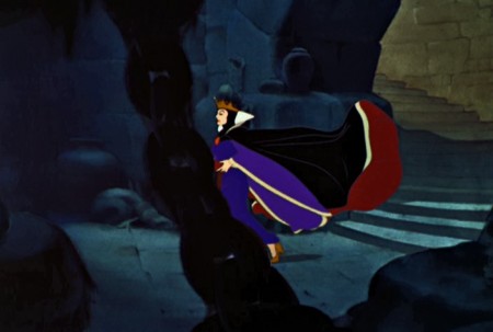
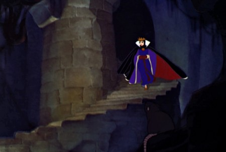
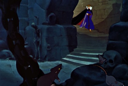
The Queen comes down the stone stairs.
 8b
8b
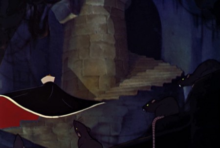
She continues to screen left.
 8c
8c
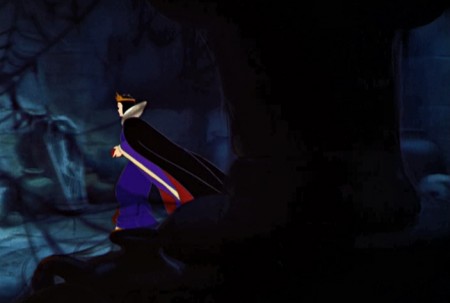
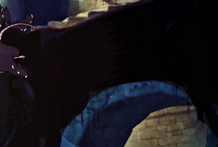
The camera pans down to the bottom of the stairs.
An overbridge passes the frame.
 8d
8d
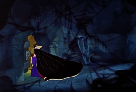
She continues on with all determination, behind chains.
 9a
9a
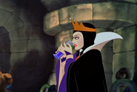
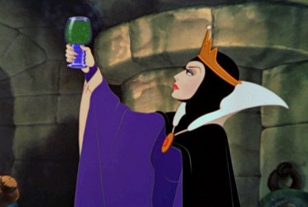
MS, the Queen raises her glass of toxins . . .
 9d
9d
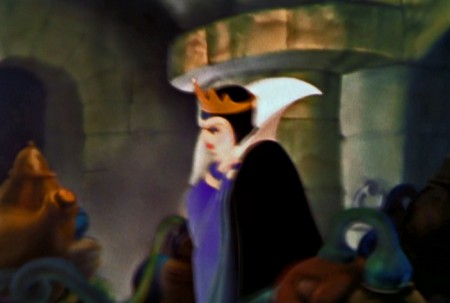
We lose focus on the Queen.
 9e
9e
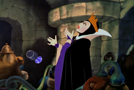
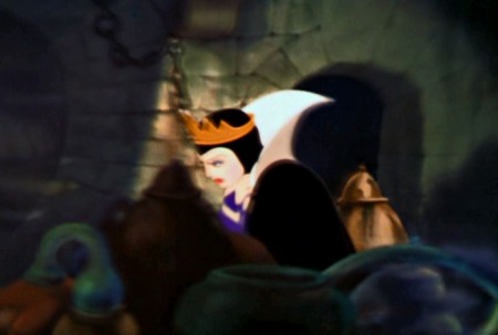
The room spins around as the montage begins.
Forground objects swirl in front of the Queen.
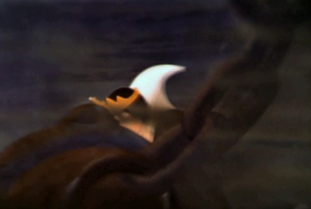 9f
9f
We end with a slip of the Queen, wildly out of focus.
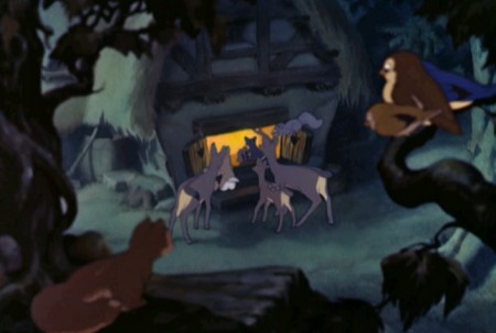 10a
10a
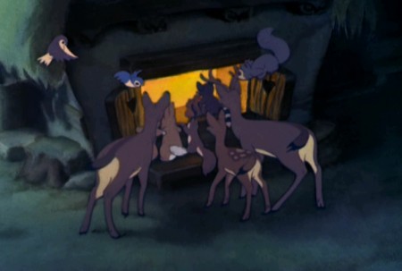
The animals watch the celebration going on in the dwarfs’ cottage.
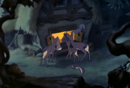 10b
10b
The camera pulls out giving levels for the multiplane camera.
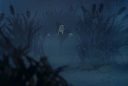 11a
11a
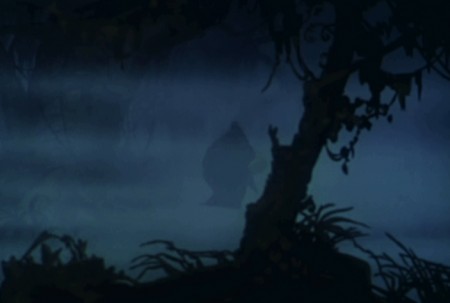
One of my favorite shots has the old hag coming out of the fog.
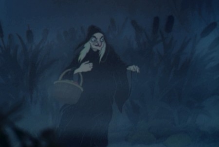 11b
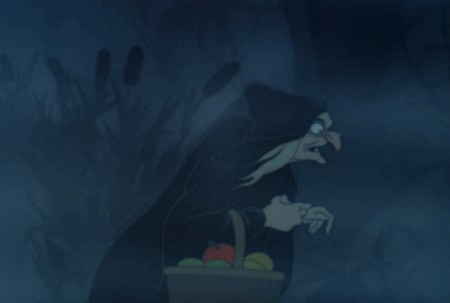
11b
She grows larger as she moves to the foreground.
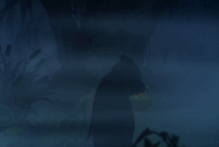
 11c
11c
She turns and moves across the screen.
 11d
11d
She urns her back to us . . .
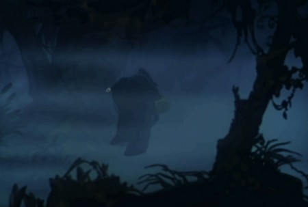 11e
11e
. . . and moves into the distance.
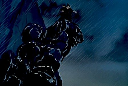 12a
12a
At the top of the cliff in the rain clouds move on another plane.
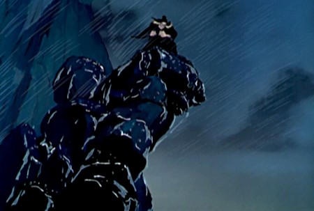 12b
12b
The camera moves in as the clouds continue to speed by.
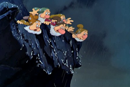 13
13
After she falls, the dwarfs look down to her.
This is the last multiplane shot in the film.
Photos &repeated posts 17 Jul 2011 07:27 am
recap Sunday – Hitching Posts
This post was produced back in July of 2008. I was looking at these bicycle posts again this week thinking of doing a follow-up. The images seemed identical, except that there was more loose garbage strewn on the street. I decided to just recap this original.
.
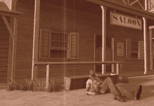 - Back in the wild, wild west, they used to have hitching posts so cowboys could tie their horses outside the local tavern to keep them from running wild. If there was no hitching post, cowboys in movies used the stanchions in front of the saloon or store.
We don’t have horses in the big city, but we do have bicycles. Hitching these with chains and locks and anything to try to prevent theft has
________(Click any image to enlarge.)_____________been a primary difficulty for
_______________________________________-_____messengers and other bike riders.
My studio has two entrances (or exits depending on how you view the situation.) At both, there are wrought iron fences which sort of act as bannisters going up/down the steps. Leaving work the other day, I noticed that the back entrance was used as a “hitching post” for a couple of bike riders. Presumably they were working out in the gym just next door.

Good thing we rarely use this exit.
This made me start looking at other hitching posts I could find on my way home, and I took some snaps.


Sign posts and trees seem to be likely candidates.

The upside-down “U” seems to be designed for smaller businesses
that want something curbside.

There’s also the “M” shape for a couple of bikes.


I’m not sure if these are supplied by the City or the storeowner.
There’s a uniformity around town that makes me wonder.

In places there are a number of these for the high bike traffic.

Sometimes this isn’t enough and a subway entrance serves as a backup.

Even though many “M”s have been placed in the same area.

I did like noting this one unit outside a “Circuit City” store that offered
an overhead to protect the bikes outdoors.
Commentary 16 Jul 2011 06:54 am
Classics
A memorial tribute film to Karen Aqua
by Lisa Crafts, music by Ken Field
- Last Sunday, July 10th, Ken Field held a memorial celebration of the life of his wife, the brilliant animator, Karen Aqua, who passed away last May. I wasn’t able to attend the tribute in Somerville, Massachusetts, but I was glad to learn that it was well attended and very much appreciated by those who were able to go. The speakers included Julie Zammarchi, Grey Held, Jeanée Redmond, and others. Ken, of course, had comments of his own which can be found on his Facebook page.
He also has intentions of creating a DVD compilation of Karen’s films and is trying to decide how many to produce. Here’s the note he sent me:
- There have been a lot of inquiries about how people can buy a dvd compilation of Karen’s animated films.
I am in the process of putting together such a dvd, and am arranging for a distributor for it. But it would be helpful to have some sense of how many to initially make.
To that end, I have put together a survey that you can answer online. If you think you might want to buy such a dvd, please go here to fill in the number of copies (1 is a fine answer) that you might want to purchase. The cost will probably be around $20, plus shipping, and the dvd will include all of Karen’s personal animated films, including Afterlife (but not any of her Sesame Street work or any of the workshop films we directed together).
I’ll tally these numbers in a few weeks, and send out a note when it becomes possible to order a dvd.
With all best wishes,
-Ken
The tribute ended with a second line procession that left a sweet note to the sad day.
- I thought it might be useful to point out that on my studio website, MichaelSpornAnimation.com, there is a place where you can see the schedule of Sporn films that are airing or playing around the country. Most often this means an HBO monthly schedule of Sporn films. There are, naturally enough, other goodies on that site.
By the way, I’m pleased as punch to have our most recent film, (an abbreviated version of our HBO show) I Can Be President, selected for competition in the Ottawa Animation Festival. I will be there and hope to see a lot of you there as well.
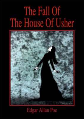
- I very much like Oscar Solis‘ idea for a new art blog. Covering the Classics is dedicated to his designing book covers for famous classic pieces of literature. Already he has done a number of beautiful illustrations. Kwaidan is beautiful and Moby Dick has strength in its simplicity. I hope he’ll keep it up.
My only complaint is that I wish the original size of the art could be a bit larger so that we can enjoy it a bit more.
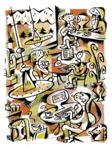
- Robert Kopecky is a designer. He’s designed for quite a few animation shows (Nate the Great, Codename: Kids Next Door, Daria et al.)
He’s created several blogs: one for animation design and another for his overall design. The latter includes a number of illustrations he’s done for publication.
Personally, this is my favorite of all the artwork displayed. There’s a lot of personality in all of this print design. Obviously, with his animation work he’s been given a specific styles to work in, and this reduces the slight edge I find in his illustration. I’d like to see some animation he designs from scratch.
His animation blog can be found here.
His design blog can be found here.
It’s worth keeping an eye on what he’s up to.
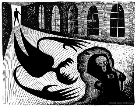
“The Tell-Tale Heart” which was part of the original proposal for the
POE feature we’re doing, but is no longer part of the film.
- And while I’m mentioning blogs of animation designers, I have to plug one who worked for me for years. The brilliant Jason McDonald has two blogs he publishes. One is for his design work, both animation and just-plain-Art, and the other is for a comic strip he does on line, My Living Dead Girl. (It’s a strip about zombies.)
Jason has done a substantial amount of design and storyboard work for my studio over the years (including quite a bit of work on developing some of the stories for the POE feature we’re trying to get going. His artwork is fun to animate and has a real sense of design to it, yet it’s not a look anyone else is doing. It’s original. He also has a great sense of daring in all the backgrounds he’s done for my films. I can’t sing his praises highly enough. As a matter of fact, though I’ve done a post or two about him, I think I probably owe him at least another one. (That way I’ll get some attractive Sporn art on my blog again.)
Champagne Bgs,
Nonsense,
Nonesense and Lullabyes (sic)
Jason’s animation design blog can be found here.
My Living Dead Girl can be found here.

- And I’d also like to give a shout out to Stephen MacQuignon‘s illustration blog. Steve worked with me for a million years coloring many big efforts such as The Red Shoes, The Hunting of the Snark, Whitewash, and Lyle Lyle Crocodile. After leaving my studio, Stephen started illustrating books and has been fairly successful at it. You can see lots of samples on his web site.
Bill Peckmann &Comic Art &Disney 15 Jul 2011 06:59 am
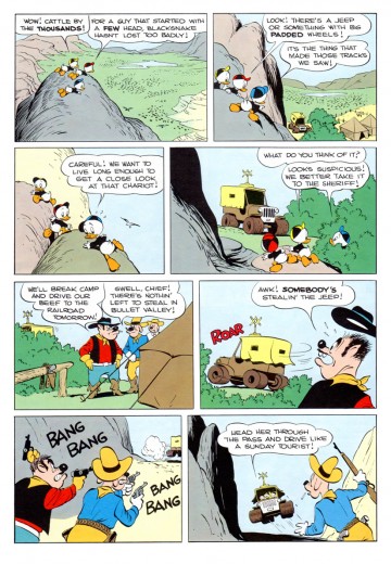
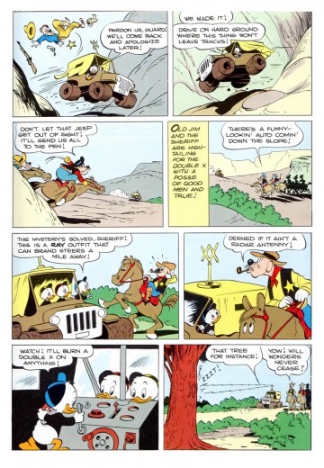
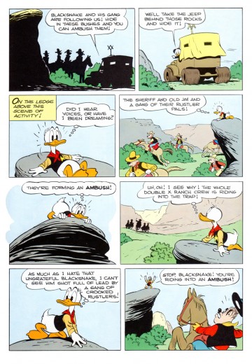
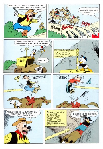
Sheriff of Bullet Valley – 2
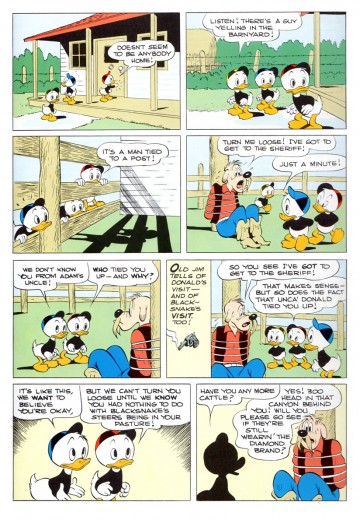
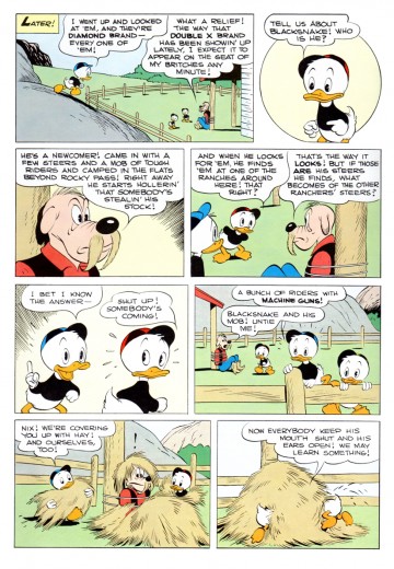
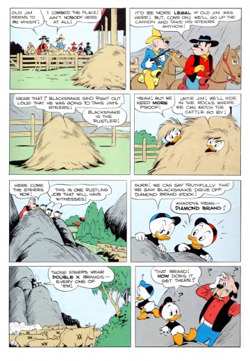
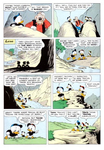
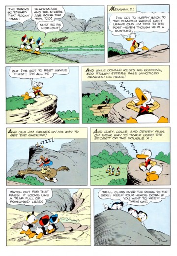
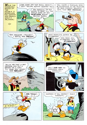
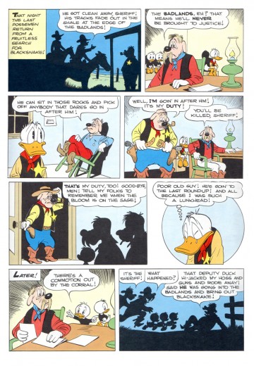
- Today we continue with part 2 of 3 from Carl Barks‘ brilliant comic story, “Sheriff of Bullet Valley.” Bill Peckmann who sent the whole thing to me for posting, starts with an oil painting by Barks which was based on this story. Bill writes:
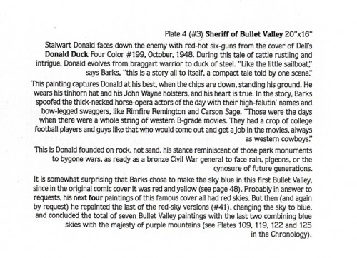
- Here’s Carl’s painting of the cover (caption to follow). It’s taken from “The Fine Art of Walt Disney’s Donald Duck” by Carl Barks. It was published in 1981 by Another Rainbow Publishing Co.
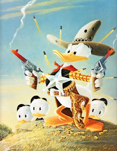
“The Sheriff of Bullet Valley”
Bill Peckmann wrote:
- Fortunately for us, “Bullet Valley” broke down nicely into 3 acts, but then again with the ol’ master, Carl Barks, at the helm, I’m sure luck had nothing to do with it.
One more note on the coloring. After rummaging through other colored reprinted (and original) versions of BV, I’ve come to the conclusion (IMHO) that this might be one of the best colored Barks story ever. I wish I knew who did the art direction on the the coloring, great job. Usually the colors are all slightly over saturated or are computer gradated, this version has all of the colors done nicely in a simple pale mode and boy, does that let Barks’ line work (one of the best in the business) superbly shine through!
Animation &Animation Artifacts &Disney 14 Jul 2011 07:18 am
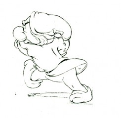
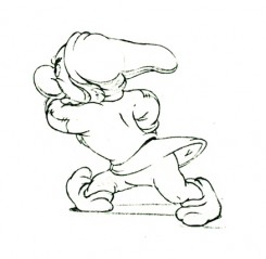
Dwarf walk – recap
As I noted on Saturday last, I have a wealth of Bill Tytla animation on the past of this blog and I think it’s time to bring it forward for a recap. The stuff is too good and deserves more than a little study for ANYONE who calls himself an animator. This piece was originally posted in August 2009.
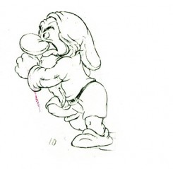
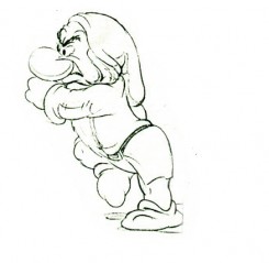
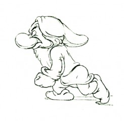
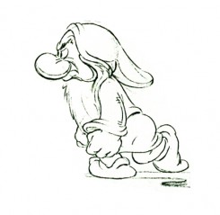
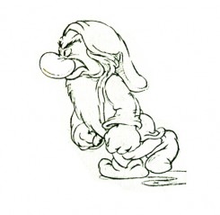
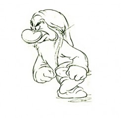
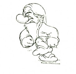
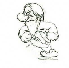
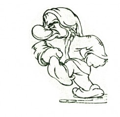
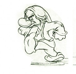
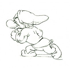
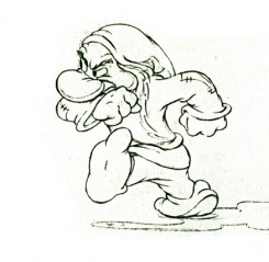
- Here are the drawings of Grumpy walking in a huff. Bill Tytla was the animator. The images come from a photostat which prepared the material for publication. A couple of these drawings appeared in the Thomas-Johnston book, Illusion of Life. The sequence, here, is missing drawing numbers 6,7 and 8.)
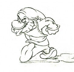 1
1 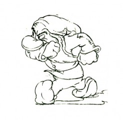 2
2Note how he starts with his shoulders high.
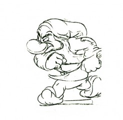 3
3 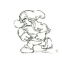 4
4
His bent leg, at this point, takes the weight of his body.
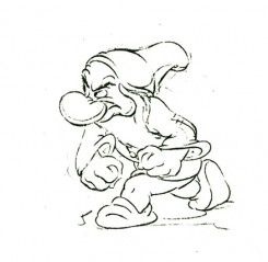 5
5 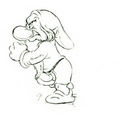 9
9
He moves his body up, high . . .
(Note that we’re missing drawings 6, 7, and 8.)
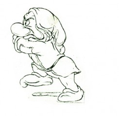 12
12 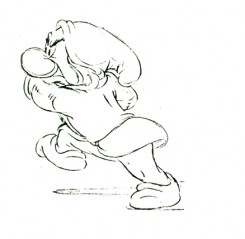 13
13
. . . then twists his entire torso.
 14
14 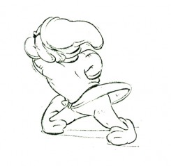 15
15
The straightened leg makes contact.
 16
16 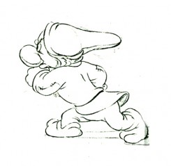 17
17
Again the shoulders go high as the pattern repeats on the other leg.
 18
18 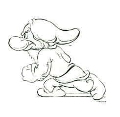 19
19
Note the detailed attention to the flow of the clothing throughout.
 28
28
(Click any of the above images to enlarge.)
The following QT movie is on one’s with
the exception of dwngs #5, 9, & 11 on twos
to make up for the three missing drawings.
Right side to watch single frame.
Animation &Animation Artifacts &Disney &Tytla 13 Jul 2011 06:50 am
Tytla’s Dwarf Fight – recap
As I noted last Saturday, I intend to repost a number of the Bill Tytla animated pieces I have in the history of this blog. His work, at least to me, is too important to let just sit there. This post was originally published on this blog in March 2009.
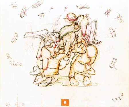
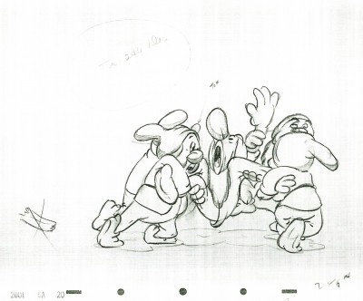
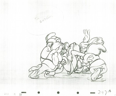
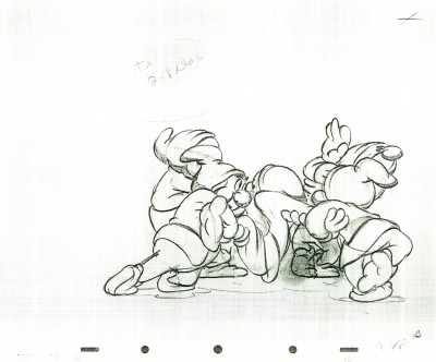
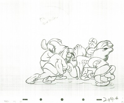
Here is a scene from Snow White, animated by Bill Tytla, in which four of the dwarfs fight Grumpy. The drawing above is the first of these drawings and it shows what it looked like in color – lots of red pencil notes, yellow pencil for rough structural lines. The rest of the drawings I have are B&W copies.
One of the things about Tytla’s work that I just love is the built in distortion he does to the characters. Check out Happy’s face (upper left) in drawing #227. Or Grumpy’s face in #260. They’re beautiful, and when the animation is moving, the distortion doesn’t show. He did as much with Stromboli. I’m convinced this is one of the ways he pulled the inner character out, trying to get Stanislavski’s theories into animation. It’s wonderful.
By the way, if you like this material check out Hans Perk ‘s site. Tytla talks about dealing with forces vs. forms in animation. This is what Tytla was all about in animating.
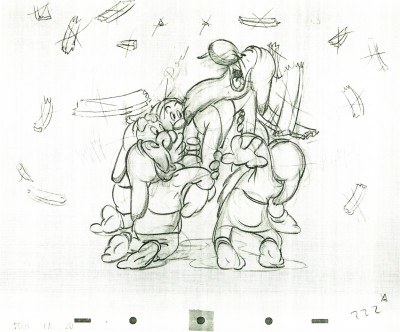 222
222(Click any image to enlarge.)
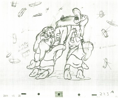 223
223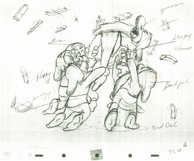 224
224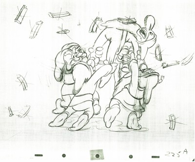 225
225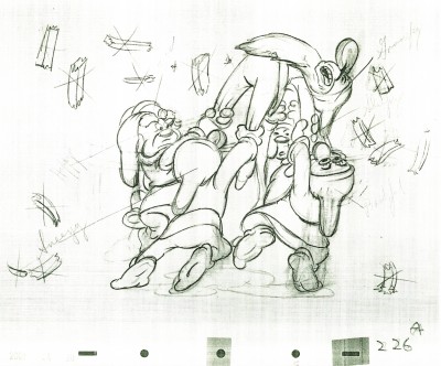 226
226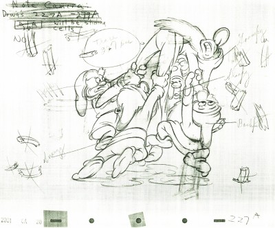 227
227Check out Happy’s face on this inbetween.
Then check out Tytla’s drawing (the next one) of Happy.
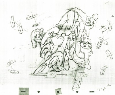 228
228
Tytla marked his own drawings with an “X” in the upper right corner.
The other drawings are the work of inbetweeners. The writing looks
to be all the work of Tytla.
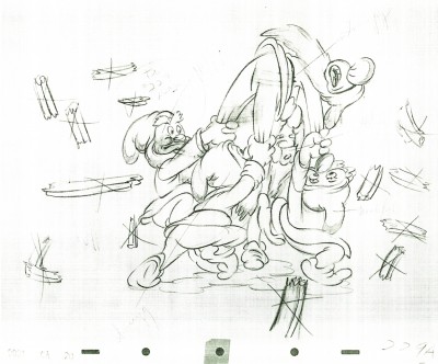 229
229
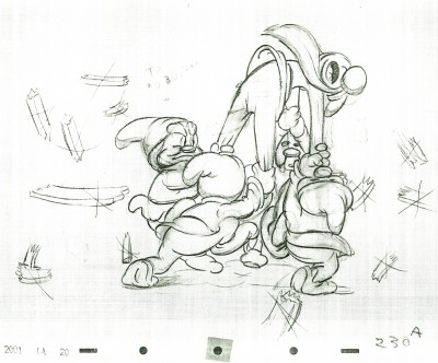 230
230
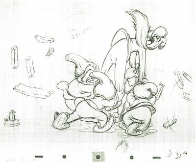 231
231
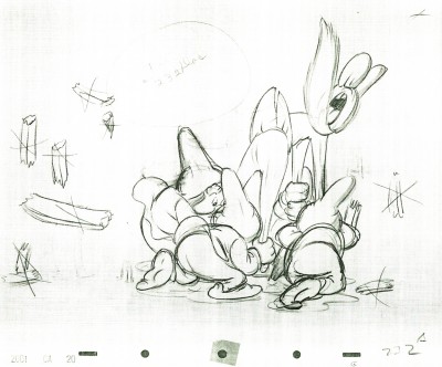 232
232
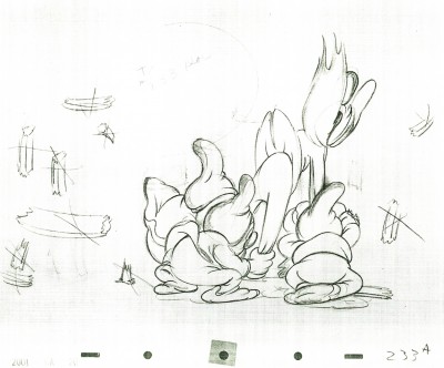 233
233
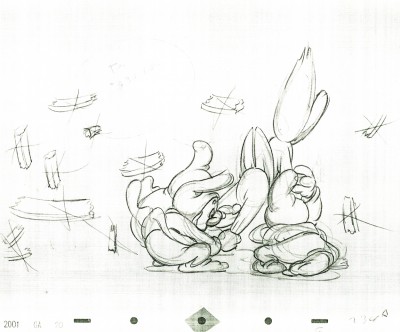 234
234
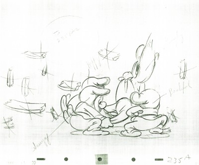 235
235
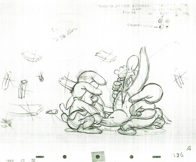 236
236
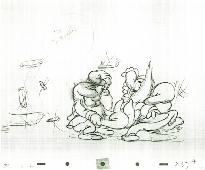 237
237
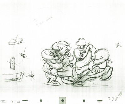 238
238
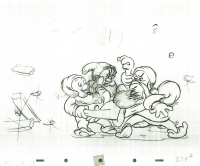 239
239
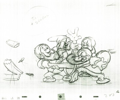 240
240
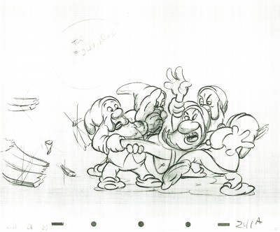 241
241
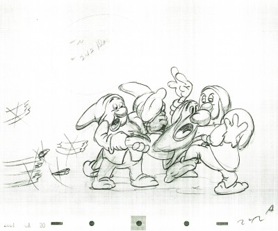 242
242
Some of these drawings are just hilarious in their own right.
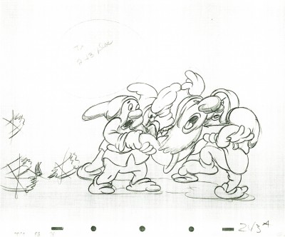 243
243
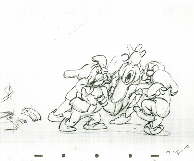 244
244
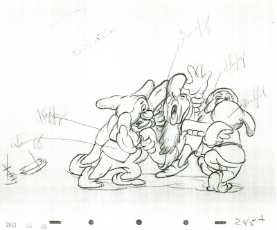 245
245
 246
246
 247
247
 248
248
 249
249
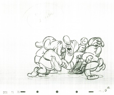 250
250
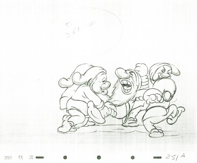 251
251
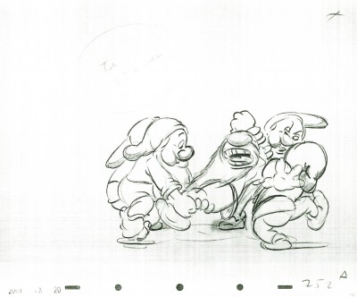 252
252
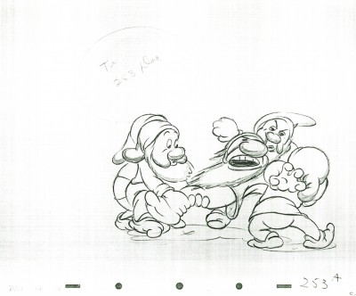 253
253
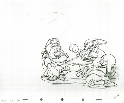 254
254
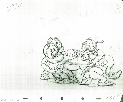 255
255
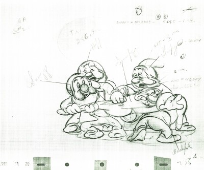 256
256
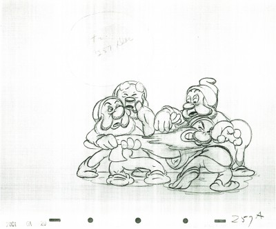 257
257
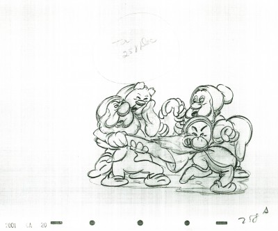 258
258
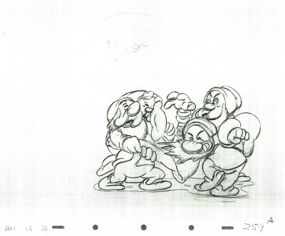 259
259
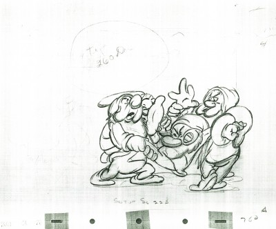 260
260
Action Analysis &Animation Artifacts &Articles on Animation &Disney 12 Jul 2011 06:46 am
Action Analysis – April 12, 1937
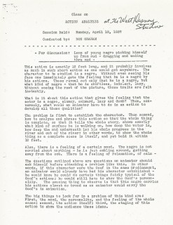
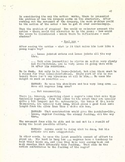
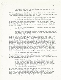
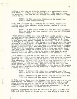
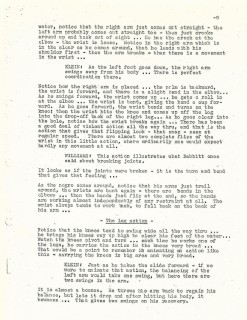
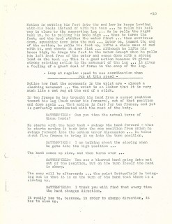
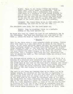
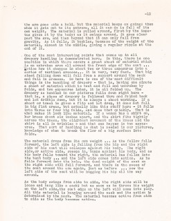
- Onto the next week’s class of Action Analysis at the Disney Studio, after hours. Actually, I’ve skipped a week. I only have four pages of the notes from the April 6 1937 class. Since it is missing a dozen pages, I’m not sure how worthwhile it’d be to post it. So I’ve skipped to this very full session.
Don Graham teaches. The film they study shows a 12 ft. (8 secs.) bit of a man picking himself up from mud – dragging and wading through mud. (It’s a little embarrassing posting this which actually reads: “Loop of young negro picking himself up from mud . . . Those were the days of feckless, racist behavior.) Obviously, we can’t see the footage (which is probably still somewhere in the Disney vaults), but we can pick up lots of information from the lesson.
The attendees who participate include: Jack Hannah, John Vincent Snyder, David Rose, Izzie Klein, Joe Magro, Chuck Couch, Robert Leffingwell, Milt Neil, Roy Williams, and Paul Satterfield.
Read on.

Title page
