Monthly ArchiveJune 2011
Bill Peckmann &Books &Illustration 10 Jun 2011 07:50 am
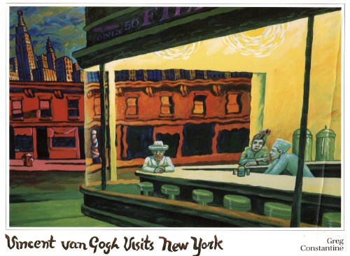
Vincent by Constantine
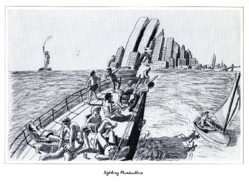
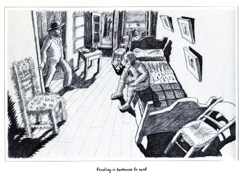
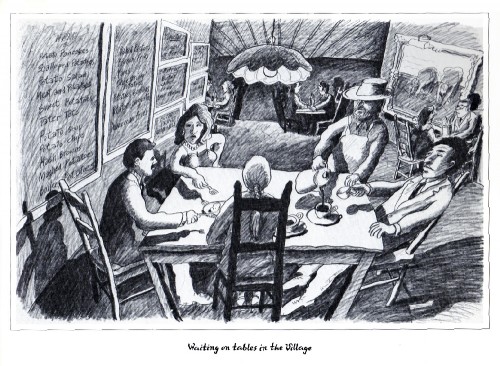
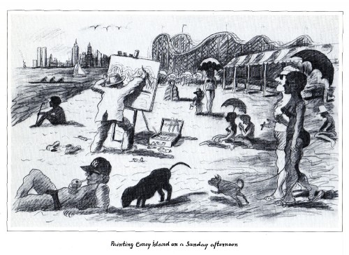
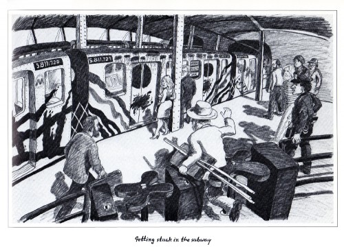
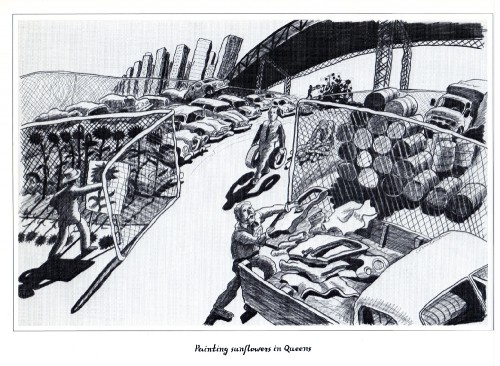
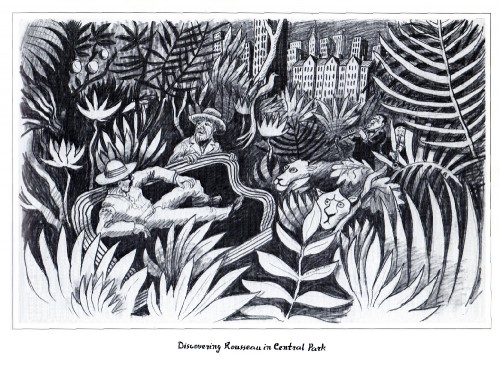
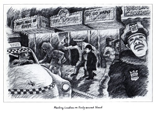
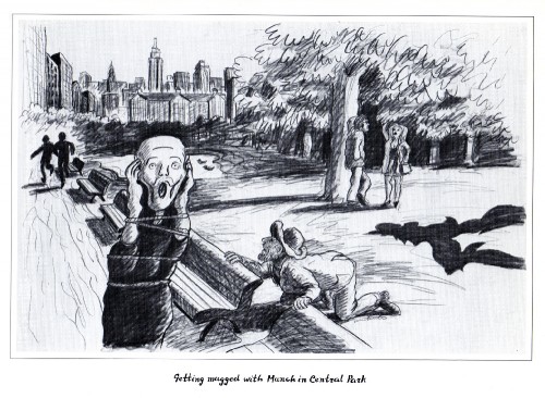
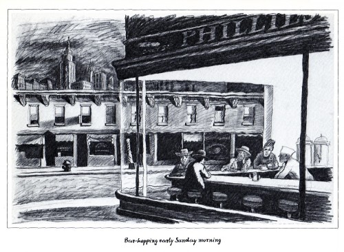
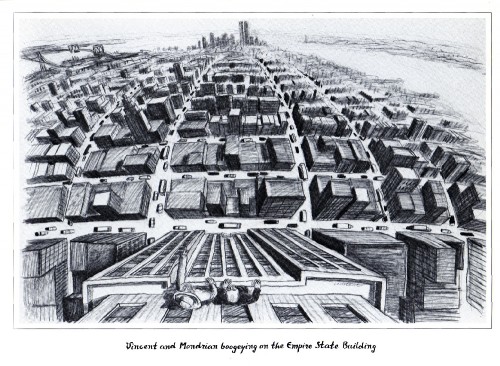
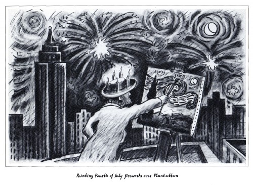
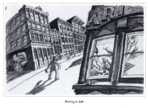
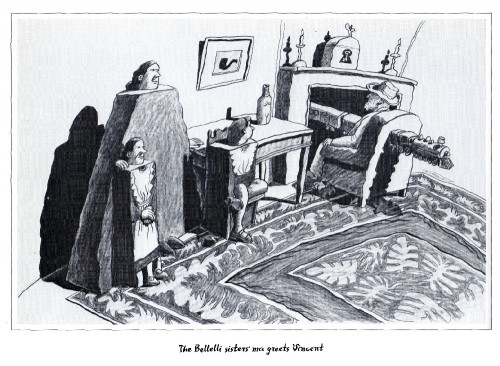
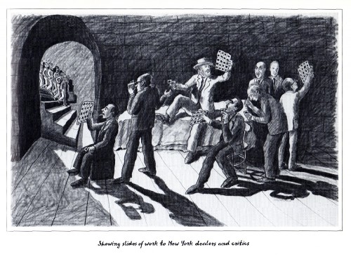
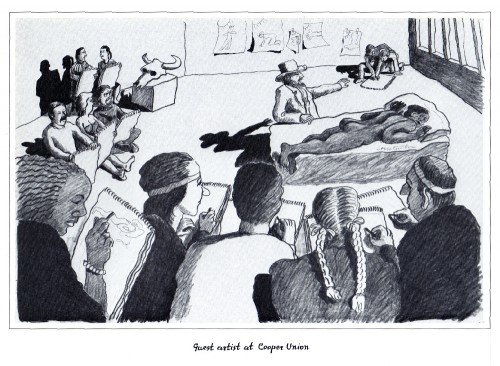
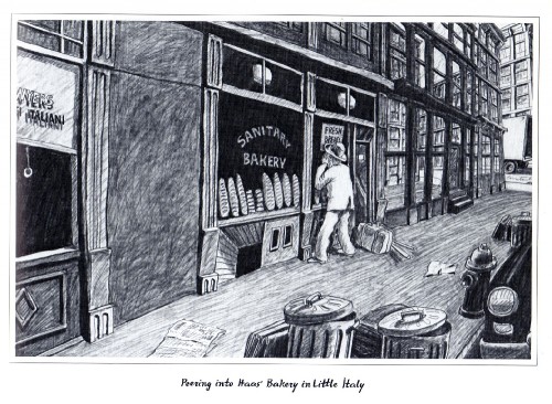
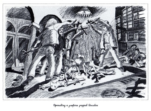
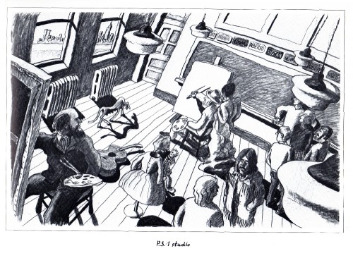
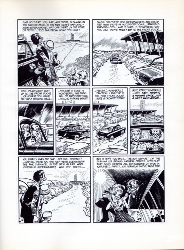
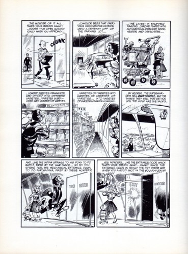
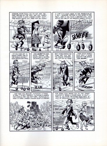
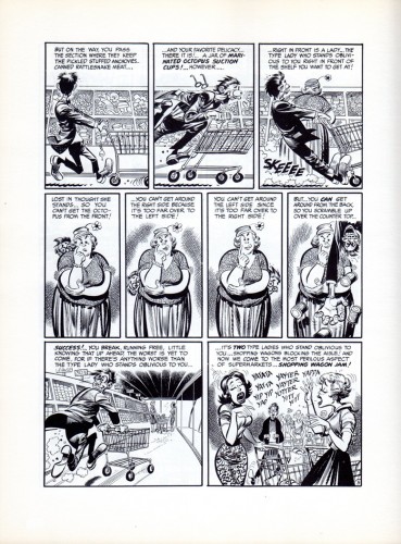
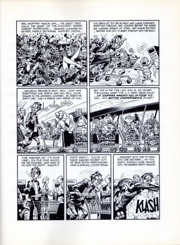
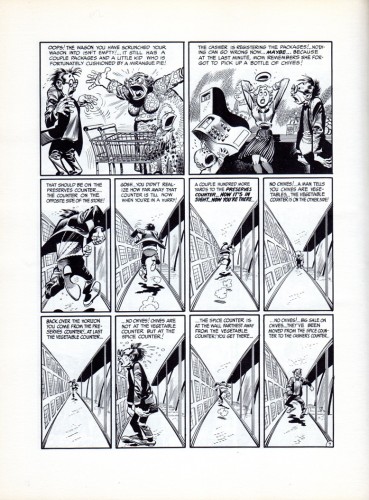
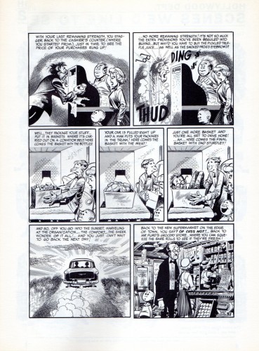
- Bill Peckmann was reminded of this book by Hopper‘s Nighthawks painting on the last Hopper post we did. So he sent me some pages of Vincent Van Gogh Visits New York by Greg Constantine, a paperback book he bought in the ’80s. Constantine also did Leonardo da Vinci Visits Los Angeles and Picasso Visits Chicago.
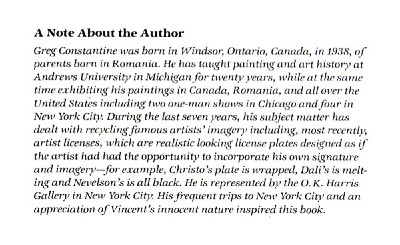
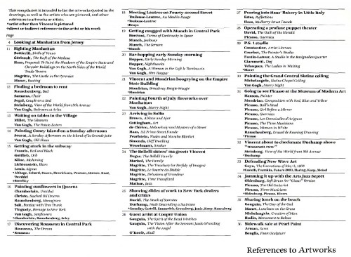
This is a guide the author gives us to artistic references throughout the book.
Thanks to Bill Peckmann for the scans and sharing the book with us.
Action Analysis &Animation Artifacts &Articles on Animation &Disney 09 Jun 2011 07:14 am
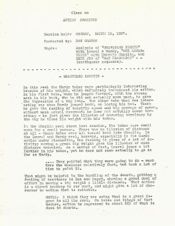
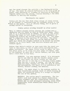
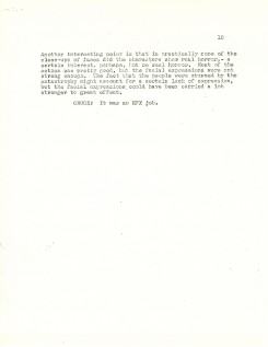
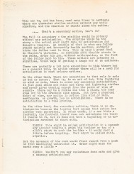
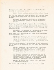
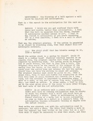
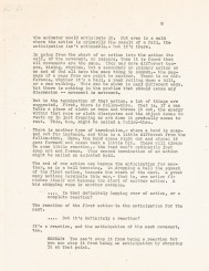
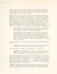
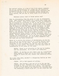
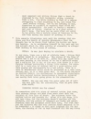
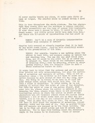
Action Analysis – March 15, 1937
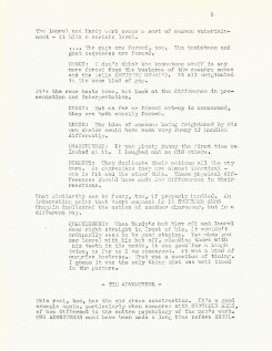
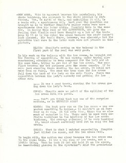
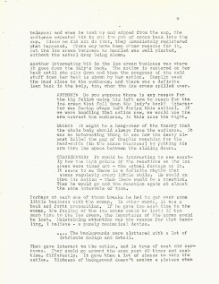
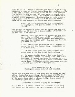
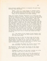
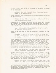
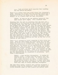
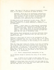
- Here is yet more of the Action Analysis class notes transcribed at the Disney studio in this lesson wherein they study clips from several films including a Laurel & Hardy short and a Charlie Chaplin short. If you can get your hands on either (Netflix might have them) it’ll help you to understand the talk.
Participants include: Teacher, Don Graham, animators, Izzy Klein, Joe Magro, either Jacques or Bill Roberts and Stan Quackenbush, storyman Chuck Couch, and BG artist, Dick Anthony.
The complete body of these notes really works as a masterclass in animation for those who are interested and take the time to read them.
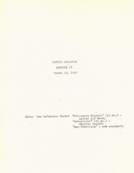
Cover
Animation Artifacts &Illustration &Layout & Design 08 Jun 2011 07:35 am
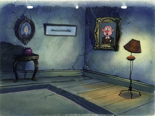
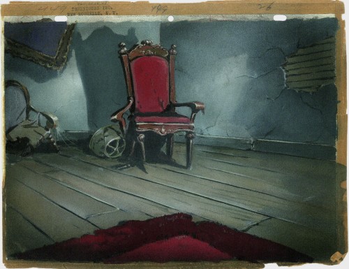
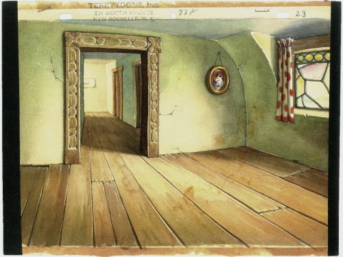
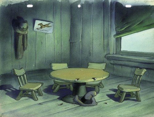
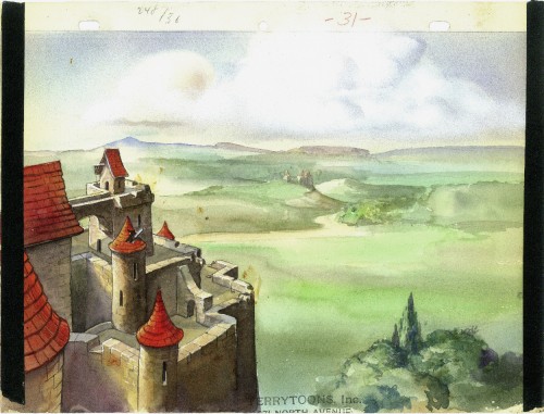
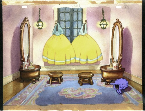
Terry Bgs
- I have a few Terrytoon Bgs and thought I’d post them today. They come from a number of different shorts from the late ’30s. If you have any idea of titles, please don’t hesitate to leave a note.
I have to say that I really am in awe of the watercolor and/or tempera painting abilities of the artists. They’re quite attractive in person. I must say that they stand up well against some of the other studio work I’ve seen. There were a couple of second rate watercolors done for some MGM Tex Avery shorts I’d seen only yesterday. I wouldn’t expect Terrytoons to be better, but they are.
Enjoy.
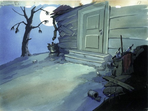 1
1
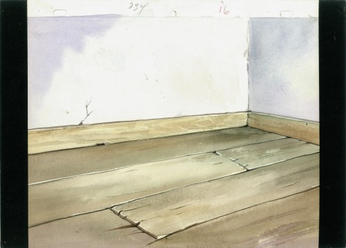 6
6
This Bg is from “The Three Bears” (1939)
Bill Peckmann &Comic Art 07 Jun 2011 07:05 am
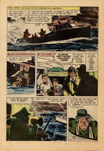
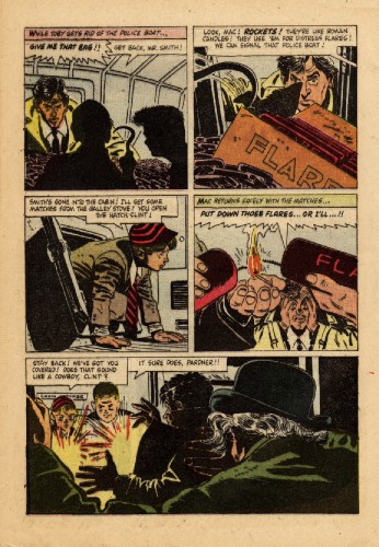
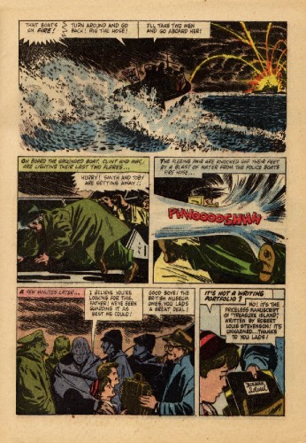
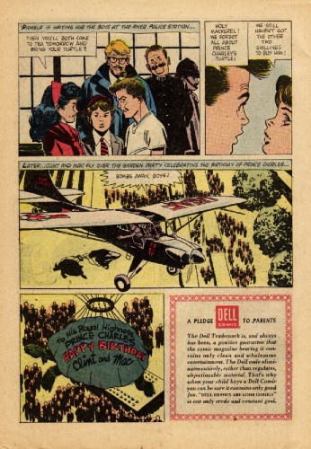
Clint & Mac – 2
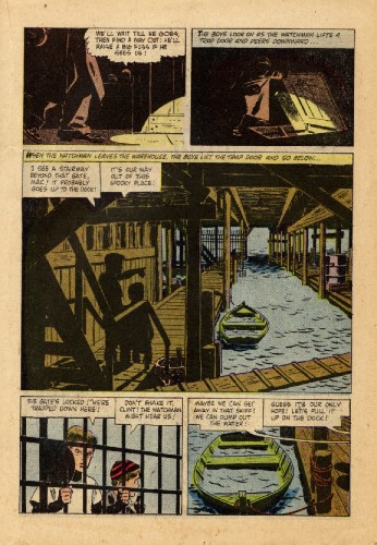
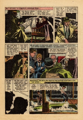
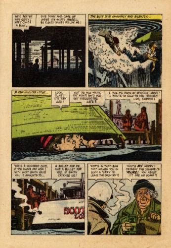
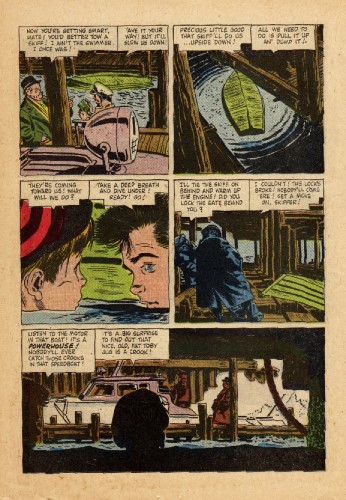
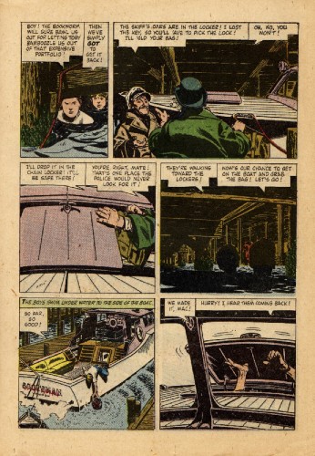
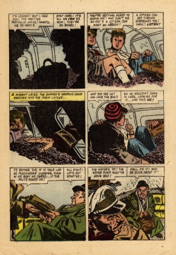
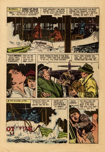
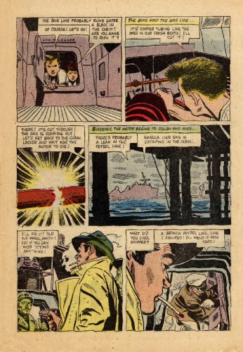
- The other shoe drops. A while back I posted the first half of the comic book, Clint & Mac, which was illustrated by Alex Toth from a Disney live-action feature. The book was sent to me by Bill Peckmann, and we’ve just put together the second half, for your amusement. The art’s all first rate, and the story adaptation isn’t that bad either.
Here’s a note Bill sent me with the scans:
- This book has been a real pleasant discovery and surprise. I’ve got to confess because of its innocuous title, it’s always been on the bottom of my pile and until recently hasn’t got the kudos it deserves. I know for me it was seeing the recent publication of Manuel Auad‘s very fine Robert Fawcett: The Illustrator’s Illustrator that made me realize just how much of a Fawcett fan Alex was and it really shows in his “Clint & Mac”.
Here’s the rest of the story, starting where we left off with pag. 19:
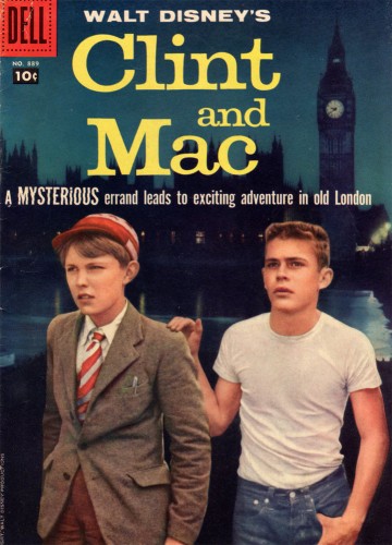
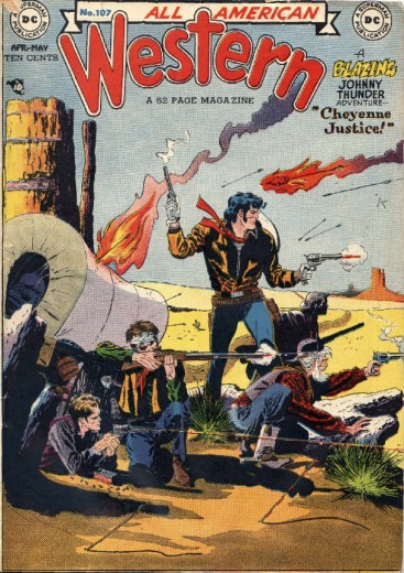
The magazine’s cover
Here’s an additional treat: it’s the original art of the “All American Western” cover, #107, 1949. Dean Mullaney had printed this art in the book Genius Isolated which he co-authored with Bruce Canwell. They were kind enough to send it to Bill for posting here.
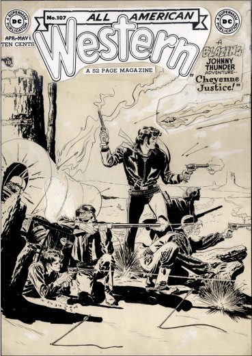
The original art
Many thanks to Bill Peckmann for arranging and passing along this rare bit of comic art.
Disney &Frame Grabs &Layout & Design 06 Jun 2011 06:40 am
Cinderella Multiplane
 - Cinderella was produced on a rather tight budget. After having produced a number of package films, containing collections of shorts, the film was Disney’s attempt to get back into features. His coffers were emptying, and he wanted to get back into the mainstream. They tightened the budget for the film and produced it quickly.
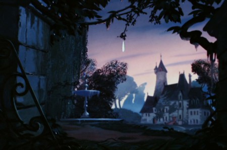
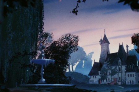
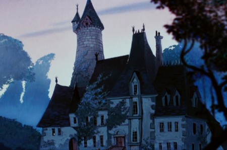
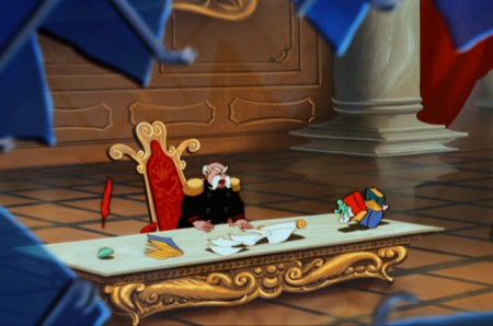
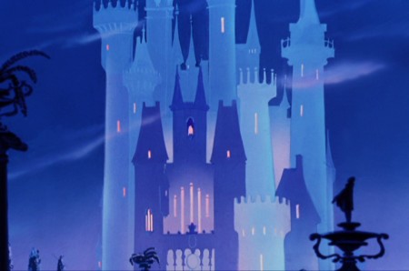
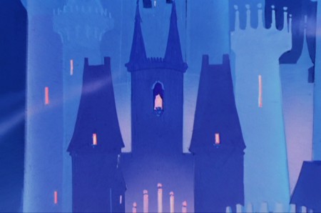
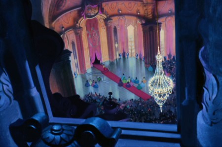
As such, I was curious to see how many multiplane shots were in the film. I was only able to locate five of them, and they’re all uncomplicated shots – all with a simple camera move in. They didn’t allow for much in the way of focus changes and kept focus pretty mcuh constant throughout them all. There was nothing elaborate built into the camerawork.
 1
1
Seq 1.1 Scene 55
This is the opening of the film, after the storybook section reveals the back story.
 2
2
The camera slowly begins to move in.
 4
4
We’re starting to see some marginal soft-focus in the foreground elements.
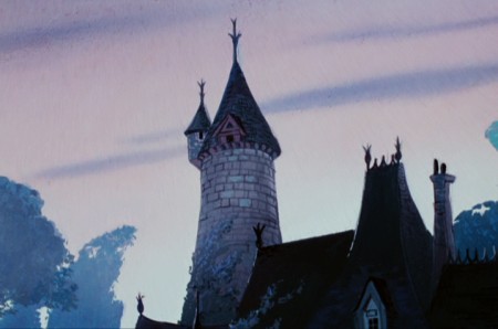 5
5
The final setup before the dissolve into Cinderella’s room.
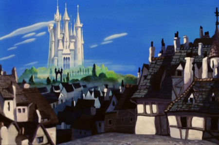 1
1
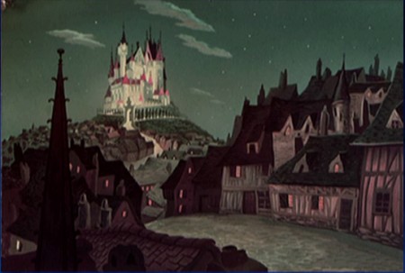
Seq 2.0 Scene 1
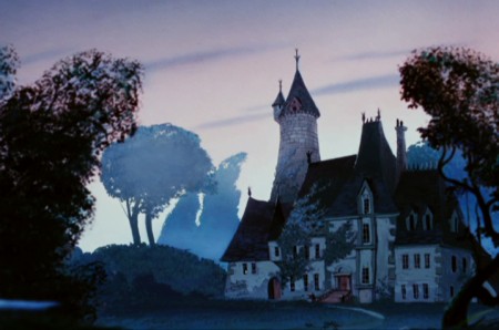
The town with the castle in the distance.
 2
2
The camera moves past the town into the castle.
 3
3
We end on the castle before dissolving to the interior of the castle.
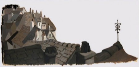
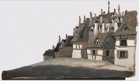
With this shot we have images of some of the elements used to create the multiplane shot.
The artwork looks to be for a night version of the same shot. I haven’t seen this in the film.
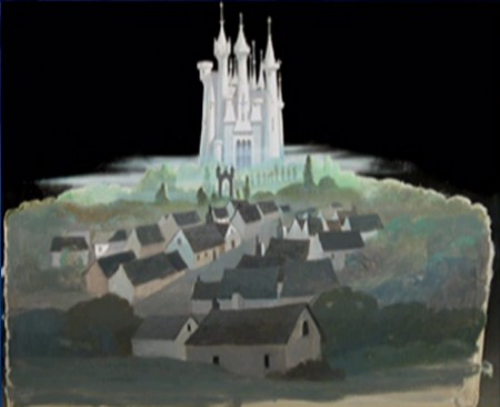 3
3
Level #3 – the castle with sky separate.
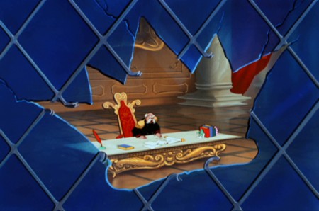 1
1
Seq 2.0 Scene 2
The camera moves through the glass. King is out of focus/ glass is in focus.
 2
2
As we get closer, king comes into focus and glass out of focus.
 1
1
Seq 4.0 Scene not listed on drafts
Cinderella’s coach is on the way to the ball.
 2
2
The camera moves in on the Palace.
 3
3
The final setup before the dissolve to the next shot.
 1
1
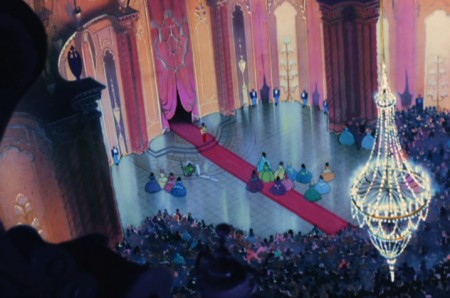
Seq 4.0 Scene 1
We move in from an aerial view of the ball – through a window.
Next week I’ll take a look at the multiplane camera in Disney’s feature, Peter Pan.
Books &Commentary &Layout & Design &Theater 05 Jun 2011 07:08 am
Boris Aronson & the Yiddish Theater
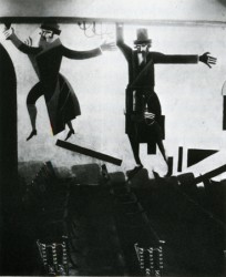 Back in 2007, Eddie Fitzgerald had an excellent piece on his site about the Yiddish Theater. This encouraged me, at the time, to write a post built on the back of some of the set designs of Boris Aronson, one of the greatest of all set designers for Broadway. I’ve added to it and recap it here.
Most people have forgotten the theatrical heritage that came out of the Yiddish Theater. The immigrants to America brought a theatrical treasure with them. In New York, Second Avenue housed dozens of theaters that entertained a very large audience with hundreds of plays. The shows, of course, were all performed in Yiddish. These shows were not only in Manhattan but in the outer boroughs as well.
Many performers stepped out of Yiddish Theater into stardom, but there were also many directors, writers, composers and designers that emerged as well to create the history of the mainstream theater.
Boris Aronson, a Russian immigrant, designed for the Yiddish Unser Theater in the Bronx. He took his position as an opportunity to introduce Constructivist designs to audiences. New art was entering America at the popular level, and it was accepted.
Aronson did quite a number of set pieces and costume designs before moving over to the mainstream, English-speaking theater. He became the foremost designer on Broadway designing the original productions of many shows such as Cabin In The Sky, Bus Stop, The Crucible, and Awake and Sing. His later work included Cabaret, Fiddler On The Roof, Company, Follies and Zorba.
Here are a few examples of the work he did for the Yiddish Theater.
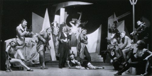
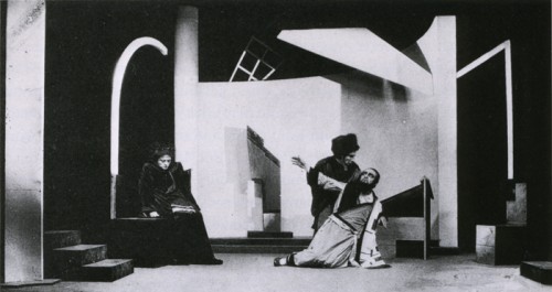
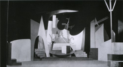
The above three images are from Aronson’s first production.
The Constructivist designs were for Ansky’s production of Day and Night (1924).
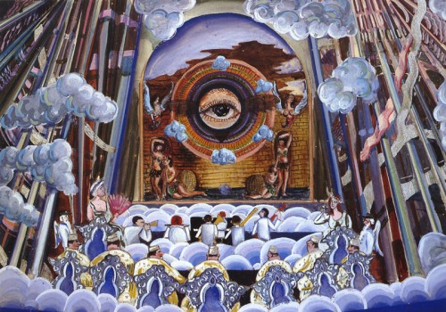
The allegorical plays of the Yiddish theater often featured Heaven and Hell.
Here, Aronson designed a “a concert hall in the skies of hell.”
The show was Maurice Schwartz’ production of “Angels on Earth”
for the Yiddish Theater in 1929.
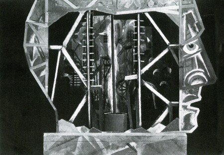
Here is his depiction of “Hell” in model form.
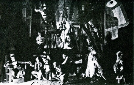
Here is the actual production of the “Hell” set.
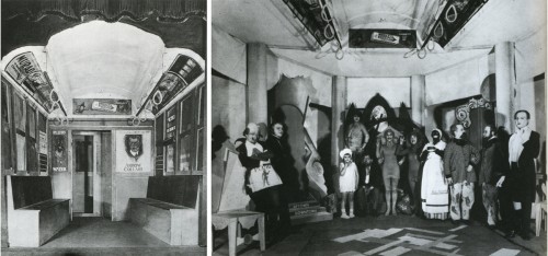
The show “The Bronx Express” required a subway car (left) with advertising cards.
A tired buttonmaker on his way home from work dreams that these ads come to life. (right)
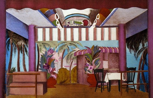
In the same show, the buttonmaker dreams of a beach resort boardwalk.
Aronson keeps the ceiling of the subway car intact for this set.
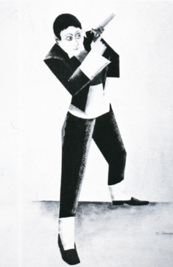
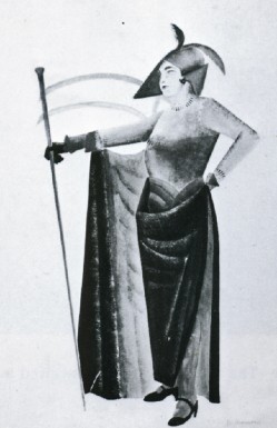
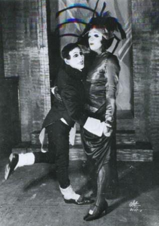
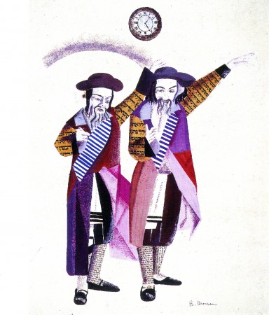
Designs for costumes for Joseph Buloff and Maurice Schwartz.
Books &Commentary &Disney 04 Jun 2011 06:52 am
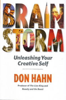
Don Hahn’s Brainstorm & Other Brickabrack
 - Don Hahn is a busy guy. Aside from producing Beauty and the Beast, The Lion King and The Hunchback of Notre Dame, he’s produced the Disney nature documentaries Earth, Oceans and African Cats. He’s also directed Waking Sleeping Beauty about the renaissance of Disney animation.
Mr. Hahn has also written a number of books, starting with Animation Magic through Disney’s Animation Kit as well as The Alchemy of Animation up to his most recent (non-picture) book, Brainstorm: Unleashing Your Creative Self.
I recently picked up Brainstorm and have read it, so I thought I’d write a few comments. I believe this is an updated and expanded version of the earlier book, Dancing Corn Dogs in the Night. In either incarnation, it’s an easy-to-read book with a light and casual sense of humor. Mr. Hahn is very comfortable in the skin of the light raconteur; he often tells stories that are witty and help to direct his point. This is a book about the creative process, and it tries to tell people how to get their artistic side out of their bodies.
 This process is best told in a story wherein a younger production manager calls Hahn in the evening asking to come up to his office. When they meet, the young executive says he needs advice: he’s trying to write a screenplay and is stuck. He wants Hahn’s advice as to how to get going. Hahn tells us that “the most successful writers write because they have to.” The conversation, he tells us, really came down to how much the writer “really felt he had to write.” Hahn says that he felt the writer had shortchanged himself; he needed the courage to be honest with himself and make big changes in his career path. “He had to be authentic.”
There are many such stories like this in the book, and they all feel authentic. It’s just that they all feel as though they’re adding up to be a Self-help book. There are many lines which I had to squirm through with ideas that no one would really have to tell an artist. The hardest line for me in the book is: “Shakespeare must have loved putting words together. He was like a phrase machine. If one guy was able to be that innovative with language in the sixteenth century, then why can’t we be more innovative?” The answer, of course, is that Shakespeare was the greatest living writer-as-artist that there ever was. He was a genius. I am not a genius, but I would never compare myself with Shakespeare. Maybe Stephen Sondheim might be comparable, but don’t ask me to be innovative so that I can be more like Shakespeare! I think of myself as someone trying my entire life to be an artist; I don’t have a problem being innovative, but I also can’t put myself in the same sentence with Shakespeare.
As such, I had a bit of a hard time reading it. I never in my life have had a hard time expressing myself artistically and have never needed advice on how to allow the muse to flow from myself. I don’t have a hard time getting started; more so I have a hard time stopping.
It was difficult for me to contain myself while reading a how-to book on the artistic process. “Art for Beginners” is not something I really needed to read, however the stories told kept me moving on through the book, and I’m sure they’ll entertain you as well. There’s the story of Dick Williams disappearing from his studio while preparing for a deadline in animating a scene, only to return very late in the deadline to whip it out. He had his own process of preparation. Or there’s the story of meeting Woolie Reitherman for the first time and hearing him call John Huston during the meeting (which leads to Hahn’s casual comparison between Reitherman and Huston.)
There are many stories we haven’t heard before, and for that alone, I felt the book was worth reading. I also appreciated that it might help some people to get the creative process going, if they are novices trying to think of themselves in artistic terms. I assume there are many such people out there.
2000
- This is the 2000th post I’ve put up.
No wonder my typing fingers are sore.
____________________
A Bad Start
 - Things started off roughly this week. First thing in the morning on Tuesday I was greeted with the news that Karen Aqua had died. It took a lot out of me that day. To lose so enormous a talent is difficult; to lose a friend in the animation community is even harder. We lost both with that email.
I posted my little post – not much more really, than Karen’s husband, Ken Field‘s telling of the news and information about a memorial service (when I know more about that I’ll pass the news on) – , but I found a wealth of Independent animators checking in to express thier feelings. Everyone from Candy Kugel to Kathy Rose, Joanna Priestly to Paul Glabicki. _____________Civilization by Karen Aqua
I realized with that open expression that there really is no place for the Independent animator to check in for news or stories about their work. Non studio artists are left to their own blogs and websites to promote their animation while multi-mega-budget films are given top headlines over whether or not they’ve broken the $100 million mark. It just doesn’t seem fair to me.
So I’ve decided to step tentatively into this water. I’m going to devote a day of the week (probably Tuesday or Thursday) to writing about some filmmaker/artist/animator. It’ll probably be a mix of reviews, interviews and bios of some of our best artists. Shameless promotion for the films that deserve more attention.
Independent animators: don’t hesitate to contact me if you have anything you’d like to promote or news you’d like to share or even if you’re just interested in having your films be a focus for a day.
- Speaking about that post, I was glad to see Cartoon Brew finally comment on Karen’s passing by directing people to my blog, but I was annoyed to see another blog lift my piece verbatim and post it on their site – not even separating my stills from their enlarged versions so that when you clicked a still it sent you to my site. Ordinarily, I wouldn’t mind, but I do like when they give my blog credit. Unfortunately, there was no naming of the origination of this post, and the blogger passed it off as if it were his own.
People, we have to have some modicum of courtesy out there !
I also contacted Ron Diamond at AWN to make sure they’d have a note about Karen on their site, (I knew they would, they’re usually just a tad slow in getting it done) and, indeed, they said one was in the works. It was posted that same day.
- The Holland Animation Film Festival has made a decision to move its date from Autumn to Spring. That means their next Festival will take place in the Spring of 2012, and there will be no Holland Animation Festival in 2011. The next edition is from 28 March through 1 April 2012.
I haven’t attended any of their Festivals, but for some reason I suspect this is one of the better ones out there. Maybe I should aim to go in 2012 if I can ever finish another film.
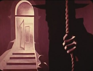 - Hans Bacher has posted a number of beautiful posts on Paul Julian‘s work on The Hangman, a film he directed in 1964. Go here and here to see the two already up and they will lead you to past posts on Julian’s work.
In the past, I’ve posted a couple of Julian’s books, Toot and Piccoli.
I’ve also done posts about Paul Julian‘s work for Roger Corman. You can see those posts here.
You can see a reddish print on YouTube here.
Bill Peckmann &Books &Comic Art &Illustration 03 Jun 2011 07:18 am
Mad Mad World
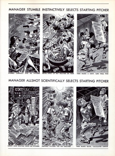
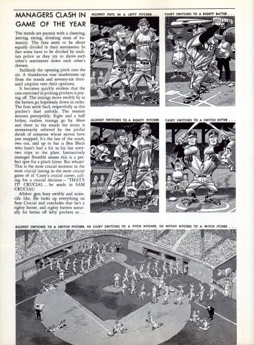
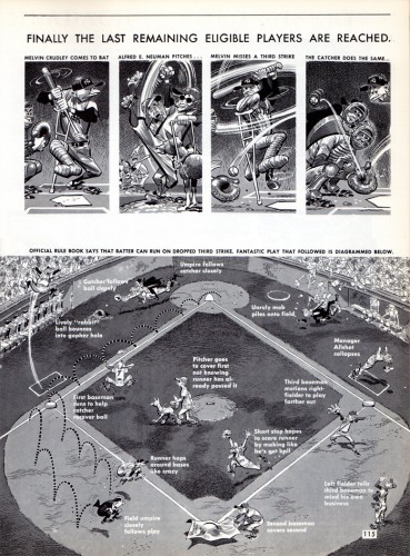
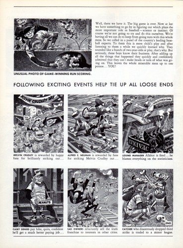
- Bill Peckmann forwarded the following material from Mad magazine taken from the collected Mad For Keeps. Here’s to Bill’s comments:
- Here’s a little something for all Harvey Kurtzman (writing and unseen rough lay outs) and Jack Davis (finished art) fans.
In 1958, Crown Publishers came out with the best of MAD collection. I believe this is the first hardcover collection of EC Comics to ever come out. Most of the book is comprised of MAD Magazine (started in ’55) stories and a few MAD Comic Book (’52 to ’55) stories.
Some of the comic book stories are printed in their original color, others without their original color. As far as I can tell, all of the work in here was written/rough laid out/edited by Harvey Kurtzman, MAD’s founder. It’s all copyrighted by EC Comics.
By the time the book came out it must have been a very bittersweet moment for Harvey because he had already left MAD, and MAD was just starting to become a commercial success. MAD went on to become an industry, rightfully so, but IMHO it never again was the “class” act that Harvey shepherded in. Also in retrospect, Kurtzman couldn’t have sustained that level for ever. After all, how many “Starry Nights” could Vincent paint?
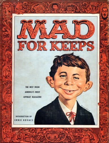 1
1We’ll start off with the cover, comprised from one of the issues,
which has Harvey’s great MAD logo, Bill Elder’s border and probably
Norman Mingo’s first Alfred E. Neuman illustration.
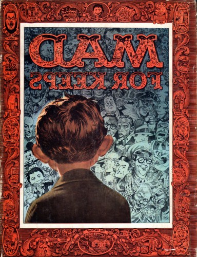 2
2
This is the back cover which Jack Davis embellished.
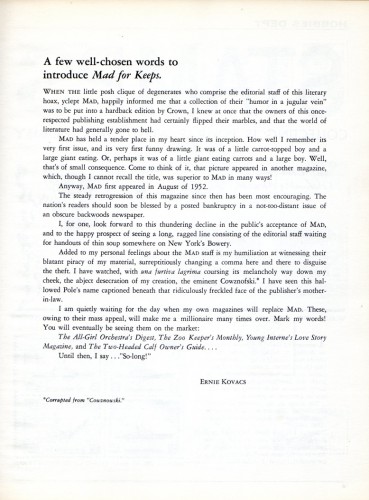 3
3
Here’s the book’s introduction by Ernie Kovacs.
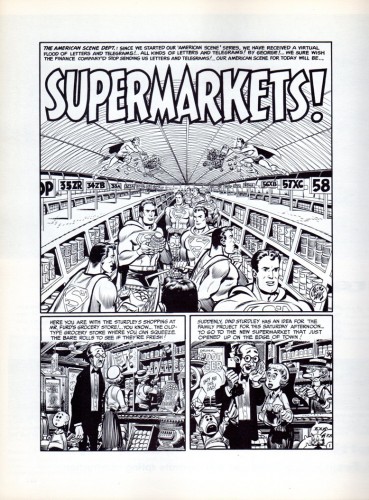 4
4
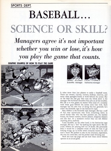
I thought with this book we would be able to show Jack Davis’ neat
transition from “comic book” art to “magazine illustration” art.
Again, during this time period, Jack is working over Harvey’s rough layouts.
Man, what a team! Sans coloring, you can really see Harvey’s storytelling and Jack’s beautiful brush & pen line work and his masterful spotting of “blacks”.
So here is the whole comic book story.
 12
12
On to the “magazine” part. Look how sweetly Harvey laid this out,
add Jack’s hilarious art and you have perfection. Harvey always
compared Jack’s art to best strawberry ice cream sundae; I’ve
always seen it as the best sparkling jewelry ever, either way,
what eye candy!
ps: It doesn’t seem like baseball’s changed that much in 55 years.
 17
17
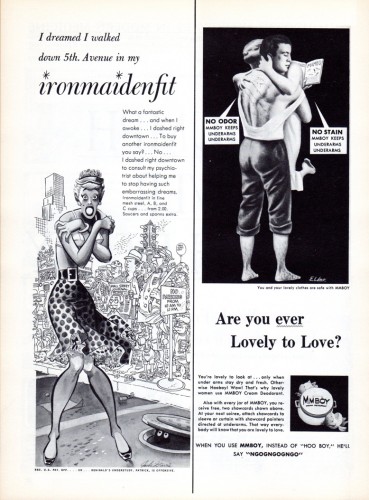
We’ll end on one of the early advertising spoofs and you can see
Jack is well on his way to becoming one of our national treasures.
Action Analysis &Animation Artifacts &Disney 02 Jun 2011 07:03 am
Action Analysis – March 3, 1937
- As we all know, Don Graham conducted night classes at the Disney Studio between 1936 and 1938. They usually revolved around a particular theme and used clips from appropriate movies, whether Chaplin or Disney’s own shorts.
In this particular Action Analysis lesson, te use of secondary motions was discussed, and clips from “Country Cousin” were screened and commented on. The participants include Izzy Klein, Joe Magro, Don Williams, Jack Hannah Dave Hilberman, Bill Tytla, Shamus Culhane, Chuck Couch, Dick Anthony and Don Strickland.
Many of the lecture series were posted on Hans Perk‘s enormously helpful site, A Film LA. As a matter of fact, you can find the previous lecture on “Primary Actions” here.
The cover of the lesson.
Animation &Hubley &Tissa David 01 Jun 2011 08:18 am
Tissa’s VIVA
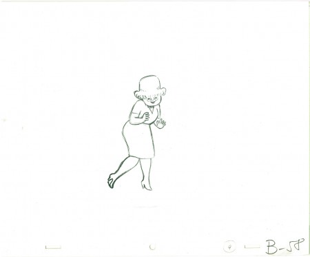
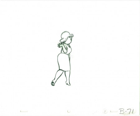
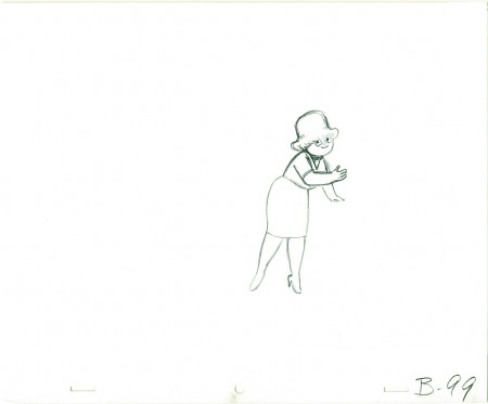
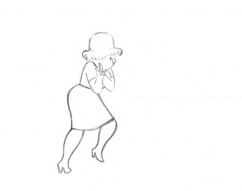
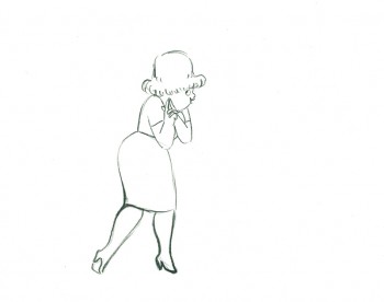
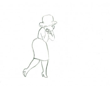
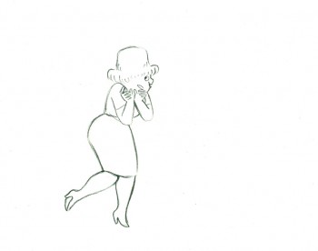
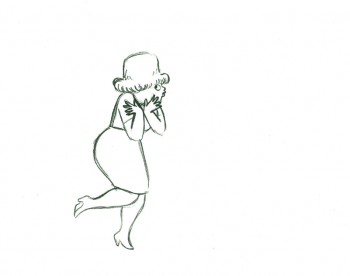
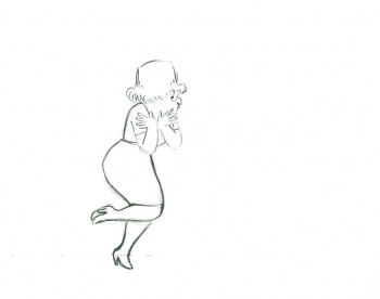
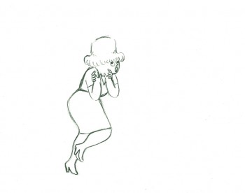
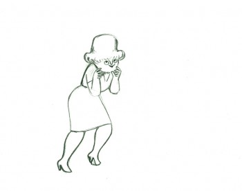
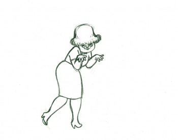
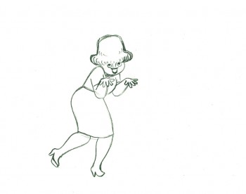
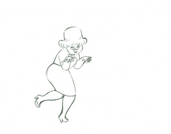
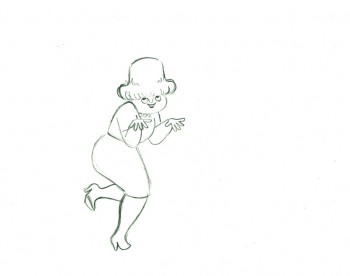
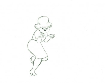
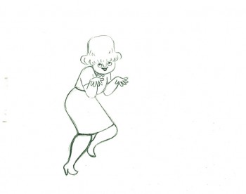
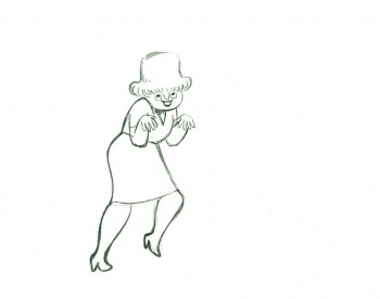
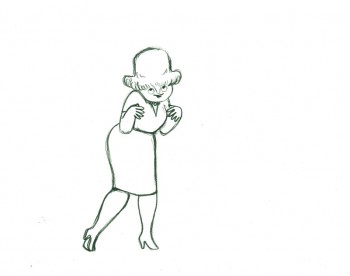
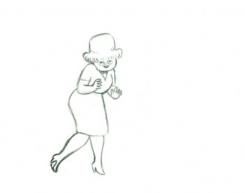
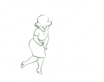
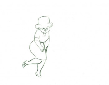
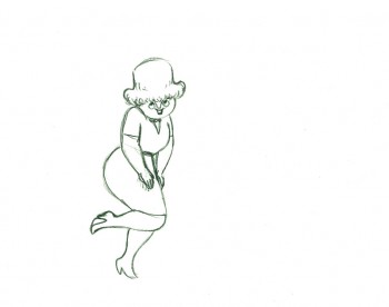
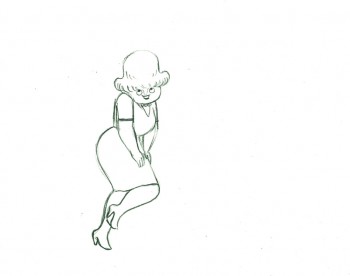
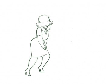
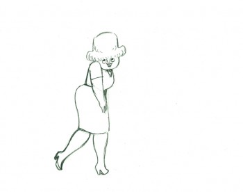
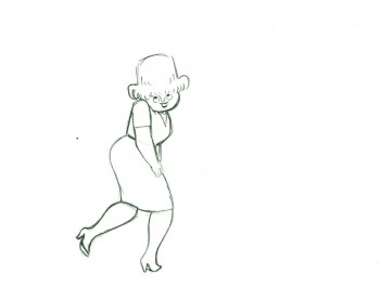
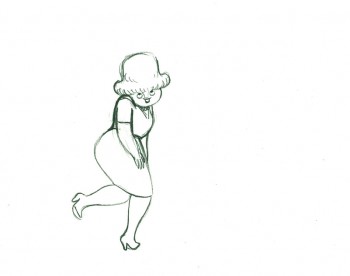
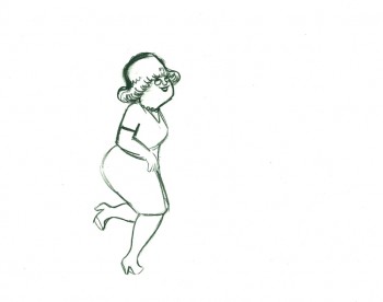
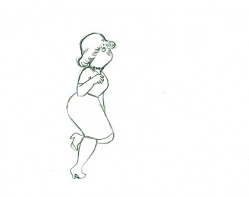
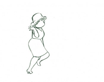
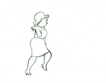
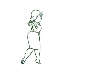
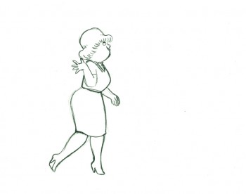
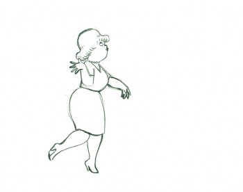
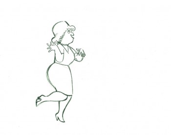
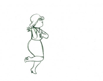
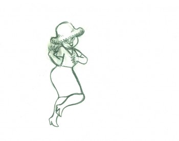
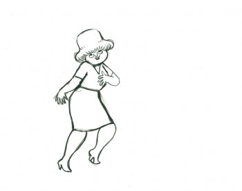
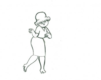
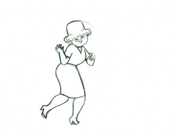
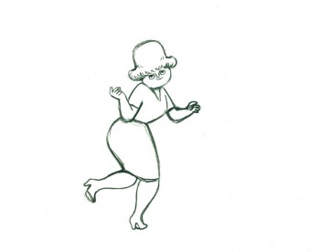
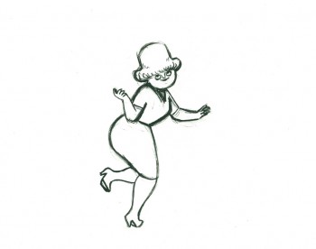
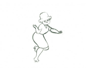
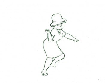
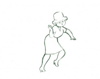
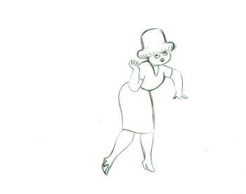
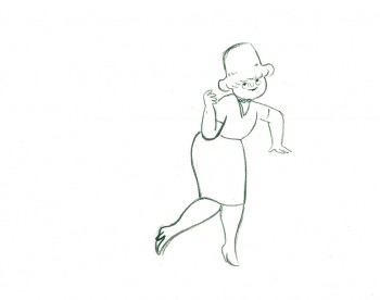
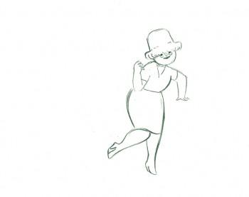
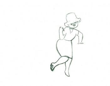
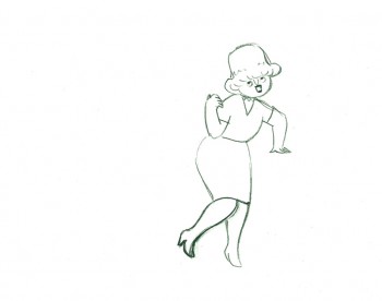
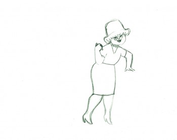
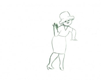
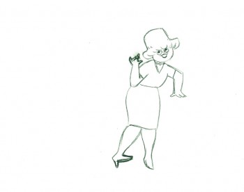
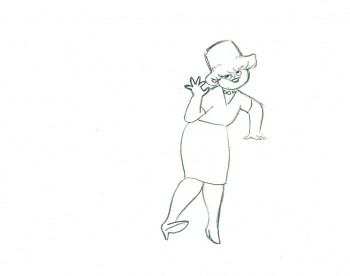
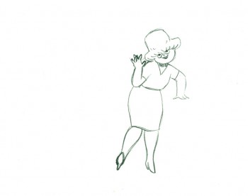
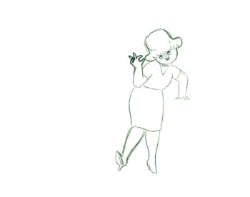
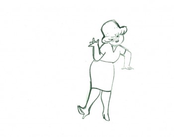
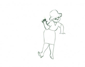
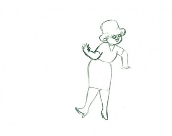
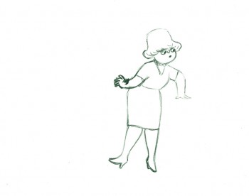
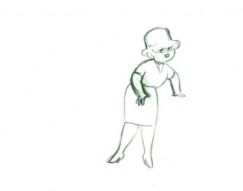
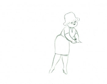
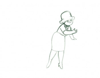
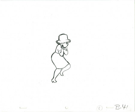
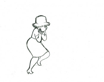
- Tissa David animated a VIVA paper towel spot for the John Hubley. I have most of the drawings for the commercial. Here’s a scene wherein the lead, a woman, walks through (Bg pans behind her at .25 per drawing) toward the kitchen, where she stops.
Instead of giving you the entire page of animation paper, I’ve trimmed it down to just include the character and her walk. Here are four examples of what the entire drawing looks like, untrimmed.
 B41
B41
And here are all the drawings for the scene cropped:
 41
41
________________________
.
The following is a QT of the entire scene with all the drawings included.
Since I didn’t have exposure sheets, I put everything on two’s straight ahead.
