Monthly ArchiveJune 2011
Animation &Disney &Frame Grabs &Layout & Design 20 Jun 2011 06:56 am
Pinocchio – Multiplane
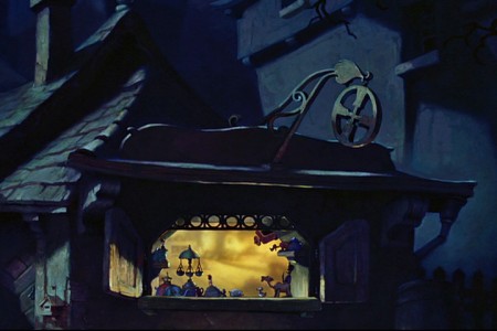
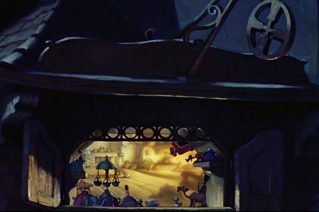
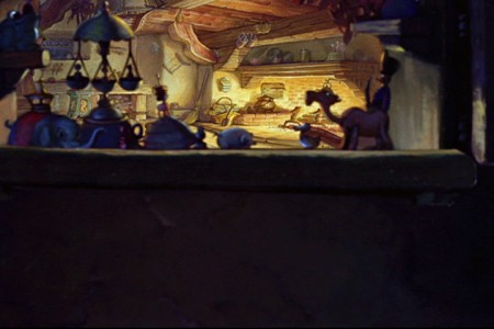
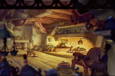
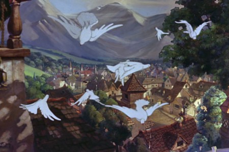
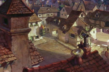
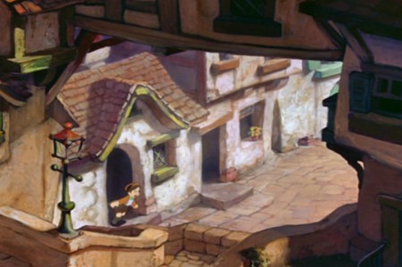
- In highlighting the use of the multiplane camera in Disney’s animated films, the pinnacle has to be Pinocchio. Two specific scenes jump out in any mention of the multiplane camera: the move in to Gepetto’s workshop and the awakening of the village.
So let’s get right into it:
Sequence director: Ham Luske
Layout by Hugh Hennesy
Animated by “Music Room 2″
 1
1Start in the sky with the wishing star that will play
a large part in the film in a couple of moments.
 2
2
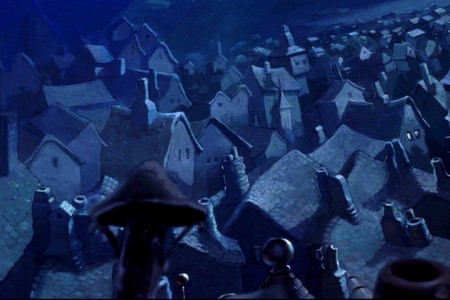
Circle down from the sky field to an overhead of the village.
 3
3
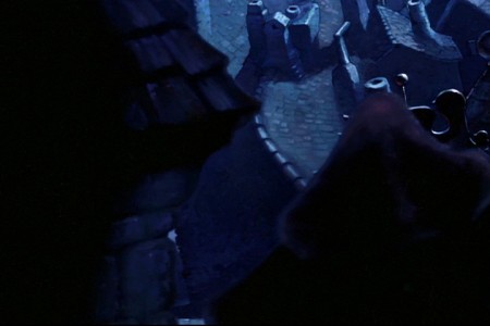
Continue moving down over the rooftops.
 5
5
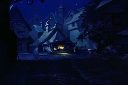
We first see Gepetto’s workshop from a distance.
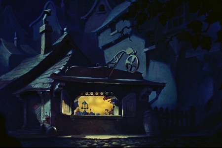 6
6
There’s a matching cut and we continue to move in.
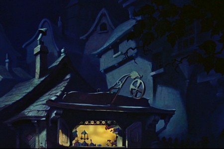 7
7
The POV of the camera is through Jiminy’s eyes.
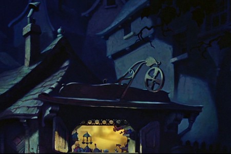 8
8
When he moves in, it’s in hops.
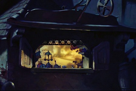 10
10
Leaps and bounds as he (through our camera’s eye) gets closer.
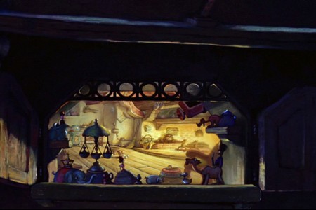 12
12
The warm window into the workshop begins to fill the screen.
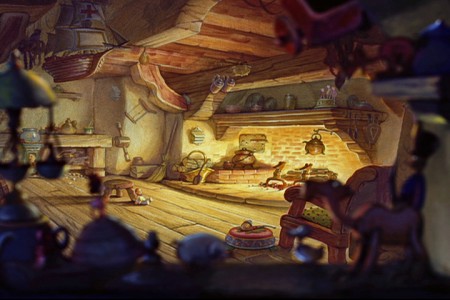 15
15
. . . looking into the workshop through the window.
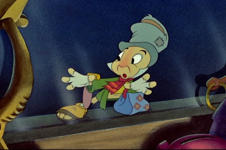 16
16
Cut to an interior shot – the interior side of the window.
Jiminy Crickey, with hands and face up to the glass.
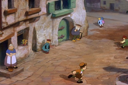
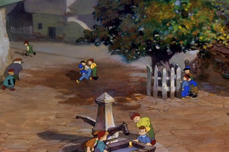
Then we move onto a miracle of a shot that would be hard even for computer users. Today, we wouldn’t anchor the feet properly on all those kids walking and running about. It’s an amazing piece of animation history.
The sequence director was Wilfred (“Jaxon”) Jackson.
Layout by Thorington C. “Thor” Putnam.
The animators involved in this scene include: John McManus, Jack Campbell, Cornett Wood, John Reed, Art Babbitt, Milt Kahl, Don Lusk, and Sandy Strother.
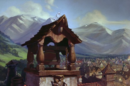 1
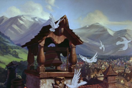
1The camera starts at the bell tower over the sleeping village.
 2
2
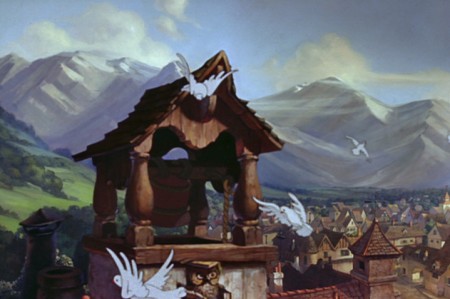
Doves fly out as the bell starts to chime.
 3
3
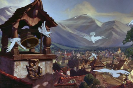
The birds fly out of focus as they move forward.
 4
4
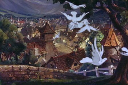
This allows the camera to start the big move
with the birds covering the tower.
 6
6
The camera pushes in to cross the
little footbridge to enter the town.
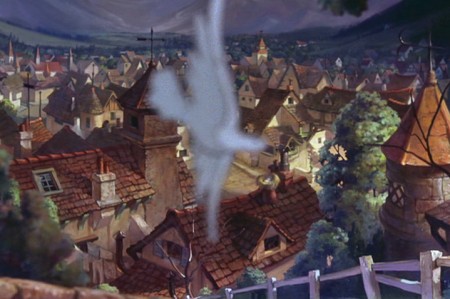 7
7
The last bird leaves us, and . . .
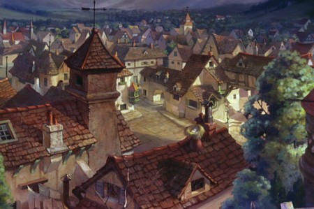 8
8
. . . we’re into the village.
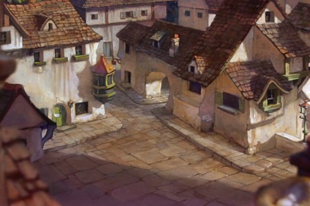 10
10
We move in toward the cross section of the town . . .
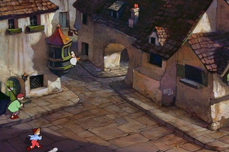 11
11
. . . as people start to come out of their houses.
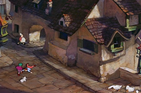 12
12
The camera moves to the right.
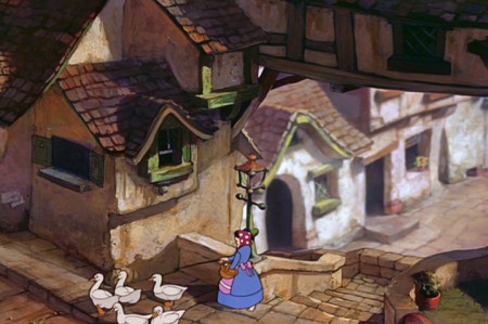 13
13
We move toward a woman with geese as the
camera goes under an overpass.
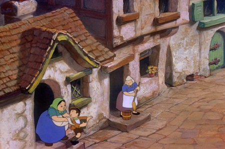 15
15
We head a few steps down as more
chldren come out running to school.
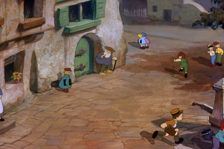 17
17
The camera continues to the right
seemingly led there by one running boy.
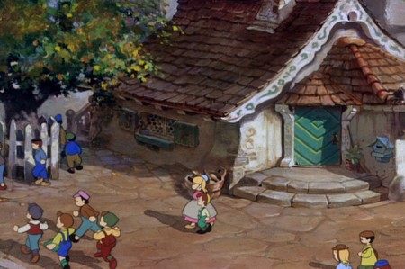 19
19
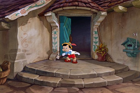
. . . reaching Gepetto’s house.
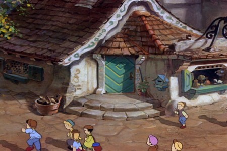 20
20
The camera moves in on the house.
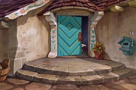 21
21
At this time we cut in and the big-time animators take over.
Milt Kahl handles Pinocchio, Art Babbitt does Gepetto, Don Lusk animates Figaro.
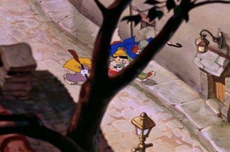
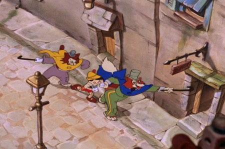
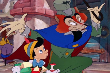
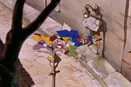
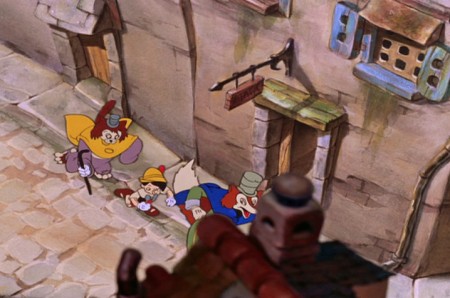
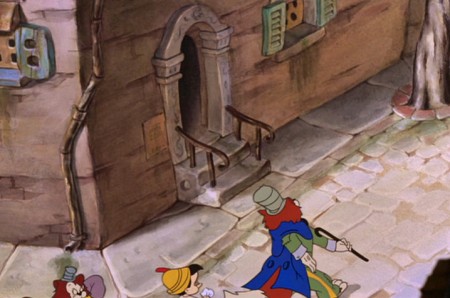
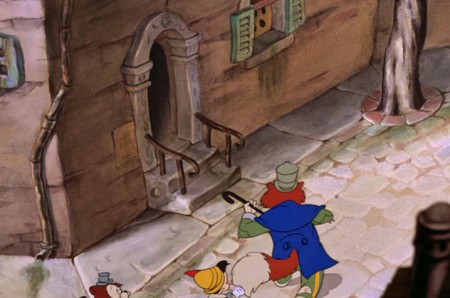
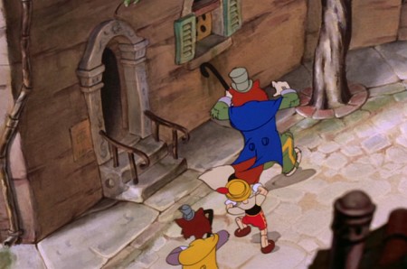
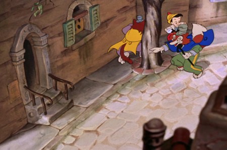
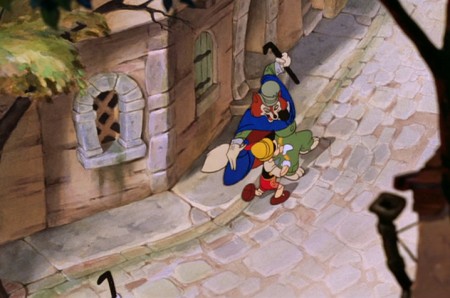
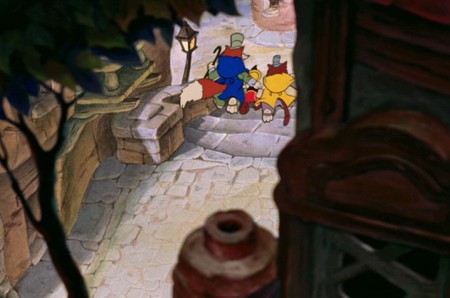
Although there are numerous beautiful scenes from Pinocchio that employ the multiplane camera, there’s one last sequence I’d like to concentrate on. This is where J. Worthington Foulfellow (“Fox”) and Gideon the cat cajole Pinocchio into following them so that they can sell him to the puppetmaster, Stromboli. This is a particularly interesting scene for the multiplane camera.
The sequence director was T. Hee.
Layout by Ken O’Connor.
The animators involved in this scene include: Ugo D’Orsi, Jack Campbell, Hugh Fraser, Charles Nichols, Marvin Woodward, Preston Blair, Milt Kahl and Charles Otterstrom and
Phil Duncan.
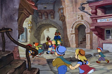 1
1The multiplane camera scene is several away from this,
but I feel as though this scene really sets up the big one.
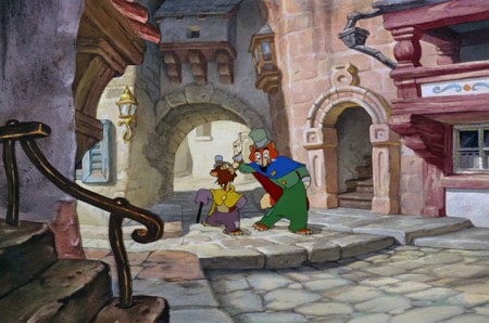 2
2
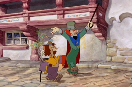
We properly meet the fox and cat as they walk through the town.
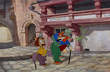 3
3
They are well into conversation.
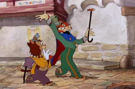 5
5
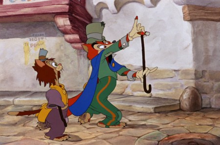
The fox picks up a cigar stub, telling us about their financial state.
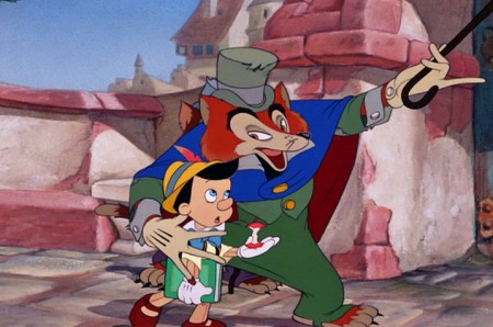 7
7
Several short scenes later, they run into Pinocchio and
coax him away from school to follow them to the theater.
 9
9
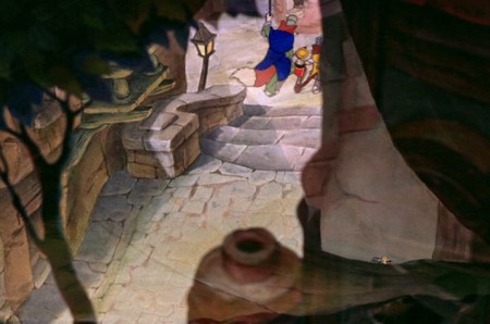
This cuts into the overhead multiplane shot.
 11
11
We watch from overhead with trees and ornaments
marginally blocking our vision of the characters.
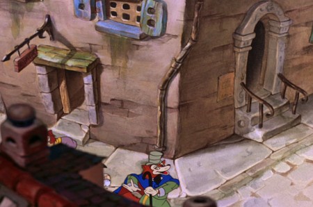 13
13
They turn a corner and the camera follows them.
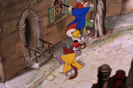 17
17
A quick circling of the tree.
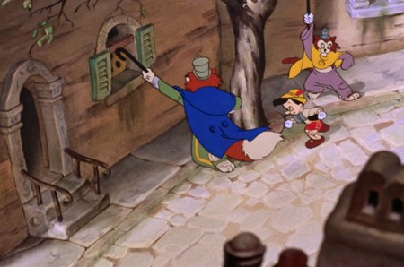 19
19
They do it again, but . . .
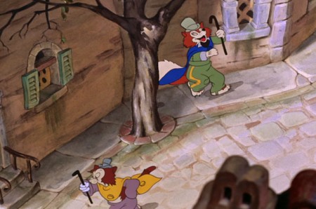 20
20
. . . Gideon the cat continues forward moving off screen.
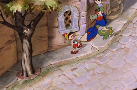 21
21
The fox and Pinocchio continue on the path.
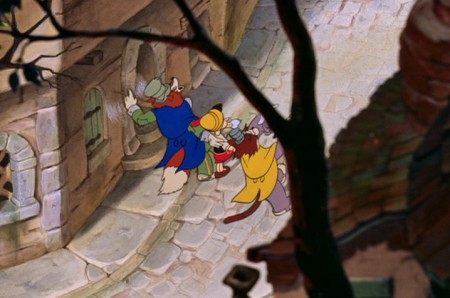 23
23
. . . catching up with them.
 24
24
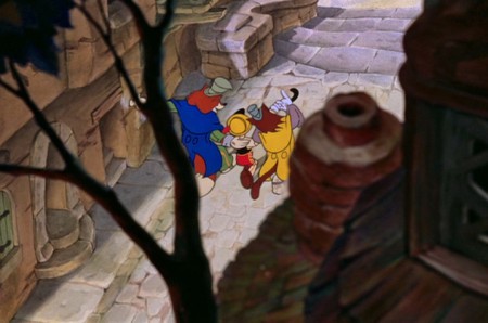
We view them through a tree and the side of a building.
 25
25
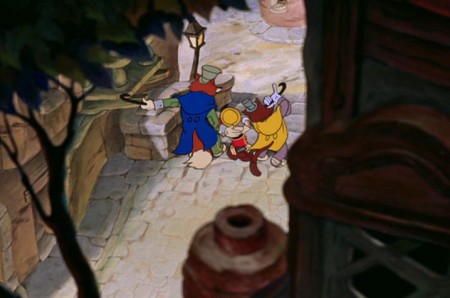
They go up several steps, but the camera stops.
 28
28
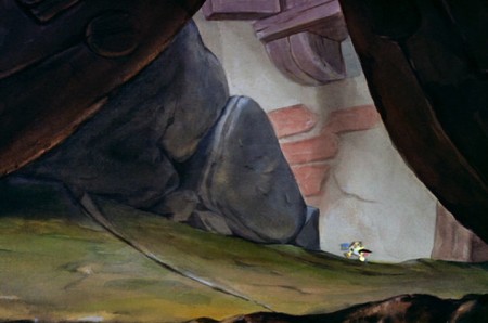
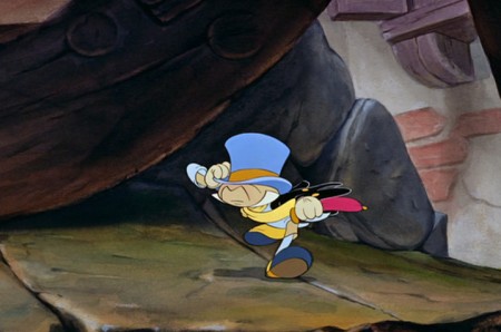
. . . the next scene, Jiminy Cricket is running. He’s late trying
to catch up to Pinocchio, thinking he’s on the way to school.
 29
29
Jiminy is animated here by Phil Duncan.
David Nethery correctly points out in the comment section,
that Milt Kahl animated this scene.
Photos 19 Jun 2011 06:53 am
Little Koreatown
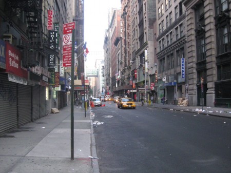
- This weekend the subways have been averted from their normal route, and I found it easier to walk six blocks to take something more direct. As it happens, this meant I had to walk through KoreaTown. The is really just a one block area midtown on 32nd Street between Fifth and Sixth Avenues.
In the evening, the area is filled with people all dressed up and ready to party. There are lots of places to eat and club and a lot of Karioke bars. In the morning, (when these pictures were taken) everything looks just this side of seedy.
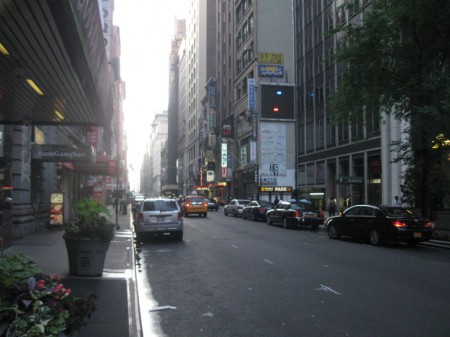 1
1looking across 32nd Street from the vantage point of Sixth Avenue.
.
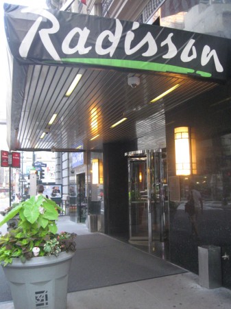 2
2The Radisson Hotel. Always busy, lots of people going in and out.
 3
3
Just next door to the Radisson is
the Spadium. Looks refreshing.
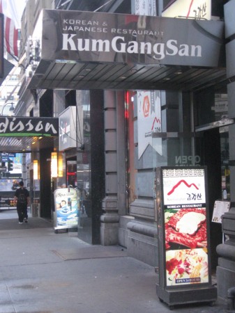 4
4
And next door to that is what appears to be
one of the finer restaurants on the block.
 5
5
This is more the average fare – just across the street.
 6
6
A display outside one store gives
you an idea of the treats inside.
 7
7
Though you can see that they all start to blend in together . . .
 8
8
. . . at least for the uninitiated.
Lots of Bar BQ.


Nara Bank sits alongside CitiBank.
I have a feeling Nara is more popular in the area.
 11
11
There’s a mart so you can bring groceries home with you.
 12
12
K-Town seems to be a club for the
young at heart.
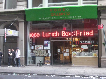 13
13
The lit sign is constantly moving across the store’s window.
 14
14
There’s always room for Yogurt desserts even in Koreatown.
 15
15
Of course, no trip to Koreatown would be complete
without a good face reading.
 16
16
Looking up 32nd Street from Fifth Avenue.
A lot packed into one city block.
Commentary &Disney 18 Jun 2011 07:34 am
Sight Seeing
- This past week Jonna commented on this blog: I can only imagine how it would have been to see one of the classics at a theater (I was born in the 90’s). It would have been great fun if any of you told about a premiere or screening that you’ve attended (e.g. the first time you saw Sleeping Beauty or something).
So I thought of a couple of memories I have of seeing some of the classic Disney films theatrically for the first time. So kiddies gather round Gran’pa while he tells you a story.
 The first film I’d ever seen was Bambi. I don’t remember much about it, but I’m sure that the experience permeated my brain and sent me on a direction I could never return from. This is still one of my favorite classic Disney films. I’m not big on the cutesy aspects of the movie – specifically the “twitterpated” sequence, but I am big on everything else. Back in those days, there were often Surprise guests coming to the movie theaters to promote the shows. At this one particular event, to celebrate Christmas they drew back the curtain and had a pile of large gifts all wrapped in foil-colored gift wrap. Clarabelle the clown from the Howdy Doody Show was a special guest who was going to give out gifts to the boys and girls in the audience. He went through a short routine which ended with the supposed gift-hand-out. But it didn’t happen that way. Clarabelle took out his bottle of seltzer and started spraying the audience. The blustered theater manager called for the curtain to be closed, and that was that. Even at the age of 4 or 5, I knew we was robbed. No wonder I couldn’t remember much about Bambi.
 The second film I’d ever seen was Peter Pan. That would have been for the 1953 theatrical release. My father took me to one of those large movie palaces in upper Manhattan, the Loew’s 181st Street. I remember it playing with a film about a jungle cat of some kind; I’ve always remembered this as The Black Cat, but that title isn’t right. So I obviously don’t remember the title of the film, a B&W scary movie.
Re the animated feature, I remember most the swirls of color of Pan and gang flying; I don’t remember much else about it from that initial introduction. I was absolutely enamored with the moviegoing experience from The Black Cat to the brilliant cartoon. Remember, I was only 6 or 7 years old, at the time.
In 1955, I was in charge of about five kids (a couple of siblings and a couple of cousins) going to a local theater to see the NY premiere of Lady and the Tramp. Back then, it would cost 25 cents for a kid to get into the movies. When we’d gotten to the local movie theater for this film, they’d raised the price to 35 cents – more than our parents had allotted.
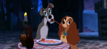 Outside the theater we were counting up our monies and trying to figure out how much we’d need to get in and buy some candy or popcorn for all of us. Within seconds my cousin announced that she’d lost her money, and it was obvious there wasn’t going to be enough for refreshments. The cousin started crying loudly, bawling until the movie theater manager came up to ask what was the problem. She spluttered out the word that she couldn’t afford any candy now that she’d lost the money to get into the movie. The manager just reached into his pocket and gave me an additional dollar. Enough money for movie and candy and more importantly it stopped my cousin’s screaming.
Once inside the theater I ignored them – even though the cousins were badly behaved and squirmed about through most of the show. I liked the film so much that I made the whole group sit with me to watch it a second time. That big, wide Cinemascope screen. It was heaven.
We did this often back then. I remember another time going to see Pinocchio with my younger sister, Christine. We sat through Pinocchio three times before we left the movie theater. That meant we had to sit through the second feature (usually some live action dud) twice to get to the third showing of the cartoon. My sister reminds me often enough that when she turned around she’d seen that the theater was empty except for the two of us. The usher stood in the back giving us the evil eye.
Prior to Sleeping Beauty‘s release, I’d been doing some reading. I’d received Bob Thomas’ The Art of Animation the previous Christmas, and I read it over and over at least a hundred times. I memorized every still in that book and couldn’t wait to get my eyes on Sleeping Beauty.
The film opened at Radio City Music Hall, and I was given permission to make one of my first trips downtown to see the film. An hour subway ride for a 12 year old. I went into this largest of movie theaters in the City, and I picked a great seat. The audience wasn’t overflowing; the show wasn’t sold out. But it was BIG.
The screen is enormous in that theater, and Sleeping Beauty was made to fill such a screen, especially in its Technirama debut. But somehow I came out of the theater disappointed. I don’t know what had gotten into me. I don’t remember any reason for disliking it. As a matter of fact, I absolutely love the film now. Those Eyvind Earle settings; the great animation of Maleficent; the dragon fight. There’s just a million reasons I have for loving it, but something about that first viewing left me cold. And I remember trying to analyze, at the time, what I thought was missing from the experience. I had no answer.
I’ve seen all of the pre-cgi Disney films in theaters. I also remember all the experiences of sitting through them. Dumbo and Alice In Wonderland were the only two that I saw on TV first. They were both special presentations on the Disneyland show. Eventually, I’d see them both in theaters at special screenings.
Of all of them, Dumbo still stands as my favorite though in a close tie to Snow White. There’s something they both have that goes beyond the brilliant animation and the graphics on screen. There’s an emotion there that they both have, not quite an innocence but more like a daring. Without consciously saying it, you felt the Disney people were shouting, “Look what we can do!” And they did do it. (By the time they did Fantasia, they were too conscious of what they could and had done, and they’d lost it – for me.)
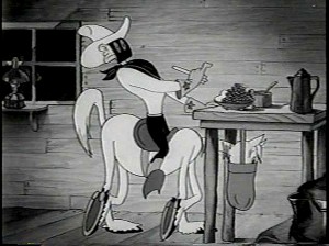 Eddie Fitzgerald is either a genius or a real-life looney toon – who I treasure. Probably, I think both; he’s at least an original. His blog is like no other in that he gives us real deep rooted comedy that makes you laugh aloud. He puts together these photo-montage storyboards creating a wacky movie that you just gotta keep reading, and when he’s on the mark, there’s nothing short of brilliance.
Bob Clampett did a wacky WB short called The Lone Stranger and Porky. Obviously, it was a parody of the big radio show of the time, The Lone Ranger. Well, Eddie takes off on that parody and does Clampett one better. It’s crazy and hilarious and you have to check it out (if you haven’t already.) The Lone Stranger (Parody) via photomontage.
Someone should finance this guy to make a real movie. This artwork would take cgi in a direction that hasn’t been considered before. Maybe then they’d have the first REAL animated cgi film instead of all these cutesy viewmaster things we get.
 Last week I started a new series that I hope will go on forever. I’ve been interviewing Independent animators, the ones who are trying to make artful animation on their own. They don’t have the dollars that a Dreamworks would, but they’re using all of their resources to make movies that have something to say.
The first post was an interview with George Griffin, who has been something of an inspiration to me. Upcoming this Tuesday will be an in depth look at the amazing career of Kathy Rose. She takes animation, mixes it with dance and Performance Art and comes out with amazingly original work. I’m having a good time putting these pieces together, and there are so many who deserve the attention.
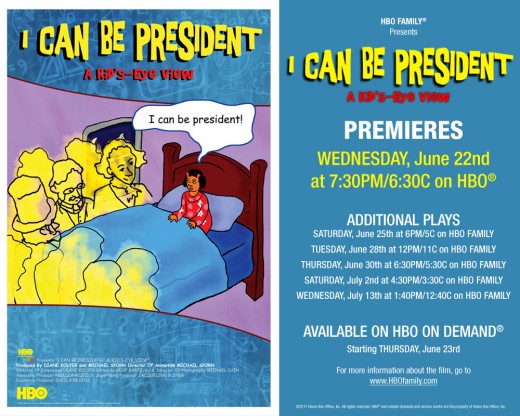
- I have one last bit of self-aggrandizement to post. THis coming Wednesday, June 22nd, HBO will premiere the latest Special we’ve done for them. (Notice how I date myself by calling it a “Special”. That’s what they were called when I was younger. These days I only know the industry word for them, “one offs”. I don’t like to think of my show as a “one off”; it’s a Special.)
The show is about half animated; the other half consists of kids saying the wackiest things. It’s fun. So there you go.
Bill Peckmann &Books &Illustration 17 Jun 2011 05:10 am
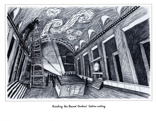
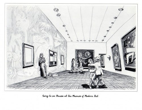
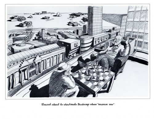
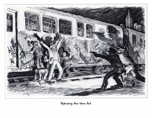
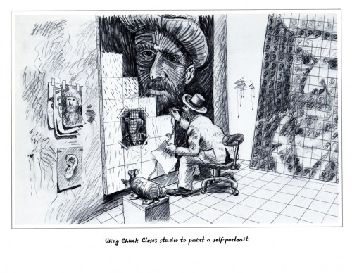
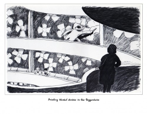
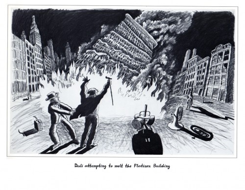
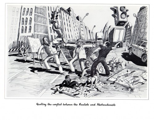
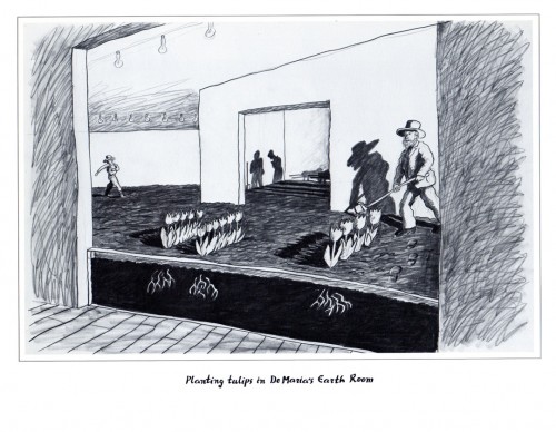
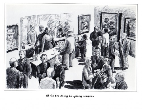
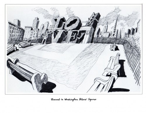
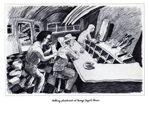
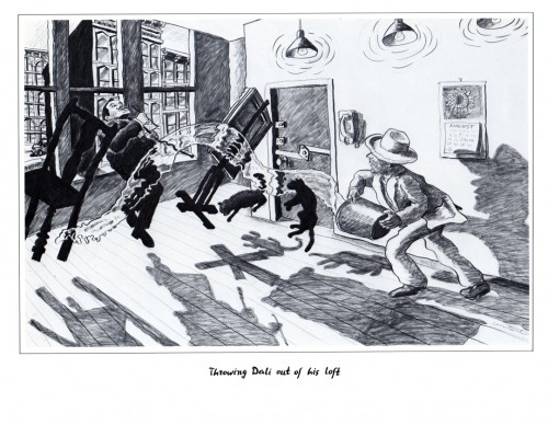
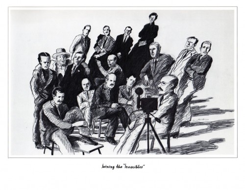
Vincent by Constantine – Pt.2
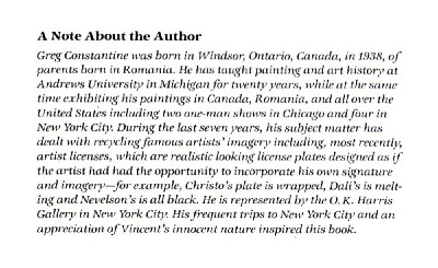
- Last week I posted the first part of this book by Greg Constantine, Vincent Van Gogh Visits New York. It was a paperback book Bill Peckmann bought in the ’80s. He introduced me to it and he scanned and sent the material to me.
Constantine also did Leonardo da Vinci Visits Los Angeles and Picasso Visits Chicago.
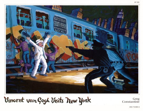
Cover
Many thanks to Bill Peckmann for sending this onto me to share.
Action Analysis &Animation Artifacts &Articles on Animation &Disney 16 Jun 2011 07:32 am
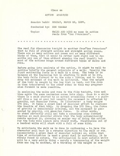
Action Analysis – March 22, 1937
- Today we continue with the Action Analysis notes from the lectures given at the Disney studio by instructor, Don Graham. The lectures, at this point, were generally built around film sequences that were screened. Oftentimes they were past Disney films, other times they were live action sequences from other studios. In this lecture, they were scenes from the Clark Gable feature, San Francisco. (This can be rented from Netflix or other distributors or can be often seen on TCM.)
The animation personnel who attended and participated included: Izzy Klein, Joe Magro, Jacques Roberts, Jimmie Culhane, Bill Tytla, Eddie Strickland, Bill Shull Moe Gollub (misspelled as Gallub) and Bernie Wolfe.
Cover
Animation &Animation Artifacts 15 Jun 2011 07:19 am
DeMattia’s Tubby
- Not every animated film is good, nor do they have good animation. But there’s usually a preponderance of workmanlike animation done for these films. Tubby the Tuba is a dog that was produced by my alma mater, New York Institute of Technology. Alexander Schure was the head of the school, and he brought it from Manhattan to Old Westbury, Long Island. He was an animation buff and wanted to be the next Walt Disney. He used his money to build an animation studio working out of his college. The studio ran through a number of heads from Sam Singer (Courageous Cat) to Alexander Schure, himself. Johnny Gentilella ultimately became the director of the project. The film took a couple of years to make with a lot of “B” animators, many of them culled from Los Angeles.
A footnote on the school was that Schure ultimately invested in some early computer animation, and though he was determined to compete with Saturday morning, limited animation quality via the computer, he financed some of the future cgi developers for animation including Ed Catmull, Ed Emschwiller and Alvy Ray Smith.
Ed DeMattia was an animator on Tubby the Tuba who did a number of scenes. I pulled one of them to give an idea of his animation. It’s surely not something worthy of study.
Since some of the drawings are just mouths calling for TraceBacks, I don’t post most of those.
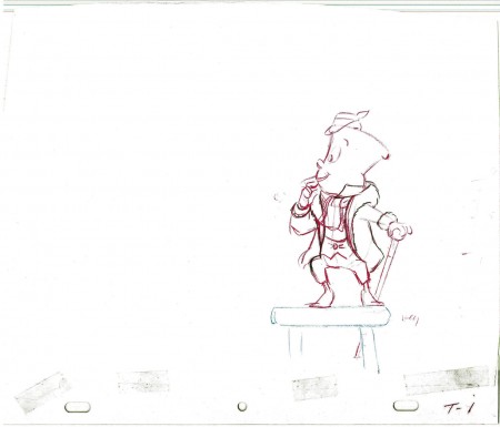 1
1
________________________
.
The following is a QT of the entire scene with all the drawings included.
Since I didn’t have exposure sheets, I calculated everything on twos but
since there were only every other drawing most of the action is on fours here.
Independent Animation 14 Jun 2011 06:36 am
George Griffin – Filmmaker
 - George Griffin has been something of an inspiration to me. His films have colored my view of what an independent artist can do with animation, and made me feel that it was possible for me to go forward with some of the films I’ve done.
His earlier films had the process of animation and filmmaking technique as a sub-theme and, in many ways, glued them all together as coming from the same personality. This sub-theme was very close to my heart, and I bought 16mm prints of several of George’s films a number of years ago. Consequently, I’ve seen Head and Viewmaster many dozens of time. I’ve certainly never tired of watching them.
When approaching the idea of highlighting the work of some of the Independent animators around the world, it was natural for me to approach George first. He’s a concerned artist whose work has helped drive me forward.
I’d sent George a few questions which he so graciously answered, and I’m posting his response here as the substance of this article. I found inspiration even in reading the response and have spent some time this morning, as a result, looking over some of my more personal projects. I hope it does much the same for you.
Q. Can you give us an idea of your beginnings? Where you went to school and why you went into animation.
Drawing came first, as with every child, before writing, and with encouragement from my parents (father was an architect) and pals. I drew and absorbed cartoons as a truant, instead of studying at school or at home. My parents forbade comic books because they thought they were limiting and vulgar, so I had to sneak off to read them. Ditto TV. There was little help from schools, either; I couldn’t deal with criticism from authority figures, especially art teachers. I was also captivated by photography and what was called hi-fi (building electronic components from a kit), machines that involved sound and image. I learned darkroom photography skills in the Army (drafted pre-Vietnam, after dropping out of college); designed posters, then learned silkscreen and type setting in order to print them; finally graduated college in political science and came to NYC to “find myself.†So, basically, false starts, no real art schooling, learn-as-you-go.
When I came to NYC I first worked in government for Head Start but the city had a way of fracturing all the walls and boxes I had constructed throughout my life. I went to films constantly, hung around NYU film school where my friends were enrolled. When I showed my drawings to anyone, I simply splayed them out on a table where people could just dig in and choose what they wanted to see. This made me a little impatient. I wanted to control HOW they looked at the drawings. That was the epiphany. I had already seen Breer, Brakhage and Vanderbeek, (also Godard) so I bought a used Bolex and tried to teach myself how to animate. Stop-motion, was easy but cartoons were another matter. I had to go to school.
,
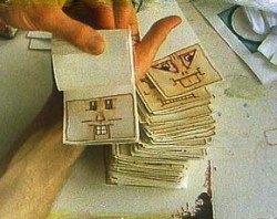
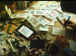
Two stills from “Head” (1975)
Q. I know that some of your first work with animation was studio driven. What moved you to get away from that commercially driven form and more toward the art form?
The work-flow at Focus Design, typical for the period, involved many specialists. It was well known for its use of designers like Rowland Wilson and Tomi Ungerer, but the real storyman was our director, Phil Kimmelman, who created pitch-perfect boards in a generic style that expertly framed the 30 second narrative. Bill Peckmann, a virtuoso stylist, did layout and design, no matter how precise or loose the style. (of course it is Bill who now supplies much of the wonderful, vintage graphics for Michael’s blog).
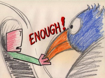 Yellow Submarine had just come out (I had particularly loved “Lucy in Sky”). Most of the older artists at the studio were grouchy because it was a “designer’s†film, not an “animator’s†film. Then I was laid off when business slowed. I had already become frustrated by the division of labor and had lost interest in drafting and timing skills and continued to experiment at night.
_______________
Being in the u-nion helped to ____________________“Flying Fur” (1981)
get free-lance jobs as an assistant,
most memorably a one month stint as an assistant on Fritz the Cat working under legendary animators Jim Tyer, Marty Taras, and Johnny Gentillela. I was fired by Ralph for not knowing how to clean Tyer’s amazing, scribbly extremes. Maybe it was the authority issue again. My wife now speculates that my “cats per hour†speed was too slow.
Concurrently I was able to produce small graphic jobs on my home-made stand. Then I got a 15 second Sesame Street spot based on one of five boards I had submitted. By 1969, I had begun to make my own films. So by the early 70s I had developed a bifurcated view of the art: professional, slick, commercial, studio-produced work for hire on the one hand and experimental, personal work done independently, without a budget, as an amateur (i.e. for love). This almost dialectical split seemed to demand an existential choice and I became a kind of evangelist for fusing design and animation in one stroke, but in fact I kept a foot in both camps. So, in the end, the lessons learned at Focus helped me later to earn a living.
,
Q. Your earlier films (HEAD, VIEWMASTER, even in a way FLYING FUR) seem to have a goal of exploring as well as exploiting the history and medium of animation & film as well as telling each surface story within the film. Yet, at some point, this theme appears to have left the more recent films (A LITTLE ROUTINE, KO KO, NEW FANGLED) wherein the narrative element comes more to the surface. Was there something that caused that change?
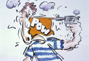 One way to consider the films is to mark a transition from self-conscious, reflexive experiments to work that’s narrative-driven, more accessible, more thematic, in a way more personal. You could say “New Fangled†is about advertising jargon, even though the linkage is obtuse, with double meanings and mysterious references. I was doing a lot of commercials at the time so it was a bit like biting the hand _________________ “New Fangled” (1992)
that fed me. Also, “A Little Routineâ€,
with my daughter and I as characters (a homage to the Hubleys), clearly embodies a big change in my personal life, dealing with emotional issues and sentiments in ways that would have been impossible during the “anti-cartoon†period of the 70s when I was quite focused on process and animation as a kind of language. Both “Flying Fur†(based on Scott Bradley’s brilliant score for a Tom and Jerry) and “Ko-Ko†(Charlie Parker’s famous tune) are driven by the music track, the former being an unscripted, spontaneous cartoon drawn in one month, the later an improvised abstraction performed with bits of torn paper and dried beans; both are two sides of the same coin. But I’m not so sure I understand the shifts underlying these changes. Even now they appear fluid, with reflexive elements popping up in the later work, documentary elements and stylistic discontinuities throughout. I try to understand the deeper implications of individual films, but not the overall arc of the work.
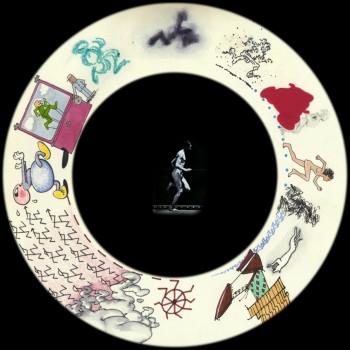
“Viewmaster” 1976″
Q. Does working with computer technology as opposed to the camera have any effect on the themes of your films? What programs do your prefer working in to create your animation? Any thoughts about 3d/cgi?
Changing from cameras and film to digital has affected the content of my work, but not profoundly. I don’t try to poke behind the scenes for an anti-illusionist tropes, like the “hand of the artist.†Process concepts aren’t nearly so compelling now that everything has been reduced to code. But there are still plenty of windows to let in all kinds of rough, angular, mysterious stuff through Dragon captures, compositing/manipulating live action, etc. I use Photoshop and After Effects. I started AE (v.2) while doing a package of Honda spots (it took Thessia Machado and me all night to render the file sequence for layoff to video) and have never missed sprockets. I gave my beautiful little Forox to Frank Mouris and do not for a minute miss the obsessive tedium of shooting. Also important are the opportunities for presentation: digital projection, installation, the internet, etc. And, in a contrary take on progress, I think the so-called inevitable hegemony of digital animation has also created a growing creative backlash among young artists working in 16mm, making “bad animation†(Hertzfeldt?), making pro-cinematic machines and performances, combining animation with sculpture, even doing flipbooks and other kinds of physical/concrete animation.
Neither 3D nor CGI does much for me: too much hoopla, not enough substance, same old studio specialization. I never liked puppet animation (except in the hands of surrealists), so Pixar’s hyper-realism, texture, lighting and acting strike me as superficial, value-added cargo, while the content tends to channel the Disney formula. Call me a curmudgeon, but I thought the love story-in-a-nutshell in “Up†was a perfectly executed jewel using every cheap, manipulative, maudlin cliché in the book.
,
Q.Your films have always had an affiliation with jazz. KO KO, YOU’RE OUTA HERE and others have been more direct about it than others, yet the attachment is there. How do you see the relation of jazz to animation?
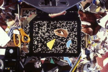 Did animated film and jazz emerge contemporaneously from popular American forms, vaudeville entertainment and dance bands? Did they embody the driving energy of modernism, both sophisticated and a little raunchy? Were both “animated†above all by the infectious pulse of the city, teeming with a heterogeneous, mobile, immigrant culture. OK, I get carried away. I just happen to ____________________“KoKo” (1988)
love most jazz because it is based
on improvisation and rhythm. The former is the gesture of drawing: rough, immediate and perhaps not too perfect. The latter is the heartbeat, handclap, call and response, but also a natural force like the ocean and unnatural force like a machine. Most animation is created by an achingly methodical process, almost deadening it its technical demands. To transcend that, to give it life, you have to make it appear to be improvised, and if you get to that ecstatic point of creativity where nothing else matters, then it WILL be improvised, only not in clock-time, but your own time, animators’ time. The most obvious examples are the direct animation of McLaren, Len Lye, Barbel Neubauer, but ideally it can extend to any decision made in sequence drawing—or any other technique—from instance to privileged instance.
Most of my films have been accompanied by some kind of printed object. The “Ko-Ko†counterpart was the flipbook, “Barrelhouse Bopâ€, which was a deliberate attempt to do a cartoon interpretation of the history of jazz with shifting styles and cadences.
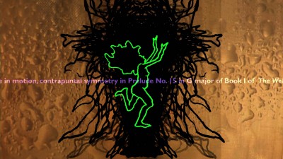
“Bather” (2009)
There’s an interview with George Griffin about “Bather” here.
There’s another extensive interview with George Griffin on AWN by Ann C. Philippon here.
You can purchase a DVD of George Griffin’s work here.
Commentary &Disney &Frame Grabs 13 Jun 2011 06:33 am
Peter Pan Multiplane
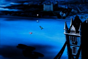
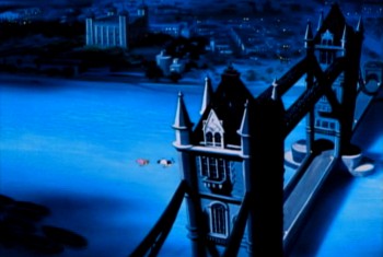
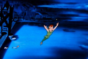
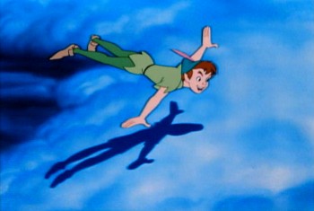
- I had remembered Peter Pan as utilizing the multiplane camera quite a bit to set up the show. In the most obvious ways, where I thought they used the camera, I was wrong. There’s, of course, the one famous flying scene with Peter, Tink and the family over lots of clouds. But other shots of London and the opening of the house are not dimensional. They were painted on one level.
In a way, this film, despite the success of Cinderella, is an equally austere production. Gone are the days of Pinocchio and Fantasia where the multiplane camera was enormously effective and often used. Hello to the days of tight budgets.
Let’s take a look.

This is the opening once we hit London (down from a star).
We pan from London to the fog.
No multiplane camera use is evident. It’s a single-level Bg.
Dissolve to
 1
1
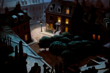
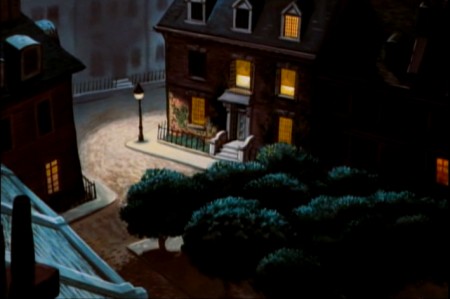
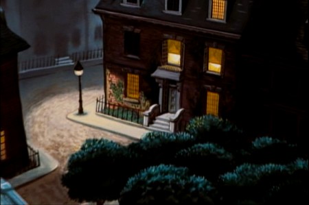
The Darling townhouse. Camera trucks in slowly.
 2
2
There are no separate levels, no use of the multiplane.
 3
3
This is disappointing given how good the similar scene which opens
101 Dalmatians looks using a simple multiplane setup.
Once inside the Darling household there is no obvious use of the multiplane.
The next scene to question starts as Mr. & Mrs. Darling prepare to go off to their party leaving the children behind.
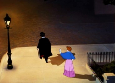
This next pan starts at the base as the Darlings
walk away from the camera into the distance.
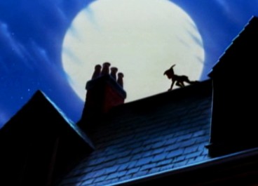
We pan up to the rooftop to see Peter Pan in silhouette.
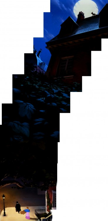
This is the full Bg.
There is no use of the multiplane camera.
Nor are there separate levels – it’s all one piece.
So, it would seem that the multiplane has not been used to this point.
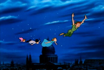
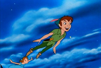
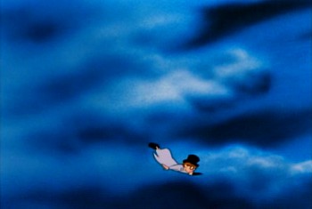
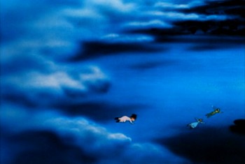
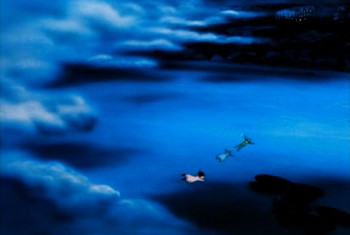
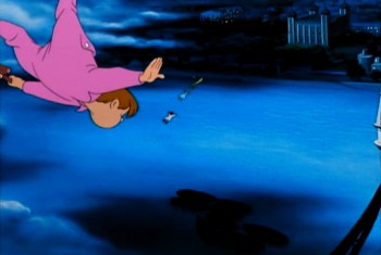
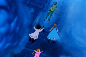
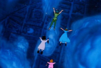
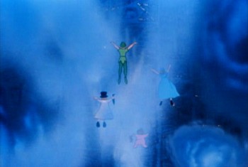
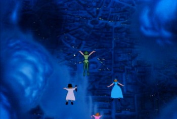
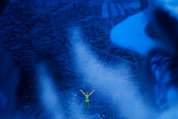
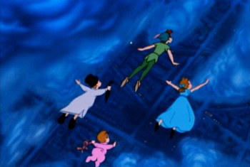
The big flying scene comes just as they’re about to fly out of London and on to Neverland. It serves as the bridge from everyday life on to the magical land of Peter Pan. You need something big here, and they’ve got it – one of the biggest multiplane scenes ever. The layout for this scene is extraordinary, and the animation couldn’t be better. It’s quite a scene.
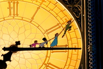 1
1We cut from this shot of the clock.
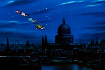 2
2
Peter & gang fly over clouds on flat Bg.
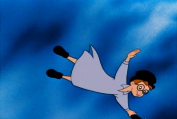 11
11
All done with some brilliant animation.
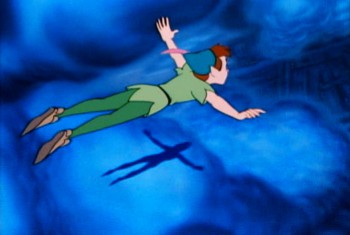 21
21
Suddenly the bottom drops out and it’s multiplane.
 25
25
The camera also turns to have the characters flying North.
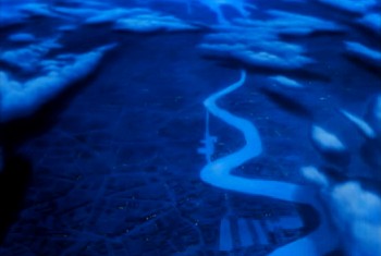 31
31
The camera zooms past them . . .
 32
32
. . . and moves up to star.
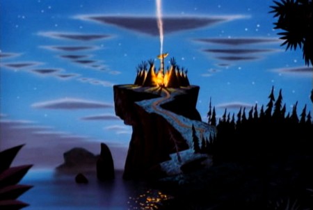
There are one or two other small uses of the multiplane camera on Neverland. Typical of these is this shot of the Indian Village. As we pull in, only the sky is separated and allowed to go out of focus as the camera moves in.
.
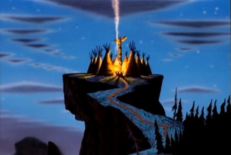
But basically that would seem to be it for the use of the multiplane camera in the film. There’s the one big scene, the flying scene, which shows it off as well as any scene to that point in Disney animation, and a couple of other much smaller scenes.
But on second look we find that there was some use of it in the nursery.
The Bgs contain stripes and obviously brought some concern that there would be strobing, especially in cutting from one set of stripes to another – one CU to another.
It appears to me that they put the Bgs for the closeups out of focus by putting them on a lower level of the multiplane camera and shot the characters in focus. It’s a simple trick (given there were no camera moves) that didn’t up the budget very much.
AfterNote: I am wrong about this. Milt Gray, in the comments section, had proof that the Bgs were painted with Airbrush to soften them.
I’d recently read that they were thinking of utilizing this trick at one point in Cinderella. They ultimately decided against it. (I think it was an interview with Wilfred Jackson, but I haven’t located that reference quickly. When I do, I’ll put the quote in here.)
Here are a number of examples:
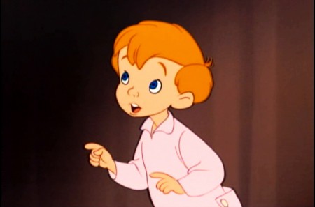 1
1There’s a soft focus on the Bg – not very extreme.
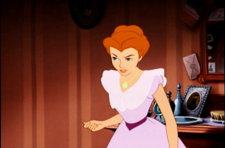 2
2
We go from this half-shot leaving the shot in focus . . .
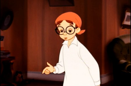 3
3
. . . to this shot of John where the focus is soft.
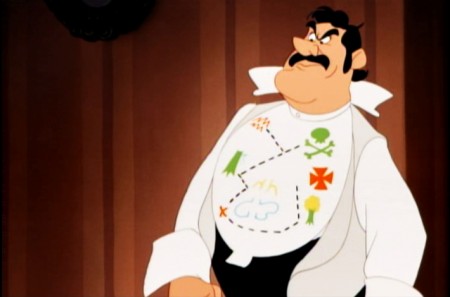 4
4
Father stands, here, with an in-focus Bg.
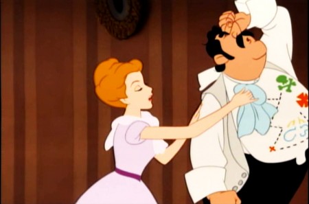 6
6
Back to the parents with the Bg still in focus.
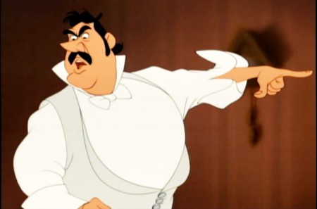 8
8
Now father stands against a very soft Bg.
It probably didn’t work cutting back and forth with the Bgs in focus.
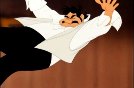 9
9
This scene is the only one with a big camera move as . . .
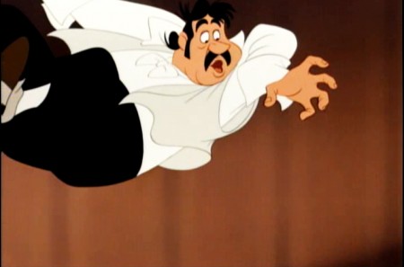 10
10
. . . father flies across the room and . . .
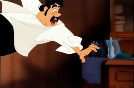 11
11
. . . hits a night table.
The stripes are out of focus. The foreground night table is
in focus, meaning it would be on the same level as father.
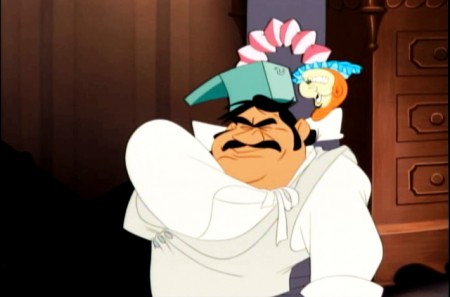 12
12
The finish comes a couple of scenes later. It’s all, now, in focus.
Back in the nursery at the end of the film, the soft focus comes back in two or three short scenes.
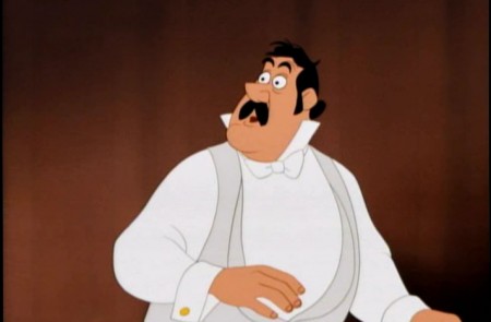
This shot of the father is typical of the soft Bgs. They seem to build
from in-focus to getting softer and softer (behind father) as he realizes
that he’s “seen that ship before.”
Many of the other shots at this point are in focus.
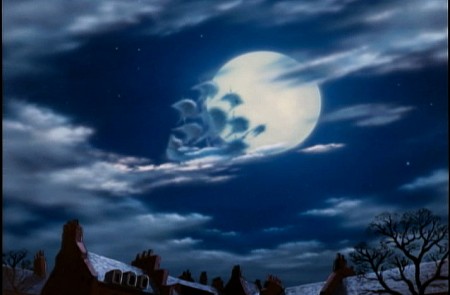
I wonder, in this shot, if the ship were on another level so that it would read soft.
This scene has such magic in it, somehow I think they HAD to use the multiplane camera.
Photos &repeated posts 12 Jun 2011 07:00 am
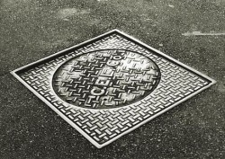
Recap – Manhole Sunday Photos
Back in August 2007 I put this photo essay together. I was thinking of it this morning and decided to post it again for those who missed it or don’t remember it.
 When I was in the sixth grade, I had an extra-ordinary teacher who left me with a lot of memories. One of them was his reading of Edgar Allan Poe’s short story “The Casque of Amontillado,” which chilled us all to the bone as we sat in those little student desks absorbed and thrilled and forevermore fans of Poe.
Another memory was his asking us all if we knew why manhole covers were round. After a number of stupid guesses, we were told the reason – any other shape would allow the covers to fall into the hole. If they were squared or triangular, they could be maneuvered onto their side until they fell in. Round objects wouldn’t fall.
He also told us that manhole covers in NYC were like snowflakes – no two were alike. This I found hard to believe until I started looking. He was right; they were all different in design. Markedly different in design. I looked for years and thumbed my way through many books admiring the designs I found.
Times have changed. Now they come in only a couple of designs.
 _
_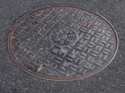
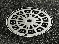
Con Edison is now the primary user for manhole covers, and they seem, these days, to have boiled down to four basic designs. See the two above and the two below.
 _
_
(Click any image to enlarge.)
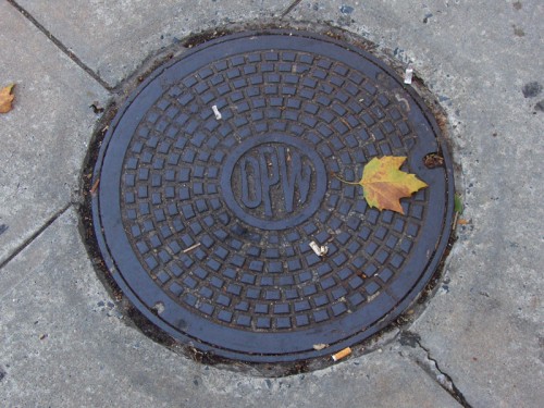
The Department of Public Works features this handy little design. I like its simplicity very much. the color also makes it unique.
 _
_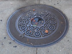
Above left you can see an older model that is wearing down. Parts of the design are blending into other parts almost making a new shape. Above right you see an interesting model. There’s a cover within a cover. The smaller model seems to fit within the larger model, and both can be pulled out. Very interesting. There were three or four of these in the same area around 23rd Street.
 _
_
These manhole covers have been fitted into what were obviously larger spaces.
The concrete circle, above left, fills in for an earlier, larger model manhole cover.
Above right, you see a round cover in what was once a square hole.

The busy minimalism of this design works very well with the cracked asphalt around it.

Here we have an interesting model. No design. I guess some would say that that’s
a design in its own right.
If you look on line, you’ll find a lot of information and photos of manhole covers. It’s amazing how big an industry is manhole cover watching. There are many books on the subject, many websites and lots of photographers who specialize in it. I have to direct you to one Roland Muhler. His work is stunning. I’ve posted three of his NYC photos just below. He has many international manhole covers on his site.
Another site which gives a lot of attention to manhole covers is Manhole Covers etc. The site is subtitled: “I’ve been looking down so long, I don’t know which way looks up.” Here you’ll find some history, links and photos from across the US as well as around the world.
Through this site I found a Russian site called Sewers of the World, Unite. There’s plenty of information and links here as well as some excellent photos. The images below are Russian designs from this site.
On the site, the history of sanitary sewers, I found this document (pictured to the right) 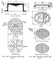 which gives a good view of a plan for some manhole covers. One cover is designed for Syracuse and another for Brooklyn.
I also learned in my small amount of research that most of the covers done for NY’s manholes are made in India. I imagine the shipping charges would be enormous.
I presume that the manhole covers are now made of steel whereas they originally must have been molded of iron (and which would have broken when dropped.) I also learned that the sewers once had a hard glass built into the sidewalk openings so that light could enter. Pre electricity must have made working below ground difficult.
I should say more difficult. It’s not a job I’d like.
Today, I received this note from Steve Fisher:
- Michael: As I just stated on your splog, I thought your essay was terrific. I, too, did not know the subject had such a following. Coincidentally, in the same year as your original posting, I was working on a photo book of snaps that I had taken while in India in 2005. I came across a manhole cover around the block from where I live on which was written, much to my surprise, “MADE IN INDIA.†That was the first time I ever really took notice of manhole covers and then learned, too, that many were made there, an early example of out-sourcing. It became a natural for the cover photo and title for my little book. Since then, I am always on the lookout for them. While in Italy in 2008, I took one in Ron’s hometown. Currently, I am working on a photo book of a children’s story, “The Adventures of Tomaso, the Rollaway Sicilian Tomato,†and I am using the image there. Thought you might like to see them. Steve.

Commentary 11 Jun 2011 06:49 am
. . . and more
.

- Terrence Malick‘s new film, The Tree of Life, is far and away my favorite of the year, and it’s hard to imagine another besting it. The film starts with a vision of god that moves beyond to a patriarchal dominated family in Waco, Texas. The suggestion of a death leads us back to god and the creation of the earth. From protozoa to dinosaur to the birth of a child, this filmmaker exudes absolute love for every organism he can show us on screen. Yet, right from the dinosaurs onward he creates an ominous tone in this male-dominated power hungry environment. You’re always expecting something terrible to happen in the hands of the children who push the film forward.
This is a film that technically has a new way of presenting itself almost through an impressionistic vision. The whispered narration and dialogue mix and blend into one; the sun streamed backlit late-afternoon interiors create a whispered visual to match. All of it is driven with a new and unusual way of cutting – first seen in Malick’s last film, The New World.
The film only has big thoughts on its mind, and the director’s absolute love of everything pulls us into a world and an environment that is like no other. It’s a great film. Audiences are finding it thrilling and tedious, too long and brilliant. There are many who love it and many who hate it. I loved it and can only question how I can employ some of these new thoughts and devices for my future films. What an inspiration!
I haven’t stopped thinking about it since I saw it on Tuesday.
.
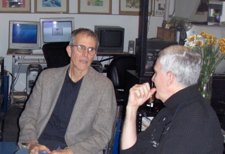
George Griffin & John Canemaker
.
Independent Animators
I’d written last week about regularly featuring articles on this blog about Independent animators. The first one is almost finished and will be run this coming Tuesday. It’s a conversation with George Griffin, an animator whose work has been something of an inspiration to me over the course of my entire career. It was a pleasure putting this piece together for me, and I think it’ll be worth the read.
- John Canemaker has an Appreciation of Tyrus Wong on the blog of the Disney Family Museum. This is an excerpt from John’s book, Before the Animation Begins.
The Disney Family Museum are celebrating Bambi all month with a number of articles, and it might be well worth keeping a watch on what they’ll post for it.
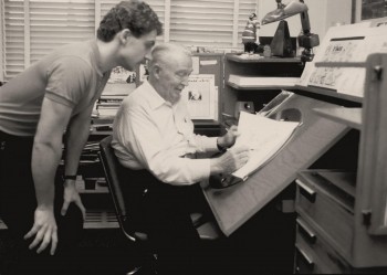 - Surely, by now, most of you know that Andreas Deja has a new blog called, punnily, Deja View.
If you haven’t visited and are a fan of Disney art, I suggest you check it out. It’s less than a week old, and we’ve already visited Eric Larsen (pictured to the left with Deja), Frank Thomas and Ollie Johnston, Milt Kahl and Marc Davis. The artwork on display ranges from multiple poses of Maleficent to Cinderella and prince dancing, to Pinocchio skipping. We can only assume this material will continue at the same high calibre for a while.
I hope we get some stories and artwork by Andreas Deja, himself, since I have to say his was my favorite animation coming out of the Disney studio in the time he had worked there. It shows how little the studio truly respects animation that they don’t have proper work for a man of his talent. How little respect animation really gets in these days of computerized puppetry.
 - Jeff Katzenberg was interviewed by The Hollywood Reporter about the decline of 3D in movies. In the interview, Mr. Katzenberg had this to say.
THR: Do you have any plans to change your 3D strategy at DreamWorks Animation?
Katzenberg: We’re not the problem. We have made five films now in 3D and have built this amazing reservoir of knowledge and tools. Nobody else has made five 3D movies back to back. You can see the quality of the experience increasing with every film. The cost has gone down significantly for us the last three years, and there is still meaningful, incremental profit to us, even though the size of our audience has narrowed. On every account for us, 3D is a win. It’s not nearly as big a win as it should be, and it’s certainly not the win it was headed toward being, and that’s really heartbreaking to me because we have managed to snatch defeat out of the jaws of victory as only Hollywood can do.

 15
15