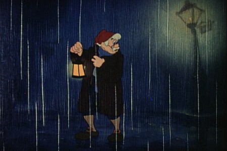
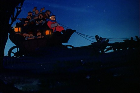
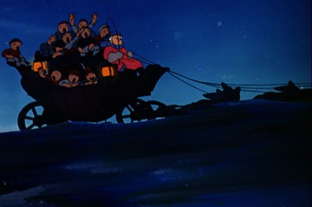
Monthly ArchiveJune 2011
Art Art &Photos 30 Jun 2011 07:05 am
Canemaker’s Back Yard
- This past weekend, Heidi and I spent a lovely quiet time in Bridgehampton at the invitation of John Canemaker and his companion, Joe Kennedy. It made for a very restful and enjoyable time despite the grouchy weather.

The garden gives you the illusion that it’s larger than it is.
Even walking in it you feel that you could easily get lost in it.
The first dominant site you take with you as you visit the house is the amazing yard and the enormously colorful and tender care Joe and John have taken to cultivate their garden of a back yard. It’s stunningly beautiful. It feels almost as though these plants grew naturally next to each other and happen to take the shape it’s taken. The amount of weeding and nurturing and debugging is left completely behind as you bask in the warm glow of this garden with its variety of flower and shrub. It’s beautiful and peaceful and inviting. I couldn’t help myself over the course of the weekend; I took many walks in the area and sat and enjoyed it. I loved it.
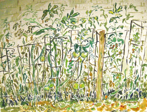
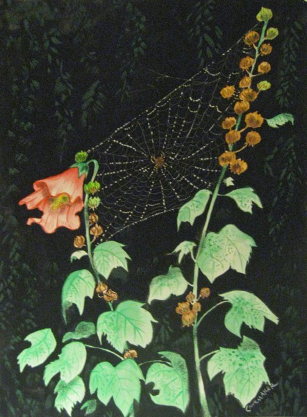
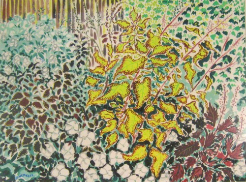
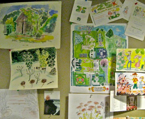
The second thing that captivated me during the visit was a painting John had done. It sat on the wall of the guest room we stayed in. In the first few hours in the house I kept coming back to the painting. I liked it enough that I took out my camera and photographed it. As I did, I realized that there were other smaller paintings in the room, and I found them almost as lovely. There’s no doubt John has been taken with the amazing garden out back, and this has helped to color these fine watercolors.
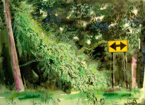
This painting obviously is not from the garden (given the road sign).
However, one can’t help but feel that the life in that garden spills over
into this painting – as it does in all the others.
At some point in the weekend, I asked John if he minded my photographing some of the paintings in the house and posting them on the blog. John, as always, was quite open to anything I wanted to do, so I went about quickly taking some photos. I also intended to mix in pictures from the garden. After all, I see these paintings and the flora as intermingling and working together in a lovely way.
There were some problems. The paintings lost some of their verve when photographed. The delicate colors were lost, and the shape of the pictures altered. (The lens of the camera seems to have slightly distorted the frames of the images.) I saw the pictures in some way influenced by Mary Blair’s work, but John took her colors and softened them. (The brashness of Blair’s work has always bothered me.) In the end, I found myself adjusting the pictures slightly to try to give them a bit of the feel of the originals, but I’m not sure I’ve succeeded. However, better you should get to see these images than none. My apologies to John.
So, I hope you enjoy the quick tour.
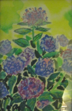
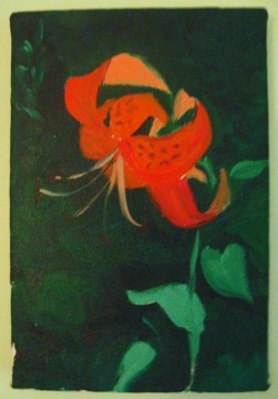
Two other smaller pictures that were in the guest room.
.


One of the larger paintings John had in his office, downstairs.

A beautiful flower that opened the day we arrived.

Heidi sitting on the porch just to the front of the garden.
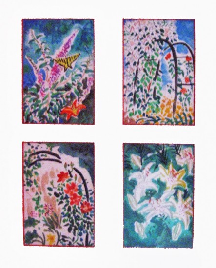
John has done many small quickly sketched watercolors.
Here, you can really feel the distortion of the camera’s lens.
Again, my apologies to John.
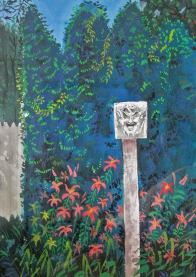
I had a hard time photographing this one.
The reflections in the picture frame’s glass was difficult to avoid.
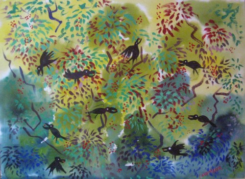
Another painting that just totally caught my attention.

Finally, a lovely little statue sitting just off the porch.
It’s a stone rabbit that once belonged to Bill Tytla.
Adrienne Tytla, Bill’s widow gave it to John as a gift.
Many thanks to John Canemaker and Joe Kennedy for a lovely weekend and all the wonderful inspiration, not only in the paintings but in the garden, as well. It was more than a small retreat.
Animation &Animation Artifacts &commercial animation 29 Jun 2011 07:17 am
Tissa Baby Spot
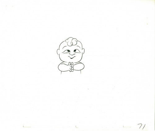
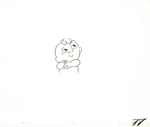
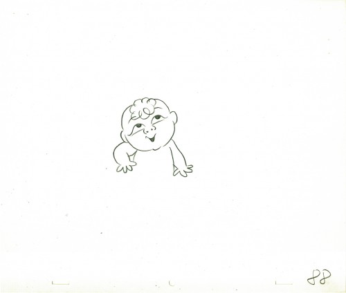
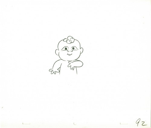
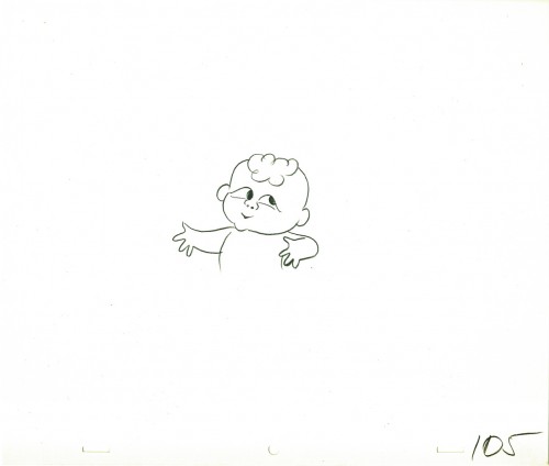
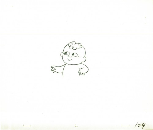
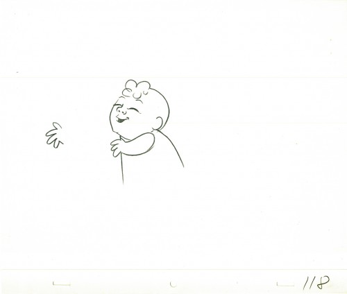
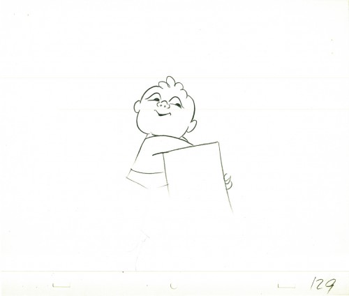
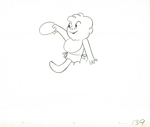
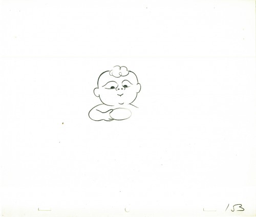
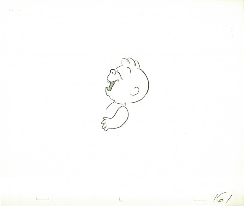
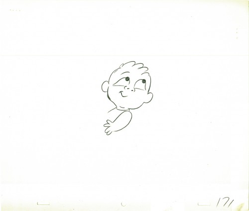
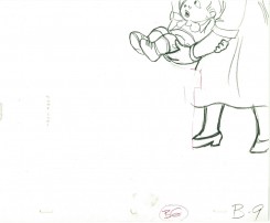
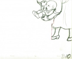
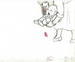
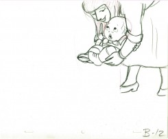
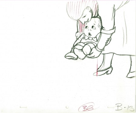
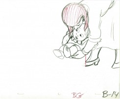
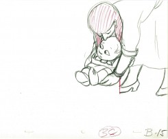
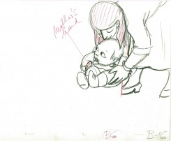
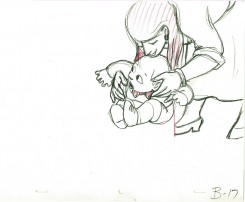
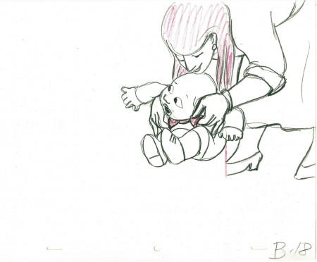
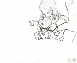
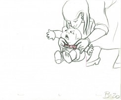
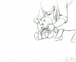
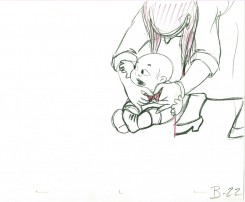
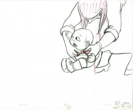
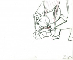
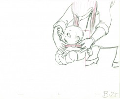
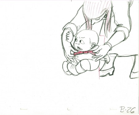
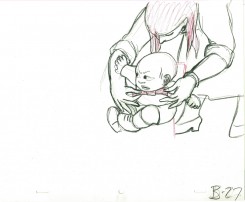
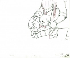
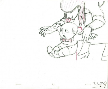
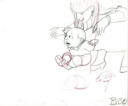
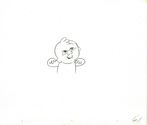
- Here are some drawings of another baby drawn by Tissa David for a commercial done for Robert Lawrence Animation. I’m not sure what the product is, but the baby obviously is happy about it, whatever it is.
These drawings were not used in the final spot. Tissa reanimated it, but I thought they were impressive enought to post. She did both animation and cleanup.
 61
________________________
61
________________________.
The following is a QT of the entire scene with all the drawings included.
Since I didn’t have exposure sheets, I calculated everything on twos and
left however many frames between drawings with 4 fr. dissolves between them.
I don’t know if there were any holds, but I suspect there were.
Articles on Animation &Bill Peckmann &Comic Art 28 Jun 2011 07:11 am
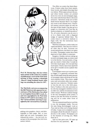
Kelly 1988
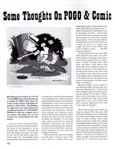
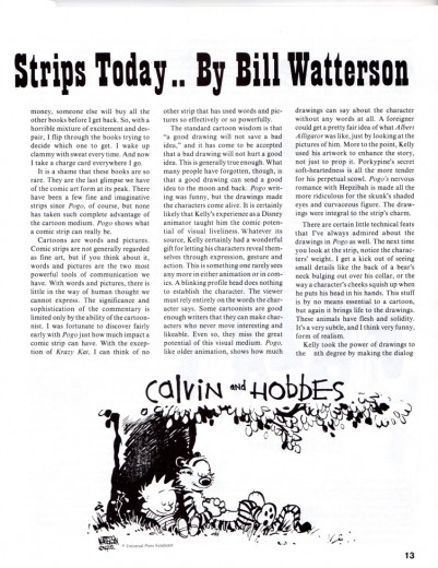
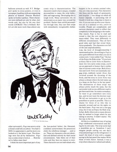
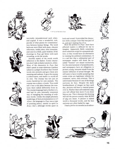
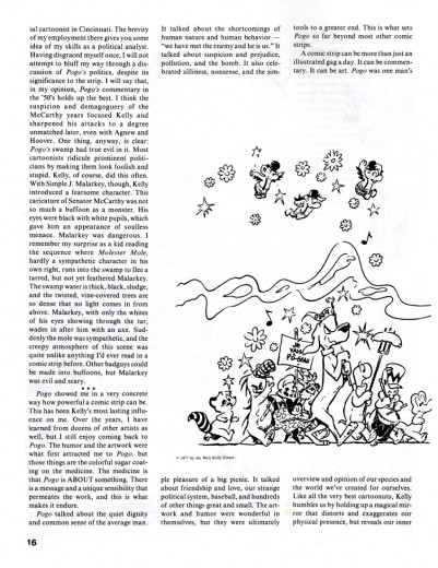
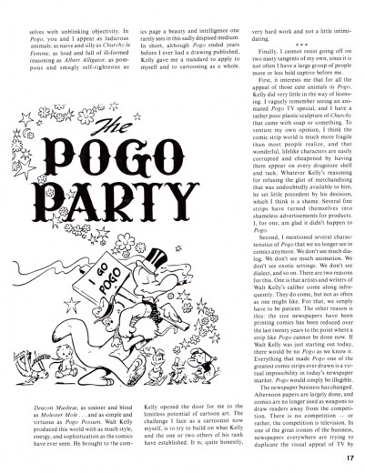
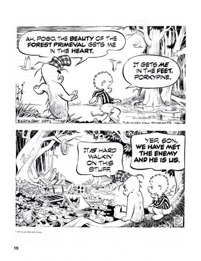
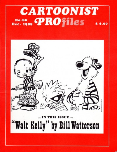
- Here’s an interview printed in Cartoonist Profiles Magazine in 1988. It’s Bill Watterson, of Calvin & Hobbes fame, of course, giving an appreciation of Walt Kelly of Pogo fame, obviously. It’s a gem of a piece sent to me by Bill Peckmann, and I’m posting it hoping you’ll find it interesting. Thanks to Bill Peckmann for sharing his incredible archives.
Cover
Disney &Frame Grabs 27 Jun 2011 06:28 am
More Pinocchio Multiplane
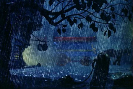
- I had such a good time last week posting images of scenes from Pinocchio using the multiplane camera that I decided to go back to the well. There are a lot of very small shots in that film that use the camera for a more limited but very effective purpose.
 1
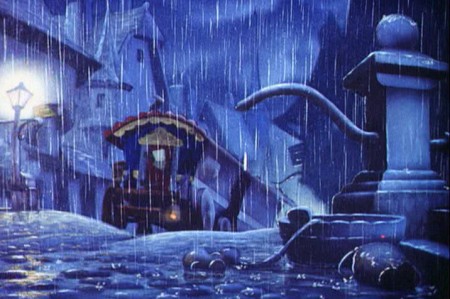
1A vaguely seen wagon rolls across the screen in a heavy rain storm.
 2
2
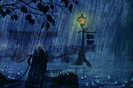
The camera pans across the screen with the wagon.
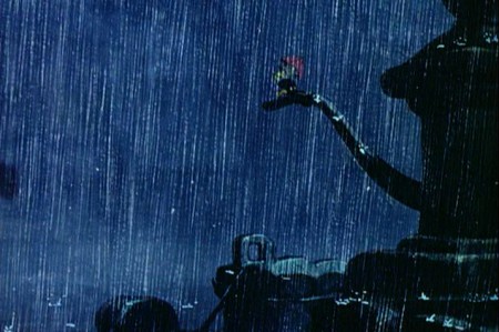 3
3
Camera trucks in to the water spout.
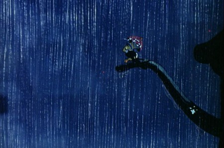 4
4
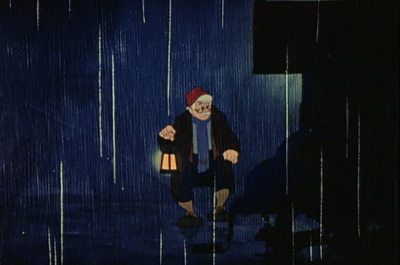
Jiminy sits on the water spout in the rain.
cut
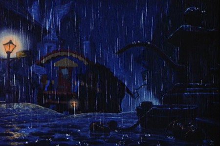 5
5
The wagon sits at rest in the rain
cut
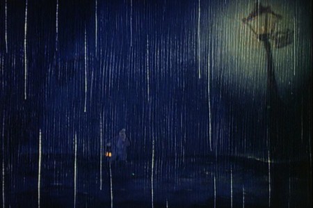 7
7
Gepetto in the far distance, in the rain, walks toward the camera.
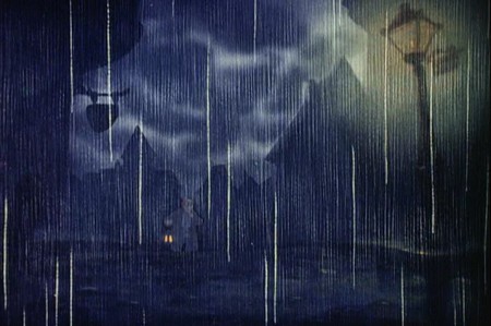 8
8
Lightning lights up the background.
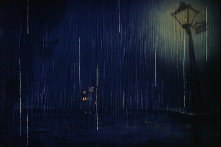 9
9
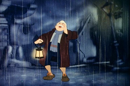
Barely seen Gepetto moves forward calling for “Pinocchio!”
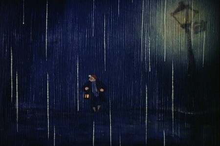 10
10
Gepetto slowly moves forward
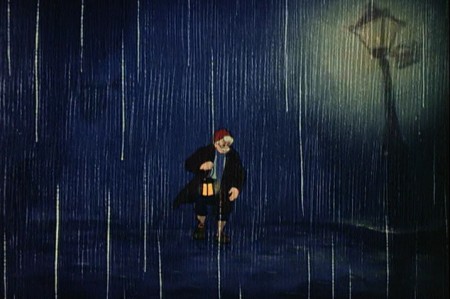 11
11
He continues on in the rain.
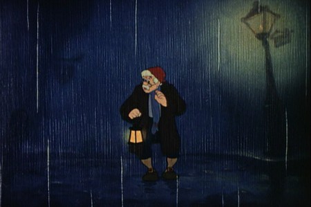 12
12
He hears the wagon approaching screen left.
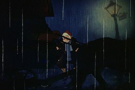 13
13
The wagon moves in front of him (slightly out of focus).
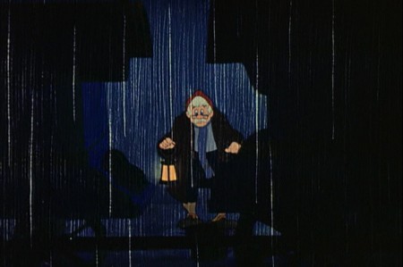 14
14
The wagon blocks across Gepetto who watches it.
At one point when I worked at the Hubley studio, John and Tissa David had a laughing disagreement. She had animated something with a couple of overlays panning over the background trying to create some sense of dimension.
John told Tissa that she was moving the overlays too quickly; they would look as though they were moving of their own accord, not that it would look like dimension as the camera moved in. She was adamant that she was doing it correctly. John told her that he had received a phone call from an historian in Europe. The guy had told John that he admired the way he used the multiplane camera on the carriage ride to Pleasure Island. The historian felt it was the best use of the multiplane, ever. John told Tissa that he had proof, then, that he knew what he was talking about. Tissa laughing, agreed to change her panning overlays.
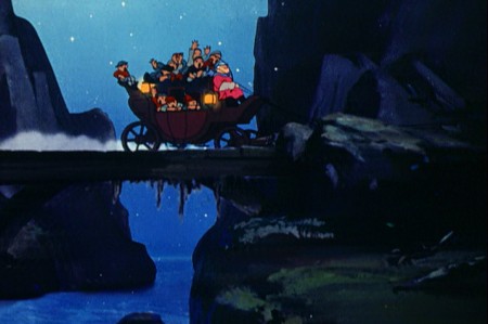
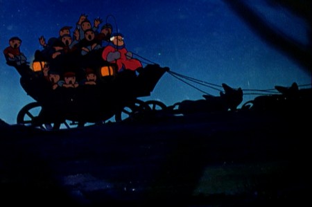
I thought it’d be a good point to look at the multiplane use throughout this entire sequence.
 18
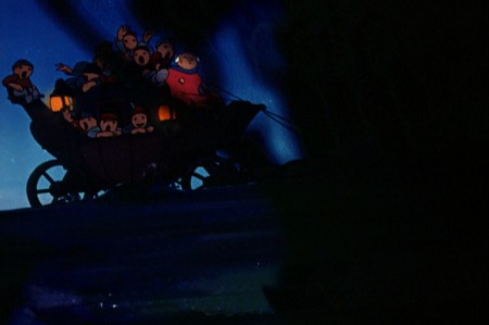
18We start with the carriage moving quickly through some wooded overlays.
 19
19
It’s definitely the multiplane. There’re levels of focus
and a very smooth movement to the panning trees.
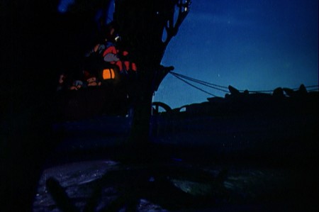 21
21
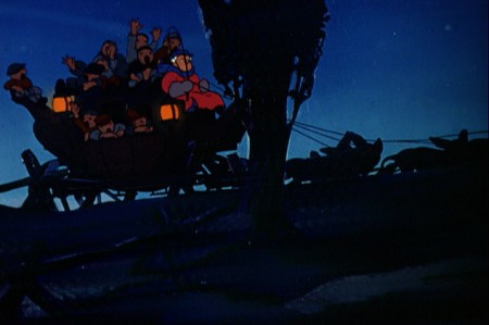
The overlays move quickly past.
 23
23
The overlay trees seem to have a slight highlight on the left side.
Could it be a cut line of a piece of paper picking up a light streak?
cut
 25
25
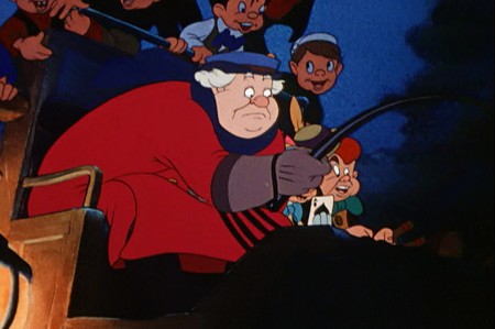
No multiplane as we see Coachman, Pinocchio and Lampwick in the driver’s seat.
 26
26
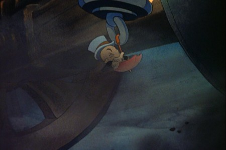
Jiminy with dust galore under the coach carriage.
 27
27
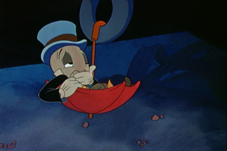
Cut in for a tighter, beautiful shot of Jiminy talking to the audience.
 28
28
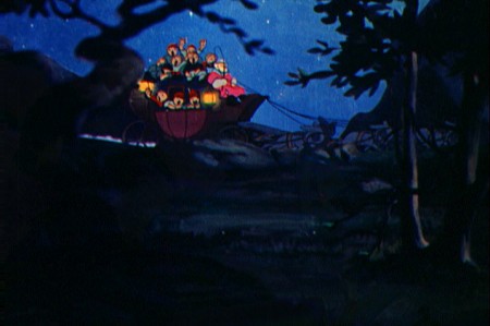
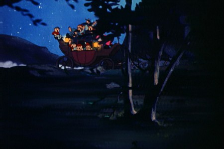
Back to the carriage moving quickly behind multiplane levels.
 29
29
. . . it passes trees . . .
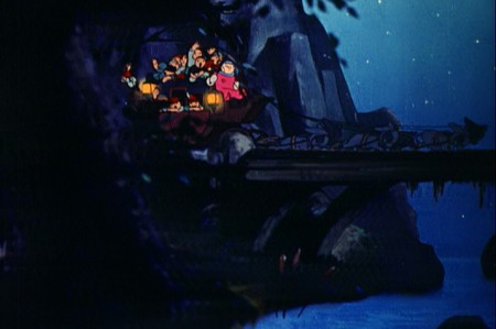 30
30
. . . and moves to a stone bridge . . .
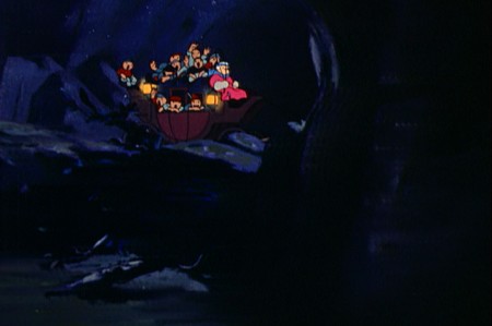 32
32
It comes to a pier and stops.
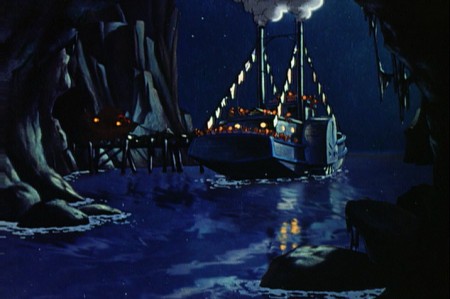 33
33
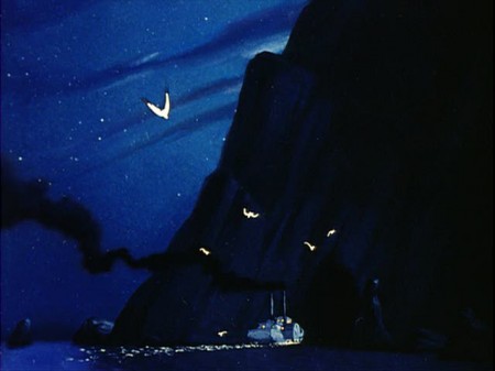
A steamship then takes them across the body of water.
No multiplane but quiet and beautiful water effects.
 34
34
Dissolve to a beautiful shot of the steamship crossing.
No multiplane.
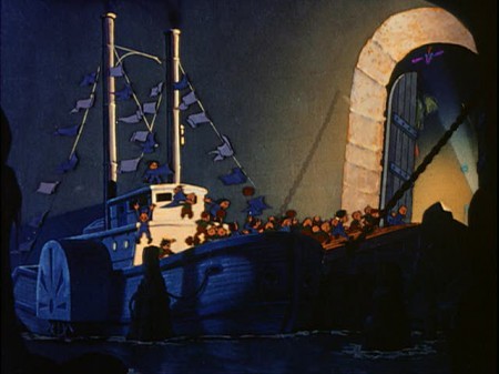 36
36
It finally stops at Pleasure Island.
No multiplane.
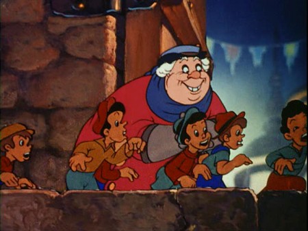 37
37
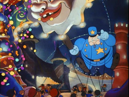
Pan with kids in front of coachman.
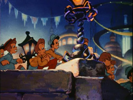 38
38
Across the screen as we open up . . .
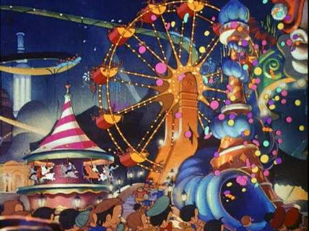 39
39
. . . to see Pleasure Island.
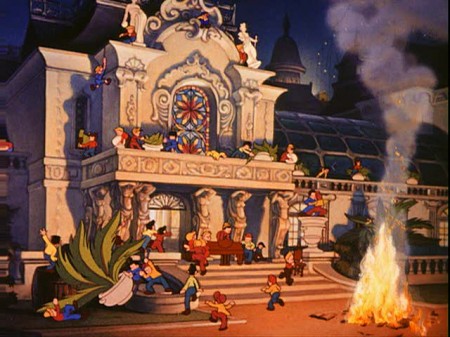
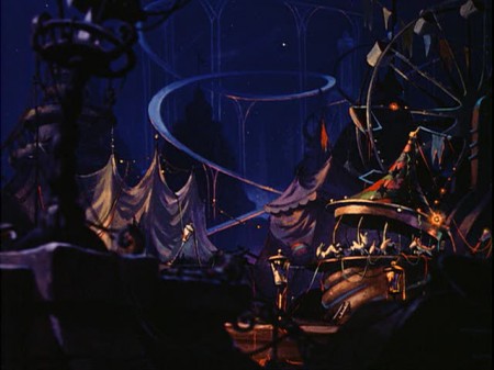 43
43
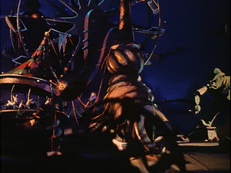
Late night. Destruction and desolation.
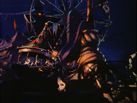 44
44
A small pan across to the cowboy.
Very quiet use of the multiplane.
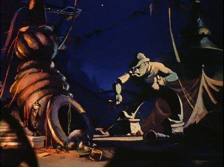 45
45
Notice the out of focus wheel in the left foreground.
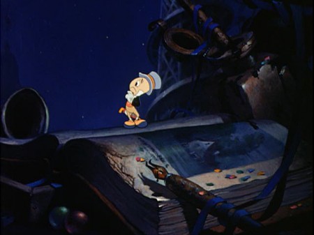 47
47
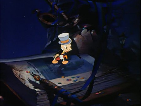
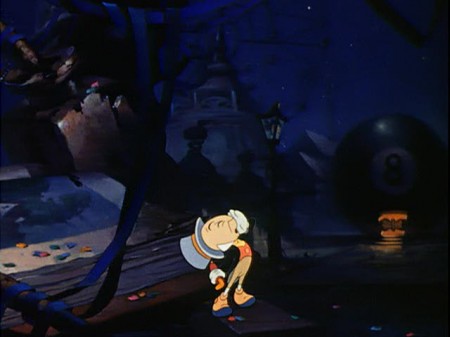
Jiminy climbs up from behind the hill and looks back calling for Pinocchio.
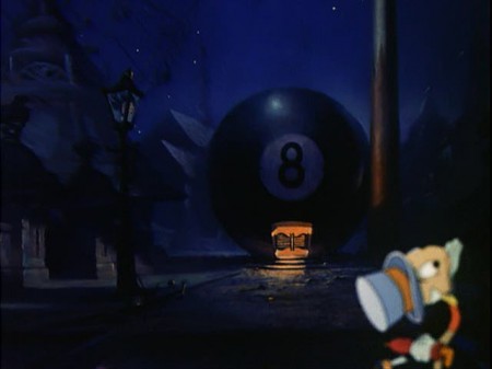 51
51
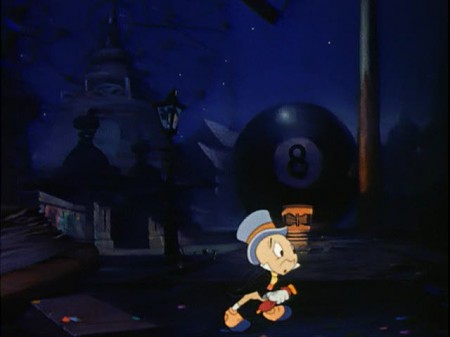
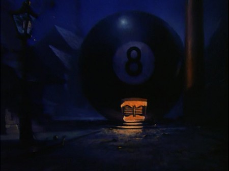
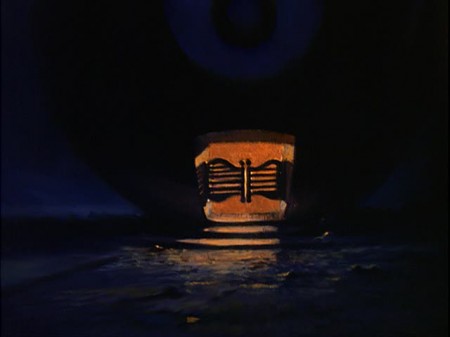
. . . going out of focus as we rack focus to the 8 ball in the Bg.
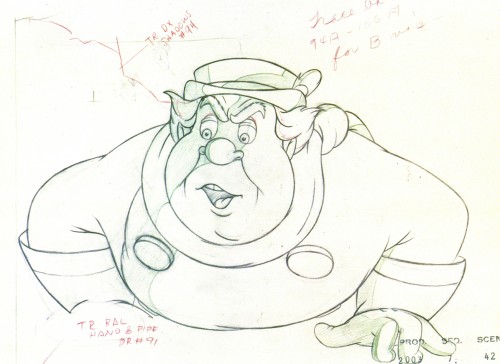
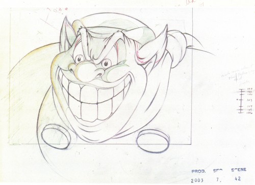
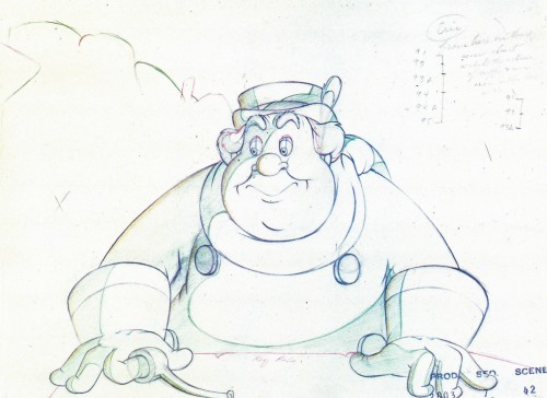
Here are a couple of drawings by Charles (Nick) Nichols done as part of the animation of the Coachman. The drawings come from the Canemaker book, Treasures of Disney Animation Art.
 1
1
Photos &Steve Fisher 26 Jun 2011 07:35 am
Sunday Photo Growth
- Steve Fisher had sent me the following three photos over the last year or so.
This week they ended up in the NY Times.
First this one, then this one.
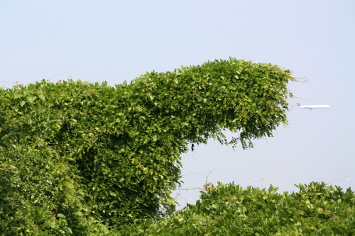
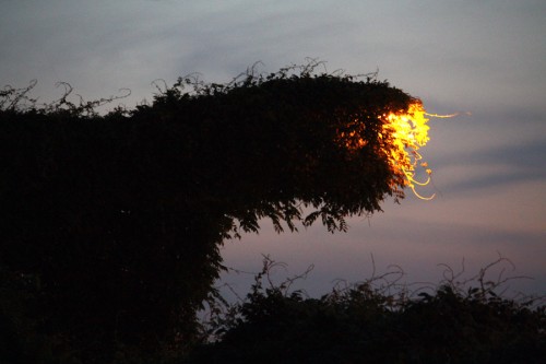
He took the pictures in Queens, an overgrown street lamp being swallowed by a fern.
 1
1
Congratulations are in order. Steve’s photos always belong in the NYTimes.
I’m glad to post them, even when they don’t make it to that paper.
Here are some other recent photos Steve took of alternate local fauna.
 1
1
 10
10
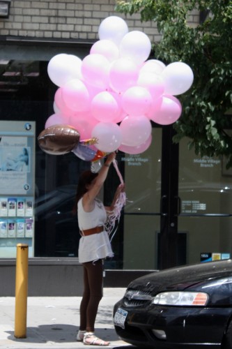
And just for good measure we have the
ballooons to celebrate.
.
They’re all beautiful, and they’re all appropriate now that we’ve entered the first days of Summer.
Commentary 25 Jun 2011 08:38 am
Cars & Archie

- Cars 2 doesn’t seem to be getting the magic reviews that Toy Story 3 got.
At least that’s how it looks in New York.
Let’s take a look at a couple of the most obvious reviews.
A.O.Scott in the NYTimes wrote:
- Even without Mater’s nattering . . . “Cars 2†would be, by far, the loudest Pixar feature yet. The whine of engines and the rattle of gunfire (surprisingly frequent in a G-rated film) compete with the nonstop yakking to such an extent that Michael Giacchino’s score has to strain and blare to be heard. Perhaps after the exquisite silences in “Wall-E†and “Up,†the Pixar team wanted to open up the valves, kick up some dust and make some pop culture noise, leaving the poetry to someone else. Or maybe the company was tired of turning out one masterpiece after another and decided to coast for a while.
“Cars 2†is certainly built to move merchandise — this series may surpass even the “Toy Story†films as an effective advertisement for licensed playthings — but it is notably lacking in soul or sublimity. . . It may be intriguing to imagine what our toys do when we leave them behind, but there is something irreducibly grim about an entire planet ruled by mass-produced consumer goods whose producers and consumers are nowhere around.
But maybe I’m misinterpreting the movie and underestimating Pixar’s capacity for subversiveness. Maybe “Cars 2†is a dystopian allegory for an era of ecological anxiety.
Or maybe not.
Joe Neumaier of the NY Daily News was the most positive, giving it three stars:
- With Porsches and Jaguars rolling out of Pixar annually, you can excuse some occasional clank and knock. So “Cars 2″ cruises in looking polished, and if there’s very little under the hood, it’s surely because this savvy and sensitive company has unapologetically made a movie for (very) young moviegoers.
. . . whereas the first movie’s lessons about appreciating a slower pace and the way the world once lived contained Pixar’s trademark subtlety — junior division — the sequel’s message about standing by friends and remaining true to yourself is nice but, well, standard.
Kyle Smith of the NY Post was not as generous giving it 1½ stars:
- They said it couldn’t be done. But Pixar proved the yaysayers wrong when it made its first bad movie, “Cars.” Now it has worsted itself with the even more awful “Cars 2.”
This international toy fair and pun emporium billed as a movie relies painfully on the redneckery of Larry the Cable Guy, an alleged but not proven comedian whose country corn-pone act makes Jeff Foxworthy look like Gore Vidal.
. . . London billboard reading “Lassetyre,” a reference to the film’s director, John Lasseter, looks like a typo. Surely they meant Lassetired?
In much the same way that a pleading nightclub comic might say, “Is anyone here from a foreign country?” “Cars 2″ makes a show of its globalism, zinging around the planet to mollify important markets — sorry, countries!
Things are so dull, rote and humorless that when signboards in a European scene read “Mondiale Grand Prix,” I at first thought they said “Mondale Grand Prix,” which sounds like an unwanted award this movie could easily win.
But then maybe New York isn’t so different from the rest of the country; the film got a 33% on Rotten Tomatoes (not good). I have a free Academy screening coming up next week. I’m not sure if I’ll make it.
The Chuck Jones Gallery, 232 Fifth Avenue, in the heart of San Diego’s famed Gaslamp District will showcase the original drawings of famed Archie’s Comics cartoonist, Henry “Scap” Scarpelli. The show will be on display July 21st through July 24th during Comic Con International.
Henry Scarpelli, a native New Yorker, studied at the School of the Visual Arts in Manhattan and after service in the U.S. Army landed his first job in the art department at General Features, a newspaper syndicate.
“We are thrilled to premiere the Scarpelli Estate’s collection of original Archie Comic’s drawings, both graphite and inked,” said Scott Dicken, vice-president of retail operations for Linda Jones Enterprises, the parent
company of the Chuck Jones Gallery, “from the hand of this master of the comic book panel. Henry Scarpelli’s work is without peer in the field of comedy cartooning.”
I was a fan of the Archie comics when I was younger, but that was in the days of Bob Montana’s handling of the comics. It would be a kick to see the original art for this comic strip, but I’m in New York with no plans t make it to San Diego. If you’re in the area, I’d urge you to check in to see the show.
- Aardman has teamed up with Nokia again. Last year they produced the world’s smallest bit of stop-motion puppet animation. This year they’re trying for the largest. (Something tells me they’ll succeed.) If you want to follow the blog for this project you can go here.
Bill Peckmann &Comic Art &Disney &Illustration 24 Jun 2011 06:43 am
Kelly’s 3 Caballeros
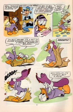
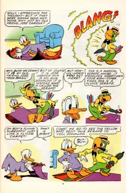
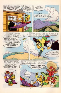
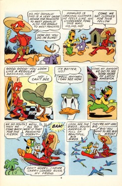
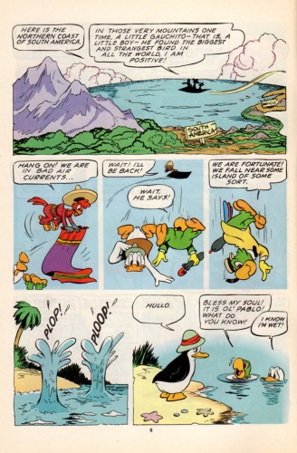
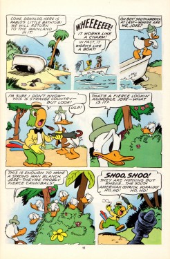
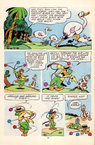
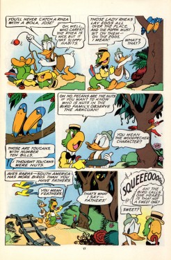
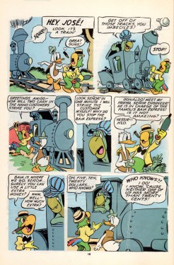
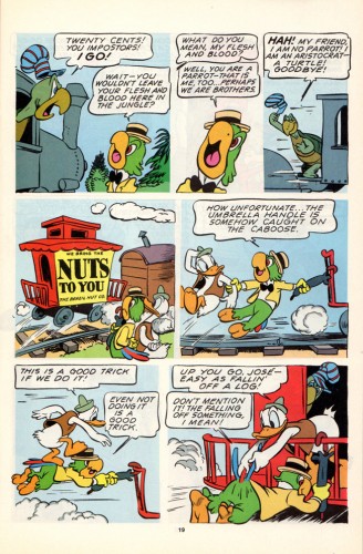
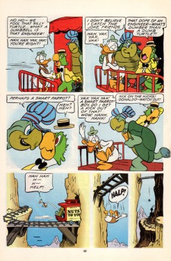
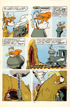
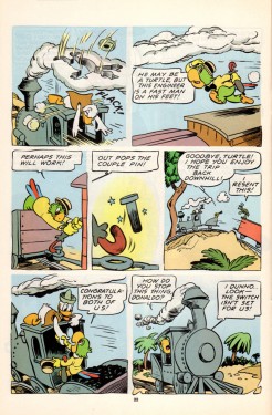
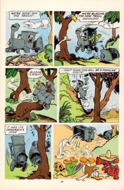
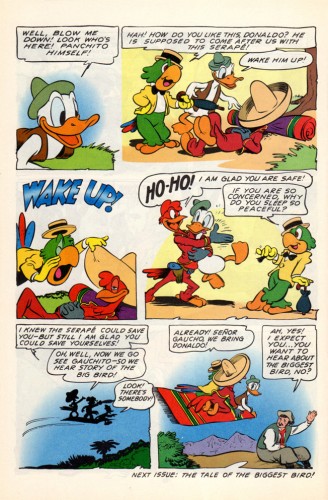
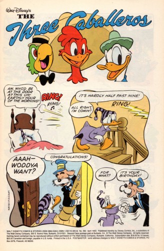
- Suppose we had a comic book version of The 3 Caballeros; wouldn’t that be fun to see? What if the artwork were done completely by Walt Kelly; would that make it a treasure? I think it does. Bill Peckmann made my week when he sent me the scans to the following comic book. As Bill wrote to me: “Beautiful stuff, like Barks’ art, it’s timeless, looks like it was done yesterday.”
Not only is the artwork out of this world, but the quality of the printing is brilliant. And the quality of the book, itself, is wonderfully well preserved. You only have to look below to read it. Take your time; this is great.
 1
1
Many thanks to Bill Peckmann for sharing this gorgeous material with us.
Action Analysis &Animation Artifacts &Articles on Animation &Disney 23 Jun 2011 06:56 am
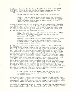
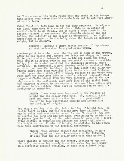
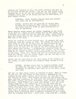
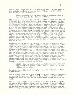
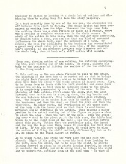
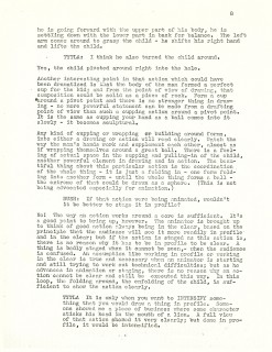
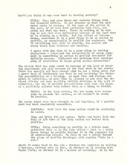
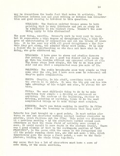
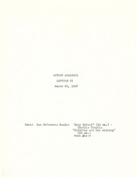
Action Analysis – March 29, 1937
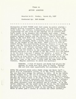
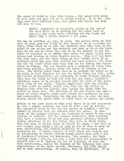
- I continue, today, with the Action Analysis notes from the lectures given at the Disney studio by instructor, Don Graham. The lectures were often built around film sequences that were screened. In this lecture, they screened a sequence from Charlie Chaplin’s Easy Street as well as an in-house loop of a man walking with two children.
The animation personnel who attended and participated on this lecture included: Reuben Timmins, Izzy Klein, Jacques Roberts, Bernie Wolfe, Chuck Couch, Jack Hannah, Amby Paliwoda, Bill Tytla, and Bruce Bushman.
Cover
If you enjoy reading these Action Analysis notes, there are a wealth of them on Hans Perk‘s wonderful resource of a site, A Film LA. Many of them from earlier periods than these that I’m posting.
Animation &Animation Artifacts &Hubley &Tissa David 22 Jun 2011 07:22 am
Tissa’s Baby
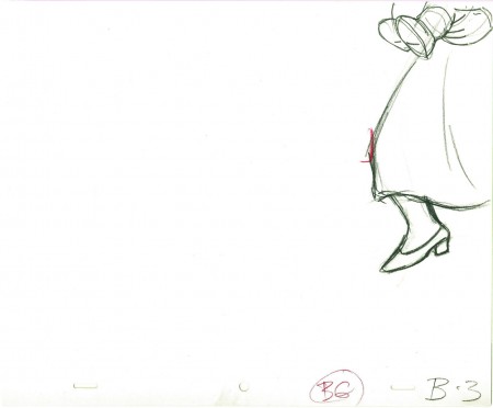
- Here’s the first part of a scene Tissa David animated for the Hubley feature EVERYBODY RIDES THE CAROUSEL. The baby is one year old and mother puts him down in front of the lit birthday cake. She tries to fix his tie, but he’ll have none of it. I have the mother drawings that follow this, but I’m missing the baby. So I’ll let it end at this point.
 3
3
________________________
.
The following is a QT of the entire scene with all the drawings included.
Since I didn’t have exposure sheets, I calculated everything on threes
since Tissa did a lot of her Hubley work on threes.
I don’t know if there were any holds, but I doubt it.
Animation &Independent Animation 21 Jun 2011 07:04 am
Kathy Rose – Filmmaker/Performance Artist
- Kathy Rose has had a long and esteemed career doing personal animation. She made her name, at first, with the animation style she began at CalArts and continued on into the 70′s with her gem of a film, PENCIL BOOKLINGS. She took a 90° turn combining her animation with her dance and performance art via her 1983 piece, PRIMITIVE MOVERS. Since then she has developed this very personal and individual art form with many more theatrical pieces and video pieces.
I had a close eye on Kathy’s original animated films, but have lost track of the performance works. It was with some excitement and interest that I contacted her to ask several questions about her more current work and have been pleased for the chance to catch up – a little bit.
Q. To begin with, can you tell us about your beginnings; why you gravitated toward animation in the first place, and what steps you took?
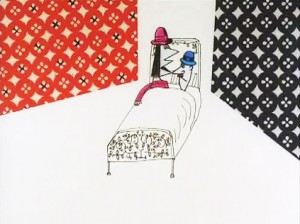 I was a film major at the Philadelphia College of Art, and while there, I saw the animation of Yoji Kuri, specifically – his film Ai (pictured right). I was totally enchanted with his work. That and an interest in photography and collage led me to animation. My thesis project was a live action film, called Portraits, but included pixilation and some cut out animation which I projected onto a live face in the film. The project was a series of portraits of friends, the
last – a self portrait – included excerpts of the other pieces, and finally this projection, all signifying our projection of others into our self image.
I also was training in dance and performing with a multi-media group in Philadelphia called Group Motion, started by former students of the great German expressionist dancer Mary Wigman. This experience would have an enormous impact on me in the coming years.”
When I left PCA, in 1971 I started to teach myself animation. My father – who was a photographer – gave me $1000 as a graduation gift to make an animated film. I did several explorations, using drawing pads to create the animation. Movers (on my site) was the last piece I made in that series before going to Cal Arts.
Q. You graduated from CalArts in 1974 with a class that produced a number of important non-linear filmmakers, such as Adam Beckett, Dennis Pies, Joyce Borenstein and yourself, who turned Independent animation on its ear. Can you tell us a bit about those years; was there a particular influence on you all?
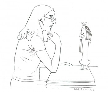 My time at Cal Arts was absolutely magical. Especially because prior to going I had been sequestered, working in an office in N.Y. while I taught myself animation. I saw that Cal Arts had a graduate program in animation, and thought that would be a great way to follow this star. The whole atmosphere at Cal Arts was very exciting – I think it probably still is. Jules Engel was an amazing teacher. He said very little, but when he did, it turned your life around – I am still inspired by his zen style of teaching. The department was small – only around 8 people at the most worked in the animation room, and some worked at home. Adam Beckett worked during the night – at home or in the optical printer room. He and I were in a relationship from 1972-74, and shared a lot about the animation we were working on. Dennis Pies (now Sky David) also worked in his dorm, as did Joyce. But we were all drawn together not just in our department, but with the rest of the Cal Arts community. For awhile I took some dance at the school along with another animator Lisa Rose. (no relation). An animator who was very influential on our group of artists was Jim Gore, who was not a student at Cal Arts. Adam had connected with him and his films. Dream of the Sphinx, and The Letter had a powerful effect on us. It was Jim’s very free, metamorphisizing style – which at the time was a revelation and led to a new way.
Q. We came to know you through your early animation work which was all very non-linear. filmically but linear graphically. MIRROR PEOPLE, MOVERS, THE DOODLERS and particularly PENCIL BOOKLINGS all had a large impact on the Independent movement of the late 70s early 80s. Can you speak a bit of this period in your work?
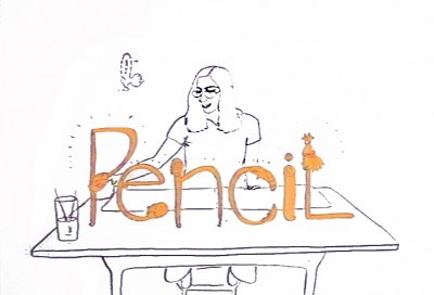 The wonderful input of Jules led me to MIRROR PEOPLE, THE MYSTERIANS, THE ARTS CIRCUS, THE MOON SHOW. I had graduated and was working at Cal Arts while I made The Doodlers, where I used the Cal Arts facilities. PENCIL BOOKLIGS was made in N.Y. with an AFI grant. All these films were the result of my exposure to the fertile atmosphere at Cal Arts, and also my fascination with Yoji Kuri, While I was at Cal Arts, I had started to correspond with Mr. Kuri, and he visited with my family in N.Y. at Thanksgiving. He then came to Cal Arts, and I finally met him. (I even saw him later in 1994 when I was a judge at the Hiroshima Animation Festival, and visited his studio, was taken to dinner (with a translator – Yoji spoke no English).
Initially, when I first entered Cal Arts, I was sure I did not want to work with narrative, and I said so to Jules, who was very amenable. I also missed the experience of dancing, and the music associated with it, especially rhythms. (I am currently studying Japanese Taiko drumming).
I think both the dance and rhythmical influences are strongly apparent in these Cal Arts pieces.
With PENCIL BOOKLINGS, I was moving in the circle of New York animators and I think although the storyboard was designed pretty early on, I was influenced somewhat by these associations, especially George Griffin‘s TRICKFILM.
Q. PENCIL BOOKLINGS was voted one of the 10 Best Films in the world by the Hiroshima Intl Animation Festival in 1976. You seemed to have reached the top with this animated form and you moved on to the dance/movement videos. Your 1983 film, PRIMITIVE MOVERS, included your dancing with a group of animated dancers, very much in your linear style. Can you speak about what caused your big change – incorporating yourself into the videos.
PENCIL BOOKLINGS was definitely an apex for me, and also left me at a decisive point. After I completed it, my father had passed away, and I had taught as a Visiting Lecturer at Harvard for a year, and I was working for R.O. Blechman on his Soldier’s Tale. I knew only that I didn’t want to return to what I had done, and I was feeling a strong pull to be performing again. But I had never performed solo, and was somewhat lost at what direction to take.
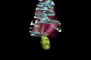 At that point, two things happened. I was living in Tribeca, and one weekend I decided I would just wander in Soho and see where it led me. I ended up at the Bleecker St. Cinema where there was a Marilyn Monroe double bill. This told me I wanted to perform again. (Ironically the first film I remember being taken to as a child was â€Some Like it Hotâ€)
At the same time I received an NEA grant to make an animated film. I decided to mix the two, make an animated film I would dance with. Jules had actually told me almost 10 years before that he could see me dancing with my films. At the time I thought he was crazy, but it demonstrates his intuition. R.O. Blechman also was very encouraging about the idea of combining these. I began taking dance classes again, and ended up studying African dance (for 5 years actually). I was very interested in the Diaghilev productions and his work with set designers for ballet, and in particular the costume designs of Sonia Delauney. In addition, Bob Blechman took the whole studio to see Abel Gance’s Napolean, which was being shown at Radio City Music Hall with a live orchestra – the score by Carmine Coppola. This production was absolutely amazing to me, the effect of the live music on the film made it a dimensional experience, and this was a pivotal moment for me.
I also found seeing Barbara Morgan’s photos of Martha Graham’s PRIMITIVE MYSTERIES clicked for me. Until then I hadn’t really connected with what choreography meant to me. But seeing the stunning, visual, and symbolic group formations in this piece, showed me that dance could be graphic, and this was something I could connect with.
I took a year to produce the animation, and mapped out choregraphy as I drew. Originally I thought I was making a 10-15 minute piece, but it turned out to be 30 minutes. I had a wonderful animation student as an intern – Monica Kendall from Chicago – who worked with me every day. At this time I was also introduced to Mary Bright who I interviewed to design the costume. I knew as soon as I met her at the door, that she was the one. She wore a very big circle earring on only one ear, and that told me everything I needed to know about her dramatic graphic sensibility.
The first performance of PRIMITIVE MOVERS was for a private audience, and it was the most frightening thing I’d ever done. After many performances, I developed my self-confidence and it totally altered me over time.
Q. In PENCIL BOOKLINGS your interplay with your characters came by animating yourself as a character in the film. In PRIMITIVE MOVERS the animated characters and shapes move into your live performance with you as the prime character. Was this part of the goal of the change in direction, or was it part of the result of the change in direction?
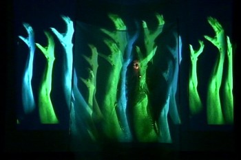 I think in both pieces I am the central character (if you don’t count the pencil). The big difference is that working with projection on something live forces you to work with a very different reality, where everything is not in your control. So many decisions and scenes are the result of the challenges that you meet in integrating the live with the two-dimensional. In PRIMITIVE MOVERS, I basically had to learn to take command, and be the leader, director in my performance itself – it is related to the central role I play in PENCIL BOOKLINGS, but has to be acted out in a much more dramatic way. I often had friends come to rehearsal, and also used a mirror. The input of certain people was key to my development of this genre.
Q. You started projecting shapes onto yourself, essentially acting as the screen for the animation. You make it seem as though the garment, itself, is alive and animated. This with other animated incarnations of yourself moving floating about you.
Unfortunately, I haven’t seen any of your live performances but have watched every video clip I can find. I’m sure I’m missing a lot. I wonder if you can talk about the difference between the live and the video.
It has always been a tremendous challenge to communicate the live event through a basically documentative video. It has actually taken me years to come to terms with it. Some of my early best video recordings were done by Swiss television, of PRIMITIVE MOVERS, and SYNCOPATIONS. I also found when I worked on my 1999 live piece KLEOPAT’RA, I was creating scenes to be used as film clips to run during the performance while I was changing costume off-stage, or to emphasize a stage action, and it allowed me to refine my approach.
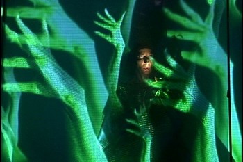 Basically, the live performance of any artist, has an entirely different sense of time from a film or video. In the live event, we are more prepared to wait for what happens because we are there, and there is a suspense, an excitement in the reality of the performer being there, live on the spot. And anything that happens integrating two-dimensional imagery seems impossible, hallucinogenic, and is therefore riveting. In my work it also becomes very sculptural. Often things I thought would be rather ordinary when I shot them as elements, like the floating hair for KLEOPAT’RA (and also QUEEN OF THE FLUIDS – which is a video re-working of the latter piece). When I projected this imagery onto a dancer, I was astounded at the architectural event that ensued. I definitely believe in being open, even waiting like a fisherman, for accidents.
With a video documentation, we tend to assume, in almost a lazy way, that what we are watching is possible, because it is like any other film. But I have found that I can still communicate the design, the theatrical sense in a video document, and of course its wonderful to be able to put these things on the web.
Q. The music throughout your pieces is strong. Do you collaborate with your composers or is it found music (or both)?
I have collaborated with several musicians – C.P. Roth had created rhythms for a piece he was doing for another artist. I heard it when I lived in Tribeca – which was next door to the Franklin Furnace where thie music was playing. I approached him about using the rhythms for SYNCOPATIONS. He also composed wonderful music for my performance piece SHE, which I also used for the later video of the same name.
Walther Giger in Zurich composed some really great music for me – I used one piece for my performance KABUKIMENKO, and a scene from it for a later video of the same name. I was studying flamenco and he has worked with Spanish guitar so it was a great fit.
Toshi Makaihara created sound for KLEOPAT’RA, and I was permanently affected by that creative experience. It drew me into the idea of pure sound, and since then I have made most of my tracks using sound from objects, instruments I recorded myself.
Toshi has come to my classes at The University of the Arts, where I have taught a number of courses, most lengthily Image and Performance, an interdisciplinary workshop. He completed charmed the class by playing every object in the roon.
Q. The lively and strong video SYNCOPATIONS has you dancing about projected mirror images of yourself. All the while images are projected onto yourself. The costumes are so vivid that it leads one to believe that the video is making a statement about fashion. I watch the very dark shadow of the live you falling onto the screen images of yourself and noticing the strong blacks against the strong luminescent white of your live gown. It’s a stirring video. Any comments about this piece?
The integration of the costume with the film projections (it was film then) was very carefully planned. The use of white and black (which is even more important in earlier scenes of this 50 minute piece) were absolutely key to the designing.. I worked with several dancers, having them come to my loft every week, and prepared choreography for them based on a rough storyboard I had made. Sometimes I shot a film test of their movements. There were seven scenes of which only two are seen on line currently. When I felt the choreography for a section was working, I shot Polaroids (this was 1985-7) and created a storyboard from those, which I was able to use for the dancers, and cameraman at the final shoot. We had several shoots, over a year or two.
My assistant cameraman, Roger Grange was extremely helpful and competent and I worked with him in subsequent years, especially on KLEOPAT’RA.
When the film was completed of the dancers, I rehearsed, using a mirror, and choreographed my movements for the live on stage component. The piece was meant to convey the whole idea of syncopations, rhythms, both our generic idea of speed in rhythms, but also of the hidden and inner rhythmical universal pulse beyond the obvious. It was about visual rhythm in the form of patterns too, in addition to the aural interpretation.
I was very influenced by some early modern dance, espedially in Germany – a number of those dancers had used scarves for interpretative dancing.
The premiere was in Santa Fe, at the Contemporary Art Center. I traveled with a simple costume case into which all the costumes went, including the hoop. People were amazed after the shows when I would return this entire magical illusion into a simple 3’’x3’ case.
And I should also mention that all during the time I was doing these performances, from 1983, no-one had really seen anything like this before. Later, when I was teaching I discovered a wonderful piece by Robert Whitman called Prune Flat (1965), which was closest to what I had done.
But my use of animation, and then live action in this very precise way with the live performer, explored so thoroughly was a very exotic bird, and I had a lot of press with this work.
Q. In QUEEN OF THE FLUIDS it would seem that an Oriental goddess gives birth to liquid/smoky characters that float about you. At one point you make yourself the screen as black tears run down your face while liquid characters dance around your head. The imagery is beautiful and the non-linear story (though I’ve only seen the short excerpts on our site) is deep. Can you speak of this film and the impetus behind it.
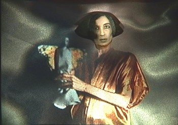 QUEEN OF THE FLUIDS (2003) , which was done with a Guggenheim Fellowship in Performance Art, was a chance to create a video using elements and scenes from my live performance – KLEOPAT’RA,(1999) which I had worked on for 5 years. The narrative differed. In KLEOPAT’RA, it opened with the formation of a statue In film clips (shown while I lay on the ground hidden in a gold pleated fabric), gold dripped into the body, the eyes dripped on, etc. Then a series of scenes followed with an imaginary landscape of the queen. I was integrating Egyptology and Japanese aesthetic.
At the end, the gold dripped out, the eyes emptied, and the figure was left vacant, empty, ready for transport to the other side. There was then a large pyramid, projected onto a veil, into which she entered signifying her passage from the real world. This piece was generated by my witnessing at her bedside, of my mother’s passing. It was an experience that changed me forever, and which I can never forget. In fact the piece She (the original theatrical work) was also a result of this.
My description of QUEEN OF THE FLUIDS says:
“Through rain falling backwards a golden queenly being rises up. In a poetic introductory scene, the gold drips out of her body, and her eyes are shed. Entering through the eerily empty orbs into her brain, we discover a metaphysical kingdom – a world of liquidity, and are led through the mind into an “under-realityâ€,arriving in the pure abstraction of consciousness. Finally, in “The Recovery of the Bodyâ€, her physical self is re-constructed, leading to “The Other Side of The Tapestryâ€, in which we arrive at a kind of “uber-surrealist†view of the artist and the symbolic mirror of herself.â€
This video represents a culiminating point in my performance generated imagery, and my first single channel video.
This piece is also influenced by such sources as the Futurist painter Boccioni’s “states of mind†drawings, bunjin-ga – the symbolic landscapes of Japanese art, and a fascination with puppetry and dolls.
I should also mention re your observation about cgi, that there is something about the reality of the actual projection (it was film) on the face, with the dripping eye scenes that makes it more magical. We were not doing it digitally, but in reality – the body was collaborating with the projection, and this makes it more “unbelievableâ€. One shot actually took 2 years because everytime we tried it, the two would not work together.
Q. Once again, in THE CATHEDRAL OF EMPTINESS, you turn to the oriental art playing off Bunraku puppets with the hand itself acting as a host of puppets moving around the screen. You perform wearing the beautiful white mask. It’s a strong film that clearly shows your love of the medium. Could you give us a few details about the creation of this piece?
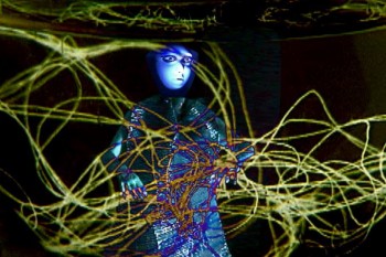 I do love this piece, and feel good performing it because it is really quite natural and organic in its structure. It does not require a lot of precise manipulation of props, costumes, etc. like the other performance works. The actual live performance uses the gold mask from QUEEN OF THE FLUIDS, because it turned out to be very easy to use, and is quite beautiful. I started out thinking I would
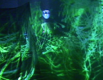 be making a performance version of my video THE INN OF FLOATING IMAGERY. This transformed a great deal, and I shot new scenes, including the trees (branches from our backyard), and the falling “petals†(paper strips that I cut in a form to extend their flight), etc.
I also used a koto that my father had bought many years ago at Bloomingdales I think. The sound was constructed by me from this and other elements.
The title comes from an article I read in the NY Times by a reporter – who wrote that the bombing in Bosnia had left a church as an empty shell, like a “cathedral of emptinessâ€. I am very afraid of thunder, but enjoy having lightneing flashes and thunderous sounds in my work.
Q. You’ve obviously moved away from the characters in your films and have shifted to shapes, effects, textures and lighting. This is an interesting evolution and wonder if you’d care to comment?
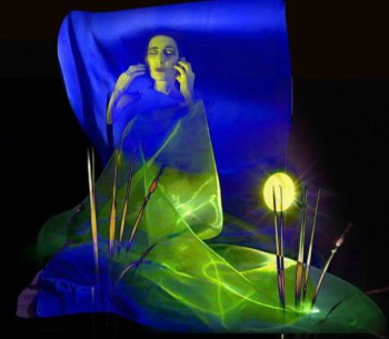 This is a very natural progression really. I feel that if you are not frightened occasionally by something you are making, then you are not advancing. I think there is definitely a big change from the early animation, to Pencil Booklings, Then in Primitive Movers I noticed the characters/figures seemed to become older, less childlike, which I took as a psychological and artistic advancement.
Each piece led me further and further along, and I find that abstraction I made in some of the performance pieces interests me by itself as well. More and more, I am influenced by the Japanese aesthetic, and my current project THE METAPHYSICAL PAINTINGS (a video) features mostly asian faces – quite often students of mine.
I also spent some time away from animation in the early 1990’s, working with only choregraphy and lighting design. The daunting precision of working with projections got to me and I needed a rest. I returned from this by doing Oriental Interplay.
Q. Where do you hope to go with future pieces?
I expect to continue to make videos, and performances. It is not really possible to predict what they will be, as the work changes by itself, and I follow it.
However I am also finding I am interested in creating projection design for other directors for theatrical, and dance productions, as well as for architect/designers.
I have also created some really beautiful installation pieces, and carrying out work like this, or projection design for architecture would make me very happy, because then I can see the work myself and enjoy the dimensionality.
Q. I know your website offers dates of your upcoming performances. Do you have any specific performances upcoming that you’d like to note? Do you find that booking performances is easier/harder/just different to navigate than the early days of sending out films to festivals?
Booking performances was always a lot of work – I had an agent in Europe for a while who got me a lot of work there, and I moved to Zurich for a while. I do find it is much more difficult now, largely because the economy is so bad. I performed for museums, film and dance festivals, universities, etc. (Performed for the Hiroshima Aniimation Festival, Cardiff Animation Festival, etc.)
I have kept up performances, and have exhibited my videos extensively in dance video festivals – which seem to be very open to a liberal interpretation of movement in media.
Of course the wonderful thing now is you can promote what you do easily. I used to cart around giant film cans for performances, and vhs tapes, even dvds would pile up as demo samples. Now we can send flyers in a paperless environment, and with one click, send people to websites with video clips.
Q. Do you have any thoughts about the current state of animation you’d like to share?
The web is really amazing because you can see all kinds of really unusual work. This is very good for animation, and really any kind of expressive video-making. I find when I teach, more and more, I show my classes things from the web, and they show me work also.
I think the whole thing has resulted in a very creative, positive exchange. It is probably very healthy and nourishing for artists of all genres. And probably there is less of a categorization – on sites like vimeo you can see any kind of really progressive interesting work, some animation, or film graphics, or installation related projection. It is a challenge to us all, but is a positive environment.
Early animation
“Syncopations” excerpt
Go here to see more samples of Kathy Rose‘s performance/animation samples.


