Monthly ArchiveApril 2011
Animation &Animation Artifacts &Disney 20 Apr 2011 06:28 am
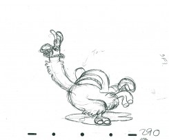
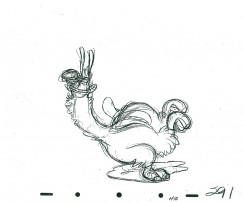
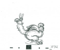
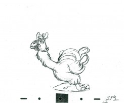
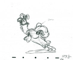
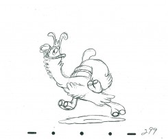
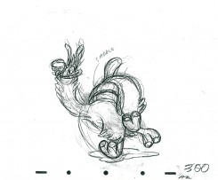
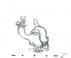
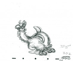
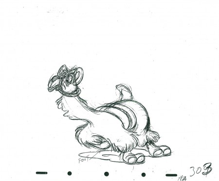
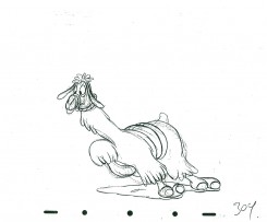
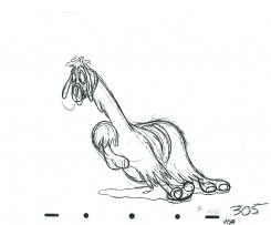
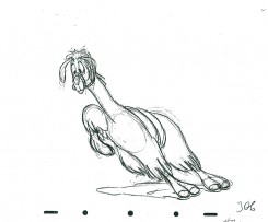
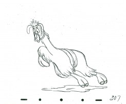
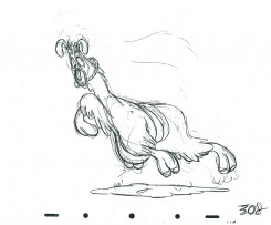
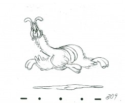
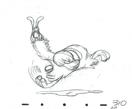
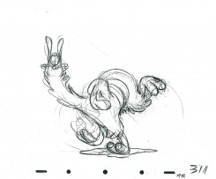
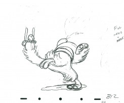
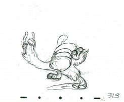
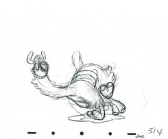
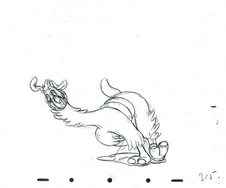
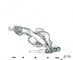
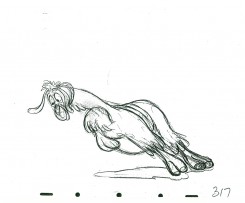
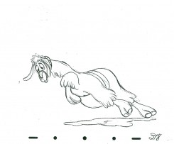
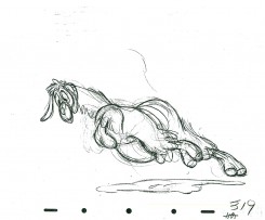
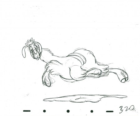
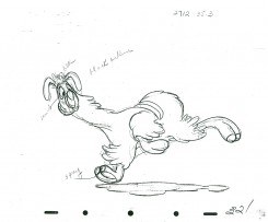
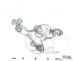
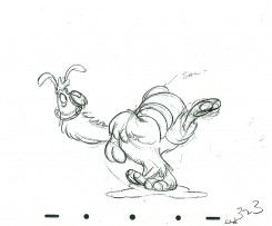
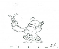
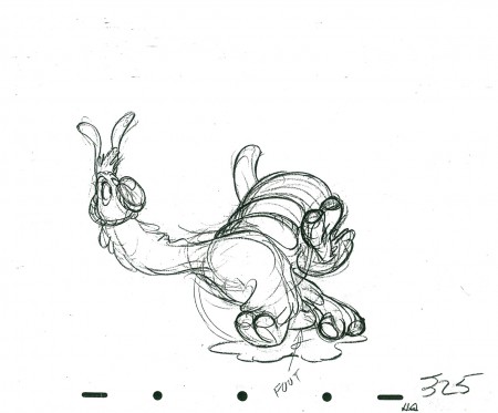
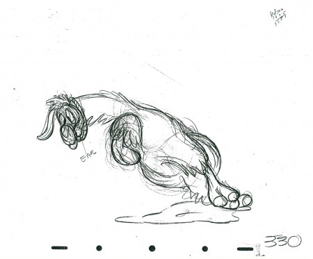
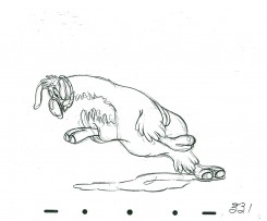
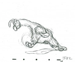
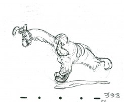
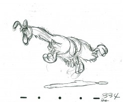
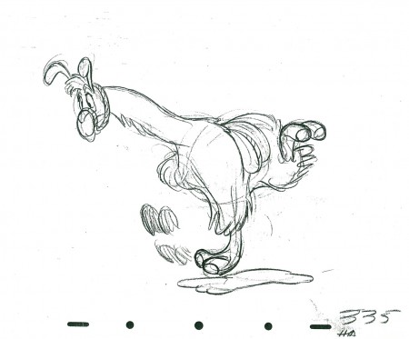
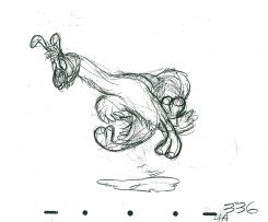
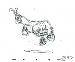
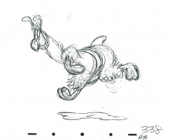
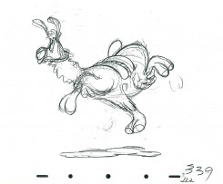
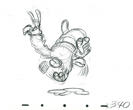
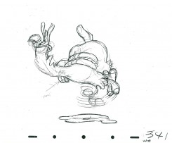
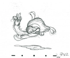
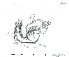
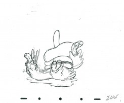
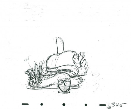
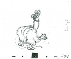
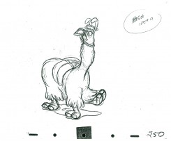
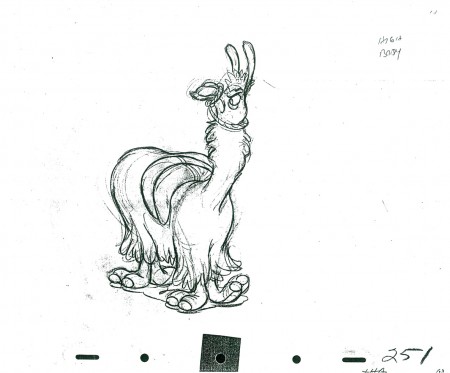
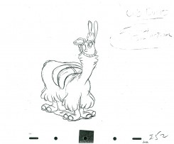
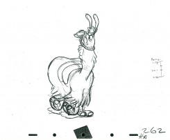
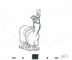
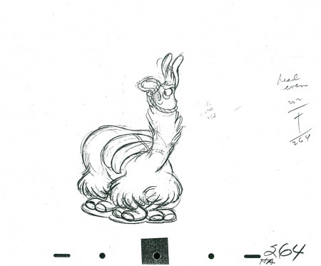
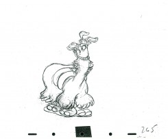
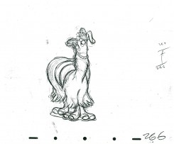
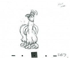
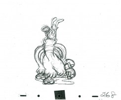
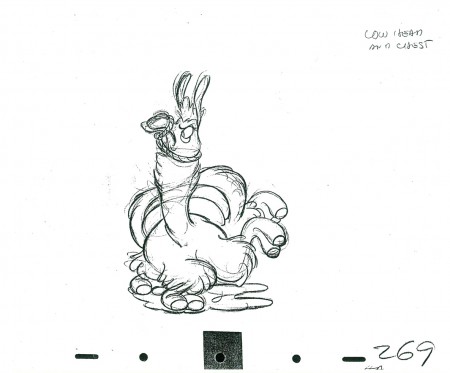
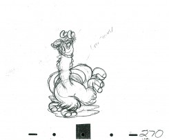
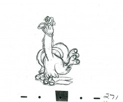
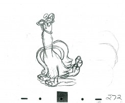
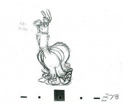
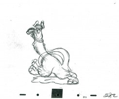
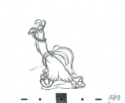
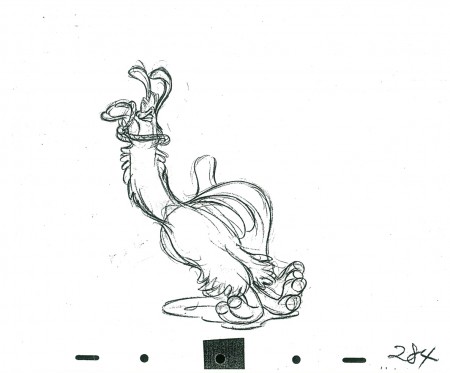
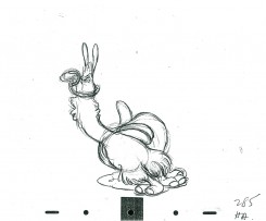
Milt Kahl’s Llama – part 6
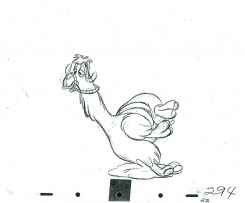
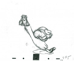
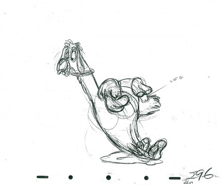
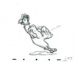
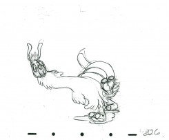
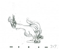
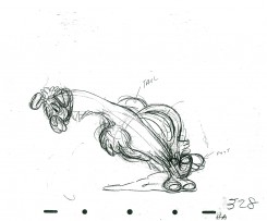
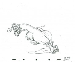
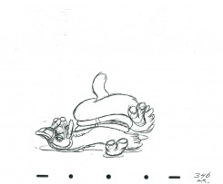
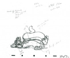
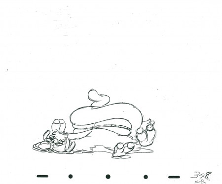
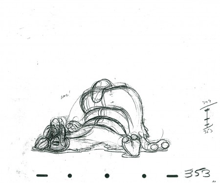
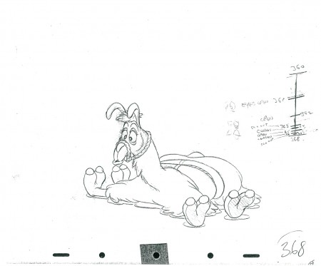
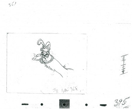
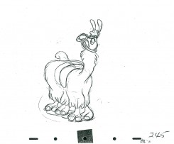
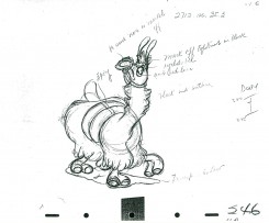
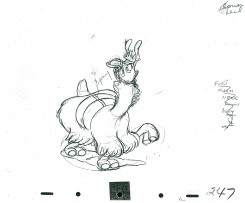
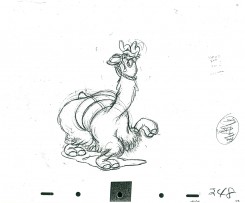
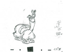
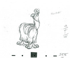
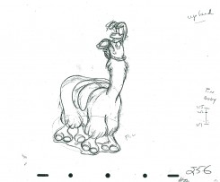
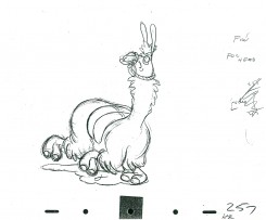
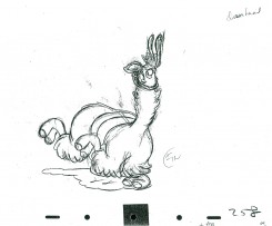
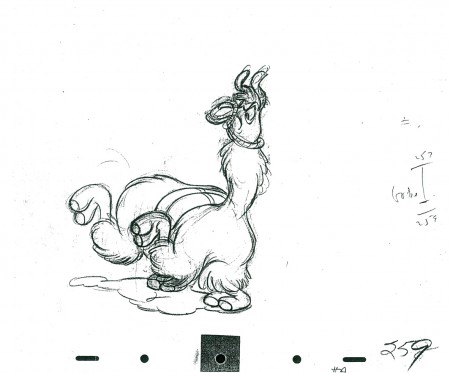
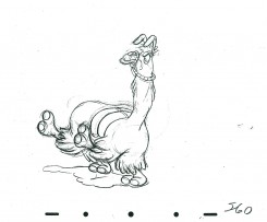
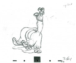
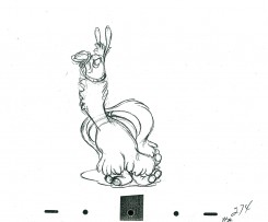
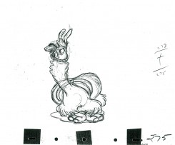
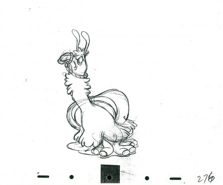
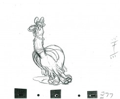
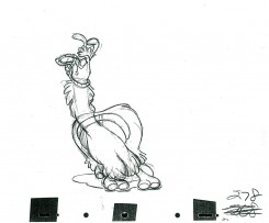
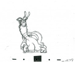
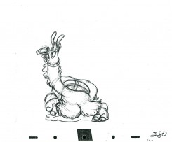
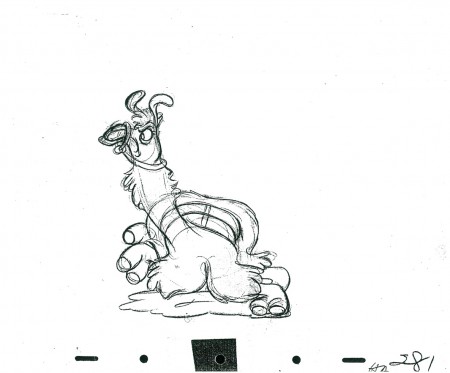
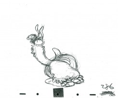
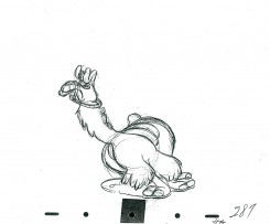
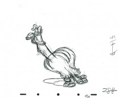
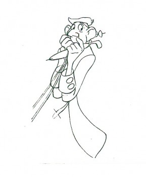
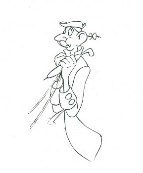
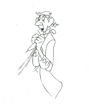
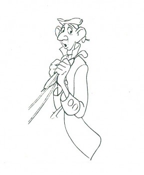
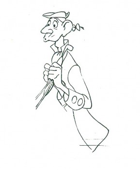
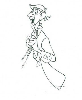
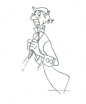
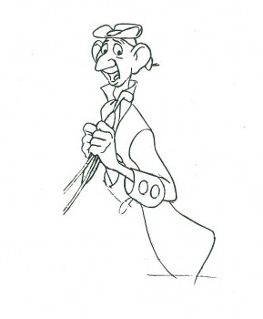
- Last of the llamas. This is the end of the scene animated by Milt Kahl for Saludos Amigos. It’s hilarious, beautiful, flowing and funny animation. The beat moves on and on despite the fact that there is no soundtrack on this QT movie.
Next week a scene by Hicks Lokey from Fantasia. Hippo and alligator. Another very funny scene.
As with all of these continued posts, we start with the last drawing from last week’s scene.
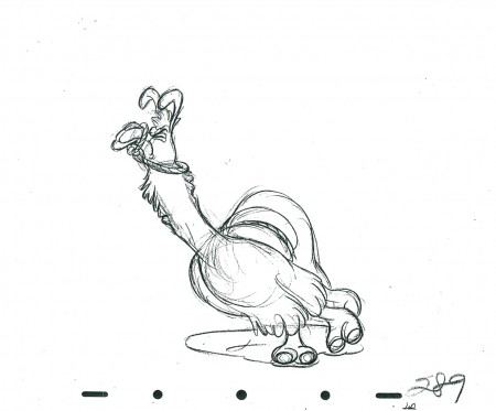 289
________________________
The following is a QT of this part of the scene with all the drawings posted to date.
Past posts can be found here:
Part 1, Part 2, Part 3, Part 4, Part 5
Thanks to John Canemaker for the loan of the scene to post.
Bill Peckmann &Books &Comic Art &Illustration 19 Apr 2011 07:12 am
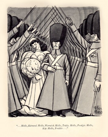
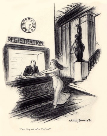
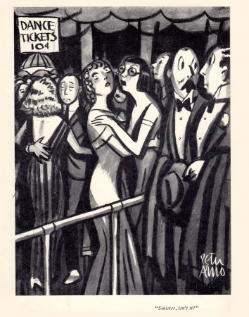
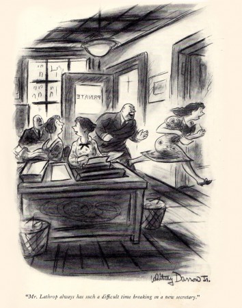
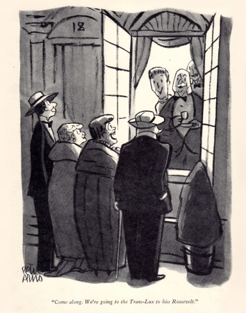
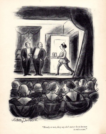
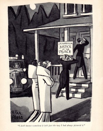
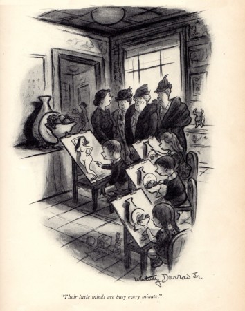
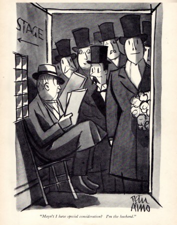
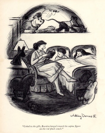
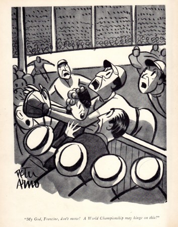
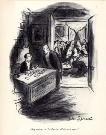
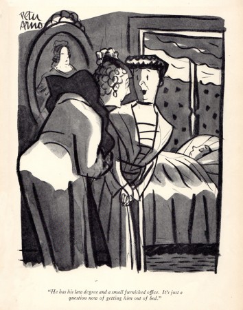
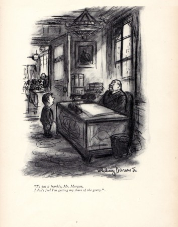
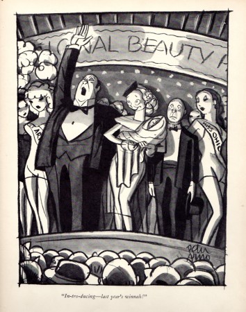
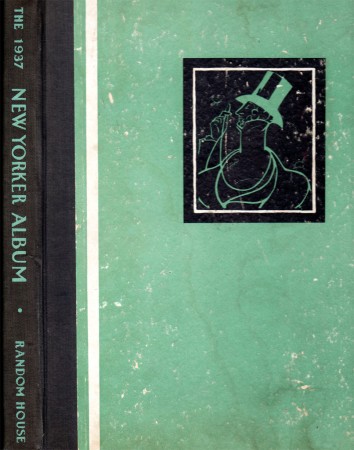
Arno & Darrow Jr. in 1937
- Bill Peckmann recently came upon a collection of New Yorker cartoons from 1937. Since we’ve been running some artwork by Peter Arno and Whitney Darrow Jr., we thought it’d be interesting to grab the cartoons by these two from that year. To put it in perspective, remember that 1937 was the year that Snow White was released.
 1
1
Animation Artifacts &Books &Disney &Illustration 18 Apr 2011 06:22 am
Catfish Bend
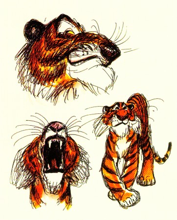
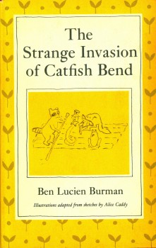 - Back in 1972 there was a celebration of Disney at Lincoln Center. As an offshoot of the main program, there was a series of lectures given by Frank Thomas, Ollie Johnston, Woolie Reitherman and Ken Anderson. For most of those days they talked about Robin Hood, which had just been released, as well as The Rescuers. In the last day, we heard about what was coming up. Anderson suddenly had a fire in his eyes when he talked about Catfish Bend. This was, apparently, going to be a melding of four of the books in the series by Ben Lucien Burman. (You can read a bit about it from Steve Hulett’s POV, here.) Anderson showed some of the drawings (via slide projection) he had done for the film. They were all pen, ink and wash drawings he was doing, similar to ones we’d seen from him on The Jungle Book, done with the Mont Blanc pen he liked using.
The drawings didn’t excite me very much, but I was curious. They did remind me of The Rescuers sketches he had shown. I suppose the fact that both are set in the Florida Everglades helped the similarities. I bought a copy of the initial book, “The Strange Invasion of Catfish Bend”, and read it. The book contained some charming and tiny illustrations by Alice Caddy throughout its 150 pages. I’ve decided to post some of those here, so you can see the originals that got Ken Anderson excited.
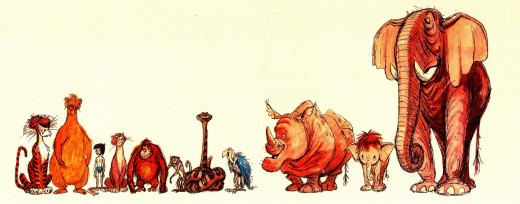
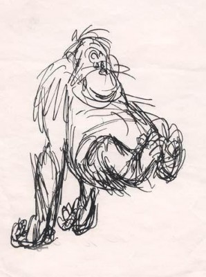
Here are a few of Anderson’s sketches for The Jungle Book:
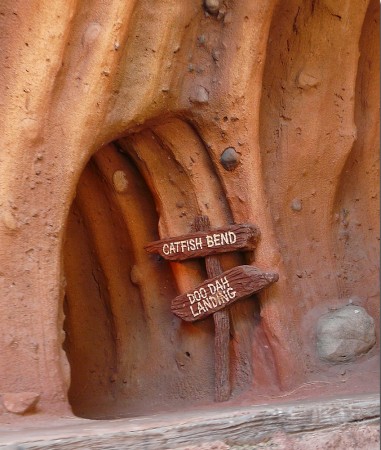
And these are a couple of Anderson’s sketches for Catfish Bend:
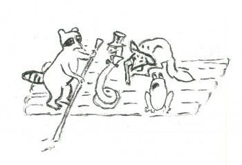
These are the illustrations by Alice Caddy from “The Strange Invasion of Catfish Bend.”
 1
1
Photos &Steve Fisher 17 Apr 2011 06:14 am
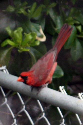
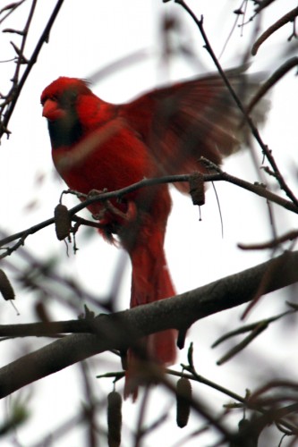
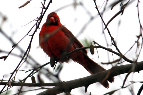
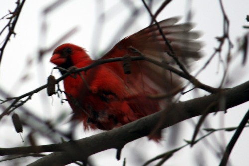
Steve’s Cardinals
- Steven Fisher has found a couple of cardinals in his back yard in Maspeth, Queens. He’s taken some great photos of the birds (whcih came to me over a number of days – so they all weren’t shot at the same time.) I thought they were attractive, and I’d like to share them with you.
 1
1
And, despite the incessant inclement weather we’ve seen, Spring is still pushing on.
 1
1
Commentary 16 Apr 2011 06:54 am
More about Sidney
- I don’t really feel as though I’d hit the mark in my post about Sidney Lumet. The man made such an impact on my life. I wrote about the different films that I worked on for him, but don’t feel as though I really said much about him. A lot of thoughts and memories have gone through my head in the last couple of days since that post. I thought with this one, I’d give some disconnected memories of things that happened or were spoken during the process of making titles.
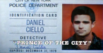 There was always an initial screening of the rough cut in a small screening room. People generally seem to sit two seats away from each other. Unless you came with someone, you didn’t sit next to anyone. At the Prince of the City screening there were no titles on or during the film, no music, and lots of markings on the print. It felt exciting. I came with Phillip Schopper, who I was bringing onto the project, and we sat alongside each other. Silent. When we met with Sidney immediately after, he told us the major problem he had with the film, and it was the one I’d seen: the film was confusing, at that time. You couldn’t ID many of the characters and you didn’t remember which side they were on – good or bad. Sidney asked for us to do IDs throughout the film. We did something pathetically simple in making the good guys color and the bad guys B&W, but it wasn’t obvious. I have to say that our work really tied the film together and made the characters more clear.
The initial screening for Garbo Talks was a bit more peculiar. I sat down and a woman sat next to me; I sort of recognized her. We said hello when she sat down. Somewhere midway during the film I realized who the woman was – Betty Comden, that half of the Comden & Green writing team. I realized she was playing the part of the older Greta Garbo in the film. It was brilliant casting, but you could say that about all of Sidney’s movies.
When I left the screening room there was a tense meeting going on with four people. I caught Sidney’s eye and waved goodbye. Going down in the elevator Burtt Harris, the producer, rushed in as the doors were closing. He asked what I thought of the film. Before I answered he said it wasn’t working, and Elliott Kastner and MGM weren’t very happy. A rough conversation in an elevator.
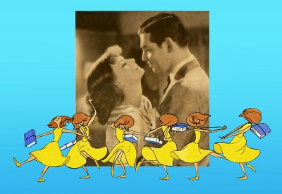
The next day, Sidney asked what I thought of the film, I said that I felt we didn’t know enough of the back story of the Ann Bancroft character in the film. I suggested that I try to offer this in the opening credit sequence. Sidney loved the idea. He just made me promise that it wouldn’t feel like the credits to “I Love Lucy” or “I Dream of Jeannie.”
During the mix, we were talking about the music for Garbo Talks when we slipped off into discussing the music for some of Sidney’s other films. I told him that the music by Richard Rodney Bennet for Murder on the Orient Express was one of the most brilliant film scores ever done. Sidney hesitated in responding finally saying he didn’t get it at first, and it took a while for him to appreciate the music for that film. Sidney wasn’t always perfect in selecting a composer for his films, although I do think that Johnny Mandel was a great choice for him on Deathtrap and The Verdict (or any film, actually).
Bob James had scored Garbo Talks. (He is an eminent jazz pianist, whose most famous piece is probably the theme to the tv show, Taxi.) Bob and I had to work together very closely. He wrote the score to the animatic I’d given him and would build the rest of the film’s score from that. He hit many of the actions in that opening title, and Tissa David‘s animation hit them all. There was a very tight sync between music and title animation.
The preview screening was held on Long Island. I drove there and met the group of Sidney, editors and MGM execs, including Elliott Kastner. He was the leading producer on the film. They weren’t happy at the end of the screening, and I was sure my titles were going to go. It took a week to hear that the titles were staying, but the score by Bob James was dropped. The composer took the hit, unfairly. A new score was being written by Cy Coleman. All that tight sync work!
Coleman wrote a lovely melody for the film, but just swept across the animation not hitting any points in particular. It’s taken me a long time, but I’ve come to like the music he wrote. Tissa still won’t watch it with the newer music.
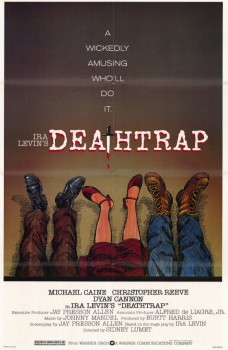 Before Deathtrap, Sidney phoned me to say that his daughter, Jenny, and her boyfriend were free for the summer and both were artistically inclined. He wondered if there were anything I could offer them in the way of a summer job. Basically, I was being offered their services in exchange for the next title job. This was the real movie business, one hand washes the other. Why not?
I did have work and could keep them busy in my studio. It turned out to be an entertaining summer (more for my production supervisor at the time, Steve Parton, than it was for me). Jenny and friend both did a good job for the work they were given. I had fun with Deathtrap. Jenny went on to writing screenplays earning lots of awards for her first film, Rachel Getting Married.
I remember, one day, walking a couple of city blocks with Sidney. He told me he’d just seen the recent Indiana Jones movie. He commented that he didn’t think there was a scene longer than 3 seconds and felt that something seriously bad was happening to movies. He was on his way to see a rough cut of Wall Street and was curious to see what Oliver Stone had done but said it was a tough subject.
There was another time when Sidney couldn’t leave the editing room. He was waiting for a call from Barbra Streisand. She was about to direct her first film, Yentl, and she wanted advice from Sidney. During my meeting with him, the call came through, and I scheduled another time. Afterwards he told me that she’ll do a great job; she did.
Sidney was great to work with. He had this interesting way of telling me exactly how many frames (3 or 5 or some such number) he wanted something on the screen. This happened quite a few times. I didn’t follow what he said, exactly, but I knew from the conversation just what he was looking for; he made it easy for me to give it.
 I was always curious about Sidney’s work with editors. It seemed that they worked with him for one or two films and then he quickly moved to someone else. Oftentimes, an Assistant Editor on one film would graduate to the Editor on the next. I found it curious on one movie to be working with John Fitzsimmons editing, and on the next film it was Andrew Mondshein. Andy continued on through another couple of films, and John Fitzsimmons came back to be his Sound Editor.
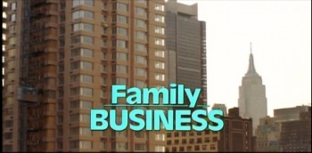
The last job we did together was Family Business. I was asked to work with the Greenbergs who were doing all the effects, and Sidney also wanted them to do the opticals for the credits. Fine. But there were problems, and the job was done over many times. The Greenbergs were the most expensive optical house in NY at the time. I got my fee, and they got theirs. Needless to say, they made more money than I.
When it came time for the titles for the next film I received a call from an editor I didn’t know (Richard Cirincione). He said that Sidney asked me to do the titles for the new film, Q & A, but it had to be less expensive. I agreed and said that if they’d allow me to do my opticals at a house of my choosing I could keep the costs down, otherwise I had no control. 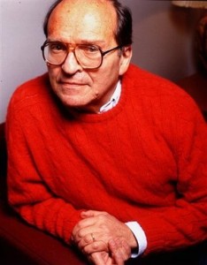 (I had done this with Running on Empty and brought the titles in for a very low budget. They were also beautifully handled.) I made sure the editor understood that I certainly wanted to do the film, even if it was only a break-even job for me.
I didn’t hear from the editor again. I’m sure I was caught up in some inner political thing. I knew it was going to happen.
The last time I met Sidney was at an Academy salute to the brilliant editor Dede Allen. There were a number of greats there, Sidney, Tony Walton and Arthur Penn among them. Sidney first saw me in the lavatory where he gave me a big hello. We talked a bit on leaving and entering the party, but nothing special was said. It was just nice to be remembered and greeted so well. I miss that relationship, and I’ll miss Sidney.
.
A.O. Scott in the NYTimes wrote a fine piece about the urgency of Sidney’s films.
Bill Peckmann &Comic Art &Illustration 15 Apr 2011 05:45 am
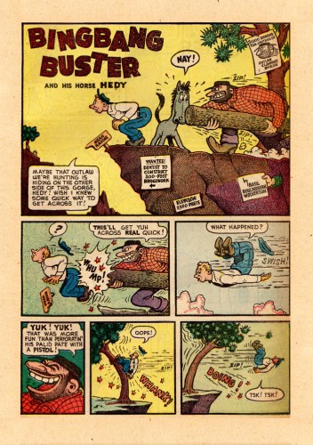
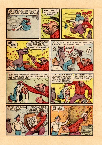
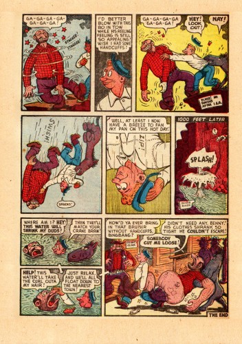
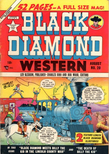
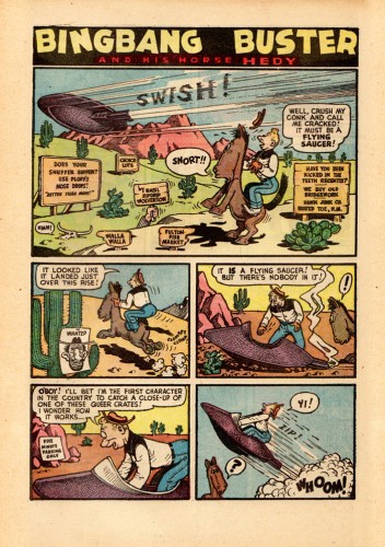
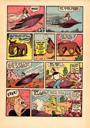
More Bingbang Busters
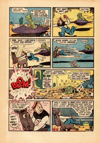
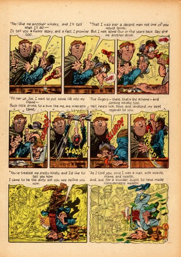
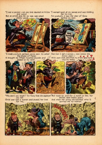
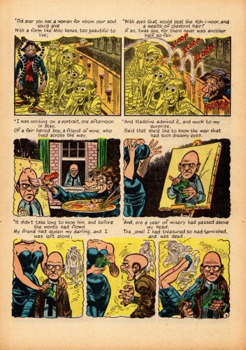
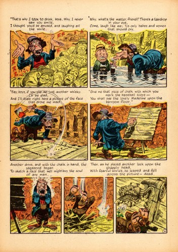
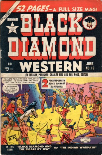
- Last week we posted a couple of “Bingbang Buster” stories from the “Black Diamond Western” comic books. These strips were done by Basil Woolverton. The Blacxk Diamond Western covers are by Charles Biro. Here are two more stories from June and August of 1950.
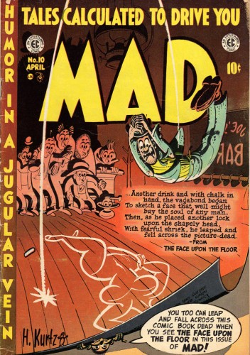
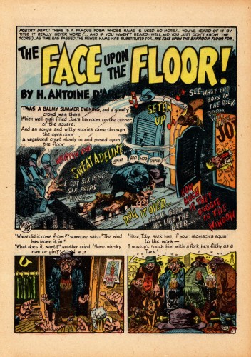
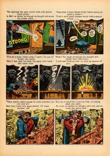
We’ll finish up with Jack Davis‘ story for “Mad” comic books. The “MAD” cover is by Harvey Kurtzman.
These, of course, come from the immense collection of Bill Peckmann. I’m grateful to him for the scans and the loan to post them.
 1
1
Animation &Animation Artifacts &Disney 14 Apr 2011 06:15 am
Kahl’s Llama – part 5
- Here is the next installment of the epic scene by Milt Kahl from Saludos Amigos. The dancing Llama obviously was fun for Kahl to animate, in the same vein as the wonderful work he did for Song of the South. The rhythm just sings out through the animation, even without the music track.
There are still another hundred drawings to go, so it’ll probably be broken into two more parts.
We start this post with the last drawing from last week’s entry.
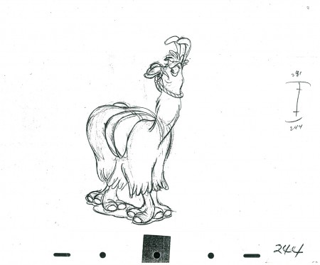 244
________________________
The following is a QT of this part of the scene with all the drawings posted to date.
Past posts can be found here:
Part 1, Part 2, Part 3, Part 4
Thanks to John Canemaker for the loan of the scene to post.
Commentary &Independent Animation 13 Apr 2011 03:37 am
Sidney and Emily
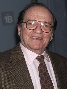 - I was a bit distraught at hearing of the death of director, Sidney Lumet. His film style is so evidently personal that you can tell his direction within the first few minutes of watching any scenes. There have been so many wonderful obituaries for the man, that I won’t attempt one. (Here‘s a good one. This is the NYTimes obit.)
I did work with him several times and felt honored to have done so.
Prince of the City was the first shot at movie titles I got to do. Art Director, Tony Walton, brought me onto the film. They not only needed an opening title and credits but they wanted some inner film ID’s for the characters. It became a large job and one that still stands out as exciting. My friend Phillip Schopper became a strong second helping to get this film done. Together, we did it all ourselves. Everything from putting makeup on the actors’ faces to forging real ID cards to photographing it with unusual lighting under an Oxberry.
Deathtrap was a very different model. For the opening credits he asked for very large type filling the screen. He also wanted an old fashioned typewriter type. Nothing really existed that worked for those demands, so I had to develop my own typeface for it. I’m not particularly happy with the end results.
I had to rush some end credits for a preview screening. Sidney asked me to just make a scroll over a blood red color. Unfortunately, he got to like that and wouldn’t allow me to try something more inventive. However, with only three days before the film was to go to the neg cutter, I did something wild. I dripped blobs and splashes of the blood red color behind the white credits until the screen had turned red. It took a full 36 hours of work and a rush at the lab to get them back. I rushed to the editor to cut them in the film and we screened it for Sidney. Those are the end titles, and I love them.
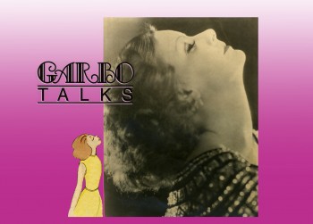 Garbo Talks was a wonderful animation job telling the principal characters back story (in music only) up to the start of the film. It was fun researching Garbo’s life and films and photos.
Running On Empty was a wonderful film. I animated a sequence of animated roads for a test title. We decided to do it live action just focusing on the dashed lines of some local roads upstate NY. The movement wa very quick so a dashed line might just take one frame of film. The editor was bothered by the fact that every third dash was painted over black. I suggested he just cut out those frames, just as we might do in animation. He did and it worked beautifully. I loved this film. If you have the chance to see it, please do. River Phoenix and Martha Plimpton were exceptional as the adolescent heroes of the story. I sat in on several days of the mix of this film and had a lot of time to chat with Sidney and mixer Tom Fleischman.
On Family Business, Sidney introduced me to Sean Connery. Sean was wearing some ostentacious jacket and for some reason, right off the bat, he apologized to me for it. He said it had been given to him by the King of Arabia. Then he immediately qualified that so that I knew there was nothing sexual in the gift. Needless, to say it was a strange conversation.
The Family Business titles were designed by me and executed by R. Greenberg’s studio. It was a major problem for the opening credits. The camera does a 360° pan on a rooftop. All the colors of the twilight sky, all the buildings, all the city acted as the backdrop or these credits. Sidney wanted only type above this backdrop (I couldn’t put the credits within boxes). The white letters would be washed out against the white of the sky; the black credits were not there when we hit black. As a matter of fact, the credits seemed to wash into almost every color we tried. It took about six go-arounds before we hit on something that worked. I’m glad I had the large team at Greenberg’s to pull it through.
I loved working with Sidney, and I’m sad that he’s not there anymore. I don’t need to talk of work with him. I just liked knowing he was there.
.
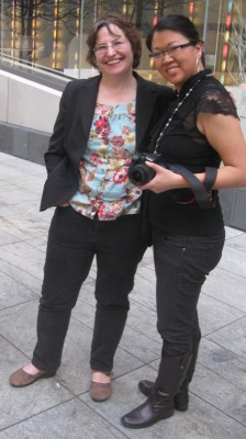 - I’m sure you’re curious as to what connection there is between Emily Hubley and Sidney Lumet. Actually, I first met Sidney at a party given by John & Faith Hubley. It was a “hello” and a “I’m your biggest fan” kind of embarrasing meeting, that I’m sure Sidney quickly forgot.
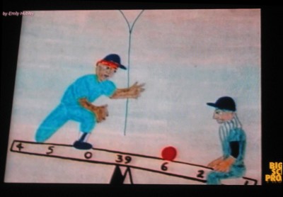
On Monday evening I went to the Big Screen Project event in midtown Manhattan. There was a show of Emily Hubley‘s work. It was good to see some of her classics again. “The Tower” (1986) was an early one; I can remember Emily and Georgia working on it. Two of my favorites are “Blake Ball” (1989) and “Delivery Man” (1982). The story in both films is exciting and even inspirational. I’m sorry “Delivery Man” wasn’t screened.
The weather was wonderful, so it was nice sitting outdoors in the early evening. It gave me the chance to catch up with some old friends. Emily and Will Rosenthal are always great to talk to. Debbie Solomon, Biljana Labovic, Meryl Rosner, Adrian Urquidez, Maria Scavullo, and Janet Benn were all there. There were plenty of others, but those were the above: Emily with Jaime Ekkenspeople I was able to chat with.
There was a technical problem with the sound. They’d normally hand out small radio receivers with earphones, which allow you to hear the tracks in excellent stereo. Unfortunately, something technical happened and the didn’t hand out the receivers. No sound. It was a curious way to watch Emily’s films. The imagery is so evocative. However, we really only got half the films.
Hopefully, they’ll have corrected this problem before screening any more of the animation shorts.
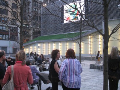
The three closest, with backs to us are: (in red) Biljana Labovic,
(in black) Meryl Rosner, (in pinstripes) Janet Benn.
Tonight Jeff Scher will have his films screened. It’d be tragic if the wonderful Shay Lynch scores weren’t heard. I hope they’ll have the sound system worked out.
Jaime Ekkens organized and hosted the event for Big Screen Project.
Big Screen Project Sixth Ave. between 29th & 30th St.
Enter through the Food Parc, and go all the way back to the courtyard.
7-8pm
.
More of Milt Kahl‘s Llama drawings will return tomorrow.
Animation Artifacts &Books &Disney &Illustration 12 Apr 2011 06:56 am
Goliath II
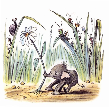
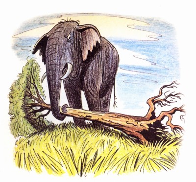
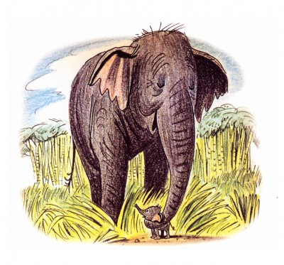
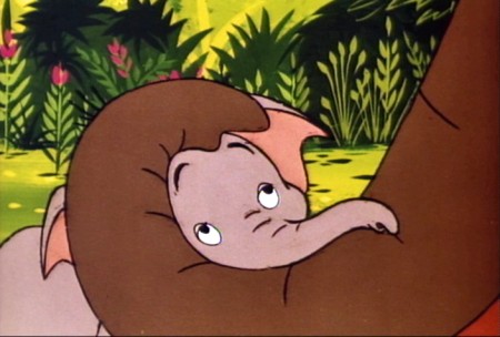
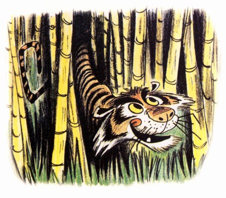
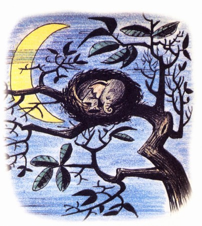
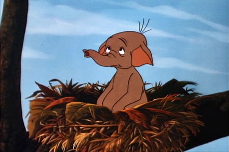
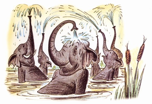
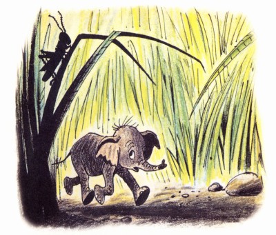
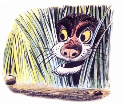
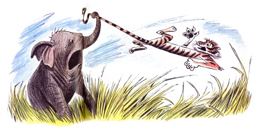
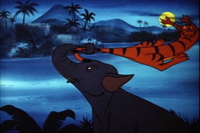
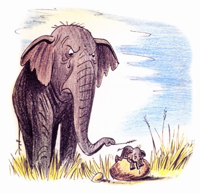
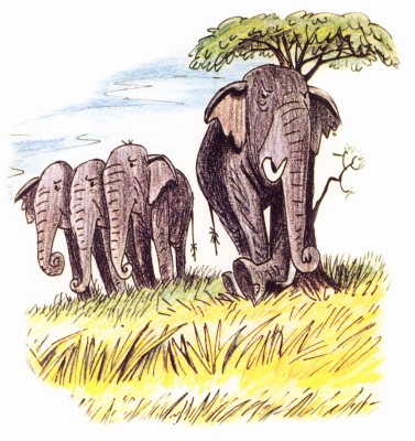
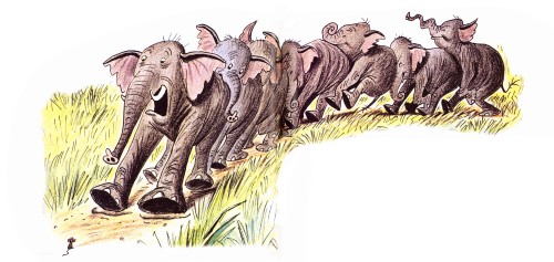
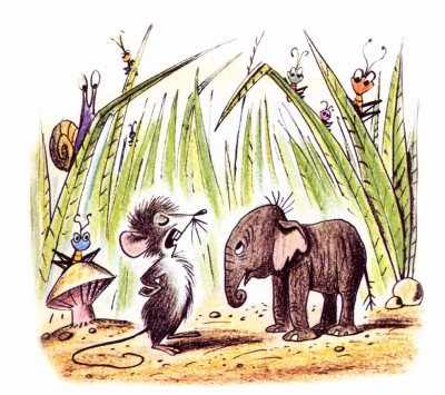
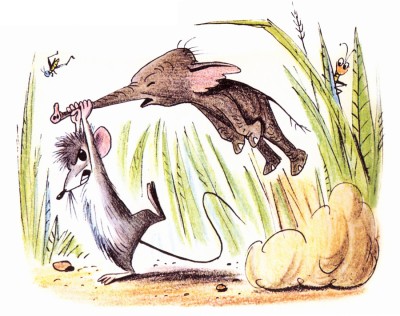
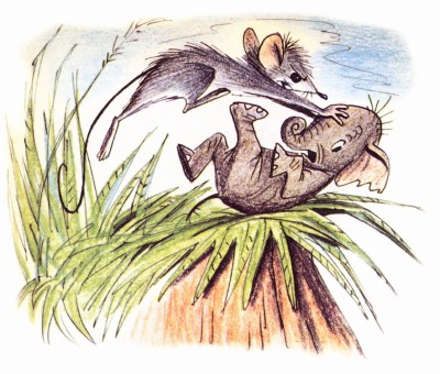
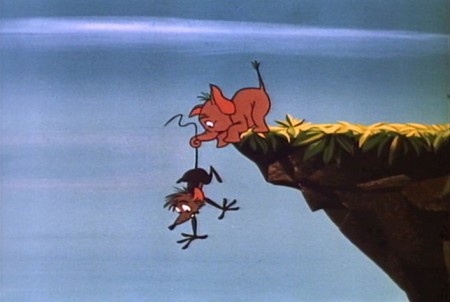
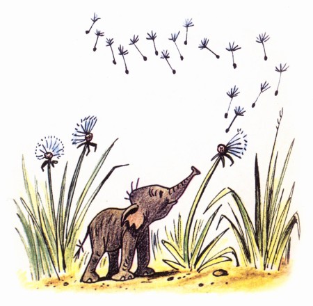
- I feel very fortunate. Jason Hand, following my posts on Bill Peet’s great book illustrations, has sent me the illustrations to the book, Goliath II. This book grew out of the Disney featurette. Peet, in his autobiography, says he pulled the story from one he had written to be made into a book. When he was in the doghouse at Disney, sentenced to working on commercials for the likes of Peter Pan Peanut Butter, he stopped Walt in the hallway and showed him the story outline. Disney put it into production immediately.
It was an important film in that it was the first to use Xerography to copy the animators’ lines onto the cels. This was an extremely important step before they moved onto 101 Dalmatians.
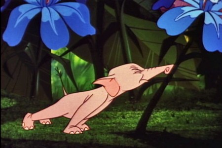
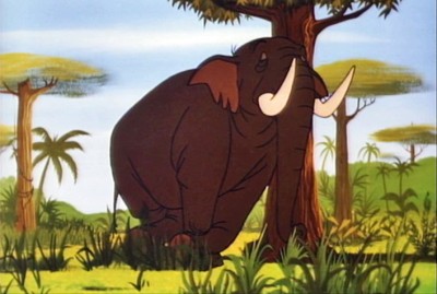
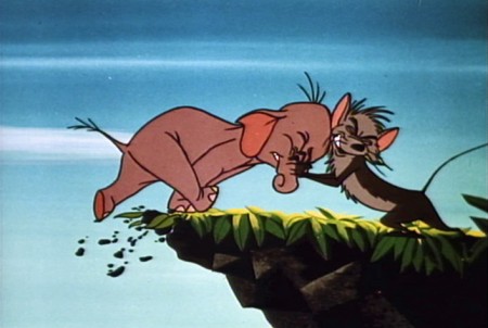
I thought this was a great invitation for me to add some frame grabs from the film which match the illustrations of the book, to see how closely the two matched. After looking at the book, one can see that the film is very two dimensional. Every action happens east – west. None of the action moves in perspective (toward or away from you). This, of course, is a product of the limited budget. The film is also all closeups. Little of the action takes place in Long Shot (the better to keep the budget down.) The film, naturally, is a disappointment when compared to Peet’s illustrations.
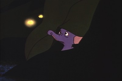
Here are the illustrations followed by the correlative frame grabs:
 1
1A delicate drawing of something that doesn’t appear in the film.
 1
1
The closest thing to floating dandelions is Goliath watching
a couple of fireflies toward the last half of the film.
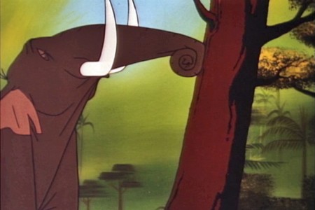 3
3
This scene isn’t played well in the film.
It’s perfectly clear in the book.
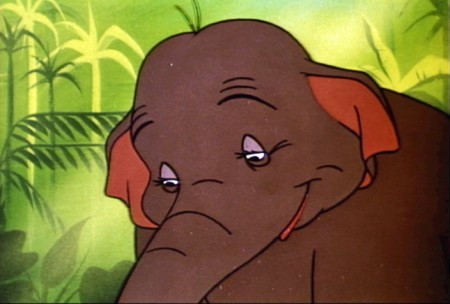 4a
4a
They couldn’t handle this scene in a single shot.
They broke it into two closeups. TV direction.
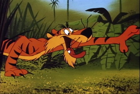 5
5
This is about as close as I can come to a match.
Peet’s drawing is so full of life.
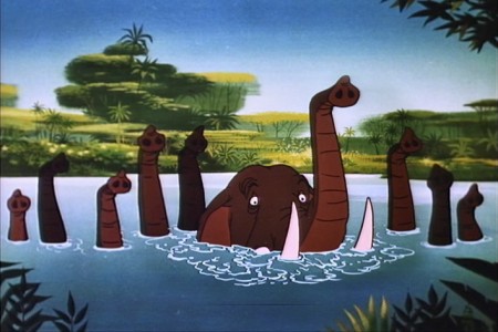 7
7
This scene actually comes later in the film.
There was no bathing scene early on.
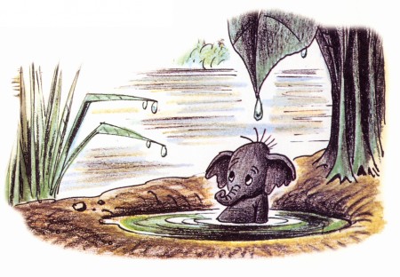 8
8
No relation to this scene is in the film.
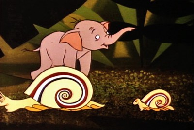 9
9
There’s no real correlative to this illustration in the film.
The closest appears toward the beginning.
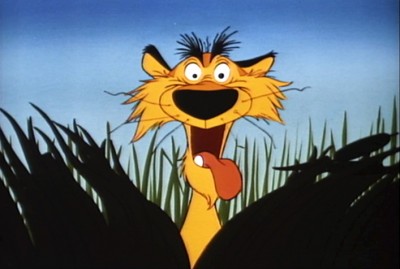 10
10
More John Lounsbery than Bill Peet.
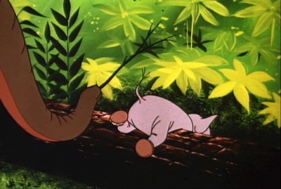 12
12
A very different approach in the film.
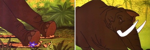 14a
14a
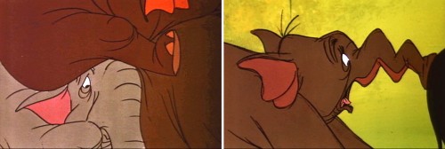
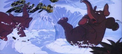
The elephant pile up illustrated by Bill Peet has to be broken
into a number of short scenes cutting back past the elephants.
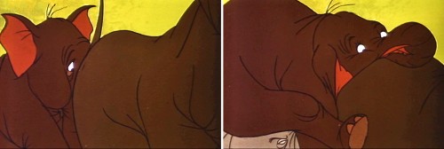 14b
14b
This makes animation easier to do and, consequently, fewer drawings.
 15a
15a
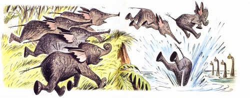
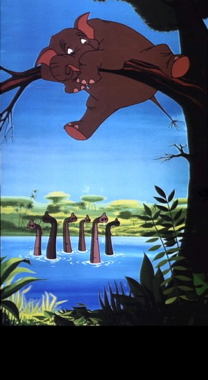
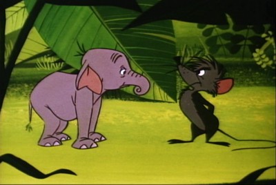
The elephants end up in water, but they jump in
one at a time. Better for the reuse of animation.
 16
16
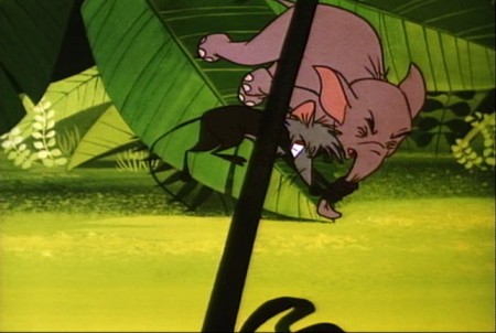
The mouse enters the story.
 17a
17a
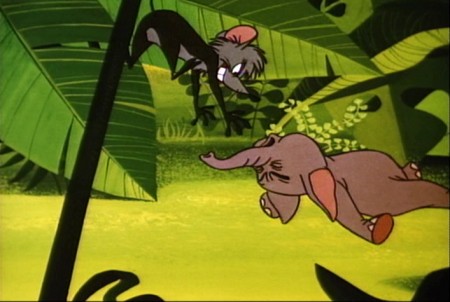
The mouse throws Goliath in a very different way.
 17b
17b
Unfortunately they’ve plotted the entire move
with an overlay that cuts up part of the action.
Animation &Animation Artifacts &Disney 11 Apr 2011 06:10 am
Ichabod’s Ride
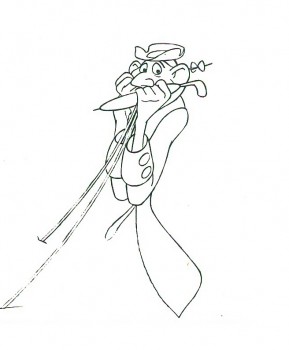
- Frank Thomas did the brilliant ride of Ichabod Crane about to meet the Headless Horseman. Here’s a flip book that was prepared by Disney which was published in The Illusion of Life, Frank Thomas and Ollie Johnston’s book (pg. 467-521). I have a photographic copy of the images and can post them significantly larger than the book offers. I’ve also done a QT for them.
The registration isn’t all it could be. I know the N/S is correct, but have no guidance for the E/W so took a stab at it. I’m also assuming that many of the drawings are not included, so I just exposed it on threes.
The assisting on this scene is beautiful (as is the animation.)
 1
________________________
Here’s a QT of the scene with drawings exposed on threes to accomodate some missing drawings.
There have also been published a few other images from a continuation of this scene by Thomas. I’ve scanned those and post them below.
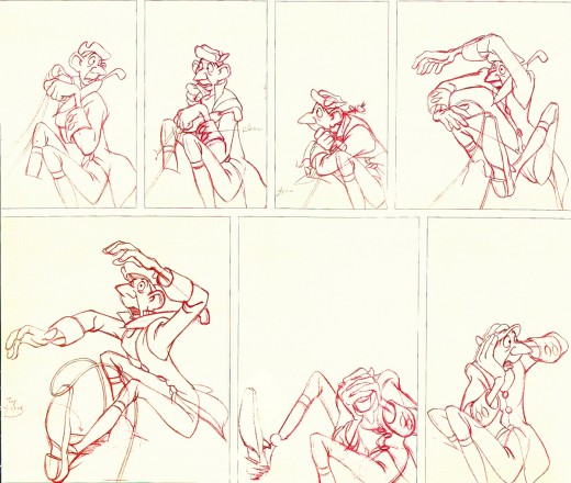
This page is from John Canemaker’s book The Nine Old Men and
the Art of Animation, with the Frank Thomas chapter.
They look like they immediately follow the images chosen for the flip book.
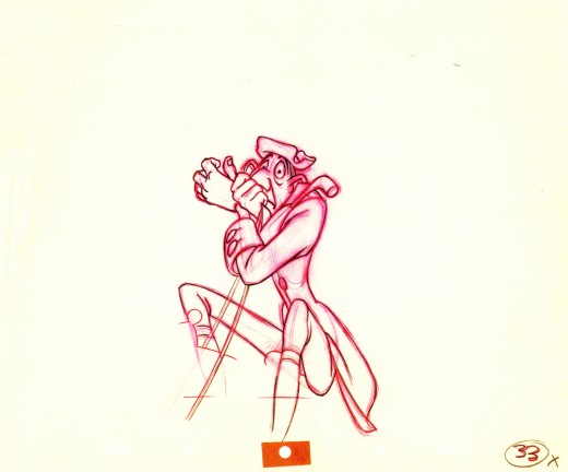
This image comes from the Walt Disney Archive series: Animation.
