Monthly ArchiveApril 2011
Books &SpornFilms 30 Apr 2011 07:49 am
Zipes’ The Enchanted Screen
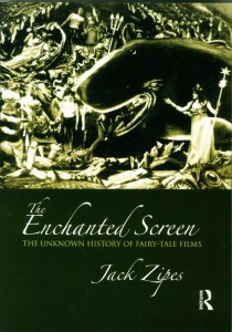 - Author, Jack Zipes, has just released a new book called, The Enchanted Screen. Mr. Zipes is a professor of German and Comparative Literature at the University of Minnesota. He is a scholar whose focus has been children’s literature and culture, and he has written at least seven other books. I’ve been aware of his work since his book, Hans Christian Andersen, the Misunderstood Storyteller. It was in that book that Mr. Zipes gave some attention to the films we’ve done in our studio. Although he felt that Andersen was often misused or misunderstood when translated to other media, he wrote that our films offered excellent adaptations. Of course, I’d be interested in anything Jack Zipes had to write in the future.
This new book, The Enchanted Screen, goes deeper than just Andersen’s tales, taking in all world literature. However, there can be no doubt that Andersen is a primary interest of Mr. Zipes’ studies. There are elaborate analyses of the various productions of The Snow Queen or The Little Mermaid or The Emperor’s New Clothes. Disney is certainly taken to task for sentimentalizing children’s literature. Indeed, there’s a complete chapter entitled, “De-Disneyfying Disney: Notes on the Development of the Fairy-Tale Film.” To be honest, it’s hard to argue with his premise, if you take Grimm and Andersen seriously. When he points out that J.M.Barrie’s Peter Pan becomes Walt Disney’s Peter Pan or Lewis Carroll’s Alice In Wonderland becomes Walt Disney’s Alice, you begin to realize the change in ownership which also recognizes a change in the values imparted in those original tales. (Shrek actually fares well under this scrutiny since it spoofs the Disneyfication of the tales.)
In short, the book is an excellent read if you’re interested in the subject – as I am. It’s especially pleasing when the author has nice things to say about your work, but that is hardly the reason I enjoyed the book. I appreciated the honest and intellectual discussion of the material, and I enjoyed some of the sources he considered at length. Since I make films using this material, I am curious to hear what critics have to say.
As an addendum to these comments, I thought I’d post a page from the book that talks about a couple of my films. Why shouldn’t I spread the news? I’m proud of these films. I’ve added some illustrations from a couple of these films to punch up the post. So over to Mr. Zipes:
- From 1990 to 1992 Michael Sporn, an American animator, adapted three of Andersen’s fairy tales, “The Nightingale,” “The Red Shoes,” and “The Little Match Girl” for Italtoons Corporation, and they are currently distributed by Weston Woods Studios, an educational company. The films, all about twenty-five minutes long and created for children between five and ten, have been shown on HBO, but for the most part they have not received wide public attention, and they can be considered marginal cultural products of the culture industry—all the more reason that they deserve our attention, because Sporn’s films written by Maxine Fisher are profound interpretations of Andersen’s stories that transcend age designation and keep alive Andersen’s legacy. They all use voiceover and colorful still sets as backdrops, and naively ink-drawn characters who come alive because they are so unpretentious and resemble the simple and found art of children.
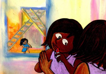 Two of Sporn’s films are particularly important because they transform motifs from Andersen’s tales to deal with contemporary social problems. Both take place in New York City, and the music and dialogue capture the rhythms and atmosphere of present-day urban life. In The Red Shoes, Sporn depicts the warm friendship of two little black girls, Lisa and Jenny, and how they almost drift apart because of a change in their economic situation. The story is narrated by Ozzie Davis as a shoemaker who lives in a poor section of New York. Lisa and Jenny often visit him, and he describes their lives and how both love to dance and play and enjoy each other’s company. One day Lisa’s family wins the lottery, and they move to another part of the city. Now that she is rich, Lisa ignores Jenny until they meet at a ballet about red shoes. The spoiled Lisa ignores Jenny, but later she returns to her own neighborhood and steals some red shoes that the shoemaker had been making for Jenny. Guilt-ridden, Lisa finds that the red shoes have magic and bring her back to the old neighborhood and help her restore her friendship with Jenny.
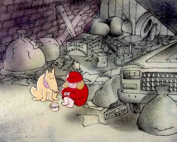 In The Little Match Girl, Sporn depicts a homeless girl, Angela, who sets out to sell matches on New Year’s Eve 1999 to help her family living in an abandoned subway station on Eighteenth Street. She meets a stray dog named Albert who becomes her companion, and together they try to sell matches in vain at Times Square. The night is bitter cold, and they withdraw to a vacant lot where Angela lights three matches. Each time she does this, she has imaginary experiences that reveal how the rich neglect the poor and starving people in New York City. Nothing appears to help her, and when she tries to make her way back to the subway station, she gets caught in a snowstorm, and it seems that she is dead when people find her at U nion Square the next morning. However, she miraculously recovers, thanks to Albert, and the rich people gathered around her (all reminiscent of those in the dream episodes) begin to help her and her family.
Sporn’s films are obviously much more uplifting than Andersen’s original tales. But his optimism does not betray Andersen’s original stories because of his moral and ethical concern in Andersen and his subject matter. In fact, his films enrich the tales with new artistic details that relate to contemporary society, and they critique them ideologically by focusing on the intrepid nature of the little girls rather than on the power of some divine spirit. At the same time, they are social comments on conditions of poverty in New York that have specific meaning and can also be applied to the conditions of impoverished children throughout the world. What distinguishes Sporn’s films from Andersen’s stories is that he envisions hope for change in the present, whereas Andersen promises rewards for suffering children in a heavenly paradise.
Sporn’s films are tendentious in that they purposely pick up tendencies in Andersen’s tales to express some of the same social concerns that Andersen wanted to address. His critical spirit is maintained, and even some of his faults are revealed. Most important, he is taken seriously.
It’s a pleasure to be taken seriously, and I have to thank Jack Zipes for that.
Bill Peckmann &Books &Comic Art &Illustration 29 Apr 2011 06:57 am
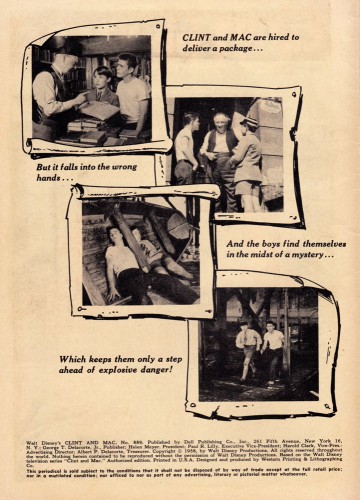
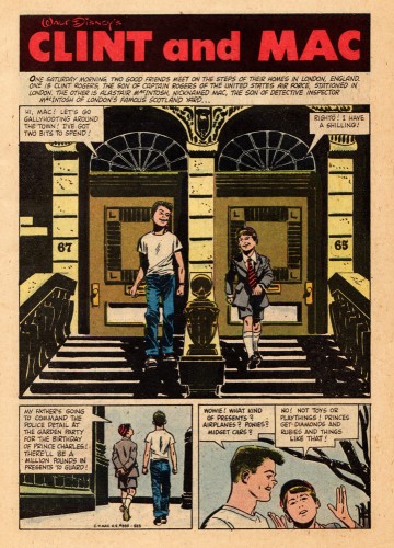
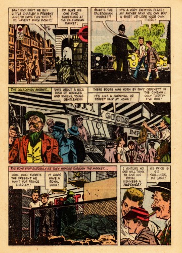
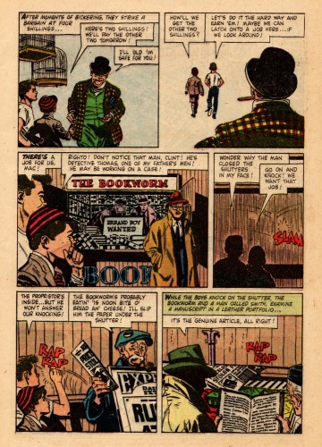
Toth’s Clint and Mac
This material was sent to me by Bill Peckmann. Here’s Bill’s note accompanying it:
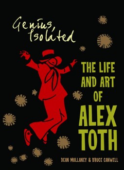 In a couple of days Dean Mullaney and and Bruce Canwell‘s Genius Isolated, a book about the work of Alex Toth, will be hitting the bookstores. This is certainly going to be a GREAT tome given the track record of dedicated work of the authors. (Early reviews bear this out.)
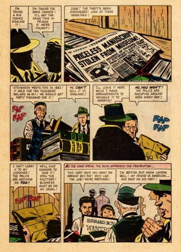
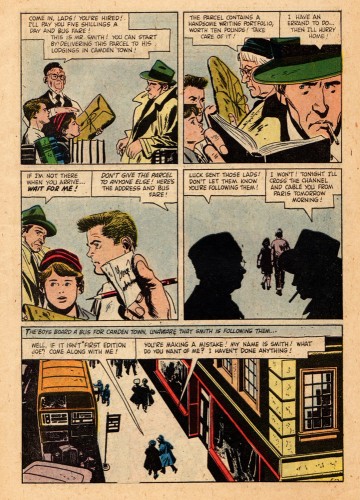
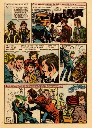
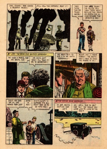
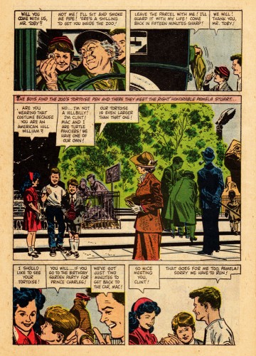
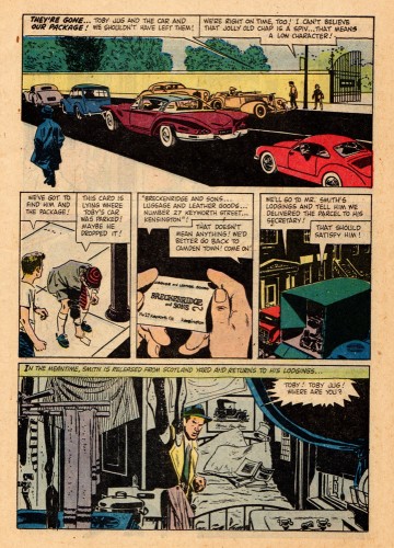
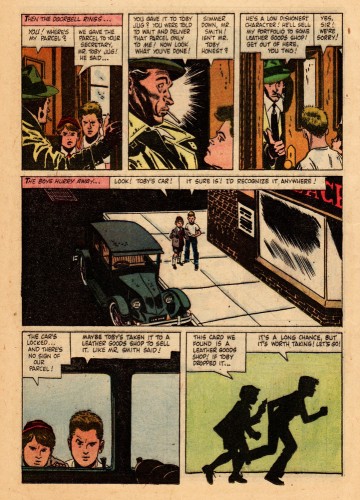
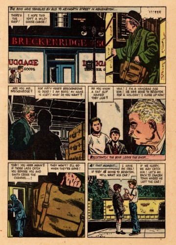
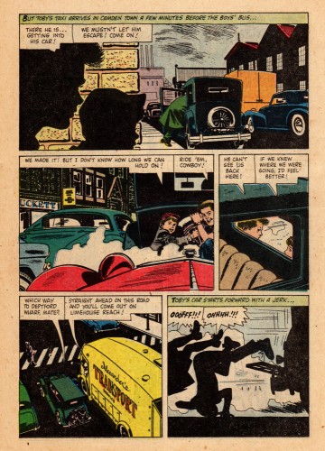
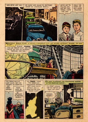
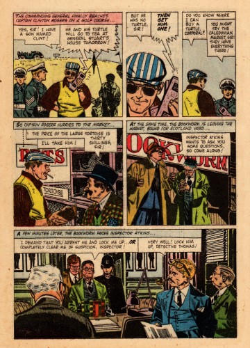
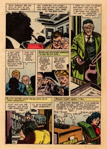
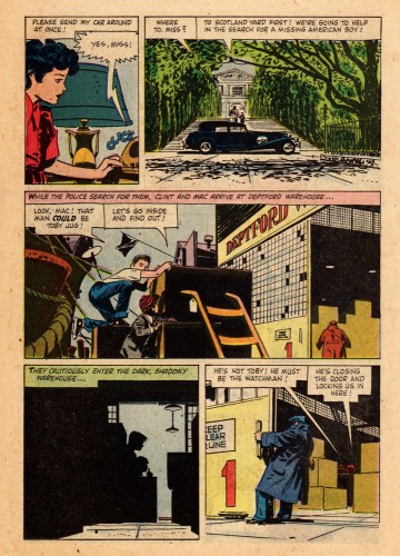
To celebrate the book here’s one of Alex’s Dell/Disney comic books. It’s the 1958 adaptation of the Disney movie Clint and Mac.
Alex was a big Robert Fawcett fan and I believe the 30 year old Toth had Fawcett on his mind when he illustrated this comic. There are so many beautifully designed panels on these pages. Sorry about the slap dash coloring of the book, but that’s the way Dell did it in those days, though the computer screen helps a lot.
One page of this magazine appears in the book. Here, you’ll get to see and read the whole thing. This is the first half of the book
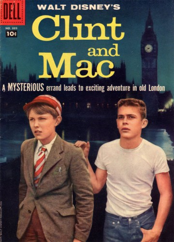
The magazine’s cover
Many thanks to Bill Peckmann for this rare piece of the Alex Toth collection.
Commentary &SpornFilms 28 Apr 2011 07:28 am
Ends and Odds
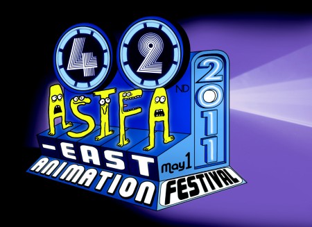
The ASIFA East Animation Festival will be held on this coming Sunday, May 1st.
Tishman Auditorium, The New School. 66 West 12th Street.
As always, admission is free. So is the party after the show.
________________________
- We just received the poster for our upcoming half-hour program for HBO, I CAN BE PRESIDENT. The show will air, for the first time, on June 22nd and will be repeated ad infinitum after that. HBO is throwing a party for it on May 26th; I’ll take some pics, if anything interesting happens, and post them.
The poster is a mishmash of part of a scene from the show with other elements thrown at it. The type is less than I would have liked. I have difficulty with the mix of translucent and opaque colors (something I would never do), so I asked them to put a white border around it. The poster originally bled from the page. Hopefully, this takes a bit of the onus off it. Hey, what do I have to complain about! They made a poster!
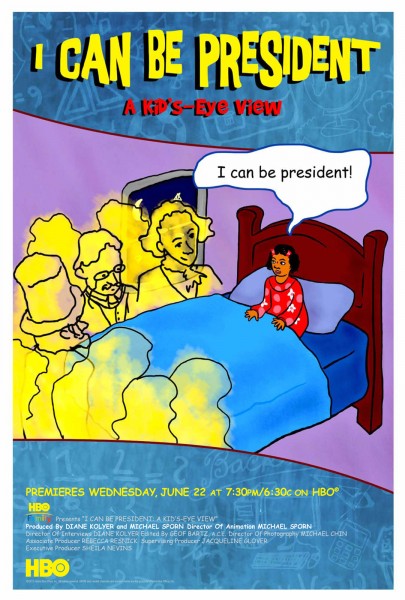
The poster for our show, I CAN BE PRESIDENT
Key to this show was the work of animators Matt Clinton and Katrina Gregorius. They both had a big hand in making anything that is “Special” in the show Special.
- As part of the Tribeca Film Festival, Saturday at 7:00pm there will be a NYWIFT “Independent Women” screening and panel.
 The films to be screened include:
Pastorale (1950, dir. Mary Ellen Bute),
Divination (1964, dir. Storm de Hirsch),
Windy Day (1967, dir. Faith Hubley),
Zenscapes (1969, dir. Marie Menken),
Anything You Want to Be (1971, dir. Liane Brandon),
Homage to Magritte (1974, dir. Anita Thacher),
1-94 (1974, dir. Bette Gordon), _________________________“Windy Day”
Coney (1975, dir. Caroline Ahlfors Mouris, Frank Mouris),
Desire Pie (1976, dir. Lisa Crafts),
Remains to be Seen (1983, dir. Jane Aaron), and
Bent Time (1984, dir. Barbara Hammer).
The panel will include: directors, Lisa Crafts, Emily Hubley, Liane Brandon, Barbara Hammer, Jane Aaron, Bette Gordon, as well as Bute films curator/collector Cecile Starr, and Tribeca’s experimental film programmer Jon Gartenberg. It will be moderated by Drake Stutesman, co-Chair of The Women’s Film Preservation Fund and editor of Framework: The Journal of Cinema and Media.
Saturday, April 30 at 7:00pm
Location: SVA Theater (SVA) 333 West 23rd Street Between 8th & 9th Avenues NYC
.
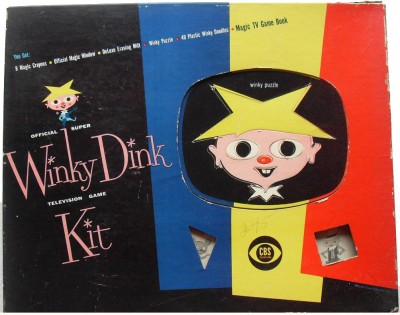
- Stephen Heller at Print Magazine reminisces about Winky Dink. Check it out.
Somewhere I have one of these original kits. The envelope it’s in is deteriorating; they used such poor quality paper to pack it in.
Animation &Animation Artifacts &Disney 27 Apr 2011 06:49 am
Hicks’ Hippo – Part 1
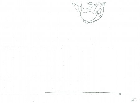
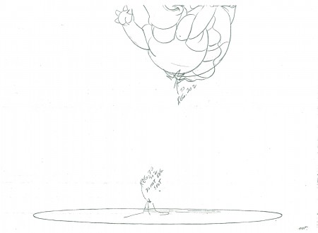
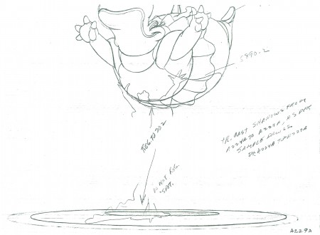
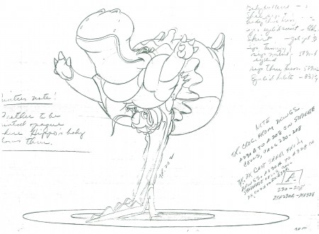
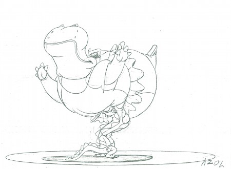
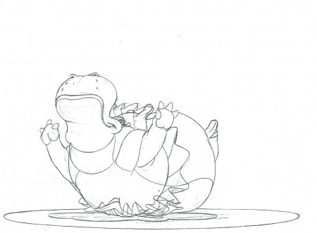
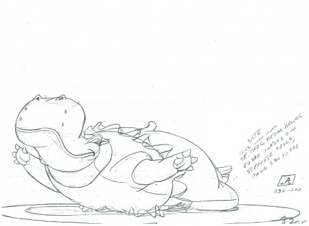
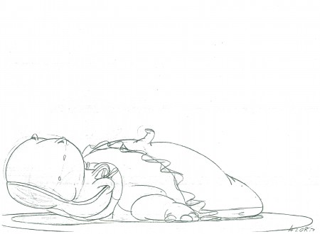
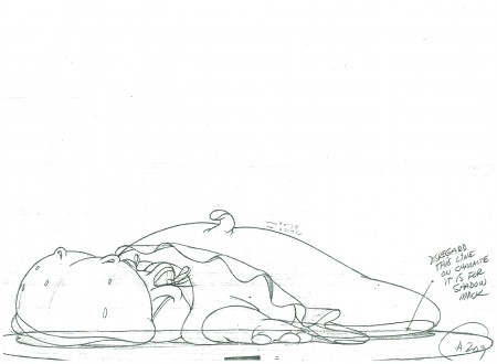
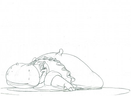
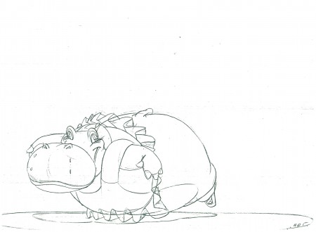
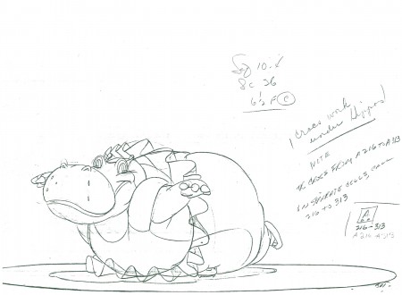
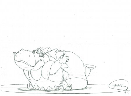
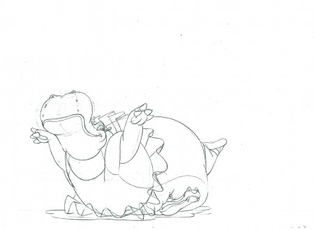
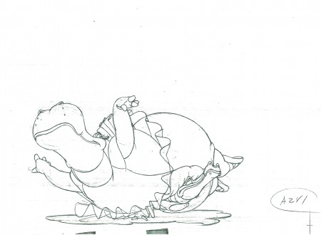
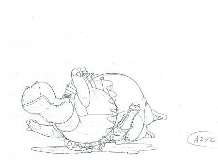
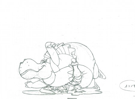
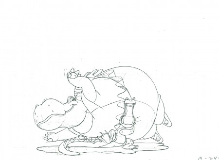
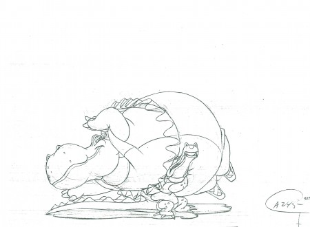
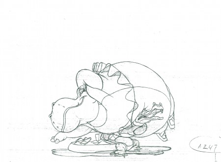
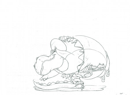
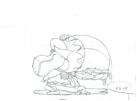
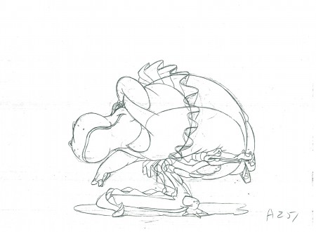
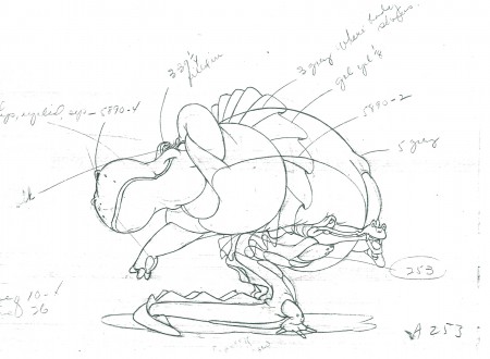
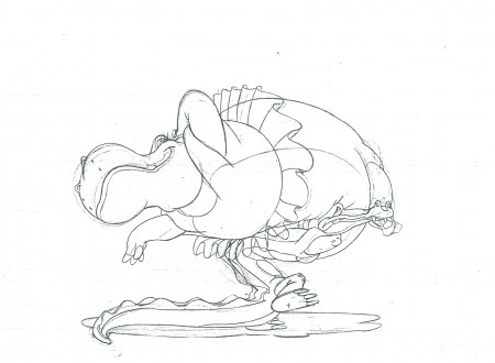
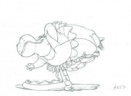
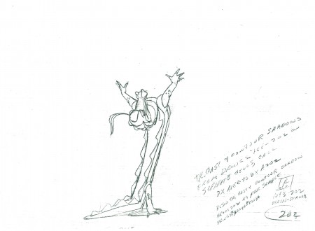
- Last week we had Milt Kahl‘s hilarious Llama. So this week, keeping up the comedy, here’s part 1 (of 2) of Hicks Lokey‘s hippopotamus & alligator from Fantasia. (Jim Will is also credited for doing the effects animation in this scene.) This is actually the last half of the scene. It starts with the hippo on the couch with the alligator making a dive for her. She runs far into the bg, then leaps forward where the alligator catches her at the start of our drawings. It’s all about weight.
The practical problem for me came down to registration. There are no registration marks or punched holes evident on these xeroxed copies. It’s like a big flipbook (14×17) that I had to try to register. There’s also the problem that at lest 1/3 of the drawings have no numbers. This made it hard to guess how long the drawings would stay on screen (since I obviously also didn’t have exposure sheets).
Nevertheless, it seems to work as is, here. I also had a lot of cleaning up to do. The drawings had a lot of xerox markings on the pages. Hence, although there are about 60 drawings, I had to break it into two. The second half will follow next week. The QT movie, below, includes all drawings for the entire scene.
The real fun here is in looking at the individual drawings. They’re all a great laugh.
 202
________________________
202
________________________.
The following is a QT of the entire scene with all the drawings (Parts 1 & 2) included.
Bill Peckmann &Comic Art &Illustration 26 Apr 2011 07:24 am
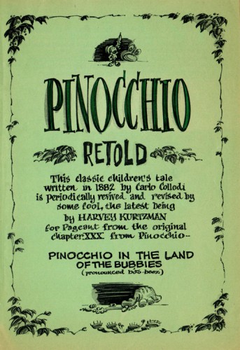
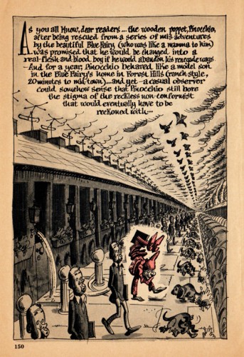
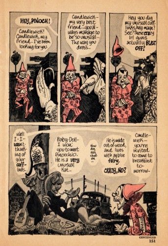
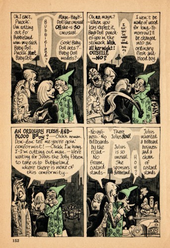
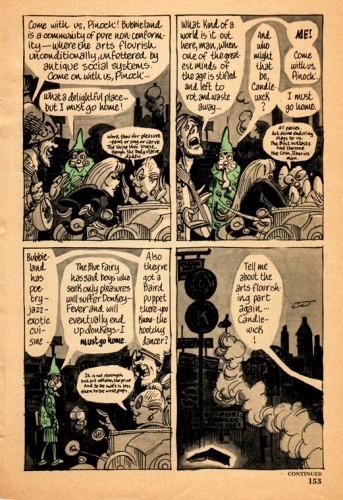
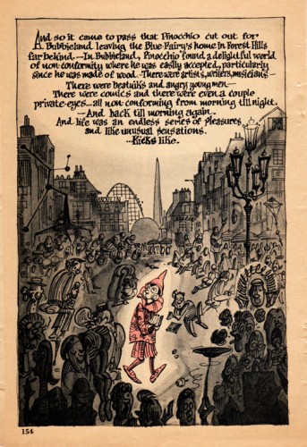
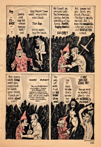
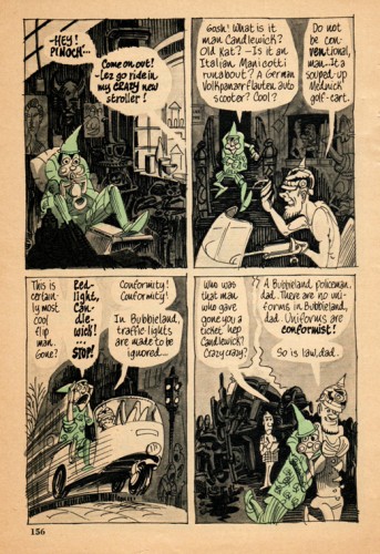
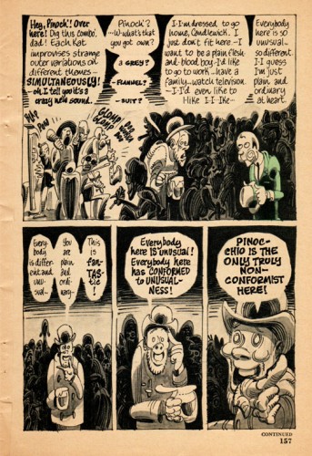
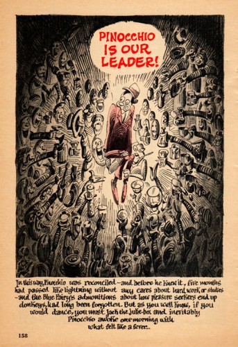
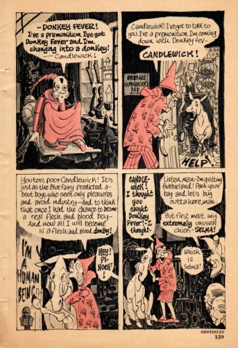
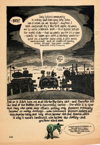
Kurtzman’s Pinocchio
- Harvey Kurtzman produced a piece for Pageant magazine back in 1960. It was a telling of Pinocchio with that distinctly Kurtzman touch. Bill Peckmann recently pulled his copy of the magazine off the shelf, dusted it off and sent scans to me. So all I have to do is take pleasure in posting it. Enjoy.
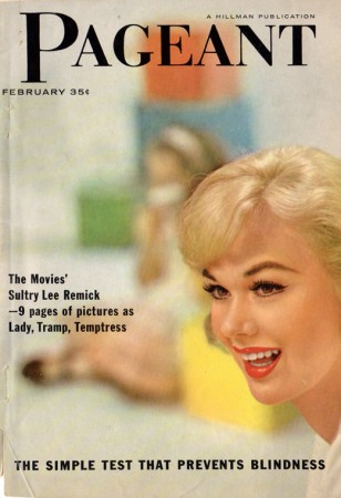
The cover of the magazine.
Animation &Books &Independent Animation 25 Apr 2011 06:57 am
Plympton Book: Independently Animated
 - Back in 1983, I received a call out of the blue from a cartoonist whose strip in the Soho Weekly News was one that I enjoyed. Bill Plympton was interested in making an animated short and asked to meet with me to get some advice. As it turns out, we met several times, always at a pub/bar in NY that I love, The Cedar Tavern (this was the hangout of the Abstract Expressionists back in the 40s/50s). Bill was about to make his first animated short, and I suggested he contact a woman I thought could help him put it together, Connie D’Antuono. Connie was working out of R.O.Blechman’s Ink Tank, and she worked with Bill outside of her 9-5 job.
Here it is some 28 years later, and I’ve received a copy of Bill’s golden artbook, Independently Animated: Bill Plympton, The Life and Art of the King of Indie Animation, for review.
I don’t know why, but this book has taken me by surprise. It’s so much more than the expected bio of an animator. It really smacks of a genuine amalgam of the guy who made all these films and the cartoonist who did the strip in the Soho Weekly News. The book boils over with artwork, not only from the films but from many many cartoons and illustrations done previous to the animation career. It all suipports a strong graphic sense found after the animation has begun. It also becomes obvious that there is a direct connection between those early strips and the animated films. This is a real gem of a book, and I’d encourage everyone to buy a copy to see how it’s done. It’s the best “Art of …..” book of the year, and it’s much more.
The text is quite informative, and despite the fact that it’s written both by Bill Plympton, himself, and David Levy, it has a casual and friendly tone that comes across as genuinely first person singular. It feels as though Bill, himself, were telling the story. We learn where the ideas for some of the films come from (the one for Guard Dog is difficult reading if you’re a dog lover), and this text is matched with plenty of drawn material, both art from the films as well as pre-production material.
It’s a fine book, and I suggest you look into it. It’s an original – a truly Independent animation Art book!
 1
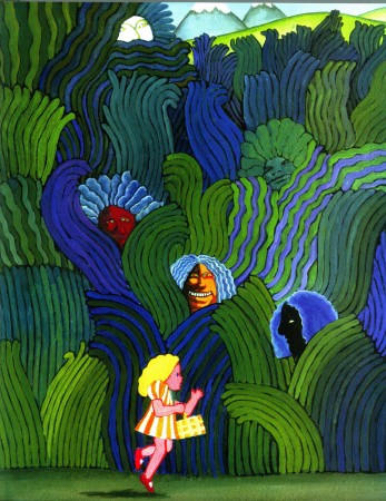
1Bill’s early illustration influences are obvious.
He hoped to study under Milton Glaser in attending
the School of Visual Arts. It didn’t happen.
 2
2
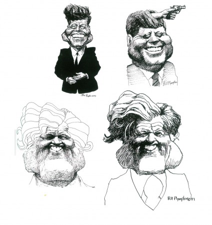
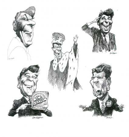
By the time he was doing his strip for the Soho Weekly News
it was obvious that Bill was a brilliant caricaturist.
(Reagan above / some Kennedys below)
 4
4
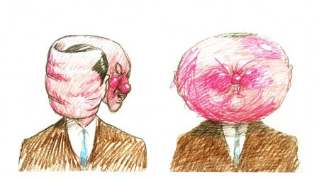
The art of caricature influenced the animation
as evident in these frames from Your Face.
 6
6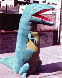 7
7
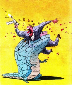
At one point, trying to generate publicity for Mutant Aliens,
Bill constructed a costume someone wore parading in front of the
Cinema Village, in NYC, where the film was playing.
 8
8
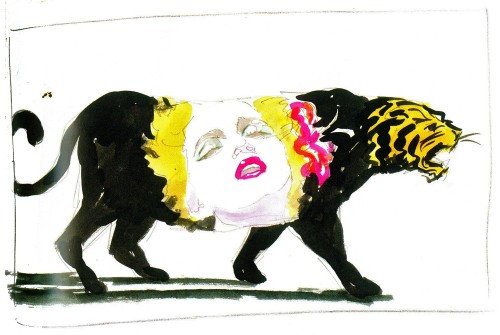
A music video proposal for Madonna’s Who’s That Girl?
 9
9
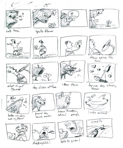
The complete storyboard for Guard Dog is in the book.
Photos 24 Apr 2011 07:43 am
B’day Pics
- On Friday night, Heidi threw me a party for my birthday. A cool group of people attended despite the fact that it was Good Friday as well as Passover. We had a blast with good ol’ wine/cheese/beer & cake. (What a cake!) In the dark light, without using my flash, I took a few photos. My apologies to anyone whose photo appears here. Take a look.
 1
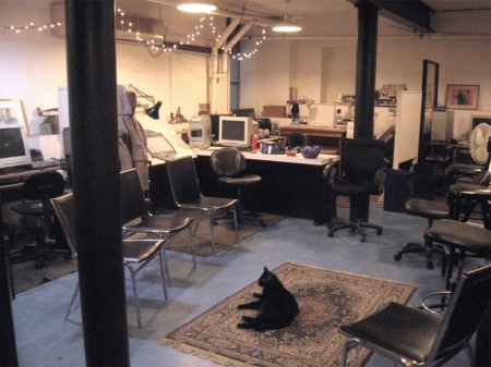
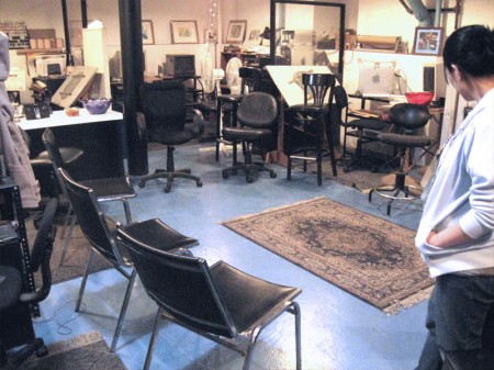
1Robbie oversees the main room which will soon be filled with folk.
By that time the timid little cat will be well-hidden under my drawing table.
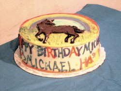

The cake was delivered just before the first guest arrived.
The cake was done by the same guys who did our wedding cake last Sept.
The delivery guy asked if I had any openings for a storyboard artist.
 4
4
The first knock at the door.
 5
5
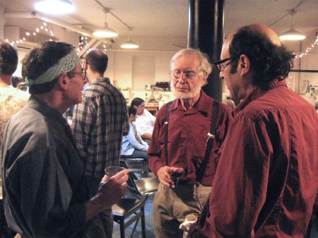
The party is going.
Left to right: Jimmy Picker, Steven MacQuignon, Howard Beckerman.
 6
6
This time their faces.
L to R: Rich Cohen, David Levy (in back), Howard Beckerman, Jimmy Picker
 7
7
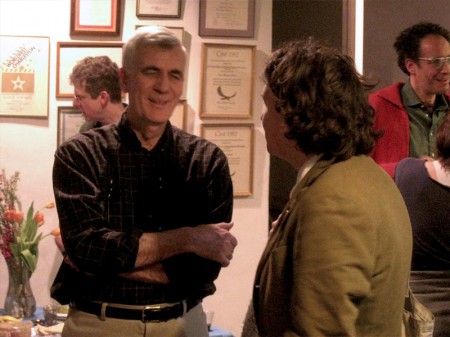
Patti Stren with Jimmy Picker’s girlfriend, Jennifer.
 8
8
John Canemaker talking with Richard O’Connor.
Will Rosenthal back against the wall.
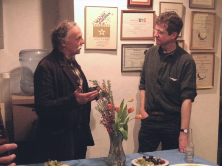 9
9
Ken Brown talking with Will Rosenthal over the food table.
 10
10
David Levy, Paul Carrillo (in back), Lisa Crafts, and
Richard O’Connor’s friend (whose name I never quite got).
 11
11
My love, Heidi with her good friend, Jane Stouffer
 12
12
Katrina Gregorius (a first rate animator in my studio) and her husband, Ryan.
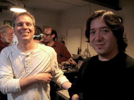 13
13
Steven MacQuignon and Adrian Urquidez in foreground.
Howard Beckerman and Jimmy Picker holding up the rear.
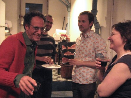
John Dilworth and Emily Hubley up front with
Mike and Tim Rauch in the rear ground.
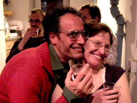
John and Emily goofing around.
The red’s in the bad photo not John’s face.

By this point all that was left was to cut the cake.
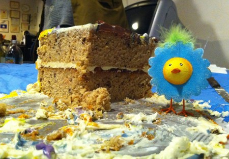
Adrian Urquidez took this final shot with his phone.
The cake went over well. Hazelnut cake with apricot preserve filling.
Animation Artifacts &Disney 23 Apr 2011 07:31 am
A Disney Contract
- Here’s a curiosity that may interest some of you.
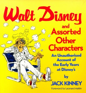
Jack Kinney’s entertaining account of the early years at Disney’s, Walt Disney and Assorted Other Characters, contains a lot of drawings and information by Jack. Originally, in its manuscript form, the book had a lot more of a scrapbook feel. Documents and papers were included, and the book might have ended up being 500 pages long if some editor hadn’t cut it short.
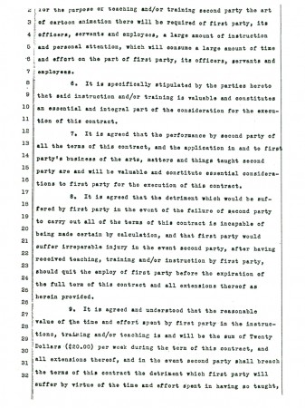
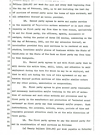
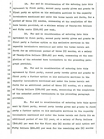
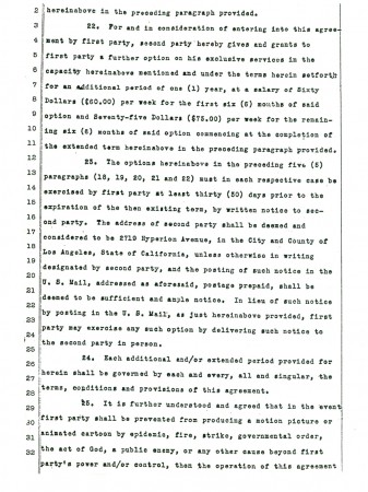
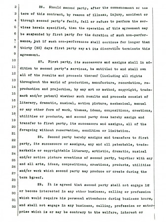
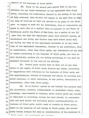
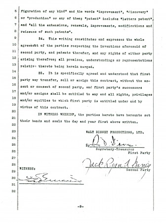
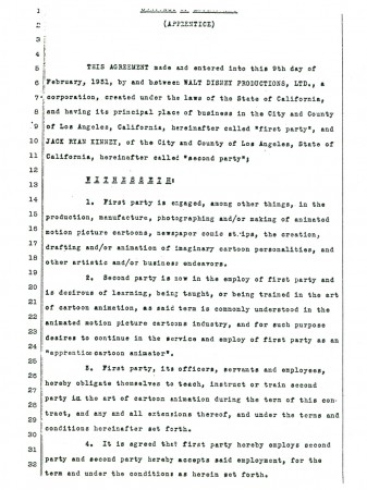
I thought I’d post something from that original manuscript. It’s Jack’s very first contract on entering the studio in 1931. You can see that the Disney contracts haven’t gotten much more complex than they originally were. Let’s start with a page from the final book:
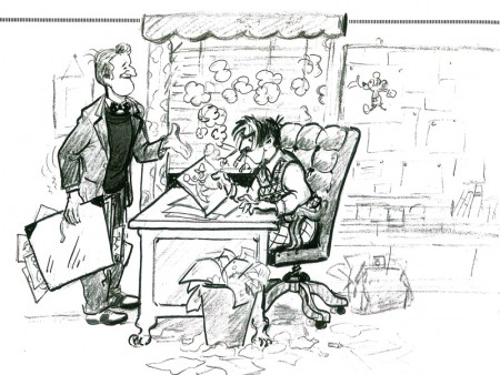
It was Monday morning, 8:00 A.M., February 9, 1931, at Disney Studios, 2719 Hyperion Avenue, Esat Hollywood. There were four of us waiting to be interviewed: me, Frank Powers, Don Smith and Ralph Wolf. Caroline Shafer said, “Walt will see you soon. . .”
An soon, the man said, “The job pays $20 a week. Not good, not bad. I can give you a job for $20 a week, but it’s liable to be only temporary – not steady!”
“I’ll take it,” I said.
Here’s the contract. The original is often cut off slightly on the top and the bottom, so try to read beyond those first and last missing lines:
 1
1Click any image to enlarge.
Bill Peckmann &Books &Illustration 22 Apr 2011 07:06 am
Robert Fawcett
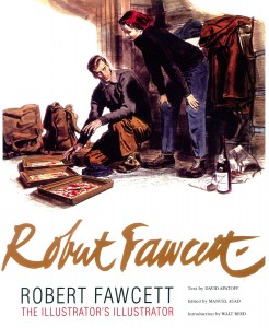 - I have to admit I’ve been a bit remiss. I was handed a copy of a brilliant new book and would have liked to have reviewed it much sooner than now. However, the book is so gorgeous that it’s hard to say much more than that about it. But I will.
The book is titled: Robert Fawcett, The Illustrator’s Illustrator and it couldn’t be more appropriately labelled. Fawcett was
an illustrator who started selling in 1927 and continued on until his death in 1967. He worked for all the major magazines and entertainment groups.
Although Fawcett and Norman Rockwell worked at the same time, they were two sides of the coin. Rockwell illustrated mom, hearth and apple pie; Fawcett illustrated men, war, danger and action. He was the consummate draftsman and an inspiration for many illustrators who followed after him.
The text clearly covers Fawcett’s biography but it also goes into depth about his drawing and painting techniques. It’s thoroughly researched and well written to convey the artist’s process. There’s also a method to the arrangement of images so that you can see a repitition of poses, and some of the themes of the artist. It’s a well thought out book.
I’ve chosen a number of illustrations from the book to give a wide range of examples from his work. I think these will speak plenty for the volume, which is filled to the brim with well framed and positioned images.
Also included in the book is an interview done with Robert Fawcett by Mary Anne Guitar for Famous Artists Magazine, Vol.8, No.4, Summer 1960.
I have to applaud the key people responsible for this book. They include:
David Apatoff who wrote the text.
Manuel Auad who edited the book.
Walt Reed who wrote the Introduction.
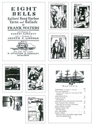
An early commercial assignment for Fawcett.
Illustration for “Eight Bells” by Frank Waters. (1927)
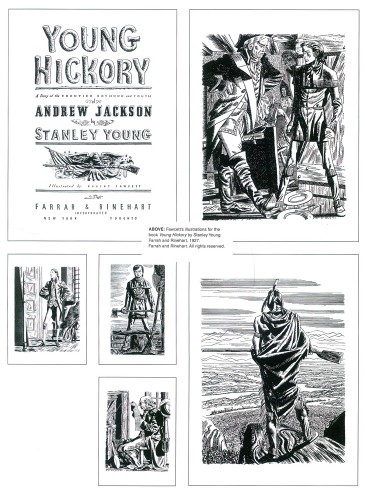
Another early commercial sale, the book illustrations for
“Young Hickory” by Stanley Young. (1927)
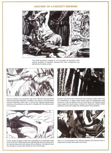
An interesting piece presented by the book’s authors.
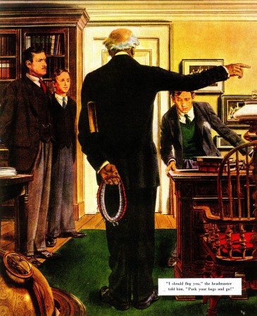
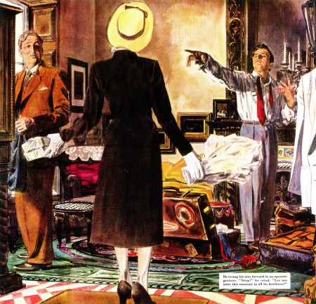
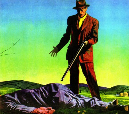
Day of Vengeance by Noel Langley
for Saturday Evening Post, April 10, 1948.
Counterfeit Marriage by George Tabori
for Saturday Evening Post, June 11, 1949
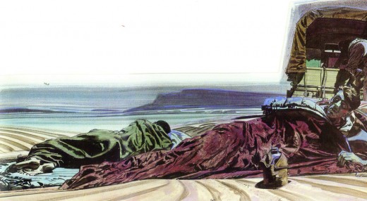
Prisoners of the Plain by Geofrey Household
Saturday Evening Post, October 31, 1947

Dawn Pursuit by Wyatt Blassingame
for Saturday Evening Post, March 1951
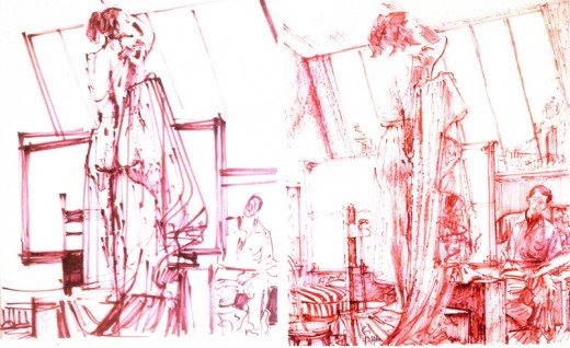
First preliminary sketch and the Final sketch for The Pride of Beauty.
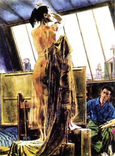
The Priide of Beauty by A.J. Cronin for
Woman’s Home Companion Magazine (1955)
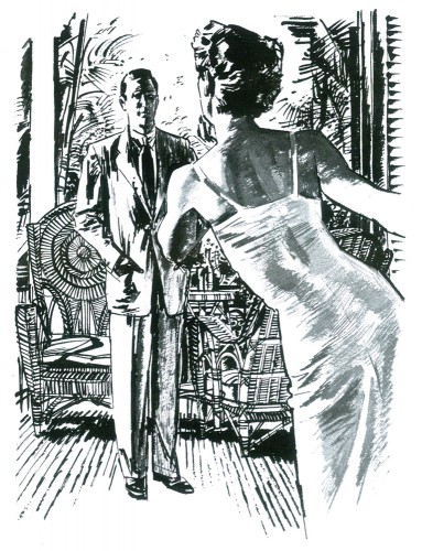
The Myna Birds by james Michener
for Holiday Magazine, (date unknown)
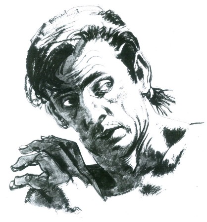
Mutiny In Paradise by James Michener
for This Week Magazine May 5, 1957.
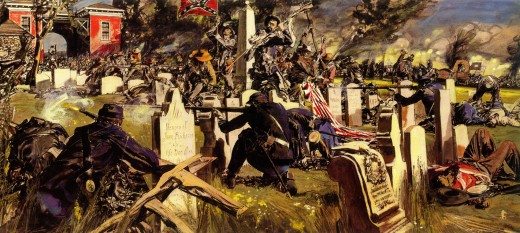
If the South Had Won the Civil War
Look Magazine, November 22, 1960
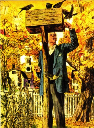
Story illustration, date & title unknown.
This Week Magazine
Run From the Hangman by Geofrey Household
Saturday Evening Post, March 10, 1951
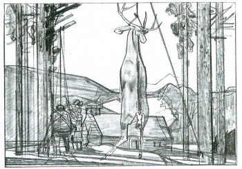
Preliminary sketch for Center Air Conditioning Refrigeration
Date unknown
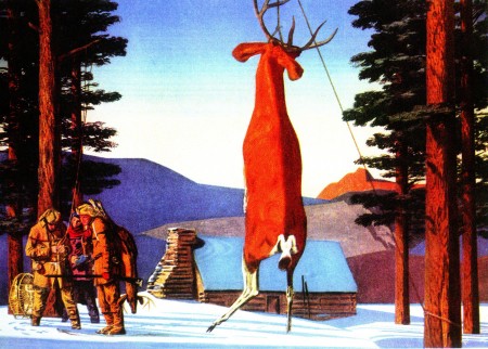
Center Air Conditioning Refrigeration advertisement
Date unknown

Center Air Conditioning Refrigeration advertisement
Date unknown
Many thanks to Bill Peckmann for getting a copy of this beautiful book to me. I wholeheartedly suggest you try to get a copy. It belongs in the hands or on the shelf of every working artist.
Commentary 21 Apr 2011 06:31 am
Loose Pieces
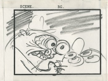 - In days past John Kricfalusi spent quite a bit of time on his site giving some great instructions, via his completed animation art, as to how to properly do different phases of the process. You can start with this ode to Bobe Cannon where images are all he needs to offer in a breakdown of Chuck Jones’s Hold the Lion. Then there’s this great piece on the BG painting technique of Art Lozzi. Part 1, Part 2. There are plenty of other great pieces of this sort, if you haven’t already seen, by just scrolling about.
Recently, he has posted an excellent piece on working storyboards-to-layouts and how to get the most out of both. The layout poses remind me of the working style of Chuck Jones, giving plenty of juicy poses for the animator to follow. Kricfalusi’s purpose, however, isn’t for the animator in the studio but for the animator overseas. As it turns out, I think it’s probably appropriate for both. It’s well worth reading and studying this art from a past Ren & Stimpy episode. Even if you think you’re beyond these stages. I suggest you take a look. Even if you have nothing to learn, it may remind you of how to do better work on these two phases of an animated film. You can find Part 1 and Part 2 at the links. There are another couple of Parts adding more layout drawings to his thesis, but those first two parts are the keys.
.
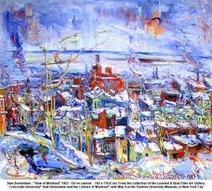 On Wednesday, April 27th and Monday, May 1, Oscar nominated animator, Joyce Borenstein, will be giving guided tours through an exhibition of her father’s paintings at Yeshiva University Museum. Sam Borenstein (1908-1969) is considered a master of post-war expressionism in Canada. Joyce’s Oscar-nominated short animated documentary about her father will also be screened.
Yeshiva University Museum’s SELZ GALLERY is located at 15 West 16th Street, NYC. The exhibition continues through to May 8, 2011.
.
- I saw Rio last week and had mixed feelings. A real three star event. The visuals are lovely to look at, beautifully colored and crafted. The character design was good, though I couldn’t get over the fact that the leading male human looked so much like animation director Ray Kosarin. I saw no cliches in the character design or animation and find that rare from American animation. The voices are excellent. I particularly liked Jesse Eisenberg as the lead character, Blu, and Jemaine Clement as the villainous owl.

The real Ray?
The problem with the film came with the writing. The plot overcomplicates with a very 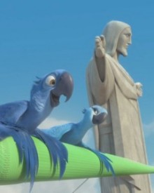 simple and obvious story. There are too many characters and too many of them are introduced late in the game. The film keeps jumping from one plot direction to another to another and back again, but there is no real tension created anywhere in the film. This is too bad since the film has so much going for it.
By the way the 3D is good. I have to admit my eyes watered as usual with these glasses, but the graying effect wasn’t as enormous as it was on other films – particularly Tangled. There is one incredible 3D shot where the camera flies around the statue, Christ the Redeemer, and an arm stretches wildly into the audience. Seeing some stills of this shot shows that the effect is completely nothing in 2D.
