Monthly ArchiveMarch 2011
Bill Peckmann &Comic Art &Illustration 31 Mar 2011 07:14 am
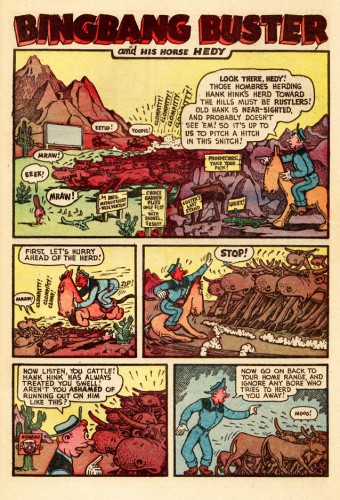
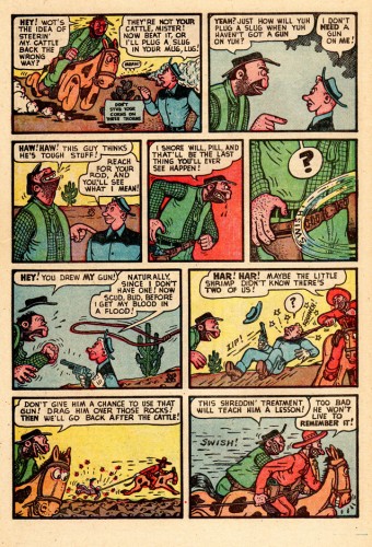
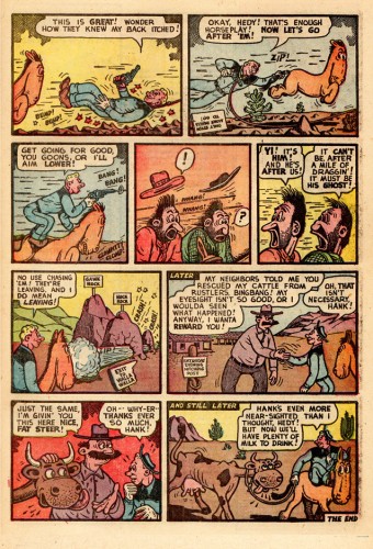
Big Bang Busters
- The other day I received this note from Bill Peckmann:
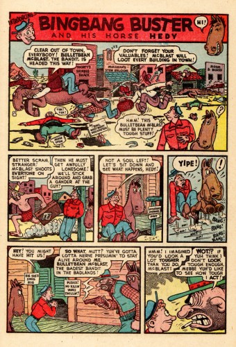
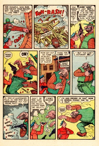
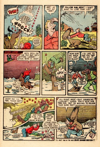
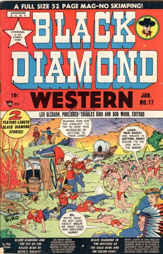
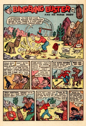
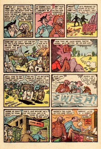
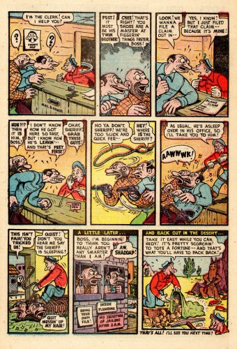
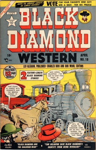
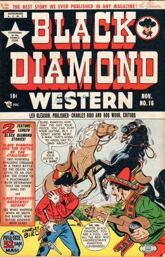
- Before there were Underground cartoonists and comic books in the ’60′s and ’70′s, there was Harvey Kurtzman and Basil Wolverton doing filler features in comic books in the late ’40′s and early ’50′s. Harvey’s “Pot Shot Pete” ran in western comic books and so did Wolverton’s “Bing Bang Buster”. “Buster” ran in a western series titled “Black Diamond Western”. The first installment was in issue # 16, Nov. 1949. Like Harvey’s very distinct style, Basil’s could also be easily spotted at twenty paces. Like “Pot Shot”, “Buster” would be very at home in the pages of an early “Mad” comic book. Wolverton did join the ranks of “Mad” artists in later issues of the comic book. This is one of many features and characters that Basil did in his lifetime but it’s one that usually falls through the cracks.
I’m including the covers of the comic to give the feature a time and place. These were done by Charles Biro who later wound up at the NBC TV graphics dept. I used to see him at 841 u-nion meetings and never made the connection he was the same Charlie of comic book fame, too bad.)
Without further ado, here are a couple of issues:
Cover 1
Animation &Animation Artifacts &Disney 30 Mar 2011 07:04 am
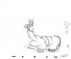
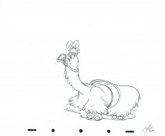
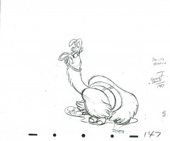
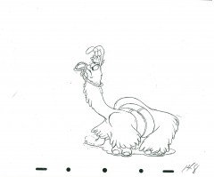
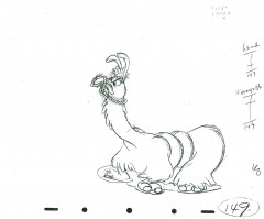
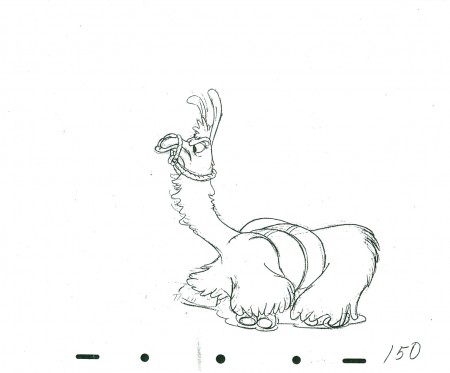
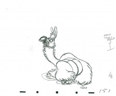
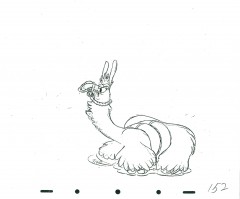
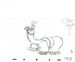
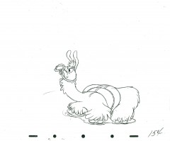
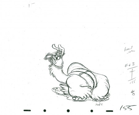
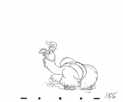
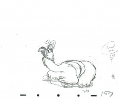
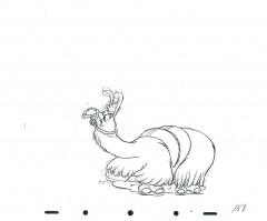
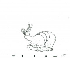
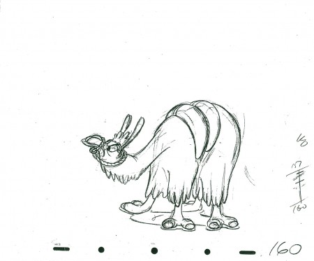
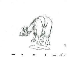
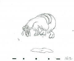
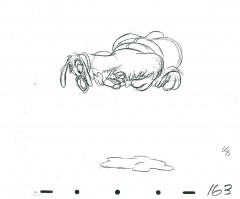
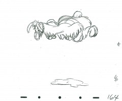
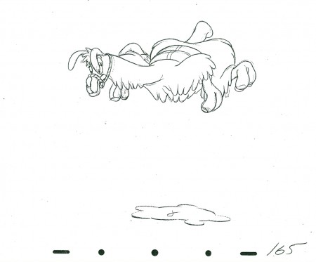
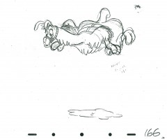
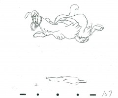
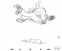
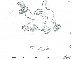
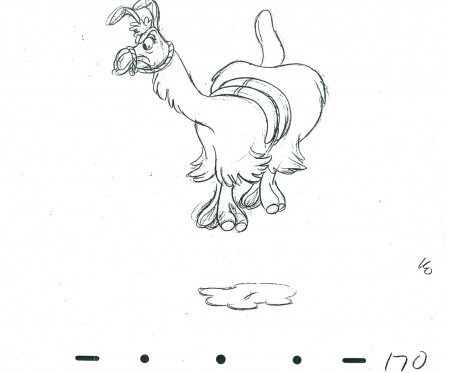
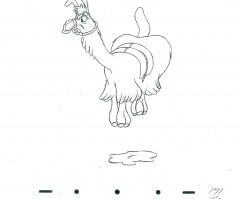
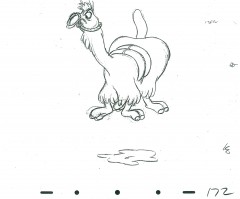
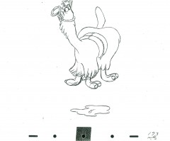
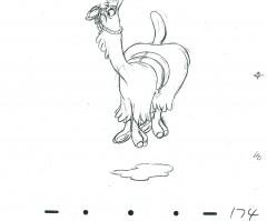
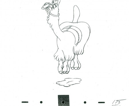
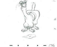
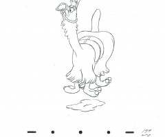
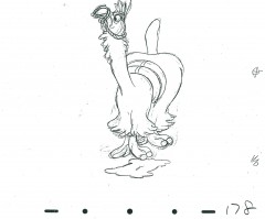
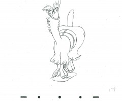
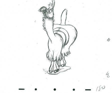
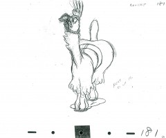
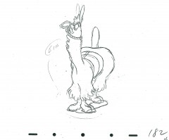
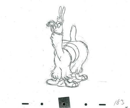
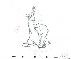
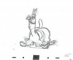
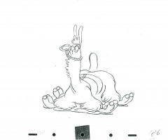
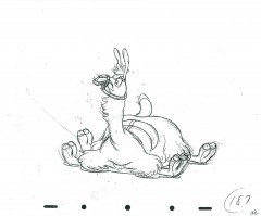
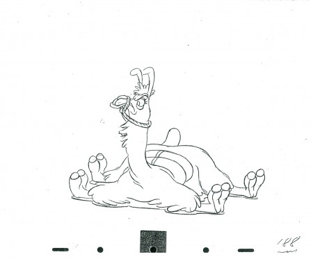
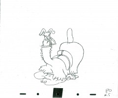
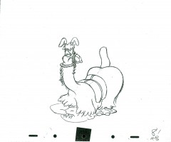
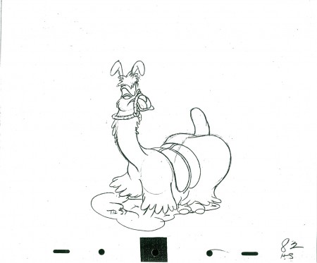
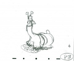
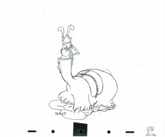
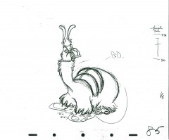
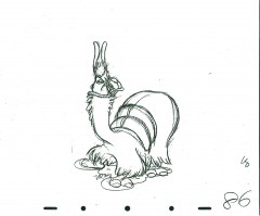
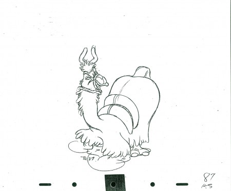
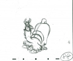
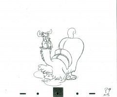
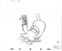
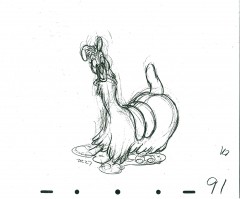
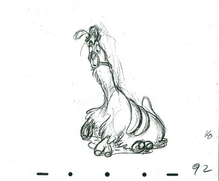
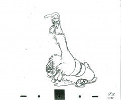
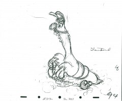
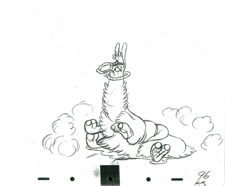
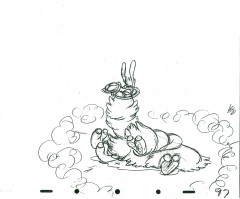
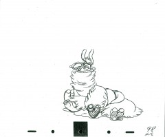
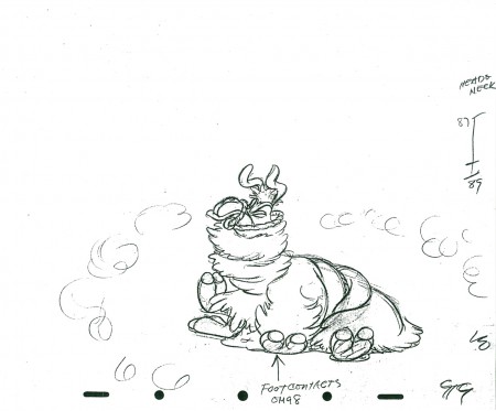
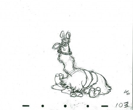
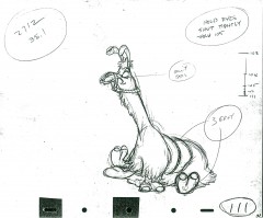
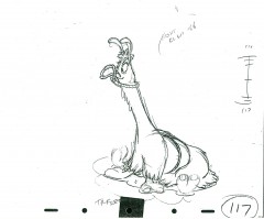
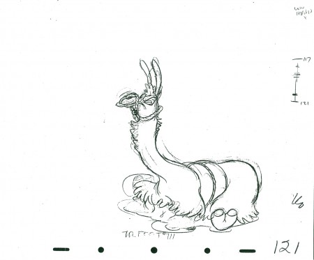
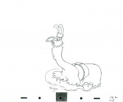
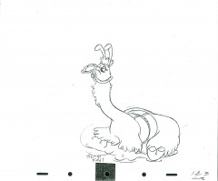
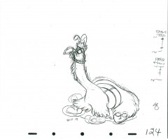
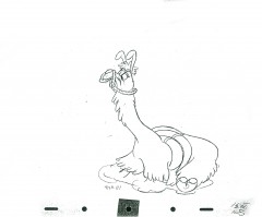
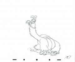
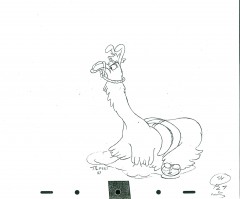
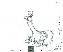
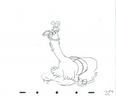
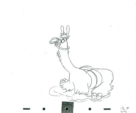
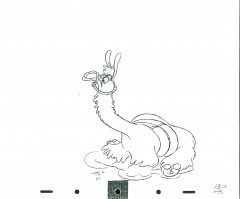
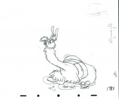
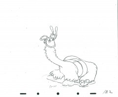
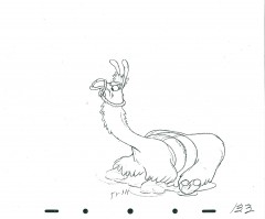
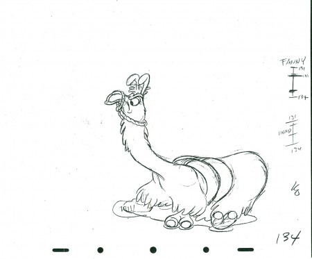
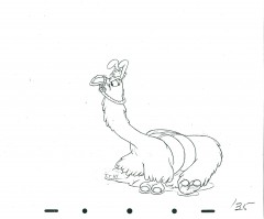
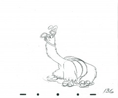
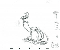
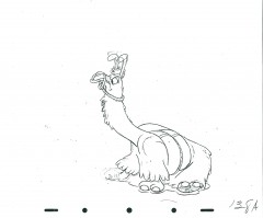
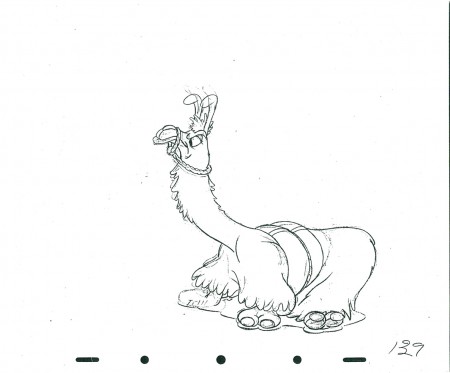
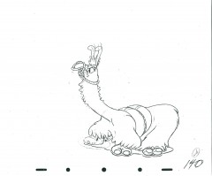
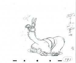
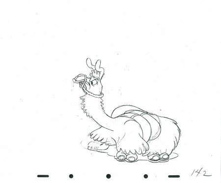
Kahl’s Llama – part 3
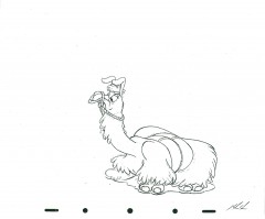
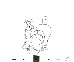
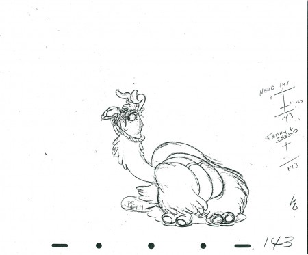
- Well, I don’t have the music, but you can almost hear it in this wonderful piece of animation by Milt Kahl. It, of course, is part of Saludos Amigos; the dancing Llama. It’s yet another tour de force of animation done by Kahl. Donald Duck plays the panpipes as the Llama tries to dance to the bad rhythms. A complex piece of humor by the diverse animator.
This is part three with another couple to come. It’s a long scene. Many thanks to John Canemaker for allowing me to scan it.
As in the past, we start with the last drawing from last week’s post:
 143
________________________
The following is a QT of this part of the scene with all the drawings posted here.
Bill Peckmann &Books &Illustration 29 Mar 2011 07:36 am
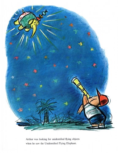
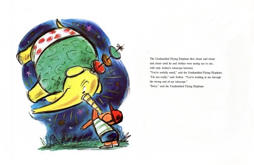
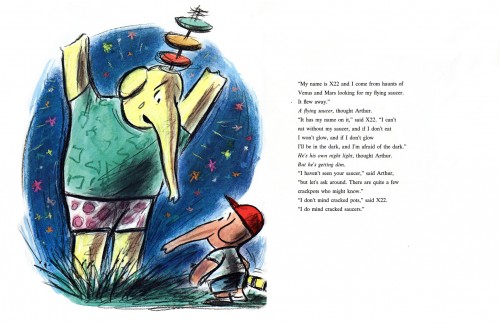
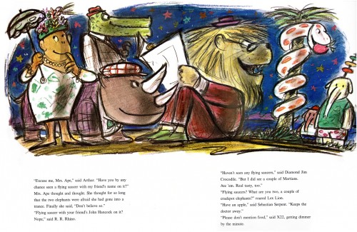
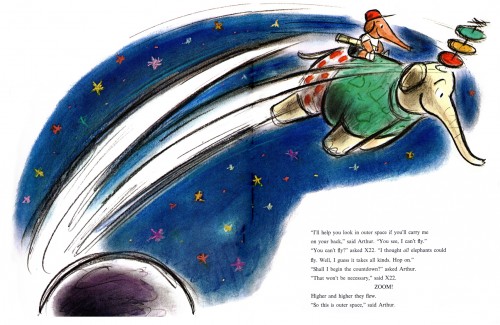
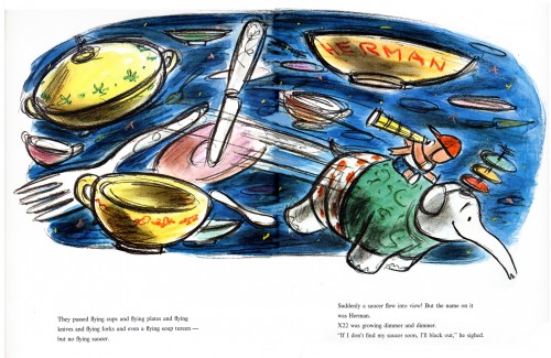
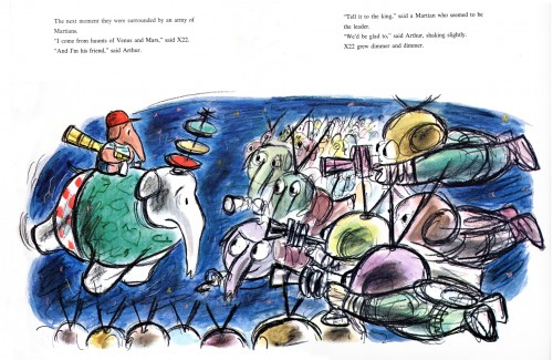
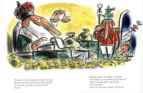
The Unidentified Flying Elephant – pt. 1
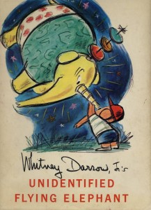 - Whitney Darrow Jr. has been one of the foremost gag cartoonists of our time. His work has appeared in The New Yorker magazine for over 50 years. His first cartoon appeared March 18, 1933 and produced of 1500 cartoons for them prior to his death on Aug. 112, 1999, just shy of his nintieth birthday. He was one of the cartoonists who wrote his own captions.
Bill Peckmann sent me scans of Darrow’s chldren’s book, The Unidentified Flying Elephant. The drawings are crisp and strong, done in the same wonderful style as his gag cartoons. Although, here, he is workng with color. Robert Kraus wrote the text. (Whitney Darrow Jr. has a large collection of books he illustrated usually partnering with another author.)
The following is the first half of the book:
 1
1
Many thanks to Bill Peckmann for the material to display.
Commentary 28 Mar 2011 07:03 am
Lantz and me
- Like many others, reading the Roger Armstrong reminiscence on Mike Barrier‘s site really got me into the Walter Lantz mood.
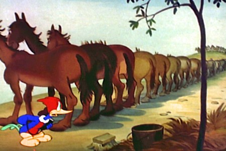
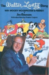 I first went back to Mike’s book, The Hollywood Cartoon, and read what info he had about Lantz. After a bit of reading there, I went to look at some of the old Woody Woodpecker shows – I have that collection from Columbia House that came out years ago which includes about three half hour shows per DVD, 10 DVDs, and some beautiful prints.
Then I reread one of my all time favorite animation books, The Walter Lantz Story by Joe Adamson. This isn’t a terribly large book, but it sure is packed with a lot of first-rate information.
As an owner of my own animation company I get a real charge in reading about the ups and downs Lantz had to go through, financially, to keep his company afloat. In one chapter, Universal dropped him, and he rebuilt, financing a couple of films with the help of a few animators. Then he went back to Univeral and sold the films to them with a brand new deal. It took enormous entrepreneurial strength believing in what he did and going forward with everything on the line.
It’s a great book, and Joe Adamson should be proud of the effort. I also encourage you all to read it. (If only there were a similar book about Paul Terry.)
I got to meet Lantz a couple of times in his late years. One was at Grim Natwick’s 100th birthday. Too bad Walter didn’t sit for the group photo; it would’ve added something to the collected group of animation veterans.
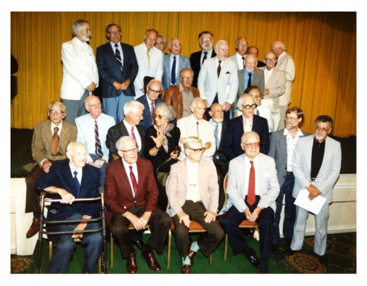
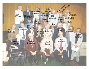
The group photo with ID’s alongside this picture.
(Click to enlarge.)
Another event in LA was the Walter Lantz Conference on Animation in which a number of speakers spoke and films were screened. Lantz was everywhere in those few days. It was great.
However, my most memorable meeting came thanks to John Canemaker. John had interviewed and met with Lantz several times during a group of meetings Walter and Gracie were having in New York in the 70s. There was, if I remember correctly, a special screening of their films at which they would talk. Since I was going there, John asked if I wanted to meet up with him and ride to the event with Walter and Gracie in their limousine. It was a treat to meet them one-on-one and to have a chance to share a few words. I have to say he was one of the most kind people I’ve run across, who gave me plenty of chance to talk. It was one of those standout moments in my life.
To complete this post, I’m going to repeat an older piece about one of my favorite Lantz/Woody Woodpecker cartoons, Ace In The Hole.
 - Back in the day, when I was just a teenager, there was very little in the way of media, as there is today. If you were desperate to become an animator, there weren’t many directions to turn. You had what was on the four or five tv channels that existed and there was the library.
TV offered the Walt Disney show, which two out of four Wednesdays (later Sundays) each month, they’d touch on “Fantasyland”, and 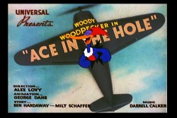 you could watch some Disney cartoons – usually Donald and Chip & Dale, or there was the Woody Woodpecker show, during which Walter Lantz would talk for four or five minutes about some aspect of animation.
For all those other hours of the day when you wanted animation you had to make do with what you could create for yourself.
At the age of 11, I took a part time job for a pharmacist delivering drugs to his clientele.
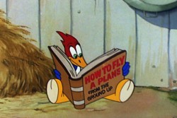 I lived off the tips that were offered, and I saved my money until I had enough to buy a used movie camera. The trek into downtown Manhattan was a big one for an eleven year old child, but I loved it. I went by myself to Peerless camera store near Grand Central Station. (It later merged with Willoughby to become Peerless-Willoughby; then it went back to just being Willoughby.)
That store, I quickly learned had a large
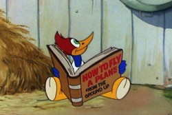 section devoted to films for the 8mm crowd. Lots of Laurel and Hardy, Our Gang and Woody Woodpecker cartoons. Once I had the camera, I saved for a cheap projector and eventually bought some 8mm cartoons.
Independence. Now, I didn’t have to wait to see them on TV, I could project them myself whenever I wanted. Even better, I jiggered the projector to maneuver the framing device which allowed me to see one frame of the film
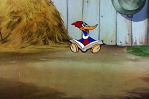 at a time, so that I could advance the frames one at a time. I could study animation.
I know, I know. I’m describing the stone ages. Today all you have to do is get the DVD (which is incredibly cheap compared to the cost of those old 8mm films) and watch it one frame at a time or any other way you want. And every film is available. If you don’t have it just join Netflix and rent it. Your library is always open and growing.
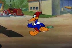
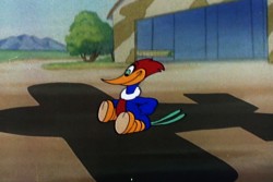
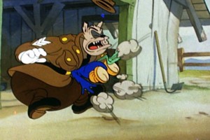 Yes, Peerless had an large 8mm film division, so you could buy the latest Castle film edition of some Woody Woodpecker cartoon, or you could find many of Ub Iwerks’ films. I had a collection of these. Ub Iwerks was my guy. Everything I’d read about him (in the few books available) got me excited about animation. Actually, Jack and the Beanstalk and Sinbad the Sailor were the first films I’d bought and watch endlessly over and over frame by frame.
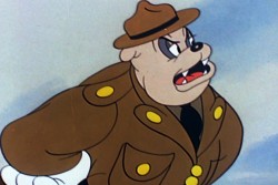 In short time, I knew every frame of Jack and the Beanstalk backwards and forwards. I didn’t realize that it was Grim Natwick who had animated (and directed the animation) on a good part of the film. Meeting Natwick years later, I think I surprised him by saying as much. He just moved on to another subject, appropriately enough.
In some very real way, I learned animation from that film and several others that I
 bought in those primative years of my career. Before I knew principles of drawing, I’d been able to figure out principles of animation. I’d had the Preston Blair book, and I had the Tips on Animation from the Disneyland Corner. I just measured what they said about basic rules and watched – frame by frame – how these rules were executed by the Iwerks’ animators. The rest was up to me to figure out, and I was able to do that.
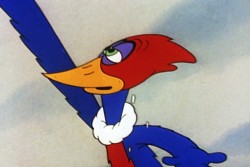
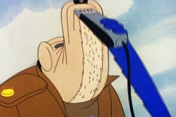
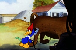
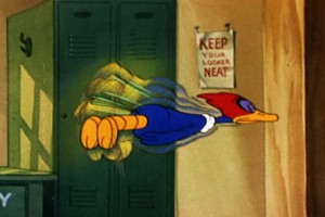 Eventually I bought a Woody Woodpecker cartoon. I was reluctant because so many of them were the very limited films done in the early 60′s – Ma and Pa Beary etc. It took a while to figure out that Ace in the Hole was a wartime movie and the animation would be a bit better. It was also the Woody that I liked – just a bit crazy. So I sprang for it and swallowed that film’s every frame for years.
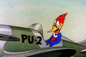 I’m not sure who George Dane is, (he seems to have spent years at Lantz before working years at H&B and Filmation) but I studied and analyzed his animation on this film closely and carefully.
The work reminded me of some of the animation done for Columbia in the early 40′s. It had that same mushiness while at the same time not breaking any of the rules. Regardless, he knew what he was doing, and I had a lot to learn from him. And I did.
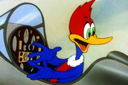
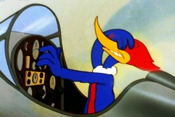
 Things keep changing, media keeps growing. I’m glad I had to fight to get to see any of those old 8mm shorts back in the early years. When I bought my first vhs copy of a Disney feature, it took a while to grasp the fact that I could see every frame of it whenever I wanted. In bygone years, I could only see the rejects that TV didn’t want. I wanted to study Tytla and Thomas and Natwick and Kahl. Instead, I studied George Dane. And you know what, it was pretty damn OK. I
 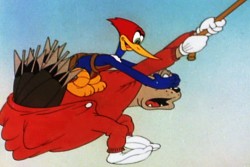 learned enough that I knew a lot when I started in the business. I just jumped in and was animating for John Hubley within days of getting that first job. (It helps that it was an open studio like Hubley’s where the individual artist could do anything, as long as he kept his head above water. In most studios there’s a rigidity that keeps you in your classified job.) In fact by then, I was more interested in Art Direction and Direction than I was in animation, but that’s another post.
If you want to learn from the masters, just pop in a DVD and watch it frame-by-frame. If you don’t get a charge out of it, you might begin to wonder if you’re really in the right business. After all these years, I still get the thrill, and I imagine I always will – even from watching Ace in the Hole AGAIN.
Photos &T.Hachtman 27 Mar 2011 07:14 am
More Murals
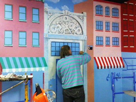
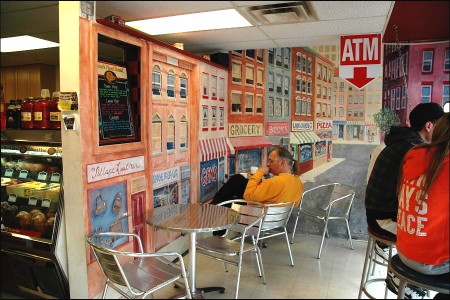
Tom Hachtman and his wife, Joey, as I’ve written before, produce murals for people primarily in Southern New Jersey. They do this work through Joey’s company, Three Designing Women Studios.
Infrequently they send me some photos so I can see what they’re up to. Here are a recent few photos sent my way. Tom describes the photos.
 1
1This job is in Colt’s Neck, New Jersey.
 2
2
We had to build a floor over the pit
so we could paint around that tree.
Joey said, “It looks like a Gehry house.”
Katie Mae, our coworker, said, “Yeah – inside out.”
 3
3
It is a faux finish – layers of silver and platinum metallic paints and
it really should be seen in person as it changes with the light every
time you move around. Katie Mott and Christine Myshka worked with us
and we couldn’t have done it without them. This sort of work makes me
feel more like a Flying Wallenda than a Michelangelo. I do think of
Philippe Petit now and then for further inspiration.
The Hazlet mural is nearly finished – I’ll send photos when it is.
 4
4
A mural in progress at Gem’s House of Bagels in Hazlet, NJ.
 5
5
This is our third Gem’s House of Bagels mural.
 6
6
Here I am working on our third Gem’s House of Bagels mural.
 7
7
I’m sitting in front of the first Gem’s mural – smaller store – smaller mural.
Commentary 26 Mar 2011 07:57 am
bits and pieces and screenings
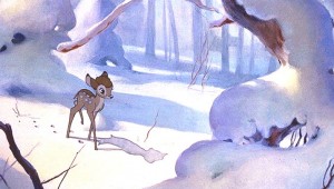 - Before getting into the info section of this post, let me talk about something that’s been bothering me from Disney on TV. Because Disney owns ABC, all their VOD shows have commercials for upcoming DVDs and movies in theaters.
Currently, an ad for Bambi runs at every commercial break, as does one for Mars Needs Moms (or whatever that film is called). The Bambi ads make me feel good watching some of the iconic scenes over and over again: autumn leaves blowing, Bambi’s first steps, Bambi on ice . . . a bunch of them. However, the music is downright annoying. Instead of using music from the film, they’ve hired someone to write a bed of Musak in the usual pop style to cover anything that’s happening on sreen.
Here’s a film that has brilliant music, and it’s all out the door, replaced by audible nothing, the musical equivalent of watered-down milk. It’s just another fine example of the little respect the Disney people really have for their merchandise. It’s like playing an ad for The Wizard of Oz and not using any of the songs. I don’t know; I throw my hands in the air in frustration. At least they’re running ads, I suppose. But they treat Mars Needs Moms with more respect and play the hyper music from that film during its ad. No synth-pop composer has been called in to write a bed of nothing.
Mia and the Migoo
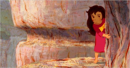
- The French animated feature. Mia and the Migoo, officially opened in New York, yesterday at the IFC Center, downtown. The film won as best animated feature at the 2009 European Film Awards.
The film has recieved mixed reviews from New York’s critics.
NYTimes said: “… trying to parse meaning in “Mia†is secondary to its main point, which is its look, created with 500,000 hand-drawn frames. That’s impressive in an age in which most mainstream animation is done with computers …”
The NY Daily News said: ” … though the animation can be transporting, its lack of lyricism is disappointing.”
The NY Post said: “France’s animated feature “Mia and the Migoo” is far too childish to intrigue adults yet too slow and dull for kids.”
You’ll find film times and schedule here.
- As it happens, the South Park guys, Trey Parker and Matt Stone, also opened their first Broadway musical yesterday. The reviews for The Book of Mormon were “Golden” as they might say. All four stars, all praise, all the time. This is obviously going to be the big hit of the year. Forget about it; it’ll be imposssible to buy a ticket.
NY Times, NY Post. NY Daily News, Wall St. Journal
 Ken Priebe sent the following notice:
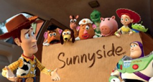
VanArts is hosting our Pixar Artists’ Masterclass with Andrew Gordon and Mike Venturini in New York City this summer, and also in Montreal (and Austin TX).
Registrations are now open for NYC, happening June 24th-25th, so we hope to have your friends, students and colleagues join us.
All information is available here.
- It’s become news when Maurice Sendak announces a new children’s book. According to the Wall Street Journal article, his latest book will be published in the Fall. It’s built from a character he developed for Sesame Street with Jim Henson. Apparently, the character, “Bumble Ardy” stuck in the author/illustrator’s mind, and now, at the age of 82, he’s developed it into a book. Unfortunately, no pictures of the character came with the article. However, here’s the original Sesame Street spot. Sendak has changed the boy into a pig.
______________________________
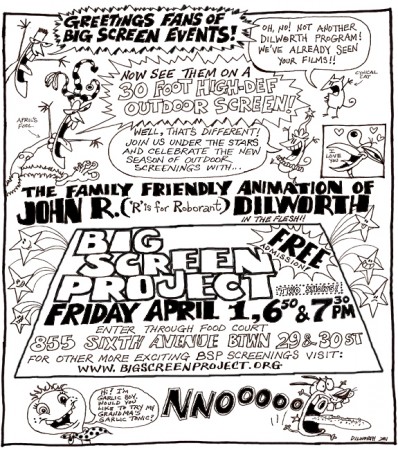
John Dillworth is having a BIG showing of his films at the new venue the Big Screen Project. All the information you need is posted above.
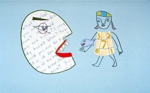 Additionally, Emily Hubley will be having a screening of her films at this site on April 11th. All the information for that screening can be found here.
The films she’ll screen will include:
One Self: Fish/Girl
Enough
The Tower (made w Georgia Hubley)
Set Set Spike
Delivery Man
Octave
Blake Ball
Likewise there will be other screenings during the month of April. Go here to find out about Elliot Cowan, Nina Paley, Bill Plympton and Deborah Solomon‘s screenings.
Bill Peckmann &Books &Illustration &Peet 25 Mar 2011 07:41 am
Peet Sampler – 1
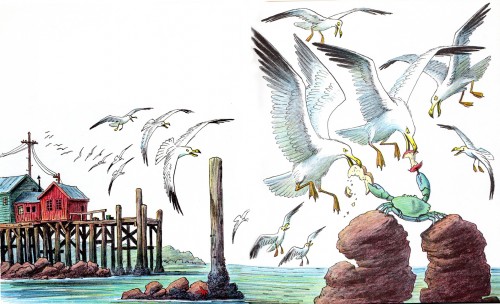
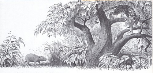
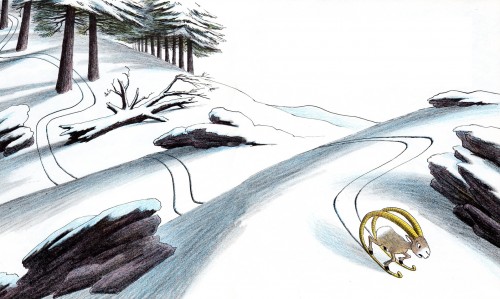
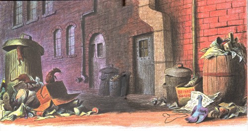
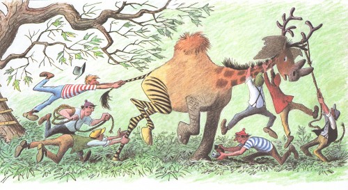
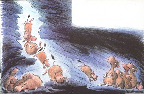
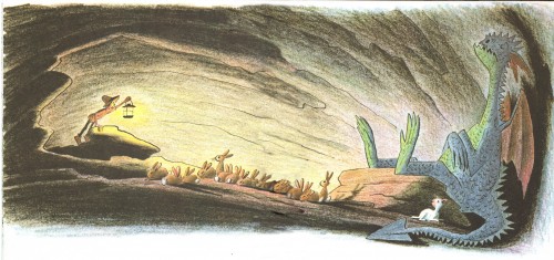
- Bill Peckmann owns 26 of the children’s books by Bill Peet. We’re coming to the finish of posting his beautiful book, Capyboppy, and we thought as a follow-up it’d be best to post a sampler from each of these 26 books. We’ve taken a double page spread from each that Bill has scanned and forwarded to me. I’ve done my best in photoshop to link the two together.
Here, in chronological order, are the first 13 of the books in Bill’s collection. By putting them in order, we can see the development and growth of his illustration style.
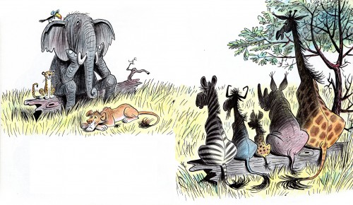
“Hubert’s Hair-Raising Adventure” – 1959
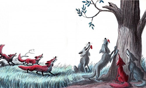
“The Pinkish, Purplish, Bluish Egg” – 1963
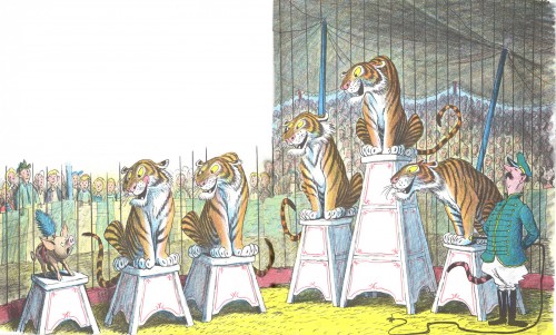
“Chester, the Worldly Pig” – 1965
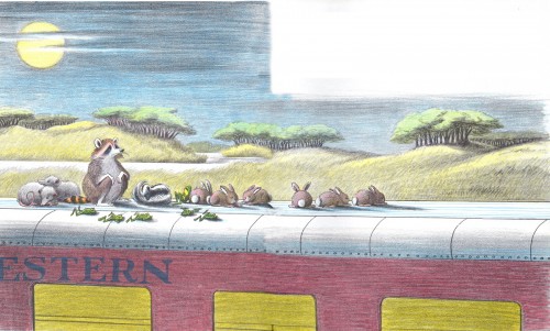
“Farewell to Shady Glade” – 1966
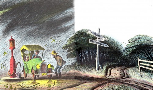
“Jennifer and Josephine” – 1967
Books &Commentary 24 Mar 2011 07:15 am
Disney books
- Lately, Disney’s book divisions have done some wonderful work. The Archive series: Animation, Story, Design and soon to come Layout & Bg are all stunningly attractive books. These are top of the line items from Disney Editions. John Canemaker‘s Two Guys Named Joe also comes from the same division, and it’s a beautifully designed and attractively produced book.
But what about the lower end of the Disney Publishing empire? In the bygone days the animated features would be made into Little Golden Books utilizing artists from the studio. Mary Blair, Al Dempster, Bill Peet, and Eyvind Earle all contributed to books for the Western Publishing offshoot. Today there are still some Little Golden Books being made from Disney material. The Pixar product, such as Toy Story and Wall-E, as well the Disney Princesses and The Princess and the Frog all have editions.
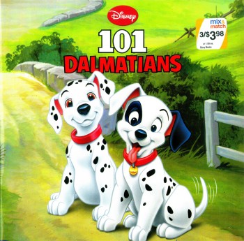
However, I came upon something even lower down the pipeline. Here are three books that were produced for Walgreen’s pharmacy megastores. Heidi bought them 3 for $3.98. None of the books gives a hint of illustrator or writer. The illustrations, on a very cursory glance, look as though they might have been frame grabs pulled from the movies.
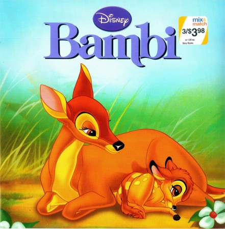
Bambi’s cover. It’s a nice watercolor evocative of the film. Though one
wonders why they played with the logo’s type. The “m” now has a
little swoosh on its lower right. Not part of any other version of this title.
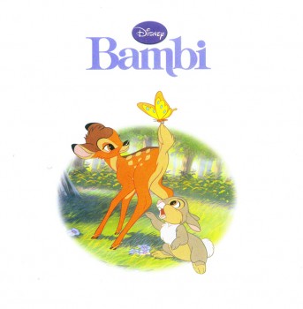
Our first interior illustration looks like it might
have been a frame grab from the film, itself.
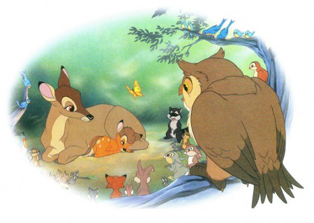
This tries hard to look like it might have come from the film.
But all the characters are moved around differently.
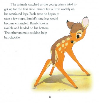
They do a nice job of layout using this iconic image against the type.
Looking at this book, I’m amazed how many well-know still images there
are in the original feature. Those old guys knew what they were doing.
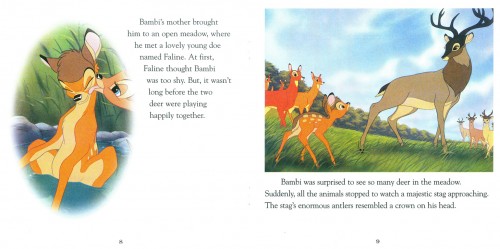
Here are a couple of double page spreads. I like the way they
handle them in these books. You can see that there is a plan.
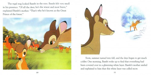
By now, the illustrations look more like Bambi 2 than the original.
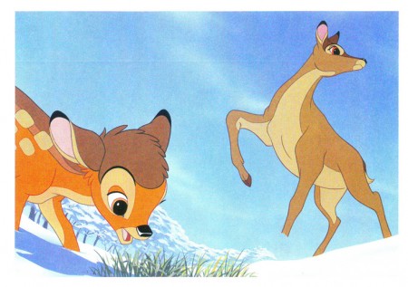
The characters were obviously done on separate levels. Notice the
mother’s leg doesn’t match the background. She’s out of place.
Something you might have seen back in the days with the use of cels.
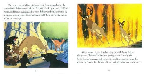
Two pages covers the climax of the film, Faline’s encounter
with the dogs and the fire rates one illustration.
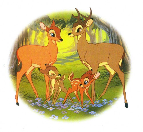
The final illustration takes us into “Bambi’s Children” and
has nothing to do with the original film, anymore.
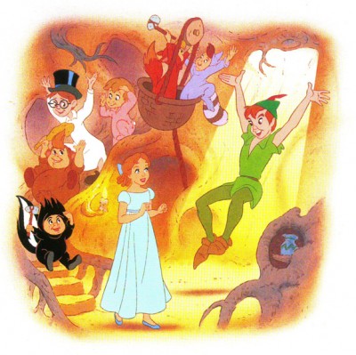
Peter Pan
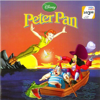
Peter Pan gets off to a bad start with a RED cover
and an action illustration. Not quite the film.
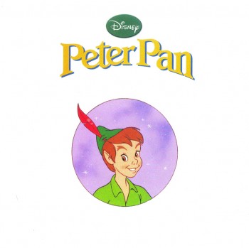
Get to the title page, and Peter is WAY off model.
Oh well.
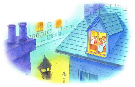
When I think of that beautiful opening shot in the film, it isn’t
quite this. I’m afraid, the Bambi book will be the best of the lot.
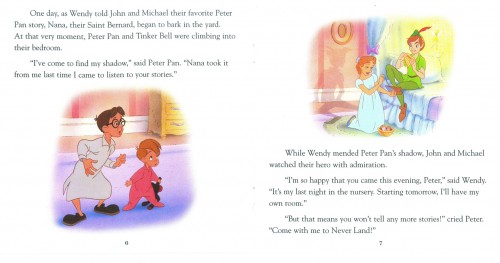
The double-page spreads do still play a bit with the form.
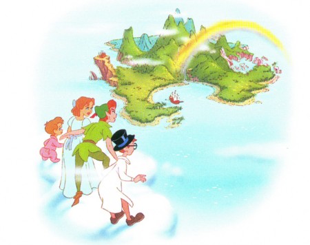
Not much magic left in this Neverland.
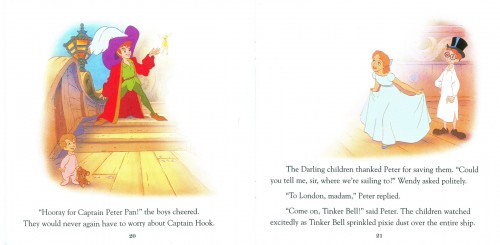
Most of the book is done in Long Shots. I’d say that’s
not the best choice for smallish illustrations. And the
airbrushed white is too opaque to work as a border; it
gets to look like a virus in the air.
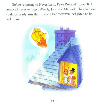
The book is too much on the red side. Everything here is
violet and yellow. Not quite the colors invoked by the
orinal designers.
101 Dalmatians
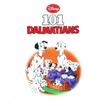
The title page makes for a good composition with bad colors.
The technique, using gouache starts to peek through.
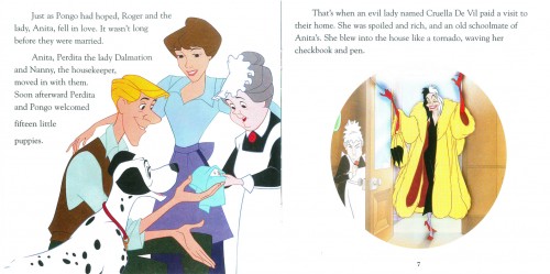
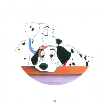
They’ve captured the pose and lost the film.
Where’s that beautiful cut-glass rose in the door?
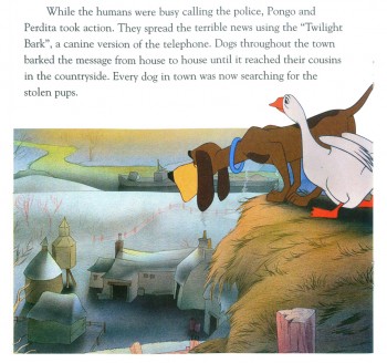
Too bad they’ve ignored the wonderful background styling
of Ken Anderson and the painting of Walt Peregoy.
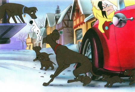
A lot of action. Not a bad image though Cruella’s been simplified.
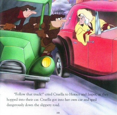
We’ve ignored the great design of the film and have gone to “storybook 2009″.
(The books were done in 2009.)
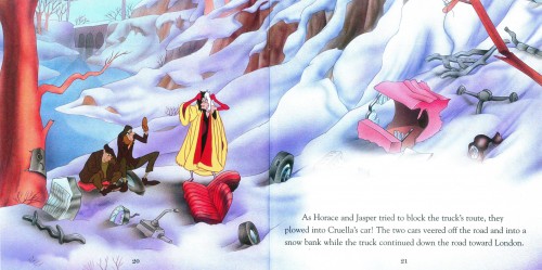
The two page spread makes use of its format, I have to say that.
All in all, I’d have to say it’s probably not a bad deal for parents looking for cheap books to entertain their children. The Bambi book holds up nicely. Peter Pan wastes a great story and 101 Dalmatians works hard to reduce their story into a small book you’d buy in a drug store.
The art and delicacy of the Little Golden Books is gone. Take a look at this, or this, or this. They all varied wildly from the film, but with a sense of originality and design. These three Walgreen books all try doggedly to resemble the film while losing the artistry in the book.
Animation &Animation Artifacts &Disney 23 Mar 2011 07:18 am
Kahl’s Llama – part 2
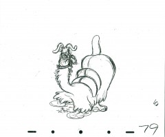
- This is the second part of the Milt Kahl dancing Llama from Saludos Amigos. It’s a wonderfully comic scene as the llama tries to dance to the poor flute playing of Donald Duck.
Thanks to John Canemaker for the use of the scene to post.
As with all such series, I start with the final drawing from last week’s post.
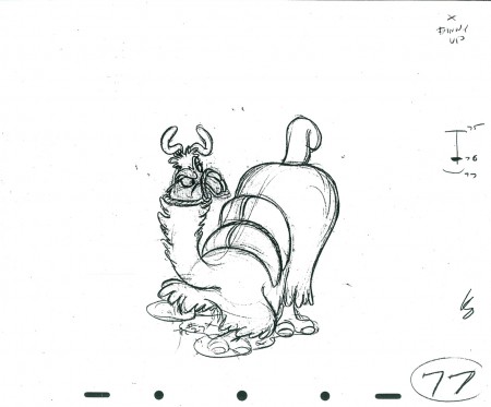 77
77
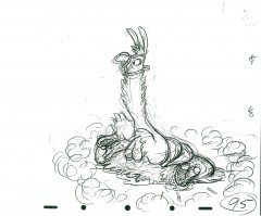 95
95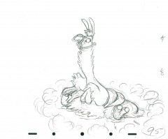 95cu
95cu
The rough and one cleaned up – a bit
The following is a QT of this part of the scene with all the drawings posted here.
Bill Peckmann &Books &Peet 22 Mar 2011 07:48 am
Peet’s Capyboppy – Part 3
- Continuing my posting the fine illustrations by Bill Peet for his book, Capyboppy we go to the third part. As I’ve written with the first two parts, I’m not including Bill Peet’s text; I prefer just to focus on his illustrations. However, I do synthesize the story so that the illustrations make sense.
So, here are those illustrations which Bill Peckmann scanned from his copy of the book:
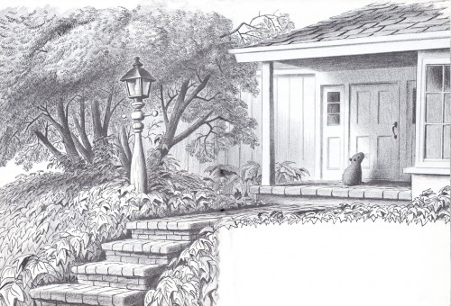 1
1Capy sat on the front porch waiting for us to let him in.
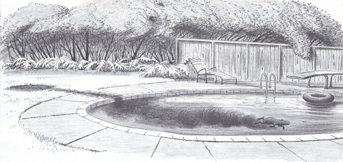 2
2
He got into the habit of rolling in the mud and
getting into the pool to clean off. This made
the pool a dirty brown color. We solved this
problem by putting an old inner tube onto the
mudwallow, which Capy grew interested in.
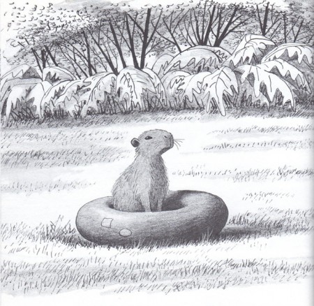 3
3
Capy settled into the inner tube and was irritated
that he couldn’t get to his mudwallow.
 4
4
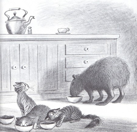
He was getting to be headstrong.
He ate more and grew bigger.
 5
5
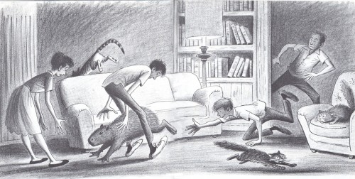
Capy still rested on the sofa in evenings, however he started to get smart.
When he knew it was bedtime, he’d jump onto the ground and raced down
the hall. Just when we’d cornered him and were about to catch him,
he’d slip our grasp.
 6
6
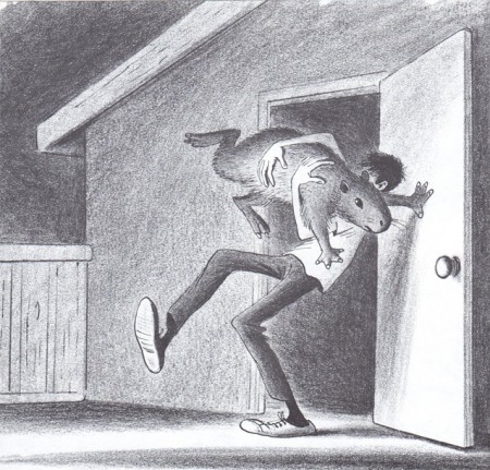
Even when we caught him, he was a handful
kicking, scratching and tossing about.
 7
7
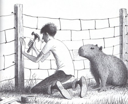
Bill helped build a pen to safely lace him in, and then
our son left to go on a month-long trip to Mexico.
 8
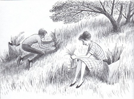
8
We used fresh grass that was gathered on the hill
to lure Cappy back into his pen.
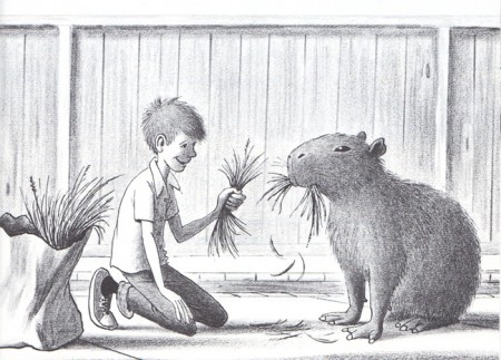 9
9
One day we allowed him to eat more than a handful.
A young friend, Tommy, kept feeding Cappy who finally
jumped at Tommy and scratched him on the head.
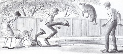 10
10
Tommy screamed and shouted and Capy lept into the pool and
settled on the bottom. Tommy was taken to the hospital and
I went to keep an eye on Cappy.
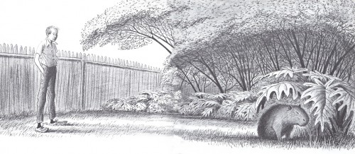 11
11
Cappy had settled in the bushes not moving. I wondered what
had caused his sudden anger, but wondered if it weren’t sudden.
Maybe he’d been building up his resentment of humans. He was a
sensitive animal. Perhaps, in some way he thought he was being
punished. Tommy returned from the hospital and
I turned to find out what news they had.
Again, many thanks to Bill Peckmann for scanning the book.
