Monthly ArchiveJune 2010
Animation &Animation Artifacts &Disney 30 Jun 2010 07:58 am
P&W-Kimball Scene – 3
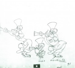
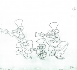
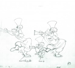
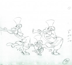
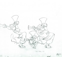
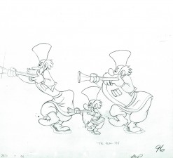
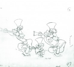
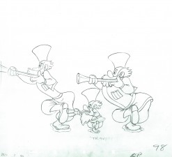
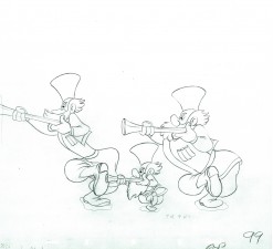
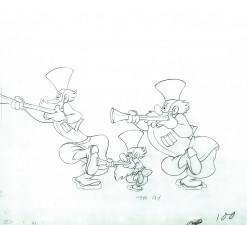
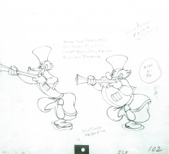
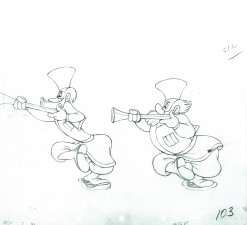
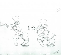
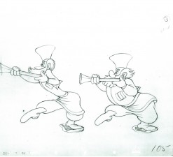
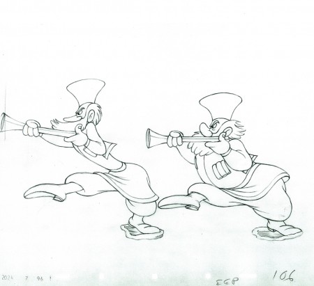
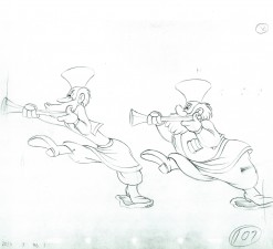
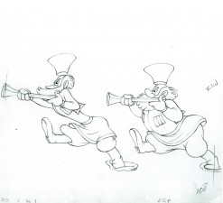
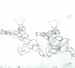
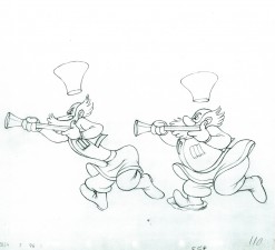
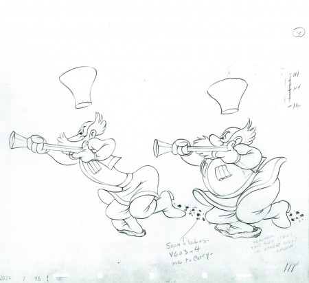
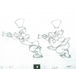
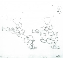
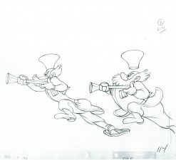
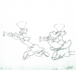
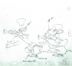
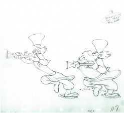
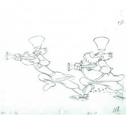
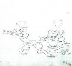
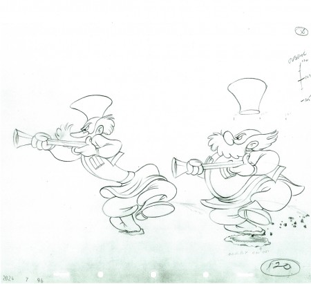
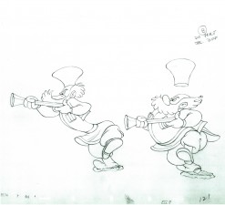
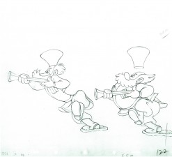
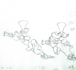
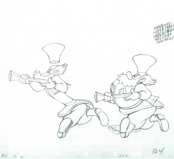
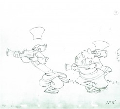
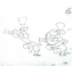
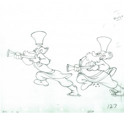
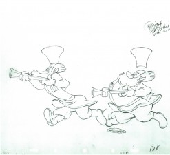
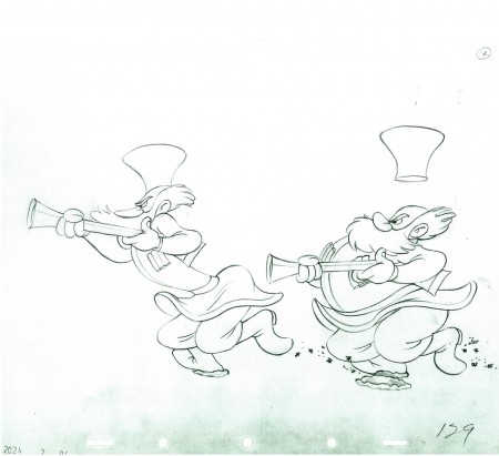
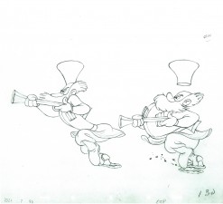
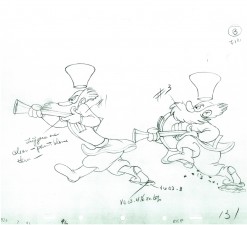
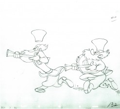
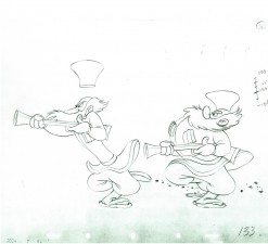
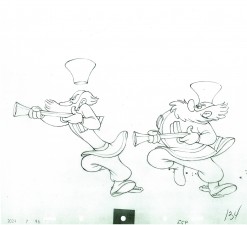
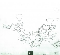
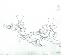
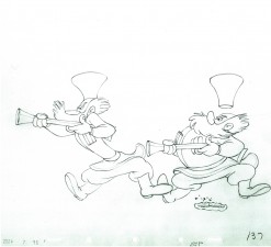
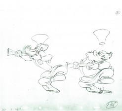
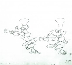
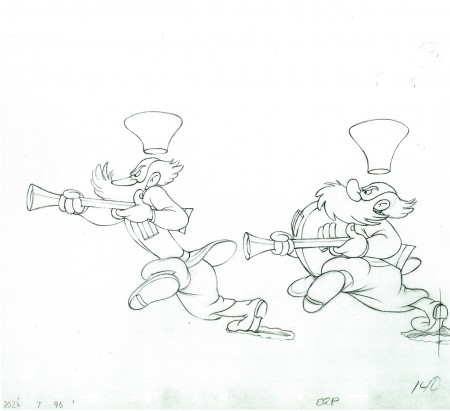
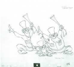
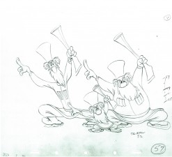
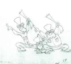
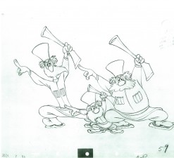
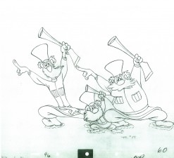
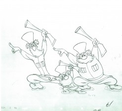
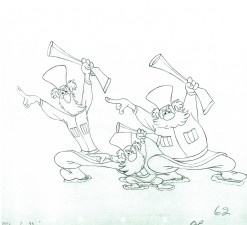
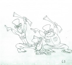
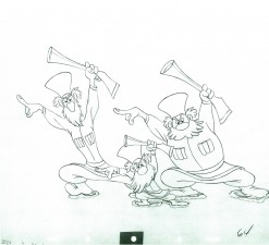
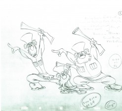
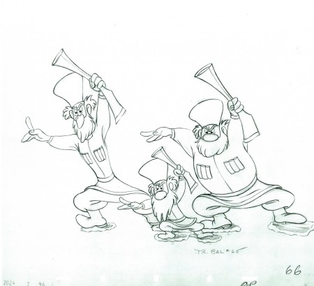
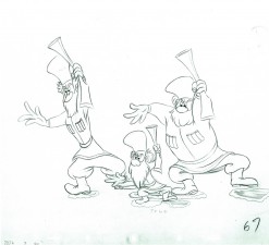
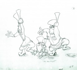
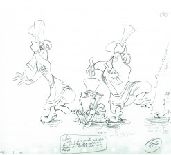
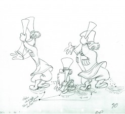
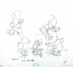
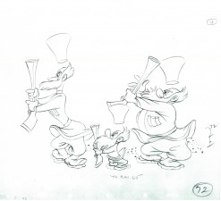
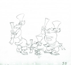
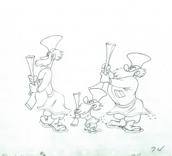
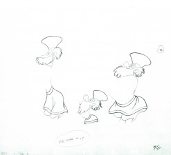
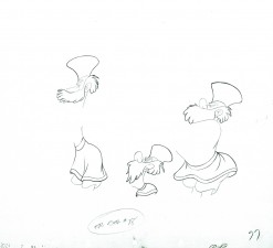
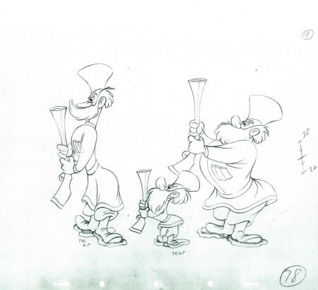
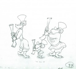
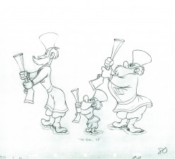
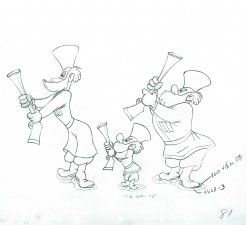
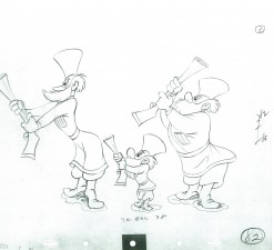
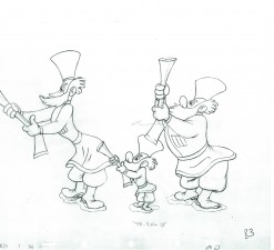
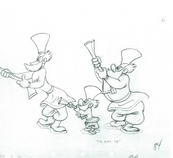
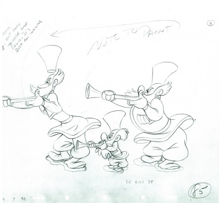
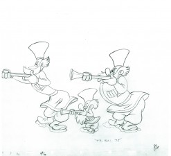
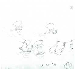
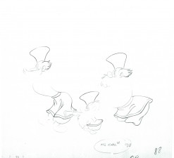
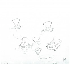
- Back to the running hunters in the third installment of the Peter and the Wolf scene animated by Ward Kimball. This animation, like much of Kimball’s work is very free, loose and fun. It’s been a trip just scanning through each one of these drawings. Unfortunately, they’re the assistant’s work and not Kimball’s, so some of the drawing is a bit “off” and I doubt that’s Kimball’s fault. Though he obviously approved it.
Many thanks to John Canemaker for the loan of the scene so that I could share it with you.
As with all other such posts, I start with the last drawing from the last post.
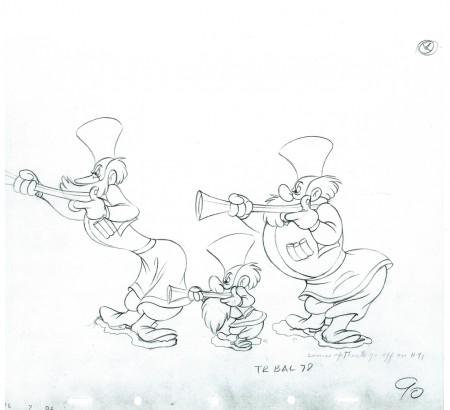 90
90
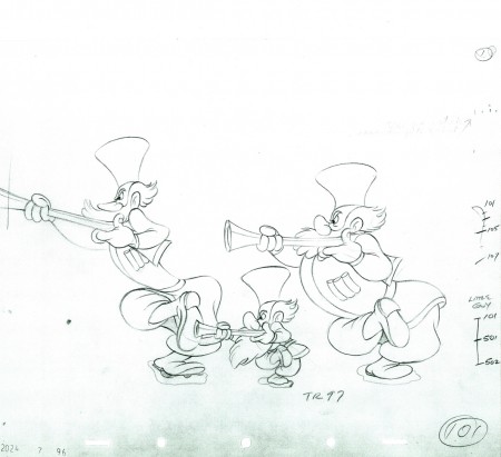 101
101
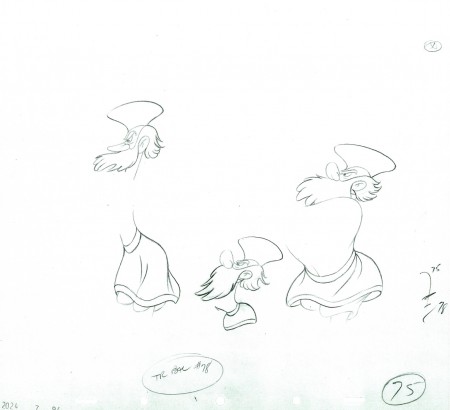
Note that this is last drawing to include all three hunters.
From this point on the little guy moves to his own level.
The following QT movie represents all the drawings posted to date.
I exposed all drawings on ones.
Right side to watch single frame.
Articles on Animation &Hubley &Independent Animation 29 Jun 2010 07:46 am
Traditional Animation Transformed
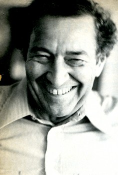
- Mike Barrier wrote an excellent article on the Hubleys for the 1977 Millimeter Magazine animation issue. Short and concise, it really put their careers and their work into fine focus. The magazine was released in February 1977, just prior to John’s death, February 27th of that year.
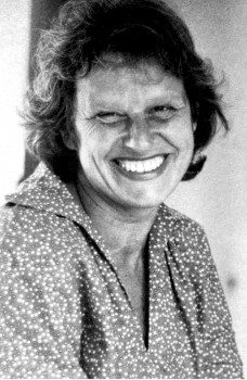
With Mike’s consent, and my grateful thanks, I’m posting it here. (I haven’t given enough attention to John and Faith lately.)
Traditional Animation
Transformed
by Mike Barrier
For more than 20 years, John and Faith Hubley have been hacking an idiosyncratic path through the jungle of post-war animation. Temperamentally — one might almost say ideologically — they are avant-garde, but they have little in common with the frauds and bores who have appropriated that label for themselves; you will not find their names in the index for the new book Experimental Animation. They have firmly and frequently turned their backs on the animation tradition rooted in Walt Disney’s cartoons — yet their films are linked to that tradition in various and subtle ways. The Hubleys have made films for television, but of all the people who have worked in that medium, they would seem the least likely to work on an animated special that was in any way conventional. However, they have now turned their hands to a TV special based on a comic strip.
Neither the comic strip nor the Hubley’s method of transferring it to the small screen are conventional, however. The comic strip is “Doonesbury,” and the Hubleys are making the special in close collaboration with Garry Trudeau, the strip’s artist-author. The storyboards are a mixture of Hubley and Trudeau drawings, and Hubley says that he, Faith and Trudeau cast votes of equal weight when decisions are made on the story. The special will be on NBC, probably in either the spring or early summer of 1977.
Trudeau and the Hubleys are not strangers; they met in 1968, when Trudeau was a student at Yale and the Hubleys were teaching their first classes in a course called “The Visualization of Abstract Concepts.” Animation courses are common now on U.S. campuses, but the Hubleys’ course is markedly different from most others. The students are not taught how to animate; instead, they are taught to think in certain ways. In effect, they are encouraged to devise animatable symbols for abstract ideas. The ideas generated in the course are converted into animated films later by the students as well as the Hubleys and their staff. Voyage to Next — in which nationalism is represented by boxes filled with people, floating aimlessly on the stream of history – went through the Yales class process as did Cockaboody and EVERYBODY RIDES THE CAROUSEL, a feature-length film, based on the writings of Erik Erikson, that was shown last fall on CBS.
Despite its origins in Yale’s rarefied atmosphere, the “Doonesbury” special will be aimed at a larger audience than the Hubleys have ever sought before (except in the TV commercials they used to make). It is, unavoidably, a highly commercial project, and so, filled with pitfalls for two filmmakers who have steadfastly turned their backs on mass taste.
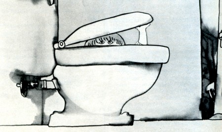
Cockaboody, a tender and sensitive commentary on childhood.
John Hubley ventured into the world of big money and high-powered entertainment in August 1975, when he became the director of an animated version of WATERSHIP DOWN. He was discharged from that job a year later, after sharp disagreements with the producer, Martin Rosen, over creative and production control of the film. Hubley had spent half of the 12 months he worked on the film in England, and half in the U.S., working with both American and British crews. (Bill Littlejohn and Phil Duncan were among his American animators.) Hubley’s comments about the break with Rosen are guarded, because he has filed a suit against Rosen for breach of contract; but it seems plain that Rosen wanted a more violent and emotional film than Hubley was prepared to give him.
Throughout their long collaboration, the Hubleys seem to have been happiest when they could work in an atmosphere entirely free of commercial considerations. Since they began working as a team in 1956, their work has fallen, roughly, in three categories: purely commercial films, like TV spots; sponsored films, which come equipped with fixed budgets but considerable creative leeway; and their purely personal work — Moonbird, Tender Game — which they financed with their earnings from the other kinds of films.
In all three types of films, the Hubleys have employed a dazzling variety of techniques, ranging from traditional line animation to the animation of blocks of color to the animation of cutouts. Two elements have been constant. All of their films reflect the influence of modern art — or, to be frank about it, modern art as it has been adapted and domesticated by commercial artists and designers. More important than the graphic style itself is the use to which the Hubleys have put it (and this is the second constant in their work): abolishing the traditional distinction between characters and backgrounds.
In a typical Hollywood cartoon of the ’30s or ’40s, the characters move against the backgrounds like actors working in front stage settings. The characters are composed of lines and flat, bright colors, against settings that are realistically modeled and painted in muted colors. The characters are treated as color accents; they “read” against settings that are designed to set them off.
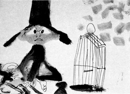
A still from Moonbird.
In most of the Hubleys’ films, no such boundary exists; characters and settings are cut from the same bolt. Movement alone sets them apart. This integration of characters and backgrounds — not any simple enthusiasm for modern art — was at the heart of the UPA studio’s rebellion against the Disney style in the middle ’40s. It was a layout man’s rebellion. The ultimate effect was to elevate design — the overall “look” of a film — at the expense of animation. Layout men, who had been subordinate to the animators at Disney’s, were now in the driver’s seat.
Two of UPA’s three original partners — Zack Schwartz and Dave Hilberman — had been Disney layout men, as John Hubley was. When Hilberman and Schwartz broke with Steve Bosustow (the third partner) in 1947, Hubley became a vice president of the studio, and its creative head. Hubley supervised the work of directors like Robert Cannon and Pete Burness, and directed a number of films himself, most notably Rooty Toot Toot (1952). The most distinctive UPA films thus bear Hubley’s stamp, more than that of any other man.
Hubley left UPA in the early ’50s; he was a victim, like many other UPA staffers, of the witch hunts by the House Committee on Un-American Activities. He formed his own TV-commercial studio, Storyboard, and then he married Faith Elliott, who had been hired as his assistant for an aborted production of Finian’s Rainbow. Faith — who had worked in live-action films before marrying John — has been his collaborator ever since; but their films are, in some ways, extensions of the work that John Hubley did at UPA, but reflect a less commercial, more personal approach. (Faith Hubley has completed two films of her own in the last two years: W.O.W. and Second Chance.)
UPA sold itself not only as an alternative to the Disney style, but as a repudiation of it. John Hubley still talks that way on occasion, and the Hubley films sometimes become pretentious and didactic. Films like The Hole (1963) and The Hat (1964) while nice to look at, suffer from windy, enervating dialogue tracks; the lessons they offer — about international boundaries and nuclear war — are too simple to bear repetition for even a few minutes. Of Men and Demons (1970), is also a “lesson” film — this time the Hubleys are concerned about the environment — but it is much better because the villains of the piece (demons representing fire, wind and rain), are ingratiating scoundrels; the characters are stronger than the ideas they are supposed to serve.
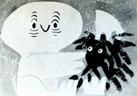
Adventures of an *.
Here we come to a paradox in the Hubley films. The best ones — the ones in which the Hubleys’ own feelings and experiences are to the fore — have a great deal in common with the Finest cartoons in the despised Disney tradition. Some of the very best Hubley films, such as Moonbird, Windy Day, Cockaboody and the opening sections of Everybody Rides the Carousel, are tender and sensitive commentaries on childhood. The graphic devices, the quicksilver metamorphoses — as children become what they imagine themselves to be, and beasts lunge from the mouths of howling babies — all serve, in the end, not to explicate ideas but to delineate character. In other words, these films are as much concerned with personality as are the best Disney films; they are very different from the Disney films to be sure, but they have sprung from the same seed, the urge to create new life.
The best Hubley films do not spit in the face of animation’s greatest tradition. Instead, they show how that tradition could be transformed and enriched, if it were still in the hands of people who cared as much about their work as the Hubleys care about theirs.
© 1977 Mike Barrier
Bill Peckmann &Disney &Illustration &Models &Rowland B. Wilson 28 Jun 2010 08:09 am
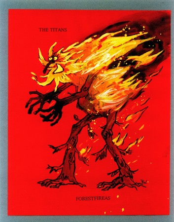
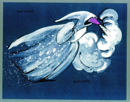
Rowland Wilson at Disney -4
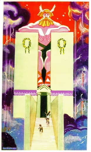
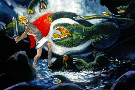
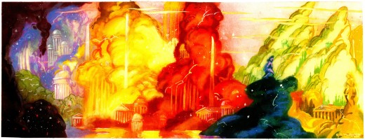
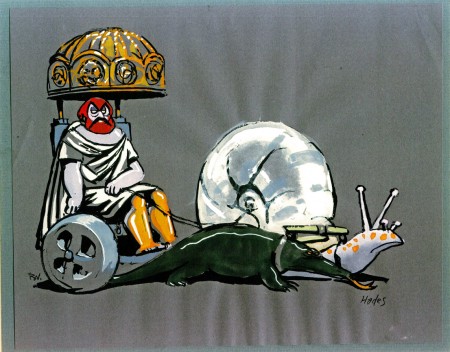
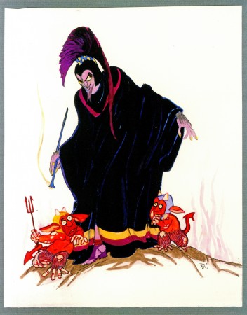
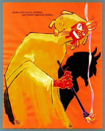
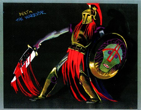
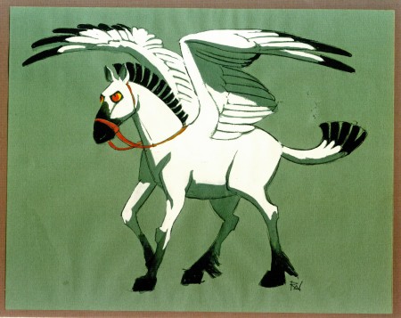
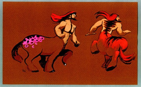
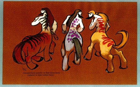
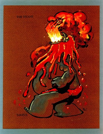
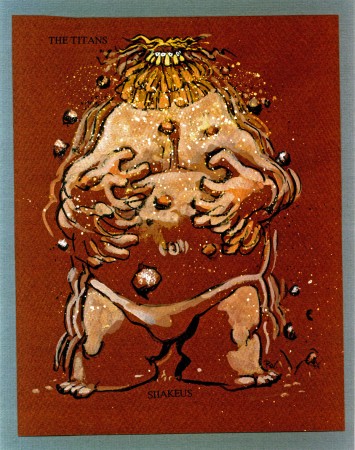
- With this post, I’m concluding the material loaned to me by Bill Peckmann of Rowland Wilson‘s sterling artwork for Hercules. I started this post last week, and you can go back there to see other character designs.
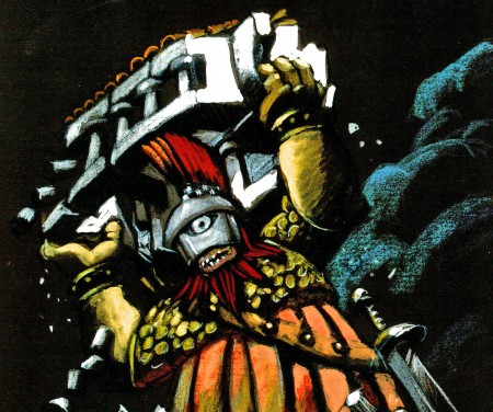
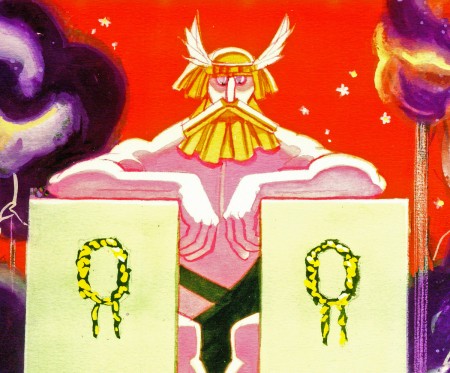
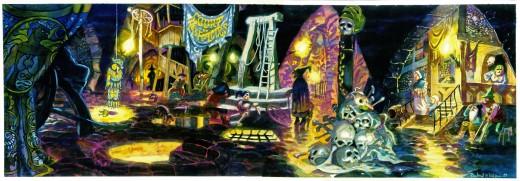
These watercolors are less character designs than they are inspirational pieces. They are inspirational. How stunning this art. I would have loved seeing something like this on the screen rather than Gerald Scarfe‘s. But that’s just me.
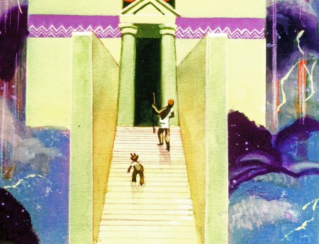
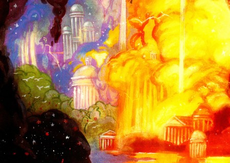
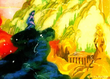
As with some of the last posts, I’m showing the larger piece (and they are large) and then going in for some tighter blowups.
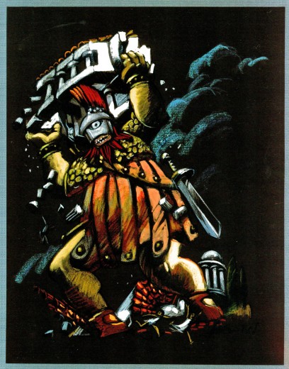 1
1(Click any image to enlarge.)
Typed beneath this image:
HERC AND PHIL ADDRESS ZEUS ON MT. OLYMPUS
The realm of the gods is in the sky. The landscape is made of sky imagery –
the classic buildings, the trees, the hills are the colors of rainbows, thunderheads,
lightning, rain, hail and stars. Trees have tops made of clouds and trunks of rain
or lightning. Buildings evolve out of mist as do the gods themselves.
The gods can be large or human scale as needed.
In mythology, Zeus changed himself into a swan, a bull, a cloud,
and even a shower of gold.
Everything is as changeable and colorful as a sunset.
THE HOME OF THE GODS.
A skyscape. Trees, mountains and waterfalls appear and dissolve away.
We can see shapes in the clouds – temples and statues.
Lightning flashes and stars gleam in unexpected places.
The whole skyscape is slowly drifting.
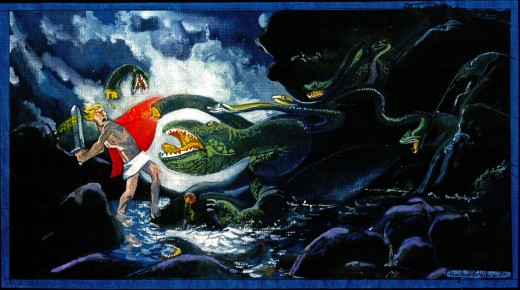
 6
6
This one looks almost as though it were painted
on black velvet – appropriately enough.
Photos 27 Jun 2010 08:29 am
New New York

It’s been hot enough in NY, that carrying your
own swimming pool could come in handy.
- Steve Fisher, who took these photos, has been part of a touring photo exhibit in New York about the NEW New York. The show has finally gotten its own website where you can see many of the pictures.
The New New York website
If you click on ‘The City We Imagined’ it will lead you to the timeline of events that you can scroll through and read more about each issue by clicking on it.
If you click on ‘The City We Built’ it will lead you to a map of the almost 1,000 photographs taken by approximately 100 volunteers. You can navigate to view the map pinpointing specific photos taken from various vantage points (clicking on them will bring up the photo and any explanatory text provided by the photographer); you can check out individual photographers, their bios and statements, or narrow the search in other ways as well, such as photos by borough, neighborhood,, project, etc.
NEW New York has its own website.
Bill Peckmann &Illustration 26 Jun 2010 08:25 am
Lawson Wood / WWII
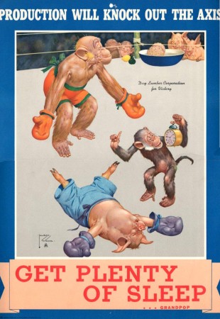
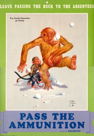
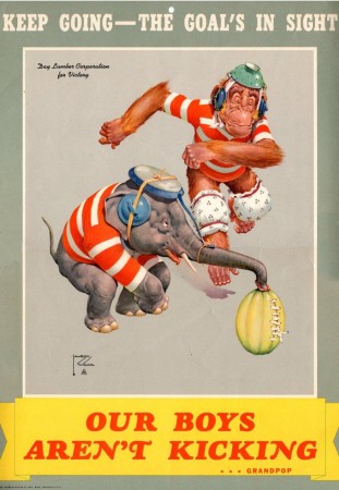
- Here are some WW 2 posters by Lawson Wood (1878-1957) which were sent me by Bill Peckmann. Wood was a stunning illustrator, and I’m glad to show these.
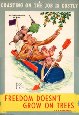 1
1(Click any image to enlarge.)
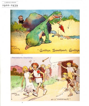
The following two pages were taken from a 1990 book: “Illustrator’s Sorcebook”.
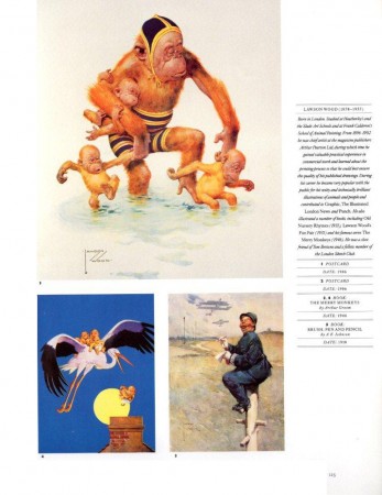 5
5
The ASIFA Hollywood Animation Archive (AHAA) has a nice post featuring monkeys as painted by Lawson.
Thanks, yet again, to Bill Peckmann for sharing.
Commentary 25 Jun 2010 06:19 am
Thoughts on TS3D
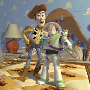 - Toy Story 3 is such a difficult film for me to write about that I am very inclined not to say much of anything more than the negative sentence I contributed last week in passing while commenting on Mike Barrier’s writing. However, negative I’ll be I feel it’s probably important, at least for my own ego, to write down my thoughts. I know most of you won’t agree with me, but that’s not really important to me. I just wanted to air my considered comments.
As such, I’ve decided to break those comments into two:
1.Things I liked about Toy Story 3.
- There’s a funny bit toward the front of the film, wherein Woody, the only toy not to be tied in a plastic bag waiting for the soon-approaching garbage truck, runs up and down several lawns in a frenzy trying to save his friends. The animation on the run is hilarious. Whoever animated it captured the lunacy of a marionette without strings running with arms and legs fluttering about in an absolute chaos.
The 3D is excellently crafted. Unlike the Dreamworks approach to 3D there are no characters or objects being thrown at the audience in a cheap attempt to create a gasp or shock moment. This is no MONSTERS VS ALIENS where the audience has to keep ducking throughout. Toy Story sets up a comfortable 3D enviironment and casually invites you in. I enjoyed it and applaud the design of that element of the film.
The voice work, as in most Pixar films, is excellent. Casting is fine, particularly Michael Keaton as the Ken doll. Tom Hanks certainly carries his character even when the animation doesn’t completely. Ned Beatty creates a very odd villain in a quietly voiced character with lots of venom but no loud shouting. It is rather sinister in the end.
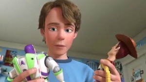 2. Things I didn’t like about Toy Story 3.
- Pixar films have gotten into something of a formula, and that formula keeps heading closer to violent, action-adventure movies as opposed to the sensitive stories they brought us early on. This story is a Rube Goldberg contraption of a film. Patchwork and obvious in its construction, the film races from one locale to another back and forth trying to keep viewers on the edge of their seat throughout. The characters, for the most part, are always in danger, and the effort is to try to keep up with the twists and turns, especially of Woody, to follow things. As I said, this has become the pattern of recent Pixar films They spend considerable time setting up their characters and then throw them and us on a roller coaster ride trying to climax to an ending. In Wall-E, there’s was a wonderfully silent opening half hour of a movie before we were shuttled to outer space where characters raced from one end of the space ship to the other, inside and out, as the audience was dragged along. Up featured a wild chase around an island which brought the characters back, in a frenzy, to fight off financial villains in their own world. The action/adventure element The Incredibles was probably the most crucial to that film since it was a film about superheroes, and we knew going in that we’d be seeing violent chase-type action.
However, Toy Story 3 is all chase from the opening to the close. Consequently, I never once cozied up to the characters as I had in the first film, and even the second. This film, to me, just features the characters and voices without giving us much character.
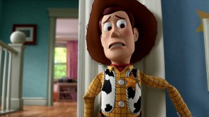 Then, continuing with the story, we’re given a climax that is so violent that parents of young children will be bothered by the horrific moments of tension that their children will have to endure getting to the end. Threatening to incinerate all of the characters comes as something of a reality that is milked for all its soppiness. (Characters waiting to be trashed form a ring holding hands so we know how much they mean to each other, but more to make us endure a longer, slower death. I found it unconscionable of the film makers, who are – let’s face it – making a children’s film for all ages. This is one film I would have given a PG-13.
I didn’t quite feel the animation was on par with Pixar’s best. The mix of quiet, sensitive movement with the popping from pose to pose style just doesn’t work for me, and I wish they would have chosen one style over another. Don’t get me wrong, technically the film is stunning, as you would expect it to be from this company, but the artistic choices weren’t always what I would have chosen.
Randy Newman’s score rambles about a bit too much for me. His score for Toy Story 1 stood out as something different for an animated feature. In Toy Story 2, he introduced his Oscar-winning song and let that tune carry the picture in a very melodic way. The score to Toy Story 3 is all in short spurts of action music, which is obviously locked into the violently short scenes featured throughout the movie. I wish he had found a way to make this feel less like an action-adventure movie.
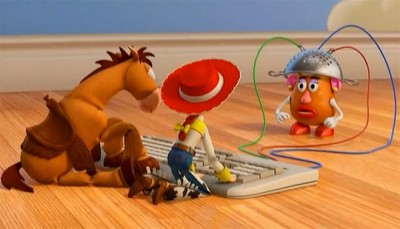
Actually, I have plenty more to say, but I think I should stop here. I didn’t have a great time at the movies watching this film. I wanted more from this magnificent studio. After their initial films, I was convinced that we’d be watching an animation company mature into something brilliant. If all they’re going to offer is an animated variant of the typical fare we’re offered from Jerry Bruckheimer, I’m not sure I see the point.
Books &Illustration 24 Jun 2010 08:41 am
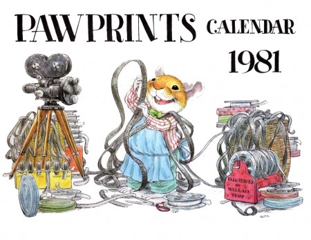
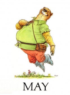
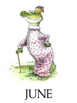
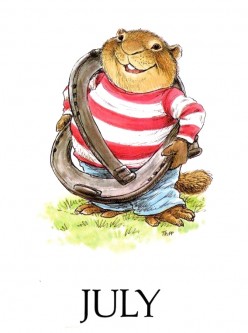
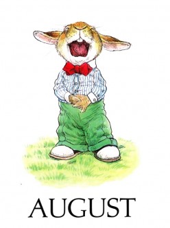
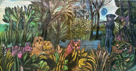
Wallace Tripp 1981
Animation &Animation Artifacts &Disney 23 Jun 2010 07:04 am
P&W-Kimball Scene – 2
- Here we have the second installment of the Peter and the Wolf scene animated by Ward Kimball. The animation is loose and wild. There are many more parts to this post before all these drawings will be put up, so keep tuned.
By the way, the animator drafts for this feature, Melody Time, are currently being posted by Hans Perk on his endlessly informative resource of a blog, A Film LA.
Many thanks to John Canemaker for the loan of the scene so that I could share it with you.
As with all other such posts, I start with the last drawing from the last post.
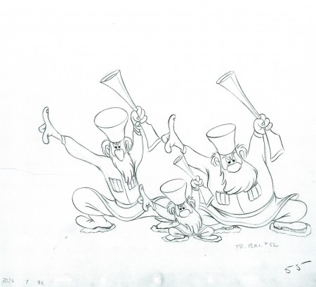 55
55
The following QT movie represents all the drawings posted to date.
I exposed all drawings on ones.
Right side to watch single frame.
Articles on Animation &Luzzati & Gianini &Puppet Animation 22 Jun 2010 07:08 am
Magic Flute
Issue #7 of ANIMAFILM included an article about the Gianini/Luzzati feature, The Magic Flute. To keep the names of these greats in the present, I’m posting the article here. Enjoy.
by Massimo Maisetti
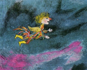 The “Magic Flute” was Mozart’s last opera, written not for the court theatre in the centre of Vienna, but for a theatre situated at the outskirts, whose manager was Schikaneder, author of the libretto. Giorgio Strehler said that it was one of the most complex and most universal works, which could be approached both from the position of the performer and the spectator. The libretto, inspired by oriental short stories, published in 1786, and by abbot Terrason’s novel, stirs up imagination, intelligence, feelings and the sense of ethics. Goethe wrote that one needed more culture to admit the values of the libretto than to deny their existence. This opinion should be thought over, as it deals with the performance staged at the outskirts in the period when to acknowledge values of a “folk” work was to oppose the accepted norms.
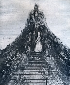 The opera, performed for the first time on September 30th, 1791, has many elements aimed at entertaining less sophisticated audience. Next to the drama of Tamino and Pamina, which is the embodiment of the eternal conflict between Right and Wrong, the Sun and Darkness, next to esoteric elements, connected with the doctrine of freemasons, which both Mozart and Schikaneder professed, there is a counterpoint – Papageno, a purely folk character from commedia dell’arte. The opera has many aspects, but the most visible ones are its fabulous and folk aspects, and next to them – metaphysical, symbolic and cosmic aspects with their Egyptian and Hellenistic associations, making one “gravitate towards one’s conscience”, according to Kirkegaard’s words. Thus to screen the “Magic Flute” was a very difficult task, as the authors of the film rejected the possibility of screening the theatre performance. It was also difficult because they had to use a chromatic and graphic language, animating drawings, where culture and experience should be combined with great sensitiveness and invention.
 Giulio Gianini and Emanuele Luzzati are among the few film-makers in the world, who can perform such a task successfully. Gianini is an animator. He is an organizer, who is able to subordinate the technique to creative requirements. His characters move like puppets against the scenography. Its colour scheme is joy, music and charm. Those colours are the invention of the scenographer Luzzati, and Gianini, the master of photography (Nastro d’Argento for best colour photography in 1952), can reproduce them using his miraculous alchemic recipes. It was not a mere chance that many years ago at the Festival in Gildenbourgh he worked on Mo/art’s operas: “Don Juan”, “Abduction from Serai”, “Cos! fan Tutte” and “Magic Flute”. “I have always wanted to make such a film since the day I worked on that scenography”, says Luzzati. Twelve years of preparations, two years of work financed by the German and Austrian television, work done with patience, skill and imagination. At least three of Gianini’s and Luzzati’s films, first films of that kind, are characterized by a perfect relation between the music and the image: “La Gazza ladra”, “L’ltaliana in Algeri” and “Pulcinella”, where the charming music happily underlines the fancy, lyrical approach and ironical reserve.
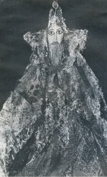
All this was expressed with the help of images in an apologue, in a stylistically sophisticated way. The above mentioned films are among the most interesting effects of using the technique of “decoup-age” in the history of animated cartoons, especially animated fairy tales. Both Gianini and Luzzati turned out to be great artists in synchronizing movements with the music of the three operas and creating three symphonies of lines and colours. Kings, soldiers, Moors, dragons and birds from those beautiful stories, created by Luzzati’s imagination come alive thanks to Gianini’s technique and move in the rhythm, forced upon them by the music and often interpret the music with the help of ballet. In this sense Rossini’s operas helped in the realization of the “Magic Flute”.
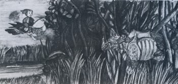 Mickey Rose, an English musicologist, made a fifty minute-long abbreviation of the opera, performed by Berlin Philharmonic, conducted by Karl Boehm, preserving its most vital elements. At the same time the graphics enriches fantastic and folk aspects with expression. It was done with charm, amazing clearness and respect for the music. When the artists use the technique of decoupage paper becomes gold, glass becomes diamond and colours become rich and luminous, like Mozart’s music. It reminds us of such great modern painters as Rouault, Chagall, Picasso, Kandinsky, as well as of oriental wall paintings, Byzantine mosaics, story, creating a naturally composed style, rich in different shades, -where a brilliant visual side interprets and completes Mozart’s wonderful music. Finally the fairy tale aspect predominates over the symbolic aspect, also due to the character of Papageno, who plays a double role: of a paper character and a live narrator (actor Marcello Bartoli). This character in multicoloured feathers reminds its famous classic ancestors. The grandson of Harlequin and Pulcinella becomes the hero of the story, determining its character. Thus the romantic story of Tamino and Pamina concentrates the philosophic sense, which is shown in the form of a fairy tale, and is meant for a demanding audience. But the simple first layer of the film pleases children, like the films “Turandot” and “L’Augellin Belverde”, screened by Gianini and Luzzati in a similar style and technique. About seventy thousand photograms with their immobile and mobile parts, three hundred drawings of the background, creative power and enthusiasm of the authors make a work of art, which is a credit to the Italian cartoon film and deserves emotions, enthusiasm and approval.
Bill Peckmann &Disney &Illustration &Layout & Design &Models 21 Jun 2010 07:30 am
Rowland Wilson at Disney – 3
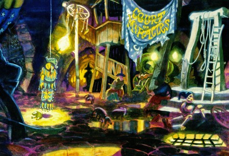
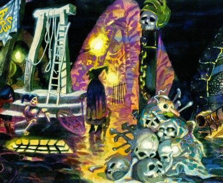
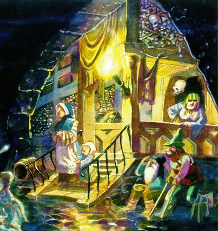
- Here’s Hercules. The last two weeks I posted some wonderful watercolor sketches, preliminary art for The Hunchback of Notre Dame from the great cartoonist, Rowland B. Wilson. (see: Part 1, Part 2)
Here for the first of two parts are some drawings by Rowland for Hercules. This entry includes character sketches for characters that developed into something completely different, or didn’t end up in the film at all.
Once again, I must express my debt of gratitude to the generosity of Bill Peckmann for lending me the art to post here. Thank you, Bill.
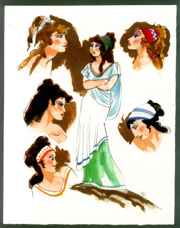 1
1Megara
Next week, the last of these beautiful watercolor sketches.
