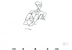
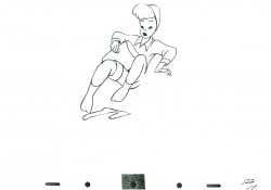
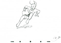
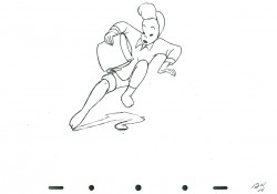
Monthly ArchiveApril 2010
Animation &Articles on Animation &Independent Animation 20 Apr 2010 08:05 am
The Picture Book Animated
I just caught up with Cartoon Brew‘s posting of the Gene Deitch directed UPA short, Howdy Doody and His Magic Hat. I’ll have a lot to write about this film soon, however I wanted to add this piece by Mr. Deitch.
Gene Deitch wrote the following article which initially appeared in The HORN BOOK, in 1978; then was reprinted in Animafilm #5, 1980. I post it again for your benefit.
The Picture Book Animated
by Gene Deitch
 Living in Prague, an ancient town so full of its own stories, I am surrounded by an instructive ambience for my kind of work: making films from books. Building Prague took a long time; every period of European architecture is represented in the city. Each era adopted the building style which conformed to the artistic expression of that particular time – Romanesque, Gothic, Renaissance, baroque, rococco, art nouveau, cubist, prefab. Just seeing all this every day helps me to take the long view and to take my time. Right outside my window, a Gothic tower stands in the courtyard. In the sixteenth century an alchemist worked there trying to change lead into gold. Now I’m here trying to avoid doing the opposite, for I start with gold. Morton Schindel of Weston Woods always sends me the very best books he can get his hands on. My job is to shine them onto a movie screen, trying to keep the image bright and the focus sharp.
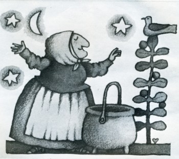
My films exist only in their relationship to the books from which they have been adapted. The goal of these films is to reinforce the child’s interest in the original book. I share Mort Schindel ‘s belief that books are still the best medium for storytelling and for the preservation of literature — a medium which is always at hand. Our aim is to illuminate each book so that a child will find his way back to it. Among my attempts to transmute gold into more gold, or at least into quicksilver, are film adaptations of “The Happy Owls” (Atheneum), “Rossie’s Walk” (Macmillan), “The Three Robbers” (Atheneum), “The Swineherd”, and “Strega Nona” (Prentice).
 Like the successive architects of Prague, I resort to a medium of expression of my own time – the motion picture. Ed and Barbara Emberley’s “Drummer Hoff” (Prentice) is an example of what I mean. Hidden among the bright colours of the outwardly lighthearted book are some interesting clues to its real depth. As the grandly uniformed soldiers strut along, intent on assembling their technological triumph – an elaborate cannon – they don’t seem to notice the flowers underfoot or their tiny observers, the birds, and the soldiers actually stepping on the flowers and shooing away the birds and thus to emphasize the meaning of the last page of the book – and of the final shot in the film – nature winning out over man and his destructive machines. Now, I don’t expect that children will absorb all of these ideas and details as such, but I do expect that when they pick up the book again (maybe because the film has now made it special for them), they will notice some things they might not have been aware of before. My hope is that they will love the book more for having seen the film.
Tomi Ungerer’s almost-over-the-edge book, “The Best of Monsieur Racine” (Farrar), is also loaded with lurking symbols, which might unnerve a children’s librarian. Tomi believes in there is much more to the book, and I tried to bring out something loving and charming that I found amidst the crazy tangle of startling images. What caught me was Monsieur Racine’s perfect serenity in his world of chaos. I felt he had just the kind of insulation which children have – carrying on and doing his own thing, immune to all of the crudity going on all around him. He has retained a childlike purity of concentration. His relationship with the beast, even when it was revealed to have been based on a gross deception, survives and continues, merely revised and adjusted to the new circumstances. This is marvellous, and I hope that the film will enrich the child’s comprehension of the book.
The greater the book, the greater our responsibility – and hazard. It may impress or dismay you that we worked on Maurice Sendak’s “Where the Wild Things Are” (Harper) “on and off and in and out” for five years before we had a film. “Wild Things” is the Mount Everest of picture books, and we had to film it simply because it was there. Once undertaken, there was no hedging. A film version would have to make specific what might be imagined in many different ways. This, incidentally, is the major risk a film-maker faces in adapting a work from another medium. There is never any one right way, but it is still necessary to have a conception and to follow it through. Maurice himself knew there was no point in making a film adaptation at all unless we could use the motion picture medium to extend some of the subtle implications of the book. He came to see me in Prague in 1969, and we had some long walks through old and dark corners of the town. We both wanted a magical film, and he left me some fascinating hints to work with: “In this story everything is Max… As for the music, think of “Deep Purple”.
Well, the old song “Deep Purple” stirred memories for me, too. Like Maurice, I was a child of the thirties. I began to see the roots of musical and sound devices which might suggest the distance between Max and his parents, who ware probably also children of the thirties. After all, why is Max “making mischief of his parents”. But where are they? Unseen in the book, I imagined they were probably in the next room having a party or (in today’s terms) watching TV. Anyway, they were not with Max. So I came to the notion of using that muffled, bland music of the 1930s, the sound of applause, the snatch of a TV comic’s joke (which just happens to be cogent), and so on. The music itself expressed the distance between Max and his parents, and with progressive distortion it could also express Max’s growing rage and journey into fantasy.
I wanted all of the sounds to be within Max’s home experience. So to create the “Wild Things” dance rhythm, I restricted myself to domestic sounds, specifically those which might express Max’s feeling of isolation: a gas oven lighting (Mother too busy for Max); a door slam (he was shut in or out); a car starting (Father going off to work); a baby crying (competition). All of these sounds repeated over and over on a tape loop, were used to heat up the music, which I made weird simply by spinning the record with my finger and letting the sound reverberate in my tape recorders.
Viewing any of our films should also indicate that we strive always fot the result of “the picture book projected”. We go to such great lengths to capture the graphic look of each book that viewers might assume they are seeing the actual book on the screen. In fact, though, we have never used any of the book illustrations. The technical processes of our medium require that we re-create every drawing and painting in terms of motion and film-frame composition, and a film’s wider scope often calls for scenes or additional artwork not found in the book at all. We must actually absorb the artists’ own styles in redeveloping the drawings and paintings specifically for film. In an effort to achieve absolute fidelity, we even asked Quentin Blake to send us the actual colored crayons he used for his illustrations for “Patrick” (Walck), and we used what was left of the same crayons to do our film backgrounds.
 Some books are almost scenarios for films and need virtually no adaptation; Crockett Johnson’s “Harold” series (Harper) is the perfect example. The books are so masterfully constructed that one might easily dismiss their perfection as mere simplicity. As I undertook “A Picture for Harold’s Room” and “Harold’s Fairy Tale”, Johnson warned me, “Don’t be fool by the seemingly simple!” He was right. These films were devilishly difficult to make. “Harold’s Room”, for instance, is a fascinating lesson in size relationships and perspective. To make it work on the screen, Harold had to be exactly the same size in relation to the film frame as he was to the pages of the book. Consequently, we could allow ourselves no close-up cuts nor camera moves in or out. In effect, the entire film must appear to be one continuous scene – all from the same camera position and all on a plain, smooth background tone, where no mistakes could be hidden. Any mistake at all meant that we had to start shooting all over again “from the top”.
If you would take apart a copy of “A Picture for Harold’s Room” and paste the pages together, you would see that it is based on one large drawing, which Crockett Johnson obviously worked out in advance. Of course, we had to do exactly the same thing. We made a huge drawing of Harold’s landscape and manoeuvered it under our animation camera. For the pencil layout of this we had already prepared seventy-five hundred inked and painted drawings of Harold himself following the lines of the overall landscape. As we placed these drawings over the landscape one by in reverse order, we wiped away our background painting to match each position in his room and working our way relentlessly back to the little town. Thus, beneath our camera Harold undrew his scenery. When we finished shooting, the big drawing had been completely wiped out; and only when the film was projected forward did it reappear.
Most people realize that it takes hundreds, even thousands, of drawings, representing carefully calculated phases of each action, to give the effect of animation in even the shortest film. A glance at the illustrations of “Where the Wild Things Are” indicates the formidable task. As a matter of fact, “Wild Things” required a totally new of rendering characters onto our animation cels* and a totally new way of making them move. When Maurice Sendak said of the story, “Everything is Max”, he has hoping I could find a way to show that the Wild Things were actually a fantasy expression of Max’s own mind, a projection if his anger. Maurice further envisioned them as having “slow, heavy, dream-like movements” and as being “clumsy, dumb, sluggish, heacingcreatures… not horrible”.
To produce this effect on film, and to do it in a way that would make clear the “Wild Things” status as evanescent fragments of Max’s imagination, I devised a way of photographing the phased drawings in an interweaving series of dissolves. This device, in combination with the slowed-down, wavering music and special effects, was part of our attempt to fulfill Maurice’s extravagant wish for us to “go beyond the book”. (I was later thrilled with his equally extravagant praise of the sound track.) Going “beyond the book” refers simply to the nature of the film medium and not to extending the book’s content or meaning. We endeavour only to bring out what is there or what we feel is there. “The Horn Book” review of the film concisely stated what we attempt: “recasting of one aesthetic form into another.”
This is the problematic task with every book we film. Each book has set me off in a new direction, prodding me to find a new way, a specific solution to the problem of adapting that particular book to the motion picture medium. I have no formulas. My private conceit is that without my name on them, no one could tell that all these films came from the same director. For me, my Oscar-winning cartoon “Munro” was a success when people asked if it was made by Jules Feiffer himself.
I used the word problematic. Is our work valid? The question haunts me. Why should we try to make films of picture books? Why shouldn’t the books be left to communicate in their own way? Why don’t we concentrate on developing original film stories? we do this, too, of course. I made “The Giants”, my own films, a child sees that books do have life, that they have movement and sound. We try always to leave room for the child to participate with his own imagination.
For instance, the ending of “Leopold the See-Through Crumbpicker” leads directly to the idea that the children can draw and paint their own variations for decorating the invisible cookie-eater. In “Changes, Changes” I added a box of building blocks, not actually shown in the book, thus inciting children to carry one the story, stacking up their own changes. The film “Patrick” ends just as the colourful procession heads back toward the drab village seen at the start of the film. By this time the children know what will happen there when Patrick and his full-colour fiddle arrive; but they don’t see it, so they are allowed to imagine the ensuing scene for themselves.
Patrick’s fiddle, incidentally, plays virtuoso variations on Dvorak. In “A Picture for Harold’s Room” the purple crayon draws to the music of a classical string quartet. Unadulterated Janecek, in all its Slavic richness, precedes the musical frame for “Zlateh the Goat”. Our version of Andersen’s “The Ugly Duckling” introduces children to Carl Maria von Weber. For our original scores we have gone to many lengths to provide just the right music. We needed authentic Central African music for “A Story”. My Czech wife Zdenka, who is also the production manager for our films, found antique instruments in a half-hidden ethnographic museum here as well as a curator-musician who could instruct us. A curious interplay of cultures resulted in our recording ses-ion: genuine African instruments played by Czechs, along with a recording by an African story-teller reading from a book by an American woman – for a movie for Western children being made in an eastern European studio.
The existence of our film versions, I am told, have often helped a book stay in print and increase in sales. Films are powerful but transitory, seen and suddenly gone. The book can always be read and will be even more after a child has seen it on the screen. The permanence of the printed word, however, is now being challenged. Movies, audiovisual media, and especially TV are very powerful forces. But must they destroy book reading, or can they complement it? The flood cannot be dammed, but it might be directed. We are trying to provide a channel which flows toward books rather than away from them.
*In animation production, moving figures are usually rendered onto transparent “cels”, sheets of acetate film, so that the stationary background painting can be photographed simultaneously on each film frame.
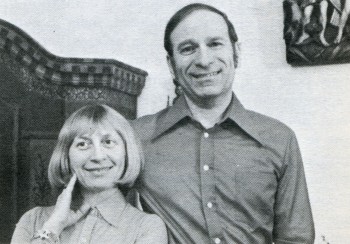
GENE DEITCH – American director living and making films (in his own studio) in Prague. During thirty four years he has directed more than thousand films and commercials and received numerous awards including the Oscar for “MUNRO” in 1959. Specializing in the adaptation of children books.
1. Gene Deitch with his Wife
2. Strega Nona
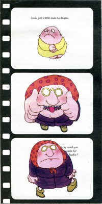
3. Smile for Auntie
Animation &Disney 19 Apr 2010 10:17 am
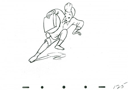
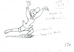
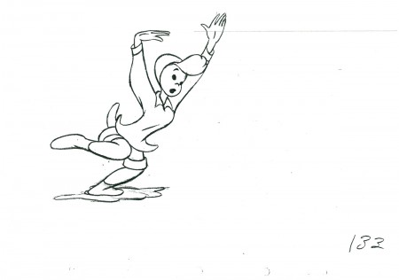
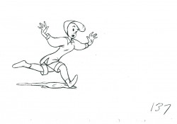
All the Cats
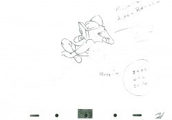
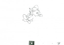
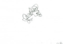
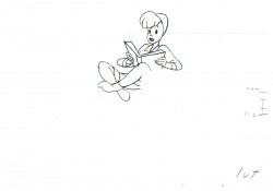
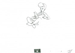
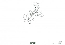
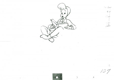
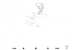
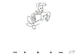
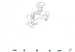
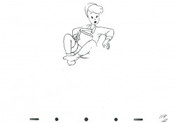
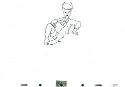
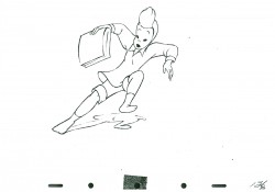
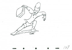
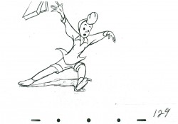
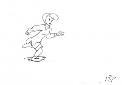
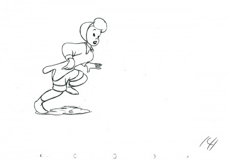
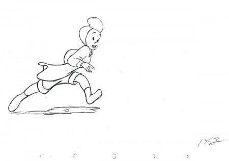
The following is the first half of the first of several connecting scenes I have which were animated by Ollie Johnston for All the Cats Join In. It’s not my favorite film, and Ollie, though a masterful animator is not my favorite.
I’ll post the second half of this next week.
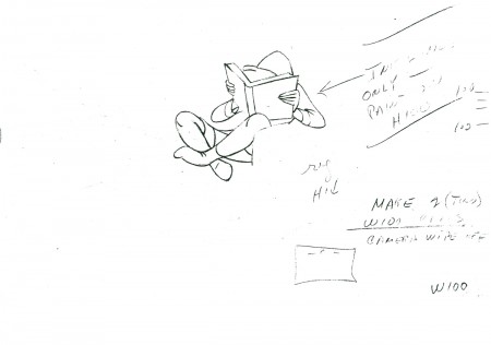 100
100
The following QT movie represents the drawings for the
enitre scene – this includes those from Part 2.
It’s exposed as per the drawing numbers would indicate.
Right side to watch single frame.
Many thanks for the loan of this scene by Lou Scarborough.
Photos &Richard Williams 18 Apr 2010 09:18 am
Raggedy Photo Sunday recap
Looking back on some of my past photo posts, I came across this odd one in November of 2006. I thought it was a good one (I love the photo featuring Judy Price), so I decided to post it again.
- Having recently pored over some of the artwork from Raggedy Ann & Andy (the NY contingent of the 1977 feature film), I wondered if I had any photos that I could post. There weren’t many that I could find quickly, but the few I did find are here.
The first two stills were taken for the John Canemaker book, “The Animated Raggedy Ann & Andy.” I think only one of the two appears in the book.
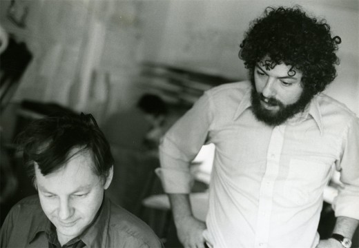
Obviously, that’s Dick Williams with me looking over his shoulder. Oddly I remember being in this position often during the film. It’s probably the first image I have of the production when I look back on it. Dick and I had a lot of conversations (about the film) with him “going” and me listening.
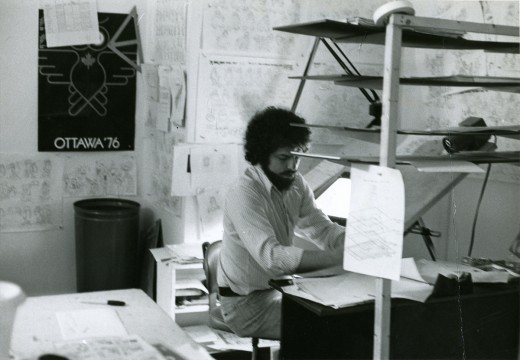
When I did actually grab time to do some drawing, this is my desk. It sat in a corner of a room – across from Jim Logan and Judy Levitow. There were about ten other assistants in my room, and there were about seven rooms filled with assistants on the floor. I had to spend time going through all of them making sure everybody was happy.
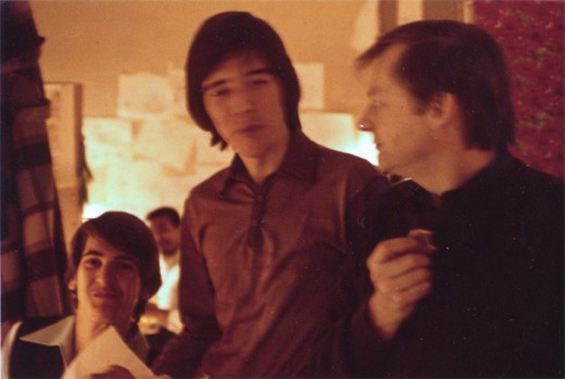
This slightly out of focus picture shows Dick Williams (R) talking with Kevin Petrilak (L) and Tom Sito. That’s Lester Pegues Jr. in the background. Boy were we young then!
These guys were in the “taffy pit,” meaning they spent most of their time assisting Emery Hawkins who animated the bulk of the sequence.
Toward the end of the film, lots of other animators got thrown into the nightmarish sequence to try to help finish it. Once Emery’s art finished, I think the heart swoops out of that section of the film.
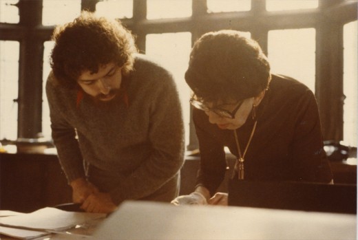
This photo isn’t from Raggedy Ann & Andy, but it just might have been. That’s the brilliant checker, Judy Price showing me the mechanics that don’t work on a scene on R.O.Blechman‘s Simple Gifts. This is the one-hour PBS special that I supervised after my Raggedy years. However, Judy was a principal on Raggedy Ann, and we spent a lot of time together.
Ida Greenberg was the Supervisor of all of Raggedy Ann’s Ink & Paint and Checking. She and I worked together on quite a few productions. I pulled her onto any films I worked on after Raggedy Ann. She was a dynamo and a good person to have backing you up.
I’m sorry I don’t have a photo of her from that period.
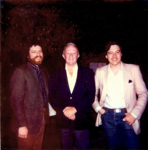
This is one of my favorite photos. Me (L), Jim Logan, Tom Sito (R). Jim was the first assistant hired after me – I’m not sure I was an assistant animator when they hired me, but I was being geared for something. The two of us built the studio up from scratch. We figured out how to get the desks, build the dividers, set up the rooms and order the equipment.
To top it all, Jim kept me laughing for the entire time I was there. I can’t think of too many others I clicked with on an animation production as I did with him. He made me look forward to going into work every day.
We frequently had lunch out, he and I, and I think this is at one of those lunches when Tom joined us. It looks to me like the chinese restaurant next door to the building on 45th Street. Often enough, Jim and I would just go there for a happy hour cocktail before leaving for the night.
I should have realized how important that period was for me and have taken more pictures. Oh well.
Bill Peckmann &Comic Art &Illustration 17 Apr 2010 10:15 am
Jack Davis tearsheets
- This just in from Bill Peckmann, an excellent piece from the great cartoonist, Jack Davis. In Bill’s words:
This . . . “is a page from Hank Harrison’s ‘the Art Of Jack Davis’ which explains Jack’s strip, and the next three are tear sheets that Jack had made up at that time. Hope the scan isn’t destroying Jack’s fine pen line.”
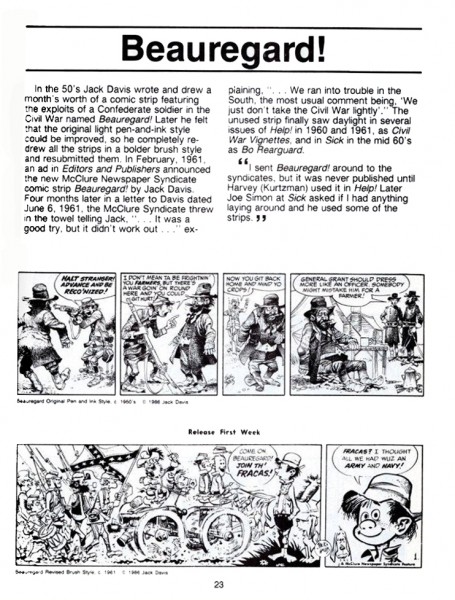
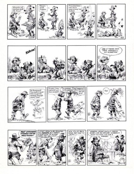
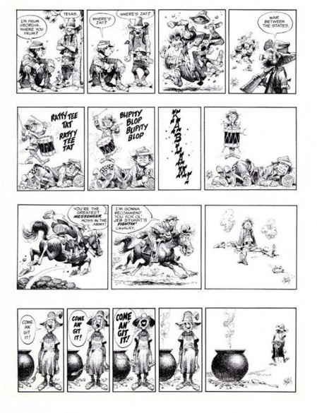
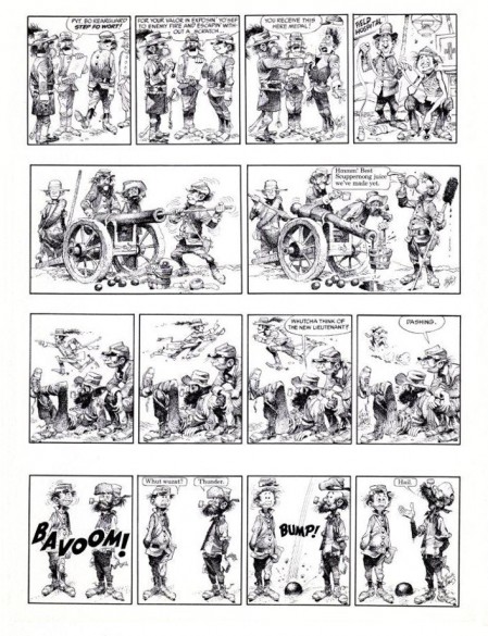
(Click any image to enlarge to a readable size.)
Bill Peckmann &Books &Illustration &Rowland B. Wilson 16 Apr 2010 10:23 am
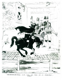
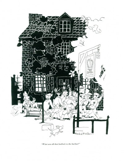
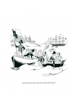
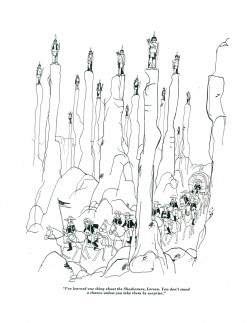
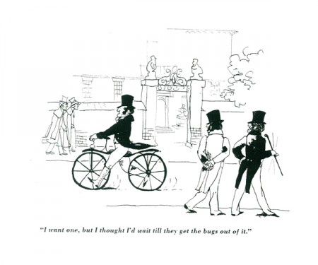
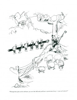
Rowland Wilson’s Whites – 2
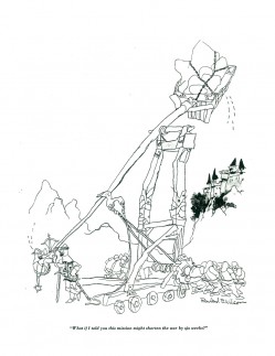
I posted part of Rowland B. Wilson‘s book, The Whites of Their Eyes, two weeks ago. (Go here to see that post.) This book was published in 1962 by Dutton and displays in B&W many of the Wilson cartoons up to that time. The display is not always glorious, but it is the only printed copy of any of his panel cartoons. Consequently, we have to be grateful for what we have.
These cartoons are xeroxed copies from Bill Peckmann‘s large collection of Rowland’s work. I’m grateful for his loan of these illustrations to post here.
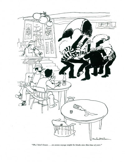
(Click any image to enlarge.)
Animation Artifacts &Bill Peckmann &Comic Art &Disney 15 Apr 2010 06:56 am
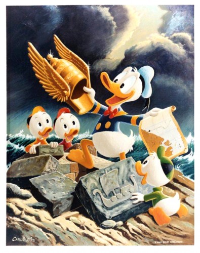
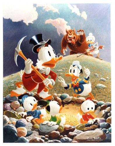
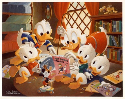
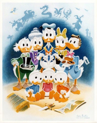
Carl Barks Duck Paintings
- When I was young I read the Carl Barks’ Donald Duck comics and the Uncle Scrooge comics and anything else the man turned out. I was religious about it and had to combat a parent who didn’t understand the importance of comic books in a young person’s life. To which end, I was on the receiving end of many a punishment when a rare Donald Duck or somesuch other comic would be found.
Oddly enough, this didn’t transfer to my adulthood where I find myself not at all interested in the oil paintings Barks did of Donald and the gang. Bill Peckmann sent me a few of these paintings, and immediately upon seeing them again, I turned my nose away but knew, just the same, that I’d be posting them. There are too many people that love these things.
So for you, the folk who love Carl Barks’ lame attempt at “art”, I surrender this post. I thank Bill Peckmann and hope you enjoy the four following paintings.
 1
1(Click any image you’d like to enlarge.)
Animation &Articles on Animation &Independent Animation &Puppet Animation 14 Apr 2010 07:41 am
Teddy Shepard interview
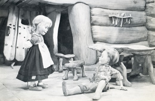
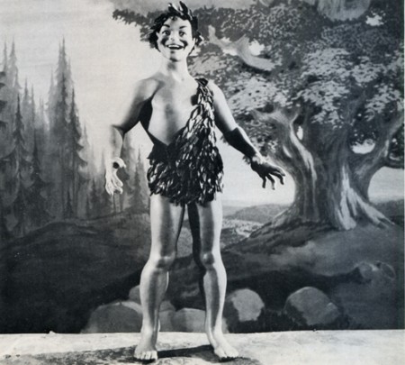
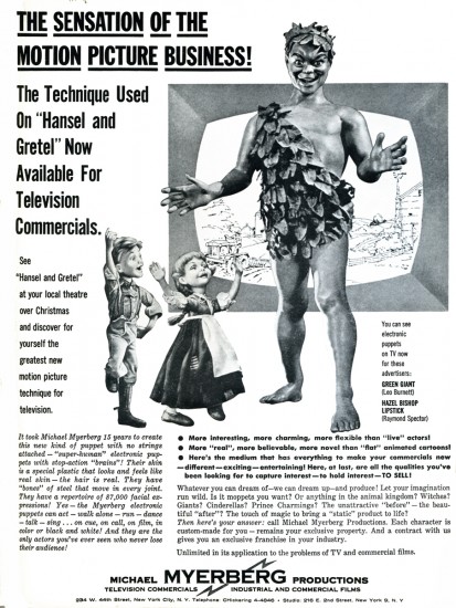
- Dipping back in the well of the Closeup Magazine from 1976. Edited by David Prestone, this magazine featured articles – mostly interviews – with 3D stop-motion animators. The focus of this particlar issue was Michael Myerberg‘s Hansel and Gretel, an animated puppet feature done in 1954.
Teddy Shepard
Born in New York, Ms. Shepard became a drama major in college, and appeared in several summer stock and off-Broadway productions. It was while making the rounds of theatrical agencies in search of work that she became aware of the interviews Michael Myerberg Productions was conducting for animators. After working on HANSEL AND GRETEL, she spent some time with the Suzari marionettes, graduating to the HOWDY DOODY television show (where she originated the character of Dilly-Dally, and was a stand-in for some time as the title puppet’s manipulator), and has, lastly, been associated with the Pickwick Puppet Theater for the past several years. It was as a member of this company that she confronted the world of rock and roll music eye-to-eye, when she appeared on Broadway at the Uris Theater with the British group. Mott the Hoople. (She manipulated a Sancho Panza puppet in the song “Marionette.”)
TS; Yes, I was elected to appear witn the one big head that had been built, on a couple of television shows (TV was all live at the time) shortly after the movie had opened. I was to demonstrate how the film had been made using the heads, but we had the fake computer setup there also, to give the impression that the head was electrically operated—when it was really worked manually. We still had to keep that a big secret!
CU: Being a novice to the stop-motion process, with only a three-week training period behind you didn’t you find this form of animation slow and tedious?
TS: No, I found the more involved I got and the more intricate the movements got, that it was anything but tedious. Some time after the film was completed I worked on a few commercials for cosmetics—Hazel Bishop lipstick, and I think Myerberg was involved with these, as we filmed them in the five-story building on East Second Street he had bought. I believe we utilized the GRETEL puppet in them . . .
Speaking of that three-week training period, I remember I was petrified when it was over—I didn’t think I was ready to go immediately to work on the film, but they said, “Go onl You’re ready!” I and another person being trained acted out little scenes with some of the puppets. Animating them walking, and doing various movements of the hands . . . The scenes would be filmed and then played back for us so we could spot our mistakes. Since money was low they only filmed a few tests for each person.
CU: How did the tests turn out?
TS: Believe it or not, they came out very well! Surprisingly so! The idea was not to be jerky, but to have smooth action, moving the puppets in small increments. When doing the actual animation for the film, we would all act out the various scenes first, in front of a mirror.
CU; Were any animators assigned to do a certain character and that character only, or did you all take turns with the various figures?
TS: Since we had two crews working, when you came in to work your next shift you would carry on from where the previous people left off, no matter which figures were in the scene. It turned out that generally I stayed with GRETEL, or the mother—I did her a great deal of the time, and I did the witch one day too. You know, we had these awful stereotypes in those days … the women puppeteers would animate the female figures and the men did the males, which is ridiculous!
CU: That’s sort of a “too many cooks spoiling the broth” situation, though. Each character should really have its own “personality ” – a way of walking and moving that is that one figure’s alone, and is given to that character by one animator alone. If you recall the feature YELLOW SUBMARINE, there’s a scene where the four eel-animated Beatles are walking down a long flight of stairs, and each Beatlo has been given a very distinctive walk that’s carried throughout the entire film. You can tell which Beatle is in a scene without seeing his face!
TS: Yes. As a matter of fact, HANSEL had a definite little personality, and he would have to be done by someone who was more familiar with that kind of boyish movement, i recall, having worked with GRETEL so much, that after a while she started getting “tacky” looking and they had to have another figure of her made. They were having difficulty making her look the same as the previous model.
One strange piece of animation I and a few others worked on was a “burst of light” effect we were trying to achieve. We had 6,000 jewels on the ground on a piece of black velvet, and each jewel had to be moved separately for an effect that lasted only a few seconds on the screen. We’d be down on our hands and knees moving the gems, and people would walk by and burst out laughing!
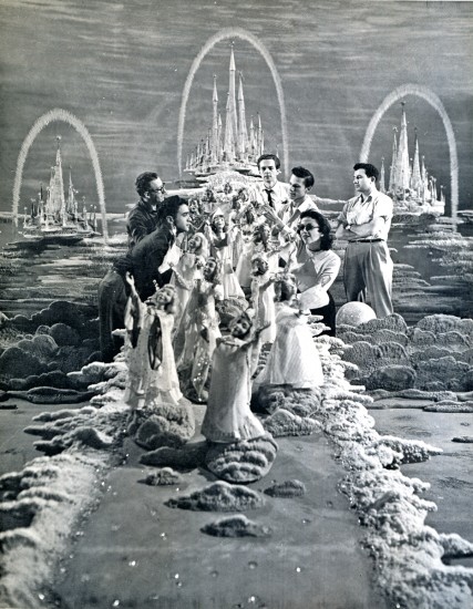
Animating the descent of the agels from their fairy kingdom.
Pictured are (clockwise) Danny Diamond, Kermit Love, Joe Horstman,
Sky Highchief, Teddy Shepard, and outside of circle (arms
crossed) Roger Caras.
CU: What’s your opinion of the final film? Do you think it would have turned out better if you had been given more time?
TS: Certainly. There was such a rush on towards the end, money was running out and we were working so hard to finish … we were all really learning the process, too. When I first saw the finished movie back in 1954, I was initially disappointed, but I think it’s held up quite well with the passage of time. And those figures were so beautiful . . . you could get so many intricate moves with them, more so than any other stop-motion models I’ve ever seen!
Other animated commercials produced by Michael Myerberg Productions during the early 1950′s (commercials whose profits were immediately used to forward production of the HANSEL AND GRETEL feature) were several for Ivory Soap Flakes (for which a mother and baby were constructed) and Ehler’s Coffee (a butler). Sometimes finished figures were built specifically to interest potential new customers. (A Kool Cigarette Penguin, and a Lil Abner model were examples of this policy.) When all plans for future stop-motion animation projects were finally abandoned, Myerberg returned to the role of theater producer for the Broadway stage.
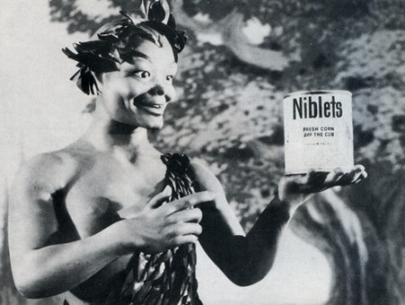
Michael Myerberg utilized the KINEMINS technique on television commercials
as well as feature films. ABOVE AND BELOW: A GREEN GIANT figure
sculpted by James Summers, circa 1953. A Speedy Alka-Seltzer model
was also sculpted, but never used. Monetary problems continually plagued
Myeiberg, forcing many of his innovative ideas to remain on the drawing board.
ARE ANY OF THE ORIGINAL KINEMINS STILL IN EXISTENCE?
Tragically, no! In late 1955, vandals broke into the East Second Street studio and wrecked havoc among the stop-motion models and scenery which were in storage there. Most of the figurines were smashed beyond repair, but, hoping that one or two models might have been carried away intact, Myerberg notified the local police station, telling them that the KINEMINS skin was highly toxic to human beings. Unfortunately, this story brought no results.
Commentary &Layout & Design &Theater 13 Apr 2010 05:47 am
Sondheim on Sondheim
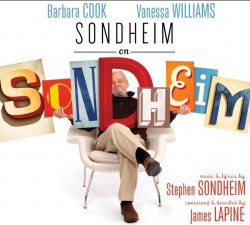 - This past weekend I saw a new Broadway show produced by The Roundabout Theater Company, playing at Studio 54. Sondheim on Sondheim is a show which revisits all of Stephen Sondheim’s lengthy and brilliant career in the theater.
Barbara Cook, Vanessa Williams and Tom Wopat lead a cast of eight who perform work from the Sondheim catalogue of songs, while cascading through the history of the man and, as a result, the history of modern theater – post Rodgers and Hammerstein.
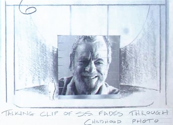
The set for this is a modernist construction by designer Beowulf Borritt. If you ask me, this extraordinary design is a brilliant turn for theater. There’s a construction of 35 multiple screens that tie together or in parts projecting film, video, slides. Stephen Sondheim is a participant in the show in that he’s always there in some projection talking about the shows, his career, his cocreators and producers. The highlight of the show, for me, was the end where Sondheim plays “Anyone Can Whistle” on the piano, and the cast sings to this. Simple and very emotional.
Through a lot of searching I was able to locate some of his original watercolors on line and thought I’d show some of these. A couple came from a slide program on the NYTimes which spoke about the use of projections in theater designs. This has fascinated me since my work on Woman of the Year, projecting an animated character behind the actor onto a 43 foot screen. (The animation work on Sunday in the Park with George – also a Roundabout Production at Studio 54 – was a projection miracle, though the rest of that recent production left me a bit cold.)
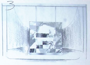
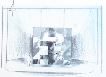
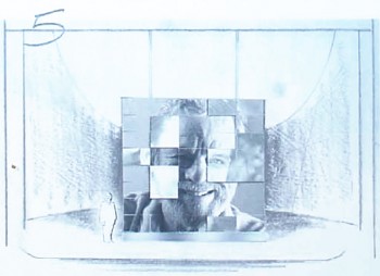
Let’s start with a short storyboard sequence which shows Sondheim aging.
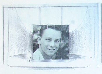 1
1The sequence begins with a young Stephen Sondheim.
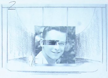 2
2
Slowly, and musically the image transforms . . .
The set . . .
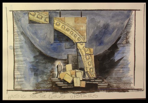
The set is a somewhat abstract construction that utilizes many
screens of digital projections both video and slide.
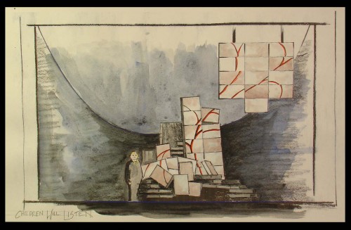
You can see how the parts shape shift even though
the projections continue on the parts.
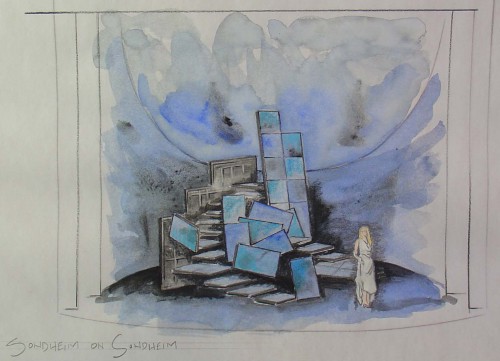
Lighting by designer Ken Billington is also brilliantly part of this set.
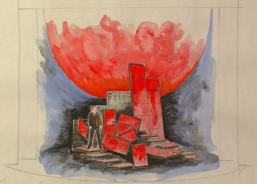
All of the parts – lighting, set, projections – all act as one.
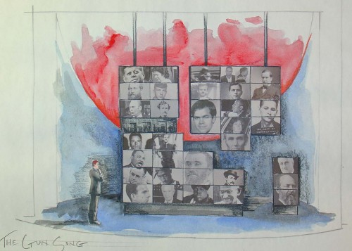
The history of the Presidency serves as a backdrop for the ASSASSINS number.
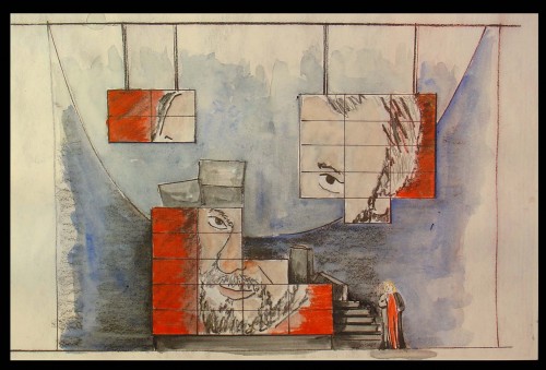
Ultimately, the portrait of Sondheim comes together.
All sketches © 2010 Beowulf Boritt
These drawings and watercolors give an indication of what the set looks like, but they can’t relay the brilliance of the device. It’s magnificently used, and the photos, video and animation on the screens is quite often brilliant. I can’t begin to capture the essence of it, but I can tell you it’s a highlight in theater for me this year.
The orchestrations for this show are by Michael Starobin, and they are just as wonderful as anything else he’s done. The miniscule orchestra never sounds it, and this should show others on Broadway how to do it. It was my pleasure to work with Michael on a number of films he scored for me. I always felt privileged to have him there and excited as any note of music came in for those many films (which included Lyle Lyle Crocodile, Ira Sleeps Over, and Poky Little Puppy’s First Christmas.)
This show is excellent, and it is even more superb if, like me, you’re a Sondheim devotee. You couldn’t ask for more from theater – except perhaps a return to some of those original productions as they sit and grow in my memory. Elaine Stritch singing Ladies Who Lunch, Glynis Johns singing Send in the Clowns, Mako and others singing Someone in a Tree, Mandy Patinkin singing Finishing the Hat – There are just too many others to keep mentioning.
However, I do have to say that in several cases, arrangements and production of some of the songs performed in this show are better than the original versions. The cast of eight sounds brilliant and easily outperforms the British cast that did Sunday in the Park recently at this same theater. Vanessa Williams is truly a star, you can’t take your eyes off of her, yet she sings with the ensemble.
If you have any affinity for Sondheim, go to see this show for a brilliant performance of many of his songs as well as a near-perfect cast and a magnificent set.
Animation &Disney 12 Apr 2010 08:09 am
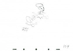
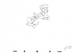
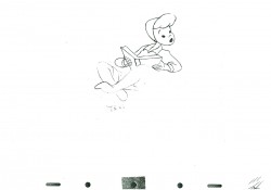
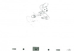
Slue Foot Sue – 2
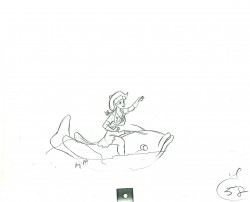
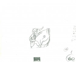
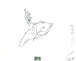
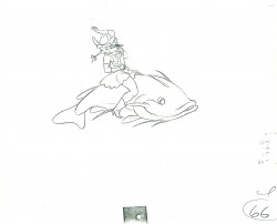
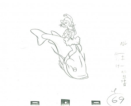
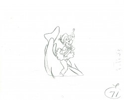
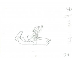
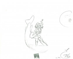
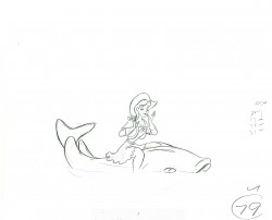
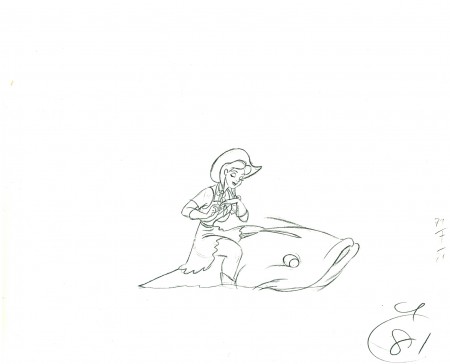
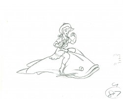
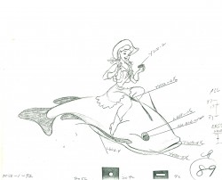
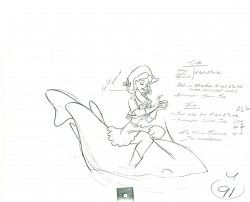
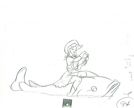
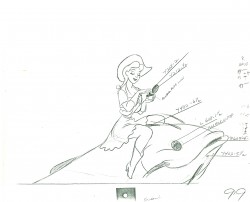
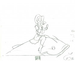
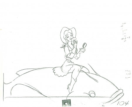
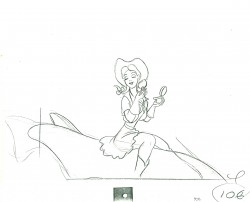
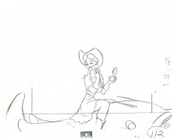
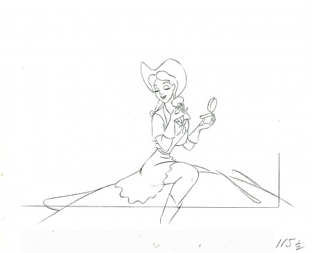
- Today we complete the posting of animation drawings from this scene from Pecos Bill, animated by Milt Kahl. It’s a shot of Slue Foot Sue riding a large fish into the foreground. The drawings are on loan from Lou Scarborough, and I thank him much for the letting me showcase the work.
Here’s the link to last week’s post – Slue Foot Sue – Part 1
As always, we start with the last drawing shown last week.
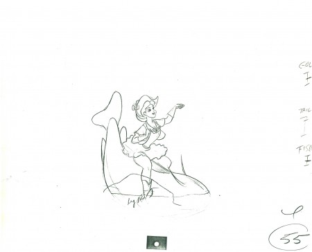 55
55
The following QT represents all the drawings from the scene. Each
extreme was held for the appropriate number of frames requested.
Right side to watch single frame.
Photos 11 Apr 2010 08:00 am
Stuyvesant Square – Photos
- One of the brilliant aspects about the design of New York City is the multifarious number of public parks, both large and small. In fact, there are so many you often walk past them without even noticing they’re there. The only time they become “there” is when they’re in your way. Then you’re forced to take notice.
One such park, for me is called “Stuyvesant Square.” This is a park cut in half by Second Avenue, located between 15th St. and 18th St. Each half is about half a city block wide.
Though I’d driven past it hundreds of times I never really noticed it. However, once I had to go to the Beth-Israel Hospital (which all of my primary care doctors seem to use) I had to take notice. You see, any of the entrances to the hospital are on 16th St. off First Ave.
To get to those entrances, you have to cross the Eastern half of the park. This means cabs going downtown have to go to blocks out of their way – to 14th St. – and circle around the park to First Ave. before they can drive back to 16th St. An extra dollar or two on the meter.
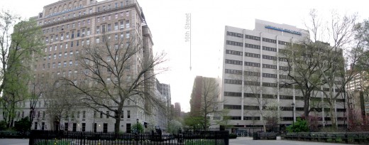
The Eastern half is the section that blocks all traffic trying to get
to the entrance and Emergency entrtrance of Beth Israel Hospital.
That entranece lies on 16th St. in between the two big buildings.
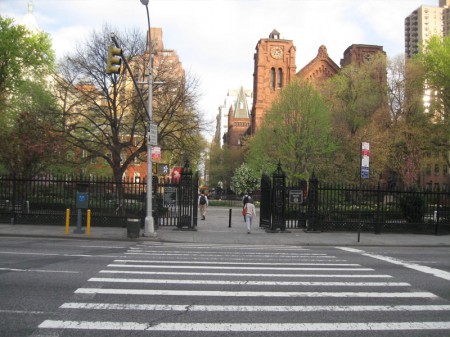
This week, I had a half hour to kill before an appointment,
so I visited both halves of this attractive and small park.
This is the main entrance to the West half of the park.
It would appear to be the principal part of the whole in that
it’s the more occupied and the more decorated.
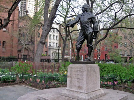
Naturally, as with all NY parks, there’s a statue of its namesake, Peter Stuyvesant.
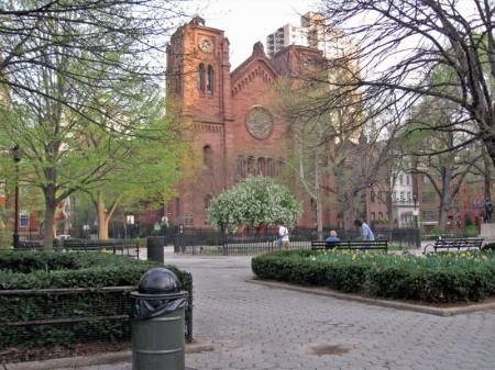
Looking down on this part of the park is St. George’s Episcopal Church.
A sturdy looking building if ever there was one. Very attractive.
Friends Seminary School is across 16th St. from the church.

The two lateral halves of the park shoot out several blocks.

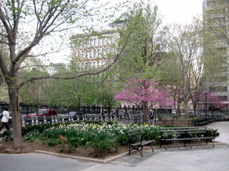
It’s Spring, so all the trees are brilliantly in bloom.

The colorful trees really are an uplifting sight
for the short rest you can take in this park.

Copious flowers have been recently planted to celebrate the
wonderful (and probably short) Spring we’re experiencing in the City.

Across Second Ave. the Eastern half of Stuyvesant Square
is slightly more bare of blossoms – at least when I was there.
The flowers seem to bunched together.

There’s a very large dog walk which consumes at least a third of this
half of the park. It was being well used by plenty of dogs and owners.
However two hours later, the dog walk seemed to have disappeared.
It had been changed to an area where dogs were now leashed and
the general public seem to be walking about – without dogs.
Do they just close this at certain times for the dogs?
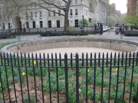
The center of this half of the park features a wading pool
which, for now, was closed to the public.
Off to my procedure. I walked through the park and into the 16th St.
entrance of the hospital. Relaxed thanks to the half hour sit among the flowers.
On Tuesday I’ll go in for an operation that should keep me there for a week. Hopefully,
I’ll have a room that looks down on the park.
