Monthly ArchiveFebruary 2010
Bill Peckmann &Books 20 Feb 2010 09:24 am
Cartooning – 1
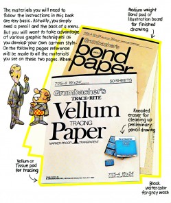
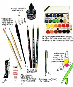
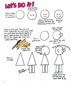
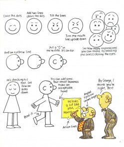
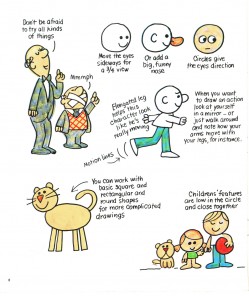
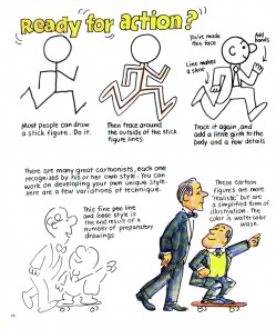
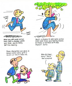
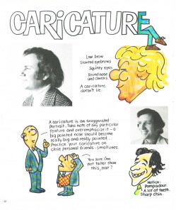
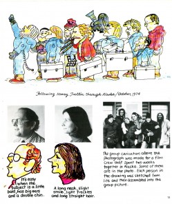
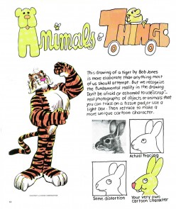
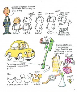
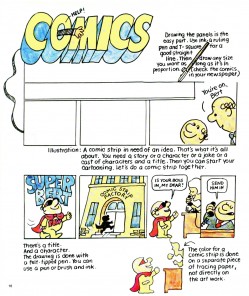
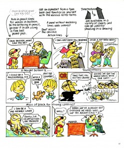
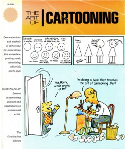 - Bill Peckmann reminded me of a “how to” book that was published in the ’70s called, “The Art of Cartooning.” It was written by art director/designer, Jack Sidebotham. He worked at a number of agencies and had a lot to do with the Piels Brothers and Scholastic Rock.
For this “Art of” book, he brings back the Piels Brothers without the wit and charm of their great voices, comedians Bob and Ray, to escort the reader through a few lessons in cartooning and a sample of a number of different jobs in the field.
I think the book was originally published by Grumbacher, along with several others on art and painting techniques, to compete with the cheap and successful books published Walter T. Foster. They were all sold in art stores for very little money, and if you hit on a Preston Blair book, you’d found gold.
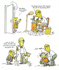
here’s the first half of the book. Next week, I’ll start with the four-page chapter on animation.
 1
1 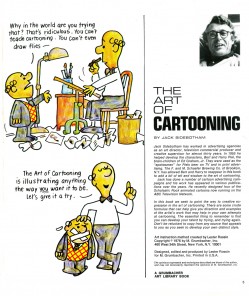 2
2(Click any image to enlarge.)
Animation &Frame Grabs &Independent Animation 19 Feb 2010 08:52 am
Fox’s Enemies
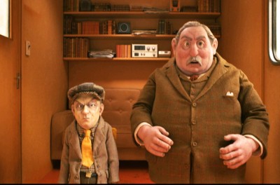
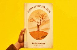 – I’ve made no bones of the fact that The Fantastic Mr. Fox is my favorite animated feature of the last year. (Though I probably put it in a tie with Ponyo – the forgotten feature.)
The film includes a lot of violent scenes, though that violence is never felt by the on-screen action. Fox’s tail is shot off, but we only know this when we see Farmer Bean pick it up from the ground, and we feel it internally when we see Mrs. Fox trying to attend to her husband’s wound.
The actual violent scenes on-screen are few, indeed.
One of my favorite animated bits in the film is probably the most actively violent. After being foiled by Mr. Fox several times, Bean sits boiling for a second, then wordlessly gets up and tears up the decor of the camper.
I’ve seen the film four times now (three in a theater and once on DVD). It hasn’t lost any of its lustre, for me, and this scene was one I had to go back and view frame-by-frame. I thought it a good one to look at in frame grabs, and I post them here. The scene doesn’t last more than a few seconds.

After seething for a moment, farmer Bean gets up
and quietly, wordlessly decimates the camper interior.

He throws everything atop the table off of it.

Then he reaches down and overturns the table, and
he moves back in perspective into the camper.

I love the way this film plays with the perspective as the
characters constantly move from foreground to background
to foreground to middle ground. It’s expertly handled.

To the left is my favorite frame of the sequence.
It’s only one frame as he rips down this curtain, but
it noticeably stands out within the animated scene.
Excellent job extending the length of the curtain here.

Then he rips off the other curtain.

He throws down shelving on the back wall . . .

. . . and he clears the table in the back of the room.

He throws the chair to the ground.
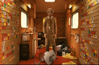
. . . and stands still, breathing heavily.

. . . making sure we see the
fox tail hung around his neck as a tie.

He walks through and past the other farmers.

He rips apart everything on the back wall.

The other farmers just stand in shock . . .
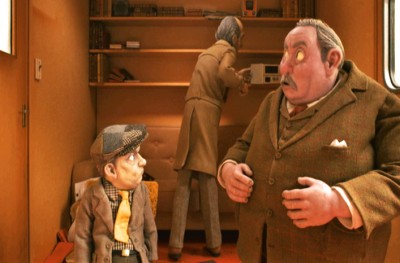
. . . as he wildly rips down the wall.
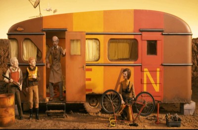
Then without a word he opens the camper door and looks out.
End of the short sequence.
.
Indian Paintbrush Productions LLC and Regency Entertainment, Inc.
Books &Illustration 18 Feb 2010 09:03 am
Ramayana
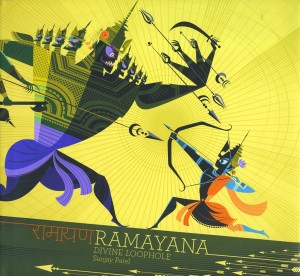 - Nina Paley has been very successful in adapting the Ramayana in her feature film, Sita Sings the Blues. She not only gives a shortened version of the Indian folklore but uses the tale to comment on her personal story of betrayal and estrangement and divorce. Her film is highly styled, beautifully animated, and well received.
So soon after the success of her film comes this book by Sanjay Patel. He is a supervising animator and storyboard artist at Pixar. someone I didn’t know about until I’d received an unsolicited copy of his artbook from Chronicle Books. Ramayana, Divine Loophole.
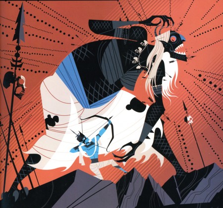
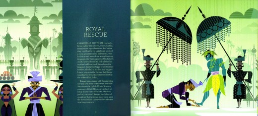
The book is a beautifully produced work full of strongly designed graphics illustrating the Ramayana. The text gives an indication of the story, but it doesn’t fully go into the lengthy text of the original tale. We’re offered a synopsis; it’s really just an excuse to hang the illustrations, and it’s a good one.
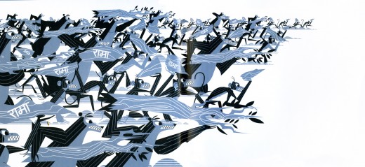
(Click any image to enlarge.)
It’s tempting to compare some of the graphics between this book and Nina Paley’s film, but there’s a distinct difference between the two. They’re both a sort of “cartoon modern” adaptation of Indian art. Nina has a feminine turn in her drawings, lots of circles and arcs, whereas Sanjay takes an angular approach with a very masculine line that feels somewhat near the CalArts style which is obviously popular in LA and has permeated the animation syling these days.
Sanjay Patel also states on his site that he was initially inspired by Nina Paley’s film.
Both artists create attractive works that glisten in both film and book versions. Personally, my taste runs marginally more toward Nina’s work, but I’m impressed with the depth and detail in the book’s illustrations.

Every once in a while, you feel as though you’re
looking at something out of Samurai Jack.
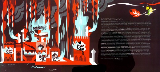
The author has a keen eye for character design, but it doesn’t always feel unique. There are infrequent times when it looks like something out of Cartoon Network. Undoubtedly, this comes from his CalArts background and the strong influences he’s felt in the animation industry in California. However, more of the time it feels totally Sanja Patel, as in the exceptional illustration above.
Often there’s a beautiful sense of color and design that makes the images sparkle. His compositions are also sterling, so you give him lots of grace for any of his lesser influences.
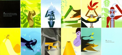
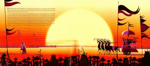
Most of the book is composed of two-page spreads with the text
enveloped in the illustration. Not always easy to read, but pleasant
to view. (Also hard to scan with the breaks in the middle.)
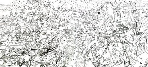
Toward the rear of the book there are a number of
complex drawings which are amazingly alive.
I’d encourage anyone interested to get a copy of this book. The book is enormously attractive and the art is well worth the visit.
There’s an excellent demonstration of author, Sanjay Patel’s process in creating an illustration in a PDF from his publisher, Chronicle Books. As a matter of fact they have a complete Q&A with the author here in which he discusses his creative process.
Sanjay Patel‘s blog is located here.
Chronicle is the publisher of this attractive book. They seem to be doing consistently attractive art books. The first notice I had of them was with Amid Amidi’s Cartoon Modern, a book that still stands strong among those that were published in the past couple of years. They’ve also done a number of the “Art of . . . ” books for Pixar and Disney.
Animation &Art Art &Norshtein 17 Feb 2010 09:20 am
Norshtein & The Overcoat
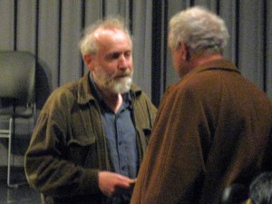 - I was pretty proud of the New York animation community. There was a full turnout for the Yurij Norshtein show on Monday night. All of the key people one hoped would show up, did show up. I was surprised at the many familiar faces in attendance: Amid Amidi, Richard O’Connor, John Dilworth, John Canemaker, Emily Hubley, the Rauch brothers, the Kraus brothers, Biljana Labovic, Jeremiah Dickey, Howard Beckerman, Matt Clinton, David Levy . . . the list goes on.
Norshtein and Reeves Lehman, dean of animation at SVA
And it was appropriate for him to
have a good turnout. Norshtein is the height of “Art” in animation, and he’s a beacon for us all. If ever one gave everything to the creation and forward movement of the artform, this guy is it. He’s been working on his film adaptation of Gogol’s The Overcoat for the past 25 years or so. He screened roughly 13 minutes of the film broken into two parts. Both were screened in silent B&W.
The first part was the opening 10 mins of the film. Throngs of shoppers and passersby in the snow on a crowded Moscow street. All I could think of was the enormous number of cutout parts for all these people, just to assemble one image of the film. Yet they were animated and the sequence was long. One guy did all the construction of those characters, all the animation, all the movement. How in hell did he keep each of those many people and parts of people in his head so that he knew how they moved? No computer assistance to help, only his brain. And to top it off the camera, with all those planes, is moving as well. It’s an extraordinary feat.
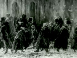
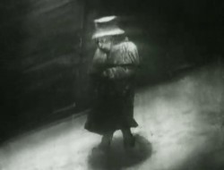
Then the lead character enters and we see what he sees – not the crowds but the writing in his head. He’s a lowly scrivener, a copyist; someone who spends his day copying documents. Obviously, he can’t remove the work and the words from his mind, though the world he walks in is filled with distraction.
From these street scenes he goes home to an extended sequence of warming himself up and eating a small bowl of soup. The character motion and development is all open to us in this incredible scene wherein we enter the tiny physical, introverted world of this man.
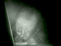
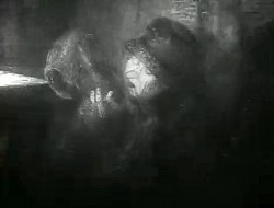
The final three minutes show him realizing how worn his overcoat has become. Threadbare doesn’t begin to describe it as his fingers easily poke through the fabric again, and again. When he puts the coat over his head, fibers end up in his mouth.
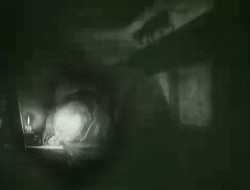
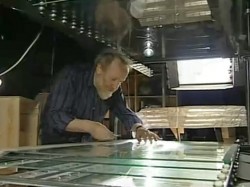
A long, very long display of character. All B&W and silent. It’s going to be another masterpiece from this brilliant artist. All done by hand by him on a complex and large camera set up. One person controlling all the pieces.
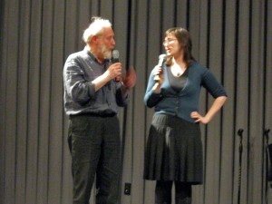 The Heron and the Crane and Hedgehog in the Fog were screened from the Jove dvd. Most of the evening was Norshtein answering questions. (There was a bit of an onstage struggle between two interpreters, during the opening segments, with the stronger interpreter doing duty for most of the event.) He took the dumbest of questions and turned them into answers we always wanted to hear. A question from a young girl about what his favorite animated films turned into a list of expected films that I was not surprised to hear: Night on Bald Mountain Disney, Crac Back, There Once Was a Dog Nazarov, and he admitted that it’s a list that’s constantly changing. He also spoke of recently watching a print of Bambi frame-by-frame on an editing machine. He said it was a film that has enormous beauty in every frame, in it’s backgrounds and layout, as well as in its whole as a film.
During his answering questions he spoke articulately to us about everything from animation to great painters to great authors. I have to say that I can’t remember any other ASIFA meeting where the “young” Michelangelo or Velazquez were discussed, nevermind Chekhov and Proust. In the past week, I’ve attended a number of Oscar parties – one for James Cameron, one for Quentin Tarantino, one for Sandra Bullock. If there’s a celebrity in New York, I’ve had a chance to meet them. I’d trade them all for that evening with Norshtein at that little SVA theater.
After the screening, they were selling photo prints in the lobby, signed by Norshtein. I bought two hoping in some small way to support him on this trip. They also serve as souvenir reminders to me that I have to be more of an artist in my own work.
(As always, click any image you’d like to enlarge.)
You can read more details by Dayna Gonzalez about the event at the ASIFAEast newsletter.
And Richard O’Connor offers a collection of notes and quotes from the evening to his blog for Asterisk Animation.
Animation Artifacts &Bill Peckmann &Disney &Models 16 Feb 2010 09:40 am
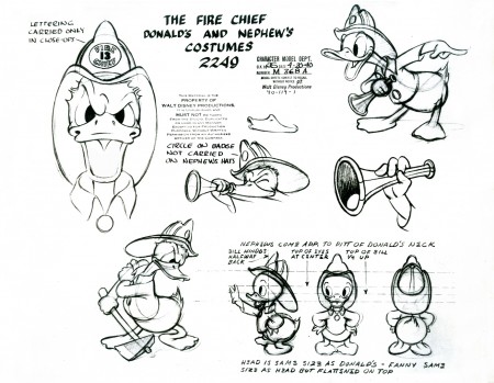
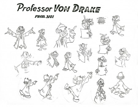
Donald Models – 2
- Last week we had the Donald Models. Actually that was the second edition of Donald models, I’ve posted. The other was a while back – back in July 2009, there was the lecture notes written of the after-hours class held in the ’30s.
As I stated, last week, this post is dedicated to model sheets of Donald that are tied to specific films he was in. I love them all. They come from several periods of Disney shorts and Donalds. The first is from my favorite period for Donald, and I’m sorry he had to change from this guy; I love him. But I also love the Mickey of that period – 1931-32.
In the end we get into the TV Donald – but not too much.
Anyway, enough gab.
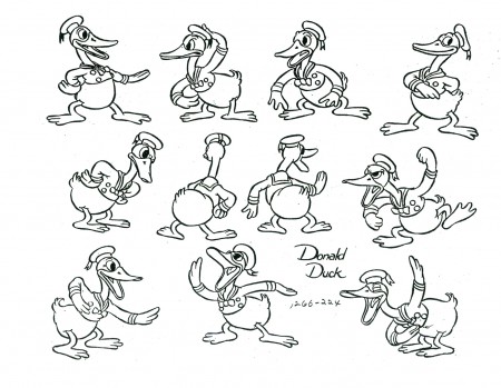
Love this character.
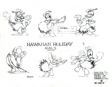
Hawaiian Holiday – Sept 24, 1937
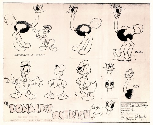
Donald’s Ostrich – Dec 10, 1937
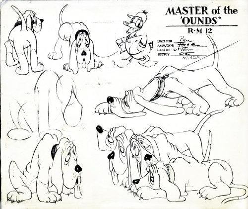
Master of the Hounds
retitled The Fox Hunt – July 29 1938
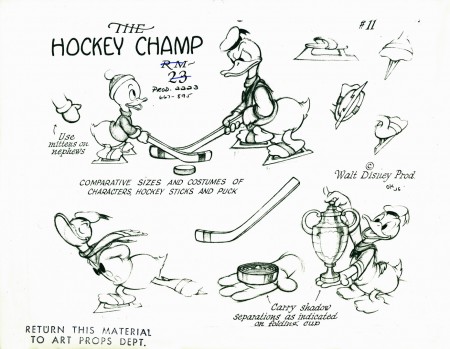
The Hockey Champ – Apr 28, 1939
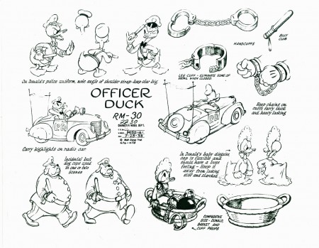
Officer Duck – October 10, 1939
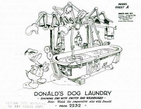
Donald’s Dog Laundry – April 5 1940
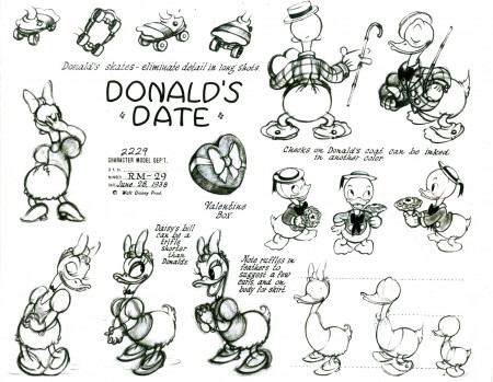
Donald’s Date
retitled Mr. Duck Steps Out – June 7 1940
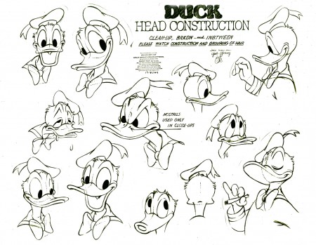
Just heads. This is getting to be late-period Donald.
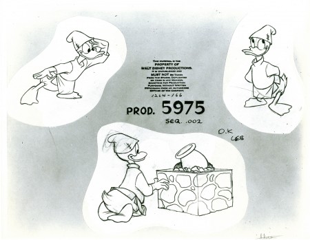
Here we have one from Steel and America (1964)
an Industrial done for the U.S.Steel Corporation.
Many thanks to the gracious Bill Peckmann for the loan of this material to post. His collection of model sheets is amazing.
Commentary &Events 15 Feb 2010 08:49 am
Norshtein/Multiplane/Gervais
 - Yurij Norshtein will appear tonight at The School of Visual Arts Theater (333 W. 23rd Street, between 8th/9th Ave). 6:30pm.
They will screen The Hedgehog in the Fog and The Overcoat, his long-in-progress film. Norshtein will also have an extended Q&A with the audience.
The man is one of the great animation masters, and I hope that there will be a good turnout for him. I wonder if the copy of The Overcoat that will be shown will be a more current version than the one that’s been screened a couple of years back. I’d read that he was planning to break the film in two and release the first part at the end of 2009. Perhaps that is the case, and we will be seeing this version.
In any event, for me, this is a big event and I’m looking forward to it.
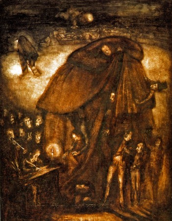
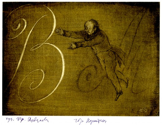
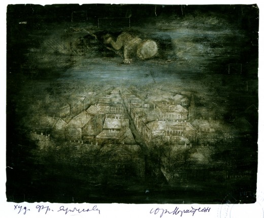
A sketch for The Overcoat.
___________________
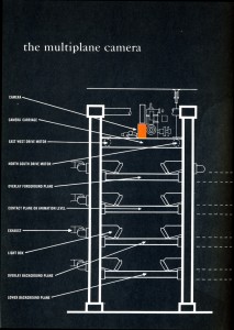 – I think I was hit with a fascination of the Multiplane Camera when I first read Bob Thomas’ book, The Art of Animation, back in 1959. (See graphic to the right.) After that book I just searched out all the scenes described within it – the flying scene from Peter Pan, the town awakening in Pinocchio, and the entire Old Mill short. I was entranced and paid attention to every use of the device in Disney films. Of course, I saw what Ub Iwerks did with his machine, even before Disney, in all his very odd animated shorts. I even watched Don Bluth develop his own smallish multiplane camera for his films.
My father and brother-in-law teamed to build a multiplane stand for me when I was a kid animating and shooting my own 8mm films. The thing handled 12 levels of glass panels 18″x36″ and had some 5000 watts of lighting spread throughout. It got hot but enabled me to make some interesting films. Not
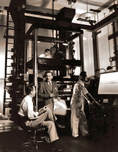 necessarily good – just interesting. It enabled so much invention in those short film fragments.
Hans Bacher this week has posted a collection of photos of the camera setup from the Disney studio. The collection is thrilling for those of us who have been entranced with this invention.
However, if you really want to get into the nitty-gritty of the machine, you have to visit a number of posts on Hans Perk‘s website A Film LA. There he has posted several extraordinary documents which detail William Garity’s plans for the invention of the Multiplane Camera. You can see these documents here: 1, 2, 3
Then there are another three with many photos of the multiplane, some taken by Hans Perk, himself: 1, 2, 3.
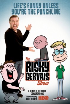 - Starting Friday on HBO The Ricky Gervais show premieres. This is an animated program built around podcasts that Gervais has been distributing on-line. The voice tracks are animated in LA predictably utilizing Flash for the lowest budget. The style is out of the predictable cookie-cutter mold we’ve been seeing lately. You can catch a couple of segments here.
The NYTimes has an article in their Sunday paper about the show, but, as might be expected, nothing about the animation is actually discussed. Star driven vehicles aren’t about the animation. Though the Times does offer an excellent interactive feature that showcases a lot of the artwork.
It’s difficult to find out much about the actual production. Media Rights Capital is co-producing the animated HBO show along with Wildbrain. The credited animation director is Craig Kellman.
The review in Variety wasn’t glowing:
. . . employing a stiff “The Flintstones”-type look and visual template.
Animation would seem to be an ideal vehicle for this, but there’s only so much it can do — in part because there’s no adhesive to the episodes. The three guys sit and bullshit for 20-some-odd minutes — at times entertainingly — until the program simply ends. Perhaps that’s why the effect diminishes as the episodes wear on, though Glyn Hughes’ jaunty score does play them out on a high note.
If you’re a Ricky Gervais fan, I suggest you check out his blog. It’s actually entertaining without being too “me me me”.
Art Art &Photos 14 Feb 2010 09:46 am
Mo’ Snow
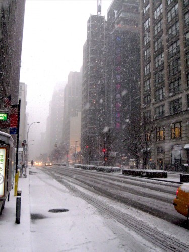
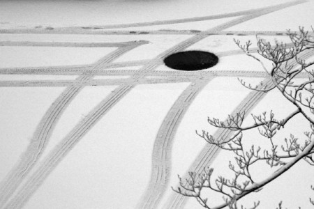
 - For some reason, whenever I step out into a newly snowed-upon setting, I feel obligated to take a picture. Consequently, I fill up the nearby Sunday Photo blog with snowy settings. Sorry about that.
It snowed this week. Not as heavily as they threatened on the newscasts, but it was heavy enough. (Right up to an hour before it ended, Al Roker was still forecasting 15 inches. We only had about 6.)
Regardless, it was white.
Memories of my first photography assignment in college – shoot white-on-white pictures – came rushing back. I didn’t aim for the white-on-white, but white was enough.

My first sight of 30th St. after entering the outdoor snowfest.
My pictures were boring enough that I won’t get too tedious on you. But my friend, Steve Fisher, knows what to do with a camera, and he sent me some great stills, shot in Queens, that I have to share.

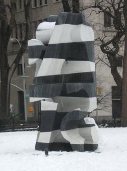
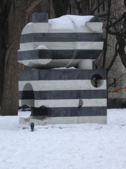
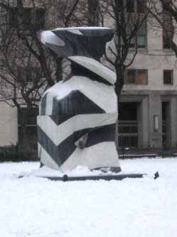
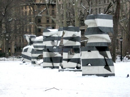
OK, let’s bring it back to Manhattan. Madison Square Park has had an art installation displayed for some time now. By sculptor, Mel Kendrick, Markers went up in September last year, but I wasn’t inspired enough to take pictures though it’s obviously monumental enough. It was supposed to have been removed at the end of December.
Now standing in snow, it looks different. The blacks look about 70% gray against the snow. Here it is. The writing comes from the official commentary by the Park.

Mel Kendrick – “Markers”
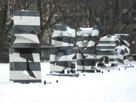
Kendrick’s Markers are cast in alternating layers of black and white concrete, resulting in bold striation that alludes to the layered stone found in Italian Gothic Cathedrals.
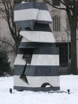
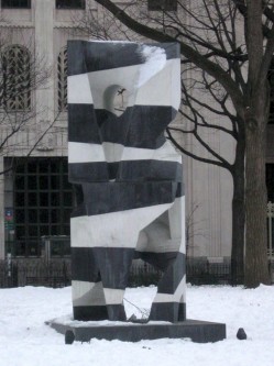
Standing over ten feet tall, the commanding scale of these sculptures echoes the grandeur of their home on the Oval lawn at the center of historic Madison Square Park.
Animation &Commentary &Events &Independent Animation 13 Feb 2010 09:16 am
Anti-Valentine
 - On Sunday night, Valentine’s Day, Debra Solomon‘s show, Getting Over Him In 8 Songs or Less, premieres on HBO 2 at 7:30pm. The film offers a musical trip through the last couple of years of Debbie’s life as she regroups from a divorce with her husband. (Animation as therapy.)
On her site, she writes this synopsis:
- In my new film, I animated myself out of heartbreak. The animated journey was also my emotional journey. In GETTING OVER HIM IN 8 SONGS OR LESS the main character is caught in a
 woman’s worst nightmare, wandering around the neighborhood undressed and exposed after being left by her husband. Through the use of brightly colored patterns that wash away section after section of the film, mimicking the ebb and flow of feelings, the viewer passes through the crisis with the main character.
 I know firsthand how intensely Debbie worked to pull this show together. She singlehandedly animated the entire show in Flash in a sort of stream-of-conscious linear style that pulsates with a nervous energy (not unlike her own). The entire story is told through a pastiche of funny songs that she wrote, performed and produced. In short she bares her soul via a quick moving, funny animated film. It’s an animated diary of Debbie’s life in the year after her marriage. She lived through it as she animated it.
It’s brilliant that HBO helped finance this animated and personal film. This is a bittersweet bon bon of a tv show. Tune in.
Here are a couple of other images from the show:
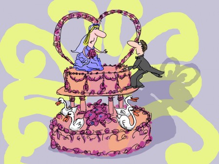
(Click any picture to enlarge.)
There’s a short interview with Debra in MovieMaker Magazine.
This is the complete show schedule for the rest of this month:
7:30pm Sunday Feb 14th HBO2
9:30am Tuesday Feb 16th HBO Signature
6:00am Friday Feb 19th HBO2
10:00am Sunday Feb 21st HBO Signature
Animation &Commentary 12 Feb 2010 08:54 am
VISA Grand Central
- VISA has taken over Grand Central Station with an enormous display focussing on the Winter Olympics, the centerpiece of which is a number of 3D ads, one of which is animated. You can get a good idea of how all-encompassing this display is with the following video:
Initially they handed out 3D glasses, but many of the people took the glasses and didn’t stay for the films. When I went through there were no glasses, but it didn’t seem to hurt the appearance of the movies (although they weren’t noticeably 3D anymore.)

Heading from the street to the subway
you’re hit with Visa’s name everywhere.

You can’t avoid the stairway signs.
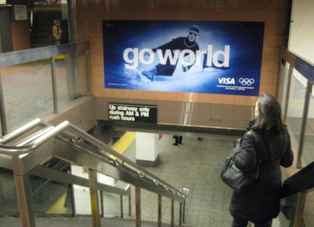
If you head off to the Shuttle train
you run into the film in the connecting tunnel.
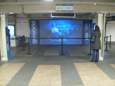
This is what the exhibit looked like. Stuck within a tunnel between
the IRT subway and the Grand Central Shuttle it’s not quite conducive
to good film watching. A lot of buildup for a couple of commercials.
Most people passed it by at 11pm on Friday night.
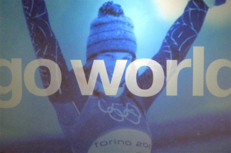
Here’s a still from one of one of the live action spots.
The guys handing out the 3D glasses didn’t have any;
they just stood about talking to each other.
The animated piece was done in the style of children’s drawings.
I haven’t been able to locate who produced the animation, so if you
know please leave a comment. Here are a couple of stills taken with
my small camera – bad lighting=bad pictures. Sorry.
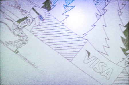
Here are a couple of frames from the animated piece.
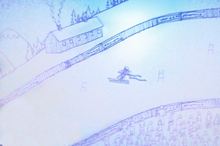
I’m curious to know how THIS worked in 3D.
It seems a bit flat. Not quite AVATAR.
The animated graphics, above, appears designed for maximum 3D effect.
This was produced by a company called Superfad.
Articles on Animation 11 Feb 2010 09:43 am
George Dunning Remembered
- George Dunning died February 15, 1979 – thirty years ago, next Monday. The January 1980 issue of ANIMAFILM featured a couple of pieces about him. I recently posted (here) the interview conducted by John Canemaker. Just preceding that piece, there was a short remembrance of Dunning, who had just passed. Comments by Bob Godfrey, John Coates and Norman McLaren were offered.
To complete the post, I wanted to give those pieces here. (Obviously the title should read: “They Remember George Dunning.” So much for translations from English into Russian and back again.
BOB GODFREY
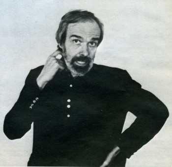 George Dunning’s T.V. Cartoons was one of the dozens of small animation companies to spring up in and around Soho in the early 50′s to satisfy the demands of Advertising Agencies eager to experiment with the new medium, Television Advertising.
Two factors contributed to JVC’s success, in a notoriously difficult medium, George’s continual striving for excellence and his long and happy association with his business partner John Coates.
Most animation houses were making their own entertainment shorts about that time, and George’s house was no exception. First came “The apple” an excellent short, and then George changed the whole shape and feel of animation with “The flying man”, painting straight onto glass. He was to change the look of animation again in the late 60′s when he directed the “Yellow submarine”, adapting Heinz Edelmann’s brilliant graphics to animation. Fortunately George lived to see “The Sub” become a landmark in animation history. George’s patience and kindness with young students was legendary and they always recognised in him a fellow “Freak”.
At the time of his death, George was animating Shakespeare’s “The tempest”. I can not think of a more unlikely subject for animation than that, but that, of course, was why George was making it.
JOHN COATES
I first met George in a Mayfair pub 22 years ago, and as a result T.V. Cartoons was formed in June of 1957.
Like all animation studios, we had many ups-and-downs, during which time pur partnership thrived. A large part of this was due to George’s steadfastness. He had an amazing way of keeping his cool under all circumstances, whether he was forcing through his creative ideas or arguing with the “money-men”.
To people in the business, he was quiet innovator of marvellous new techniques and experiences, and many are the studios around the world today whose creative owners learnt their art at TVC, under George’s patient direction.
Animation has lost one of its great talents, and many of us a very good friend.
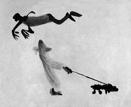
A still from Dunning’s short, “The Flying Man.”
NORMAN McLAREN
I had the good fortune to work with George Dunning when he first arrived at the National Film Board. He had just come from Art College, and already his style as a graphic artist was quite distinctively his own.
From his very first film he showed a ready and natural bent for animation, and, what was even more important, he had the ability to make the sensitive and mystic marriage between his talents as a graphic artist and as an animator. His peculiarly personal vision and whimsy soon shone out in such early films as “Cadet Rouselle” and “Upright and Wrong”. I found George a graceful, articulate and gentle person: a philosopher much given to strangely fanciful invention and drollery, and all in great taste.
His later personal films such as “The Flying Man” and “Damon the Mower” emphasize these asnects of the man even more. He was a true noet.
