Monthly ArchiveSeptember 2009
Daily post 10 Sep 2009 07:39 am
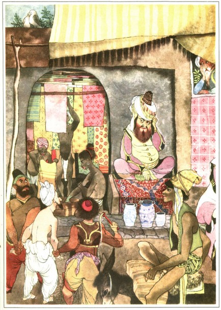
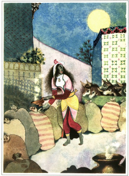
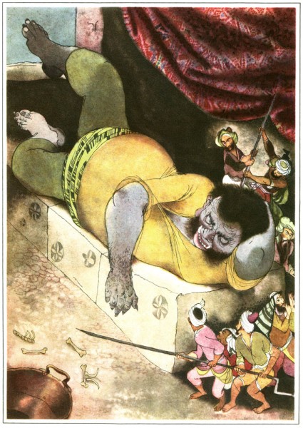
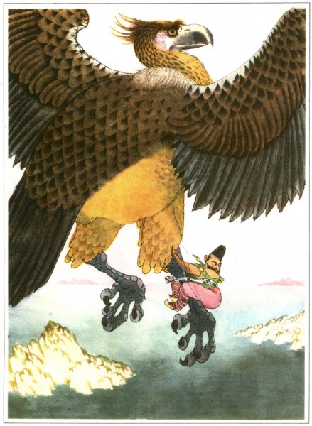
Trnka’s Arabian Nights
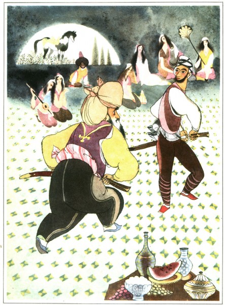
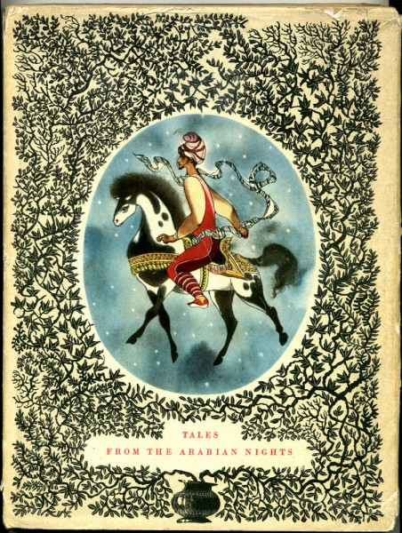
- On her blog, Moonflygirl, Tania Covo posted a few of the beautiful illustrations in the book Tales from the Arabian Nights – published by Hamlyn in 1960. The illustrations were by Jiri Trnka.
I was familiar with Tania’s excellent site covering the works of Errol Le Cain, so was pleased to see that she enjoyed Trnka’s work as well. However, I was delighted when she offered me scans of the remaining illustrations in this book.
A joy to offer them here:
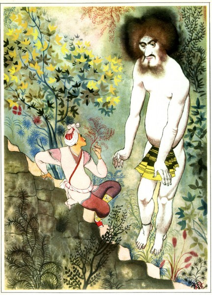
(Click any image to enlarge.)
The book is a treasure.
Thank you Tania for your generous loan of these excellent illustrations.
Animation &Disney &Frame Grabs 09 Sep 2009 07:43 am
Fantasia FX
- Herman Schultheis was an effects animator who worked on Fantasia. He kept a tight record of the effects they were creating from 1938-1941 and a photo display of how they were done. Schultheis disappeared in 1954 while trekking through Central America, and the notebook was forgotten until his wife’s death in the early 1990s, after which it was discovered by Howard Lowery behind the couple’s bedroom wall.
The book will be on display at the The Walt Disney Family Museum when it opens in October. It’s also been digitized so that visitors will be able to go through the book, enlarge photos and view it page by page.
Prior to the discovery of the book we were able to figure out a few of the effects. One Disneyland show, in fact, recreated the bubbling lava scene from the Rite of Spring sequence.
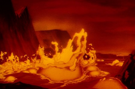
(Click any image to enlarge.)
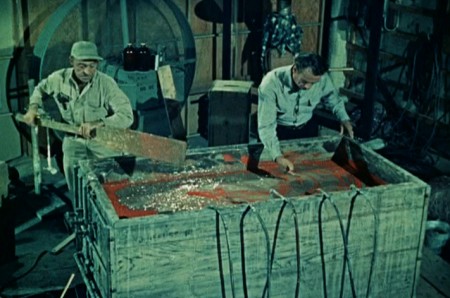
Josh Meador recreated the slow motion shoot of the
boiling concoction used to develop the bubbling lava.
However, the book revealed so much more than we’d understood
about how the superb effects had been crafted.
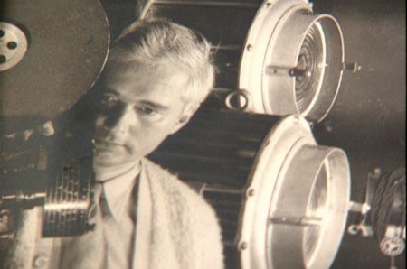
Herman Schultheis created the book of charts and photos
which gives us a link to the many creative effects in the film.
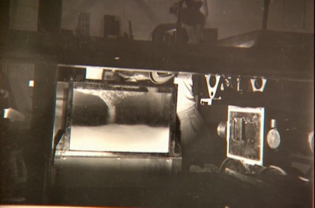
Using a vat of water, they were able to
drop ink into the liquid and film it in slow motion.
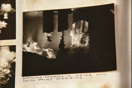
A photo of the ink spilling into the water behind built-in mattes.
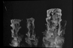
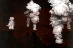
Taking the shot of the ink, they then turned it upside-down.
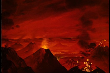
They then superimpose the “smoke” (or ink) over the volcanoes.
This same effect was used in Close Encounters of the Third Kind
to create clouds when the alien ships were moving in on the
farmhouse where the boy and mother lived.
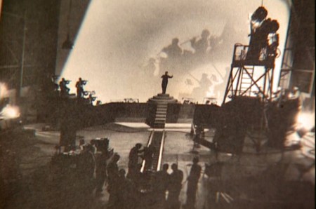
The orchestra was shot on a set with strong, planned shadows.
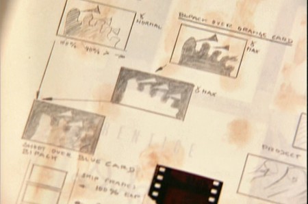
All these shots were orchestrated and planned for color effects.
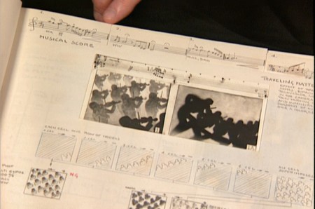
They were also catalogued by Schultheis who kept close
track of the music, as well, in his book. You can see a
page by page breakdown of the score at the top of the page.
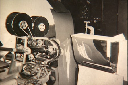
You can see the highly polished sheet of metal (middle left) which reflected
and distorted the animation drawings. This is what the camera photographed
in some of the scenes during the Night on Bald Mountain sequence.
It was also used for the fire in Bambi.
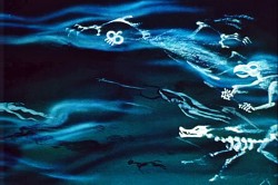 1
1 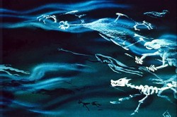 2
2
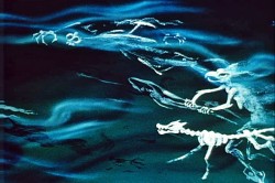
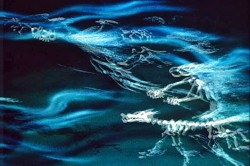
This scene’s ghosts were shot using that distorted metal reflection.
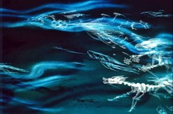 2a
2a 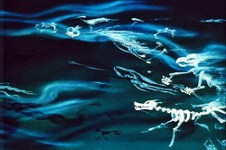 3
3
The ghosts also used a form of cross dissolve.
John Hubley explained to me how that was done.
 4
4 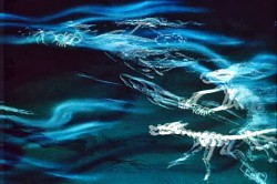 4a
4a
They shot the entire scene at 50% exposure. Then they went back
to the beginning and reshot the entire scene again at 50% exposure.
 5
5 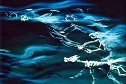 6
6
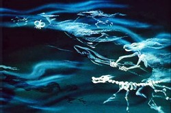
However on the second shoot, they started by shooting a black frame.
This made #1 fall where #2 should have been, #2 for #3 etc.
This creates a ghostly dissolve effect.
 6a
6a 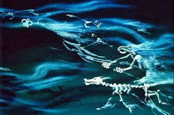 7
7
All of the drawings labelled with an “a” are the double exposures:
2a, 4a, 6a
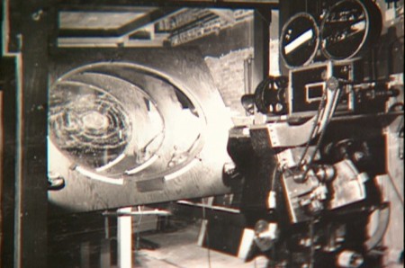
A make-shift circular multiplane camera was built.
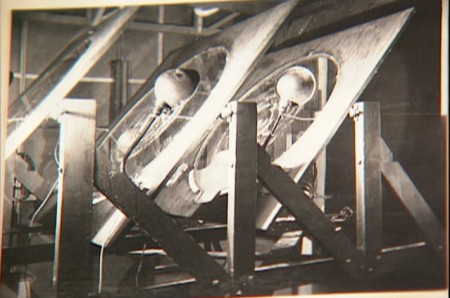
Created out of wooden sheets with holes cut out,
placed so they could shift angles, they were designed to
allow revolving artwork in the circular cut outs.
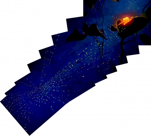
This allowed shooting scenes such as this shot of
a spider web as the camera turned around it while
dew glistened off it.
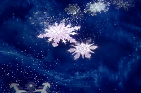
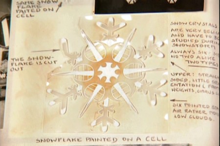
The spinning snowflakes are well explained in Schultheis’ book.
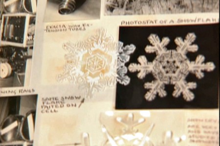
The snowflakes had a detailed construction.
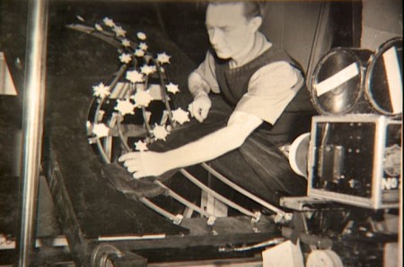
The path of action was intricately defined.
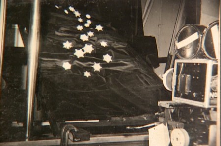
The snowflakes were shot against a sheet of black velvet
hiding the wire guides.
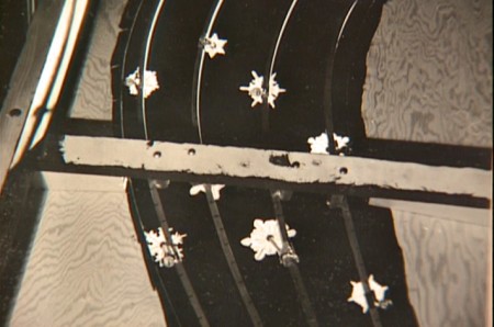
They were shot in tight closeup. From below you can
see the turning gears they were constructed on.
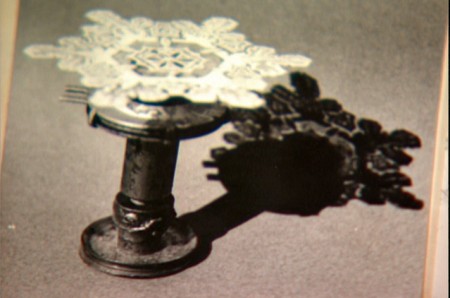
Each snowflake was built on a turning gear
so that they could revolve in their path of action.
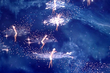
Burn these snowflakes over the multiplane background
and add matching 2D animated fairies within each snowflake,
and you have the finished scene.
Animation Artifacts &Bill Peckmann &Books &Disney &Models 08 Sep 2009 07:35 am
Nutcracker Models
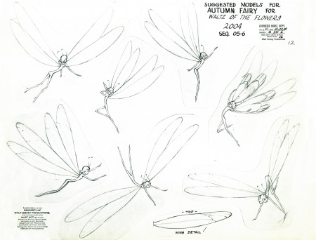
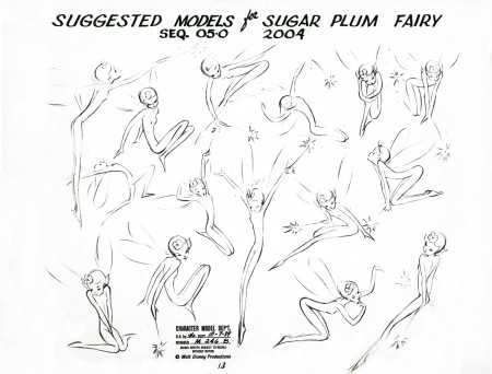
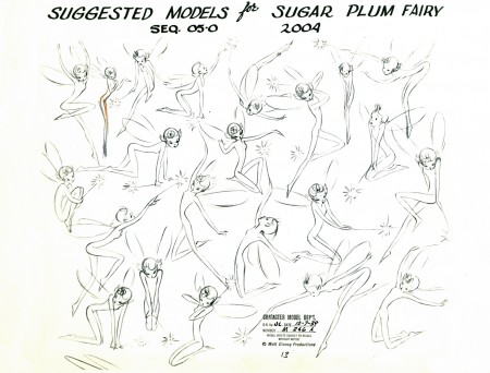
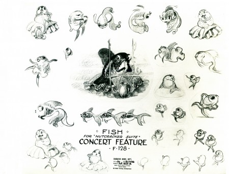
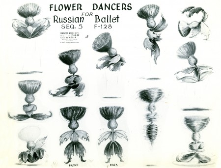
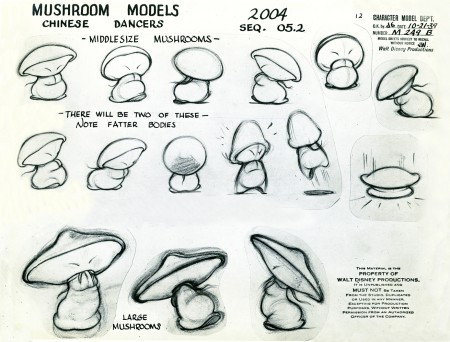
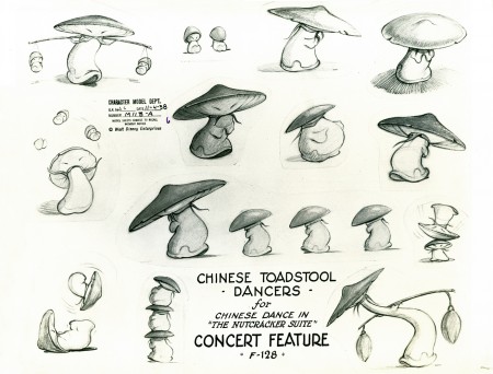
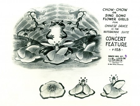
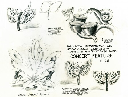
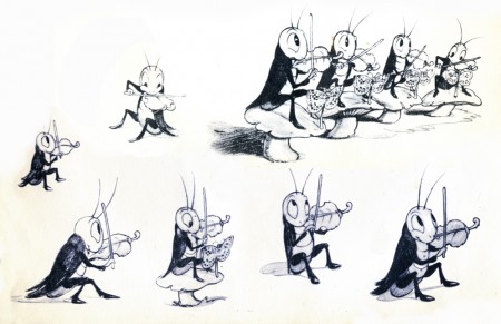
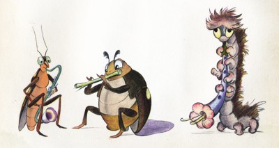
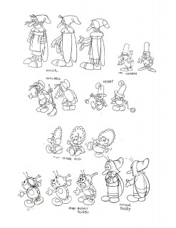
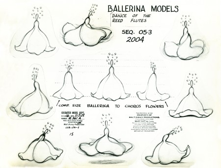
- And speaking of the Nutcracker sequence from Fantasia, here are some models from Bill Peckmann‘s extraordinary collection of that sequece. This is probably my favorite of the sections of that feature. There’s some beautiful character animation within it, excellent effects and conceptually the images and music match.
 1
1(Click any image to enlarge.)
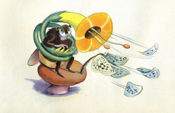
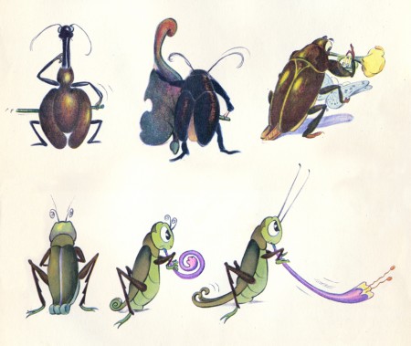
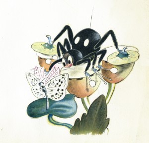
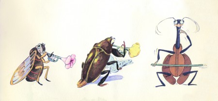
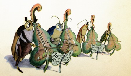
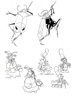
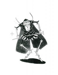
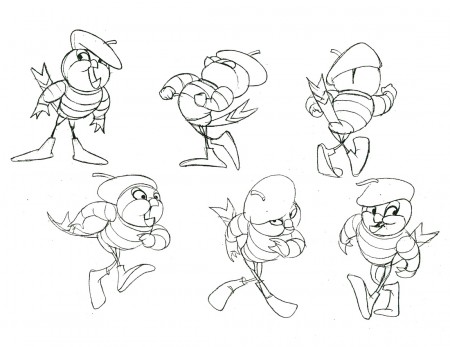
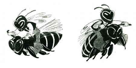
As this last model shows, the original plan for this sequence included a bug orchestra playing the score – whether part or all of it is questionable – there are a lot of models, drawings and watercolors left behind.
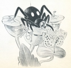
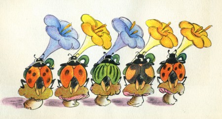
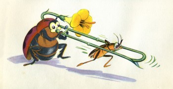
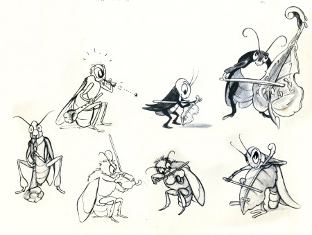
These can be found dominating the book that was released in 1940. There were books for each of the segments of Fantasia, and The Nutcracker Suite is one of them. Oddly, only few of the illustrations are frame grabs from the film, others feature fairies or few of the other characters who made the sequence. Most of the illustrations are these bug characters that don’t appear in the film.
So, to accompany the beautiful models above, I’ve decided to include the bug illustrations from this book – featured below.
 1B&W
1B&W
For more Fantasia items of interest, Bob Cowan is currently showcasing a number of his beautiful pieces on his website.
Photos 07 Sep 2009 07:31 am
Labor Day
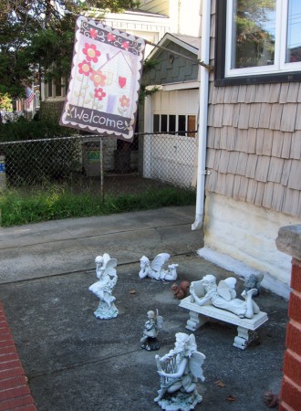
- Labor Day is one of those holidays you show off your flag, if you have one. In the past, it was expected that the flag might be an American flag, but times they are a changing.
My friend, Steve Fisher, found some other flags flying in Middle Village, Queens.
These are they:
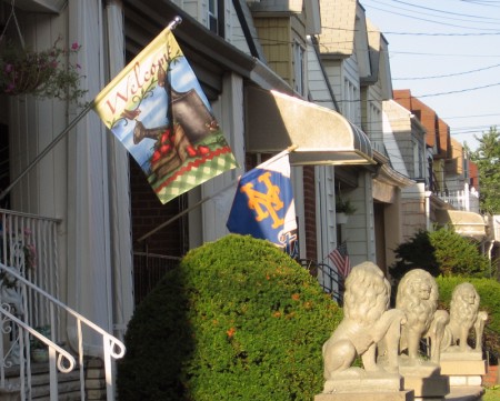
Aside from the Welcome flag, there’s one for the Mets.
Queens, home of the Mets, is where many of their fans reside.

It’s doubtful the flag will help their season.
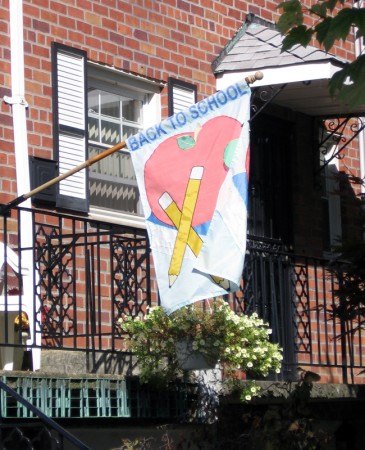
Just in time for Obama’s speech to the school children.
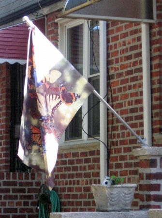
Just decorative. Very positive.

Here come the Italians. Prouder of their heritage
than they are of their country – I guess.
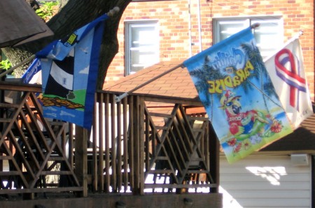
A lot of flags but nothing in stars and stripes.
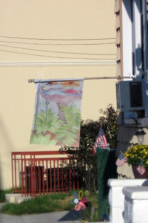
If you look in the background, you’ll find
some itsy bitsy American flags for the holiday.

I had to post this brilliant shot by Steve
from a past post. How could I not
end with the real McCoy?
Happy Labor Day, everyone.
.
Many thanks to Steve Fisher.
Art Art &Puppet Animation 06 Sep 2009 07:33 am
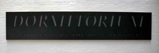
Quay Dormitorium
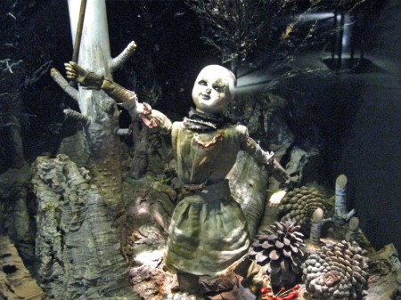
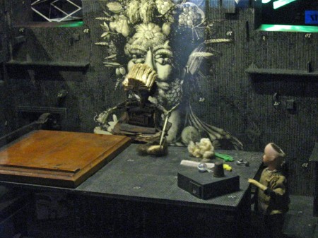
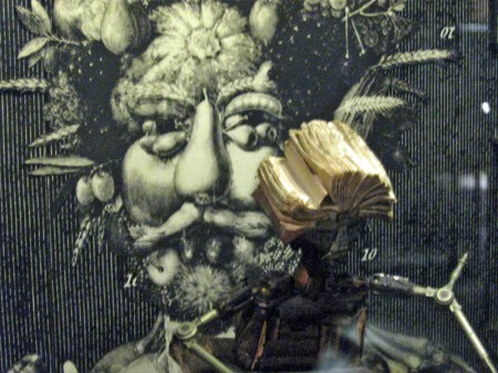
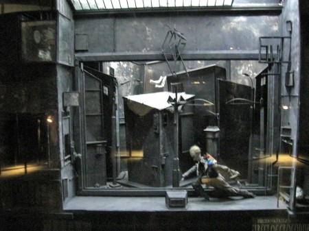
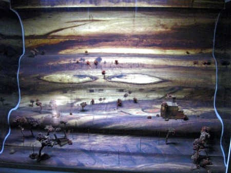
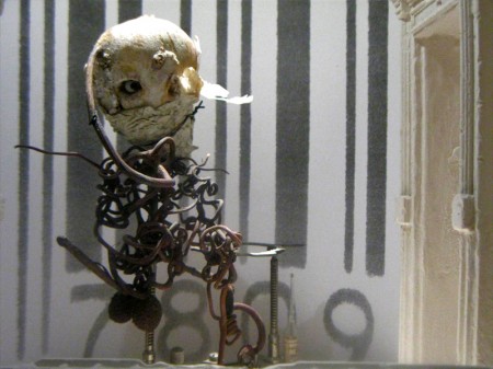
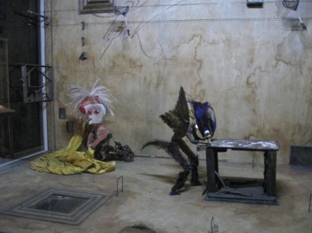
The Brothers Quay have an exhibition on display at Parsons School of Design, 2 West 13th Street on the ground level. It’s on exhibit from now through October 4, 2009.
Stephen and Timothy Quay claim writers Franz Kafka and Robert Walser, animators Walerian Borowczyk and Jan Lenica, puppeteers Wladyslaw Starewicz and Richard Teschner, and composers Leoš Janácek, Zdenek Liška, and Leszek Jankowski among their influences. All of these artists can be felt with each of the constructions on display.
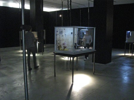 1
1On entering you see a darkened room with boxes about
the size of your torso – maybe 3′ x 4′ – on display.
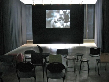
Of to the side there’s a theater with constantly running films
showing Quay brother works. One of every kind of chair.
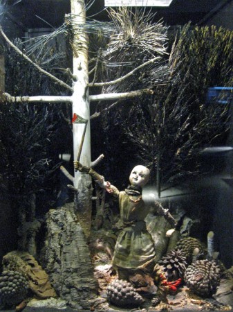
Within the boxes there are whole worlds.
Magnificent detail upon detail.
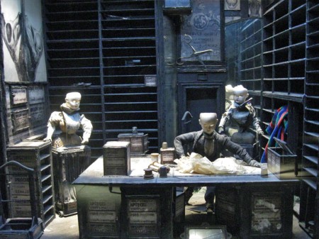
To the next box for a wholly different world.
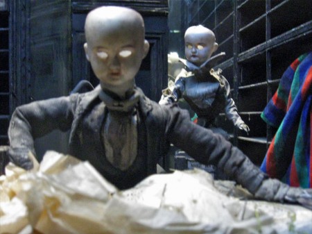
Again the amazing detail is brought to the enclosure.
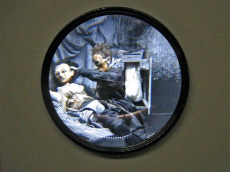
A couple of the boxes are seen through a prism.
The interior is magnified.
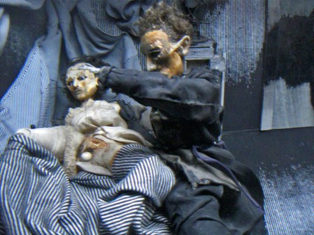
You have to get close to it to get real clarity.
You virtually enter these little rooms.
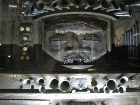
Some of these worlds seem enormous.
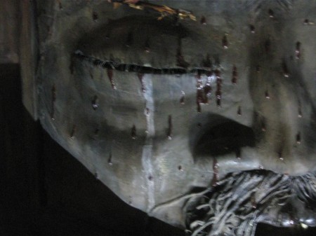
There are many closeups one could take given all there is to see.
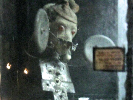
This little scene is in the upper left box of the full view above.
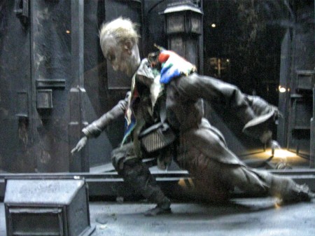
The central character on the main stage.
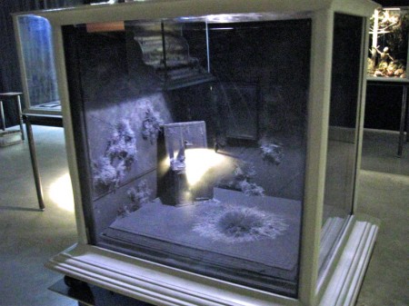
You can get an idea of the cases and the display.
All contain their own little worlds.
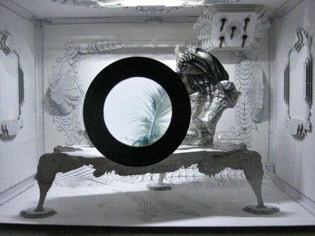
Another magnifying glass focuses on a feather.
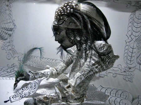
Just beyond the feathered quill there’s the writer.
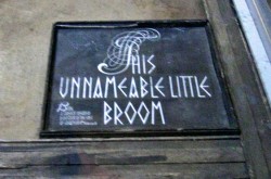
The last box near the exit has a label within.
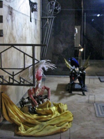
Many of the cases can be viewed
from three different perspectives.
Articles on Animation &Disney 05 Sep 2009 07:41 am
Snow White at 50
- Last week I posted an article about women in animation which originally appeared in Sightlines Summer/Fall 1987 issue. I’d also mentioned that the very same issue had an article by John Canemaker about Snow White’s 50th Anniversary. Naturally, I have to post that article as well. It ties in with the recent issue of D23 wherein John has an article about Snow White celebrating a new remastering of the film and the ways it continues to inspire new animation artists. This is its 72nd anniversary.
Here’s the article:
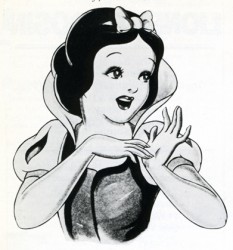 This year, Walt Disney’s first animated feature, SNOW WHITE AND THE SEVEN DWARFS, celebrates its golden anniversary with its re-release in some 2,000 theatres in North America and in venues in 60 countries overseas. The blitz of media events and publicity has encompassed proclamations, parades, and public appearances; soft-drink, clothing, and book tie-ins; a TV special; and, according to Jon Lang, Disney’s director of film licensing, “More merchandising for this movie than any other, including STAR WARS.” Even a Snow White rose has been created, with 100 bushes shipped to mayors in 40 major cities.
To date, the half-century-old SNOW WHITE has worldwide grosses totalling more than $330 million, making it one of the most popular motion pictures of all time and the movie that saved the Disney studio from financial disaster. “You should have heard the howls of warning when we started making a full-length cartoon,” recalled Walt Disney years later. Hollywood pundits called it “Disney’s Folly,” and predicted no one would sit through a seven-reel cartoon.
One of Disney’s reasons for producing SNOW WHITE as a full-length, animated cartoon was financial: The introduction of double-features during the 1930′s bumped Disney’s one-reelers—his cartoon “fillers”—off the screen. The other reason was an artistic one: A bold visionary and innovator, Walt Disney wanted to make full use of his staff’s extraordinary skills, which were developed during the making of his short films. Starting with Mickey Mouse’s debut in 1928, the Disney studio artists made remarkable and steady progress in expanding the stylistic and narrative parameters of the animated cartoon.
Disney’s introduction of certain technological elements-sound and color—forced animation to change. Soundtracks dimensionalized a character’s personality and toned down the over-exaggerated pantomime favored by the silent cartoons. In 1932′s FLOWERS AND TREES, one of Disney’s experimental Silly Symphonies (a series of shorts begun in 1929), Disney utilized a three-toned Technicolor process that allowed for a full range of hues. Old graphic formulas for characters and forces of nature were gradually redesigned to convey the illusion of reality and sincerity that Walt saw in his mind’s eye. The plots of the shorts came to be based on the personalities of the characters, rather than on mere action or gags. Thus, the emotional possibilities for animation were extended as never before.
Unprecedented Problems
The problems encountered in the making of SNOW WHITE were unprecedented. More than 750 artists worked on the film for three years, creating at least two million drawings (of which 250,000 made it into the film).
One of the most formidable problems was the animation of the human figures. The Princess, the Queen, the Prince, and the Huntsman had to be convincing for the melodrama to work. Indeed, the audience had to truly believe that two cartoon characters were going to murder another cartoon character. Previous unsuccessful attempts to portray human motion included the 1934 Silly Symphony, THE GODDESS OF SPRING. To overcome the drawing problems and stiff animation of that experiment, Disney established art classes on the studio lot. All staff artists were obliged to attend in order to study films frame-by-frame and to draw from a nude model. In addition, live models were filmed for the animators to study; interestingly, the model for Snow White was a young dancer who later became famous as Marge Champion.
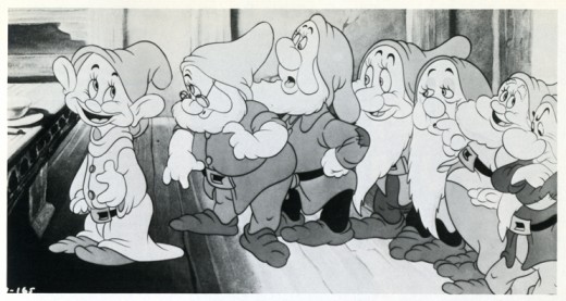
The animation of the human characters works, for the most part, but is spotty. Snow White has a unique, sweet charm, but the poor Prince is never more than a cardboard symbol of a romantic hero. In contrast, the seven dwarfs are superbly realized. “These inspired gnomes,” wrote New York Times caricaturist Al Hirschfeld, “with their geometrical noses, flexible cheeks, linear mouths and eyes, highly stylized beards and costumes . . . lend themselves to articulation because of the tremendous magic of well-directed lines. But the characters Snow White, Prince Charming, and the Queen are badly drawn attempts at realism. … To imitate an animated photograph, except as satire, is in poor taste.”
For SNOW WHITE’S feature-length format, the violent, fast action and bright colors used in Disney’s earlier short films had to be softened and paced to sustain audience interest. Muted earth tones of green and brown predominate, and the extensive use of shadows enhances cool forest scenes, as well as bright meadows and moonlit castles. Snow White’s nightmarish escape through the forest is a scene full of rapid cuts and violent movement. It is followed by the sequence in which the forest animals discover Snow White, which is gentler and slower-paced than the one that precedes it.
The score, eight songs by Frank Churchill and Larry Morey (including “Whistle While You Work,” “Someday My Prince Will Come,” and “Heigh-Ho”), advances the plot and adds to our knowledge of the characters and their motivations, desires, and inner thoughts. The integration of songs with the plot precedes Broadway’s Oklahoma by six years.
Disney’s greatest personal input was in the development of the script and the personalities of the characters. The final scenario is admirably lean, clocking in at 83-action-packed minutes. While the story is succinctly told, it is also filled with details, the result of three years of intensive story conferences and ruthless storyboard critiques by Walt and his creative staff. Six months of work on the film was scrapped by Disney, and he ordered entire scenes redrawn. Three sequences in story-board or rough animation were cut from the film, not because they were bad, but because they impeded the flow of the story. At a recent press conference at the new Disney animation studio in Glendale, California, drawings and test footage from those “lost” sequences were shown. It was apparent that those sequences—which feature the dwarfs’ bed-building routine, soup-eating song, and a dream ballet with Snow White and the Prince—would have been as charming and entertaining as anything that remains in the film.
Disney’s perfectionism drove up the cost of the movie, produced during the Depression years of 1934-37, to astronomical heights, from an initial $150,000 to $1.5 million. “As the budget climbed higher and higher,” said Walt, “I began to have some doubts, too, wondering if we could ever get our investment back.” There was a cliff-hanging deal with a bank to borrow more money; but as the world knows, SNOW WHITE finally proved a great success. The film made its world premiere on December 21, 1937, and reviews were glowing. SNOW WHITE initially earned $8.5 million at the box-office, an enormous sum for the time, especially since children’s movie tickets cost 10 cents.
Feminist Reassessment
Although SNOW WHITE is undeniably a masterpiece of American cinema and a classic of character animation technique, the film has recently become the focus of feminist reassessment and anger. Feminists argue that Snow White is a symbol of female passivity, as she waits to be rescued by an active male, who will give her life purpose and meaning. Film historian Sally Fiske suggests that in order to “comprehend the statement SNOW WHITE makes, imagine reversing it. Try to imagine that the dwarfs were seven little women and the title character was a young prince. The story becomes utterly inconceivable—which is a very telling comment about how we perceive women.”
Charles Solomon, writing in The Los Angeles Times about this subject, interviewed Karen Rowe, an associate professor of English at UCLA specializing in fairy tales and folklore. “While children need a sense that a young figure can confront problems and surmount them, heroes tend to overcome problems in more active ways,” claims Rowe. “What I think is problematic for the 20th century reader of popular tales-including the Disney versions— is that no provision is made for activity on the part of the heroine. It’s all rescue, all passivity. What that communicates to a female child is that it’s never by your own will or action that you overcome a problem. It’s through intervention on your behalf by some other figure. That undercuts any sense of growth and leads to a cultural emphasis on female dependency, which I think is very destructive.”
When SNOW WHITE AND THE SEVEN DWARFS was made in the 1930′s, issues concerning women’s rights, feminism, and role models were not part of the social consciousness of the time. Our approach to viewing SNOW WHITE today should be the same as the one we bring to viewing other film classics, such as THE BIRTH OF A NATION, whose ideology is out of step with current important social issues. Parents should discuss such anachronistic screen images with their children, placing the characters within the context of the period in which they were created and supplementing them with alternative stories and female characters who are, as Professor Rowe says, “more affirmative of a young girl’s ability to act.”
John Canemaker, a contributing editor to Sightlines, ;s the author of Winsor McCay—His Life and Art, recently published by Abbeville Press.
If you want to see more pictures from Snow White, I posted a bunch of model sheets last Monday. Go here.
Animation Artifacts &Models &Rowland B. Wilson 04 Sep 2009 07:37 am
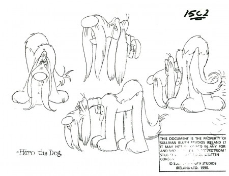
more Rowland Wilson models
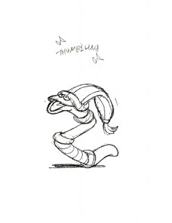
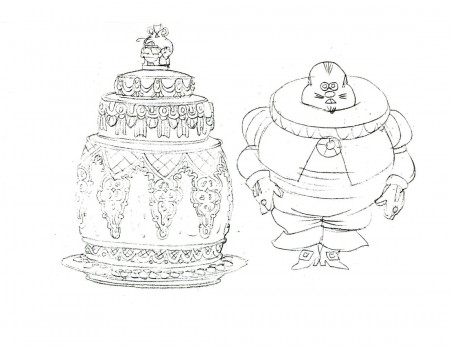
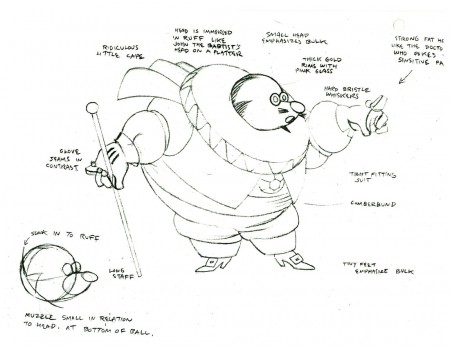
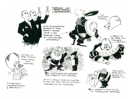
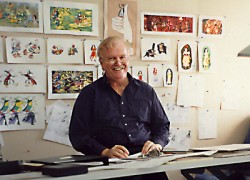 – Yesterday I began the display of models by Rowland B. Wilson done for SullivanBluth’s 1994 feature, Thumbelina. I have another large stack of them – all xeroxed copies, and I’ll try to get them all in today.
This film is far from the best of Don Bluth, but it goes to show how much solid work is done for any feature film. There’s also quite a bit to be learned from any feature. Many of these models didn’t end up in the film (take a look at Thumbelina herself in yesterday’s post) but the drive was a forward one.
Off to the modelshow:
 1
1
(Click any image to enlarge.)
 3
3
Another color one copied in B&W
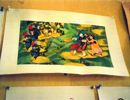 30
30
Finally, here are two color photos Rowland took of his presentation art.
Animation Artifacts &Bill Peckmann &Models &Rowland B. Wilson 03 Sep 2009 07:20 am
Rowland Wilson models
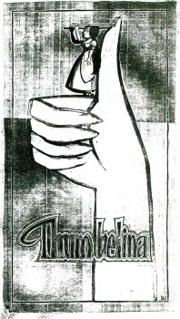 - In the past couple of weeks, we’ve seen a large group of Disney model sheets from some of the early shorts and features. I thought it’d be a good time to look at something more recent. Thanks to Bill Peckmann‘s extraordinary collection of design material, I have access to quite a few model sheets by Rowland B. Wilson.
His models for Don Bluth‘s feature, Thumbelina, fill a binder. I’m gong to have to break it up into two posts.
In this first one I’ll reproduce the article Rowland had written for the in-house organ “Studio News.” This follows with models for some of the lead character models.
These models were done in pencil and ink, sometimes in color. Unfortunately, all of these are 8½ x 11 xerox copies. Blacks wash out and washes blacken. Regardless, they all come across fine enough to get the idea.
Any feature takes a lot of work. You can understand that just in the large number of model sheets that grace the production. When you have a talented artist such as Rowland Wilson doing that modelling for you, your art is off to a good start.
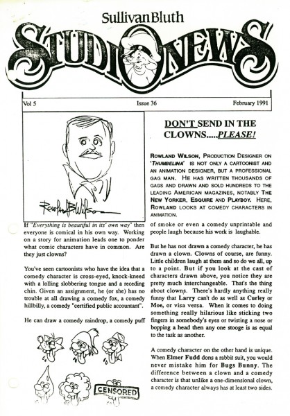 1
1(Click any image to enlarge.)
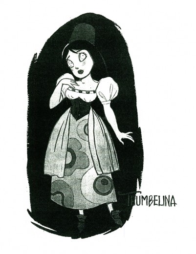 1
1
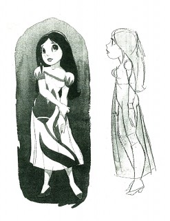
Here we have the model that Rowland drew for Thumbelina.
This is definitely not the rotoscoped princess that we saw in the film.
 2
2 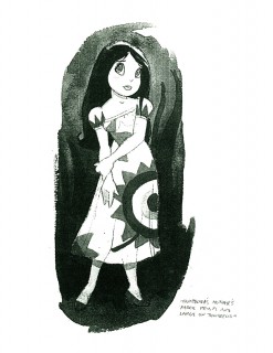 3
3
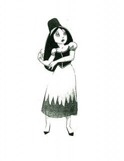
Here we have a lot of different costumes Thumbelina
will wear as she travels on her expeditions.
 4
4 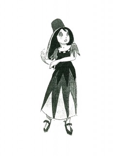 5
5
An original idea – a character who wears
more than one costume in a film!
Plenty of other models to follow tomorrow. Again, thanks to Bill Peckmann for the loan. It’s always great to showcase Rowland Wilson’s work.
Books &Daily post 02 Sep 2009 08:35 am
Friends’ Success
Jeff Scher has one of his excellent animated pieces on the NYTimes site. Once again the music by Shay Lynch has supported the piece and completed it at the same time. A fine piece of music as well as a fine piece of film music. The themes anticipate some of the turns that Jeff takes in his anthem to the end of summer. Take it in and wonder how this could ever have been done in cg. These pieces get better and better for me.
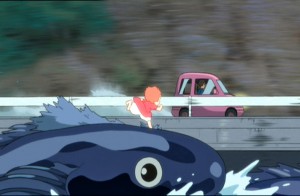 - I’ve recently bought the DVD of Ponyo in Japanese with English subtitles. The film has some strong differences. I saw the movie in English again last night and took some notes. It was my third viewing (2x in theater – once on video) and the film holds up in spades.
I’ll report on what differences I’ve heard later this week.
Howard Beckerman was at that screening – he came with John Dilworth. We said hello and Howard handed me a press release:
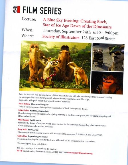
(Click to enlarge.)
Should be an interesting talk, if you have any interest in design or the development process.
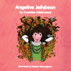
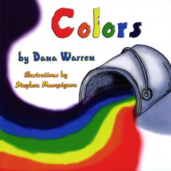
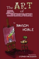
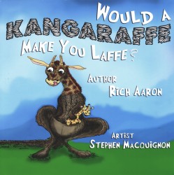
- Stephen MacQuignon was a mainstay of my studio for quite a few years. From 1987 through 1993 Steve was the backbone of the coloring department working on many of my principal films – all pre digital. He left animation seeking other fortunes.
Lately, he seems to have found some success with a number of children’s books which he’s recently illustrated. These can be bought on Amazon for a fair price.
Steve tells me that at least three of the upcoming books have yet to hit the market. It’s nice to be busy. We’ll look forward to collecting them all.
 ___
___
Art Art &Commentary &Illustration 01 Sep 2009 07:32 am
Hirschfeld
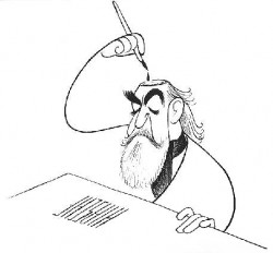 - Last week there were the noisy attacks pro and con of the 09 Ottawa Animation Festival poster. It climaxed with Amid Amidi’s turn on Pete Emslie’s artwork attacking his caricatures as: “. . .tired Hirschfeld impersonations”. This isn’t quite a bad put down considering the almost 70 year brilliance of Al Hischfeld’s caricatures. Hirschfeld was an artist of the highest calibre, and to say one’s work looked like his is to say it looks like a Matisse or a Picasso.
I was never a raving fan of Hischfeld’s work, though I couldn’t help but respect his lifelong consistency, clean art and beautiful ink work. However, when I went to an exhibit which toured NY through the Public Library a few years ago. This exhibit initiated at the National Portrait Gallery/Smithsonian and moved across the country.
It was after seeing this work, in person, that I began to see Hirschfeld himself. Somehow we ended up at the same venues for four or five occasions at this late point in his life. I was always too shy to go up to him to introduce myself.
Surprisingly, Hirschfeld’s caricatures were the stunning gems throughout the show. (There were also those beautiful Joe Morgan celebrity caricatures as well as setups and drawings from Disney’s Mother Goose Goes Hollywood (see this post.)
By the age of 18, Al Hirschfeld had been an art director for Louis Selznick, Sam Goldwyn and Universal Pictures. His connection with movies and movie stars was set for the rest of his life. He befriended Miguel Covarrubias in 1923 when they shared a studio and many interests.
In 1924 he left to study painting in Paris and traveled extensively for the next few years. In the interim he began to pubslish celebrity caricatures. Dick Maney, intrigued by the actor Sasha Guitry, noticed and liked a caricature on a playbill that Hirschfeld had done. Maney brought it to the attention of the New York Herald Tribune. Thus was began Hirschfeld’s career in the newspapers – including 20 years at the Tribune where he even acted as Moscow Theater correspondent for the paper.
After he had done the Marx Brothers’ collage caricature he was on a bee-line to great success.
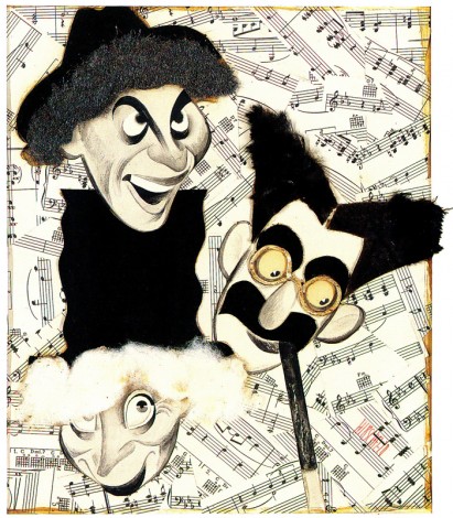
The Night at the Opera 1935, a collage.
(Click any image to enlarge.)
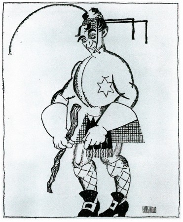
A 1928 caricature of Scottish comedian, Harald Lauder, printed in the NYTimes.
This was one of the earliest published and a good start to a career.
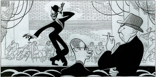
A 1939 drawing of dancer Bill Bojangles in the show, The Hot Mikado.
Designer, Nat Karson and Producer, Hassard Short stand to the right.
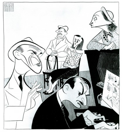
This 1946 caricature of the Cradle Will Rock shows composer,
Marc Blitzstein at the piano surrounded by the cast.
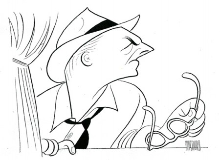
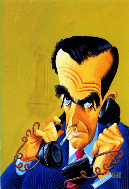
This 1950 caricature of Walter Winchell shows the
style fully formed including the imbedded NINA.
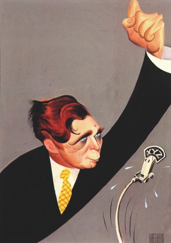
Presidential candidate Wendell Willkie was painted for
American Mercury magazine in May of 1944.
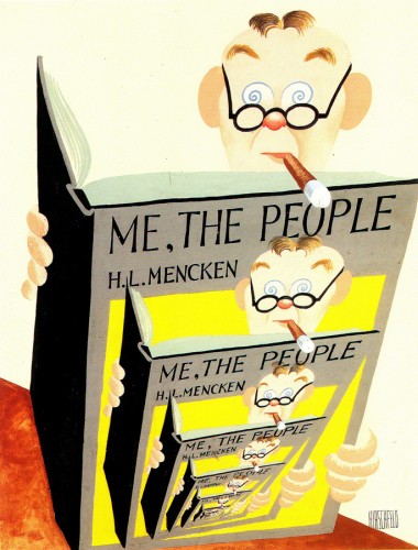
A 1949 painting of H.L.Mencken as the first of a series of covers for
American Mercury magazine, Lawrence Spivak, publisher, commissioned it.
Good caricature is an artform of its own.
Great caricature can be as brilliant as art can get.
